Transcripts
1. Intro: [MUSIC] What's up, guys?
It's Patrick here. Welcome to another
Skillshare premium class. We're going to be making really highly
requested class today. Photorealistic candy and
specifically ring pops. This one's very fun one and
very simple and we're only going to be using Cinema 4D and little bit of
Octane as well. Then we're going to put it into a great still-life
which will be good for ads and social
media, all that stuff. We're going to go over the
whole ideation process. References are integral to the modeling, camera
settings, lighting, rendering, photoshop,
composition, and then making some cool
stuff like that as well. It's been a while, but I
think this class is for sure going to be useful
for a lot of people. I can't wait to jump in with
you guys. So let's do it.
2. References: What's up, guys. Now we're in the preliminary phase
where typically I would be picking a reference photo or something
of that nature. Usually, I just go to Google images because
if you're trying to make things that are
super realistic looking, you're going to want
at least some decent proportions and just seeing
close-ups of the texture, see how it all works. We're going to go here and
pick some of this stuff. I like this one, gives you a lot of variety. To mark these down and place
them in an area we can see, I usually have this tiny
program called PRF, and it's free, I believe. At least when I got it was
free and it's super dope. You can just drag images to it. You can scale them
however you want to, always stays on the top layer. Very nice tool. Let's see, let's grab a couple more. This one is cool, let's drag it, they all come in different sizes depending
on how big they actually are but super-helpful. You can arrange
them how you want. You can even if you have
a bunch of pictures and you're just dragging stuff around, you
highlight them all. You can right-click images, arrange in optimal and it gives you a
really cool collage. Super dope, super useful. I may have mentioned
it in other programs, I'm not sure or other
classes of mine. But I'm going to
delete these two, I don't think I need them. I'm just going to keep maybe these two because you can get a couple different
angles like this and they're all on white. Easy to see and I'm
going to minimize that. The next step will just
be starting these things.
3. Modeling: We have our references here. We can place them anywhere. We can even place them in a
different monitor if we have. I may keep them here for
now and then just work off, then move this panel
as I would need to. But in any case, I think it's a good
time to start modeling. This is the old
standard workspace or layout, I should say. I use a completely
different one for a lot of my dailies just
to speed up the process, but I guess for this I'll
just be using the old layout. Since our 25 or 26,
I can't remember, they've switched
up the layout to a newer one which I'm
less familiar of, and so we're just going
to be using this. Without further ado,
I think we can start creating some cool shapes here, and I believe if you look at the amount of sides
on these things, let's start with a
very simple shape. How many sides? I
think it's eight, 1, 2, 3, 4,5, 6, 7, yeah, eight sides
to these things. Pretty much the whole
thing has eight sides, it just changes in
the scale of them. I think what we're going
to start with is let's go start with a cylinder. I think I want to start
this on there. There we go. See I'm already
moving this thing. Maybe we can make it smaller just to see and
have this one up. But we start with the
cylinder here and if you go to the attributes panel here, we see the amount of sides or the rotation segments are 16.
Let's change that to eight. [NOISE] That should be good. I think we're going to
want one split here. Let's go here, and rotation
segments eight, that's good. Let's take the height
down to one, I believe. Then if you go to
Display shading lines or quick shading
lines might help. You can see the segments
there pretty nicely. We may need two
segments actually. There we go. This doesn't look
like a ring pop yet, but it will in a second. What we need to do now
is I believe just click "C" or this guy here,
make it editable. Now we can take these
polygons by going to the face, edges, or point mode and start manipulating these
things just like this. That's the key here. We're not going to want to
move them with the faces, we're going to want to
move them with the lines. If you're in any of these
modes like the move mode, you can just double-click one of these guys and it'll select the whole circumference, I
believe that's the word. If you click T, you can just scale these things up like this and make them smaller depending
on which side you're at. You can see pretty
quickly here if we go to the front view here,
it'll be easier to see. All we're trying to do is
make this shape. Very simple. Let's leave. Actually, just make this one a
little bit smaller. Let's bring this guy
up a little bit. I'm using key commands. Usually, I'm just
clicking E, T, or R, for E being move, R rotate, and T scale. That's all you pretty
much need to know. Then double-clicking here, let's go ahead and E, and you'll see we're moving these edges but not the bottom. I might just want to go here and select
the faces instead, just for this one because
it's at the very bottom. We can go U, L and it'll be
selecting the loop mode, so I'll just select this
whole bottom part here, [NOISE] E again for the move tool and then
go back to this mode. Bring this up.
Somewhere around that. You can always bring
reference images in the back, which can help. But I think for this it
doesn't really matter as long as we're getting
the general shape. Maybe this one. Let's move this line
a little bit smaller, and I think that's
honestly good; the shape. We're looking good
there. That's honestly as crazy as it gets for the
modeling of that piece, and yeah, we can go ahead and I believe create another cylinder. This will be for
this base part here. Before we do that, I'm just
going to hide this cylinder. Let's call this the diamond
and let's call this the easiest way to
pop to the top. The cylinder will be base. Bring that underneath.
Make it active again. Let's just start
making this a little bit more finite and
small. Bring it down. Again, we don't want
to be too crazy. We're making an approximate. Something like this. You
see it's pretty thin. We're going to get decently
thin with it like that. Then if you notice, I don't know if you can
really see in any of these, but there is a clear thing that sticks out here that
we want to be attentive to. What I'm going to
do is essentially, let's take out some of
these segments here, just like that and
I already click C, so we can edit this thing. If you'll notice it looks
pretty low poly now. But right now we're
going to take the pop and go to x-ray mode so
we can see in-between it. We're going to want to
extrude a piece out here. Easiest way to do
that, let's go to the face mode and
then remember U, L to loop-select
this whole area. Let's go ahead and inset, which will give you
another segment just going inside of it. We want to pretty much
match that shape in there, so let's go over there and then holding down
Control or Command, I believe if you're on a Mac, just bring it up which will extrude one of these faces out. I think that's about
how much you want to do. Nothing too crazy. Depending on the reference
photos you're using, you might be able to see the
ridges in here like this, and that doesn't have to
be too exact because it's literally being covered
by so much candy. We're just going to
create those ridges here. But something to keep in mind is that we want to
smooth these things out, and to smooth those out, we're going to put those
into a subdivision surface, which is this guy here. Just clear one of those guys. Just move it underneath the
pop and then create the base, take that and make it a child of the subdivision surface, and that's going to make
this thing really smooth. However, it doesn't exactly have any hard edges
because we need to add a bunch of loops
to it; edge loops. Let's press "Q" and just disable
the subdivision surface. That's an easy
trick right there. Just clicking Q will
allow you to do that. Let's make some loop cuts here. We need to make it
sharper on the edges, so I'm going to go to Command A. I usually just
select everything, go to Loop, Path Cut, and then here, I'm
sure to click and drag until I have an area here. You'll see right away if I
were to just add one here, press "Q", you can
see we're getting a little bit more detail
towards the edge here. But it's not really going to be showing until we add enough, so let's add one
to the bottom now. Now if we click Q, we're actually getting some
stiffness there. I'm probably going to
want even more stiffness because it's a
pretty sharp edge. To add a little bit more
stiffness there we'll just add a quick loop cut here, and a loop cut here. Again, this doesn't
have to be too exact. You could go as to be
as exact as you want to make sure it's
right in the middle. Great two of them, and then while you have maybe one of these
faces selected, you can just do
something like this. There's many ways
to make it exact, but for something this small,
it doesn't really matter. Then when you click
Q, you've got these nice clean shapes here. Of course, this needs
to be cleaned up. We're going to do the same
to that base area here. [NOISE] What I'm going to do is select all of them Command A, and let's go Loop Path Cut. I'm going to go somewhere to
make it like a clean edge. The farther away you put
it towards the edge, the more flow it's
going to have. If I put it here, let's see. Pretty sharp edge
there versus here. Much more gradual edge. That is pretty much what you
got to do there. Looks good. I'm going to go here and
make it pretty sharp here. Now we've got a sharp edge. I'm going to do the
same with this guy, so you can do this mode if you want with subdivisions surface activated so you can see what
you're doing in real-time. I think that might
be the easiest. Sometimes I just like
to make it very simple. Now that we have this
edge and this edge, let's create one in the middle, make it centered, and
create more of these guys. Maybe like that. So not that we have approximate amount
of segments here, around two, with the
faces selectives UL, and select a bunch of
these guys like this, and then we can go bevel, and we can bevel these
guys out a little bit. If you want, insert it so they'll be a
little bit sharper. Now subdivision surface it, and solo this guy. Oops, let's solo. There you go. You can see
what we're working with here. Pretty simple, but it
gets the job done. I believe this is the
biggest portion at the top. It's hard to tell. I guess
what we made could be good. Looks like the top one
is a little bit bigger. What we can do [NOISE] is
here let's take this one. Actually, it's taking
this edge loop right here, move it down. Let's loop select this edge, bring it up a little bit. Because these points
are where they are, let's select the faces
move that up a little bit. Then loop select this guy, and bevel it out a
little bit further. If you want this area
to be sharper [NOISE], let's select, and inset. Now this should
be a decent model for this thing, so now we go. A little bit bigger on the top, still gets the job done. Let's un-solo that part. We're looking pretty good.
It looks like a ring pops up are maybe a little bit high. If we want, we can
take the pot part, and maybe bring it
up a little bit, and then just move
the whole thing down, going into model
mood, bring it down. An easy way to
snap these things. If you go to this guy, enable axis, and
click "Enable snap". In snap, just open
to the bottom, disable axis, and snap
it to the top there. Now we're perfectly on
that part of the mesh, and then just disable that.
Now everything's good. We just need to
make the ring part. I was trying to figure out
the best way to do this. I think the best
way if I remember correctly was just to make, I believe it's tube. We're going to make it going
on the z-axis like this. You can see where
I'm going with here. Let's move it all the way down. Actually, let's T scale it down till we have
the approximate size. This part you can
do by yourself. Just imagine this was a cut ring shape instead
of just a full ring. Let's make it pretty.
There you go. Just like that. We
get the idea here. Just seeing how much we
want to go behind on this. If you look at the
thickness here, let's just make it a
little bit thinner. Something like that, cool. It being cut at the bottom,
we're looking good. Now we could Boolean it. We
could do all that stuff. But I think that more simple
option that I came up with was putting it into a subdivision surface,
and just slicing it. Let's go slice just like that. We don't want that, we
want that reverse this. Let's go 360-180,
something like that. That gives us half. Then I was just playing around with here we need more of this. Maybe you want this at like 120. This can be 420. It looks right, 420, and 120. That looks good. If you were to put this
into a subdivision surface, I like to use one subdivision
surface for both objects. But you can't plug two things at a time into a
subdivision surface. But you can if you
select both of them, and put them in a null so that anything that's in
the null is applied. We look at this, and it
looks pretty decent. It's getting us where we need, and then messing with
the segments here. You can see depending
on the cap settings, you can make it really
sharp or not sharp at all. The rotation segments,
we can dim down. You can see what happens. I feel like these aren't
perfectly circle, so something like that's good. Then height segments, depending on how sharp we want the ring. I think something like that might be nice [NOISE]. To me, that looks good. Then
we can always go back to the scale of these things, and the inner side of
how tall they are. But I think I want
to keep it here. This is pretty much
our finished ring pop. We can if you want take one
of the these guys down. But I think I like it like that. We're going to be
using instances. By no means this
is a very heavy or dense polygonal
shape by any means, but that is pretty much the
modeling of the candy there. You can do some stuff that you really want to rough it up. You can make these guys, the pop, a little bit
more dynamic if you want. But we're going
to be doing a lot of that in the texturing. We can really hunker down with such a very simple
base model here. Then going forward, we can have a bunch
of imperfections, and all that stuff to
make it realistic. Right now it looks
pretty simple. But this is going to
get very complex soon, not really as far as skill level but as far as the look of it. Just looking at it now, I might want to increase the
size of this guy real quick. What we can do is, let's go T for the
scale, and increase. I believe we want
to lock the height, and just increase the depth and the X if that makes sense. That looks good. Unlock the
Y, and we should be good. I think we're ready to light,
and texture this thing. We'll do that in
the next section.
4. Camera Settings & Scene Settings: Hi guys, we're back here and we have this finished model here. I think we're ready to
get this scene set up. We're going to set up
a camera real quick. To do that, I'm
trying to do Shift C. I'm just going
to type an octane. Should go Octane camera. Should be good. Then hop inside that camera by going to click
this little square here. I'm going to cancel all
these coordinates out here and just move this Z back so you can see
what's going on here. I like to have a pretty
impactful camera, a longer lens. I'm going to go
scale more back on the Z and go to the object
tab instead of classic, let's go to like telephoto. That may seem like
nothing really happened, but you'll be able to see
once we start rendering. I'm also going to look into
the Render Settings here. I have it set to Octane Render. May start making classes
soon on Redshift, I need to get more into that. I know Cinema 4D comes with it, but I've just been
Octane for so long and I appreciate you
guys rolling with me here. I'm going
to go to output. We really just have to worry
about the width and height. I think I'm actually going to
keep that at 1500 by 1500. Lock that there. Depending on if you
want to go like 1920 by 1080 or 1500 by 1500
up to you guys. I'm going to keep it
square for the time being. That's really all we have
to worry about here, as long as it's set to
Octane, we're good. I want to be able to see
the borders here now. If I just click into the
viewport and go Shift V, go to Safe Frames, take the opacity to 100. Now we can see our aspect
ratio and if you really want some details go Octane
camera composition, grid. Now we can see, this
isn't really centered. What we're going to do is, let's tilt the camera
up a little bit. In fact, let's move
the ring pop down. Let's collapse these into a
group. We have the tube here. Let's call that ringing base. Collapse that, and then put these all into
a null together. I'll name this ringpop.
That should be good. Depending on what
your use cases, maybe you'd want to
bring the axis down. Remember we have to click
"Enable Axis" here. Depending on, if you're going to have you stand
up on the ground, you might want to
have them there, but I want these guys
to be dead center. I'm going to switch camera view, make sure there's galaxy
key centered here. Just somewhere in the middle
because once we clone these, it'll be better to
have it like that. That looks good
there, and then once we disable the axis, we can go back to
the coordinates, move it down, it
should look pretty centered, which it does. Then when we want to
rotate it and stuff, it's easy to just boom like
this. That should be good. Notice how the ring and the base here aren't
really attached. We could be doing some volume
[inaudible] all that stuff, but we don't need to mess
with that many segments. We'll be doing this
in the texturing. There's a way you can blend
those a little bit together. Let's center this out again. Actually, we can, let's
zero, zero, zero, zero and we move it
on a cool axis like this just while we get
everything set up. We have the ringpop
and the camera. Doesn't really matter
the order these are in. We have the ringpop
and the camera. Let's go ahead and start
rendering this stuff. Let's go and grab an
Octane live viewer window. Let's go to Octane, live view window,
and pretty big. Let's bring this down here and grabbing
these three gold bars, host these next door here so
we can see what's going on, as well as maybe grabbing
Octane settings here. This part, I think it's
pretty important just getting some basic settings so we
can have something we like. If you want to just
copy these settings, I only really messed with
maybe the max samples. Bring those 250 or 100 depending on your computer's needs, but that is not too bad. Maybe I'll go to 60 to get a very quick clean
render and make sure you are on path tracing
instead of direct lighting, and then can't remember juror keep everything the way it is. That should be good.
Let's render right here. This is what we're getting and typically
I'll click this lock icon here because it'll allow us
to move these frames and give us our actual aspect ratio here and not just
fit it to this box. I think what I'm going to do is subtract this a little bit,
and that should be good. Very fast runner, if I
were to render this, redo the runner, extremely fast. Again, I'm working with
a couple of 30, 90, so there is that. Then some quick camera settings before we get started here to make this thing really
look better in the long run. Let's click this
camera tag here. Camera Imager,
Enable Camera Imager , highlight, compression, take that all the way
up, and to you right now it may look like I just
made it really flat. That's what we want because then we'll have more latitude, dynamic range to work with
more of a camera guy thing. But then we can take
the exposure up to compensate a little
bit, maybe to 1.7. I do this for every
one of my renders, just to give it a little bit
of a punch with more detail. I think we can probably
move this little bit down. It's not outside of it, it's colliding with it. That looks good. I believe we can start
lighting this thing.
5. Lighting: First thing we want to do is create for your two
objects, HDRI environment. Now, this is what we want here. It's pretty much empty sky. We want to bring in
an HDRI in there. I'm probably for the HDRIs, I'm going to grab, let's see if I can
bring that in here. HDRIs. Got you. Let me bring this in here. These are just some HDRIs
from my one of my packs, and one of these I do use a lot. You can actually get these on my Padgett 4D.store website. I use parking deck 1, so I'll grab the HDRI and our HDRI file and just put it in there. I can click "No" for now. You can see already
we're getting a pretty nice lighting and I can rotate this guy
however I want it, but I don't really want to be
able to see the background. I'm going to create
another HDRI environment. It's overriding this
other one here. I'm going to rename this BG for background and just go from primary
environment to visible. Now, if we go back to this one, let me just rotate,
that's all I really need. Even that's looking
pretty good, and I usually bumped the
power up a bit, something like that,
something that'll give us a nice immediate lighting. Far, we're still going to
just blink geometry here. But at least it's in a
lighting scenario that we can start off with and see what
texture start to look like. I boost this to 10,
something like that. That's good. We're
at a good spot here. Let's say we're
done for lighting until we want to
add another area, light usually set a baseline
image lighting there. If I think it needs some punch or kick from a
different direction, I'll add that. We're good there.
6. Texturing Pt.1: The next thing we want to do is start messing with textures. This is where it
gets pretty fun. I'm going to go Shift C
and octane node editor. This is going to give us
exactly what we need here. Sometimes I replace what's going on here and sometimes
I leave it there. I'm going to select
one of these. Bring props here. Maybe I'll do the, I don't know
which one I like more. Maybe the green one will
try to replicate first. I want that pretty small
in the frame. Maybe there. Then I could replace maybe
the live viewer window. Now we can switch between the
view and the octane node or sometimes when you do
it this way it won't update correctly. But
we'll see how this works. Let's go ahead and create
a composite material. Just like that. I usually start every material with a
composite material. I guess you guys can see it, but it's below my picture here. But either way, let's grab
the composite material and put it on the base and
ring. We have that there. Hopefully, you guys
can understood what just happened
there underneath my face where you can see me. There is the material. As long as you know
that we should be good. We have the material here which is applied to the
base and the ring. The first thing I want
to do is grab Material 1 and create some material
which should make it glossy. Now we're getting some
nice highlights, perfect. The next thing we want
to do is I believe, no, I think we don't
need to smooth out any edges now with this ring, so we're good there. Let me zoom in
here a little bit. Then we'll want to
create some color here. I guess the reference here is blue and it almost looks like it's translucent
a little bit. I'm not sure if I want to do that or if I want
to just keep it. Like plasticky because
some of them are plastic. But if you do want to, let's go ahead and
create a specular. Then let's go ahead and go. Common fake shadows. That'll let light pass through these things a little
bit more realistically. Then we can go to the
median and scatter. Now it's going to get
darker a little bit in certain places where
the light is hitting. We'll drag something
into the absorption, maybe a color RGB spectrum. We can bring this to HSV. Let me select the colors here. Let's go get this
blue color here. We just select
something like that and increase the
brightness here. Then the important
part, scattering. Now can see what's
going on here, but we're letting the light be very roughed up as it hits
inside of this thing, then we can adjust
the density here. Let's see what happens if
we don't have a lot of density versus a lot more. Something like that looks good. We're going to
definitely want to tone down that blue
color though that's very, like that. Looks more purple then
increase the color. If anything, that looks a
little bit more mess we're not getting complete shines. Let's go ahead and graph
it up a little bit. Maybe not that much. Something like that,
I believe looks good. We also have to
start rotating this and seeing what's really going on with this lights and how it's
interacting with stuff. To me, it needs to be
a little bit darker. Let's go back into
the node editor. Honestly, I think go to
the transmission tab, add a color node. Bring that down
just a little bit. We add some color in
there. Just like that. That looks pretty good from now we can keep that
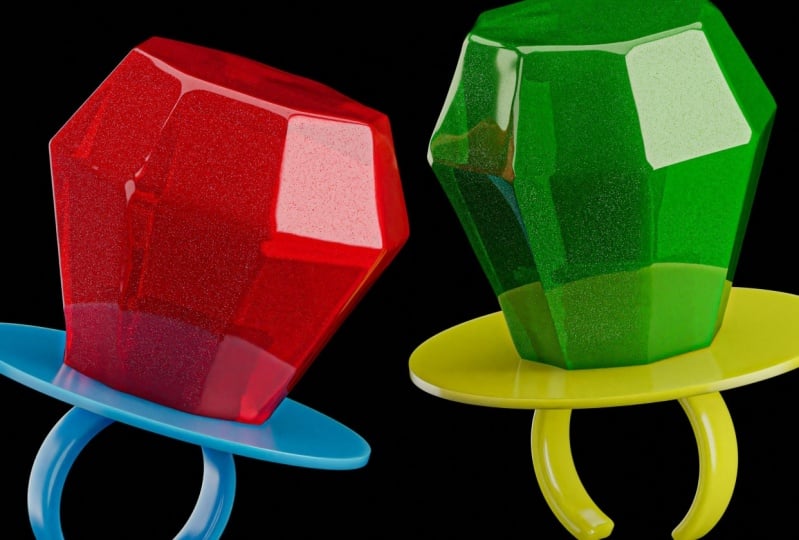
there how it is. Now it's time for the fun part. The specular material that will be on this main ring pop thing. We're going to create
another material. The material create octane composite material again
and drag that onto the pop. Go back to the note editor with the pop-selected
sub-material. Got you. You can see what's
going on here. We have the glossy material
affecting this thing. I don't think we
need this song tag. Yeah, so that was distorting
our mesh a little bit. We don't need that.
But for this, you'll be able to see
what's going on here. Before I even get to
the specular part, where we're going to do is go to basic and click round edges. Now we're going to have
this other tab here. Drag that out. Let's go round edges, Name, Fast, to accurate. Now watch what happens when
we increase this radius. We're going to see,
we're going to take these unrealistic
sharp edges. See in this reference we have little bit of a double there. We could double the
actual geometry, but it's nicer to
be able to do that on the actual ring pop. Let's click consider others
and bring this guy out. You can see we're
actually getting a much more doubled
thing right there. That's what we're looking
for. Just like that. That'll look much nicer, more realistic when we
start adding stuff there. We've got that
there. Let's start with the specular materials. Let's go through some material. You can go glossy to specular. Now you can see what's
going on, perfect. We can see the stuff hitting
the areas on the inside. Let's go ahead and common fake shadows
checked. Same thing. We're going to go
to the medium tab, scattering,
absorption, RGB color, scattering, at a float. The flow we're going
to want to take down almost all the way. We want a little
bit of roughness going on in there. Very slight. It's like 0.006579, I guess. Then create a greenish texture
here, or like a yellow. Then I think the scattering
we can tone down a bit. Maybe increase that
guy looking good. This, we're going to
add some bump here. I believe and I can't remember
if we want to do a normal or the roughness
or what have you, but we're going to
create a flakes tab, flakes, and apply this to I think the bump or I think
normal first maybe. Let's try that. Took the
base color down to black. Now we're replacing, see what it's doing here is, going to show us the solid probably should at
glitches on that. Oh, that's what it's doing. It's projecting a bunch
of randomized flakes on there flakes size, flake variants,
increase the variance. Then we're going to
go ahead and take the blend factor, I believe, all the way down and add a transform node and
bring this guy down. This looks like
bubbles and stuff. It doesn't look
fully realistic now. But you can take something like a color correction
node in place that in-between and lower
that was going on there. From afar, it actually looks like a little
bit more roughed up and stuff like that. We can take the size variance, bump that up a little bit more. You see we bump up
the flakes sides. What that does? Yeah,
something like that, I believe isn't too bad. Take the brightness down. That's looking much more roughed
up, much more realistic. [NOISE] We can actually add
it with some other elements. If we go to add an Octane noise, let's take out the normal there, like these spots real quick
and just work with the noise. If we saw the noise, we can see what we're
working with here. We want something a
little bit bigger. Let's see, Turbulence might
work a little bit better. Create a Transform node. As a matter of fact, actually a Projection
node as well. Let's go to Box
and just increase the size, something like this. We don't want this
too harsh at all. If anything, that's
not what we want. Maybe something like
that, really toned down, disable the node. See how this looks. Got it. We are getting
something cool. It's hard to see maybe
on your screen so we can maybe bump up
the power a little bit. Yeah, it looks good. Perfect. Maybe even
a little bit more. Then we just drag this
into the Bump again. We can mix both of
those together. I think those two
mix looks great. We got the round edges. We've got everything
working together. It's hard to see
what's going on. We add in the Normal, the flakes and then the Bump, the Noise, and I think
combined that makes for a really realistic
looking ring pop. I think the only thing
we do left is increase the saturation of
the green here. That's the color, and
this is where it gets really easy to
change the color to whatever you're vibing with. Have more of a
yellowish color here, which I believe is fine. Now when you rotate this
thing, say it again. You will rotate
this whole thing, we have this really
ring pop going here. To me, I think that fits the bill for the most
part to what we want. I think I might want
to change this. I might want to make this base
material a little bit more plasticky and less translucent because I'm just not a fan
of that at the moment. I'm going to go back to
this Composite material. I'll just take this from
Specular to Glossy, [NOISE] and detach
these guys here. Takee color to the
diffuse maybe. Shader. Something like that. If we want to copy
the flakes texture from this node or this
material to this material, and maybe bring that
onto the roughness. You're going to get some
really nice material here, and I believe we
can just then take the one factor and bring that up until we don't
really need it anymore. Actually, let's create
a mixed node here. Instead of this
being in the Amount, let's bring that
to a Texture here. This will be full flakes, this will be full
roughness, I guess. We're going to want
to find somewhere in-between, maybe like that. Then just take this color
a little bit fuller. To me that looks pretty good. It looks like a r
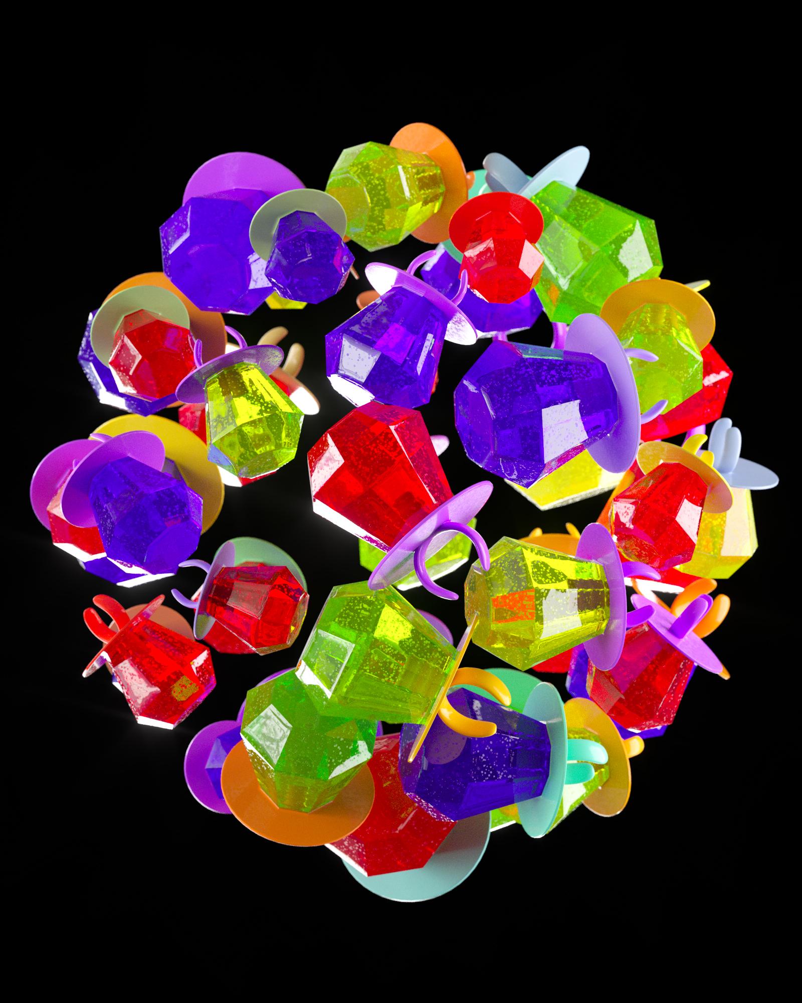
ring pop. That's how you make one ring pop. Now I'm going to show
you pretty much how you create a clone of these, and then we're going to
make another texture that will randomize
pretty much everything. Let's do that now.
With this guy, we have the ring pop here. We have this guy. Let's copy and paste this and just hide that
one right there. For this one, we're going to pretty much start from
scratch on the materials. We can keep the materials
how they are now. But let's go and hop
this into a Cloner, which is this guy right here. Let's bring these guys above
the background, HDRIs. Let's go ahead and
take the ring pop and drag it on top
of the Cloner. Make the Cloner a
Render Instance. Everything is going to load much faster if we keep it that way. What I like to do is
scale these guys down, and let's go Cloner,
Grid, Objects. They're all going to
disappear. We need to clone them on an object. I like grabbing like a sphere, something like this that you saw on maybe my Instagram
when I posted about it, and you can see we have
like faces here and stuff. Let's go from Standard
to Octahedron. Change these segments
from 16 to 12, and go Cloner, drag the
sphere on top here. Now by default it's
going to randomly assort them in places. That is cool if you
want to just hide the sphere and have them
all be randomized there, that's also very cool, but let's go to the Cloner, and from Surface,
let's go to Vertex, then hide the sphere. Then we go to the
Transform, and I believe it's the rotation. Let's go negative 90, just like that, and now we get a very cool looking
assortment here. When we rotate the sphere,
everything rotates together. That's cool. Again, we're still just using
the, what do we call it? What is the word I
was thinking of? Oh, the HDRI to
light this thing. At this stage, you can say, oh, how does this work with like different HDRI rotation
values and stuff like that? You can start messing
with this, and sometimes it just
hits on me like, that looks great.
Let's keep it there. Let's go something like this. I like these ones on
the edges for sure. I'm happy that, a little
bit darker on that side. But everything is too uniform, so we want to randomize
these colors. The way to do that, we don't have to do
that and make like five different types of models and texture
them differently. We can do that
with a randomizer, essentially, an octane. Before we do that, let's
randomize the size a little bit. Let's go. Shift C, random. Make sure it's the random
MoGraph, this purple guy. By default, they're
going to go everywhere. Let's go Parameter,
tick the Position. We've done there, and then take the Uniform Scale and start
messing with this guy. That will create some
smaller ones, bigger ones. If you want, you can
rotate them like this. If you want to just have that
extra bit of realism there. That should be good.
Something that looks realistic, not too [inaudible]. If you have some that are
running into each other, that's not that big of a deal. You can add a Push Apart. Change the iterations to
68 or something like that, and change this to Scale Apart, and take this down and we'll see just increasing
this value here, I'm going to start. Something like that.
That should be good. Hopefully, you guys
understood that. I wasn't rambling too much, and we're going to get into
randomizing the color now. I think we had a great
still life at this point. Now we just need to
randomize stuff.
7. Texturing Pt.2: Let's go and delete
this material here. We can keep the
materials of the bases, but let's just work
on the material. I'm going to duplicate
the compile. This original texture we have, let's call it pop 1, and then we'll duplicate it, call this random pop. We're going to drag this
onto the cloner this time. Far it should look
how it was before. Let's go to the
Node Editor, and we call this random pop. You can see it titled here. It's going to get
cool. The color is being derived from
the medium here, the shader, and we want
to randomize that. Let's remember this color here, and before anything
changes here, let's add a random color. This is going to be
our randomizer here. But we need to drag this into
something like a gradient, and that's going to be
driving all this stuff. Let's go ahead and honestly
kill this color here. We should have some
random color here. That's the default there. The gradient, this is
where we're going to craft our colors that we want. We can highlight both of these. Let's go, interpolation
of all knots, step. Now, they're going to be a
pretty harsh decline here. One was going to be white
and one was going to be, let's say red, I believe. Just drag this gradient into
the absorption. Got you. Now, we've got some red ones
and some white ones and a nice random assortment
of colors, and that's dub. We can change maybe this red one that
might be too intense, or if you'd like that, that's
totally fine. Let's go red. Maybe make these, the greenish ones we
had just like that, and the white, let's maybe make these, what are
the other colors? Purple is cool. Going a
little bit like that, and this flow texture make them a little bit
foggy around the inside. That looks good. Now, we have two separate colors. At least in my past experience, it gets a little dicey
when you start adding a bunch of colors
for some reason, they start blending together. Actually, I'm going to
command copy this one. If we were to make this one, maybe green one or blue one, they start getting a little bit fuzzy for whatever reason. Let's go here and go, maybe red. That looks pretty good. If you don't like the way
they're mapping together, you can take the random color
and just change the seed, just like that, and you see you've got
some that are like this weird off-white color. That might be something you have to deal with a little bit, but the most part
we're looking good. I was actually happy
with the first seed, so we can keep it there. That's for the most part. You do that. Again, if
you change the density, it will apply it
for all of them. Cool. These might be a little bit more saturation
on some of these. Purple. Cool. That's
actually pretty dope. It looks pretty realistic. You can change these colors
as many times as you want, and that's good. The next thing we have to do
is just change the stuff for the color of the base and ring. Let's just copy these
two nodes here. Go to octane composite. Let's go, that's random base and drag
it onto the base ring. Now, we are here and where
we have the color here, just delete that, gradient into the diffuse, and pretty much immediately
we should see if you're not. Base ring. Wait. This is confusing. Let me see what's going on here. Which color is it coming from? I think we have a little bit
of a glitch or something. There we go. Actually, there was no human error there. When you have the
octane node selected, sometimes it takes
a while to update. Let's go random base
to the basic ring. Perfect. There we go. We can just change
these to make them different colors if you want. Let's go ahead and
this one, teal. That's on maybe orange, and this one maybe a yellow.
This is looking good. We just have to
randomize the seed of the random color to our liking. Something like that looks dope. That's pretty much
how you do it, guys. If you want to add some
finishing touches, you can go to the
camera tab here, go to post-processing,
enable bloom. There you can get some cool looking dreamlike glows here, a little bit of glare, then cut it off a little
bit so it's only affecting the really bright areas. You can see it a
little bit more there. But typically I want to keep
that tone down a little bit. But for the most part,
that's good guys. I just have to go in and
mess with this on Photoshop. I'm going to go ahead and make sure all the settings are good. I usually take the
samples after this to something a little
bit higher like 800, and we could have added an
area light if we wanted to, or even randomized the
rotation on some of the other axes here if you wanted less of a reclining
this on a ball here. But for the most part, we got the job done. Now, you can just
change the size of the ball to randomize
this thing even more, or just straight up, rotate the ball to get more
angles of this thing. But for the most part, I'm
pretty happy with this. I think that's good and I think we'll
start and render this. We're getting a lot
of yellow here, maybe you'll change
the random base a little bit.
Changing the seed up. Let's go in here and
increase. There you go. A little bit less yellow.
Well, that looks good. I think that is good to render. Let me just mess with the
lighting a little bit maybe. This is just
assuming you want to stick with a black background. If you wanted to change
the background color, you just go to the
background and add a color.
Something like that. You can choose whatever
color your heart desires. Maybe something like
that you wanted to go with. A little bit darker. But I like the bright pop of
blue or something like that. That's pretty cool. We can stick with something like that.
8. Rendering & Photoshop: Let's go ahead and
render this out. If you wanted to have the
blue shine in the background, I think you'd want to go to Visible Environment
and Refractions. Now that is technically what you'd be seeing
in the background. Anytime we change the
background color, we're going to get realistic
bleed through these things. This might give you
a better idea of what color you want to go with. Something like that or you
could just stick with black. Totally up to you. But to me, the yellow
looks pretty good. I'm actually going to
disable that because I want a little bit of the brighter
reflections hanging through even if it's technically unrealistic. But
that looks good. Let's save that and render it. Now this might not take
as long for me to render. It's pretty much almost
done at this point. I'm using technically four graphics cards to
render this out. But by all means,
take your time. Let it finish, maybe even pause the class and we'll
get this thing going. I'm going to right-click
"Save" as a 16-bit tiff. I'll just save it wherever. I'll share tutorials, premium, ring pop, boom. That is saved for me. I'm going to just open it
up real quick in Photoshop. This is where we're going to
be doing the second half of this or not second half. We're
pretty much almost done. Let's go and grab the file
here. It looks like that. Now we've got this thing open
in Photoshop, 1500 by 1500. Looking nice. You can
start editing this thing. I usually Command J. Just copy the background layer. I convert for smart filters so we can always edit
the Camera Raw Filter. We can just start adjusting
these colors real quick. Right off the bat, I
think sitting the black, we do have some stuff
peaking the highlights, which is probably these
white areas right here. But I like increasing
the exposure, maybe taking the whites
up a little bit. Something like this. This
is like a candy render, so you want it to
pop a little bit. Maybe increase the
vibrance a little bit. That's with the shadows. Actually maybe take
the shadows up and the black value
down a little bit. I'm going to create some
nice contrast here. For stuff like this, I typically don't go
too crazy with some of these other sliders because
I think it's good as is. Maybe adding a little bit
of a yellow should be good. I think for something like this you just want
it to look really playful, friendly,
even childlike. The more saturated the color, sometimes that
even looks cooler. Then you can see the
before and after here. A dark render we started
with and then we end with a nice bright poppy render. Honestly that looks pretty good. I think that's for
the most part good. There's so many
other tabs you can mess with like the
color grading. I have other classes
where I'm doing more stylized work and so I'll using these
tabs a little bit more. But if it's not broken don't fix it if it's already
looking pretty decent. It's already looking pretty
decent. Maybe I'll add a little bit of grain here. Like a tiny bit and then
that should be good. Then save your preset. Click this guy right
here, save it. Let's go call this
Ring Pop Tutorial. I wanted that so you can
to know it's picked from the Presets, save, boom. There's our render and
that's pretty much it. Guys, I appreciate you
checking out this class, especially you guys who
are subscribed on IG. I think that was promised
for this class and then we'll be back with
the next one pretty soon. I'm trying to get on
this a little bit more as we keep going. I've been learning
a lot in ZBrush, I've been learning a lot
in Nomad or the iPad. Once I get the stuff ready, I'll be releasing these things hopefully much more frequently. If you did like it, let me
know, comment on my post on IG when I do post about this stuff and then future
classes you would want to see. Appreciate you guys and we'll see you guys in the next class.
 Patrick Foley, 3D Artist