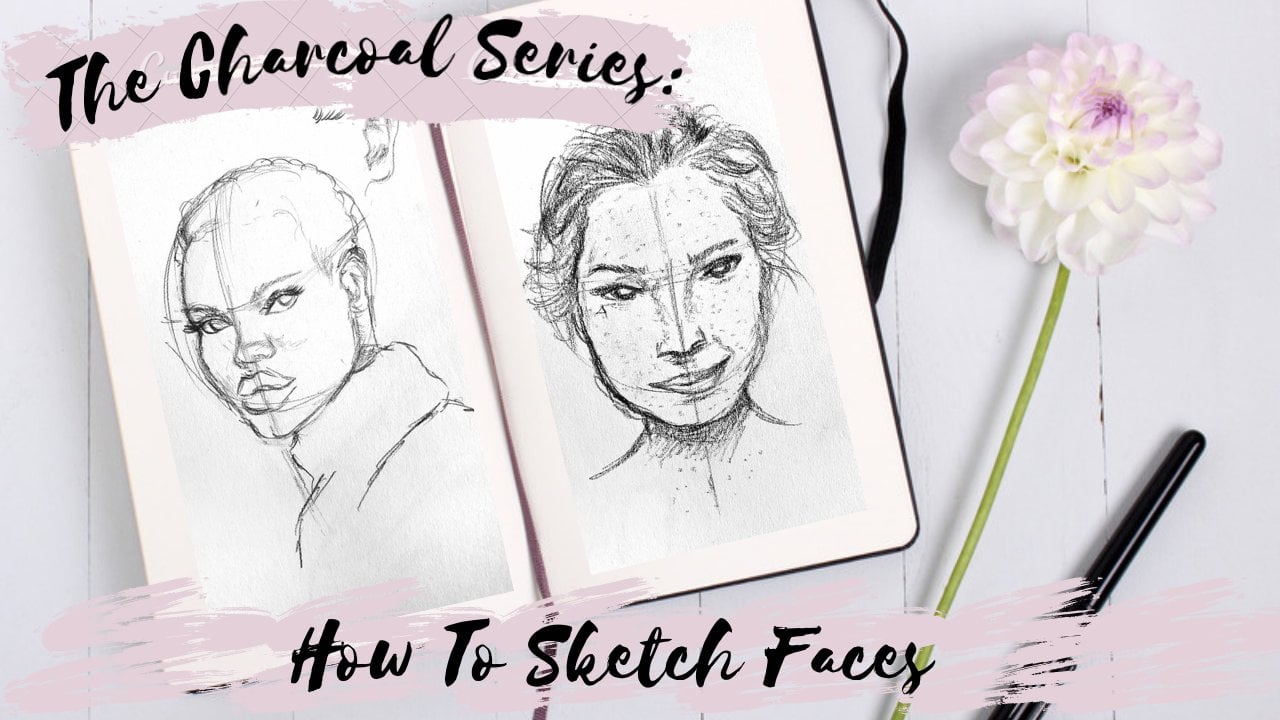
Transcripts
1. Introduction: I'm Lauren. I drew a realistic AML portraits with colored pencils. Over many years. I've gone from drawing this to this, which is what I'll be drawing at the end of this lesson. But I want to do more than give you a step-by-step guide to during antelope and want to help you improve if you're at a level that's anywhere in between and teach you skills that you can apply to any drawing. There are three core topics that separate these two drawings. First is outlines. I'm pretty sure his horn is not supposed to be attached to his year. I'll teach you my method of free hand sketching to give you more accurate outlines. Shading. I mean, there is contrast in this. Don't get me wrong, but it's not in the right places. It's got no depth. The face looks completely flat and the shading technique is very coarse. And last is texture. This looks like paper. This looks like for, I'll go river coloring, layers and all that fun stuff. I'll take you through three drawings to demonstrate these fundamentals. But maybe the most useful thing I can teach you is how to practice. Practicing is a skill. I didn't get the hang of it for years. I put hours and hours into drawing and I didn't get any better for a very long time. My art only started improving after I figured out how to practice. I've designed the class projects to teach you skills and to give you some good practice techniques that you'll never outgrow. The projects will test your limits and disrupt the bad habits that stop your progress. They are separated to focus on sketching, shading, and coloring. You can do as many as you want or need to do. I'm entirely self-taught. I've been where you are. I've run into a lot of the hurdles you'll experience. I think I must have stumbled over most of them at some point in my little journey of trial and error, so much error. I'll share my own experiences to show you where I got stuck and why I couldn't improve. I'll tell you how to get out of the rots when you're bogged down and going nowhere. I'll share the technical insights that made everything clicked for me and the changes I needed to make to my thinking to be able to overcome the challenges. That is, how to embrace failure, how to persevere, and how to turn drawing into a hobby. Hopefully with that, I can set you up for long-term success. Because drawing isn't something that you can learn overnight. They say you need 10 thousand hours to master skill. I can neither confirm nor did I lost count. Besides, I'm not done yet. Drawing isn't something you can complete. Anyone can improve. And no matter what stage you're at, there's always more to learn. You don't need art classes or expensive supplies or talent. You just need to be willing. You're on the right track already because you're here, taking charge of your own learning. That's a big difference. It's daunting. If you don't know where to start, start here.
2. What you need: There are many art supplies for many different purposes. The processing quality is usually what people focus on. But expensive supplies will be just as frustrating as cheap supplies. If they're not right for the job. You're supplies need to be fit for purpose. So what a suitable will change depending on what you're trying to do. You can learn good techniques with cheap supplies. You can't buy expensive supplies and rely on them to solve your problems. We're practicing our drawing as applies to into be Aqaba quality. They need to be functional. If what you've got is functional, that's great. You don't need to go out and buy supplies that are theoretically perfect. It's more important that you use things you're already comfortable with. Different types of pencil-and-paper feel different. And it takes a while to learn how to use them. It's easier to learn one thing at a time. So keep that in mind when making your decisions. Pencils, you need something to sketch with any graphite pencil do because they're easy to arrays. On that night. You need an eraser. Hills need colored pencils. So these pencils off its purpose. They lay down easily. I can get light and dark times with layers and pressure. I can mix colors to blend them. I'll be using PRISMA Calas. I have a set of 36 and a few extras. You don't need to be set. 12 is fine. Test if your arrays of works on your colored pencils, it probably want. If you have a thick layer, it will likely smudge. Color pencil is very difficult to remove. I'll show you one method with sticky type later. And for the class project, you will also need a ballpoint pen or doc graphite pencil. Pipa selection is a lot more subjective and it's more important than pencils. It makes a big difference to the outcome. The first step is picking pipe is specialized for the medium you're working in. Be it watercolor or Postel, the markers, the pencils in general, you need to consider the texture and the way to the paper. On smooth paper, you can get finer detail, but you can't get as many layers of color. Rough pipe it gives more layers and a paper texture to the finished work, which you may or may not want. You might have to draw bigger to get those fine details and work hard to get rid of the grainy want dots. The paperweight in GSM is a measure of how thick the paper is. Thick, paper is stronger. Marr paper is a 165 GSM and competitive printer paper which is 80. And my paper's not especially thick. Printer paper isn't designed for drawing. It's too fragile and through smooths the pencils. But it's like hey, for outlines or ballpoint pens. If you have nothing else, you have to consider your shading style and decide what artistic effects you want. Balanced these drawbacks and advantages. Try a couple of different papers and see what you prefer. We're focusing on realistic drawing. So we could draw from life, except life tends to move around and be in uncomfortable places. So let's draw from photos. It's always safest to use a reference with the CC or Creative Commons law, since it means you're free to do what you want and you don't have to pay licensing fees. You can find them with Google Advanced Search built by Lawson's. On sites like Pixabay. Pick references that lend themselves to your ability level and supplies. If you can't imagine how you're going to make the colors in your reference. It's going to be harder to draw. I usually don't print references, but I will for these lessons, I heat my computer in front of me so I can zoom in, change things to black a watt or increase the brightness or contrast. Or you need time and patients drawing can take a lot longer than you expect. The antelope drawing took me 15 hours across five days. It goes a lot smoother if you're prepared. He's a comfortable chair and set up a long playlist. In eLearning resources. Keep trying new things. Listen and watch experienced oddest land from other people so you don't ingrain bad habits and you gain new ideas to things to try in checkout, YouTube Scotia, Instagram, anything. The internet is your friend. This is a pencil extended. Very nice to have when your pencils and short. This is PRISMA coef column with splendor. It has no pigment in it. It's just the wax bonding that all the other pencils have, so blends them together. This is critter. It's a free alternative to Photoshop. Those many of the same things. I use it a lot.
3. Practice better to learn faster: To get better at drawing, you must identify where you need to improve and tying that you'll practice to work on a specific skills that are letting you down. I don't wanna demonstrate mistakes with over top cockroaches of bad outlining or shading. I think it'll be more relatable if I use my old instead. I hold it everything, all the failed attempts. I stopped at using how to draw books. And the proportions are very accurate, but they're not bad. It's enough to get the point across. The shading is very basic. I didn't understand contrast. These look flat because there's no dark spots. I wasn't trying anything. New. Inequality is up and down depending on how much effort I put in. But it's basically the same. I wasn't making progress. This is what being stuck in a rut looks like. It's not very motivating. Always at this stage be yeas and didn't improve much. But these were not idle use. There are many, many, many more drawings like this. I only got a bit quicker, a bit better pencil control, and a little more accurate at sketching. And it's not because I was terrible at drawing. It's because I was terrible at practicing. I was so proud of this. There's more intricate than anything I'd ever attempted before. So of course I wasn't going to risk ruining it with shading. I try it again a few months later. It was familiar and not as scary. I could take more risks with this one because I had a backup if I failed and I blew myself away, I had no idea I was capable of this. It shifted my perspective. Suddenly the potential success was worth the risk of failure. And I started trying my hand at hotter and hotter references. In just a few months, I could draw leaps and bounds better than I could before. The most immediate difference you can make to getting more detail is to draw bigger. At this stage, I was learning how to practice. I was exploring, look at the variety compared to the last book. I started trying new things, trying and failing. And the more I failed, the less it bothered me. This was the turning point. I only had a set of 12 colored pencils and then we'll watercolor pencils or that you can do a lot with 12 pencils. This is a skin tone. It's not a great one. It's be oversaturated. That was due to my skill level more than me using primary colors. Look, I've now added water to watercolor pencils or radical concept. This is one of those things you can't ask this paper to do. It's thin, it's not very absorbent. I wasn't willing to take it out of the book to stretch it or even type it down. And it works to a point. And that's why I kept doing it. I'm glad I spent so long with a small set. That restriction meant or learn how to blend in layer to create all the other colors I needed. I gotta set a 36 pencils. It took me awhile to figure out how to use them. This is where the foundation skills with blending and layering really came into their own. It gave me a huge boost with transferring my skills with contrast and texture into color pencil. So moving on to more difficult references meant trying different colors. Colors that required more blending. And we're so ambiguous that it was hard for me to tell what colors to put into them. Blue feathers on this bird. A way off from what I was trying to get. Improvement isn't a continuous curve. Learning has different stages. There's practice and there's progress. You do the same things over and over until suddenly it clicks. Improvement comes in, jumps. You practice at the edges skill level until you're comfortable taking the next leap. You can't skip ahead. You still have to build up to it. You need foundation skills. But if you practice well, you can minimize your time in the rats. It doesn't have to take years. You can improve faster than I did. There is definitely good practice and bad practice. I don't mean that bad practice is when you repeat in ingrain bad habits. Although of course that's not great. You can get around that by gathering knowledge and advice from more experienced people. But no bad practice is when you're practicing, but you're not learning. Because practicing and learning are not the same thing. If you draw things, you know, you can do easily that you are not learning. Good practices. Self-reflective. Good practice is when you tackle your problems head on. And good practice is exploratory and fun and uncomfortable and challenging. Challenges. A way of focusing your attention and super charging the alerting speed. Bad practice rules these flat zones because it doesn't result in much progress. This route was caused by bad practice. This phone was more of a lag because it takes time to learn skills. This is my progress curve. It's not the right way or the best speed or the only path. But I bet yours has similar features because you can practice smarter to reduce your time in the flat zones, but you should expect to encounter them. Everyone falls and eventually you can improve faster, slow, but you will improve. But only if you stick with it. And that's the hard part. You've gotta get good at making yourself uncomfortable because that's where you learn and that's where the mindset comes in. So how do you stay motivated over the years? You don't, sorry. You get busy, you get frustrated, you get distracted. One of the best ways to get de-motivated is to compare yourself to others. That's not fair. You see all of your failures and none of theirs. Look at this mess. Do you think I post these things on social media? That's the first thing to keep in mind. Everyone struggles. It's not just you. So keep all your sketches. Be inspired by others, but only compared to yourself. You're looking for improvement. So you can only compare to your past. Look at your experiments and decide what worked and what didn't. That's part of the reflection in good practice. You need to figure out how to deal with failure. If you're challenging yourself and practicing at the edge of your ability, that failure comes with the territory. Look at all these incomplete drawings. A fail often. But the failures don't really bother me. I'll move on easily. It's not because I've got superhuman fortitude, optimism. I'm a perfectionist as the every little flaw. And that can manifest in a really negative, critical, fearful way. It used to hold me back, but I made a few small changes to my perspective. Use it for good instead of evil. But actually, I didn't change my perspective. I took the risks first and my perspective changed as a result. So my advice to you is to take risks, just start. You can treat failure like any other skill you need to improve that. So maybe set out to fail on purpose as a kind of exposure therapy these days. And very specific with my criticism, this failure didn't mean I couldn't draw, it meant I couldn't draw feathers yet. And then that failure wasn't permanent or a big deal because I could practice drawing feathers and fail again and maybe only fell half of it and eventually fail hardly at all. Now, there's good and bad reasons to give up when the going gets tough. In the early days, it was fear of failure which stopped me from challenging myself and stopped me for improving for so long. I didn't know where my limit was because I'd never pushed it. Now, I'm constantly challenging yourself or recognize when I'm overreaching my abilities and when and what I'm doing isn't working. And I stop and try something else. I look up and new technique, start another drawing. That's an intermediate step for this specific issue. I'm hoping. I don't complete drawings just for the sake of finishing them, especially when I know I'll be disappointed with the results if I keep pushing. Usually a return to them later with fresh eyes more experienced and I'll get past that tricky part. I did a lot of these drawings are the months, just doing a few bits at a time. It's really satisfying to go back and have solid evidence that I've improved a little bit. That easy abandonment is something I picked up when I started with color pencils. I think it's really helped reduce the pressure and stress I put on myself. And sometimes I don't return to it. But if it's not fun and if it's not a commission with the deadline, then what's the point? You might say? Well, to make the hours I've already put in worth it. Except it doesn't feel like I've wasted those hours because it was fun while it lasted. And that's why failure doesn't feel like failure. I think that's the key to keeping it up long-term. It's got to be fun. You can make things more fun. And a lot of that will be personal to you. But the big things that apply to everyone is to draw the things you want to draw. Keep learning new things. Because experimenting is playing and playing as fun. Also, you can do lots of other things at the same time. I listened to videos and movies. Pay attention to your feelings. Bad feelings can be helpful. At the start, it's really inspiring and challenging. But when you're stuck in a rut, it's frustrating and then comfortable and then boring. Your emotions are good indicators. Frustration is assign. You might need to sleep on it or step back and approach from a new angle. Comfort means it's finally working and you're ready to move on. Boredom is a sign that you're not challenging yourself. You've gotten good enough that it's easy. So try adding something new. We know how to get stuck. Only try things you know, you'll be able to draw. Never challenge yourself. Never experiment with tools or techniques. That's the three-step plan to always getting the same results. We also figured out how to get unstuck. You embrace failure, reflect on your past work to spot areas for improvement and deliberately practice your weaknesses.
4. Sketch accurate outlines: Drawing is the art of taking a complicated object and representing on the page outlines or the very first step. I use outlines and every drawing doesn't matter how simple. If I wanted to draw a square at still need sketch. Now on to get the sides and the curricular portion to outlines cafe the shape of your subjects. They are our way of density information and making the task more manageable. If your outline is off, it, it's really hard to correct later detail where harder or brands are too good at picking out asymmetry. I'm going to demonstrate with this incredibly Chou Cuo. So this is a good reference for beginning to intermediate level for couple of reasons. Firstly, it's a weird pose. A lot of the time if you're having trouble with your sketch, it's because your brain is taking shortcuts, it shouldn't. Do you need to focus to see what's actually there. Which is easier if the poses uncommon, because if you're uncomfortable than your brain pays more attention. You can also turn your reference upside down to tricky brain. Secondly, the way this image is composed makes it a good test of judgment. It will magnify my mistakes. The angle of this branch, if it's slightly off, it'll distort the upper body and throw the arms and head away out of proportion. So there's less wiggle room, but it will also be more obvious to me. It gives me a lot more feedback to work with so I can fix my mistakes. So before I draw anything at all, I'm going to look at my reference. I see many of these key features are roughly the same length. This will be a very important part. The span of the chest is almost parallel with the branch is leaning on. And it's about the same span as the distance to this other part of the tree here. One way I measure what I'm doing. I check against other pots by drawing horizontal and vertical lines. This part of the leg will be roughly even with the opposite. This top claw here happens to be the same height as the top of the head. And the nose will be in front of the arm and the rest of the face will be behind it. So you need to keep your whole reference in mind at once. But that's too much information, so we have to feel throughout most of it. And this is how you filter out the right parts. You make a map of key points is roughly straight lines in between them. This is the process that goes on in my head. I don't normally annotate the reference lightness, but you could do it if you find it helpful. I started one key point and draw a line aiming for the next point. And I'm going to start with the branches of the tree because that will give me the most points straight off the bat. The tree I consider it compared to the vertical. The right fork is slightly off vertical and this is almost a 45 degree angle. The next thing I will do with the intent of the elbow, going up the neck, curving around the leg. The aim is to put the key points in your drawing at the same places of the key points in your reference is automatically lets you break up the reference and gets older proportions of its separate pots. Proportions are relative. It's the size and shape of one pot compared to all the others. And you'll see when I draw this for real, that is basically where I stopped. There's not much to the pencil technique. You should use lot strokes. If you're going for realism, you don't want hotlines. Heavy strikes, hard to arrays and if you indent the paper, then they will show up as white lines when you shine over them. But hold your pencil vertically and don't try and draw with the very tip. You can use the sod and rotate to self shop and there's not one way to sketch. You can start by drawing key shapes like ovals. You draw an oval for a head over for a body. There are other methods, but I recommend against the grid method because it's very messy. The grid method requires you draw horizontal and vertical lines at equal spacing across your entire picture. And you can avoid sketching it all if you trace. But tracing weren't teach you how to draw, you wouldn't develop the judgment you need. Unfortunately, we learned to recognize mistakes by making mistakes and you won't ever be at a correct them if you can't see them. It's worth learning freehand sketching, it will give you more flexibility to change your reference or combine multiple references. When sketching, we start rough and try to represent the most basic shapes first. So I'm drawing darker than usual so the camera can pick it up. You wanna go so light you can barely see it. Particularly this rough stage, I'm expecting to put my laws in the wrong place the first time. So that add any details yet. It's a waste of time. If you're you have to erase the whole face and move it slightly. This is the loose, flexible stage. Everything is allowed to move. It's really important that you give yourself that freedom. If you decide the head is perfect and then draw the next based on the head. And then tool also based on the neck, and then the legs based on the torso. By the time you get the legs, it will look like I don't really fit in with the head because you didn't consider the reference as a whole. So always compare at the same spot and don't work from left to right or top to bottom. You'll notice that I don't finish what I'm working on. A draw the front of the face, but I don't do the whole head. I draw the top of the arm but not the hands. I'm jumping between my key points. This lets me keep looking at the bigger picture and makes everything look like a cohesive part of the whole. I compare how far these points are from each other and at what angle. I don't get a ruler or a protractor. I'm guessing. I judge the angles by comparing it to horizontal and vertical lines that stretch out from the first. And I joined the points to make an airline check my reference, then go back and adjust one points. When I place my first. I had nothing to measure against except the center of the page. As a transfer, more points to my drawing will have a more complete picture. Because I have more to pair against more feedback. I'll go back to my first points and update their position. It gets more accurate as I go. Now that I have the rough shape, I can compare my whole drawing to my whole reference and see that everything is pretty much where I want it to be. Now it's time to refine the sketching out the details. It's the same process. I'm looking at the placement of the hand in relation to parts of the outline. I already have this indent here were the leg power it sticks out is about roughly level with the bottom of the claw. Now on completing the outside edge, adding details like the face and fingers. I'm still allowing myself to make changes, but the adjustments will be smaller because I'm most certain about the position of all the body parts. The sketching process is a constant back and forth, check and adjust. You can pay a part of the drawing to itself and to the reference and incrementally change. And then check again. We're playing spot the difference. And you're learning how to judge angles and size and position. The more you practice, the better you get at spotting differences between your reference and you're drawing. You'll see smaller differences and get more accurate. If you look at your work and something seems off. But she can't tell why. It's because your judgment hasn't narrowed down Lafayette. He didn't spot the little things and they add up. The judgment is the hardest part. We can improve it with purposeful practice. So you need feedback to improve faster. And eventually that will come from your judgment system. But until then, I have a trick. It's a pop quiz. You wanna see your drawing overlaid by V0 reference so you can objectively compare them. And the places where the different model B where you expect. Take note of that than joy your references second time, test again and see if it's closer. There's a couple of ways to overlay. You can print your reference Gd by three the same size, and then put the two pieces on, on top of each other on a window or a lot, books or computer or any other backlog. You can scan it or digitally overlay it. If you can scan it rather than taking it further. So for the class project, I want you to draw at a difficulty level that you're comfortable with, but a subject you're unfamiliar with. So your brain won't make it harder for you. Drew or an outline of an animal that you don't see every day, not a cat or dog or anything that shows up regularly on your Instagram feed. Maybe try a bird or insect or a reptile. Keep in mind the k points. Give it a go. Test yourself, Try it again.
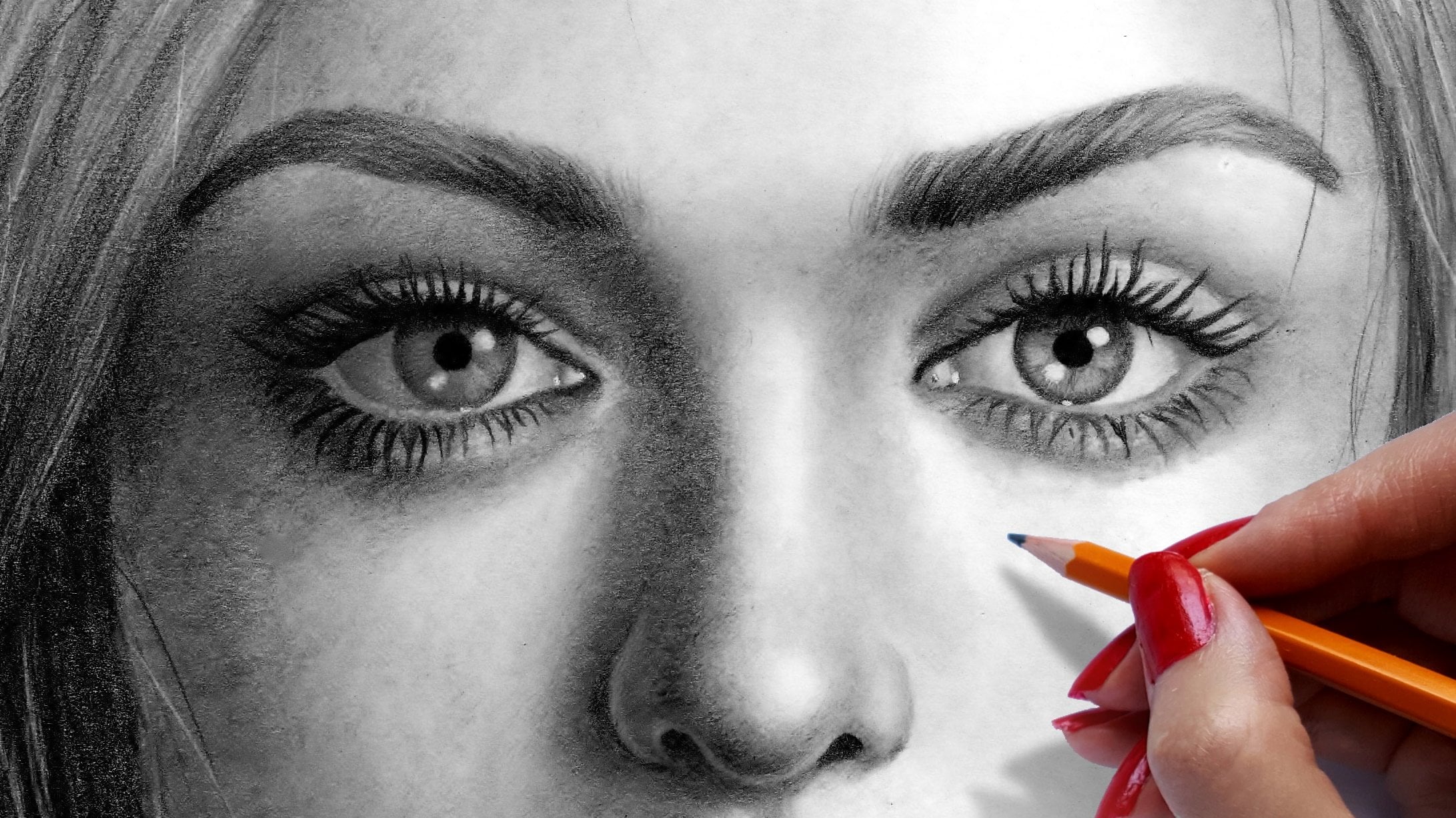
5. Get depth from shading: The key to realism is contrast, texture and detail. Color isn't necessary for realism at all. Colors just at a whole layer of complexity that distracting. So we'll start with monochrome first, focus on getting the contrast rot. Parts of this drama unfinished is PIO pots do not have enough contrast with the difference that makes a good references clear. So it's not insult focus and it has high contrast, which you can check but tiny at black-owned want in image manipulation software or even in Word. So once we have an accurate sketch, we have the necessary framework to create a realistic flooring with the outline. We were simplifying the photo, reducing it to an abstract series of points and angles, a 2D representation. Now, we need to create the illusion of shape. So we need to switch up your thinking and look at our reference as a 3D object. The focus of this lesson is conveying the shape of the object through shading. We will work on texture in detail more in the next lesson. For now, we're looking at general shape. The value of a tiering is the broadness with darkness, IE, how light or dark it is compared to other parts of the drawing. Values range from white to black. Color also has valley, but we'll get to that later. In many pencil drawings, the wind will come from your paper. The darkest values comes from your pencils at them. Most saturated. Shading technique is all about pressure control. To get darker shading, you don't press harder. Generally. You use more layers. If you're working with hard graphite, that is graphite with a height sled, you won't be able to use the whole value scale because it won't get dark enough. Todd graphite is not the best tool for this lesson. I'm using a black ballpoint pen because it's very doc. You'll get the whole value range to work with. It'll go right to complete black. We learned in the last lesson that outlines should be near invisible. That is because outlines around the light areas will interfere with contrast and make it look to dock. A doc rim will reduce the depth of the image and make it look flattened, sunken in. Beginners have a lot of trouble with this when drawing on us. But a lot of the features I outline I will need to bring to the front to make it look 3D. They will have to be quite a bit brighter than the rest of the eye and they cannot have any Docklands near the middle. I'm going to start with the people because it's the darkest part of the image. On my largest highlights will be as white as the paper. So now I have my extreme values in place and I can judge the gray areas in between. Next is the iris. It has a very clear texture, so the direction of your pencil strokes is really important. I'm rotating my papers so I can get the lines in the right direction. It's more accurate than bending my wrist because my strokes and more consistent, the middle of the ring is quantum bit brighter than the outer and inner edges. The same process as other shading. I stopped a lot layer over the iris and feeling that base value. Then I go for the second pass on the around the edges to dock in those until there is Docker's on ate them. I'm leaving highlights on the lower lid, the T doctrine, the pupil. And I'm doing that by drawing around them. Those are the brightest parts of the image. This water, the eye is actually a fairly dark gray. So I'm going over that with my pen and blocking in the dark areas, which is the lip of the eyelid. The darkest areas give me boundaries. Then I stop on the surrounding areas with light layers and add more layers to dock and until I approach the Dockers boundaries. So I'm building that gradient up from light to dark. I'm constantly checking my reference, checking module roaring, comparing the two and adjusting until my drawing gets close to my reference. I'm following the contour of the eye. So I'm using round strokes around the eyelids because the eye is a bowl. Essentially. I'm using these lines to indicate shape. And the Contrast does it by casting shadows. The lines in the cage shape by following contours. Crosshatching can be very disruptive to realistic styles. Cross hatching doesn't follow the contours. It's a rough kind of shading. So the eyelashes aware, many people get tempted to draw what they think is there rather than what they see. Look how lashes curve and how they clumped together in groups of two or three. Sometimes they face directly at the camera and you can hardly see them at all. You shouldn't try to fill in this blank and continue the pattern around the the side with long curvy lashes. So there are some of the highlights of my reference where it's more efficient to set down a solid color and draw the white spots at the end. So I'm going over with a kind of opaque watercolor called Gosh. You can also do this with gel pen. Ink or paint highlights. Makes the highlights look shiny because they have very sharp edges. When you need a soft highlight. It's impossible with gel pen. It's very difficult to do with watercolor without blending it out. For the project. For this part of the lesson, I'm selling you a challenge. There were two rules. The first rule is you only get one drawing tool to use. The second rule is it has to be duck. It can be a graphite like 8B pencil, or you can use a black color pencil or ballpoint pen. If you're still learning pencil control, use a pencil. If you're a bit more advanced than I think you'll learn a lot more if you use a ballpoint pen, pick any photo with high contrast, then look at your image. Make a mental note of where the lightest pot are and leave them blank. Start with the darkest parts. Build up the gradients in-between the lightest and the darkest. Focus on getting the values right to convey the shape. This challenge is not about detail. You didn't have to add a lot if you don't want to. This is about shaking things up and breaking habits. I see to really common issues with shading. The first issue is the pencil is just too dark. This is a technique based mistake. It's usually by pressing too hard and then over-relying on an eraser to bring the highlights back. Using a pen forces you to address this. Pens makes much harder and it really exaggerates how lightly You have to press to get the live values. It forces you to work slowly, take your time. Work in layers from light to dark because you can't erase anything. This is a really good habit to get into your need for color pencil because you can't arrays that either. The second issue is shading is people are too light, too timid. If you draw too lightly, you'll really struggle to do that with pens, with pencils. It takes a lot of effort to draw dark and it's easier to back down with pens at the dock pot is easy. Depends on on deal during tools, of course, it's really hard to make it look smooth, but don't worry about that. That's not the point of this focus on the shape. I'm giving you a difficult challenge. So you have to pay very close attention in order to speed up your learning. It will be easier to use pencils after you get used to this exercise.
6. Render detail and texture in colour: Man will teach you how to draw realistically with color pencils. So the outline process is the same, except now we need to consider not just the shape of the animal, but also where the blocks of colour on this antelope has a pattern. I mark the position of the patches to remind myself not to cover over them with the Browns. If you're making adjustments to a reference, now is the time to test what works on removing the tongue and adjusting the leg length so it looks like it's standing on flat ground. I might add hooves. I haven't decided yet. And I could remove the horns if I wanted to simplify it. The antelope is a whole range of Brown's. It has dozens of colors, but I don't need many pencils. I will use a yellow and an orange on the layer. The majority of the firm will be a red brown and an earthy Brown. I will use dark brown and black for the shadows. There are other details where I might add Blue and Gray. I'm looking at my reference in looking for the extreme light and docks. There is a bright golden brown Whether Sun hits and a very dark brown on the belly and the legs. I know I can make the lightest areas by putting yellow and red brown on top to make that golden color. I can make the dark colors with red-brown as the base and then dark brown and black on top. So mixing various amounts of those together will give me a continuous gradient from that light all the way to the dock belly. The red brand is going to show it through the whole drawing and taught together. It's a nice bit of consistency. Using the same pencils is me isn't important. The exact color doesn't matter as much as conveying the shape and form which we covered in previous lessons. We're going to build on those lessons and keep talking about detail and texture. You can arise color pencil with sticky tape. It's like easy and needed a razor. It lifts color off the page so it doesn't completely erase what's on it. And if you go over multiple times, you will damage the paper. So it has its limits. Colored pencil is very difficult to get rid of. It's often easier to work through mistakes and cover them up. And that is one reason we go from light to dark. When we're layering. First, I will go over the whole image with the base layer. There are lots of ways to do a base layer. You can use watercolor or mockers or anything that pencils will lay on top of. There are advantages to doing it this way, but to keep things simple for this lesson, we are only going to use pencil. I'm not going to start with the want for, I can't judge how dark shadows in the white for Nitobi until they're surrounded by the brand. So I'm going to start with the brown fur and draw around the watt spots and stripes, leaving them entirely blank. For now. There are three sections of the base layer of the branch, depending on where the shadows and highlights awe for the holiday or have a bright yellow and a less saturated creamy Miller. I'm mainly using the cream yellow. I'm reserving the bronchi yellow for few special places on the side of the neck and the top of the back. I'm using the bright yellow sparingly because I want it to stand out. I'm using the contrast of the saturation levels. The D saturation of the cream will make the other yellow look even brought a, so it will convey the warmth of the sunlight where it's hitting those places on the backend the NIC. For the next part of the base layer. Under the mid tones, I'm using a desaturated orange. And in the pots on the neck and belly with a fair will be in shadow. The base layer is the red Bram. My pencils aquatic blunt and I'm shading broad areas. I'm going in the direction of the flow, but not drawing strokes. It's very lighting grainy. I overlap the three baseline because the yellow, the orange, and the red brown. To make the gradient across the whole first section column makes it more difficult to make things look three-dimensional. In black and white drawings. Shadows and highlights are created with the values have bronchial docket is color also has value, but it has other properties, too, cold hue and saturation. So to create accurate contrast, we still need to consider value, but also hue and saturation. For an example, the main red-brown compared to other grounds, it's a lot more saturated. It's quite grid, but it's not as dark as my shadow browns and it's not as light as my on the code. You also control the saturation and the value to some extent, how much pencil you put down with layers and pressure. The shadows are usually desaturated compared to the mid-teens and highlights, its wash shadows look muted in gray. I'm not going to go any further into the theory. Does try to match what you see in your reference, but not just the color, also the darkness, and the vibrancy. This is a good beginner reference. A basic set of 12 pencils will have enough colors to get the point across and give you lots of practice with mixing the yellow, red, and browns. The hardest part color will be the horns. Because that color is an ambiguous mixer, gray and brown and blue. It's definitely not necessary to have a huge selection of pencils. That can be overwhelming. If you have a big set of pencils, take out the ones you will need and put the rest out of sight. You'll get lost fussing about the exact shade of brown. When one, it doesn't matter that much. And two, it depends on the context. And three, you can get that shade by combining a few others. Pencils blend quite well. The belly fair is very dark. I still give it a Doc Brown base layer to give us some debt. And I go over the darkest pots with black. I need that brand in there because some parts of the black will still look lighter than others. So the base layer for the brand fair is done. Now it's time to go back in with a second life and make it actually look like for I'm going in with darker colors that closely match the reference. I don't complete a section or move from left to right. I do little bits, a few layers at the time. This is because the colors look different in the outlook than they do on your swatch cub. The colours underneath show through and create new colors and they look different depending on the context of the colors are random. Color isn't right the first time you put it on the page, the colors you first lay down won't look the same once you put other colors next to it. You have to constantly evaluate and decide what direction you want to take it. Much like the process we went through with the outline and the contrast. A constant Guess and Check and update when you have more information. My pencil strokes are more important in this layer. By strokes are the same length as the fir. So they're very short and straight. I'm still using light pressure, but now I'm keeping my pencil shop. I rotate my pencil very often. As I wave my pencils down, it creates a sharp edge. Am I turn my pencils were always using that sharp edge. So outlines create shape, contrast makes it 3D and textures. The skin texture is what makes eyes look glossy and further look fluffy. It's the part of the illusion that makes you feel like you can reach out and touch it. This is the part of the drawing process that takes the most time. You have to work slowly. If you rush through the process, it's textual, that'll let you down. Texture sets realistic drawing apart from other styles, not color. One benefit of using a pencil base layer is that now I'm drawing on a layer of wax. That's because I'm using Rackspace pencils, but other pencils behave in a similar way. The grain of the paper is slightly flatter and filled in. I've essentially made my paper smoother and as a result, my lines are smoother, which in turn makes them look silky. Without the base layer, My strikes would be grainy and bumpy and the third would look like cause hair. When I want the third darker or add more layers as I go through this series of pencils from what Brown to Doc Brown, I'm paying attention to my shadow areas and reserving went dark colors for those areas. It is easy to lose contrast by applying dark colors too broadly. For the third layer, I'm adding finishing touches. I'm blending to fill in the last white graininess of the paper. I'm not burnishing, which is pressing hard. Once you burnish, you flatten the paper and you can't add any more layers on top. I'm adding more detail, getting final lines with even sharper pencils. But I'm not doing it everywhere. The detail is less visible in the highlights and shadows and in the parts that are further away from the camera, detail and texture is a balancing act. If everything is very detailed, then nothing stands out and you lose a lot of the impact of having the fine detail in the first place. So on the body, when I'm blending our return with the base color and I go in the opposite direction as the for to soften the lines. So it looks like it's in soft focus. I won't do this on the face. I want the face to be sharper than the rest of the body. I blend with either the base layer color, a colorless blender, or my white pencil. I use the base layer color when I want the result to look brighter. The colorless blender makes the colors of darker. And the white pencil reduces the saturation of what's underneath it and makes it look glossy, which is good for the black, for the black colored pencil actually has a little blue in it. And blending with the white creates a nice blue gray on the legs. The fair on the belly is long and wavy and long first sticks together and clumps. So I'm treating H clump like one object. All the strands in that one clump go in the same direction. And it has its own shadow area where it overlaps with other clumps. I use different colors for shading the highlights and shadows of the wad for I'm using an earthy Brown for the shadows. If I use a broad or saturated color, the fair will look yellow instead of wide. I'm not using gray or black to shape my water because that's not what's in my reference. When I start on the face, I go through all the steps all over again. Start with a base layer, going with a second, encouraged to do the third texture and a third layer to do the details. I'm outlining that I and Doc Brown, I will go back in with black later. I don't want to black outline around the I, I want to very slight gradient from dark brown to black where it is darkest. So the ear is casting a shadow across the face. I've decided to soften it or don't want to hard line on the, distracting from the i itself. A shadow is a generally shopping near the source and they get fuzzy when they get further away until it disappear. So I'm going to lighten the rest of the face so it looks like that shadow has ended right near the E. The E is a very dark, but I'm not going straight in with black. I will still start with the base layer. Black is rarely ever just black. In the East, it's brown on the top of the legs that's red. And on the lower leg it's gray. And on the nose it's blue. The most important thing to keep in mind with colored pencils is that they're semi-transparent. This determines how you must work with them. Doc sketches will show through, particularly with lighter colors. You have to work around highlights like we did in the last lesson with the pen. Because you can't arise colored pencil and you can't cover up dot colors with light colors. Putting them blue layer on top of a red layer will create purple. And it will look different if you do it in the opposite order. The majority of pencils, a wax and oil-based PESTEL pencils are bit different. They are, pastels are a different medium, different techniques apply. So here's the final piece, probably scanned in copy with the texture shortfalls or with the easiest, cannot have a complicated structure of things like long fur and feathers. For the class project. For this lesson, we're going to apply everything we've learned so far about outlines and contrast and color. If you're new to color, limit your color selection. Only play with a couple at a time. Butterflies and flowers are a good starting point. Long fur, feathers and scales are difficult. The most immediate difference you can make, getting more detail is to draw bigger. The trade off is it takes longer, which got a lot more room to work to get the detail and shading rise. So now it's your turn. Pick something that interests you. Posted in the project section. Comma it, see what you come up with.
7. Recap: They have a sketching, shading detailing. Work on those and you'll improve your shape, depth and texture, and your drawings will look more realistic. Let's summarize what we learnt. You gotta learn how to practice and practicing and learning and not the same thing. Bad practice doesn't teach you much. To practice smart, you must embrace failure. Reflect on your password to spot areas for improvement and deliberately practice your weaknesses. Essentially, you must challenge yourself. When sketching. Draw lightly. Look at your reference and assign k points where the lines in the reference change direction or intersect, transfer. There's points to you drawing. Constantly compare your drawing to your reference. As you transfer the Milky points, you'll have a more complete picture to compare to your reference. So returned to the pons you've already done and adjust them if that outfit stopped with the rough shape, allow yourself the freedom to change anything. Once you set it on the rough shape, go back in and add the details. Sketching has more to do with your eyes than your hands. It's about spotting the differences of Bhutan. You'll get better at judging the angles and the distances between the key points to tighter and tighter tolerances. Sketches will become more accurate. Plan you're drawing. Decide if you're going to leave what's boats will go in with what insulator. You need contrast between the lot and dock areas. So when you're shading stopped with the extreme values, the white and black areas in your reference. Outlined what areas on your page. Leave them blank. Mock in the darkest areas so you can see the limits of the tools working with. And you have a boundary to work up to, then go from lot areas to dock areas. Buildup the Middle Times by stacking lots of light layers until it's as dark as you need. Shading gives you depth and detail and texture comes from the length and direction of your pencil strokes. In its simplest form. Layering color pencil is also about building from light to dark, but the lion's take on additional roles. The base layer is for establishing a gradient from highlights to mid tones to shadows, and for influencing the saturation and the hue of the colours you put on top. The second layers when you're focused on the texture by controlling your pencil strokes and blending. The third layer is for finishing touches. To add fauna details will smooth out and sulphide areas. Texture and detail sets realistic drawing apart from other styles, not color, which is more realistic. I rest my case. People put too much emphasis on color because it's flashy, but it's the fine detail that makes the difference. Learn how to apply shading and mimic texture and detail with graphite before you use color pencils. When you start using color pencils, you don't need many. I use just five pencils for 90% of the antelope. When you're using color pencils, you need to keep in mind contrast, not just of Latin doc, but also of saturation levels and color. Cuz if you understand contrast and detail and give you the freedom to do what you like with color. I want to emphasize patients. Be patient. Take your time. I've checked the timestamps. The koala took me 20 minutes, the i took me 2.5 hours, and the antelope took me 15 hours across five days. Once you're armed with the basics, you decide where to go next. Maybe you don't want to be constrained by references. Off you go. Use your learning resources to gain more knowledge and your good practice to ingrain the skills they teach you. The drawing fundamentals we covered in this lesson apply to all styles. If you're drawing cartoons, you still need judgment to compare your mental image and accurately sketch your imagination. Serving the class projects. I want you to evaluate your skill level and figure out what you need to work on. But it's really hard to judge or are not, especially if you've been staring at it for hours. So test yourself. Use a backlight to measure the accuracy of your sketches. Competitive contrast in your drawing, reference side-by-side. Give ballpoint pen shading a try. If you feel ready to move on, put it altogether with color pencil and see what you can do with it. In the class resources. I'll provide the three references I used in this class and a range of other references for you to try. You could use them just for outlines or shading or go all the way. There are a range of difficulties. Well, you can look for your own references on whatever interests you remembered. Draw what you want to draw, something that catches your interest. Post your work in the project section. Let us know if you want feedback and what you want feedback on. Remember, compare against yourself. Keep your sketches and date them. Look back so you can see the way forward. You go. Let's do better tomorrow than you were yesterday. The projects are supposed to be tricky and slightly uncomfortable, but not painful. If you're having trouble, ask for help. Everyone is at a different point in the process. Don't try to jump too far ahead of yourself, but also don't repeat the things you know you can already do easily. The goal is to be challenged. Try something. And if you succeed, then trusting hot up, find your limit, then push it and keep pushing it until it moves. Ask any questions in the discussion, and let me know if there are any topics you want me to cover next, this class is a bit of an overview. I can elaborate on technical skills. Will make a class dedicated to practicing drawing if there's enough interest. Maybe a series focusing on more difficult animals, textures like Fed is we'll scales will draw on black paper. That's always fun. Thanks very much for watching. And I hope I helped.
 Lauren Thornton