Transcripts
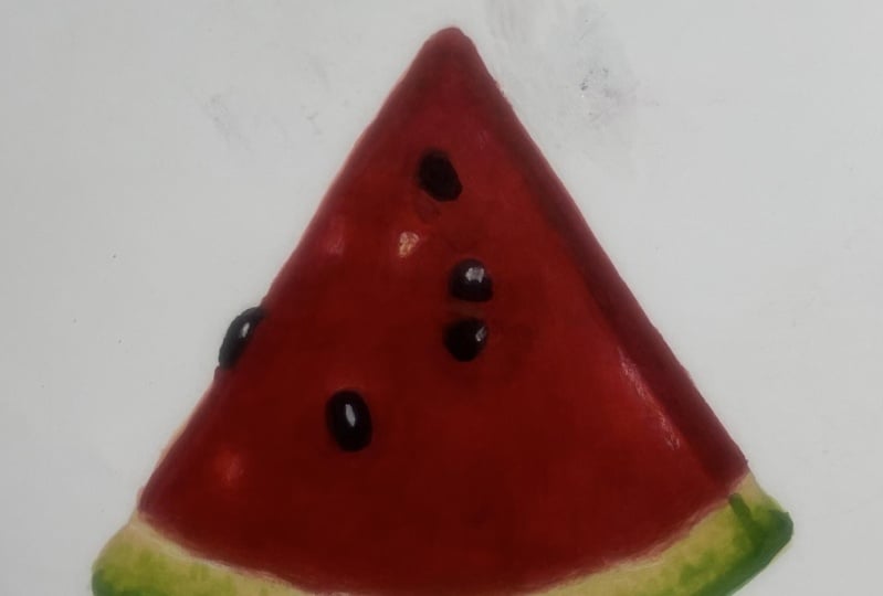
1. Welcome to the Class!: Hello, I'm Anna Stapenkom, a watercolor and marker artist. And in today's class, we are drawing a juicy
watermelon slice. This class is beginner
friendly but also perfect for intermediate artists
who want to practice capturing fresh,
vibrant fruit texture. We'll start with the
simple pencil sketch, then move step by step through drawing the
bright red flesh, the dark seeds, the
gradient rind and the light highlights that make the watermelon look
juicy and refreshing. Finally, we will add shadows and details to bring
the slice to life. Even if you're new to
markers, don't worry. I will guide you through
each step literally. And there is also a
quick basic section included to help you get
comfortable with the materials. By the end, you'll have a fresh and vibrant
watermelon slice illustration and a stronger understanding of how to draw juicy textures, gradients, and light
reflections with markers. So grab your supplies, and let's get started.
2. Marker Basics: Let's take a moment to talk
about some marker basics. I will be working on Bristol
paper by Windsor and Newton, but there are many
other great brands that make this kind
of paper, too. It's an excellent
choice for markers. It allows me to create smooth color fills and
beautiful gradients. Now, let's get familiar with different types of marker nips. There are a few common
ones you will come across. First, the brush nip. It looks and feels a lot
like a real paint brush. It's perfect for expressive
flowing lines and gives your strokes a
dynamic painterly feel. Next is a chisel nip. Great for covering
larger areas quickly. And if you tilt it, you can also get thinner
lines with the edge. And finally, the ballet nip. This one is ideal for crisp lines and small
detailed areas. Let's try creating a
gradient using two colors. First, I lay down
the lighter color. Then I add the darker color, slightly overlapping
the lighter one. I go back in with
the lighter color and blend the transition. You can go back
and forth between the two markers to soften
the gradient even more. Here's how it looks up close. You can also create a gradient
using just one color. Since marker ink
builds up in layers, you can get a full range of tons from just a single marker. For example, I apply the
first layer of color. Then I move slightly to the
side and add a second layer. I keep repeating this adding more layers with
small gaps between. And you'll see how the color becomes richer and
darker with each pass. Look at the tunnel range you
can get all from one marker. Now, let's talk about filling
an area with a solid color. To create a smooth even fill, use a small circular
motions marker, working wet on wet without
lifting your hand. Of course, you can
also use strokes like this to create some interesting
texture and effects. I also have a magical tool
here, the colorless blender. It's used to soften blends, but also to lift
color from the paper. I like to place an extra sheet of paper underneath my work. This helps absorb
the ink I'm lifting. Watch how the pink fades out. It's a great way to create
highlights and fun effects. Just remember to
clean the blender tip afterward on a scrap
piece of paper, since pigment tends to
stay on it as well. And here are a couple of my favourite tools for
highlights a white gel pen. It works beautifully on top of marker layers and is perfect for adding sharp,
bright highlights. And a white pencil. This one gives you
soft white accents and can help brighten up areas
without looking too bold. It's not as opaque as gel pen, but it creates a
gentle glowing effect.
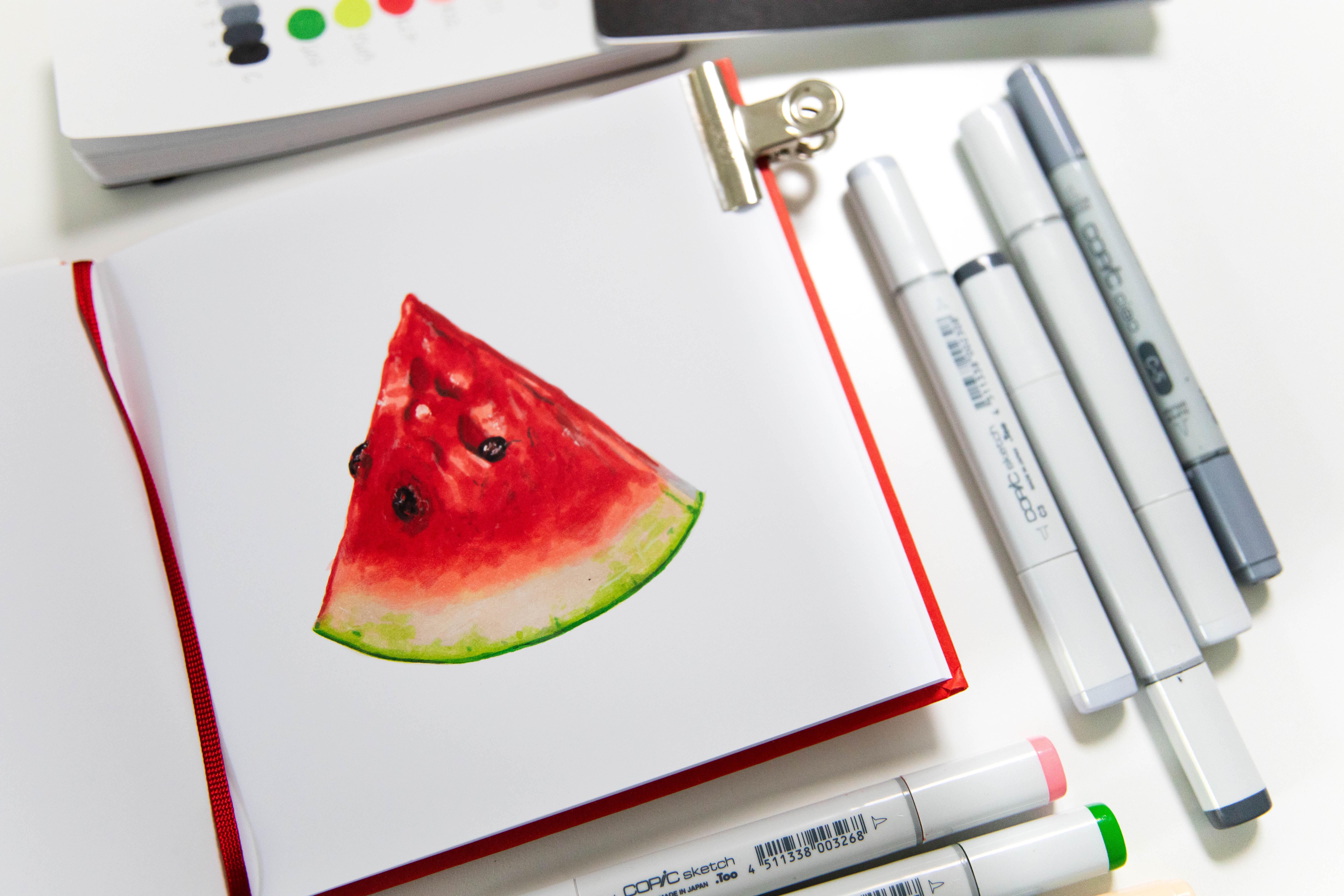
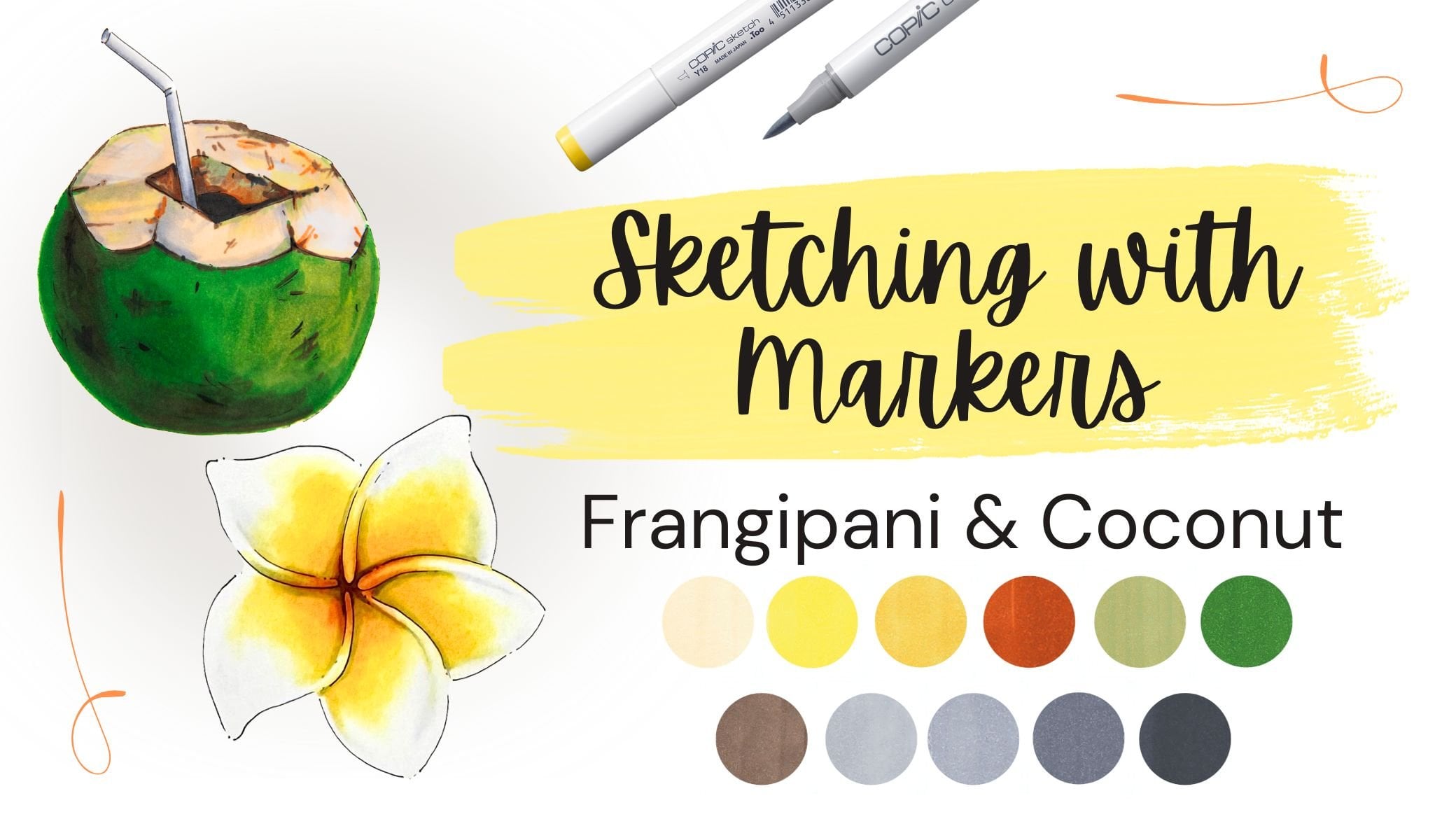
3. Project: Materials: Okay. All right, let's go over the materials
you'll need for this class. First of all, you will
need a regular pencil. I'm also using two
types of erasers, a needed eraser and
a regular eraser. But you can absolutely use just one if
that's what you have. Next, paper. I will be working
on market paper one sided. For example, you can
use Bristol paper, which works great
with alcohol markers. Or like me, you can use
a marker sketchbook. In this class, I will be
working in one of those. It also has one sided paper, and as you can see, the
ink does bleed through. So you will definitely need
a sheet of scrap paper underneath to protect
the next page or your surface from the
ink soaking through. If you don't have a
marker sketchbook, Bristol paper is a great option. For highlights, I will be using a gel pen and a white
colored pencil. Now let's talk about markers. For the lightest areas, I use two light beige tons, but you can definitely manage
with just one of them. One is a bit cooler and
the other is warmer. For the watermelon flesh, I'm using a light
pink or light red, and a bright red. So you'll need two
shades for that part. For the wind wind, I'm
also using two greens, a lighter yellow green
and a darker green. For the shadows, you'll
need a few gray markers. I'm using cool gray, but feel free to use any
gray you already have. I will be using C three, C five and C seven. Those are the key
grays in this class. And for the deepest accents
on the seeds at the end, I will use C nine. This one is optional. You can skip it completely
or just use black instead. But like I said, you can absolutely get by with
just those 3 grays. And that's it. Now
let's get started.
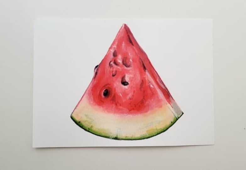
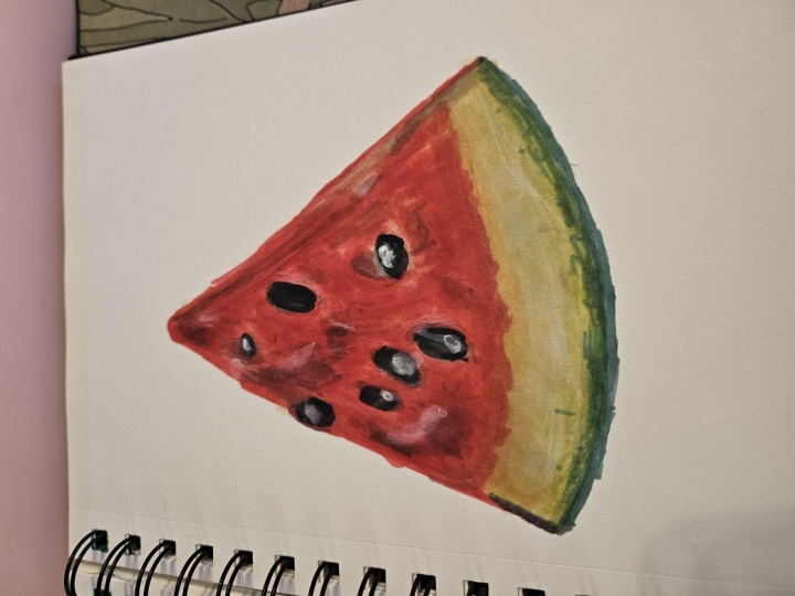
4. Project: Pencil Sketch: Let's start with
the pencil sketch. I begin by drawing
a rough shape, lacing the watermelon slice approximately in the
center of the page. Next, I refine the lines and define the details more clearly. This line I'm drawing now
shouldn't be too straight. Keep it natural and flowing. Look at the reference shape
and try to imitate it, but don't worry about
making it identical. Same with the right
edge of the slice. I'm drawing it with
a gentle even curve. Now, I outline the ring and
the bottom of the watermelon. Then using a needed eraser, I soften the lines a bit
and make some adjustments. I also want to
show this cut edge of the watermelon on the right. Let's slightly mark where
the red flash begins, a soft faint line. Now, I start
sketching the seats. First, the ones that stick out
like this one on the left. Then I lightly play the inner seats alone with the bold
shadows around them. Now I see that I want
to adjust seats a bit. So I'm moving the
seats a bit lower. In my opinion, it will
look more interesting if the seats aren't
all lined up evenly. I keep adding seeds
and the deep shadows. This tiny seed here, I'm marking it with
pencil for now, but I think later, we can highlight it with
a white gel pen. Now I go over the sketch with a needed eraser to
lighten the lines. And we are ready to
move on to the markers.
5. Project: Base & Rind: Now, I'm taking the
latest marker E 40 using the chisel tip and gently filling in
the bottom part of the watermelon slice. While the ink is still wet, I switch to a beige tone E 51 and blend it in
working wet on wet. Then I go back to the chisel
tip and start covering the lightest areas where the red flesh of the
watermelon will be. In a few places, I'm adding a warm undertone
to build depths. Next, I grab a
yellow green marker, YG 03, and while the
ink is still wet, I work on the lower end area. Here, I start
adding some texture to suggest the skin's
natural pattern. Now, I turn to E 40, my lightest shade
and softly blend everything together to
create smoother transitions. I also add a bit more E 51
to bring in some worms. Then I go back to
the yellow green and refine this section further. Since the surface
is still moist, I take my dark green g07 and carefully start
defining the outer end at the bottom edge. Now, I'm just
suggesting the shape. We'll return to it
later for more detail. Let's go over that
area once more with yg03 to soften the blend. Using the chisel tip, I also add a bit more texture. And again, I go back to E 40 to gently smooth
everything out.
6. Project: Coloring the Flesh: Now I'm taking my
light pink marker R 32 and I'm covering the
entire watermelon slice. I go right over the seeds tomb. They will be darker later, so we will bring them
back using graze. Let's switch to the chisel tip to cover the larger
areas more quickly. In some places, I'm leaving little beige highlights on denies to create a natural look. Next, I blend everything
with E 51, the Bay stone, and then go right over it again with pink while
the ink is still wet. As you can see, this gives a much softer transition
and lightens the pink. Again, I blend with E 51 and then use E 40, my latest marker to smooth out
the transitions even more. Now I return to E 51 to soften the beige highlight areas and
make the edges less harsh. Let's go back to our pink and refine the outline of
the watermelon slice. And also deepen the
tone in some parts. Using the chisel tip, I add a bit of texture
to suggest the flesh. And back to E 51 again,
to blend it all out. Then once more with E 40 to really smooth
the transitions. Now, I grab a bright red
marker and begin adding bolder areas of red to the
flesh using the chisel tip. M. I'm careful to avoid the seed spots and leave
some lighter gaps. I'm not feeling the
whole slice solid wrap because that would look
flat and unrealistic. Step by step and building
up the t refining the shape of the slice here
on the left side first, then moving over to the right. Let's switch to the
brush tip for now. It's easier for small
areas and finer details. Then I go back to the chisel tip to add
more of the texture. Now I soften and blend it
all with light pin sort too. Followed by E 51. Now I want to deepen the
red in certain areas. So I lay the same bright
red marker again. One of the great things about markers is
that you can create darker tones by laying the
same color multiple times. You don't always need to
switch to a darker shade. Learn can give you
beautiful tonal variation. Here I'm hinting at shadow
areas near the seeds, which we will later
define using grays. I'm also leaving some of those nice beige
highlights untouched. Using my bright red marker, I continue showing the
darkest parts of the flesh. And even if we accidentally
color over something, we will be able to fix it later with a white pencil
or white gel pen. Now I go back to
the brush tip and refine the edge of
our watermelon slice. Let's take light pin, R 32 again, and blend
a few more areas. Then soften them with E 51 and again with E 40. Right here, I want to bring in a bit more yellow green
to the bottom in. I add some texture. Then once again, blend
it all out with E 40.
7. Project: Seeds & Shadows: Now let's work on the shadows
and seats using our grays. I start with C five and
begin to define the seats. Looking at the reference, I can see the seats are
actually quite dark. But I don't want to jump in with my darkest
shade right away. Instead, I'm gradually
building up the tone. Next, I switch to a lighter gray three and use it to
shade around the seeds. This helps make the seeds look like they're sitting
inside the flesh, not just floating on top. I continue adding shadow
areas using C sum. Including this edge of
the watermelon slice, which is also in shadow. I even add a bit of texture with the grad to give a more
realistic feel to the flesh. I'm using little dots
and lines to imitate the watermelon juicy
texture on the slice. Once again, I darken the
shadows around the seeds, adding more dimension
with this rib. I also soften the bottom
part of the slice slightly with gray to tone down
the bright green rind. Using short gray strokes, I add just a hint of irregularities to the rind
and surrounding areas. Now, I return to the red flesh and deepen the tones a bit more, especially near the seeds
and in the darker areas. Then I go back to
the darker gray C five to intensify some of the shadows and
push the contrast. To keep the grays from
looking too harsh, I take the bright red and
blend over them gently. I continue working with the red, deepening tons in recessed areas and adding more texture
on the right side. Especially around the seeds, I keep reinforcing
the darker tones. Now switching to the chisel tip, I add a bit more
texture to the flesh. Then I return to C five to refine and adjust
some shadow areas. And once again, I use
the bright red to go over the gray shadows,
blending them smoothly. Now I take R 32, the light pink to soften
everything and unify the areas. Where the pink ends, I blend once more with E 40 my lightest color for
a smooth transition. Now it's time for the
darkest gray C seven. I use it to define the darkest and boldest
areas of the seeds. Back to C five, I outline the bottom rind
of the watermelon slice. Then I take the dark green g07 to gently blend that gray
and refine the lower edge. I also add just a few strokes and dots for a touch of texture. Now I grab the yellow
green, white g03, and go over those areas slightly muting the bright
green for a more natural look. Finally, I return
to E 40 and softly blend everything together to
smooth out all transitions. And that's it, the shadows, the shadow and set
details are complete.
8. Project: Final Details: Now I'm taking a gel pen and using it to highlight
this bright seed over here. Next, I add a little highlight
on this darker seed. And then gently smash it with my finger to soften
the brightness. Moving on to the next seed, I tap in small white dots
to show the shiny spots. I also add a few highlights to the flesh of the
watermelon itself. Again, softening them with
my finger to keep it subtle. I use the gelpan to adjust
a bit of texture as well and lightly blur it with my finger so
it's not too harsh. As you can see, with
just a few highlights, the watermelon slice
starts to glow. Now for the softer highlights, I switch to a white
colored pencil and use it to gently mark the lightest
areas on the flesh, on the seeds, and
around the seeds. As you can tell,
the white pencil isn't as bold as gel pen, but it works perfectly in these spots where we
need a softer glow. These little touches really help bring realism
to the sketch. Here, I'm adding tiny white
eyeballs on the red flesh. A similar texture to
what we did earlier with the gray markers when we
added darker details. Okay. Right here where the red ends, I use the white pencil to soften the edge and create a
smoother transition. As you can see, the
white pencil can even lighten up the
marker color slightly. It's a great tool for
subtle adjustments. Now for the final
texture touches, I'm using soft lines and dots to the lightest
lower areas of the slice. And finally, I go back to my
beige marker E 51 and tone down this seed to
make it a little warmer and not so bright white. I also layer some light
pink R 32 over e and other light areas
to slightly mute the brightness and blend it better into the
rest of the slice. As a finishing touch, I take my darkest gray C nine, which is almost flat and place the deepest
shadows on the seeds. And that's it. Our watermelon
slice is complete.
9. Final Word: Thank you for joining
me in this class. I hope you enjoy drawing this juicy watermelon slice and feel more confident
using your markers. To keep practicing,
encourage you to applaud your artwork
in the class gallery. I would love to see
your vibrant creations and offer a personal feedback. If you enjoyed this class, don't forget to check
out my A marker classes. There are plenty of fun
projects waiting for you. See you in the next classes
and happy sketching.
 Anna Ostapenko, Watercolor & Marker artist