Transcripts
1. Introduction: Drawing with graphite pencils, it's kinda thought of as the
default method of drawing. But despite this is also considered to be
very complicated. I want to show you today that it isn't as hard as
you might think. And then if you follow a few fundamental rules
and techniques, you can create some
beautiful Art really easily. My name is gemma Chambers, and I've been making online
Art tutorials since 2020. My goal is to help
people improve that out. And I've helped
tens of thousands of people on my YouTube channel. Today. I want to
take it a little bit further with this
Skillshare course. Now, this course is designed
for absolute beginners. If you know nothing
about graphite pencils, then this is the
perfect course reading. I will cover the materials
that you'll need, as well as the
fundamental techniques of drawing with graphite. Plus I'll go through
the prices that I used to draw any picture or then show you how
to put that method into practice by
drawing this orange. Alright, let's get started.
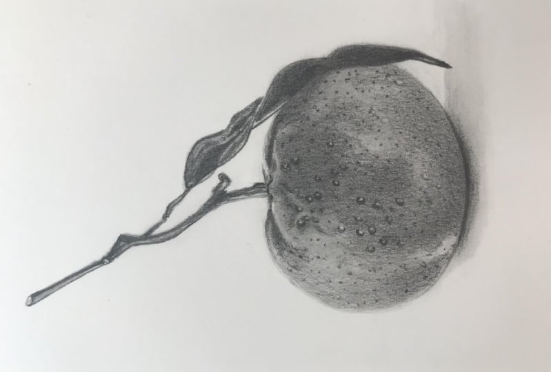
2. Class Project - Drawing an Orange: Now the class project is going
to be to draw this orange. Now I picked this orange
for a couple of reasons. Partly because it's a really nice and simple
shape or say that it's got some really
interesting texture by showing you how to
build up this texture. Hopefully it will make
it really clear for any other drawings you
want to do in future. Now I will show
you everything you need to know to
draw this orange, including how to
make this sketch. That said if you get
stuck with the Sketch, I have included some
Sketch outlines in the class resources. Don't forget when
you've completed the class Project to upload it, I would love to see
what you've drawn
3. Materials for Graphite Pencil Drawings: Now let's talk about
some of the materials you'll need not only to
complete the course, but just generally when
drawing with graphite. And the most obvious
thing is pencils. Now before we talk about
which pencils you'll need, not all of graphite
pencils are the same. They come in a variety
of different harnesses. So there's some harder pencils which generally appear
lighter on the paper, like to H for example. And then there's some
much, much softer pencils, like six B, which looks
much darker on the paper. And then there's an
array between these. So what you want is a variety
of different pencils. I own a few different sets. Generally speaking,
I would use an HB, harder side, and
then I'd use a two before B and 6 ft as well. So a set that contains these Pencils would be
what I would recommend. You can use standard
graphite pencils or you could use Matt
Graphite Pencils. These are very similar
in how they feel, but they don't have the classic
shine of usual Graphite. Think it makes your darks
darker now it is them Matt pencils that I'll be
using to draw this orange. But you can use either the map pencils have a
slightly different scale. They go from to be
at the hardest, all the way up to 12,
be at the softest. But I will include when
I'm drawing the orange, which pencils I'm using
from either scale, add some Graphite Pencils of
a few different harnesses. Beyond that, we also
need some paper, but not just standard
printer paper. The whole key to
drawing with graphite is to build up layers and
builds up the pencil. So you need a decent Paper
to be able to do that. Now, I generally like
drawing with Bristol Board. I find that you're able to build up a lot of layers
on this paper, but also it's nice and smooth, so it's easy to work with. I can't stress enough
that the paper is probably more important
than the Pencils. You'd be better off getting some cheaper
graphite pencils and some more expensive paper
than the other way round. Now the next thing you'll
need is a Pencil Sharpener to be able to make a nice
sharp tip to your pencils. Now, I don't use anything fancy when I'm drawing
with graphite. I just use this small little Faber-Castell
Pencil Sharpener. But as long as you have
a Sharpener that does make a good point,
That's all you need. Now beyond this,
you also will need a few different types of Eraser. Now my method involves
building up a lot of the Graphite and then adding
the light areas back in. So there's two types of erasers
that we need to do this. First up, we need
a Putty Eraser. This is a moldable
Eraser that is really good for lifting just small
amounts of the Graphite. I like to use it to just
gently lightening area. I don't tend to use it to create really harsh white lines. I also like to use
an Electric Eraser. Now, this Eraser is a very good for making some
really fine details. When we draw the orange,
it's going to be great for putting
the dots back in. Now my Electric Eraser
isn't anything fancy, and it comes with two
different sizes of erasers. There's a smaller one
and a larger one. And generally speaking,
ID use the smaller one. So you want something like this. And then the last
thing you'll need is a way of looking at
the Reference Photo. Now, I generally do
this with an iPad. I like that it's a
reasonably large screen and that I can zoom in on it. But you could use anything
that you've got to hand. You could put the
reference photo on your phone or you
could print it out. It's completely up to you. So what you'll need is a few different Pencils
of different harnesses. And I will include in the Skillshare
description all of the pencils that I am
using in this course. You also need the right type of paper, a pencil sharpener, Putty Eraser, and
Electric Eraser, and a way of looking at
the Reference Photo. In the next lesson,
I'll show you the main techniques
that you need to know to draw with graphite
4. The Key Basic Techniques: Let's talk about the
fundamental techniques that you need to know to draw
with graphite pencils. And what it all
really comes down to is building up the pencils, layering them to
make them richer. Now let me show you why
this is so important. Let's say that you
didn't want to build up the color and you
wanted to just go straight in with the
Darkest pencil and try and just draw a sphere. You can see that I can get some really nice
dark values in here, but the right values aren't looking
particularly exciting. It's just not looking very rich. But let me show you if you
use a few different pencils. So starting here
with the HB pencil, and then once I put all
of this Pencil down, I'm going to use a
tissue to blend it. I can then put the
next pencil on top. So this is the 3D Pencil doing exactly the same thing
again and then blending it. And then I will do it
with the six B pencil. And you can see that
this is looking far richer and has far more
interesting shading than the first one. I think they're really important
thing to remember about graphite is all about contrast. If you get the contrast right
and the proportions right, it's going to look good. And the way to get the
contrast right is through building up the Graphite
through the different pencils. Now, generally speaking, when I'm building the Graphite up, I want to try and make it
as smooth as possible. Most texture gets put
in towards the end. So there's a few ways that I go about making it as
smooth as possible. Best up, I hold the
pencil further back. I hold it back here rather
than really close to the tip. That is because I want to be pressing as lightly as possible. If I go in really hard, I'm going to end
up probably making marks on the paper
that I don't want. And it's just generally going
to look really scribbly. And when I try and blend it, it's not going to work. So I wanted to be
pressing lightly and if I hold the pencil back here, it won't be possible for
me to press too hard. They also find that the
pencil goes down in a far easier and
more uniform way. If I have a nice
and sharp pencil, I do really try and keep on top of sharpening it frequently. And generally speaking, the softer pencils need
sharpening more frequently than the harder pencils because their software and
they wear down faster. Now the last thing that I do
is work in sack animations. Again, I don't want to be
scribbling back and forth. It just makes some
really unsightly lines. If I work in circles like this, the Pencil again goes down much, much to me that you will hear me talking about working in
circular motions a lot. And this is what I mean. These are the main
things that you need to know to start drawing
with graphite. And the next class, I'll cover the overall
process that I use
5. The Process: Now let's talk about the
process that I go through on every graphite
drawing that I do. This is my really nice simple
method to work through. First off, I like to
find a reference spade. Say every drawing I do is from a reference because I
like to draw realistically. I find this is the
best way to get as realistic a
drawing as possible. Now when I'm selecting
Reference Photo, what I'm looking
for particularly is a reference with
really good contrast. The key to drawing a good
Graphite picture is contrast. So I want some really
bold dark areas and some really
bold light areas. I don't want to pick a reference
that is just midtones. Once I've got that reference, I then want to think
about the Sketch. And I generally do this
with the HB pencils, so a harder pencil so it
doesn't look as dark. I want it to look as
light as possible. The Sketch isn't
something that I'm going to want to see at the end. Generally speaking,
when I do the Sketch, I do this using the grid method. Now this is where I
draw a grid on my paper and I draw a grid on
the Reference Photo. And then I just draw what I
see in every individual box. We'll go through this in a bit more detail in a
couple of lessons time. But that is generally how I
go about drawing the Sketch. Once I've drawn everything
down in each of the boxes, I then erase all the lines. Once I got my sketch,
I then carry on using the hardest pencil that
I will for this drawing. So the HB, so the HP, if I'm using standard
graphite pencils or maybe the 4-bit if I'm
using them, Matt Graphite. And all I wanted to do here is blocking the main
lights and darks. I never worried about any
texture at this point. I literally just
want to block in the shapes and get
something on the paper. Generally think about it
that I want to get something down so I have something
to be working with. Now I'm usually trying to make
this as smooth as possible using all of those
circular motions that I talked about in the last lesson. So that hopefully when I put
down all of this Pencil, I have something that kind of roughly resembles
what I'm drawing. So an orange here. Now what I wanted to do at
this point is blend it. All I do is I get
a piece of tissue, I wrap it around my
finger and I blend. So I work in circular motions,
whatever I'm drawing, I always like in circular
motions to smooth it all out and you can see what a
big difference it makes. Once I've smoothed out, I have a blurry version, a very blurry version of
what I'm drawing from here. I then move on to the
next softest pencil. So in this case I use the HB pencil and I do
very similar again. So once again, blocking in the Lightest shapes,
the darker shade, still trying to be as
smooth as possible, but maybe adding a tiny
bit more detail this time. So maybe looking at some of the more intricate shapes and
slightly marking those in, but it's certainly not
something I worry too much about once I've
blocked in all of the shapes with this Pencil, I then once again blend it
with a clean bit of tissue. Once again, wrapping the
tissue around my finger and working in circular
motions from here, I then move on to the softest pencil that I'm
going to use in the drawing. Once again, blocking
the main shapes, particularly the darker shapes. Here, I give it a final blend. And at this point it
looks a little bit murky. A lot of the really
light areas have disappeared and it doesn't really have a huge
amount of detail. So what I want to do here is use my erasers to add
the light back in. For example, on this orange, there are some areas where I need to use
the potty eraser, just a slightly lift some of the Graphite and just lighten
up a couple of areas. And then there's also
a lot of spots on the orange sunlight to spot some darker spots for
the Lightest box. I like to use the Electric
Eraser to add those back in. So generally use the
potty eraser just to tidy up around the edge
where I've blended, it all gets a little bit smudgy. So I use the Putty
Eraser just to fix that. And then at this point, I
have a drawing with them, Lightest areas in quite
good range of mid tones, but generally at this point the dark areas have
all been blended away. So what I want to
do at this point is go back to that
softest pencil. So the 12th be in the
map pencils or maybe I'd use the six be in the
usual graphite pencils. And now really adding
all of those details. Now it's all made a lot
easier because I've already really thoroughly blocked
in the main shapes. I've also added all
that light in so I can use it as a
framework to work out. Finally, what needs to go where this is where the whole
drawing comes together. So it's really just a case
of blocking in shapes, blending, blocking
in More Shapes, blending, blocking in
More Shapes and blending, then adding the light back
in and adding the details. And that is what I do for
every graphite drawing. So let's start actually
working through this orange
6. Studying the Reference Photo: Now before we start actually
drawing the orange, what I like to do is have a really good look at
the Reference Photo. We will be drawing this
orange from a reference. I find that that
is the main way to make a drawing look as
realistic as possible. But rather than just diving
in and starting drawing, I want to really look
at what's actually here and just show you the
main things I'm noticing. So first off, I'm noticing
the shape of the orange. So generally speaking,
you think of oranges as being round, I assume, but this looks more
like a slight oval, is certainly not
completely round. And I would say from
the picture that the light is coming from
this left hand side is far lighter around
here and also the stem is lighter on the
left-hand side and it's got the shadow
on the right. So he wants to be
bearing that in mind, looking at the actual
shapes on the orange, There's so as I mentioned, this light patch here, there's this dark
patch all around here through the
middle of the orange. So this is a measure darker
mid-tone, I would say. It's also reasonably
dark around the bottom, and then there's a
lighter mid tone here. So this color is quite
similar to this color. I would say, when I'm mapping in all of the initial
shapes I'm going to want to mark and particularly
this shape around here. Beyond that, looking
at the texture, there is this kind
of spotty texture. I'm noticing looking at the spots that
generally speaking, they seem to be a
lighter spot with a darker patch to the top left. And that'll be the shadow created because the light's
coming from Eva here. So I'm going to later on
in the drawing once to add these light spots with
the darker patches above and beyond that
on the stem itself, there isn't a huge
amount of texture, I would say going on here, a little bit around this area. And there's the odd kind
of stroke, I guess, bit coming out here
the most part it's a pretty smooth stem and then leave has a
little bit of texture, but on the most part, it is just very, very dark. All along here, it
is extremely dark. But those are the
main things that I'm noticing initially,
let's start drawing
7. How to Draw the Sketch: Now let us get our sketch
down on the paper. Now the orange is actually a reasonably simple shape
and I'm going to go through this as if I was drawing a
much more complicated objects. I'm going to show you using the grid method that
before I go over this, if you don't want
to Draw the Sketch out yourself and you'd
like to use my Sketch. It is in the class resources. So you could use that to trace onto your paper
if you want to. It's completely up to you. Now for the grid method, the first thing that I do is add a grid onto my
reference photo. Now again, I have included
a grid on the Reference and added it in the class resources
if you want to use mine. What I wanted to do is a little
bit of maths to work out how many squares
across the orange is and do the same on my paper. Now for my paper,
it works out but I need to make two
centimeter squares. I'm only going to draw
these squares in the middle where I'm actually going
to put the orange. Then I'm literally just
going through marking out a squares and drawing the grid. Now here I'm pressing reasonably family
so that you can see nice and clearly
on camera what I'm doing when you are doing
this at home yourself, you want to be pressing much, much lighter than I am. You basically want to
press as lightly as you can while still being
able to see the grid. And then it'll be
far easier to erase than how hard this
is going to be. Once I've drawn out my grid, then what I can do
is start working through pitting the Sketch
down one square at a time. So starting at the very
top of the drawing. And what I'm doing is first off, looking at where lines
are crossing the grid. For example, in
this first square, I'm noticing that this
section of the twig is going pretty much perfectly into the corner of this square, this line where it's
crossing the edge here is maybe just over a
third of the way up this line here is a
little bit over half, half of the square. And then this line here is
maybe about a third again, because this is a
reasonably straight line, I can pretty much look at where those lines are crossing
over the edges of the square and then just draw up
and join up the lines and in working through this
one square root of time. So let's look at
this square here, and that is this square here. And there's only a tiny bit that I need to draw
in this square because the left-hand side of the stem is pretty
much in the corner. I just need to draw
the right hand side. So I'm looking at where this
line lies along the bottom. And that looks like it's
about a sixth of the way EVA, about half of a
third, I would say. So I can take note
that that's where it's crossing the line
here and join up to the line that's
already there. This square around, he
gets a little bit more complicated because there's
all sorts of lumps and bumps. But again, just wants
to be focusing on what is in the square. So I'm starting off, I can look down the
bottom and look at where this stem is crossing this line. So this line is probably just
over halfway, I would say. And this line here is about
a third from the right. There's this bump web, whether bumps sticks
out the most is probably about a third
in anesthetic up, maybe a little bit
less than a third up. So I'm going to
want to draw bump around here and then
I can just go along and joined to this section
and then on this side, so I've got this line here. I can think about where
this bump needs to be. So again, it's probably
just over a third down and it's about level
with this line here. And then I can use that
to Draw, run this line, I think is worth saying that I didn't necessarily need to get everything absolutely
perfectly in the right place. Obviously, I am trying to get
it as accurate as possible, but I wouldn't worry
too much about it. Now he would invest
the extra time to make an absolutely perfect
as much as possible Sketch. If I was drawing a
person, for example, where it's really going to look wrong if you get something
slightly in the wrong place. But because what we're
drawing Harrison Orange, although obviously we want to strive to get everything
in the right place, it doesn't matter as much. Now as I went my way around
the main orange section, this is much easier really than the stem because
we're just drawing the outline and we're
just taking note of where the two lines cross the boxes and joining
them in a curved line. That's all there is
two it really here. If you are struggling with drawing what's in each box
and getting it to look right. You could always put a smaller
grid on the Reference. So remember, you
don't have to use reasonably large
squares like this. You could use much, much smaller squares to get it
even more accurate. Or if you want to give
yourself a bit of challenge, you could use much
bigger squares. I think it's all
personal preference. Once I've gone through and got the general outline in the
main shapes of the orange. I do want to draw in a few of the darker sections
particularly. So these dark spots around here, I want to get this
roughly marked in. It's just going to help
me a lot later on. Now we're don't need
to worry quite so much about getting it as accurate. I just want to roughly
mark in the shape. Again, using the boxes
is a bit of a guide, but I would say I'm not
being as precise here. Once I'm happy with
my sketch now what I need to do is erase the lines. Now I'm using a potty
eraser to do this, you could use a normal standard
Eraser and you should, as I said earlier, find
is much easier than I am, because you should
have done this much, much lighter than I have. But when you get to the end, once it's all being raised, you should have a very light
sketch that looks like this. Alright, so we've now
got our sketch down. Let's start drawing
8. Building up the First Layers: Alright, so we've had a good
look at our reference photo. We've got our sketch down. Let's start drawing. Now what I wanted
to do here is start off with the hardest pencil. So the Lightest pencil that I'm going to be
using for this drawing, say for me with the
Matt Graphite Pencils, this is the for B. If you're doing this with sort
of usual graphite pencils, I would look at starting
with maybe a Tooby. And all I'm wanting
to do here is get something down on the paper, beginning by drawing the
stem towards the top. There's a few things that
I'm trying to do here. First up, I'm making sure that
I press nice and lightly. I don't want to be
pressing really hard. I want to make sure that I'm
able to build lots of Pencil up or I want to make sure
that I will be able to put lots more pencil
on top of it. And by working lightly, that's going to enable me
to be able to do this. The other thing I
want to do is I'm not really worrying about
texture at this point. Now, as I mentioned when we're looking at the Reference Photo actually on the storks up here. I wouldn't say that there
really is much texture anyway. But on all of the orange, all of this chapter, I am focusing on getting some nice smooth
layers of color down. It's now generally
speaking, the easiest way to do this is to work in circular motions
or oval motions. You can see that here I have marked in either
side of the stem. Now I'm creating these large
oval is going up and down. It's to try and get this
as smooth as possible. Now it doesn't need to be
absolutely perfect because we will be blending
this in a second. But we want to try and get it reasonably as
smooth as possible. It's now I've just blocked
in some of the stem. I'm also going to use
this pencil to begin just very roughly marking
in the darker areas. So for example, up
this right-hand side, this is all pretty dark, all along up here as well. On this right-hand side,
I just wanted to be marking in all of these areas. It comes out a bit
here and then there's this darker circles,
not really a circle. This shape here. I want to mark that in as well. And I'm noticing that there's a little lighter triangle here. So I'm going to
work around that. I can't stress enough
that I'm not doing anything particularly
fancy here. I'm literally just blocking in these darker patches
and using this as a bit of an opportunity to start to get my bearings
with the drawing. I can lightly block in this top section of
the stem as well. And then being marking
in those shapes that I mentioned and getting those
dark areas marked in. Now as I'm marking in
these darker areas, although I would say maybe I'm pressing a tiny bit firmer. I'm by no means pressing hard. The best way to build up
a darker color is to go over the area More Times or
later on in the drawing, will begin using softer pencils as well to create
those darker values. I'm not pressing really hard. The other thing that is
going to make this easier is if you make
sure that you keep your pencil nice and sharp, it's going to help
you be a lot more accurate about where
this is going. I'm just going to do this
little section here. I'm not going to
draw the leaf yet, mostly because I think that
there is a risk of smudge it. If I do, I'm going
to move on and start shading in putting something
down on the orange itself, then you can see a
bit easier here, what I'm doing to try and get this nice, smooth even color. First off, you'll notice
that I'm pressing really lightly just
like we did before, because this is a bit
of a larger area and I don't need to be as
accurate about where the Pencils going to help me press nice and lightly holding
the pencil further back. So you'll notice
that I'm holding the pencil about halfway down and that makes it not possible
for me to press too hard. You'll also notice
that I am again working in these large
circular motions. You can kinda get a
bit of an idea on how smooth the Pencils going down. Now as I mentioned when we were looking at the Reference Photo, there is this darker patch towards the middle
of the orange. I'm not worrying about that
at this minute right now. All I'm trying to
do is get down this Smooth even cover of Pencil. I just want something that I can begin building the shading on. Now I am being very
careful when I go around the edge of
the orange because I wanted to try and
make sure that I'm keeping the shape
of this orange. But beyond that I'm
just blocking in its, once I've gone over the
whole orange and I've got a solid color of this Pencil. From here, I can
begin marking in those shapes that I
mentioned earlier. Now I can still see the shapes
marked out from my sketch. So that is making
this a lot easier. I'm just literally very
roughly marking in these patches some going over the areas that I want to be
darker a few more times. And you can see that that is
making a big difference to the amount of shading
that is in these parts. So let's take a minute to
look at the Reference Photo and really look at the
shapes we want to be marking it in a darker
patch around here. There's this prominent
dark patch all around the middle that I
mentioned all around here. And I'm really noticing
the shape of this Also Patch going all around here and then it's
a little bit darker. You can see a line
going down here. It's a little bit darker hair in comparison to here,
but not hugely. Beyond that, I'm noticing
that there is a line coming down here and then there's
this darker wedge here, and there's this darker
wedge here as well. So it's essentially what I'm
marking in with the pencil. I'm not worrying about
any of the texture. I'm not worrying
about all of that. So dotty texture on the orange, I'm literally just trying to get these shapes where possible
in the right place. I wouldn't say that it needs
to be absolutely perfect, but I do want to get it
as close as I can to the Reference Photo
that's going to help make the final drawing look as accurate and as
realistic as possible. So you can see me just gradually building up the color through
all of these patches, just going over the
same areas over and over again until it's
built up the shapes. Once I'm generally happy with
the shapes on the orange, I also want to be thinking about some of the shadows down
the bottom as well. So there's generally a pretty
dark shadow down here. I'm noticing that there
is where this leaf is meeting the surface. There's a shadow coming along here and down here
and across here. Also generally darker, particularly where the
oranges meeting the surface. So it all along here
is very, very dark, but it is generally
darker near around here. It kind of fades from the really dark color to
slightly lighter gray, I guess. Where that transition is, I want to be building up
some of that shading. I doing this in
exactly the same way. They'd just very lightly
going over this area, building up some of this color. I want some genuinely happy with the shadow down the
bottom as well. I want to start
marking in the leaf as the only area now that we
don't have any graphite. So I can once again
begin by just blocking in the area
trying to get the shape as accurate as possible
and just putting down a nice smooth
even coverage. And then from here
I can begin marking in the shapes I can
see within the leaf. So generally I would say
down this right-hand side, it is pretty dark. There's this
Lightest strip here, and then all the way
down here is dark. There's also a dark line going down the left-hand side as well. Actually, a dark strip
here followed by the Lightest strip and this
rather large shape up here. Now all of this is marked in on my sketch if you're
a little bit unsure, but I'm literally just trying to roughly mark in these shapes, which is going to make
my life a lot easier and really helped me in
the next few chapters. Once I've blocked in
this whole section of leaf all the way
down to the bottom. I am generally happy, I would say now with
my base layers, what I want to do is use a piece of tissue to
Smooth all of this out. So it's looking a little
bit too grainy and I want to blend the
whole thing together. Now what I've done here is
used a piece of tissue, just wrapped it
around my finger. And then I'm working
in circular motions once again to get this Smooth. Now, I can't stress enough that I'm not pressing hard here. I'm just very lightly rubbing my finger
against the paper. If I want to get
more of a blend, I can go over areas more times rather than
pressing harder. We don't need to get
this looking absolutely perfectly smooth because
we're going to put a lot more pencil
over the top of this. We just want to get a slightly softer surface to work from. Now. If you feel like your
tissue is getting a little bit too smudgy, then you can just
wrap the tissue around a different
part of your finger, wrap it around in
a different way, and then you've got a
clean piece of tissue. Don't worry about
blending or smudging the pencil onto where
we'll be whitepaper. We can always erase
that a little bit later and we
can tidy that up. Say by the end of
this first chapter, you should have an orange
that looks like this. All of the initial Pencil
is marked in and you've got something that we
can be working from
9. Adding in More Details: I wanted to be doing in
this chapter is moving onto my next softest pencil. So we started off with
the hardest pencil. I'm going to use three
pencils in this drawing. I want to move on to a
slightly softer pencil. Now for me, with
the Matt Graphite, I'm using the HB pencil, but if I was doing this
with standard graphite, I'll be using more like a for B. And to start with, what
we're doing is very similar to what we did in
the last chapter. We want to be once
again going over the stem marking in these
lighter and darker areas, you can really see how much darker this pencil is
than the previous one. So we can really start to get that contrast marked
in a bit more. It's a good opportunity
for me to be thinking about if there's any
slight adjustments I want to be making. If some of the shadows
that maybe they're in slightly the wrong place now as a good time for me to just
begin to change that. Now generally speaking,
in this chapter, we want to be adding in a little bit more detail than we did in the previous chapter. That said there's
not a huge amount of detail on these stems. So I'm really just
going over them in exactly the same way
as we did before. And this is made far easier because we've
already got there very in-depth template
from the first Pencil. So I'm really just
going over it. A little bit of it was maybe slightly lost from blending it. So just redefining all of
the shadows, as I say, maybe adjusting
some of the shapes, but it's very much doing
what we did before, wasn't happy with the stems. I'm going to also move on to
the top half of the leaf, once again, marking in the shapes that I
mentioned previously. So giving a nice and crisp
line around the edge, generally around the
whole of the leaf. As I mentioned, it's
got a pretty dark line. And then I want to be marking in this darker shape towards the middle was leaving that lighter line that's going
down the right-hand side. Now as far as shading this in, I'm very much approaching it in the same way as we did before. I'm still not pressing hard. I'm still working nice and lightly and working in these
little circular motions. I am wanting to make this leaf as smooth as possible because
generally speaking, I would say on the leaf you
can't really see any texture. I'm just going to mark
in this shape down the bottom and then I'm going
to move on to the orange. Once again, I don't want to
risk smudging this section. Certainly not more
than I need to. I can fill in the
rest of the leaf. The rest of the
leaf is mostly just blocking in some dark shading. And I can do that a little
bit later on in this chapter. So let's start thinking about adding in some of the
shapes on the orange. Now again, a lot of
the main outline shapes I've already marked
in with the previous pencil. And what I'm wanting
to do is just add a little bit more detail. And I'm going to work through
this one section at a time. I find that is the easiest
way to go through this. So starting off on
this little wedge, I guess at the top
on the left here. And this has a lion, I guess coming down here. And then this kind
of wedge-shaped, there's also a little line
going along up the top here. It's not a particularly
complicated shape and I don't need to try and
get it perfectly right. I just want to be trying to
get it as close as possible. I'm then going to work my way
along the top looking for any details around near where
the orange meets the stem. There isn't a huge amount here. There's a little line coming up here and this little
section here. And then I'm going to draw
this wedge shape here. So just really looking at
the shape of this section, I'm marking it as closely
as I can to that. Now it's going to become a bit easier and be a bit more power. And the extra
detail I'm doing as we're moving on to the
rest of the Orange. Say for example, starting from the top again and
working my way down, I am looking at the dark
patch towards the middle, but it isn't really all one
solid block around here. For example, there's all
of these little patches. So all of these little
squiggly shapes, for example, around here, there's this little patch here, and then this almost
looks like N, I guess, like a bump. And then there's a
little dot up here. And again, I don't
need to get it. Absolutely perfect,
but I do want to get as close and match to the
Reference Photo as I can. That said, you'll
notice that I'm doing this reasonably quickly. I'm not going really slowly. I could probably get it more accurate if I
really slowed down, but I don't think
it is necessary. So I can work my way
along this patch, filling in any of these more
intricate lumps and bumps. But besides that,
you'll notice that I am once again working in
these circular motions. I still want this to be Smooth. I'm not worrying about any
of the dots at this point. That's something we want to be adding in right at the end. We're not worrying about any
of the main texture will literally just
looking at shapes. And you'll also notice that I'm still holding my
pencil quite far back. I'm not holding it
really close to the tip. And that again is just helping me be able to press nice and lightly so you can fill in this darker patch on
the left-hand side. We didn't mark it in with
the previous pencil and I'm just going back over
it a little bit more. And then I can start
expanding upon this patch going again over
these same shapes that I've marked in before. But really thinking about some of the shapes around the edge, around here, for example, and marketing those
in as best we can. Now I can't stress
enough that you don't expect this to look amazing when we're done with this is not going to
have any sort of detail. We're really just still getting our bearings with the
shapes within the orange. And the important thing
is that you'll notice how nice and smooth. And that will make it
easier if we need to change anything,
adjust anything, if it's nice and smooth
without lasers scratching, this is just going to give us much more forgiving
series of base layers. I can mark in this bottom
section where I mentioned that towards the bottom of the
orange is a fair bit darker. So I want to be a
shading this in to really deepen down this area. And then I want to be
working along here again. I mentioned when we were
looking at the Reference Photo, there's a line here where on the left of it it's
a lighter mid-tone, and on the right of it,
it's a much lighter shade. You can see that a
line along here. This is the lighter mid tone. This is a lighter color,
I would say here, I can mark that and
then carry on working my way over to the
right-hand side. You can see that
following these shapes from the Reference Photo is helping make this
orange look round, is literally just a case of following the shapes
and working lightly. It's now I'm generally
happy with the orange. I want to move back
onto the leaf. And once again,
we're going to block in all of these
shapes along here. I'm really adding some of that darker shading because I am now nearly finished with this pencil and I want
to think about blending. I'm not as worried about
smudging this area. Now, I'm again going nice and carefully around the
edge of this section. And then I can use, I would say light to medium
pressure with the circular motion
still to just block this in and really give that
a little bit of contrast. I can block that in the whole
way down except this area, right, the very bottom,
which I would say is a little bit lighter. Then once I've filled
in the whole area of the leaf, before I move on, I'm just going to add a
little bit more shading around the bottom here. As I mentioned in
the last chapter, where this oranges
meeting the surface, it is a very dark patches, very dark line along here. So just wanted to add
to that a little bit more and maybe go over
the shadows where I mentioned there is
these three shadows coming out from the leaf. So here, here and here, I just wanted to go over that really make it stand
out a little bit more. I did mark it in with
the previous Pencil, but I don't think it's
quite clear enough. And then I'm also going to
add a little bit more shading around the bottom. So from here, I would
say that I am happy with the extra few bits of detail I've added in
with this pencil. What I wanted to do
now is exactly the same as I did in the
previous chapter. I once again wants a blend
this and really smooth out what I've got here
exactly the same as before. I've once again wrap the
tissue around my finger. I'm again working in these circular motions,
pressing very lightly. You'll see that I am
smudging a little bit around the edge,
but that's fine. We're going to tidy
that up in a second. I've just ending up with a
much smoother surface that I can carry on building up
all of the orange on top of. So it's giving me a really
nice base that will be able to put all of the texture
of the orange onto. Again, don't forget that if your tissues getting
a little bit dirty, you can just use a different section of
tissue or a new tissue. You want to try and keep
this as clean as possible. But by the end of this chapter, you should have something
that looks like this
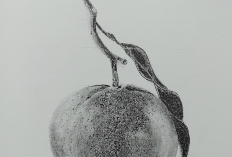
10. Add the Lightest and Darkest Values: Now in this chapter I want
to start filling in the very darkest and the
very lightest values. So I'm using here the
12th be Pencil again, if you're using usual
graphite pencils, I'd be using
something like six B. And I'm once again going
over the same patches, initially focusing on the darker patches
towards the middle. So I'm just wanting to give them that extra little
bit of darkness. They don't need to
be the full Wacker, don't need to be using
loads of pressure to build this up and
make it really dark. But I do want it to be darker than what it is at the moment. So you'll once again see
that I'm going through this in exactly the same way. I'm working in these
little circular motions. And I'm also still
pressing lightly, and I'm still able to do that by holding the pencil further
back, right this minute. I'm not worrying about
adding in any detail, so I don't need to be really specific on where
the pencil is going. I can hold it back
here and that is fine. So I'm again going over
these same shapes. And this is all made far easier
because I've already done this a number of
times and it's pretty clear where the
Pencil needs to go. Now, once I've gone over the bulk of the shape
towards the middle, I can also go over all of these slightly
more random shapes that I marked in up here, just redefining what's
he going back over them. And then I'm also going
to mark in some of the darker dotty shapes
around here as well. Once again, I didn't
mark them in previously. I'm just going over them, making them a
little bit clearer. Then once I'm happy with
the middle section, I can slightly move
down the side. And then from here
I want to start focusing more
towards the bottom, filling in this slightly
darker section here. And then going back over the very bottom where it does
need to be a bit darker, but always in exactly
the same way. Always nice and lightly always
with the circular motions. I don't want to be
pressing really hard. I want to be able to gradually build up this
color or this shading. Once I've gone over this patch towards the
boss in this darker patch, I also want to go
over this area. I've mentioned this a few times. It's got this line going
down the side where it's kind of mid tone and just going back over that and making
that a little bit clearer. Now you'll notice that
I'm not going back EVA the leaves or the
stem at this point, to be honest, I think that
they're already pretty dark. I will be going back over them before what I
finished the drawing, but I don't think they're
going over them again and then blending it is going to help
particularly at the moment. For now I'm going to leave the
stem and leaf as they are, but I can redefine them
a little bit later. Just go over this little
shadow at the bottom again in exactly the same
way as we have done before, because we're gradually
building up the shading. I'm pretty confident that
what I've got now is right. I just want to go
over it and let it build up bit by bit swatter. Last few tweaks. What I want to do is give
this one Final blend. Now I want to do this in exactly the same way
as I have done before. So going back to this tissue, wrapping it around my
finger and once again, working in circular motions. But I'm not doing it. I would say as much as before. I wanted to blend
this, but I don't want to end up smudging
the whole thing. I want to make sure
that I'm keeping my lighter sections and darker
sections pretty obvious. Now from here, what
I'm going to do is adding the very
lightest areas. So you'll notice on the
Reference Photo there are a number of areas
where it actually, the orange needs to be lighter than what I've got
at the moment. I'm going to use sometimes
this Electric Eraser, and I will also be
using a potty eraser. Let's take a minute to look at the Reference Photo and really notice what I'm seeing
and what I'm doing here. All over the orange, as I've mentioned before, it's not perfectly smooth. It's got all of these
little dips on it. And actually when
we look at a dip, it's light patch
and then there's a dark patch at the top left. So what I want to be doing with the Electric Eraser is
adding in these white spots. And then once I've added
in the white spots, I will then in the
next chapter be able to add in the
darker top section. But for now, I want to be
looking at my drawing, comparing it to the Reference
Photo and trying to get these dots in as closer, same place as possible. It doesn't need to be perfect, but I wanted to try and get
the same pattern if possible. Now firstly, the reason I
want to try where possible to get the same
pattern is because the spots and dots on the Orange of very random because
they're made through nature. And if I can follow the
patterns and the shapes that are on there is going
to look more realistic. It's going to look
more random if I try and come up with it and come up with my own where
this box should go. It's not going to
look as realistic because I generally speaking, won't be able to make
them look as random. It's hard to be as
random as nature. If I try and work out
where the spots should go, I'll probably end up
accidentally evenly spacing them and they
won't look as realistic. Now as to why I'm using the Electric Eraser rather than the Putty Eraser to do this They're very small
spots and I want to be very precise on
where they're going. Once be erasing a
very, very small area. Now I particularly like
this Electric Eraser because it has such a
small Eraser part to it. It doesn't also come with
some bigger sections, but I like using the small Eraser sections and
you'll see that it just very easily makes
it very clear white dot. What I do need to do
periodically though, I find that once I've
raised a certain amount, it stops erasing as well. So I use something like a
craft knife to just cut off a very thin
sliver of the Eraser. And then it makes it nice
and crisp and white again, and it starts erasing
everything properly. It's, you'll see there
me going through and doing this firstly, it's not all absolutely perfect. I'm not making perfect circles. We can adjust that and
change that once we do the next layer with the
pencil and it looks, it's not looking massively
realistic, but that's fine. Don't worry about that. Now one thing to note is
once we've done the erasers, once we've marked
all of this in, I can't go back to
blending after this. Or if I do want to blend, I need to bear in
mind that it will take away some of
these light areas, obviously blending
now with just match the pencil onto
wherever raise this, which is fine, but just
bear that in mind. So once I've gone over and add
it in a lot of these dots, I also want to be
looking at the stem, seeing if there's any areas around here where I want to lift some of the pencil and I'm really looking at the odd area. And the most part I would say, I'm pretty happy with the stem. You'll see very few
odd areas on the leaf, for example, that little line. It's really not a huge
amount they need to do. And then I can move on
to the Putty Eraser. What I use the
potty Eraser for is to just slightly lift patches. So for example, around this area here in
the Reference Photo, it is a very, very light. And although I have tried
to make it that light in my drawing where I've
been blending it has got a little bit
too dark for my liking. I'm literally just
molding the Eraser into a flat area and I can dab it onto the drawing and it just lifts a little bit
of the Graphite. I do like to
frequently reshape it. I find that otherwise
it doesn't again, it doesn't perform as well. You don't, it doesn't take
away the Graphite as well. I'm taking away a
lot of the areas over on this left-hand side. I'm also going to use this
Eraser to just tidy up around the edges to where we
blended a few times earlier. That has smashed the pencil onto what we want to be
white paper, which is fine. I can again do exactly the same. I'm just molding my
eraser and gently wiping away the Graphite until I
have a nice clean orange. Then once I'm happy
around the edge, I can once again lighten
some of this area. On the right-hand side, again, looks a little bit
too dark for me. And then I'm gonna go back to
the Electric Eraser and add a few more white dots
just bit by bit, building up some of
these lighter areas. As I said, you don't
expect it to look amazing by the end of this
and that is fine. But we do want to have a lot of these dots built up so that we can begin adding some final
shading in the next chapter. So by the end of this chapter, you should have something
that looks like this. It kinda looks like an orange
with lots of white spots, but some of the spores
are a little bit messy and you don't need
to worry about that. I just tidy up around
the edge one last time and then that is
it for the erasing
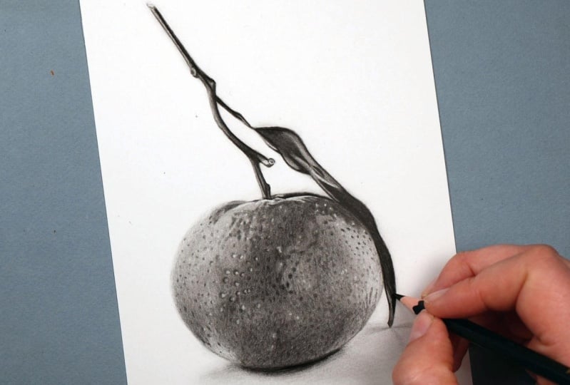
11. Adding in the Final Details: In this chapter, I
want to be adding in the Final Details and the
Final lot of contrast. So just like in
the last chapter, I'm once again using
this 12 be Pencil. This is the softest
pencil that I'll be using and I'm focusing on
working around the spot. So all of the spots to meet
added in the last chapter. And what I want to be
doing is basically drawing a circle around each spot and adding a bit of
shading in the top left. So now I've shown a few times, I've mentioned a few
times that is what I can see in the Reference Photo. And that is what's
going to make these look like little
dips on the orange. Now it is going to be reasonably time-consuming working
around all these dots. But I am happy with the
placement of all of them. So I don't really
need to think about that because I took the time to think about it and
think about where I was adding these dots when I
was doing the erasing, working around here you can see I'm just going
back-and-forth with the pencil. I'm still not pressing hard. I'm letting the
fact that this is a soft pencil
really do the work. I don't need to be pressing hard to make the
color very dark. So once I began going over
all of the spots here, it starts to look like this. So it's looking a
little bit peculiar, but it will all come
together quite quickly. What I wanted to be doing
is first off focusing on this middle section. Once I've gone around
all of the light spots, I want to begin adding
some light shading. Now I've mentioned a few times about the fact
that this patch in the middle is quite a bit darker than the
rest of the orange, and I've marked that in
quite a few times now. But every time I blend, it gets a little bit more muted than maybe what
I want it to be. So I'm going to once again shade that in nice and lightly. So working in again
these circular motions, it's still the same as what
we've been doing before. It's all a very similar process. Once you've done it, once, you're fine to keep
doing the same thing. I'm just going to block in this whole area really
carefully working around these light spots and that's helping blend
in a little bit. You'll notice that I'm
making this lighter than the shadows to
the top of the spots, which is what I can
see on the Reference. So I'd say that
these dots up here, I'll probably a
little bit darker than this patch for example. So that's what I'm wanting to do while I'm shading in this area, make sure that this is
a little bit lighter. I'm also noticing
that on this patch, there are all of these
slightly darker spots. It's not all perfectly smooth
like we've been drawing it. When you start seeing them, you can see there are
a lot of these dots, so we will want to be
adding those in a second. But before I do that, let's also mark in some
of the other areas. So again, it's exactly the same as what we've been doing before. Marking in these
dots and long hair, for example, and all
around and up here, these, I didn't know how clearly
these are marked here, and I think they could be
marked in a bit clearer, as well as some of the line shapes around the
bottom, around here. So some of the line shapes
you can see around here, I want to be getting
these Martin, and it wasn't
generally happy with the underlying shading
of this section. I'm going to start
going over and adding those darker spots
that I mentioned. Some just very
lightly working in some little small circular
motions to add these dots. They're not very prominent. I didn't want them to
stand out too much, but I do want them to create
that kind of texture. I can just keep going over
the area until I'm happy that they are matching the
Reference until I'm happy with the amount
of Spotfire here. Then I'm also going to add
some spots underneath. Again, there's some
light spots around here. I don't need to add so
much shading because this is a slightly
lighter section, but it's still wants to be
adding in that texture. I'm going to work my
way over the whole of to start with
this left-hand side, adding in all of this texture in this
similar kind of way. So adding in the dots, I'm noticing that as we
get lower on the orange, they seem to get a little
bit closer together. And as it's a bit higher on the orange there a
bit further apart. And that's what I partly helping add to the curve
look of the orange. He also wants to be adding spots between the Lightest spots. So some of the spots have the light dots but
not all of them. And I wanted to be putting
these darker pencil spots in-between these, then it can start working up
the lighter left-hand side. So there is all of
these light areas where we lifted some of the pencil
with the potty eraser. I still want to be
putting dots on here, but I don't want to
be pressing as hard. So I just want to
make some light dots just to build up that texture, but still keep the level of
contrast that's around here. I'm just going to
work up the whole of this left-hand side, adding in those little dots. There's also work on
this area up here again, I've marked this in
a number of times. Up until now. I've really only marked it in with mostly shapes,
but they are, I would say actually
more like dots, so I can start adding
those shapes in, but making it a series of
dots to make up the lines. I'll show you a bit
better what I mean. So for example, this looks like two dots and this is a separate
dot and then there's dot, dot, dot, dot, and
it's making up all of these patches that I've
been previously marked in I'm going to carry on working
around the left-hand side, marking in all these dots. I don't need to add
in any extra shading, really around ten
because I'm genuinely happy now with the
shading on this side, it's more towards the middle, I would say where I want
it to be a bit darker. You can see me going
over this area, adding in all of those dots. And then once I'm generally happy with the left-hand side, I can start moving my way
towards the right-hand side. Once again, blocking in the
shapes towards the top, working around the light
spots and once again, shading using circular motions, really getting this looking
as dark as it is in the Reference
marketing in all of those spots I mentioned
around the edge, I have previously marked him, but I just want to make them
a little bit more prominent. They firstly got a little
bit lost, I would say, but also, I think that they could be quite a
lot more accurate. So then I'm marking in this
whole section up here, then you can see I'm once
again adding some of these subtle dots over the top. So spotting these in, and then I can move on to
this area down the side, once again doing
exactly the same thing, working around the spots, adding in this shading and then filling in dots from hair down. And it's really just a case of working over the
whole of the orange. Doing exactly the same price
is exactly the same steps. So I'm looking at my reference,
noticing what's here. So noticing all of the spots in each area and then gradually
adding all of these in, in some areas, the sports
are a little bit more prominent in some areas
they are much lighter. I just want to be
looking at each area and working out how I want to go about putting
in these spots. But all of them are going
to be nice and lightly. I never want to
be pressing hard. If I press hard, it's a firstly probably going to make a
bit of a dip in the paper, which we'll look a bit peculiar. But I also think it would be too much if I was to press hard. Also, if you press
hard, you very much committing to putting the pencil in that area
and that's not generally, you always want to be able
to remove the Pencil. I'll put it in a
slightly different place just in case you make a mistake. Once I've worked over the whole of the orange adding
in these dots, I'm going to once
again add a bit more shading into this area. Again, it's this
area where there's a mid tone and there's that line going down
the right-hand side. I can shade over the top, again using circular motions. This is made it easier
partly because there aren't really any white
spots in this area. I can go over all of
the darker spots. It doesn't stop them from being that it just makes them a
little bit less obvious. I'm also going to
add a little bit of extra shading around the bottom. Once again, rounds here. I didn't think it is
looking quite dark enough. So I can build this up in exactly the same way
as we have before. I'm gonna do a series of
adding in some extra shading, adding in some extra dots, and just keep building
this up in the same way. I find it's best to maybe
take a step back and really have a look at your drawing versus
your reference photo. So I'm noticing I need a
little bit more shading here for example. And I'm also noticing
that I want to add a bit more darker shading and detail at the top around here. Once I'm generally
happy with the orange, I'm just going to add some
final shading onto the stem. So Final shading
and Final Details. So mostly working down this right-hand side where the particularly dark
shadow is going to be. I'm just really looking at any shapes that are within here. For example, there's
the old line down here adding a very small
amount of texture. But as I've said before, there's not a huge amount
of texture on the stems, but I'm just really
looking at if there's any extra lumps or bumps that I think are going to help make this look a little
bit more realistic. I wouldn't say
there's a huge amount though on the most part, I am just working down
this right-hand side and really giving it that extra
contrast to help it pop. On the most part, I'm
really going over this in same way
as I did before. And then I'm doing exactly
the same to the leaf, again, going over the darkest
areas on the leaf to really help this pop, a lot of the shading that I
need to do is lower down, as I've mentioned a
few times down here, it really does get
very dark and that's going to help make the whole
leaf look more realistic. I'm really stand
out if I shade this in as dark as it is in
reference, they can. This is pretty
simple because I've already marked it
in so thoroughly. Now I've drawn most
of the orange. I want to start thinking
about if there's any absolute Final
Details that I think is going to make
this orange look a little bit more realistic. So I am gonna give
this a tiny blend. The smallest blend,
it looks a little bit scratchy and that's
just going to help soften it just like that. I don't want to be risking ruining all of these light
patches that I added in. I don't want to
risk losing them, but it's just going
to soften what I've got here a little bit. And I'm also going to go back over this shadow
towards the bottom, just very lightly
going back over this really helping to give it that extra
bit of contrast. The darkest areas
in this drawing is around the bottom of rounds here and also on the leaf and stem. I really want these
areas to stand out, whereas the skin of the
orange is much, much lighter. I want scan once
we thinking about there's any final things I think is going to help
this go to the next level. Actually, I am going to use the Electric Eraser
one more time to just very lightly adding the ahd dot a little bit whiter again, obviously where I blended
even that tiny bit, the white patches
became less white. And although I did want to
smooth out a little bit, I just want them to be
a little bit brighter. So I'm just very gently
dabbing this Eraser on these white patches just to
bring them out a little bit, then that is, it
12. Class Summary: Alright, and that is
the end of this course. I hope you enjoyed it
and it's helped you see how you can work
with graphite pencils. Hopefully it's taken a lot of the mystery out of
how to build it up. The key things to
remember is to first off, have the right materials, not only the right
different graphite pencils, but also the right Paper. And that'll allow you to
build up those Pencils. It also, again helps to
have the right Eraser. From there. You need to put down a nice and accurate
sketch and then gradually start building
up the Graphite. So starting with
your hardest pencil, put it down all of
the main shapes, everything in, give it a blend, and then work to the next
softest pencil, again, mark in the main shapes
and give it a blend, and then go to the
softest pencil mark and the shapes and
give it a blend. From here you can add
the light back in using the potty Eraser
to just Satterly lifts and graphite and
the Electric Eraser to adding all of
the light Details. From here, you can
add in the Final darker details with the
softest pencil, and that's it. Now I hope you found
this course helpful. Please do leave a review. I would love to know
what you think. Don't forget to upload
your class projects. Alright, I'll see you
in the next course.