Transcripts
1. Intro : Hello, fellow art enthusiasts. My name is Kolev, a botanical watercolor
artist on a mission to share the joy of creating lifelike botanical
watercolor paintings. Despite holding a degree
in public administration, my heart have always
earned for art. But I could never
place myself in any specific area or medium. Therefore, I quit art entirely. But the discovery of
botanical watercolor art have marked a beginning of this
profound artistic journey. So after graduating from
Society of botanical artists, distance learning
diploma course, I realized the need for more immersive
learning experience. Do not contain any tutorials, demonstrations, or techniques, and made this journey
as a beginner, watercolor artist
very challenging. What's hard to find is to find an artist's
work that you really love and enjoy and you just wish that you knew
how he did it, all the techniques and tips, the process you took
to paint something this complicated,
realistic looking, or just simply beautiful
to see fully what it takes to create piece of art that
you like. And especially it comes to watercolors
because watercolors are quite difficult and
challenging medium, but it's absolutely fascinating with its fluidity, transparency, and to create something really realistic and detailed,
it can be challenging. So it took me quite
a lot of trial and error and quite a few years
to learn to control it. And so that's why I'm
here to try and tell you some tips and tricks and
techniques I wish I had. Thousands have found already inspiration from my teachings, whether it's here or on patron, and now it's your turn to bring your botanical
visions to life. I hope you will stick around.
2. Before We Start: Before we start, I would like
to mention a few things. If you are an absolute
beginner and you are not familiar with basic
watercolor techniques, I would like you
to check my class specifically dedicated to those main botanical
watercolor techniques called master main Basic
botanical watercolor techniques, and I explained there in great detail how the
technique works, how to do it correctly, and how to practice it
with simple shapes. If you do that, you
will feel much more comfortable painting a subject. Also, if you would like
to know how to stretch a watercolor paper onto
the board, for example, if you're using 300 GSM or
lighter watercolor paper, I do that to prevent
paper from buckling. And settling unevenly. Or if you would like to know how to transfer your drawing onto the watercolor paper
from either your sketch or from the line drawing that I'm going to
provide you with, or if you would
like to know more about the materials that I use in greater detail like what type of paint and
brushes and palettes I use, then I would like you to check my very first Scotia class called botanical
Oracle painting, learn to paint Iris
bud step by step, and choose a lesson accordingly. You don't have to
watch an entire class, just the topics that
you're interested in. Then without further
ado, let's get started.
3. Material List : Hi, again. So let's
go quickly through the materials you're going
to need for this project. So to start with, you will
need watercolor paper. I recommend to be 100% cotton so it can handle the
layers and water. If it is 300 SM or Lira, I would recommend
stretching it onto a board to prevent
from buckling. For that, you will
need gum tape and a sponge that you can
watch a paper with. If you would like to
know how to do it, I have a class on my first
Skalsia course watercolor Iris bot where I show you how to stretch a watercolor
paper onto a board. Next to transfer
your drawing onto Watercolo paper from your sketch or the line drawing
I provided you, you will need tracing paper. If you would like to know how to transfer your drawing
onto watercolor paper, I have a class on my
first Skillshare course, as well, Watercolor iris bud, choose the class accordingly. For that, you will also
need pencil and an eraser. You will also need a container
to clean your brushes. I use two, one to
clean my brushes, and the other one for
clean water glazes. You will also need a towel
where you can wipe your brush. And a palette, I recommend
ceramic palette because the colors flow much
nicer on the surface, and you can see the
correct color of your mix. In my paintings, I
use my own range of Kolinsky sable round brushes available as a set in
size six, four, two, one, zero, and my specially
designed smoother brush for dry brush technique with a flatter tip that provides
extra stability and control for those very
fine dry brush details. And also use a little
bit of blue tech to remove the excess
graphite of my drawings. So that's it. Those
are materials, and let's go straight
to the painting.
4. Mixing Colours: Hello, everyone, and
welcome to new class. So this week we are
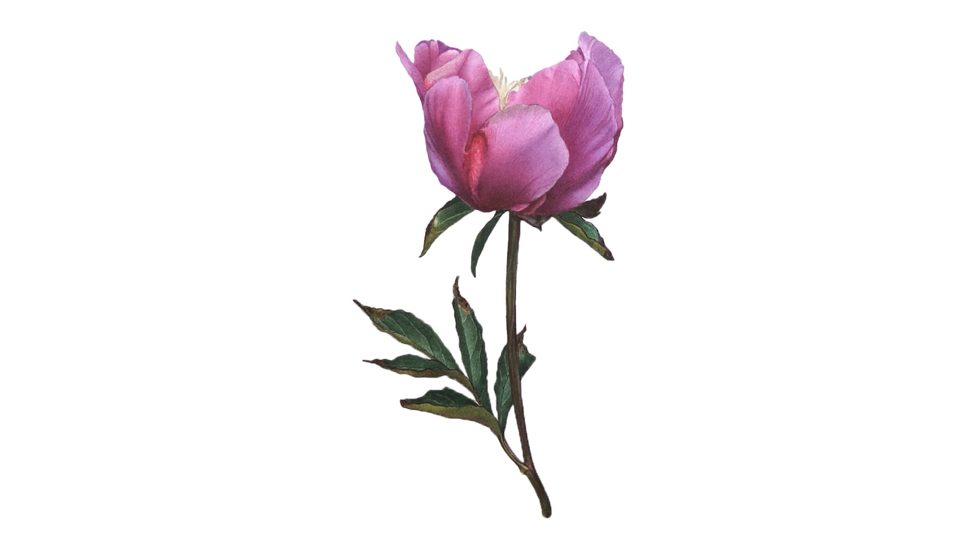
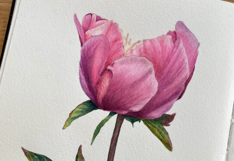
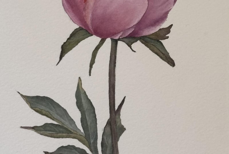
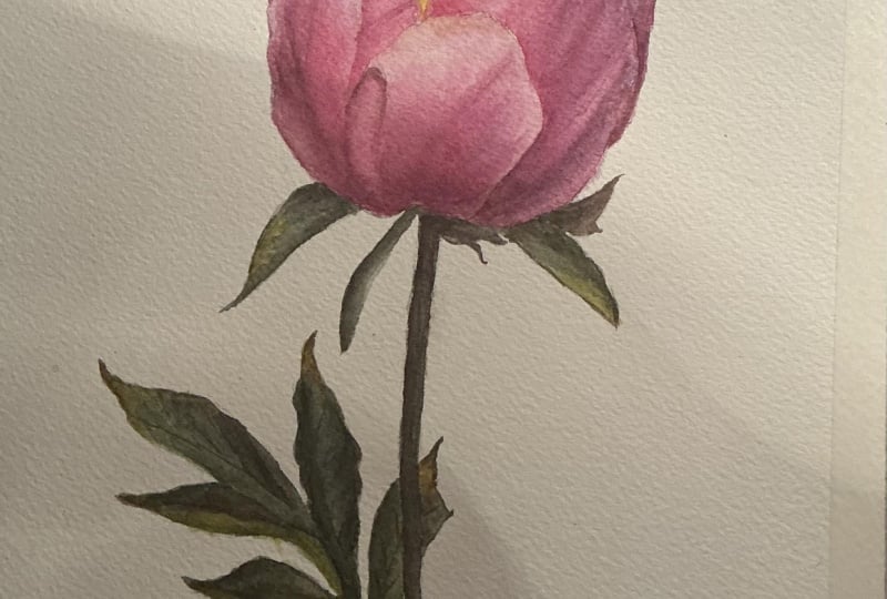
painting penny bud. Well, it's kind of
semi open penny bud. I took the photograph
of this peony myself, and I want to visit
my mum in Lithuania. So I really liked it because it just not really a tiny bud. You know, like, usually pennies, like have very round little bud, but it's not fully open
either just this sort of emerging flower and it
just looks really beautiful. A little bit hard to see the
leaves. It's quite dark. I try to brighten one on one picture just to
make them a bit more lighter, so it's easier to paint in some places it's just
completely black. So I'm not sure if we'll
see how we get on with it. Today we're going to be painting the flower itself, and
then the next part, we're going to paint
the leaves, the stem, and sepals because it's
quite a bit of work. Right, so let's see
what colors do we have? We have beautiful pink, magenta, some red, some purple,
all kinds of colors. So we don't want to
keep it limited. So I see a couple
of major colors. So we have this
beautiful magenta, and then it turns a bit
into more bluish magenta, so a bit more violety,
so it has blue in it. And in a few places,
it's a bit more red, so it's more like sanelia red. There are a few white petals that are a little bit peeking through yellowish neutral tones. So we're not going to talk
about greens just yet. We'll talk about them later. So now let's focus on a petal. So they have very
saturated nice color, and maybe the hardest part is those very subtly
interconnecting hues of color. So from pink to slightly
more bluish color, and they merge very seamlessly. So we're going to have
to have quite a few, maybe I don't know how many, but definitely at least one
or two wet-on-wet techniques to apply those colors,
to merge them, and then all those
lighter patches where the petal
curves has, you know, some little bumps that creates little shadows and
highlights in certain places. And the petals itself, they are a little bit textured. More specifically, you
can notice on that petal has this linear texture. So we might build color
in a little bit of a dry-brush manner to create
that textured feeling. We do see a little bit of
sort of neutral gray color. Usually we paint from
lighter to darker colors, but I'm thinking that if we
leave lighter area in here, we can apply that
gray at the end. It doesn't have to be
necessarily from the beginning. So yeah, I think we can
maybe try and establish those main colors first and then start applying our base
layers and go from there. So let's see. I'll pick up a piece of
paper for testing colors. Oh, and by the way, I've I
have received my brushes. I don't know if you
can see on the camera, but they are this, um, beautiful, dark brown, reddish brown, burgundy color. They're not black.
I don't know if the camera can pick this up
and has nice gold lettering, gold letters and numbers. So these are Kolinsky
sable brushes. It is what I prefer
painting with. So that's what I made. I just made the
brushes that I like to paint with that I myself
would be painting with. So. And so the thing is that
what's a bit different about this set that I'm going to have this smoother brush,
which is small brush. Which will be easier for dry-brush because if you compare to the smallest
brush on a set, so it's a little bit bigger
in size than this one. But look at how to show
the difference of the tip. One is very sharp and small
for the finest detail. And the other one is
a little bit dula. So the Dalla one is made to be easier to dry-brush and do the smoothing
technique and so on. So it has been made dula on purpose and intentionally to help with the dry-brush to
make the dry-brush easier. That's how I prefer
to do the technique, the dry-brush
technique that I do. Did a very decent job
at cleaning the power, but it will be okay. Right, so I'm just going
to use magentas town for the main color as I think
that's going to be better. And then to make it
a bit more bluish, we are going to add. So I'll mix a bit magenta
on the other side, and we're going to add a
little bit of perhaps blue. Let's see how it
would look if we add a little bit of palo blue. That was too much, but
I sprayed my pigments, so they're wet so easy to
pick it up. Right, let's see. That just looks a
bit more bluish. And in certain places, it's even more blue where
we can lift, perhaps, make it a bit lighter
because here you can see, it's almost like it
would want to be white, but then it has this blue hue, and then we can just glaze
with very light blue. Color. So but where
the side is bluish, we're going to use that
magenta with blue and we pink. You know, the fresher color, we just going to use
magenta on its own. And once we have a
couple of those layers, we can slightly adjust
when we build a color, glaze with a different
color to kind of intensify. If you want it a
bit more bluish, we can glaze with very
thin wash of blue, and we can make that
side a bit more blue. You don't have to premix
every little color, you know, for each little spot. So you have to kind
of think ahead, see what makes things
a bit less stressful. So we're going to paint those two colors and
then we're going to adjust little corners here
and there when we need to. So we do have this
very dark burg in the dark red
color as well here. We need to mix something up, so I'll start with
magenta as our base. Then I'm going to add
canalia red and palo blue. Can I get this maybe heavier on red than
magenta, perhaps. And we get this dark very
dark burgundy colour. Let's save that.
Something like this, even maybe a bit more
red just to make it less purple and
more very dark red. Et's see. Similar,
a bit more red. Okay, that would be fine. Now I'm going to pick up the tiniest amount
of Mayan yellow. I have a little bit
pigment left on my brush. So a a tiny bit of that color
here from that burgundy and mix it in and get a
slightly brownish creamy color, which should be fine right
here for these white petals. Here you go. It's perfect. Okay. Now, the most
important part is to start painting it.
5. First Layer Part I: So I think I'm going
to paint with. Small maybe my number two. Let's see. If you notice I already kind of like to paint with smaller brushes
rather than too big. Let's see. Either
number two or four. Well, I think I'm going
to take number two here. It's pretty it's pretty small. Okay, so we're going to be
painting white on wet all our main or we're going to lay our base layers
with white on wet. So usually when you
paint water on wet, if you already know if you
already painted before, you kind of jump
from petal to petal. So if you paint right here, you can't paint next to
it because you don't want to interfere with
the settling lay. So you're going to
paint with something that doesn't touch the one
that you just painted. So we're gonna jump
around like this. We might need to wait
a little bit because it doesn't dry as
quickly white on wet. But we can start with, let's say, let's start
with this bigger one. So this one is one petal, but because it's quite big, it might we might run
out of time to paint it because we want to do a little bit lifting
and so on, and so on. We can glaze it a bigger
area than we need to and paint only half
of it because there's a little bit of
texture over there that we're going to have to do. So if there's a little bit of watermark from applying
two different glazes, we can kind of cover
it up with a bunch of here textured little
things there. So we're gonna
apply water glaze, sort of even a whole
petal if you want to, but we're going to
paint this one. Pick up clean water
from my second ja. You don't use the
water that you clean your brushion. I always used to. So you don't want to go
over the pencil ine. Better not go far, but then then going over. So kind of drop my water
in the middle usually, and then I push around
that water up to the pencilin one thing you
hear me say all the time. What we want is an
evenly glistening glaze, so no drying patches
and no puddles. So the more even you can get it, the better the
glaze will settle. I'm painting on
Fabrinr tiestico, so the water somehow usually dries quite quick,
especially in summer. So you want to saturate
your paper a little bit, let it soak it in and then re glaze as it
starts to dry out. So you see I'm
applying water kind of about halfway
through the other part, other side of the patel, and I might leave. So now I'm dropping in some
water, which is too much, but I'm going to let it soak in just to hopefully
have more time. Right. Alright, so it's glistening quite easily. It's a little bit
too bad. So I want to let it soak in a little bit. While it's doing
that, we can discuss a little bit of our reference. So we have this magenta
here and on that side, we have more bluish
magenta, the violety color. And then we have some
dark red in that. So I'm not sure if you're going to be able to put that yet. Maybe we want a second
glaze, but right now, we're going to focus at least
on those two main colors. So it's a little bit
lighter around the edges, so we're going to have to
do a little bit of lifting. And there's a few sort
of lighter patches. Even here where it's
a violety colour, kind of in the middle with
a little bit of light. Right. Making sure
that no drank patches. Alright, I think we can start
dropping in some color. So I load my brush
with magenta first. Don't go with a thick colour. It needs to be
quite milky color. Okay. I'll drop it in sort
of where it's darker, so it's sort of in the
middle here and slowly move it up where gets lighter. Go up to the pencil
ine where I need to. I will go up to the center
path here and I will stop. That will be up to where
we're going to paint. Okay. Now we can move as I have
less pigment on my brush, I can move up a little bit gently up to the
penciline but not fully. That's take the water out. Okay, no, don't take water out. Add a bit more. I'm
picking up a little bit of that violet colour with a
little bit more dilution. I added a bit more water, just not have too
dark of a color. And with that violety colour, I go on the other
side of the petal. Painting with a very
tip of my brush. I don't apply any pressure. Just letting that color fall on. You can see it's quite
light. Maybe you can pick up a little bit darker. It's not looking like
it's dark enough. Okay, like so. Over these
lines that we drew in. I'll dilute a bit more, take the excess off, and with that bluish color, go around the edge
because the edge looks like it has this kind
of bluish color. Okay. Clean take the water out. I'll scoop it up
a bit here where it will be slightly
more pinky color. And pick up a little bit ma gun. I see that edge kind of can
go slightly higher, like so. And now we quickly need to lift where we need because
it's drying very quickly. I'll lift a little bit right here a little bit in between those kind of ridges
that left out. And a little bit right here. God so now I can pick up a little bit of that dark color on the
very tip of my brush. Carefully go a
little bit on that. Maybe it's too dark. I'm
going to have to add more red and magenta day just
looking a bit too brown. So with the very
tip of my brush, let me just quickly add more
red just looking very brown. Take the excess. Yeah, I'm going to have to add more magenta day just
not looking right. I'll do for now. Just adding a bit in
that shadowy part. Just to give us a good
start to the shadow. We'll hopefully lay a
little bit more magenta on it and it's going to
soften that brown color. We'll look more what we need to. English, take the water out, I pick up a bit magenta now. Just go over a bit. That shadowy color. Okay. As for the first layer, I think we're gonna be okay. Oh. It's actually dry
here, so I'll soften. The very tip, I'm
just adding a bit. Okay, no. At the top, I don't go 'cause
it's quite dry. Maybe we can add a
little bit of bluish. C and add a bit of a very
thin layer. Anyways. So I'll leave it as it is now because I can see I'm
messing it up already. So we need to leave it to dry, and then we can
paint this one next. So next we're going to
paint this bake one.
6. First Layer Part II: Right, let's paint that
one. Nice water glaze again. It's a bigger one. So while I'm applying
water glaze, that needs to be even
evenly glistening, no pedals and no drag patches. So again, I know I said
it quite a few times, but I just, again, noticed now and because
last few times, I painted on Moloduroy
last few tutorials. And well, maybe asparagus
wasn't on Molondoy, but generally, I started painting on Moon duro
and a bit morgan. And how different it is from Fabriano or from
Saunders Watford. So Molonduroy is much smoother and all the
white and wet layers, they appear much more
smooth and messy. They dry out somehow tidier, especially when
you start lifting. They live very nice layers and much more patchy
on this paper. But on Mlondero, you
need more layers to get a saturated vibrant colors, way more than, for
example, Fabri Artistico, the dark colosmo stays dark, quick requires less layers. So you need to know
all these pluses and minuses of each paper so that you can accommodate
particular projects. But what I wanted to say
is because for example, if I painted on Moon Doi, those were on what
layers would look way more smoother and the
edges would be nice, and it just looks more tidy and precise than when
I paint on this paper. So but then you need to
accommodate the techniques, the dry brush to kind of end up with pretty much the same
result at the end, right? But the process might vary. And so that's how important
it is to know your materials, know your papers, and know the characteristics,
basically. And so I choose now to paint on Fabriano artist to
co more darker objects. Because it requires less layers
to achieve the darkness. But if the smoothness and tightness is kind of very
important for the project, especially when you
paint, let's say, like single petals with
water drops and so on, I choose molnduroi or wider
projects like lighter, like white flowers, so so on. So don't get scared if it
looks a bit messy now, all these wet and wet layers, we'll try to fix
it up with drabsh. Alright, so my layer
looks pretty even. I can see the text of the
paper which you want to. And it's pretty damp, I think, and we can
start laying the colour. So we'll start with magenta. Again, it's pretty much the
whole petal is fully painted, but around the edges, it's a little bit lighter. So kind of starting from
mid section of the petal, where it's more saturated in color and leave the
edges just for now. I will bring that color later. So I'll go a little bit with magenta, sort of
a bit down there, and then we need to start
picking up the magenta color. Okay, clean my brush, and I load my brush with
magenta violet color. So this petal has lots of
sort of bumps and curves and curls of the petal.
And we can lift. And even if you
don't manage to kind of create them with
this no wet layer, we easily can do that after. So don't stress
about it too much. We will need quite a few layers to achieve the
saturation, the color. All those petals, we
will apply more layers. We're going to do glazing
little sections at a time, so we can focus on
creating the details. So if you won't be able to do it now,
that is absolutely fine. So it's quite dark in there, but it's a bit too wet, so I can't really
apply more color, so d more and leave it, and then before it dries out, I'll add some of that
dark burgundy color. So where we have the lines, I'll add a bit slightly dry a pigment and go
over those lines. Creating that shadowy
part of that, each sort of curl
curve of the petal. It's not going to be very
visible, but I can try. Okay. Cleaning bridge take the rot of my magenta and go sort of a bit in a heart
here in the center. I wanted those colors to
merge because I can see them both sort of in them. Pull my brush, take
the water out, pick up a little
bit of very light, watery violet magenta. Just very light so that I can go around the edges lighter, but also has a bit of color. Well, mix it with that magenta. Just basically a
very light color. Go around applying
a bit of color. If it's too dark, then we
can go and do some lifting. So with the very
tip of my brush, go and create nice edges. Okay, that's looking
pretty good. Pick up a bit more
color and bring it more up if the edge is
a bit too wide. Lighter, you can add some color. Okay, now, I'll clean my
brush, take the water out, and then we can go and lift a bit where we want
it to be lighter. After each sweep, you
want to clean your brush. Clean and take the water out. Do not bring water
into settling glaze. So I want to kind of wallet stamp remove from
all these areas that's supposed to
be a bit lighter. Now go around the edge
here a little bit. Take off a bit more
and now in those areas where those folds
fold, but what to say, little curves of the petal and
one very obvious one right here here and here
at the bottom. Okay. We can do a little flick
through for the texture sake. Not really happening
because the glass is a bit too wet,
but we can try. Alright, so now I'm picking up a little bit of that
dark burgundy colour, a little bit more
magenta in there. Okay. So adding in that corner. While it's damp, if it's dry, don't do anything anymore
and you can reglde. But it's still a bit
damp, so I'm adding. Still a bit too brown, I think, still need to add more
more gent and red. To create that shadow. The very tip of my brush. Okay, clean my brush, take the water out, and
picking up just the magenta. A slightly kind of dry pigment because it's
dried on my palate. I'm not adding too much water. And I want to add with the vertib my brush and those little strokes because
now the glaze is dryer. In the direction of
the petals form, you can see how the
lines are curving. I'm adding a bit more
magent the center part, a bit where those folds
are just to try to start creating a little bit of
that now tonal variation. And it's quite dark in here. So I want to intensify
now light and shadow. So going over that shadow, we part with magenta because
the color is just a bit off, so we're going to
try to adjust even more after we finish
with this patel. Just go over with magenta, so it's not looking too ground. And I'll soften a bit
here there just because it's dry with dam brush. If something uneven
with clean dam brush, you can run your
brush across just to Okay. Right, so it's
settling nicely. I don't want to do
anything too much. Maybe the edge kind
of could be lighter, but the glaze is already dry, so I'll leave it as is. And then we can move. This is already
dry, can move up. So it's smaller petals
that I might need to take slightly smaller brush. So I'll go to my number one. Again, it has a very nice Right. So I think we can
paint the one on top or those side ones. Let's see. Um, Okay, before we do, let's adjust our color that we keep meaning to adjust
to brown color. So I'll add quite
a bit more magenta in here and red, canalia red. Let's make it less
looking brown. Me magenta, 'cause it's a
bit too much blue there. Let's hope that's
gonna be better. Right. Let's paint
that big petal. I'm adding water
with my number one. It's a very nice tip so I can get into all these
little nooks and crannies. Even glaze, even glistening up
to the pencil lion, no drying patches, make sure you don't dip
your hand in here. Right. It's more it's
not much violet magenta, but mostly just magenta. So kind of go from the right hand side where
the color is more saturated. There's a little bit
light patch in there. Pretty much covering it all. And then we're just
going to lift and add more color to intensify and create the curve and
light and shadow areas. Again, keeping a little bit of the pencil mark of the edge. Nicely going into
that nook there. So that's the area where we're going to want to apply
a little bit of pink. It's quite reddish
pinkish color there. Okay, my brush,
take the water out. I want to lift from that edge because there's no color there. Pick up a little
bit violet colour. Kind of add but here, the top. There's not much difference, and around the
edge. There you go. Pick up a little bit of I think I'm going to pick up a little
bit of rose made lake. Just right here in that corner. I know it's drying, so I'm just gonna try to be quick and soften a little bit. So now I can pick up this
white actually color. Mix a tiny midgon of
magenta and go over. Busting the water lift
from the bottom miter. Now let's see where
we want to lift. We lift a little bit
here, a little bit here. A little bit in
the middle and now pick up a bit more
color and add in between where we
want it to lift to create now the tonal variation. To intensify intensify
the shadowy parts of the highlights
intensified too. Here you go. So take the water. I'll pick up a little bit
of that Rose Maddo lake. Rose madder lake and
go here and cocre that slightly rather Here it
there. There you go. Okay. Now clean my brush, take the wall out
and see if the edges of the extra color
that we applied. If they're a bit too fuzzy, you can go with down brush, smooth them and feather
them into the petal. They kind of separate
it a bit too much. Can add a bit more strying the very tip of your brush only. Actually can pick
up a little bit of violet imagent here it's
almost in that shabby part. It's almost with a blue hue. Anyway, we can add later. But that's the basis basically. It's just a basic layer, so that's going to do. Right, so now we need to let the area dry. We
can go in there. We can paint, for example, that little look there with some dark violet colour on dry paper because it's
just a tiny little corner. Go. Right. Almost dry.
It's dry at the top, so we can paint that edge.
7. First Layer Part III: Color. So again, we're
going apply some water. Clean water. A little bit. Use the
brush up accordingly because it's small
petals behind. Because if the brush is too big, then you won't be able to go
into those little corners. Again, let's try to have as
even of a glaze as we can. Now, I'm collecting the
excess because it's too damp. Okay, I'll start with
violet color this time because it's the colour
that dominates that petal. And the edges aren't
really lighter, so I can just kind of drop it in and go all the way
to the pencil line. Not worry at the very beginning
of any light and shadows, we can lift off and add more colour to
greatnal variations. So now I just want to drop that in because
it's a small petal, not too much going on. Go all the way down, a bit more magenta now in there without even cleaning
my brush just so that it can mix on a paper and in a brush and have a bit
more magenta color. And as we go down, we
can pick up a bit of that really, really dark color. Let it mix in with
the rest we finish. We're off. You go Okay. Clear my brush, can add more magenta here just to
have a better transition. Okay, a bit more magenta as
well, maybe on that side. There's a little
line of dark color. It's like almost two petals. Okay. Clean my brush,
take the water out, and now we want to lift
here where it's ldn. We can apply this dark color right next to it when the lays dry to have this very
sharp, nice line there. So I want to lift a
bit here as well. Holding my brush a
bit more horizontally because I don't like a
sharp line or anything, just a little patch of light. I'll pick up a bit
more color and intensify the contrast
by adding where we need. So we need darker right here. Create that line there. I bring the color down just
to not leave any hard edges. Okay. With a little
bit of color, take the excess word out. And I want to add direction of a form a little
bit darker here. Tiny bit. Okay, so now we have a little
bit of that variation. So we will need more
bluish color here, even you can see. We
can do that later. Adding a bit more
on the left side. And I will leave it to try. Not to mess with it too much. Yeah, this kind of
requires more blue, I think. Here you go. Okay. I'll leave it. Right. So what's left now is this big one here and those
few and the white ones, and then we can start
building with, I don't know, I think might be
glazing dry-brush. We will see how we go. So I want to I don't think I
have to, actually. Pretty it's pretty dry. So we can go and paint that in. I'll go back to my number two. Picking up clean water. Okay. Dropping it in the middle first and then
moving it up to the pansy line. Go over the line. Now here, you again
want to apply water kind of into
the petal further, but no scrubbing because you will start
lifting the color. It's just so we don't
end up with a hardag. Okay. Okay. So we have a lighter
edge now way more. So I load my brush with
my gentinel and go a bit lower like where we see the colour sort of down here and the edges
are quite light. So I'll start with that
main colour right there. Okay. It's going to be some
dark in there as well. Okay It's a bit too wet, so I want to let it kind
of dry apply dark color. So what we're going
to do is clean the brush, take the water out, and we're going to push
that color that we applied from the edge of it, pushing it up a little so
that it becomes lighter. So clean my brush again and continue pushing
from that edge up. Just drag some pick up
from that puddle and drag a bit up, controlling it. If it's too much, you
clean your brush. So that way, we created
that nice transition. And if I want to
push a bit more, I'll pick up from the edge of that color and kind of smudge that in between dark and light to push a
bit more color up. And if you need
it to be lighter, like more bluer, we can glaze the whole
thing with a nice clay. So I'm picking up a little
bit of the violetic colour to create that here, little fold. A bit of color we can
on the right hand side with some violet color. I see amgon of
violet color there. Okay. Can apply that gray
layer doesn't have to be now. So now I'm going to pick up
that dark burgundy color and go into that bottom. Shadowy color now. Shadowy part, right under the patel. Oh, that's too much. Take the excess. Now, I have
a bit of a tubico a bub. Now I'll clean my brush,
take the water out, pick up magenta, so that I can
create a nicer transition. So it's quite like not sticky, but it's not very watery,
very, very buttery. And I'll go next to
it so I can create nicer transition with
the very top of my brush just kind of brushing like
this little brush strokes. Trying to merge those colors, so it has my transition in
just a blab of dark color. Moving the brush
according to the petals. Texture. Go. All right. Okay. I'll go actually all
the way to the bottom. It's a different petal, but they merge nicely. I want to add a bit more dark. Okay. Can my garage,
take the water out. Left from here a little. Just kind of weird area
that has different color. We're going apply some nunel. Maybe we can do it later. So otherwise it's
going to merge. We're going apply some
rose materk in there. Okay Okay. Right, so I think we can leave it to dry because this edge
needs a bit more colour, but it's dry already, so I don't want to mess with it, so I'm going to leave it. And yeah, so that's
what's going to be left. So I don't want to
put my hand in here, so I'll leave it a
minute to dry and then I'll go and paint in the
remaining right here. And we will get closer to finishing with
our first layers. I'll probably paint
with number one. You know what? I think, I will apply a little bit more,
but we don't need much. In here, there are
small sections. On these maybe I want
to apply water first. They're very small, they're
pretty plain and don't have much going on. I apply a bit, clean my brush, take the water out,
and soften at the top, so it helps softer tipta and
continue adding the rest. Okay, so we have all the layers, base layers painted in. I'm going to leave the light
bits for later, actually. Gonna focus on magenta pretzels, and we're going
to do that later. So let's just go in and quickly paint in those two
remaining parts, and then we can start glazing. So I'll just pick up small brush and go straight on the paper without wetting it first and
just go and paint therein. Start here with a bit of a
magenta and then can add a bit dark as well. Right. I'll just leave there and we'll fix it
up with the driver.
8. Explaining Layering : A, I'll just leave there, and we'll fix it up
with a dry So how do we go about now building
the tonal values? So after this initial layer, it looks pretty okay. We have tonal values. We have some lights, some darks. But what do we need to do
now is to build the color, the saturation, the vibrancy, and at the same time now
intensify the balance between, like highlights and
shadow so that we have this three
dimensional object. So there might be a
few ways of doing it. You can you know, every artist has their own
preferred techniques. So can dry brush all the way, and little by little
takes many hours. So prefer lots of wet
on wet techniques. So I kind of I like to do my base foundation layers
with where on wet and then start building in
slightly dryer way. So start with glazing
and finish off with dry brushing because then you can be a little
bit more accurate, you know, and we on what
is great technique. But for me, it
serves best when I do the basic layers,
the foundational ones. So I think what we need to
do is now have two brushes. One you paint with and one
you keep softening the edges. So it's quicker that way when
you work with two brushes, when you build your layer. So when you paint
with watercolors, you do want to always keep
your colors transparent. So to avoid them
getting muddy and in order to get the color
luminous and vibrant, you need lots of
layers stacked on top of each other with very
transparent colors. That's the beauty
of watercolors. So lots of lots of layers. So how do you do that? Now,
so I have two brushes. One, I'll paint with
and slightly bigger to soften with. Both wet. Right, so I'll paint
with number two, soften with number four. I think that should be.
If it seems too small, I might swap paint with number four and soften,
maybe with number six. We'll see how we get on. So now we're going to paint
with transparent colors with dilute them, have them quite watery, and we'll be glazing
little sections at a time. So when you glaze one area, you can't paint right
next to it right away. You need to kind of give it
at least a few seconds for the area to dry so you
work on the other area. So that's how we're going
to be jumping from area to area, building up the color. So you constantly refer to your reference and just say, Oh, this little area
needs a bit dark, you paint there and
then you look around, Oh, this needs to
be here, darker. You build with the color that you think it's
appropriate for the area. And that's how you
like jump like a puzzle from area to
area, building up, building up to about 80 or 90%, and then remaining ten, 20%, you finish off with the drivers where you smooth it all out, you add the extra
remaining saturation of color and then
tidy up the edges, put in a little bit of
detail detection, so on. So now we're going to do
that tonal valley buildup with nice glazes. So just to start with. So for example, you don't now focus on a petal as a whole. When you paint with
no matter what, you focus on the whole thing and you try to kind of apply this
base layer on a whole petal, keeping all the
corners all at once, and you focus on a
petal as a whole. Now I'm going to focus
on a smaller area at a time, not the whole petal. So, for example, I start
from this petal, let's say, and I immediately see that everything needs to be darkened. So start from one area. So I'll pick up some color. Diluted. I have very
transparent, watery color, nothing thick, nothing
yeah, just like that. We want to build it gradually. Unfortunately, watercolors
is in the fastest medium, but that's the
right way to do it. You don't ever want to
use very thick pigment. And I just go and
start building. So I can see there's
a bit blue colour there and magenta here. So I glaze like so, right to start with, soften the edges with my
second brush quickly, and leave it and move
on to the next, right? And when it's somewhere
a little bit dryer, we can come back, apply
more, and how you do it, you constantly after
layer or two or three, you refer to the
reference and you see, Okay, so now it's
enough saturation. Now I need to make
sure that the scent is a bit lighter and it's
a bit darker on the side. So then I start applying coladen just on a side like
this right and soften. You start shifting. After a few layers, you
see that now you need to darken the darkest parts in
slightly different areas. So you constantly,
constantly refer ds like a one rule that I can say, Oh, you do this, and next
step is this, and we're done. No, you kind of have
to constantly refer, and you apply many layers. So it's important to understand the process
and the technique to use rather than following every step blindsst thinking
why and how you're doing it. So that's the most
important thing is to just kind of know the approach, but you still have to make your judgment where
to apply that color. I can't tell you because everybody's first
foundation layer will look slightly
different, right? So I applied more color,
some applied less. So therefore, you will need
more or less layers, right? So depending on what you
have achieved so far. So but that's what
we're going to do. So we're going to
jump from area to area, start building color. So now we see we
left out this area. We can apply some pink ta. And so it's not going
to be the tidiest. You want to always paint
as tidy as you can. But, you know, all the little lines and
edges, everything, we're going to be doing
and tidying up to this tiny level is when we
dry brush or at the end. So now we want to
build a tonal values to somewhat like 80% or
90% saturation, like, to get it as dark as
we almost want to, but that tedious little detail will kind of go at the end
where we dry brush and really, like, go into everything. So right, I think some of the pencil is a little
bit maybe too dark for me. I want to see if I want to remove a little bit
of pencil line somewhere. Careful don't remove
the because it's where you're still gonna paint, but somewhere some lines can
be removed a little bit. Make sure that's right.
Yeah, that's right. Some pencil mark can be removed. Okay. Right, so keep your second brush kind of
clean, constantly cleaning. Right, so we just want to assess and see what we need to do so pick
up a little bit of rosemdak we can immediately
go first place right here. And see that detail, that
little kind of texture, we can do it when we dry brush. Now we want to build the colors. I clean my brush,
take the water out, and I pick up magenta,
and water it down. We have to have
transparent colors. And I'll start building. You apply a bit of color if you think it's a bit too big of area and might dry out
because you want to soften right away to not
leave any hard edges. So you paint just a
tiny area at the time, soften and continue
covering if it's like a large area that you
need to apply color too. Soften here. You go. So now we leave it. Next time we can go
up and paint here. Now, I'll just focus on
slightly darker areas. And every time now we paint, we kind of want to pay a
little bit of attention. What the shadows, we can start
introducing those folds. And even though it
doesn't look tidy now, but when you apply
multiple layers, they're gonna look
tidy and nicer. So here you go, kind of, now shaping this in a way that leaves the scena
here slightly lighter. And never in perfections, I think I would tidy
up with a dry brush. So now I'll pick up some violety and here it's even more
violet than I have. So I'll pick up a bit
more blue and add more blue here in a corner to have
this very violety color. Dilute it and go
over with a small. It's even like there's, like, gray in it, even, to be honest. We might need to give a single glaze at some point
if we feel like we need to. And so this, for example, area is quite imperfect. But for me, to best build up the darkest
darks and to have this nice shape as it's
supposed to be with the fading edges is
when I dry brush. So I don't get too hung up
on neatness at this point. I get that with a dry brush. I fix it up with a dry brush. So now we focus on building the tonal values and saturation.
9. Building Tonal Values : See, so this is a
bit too violety. It looks a bit more gray. I might need to pick up a little bit of neutral
stinta and give it a glaze to kind of gray
it out a little bit. So now I'm picking up more violety with
slightly less blue, and I'll go a bit
at the top there. And soften. This is already dry. So if I want to, I want to dilute quite
a bit my violet color. Oh, that's a bit
too dark, actually. And I quickly want to
soften very quickly because it dries when you
paint with dry pigment, it dries very quickly. But if you don't get
it neat, don't worry, we can kind of fix it all
up with the dry-brush. But you do want to
soften quite quickly. There's a shadow there. I'll play a bit more
while it's damp. And I'll soften. Here we go. Now I need to leave it to dry. So this whole petal
is a bit too wet, so I can go work on
some other areas. For example, let's go. What do I like so. I kind of focus first on the darker areas. And then after a couple of glazes of building that shadow, I then see that I need to
glaze over the light apart. For example, I apply a bit here, and then I see
that, this area is definitely not too
light, so I glaze over. Then again, I work
a couple layers on dark, and then again, I assess whether I need the
lighter area to be darkened. I still a bit damp. I soften. And then I clean. That softening brush as well. And I go focus now
on the other petals. So a little bit of
little area here. Soften. Move on to the next. Soften. I continue
glazing and building. Now, in this area here, it starts turning movilety, so now I'll go and
pick up some of my mobility color and use my brush strokes in
the direction of a form. At some point, we might
want to use a little bit, maybe dry pigment where there's those lots of folds to
try and get the shape. Like at the very tip of
my brush here try to create I continue covering. Yeah, but I noticed that I
dose folds and I did can I get better with that
dry-brush. Soften. Lift, if you think you got too much colostomer we still
want to keep our highlights. So you need to get this at the bottom
here quite dark. Again, I find it better
to do it with dry-brush. Go. Okay. And we're going to have to come back and
add more color there. So I'll go now, pick up this
yellow color and go here. So you kind of jump
around and assess whether that particular area
needs to be darkened or not and do it if you do. Here you can see it
needs more magenta. And so you focus on one
particular area of the petal and you decide whether it needs to be
darkened or it's not. And after initial layer, usually everything
needs to be darkened. So you kind of mostly focus
first on the darker parts, on the darker areas, build the shape of the shadow, and then you later go and glaze over the highlight around it. So kind of you see now shaping a bit those little darker folds. And then after a
couple layers of that, I'll come back and glaze over the the highlights if I need
in between those folds. And you will get a bit
more patchy that way, but you remove those patches
with that dry-brush. Now go to my violet color and go work with a violet in
the areas that I see. And the magic happens when you
start dry-brushing and you make all those layers of tied together and
everything neat and nice. And dry-brushing is
my favorite part. Oh, yeah, I got over. Alright, so that process, it might take a while,
but it's how we do it. So let's before you kind of put it to music and start
building more colour. Let's apply this Let's make
that shadow the salt pickup, a little bit of neutral tint. Mix it here a little bit
with this yellowy color. Do we have and I'll go apply around this edge where it seems
to be that shadow, and I'll quickly soften. And we'll let it dry.
I'll see how it looks. And if it looks like
it's a bit too gray, we can give a nice
very thin layer of magenta to kind of
make it less look gray. But I can see gray a
little bit of everywhere. So I'll pick up a
bit more water, dilute it a bit more and
see if I want to glaze anything to gray it
out with that gray. Even kind of around
here, I see some gray. I'll go and give
that very subtle, very thin layer that
doesn't do much difference, but maybe it gives
that grayness. And then I'll go over with some more bluish magenta and
hopefully get the right Hue. Add a bit gray as well, but very, very thin, like, very I can even think I can add a tiny bit of
blue that gray. Ooh, Oh, that was too much. Mix up slightly
more bluish gray. Mix it with some purple even and see if that's the color
that I need in some areas. Like a bit here, which looks quite gray purple. And then I'll go and soften
away that etch. There you go. It's like violet, but
still a bit gray. There you go. I'll add that
go a bit more in here. There you go. Maybe
a bit too dark. Right. Let's, right. So let's go around building,
building, building. And when I think
it looks sort of in saturation way similar, then we'll go and smoothly
roll out with a try press. So let's apply a bit more
just before we do it. In those very, very dark areas. After you applied maybe a few layers and it
looks sort of dark, but you want to
kind of intensify, we can pick up a little
bit less watery. Still not thick,
still very thin. You can see it's like
thin pigment here, but slightly drier, so it's going to appear a little darker. And we can go and, um sort of painted a little bit like this sort
of semi dry-brush glaze, but you can see it's less wet. And when you do it
with the very tip of your brush, kind
of leaves darker, but it gives a bit of texture, and not often you might not even need to soften because
it's leaving quite nice. But usually sort of when you go towards a little bit the
end of your glazing, when you already have
a certain amount of darkness in that
color, for example, it's quite dark in here, and I can try to
build a bit that way. And soften if needed to be. Oh, here maybe it's a bit too
light, actually, but here, it's better because it's
quite dark already there, and we just need just a
tiny bit of that darkness. Like, for example, especially when you kind of want
that texture there. So you need to kind
of be the judge of where you are in saturation
wise with your colors. But you don't have
to do it, because we can create a little bit
of that texture when we dry-brush and smooth it out
and tie the layers together. Okay, let's go on. So now that we kind of saturation wise,
it's getting there. I want to still not yet a
dry-brush technique smoothing, but now I want to kind of paint in a little
bit dryer way where I when I was telling you earlier to kind of now introduce a little
bit more texture. So I want to continue building now because we already made it quite dark and this a
little bit, like a dryer, so I pick up this
thin, transparent, milky consistency, don't
have too much water and go like this building. Now, you see, I don't leave
like a very wet glaze, but rather pick up on
the tip of my brush, dry and I go build like this
because then now you can be a little bit more detail
and you might leave a little bit of that linear
texture because specifically, especially on this petal,
it's quite obvious. So I want to now continue building so that I can
create some of those. Now you see lines a little bit and continue
building that way. Where it's appropriate.
Maybe it's everywhere. So petals are quite smooth. For example, this one, right? But where it feels right, I want to go like this
build a bit more color, but with a bit more, for
example, here as well, you can see quite
linear here as well. And I want to build
with this a bit more textured way a bit dryer way to start
now introducing that shape and where the
curves are a bit more detail. When you have dry pigment, you can be a bit more precise and continue
building a bit more, and then we'll go on dry-brush to kind of
smooth it all out. Also, you might try with pinks. It's quite hot,
but you might want to see if you made
it a bit too dark, see if you can lift a
little bit of color. It might not work, but
let's say here maybe, well, it's quite light,
but if you want, you can damp brush, wiggle your brush like
this a bit with water and damp it and see if you can retrieve some of the light
if you lost it somewhere. But it's best if you don't
need to do that because pinks, they don't really lift well. Here, for example
is quite uneven, so I'll try and see if I can
scrub it out a little bit of that uneven edge and then
fix it with that dry-brush. Okay. Okay, so let's continue
building a little bit more, and then we'll grab our smallest brush and
start dry-brushing, Frank to finish it off by tying it all together and smoothing
out the layers. Okay, so I think I am done
now with tunnel values. It's gonna be easier for us to build the remaining
color with a dry-brush, but now we want to make sure everything kind
of ties together.
10. SMOOTHER Brush vs Regular Brush: Okay, so I think I am done
now with tunnel values. It's going to be
easier for us to build the remaining
color with a dry brush, but now we want to make sure and Everything kind
of ties together. After I've done
with a dry brush, then I'll go and painting
this lighter part. So now I'm taking
my smoother brush. So the brush with slightly
slightly dell point, so that it's easier
to dry brush. Why do I need to delve on? For example, I was just
testing it out a bit. For example, the new
dry brush, right? So I saturate the bristles
first of all with water. Pick up some color. Don't have much water in
there. So when you dry brush, you want to dry brush
in various ways. Sometimes you want to do
little glazes like this, right, little brush strokes. So you create this very
nice, even little glazes. And when you do it over the
already existing layers, creates a very nice thin layer. Atis you want to dry brush
in the direction of a form, but there's like little tiny ra gaps that you want to fill
in and you go like this. But you want to have the
slightly thicker stroke so you can actually
fill it in, right? Sometimes you want to
go do big like this. And you want it to
be sort of even because you want to even
and smooth things out. If you have a brush, so this is even bigger brush slightly, but it has a very sharp point. So this is for all
the smallest detail. But it has very sharp points. So when you have
something like this, you can't really
create this very nice because it's just too
thin and it creates those. Let's pick up some
more colour even. It just it's too thin, right? So it creates lines. You try to get them as close as possible
to get this nice, but it's still kind
of it's too sharp. This is for all the smallest of the detail and all the
hairs and veins, right? But you can't create this very
nice little glaze, right? And it's more for detail. And when you want to fill
in those little gaps, it's harder when you make such
a small little thin lines. You want it to be
still very small, but to have this
slightly thicker line but a small brush so they have all the
control and no water. And that's where you
have this slightly, slightly dull point so
that you can go small like this and still create
very nice even glaze. Alright, so that's
why for dry brush, it's much easier when the
point is slightly dull, so you can actually fill in the gaps and dry brush over creating this very nice
layer that's even. So now I'm having that brush, that's going to be
part of the set. This is the whole
set that's going to be in my set, six brushes. So now I'm grabbing
that smoother brush, and we'll start dry brushing. So I'm going to and if
you don't have that, you just grab one of the
smallest brushes you have. And was that dry brushing?
11. Explaining Dry-Brushing Technique: So going to go from
top to bottom. And I dry-brush everything,
the whole petals. And then, so now,
as I said before, when we painted white on wet, you focus on a petal as a whole. When you glaze, you focus
certain areas at a time. And when you dry-brush,
you focus on the tiniest little
area at a time and try to match the
smoothness of the area, the darkness of the color. And so you build up the colour remaining color
that's still missing. That's why I said you kind
of glaze up to like 90%. But the point is more here to put almost like a filter
over to smooth it out. You fill in the little gaps. If you look very, very closely, you can see little lighter gaps. So those you want
to fill in so that the whole layer becomes
sort of smooth. You tidy up the example
those nice lines, right? So you create nice transitions between the dark lighter color. So for example, you pick up some color that you think is
appropriate for that area. You can mix in
between each other all these colors just to
get the right tone, shade. I will go from top
to bottom or from the darkest area and
you try for this, you might need going
into the dark color. And you fill in
the little gaps in the dark area and start dry-brushing around
where the dark color meets nice magenta color, and you dry-brush in between to create a
smooth transition. So you dry-brush with
quite light colors. And we start putting the
detail like the nice lines. Then you dry-brush
that dark area so that it is sort of not just
looking like a dark line, but rather than a shadow
that's not sticking out, but belongs to it
and it smoothly transitions as the petals
curve in various shades. I'm now filling in
the little gaps in the dark glaze first. And then start dry-brushing
right next to it as it's getting lighter so that
I can create a transition. So now we want to lose
that sharp line and we want it to transition
from dark to ra, like smoothly sit nice
graduation of the color. So we start with the dark. And when you start losing
the pigment in your brush, you go into ira
area and dry-brush. And then as you go here, you start picking
up magenta color and you continue and you create that nice transition between
two different colors. And dry-brush is quite
intuitive thing. I can explain as best as I can, but you still need to sort of feel how much water you have. So generally, I leave the
pigments dry on my palate. I pick up water on my brush, and that's how I
loosen up the pigment. I don't add more water
in all of my mixes. I just loosen it
up by picking up a little bit of water
on my small brush, making this very
silky little like, glaze color. It's not thick. It's translucent, transparent. And I pick up a bit
and I take the excess, especially from that part
where the drops are. It's always useful to have little paper where you test to see if you don't
have too much water, and I go and dry-brush. Ally from top to bottom, and as I go down, constantly
referring to the reference. You see now where it
needs to be dark, where lines start appearing. Start filling in a
lira area those gaps. So you see those little
just water marks and gaps. So I'm filling them in by dry-brushing in
them around them. And just when you dry-brush, the whole glaze starts
looking better and smoother. You want to have that texture, you can emphasize those lines, spread them out a bit, dry-brush lines to make them
a bit more visible. But if you make them smaller and filling
in just the gaps, then the glaze will
be a bit smoother. So now I like smooth effect. I don't like too much texture, so kind of prefer it to
be smooth over anything. But sometimes, here,
you want to emphasize some of that texture. And you maybe want to leave some of those
lines quite visible. So that's why you
move your brush in the direction of a form. If it's curve that way, you dry-brush that way, right? So now with a
dry-brush, I notice, it's missing sort
of this gray edge. So I can still pick up
with my small brush, same one and do a
little glaze instead of dry-brush because I just realized that I missed it
and I can just go like this. Quickly clean my brush,
take the water out, and soften, and
then when it dries, I'll go back dry-brush
a little around, and then it's to create again, smooth the transition
from that gray into the magenta color. Right to be honest,
that's all that it is. So depending on which
area I'm dry-brushing, I pick up the
colour accordingly. If I need purple or magenta. And I dry-brush
and emphasize now all these folds of each petal. But generally, I kind of
dry-brush everything of entire petal and just a little bit more in certain
areas if I want. Like, for example, this
kind of fold got lost, so I can emphasize it. And then continue again filling in little dots in a glaze. So it's more about smoothing the transition between
shadows and light, filling gaps, and adding sort of the remain
of the saturation, and pretty much
that's all there is. With a dry-brush. So for me, it's like a dry-brush is like you would put a
filter on the skin, you know, with a phone,
you smooth it all out. So that's what it is. It's just the last
bit of the detail. You go over everything, small brush strokes,
filling in all the gaps. So this transition between that shadow of that curve is getting smoother
and smoother. You can go get some darker
color perhaps and go really even apply little dots just
to make it even smaller. It's really getting in there. And so trirush is kind
of a very tedious job. And I don't know, maybe not everybody prefers. And you don't have to, you
know, I often say when I kind of get to the drivers point, you
don't have to do it. If you feel like this now is good enough for you,
you can just do that. But for me, it's not enough. For me, dry-brush is essential. And even if I dry-brush
here very literally, not long at all, for me,
it already looks better. I'm not even finished
with that petal, and it already feels
like now inx level. Completely different.
So it just from average painting turns into this where people wonder, like, how did you get it
so vibrant and so smooth layers, you know, and sometimes even
questioning if it's with watercolors
painted because it looks sometimes like with
pencils with pencils can get hyper detailed
and realistic. So dry-brush the
technique for me. I think it gets my
paintings to that point. So I think it's important. And I urge everyone to try. So now I'm kind of working
with some of those on some of those lines,
emphasizing those lines. And just draper so that glaze looks a bit more
yummy and a bit more smooth. I just like how it looks more
satin and velvety already. It's not identical. I struggle. I can get quite realistic, but still it's not with pens. Like with pencils, you can get where you can't tell
the difference, right? With watercolors,
you sort of can. I'm okay with that, but
I can get pretty close. And so now that area, for me, looks already better. It's missing more magenta color, more saturation
with magenta folk, especially here in the shadow. So now I want to work with a little bit more
dry-brush working on that, building that
magenta right here. Especially that little fold when the petal folds
back a little bit. So I want to dry-brush
a little bit here, build up that color in that area specifically until I feel
that's where I needed to be. And when you dry-brush,
it dries pretty quickly. So I can keep on working in the same
petal, the same area, don't really need to
jump much from side to side because you
don't really need to wait to dry because it
dries instantly almost. And so I'm building
now that shadow here. And when you start
dry-brushing and focusing on smaller details and on
smaller area than before, you kind of start noticing more where you perhaps missed
it when you were glazing, you weren't focusing on that
small of a detail, right? So for example, right
here is the shadow. I didn't notice before. And I noticed now when I started dry-brushing
because now I focus on smaller areas and the snow is more
than you did before. And so I can work on
that with a dry-brush, build that shadow
with a dry-brush. And when you want
to build a color, on certain, you can
use a little bit of crosshatch technique as well. It works well when you want
to build up some color. When you smooth it out and
you want to fill in the gaps, make the glass look
a bit more smooth, you kind of go within
direction of the form. Natural form. Okay, so he kind of created a little bit
more shadow in there. And that petal already
looks better for me. Still, a little bit more
dry-brush in the area, and I think we can now will be able to move soon
into the other side.
12. Dry- Brush Layer: Sometimes when you have
that brush, you know, if you want a slightly
thicker brush stroke, kind of let it spread a little. It's going to be a
bit thicker line. But if you want it
slightly thinner, I then roll my brush as
I took up the color. It's going to be
slightly smaller. Just adjusting it
the way I need it. Cool. Sometimes you end up needing a very sharp
point when you make detail, but generally when I dry-brush, the low point for me is better. There you go. Here. And
that's the process. Here, now we want to
perhaps apply some kind of a messy texture. You just want to almost with rosemary like kind
of wiggle your brush, whatever, just to
create that kind of messy veiny looking texture. Just wiggling my brush various directions
to create that look. Sort of and move on to D side. So for me, that looks
already better. Still kind of not happy
with this area, though. So picking up a little bit of
mobility color and see if I can emphasize some of
that linear texture. So that side, that
petal is sort of done. And now I would move on and
do the same on the rest. So it might take a little bit. It might take longer than
what you've done so far. Up to you if you want to do it. But if you will go
compare the results at the very end and this
stage before dry-brush, I think you would
see the difference. Okay? So that's the technique, and that's the process
we're going to take to cover all the petals, create a little texture, smooth transitions,
fill in the gaps, and the final detail. So best of luck, and
let's get to work. Okay, so now I think I'm
finished with dry-brushing. What we need to
do is paint in ta
13. Last Detail For The Bud: Let's water down that little yellowy
brown color that we have. I'll add a little
bit more yellow. I just got a bit too brown. Water down, have it very light, and just color that in. There's not much of
variation going on, but we can create it on a
second layer a little bit. Now I'll just go in
block in that color. And then when it dries, we're going to go back and just add a little bit darker spots here and there just to give
a little bit of difference. In tone. So it's not
looking that flat. Also, can pick up
a little bit of that dark gray and paint
what you see there kind of behind a few petals. Maybe it's too dark, so pick up a bit more
slightly darker, mix in here with a brown
with a darker gray. And separate some of the petals. Okay, go back with some brown and add a bit more
where I think it should. It's really simple there, so we don't stress
ourselves about too much. I think that's it. There's
not much to advise up. I can even make up some detail just to not make it this flat. Looking. What do you go? That will do. Alright. So I think that's kind of it. So I don't know, you can
beat the judge of it and see whether dry-brush
changes anything for you. I think it definitely
changes for me. And when I look before
the dry-brush and after this is when
you dry-brush, you do darken your painting
quite a bit because you keep adding more color and in order to smooth
out, you have to add more. And it becomes slightly
darker than the reference. But if that's the expense
of it having this kind of more smooth and
slightly well, even textured where
it needs to be and smooth in other areas,
then I'm fine with it. So I would take
that over anything.
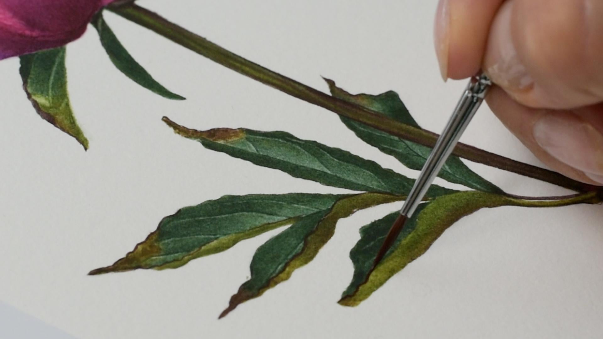
14. Mixing Colours For The Leaves: Paint the leaves and the stem. So without food, I'll
start mixing the colors. So if you look, I mentioned
the previous video for that. It's a little bit hard
to see the detail. It's quite dark and
I have an image that I just a bit to try and see
the detail in the stem. So there's, like, a stem that has some green and
this burgundy brown, reddish color mixed together. And this one it just looks
like it's a plain black. So we don't want to paint
it like that because it's just going to
look quite flat, so we need to try incorporate some green and some
burgundy and try to get some sort of
a detail in there. Right, so let's just mix up now this main basic
dark green color. And then we can adjust
that mix on one side, adding a bit more yellow
to make it lighter and on one side a bit more blue to
make it slightly bluish, because if you look
right here closer, it has this even on
the lighter image, it has some more bluer tone where the light
hits on this dark. Um dark color. When you're going to
look at the reference on your phone or
tablet or computer, those colors will
be more apparent. So when you print it
out, the colors a bit, at least for me, gets stuck and loses a little bit of detail
when something is dark. So I do have an image
on my computer as well to try and see a
little bit more detail. Right, so let's start
mixing the colors. I'll bring in a
little bit of water. Oh, My brush is dirt apparently. With a bit of water. And so I'll start
with Mam yellow. Usually, when you mix
your green colors, you want to start
with your yellows and then start
adding your reds and blues because you don't want to kind of mess
up that yellow color, but you might end
up anyway doing it because you're
going to have to go back and add more probably. So just to make it
a bit more fresher, I'll add some lemon yellow as well just to
brighten it up tiny bit. And now I'm starting to add
palo blue little by little. Okay, we can add more. So we do want to add more because we do want to
get quite a dark color. Those pony leaves, they
they're quite dark. So now into that green, I'm adding sanelia red. So to bring that
color a little bit to look more earthy and
less artificial. So it's kind of dark in it, but it also dulles it down a bit and makes
a bit more natural. Even even more. Let me grab a piece of paper where we can
test our colors. Okay. So we have the reference. Clean my brush. I do want to
add more a bit more yellow. Okay, let's see maybe
already what we have. Okay. So that's pretty close, but I think I've got
a bit too much blue. So I have that's the color sort of what you
would want in the middle, but I do want a bit more green. So I'm just adding a bit more of the yellows to just freshen it up a bit and make it
more green, less blue. Right. Because when it dries, it will look a bit
more blue, I think. So you do want to
perhaps go a little bit heavier on yellow than
you think you'll need. Okay. So now I'll pull some
of that colour to the side and add more yellow. Yeah, even more yellow. And we want to get this
kind of light green, slightly lov color,
something like this. So you get this olvi
color when you add red, but we already added red there. So I think it might
be just enough. See. So it's for right here. There's a bit it's even
more liv to be honest, I want to kind of pick up even more here
at the bottom, perhaps. Green and add more yellow and a bit more red to get
this more dirty liv green. Men. Almost sort of
this brownish green. So we can use that brownish for these sort of going bad
bits on the leaves. Okay. And right here, I'll push some of that if
I'll have any green left now and add a bit more
blue on the side. Okay, maybe a bit more yellow, not to have to maybe blue. Something like this.
Okay. So we do have this burgundy color
all over the place. Very dark. So I'll start by picking up quite a
bit of sennelia red. Start adding blue, yellow
blue. More sennelia red. And we want a bit of yellow. Adding Mam yellow. A bit mobu. I'll add more more yellow. Mob. So now we have this
dirty brownish red color. Let's see how it
looks on the paper. It's a bit it's
good for the stem, but I wanted to have
slightly more red undertone, because that's what I see the reference looks more
reddish rather than just black. Something like this, perhaps. Let's leave it as it
is, and we can just adjust slightly if we need
to once we start painting. So what we're going
to do as we usually do with majority
of our paintings, the way we start
is we start with our foundation layers using oma, so we kind of want
to block the whole, um space and shape, let's say, like every single
leaf at a time with main colors so that we have this very good basis
and foundation to work with. So we do have a lot
of take a brush, like, where the
leaf is going bad already and fading away and has those little already brown bits. So we need to be aware of those, and we need to put some color appropriately because it's
supposed to be a bit lighter, so we probably don't
want to put green there. So I'm going to try and block those colors
with double white on wt. So there are veins as well. Those are very, very thin veins that if you've seen
some of my other tutorials, you will know that I don't
really like lifting, you know, while the glaze is done
because then you lift and the vein looks
a bit too thick. So I like to kind
of ignore them, paint them as if they
don't exist, sort of. And then at some point, I like to scrub off
a little bit of paint. With clean brush. Once the glease is dry, dp with the kitchen
towel and you can hopefully retrieve
this nice thin line and then paint
around it and then shape it a bit more and start
adding shadows and so on. So now this first layer on what we will paint as
if there are no vein. So ignore them. We just want to put put
down the main colors, the main green colors and
we'll have the foundation, and then we can start building the tunnel values and
the detail all around. You can see all these red
colors and so on and so on, and the veining and then
shadows around them. So now let's just do
that foundation layer.
15. Leaves- First Layer Wet-On-Wet Part I: I'm going to paint
with my number two. So we're going to start by
applying a little bit of water on the area that you want. So we're going to start
maybe with the top. Then we're gonna
go to the leaf and maybe then on the stem. I think I need even smaller
brushdes a little bit, so I'm going to take my
number one, those two. I think a bit too small to paint with big
a brush, hit smaller one. All right. So we cover
that little leaf. So those are sepals, perhaps, that leaves with a
little bit of water. So you want to cover evenly and don't have
any drank patches, obviously, and no puddles. It's a small area, so it's not really difficult
to cover with water, but you still want it
to be very evenly. So you want to be mindful
and tilt your head. Make sure you see the light
reflecting of it so you can see how well you covered it. Even if it's small, you
still want it even. And so we see the
texture of the paper. I don't see any puddles. It's just an even
layer of glistening. Right. I'm picking up my first mix right
here in the center. Ling my brush, twist it
right before I move away. I like to have even
though I have a towel, I like to have paper towel so I can remove a droplet
sometimes you have a drop right here at the neck of
the brush and just like to roll it like this so it
doesn't drip on my paper. I go in straight where I
need at more where it's darkest with a little like tabs like this, with the tip of my brush, I'm letting the color
just fall off my brush. I'm not applying any pressure. Start bringing that
colour further. I think it's near enough for you to already dry that part. That was very quick. And now
I'll clean my brush quickly. I'll pick up my light green. Join that layer. And I even go here
to my olivi at the very here tip of that leaf. It's completely dry here, that dried so quickly. Right? And so, you see, I'm
not really paying attention to the detail and
veining that's there. We'll try to figure
out that later. Okay. We do want to though. Make sure we have an even glaze. And if you need to
lift somewhere like highlights, we do
need to do that. Let's see. So clean my
brush, take the water out. And I might want to
lift a little bit here, the neck, sort of highlight
veining, not really, no. I think I'll just
leave it. As is. I think I lift it
on the wrong place. I think it needed to be right.
Let me put back the color. I might even want to add a
bit more color at the really, really base of it,
where it's really dark. Can my brush take the water
out and lift where was it? It was here, wasn't it
little highlight. Okay. I now, leave it to dry. It's a little bit
granulating for some reason. It's not really laying down
very nicely that green color. Why is that? Right. This one just looks
completely black almost. So, well, we just kind of
paint as we see, right? So do apply a little
bit of water again. Load my brush. Drop in
the color. Simple one. We can add a bit
more detail later on to try and make it
to look less flat. I want to collect that drop
here. It's a bit too wet. Pickup a bit more. I'm
adding more colour. I'll just leave it. As is. This one has some dark green
and some burgundy color. So I'll add a little
bit of water. It's hard to see 'cause it's
very, very dark in there. So if you can barely see, it doesn't matter that much, that kind of detail
you'll put in, but you still want to try put in some detail even
in the darkest areas. So apply that green, and I'll pick up my
burgundy and add it to the kind of center of it. And let those colors blend in
mix and whatever because it just looks completely black
in a reference anyway. Clean my brush,
take the water out, and it's a little bit lighter perhaps somewhere like this. Okay. Okay, let's move on to this one. So this one has slightly
different colors on the underneath of
the leaf and the top, so we're going to have to
paint them separately. So I'll paint in first
underneath of the leaves, so I'll apply a bit
of color on that, but I'll leave the other half to paint once that
layers gonna dry. It's going to dry very quick because it's a very small area, so it won't stay
wet for very long. It will be just a minute
and you can paint it. Right? So now I'm going
in with this olivi green. Drop it in here at the tip
where you see the lov colour, a little bit of lighter green as I go closer
to the dark color. Then we can pick up
that dark and fill in the rest and let it mix with the colors
we just applied. Bit more oliv. That green is just not dark enough. You're gonna need much daka to get some of those
areas just nearly black green. Right, so now I'm going
to leave it to sort of dry and we'll come back. So let's just paint the one
jump the area and paint in the one at the back again
a little bit of water. Okay. And I'll start with the green at the base. It's a bit too wet. Let
me collect the excess. So I'll start with the green. And then it finishes off in the tips with
some burgundy colour. Again, with a little taps
just with the very tip of my brush.Pling no pressure. Now I can pick up some burgundy, finish it off. Bring
it a bit down. That reddish color. Let
it mix with that green. Clean my brush,
take the water out, and with clean de brush, I'll just sort of wiggle my brush leg so just to
let those colors mix in. Can even pick up
a bit more olivi and drop that in the base. It looks green there. Okay. So that area needs to dry before we come
back and paint that one. So now we will move
into the green Leaves, but before I do that, I would like to mix in a bit
more perhaps darker green. So I just want to add more yellow here into
that base green, more blue, more red, just the same colors, perhaps a bit daka. I know I'm destroying
that yellow, but I'll clean it up, I promise. Okay. Make sure that's
right. I think so. Go ahead and wake
up my bluish green. If it's two, we'll
just add a bit yellow. I think it's a bit too we know this dark colour can't get
it right. IT more yellow. Okay. Should be fine. Right. So the same principle. What on what? What the page? What the leaf, even glaze,
even leak glistening. And you drop in the colors. Mainly two colors, the bluish
one and the main green one. Choose a leaf. So we do want to paint them sort of
without touching each other. So if you paint that one, you can't paint the one
that's touching. You're gonna jump paint the one that's not touching,
the one that's drying. So so that every time you come back to paint next to
already painted area, you need to make sure
that the area is dry because you don't want to disturb the
the settling lay. So you're going to
jump around that way. So let's go and paint
that main top one. Well, it's not main,
but it's the one that catches your
eye right away. So I'm not painting the
underneath of the leaf. I'm painting the top
part of the leaf. So we want to make sure we bring in a bit more water, perhaps, let it soak into the
paper so that we have more time to work with it. So I'm bringing in a bit more water more than I think I need. So I have a puddle
at the moment. And I push that puddle around
until I cover everything. And I let that puddle
to soak in a bit. So we want to saturate the paper a bit more because these
ones write very quick. And so we want a little
bit more time to work with our area. So you want to
saturate a bit more. But the glaze end result, the way you have
your glaze it still needs to be evenly glistening. You can see, for example,
now I have a big puddle, so I don't see a
texture, you see, like, a bulge of water. So
that's too much water. You can't paint when
it's like that, but I left that bulge to soak into the paper so
that it saturates it. And then I'll keep an
eye on that glaze. And when it starts drying, for example, around the edges, I reglazeO I can just collect the excess of that water
and start painting, but I want it to be
more wet the paper. So I'll let that water
soak into the paper, and then I'll re glaze
to make sure that glaze is even in glistening, no dry patches and no puddles. So now I can see that bulge disappearing, it's soaking in. So I'll give another minute
for it to get in there, and then I'll start to paint.
16. Leaves- First Layer Wet-On-Wet Part II: Okay, so you see the
wetness is disappearing. And I want to re glaze, make sure the tip because it
started drying first is wet. And I run my brush like
so to co the excess and reglaze at the same
time more drying areas. So now, I'll pick up some
of that liv green at the tip of the
leaf where you see that fading away already pots, clean my brush and
I'm loading my brush with now that main green colour. I'll go all around, start up from the edges because that's where that color is. Push it down. Take the war out
and I'll load with that bluish color and
add it right by the mid rib sort of where it meets
the underneath of the leaf. Trying to understand
where the leaf is. Right. So now clean my
brush, take the water out, and I want to So where that line is where that one green
meltiaa I want to go and, like, wiggle my brush through so that that
line disappears, and they just merge seamlessly. So I let those colors merge
and just mix them up a bit. You can add a bit more around the edges where it's darker. But that very subtle
transition, it's there. There is this color
difference, you can see, but we don't want it to be
very obvious because it's not very obvious on our
reference, either. Okay, and so now I don't
want to overdo it. So I'll probably just leave it. Okay. Remember take the water out. Pick up a bit of that burgundy. Just add a bit at the tip there. I see a little bit of that red. I think I will need to add a
bit more red. You know what? I think I even add a bit more. I'll pick up some rose
mata lake and add that just to give that
pink maybe flavor. I don't know if I
need it, and a bit more red mixed therein. So it doesn't look
as black and brown. It needs to have that
red kind of color. So like this. Maybe. We'll
just again if you need to. Alright, so I don't want to
disturb that leaf anymore, so I'll leave it as this, and I'll move on to
the one next door. The ones underneath, same thing. I just a different color. So you use probably lira here green and then the olivi
green here as well, olivi green and
some light green. All right, so now I'm
picking up some water. Drop that in right
here in the middle, and I'll move that puddle
again up to the pencil line. So I'm painting it still
with my number one. Cover it evenly, just the same way we did on
the first leaf. Pick up some of the
olive color again. Drop that at the tip. A bit later, I'll
add some brown, but it's a bit too wed, so
I don't want to disturb. So now I'll just go and pick
up regular green color. I realized that I probably
could have painted both sides separately because that one is lighter, but it's
not a big deal. We can glaze on a second glaze that side to make
it dark and gray that line that midrib separate. So we can just
carry on painting. Oh, I actually need some blue in the middle so start
with the edges. Bring it a bit to the
middle now. Go my brush. Take the war up, cut my blue, drop that in the center. Com my brush, take
the water out, and just mix them up. Wiggle your brush through
those two colors so that they have seamless transition. And when we need to when
we lift some color up, you're gonna glaze over
to create a separation, clear fold of the leaf. Pick up a bit of that
red colour or I think it's a bit too late
dry haze in it. But I can just tap away some
of that brown red colour, clean my brush, and I'll
smudge it just a little bit. Okay. Clean my brush
take the water out. I can maybe see where
that mid drip is. See if I can collect a
bit, retrieve some light. Add some dark. That one side. Okay. Right. And just like that. I think I'm going to leave it. To try. Right, so
let's go ahead and let's paint in the
remaining leaves and then we're going to
start painting the stem. Right, so I can't paint now those too
because I need them I need wait for the leaves that I just painted to dry before
you can paint the underneath. So in the meantime,
not to waste of time. We can paint in some layers
already on the stem. What I want to do because
there's some green and the dark brown red color. But if you look on your phone, if you look at the reference,
it will be better visible. It's like the green is peaking through some of the the red. So what I would like
to do first is apply that green olive color first
and let it dry completely, and then on the second layer, apply red so that those two
colors don't really mix, but rather, you know, you can see a
little bit of both. That's why you need to
do on a separate layer. So let's just supply a
little bit of water, and we're gonna apply
first color green. You wake up my
olive green color. I want to make a bit darker. I will add a bit
of that dark here. Have a little bit
of a darker color. Now that in. Drop
that straight in. Then no highlights, so we can
just cover the whole stem. Be careful around the edges because we're gonna have
to get it quite dark. Paint around where
some pink will go and a bit of lighter
olive right at the bottom. I know it's completely
dry already, but it's a small area without any highalt so we can
just paint that anyways. Here you go. You can add a bit more to have it darken
more saturated, while it's still a bit damp. And then the red
burgundy will go on top. Give my brash take
the water out, and I want to soften a bit
here where we're going to apply a little bit of that magenta color
there you can see. Okay. Even maybe want
to pick up a bit of that dark and apply
a bit at the top because it's very
dark in the shadowy. Okay. Right. I'll leave
it as is the steel. So that's nearly dry, we can start painting
the underneath. Here, for example,
it's very small. I'm going to even I'm
not gonna wet the paper. I'm just going to paint
straight and so with that oliv green color. Go straight on. I want it to be a bit darker, especially on the
lower side of it, adding some dark colour. In brush t the
water out and sort of soften those two colors, the edges. Just like that. Let's do the other
one. Bit more yellow. Dark right at the top there and continue
with the remaining. Much more red. Again, I'm painting
on a dry paper. I didn't wear it before
it just want solid color. I want it to be a
bit You know what? I want to add a bit Cacton
gold just to make it a bit more brown like, more golden. I'm going to add a bit more. Straight on, I'm not too
worried about some marks. We can dry-brush and
smooth it all out. Plus it's quite small, so it's not really visible. If it is clean my brush, take the water out and
soften at an even edge. Okay, let's do the same or, you know, this one
is a bigger one. So I'll apply some water first because there are a
couple of colors. There's this oliv at the bottom and then
green at the top. So water glaze on first. I'll pick up a bit of
light green first. Or maybe not, maybe. Slighter lov here. Okay. Drop that in
at the beginning. Give my brush, take
the water out, pick up some this slightly
lighter green on that side. You're leaving some space at the bottom for that
olive green again. And then all the way green. I think I need some a little bit of that
darker green as well. Too light, I think. I want to clean my brush
tick the wood out. And again, just want to
wiggle through both of the colors so that they mix
and create nice transition. Pick up a bit more olive and a bit more
here. Here you go. Touch more yellow. Nokona. Just that little
edge of the green here. There will be some red in there. Pick up some red. Sort of, I think I
can see right there. There's sort of dead stem
visible with dark red, I'll go over just eyeballt and
throw there and, like, so. Right, so do we have
anything else to cover? No, I think the stem is dry. And I would like to add
some of that purply color.
17. Leaves- Adding Red To The Stem: So I'm again gonna
my brush and pick up some water and add on the stem. Be careful not to
scrub because you already have some color that
you don't want to lift it. Just want to wet it
for that red colour. Okay. Clear my brush. Touch more red in here. Wake that up my brush. And maybe even if you don't
get exactly as the reference, just apply whatever just to get the same feeling of the
stem here and there, 'cause it's, like, scattered
all over the stem. It's not very clear. It just looks dark overall. So some lines here and there. You want some green to be
showing through a little bit. It's a bit dark at the bottom, a bit more of that red. So I went over there. Fine. So I just want to get that
same feeling of a peony stem that has lots of these red
brown tones on a stem. Even though it's not exactly, but still what we want is just for it to look
like a pianis stem. Even if we applying those
colors, not exact spots. There you go. Can
see I'm just sort of almost eyeballing where
putting that color. Okay. I went over the line
a few times, unfortunately. My hand isn't the steadiest. Fortunately, Okay. I think I'm gonna leave it before I dabble
too much with it. And let's pick a tiny
bit of quinacal magenta right from the alas
straight to the pala. Oh, that's a bit too strong. Just the clean my brush, take the water out and soften
around if it's too strong. Just a little d. Right. I think I'm going to leave it for everything to
dry completely, and then we're going
to start putting a bit more color like glazes and then we'll start probably
lifting off some veins, then adjusting the shadows
again and then applying the red around some
edges and so on, so on. So we want to get the darkness, right, so we will need
a few more layers. But I want you to give it
a minute now to completely dry and then come back and
build it on the values.
18. Leaves- Building Tonal Values: Okay, so now that we have all pieces painted
in with one layer, we can start now, let's say, stage two, where we want to now work a little bit on tonal values and darkening the color like
working on saturation. Because this is just one layer. So as you can see in a
reference, it's quite dark. But I quite like the way
it's turning out here, and I think I don't
want to because usually I try to match as close to the
reference as possible, but in this case, it
looks a little bit flat, so I don't think I
want to get that dark, so I want to keep
a little bit of higher contrast and
maybe lighter colors. So maybe I'll try not
to overdo it if I can. It's hard for me,
but I usually want to match as closely to the
reference as possible, but in this case, it's maybe a little bit
too dark in a reference. So I'll try to make it
a bit lighter, perhaps. So I think we would
have to apply maybe 23 layers to
very transparent, very light colors to
just give the depth to the leaves and also to just make the color
bit more saturated. And in some areas, for example, like here you see
needs some darker. But yeah, so just
simple as that. So all the colors are
dried on my palette, and I'm not going to
maybe loosen them all up. I'll just bring
some water in once I need to just pick up
a particular color. So I'll paint maybe
even my number two. Um, I think so. Or number one. Maybe number two, and I'll have another brush slightly
bigger one to soften the glazes Okay, keep it clean. So I pick up some water, and I just look at each. So let's pick up, let's
say, let's start from here. I'll, um, examine that and I'll just pick up
a little bit of color, loosen that up, put some water. Bring a bit more water if you
want a lyra color because we want to keep all
the colors and mixes. Is very light. You see
milky now consistency, no as stick as when you
paint with what on what. You can have another piece of paper nearby just
to test it out. And we want a very nice
little glazes just to kind of darken and give depth to the objects because
we want some layers. And I paint a little bit, where I think where it is the darkest and
I soften the edge too. I soften the edge of that. Then clean my brush, see if I want to pick
up some other color perhaps, loosen that up. Ooh, what's going on?
I keep dropping that. The brushes. Pick up some olive and maybe
apply a bit more here. Now we can work a little bit
around the highlights and perhaps now shape
the tonal values in a way where you want
to keep some light. But as you can see, I
still ignore the veins. So I'll apply maybe a layer
or two of color and then we're going to lift off
some veins and then paint a little bit more extra
around the veins. But so a little bit of color before we start
removing the veins. And so you need to let it dry before you come back
and add more color. So I go and paint a different area while
that one is drying. This one is pretty flat, so just paint simply like
so and forget about it. I might also want to
pick up some of that red now color and add at the base. I think I see some red in there. Oh, too much. So it away. Okay, I don't think I would
want to go, to be honest. So now, water down
the red brown color. Go like so. Soften. And maybe leave that
to dry as well. Or maybe that one edge here. So move across all
of the leaves, adding one layer, at least. One a bit more quanacton gold into my
olive in some areas, it just needs more golden color. Like so. A little glaze, clean, pick up some other colour, pick up a little bit
of that lighter green. All right and. A little bit at the bottom. Soften. Okay. I'll leave that now to dry. Well, this one's dry.
I would like to add. You can see there's like
an edge here that's behind the green that's supposed
to be this brown color. So I'll paint that in and
we'll leave the top part. I think it needs more red. Probably needed to pick
up a smaller brush, but let's get it done
now with this one. Has a nice point. There are, like, brown edges or pretty much on
all over leaves, but we're going
to do them later. I just wanted to paint that it's like a whole section missing. And then there's some
dark green right, I need dark, I think. Okay, let's move
on to the leaves. I think I don't want it to
be any darker than this. So we're going to probably
leave the top part of this. Apply at least maybe one layer, let's say, yeah. So not two. One layer on leaves as well, then remove the veins, a little bit where
it's possible and then paint a little
bit extra around them, probably with a dry-brush,
and I'll leave it at that. So I don't think I want
make it as dark as it is in a reference because it just
looks a little bit too flat. So I would like to keep
Lira and a bit with a higher contrast
between light and shadow just to make it
a bit more realistic. I know it sounds weird saying more realistic than
the reference itself, but it just somehow
looks too dark for me. So I'll try to keep it a little bit different
from the reference. In terms of light and we
absolutely allowed to do that. So let's move on to the leaves. Okay. So we'll do
the same thing. Have my clean brush softened and I'm painting
with number two. So first, let's say
work on this one. So I want to create a clear line on one side and then on the other
side, where the midrib is. So I'll paint them separately. I'll paint one side, let it dry, paint somewhere else and then come back painting
the other one. So let's just paint
now that side, and maybe we can draw in
where that midrib would be so that we can have
a nice line like so. And now let's paint that
side in with, again, very transparent
colors. Here you go. Then we'll come back and
paint the other side. Maybe I'll add more water and I want it to be
a bit more water. I don't want it
to get this dark. Then choose another
one, and I'll paint the mid rip this
one I'm eyeballing. I can't really see anymore. So I'm just eyeballing, and I'll paint and like so. And I'll soften
towards the mid rip, keep it a bit lighter
than the reference. Okay. I'll leave that to dry
and work on something else. So let's paint in that side. V transparent greens. And I'll I'll keep it
light next to the mid rib. I'll soften it just to keep that contrast a
little bit higher than stronger than the reference so that our paintings
don't look too flat. This one's already dry. Dries very quickly when
you paint on dry paper. And now I'll start from the
darker area from the edges. You need to work quick
because it dries very quick, so you don't want to have a
hard edge. I apply like this. And then I soften that edge dragging a little
bit of color on there, and that blue is
shining through. And I'll go a bit strong
at the bottom there, 'cause it's supposed to be
quite dark there. Here you go. Yeah, I don't think I will
apply a second layer. That's dark enough
for me, I think. Okay. There is also
midrib in here. Let's draw that in. Visible. Pretty
solid color as well. Here not much going on.
So just paint that in. There you go. Pretty solid cover
right as well. Not much going on
in terms of detail. So I'll just give a nice glaze. Pick up a bit more, and
I'll paint that dry? No, I think I do
paint the side here. Soften that way.
And at the bottom. So a bit dark around the edge, and I want to keep it lighter
going towards the midrib. Here you go. So quite a little
light glaze over here. And now we can pick
on other colours and paint the underneath of the leaf, which is
a bit more olive. So pick that up. Pay close attention where
it's a little bit lighter, you want to keep just so that that contrast is there and
doesn't look too flat. Kind of light around the
edge and then the tip them. The soon as well. So it's a bit
lighter right there. I'll soften jump the
light and continue painting the rest of the leaf. It's almost I can see
some light red there. I think I might want
a glaze with light, very, very light red
color over there. Yeah, I'll clean my brush,
take the water out, the tiny bit of that
brownish color. Go like this. Just to give a smidgeon
of that smidgeen. Just to give a little
bit of that colour. I think I see there like right. And I can see it here as well. So let's very, very
light and very diluted. There you go. I think so. I'll soften that,
but I want it to p r. Can't even probably
apply them all in here. There you go. That it better. Right, so we want
to pick up a bit of coacon gold and mix in
with some of that red to get it a bit more brownish color and go into those bits here
tips that are supposed to be. So I dab a little, and then we clean the brush, dab around, spit it out, but make it a bit spotty
and, like, an even. Bit more conacto. That's all. Just wherever you
see that color. And it's the stip one
here as well. Soffen. Okay. So, right, so I think we can now Oh, we forgot the stem. So I want to apply a little
bit of colour on the stem. I probably get a little bit
of that olive color here. And I don't think
I need any red. I just want to a
bit more conacton Just a little bit green over. That's it. I have enough red, I think. Like so. Okay.
19. Leaves- Lifting Off The Veins: I would like to grab
a small brush now. Maybe my smoother brush
with slightly duller point. Have it clean and damp and see if we can retrieve
some light somewhere. It might not lift off
very well everywhere because we didn't make
the leaves as dark, but the darker color the easier, you're going to lift some
stuff, some color off. So I'll just try and go and
rub very gently clean brush. Just a bit and dab with paper towel and you can see
we have a nice even vein. And just go around, see
where you want to lift off. You might not want to go and do every vein or maybe every
vein that you can see. There you go. And then we'll go with a little
bit of dry-brush, dry-brush around,
smooth out the layers, and add some more
shadows where we want. Let's see. So there's something
like this here as well. Okay. I mean, some of them, you just need to
paint in basically, rather than lift off in,
you know, they're dark. Like on this leave, it's
not much lift than needed. Let's go see on the other ones. So that may drip. But
we left it quite light, so you won't be able to lift it because we left it
quite light area there. See if I can get some of
the veins next to it, yeah? There you go. And I'm eyeball, and I don't really have any more
pencil marks visible, so just going straight on. And damp. You can see. Nice little
vein, not too thick, not too bright,
the right amount. Make sure your brush
is not too wet, but just damp because you have a droplet on the
end of your brush, you won't be able to retrieve
this very thin line. You just need it damp wet. So that your brush just
comes to a nice point. There you go. I don't
need more than that. That's just enough. And then when you
dry-brush around, you can intensify that vein just by painting
around negatively. M And I know you're wondering why
you're not doing a smaller brush that has very, very, very sharp tip. But I like doing to do it with smoother brush that has
dolla point because it just it's just a bit more robust
and sort of speak like a turdier that dula brush rather than when it
has just needle point. At least for me. That was too wet brush. Didn't get a nice thin line. All right, let's see here. Check the cow, okay. Just in
case you dropped somewhere. Let's just go and remove
from the rest of the leaves. Okay. Okay. So we have some veins. So we are very close to the end. We are very close to the end. And so what I would like to do is go dry-brush
a little bit more, and we're going to do a few things when we
dry-brush when we normal
20. Leaves- Dry- Brushing And Last Detail: You've seen torals, you know
very well how the dry-brush now how dry-brush
usually works at the end at the end
of the painting. But if you knew, we're just going to dry-brush
every single leaf with quite dry wet pigments
like I loosen up the color, pick up some milky
color, take the excess. You have something
like this. You see? So you're making a nice mark, but it leaves no droplets, so it's not like a wet. You know, it's not something like this, you know,
where it's wet? You want to have this, like, a little mark mark rather than wet. So
you want it like this. So every time you
pick up some color, you either feel it intuitively that you don't pick up too much or you can take the excess on your paper towel.
And here you go. This is the marks that you want to make when you dry-brush. Yeah, it dries quick and
it makes nice even glazes. When you want to build up color, you can cross hatch you know, you need to let it dry, then
you're going to come back. You cross hatch. Oh, we
can just go like this. We go like this in various
directions filling in the tiniest gaps in a glaze. But when you dry-brush
already painted there, which gives nice smooth, velvety texture, like so when you can go on various directions,
build up the color. And because you do
with that small brush, not just you can fill
in those little gaps, those tiny little lighter areas. But even if there are no
light areas to fill in, but when you dry-brush
as a last step, it just smooths out the layer and gives that color
a little bit more um, saturation, but it lives
with nice texture, and when you do it
with small brush, you can go right around all the nooks and crannies
and get very detailed. So when we will
go dry-brush now, now examine only one little leaf and look where the vein is
and you can be very detailed. So for example, you
need that corner to be a bit darker so you
can dry-brush so. Yeah, keeping close. Eye on your reference, and
you can be very detailed and darken just that
little area that you need, and then paint very
closely around the vein, intensifying it. But being extra detailed fill in the gaps and create just this tiny subtle shadow around it. Then there's little
shadow right here, for example, when you dry-brush, you can go that detail because
you have the small brush, and it's hard to make a mistake
with a tiny brush, right? So that's where you can
be very, very detailed. And as a last step, this
is what I always do. And you dry-brush
the whole painting. Adjusting that detail,
intensifying your veins. You can paint in a
vein here and there. And just dry-brushing
from top to bottom, keeping close eye on a reference and just trying
to match what you see. And in that case, I'm keeping the contrast a little
bit different than saturation of the leaves
as I mentioned earlier, because I just
want it looks more realistic to me than
very, very dark. But dry-brush is something
I just never skip. I do always because
if you compare it a little bit patchy texture with already dry-brush area
on a on a flower itself, you can see how we can have this very nice linear texture. You can have that or
not have any dribr if you use a little
bit darker pigment and spread out your dry-brush, you create a little
bit of texture. But if you put them closer together and use
slightly lighter color, you can just end
up with smoothing the area without making
the lines visible. So you just as I
mentioned before, this dry-brush quite intuitively intuitive way of painting. But you do generally want
to keep your pigments very, very light, transparent,
not thick paint, you don't dry-brush
with this goopy, gloopy, like pigment,
you know, Neva. So you want I usually let
my pigments dry by the end. I don't re wet them. I keep them dry and I just
pick up a little bit of colour with my wet brush
and loosen just tiny bit of that color so I
can feel the control of what kind of pigment
and water ratio have. And you want this very milky
texture when you dry-brush. Unless you need to
dry-brush really, really dark area, you might
want to pick up more pigment, but still keep it watery, even though it's more
saturated, right? Like so. So it still needs to be very
transparent and light. And yeah, dry-brush all the
areas that you painted, just to give that extra oomph. At least that's what I think
it does when you dry-brush. And yeah, you pick up a dark, a pigment in a dark areas, lighter areas, obviously
just like common sense. But dry-brush is something I do all over the painting always. It just leaves me with
this more tidy Um, finish. Yeah, so we will go
now and do that. Packing up and and
rubbish all over. And if, for example, I
need to darken this area, I can dry-brush a bit more cross hatch
build up a bit more. If I want to just smooth it out, I just add a little
bit lighter color, fill in the gaps if I
wanted to smoother area. If I want it to look smooth, I just fill in the
little gaps and just re brush the whole
thing with very, very fine brush
strokes. There you go. And again, I always say that
the step isn't mandatory. You don't have to do it
because it looks pretty good now as well already, but dry-brush always is something that in my eyes,
makes the difference. So I do it. And the
dry-brush always. So basically, when you paint, I get my paintings
about 80%, 80%, 90% to, like, in terms
of tonal values, and then I add extra depth and darkness and
saturation with a dry-brush. At the end. The layers, you go look smooth to me, and then that's
the time also when you perfect your edges,
clean up the edges. And if there's a little
ovspill I extend my shape and just create a nice
edge if I need to. Yeah, so let's go and
do that all over. Let's see how it's gonna live. The texture because
it's a little bit more granulated than I like. I don't know which color
is granulating exactly. But anyway, after dry-brush, it will smooth it
out a little bit. So let's go ahead and do that. And in those brown bits, you can just pick up a little
bit of your brown color and just go and add a
little bit extra texture, just dabble around, like, so to make it look a bit
more contrasty and textured. Okay. And that will be our last step. So loosing it up, the color, picking up some very
watery light pigment. Take the excess, especially
from the neck where it's usually like a little
droplet hanging always. So you don't want it to
fall on your painting. Just pick a leaf and uh yeah,
just go around like this, perfecting edges,
rubbishing the whole thing because for me, it looks better. For me, it looks just smoother. That's all it is when you
dry it because you can just adjust that uneveness by filling
in a little lighter gap, darker color and leaving
it out the darker ones so that at the end result
is just more even color. I hope I make sense. Mix of, and I'll just go and do that. Although when you
start dry-brushing, I usually pick up some
color and go into dark area first to just kind of see
how dark I have my color. And then when I have after dry-brushing for a few seconds, I have less pigment left, right? Kind then can start moving
into the lighter area of that leaf because I have
less pigment and I can go into the lyra area
so that I can create this nice transition
from dark to light. See? Because at first I
had just too dark pigment, too much of it, and now
I have very little. I can go into the lyra
area and smooth that out. Here, like so. You do end
up adding some more color. The painting it will
be a little bit darker, but that's okay. Let's go into that. And so now the last step, what we need to do is
you can see there is this red color around the
edges in a few places. And so we're just going
to go and do that. Just give those edges
where we see them. Pick up some of
that, water it down. It's a bit more red. Okay, take the excess. We want it quite dry pigment because we want
to create a thin line. See, that's too thick. Take the excess off. And twist your brush. Maybe I think I'll
take not as smooth, but my smallest number zero to have a very, very thin line. There you go. Pick that up. There you go. Now we can really go into
small detail and just give the edges where we kind of
see that red edge to be. Not everywhere, here and there. For example here not
fully all the way, jump the light, where
you can see it. A few dots. Okay. I think that's pretty much it. I think I want to leave
it and not overdo it. And you can see the contrast
is a little bit different. I kept it a little
bit higher contrast to make it, you know, the contrast between light and
dark to make it less flat. So overall, I think, when
you take the reference off, reference away, I think
it looks pretty good. So I hope you enjoyed
this tutorial. Yeah, so I'll see you in the next tutorial and
good luck painting it. Hope you're gonna share it, and I hope that you enjoyed it. I'll see you in the
future, bye bye.
 Egle Kolev, Watercolour Artist & Teacher