Transcripts
1. Introduction: Have you ever looked at a beautiful bird and
wish you could capture the same level of detail and realism
in your own art, but then immediately
felt intimidated by the sheer complexity
and time commitment. To be honest, I felt that
overwhelmingly before. That's why in this class, we are not going to draw an entire bird from
start to finish, but we are going to
conquer that complexity by focusing on different
types of bird feathers. What better medium than
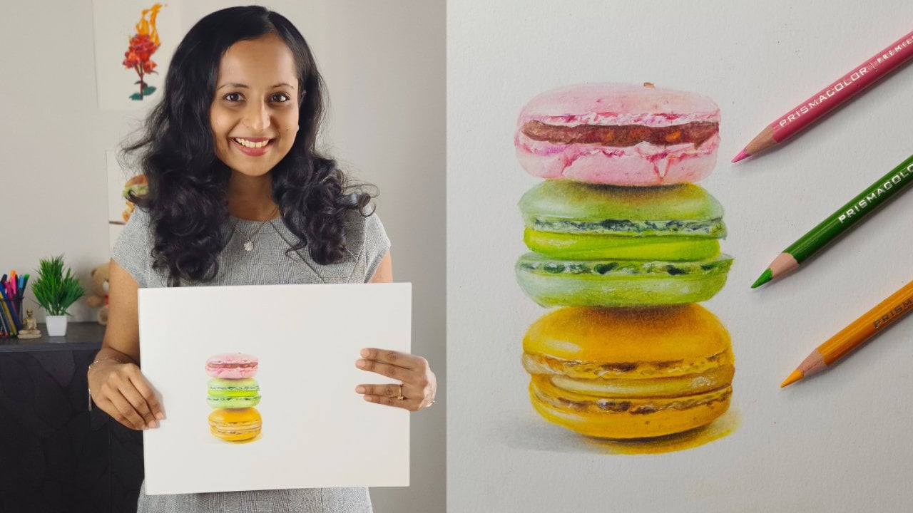
colored pencils to capture those intricate details and vibrant colors? Hello, everyone. I'm Smitha, an artist who mainly works with colored
pencils and pastils. You can find me on
Instagram and YouTube as art underscore by
Underscore Smitha. I have a keen eye for details, and hence my style is realism. I have been teaching on
Skillshare since 2022. So far, I've covered
a wide range of topics on colored pencils, including basic techniques,
rendering different textures, reference photo
breakdown to name a few. This class we'll be using several vibrant references of the magnificent scarlet
Mcco as our guide. This is an excellent
subject as each section of its plumage offers
a unique texture and color challenge to explore. Instead of attempting
the entire bird, which can be daunting, especially for those
new to bird art, I've broken our project down into focused
manageable sections, the intricate head feathers, the rich breast feathers, the dynamic wing feathers. And the long flowing
tail feathers. My main focus will be on teaching you the
techniques in real time. We'll go step by step through
the blending, layering, and linework so you understand the why
behind every stroke. This class is perfect for you
if you're tired of trying to decipher techniques from
blurry sped up time lapses, if you're familiar with
colored pencil basics and are looking to
elevate your skills. By the end, you won't have just learned to draw
the MCO feathers, but you'll have a set
of transferable skills you can immediately
apply to any other bird. Since this is an
intermediate level class, it's best if you already have some colored pencil
experience under your belt. If you need to brush up on your foundations
before we start, you can always check out
my short classes series on Skillshare or this
particular class on introduction to realism. I'm so excited to share these
techniques with you and help you elevate your
colored pencil art. Let's get started.
2. Class Structure & Project: Let's have a look at
how this class is structured and what's covered
in the class project. I will first talk about the materials required
for this class. Based on my experience, I will give you insights
on different types of surfaces that you can
use for bird drawings. I will also show you the
drawings that I made over the years so that you
can see the growth curve. Then I have a short
lesson dedicated for the reference photos that we'll be using for our class project. Also let you know what colors are needed for each reference. For our class project, we'll be using the dazzling
scarlet maca as our guide, an excellent subject to understand different feather
textures and colors. If I were to draw
an entire bird that would take about ten to
15 hours in real time. Let's be honest. Lendy videos can get boring and
repetitive sometimes. Drawing an entire bird could seem intimidating
for first timers. On the other hand,
to make it faster, if I were to convert the entire process
into a time lapse, then it would be hard to explain certain
techniques in detail. That's why I've broken down the project into focused
manageable sections. I will explain in detail the techniques involved in drawing different
types of feathers. I've recorded the process
involved in real time so that you get to know the why
and how behind each stroke. We will start with
the head feathers and then move on to
the breast feathers. In both these lessons, we'll learn how to layer different colors and
create that fluffy look. Then we'll move on to the
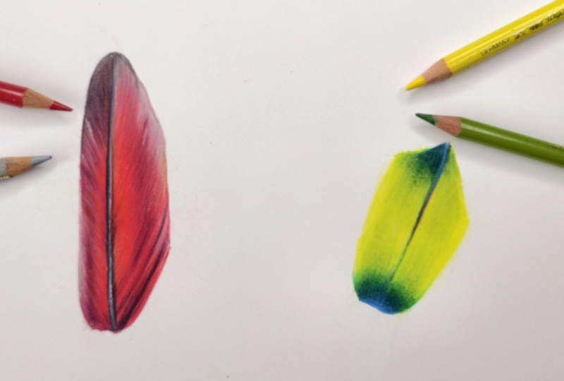
wing feathers and understand the glazing technique to create shimmering,
iridescent feathers. Lastly, we'll cover the
techniques involved in drawing those flowing and
glowing tail feathers. It would make me
very happy if you could attempt all the
types of feathers covered in this class and upload them in the projects
and resources section. Each section will take you
about 15 to 20 minutes. But if you have a
time constraint, then please feel free to pick any one type of
feather and draw. The reference photo and the
corresponding color chart for each section can
be downloaded from the projects and resources
section of this class. The color chart contains the exact names of the
shades that are used. You don't have to use those
exact shades or brand. Just use the color chart as a guide and pick similar
shades from your set. At any point if you feel stuck
or if you need guidance, please post your query in the discussion section
of this class. Please remember to upload
your drawings in the projects and resources section so that
I can give you feedback. All right. Let me
explain to you about the materials required for
this class in the next lesson.
3. Materials Required & Some Advice: You will need colored pencils. Set of 48 or more
would be ideal. You can use either wax based or oil based pencils or a
combination of both. Any paper that is suitable for colored pencils,
smooth, hot pressed, or even textured,
as long as it is sturdy enough to take
in a lot of layers. Basic stationary, a craft knife or a battery operated
eraser for details. Throughout this
class, I have used the Strathmore Bristol
Smooth surface and the Fabacastal polychroms
pencils, which are oil based. In most of my earlier classes, I have used wax based
pencils, but this time, I decided to only use
oil based pencils because some of you have told me that you
struggle with these. I want to show you
that you can achieve fine details as well as smooth blends with
oil based pencils. Having said that, if you have
a set of wax based pencils, please go ahead and use
them for this class. The techniques are
exactly the same. As this is a slightly
advanced topic and is more technical than what I
covered in my earlier classes, it is important to do
some trial and error until you find the right surface that suits your skill level, budget, and also the kind of finish that you want for
your final drawings. Now, let me show you
how the pencils perform on different surfaces so that
you get a better picture. I will just show you the
ones that I've tried. This is a Bristol smooth
surface that I showed earlier. I'm making random marks with both oil based and
wax based pencils. This surface is excellent for getting fine, crisp details. Your final drawing will look vibrant and smooth on this one. This is a mixed media paper. This kind of surface is
slightly textured and will let you add a few more layers than the previous
smooth surface. You can also use medium
textured surfaces like this cold press
watercolor paper. Although you can add
a lot of layers, there is a possibility
that the white of the paper would be visible
in the final result. Burnishing may be a bit
hard to achieve here, but if you want a rustic
look to your drawings, you can use this paper and use the texture to
your advantage. There are also rough papers
with a lot of tooth. I haven't tried them yet. You can use toned papers. Such surfaces make
your drawings pop. But remember that
the colors tend to appear different here as
compared to a white surface. You can also use hot
pressed watercolor paper or even 100% cotton paper. Now, let me show you
the bird drawings that I made over the years
on different surfaces. This is my very first
colored pencil bird drawing, and I made it in 2019. I used a not so expensive
toned tan surface which just weighed 118 GSM. Yet I was able to add a
decent amount of layers. At that time, I
was just trying to understand colored pencil
techniques and hence did not bother much on adding too many layers or getting
every single detail. For this drawing, I used a
tone blue mixed media paper. This is a thicker paper
which weighs 300 GSM. I felt that the wax
based pencils work better than oil based
ones on the tooned paper. That's why I mentioned earlier that it's important
to do some trial and error if you want to find the right combination of paper and pencils that
suits your style. This drawing was made
on a 25% cotton, hot pressed watercolor paper. I used a combination of oil base and wax based
pencils for this one. And finally, the following
drawings were all made on 100% cotton,
hot press paper. I used oil based
pencils for these. This is a very expensive
premium quality surface, and hence, I use
it very sparingly. The reason why I
explained all this in detail is because
I want you to understand that there is
no right or wrong surface or pencil when it comes
to drawing birds. It is a matter of
personal preference. As you can see, I have used a wide variety of
surfaces inexpensive, mid range and premium, bristle, smooth, hot pressed,
slightly textured. I have used both wax based
and oil based pencils. As my skills and style
evolved over the years, so did my paper preference. If you're just learning
to draw birds, please start with a
decent mid range paper. Once you're comfortable
with the techniques, then slowly transition to
expensive papers if you want. If you want any help
in deciding this, you can start a thread in the discussion section
and I will help you out. In the next lesson,
let's have a look at the reference photos
and understand what colors to pick
for a class project.
4. Reference Photos & Color Charts: As I mentioned earlier, we are going to use several reference photos for
our class project. In this lesson, I
will just mention the generic names
of the colors that you will need so that you have a rough idea before
starting the class project. You can download the
reference photos and their respective color charts from the projects and
resources section. If you want to know the
exact shades that are used, use the color charts as a
guide and pick similar colors. If you're interested
in understanding in detail the steps that I follow to break down a reference photo and
identify the colors, then I do have a class dedicated on that
topic on Skillshare. Alright, this is the
first reference photo, and we'll start with the
feathers on the head. I have marked them with white. Just focus on this
small section only. After that, we learn
the techniques for these feathers
on the breast. For both these sections, we need light orange, dark orange, scarlet, deep reds, and red violet, and also a bluish purple shade for dark tones and a
white for highlights. Next, we'll use this reference to draw this blue
feather on the wing. You will need light blues, mid tone blues, dark blue, and an indigo for
the darkest tone, and a white pencil
for highlights. After that, we'll use the
same techniques and draw this yellow green feather
using another reference photo. You will need a
bright mid tone blue, a lemon yellow, mid tone green, and a couple of dark greens. Lastly, we'll use this photo
to draw the tail feathers. You will need a deep orange, red and red violet that
I mentioned earlier, and additionally a pink. You will also need
a cool light gray and any darker shade of gray, and of course, you will
need a white pencil. Please observe the
reference photo in detail. Have a look at the color
chart and join me in the next lesson to get started with the
feathers on the head.
5. Head Feathers: Focus on this section
and identify the light, medium and dark tones
before you begin. Start with the lighter
shade that is light orange. With very light pressure cover the entire section in the
direction of the feathers. You need not draw
individual strokes here. Just follow the
direction and make short overlapping
strokes this way. Towards the front, the feathers tend to flow to your
right hand side, and as you proceed, they tend to flow upwards and then towards
your left hand side. Next, in the same way at
a layer of dark orange. I'm using generic
names as always, but if you want to know the exact names as mentioned in the
pencil that I'm using, it's there on your screen, as well as in the color
chart that you can download in the projects
and resources section. We used a dark orange
for the mid tone, and now we'll be using a scarlet red for
slightly darker tones. Use a sharp pencil and raw shot strokes wherever
you find dark tones. The top part has
more light tones, so don't add a lot of red there. The lower section is darker
and looks more dense, so add more red there. You can alternate between red and dark orange
to get more depth. To intensify the dark tones, you can use a deep
red if you have, or else you can use the same scarlet red
with heavier pressure. Next, for the darkest tones, I have used two
shades, this dark red, which is like a maroonish
shade and then a red violet, especially at the lower section. After that, you need to add
a couple of layers or more, with the same set of colors gradually increasing
the pressure. Observe the reference photo again and compare
with your drawing. You need to use
your judgment and add oranges and
reds accordingly. Do not cover the oranges
completely with reds. Let the orange strokes
be visible at the top. This will make the feathers look denser and add more
depth and value. Towards the end, you can make defined strokes with heavy pressure. But remember to stick to the
direction of the feathers. Stop when you feel the
feathers look dense enough. Also, please do not burnish as we are not aiming
for a smooth look. If you want to make
the darkest tones pop, then you can use a
let along with red. If you want to make
the highlights pop, use a white over orange. You can also use a
craft knife to gently scrape off some pigment
and create highlights. This will be helpful if you have accidentally covered the
highlight area with reds. Once you have scraped
off layers of reds, you can again add
light orange on top. So this is the technique
for the head feathers. You can use this technique for any other bird that has a
similar feather pattern. In the next lesson, let's get started with
the pressed feathers.
6. Breast Feathers: Let's draw this section
of the breast feathers. You can use the same set of colors as the previous lesson. These feathers are
slightly longer and curvy, so make longer strokes
with a light orange. Add a couple of layers with light pressure until the
paper is roughly covered. Then add a couple of layers
with a darker orange. Don't add individual
strokes like this. Also, don't hold the pencil
too close to the tip. Instead, hold it this way at
an angle away from the tip. This makes your strokes
uniform and light. After that, add a
red or a scarlet. Simultaneously, you can also work on the feathers
below this rope. Please observe the
reference photo now to understand this. The upper section
had light tones, and hence we used light orange, but this particular section below has mid tones
and dark tones, so directly start
with a darker orange. At certain places, just break down the clumps of
feathers with the red, slightly increasing
the pressure. Then just like we did
in the previous lesson, alternate between orange
and red to add more layers. Now, enhance the light tones at the top with a light orange. You can maintain some gap
between the strokes now. Then just focus
on the upper row. Use a sharp, dark
orange pencil or even an orangish red and add strokes like this
starting midway. We do not want to disturb
the light tones now. Once done, slightly overlap this light orange with the dark orange that
you just added. This will give a
smooth transition from light to dark orange. That's why it is
important for you to observe your reference
photo every now and then. If you have missed
something in the beginning, you can make changes now. After that, again,
alternate between orange and red until you
get the desired depth. Wherever you see this
kind of partition, use a scarlet red
with heavy pressure, or you can also use a darker shade of red
if your set has one. If you feel overwhelmed, just take a break and
come back later to observe the reference photo
with a fresh pair of eyes. In fact, I did the
same at this point, and hence I was able to observe
a bit of red at the top, where we added light orange. It is actually the shadow from the section
of feathers above. Go ahead and add them. Finally, move on to the
highlights. If you're using an oil based white pencil, adding a white on top
now might be hard. I actually use this wax based white pencil for adding highlights on almost
all my drawings. This has a chalky texture, and it shows up very nicely
on dark shades, as well. If you don't have a good white
pencil, then don't worry. As I explained in
the previous lesson, you can use a craft
knife to get highlights. Have a final look and at any missing details or enhance the dark
tones if required. You can use this
technique throughout the breast feathers and
the stomach feathers here. In the next lesson, let's learn the techniques for
wing feathers.
7. Blue Wing Feathers: Let's start with this
blue wing feather. This feather may look simple, but at least for me, it wasn't. That's because I rarely
work with blues. Also, this feather
looks iridescent, which is quite
tricky to achieve. But let's try to
simplify this now. Just remember to use very light pressure for
most of the layers. First, cover the entire
feather with a light blue. Since I have used
very light pressure, this looks very pale now. I have used a couple of greenish blues for
this base layer. Please refer to the
color chart for the exact names and swatches. Once the feather is
roughly covered, shade with an ultramarne blue, which will be the mid tone here. Carefully observe the direction
in which I'm shading. From the center
to the sides like a sloping line or in
other words, diagonally. This will give a three D look. Maintain this slanting
direction throughout. You can once again
go back and add the light tones along
with this mid tone blue. I have used another shade
of blue here for the sides. You can skip it if you
don't have a similar shade. As I told you earlier, I
haven't worked with blues much, and hence, at this point, I was just figuring out
what shades to use. So I ended up using a
couple of extra shades. Of course, no harm in
using a lot of blues. If you have a bigger
set of colored pencils, why not use it to
your advantage? But if you have a smaller set, even then you can achieve this. Just slightly
increase the pressure of the light blue that you used in the very beginning if you want a darker
shade of blue, or else you can also mix two shades and
create a new shade. Now, move on to the edges
where you have dark tones. Here you will need a
couple of dark blues. I used the shade
called deaf blue. You can also use a toilet, and then to intensify
the dark tone, you can use an indigo blue. Use these two shades here
for the line at the center. Ensure that the pencil
tips are sharp. Now, we have the light tones, mid tones and dark
tones in place. Add a couple of
layers of light and mid tone blues now
with medium pressure. Now, let's take a pause and continue this
in the next lesson. In the next lesson, we'll understand the
glazing technique.
8. Blue Wing Feathers: Glazing Technique: What is glazing? With
respect to colored pencils, glazing involves adding
a thin layer of color with very light pressure on
top of an existing color. This will give the initial color a different tone or lets you
tweak the initial color. This will help achieve that iridescent look on the feathers. Observe these blue
feathers again closely or this close up from a
different reference photo. When you observe at
different angles, the blue looks
different each time. We'll try to replicate this
effect now by glazing, hold the dark tone blue or a violet blue at an
angle like this, away from the tip and
shade with light pressure. Stick to the direction in
which we shade it earlier. Do the same with
the mid tone blues. You can also use the
light tone blue to get a smooth transition by overlapping
it with the mid tones. Repeat this process
again if needed. Do not overdo this, or you will end up covering the earlier layers
entirely with dark tones. You can use a white
pencil at the center near this dark line that is dividing the
feather into two. If you observe the reference, you will notice that
white glow here. Intensify this dark area with heavy pressure
with an indigo blue. So this is how the feather
looked in the end. You can use this technique for the other blue wing
feathers as well. Before we move on, once again, observe this particular photo. As this is a close up
of only the feathers, you can notice these
thin blue lines running all over
the feathers here. Since the earlier
reference that we used was that of a bird
captured distantly, we were not able to see
these fine details clearly. In case you want to add
these tiny details too, then use a dark blue or a violet blue and add
thin lines throughout. Use a sharp pencil. To be honest, this
is not needed. When you are drawing
the entire bird, this minute detail
is irrelevant, and I did not add this in this particular
drawing as well. You can leave it
at this and move on to the next lesson
where we'll be drawing the yellow green
wing feathers. So
9. Yellow Wing Feathers: Let's draw these vibrant yellow feathers from
this reference. Just a reminder,
before you begin, please download this photo and a corresponding color chart from the projects and
resources section. Start with a rough outline
with a light yellow. Before covering this
section with yellow, mark the tip of this
feather with blue. That's because once
you add yellow, then if you add blue on top, that section will turn green. Use any mid tone blue. Later on, we'll overlap a fraction of this
blue area with yellow. Now cover the entire feather
with a light yellow. Here, I'm not shading in a slanting direction like we
did in the previous lesson because I did not find
such movement when I observed the reference
photo that I picked for this, use circular motion and light
pressure while shading. If you have a greenish yellow or a lemon yellow, you
can use that too. In fact, I have used two shades of yellow here just
to get more depth. Overlap some yellow on the blue area to create a
gradual transition to green. Just skip the tip area
so that it looks blue. To intensify the green
section, use a deep green. Here at this section, we have brighter greens, so I used an emerald green. Observe the reference carefully and complete this section, alternating between the two
greens with medium pressure. For the line at the center, use a deep green
and a red violet. Now it's time to apply the glazing technique that we learned in the
previous lesson. If you zoom in and observe
the reference photo, you will be able to see
green here on top of yellow. Use a yellowish green and glaze it over the
yellow base layer. Use very less pressure and shade using sides
of the pencil tip. Here, overlap a deep green and the yellowish green to get
a smoother transition. Almost done. Just need to add a few final details and
smooth in a few areas. Observe your drawing carefully, and if needed, go back
and add yellow again. You can also burnish with a yellow to get a smooth finish, or you can burnish with a white pencil as well
with heavy pressure. You can use this technique for the yellow green feathers or the yellow red feathers here. This drawing was made
using this reference. Here is another reference photo. This is a close up of
just the feathers. Here you can observe green lines all over the yellow feathers, which wasn't visible in the previous reference
that we used. You can use this reference
photo as well if you want to practice more and
add few more details. I will upload a few
extra reference photos in the projects and
resources section. Now we just have one type of feather
left the tail feathers. We'll cover the same
in the next lesson.
10. Tail Feathers: Let's learn to draw these
shiny tail feathers. The techniques here are somewhat similar to the blue
wing feathers, and the color palette is slightly similar to
the breast feathers. While the breast feathers
have warmer reds and oranges, this one has pinkish undertones. First, let's roughly mark the outline with an
orangish red and a gray. Sing an orangish red, start shading in a
slanting direction on both sides of the feather. I used a light cadmium red. Remember to hold the
pencil further up at an angle to be able to
apply light pressure. Leave the ends of
the feather white. Don't shade at the center
where we have the partition. Next, use a reddish pink or a carmine and fill in some of the area that you left white. Overlap the spin with the red. Notice that the extreme ends on one side and the tip
are still white. We'll add gray there later. Now let's gradually build
up the layers using a pinkish red and also the cadmium red
that we used earlier. You can slightly
increase the pressure. The If you observe the reference photo, you will notice dark tones here. So use a deep red. Remember to stick to the
same direction throughout. For these dark lines over here, use a maroonish
red and a red let. You can add a light layer of red let on deep red to
get a deeper tone. Now, all you need
to do is repeat these steps with medium pressure with the same set of colors. For this line at the center, use a very dark gray or
even an indigo blue. Use a light cool gray
to get that glow around the central line and also
to cover the white area. Now, use a warmer shade of gray and overlap it
with a light gray, especially at the
tip of the feather. You can also combine it
with red wallet or maroon. Use a sharp pencil
to get crisp edges. In the next lesson, let's add some more details and
complete this feather.
11. Tail Feathers: Burnishing Technique: Absorb the reference
photo and add a couple of layers of red
or dark orange if required. Use heavy pressure and deepen the dark tones
with a red wallet. Add the highlights with a
white in the same manner, complete the other
side of the feather. You can burnish
with an orange at the center near this dark lime to get that glowing effect. Adding orange on top of red will give an
orangish tint to it. Next, use a cool gray here at
the tips and at the sides. A hint of orange here
to get that glow. Use a white to combine
both these shades. Use a darker warm
gray for the details. I think now we have successfully replicated the shiny
effect on this feather. This is how the
feather turned out. The techniques are similar for the other tail
feathers, as well. Next, I will summarize
everything that we learned and make a note of the key takeaways of this class.
12. Key Takeaways & Closing Thoughts: Well, then, everyone,
we've reached the end of our journey in mastering
realistic bird feathers. First off, a huge congratulations on
completing this class. And thank you so much for dedicating your time
to learning with me. Let's do a quick recap
of what we learned. We started by understanding the different types of surfaces, pencils that could be
used for bird drawings. We then broke down the drawing into manageable detail sections. We started with the
fluffy head feathers and the curvy breast
feathers and learned how to layer different
colors on top of each other making short
directional strokes. We also learned how to use a craft knife to get
additional details. Then we moved on to the vibrant, shiny wing feathers and captured the iridescent color pattern
with a glazing technique. Lastly, we recreated the
shimmery tail feathers. We used layering and burnishing techniques here to make
the feathers glow. Remember, the techniques
you've learned on the scarlet maca aren't
just for this one bird. They are transferable skills you can now apply to any bird. Practice these techniques
using few more references, and soon you will be confident enough to draw an
entire bird in one go. I truly hope you
enjoyed the process, discovered some exciting
new techniques, and most importantly, feel that your colored pencil skills have been significantly
elevated. Seeing your progress is what
makes teaching so rewarding. Once you've completed
your project, or even if you're just
sharing your progress, please upload your work to the projects and
resources section. I love seeing your
amazing progress and providing
personalized feedback. And remember, if you have
any questions at all, don't hesitate to post them
in the discussion section. I'm always happy to help. If you have enjoyed this
class and found it helpful, please consider
leaving a review. Your feedback not only helps me grow and improve
as an instructor, but it also helps new
students discover this class and join our
wonderful creative community. Of course, don't forget
to follow me here on Skillshare to be
notified of new classes. You can also connect
with me on Instagram and YouTube for more
art tips and updates. Thank you again for being
a part of this class. Keep practicing, keep creating, and I look forward to seeing you in the next
one. Happy drawing.
 Smitha Rao, Pencil and Pastel Artist