Transcripts
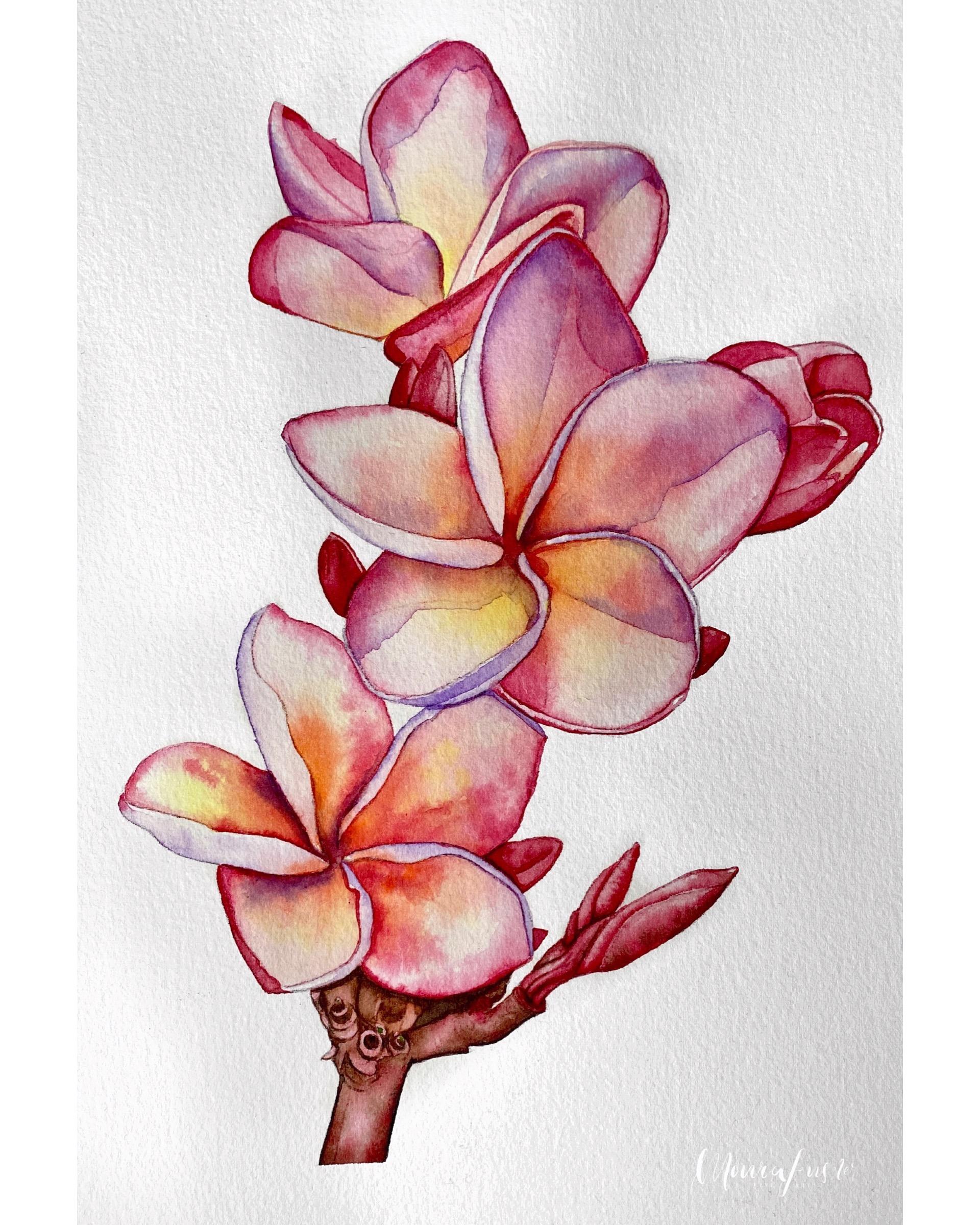
1. Introduction & Techniques: Hi, guys. Welcome to another class. In today's class will be painting a plumeria flower, specifically three of thumb. I've created a, um, little composition for us to paint together. This is what they look like. It's an a four sized watercolor painting. Like my previous couple of classes we've been, and once again I take you step by step from the very beginning of transferring the drawing onto your paper all way to the end, where you removed the painting from your board and you can finish it up and ready it for framing. So it's one of thes long form classes where you can paint a home and work along in real time. I really hope that you guys enjoy it. I do really love this particular flower, and I think it's so fitting for summer do paint along with us. I would really love to see your projects down below in picture format uploaded for everyone to see. Um, if you're logged in through a computer year, olds will be able to find all of the relevant downloadable files. If you look under project Resource is now. If you're logged in on a mobile device in the app, you won't be able to access these files. I'm not sure why that is. I've just found that they seem to only be available if you're logged into a computer. So to make sure that you go and download those files so that you can benefit from them, I include everything from the reference pictures, the line drawing the supplies, list everything. Um, so to make sure that you get those files so that you can paint with us, I really look forward to your feedback and also to hearing how you got on with it. Obviously, if you get stuck along the way, you can always leave us a question down below, and I'll do my best to get back to you and to help you out. So I really hope that you enjoy the class. Now. The court techniques that will be covering in this particular course are the wet on wet on wet on dry techniques, Um, meaning that we either apply paint onto wet paper or we apply paint onto Dr Paper on. By varying these techniques, you'll be able to achieve different kinds of effects. The majority of the painting is actually painted went on what? Because this allows us to get nice, smooth radiance where your pain fades either from one color to another color or from one color to white, so essentially to plain paper. And in this way we can create really nice, smooth looking petals and transitions of color within the petal, while simultaneously keeping our edges very smooth and crisp and full of contrast. Now, this does two things. A. It makes the painting look more realistic, which is always something that I see a lot of people struggle with and aim to achieve, and secondly, it increases the amount of contrast that you have at the edge of each of your shapes. So, for example, um, the edge of this petal here where the metal meets the white paper Now, by increasing the contrast there, we helped the painting to pop, so it will look more eye catching and more interesting to something looking at it. And it does also, really, you know, help bring the colors forward. And in general it creates an overall effect that is, I think, very pleasing to the eye. So those are the two main benefits that we reap from using this wet on wet technique, and I'm going to be walking you through each of these steps, so we'll be painting the painting and layers, most of which are wet on wet. And some of the later layers where we have just a few more details are wet on dry, for example, we add some of thes cast shadows that you can see here. For example, here's an edge of a shadow running down the middle. We add those wet on dry once the petals themselves air finished using just a little bit of the violent tone. And in that way we create a nice looking shadow, which again helps create realism and helps to give thief lower dimension on and shape. Now I look forward to seeing you in the first lesson. The first lesson will cover the core supplies that will need to paint the plum area
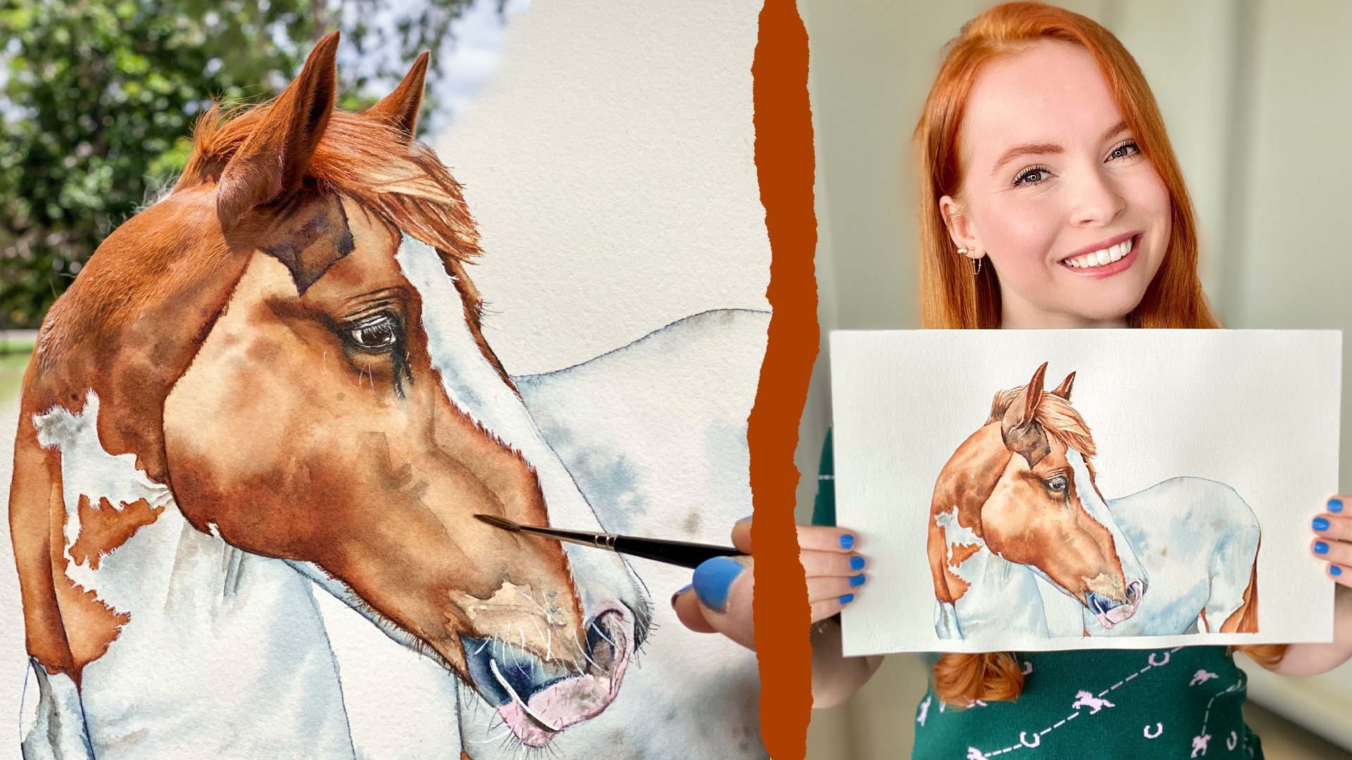
2. Materials: all right. So before we're going to get started with the actual painting process and preparing our paper, I'll take us through the materials that were going to be using in this class. It might seem like a lot, but they're very repetitive class to class, because with watercolor, they're just certain things that you always need. So to begin with, um, to prepare are working surface. You will need a piece of watercolor paper that is a little larger than a foreign size. So this is actually the finished painting, right? And this is an a four piece of paper. But what I did just use my large sheet of paper and cut it to roughly a little bit larger than a four just so that I have space to tape down the paper. Um, without risking, you know, damaging the paper there with a tape makes contact so that I'm able to cut it to size after I finished painting. However, if you only have an a four size piece of watercolor paper to Pune with, that will work just fine. Um, do make sure that it's 300 GSM in weight or heavier or thicker because, um we don't want the paper buckling, and I'm not going to be stretching it. So if you do work with something that is thinner, stretch your paper first, um, to mount the paper, I'm using old chopping board. This is always a firm favorite of mine to put a four sized paintings on two chopping boards . Because they're plastic, they're water resistant. They're cheap, easy to come by and easy to clean. Any board will do so long that it's, um, what are resistant. You don't want to be using cardboard for this. And to be able to tape our painting down, we'll need some masking tape to be able to transfer the Drury. I'm going to be using an HB pencil, so to make sure that it's really HP because HB smudges less on, um, it also doesn't dent the paper too badly Together. With that, you'll need an eraser. So this was one of these gummed artist erasers, and these are really great for lifting pencil off of the paper. So it's really my favorite, Um, and you'll need a ballpoint pen, anything that will allow you to transfer the drawing onto paper, meaning that you just need this to apply pressure with onto the paper. I like using a colored one like this one writer blue, because it will show up on your line drawing. And in that way, it makes it easy to know where you've already transferred your drawing. So those three things, um, for the actual transfer, you only transfer paper. This is surround paper, and it has one layer. I can open that one layer of last night, and it just allows you to transfer your drawing. To be able to do that, you need a printed copy of the line. During that I provide, which you confined down below under, um, under resource is now do make sure your loved it on a computer, because if you're in the app on your phone or tablet, the downloadable files don't show up in the up. I'm not sure why that is, but it's important to note because I provide a lot of materials there. I give you the original to reference pictures, which you will need access to. To be able to paint them. You'll need the line during that. I've made for us already. You'll need to be able to print that and I'm also uploading their A list of all of the supplies that you'll need together with a picture of the final painting so that you can use that to orient yourself. Um, do note that I made this composition myself out of two stock images, So you'll need both off those pictures to be able to paint along. And what I've just done is displaced the three pictures or while the three flowers from the two pictures together. So depending on what section of the painting your painting you might have to look at, you know, one or the other picture as reference. That's what this looks like and you can see actually that I use the red pen on here, which is easy to see when you print and black and white. Um, aside from that, you will need a pair of scissors to cut your paper to size and then obviously, paints and brushes. So I actually only used three brushes and this painting process or in this particular painting, um, I use my castle Nao mop brush. This is a size zero, my brush. This is what it looks like. It's a nice, smart brush that holds a lot of water, has very smooth synthetic fiber, so it's a vegan brush, Um, and it has a great size for this particular painting. I also used the maestro brush and size zero, which has a lovely fine point. Andi is a nice in between size if you compare it to the detail burst that I make a lot of use of in this painting. This is the Nova, and it's in size $3 0 So this was the detail brush. This is our medium round brush with a nice, fine point there. And this is thes likely larger brush that we use for the initial rounds of paint for laying down water, wetting the petals, etcetera. Whilst you're painting your also going to be needing clean water in a large jar or mug, Um, you'll need a palette and specifically a porcelain palette. I discussed this on every class that I give, but I really do prefer porcelain for watercolors over any kind of plastic pallet. Now, if you don't own a porcelain palette, you don't want to buy one that's not an issue. Just use an ordinary dinner plate. So something better ceramic because, um watercolor will pool and collect in a funny way on plastic. Um, on. I find that ceramic is much better when it comes to these wet on wet techniques, where you need to be able to make a distinction between picking up, You know, very watery paint from inside the well inside this area that collects a lot of water that generates very watery washes of color. So you're picking up water with a hint of color, essentially in your brush versus being able to pick up really strong, um, concentrated pigment from the top of the palate, I call it or, for example, if you were to rub your brush over this blob of red paint here. So that's what I mean when I say that, um, ceramic is really much more suitable. Obviously, if you only have pan pains and you don't have tubes, this doesn't apply to you, although I will say that my techniques work far better with two paints in the do with pan pains. So you'll need a palette of some kind, your water a towel to dry your brushes on, but also to mop up excess um, water, and I also do that sometimes with a piece of kitchen towel or tissue. So having something like that on hand is really important. And then obviously you'll need your paints so we only use a handful of colors in this cost . So the 1st 1 um, that we use actually don't own as a tube on the owner it as a pan, and that is lemon yellow by winter Newton. So that's what that one looks like. That's our yellow tone. The orange that I make a lot of use of is Winter Newton, um, Winsor Orange red shade. So it's a very vibrant bright orange. Then I use shrink a violent one of my favorite purples, mostly for the shadows. I use CPR, brown and burnt number for the stock and some other details. Things like that. I use a tiny little bit of permanent sap green, the red tones that you've seen, the flower all painted with, um, and threat Paranoid read by Daniel Smith. This is a really beautiful, um, bright, vibrant, cherry red and then last but not least for the majority of the pink of the flower. I use shrinker ruby red. I can find it. So this is what Ruby red looks like. Um, it's called Ruby Red, but most other brands actually call it permanent Rose. And it's a very nice, bright, vibrant pink tone, So those are the paints that will be using.
3. Preparing your Paper: so as per usual, the first step in the process is to prepare your paper. So what you'll need for that is a, um, printed copy of the line during that I've made for us. So that's what that looks like. It's just printed on an a four piece of paper, and you obviously also need your watercolor paper. Make sure that it is, um, facing up so the grainy textured side should be facing upwards. That's what you want to paint on. And it should be slightly larger than a four in size so that you have enough space to tape your paper down and to, you know, we're comfortably with the size that we're working on. Um, I'm also using an old chopping board, and I will be using this as a mounting board to tape my paper onto to keep it flat and sturdy. I'm not going to be stretching the paper. I'm using arches, watercolor paper or are sh watercolor paper that is 300 GSM and wait, and I find that I don't need to stretch it for this kind of a project where we're working fairly wet, but not any huge, um, were not wetting large areas of the paper. If you find that the arch papers too expensive, I can also recommend this particular cancer. On paper, it's the Montreal paper. I would say that that's the best option that you have. If your budget is low, you can see that I used this for sketches and practice, and I do quite like it. Um, it will warp a little more than the arch paper, but it can get the drop down if you need something that is more affordable. So that would be my choice. If you don't want to invest in our paper now, something else that I can show you here is that I actually also did a couple of practice runs. So you can see here that the paper worked a bit there. Um, but it's not too bad. So I think that this is the best option. Um, and you can see I've done some practice runs here on the plume areas just to kind of get a hang of the shape and the color and to experiment and to take some notes. And I can also highly recommend doing this every time. You know, you paint something that you haven't painted before, so that's a little bit of, Ah, a tangent there, but I can recommend the paper. It is a little smoother than the arch paper overall, and it handles water lists well, but it is an option that will work. So if your paper is not a four size, you'll just have to cut it to size. Um, that's what So what I do with my arse paper here? I'm just positioning the line drawing that I've printed on my piece of paper so that there's, Ah, border everywhere. So if I zoom out, that's what that looks like. This was just a spare piece of what a color paper I had left over from another project, and what we'll be doing is mounting it onto our chopping board. Now you can see, actually, that my piece of paper, um, has a bit of a funny size, and it's hanging over the board. So what I'm going to be doing is chopping that off so that it's easier for us to tape the paper down onto the chopping board. Now. You don't necessarily have to use an old chopping board, just you something that is plastic that is water resistant and that will hold its shape throughout the entire painting process. So for the smaller projects, I do like thes chopping boards because of their size. But you can also use something like an art board. If you have it. I have one as well, but it's quite large, and I tend to only use that for my larger projects. So you consume just dropping off the overhang with a pair of scissors. It doesn't have to be perfect. Just make sure that the piece of paper fits onto your board. I'm just straightening it out and cutting that side so that it's a straight line. So for this particular class, I've prepared the line drawing for us in this way. I did it digitally, which, if you want to learn how to do this, I actually have a course here on school. Share all about the process, but should you want to make your own, you're welcome to obviously print out the photograph and use tracing paper to make your own line drawing. I just thought that by providing a line drawing in this way, it saves you one step, and it means that the composition is fixed and set right, because I used to different pictures to combine the three flowers together into this particular composition. So here I'm taking masking tape and I'm sticking my what are color paper down onto my board and I'm taking the overhang around the board to really fix the paper into place. So this is the only way in which we're going to be preventing the paper from warping or buckling from the water. I'm not stretching the paper in any way. If your papers center their mind if it's, um, less weighty than 300 g s, um, you would absolutely have to stretch it first. I really dislike the process of stretching. I find that difficult and it can go wrong and ruin your paper. So I try to rather invest in more expensive paper that I don't need to stretch. So actually, my favorite weight of papers 600 or even 700 GSM, which is very expensive. But I find that it's worth it in terms of the effort that you save out the quality of the outcome. So if you are on a tight budget, I would absolutely advice for you to spend less money on your paints and more money on your paper. I would always prioritize the paper over any other material when it comes to water color. So here I am, wrapping the tape around the board, and I'm really making sure I get a nice tight seal on the tape at this point. Now we can have a look at the line drawing and position it. I'm going to be cutting the paper so that the stock meets the very edge of the paper because I find it easier to judge how high up I need to place the line drawing on the piece of paper right, because we want a nice border at the bottom to give us a nice, clean edge where the painting starts and finishes. So I'm just having a look at what I like, making sure that that is horizontal, and I'm going to be taping a straight line where I want the stock to end. So that's what I'm doing here and now I'm making sure that it's horizontal and a nice straight line, and I'm taping it off, and that will give us a nice, crisp edge where the stock ends. So just in that maybe two inches off the bottom of the page there. So if we position the drawing now, that's where the stock would end. There you can see what that looks like. So once I'm happy with the position of the line drawing, I can tapes the drawing into place so that we can move on to transferring the drawing. So that means that will be slotting transfer paper between are printed line during and our , um, watercolor paper and then pushing that Griff I threw onto the watercolor paper. So this is the same technique that I've been using in all of my courses. Basically and again, I have, ah, class just on the topic of transferring drawings as a whole, because in the beginning, when you're just getting started with watercolor, it can be quite complicated and intimidating. Um, but the benefit of using the transfer paper is really that you use as little graphite as possible in your final painting, which minimizes thieve visibility of your original lines, and it also minimizes the amount of smudging. Now, with this particular technique that I like to use, it's really beneficial to have his little pencil on the watercolor paper is possible because it's all very transparent and light. And we want, you know, the paper to shine through. And they're to be areas of transparency. And, um, that effect can be ruined if there is too much pencil that smudges on your paper. Right? So you've seen that I've now slaughtered my transfer paper in between the line drawing and my watercolor paper with the graphite side of that transfer paper facing the watercolor paper. And now all I need to do is push through that graphite. So that means that we need to trace over the entire during with a pen. Anything will do. That applies pressure. But I find that something like a red pen is really useful because, um, so I printed this, you know, black on white, and I'll obviously be able to see where my red pen has been. There you can see how we've pushed the graphite through. So in that way, it's easy to see where you've already pushed the graphite through onto the paper. Um, that way you don't have to keep checking. So especially with the stock here where we have a lot of detail to cover, I find using a colored pen the most convenient method. Basically, it's all I'm doing is really pushing and tracing over every line and mark that I see and really taking my time to carefully draw each line from start to finish. And you can see I'm going quite slowly here and I'm applying a fair amount of pressure because for these details, I do really want nice, crisp, clean lines that will help me know where to place my paint. Um, and this also makes the painting process much easier than if you were to only have very few lose lines. That kind of, you know, guide you, um, but that don't provide information about where a shape starts and ends. The easiest way to paint is, if you're drawing, has already completely sorted out. You know, you don't have to worry about it. You're not wondering how far do I need to take a paint? Should this be smaller or larger, you know. So in this way we're breaking down the steps and the painting process into manageable steps or manageable chunks of work, and each of thes separate steps required different kinds of skills and by separating them and focusing on them individually, you can improve the different parts of the process of a painting, So by having a well developed line drawing that is clear and finished, you will find that it's much easier to focus on your painting skills when you are actually painting, because it minimizes the number of decisions that you have to make at one given point in time. And you can then solely focus on the color. You know how what your paper is, how much pain you should be using and picking up and things like this, which I find makes the process easier and less tiresome. So I've just been going around the entire during, going over every little line, keeping even strong pressure. So I'm done there, and if I lift, you can see where we've transferred the drawing. And if there any areas that I've missed or you notice that you've missed, you could just go over them again, also, if anything is too pale. So for me, the tip of that petal there was just a little ill defined. So I went back in more pressure to make sure that that's nice, invisible and Then you can remove the drawing and your paper, um, to reveal the final line drawing on your watercolor paper. If there any areas that are smudged or a little too dark, this is the point in time where you take your eraser and you just lift that. So if I take you up closer, you can see I have just a few. The list much is here and there, so I'm taking my gummed eraser, and I'm carefully rubbing those areas and also just needing the race. It'll point to get in between the petals to lift as much graphite as I can without disturbing our lines. So again, this will minimize smudging. It minimizes graphite on the paper, and it enables the paint to look clearer and more translucent without smudging.
4. Painting wet in wet; Introduction: so the first layer of paint will be yellow and will be placing yellow fading from the inside out on each of the petals in each three of the flowers. So start with this one down here, and then I'll move my way up up the painting. So the initial technique that will be using to lay down the first layers of paint is the wet on wet technique, which implies that you wet your paper with water and then drop watery paint into the area that you have. What? So I'm really taking my time here. To what? Onley the inner portion of this petal and making sure that my edges are well defined and I take the water all the way up until the pencil line. So I'm coming in with more water, and I'm taking the tip of the brush all the way up until the mark. And this is why it's so important to have to line drawing well transferred and clear so that you can take your water all the way up until the edge so that you get nice, crisp, clean lines. So I'm trying you this in real time here so that you can see that it does take time. And I'm very patient with the water. You should treat your water like you treat your paint. Um, so if I lived this a little, you can kind of see how, what The papers. You don't want a puddle of water on there, but there should be a sheen, and it should glisten. So that's about where you want it. Any more than that, um will make it more difficult to lay down paint evenly. So if you have a real puddle on your paper, I would suggest to lift some of that water either with a tissue or just with a brush that you have dried on your towel that you keep at your station. So I'm now taking some of that lemon yellow. Like I said, I don't own this one in a tube yet, so I'm having to resort to my pan. But I do prefer to paint. I'm just rolling my brush in there and then taking a little bit of the excess off before taking it into the center of the petal, and I'll show you this again with another petal with the picture in comparison. But for now just focusing on the technique. We're going to be, um, placing the paint towards the center of the pedal and then letting it fade out. So you'll see here now that I'm going in along the inch, and I'm just wiggling my brush around and you'll notice that I don't have to do much work with the blending. The witch damp paper there is letting the pigment fade out, and it will create that Grady in naturally for us. And this is why the wet on wet technique is so suitable for flower petals because you get these lovely, smooth radiance and you have to put in relatively little effort to achieve them so they're up close. You can see how that Grady and is looking, and you can still see that the pigment is slowly moving and fading into nothingness so into white. And that's the trick, right? You want to take your paint not all the way up until any of the edges at the bottom of the petal there, because if the water extends beyond where you place the pigment, it'll naturally fade from pigment too white, too. White paper. And that is exactly what we want. So while that drives, we can now continue doing the same thing on the other pedals. So here, from another angle, so you can see the technique again. I'm taking the birth right up until the very, very edge of that pencil line, and I'm taking my time moving the water around and really making sure. But the edge is smooth. And then that way you keep nice, crisp edges and you keep your painting tidy looking. So something that I get a lot of comments, um, about is that people struggle to keep water colors from looking messy from looking splotchy and overall, just not looking clean. So the first step to achieving that is to keeping as to keep your edge is nice and smooth and clean by having your water be, um, well placed and taking it all the way up until your edges. So I've picked up some yellow again, and I'll be doing the same thing as I did on the previous pedal. So I'm taking the yellow into the center of the pedal and kind of coaxing it outwards all the way up until the itch. But I'm not going out that far I'm letting it disperse itself and create that Grady in from yellow to white, just pulling it out a little further, looking at the picture and just pulling the yellow out where I need it and then coaxing into a little further. And then I can let that petal dry. So here I'll be working on the next one. So I'm taking the water of what the entire pittle taking it all the way up until the edge of that pencil mark and making sure that the entire pedal is damp and evenly show. There's no puddle of water on the paper, but the papers shiny with water. That is the exact perfect state for the paper to be in to achieve these kinds of radiant. So here of picked up yellow and I'm just coaxing it outwards and then cleaning up the edge there. So I'm taking the paint all the way up until the pencil line on both of those edges. And once I've done that, I'll let that pedal dry and the next lesson will continue with this technique
5. Painting wet in wet; Yellow wash: So now we can continue with that technique. I'll do it again on this pedal. Softer picked up water, taking it all the way down and up until the edge of my pencil there and actually have picked up too much water here. So in a second you'll see how I've I had to try that a little. But, um, that puddle of moving water is problematic. So what I've done for now, here's just spread it. Sometimes you can spread the water far enough to the point where you no longer have a puddle. But actually, if you have a look here now, I really do have a moving a little puddle on my paper. There, you can see the droplet forming, and that's just a little too much water. So at that point in time, you can spread the water as far as you can up until the itch, dry your brush and then, with a dry brush, mop up some of the excess. Alternatively, you can also dab at it with a tissue. Um, whichever you prefer to just lift any excess water. So here I've dried the brush. You can see me do that there and then going in with a dry brush. It will just soak up some of that excess water for you. Especially these mob brushes will do that. They're very convenient for the's initial layers of paint. So there, if I lift that, you can see now we're back to our desired shiny, damp state in which we can apply paint. So I've picked up yellow again, and it was going to be taking it as far as I wanted to go and making sure that that just nice and clean, picking up more paint, taking it up until the very edge, and dabbing some here and there where I need more pigment or where I want the pigment to, um, stretch further up the shape of the pedal, just connecting these areas down here. And then that petal can also dry, going in with clean water again and again, I made the same mistake. I've picked up too much water, so here again, this is what too much water looks like. You no longer see the texture of the paper, and instead it's just one large puddle or a damp area with it droplet forming, In which case you'll have to lift some of that water off of the petal so that, um, you know, the pedal isn't too wet. If you apply paint onto paper that is this damp, it'll go everywhere and spread without latching on to the paper without holding onto anything. It'll move around like a swirl, which can create very lovely effects, actually. But it's just not what we're looking for here, right, because we want a nice Grady int. So there have just dried the brush and I've picked up the excess off the pedal. It's at this point, I'm just loading up the brush with the pigment again. And much like with the other pedals. I'm dropping in watery paint, keeping the edges closest to the center of the flower nice and smooth, and then I'll let pigment disperse out to create that radiant. So we've finished that first layer of yellow on the flower down here shall do the same thing for the other two flowers as well. Now you'll notice that the pencil lines are quite dark for this particular flower, so I'm actually just going in and lightning, Um, a little bit of that graph writes. I'm just picking up a little bit of Theis excess to make those lines a little paler. I'm just dabbing it with my gum to razor to remove some of that graph, right, Because it was just a little too dark, you know, and any unnecessary graph ride we can just remove. So I'm going back in with water carefully around the edge, picking up more water and going all the way up until the edge of that petal, and you'll notice that I'm going over the line in the middle of the pedal, which is where the shadow goes, because for now, we're not worried about The Shadow were only worried about the base color of the petal, so that line will only become relevant to us at a later point in time. Gerken see him picking up watery yellow, dabbing it off a little on my tissue because I don't have a tube for this particular color , and then I'm going to be going in with the pigment. And there I stopped too much off, so I'm just going back in for more, and I'll keep the edges really nice and sharp on the address. There, the edge of their petal making contact with the other Pittle and here on the side as well. And then all stop short of the edge of the bottom there so that we get a nice, smooth, radiant going in wolf more paint, just dropping it in where need more color? I'm just washing my brush, and then that first petal can dry while we work on the next one. So I'm just picking up clean water and repeating the placement of the water all the way to the very edge of the metal. And then I'll go in with Hilo. I'll keep it smooth and clean around those edges that make contact with the center of the flower. So one smooth movement along the edge there, and then I'm letting it fade out and great age into white. They're picked up a little too much water. So life dried off my brush, and I'm just coaxing it out and blending it out into nothing. And then again, with more clean water. This time I've picked up a bit too much again, so you'll see me mop some up. I'm waiting that pedal appear. I'm going over the line nuts. Marks are shadow because I don't need to worry about the shadow just yet, just covering the pedal, going in with my yellow paint and then same as before. I keep those edges nice and clean and tidy. I'm just going in with a little more pigment for the center, where I want the color to be strongest right there. And then I'm washing my brush, picking up clean water and waiting the next pedal. This was a fairly large one, so I'm picking up more water, keeping that edge nice and smooth and clean, and then taking the water all the way up, picking up the yellow paint and dropping it in towards the center of the petal. There now work it outwards, keeping those edges smooth and tidy. And I've washed my brush and I'll be doing the same thing for that last pedal as well, taking it over the shadows because we'll deal with the shadows at a later point in time. And there again, I've had it just a little too much water on there. So I'm mopping some of it up before I go in with a yellow pigment, taking it from center outwards, keeping those edges nice and smooth. Having the pigment go all the way up until the very edge of the water. I'm spreading it airports and outwards, and I'm always looking at the picture while I'm doing this. I'm not showing you the picture here just yet because I want to show up close what I'm doing. But every time I paint him always looking at the picture, and I'm always checking to see how far I need to take which color. Now I'll leave that to dry while they work on the last flower. And actually, this one doesn't have too much yellow in it, so it will be a fairly quick little area to paint. Um, so much is going to be picking up some of that excess graphite again with my racer. So I'm just dabbing it with my gummed eraser to lift some of the darkest marks just to lighten them so that it will be nice and trans solution looking by the end of the painting process, just removing the excess that I don't need. So again, I'm going in with clean water, just wetting this pedal all the way down to the edge there, taking it over those shadows and all the way to the edge of the pedal. So again it was a little too wet. So I'm going back in with a dry brush just to mop up some excess water. Now you can see there's a sheen, but no longer a puddle, and then I can go in with the yellow. And if you look at the picture of the yellows, concentrated mostly on the edge down here. So that's also where I'll be focusing the pigment by wetting the entire petal, you prevent any kind of chance of a harsh line forming where you don't want to to. So you always achieve a nice, smooth Grady. And even if you're very haphazard with the way that you place your pigment, so long as your water is in the right place. So now I'm working on the next pedal, just wetting the area, and then I'll go in with the yellow pigment towards the very center down there. Speaking of a little more painted, keeping the edge Nicene tidy there on both sides, I'm just letting it blend upwards, and with a little bit of water, I'm just coaxing it to spread a little further. Then I could work on the next shuttle again. So, like I said in this area, there isn't too much yellow. So this won't take very long to paint It'll I was taking this along the edge. I've been going in with the yellow pigment as well. I've spared that area down there because there's really not any yellow visible image if you look at the picture such as connect that shape. But I don't focus much of the yellow pigment on that last petal. So this is where we're at right now. This is the yellow coat of paint finished here. You've been look at the picture and compares, and in the next listen we will work on adding more color to the pedals.
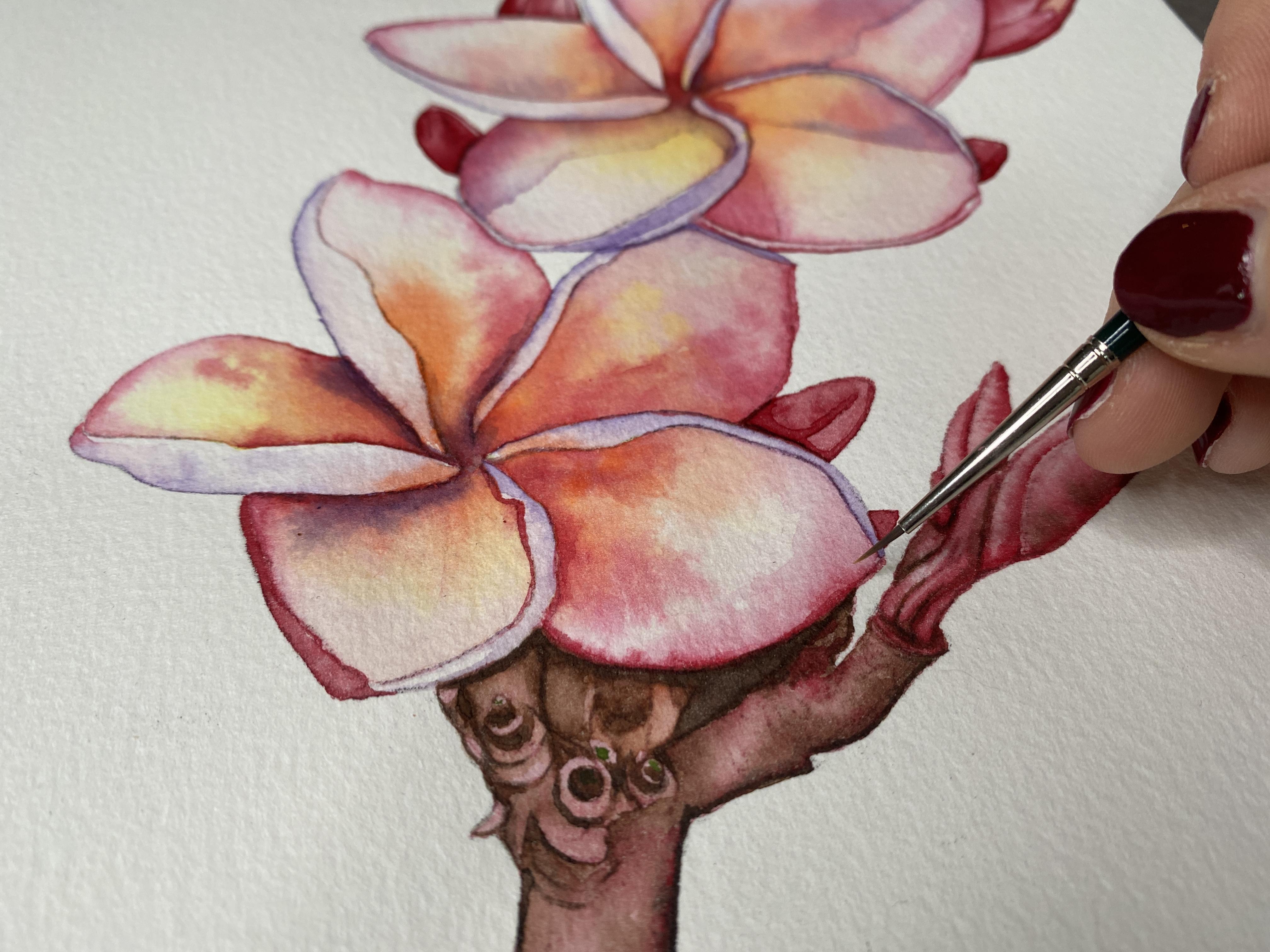
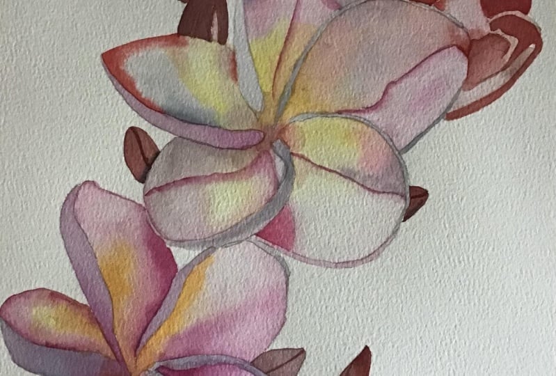
6. Introducing pinks and oranges wet in wet: so in this lesson will make first, um, step towards introducing the pink in the orange, and this will be towards the edges of the pedals. So I fled the yellow dry completely, and I'm going to be wetting up some of the uhm pink tone and the orange tone of my palette . So that's the winter orange and the ruby red. Here, you can see Afghan little at the top of my well there, and I'm watching the well so that I'm able to choose between watery paint from the bottom. There's the will, or I can take my birth straight into the little patch of paint to pick up a very concentrated pigment. So it's always important, an important distinction to make so I can do this. Or I can go into the watery, washed out orange that collects at the bottom of my well, there, doing the same for the pink. So I'm just waiting my well with some water, mixing up a little bit of the paint, and then I always have the choice if I want to take really strong pigmented pink from the top there, or whether I want some watery color from the bottom of the well that you see there. You have added a drop more water and then we're ready to go. So this I also be doing wet and went, So I'm going to be starting by wetting a pedal. So here's my palate, so you can see I'll be starting by waiting a piddle, and then I'll be introducing pink and orange from the edge in words, and I won't fuss too much with e inter portion off the pedal. I'll rather let the water do most of the blending for me, and I'm going to be concentrating on the edges of the petal, keeping them clean and crisp and increasing contrast at the edge, meaning that a lot of pigment will be deposited along the very edge of the pedal. So same as before. I'm going to be wetting the pedal with some clean water, and this was after the yellow has had a really long dry, so the pigment we've placed so far is completely dry. I'm starting on this puddle over here, just wetting the area like was done before, and because the yellow has had a chance to dry, this new layer of water will not disturb the pigment. It won't move the pigment unless you really begin scrubbing at it. So be gentle with it, just with the area like we have done before. And then I'm going in to the orange. So I'm taking watery orange from the well, placing it on the inner portion off the pedal and taking it along the edges there. And I'm dabbing on a little more before I wash my brush and switch over into the pink. It's now I've picked up pink from the top of the palate, so my brushes not very wet. Right now, it's mostly just dry pigment that mixes with some of the dampness that's already in the brush. And I'm taking that along the lower edge of the petal there, which, if you look at the picture, has a fair bit of pink in it. There you saw, I dipped into the well of the pellet, and now the pigment is moving much more because I've picked up more water, Um, more water and more pigment, which allows the paint to move across the already damp paper there. I've just washed my brush and whatever is remaining, and nearby I spread all along the edge there. So this was me spreading pigment that is already on the paper. I didn't pick up anything. Additionally. So here, up close, I'm stamping a little more pigment along the vory bottom edge of the petal. And this is what I mean when I say that I'm increasing the contrast at the edges. So I'm placing more pigment at the edges, which then contrasts with the white of the paper, the white of the background. And in that way your edges stay nice and sharp and well defined, and it helps your subject to pop forwards and off of the white background. So now I'm placing pink wherever I see pink in the picture with the very tip of that brush . And then once I'm happy with the pink, I can also go in with a little more orange. So I'm just placing some color where I think it's needed. And then I go into the concentrated orange from the top of the pellets. So not the watery paint from the, well, the concentrated paint at the very top, and I just go in and I place that where I need it, and I also sharpen up that edge over there. So again, we're focusing on the interest, keeping those nice and well defined and letting the wet paper do most of the blending within the petal for us. So I'm going to be repeating that on all of these petals. So I'm going to dampen this one again now, just with clean water, taking it all the way up until the edge, being really careful with it, I'm just using the tip of the brush. I can pick up my paint, go into the orange and then placed the orange towards the center of the pittle and just coax it outwards. And you can see again here now how the damp paper does most of the blending for you. So it's much more about place in color rather than moving color and clean up that edge there. And I can also clean up the edge on the other side, making sure to get that little of rivet, that little detail before I pick up more color. I'm just blending it out. Sometimes you have to coax the pigment along here Mike Shields or just spreading whatever is left on the brush along the bottom edge of that pedal because it's not very, um, it's very pale, but we do need to define the edge of the petal even where the pedal is mostly white, going in with more pink, focusing on that edge there and then tapping the brush to deposit more paint and then also taking that along the edge. And I'm making sure that that fold back that I've included in the line drawing stays nice and crisp and white because we'll be painting those at a later point in time. But we do need to reserve the space for them, so we need to keep them white, and we need to keep the edges clean so that we can create that effect of the pedal folding in on itself. So here have actually just washed the brush in. I'm moving the pigment around that's already on the paper, too blended further but also defined to define that edge there where the petals mostly pale . But I still need to create some amount of dimension between the pedal itself and the folded portion that will paint at a later point in time.
7. Building Pinks and Oranges: I'm doing the same thing again with the next pedal. It's wet now. Then I can go in with some watery orange. I'm placing that towards the center of the petal, letting it spread out. I always find it so satisfying to see the pain shoot across the paper like that. It's one of my favorite aspects of watercolor, so I'm taking it along the edge to define the edge and then dropping in pink and taking that all along the itch and another note to keep in mind. Um, the effects that we're getting here, where the pain shoots across the paper like this, I find that this is easier to achieve with cold press paper, so paper that has a little bit of a tooth, a little bit of texture to it. If you're working on hot pressed paper, you may find that you will have to coax the paint along more. You'll have to move it more than what I'm doing here now, because, um, the texture paper does allow for more movement of the paint in the water, it seems to me, or at least that's my experience. So if your paper is fairly smooth, smoother than what I'm using here. You may have to put in more effort for the same amount of movement. That does not mean that you should add more water. Um, you can definitely overwork hot pressed watercolor paper with too much water. So you will just have to do more labour with your brush to coax the pigment across the paper. Anyway, I've switched back into orange here again now, and I'm taking that through the center of the pedal. So I've placed that down. I've kept the edge is nice and clean, and then I'm going in with more pink to build up depth taking that wherever I see pink tones in the picture or just wherever the petal is fairly dark. So zooming out a little bit further now will do the same thing on the next pedal. So I've just wet it again here now, taking my brush all over and then going into the concentrated pigments of there, you could see what I'm doing. I'm really rolling my brush over the pigment that is on my palette. So that is straight from the tube, not watered down. Um, And you can see, by the way, that the pigment is spreading that, um, you get quite a nice effect in this way, and it's easy to build up contrast along your edges. And if you achieve the right kind of dampness of the paper, it's fairly easy to do so. If your paper is shimmering with water but not in a puddle with water, you will be able to, um, see this happen quite easily, assuming you're using decent watercolor paper. Um, and I really love the effect because it's so natural looking and the Grady and his always move, and there's very little fairly little effort on your part to achieve this. So when I'm happy with the amount of pigment that's place down, I wipe my brush on some kitchen talent, and I just extend some of that pigment up to define those edges where the pedals fairly pale. Yet I do want definition, so if you look in the picture, that's it's almost white there. But we do need to help it stand out and stand forwards from the white background, and we need to help it stand out from the little folded back portion off the pedal that will be painting at a later point in time, so we shouldn't leave any portion of the edges of a petal white. But we should pay attention to the fact that some of them are very, very pale, Um, pressure just because that's the coloring of the flower and partially due to the way that the light is hitting the flower. So I would argue that even if it looks white to you in the picture along the edges, you need a little bit of pigment, even if that's just a very watery wash of the orange or the pink, you can see I switched over to my smaller brush here for a little more control. And I'm just working that pigment along the edges to do exactly as I just said, right. I'm just defining the edge and, um, separating the pedal from the background on that folded portion. I will paint later. I'm just taking the pigment that's already there, spreading it down and connecting it into that orange interest, softening some of those lines, and then I'll let that dry and work on the next one. So again, I'm just waiting it, and in this light you can see that, um, the papers fairly textured because you can see the Corine shimmer whilst the pedal is wet. And there you saw I applied just a little too much water. So I dried off again with my brush before I pick up pigment to go in with my smaller brush . There, you can see I'm going into the concentrated pain to the orange. I'm really working it into my brush and then taking that along the edge there so that I can move freely on the damp paper. And again, this is why it's so important to be careful with your water placement because this paint will spread wherever your water is. So if your water is placed, have passively or messily with a jacket edge. You also find that reflected in the painting, whereas if you pay attention to the placement of the water, you have fairly little um, that can go wrong with the actual paint. Worst case scenario. You might apply too little or too much pigment, both of which can be corrected for quite easily, assuming that the paper still damp right, you can always lift pigment with a tissue by dabbing so you dab and lived or with a brush, you can lift away highlights. You can blended out. You can add more pigment if you need to write. But changing the shape of something is very difficult with watercolor. So there I'm quite happy with the shape. I'm just going to be adding a touch more pink on the very edge to increase the contrast there and to give the pedal more shape around the itch. So that was just with a little more off the pink. And then I'm also dropping in pink there, too, highlight the shadow that you can see there in the picture. So that's the shadow that's being cast by the petal. That's just overlapping this one. It's, Ah, dark area that, uh, gives a lot of dimension right to the flower. So it's important to capture it. Um, and I'm doing this again with the pink because I want to keep the vibrancy high. I don't want to immediately grab for something dark and dull to create shadow. So that is why we're sticking to these few colors at the moment, which also creates a lot of visual color harmony in the picture. In addition to that, it keeps the picture looking very vibrant and colorful, which something I really love to work towards with watercolor Because, um, I love the interplay between the translucency on seeing, you know, the white of the paper, showing through or other layers of pain, trying through whilst at the same time, creating something that is punchy and interesting, an eye catching. So I've found that this is the best way to do so, to stick too bright colors as much as possible and to minimize the separate number of colors that you're painting with.
8. Completing the initial wash of Pink and Orange: so we'll repeat what we did here with the next flower now as well, rearranging myself a little here. So again we'll with the metal completely and then go in with orange towards the center of the flower and pink towards the edges. Mostly just focusing on getting nice, sharp inches and not worrying too much gets about what's happening in the center of the patrol, because the water that we're placing down, what blend the pigment for us, and we'll be adding more detail. Andi shadow in a later earlier. But for now, I need to get the color down and get the shape right. And part of getting the shape right is making sure that you have nice, sharp edges that are well defined. Um, because I creates a lot of realism for the petals. I'm going to go into the winter orange here, fairly watery pigment, the entire petals, which and I can just dubbed, um, the pigment wherever I need it, and then take it along the edge here and about till there you're not forcing much with it. Um, I took it a little far here, so I'm going to push down and then what my brush. Do pushing whip. There we go, and then I'll switch over into some pink. So with the very tip of that brush and picking up ruby red, which, ironically, is a pink. But there you go on, I'll takes out along the edge here and then also down for that shadow. If you look at the picture, there's obviously a shadow being cast by this pedal that hangs over this lower petrol. So I'm just dabbing for a little more pay off and then taking it all the way till the very , very inch of my pencil line here, where that fold over begins now in the picture. There's no a lot of pigmentation right around here, so I washed the brush. I've given it a little bit of a pack try, and I'm just going to be blending whatever is on the paper already along the edge here. I'm not depositing anymore paint here where the petrol is virtually white, so it's not going to be quite white in the painting just to give it enough shape and definition. But by not putting down more paint into spreading what's already there, we keep it very light and translucent looking. Have to clean this gun shop over here. There we go, and I'm going to leave that as is, and it'll dry. And then I will be ready for the next layer details to take the water carefully over the entire area up until my pencil like and I make sure it's a nice smoothly so that the entire shape that I want to paint is damp, just like we did with the first layer of paint with the yellow. And I can go into orange pick up somewhat. My winds are orange. We're going to take that along the edge here with the very tip off this brush. You can become very precise on along the edge there, and then I'll have a little to encourage not to bleedin blend words. Give the brush a wash on a dry, and then you could coax it up a little more. And then I'll wash the brush, dry the brush and going to the pink. So that's the ruby red, and it's not a very pink pedal, so I'm going to be cautious with the amount of paint a place down. So I'm washing my brush now because that's more than enough. I'm putting it dry. I want to spread what I've placed all the way down to keep it very pale, because in the picture this is one of the pay list pedals, mostly because it's curved. So this point here that I'm pointing at is kind of bend backwards into the background, and this portion is coming forward. So what we want to create is it kind of round highlight here. We're just easiest to do if you keep it very pale and then make sure that there is some pigment to define the edge here and also in the back. But I'm keeping this area pale, and when we had some of the details later, that will help also to give that shadow some shape. But for now, I'm just keeping the pain to fairly light, and then here, where it's darker. I'm placing more pigment by having it for the pink, and I'm going to go back into some more pink, just a dark and the shadow here, and to really concentrate the pigment along this edge here, where this petal is naturally darkest, that's here and in the center there, give my brush awash let that dry while we work on the next pedal. So I'm noticing that I actually have a fair bit of graphite on the paper here. So I've taken my research and I'm just patting the area again to lift some of the excess pencil. Um, it's the line that kind of indicates where the shadow falls. And I just don't want that to be so dark because it will show up later on otherwise. So I just lifted some of the pencil line there, and I'm going back in with water do with the petals so that we can apply both orange and pink. Now this particular pedals more pink than orange. But to keep the continuity and to keep each better looking harmonious, I always use both colors on every petal. Um, even if it's just a little, you know, a little hinge of the color. Um, especially also considering that there isn't really much orange in the original picture, right? So the orange was my choice, more so than me seeing a lot of orange in the picture. So I'm going in with orange here around the edges, keeping that fold nice and sharp and again letting the pigment blend up and out, and I'm just placing it where I want the most color to be giving my pressure clean to just spread the remaining pigment that's already there out, giving it a bit of a dry and then going in with concentrated pink pigment from the top of the palette. So that's me rolling my brush through the dry paint at the top of the palate, rob than picking up which, um, pigment that has been diluted with water. So that's why you see less movement here right now, because I've introduced pigment without um without having more water flowing, to keep that edge at the top there fairly well defined and to introduce a fair bit of contrast there and will be blending that out in just a sec. But for now, I'm really just focusing on placing the color where I needed to be there. I'm spreading it up, and it needs to be dark here anyway, because will be layering on a shadow in a bit. So for now we can just focus on laying down a fair bit of the pink and spreading out a pigment that we've already placed down. So there with a damp brush. I'm just letting it blend down. It's okay if it gets a little darker on the sides, right? Because we'll be introducing the shadow up until where the line goes up in those two pencil lines. Right? Um, so in that way we will build more depth at a later point in time. And there you can see, I've been fairly quick with creating a nice, even wash of color that features mostly contrast along the edges with just a subtle hint of the orange at the bottom. There, just with a bit more pink, I can work on improving the depth, taking it along the edges there and again with the very tip of the brush, lightly depositing more pigment until I'm happy with the depths of color. So there I'm going in with another layer of pink, where the shadow will be later on, just to build up that color and pigment. And I roughly take that towards where that pencil line indicates the shadow, and I'll let that try. Well, I work on the next pedal, so here I've just taken water to dampen it. That's a really large pedal, so I'm trying to be quick with it so that it doesn't dry on me before I have a chance to even lay down the paint. So at this point in time, you might find it helpful to use a larger brush, depending on you know how quickly you work. But here I'm going back into the orange life with the brush with a bit of watery orange. But I'm really going into the dry pigment at the top. There on, I'm just letting it spread out again and to its own magic. I'm just focusing on keeping those edges nice and smooth and just kind of coaxing the pigment outwards. Here. I've washed the brush, dried it a little and picked up pink so there will be read on. I'm taking that along the edges, looking at the picture, taking it up until roughly where that edge of the shadow starts so I can keep the left portion of the pedal fairly dark. Relatively speaking, Um, because again, it's it's a shadow, so we'll need that pigment anyway. And this was a very effective way of building up the color there, and I'm just taking along, leading it blend and then also respecting the highlight towards the top portion of the Pittle here by not taking any more pigment there, I'm just spreading the pigment that's already on the page upwards. So in that way you create a soft, radiant and a nice highlight where you need it. I'm doing the same here. I'm just taking a thin amount of pain down here by essentially just moving the pigment that's already there. So I've not added anything more. I'm just spreading it all the way up until my pencil line there to delineate where the petal ends without making it too dark. So now I'm just going in with a bit more pink along the edge there just to improve the depth of color. And I do always want the center of the petal to be the darkest together with any areas that are in shadow. So here the shadow really clearly runs up the center of that pittle and blends upwards but not downwards. So in this way we can mimic that effect already know, and it will obviously become clearer once we also layer on an actual shadow later on. So this is just a bit of a base for that while I'm here, I'm also dropping and more orange for more vibrancy and just a little bit more color before moving on to the next pedal. So here you can see I've actually gone in with orange immediately. This is an alternative way in which you can paint some of these petals. So what I've done here is I'm going in with some watery orange, washing up my brush, picking up water and then extending the water out. Um, so if you ever find that you have some paint left on your brush that you don't want to waste, you don't want to just wash it out. Um, you can do this. Just be aware that you need to complete the entire layer of water before, um, anything dries else. You get marks or splotches or edges that you don't want. So them going into the concentrated orange again, dropping it in as we've been doing before and just letting it spread and fade. I'm going in with the pink because that shadows very pink and tone. And I'll also be taking that along the edge of the pedal there where the fullback starts and you can see that I've major to spare that sliver of white for the highlight of the fold of the pedal, and it runs all the way through from start to finish off the pedal arm, just connecting these areas with a damp brush. So I haven't picked up any more pigment. I'm just spreading what's already on the paper and, well, that dries. I can move on to the next flower. So here I'm just wetting the petal again. Same story as always, just making sure that the water is in the right place, that it's not too dry and not too wet, that I don't have any puddles sitting on my paper now. Once I'm happy with the amount of water here you can see. I'm just picking a bit of it up again because it was a little too wet. Once I'm happy with the amount of water I can go on with paint. So here I'm dropping in a bit of orange, just a tiny bit, because there isn't much visible in the picture. It's mostly pink, but again, for the sake of harmony and for the sake of vibrancy, I do drop in a little bit of orange for every petal you can see here that I've gone into watery paint, so that's from the inner portion of the well, just so that its pale and not as strong as it would be had I picked up concentrated pigment again because the petals is just not very orange. Now I've picked up concentrated pink from the top of the palate, and I'm taking that along that edge there where the shadows cast where the colors strong and vibrant. And I'm also taking it down this Adrover here and I'm looking at the picture and looking at where I see the most pink or the most shadow, and that's where I take the paint. So I want to let that sit for, but I'm not totally happy with it, but it's very wet right now, so I'm going to just leave it for a minute and going to the next pedal, and you can see here that when I'm applying the water, I'm leaving a dry sliver as to not disturb or connect the two shapes. Because the previous petal still very wet and I don't want thes two portions off the flower to bleed into one another so they're after is what the petal. And then I can go in with orange and you'll see, um, that sliver of dry paper that I've left just to prevent the bleed. Actually, there I realized I had way too much pigment on my purse. Oy patted it off and just went into blended out again. The petals not very orange. So I don't want to much of the orange pigment settling in the paper here. But anyways, you can see that I've left that little sliver dry and not just prevents any kind of bleeding and disturbing of the previous petrol. In the meantime, I can also take the pink along the very edge here, focusing on that edge, using the tip of the brush, moving the pink along along the edges and then patting it wherever I need more pigment to deposit. Just a little more paint. Next, I'm watching this pittle just pushing the water into that little triangular shape and then all the way up until the pencil line there, and I don't need to worry about not connecting it to the petal down there because that puddle has already dried as soon as you want to call her his bone dry. You don't really have to worry about bleeding anymore. It's just, if the paper still what or even just damp that I would. Highly, I would encourage you tow. Avoid connecting those shapes than here have gone in with orange. This is watery orange from the well and then pink along the edge there, where the shadows darkest stand along the top edge side there and again. Like I said, even the pale areas need to be defined Esper to the edges. So I am pushing the pigment that is already on the paper all the way down to the edge down here, even though the pedal is fairly pale there. So this way it gives shape. And I mentioned we can always balance it out by then ensuring that our shadows air deep and dark and in that way, relatively speaking, these areas that have some paint on them that is light and translucent, they'll look quite pale and luminous and still they will still appear is though they are highlight because relative to the remainder of the painting there will be rather pale. It just means that we can't relieve, keep certain sections as white as we see them to be in the picture. In the meantime, I'm waiting the last petal here. So this one actually didn't have any yellow in it, because I just I didn't see any yellow in the picture. And it didn't seem fitting because the bottom portion of this petal is not visible, right. So the weave we've applied the yellow towards the bottom portions of each of the petals, where the warm color and the picture kind of grows out like a son. You know, it glows, and that's just not visible here because it's covered up. So for the time being, now we're working with, uh, pink, because the petrol is predominantly pink and I'm just taking it along the itch there and also focusing on the other edge and that dark shadow towards the center. I'm doing this with watery paint that I took from the well just because it's a fairly small area, and I don't want to overload the small shape too quickly with too much pigment. But you can see that I have dabbed quite a fair bit of paint on because the shape is fairly dark in relation to some of the other petals surrounding it. So here I'm just pausing. I'm looking at the picture and deliberating a little bit about how to, um, gained back that highlight a little bit. Sorts because the shape so small, the damp paper has spread the pigment just a little far for my liking. So what I'm doing now is actually just washing my brush, drying the brush off and then actually just swiping the wet area to capture that highlight again. So in a way, we're lifting some of the paint here now. So I'm each time dabbing my brush on my kitchen, tell to remove the pigment that's on it and to dry it and then just swiping over the area until I'm happy with the lightness of that highlight that I'm achieving their
9. Washing in the bulbs and stem wet on dry: So I've just cleaned up my pilot there, and I'm going to wet some of that red. It was a really beautiful color by Daniel Smith. Um, but any rich cherry red will do. It's creating a little bit of color in the will. And then, as per usual, I can either take watery color from the well. Or I can go up here into the thick paint if I need really strong payoff for the boat. But because it's quite small, I'm switching back over to my little brush. That's the size sooner, Divinci. And I'm going to be starting with the pink so me for you, straining with the pink. And I'm just going to be filling in some of the major shapes off that Bob now because we're working in a very small area and they were very specific shapes. I'm not always going to be wetting the paper. First someone says I'm doing went on dry. So, for example, this portion here now, um, I'm just layering down one layer of pink without wetting the paper. Because it's a small area, it won't dry, um, too quickly. So have time to fill out the entire shape before the paint dries. And because it's a very specific shape, it's easier to work. What on dry. We don't need much of, ah gradation of color right now. So for that reason, we don't really need to, um, bother reading the paper first. Well, that gets a chance to dry. I can work back here. So again, just laying down the pink will be going in with red later. So I was just creating base of color, much like the yellow that we placed down with the remaining flowers. So the ones that are open this is just too great. An under wash that shines through the red that will be placing the accents with so just covering everything in pink that is not white or very pale. So we're painting everything with the color were just sparring. We're just omitting the highlights here. No picked up water, too. Help spread the pain faster because it's drying on me, and I don't want any unnecessary harsh lines picking up more water, going up to the edge here. For that highlight, I'll pick up some more pink to intensify the color here and then also color in the shape here that's much darker. I'm going all the way up until the edge here and then also dropping and more pigment over here, because I need this to be quite dark, just like so, dropping in this dark shape, washing my brush, patting it dry and then going into some water here to blend that corner to make sure that that's nice light. So by dropping in some water here and creating this highlight here that is also visible in the picture and then with a which brushland? No pigment. I'm just filling out these pale ships, so that's just spreading some of the existing pigment over into that shape there. And then we will let that dry for now, before we work on further details. Now everything else in the area is dried, so there's no chance of bleeding, which makes it easier to paint it now, um, under to be mostly working with the pink and also drop in a little bit of yellow and orange . But the petrol is kind of complicated because of the way that it's angled. So that's why didn't paint it earlier, and now that everything's dry, there's no chance of bleeding. All right, so because the pedal is fairly complicated. As I mentioned, I'm going to be working What on dry? Because it gives me more control and time as well. I'm starting with the pink, fairly concentrated at the bottom of the pedal here, where it is darkest. I'm just making sure that I get to shape right so that I spare out or carve up the shape of those two buds that are sticking up and overlapping the Pittle. So that's the second point. There I am also taking the pink upwards and making sure I get that entr. Right. So the edge here where this petal is kind of tucked in behind the pedal in front of it and is leaving Ah, highlight There, Right, that's the full back of the pedal in front of it. I'm just making sure that I get that shape right for now, taking the paint all the way up. And I'm using my small little maestro brush here because it has a nice fine point, and that holds a fair amount of pigment, which makes it the perfect brush for this job. So there I'm taking it all the way up and around the curve of that little. I'm just carving out the shape there. Now, I've picked up some water and I'm blending the edge there where the petal curves in on itself. Um, in the picture, you can see that the color fades out there. Similarly, I'm taking some water down towards the bottom here to push the pigment towards the edges of the shape to create that slight highlight that you can also see in the photograph. So, in a way, this is just pushing some of the pigment outwards. I'm coloring in the shape down here using Winter orange, and I'm letting that bleed into the shape we've just created that is still damp. So there I'm just blending that color upwards, and I'm going to actually leave that little bit now to dry before I do any more work there . So while I'm here, I can also paint thes little bulbs, and I'm just covering them in a very thin layer of the red paint. So it's just a very watery layer just to cover them. And then I'm picking up concentrated pigment from the top of the palate, and I'm going in around the edges so that the paint will spread and create that curved shadow effect that I'm looking for. So we're just taking the pigment along the very edge there where the shape is darkest. Now, between painting these guys and painting that pedal up there, I did leave about 10 minutes drying time. So at this point in time, the petal above where were painting now is dry. And I'm just taking more pigment on my brush now to take along the vory edge there where there's a shadow being cast by the pedals in front. So these air coming of coming out from shadow from the dark background I'm just taking more pigments and placing it wherever I need the shape to be darker. Well, I let those dry. We can also make a start on these bulbs down here, these air larger and connected to the stem. So I do want to make sure that we have a nice amount of detail here, um, and that they're well defined. So here I'm actually going to be working wet and wet again because these are larger than the previous ones. So I'm just wetting this one little shape, and I'm going in with a thin layer of the red paint. So that's the read by Daniel Smith, and I'm just making sure it's one even layer of color here. I've just dried off my brush in and picking off and swiping off the excess moisture. And there you can see we've reached the perfect listening state again. I call it right where it's damp, but it's not stopping what and then I'm going in with concentrated pigment from the top of the palate. So I've really rolled my brush in the dry pigment, and I'm just letting that bleed up to create that shadow that helps us create around it looking shape. So there I'm just cleaning up the edge with the very tip of that brush. I'm also extending that all the way up to the end of the shape, and then I can also use that, too. Map out the other edge there. That's also going to be a dark shape. And then, with a bit of water, I blend out the tip and also the edge that I made, and I'll be making sure to leave a gap, a dry gap between that shape and the previous one we've just painted just to make sure that there's no bleeding across the different shapes. There, you can see the gap a little more clearly. I'm just taking the very tip of the brush along the edge of where placed the water, making sure not to connect those to keep a little sliver of dry paper in between the shapes so that they remain distinct, dropping and more pigment now and letting the water do most of the work for me, taking it all the way along the edge. I'm not so along the bottom to again built the contrast after layer, apply pigment and increase the intensity of the red color. Now I've cleaned off the brush, and I'm just using it to blend whichever area I'm not completely satisfied with yet. I'm just pushing the pigment to wear, needs to go, just help blend it and move it into place. So there have actually cleaned off the brush again, so I'm swiping it on my kitchen towel and then coming back to blend it out. And then when I'm happy with that shape, I can move on to the next shape. And again I'm taking watery red filling out my shape being careful with the placement of the water and keeping the interest smooth and taking the water all the way up until the edge of the pencil line before then pick up more pigment to run along the edge of the shape so that I can bleed out and create the shadow that I need. This just creates a very organic looking blended effect, right, and that's really something that I really appreciate with watercolor. Obviously, if you wanted to be more of a smooth blend and you don't want all of this texture up there , what you can do is use smoother paper or spend more time with your brush actually moving the pigment around. So here I was, just indicating that the area up there is small and what so I don't want to paint those two shapes that are right next to the larger one. I just painted because it would just be too difficult to avoid having a bleed. So instead, I'm working on this section down here that connects to the stock for now, and I'll go into those two little shapes up at the top in a little moment when the other one has had a chance to dry. So here again, just wet the area. And then I'm going in with the red paint to add more shadow where I need it, and depth to any area that looks dark in the picture. Now, while I'm here, I'm also just going to fill in this little shape. That's just another little bulb. I'm just starting off with watery red. That's a Daniel Smith color, just filling it in like we've done with the previous one as well, all the way up until the pencil line. And then I can pick up more pigment to give it shape and dimension. So here I'm going in with the red from the top of the palate, really concentrated pigment along the edges to set it off. From that full back, that's going to be very pale, two separated from the white background and to give it shadow around the edge of the shape to make it look rounded. So here have assumed us into those little remaining shapes. Now the rest of that area has dried, and we can easily paint them without the risk of a bleed. So I'm just filling them in with red You can even overlap there slightly if you want to, just to make sure that there is no little white spots left behind. And then I'm going into the concentrated pigment right from the very top of the palette there, as we've been doing before. But I'm taking some of it off because the shape so small and I don't want to overloaded with pigment. And then I'll just be going in to provide more shape to the round inner portion there. So I'm just taking it along and just watching how to react with the water that's there, placing it where needed to go and then also adding more depth to this guy up here who is almost dry, but not quite just for a more definition, and then with a clean brush that I have washed and dried. I could just blend my mark there, and I'll just fill out this little guy down here. So if resume out, that's what it's looking like. And here I'm just adding a little more pigment to this little portion down there where actually, in the picture, it's fairly dark. I'm just building up the color with more of the red paint using the tip of that maestro brush to great, really nice, thin fine lines just building up the contrast around the edges. So all along the side down here and also within some of those ridges that you can see in the picture So what? I'm here and I've got the red paint going. I'm going to be washing in the stalk of the plant. Um, it has quite a lot of detail in it, but I'll only be adding that later on. For now, we just need to lay down the red color to get an even layer of the paint, and we'll let that dry before we work on any more details. So I'm just taking some of that red paint and taking a fairly watery wash of it, and I'm going to be taking it all over the stock, just focusing on having nice, sharp edges and not worrying too much about the center. Um, I'm working with e small maestro brush here because there are a couple of nooks and crannies along the edge of the stock towards the top that I do really want to be able to have be nice, sharp and crisp So hence why I'm using a small brush for relatively large area. I'm just taking that red paint all the way up getting those little marks. So I first take it through the edge and then worry about covering the majority area. I was taking it up the side as well and then loading up with more paint and again because we're using the same red here. It will keep you know, a nice amount of continuity and harmony in the picture. So whilst the stock is also brown, we'll be working with the brown later on. Having this base layer of red helps tie everything together, and it'll just help for the painting to look more again, vibrant and also harmonious. So I'm just going to be taking it all the way up the edge here as well. There you can see what I meant when I said that there are a couple of nooks and crannies that the small brush is very convenient for, and I'm just taking it all the way up, and these petals air dry, right? So there's no chance of any kind of bleeding or mishaps just working my way up here, taking the paint all the way up, just making sure that the edge of the area that I'm painting never dries before I keep moving, so I always keep reloading with watery paint to keep the area damp overall so that it's ones moves layer. And I don't run the risk of it drying on me before I'm finished. I can also fill out this tiny little but at the top here with the same paint that's on my brush. And then I'm just taking a little more into some of these nooks where I just wanted to find the edge a little more, and I just want to deposit a bit more paint to help push the stock into the background. To then it also helped lift the petals forward.
10. Defining edges and introducing shadows (1): Okay, So at this point in time, we've got the initial layer of color down, and what I'll be doing now is working on some of the edges and improving the contrast we have there. So I'm going to be using the Casoni a brush, but also this little detail bar. So this is the, um, fine detail brush that I mentioned earlier in the class. I'm going to be using both them, and you can see that the detail purse is really quite small, which lets you really smooth out the edge of a petal. And it also means that the pigment is deposited in a smaller space, so there's less spreading off the paint this way. So I do like using a very small fine brush for this, um, step of the way. And this will be the last step before we then go and paint the full backs. So again I'll be working wet and wet, some just dampening this pittle down here with water. So this is the third time you'll be wetting it with water. Most likely, um, and everything has dried completely since the last time you saw me paint, so there's no chance of any kind of bleeds. Everything has had a chance to drive properly overnight. And this is me painting on a new day. So here you can see I've switched into my little detail brush, and I'm going to be taking the red color all along the edge here. So this was the first time we're using the red paint on the petals because I'm now building the depth of color and also introducing, um, more contrast here. I do like to then use the red because it's just a little darker and it just gives everything a little more dimension, and it improves the shadows. So this is now watered a little. And I'm just taking whatever is left on the brush along the edge there that have concentrated most of the paint along the upper edge, where you also see in the picture that the shadows darkest. So I'm just blending that down and you can see there's just very little paint left on the brush in that lets me just pull that shadow down slightly, and you can see what I mean here. When I said that thesis more brush means that the pigment doesn't travel so far. So here my she going back in with my damp, clean Cassini. Oh, just to blend that out. So here I'm watching this other edge just to make sure it's damp enough for me to go in with my little detail brush, which I can then load up with red paint to then take around the edge there a long and you can see that I've used now fairly watery paint. It's not very strong because the petals very pale down here. So I'm just using barely enough to define the edge and to set it apart from the full pack, but not enough to make the petal dark. So overall, the pedal is still at its pay list in the bottom, right, And towards the center portion down there, um, which is also reflected in the picture to here. I'm just blending out my rich Otto a little bitter, and I'm pretty happy actually with that first pedal, so I'm going to be moving on to the next one. So I'm doing the same thing again. I'm just going to be winning it with water, taking my castle near brush all the way up until the address and Actually, the edges are the most important things right now, right to dampen, because that's what we're working on. So I'm really making sure that the water goes all the way up until the pencil line and that the pedals not too wet, but what enough so that the pigment will flow and it'll blend itself inwards so that we get a nice, sharp, crisp edge and a nice, even Grady int moving in. So then I can switch over to my detail brush again, loaded up with the red pigment, and then I can take it along the inch and here have taken fairly concentrated paint. So I've loaded up more pigment than I did with the previous section. Just because the shadows quite dark and strong, especially down here, enters overall in that inner portion of the pedal. This was a great opportunity to smooth out any lines that might have dried a little ragged or anything that you're in terms of the shape of the peddler. Just not happy with this is the best opportunity that you have to correct for it, because you can used the red paint as a sort of cover up for the pencil line, and you can also just use it to reshape anything and just smooth out anything. So there you saw. But that EJ was little jagged, and I've now smoothed it out with the red paint. So I've picked up a bit of water to dilute whatever is left on my brush. And I'm not taking that along the pale edge of the petal here, which objectively in the picture, is the pay list portion of the pedal aside from the fold back. So I'm just making sure that that's nice and smooth and that that doesn't get too dark. Picked up more pigment now so that I can darken the inch over here. Um, just to capture that little speckle of red that you can see in the picture there. I'm just taking it all along the edge. So just trading up down there and then with a clean brush, lifting a little bit of that pigment and also just blending a little bit of that. So here have just wiped the brush to lift little bitch. And to spread that just a little bit further, So free Zoom out. You can really see the impact off that red edge and the impact of improving the contrast around the petals to work on their shadows. I'm going to be going in with the purple color, so there's a shrinking violet and I'm going to start placing in the shadow that you can see in this larger Pittle. So I'm starting off bridges, taking that purple along the edge and then with a clean brush, coaxing it down and keep in mind the petals wet right? So it's fairly easy to move to pigment around here, and then I'll let that dry and I'll continue on the next one. So here I'm taking the water along the edges again. And then I'm going into the pink with my detail brush. And I'm going to be using the pink to define these edges here because they're just not as dark as the ones on the previous Pittle, Which is why I'm not using the red right away, just letting that spread. And I'm just smoothing out that line, removing any little squiggly marks or jacket edges. I'm just letting the water do most of the work for me there and then also working on the edge here, which in the picture is not very dark. But as I said, I do need to work to lift the petals off of the white background. So we do need a fair bit of contrast to be able to do so, taking the pink all along the edge and up the center here where the pedal is darker and Richard Color and I'm just connecting that shape up to the edge here have just wiped my brush to be able to blend us all the little without adding too much pigment. And again, I've wiped the brush and it's just damp, and I could just use it to spread whatever pigment I need to spread. I'm taking the tiniest bit of the pink up under that petal there now in the picture. Obviously, there's no shadow, but because I've changed the composition and I've place these three together, I do need to account for the fact that there would be a little bit of a shadow there. So I've just taken a little bit of pink along the edge, and then I've switched over into the purple to start to build the shadow that would be there if that pedal were to be hanging over the flower were just painting now. So in a way, we have to hypothetically imagine there to be a little bit of a shadow. So I'm just blending that out with a clean brush now, and you can see it's really not a lot of purple. The purple is a very strong pig when it's very dark and very rich, and you need the slightest touch of it to create the illusion of a shadow. So go very lightly with it. You can always add, but you can't remove, so build up in layers and, if you're not sure, literally or dry before you make further decisions, because the darker watercolors tend to actually dry a little paler than what you expect them to be. And watercolors can look a little different when their drivers is when there would. So if in doubt, I would pause, let it dry, reevaluate and then see if you want to add more pigment or not. So I'm going to be working on this piddle next, and it has a very pronounced highlight up there that I'm just going to be cautious of preserving, so I'm actually not taking the water all the way over the entire petal. I'm leaving a little bit of that white area that you see in the picture, um, dry in the petal so that there's no chance of the pigment traveling there. And then I switched to my little detail brush. I pick up concentrated red pigment from the top of the palate, and then I go in along the edge there and I take it all the way along the edge and under that pittle and along the side there and there I am, dragging the brush, and I'm kind of laying it flat, which helps you get a nice, smooth line. You just smooth out any jagged little edges that I might still have their there have picked up more paint this time from the well. So this is a watery paint now because I wanted to move more. I want to create a bit of that shadow there, and I'm just placing it along the edge to increase the color of the petal there. And two Cokes, the pigment into moving a little bit too. Create more of the shape and the color that you see in the picture. Then we can move on to the next petrol, so I'm just wetting it here and then switching over into my smaller brush and taking red pigment along the edge there. But this is the exact same process we completed with all the other pedals, and slowly you can start to see the flower come together, right? You can see how the contrast is improving the detail and the overall realism of the flower , and we're still keeping it very vibrant by sticking to if you and bright colors and by really making sure they will be introduced. Contrast. So contrast between white and color, especially along the edges. So I've placed down my pigment and my pressure's almost empty. There's almost nothing left on it, and I'm just taking it along the very outer edge, which is pay their than the center of the petal, Um, just to define it a little more and to provide a sharper edge where that pedal in the left meets the white background. There have picked up more pigment to darken up the edge there, and this is actually now with a drop of the purple. So that's shrinking Violet that I've just dropped in there just to darken it up into start to build a bit of that shadow that you see in the picture. And I'm taking that down into the center, and I'm using that also to define some of the edges of the full backs in the very center of the flower. So if we zoom in, this is where we're at right now and I'll be doing the same thing on the next flower.
11. Defining edges and introducing shadows (2): All right, welcome back. I've let the flower at the bottom of the composition dry little bit, and in the meantime, we'll be working on this one in the middle here. So I've just wet the petal similarly to how I've done for the previous petals. So the entire areas damp, and I'm going in with my detail brush and the pink along the very edge of that petal there . So I assumed you infer announced that you can see what the paint actually looks like when it's traveling, but I'll show you the picture again a little bit as well. So I'm just making sure that the edges are nice and smooth and you can see that the pigment will spread quite a bit on its own, and it'll blend itself. So I'm really just focusing on the placement of my pigment and on smoothing out any of the edges around the site, especially where they are. These folded portions of the petal that really are perfectly smooth lines. So the more that you can achieve a nice move line there, the better the outcome will be. And I find that what's going on on the center of the petal is really not as important so long as the value is right, so long as pail areas or pail and darker areas that need to be darker are in fact darker. Um, so here I'm just going back in with more water because it was just a little too dry, and I'm waiting specifically that area that is cast in shadow. So that's roughly up until that pencil line that we have there and also just blending the pigment I've already placed and again, the petals damp, so it's very easy to move the pigment around while I'm, um while it's still wet. So if you ever notice that you've just applied a little too much, you can always just lift it with a larger brush. I'm going back into the pink, and I'm defining that edge there, going all along the edge of the fold and up towards the center of the petal. There interest moving the pigment where I needed to go and then slowly starting to define the edge of the shadow. I also take it around the center here, and then I can darken up the corner and that shadow in the corner all the way up until I meet my pencil line, and I can create somewhat of a combination of watering concentrated pain. So you saw that I dipped into the well, but also into the concentrated pigment at the top there just to create something in between . And then I'm just dabbing in more pigment until I reach a value that I am happy with. I'm doing the same over here and taking a little more pink along the edge. And then I'm switching into the violet to continue to work on the shadow. So there you can see. I just took a tiny amount of pigment, and it really does have quite an impact because it's such a dark, rich color. So do be careful with it. Else. It can really overpower the soft yellows, oranges and pinks that we've created. We're not looking to cover anything up. We're only looking to add a touch of the violet in areas that are cast in shadow for a cool , toned yet colorful shadow. Um, you could also, for example, create this with a gray, but a great would really dull the image down, which is why I really like using purples or violets or even blues for these kinds of shadows blending out the edge a little. So that was with a clean brush And then I'm going to let that try. Well, I work on the next section, so I'll show you this one up close as well. I first went the pittle take a little more water. Make sure I take the water all the way up until the edge. And thanks to that little fullback, we don't need to worry about any kind of bleeding, right, Because we're not connecting the two petals. The water doesn't come in contact with the damp area of the previous one. And then that way we can just continue painting. So I've picked up my little detail brush again, and here I'm going in with the red paint along the edge off that petal towards the inside. So you have to scrap more paint. And I'm taking that along the edge there and dragging it upwards to capture that shadow being cast by the folded portion off the pedal. So here I'm always looking at the picture and reshaping. He fooled pack a little, so I missed that curve towards the inter portion starts mapping it out with my brush and then filling out the area with the red paint. And then this way you can easily correct, um, small shapes like that, so long as you are working fairly dark so that it covers whatever is essentially underneath that little portion. Three of what the brush. And I'm just blending that out and you can see because the pedals went again. It's easy to blend, and it's easy to manipulate the pigment, to fade out and to give you a smooth transition. So I've picked up the violet color now to darken up the shadow. I'm just having it towards the very center and along the edge, where the shadow is more cool, toned and darker, and you can see that I don't have very concentrated paint on my brush. I've taken the violet from the well, so it's fairly watery and soft, and I have a lot of control about how dark I take the shadow. And again with this purple color. It's always best to start light because you can easily dab a little more pigment into place . But you can't really, um, it it can easily overpower, so I just start very light, very watery. Also because this ensures that the pigment travels right. Because if you introduce very wet paint into a what surface, it will travel quite far, and you can easily blend it out and create a nice, soft, translucent look rather than something stark or overpowering. I'm doing the same down here. I'm just sitting out that full back by introducing a little more purple down there just so that the shape is more accurate. I wish. Find it easier to keep them a little thicker than going to thin too quickly, because then you run the risk of accidentally, um, losing it. So going a step too far. So it's always good to start just a little generous with these little white portions and then send them out as you need to. And I've actually switched back into the red here for that lower portion of the petal that doesn't really have very much of a cool shadow. So I washed the brush, I dried it off and I went into the well of the red paint for this section down here. I've been decided that I thought there wasn't quite enough orange in the pedal. So actually just picked up a little bit of orange from the palate, and I'm dropping and in towards the center, here and again, the pedal still with. So it's really easy to do this and to blend it out. Just taking that, making sure the interest smooth and then I could just let that dry.
12. Adding details to the stalk, wet on dry: Okay, so we're entering difficult territory. I've been leaving the flowers to dry for now, and I'm actually going to be focusing on this stock for a little bit. Now, I'm going to be doing that with the brown, and I'm starting off to just to find the edge there, to push the stock into the background and to keep that edge nice and smooth. So I don't accidentally make any mark that overlaps the petal because I would really ruin the effect of making it look as though the stock is coming, um, up and behind the petals. Right. So the petals air in the foreground and the stock is in the background. So just by lining the edge there, we prevent any accidental, you know, overlap with the pedal that we don't want. And what I'm going to be doing is looking at the picture to see the darkest areas of the stock. And then I'm painting those in with the brown. So I'm taking my detail brush here, and I'm just following the picture painting in every little dark shape that I see. And it helps that we have the line drawing right because it guides us and we just need to have a look which shape needs to be filled in with which shade of brown or red. So the value, right? How dark the areas, that is what will ultimately maketh e stock look realistic. Um, so I'm just focusing on the picture and having a look at where it's dark so specifically here along the edge there. And there's a funny looking shape here, sort of like a little pyramid. So I'm going to be sort of outlining that first and then filling it in. And I'm sparing any areas that are paler, and I'll work on those later filling out the area, shading it in and then also over here. If this was a very dark spot, this little shape over there together with that line there and overall, I'm keeping it simple, right? We're not painting every single little mark in detail. We seen the stock. We're just trying to capture the overall shape that it has Anthee dimensions. It has. So all that we're worrying about is creating an illustration of the stock, so to say so I'm focusing here on that little around portion. I'm really taking my time and just using the very tip of the tiny brush to mark those dark areas taking around the bottom there, filling out that little around guy and there are actually made a mistake. I accidentally covered the center of it, but I will fix that later on White going over it with something like, for example, white ink. So I accidentally covered the little circle that I meant to keep pale. But that's OK. Accidents happen, and we can fix that in a bit. So here I'm filling out the area in between going around underneath, and I'm always looking at the picture, simplifying their shapes that I see and then filling them out in whichever, um, depth of paint that I need. So if it's very dark, I make it dark, rich brown. And if it's paler, I use a more watery version of the brown. So here I'm filling out this guy who was sort of pay their than the rest there. So I'm just taking some water and taking the pigment that's already on the paper, and I'm spreading that out here. I'm building up the depth so areas that are very dark are becoming even darker by just adding another layer of the brown and again working in those details, just thinking about the overall broad shapes. But I see, and then wherever I need a pale wash of brown, I just what my brush and I spread, whichever whatever pigment is left on the paper around those areas. And then that way you can see that this stock is starting to come together without us having to do too much work. And by using just a single color, I'm filling out this larger shape. Appear with a medium wash off the brown, making sure to spare that highlight that runs along the edge. And I'm also filling out this guy, improving the shape of the highlight, taking my time around the edge to not overlap with the petal and then picking up more paint with my brush to then darken up the edge. There again, be really careful that you don't apply any paint that overlaps the red pedal, because that would destroy the illusion right of depth that the stock is sitting behind the pedal. So I'm just taking my time, keeping that really nice and dark and smooth, and animals are going to be taking that along the edge of the stock because that improves the roundness, the illusion of randomness, right, because both of theaters a really cast in shadow, and I'm filling out the shape by just taking a little more water on my brush to dilute the pigment that's already on there. And then I could just move that around wherever I needed to go here. I'm just applying a little more to darken up the area. It was just me dabbing more of the brown wherever I see fit and again, improving that edge apprenticed, increasing the contrast also along the edge of the stock again to make the stock look more rounded and well defined, and then also adding depth to some of the marks that have dried a little paler than I wanted them to. Because with watercolor, it really has a tendency to dry paler than you expected to. If you're working with a dark color, the paler colors tend to dry, um, darker than you think they would. Anthee dark colors tend to dry paler than what you expect from them. Doesn't the picture that there is just a little speckle of green here and there where they're just butting little leaves in the stocks. I'm just going to be using a little bit of the sap green, fairly concentrated pigment to create a couple of little marks, so they're not going to show up very strongly. They're just there to add a little more detail on realism. I'm just placing them here and there where I see them in the picture. I'm just taking fairly strong, concentrated color and dabbing that on a couple of the little springs there. I'm not going to be re wetting the stock here. It's tried by now, and I just want to give it more color and more shape. So I'm taking water over the main portion of the stock here, all the way up until the edge. And then I'm going in with the red paint fairly concentrated and from the top of the palate and understanding that along the edges, which will help the stock to a become more vibrant and color and be look more rounded. So by introducing shadow on the edges of the stock and leaving the center of the stock paler, it'll look around and more realistic. And I'm using the red because the Brown had, um, build it down just a little too much for my liking. And I wanted to be harmonious with the remainder of the plant from taking that all the way up and then going in with a little brown, just a dark, uncertain areas. So that's watery, brown. I am also taking that up here where I need just a little more depth. So I'm just moving it around the shape in one watering layer. And then I'm also revisiting this little spot to increase the depth. And then I'll drop in a droplet of water here to create a little bit of a blue to create more of a highlight in the center of the stock so that water will just dis large some of the pigment and put it towards the edge of the shape. So in that sense, you can always increase some of your white highlights. Now, I had thought that I saw a little bit of warmth in the stock here, so I'm just taking some of that orange that we had also used and the pedals, and I'm just taking along these shapes here to introduce a little bit of a warmer brown tone after supplied a bitch. And then I'm taking some water to spread that to create a bit of a warm patch to warm up the brown, because the burnt umber is quite a cool toned, um from and the red is fairly cool, toned as well. It's rather a pink cherry red. So I just wanted to warm up the area, and that's easily done with just a little touch of orange. I wasn't quite happy with C shape there, so I'm just blending out those little edges that were left over. And then I'm dropping in a little bit of water to push the pigment towards the edge of that shape to create another small highlight. I'm just going around with the damp brush, blending here and there wherever I see fit. And then I'm going to go around the very edge of the stock with CPS. So this is the darkest color that we're going to be using. It looks almost black, but it's actually a very cool tone, dark brown and just taking that along the very edge of the stock again to increase the contrast and to set it apart from the white background, but also to improve the, um, overall dimensions. I would say of the stocks or two, Um, introduce shadow center, um, correct and value. So there's only so dark that the burnt number will go, and some areas just need to be almost black, looking for them to be realistic and in relation to the other shapes that we've painted. So that's what we'll be using the CPR for. I haven't taken very much of it. It's fairly watery, but just enough to increase the depth along the edge. And it's wet enough so that the pigment will spread and blend a little bit, but not travel too far.
13. Adding details to the bulbs, wet on dry: So while I'm down here working on the stock, I can also just fill out some of these remaining, then the shape. So this is just one tiny little, but that's peeking out from behind the pedal. And I'm just coloring it in with a little more off the red paint to darken up the color because it just needed to be darker. And then I can also work on this little guy back here, so he needs to be darker, and we need to introduce a bit of shape. So first I'm just mapping in the darker portion off the shape that's roughly there, and this was using watery red, and then I introduce a little more pigment under stab it into place where I need it. So first I applied the wet paint onto the dry, um, shape. And then I went in wet on wet, with more pigment to increased depth of color and vibrancy. I'm rounding off that edge, spreading the paint all the way up till we reached that highlight, and I need to spare that round. Highlight there and don't you just a little more highlight. I'm dropping in a little bit of water just to push some of that pigment inwards. True blend, um, a little bit of a highlight into place. So next up, I'll work on the but here, and I'll be using the same technique as before. So much you're just going to be wetting the area shape by shape and then going in with pigment went on. What? So I'm just waiting this first Christmas moon shape, and I'm going in with more of that red paint to build up the depth of color and to increase the vibrancy and also just to, um, improve the value. So overall it just needs to be darker. And I'd rather do that with color rub of an adult grey or brown. So I started off with the red, and then I'm dropping in a little bit of the burnt number. So are brown here and there, and you can immediately see how that improves the round. Look off the shape because again where highlighting the center of it and increasing the depth of shadow towards the bottom and again that helps you to create around looking shapes and because the pigment will blend naturally in the water and holds looks fairly organic and natural. So while that has a chance to settle a little bit, I can work appear. I'm just waiting the area again with my little detail brush, and then I'll go in with the red paint, taking it along the edge and letting it blend itself in words. I'm taking it around the marks, which will increase the saturation of color and the depth and fill out the little space there here have picked up the brown, and I'm going over that same area but keeping it mostly towards the edges to create an even Grady int. Next, I'll fill out some of the color down here. So this was using watery red all the way up the side of that shape because the entire air just needs to be dark or so. No need to work. What and what here? I'm just literally covering it in one even wash of red paint and then again adding more depth with brown, where I need it towards the bottom, there, going up the side of that seem, or those two shapes meet and then drying off my brush and blending that out. So here I'm just moving the pigment around with a dump but clean brush. I'm going back in with the brown to just increase the depths again and to introduce more shadow. So here I'm taking the birth number all the way up the side there. So I'm essentially just repeating what I did with the red. But then, um, keeping it closer, toothy center of the darkest area of that space. So we're getting more narrowing, more detailed, and this way creates a nice Grady int on, especially from a distance. It looked very, um, smooth and rounded, which I really like. So while that tries, I can work on the shape back here. So I'm just waiting at first, taking the red all along the edge and then with a clean brush, just blending that out and already with this area, appear so that I can take more pigment along the seam there to darken up the shadow. So I'm doing that with Red, also taking that along the top edge. So even though that that's in the picture, um, again, also quite dark. So I'm just working on imitating as much as possible the value shifts that I see in the picture. So taking the paint all the way around there and also around the highlight down the side there. And then I'm also running that dark brown, so concentrated dark brown along all of the edges, where it just want a little more depth and definition. Lastly, I'm blending a little bit of watery read along the edge here because I've left the highlight of little too pale. So I just want to, um, even that out a little more and introduced just a little bit of color there because if you look at the picture, the highlight does not very pay little of roller to fairly dark area, so I'm just correcting for that.
14. Introducing details wet on dry: So at this point in time, we finished the majority of the flowers and we can now just move on to these little folded sections that I'm going to be painting in much the same way eso these air little folded portions of the pedals that are much paler than the petals themselves and, um, are mostly actually white. So I've really assumed us in here so you can see what I'm doing was wetting the area as per usual. And I'm doing this with E small meister bush, which gives us a nice amount of balance between control and water retention. So the brush, because it's a natural bristle brush, holds quite a bit of water for its sights. But it still has a nice fine point that lets you control the edges of your water and that lets you get into small, little detailed areas. Um, with your water. And then at that point, I'm going to be switching over to my detail brush. So there you can see the comparison between the maestro, which is a larger of thes two and the little Nova brush, and I'm going to be using the Nova to complete most of the painting here, so I'm going in with the violet tone, and it's a fairly pail wash of the violet. So again, I've said this before, but the color is very dark and rich, and to achieve that kind of luminess translucent look, you want to use very little paint, so I've gone into the well, so the watery portion of my palette and I've just picked up the smallest amount of this paint, and there you can see, I went along the edge and I'm letting that blend up. And then I'm going in with a little touch of orange just towards the center of that folded portion, just adding a little more orange and then also be painting in this little pink mark. But you can see in the picture it's, Ah, bright pink marks. I'm going in with Ruby red. I've clean off the brush, and I'm just blending that out. So there again, I switched brushes, so I'm going to first take water on my maestro brush over the folded section of the pedal. So that's right there. So I'm watching the entire portion of the fold before then. Take my detail brush and I take the violet color all along the edge to define the edge. And then I let that I'm paper blend out the Grady INGE from purple to white, and in this way we create a rounded looking fold that is harmonious and color. And, um, indicates shadow where necessary without painting too much, right, because these are very pale if you look at the picture, everyone to keep them pale in light and fresh and translucent. So the easiest way to do that is to use a dark color, but then keep keeping it very water down. So, in a way, there's very little pigments settling on the paper, and that's how you get a nice, translucent effect. So here I'm just taking it all the way up connecting it. And then I'm going to be going in with some orange towards the center of the fold, because if you have a look at the picture, there's a fair amount of orange towards the center or yellow, at least warm tones, which I'm capturing with orange. So I'm just adding that in here now you can see I don't have to do very much because the papers went and the paint more or less plant itself. I'm just spreading that up a bit and you'll see that I've picked up some water here to be able to do that and to be able to coax whatever pigment is on the paper upwards and outwards to blend it and to dilute it. So here, I'll show you one and compares into the picture. And I'm actually only using the detail brush now because this one so thin I'm just waiting the entire fold, being careful with my water and Onley placing water where really needed so within the confines of the pencil line. And then I can load up my brush with my pigment. So in this case again, it's the violet, and I just take that along the edge and I let the water do the hard work for me. I also take that along there for the shadow. So the hypothetical shadow that would be there if this were to be a single composition again, we have to take a little bit of artistic license here because I've combined several pictures together, but there we can go in with the orange. So this was the winter orange again, and then I've cleaned off the brush to be able to just spread whenever on the paper, so I haven't added any more. Pigment here have just washed and dried my brush, and I've swiped it over the area to blend just a cooks the pigment where I needed to go. And then I can also take care of the shadow that's here. So I'm just taking more of that violent along the edge of the pedal. And I'm just filling out that space and keeping the edge nice and smooth and clean to maximize the realism. So if we zoom out a little, we can see what that's looking like so far, and then I'll work on the pedal down here. So again I'm taking water over the entire shape all along the fold, and then I'll take the violet along the darker edge there, and this again is watery violet from the well. So it's surely diluted and wet, which is why it's moving around so much, and I also just take it up the edge there, and overall, you can see that I've applied too much paint here now, so I'm kind of having a look and drying off my brush a little bit and wiping it to lift some of the excess pigment. So just overall overdone it a little here, and I wanted to be paler and later. So I'm just wiping and wiping, using the brush and then drying off the brush, removing the excess pigment and lifting pigment until I'm happy with the death of color. So that's right about there. Then again, I'm going in with a little bit of orange towards the center and with a clean brush, just blending that a little bit. And if we zoom out, this is what we're looking like at the moment. And I'm really happy actually, with how these flowers are turning out. I think the colors are really harmonious, and at this point in time it's really just more of the same. So back I go again with the water, and this one's quite interesting because the right side there is really pale and the left side is actually dark red. So I'm going to start out on the right side here, waiting the area to get ready to paint. So just taking my water through the entire space and all the way down towards the center of that pedal. Then I can go in with a violet. So I noticed here I had too much pigment on my brush. So it just clean it off a little bit and I'm spreading that all the way along the edge, letting that blend in, words on older, the same down here. I don't take that shape all the way down. Then I'll go in here. So I'm making sure, actually, not to connect those two because I don't want any of the red bleeding into the pale side of the fullback, So I'm making sure to leave a little gap at the bottom. But I'm waiting the area and then I'll be able to go in with, um, the color and I'm taking red. But I've swiped off a little excess from the brush because I just don't want it to be too much too fast. I'm just taking it along the edge there, all the way down, just filling in that space based on what I've seen the photograph creating that little separation there and filling it in. Now I have decided that it was just a little pale, so I'm going in with another round of pigment taken from the top of the palate. Um, so I'm not introducing much water here. I've really just scrubbed my brush over the dry paint at the top of my palette to pick up rich red pigment to just amp up the color here while I was down here. I also thought there was just a little too a little, um, definition here. So I'm going with the red. Just a kind of define the darkest part of the shadow of that Fooled. I am also taking it underneath this fold to increase the contrast there and to clean up those lines.
15. Painting foldbacks: I moved up to the center of flour, and I'm going to be doing the same thing. So again, I'm using my maestro brush too wet, the shape, taking water all along the fold here before switching to the orange. And actually, no, I'm using the same brush again because, um, that's a fairly large fold. It's a larger area than the previous flower head, so we're fine using the larger brush here. And I'm just having a look at how that orange is spreading and blending for me before switching brush to take the violet along the very edge, the darkest edge down the side of the flower. I'm having a look at how that's blending, comparing it to the picture. I'm just applying a little more pigment where I needed so towards the top here, down that center line. So if we zoom out, this is what we're working with so far, and then I can move on to the next fold. So again I'm waiting at first using the maestro push. This is clean water. I clean my brush between every pedal that I work on so that there's never really much pigment left on it because we do want to start with clean water else, you risk having a bit of a purple or orange tint throughout the entire fold, which is not not ideal because it can change the way in which the pigment you apply later kind of behaves. So we do just want clean water all the way, wrapped it up and notice how a spilled some water there. The best thing to do about that would actually just be to dab it off. Don't wait too long because it can actually start to lift some of the pigment that you have placed on that has dried. So if you do this accidentally, just take a tissue and remove it immediately. So at this point, then I can go in with a watery violet just along the edge, like we've been doing all the way up the shape until we reached the very top. And you can see here. I've really taken very watery color this time, even more watery them before, because it's a very pale area, and I don't want to overpower it. I'm really just looking to give it a little bit of shape to indicate that it's round here I'm dropping in a little bit of orange, and I'm just letting that spread on its own. So if we zoom out a little bit, we can see what that flower is starting to look like. And I'm already really happy with the result. So I'm just going to keep going and work on the next fold. This one's thinner again, so we'll have to be careful with the placement of the water. But, um, with a little detail Porsche, it's absolutely doable. So again, I'm just waiting this little drive punch all the way, and then I'll go in with the paint on that same little brush using the violet. And again, it's watery paint that I've taken from the watery portion of my palette. Then I'll just drop in a little bit of orange towards the center, and I let that blend and the wit this little great as well, all the way to the end there. And then I take the violet along the edge, and then I can drop in a little bit of orange towards the center. Just clean up that shape there, clean up the edge, and then I can continue one to the next one and have switched back onto the maestro brush here because it's just a little larger. So in the end, you can always really just use whichever brush feels most comfortable to you. I just find that, um, depending on the size of the shape that I'm working on, I prefer either the Maestro Bush or the detail brush anyway. So such back onto the nova here and again, just with the purple going all the way along the entry. And this time it's a little darker than for the previous, um, a section we worked on just because I find that I see it a little more darkness in the picture. The shadow just looks a Tad Richard color to me. Um, and I'm just having a look here because I also need to respect some of these highlights. So I'm just kind of coming and I ng about a little bit. And then I decided to go in with a little more pigments because I just wanted them but more of a shape here in a bit more dimension. So I wanted it to look a little more three dimensional than what it was looking like. So far, so I made sure that that edge at the bottom there is nice and dark. And I'm just pushing a little bit of pigment along the edge over there because I don't want it to be bear. And then I'm just working that all the way along. And then I'm taking a bit of orange towards the center there, and then I'm reevaluating this area because I accidentally covered a little bit of the highlight that I should have spared. So I'm actually just drying off the brush, and I'm going to be swiping off a little bit of the pigment to kind of, um, wipe out highlight. So I'm just taking the brush over the area, picking up the pigment, wiping the brush on my towel and wiping again until I'm happy with C lightness of the highlight. And there you can see it's it's lightened up a little bit so well that dries. I can work on this pedal over here, and it has does a red section towards the bottom of it there that I haven't painted yet. So I'm painting that and now, using the red pigment, I just started out with fairly watery. Um red color for now, but I'll deepen it up in a bit. I'm just shaping it, having a look it how thick it needs to be, Um, and making sure that I blocked in the initial layer of color there, just taking that all along the edge and then picking up concentrated pigment. It's a really rich color from the top of the palate, and I'm running that all along that edge over there on again. I'm picking up even more color. I'm taking that along the edge again, slowly building up the intensity and just adjusting course as I go. Now I overlapped just a little bit with fold over there, and I really don't want that. So I'm just holding a tissue there for a second to mop up my mistake, just dry that area out of it to prevent further movement of the pigment and to lift the red that had just like the overlap there. Um, and then I'll let that dry. Well, I continue on the flower at the top here, so here I'm just waiting. This little guy. It's a really straightforward little a portion of the flower just waiting him a little bit so that I can take down the level of white, right, because, well, there's not much color here. Um, if you leave something stark white, it will really stand out against all the other painted petals. So I'm watching the area just to be able to apply a little bit of color to tone it down and push it backwards a little bit. So here I'm dropping in a touch of orange, and I'm just pushing that up the petal almost to the very top. I'm just leaving a little bit of an edge to capture that highlight that you can also see in the photograph. I'll do the same thing here. Some first was waiting it, and I'm making sure not connected. Toothy little fullback. We've just painted, so I'm leaving a dry gap there. Then I can go in with a little bit of orange to tone down the white of the paper. At the same time, I can reserve a little bit of a highlight to reflect what I see in the photograph. Take that all the way around to the very end of that pedal, and then I'm working my way around the other half of it using the red color because I see a lot of red on the edge of the pedal there and again, it enables us to create a lot of contrast and to help that pittle stand out against the white background. I'm also taking some pink along the edge here. So this is watery pink, and I'm taking it all along the edge of that full back. And in that way we just give it more definition without making it too dark. I'm just tidying up the edge, and I'm also adding a little more shadow here by just running more of that pink color along the side. I'm also just blending that out, and then I can move on to the next portion. Well, that dries. So here we're actually going to be painting in that darker portion of the red that you see in the picture. Um, that sort of curved around where the petal is cast in shadow. So just feeling that shape in, we've already got it pencilled in, so it's not very difficult just running my brush all along the edge filling in the shape was watery red. It's not as watery as it can be so I'd say I'd dip into the well of the palate and then also briefly across the dry paint. So this was kind of a medium, um, concentration of paint that I've got on my brush here right now. And there have dried the brush and all I'm doing now is spreading the pigment that's already on the paper across the paper. So I haven't added anything new. I'm just spreading at further now. Then I can also paint this foot back from filling it in with water. They're sweating that area, loading up my brush with paint and then taking the orange all across that shape. Once I'm happy with that. I'm dropping in violet towards the bottom here, and I noticed I had too much pigment on my purse, So I'm actually removing some and I've cleaned off the brush and under spreading whatever he applied up the edge of the flower. Just moving that and also removing the little hair that molted from my brush. And I'm just moving that all the way up to define that fold without making it too dark. So it's a fairly pale wash of purple here. What? This guy over here to introduce the shadow. So he has a very noticeable dark shadow that I'll be painting in with the purple, Um, and it runs along the edge there in that corner and then as a rounded band going around the side of the petal here. That's what I'm painting and now with watery violet adding a bit of depth to the inner portion of the Pittle there. On that, I'm blending that with a clean, wet brush. Once I'm happy with that, I'll let that dry.
16. Evaluating progress & adding details to bulbs: Okay, so we're actually almost finished. This is what it's looking like so far. So I'm just assuming you in here on the status of the flower so far, you can compare to the picture. So they're just a couple of things that I still want to work on. And I find it very useful to, you know, to take a step back and to evaluate where you're at and to make some choices about what you still want to do. So that's what I'm going to be talking us through here. Now. Now, obviously, Step one would be to finish up some of these bulbs, so they're not quite as detailed yet has the need to be, and then also this bigger guy up here towards the back. Um, so all that we still have to do here is to add some detail and to sharpen up the edges and to just improve some of the shadows right to increase the level of detail in the bulb to match it to the remainder of the painting because we actually achieved quite a bit of detail in the petals and in the stock. And these little bulbs look a little out of place if they're kept too simple and too washed out and not to find enough. So I'm going in here with my detail brush and the red paint, and I'm using quite concentrated colored, and I'm just going around the edges. That in the picture you see are the darkest. So this will help push them back and to create more of an illusion of shadow where the ball was kind of peeking out from behind the flower. So this will help give more dimension and to make it look more three dimensional, if you will, I'll do the same on this little guy up here. So I was loading up my brush with the red paint and going in there, just filling out the area that needs to be dark and going around the very edge where just peeks out behind the pedal. I've cleaned off my brush with a little bit of water, and I'm just blending that out so that it looks rounded and smooth and so that the highlight is towards the upper edge. There. I'll do the same thing for this guy. I'm just going in with read, covering the area that needs to be darker, so I had left us one quite pale. It dried very pale, Um, which, as I said, can happen with watercolor. So I'm just laying on a fairly thick layer of the red paint, sparing the highlights. Here you can see I'm mapping out the highlight. That is like a thin chart of light on the edge there. But I must have defining the edge, and I'm building the intensity of the color in this way and also just indicating that this both was very much behind the flower and peeking out from behind the flower. And I'm taking another load of the red paint along the very edge where you would expect the bulk to be darkest, where it's cast in shadow. Also taking this along the edge here, which in the picture is very dark. I'm tidying up the very edge there, have picked up some water with my brush, and I'm just using that to blend out highlights. I'm just moving the water around, pushing the pigment outwards and keeping everything nice and smooth. And then I can also do the same thing up here. So again, I'm loading up my brush and I'm going to tidy up this edge here and also just deepen up the color. And again, I've just picked up the red paint fairly concentrated on my little detail. Bush taking it down, defining that edge and going up the side of the boat there. I'm feeling it in because again, a dried fairly pale and I just want to increase the value. I'm taking it all the way around the edge and coaxing the pigment to where needed to go. I just cleaned off my brush and picked up a little bit of water just enough to blend out those edges. So if we zoom out, we can see what that's looking like. So far, I'm actually quite happy with that. No Excel work on this larger bulb in the back here. So again, I've picked up the red paint and I'm taking it wherever I need to darken the color and then lending that up and out, keeping the edges darkest and the center of the shape lightest. I'm taking very concentrated amount of that red color along the side here, which is really very dark, and I'm also using that to define the edges of thes highlights which will help great a more three dimensional effect. And it will also help to let thes angles and lines pop a little more right because anything with a lot of contrast draws in the eye. It's eye catching. It's interesting. It's fun to look at. So in this way we're adding to the perceived amount of detail in the painting, even though we're not necessarily adding more detail. We're just increasing the contrast, Um, which is a really nice way to increase the interest in a watercolor painting without having to get too messy, right? Because some people say that once they had too many details, it starts to look splotchy are messy, and I find that that can be true. But this is a nice, alternative way of increasing the impact of a painting without having to paint too many details or small fine marks. Because it's those really small, fine marks altogether that can sometimes have the painting look a little messy. Anyway, I'm still continuing on with the shading here. This is all done using the red paint. So again I'm just picking up more pigment, and I'm placing it in that area that I've just dampened kind of carving out the shape here because it's quite dark in the picture and a dried very pale. So I did really have to load up another layer of paint here to achieve the desired value or depth of color. And I'm also taking that around and then picking up some water with me little brush to help me blend out the edges. Now I'm mapping out this little shape here that you can seen the picture where there's a funny little highlight running around it, and you're also filling in that shape there. And then I'm slowly blending it out with a clean, damp brush loading up a more paint again. So I've really scrub my brush over the dark, read um, dry paint at the top of my palate. You can see that's hard for me to move the paint because it's so thick because I just really wanted to build up a lot of depth of color here. It's a very dark area. I was using that to define that edge before going in with a little bit of water and just blending all of that out, and I've picked up more Khazri pigment again to define this edge here, and I'm taking that down, up and around. And then I'm picking up some water just to help blend that out and to fade it out during the same thing up here. And then I'll define this edge down here. I'll go around and just again work on improving the edges, defining them well, having them set apart against the white background and to keep the highlights of sharp and crisp and clean. Now, I noticed that there's a little bit of a mark left here, and I don't I don't like it. So I'm just taking a little bit of a damp my little detail brush that stamp, and I'm just blending it out with a touch of water. Um, and luckily enough, it actually did work out quite well. Um, so I basically was able to raise that mark, and I also noticed that this highlight was just a little too bright. So I'm toning it down with a little touch of the orange paint, actually, just to introduce a little bit of orange into the equation here and to increase the, um, harmony with the remainder of the plant. So I'm taking some of that orange around into most of the highlighted areas off the bulb because they were just a little too bright and too white. And overall, this just increases to harm me and ties it in nicely to the remaining flowers.
17. Painting cast shadows & finishing touches: So at this point in time, the last step remaining is to paint in some of these shadows that we so far only have penciled in. So I'm going to be doing that with the violet tone, and this will be the very last layer of paint that we're applying, so are actually almost finished. And I'm really excited to be wrapping the painting up, and I've let it dry overnight, So this is completely dry and, you know everything's had a chance to settle. And I do think that that's important because else you can run the risk of dislodging some of that red paint and the areas that we've replied thicker pigment to. So I do advise for you to let it dry at least overnight before completing the step. Also because it gives you a chance to look at the painting from a little bit of a distance to take a break from it and to come back with, you know, a fresh pair of eyes, a fresh perspective. Ah, so at this point in time will just be painting in the shadows. And I'm mostly doing that wet And what? So, um, I have what That area there, And I'm actually going to be going in with a little bit of red here because, um, the edge on the side here just wasn't quite deep enough. Um, so this is the time to be making corrections adjustments for, you know, looking at your picture. And it's really the time to be looking at your picture and making final fixes and changes should there be any that you wish to make. So I tend to do this by going petal by petal and just comparing the petal that I have painted to the one in the picture and making a judgment about whether I need to add or change something. And then, of course, I'm also adding in the shadows. So I'm going back in with more pigment taking it along the edge. And again the water is doing most of the blending for me. So here I have, um, just applied a little too much water. So take my brush, actually, to just lift some of that up, and then I'm going in with a little bit of that violet and just kind of dabbing it into place. And it's very sin pigment, um, which just means that it's spreading really easily, and it's just going to be depositing a thin, translucent hue of color. And that will help to create the illusion of shadow rather than applying a very thick, you know, layer of paint that would disturb or overlap the previous layers of paint too much. Cover them up too much. So you really do want something that, um, let's every layer of paint that you've previously applied shine through. And that's also how you create this illusion, you know, of shadow and light, where Shadow is really just something being cast onto an area that does not necessarily cover up what is in that area. Um, it's more like a layer of something that's being they were thrown across something else. So that's really what we're doing here. And you can see I've used the smallest amount of pigment, and I've just filled in that area up until the pencil mark. And this is basically going to be the technique for most of the shadows. So we first went the area. We apply water where the shadow needs to be, and then we go in with the violet tone and, um, a very light hand to create a cool toned cast shadow. So here I'm going into that area that I've just went was a sin amount of pigment. I'm just moving that all over the area where I see a shadow in the picture. I've picked up just a little more pigment here to fill out that area, and I'm with a clean brush. Also just blending that edge out a little bit Here. I've picked up a little bit of red to increase the, um, intensity of that red color on the inch there where the petal ends and also at the very tip there where that shadow began. And this is what I mean when I say that I look at the picture and then just make small adjustments if I think they're necessary or beneficial. So here Now I'm going to be working on this petal. I'm just waiting the entire area, and once it's damp, I can then go in with the violet, and I'm really being careful with where placed the water because again, we don't want the violet color traveling anywhere where we don't intend to place her shadow . So here you can see, I've really only picked up the slightest amount of pigment, and I'm going to be spreading it quite far, taking it down here and then just kind of coaxing it to where I needed to go. You have picked up just a little more to take her own the edge. So I'm taking that all along that side and edge, and I'm building intensity just a little bit in those key areas. And then I'm having a little bit more where I think it's necessary, taking in around the outside of the petal and not very inner corner there. Next, I'm going to be increasing the orange just a little down here. So I just what the area and then going in with a little more of that orange pigment to brighten up the area in general. And to have that orange hue pop just a little more, Um, because I would found that it was getting a little lost amongst all the rent next week and work on the shadow of this large metal. So I'm just going to be taking a large brush toe, wet the area just because it's a little faster. There you can see I'm really picking up very watery. Violet, I'm really making sure not to take too much at once. And then I can place that all over that area to build the shadow. And I take it all the way down to that pencil line and along the top there. And then I'm taking that down the side, making sure to spare that highlight here. I've picked up more. We're spreading it down towards the pencil line to build that shadow with a little more pigment. I'm just improving the edge there and also down there. Then I can let that try move onto the next one. So again, I'm going in with the water up until my pencil line. And there I've applied a little too much. So I'm just going to be mopping some of it back up. I'm actually using a tissue to soak some of it back off the page, and you can see there again. It's shimmering with water, but there's no longer a puddle of water, and that's exactly the ideal state of the paper for this kind of a technique. So I'm taking my fine little brush, Um, just to work on that edge there and to have a little more control along this line of the shadow here, where I do want to make sure that I stick to the edge and I don't, um, take the purple to any area that I don't want to. So in other words, I just want a little more control over the paint here, which is why I'm grabbing the small brush. And then there's working water, re violet along the edge there and spreading it to where I needed to go. I'm just dropping in a little more pigment, and I'm letting the water do a lot of the blending for me and I quite like that slightly mottled effect. And this, like the organic way in which the water just blends the pain for you and move some of the pigment around. I really do find it's one off the beautiful side effects, Let's say of working with watercolor. At that point in time, I was happy with the edge. Soy switched over to the maestro brush for just a little more surface area, and then I can let that dry and work on the next shadow. So I'm watching this area again, and then I can go in with a little bit of red to start building the shadows on the picture . You can see there's quite a lot of red tone in the Pittle, actually on this side. So I've started with the red, taking it all the way up until the edge and then also going in with a violet, spreading that around the edge and then also here under the fold. And then I'm lending that out. Just a little bit of water on my brush. I'm going to be doing the same thing down here, So I'm dropping in some of that red pigment, letting that spread up until the pencil line. And then I'll let that dry while I work on the next section. So that areas what now and I've picked up what a re violet. I'm taking it around the side of the pedal up into where that shatter was, and then also down the other side for that cast shadow that's being created by athe pedal. It's hanging over this one, spreading the pain, keeping my edge nice and clean and dabbing for a little more pay off. I'm also going into the fold back Trust to create that around looking shadow that you can see in the picture. It's a little bit of a funny shape, but I'm trying to create that here. So here, just lifting a bit of the pigment off because I meet that too dark. I used too much of the purple. So you have now got a clean brush and I'm just spreading that out and also just lifting a little bit of it off again, dropping in a little bit more red. Just stay true to the picture and then increasing the depth in the center of the flower here. I'm dropping in a little bit of clean water to create a blue inside that shadow where I just want thesis of that chatter to be a little paler. So here I've zoomed us out so we can see how far we've come and we're actually almost finished. We just have one more flour to go starting known here all what? This guy with some clean water. I'm taking that down to make sure that it covers the area that I want to shadow to be in. Then I can pick up my pigment. I'm going on fairly dark with the shrinking violet here because it is a very dark shadow in the picture. And I'm just placing that down and having a look at how far it's spreading. And while that does its thing, I can also take it along the inch here, where really needed a very dark contrast ing, um, stripe along the fault back because that shadow there's really quick, dark in the picture, and the same goes for the edge along the pedal. Here I'm having a look, and I'm just kind of spreading out the pigment a little further. You know, let that be again just to see what happens. And in the meantime, I'm taking some clean water, just blending out that shape that we created there, blended into the center and up along the edge. There, some animals are taking it down around most of thes inner folds off the flower. So I'm watching this area now so that my paint will blend easily. I'm dropping in a little bit of the red because we've lost a little bit of that red tone, and it's a little too orange, a little too pale right now, so I'm just making an adjustment here and also down there and also along the edge here I'm spreading that read up a little bit and then with a clean brush, just blending it out. I'm also taking some water to blend out the shadow we created here and most of the other marks we've placed down so far. Once I'm happy with how that has blended, I'm zooming us out again. And here you can see how far we've come. Something that I still want to improve is the, um, depth of color in the very center of this particular flower, Sir, just looks a little bit uneven and splotchy to me right now, which is why I want to improve it by just deepening up the color using the red pigment. So I'm just going to be layering on a little more red, too. Send that center backwards and to just create even a little more contrast between the center of the flower that's really quite dark and those pale, folded sections of the petals. Then I'm also just improving their shape of the shadow here again with same red paint. And then I'll go in and blend that out with a clean brush and just a little bit of water and that's it. We're done. And the next clip I'll just show you all of thief flowers close up so we can have a look at the final product. I hope you've had a ton of fun painting with me, and I really do look forward to seeing all of your projects down below. So do please make sure to take a picture of your painting to shared with the group and let us know how you found the class.
18. Preparing for framing and wrapping up: All right, guys, we've actually finished the painting. We're ready to just remove it from the board now. And to cut it to size, right, so that you can put it in, for example, a frame or hang it on your wall or pen into a pin board. Anything like that on the intended size for this particular painting is a four. But if you recall to the lesson, if you recall the previous lesson in which we actually prepared the paper, we had left a little bit of a border around the side to give us space to tapes of paper down. So all that's left to do, basically, is to move the tape and then to cut the paper just size. You could get that using, for example, a guillotine paper cutter. But if you don't have that matter, because the site is fairly small, so actually, I'm just going to be using a pair of scissors. Um, you could do whatever you like. I'm showing you this way because I think it's the easiest and the most accessible for everyone. So, first of all, I'm going to be having one last look at the painting to see if I want to remove any remaining, um, pencil lines remarks because once I've removed that, I don't want to be messing with it any more. So I'm just going to be have actually, I don't see any marks that I need to remove. But for example, if you still have some of these lines here, um marked with pencil, then I would remove them now using an eraser. So just have a look if you're happy. Um, and one important thing to notice that the painting should be absolutely bone dry at this point. So do leave it at least overnight before you go in to remove the tape and before you want to cut the paper to size so that the paint is fully set and dry, because else the paper could still warp or change in shape after you've removed it. So what I'm going to be doing here is just going around removing all of my tape. And once you've removed all the tape, um, you can just easily lift us off the board. And there's our painting. Um, so I used a piece of papers like a larger right, and I did not originally pencil in any edges for the actual dimensions of a four. If you did, you probably can already still see you. No, those pencil marks. But if not, just pencil that in using a ruler or just even a piece of, um, an a four sized piece of paper, Um, the dimensions of a for about 21 by 30 centimeters. There you can see the size. So all that you would have to do is to go around that and cut the painting to size with a pair of scissors, which is what I'm going to be doing now. Did she have given myself a pencil border to cut a long so that I can just easily with a pair of scissors, go around and cut it out? Oh, and there we go. We're finished. At this point in time, you can put it in a frame and hanging on your wall. You could just benetto a pin board or hang it or, you know, show it. However you would like, I really hope that you enjoyed the class. I did put a lot of effort into it. I would love to see your recreation of the painting down below So please just make sure to actually upload a picture of your painting so that the community can see it so that I could give you feedback or, you know, alternatively, if you have a question, you could leave down below, and I can try and help you out. I'm already working on the next class, so I'm really looking forward to that. And I hope to see you all in the next one. Happy painting.
 Maura Leusder, Watercolour artist and lover of color