Transcripts
1. All About the React Js Course: Take a look at this
beautiful website. It is all hand-coded
with React js using a CSS framework
called tailwind. It is carefully
and professionally designed to work in all devices. What about this
beautiful Netflix clone? Don't do like this amazing
reacts dashboard application. Take a look at this updated professional React js
portfolio website. So what, it'd be super
amazing if you knew exactly how to design and code any of this
website from scratch. Here exactly is where I come in. Hi, Welcome and thank you so much for your interest
in my new React js. Cause for beginners, my name is, here's x and I'm going to be your instructor in this course. In this course, we
will start from scratch to learn and
understand the basic concepts. React. At the end, you will be
well equipped to build complex web application
using React j. We're going to
start by installing the necessary tools
that is needed to work with React years. And after that, we will go ahead to create our first
React application. So you have nothing to worry about simply because I will hold your hand and walk you through the fundamentals that are finer points of
mustering React js. And just like our
bits instance set, If you can't explain it simply, you don't understand
it well enough. My goal in this
course is to explain, react just simply so that everyone understand
it well enough. Therefore, we are going to treat all the basic
concepts of React, including advanced topics
such as who looks. Indeed, it is going to
be a complete series. And at the end of this course, you will be well
equipped to build complex web application
like the Netflix clone, react the dashboard application, food recipe application, and it top-notch professional
React js portfolio website, which you can use to showcase your jobs to your client
or your employers, including your
families and friends. Without further ado, join
me and let's get started.
2. 2 What Exactly is React js? : What exactly is react
and why would we use it? React JS is a
declarative, efficient, and flexible JavaScript library for building fast and
interactive user interfaces. I want you to underline
these key points. Declarative JavaScript
library user interfaces. Before we proceed, I want
to correct an impression. React js is not a framework. It is a library. And the purpose for which
this library was created is to build interactive
user interfaces, which simply implies
rendering the view and making sure the view
is in sync with the state. That is the only thing it doors. And it does it perfectly fine. Therefore, react, do not have a built-in solution for
handling HTTP calls, routing, and other
functionalities. However, we can handle all of these functionalities by
installing external libraries. E.g. if you implement a button click to redirect you from
Component a to Component B. You have to install an external library
called React router dome. Another important point is
that React js is declarative. And this paradigm simply implies u tau react what you
want by writing code. And with the help of
Reactome library, react will efficiently
update and render just the actual component
when your state changes. Alright, So React will
have abstract away. Are they ladies? And make it easier for you to create interactive
and complex UI? And now the question is, why would we learn react? And what exactly is the
advantage in the tech industry? Point number one
is market demand. When you check out
the Google trend, you will realize that
React js is dominating the tech industry
in terms of library or framework for building
user interfaces. If you want to expand your opportunity as a
front end developer, React js is one of the best tool you can
add to your toolbox. Point number two is
high-performance. React just uses some
clever techniques to minimize the number of costly dome operation that is
required to update the UI. Which in turns, allow
the developers to create a web application that
can change data over time without having
to reload the page. And please take note of that. Alright, so it allows the developers to create
a web application that can change data over time without having to
reload the page. Let me quickly give
you a metaphor. E.g. one of your friends posted
his picture on Facebook. So you go ahead to open
up the picture and then give the picture
like immediately. You give the picture alike. The likeCount will be incremented even without
having to reload the page. And that is one big advantage
of React chairs OR gates. So it's kinda reacts to changes. But though it is not
fully reactive in terms of communication
with database, but with the help of redox and other state
management tool, you can have
application boots with reacts to be
completely reactive. Point number three is
strong engineering team. React is created and
maintained by Mehta. Therefore, when a
company like metta uses reacts to create and
manage their own product, you can be rest assured that React js is not going
to die anytime soon. However, some of the
biggest application in the world we are
built with React. Applications such
as Netflix, PayPal, Facebook, instagram,
Dropbox, and many more. So in this course, Netflix is one of the
application that we're going to build from scratch to the
final stage of deployment. And of course,
Lenin, how to build this project will be
a huge plus for you. Sounds good, right? Beautiful. Another advantage is it's large
community and popularity. React js has a very
huge community. So whenever you
run into trouble, you have thousands
of articles and library on the Internet
that will help you out. So you can set it out
on Stack Overflow, W3 school, and many more. Technically, application
boots with React follows the component-based
architecture approach, which simply implies complaints, are one of the basic building
block of React application. And now the question is, what is a component? The worry? In the next lecture, we will discuss that in details. This is all for now. See you in the next lecture. Stay focused and
always take care.
3. 3 Component: Components. Component is an isolated
piece of UI that is composed to build
complex user interfaces. In other words, it represents a part of the user interface. It traditional
website can be broken down into the header component, but a container side nav
and the footer components. Right? So let me
make it cleaner. Take a look at this
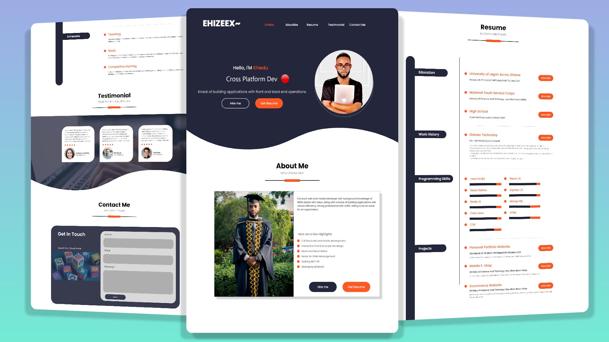
portfolio website. And for sure, this is another big project that we're going to build
in this course. Now, let's understand
the structure and how it was viewed. This portfolio website
is broken down into smaller isolated segment
called components, which includes the
home component. And again, the home component is broken down into
smaller parts, which includes the
header component, the profile components, and
lastly, the profile food. So we have the rest of the components such as
the About Me components, resume, testimonial, and
the contact me component. So all of these nested
component is wrapped up in a root companies, tech nodes. The roots component is the default components of
every React application. So the responsibility of the root components
is to serve as a container for every
other component that will be created when
building React application. As a matter of fact, I call this component the
mother of all companies. And by the way, that is
my personal opinion. So when you take a
look at it closely, you will realize that
each of this component defines only a section
of the user interface. And all of this
section is then put together to form the
entire application. Technically, if we
want to represent this application on a
tree of components, we are going to have at the top, the app component, which is
the root companies, right? So below, we're going to
have the home components. And nested within
the home components are the header profile, the profile foot, our company. And then we have the
abutment component, resume, testimonial, and
contact me components. So in summary, component
allows us to break down our application into a smaller
encapsulated segments, which can then be composed to make more complex
user interface. Simplest techniques. As of the time of recording, application like Facebook is
got over 30,000 companies. So the size of the application
determine the number of components to be used. One good thing
about component is that components are reusable. So in React js, a reusable component is a
piece of UI that can be used in various parts of
the application to build more than one UI instance. So in a simple term, it means that one
component can be used with different properties to
display different information. Right? So this is all for now. In the next lecture, we will proceed with the
setup and installation. Stay focused, and
always take care.
4. 4 Tool installation (Node js, vs code, google chrome): In this lecture, we will
go ahead to install the necessary tools that is
needed to work with React js, such as Node.js, Visual Studio Code ain't
any browser of your choice, but preferably Google Chrome. So quickly head on
to Node js.org. Here is the address. So right here, we're
going to download and install the latest
stable release. I already have it on my machine. But for teaching peppers, I have to download
and install it alongside with you for clarity. So when you observe the screen, you are going to see
two different versions. So please do not download
this version. You know why? It is simply because
it comes with extra complexities that you may not be able to figure out. So let's proceed to
download the LTS. Here, is it lifted
off the screen? I'm just going to
click to download. The reason we are installing
Node.js is to make use of the MPM package to install
third-party libraries. Download successful. Open. Let's continue. You can decide to read the
software license agreement. But for me, I'm just going to continue our agree.
Let's continuum. And lastly, we have to hit
on the Install button. Here, Is it? Of course, if your mug, this would definitely pop up. So you just have to
key in your password. And if you're on Windows, it is going to be a
straightforward installation. So hidden install software, not GS installation is ongoing. And these would definitely
take you awhile. So I just have to
fast-forward the lecture. Node.js installed. Successful. Let's close it down. Right, so you can decide to keep it or to move it to the beam. But for me, I'm just
going to keep it. Now let's open up the terminal. Press hold the command
key on your Mac, and then tap the space key. So we're going to search for
terminal. And here is it. Over here, we have to check the version of node
that we just installed. Node dash V, hit the Enter
key on your keyboard. And this is the
version of a hair. Close down the terminology. The nest thin line is to
install the code editor. And the code editor
I'm going to use in this course is the VS Code. Feel free to use any code
editor of your choice. But for me, the VS
Code is my favorite. And I highly suggest
you stick with VS code so that
you won't be able to follow along with
me in the future. Scroll down and let's
have it download. It lifted off the screen. We have for Windows and on
the right edge of the screen, we have it for Mark. So I just have to
download for Mac. And if you're on Windows, you also have to
download for Windows. The Download would
definitely take awhile. So I just have to fast-forward
the lecture. Download. Successful. Open. Here is it. You just have to
launch it. And that's it. The VS Code is opened. So at my end, you are going to see
the recent project. Don't worry, this may
not appear to end simply because you haven't opened
any project with VS Code. So please make sure to
download Google Chrome. And of course you
should have it by now. This is all for now. And in the next lecture, we will go ahead to create
our first React application. See you in the next lecture. Stay focused and
always take care.
5. 5 React installation: In this lecture, we're going to create our first
React application. So quickly head on
to React js.org. Here is the address. Click on dogs. Here is it. Alright, so on the right of the screen you are
going to see the tab. So right at the top, you have to click on
Create a new React app. Here is it. So the first thing
we're gonna do is to basically generate a boilerplate
of a React application, which comprises
of the libraries, the initial files
and folders to run a simple React
boilerplate application. Scroll down, let me show you. To create a new React app. We have to follow
these instructions. The NP X command would
be used to create a new React app without having to install
it on our system. Haven't understood all these. Let's proceed to create
a new React app. Head onto the desktop. And over here, we're going
to create a root directory. React cause. Right-click here on New Folder. React, dash, cause,
pit on the Enter key. Techniques. When naming your project, always use a descriptive name that tells the purpose
of the project. So you want to be able to
recognize it in the future. Sounds good, beautiful. So quickly open up the VS Code. Let's close down
this sample page. Now, the next in line
is to drag and drop the folder down
into the VS Code. Again, close down
the sample page, maximize the VS Code. Let's open up the VS Code
integrated terminal. And I'm gonna do
Control back tick. Can you see the Arctic is located at the top-left
corner of the keyboard, right below the
escape key as well. If the shortcut
doesn't work for you, all you have to do is
to go to the top and then domino new terminal. You click on it, it
opens up for you. Right at the terminal. We have to create
a new React app. And p x Create React app. The React application
will be installed in a directory called Klein's. And also you can decide to change the name of
this directory. But I highly recommend
you stick with the convention client simply because React js has to
do with the front end, which implies the UI
part of the application. You can as well, limits
front end like this. So this is also conventional. Alright? But for me, I'm just
going to stick with the conventional heat on
the Enter key to proceed. React installation is ongoing. And these would
definitely take awhile. So I just have to
fast-forward the lecture. React js installed successfully. To proceed, we have to step into the client directory where
we installed the React js. So I'm just going to do C, D, Klein's hit on the
impact key to proceed. The next in line is to start
up the front end dev server. And I'm going to do npm, starts hit on the Enter
key to get it to fire up. And by the way, MPM simply
means Node Package Manager. On the screen is the
React London page. And by default, it is running
on localhost port 3,000. So now we are done
with the installation. In the next lecture, we will begin to unveil
the React boilerplate. This is all for now and see
you in the next lecture. Stay focused and
always take care.
6. 6 React boiler plate: In this lecture, we
are going to unveil the React boilerplate Command B to open up the Explorer as well, we have to close
down the terminal. So you have to click on the icon over here on the right
side of the screen. But for me, I'm just
going to do control back. Open up the client directory. Here is it? Let's proceed with the
package.json file. Here is it? The package.json file is where all the dependencies that concerns the front
end will sit on. Over here. We have reacted visual
aids and 0.2 installed. Right below. We have
the reactor dome. The reactants dome
is used to work with the document object
module in the browser. Here we have the React
scripts on the web vitals. And down here we
have the scripts. And in the previous lecture, we did MPM start to start up
the front end dev server. Right below we have the viewed. When we do npm run build, it is going to beat up the
static assets for deployments. So when we want to deploy an
application on the server, we would definitely
make use of the viewed. Here. We have the test. Under eject. Eject is necessary when you
want to eject from Create, React, app, and
customize your web park. And here we have the
configuration for ES lanes, which helps to highlight some possible errors
in your code. Lastly, we have the
compatible browser least done with the
package.json file. Let's proceed with
the package log. Open. The package log hubs for steady installation of
your dependencies door. We do not have any
business over here, but we also have
to talk about it. Here we have the
Redmi dot md file, which helps for documentation. E.g. you are done building
your application. So you can come to the
Redmi dot empty found to document the
processes involved. So let's quickly
unveil the folders. Open up the public, right. In the public directory, we have the index.html, the logo, and the
manifest dot JSON file. The manifest dot JSON
file is used for Progressive Web App that for now is not relevant to the
purpose of this course. So as a beginner, we have to focus on
the index dot HTML. And here is it. This is all for now and see you
in the next lecture. Stay focused on holistic care.
7. 7 How react works under the hood: In this lecture, we are
going to understand the flow of react as a
single-page application, which implies how React
JS works under the hood. Quickly open up the index.html Command B to
pop up the explorer. Clients public and
hazy index dot HTML. Let's go ahead to open up
the index.js and the app. Proceed to the source, which is the SRC index
dot js on here is it? Lastly, we have to open up the app js command B to
close down the Explorer. Let's begin with the index.html. Scroll down. I want you to take note of
this div with the id of root. It is extremely important. As a matter of fact,
this div with the id of route serves as a container
for the empire application. Let's head on to the index.js. The index.js is the entry point of every React application. For best explanation. Before we proceed,
we are going to downgrade the
application to react 17. And then I'm done
with the explanation. We are going to bring
it back to react, eating right on lines to highlight that the
client wipe it off. Over here. Highlights,
wipe it off. And as well, we have to
highlight again Command X to place a comma
right here and paste. So we have to take
off the semicolon, the brackets on this
other bracket over here. So we have to remove the root. We're going to use the
reactor dome to copy, paste it here nest. We just have to tick
off the strict mode. Beautiful. Now we have succeeded
in downgrading the application to react 17. All I want you to do in this
lecture is to sit quietly and pay maximum attention
to my explanation. Let's proceed to understand how React JS works
under the hood. At the top, we have React
imported from React module. Below. We have React DOM
from react to the module. The React DOM helps to tie the low-level dome of HTML with the high
level dome of React. And also the React dome has
a method called render. And the random method
takes in two parameters. The first parameter
is the elements, which in this case a react
element to be rendered. The second parameter is a vanilla JavaScript, which
is document.getElementByID. And it says, Hey, I'm going to bind with the
DOM element in the HTML. Precisely. A sudden DOM element
with the id of roots. And this DOM element
with the id of roots is found right within
the HTML file. So what reacts
doors is to inject the first parameter into the DOM element with
the id of roots. In simplicity, whatever
you have here as the first parameter
will be passed down into the root DOM node. It is gonna be seated
right within this div. And more importantly, the index.html is the only
page that is saved on the browser in order to
display whatever you pass in as the first parameter
into the roots DOM node. Alright, so this approach of rendering components
on a single page and changing the dome exabytes
the single-page behavior. And hence, we can
say that React js is used to build a
single-page application. Let me break it down
back to the index j. So over here, I'm
going to take off the app component as the
first parameter, wipe it off. So I'm going to have
a head tag, right? We're in the head tag. I'm going to do. Now, let's save the application
to see what happens. Safe. Boom. Can you see the head one tag
is displayed on the browser. So when we inspect the element. Right-click Inspect. Right here, you are going
to see the index.html file, which is the only page that
is saved on the browser. So let's, let's try
to open up the body. When you open up the body, you are going to see the
div with the id of root. So let's quickly open up this D. Can you see the head
one tag is injected right within this div
with the id of root. Is as simple as that. Understood, beautiful. Let's take it one more time. Her, right? So whatever you have here as the first parameter
will be injected right, in-between the div with
the id of roots and the diff with the
idea of roots is located right here
in the index.html. So the index.html is the
only page that is saved on the browser in order to display whatever you injected
in-between the dv. And that is why when you
inspect the console, you are going to see the
head one tag in-between the div with the id of a root. Best explanation, getting good. Beautiful. So again, go back to
VS code index dot js. So let's wipe it off and
bring back the app component. And by the way, the app component
is imported at the top. And when you save on
the browser, boom. And you are going to
see the London page. Let's unveil the app back
to VS code up dot js. And over here in
the objects we have a div with the class
name of our app. And we have a Herder here. We have the IMG
tag that describes this logo over here that is continuously spinning
on the screen. We have the p tag. Here, is it? Lastly,
we have the a tag. This is it right here. So right here we have the body, and here is the div
with the id of root. Let's open it up. Can you see when you open up
the div with the id of root, you are going to see another div with the class name of up. Here is it? Let's
open up the div. We're going to see the header
with the class name of our app header. And here is it. Let's open up the header. So we have the rest of the
contents such as the IMG tag, which describes the logo. We have the p tag. Can you see? And lastly, we have the a
tag is as simple as that. Let's quickly bring back the
app to react 18 index.js. And then we just have to undo. Now we have upgraded
the app again to react. 18 is exactly the same pain. The app component is over
here as the first parameter, and it is going to pass
through this line of code into the div with the id
of root hairs it. And you should always recall
that the div with the id of root is fun here
in the index.html. And the index.html is the only page that is saved
on the browser in order to display whatever
content you inject that in-between this
div and that's it. This is all for now. See you in the next lecture. Stay focused on
always take care.
8. 8 Introduction to jsx: In this lecture, we're
going to understand GSAs. So quickly head on to the
app Js command P to pop up this little search box
at the top and then set for AARP dot j is here, is it? If the shortcut
doesn't work for you, all you have to do is to
navigate to the Explorer and then open mixture to
open up the client SRC. And then here is it. Closed down the explorer. Beautiful. So right
on the screen we have a function that
returns a piece of UI. So everything you see
over here is called DSS. Dss simply stands
for JavaScript XML. It is a syntax extension
of JavaScript that is used to define the meaning and the structure of
your web content. So these may look
familiar with HTML, but it is not HTML. What you see on the
screen is called GSAs. One of the difference
between HTML and Jesus is the class
name attribute. In HTML, it is a class. And right here in Jess's, it is a class name simply because class is a reserved
keyword in JavaScript. So all of this mockup over
here defines the London page, which comprises of the logo, the p tag, and the a tag. Let me show you quickly. Back to VS code. Here is the IMG tag that
describes the logo. I'm here, Is it right below? We have the p tag. This is it right here. And lastly, we have
the a tag here. Is it back to VS code? So when I try to
delete everything, right within this div, we're going to experience
a new behavior. I'm going to highlight from the opening header tag to
the closing header tag. Wipe it off. Safe. This is the new behavior. The screen is blank simply
because we have deleted the GSS expressions that
defines the London page. Back to VS Code. And also we have to delete the div with the class
name of our app. We want to do everything
from scratch. So here we are going
to have a head tag and then hello word, save on the browser. Hey, is it? How beautiful is this? So the head one tag over here describes the HelloWorld you see here on the browser. It's as simple as that. Go back to VS code
and let's continue. Now, let me zoom in France here at a major key points that you have to keep in mind
when using GSAs. In all of these key points
that I want to share with you are extremely important. Point. Number one is that
you can only have one parent wrapper
elements in Jesus. So when you do something
like this, e.g. let's have a hashtag
and I'm gonna do. My name is Barbara. So this would definitely
throw an error. When you save and
check out the browser, you are going to
see the complaint. It says, I just sent Jesus elements must be
wrapped in an enclosing tag, which implies you can not have Jess's outside of another GSAs. So the only way you
can do this is to wrap up the entire Jesus
in a parent element. So let's have a dv over here. Then. We're going to highlight, hold down the Alt key
on your keyboard, tap the up arrow
key to move it in. And as you can observe, the error is gone. Let's keep the code clean. Beautiful. Checkout, the browser, everything
is working as expected. I love it. Come back. So this dv over here serves
as the parent element. So you cannot have
gestures elements outside of a parent
JSX elements. So when I do something
like this, e.g. when I have a div over here, it is going to throw an error. I just sent Jesus
element must be wrapped up in an enclosing tag. So this simply implies
all the gestures expressions must be wrapped
up in a parent element. So for now, this div is
used as the parent element. We just have to move it in like this is as simple as that. Point number two. Class attribute in HTML is replaced with class
name in GSAs, simply because class is a
reserved keyword in JavaScript. So let's try to give
this div a class name. The class name is container. Save. On the browser. Everything is working
perfectly fine. So let's quickly
inspect the console. Command I to open
up the console. Can you see everything is fine? Back to VS code. So let's try to replace
the class name with class save on the browser. Here is the warning in
valid DOM property class. And it asked a question. Did you mean a class name? Yes. We mean a class name. So I have to go
back and then save. Check it out. Let's refresh the console. Everything is working
perfectly fine. Point number three. So far in his Gmail is
replaced with HTML4 in Jesus. And also for is a reserved
keyword in JavaScript. So when we tried to implement
something like this, so right here, we're
going to have a label. And let's specify the for
attribute, equa, username. So this works for HTML. And when you try it out on GSAs will definitely get some
warning on the console. Invalid don't property four. Come here. We have to change
this for two, HTML4. So these will
resolve the problem. Safe on the browser. Refresh the console. Everything is fine. Point number three, in Jess's, the onclick on the top, index attributes will be
written in comma keys, which simply implies
you capitalize the first letter of every word
except for the first word. So let's assume we want to
implement a button right here. Then we have to specify
their own clique. If you notice, you
will realize that the onclick is written
in karma case as well. We set it to a
colleague brackets. So this is how to implement
the onClick in GSAs. To recap, class in HTML is replaced with
class name in GSAs. For HTML is replaced
with history, and therefore in jazz is the
onclick event handler in Jessie's is written in comma keys and also it is
said to a colleague bracket. So over here you can call any of the function that you
defined in the application. I'm just going to
wipe this off for now because in the future
we're going to treat event handler in
de Dios, wipe it off. And lastly, you cannot have GSS aspirations outside
the parent elements. So all the gestures, expressions that you are
going to have when creating your UI is going to be wrapped up in a one parent elements. So we have to move it in. That's it. This is all for now and see you in
the next lecture. Stay focused and
always take care.
9. 9 comment in jsx: Now we are done with JSX. But it is extremely
important, you know, these, if I want to place a
comment on the gestures, expressions, How do I do that? Tech, e.g. I want to place
a comment on the history. How can I achieve that in GSAs? So the shortcuts to do
that is to precisely select the GSS elements that you want to
place a comment on. And in this case,
I'm going to place a comment on the H2 tag. So you just have to select. Let me show you again. Select and then press hold the command key
on your keyboard, then tap the forward slash. And this will precisely
place a comment on the Jess's expression
that you selected. If you notice, you
will realize that everything is wrapped up in
Ecoli brackets here, okay? And right, within
the curly brackets, you will be able to use
the multi-line comments. So this is the opening
multi-line comment. Here is the closing
multi-line comment. So in simple term, in order to use
comments in Jess's, you have to wrap it up
in a curly bracket. So when it is wrapped
up in a curly bracket, React js is going to treat it
as JavaScript expressions. You can now use the
multi-line comments on it. So the same thing
applicable if you want to remove the comment, highlights. Hold down the command key, tap the forward slash. It's as simple as that. Even if you want
to place a comment on the entire Jesse's, it is exactly the same process. Let's assume I want to place
a comment on everything, wouldn't the parent element. So I just have to
highlight like this, hold down the command key top. The forward slash is
as simple as that. And also, if you want
to remove the comments, highlight, hold down
the command key, hit the forward slash. So this exactly is how
comments walks in GSAs. See you enjoyed this lecture. Stay focused on holistic care.
10. 10 Types of component: Previously, we spoke about competent and we
lend that components are reusable and it can as well be nested inside
another component. And now the question is, how do competence translates
to code in our application? The simplest way to define a component is to write a
simple JavaScript function. In React G is, we have two types of complaints. Functional component
and class companies. Functional components
or JavaScript function. But accept probes as an argument and then
return a valid GSAs, which electro sense is the
mockup that describes the UI. In simplicity, the syntax
will look like this. This function is a valid
react functional component simply because it accepts a single probe
object argument with data and returns
a React elements. So if we are to do the same thing using
the class component, the syntax will look like this. From React point of view. The above two components
are equivalent, but only that class component
is usually irregular. Es6 classes that stains a competent class from
the React library. And it must have a random
method that returns the Jess's, which in turns describes the UI. However, in this course, we're going to stick with
the functional company simply because it is extremely
easy to reason about. And also class component
is gradually fading away. Majority of the
companies are now rewriting the application
with functional component. So we definitely need
to follow trends. Using the functional component. We do not need to worry about state because with
the help of hooks, we won't be able to use
the state and other React futures without
writing a class. And hooks was
introduced in 2018. React conference technique. When naming your components, always use the past
condiment convention, which implies you capitalize the first letter of every word. So e.g. Home components
will be written like this. When you name it like this, React js, we'll treat
it as a dome Park. Beautiful. But the point is that a component code is
usually written in a JavaScript file with a dot js extension or
dot CSS extension. But in this course, we will stick with the
dot js extension, e.g. the home components will
be written like this. Home components dot. Alright, so this is all for now. And in the next lecture, we will go ahead to create our first react
functional components. See you in the next lecture.
11. 11 Creating our first functional component: Let's go ahead to create
a functional component. To proceed, we have to create
the components directory. Open up the client. Within the SRC. We have to right-click and then new folder. And I'm going to
call it components. Notice that I used a
plural word over here. It is simply because
we're going to have so many components, right, within this
component's directory. So it should be a good
practice to name it with pleura road pizza
on the enter key. Then we're in the
Components directory. We're going to create
the components file. Right-click on components
here on New File. Demo component dots j's phrase. I want you to take note
of the conventionally used in naming this component. It is called the Pascal
naming convention. It's implies you capitalize the first letter of every word. And also, I want you to
take note of the tension. Here is it dot g is hit
on the Enter key and less proceed Command B to
close down the Explorer. So over here, we're
going to create the functional
component from scratch. So first, we have to import
React from React module. For now, this is optional. Alright, so in terms of code, components are simply
JavaScript functions. And the name of this
component is demo component. Functional component
returns JSX markup, which describes the UI. We are going to
have a div, right? Within the div,
we're going to have a head tag and I'm
going to do hello lot. Thus simplest that. Now we have succeeded in creating our
functional component. The next in line is to have
it displayed on the browser. To have this component
displayed on the web. The first thing
we're gonna do is to export the component. So here I'm going to do export default function,
demo component. So I haven't exported
the function. We have to render the demo
component right in the app. G is Command P to pop up
the search box at the top. And we're going
to search for up. Here, is it? So here we're going
to take two steps. Step one is to import
the demo component. So over here, we have to import demo components from
open and close single quotes, or you can as well
use double quotes. So here we have to target the directory where the
demo component is located. So for that, I'm
going to do dot slash components slash demo component
is as simple as that. Haven't done that. We have to render this component right within the
return statement. So what I'm gonna do
right now is to highlight from lines nine to
13, wipe it off. So we have to render
the demo component right in between this div with the class name of container, and then close it down. If we do not have children
in-between the tag, it will be so nice to use
the self-closing tag. So I'm going to highlight
the closing tag, wipe it off right within
the square brackets. I'm just going to specify
the forward slash. This is called the
self-closing tag. Safe. On the browser. Boom, everything is
working as expected. And here you see the hello word. Hello again. Now we have successfully created the functional
components and have it displayed on the web. Congratulations. This is all for now and see
you in the next lecture. Stay focused on holistic care.
12. 12 Types of export: Ax6 provides two different ways to export modules from a file, which include default export
and the named export. When you observe the screen, you will realize
that we export that this component as
a default export. Alright, so default export
allows us to export a module and specify any name to that module
whenever you want to import it. So since we exported demo component as a
default export over here, we will be able to
name it anything. Alright, so let's take e.g. I'm just going to wipe
this off and then I'm gonna do grid components. And here we also
have to do the same. We have to render grids,
component, checkouts. Everything is
working as expected. So this can only work when you make use
of default export. Another important point that you have to keep in mind is that there is only a single
default export per module. So over here, right, in this component,
we will not be able to have a default
export anymore. You can only have one
default export in a module. Sounds good, Beautiful. Now, the next in line
is the named export. Named export are useful
to export several values. And during the import, one will be able to use the exact same name to refer
to the corresponding value. Let me show you quickly. So over here, if we want
to use the named export, all we have to do
is to highlight the default over here
and then wipe it off. This has been transformed
to named export. So when you save on the browser, here is the complaint. It is trying to say that the grid component
does not exist. Go back to VS Code, head on to the app js. And then we have to use the exact same name
of the module. And over here, the
name of the module is demo component
head on to the app. So to work with
the named export, we have to wrap up the exact same name
in a curly brackets. Right here. We're going to have
a curly bracket. Then I'm just going
to wipe this off. Right? Within the college brackets, we have to precisely import
the module by its name, and the name is demo component. Having done this,
we also have to import the x hat
component over here, highlight on, wipe it off, and then I'm going to
do demo component. Check it out on the browser. Everything is
working as expected. I love it. Alright, so to recap, when using the default export, you wouldn't be able to specify any name to eat when
you want to import it. And you can only have one
default export pair module. Compared to the named exports, where we can be able to export several values from a module. During import, one
will be able to use the exact same name to refer
to the corresponding value. This is often on
synchronous lecture. Stay focused on holistic care.
13. 13 Props: We come now to talk about perhaps without
mentioning components. Earlier on in the
previous lectures, we learned that component
enables you to split the user interfaces into
independent, reusable segments. So right now, I want you to think about each
segments in isolation. The question is, if components are separated
from each other, how do we pass information from Component a to Component B? Here, as that Lee is
where probes comes in. So what exactly is perhaps, perhaps stands for properties. It is an object that stores the value of an
attribute of attack. And also perhaps enables you to pass data from one
component to another. Precisely from a parent
component to a child component. Take note of these key points. Props are immutable, which simply implies it value
cannot be changed. Haven't understood all these. Head on to VS Code and less
practical as it quickly. Let's quickly get
rid of the head tag. Proceeds to the app component. Over here. I just have to change
the class name to app simply because I want to make use of
the default CSS file. Another important point that I want you to take note of is that prompts can be passed to a competent VGS is
our attributes. E.g. we want to pass data from App component down into
the demo component. So to do that, first, we have to
specify the attributes. So let's assume we want
to pass a name probes. So here the attribute
is going to be named, assign it a value. Daisy. So this is the attribute. Here, is the value on. All of this puts together
is referred to as probes. So having done this, we have succeeded in passing probes into the demo component. But when you check out the
browser, nothing happens. So you cannot see
anything on the browser. You know why? It is simply because we also have to receive
the probes, right? In the demo company it back to VS code demo component to receive the probes
is very simple. All we have to do is to take
an probes as an argument, right, within the function. So I'm going to do probes. You can decide to
change the name of the probes to something else. But I highly suggest you stick
with the conversion probes because that is the convention that is widely used
among developers. So having done this, we have succeeded in receiving the probes right here
in the demo component. Let me show you. So this props right here will be stored inside the props object. Let me prove it to you. Come here. Then. We are going to
console log props. So we want to see
the value that is stored inside this props object. Head on to the browser. Let's quickly
inspect the console. Alt command I to
open up the console. When you inspect the console, you will see an object. So let's quickly
open up the object. Right here. We have in the
object and attribute name with the value Daisy. So technically, we have received the probes down into
the demo component. The nest and ln is to access the props value and have it
displayed on the browser. So if we want to access
the value of the probes, we just have to target
the attributes and then the value would be displayed
head-on to VS code. And let's do that quickly. So right here, I'm
going to specify a Hadrian tag because I want to do it right within
the header h1 tag. So ordinarily, I'm
gonna do props dot name on the browser. You are going to see probes that name simply because it has
been treated as tests. So for this to work, here, we have to take in the
curly brackets and then Highlight Command
X to cut paste it here. So when you wrap it up
in a curly bracket, the JSON parser will be
able to recognize it as JavaScript expressions
instead of a taste safe on the browser. Here we have Daisy. Alright, so let's quickly
add on to VS code and add more attributes for the
Component Tree app component. And here we have
the props as name. Now we're going to
have another probes. As country, assign it
the value Brazil, safe. On the browser. You will definitely see
they see on the screen. But when you inspect
the console, you're going to
see the name Daisy and the country, Brazil. So let's quickly have it
displayed on the browser. Back to VS code demo component. And then here I'm going
to do props dot country, safe on the browser. And we got here, Brazil. Alright, so let's make
these more meaningful. Come here, right within
the header h1 tag. I'm going to do I am props dot name from probes, that country. Safe on the browser. I Am Daisy from Brazil. How beautifully these. Alright, so let's continue. Back here. Now, we have successfully
pass probes from a parent component down
into the child components. So to recap, when
dealing with probes, three steps are involved. Step one is to send
the probes, true, Jess has attributes into
the child component. And step two is to
receive the probes, alright, wearing the
parameter of a formulation. And after that, we have to displayed on the browser
is as simple as that. Okay, so now I want you to recall that components
are reusable. Quickly head on to the
objects and let me teach you how to reuse this component. Reuse this component I'm just
going to highlight and then duplicate it as many times
as I like on the browser. Now we have re-used this
components but probes. This is one of the beauty of React that makes my head spin. So another important point is that reusable component
can be reused with different properties to display different information
is held on to VS code, and let's do that quickly. Vs Code. Here. This attribute is also
referred to as the property. I want to change the
value of the attribute. Here I'm gonna do my goal, and my goal is from USA. Change the attribute here. Sahel. Sahel is from India. And lastly, we are going to
have myself a double bar. And they do. Baba is from UK. On the browser. Can you see that? Here we have DC from Brazil, Michael from USC,
Sahel from India. And lastly, it toolbar from UK. This exemplifies how reusable component
works with probes. This is all for now. See you in the next lecture. Stay focused on holistic care.
14. 14 Props.children: Props dot jhu drain. When you look closely, you will observe
that we are using self-closing tag for all
of these components. Why? It is simply because the
components do not have children. In React, G is a
component with children, is always identified by an
opening tag and a closing tag. And the children must be placed in-between
the enclosing tags. So let's say we want
to add some couple of information about this guy, including his profile picture. How alright, so what I'm going
to do first to clear off the self-closing tag and then close it down with the
actual closing tag. And here is it. So this is the closing tag that is used when the component
has children. And in this case, here, we're going to have a p tag. And right, within this p tag, I'm going to do here, we're going to have
another P tag. And I'm going to do lastly, we're going to have
a profile picture. In order to work with images. First, we have to
import that image. So there are several
ways to do that. I'm gonna do Command
B to open up the Explorer right
within the SRC. We're going to
create a new folder. And this will be caught images. So right, within
this images folder, we're going to import
the profile picture. So what I'm gonna
do right now is to maximize the VS Code. And here on my desktop
you are going to see the basic
materials directory. Click to open. And by the way, this directory is right there on
the description. And here is the profile picture. So I'm just going
to drag it right into the images directory. Can you see here is
the profile picture. Maximize the VS Code
command B to close down the Explorer and then also close down
the profile picture. So right at the top, we have to import
profile peaks from. So we have to target the SRC, right within the SRC, we have the images directory. Right within the images, we have to precisely target
the profile picture. Profile pics dot PNG. I think this is correct, right? So let's check it out quickly. Command B. Here we have
profile pigs dot PNG. It is extremely correct. So scroll down and here
we are going to have an IMG tag as RC equa
this input over here. So we have to call
this Import Copy, come here, paste, close
down the IMG tag. When you save and check
out to the browser, you are going to see the
children probes why. It is simply because we also have to retrieve the children probes quickly heroin to
VS Code demo component. So right here, we're going to retrieve the children probes. So let's do it right
within the H2 tag, open and close curly bracket. So to retrieve the
children probes, all we're gonna do is props, dots, children on the browser. Here are the children. This is extremely awesome. To recap. Open up the app js, and then whatever you have
here in between the opening and closing tag is referred
to as the children probes. And to retrieve the
children probes, all you have to do is probes, dots children is
as simple as that. Come back to the app components. And now the question is, what type of content is allowed
for probes dot children, the content pass to a component, true prompts that
children can include the following undefined
null boolean number, string, React elements
including an RA. This is all for now. See you in the next lecture. Stay focused and
always take care.
15. 15 Props Immutability: Another important point
that we have to take note of is that probes are immutable. And that simply implies the value of a probe
can not be changed. Let me prove it quickly. Open up the demo component. And here we're going to try to reassign another value
to the name attribute. So I'm going to do here. Props, dot name, equa, Angela on the browser,
the application breaks. Let's quickly inspect. The console. Cannot assign to read
only property name. So probes are read-only, which simply implies the value of a probes that is sent from a parent component cannot be altered in the child component. And that is why when we try
to reassign another value to the name attribute, the
application Briggs. This is all for now. See you in the next lecture.
16. 16 Props destructuring : Prompts destructor
in this doctrine was introduced in EXE is it
is a JavaScript future that allows you to extract multiple pieces of
data from an array or an object and then assign
them to their own variables. One of the beauty of
the structuring is that it improves
code readability. So in functional component, there are two ways to
destructure probes, but we're going to go
with the best option, which is to destructure probes right inside the
perimeter of a function. Let's give it a try. Right? We're in the
parameter of this function, we have to wipe it off. And then technically bracket. So let's go back to the app. Here we have the
attribute name and the attribute country, right? So come back, we have to
precisely target that attribute name calmer
country, comma. Children haven't performed
this structuring. We have to access all
the attributes directly. We do not need the
probes anymore. So I'm going to highlight all the occurrences
of props dot. Then, hold down the command key, tap the letter D
on your keyboard. D for dog, like this, and then wipe it off. Press the Escape key to disable the
multicultural editing. Let's check out the browser. Can you see everything
is working as expected? I love it. So to recap, if you want
to destructure probes, it has to be done right within the parameter of a function. And to do that, first, you have to take in
a curly bracket. And right, within
the curly bracket, you can then precisely target
the name of the attribute. So what you should know is this. So here, if you make
a mistake, e.g. let's do something
nasty over here. Let's Pell the
country like this. When you do this, Let's
save on the browser. You are going to
get a weird result. Look, the name is
displayed on the screen, but the countries disappeared. So when performing
this structure in, there is a need to precisely target the name
of the attribute. So I'm just going
to undo, save Bone. Everything is
working as expected. I love it. This is all for now. See you in the next lecture.
17. 17 Function as props: Earlier on in the
previous lecture, we learned how to
pass props from a parent component to
a child component. Now the question is, is it possible to
pass props from child components to
a parent component? And the answer is no. You cannot directly pass probes from child to a
parent component. But you can however, pass a reference to a function as probes to the
child component. Some streaky, right? Let's quickly practical
eyes it so that you can understand
it well enough. Open up the Explorer. Right? We're in the components. We are going to create
a new component. Parents dot g is again
right within the component. We also have to create another
component, child dot js. Beautiful, close
down the Explorer. Then I have to also close down the demo and the app jeers. So wouldn't the
parent component, I'm going to use the
shortcuts RFC to generate React js
functional component. Again, if the shortcut is
not working at your end, it is because you have not
installed the snippet. To install the snippet, head onto the extensions. Click to open. So right here, we're
going to set for ESM. React slash, Redox
slash GraphQL, react dash, native snippets. I'm here. Is it click to open? And at my end, I have
it installed already. And that is why you see over
here the uninstalled voting. So at the end, you just have to click the Install button and then
you will have it installed. Close it down, and as well
close down the extensions. Now the shortcut is
going to work for you. How right, let's continue. So right within the div, we're going to have a hit
one tag here I'm going to do this is parent component. Let's head on to the child. G is Here, is it as well? We have to generate the React js functional component,
RFC and bone. Beautiful. Having done this, let's define a function right in the parent components and
then pass that function as probes into the child
component, parent component. And let's do it right here. Right? So I'm going to do
function greet parent. So right, within this function, we're going to have a dialogue. Right here. We want to display
welcome parent. So the nest and line is
to pass this function as probes down into
the child component. Let me show you quickly. So at the top, we have to import child from dot slash
child components. So let's quickly render
the child components. Child closer up with
the self-closing tag. Beautiful. Haven't done this. We can now proceed to
pass the function as probes down into the
child component. To do that, we have to
specify the attribute, then assign it a value. But this time the value is
going to be this function, highlight and then
Copy, come here, paste. So this is the attributes
and here is the value. And all of these
is called probes. Understood, beautiful. So when you do this, we have succeeded in
passing this function as probes down into the
child component. So having done this, we have to render the
parent component right in the app command P to pop
up the set box at the top. Then I'm going to search
for up here is it? So we just have to
place a comment on all of these stoves highlights. Hold down the command key, hit the forward slash. So at the top, we have to import parent components from dot
slash component slash parent. Right below. We have to render parents closer up with
the self-closing tag. Save, go back to the
parent components. So now we have
succeeded in passing props into the child components. Western line is to receive it right in the child component. Child. And to do that, we just have to take him props as an argument. And then when you console log probes on the browser or Command I to open
up the console. And we also have to open
up the props object. And here is the
attributes grid with the function grid parents
as it value go back. So the purpose of this
lecture is to call the function that we defined in the parent component right here, In the child component. So onClick of aborting
in the child component, we want to be able to
call this function, come back to reach out. Let's have a button right here. And right here. We have to specify the onclick. Onclick of the boating. We want to be able to call
the function grid parent. And of course, you know that the function grid
parent is already stored in the props object. So now I'm going to do
props, dots, grids. So when you do this, safe on the browser, This is the parent component. Here is the child components. So onclick of this button, we want to invoke the
function that was defined in the parent
component clique. Can you see that? Work on parents? To recap, we define the function here in
the parent components. And after that, we then
pass the function as probes down into the
child components. So whenever we do
props dot grid, it is going to
retrieve the value that is passed into
the attributes, which in this case the
function grids parents. And finally, we
trigger the bottom by specifying the onclick. Onclick of this button. This function right
here will get fired up. So what exactly is the
benefit of doing these? Alright, so the advantage
of doing this is that it helps to
improve performance. So when building a
reward application, chances are you may
run into a situation where you want to make use of a function in
different components. Alright, so let me
show you quickly. Open up the Explorer and then rights within
the component. Right-click new file. And I'm going to call
these user dot js. Close down the explorer, generate the React js
functional component. Right? Within this component, we also want to make use of
this same function. Okay? So what I'm gonna do
right now is to first import the user components
from dot slash user. We have to render it over here. Closer up with the
self-closing tag. I'm going to specify
the attributes grids and then assign it a value, which in this case
the function grid parent head-on to
reuse as component. Then we have to
receive the probes. So right now, I just
have to go back to the child and copy this bottom. I'm here. Paste. Let's check it out
on the browser. Here is the boating from
the child component, and here is the boating
from the user component. So when we click the button
and the user component, can you see we are calling the same function that is defined in the parent component. And also when we click
the chart component, it works exactly the same. So if you're building
an application and you want to make use of
the same function in different components. The best option is to
pass that function as probes into the component
that needs seeds. It's as simple as that. Let's go back to the child. Another important point that I want you to take note
of is how to pass parameter when calling
a function defined in the parent component from
the child component. So this is extremely important. As a matter of fact, it appears mostly as an interview question. So now let's pay attention
on how to do that. So the simplest way to pass
parameter from the child to the parent component is by implementing the arrow
function syntax. We're going to have an
arrow function come here. Specify it like this. So with this, we
will be able to pass any number of parameter
to the greet function. Let me show you quickly. So right here,
wouldn't dysfunction. We're going to take
in string right here. I'm going to do I am child. We want to pass
these as parameter down into the grid
parent function. Here. We have to incorporate it right, within decreed parent function. So here I'm going to do child. Now we're going to use
the string interpolation. Change it to embark
tick, tock, tick. We're going to take
in curly brackets. So I'm gonna do
child right here. I'm just going to place
a comment on these. So having done these, Let's check out the
result on the browser. Click on the button. You're going to see,
welcome parent, I am child. And I want you to recall that this was passed as parameter from the child component down into the grid
parent function. And the grid parent function is defined in the
parent components. So this exactly is how to
pass parameter when calling a function defined in the parent components
from the child component. And please, I want you
to take note of that because it appears mostly
as an interview question. This is all for now. See you enjoyed this lecture. Stay focused and
always take care.
18. 18 React State (useState): In this lecture, we are going to understand how state
works in React js. Alright, so let's assume you are building an application and you want to maintain a components data that
changes over time. E.g. on click of a button, you want to change the title of your application
to something else. Yeah, so that will be done
with the US debt hooks. Less practical as it quickly, so quickly create a
new component called title Component Command B. Right-click on the components
directory here on New File. Type Tool components
dot g is generate. The functional component. Here is we had a firm
begins after that, open up the app js, and then let's run that
component right here. First, we have to import it, import title components from component slash title component. We also have to place
a comment on these. Come here and then
title competent, closer up with the
self-closing tag, head on to the title component. So the aim of this
lecture is to change the title of our application
when the button is clicked. So to maintain a competence
data that changes over time, we have to make use of
the US State who looks. So right at the top, we just have to import it. Press a comma right here, open and close curly brackets. And I'm gonna do use dates. The use that hook is a special function that
takes the initial state as an argument and then returns
an array of two entries. It is a function, so we have to invoke it. I'm gonna do it like this. And the initial state is
going to be an empty string. We also mentioned that we use that hook returns an
array of two entries. So right here, we're
going to have const, title comma sets tight hold, assign it like this. So this variable over here is used to hold
the initial state. And then this guy right here is a setup function that is used to update the initial state. And in this case, we are going
to have the initial state to be React JS. Cause for beginners
haven't done this. Let's display the
initial state, right, within the H1 tag. Hit one. We're going to have a
curly bracket and then we just have to display
the initial state, which is the title. Paste it here, Save. So this variable over
here will be holding the initial state when you save and check out the browser. Here we go. Do you see that? Beautiful?
So the intention of this lecture is to
change the title of this application when
a button is clicked. Here, we're going to
specify a boating. Here. I'm gonna do change
title. Beautiful. Here is it. So
right now when you click on the button,
nothing happens. Let's quickly
implement the onclick. Onclick equa. We're going to take in an
arrow function over here. And then we have to invoke the setup function
sets type tool, which is this guy over here. And write willing to
set our function, we are going to pass
in the new state. So here I'm just going to do, Let's save and check
it out on the browser. Let's give it a try by clicking
the change title boating. Can you see that onclick of the boating, the title changed? Let's reload. Can you see
React js calls for beginners. And when I click on the bottom, we see ultimate
React Hooks calls. This is indeed beautiful. And actually this is just a
glimpse of the US did hooks, Don't worry. In the future? We are going to discuss
hooks in details. So to recap, whenever you want to handle data
that changes over time, you definitely have to make
use of the use Git hooks. The use that hook is a function that takes
in the initial state as an argument and then return
an array of two entries. So, right, within this array, the first variable here is used to store the initial state. And then the second
elements in this array is a setup function that is used to update the initial state. So when the button is clicked, this function will be invoked. And then we're going to
have a new states that is used to update the
initial state. This is all for now. See you in the next lecture.
19. 19 Event handling: When working on a
reward projects, definitely the application is going to have user interactions. So when the user interacts with the application,
events are triggered. E.g. mouse click, mouse hover, key press, and many more. So handling events with
React elements is very similar to handling events
with his HTML DOM elements. But the difference
is that React events are named using the
karma case. So e.g. we are going to have onclick
is that of on-click. And also react event handlers are written inside
the curly braces. Alright, let's practically
is it quickly open up the explorer rights within
the competence directory. We are going to create
a new component. And these will be called
click event handler dot g is RFC to generate the
functional component. Right here, we're going
to define a function. Function. Click handler. Right? Within the function, we are
going to console log Euclid, the action voting
rights within the div. We're going to have the
action voting, right. So the intention
here is to teach you how the onclick event works. So right within the boating, we're going to specify
the onclick and then set it to equilibrate these
onclick of this button. We want to trigger
this function. Then here I'm just going
to do click handler. So having done this, we have to render this
component right in the app. Jeers. Highlights, place a
comment on these. Then we are going to have click event handler closer up
with the self-closing tag. Save on the browser outcome
and I to open up the console. And now when we click
on this button, the message would be
logged into the console. Let's give it a try. Can you see you clicked
the action button? When you click again, the
message would be logged twice. So VAP is that Lee is how to handle events in React years. Alright, so go back to the
code and let's highlight the common mistake that we began to speak with event handling. So sometimes you may like
to do something like this. Taking the parentheses. So when you include
the parentheses, it becomes a function call. Let's see the behavior when
you include the parentheses. First, I have to reload. Can you see when you
observe the console, you will realize that the message is logged
in the console. So you do not need to click the button for this
message to be logged. Can you see, even if you click the button, nothing happens. Why? When you specify
the parentheses, it becomes a function call. So when you save the application and go back to the console, the function will be
invoked immediately. Hit. Okay, and now
let's try to take off the parentheses safe
on the browser. Now we have to refresh. Can you see nothing is
logged on the console. And now you have to click on the Action button in order to log the message on the console. Point to take note of
when handling events. You do not need to
specify the parentheses. When you do this, it becomes a called event handler
is not a function call. Alright, so it is
just a function. Let's wipe it off. Save on the browser. Everything is
working as expected. To recap. Event handler in React js
is written in karma keys, which implies you capitalize the first letter of every word
except for the first word. After that, you have to
set it to a curly bracket. And right, within
the curly brackets, you just have to pass in. The function is as
simple as that.
20. 20 Conditional Rendering: When building a
real-world application, you will definitely find
yourself in a situation where you have to render Jess's based on
setting condition. So we have four different
approach to solve this problem. Include the if else statements,
the element variable, tannery conditional operator, and the short
secrets or burrito. But in this lecture, we are going to go with the most reliable and the approach
that is widely used, which includes tannery,
conditional operator, and short secret or burrito. Let's practical is it quickly open up the
Explorer, right? Within the component. We're going to create
a new component called user login dot js. Generate the
functional component. So right within the div, we're going to have
a hit one park. And I'm gonna do welcome
to class project. And also we are going
to have another H2 tag. And this will be, you
cannot access this project. So the idea is this, if the condition is true, we are going to display
the hedge one tag an else. If the condition is false, we are going to
display the H2 tag. Let's quickly run that
is component in the app, GAS highlights and
place a comment on it. Screw up. Right here. We're going to import user login from component
slash user login. Right here. We just have to run
died over here. Closer up with the self-closing
tag and moved back here. Let's quickly declare
a variable over here. Then I'm gonna do is logged in, set it to true. So let's proceed with
the implementation. So first, we have
to wrap this up in a curly bracket
Command X to cut, open up the curly braces, come here and paste it. So right now I'm gonna
do is logged in. It's true. We're going to
display the H1 tag an else. We're going to display the
H2 tag on the browser. Welcome to ED Baba's project. So if we change this to false, safe, check it out. You cannot access this project. So everything is working
perfectly fine as expected. Alright? So this is used to denote
when the condition is true. And this is used to denote
when the condition is false. Let me zoom up a little bit. Can you see this is used to denote when
the condition is true. This is used to denote when the condition is false
is as simple as that. So the next line is the
shot Secret approach. So the shot Secret approach is used when you want to render
either something or nothing. Less practical, is it quickly? So first, we have to place a
comment on this highlight. Hold down the command key, tab, the forward slash to make use of the shot
Secret approach. So let's assume you
want to display hello, I am logged in when
the condition is true. And if the condition is false, we do not want to
display an ethane. Okay? So I'm going to take
in the curly brackets. So here I'm gonna do is
logged in and percent, um, percent, then we're
going to have a head tag. And right within this tag, I'm going to do hello. I am logged in on the browser. Nothing happens. Why? It is simply because
the condition is false. So when you change it to true, safe on the browser, hello, I am logged in. So the shot Secret approach is used to render it or
something or nothing. So let me quickly explain
to you how it works. So the shot Secret approach
will first evaluate the left hand side to check
if the condition is true. And based on the true C, The right-hand side
will be evaluated. So if it's logged in is false, the right-hand side,
we never be evaluated. React, will ignore
the right-hand side. Simply because we do not want
anything to be displayed on the screen if the
condition is false. So there wouldn't be any need to evaluate the right-hand side.
21. 21 Map Method (List Rendering): When you are building
a React application, one of the problem you will
always have to solve is how to display a list
of items on the screen. E.g. you may be asked to display the list of products
employees use us, and so on and so forth. React G is the best way
to display a list of items on the screen is
by using the map method. The map method allows
you to iterate over an array and modify its element using a
callback function. The callback function
will then be executed on each of
the iris element. Techniques. Map is not a future of React. Instead, it is a standard
JavaScript function that could be called
on any array. Let's practical, is
it quickly so that everyone will understand
it well enough? Go ahead to create
a new component. Right, within the
component's directory. Hit on New File. This will be called
employee least Delta G is generic, the
functional component. Let's close down the Explorer. So right here, we're glow
create an array of employees. Employees equa, open and
close square brackets. And right within the array, we're going to have Daisy comma, we're going to have
Mike comma, Joe. And lastly, we are
going to have angela. Notice that I used a
plural word over here. It is indeed a good
practice to always use a plural word when
naming your array. Simply because an array is a collection of elements
with a similar datatype. So here we have several elements
right within the array. Let's continue. Now, the major challenge
over here is to display the list of
employees on the browser. So ordinarily, we can also do
that using the array index. So right, within this div, we're going to have an H2 tag. So rights within the H2 tag, we're going to specify a curly brackets and then
write within these brackets, we didn't have to access
the elements in the array. And of course to access the
first element in the array, we have to make use of
array index of zero. So right now I'm gonna do
employees square brackets zero. So this is going to retrieve the first
element in this array, highlights, duplicate
it three times. Then to access the
second elements, we have to use index
one index tool. And lastly, for the
fourth element's index three Command P. Let's
head on to the app Js. And over here we have to
render the employee leaves. First, we have to import employee list from component
slash employee leaves. And down below, we
just have to render out a component
over here and then close it up with the
soft closing tag. And under browser here. Now we have the list of employees displayed
on the browser. Alright, so this approach may appear simple and work in fine, yeah, but it has a
very huge drawback. Let me show you quickly back
to VS code and place least, when you observe the screen, you will realize that it
involves repetition of code. So let's imagine we have
thousands of employees, right, within this collection. So it then means that we have
to do these thousand times. We're going to have
something like this by targeting the right
index thousand times. This will make our
code to be extremely noisy and that one's
be nice at all. So following the best practices, we have to use the map method to perform a titration
on the array. Alright, so let's quickly undo. Beautiful. Now we just have to
clear off the H2 tag. Let's start from scratch. The map method is
a JavaScript code that needs to be
evaluated, right? So we have to wrap it
up in a curly bracket. Then Nestor line is to call
the map method on the array. Usually the syntax is array dot. Map. So this exactly
is the same tags, but in this case, the name of the area
over here is employees. So I'm just gonna do
Employees dot map. The map method takes in a
function as an argument, and in this case
an arrow function. And also the arrow
function takes in an argument which I'm
going to call employee. This employee over here represent each
element in the array. Her again, you can decide to change the name
of this argument, but I highly suggest you use a descriptive name that is relevant to the array
you are iterating over. It's as simple as that. Alright, so right within
the function body is where the transformation
would take place. So for every employee, we are going to return
a hedge to tag with the employee as an
inner HTML return, we're going to have an H2 tag. And right, within the H2 tag, we're going to return the
employee as an inner HTML, which is this argument
over here that represents each
elements in the array, is as simple as that. Save on the browser. Here the beautiful, this problem we just
solved is quite simple. Let's pick a more
complex scenario. Back to VS code. In a reward organization. Employees details will
include employee's name, ID, phone number, and
so on and so forth. Alright, so let's quickly
make an employee's object to include all of these
details right, within the square brackets. I'm just going to wipe
off the elements, then hit the Enter
key like this. We are going to have an object
right within the array. So right within this object, we're going to have the
properties and its value. And in this case, the
employees details. We're going to have name
separated with a comma. We're going to have gender, male separated with a comma. We're going to have country, UK. And lastly, we are
going to have age. So you can choose
to have as much as in place details as you like. But for me, I'm
just going to stop here right outside the object. We're going to separate
it with the comma. Now, we're going
to highlight and then duplicate it as
many times as you like. But make sure to
change the details, which is the values. So right here, I'm
going to change these. Today's see, sorry. This is going to
be female. Here. We're going to do 19. So you just have to change
the details are to end. And I'm done with mine. Can you see beautiful? So this approach is no
longer going to work for this object simply because we are no longer
dealing with strings. So right here, I'm going
to wipe off the H2 tag and then open and close
parentheses, right? Parentheses. We're going to have an
H2 tag and write H2 tag. We have to display the
employee as an inner HTML. And in this case, the employee over here represent
each object in the list. And to access the properties, we have to make use
of the dot operator. And here I'm going to
do employee dot name. So when we target the property, the value will be retrieved
as simple as that highlights, duplicate it four times. And we have some
error over here. It says gestures, expressions must have
one parent element. Come here. We're going to
have a parent div. So right within this div highlights and then
move the code in. Here, we're going to
have employee dot, gender, employee that country. And lastly, employed at age. Safe on the browser. Can you see everything
is displayed on the browser functioning
perfectly fine as expected. Now we have the list of
employees on the screen, but there is another approach to do this just in one line. And that is with the use
of string interpolation, which is object literals, head-on to VS code. And let's do that quickly. Let's get rid of
everything here. Wipe it off now so we have to make the code
clean a little bit. Perfect. So here we are going to
have another H2, H2 tag. We're going to have a
curly braces, right? Within the curly braces. We're going to make use of
the string interpolation. To do that. We just have to
specify the bark tea. And the batik is located at the top-left
corner of the keyboard, right below the escape key. Here I'm going to do name. We're going to have $1 sign, open and close curly brackets. And I'm going to do
employee dot name. Come here. And here we are going to have agenda, employee dots, gender. We are going to have country,
employee dot country. And lastly, we're going to have each employee dot age, save her. Alright, so let's quickly
format this code with prettier. Format documents with prettier. I think the code is
looking pretty right now. So you can have a look. You see, let me zoom
out a little bit. And here is it. Take a look. Can you see right? Let's take it out
on the browser. Can you see that everything is working perfectly
fine as expected? Love it. Alright,
so after mapping, another thing most developers do is to destructure the code. Let me quickly teach
you how to do that. So destructor the code. We're going to come here
and then we can have a regular JavaScript function
or even a component. So now I'm going to do const, open and close curly brackets. We want to structure the
name, comma, gender, karma, country, and age, and then assign it to
the actual employee. The simplest that
having done this, we no longer need to use the dot operator to
access the properties. Now, we will be able
to access it directly. Come here, select employee dot, and then press hold the
command key on your keyboard. Tap letter D to select all the occurrences
of employees dog. It's as simple as that. Then wipe it off. Save, press the Escape key to disable the
multicultural editing. And on the browser. They have these beautiful. Now the code looks more
concise and more readable. I love it like this. Right? So following the best practices for nesting line is
to refactor the code. By refactoring the code, I simply mean we should improve
the structure of our code to enhance readability
and maintainability. So the way to do that is to separate the logic from the
presentation component. Let's do that quickly. So we do not want all the
logic to be written over here. So we have to hide the logic
in a separate components. Open up the Explorer right, within the competent directory, create a new file, and this will be caught. Employee dot j is generic. The functional components. Quickly go back to
the M place least. Then we have to highlight
from lines 3032, lines 38, command X to cut. Go back to employee, select from minus four to six, wipe it off, and then
Command V to paste. So having done this, we have to map through
this component, which is the employee's
company and go back to employ a list screw up. So right at the top, we have to import employee
from dot slash employee. Right below. We have to render it here. Closer up was the
self-closing tags. So the next in line is to
pass the DTs as probes. So right, Wouldn't the employee, we are going to have name equal. Employee dot name. We're going to have gender,
employee dot gender. And we have country equa,
employee dot country. And lastly, we have h
equal employee dot h. Right? So we just have to
format the code. Beautiful. We have succeeded in passing
all of these details as probes down into the
employee component. So the next in
line is to receive the probes so quickly
head on to the employee. First, we have to receive it by passing probes as parameter, right, within the function. And after that, we have
to assign it to probes. Safe. Take it out on the browser. Right? We have a blank screen. Okay, go back to VS code. Everything appears
fine over here. Let's check out the
employee's least harm, right? So we have to tick off
the curly bracket, wipe it off, Come here, wipe it off, and as well, take off the semicolon. Save on the browser. They are, these. Everything appears to be
working perfectly fine. But when we inspect the
console, take a look. We're going to see this annoying error
over here that says, it's child in a list should
have a unique key prop. Let's do that in
the next lecture. See you then.
22. 22 Unique Key Props (Mapping): Alright, so when you
open up the console, you are going to see this
annoying error over here. And it says, each child in a list should have
a unique key prop. To resolve this problem, we just have to go back to
the code and specify the key. So quickly heroin to VS code. The key must be
something unique. Within the least, we're going
to search for a property that can be used to uniquely
identify each employee. So when you observe the list, you will realize that the
name is quite unique. The employees, right within this list is got
different names. We can then proceed to use the name as a unique key probe. Come here. I'm going to do key
equa, employee dot name. When you save and
check out the browser, can you see the error is gone? Beautiful. Everything seems
to be working perfectly fine, but it is not advisable to use the name as a
unique key prop. Why? It is simply because in
a reward organization, chances are you will have
two different employees. That B has the same name. So it is not proper to use
name as a unique key probe. Let me show you quickly. Here we have a two-bar. So let's change this
guy here to do baba, because in a reward
organization, chances are two employees
will be the same name. So when you have
something like this, There's gonna be a conflict. So using the name as a key probe is not
gonna work anymore. Can you see it says and count out to children
with the same key. It Ababa. Keys should be unique so
that component maintain their identity across of D. So the best way to solve this
problem is to specify an employee ID simply because in a real-world
organization, employees must have a unique ID. So every employee is
got different ID. And that is the best way
to specify the key probes. Come here. Right on the list. We just have to specify the ID, make it one, highlights, copy, come here, paste Mickey
to make it three. And lastly, make it for. So if you have more
employees in the list, you can as well specify their IDs to match the
number of employees. And right here, we're
going to change it to ID on the browser. Let's quickly
refresh the console. Can you see everything is working perfectly
fine as expected? Another important point that
I want you to take note of is that when specifying
the unique key probes, it must be done
at the top level. Go back to VS code and
let me show you quickly. If I should wrap up
everything in the parent div. Highlights. Hold down the Alt key
on your keyboard, tap the up arrow
key to move it in. And then when we save and
go back to the browser, the key is not going
to work any longer. It's charging at least should
have a unique key prop. It is simply because the key probes must be
done at the top level. So I'm just going to highlight
and then cut it off. Come here right within
the div. Paste it. All right, we just have to
quickly format the code. Beautiful on the browser. Let's refresh the console. Can you see everything is
working perfectly fine. This is all for now. See you enjoyed this lecture. Stay focused. Unrealistic.
23. 23 Regular css: In this lecture,
we're going to learn how to style React components. There are several options
to style React component. And this options includes
regular CSS style sheets, inline CSS, CSS module, CSS in GIS start
component and a lot more. In this lecture, we're going to stick with the first
three, our approach. And now we will begin with
the regular CSS stylesheet. So quickly within the
competence directory, we're going to create
a new component. Irregular style sheets. Dot G is I always
make sure to use a descriptive name in
limine my stoves so that it becomes so easy for me to
refer to them in the future. Close down the Explorer
and then quickly generate the
functional components. So right, within the div, we're going to have a head tag and we're
going to hit one tag. I'm going to do learning how
to style React component. Alright, so let's quickly
stylize the head tag. Open up the Explorer, and quickly create a CSS file right within the
component's directory. This CSS file would be caught. My styles dot CSS. So having created the CSS file, we have to stylize
the Hadrian tag. Come here. First. To do that. We have to specify
the class name. I'm going to call it primary. Go to the CSS file. Here, we have to
stylize the primary, which is the cluster
name that will be used to reference the H1 tag. So right, within
the curly braces, regular specify the font size. Let's make it 50
pixels, the color. Let's make it blue. And lastly, we just have to
specify the font family. And I'm going to make it
currency higher, right? So the next in line is to link the CSS file
with the company. And come here right at the top. We're going to import dot slash, my styles dot css, the simplest that open
up the app component. So we have to place a
comment on these. Quickly. Let's import. Let's quickly import
regular style sheets from component slash regular
style sheet. Right here. We just have to render the regular style sheets closer up with the
self-closing tag. Save on the browser, on here is it, can you see that? Beautiful? Alright,
so another thing you can also do is to conditionally apply
a class based on probes or states
of the company. Let me show you quickly. So right here, we're going to
have a prop primary equal. Let's set it to true. Having done this, we have
to receive the probes, right in the regular
stylesheet component. And we do that by taking probes as parameter rights
within deformation. Now, what I'm gonna do is this. We're going to have a
variable called className. Then if props dot
primary is equal true, we're going to set the class
name to primary and errors. We're going to set
the class name to secondary, the simplest dot. So basically the result
of the operation on the right-hand side will be
stored on this variable. And now this variable will
be used as the class name. Will come here. Highlights, wipe it off, open and close curly brackets. And then we have to
pass in the class name, which is this guy over here. So if props dot primary
is equal to true, we're going to have the
class name to be primary, and then we'll, we'll
stylize the primary. And else, if it is false, we are going to have the
class name to be secondary. So all of these
will be stored in a constant variable
called class name. And then we dynamically
pass it down here. So this over here is going to hold the primary when
the condition is true. And it is going to hold the secondary when the
condition is false. Go back to the CSS file. We have to stylize
the secondary. Just going to copy everything
from here, down here. We just have to
change the color to. Tomato. Here. Let's wipe off the font family. Safe on the browser and bone. Can you see the
condition is true? Therefore, we are going to have the primary beam stylized. So when you come back here
and change the condition to force safe on the browser, we're going to have
something like this. Can you see how
flexible it can be? Beautiful? So this is extremely
helpful when you want to style as competent
based on condition. Alright, so next
is the inline CSS. Hold on to VS code. Let's quickly create
a new component called inline dot js. Let's generate the
functional component. To achieve the inline styles, we just have to
create an object and apply it to the style attribute. Let me quickly show you. As usual, we're going to
have a headphone tag. Right? We're in the head tag, I'm going to do, right, so using the inline CSS, we have to apply the
style attribute. So here I'm going
to do style equa. Let's assume heading. Okay, so now we have
to create an object of this heading and
implements this town right within. Come here. I'm going to do
const heading equa, set it to empty object, right? Within this object,
we have to implement this tau font size. So this is in form of
key-value pair, right? So I'm gonna do 100
pixels, calmer. Karla, muscle gonna do tomato. Beautiful. So I
want you to notice that the font size
is on comma keys. So this is how the inline
styles work up GS. So we didn't have to import the inline from
competent slash inline. Let's place a comment
on the regular CSS. And then we have to render the inline closer up with
a self-closing tag. Save on the browser. And boom, right, something
is wrong somewhere. This tau is not applied
to the head one tag. Alright, let's check
out the n line. Oops, there is a typographical
error over here. So we just have to make the necessary
correction by deleting the t. So this is
supposed to be Style. Save and boom. Everything is working
perfectly fine as expected. One thing I want to
discuss with you is that if you want to
stylize another, hit one tag,
something like this. Let's make it a hitch to
tag this time around. I'm going to do give
it a style attribute. Now we have to create another
object for the H2 tag. So here we're going
to do constant. Let's call it head into. We're going to have the
font size to be 50 pixels. Let's make it blue. Having done this,
we have to apply this tau by referencing
it over here. Paste, save on the
browser and bone. Can you see? So when
using the inline style, you have to create a
different object for the attributes you
want to stylize. This is all for now. And in the next lecture, we are going to discuss
the CSS module. See you in the next lecture.
24. 24 Css Modules: Css modules, our
CSS files in which our class names and animations are locally
scoped by default, which simply implies it cannot be used outside its domain. And this is very helpful
to avoid conflict in CSS. So to explain it well enough, we have to make use of the regular CSS style sheets and compare it with the CSS module. So quickly open up the Explorer and then right when the SRC, we have to create the
regular CSS stylesheet up styles dot css. And also right when the SRC, we now have to create
the CSS module. And I'm going to call
it my app styles dot, taken out of the
convention module dot CSS. This is at least how to
name your CSS module. So let's go back to the
regular style sheet, right? In the regular style sheets, we are going to have
an error class. And I'm going to stylize it by specifying the color to be red. Simple and short. Rights within the CSS module, we're going to have
success class. And of course, the color
is going to be green. It's as simple as that. Let's head on to the app. Jeers. Rights were
in the app.js. We have to import the
regular CSS style sheet, app styles dot css. The Western line is to
import the CSS module, and the input is quite unique. So we have to specify a name. In this case, I'm going to
call it modules towers. So we have to import it from dot slash my app styles
dot module dot CSS. So this exactly is how to
import the CSS module. Let's make use of the CSS files. So first, let's place a comment
on the inline components. So right below,
we're going to have an H2 tag whose
class name is error. So this class name over here is this guy
over here, right? And then I'm gonna do error. When you save on the browser. You're going to have here error. So let's quickly implement
these for the CSS module. I'm going to have a here to tag. We're going to have the success and then specify the class name. So the class name is going to
be modulus towels socks x. So this module
style over here is the name that we used in referencing the
module style CSS. So now we're going to
say modulus tau dots the success class itself
that was defined. Over here. It's as simple as that. Let's quickly save and see
what code can you see? Beautiful. And now here exactly is
where the fun begins. Go back to VS squared. Let me show you head on
to the app.js and then let's uncomment the inline
G is safe on the browser. These are the style coming
from the inline J's. Yeah. Now let me show you something. This h2 tag is for the
regular CSS style sheets. So if I copy this and
paste it over here, right in the inline, we can do it like this. And over here I'm
going to arrow from inline so that we will be
able to differentiate it. Can you see error
from inline as well? We have the error from
the app component. I want you to pay
attention over here. Go back to the app.js. And then when I
copy the CSS module and paste it right within
the inline CSS, like this. When you save on the browser, we're going to
encounter an error. And it says, modules
towel is not defined. This exactly is what
we are talking about. Css modules, our CSS files, which all clusters, names, and animations are locally
scoped by default. So when you have a CSS
module defined over here, you cannot use it in a different component because
it is locally scoped. Understood, beautiful. So when we take it off unsafe, can you see everything is
working perfectly fine? And the advantage
of the CSS module is that it allows the scoping of CSS by automatically creating a unique class name
of the format. Secondly, the CSS
modules lets you use the same CSS class
name in different file without having to worry
about the name clashes. What exactly is a great future? This is all for now and hope you understand what the
CSS modules are. Take care.
25. 25 Form input (Controlled Component): In this lecture, we are going to discuss how to work
with form in React JS. We will learn how to capture data from the form element and then make the capture data's
available for submission. In regular HTML. Form, elements are all
responsible on their own to handle the user imput and
update the values respectively. Portrayed here, we want to react to a hand tool and
control the form element. So such form elements whose
value is controlled and 100 by React is called
construed component. Let's quickly
proceed by creating a new component wherein
the competent directory. We're going to create a
component from impute dot js. Generate the
functional component. So I'm just going
to wipe this off. We're going to have a
firm within the form. We're going to
have a div, right? We're in the def, we are
going to have label. So here I'm going to do name. And here I'm going to have the input type test closer up
with the self-closing tag. So ordinarily, this is
just a basic HTML impute. But in React, we have to convert this imput into a
controlled imputes. So to do that, we have to follow three steps. Step one is to import
the usted hook and declared the state variable that will control the
forming periods. So let's quickly import
the US did hook. And over here we have to declare the state
variables to be used. And in this case, we're
going to have costs, right? We're in the array, we are
going to have name comma, the setup function that will
be used to update the name. So the initial state is
going to be an empty string. Hi, alright, so
having done this, let's display the
value dynamically. Here. I'm going to do value. Oops, take a look. This is supposed to be name. And here we're going to do name. Let's open up the app
component mixture to place a comment on all
of this stuff's over here. At the top. We have to import from imputes, from components
slash from impute. Right below. We have
to run that if forming peers safe on the
browser and boom, push it up a little
bit like this. Nice. So this is what we have browser. But for now, when you type into the text field, nothing happens. Why? It is simply because we have to specify the onchange
so as to update the value when the state
changes right on the VS code. On change a core. We're going to take in a
narrow function over here. We have to call the
setName function to update the initial state. So the onchange will give access to the events and with the help of
the event object, we're going to grab the new value that the
user would type in. To grab the new value, we're going to do
events, dots, targets, dot value, which is the current value that you are typing in into details viewed. This value over here is going to update the initial stage. Safe, and let's give it a try. Hard right now, my mouse is
right in the input field, and I'm gonna do it Ababa. Everything is working
perfectly fine as expected. So to understand how
the onchange works, we have to console log the name. So right here I'm gonna do console.log name
safe on the browser. So let's quickly inspect
the console. Right now. We do not have any pain
right, in the input field. And as well, the
console is empty. So it is assumed that we
have an empty string. So when I key in
something like this, can you see now we have E on the console and we
have E over here, right in the input field. Can you see this exactly is
how the onchange event is triggered in order to call the setup function to
update the initial stage. So this is the setup function that will be used to
update the initial state. And with the help
of these events, we will be able to grab whatever
the user is typing into the input field and then use it to update the initial state. The simplest that
I talk too much. So let's continue. Let's quickly declare
more state variables, highlights, and
duplicate it twice. Let's change these to address. We have to set address. And this is going to be skewed. Says q. The initial state of this field is going to
have React js like this, okay, because we want to make
it more like a select box. So come here. Highlights
from lengths 102 lines 18. Duplicate it twice. All right, so for this, we're gonna
change this to address. The value is going
to be address, which is the initial state. So we have to call address. Come here. So over here, things
is going to change. I liked from lines 29 to 35. Now we're going to
have a different level rights within the label. I'm going to do scale. We're going to have a select. Rights within the select. We are going to have the
options, specify the value. React. So here I'm going to do React. Js highlights, duplicate
it three times. Here I'm going to have Angola. So here we're going
to have viewed years like this, right? So lastly, we have to
specify the onclick as well. So right, within the select
and specify the value. The value is going to be scaled, which is the initial state. Then the onchange is
going to be equal to, we're going to take in an
anonymous function over here, which will give
access to the event. Then we're going
to call the sets Q function to update
the initial state. And then let's target and
grab the new imputes. E dot target, dot value. Simple as that. When you
save on the browser, Let's see if the select
option is working. Can you see beautiful? Everything is working
perfectly fine. I love these. Alright, so lastly, we have to specify the button
to submit the firm. Right? Where do we do this now? Okay, let's have
another div over here. Right within this div, we're going to have a bolting
button type is going to be submit, value. Submit. Here, we're going
to do safe bomb. Everything is working nicely. Right? Finally, we have to define
a function for the boating. Let's scroll up quickly. And then as we tried here, const, handle submits a choir. Here we are going to take
an event to our function. So to avoid automatic
page refresh, we have to call the
prevents default. So I'm going to do EV
t dot prevent default. And finally, when the
button is clicked, we want the value in the input field to appear
in the alert dialog. So here we're going to make use of the string interpolation. First, we have the name, we have the address, and lastly, we have the skill. Right? So now we have to invoke
this function right, within the firm. To do that. First, we have to
specify the onsubmit. And then I'm gonna do handle, submit. The simplest data. When you save on the browser. Let's check it out. Okay, I do react. So let's hit on
the submit button. Take a look. Can you see the input appears right here
on the alert dialog? So to recap, when you are
creating form in React JS, you have to convert the form into a controlled components. And to do that, first, you have to import
the US did hook, and then declare the necessary state
variables to be used. After that, you have
to specify the imput and then taking the initial
state as the value. So having done this, we have to specify the
onchange higher, right? So let's format the code. Beautiful. Can you see this is
at least how to work with form in React years.
This is all for now. See you in the next lecture. Stay focused on holistic care.
26. 26 React Fragment: In this lecture, we are
going to discuss fragments. A common pattern in React is for a component to return
multiple elements. So fragments allows
us to group a list of children elements without adding extra node to the dome. Let's understand it well
enough with an example. So quickly within the
component's directory, we're going to create
a new package called Fragments demo, frog demo. And right when the frog demo, we're going to create
a new component called demo fragment. Right-click New File. Demo fragments dot js. Generate the
functional component. Press the Escape key to disable the
multicultural editing. Then here, I'm just
going to wipe this off. Let's replace the div
with a Hadrian tag. Now, I'm going to highlight the div Command D to multi-select
the div, wipe it off. And now we're going
to do is to press the Escape key again to disable the Monte-Carlo
editing. Right here. We are going to have
fragments example. Alright, so let me
show you something. Here. We're going to have a
head tag again, heart rates. Let's do it this way. Can you see, if you
observe the screen, you will realize that the
application is complaining. And when you hover
your mouse on it, it says gestures, expressions must have
one parent element. So the application demand, we should wrap up
the GSS expression in one parent element. So quickly, we are going
to do it over here, div. Let's give this div a
class name of container. Highlights. Press
down the Alt key and then tap the up arrow
key to move it in. Beautiful. Save, Let's quickly render out a
component in the app. G is scroll to the top. And over here, we're
going to import them or fragments from component slash frog demo slash
demo fragments. Right below. Place
a comment on this. We're going to render
them are fragments. Closer up with the
soft closing tag. Make sure to save
the application. And on the browser. Boom, can you see everything is working perfectly
fine as expected. But when you inspect the
elements, right-click Inspect. Let me show you something. Open up the body and rights. Within the body, you are
going to see a div with the id of routes open, right within this div, you are going to see another div with the class name of our app. Let's open. And right
within this div as well, you're going to see
another div with the class name of container. Look, we have so many
parents node over here, and these could slow down the performance of
our application. Alright, so when
you open up the div over here with the class
name of container, you are going to see the H2 tag. But the problem is these, this div with the class
name of container is needed to wrap up the
gestures, expressions. Alright, so it serves
as the parent node. That is, Jess has elements. But the issue here
is that we have so many parents elements
right over here. And that could slow down the performance of
our application. What we're gonna do right
now is to remove this div. So the only way
we can do that is with the use of React Fragments. Heroin to VS Code. Open up the demo fragment. So we have to wipe off the diff. Can you see the application
is complaining? Now what I'm going to do
is to replace the div with React dots, fragment,
highlights. Press down the Alt
key on your keyboard. Tap the up arrow
key to move it in. And don't forget, we
have to format the code. Beautiful. So let's inspect the element. Can you see right over here, you are going to see a div with the class name of
app. Previously. Within this div, you
have another div with the class
name of container, which saves as an extra node. But now we do not have
swatch over here. So the extra nodes that
was added is gone. This exactly is the beauty
of React Fragments. Okay, so it helps to remove extra node and improve the performance of
your application. So let's quickly take
another example. Open up the Explorer. Right, Wouldn't the frog demo? We're going to create a component
called my table dot js, generic, the
functional components. So let's replace the
div with a table. Right? We're in the table, we are going to have the
table body, right within. We're going to have
the table row. So right within the table row, we're going to have
the table colon. But in this case, the column will be maintained
in a separate component. Quickly, let's create
the column component Racket construct demo new file, my column dot js RFC to generate the
functional component, close down the Explorer. So rightward on this div, we're going to have
the table data. And here I'm going to have skill highlights, duplicate it. So here I'm going
to have React js. So head on to the app component. We have to render my table. First, just have to place a
comment on this. Screw up. Let's import my table from competent slash frack
demo slash my table. At the bottom. We have to render my table G is closer up with
those self-closing tag. Save. Having done this, we have to render the
column components right, within the zero, which
is the table row. So first, we have to import
my column from my column. Of course, it is in
the same directory. So here we have to
render my colon safe. The browser and bone. Here is it beautiful? Again, let's quickly
inspect the elements. Open up the body. The div with the id of roots. We have another div with
the class name of AB. And then we have the table, the table body, the table role. And now we have an extra node
that is added to the tree, which is this div
over here, open. And right, within this div, we have the table data. So when you inspect the console, you are going to see some
annoying arrow over there. Can you see it says Validate DOM nesting TDI cannot appear as
a child of a Div. Let me show you in a column. You see this guy over here. It cannot appear as
a child of a div. So the only way to solve
this problem is to replace the div with a fragment. Now, we're going to come here, command D to select all
the occurrences of DV, wipe it off, and I'm gonna
do react dot fragments. Safe. On the browser. We have to refresh the console. Pair. Can look,
the error is gone. Isn't this beautiful? High? Love it. Alright, let me take you to the elements. Come here. Now, when you inspect
the elements, the extra node that was added
to the DOM tree is gone. So here we have the T
body theorem and TD. Can you see this is exactly the point
you have to take note of when working with table. So the TDI cannot
appear in a div. Rather, we have to enclose the td elements in
a React Fragments. The simplest done. There is a shorter
syntax you can use for declaring fragments. And the syntax looks like this. You just have to
select React dot fragment Command D to select all the
occurrences, wipe it off. So the empty tag you
see over here is another way of writing
React Fragments. When you save on the browser, the result looks
exactly the same. So the key points I want
you to take note of is that when using the empty
tag as a React Fragments, you cannot pass the
key attributes to eat. The key attributes
can only be passed with React dot fragments. Let me show you quickly. Can you see the key attribute is the only attribute that can be passed to a React dot fragment. So when you do
something like this, using the empty tag as fragment, it is not going to work for you. So the key points to
take note of is that key is the only attributes that can be passed
to a fragments. And in the future, they may add some support for the
addition of attributes. For now, key is the only
attribute that can be passed to react fragment
point number two. Fragments declared with explicit React dot
fragment syntax is the only kind
of fragments that can take the key attributes. So this is all for now. See you in the next lecture. Stay focused on
always take care.
27. Introduction to Hooks: What exactly is hooks and why is it important to learn it? Alright, so what actually
necessitated hooks? Before we proceed? I want to be sure
that you already know the basic
concepts of React js. And you are familiar with topic like functional component, prompts, States, maps, control, impute, and so on. However, if you are a newbie, I highly suggest you go through my React js one-on-one
calls for beginners in order to get yourself a equipped with the basic concepts of React and then come back to
hooks and continue with ours. And now let's begin. What exactly is
hooked in React G is hooks are near future
edition in React system 0.8, which enables us to
make use of state and lifecycle features
without writing a class. Alright, so it implies that we will be able to hook
into React state, make use of all
the state futures in functional components. As a matter of fact,
using React Hooks, you can achieve exactly
the same results you had using the
lifecycle method. And you can do that
with lesser code. Tech nodes. React Hooks works only with functional components. Now the question is,
what necessitated hooks? And why is it important to
learn who's point number one. Earlier on when
reacts was created. To work with classes, you have to clearly understand this keyword in JavaScript. And if you are familiar
with java script, you will know about
these in JavaScript doesn't work exactly
like in other languages. However, when it
comes to React Hooks, you don't have to worry
about these key Rod. Why? It is simply because we
want to use it anymore. Sounds good. Beautiful.
Point number two. You will always have to bind
event in class component. But with the introduction of hooks in
functional component, no more methods binding. And that is of course,
a huge relieve. Point. Number three. Classes mix hot reloading,
very unreliable. Simply because they do
not minify very well. Alright, so classes mix
hot reloading, very flaky. Point number four, hooks
makes it possible to shell stateful logic
between components without changing your
component hierarchy. Take note of these key points. You cannot use hooks inside
of a class component. Hooks only works in
functional component. Alright, so hooks can only be
used in functional company and they are ineffective
inside the class component. Number two, hooks do not contain any breaking changes
and they are released, is
backward compatible. In summary, hooks or special function that
allows us to hook into React States and lifecycle futures from functional
component, e.g. they use that hook
is a hook that enables you to add react state
two functional components. Hooks allows you to hook into React futures without
writing a class. With the use of hooks. You don't have to worry
about these keyword anymore. And finally, it allows us
to reuse stateful logic. Now we have cleansed
knowledge of what React Hooks is all about. Let's practical eyes it
in the next lecture. This is all for now.
Do well to subscribe. And I'll see you in
the next lecture. Still focused on
always take care.
28. 27 useState Hooks: Let's proceed with
the usted hooks by practically using it. Quickly create a new
React application and give it a descriptive name. E.g. you may decide to
call it hoops practice. At my end. I have it created already. So let's continue on to VS Code. Open up the explorer
clients. Right? We're on the SRC. We're going to create the
components directory. Right? Within the component, we're
going to create a new file called counter dot js. Generate the
functional components. Perfect. Alright, so let's talk
about the use that hooks. They use that hook is a special function that
takes the initial state as an argument and then returns
an array of two entries. The first element in the array is used to store
the initial state. The second elements in the array is a setup
function which accepts the arguments that is used to update the
initial state. Let's implement it
quickly so as to have a clear knowledge of
what I'm talking about. To proceed. First, we
have to import the usted who come here plus
a comma right here, open and close curly bracket. And I'm going to do
ustedes just like this. How can they use that hook is
a special function, right? So we have to invoke
it like this. This function takes in
initial state as an argument. And in this example, the initial state is
going to be zero, which then will
return an array of two entries, const array. So we're going to have cones, coma, setCount,
assign it like this. This syntax over here is
called RE structuring. It is a future of
ES6 right here. The first element in
this array is a variable that is used to store
the initial state. So the second element is a setup function which
accepts an argument that is used to update the initial state is as simple as that techniques. The initial state
could be a number, boolean, string, or an array. Okay, So all of them can go in here within
this parameter. Let's quickly display the
count on the browser. So right, we're on the GSAs. Let's use our hedge
one pack to display the account opening and
close curly brackets. And then we are going to
reference the initial state, which is the count that holds. This guy. Simplest
dot save mixture to run your application
on the terminal. So before we proceed
to the browser, we have to render this
component in the app. G is right here. We have to select from
the opening head tag, the closing header tag. Right at the top.
We're going to import cones from dot slash
components slash cones. So let's run the
account over here. Simplest that again, makes sure to run the obligation safe. On the browser. And bone. Can you see here is the initial state of the
counter application. Let's make it more
beautiful right now. I'm gonna do here,
is it Perfect? So the intention of this
lecture is to change the initial state of our content application
when the button is clicked. So for that, we have to
specify a voting, right? What are the boating? We're going to
specify the onclick, onclick of this button. We're going to invoke
this setup function. So right here I'm
going to do set count. And then the setup
function would take in an argument that will be used to update the
initial state. And in this case, the
argument is going to be the initial states clause, the new value of this t. Let me drag this down. Heart rate, and this
is a function call. We have to convert it
to an arrow function. Just like this. Save on the browser and bone. Let's give it a try by
clicking the change boating. Can you see that? Perfect. This is Lee is what
the intention is. To recap. If you want to make
use of this data, React G is first, you have to import the
use that who cares hope. And after that, you have to
invoke the US did hook and then pass in the initial
state as an argument. So having done that, you have to assign it to
an array of two entries. And we're in this array, we have the first
elements to be a variable that is used to store
the initial state. And the second element is a
setup function which accepts an argument that is used to
update the initial states. And in this case, the
argument over here is the initial states plus one. Alright, so for the first
time the components renders. Instead variable is created
and initialized to zero. Now, when you click
on the button, the second method
will be invoked, which then will increment
the current count by one. So invoking the
setColor method will cause the components
to re-render. And after that,
counts will contain the current value which then
is displayed on the browser. So it's as simple as that. There are two
impotence rules to be considered when
using React Hooks. Rule number one, hooks can only be caught
at the top level. So do not call hooks inside of a loop condition or
nested functions. Rule number two, hooks can only be called inside
the React function. This is all for now and see
you in the next lecture. Stay focused on holistic care.
29. 28 update state based on the prev state value: In this lecture, we're
going to learn how to set state based on the
previous state value. And also, we will
discuss the difference between this example and the
previous example we did. So here in this lecture, we're going to demonstrate
how to increment, decrement and even
reset the counter. So let's quickly do that. Wouldn't the
components directory? We're going to create a new
component called counter to generate the
functional components. So let's quickly
import the use that hook. It is a function. We have to invoke it and then taking the initial
state as an argument. And in this case,
the initial state is going to be zero as usual. And this returns an array
of two entries, right? So I'm gonna do
const an array here. We're gonna have count. Then we have the
setup function to update the initial
states assigning plaque. This simplified our right. So having done that, let's
quickly move on to the GSS. Let's use the Hadrian tag
to display the current. Having done this, we have to
implement the board Haynes. First, we're going to have here increments as
duplicate it three times. Here we are going
to have decrement. And here we are going to
have resets. Just like this. I specify the onclick. Taken an arrow function. We're going to invoke
the set counts and then pass in the initial count
plus the new value. Same thing here.
So I'm just going to copy compare, paste. So the difference
is that this is going to be a production. For the reset. We have to declare a
variable, constant, initial count. Equa Zara. Onclick of this boating, we want to reset the
counter hirings. So I'm going to do something
like this right now. Let's just wrap it up in a div. Move it in as quickly
format the code. Perfect, see, whenever
I format the code, you are going to get
proper indentation. Here, let's specify the onClick. So we have to set comes
to initial current. Okay, so having done
this, open up the app. And here we have to
import tattoo from competent slash counter to we have to render it right here. Since the obligation. Let's press the comments
on the current, which is the previous example. Check it out on the browser. Can you see? So let's give it a try by clicking the
increment borer team. Who beautiful. Okay. Decrements, increment,
increment, decrement, reset. Everything is working
perfectly fine as expected. So the intention of
this lecture is to update the state based on
the previous state value. So go back to camera two. We're going to demonstrate this example with the
increment borer team. And after that, you can go
ahead to implement it on the rest of the button's
onclick of this button, we're going to call a
function increments. And this function would
be defined at the top. We're going to have
const increments, set it to our function. Then right here, we're going to set count
to count plus one. Save on the browser. And everything still
works perfectly fine as expected are, right? So let's go straight to
what the problem is now. Let's assume within
this function, we want to increment
count by two. So it is easier to do
something like this. We just have to
duplicate these and then have it like this. When you save on the browser, refresh, click on the
increment boarding. Can you see everything
is incrementing by one. But look, we were expecting this application to be
incremented by two. But now on the browser, we have it incremented by one. It seems is not
working out fine. So that is one of the
drawback when using CMS plus one in React years. So let me explain
it well enough. When you look at this closely, you will realize that we are updating the same
state multiple times. As a result, react
will aggregate all of this data into a single
batch and execute them once. So even if we do this
1 million times, let me show you like this. Save. These also will be
incremented by one. So React will aggregate
all of this data into a single batch and
as acute them ones. So you may not see the effects
of what you did over here because this is
even supposed to be incremented by MSE 123456. So this is supposed to
be incremented by six, but look, it's
increments by one. So this is the drawback of using count plus one and react. And now the question is, why do react of the
state embodies? Don't worry. I will give you the answer to this question Towards
the end of this lecture. So let's quickly
solve this problem. To resolve this issue, we have to pass
anonymous function that has access to the
previous state value. And now the syntax
will look different. Set counts. So right, we're
in this function, we're gonna do previous counts, set it to our function, then we're going to have here previous counts plus
one, okay, highlights. Duplicate it. So when you do this and check
out to the browser, reload, hits the
increment bought in, and you see it is
incremented by two. It's as simple as that. Do you see that? Now the application is
working as expected? Trust me, it is indeed
working as expected. Here we passed a function
that has access to the previous state value and
we incremented it by one. So we can also
incremented by five. Let me show you duplicate,
duplicate, duplicate, safe. On the browser. We have to reload
increments by five. It's as simple as that. So take e.g. you want to increment all of
these tops by ten. So you are going to have
repetition of code like this. I don't like that. So let's perform some lead
to dehydration over here. Now I'm going to do
for let I equals zero. I is less than two and then
I plus, plus like this. So here we're going to
have the set function. So right within,
we're going to get access to the
previous state value. Then the previous
state value plus one. Save on the browser, refresh it on the increments. Can you see it is
incremented by two. When you come here, you do five. Save on the browser, refresh. It is incremented by five. So this brings us
back to the question, why do react update
state embodies? Let me give you an answer. The reason why react of the stadium badges is
simply because in React js, whenever the state gets updated, the component will re-render. Let's imagine we have this
updated thousand times. It's simply means our
component is going to re-render thousand times. And that's what affects the performance of
the application. React, give it a taut and decided to update just
stayed in batches. So it is going to
aggregate all of those occurrences and
execute them ones. Okay, So I understand that
this lecture is quite tricky, but I highly suggest
you play the video over and over again to get a
stick to your memory. This is all for now. See you in next lecture. Stay focused on holistic care.
30. 29 Object as state variable: In this lecture, we are
going to understand how object works with the US
debt who works hard, right? So let's get started. We're in the
Components directory. We're going to create
a new counter. And I'm going to call
it counter three dot g is generic, the
functional component. Close down the Explorer. So quickly. Let's import the use that hooks as declared the necessary state
variables to be used. So here we are going to have const Mary wearing this array. We're going to have
employee coma Sets, employee equa, uh, right? In this example, the initial stage is
going to be an object, right, to vote in these objects. We're going to have name column, set it to empty string comma. We're going to have
country column, set it to an empty
string as well. Alright, so the initial
state over here is quite different from
the previous lectures. So dealing with
the object and use that hook will involve
a new approach. It's quite simple, so I
don't want to scare you out right over here. Let's wipe this off. So within the div, we're going to have
an input tag and the type equa tests the value. We have to display the value dynamically, employee dot name. This impute is going to
be used for the name unchanged if the user begin
to type into the input field. Right here, we're going to
get access to the events, set it to our function, and then we will invoke
the set employee method. Of course, you should know
by now that this will accept an argument that will be used to update the initial state. It's as simple as that. So what are the parentheses we're going to
take in an object, and I'm gonna name this E dot targets,
dot value. Beautiful. Let's close down the input tag. Okay, let's go to
format the code. Better. Highlights from line 72, lines 11. Duplicate it. So here it's going to be
employee dot country. So the next in line is to display in place name and
country on the browser. And we're going to have a div, right within the div, Let's have a p tag
and write the p tag. I'm going to do. My
name is employee, dot name, highlights and duplicate
is going to be employee. But country. So here I'm just gonna do, I am from employee dot country. So whatever country
you are typing in into the input field is
going to appear here. Alright, so safe. Open up the app. Yes, we
have to render it over here. And I'm going to do in part, compare three from
components slash comma three plus a
comment on Canvas too. Then we have to render count of three dot G is closer up
with the self-closing tag. Save on the browser. Boom, Perfect. So let's type in
something into the name. So the name is a double bar. Everything is working
for the name. So when we begin to type
in into the country field, we're going to experience
if we add behavior, country is going to be you. Okay? Can you see when you type
it into the input field, the name over here
would disappear. And when you begin to
type it into the Nim FUD, the country over here
is going to disappear. So what it closely. You see now, also, when you begin to type into
the country input field, the name is going to wipe off. Alright, so let me quickly
bring it to your annuities. Okay, let's do it right here. Let's have another div, right? What on this div, we're going
to have a p tag, right? We're on the p tag. I'm going to do
JSON dot stringify. Then we have to reference the employee safe on
the browser and bone. Can you see now we have the
name and we have the country. So when we type in into
the input field of name, it is going to appear here
in-between the string. And when we tap
into the country, it is going to appear here in-between this string as well. Check it out. So the name is going
to be a double bar. When I type in into
the country field, can you see the name disappears
and the country stays? So this happens simply
because they use that hook does not automatically manage
and update object, unlike the set state method that is found in the class component. So the solution to
this problem is to use the spread operator to manually manage and update the object. Let me show you quickly
is extremely simple. So right here, we have to
spread the employee like this. Okay? Here also, we have to
spread the employee. So this will help to manually manage and update the objects. A simplest that when you save. All right, let's give it a try. Baba. Baba appears here. The country, UK. The UK appears here. Everything is working
perfectly fine as a spectator. So in conclusion, whenever you are dealing with objects as a state variable, you have to make use of
the spread operator to manually manage and
update the object. This is all for now. See you in the next lecture. Stay focused on holistic care.
31. 30 Array As state variable: In this lecture, we're
going to learn how to use array as a
state variable. So right, within the
component's directory, quickly create a new
file called hooks. They RE right-click
new fan hooks, that array dot g is RFC to generate the
functional component. Close down the Explorer. Let's quickly declared a
state variables to be used. But before we proceed, first, we have to import
the usted hook at the top level plus
a comma right here. Open and close curly
braces, ustedes. Now let's declare the
state variable items. We have to set items. And the initial state is
going to be an empty array. Okay? So the intention of
this lecture to add items into this array. Okay? So the items we're
going to add into this array is going to come
from the imput viewed. So therefore, we have to declare the state variables
for the imput field. So let's imagine we want
to add the names of employees into this array. And I'm gonna do here. Employee coma sets
employee equa, you state, and the initial state is going to be an empty string. So wherever we have here will
be added into this area. And the question is, how can we do that? Don't worry, I'm going
to show you in a GC. Let's quickly move on
to the UI. Highlight. These, wipe it off. Now let's have an H2 tag. And I'm going to
do add employee. Right below. We're going to have an imput closer up with the
self-closing tag. And then the type is
going to be test value. We're going to take in
this guy right here, which is this variable
that is going to hold the initial state. Quickly copy and paste it here. So when the user begin to type
them into the input field, we have to grab those values
that they are typing. So for that, we have to
specify the onchange. Right here. We're going to
take in the error function. So right, within
the error function, we have to invoke the set
employees setup function. So having done this, they are function over here is going to give us
access to the events. And with the help of this event, we will be able to
target and grab the value that the
user is typing in. Event dot, target, dots value. The simplest that. So the intention is to add items into this array
on boating clique. So let's quickly
specify the voting. Voting rights wearing
this boating I'm gonna do at items within the boating. We have to specify
their own CLI. So onclick of this button, we're going to invoke
the add items function. Let's quickly define
this function. Come to the top. So we are going to have
constant Add Items. Set this to our function. So right, within this function, we're going to invoke
this setup function of a head set items. Let's quickly pass in the
value sets for item array. And in the previous lecture, we learned that the
setup function do not have the capacity
to match an update. Or in the case of array, we can say that
the setup function cannot append item to
the end of the lease. Therefore, we need to handle it manually with the help
of spread operator. Let me show you quickly. All right, so to set the item, we're going to have an array and then spread the item array. So lastly, we're going
to push a new object. As simple as that, right? We're in this new object. We have to specify the
ID items, dots, land, because we want an ID
that will be used to uniquely identify the items that will be added
into the array. Name employee. So over here, right
within this object, you can add as much
as data as you want. So e.g. if I want to
add employees address, you just have to duplicate
the state variable and specify the variables
and the setter function. Then come here calmer. You can add it below. Simplest that having done this, let's quickly map
through this items. Let's do it right
below the bottom. I want to use the UL tag. Right? Within the UL tag, we're going to have
the curly braces and then items, dots map. The map method. We're
going to take in an arrow function and then
open and close parentheses. Right? Wouldn't the error function. We're going to pass
in a parameter. This parameter represent
each item in the list. Then here we have to
display it on the screen. And I'm gonna do, I'm
gonna use the LI tag. Let's specify the key
to be item dot id. And right, within
the inner HTML, we're going to have item dots, name, which is this
name over here, the ID and the name. Let's run that this
component right, within the app Js. We have to import hooks that array from component
slash hooks. Did RA, press a
comment on these? Come here. Render, hooked it, Ira, safe on the browser. And boom, Beautiful.
Let's check it out. Here. I'm going to key in. A bar, has the first
employee and I hit on the board in it get added. We're going to have
the C boom mic. Okay, so we're going to
have this name over here. This is dear to my heart, right? Everything is working
perfectly fine as expected. Teaching good, Beautiful. Go back to VS code and let me explain what happens
under the hood. So something is going on
here and I have to explain it simply so that everyone
understand it well enough. Let's move on to the function. Before we proceed, let's
quickly format the code. Perfect. It looks
clean and I love it. Okay, so when the Add
Item function is called, this setup function
would get fired up. So we make a copy of all the
items in the array using the spread operator to
the list of copied item. We then append a new object. And by so doing, we are not overwriting
the original array. This will actually append
it to the end of the lease. So in summary, when working with array
as a state variable, first, you have
to make a copy of the items using the
spread operator. Having done that,
you have to append a new item and pass it as an
argument to our function. This is all for now. See
you in the next lecture. Careful course and
holistic care.
32. 31 Organize the code: Welcome back everyone. So in this lecture, we're going to organize
the folder structure. Open up the Explorer, right within the
company's directory. We have a look, create
a new directory called usted practice. So now we're going to copy all the files that is related to the use that
hooks into the US. Did practice food. Hold down the command
key on your keyboard. Tap to select the related files. Drag and drop it into the US. Did practice. Click on Move. Perfect. So now we have the competent directory and rights within the
component directory. We have the US did practice, which contains all
the files that are related to the use Git hooks. Because we are going to practice so many
hooks in this course. So it is good. We organize our
folder structure. Now, the problem here is that
the inputs will be missing. Close down the Explorer. And then let's see what happens. Rights in the terminology. Can you see we are having
problem with the inputs. Can you see how right, let's resolve it quickly. Go back to the app component, because here is where we
have almost all the imports. So let's quickly take off all of these stuffs and then
let's do it from scratch. Like these. Import Counter from dot slash components slash used its practice slash counter. You can do the rest at the end. Don't get it, right. So when you check
out the browser, but everything is working
perfectly fine as expected. So in the next lecture, we will begin to practice
the use of that hooks. This is often our n catch
you in the next lecture.
33. 32 useEffect Intro: The US effect is a
hook for encapsulating code that has to do
with side effects. And it is a combination
of component did mount, component, did update. Component will mount. Previously functional
component don't have access to the
component lifecycle. But with US effort hook, you can tap into
the cycle futures. Therefore, we can
say that Use effort hooks allows you to perform side effects in your components. Some example of side effects
includes fetching data, directly updating the dome. Timers. In simplicity, they use effect syntax will
look like this. If you want to make
use of the US effect. First, you have to
import it at the top. They use effect is a function, therefore, we have to invoke it. Here is that Lee is
where the fun begins. Alright, now, I want you to fold your hands and pay attention
to my explanation. And please do not join
me in typing code. So the US effect is
a function writes. And here we invoked
the function. The function takes
in two parameters. The first parameter
is a function that gets executed after
every render. Alright, which simply implies every time the
component renders, the function will get called. So the first parameter
of the US effect is a function that gets
called after every render. This guy right here. Okay, let me put it together so that
you can get the gist. This is the first parameter
of the US effect, which is a function that gets executed after every render. And the second parameter
is an empty array, which is widely called
the dependency array. So for that, we just have
to place a comma right here and then taking an empty array. So this is the first
parameter of the US effects. And then this is the second
parameter of the US effects. This guy right here gets
fired up after every render. So this is called the effect. This function right
here in the US, effect hook is
called effect when an empty dependency array is passed as the second argument
to reuse effect hook, it simply means they use effects will run only on
the first render. So whenever the
component re-renders, the effect is not going to run. That exactly is the use of
the empty dependency RA. Another important point
is that you can also condition effects using
the probes or state value. And you do that by
passing it, right? We're in this array. In the next lecture. When we begin to
implementations, you will definitely
understand it well enough. Alright, so this is just a glimpse of what
they use. Effect is. Another important point that I want you to take note of is that the US effect is defined
inside the component. And by so doing, we will be able to get
access to the state and probes without having to
write additional codes. So let's quickly format this code and have
it look better. Perfect. So to recap, before you
make use of these effects, first, you have to import
it at the top level. The US effect is
a function here. So we have to invoke
it over here. And having done that, the US effect accepts
two parameters. The first parameter
is an error function, which in this case the effect. And the second parameter
is an empty array. Haven't understood all these. We can probably say that the second argument helps to
conditionally run effect. Let's practically is it in the next lecture? See you then.
34. 33 Component did mount and update: In this example,
we're going to build a very simple
application that update the document title when
the button is clicked. So we are going to mimic the component did mount
and the component did update quickly within
the component directory. Let's create a new
package called user effect practice. Command B. To open up the explorer, right-click on
component, new folder. Right? We're in the
US effect practice. We're going to create
a new component called Effect example one dot g is generate the
functional component. So let's forget about the
side effects for now, and let's create a simple
counter application. Quickly imports
the use that hook. Let's declare the necessary
state variable to be used. The initial state is
going to be a number, and in this case is
going to be zero, right? Within the body. We have to display the count. And then we're going to have a boating and onclick
of this button. We're going to update
the initial state. So I'm just going to do click. And here we have to
specify that onclick. Onclick, we're going to
call the setCount function. And right, within the parameter, we're going to take
in the initial state plus the new updates. Save, open up the app components and less have it
rained down over here. So we're going to import
Effect example one from component slash used if at practice slash
effect example one. Right here. Let's place
a comment on this. Let's render the
effect example one. Safe on the browser
and bone are right. Everything is working
perfectly fine. Can you see? Okay, let me do
something beautiful. Let's customize
this application. So I just have to remove the click right within
the inner HTML. And I'm going to indicate
with the plus sign, save on the browser and boom, look more beautiful
like this. I love it. Let's zoom up bilirubin. This is called, the intention of this lecture is to update the document title when
the button is clicked. Let's do that by implementing
the use effects. To implement the US effect. First, we have to import it. They use effect is
also a function. So we have to invoke it. Come here, and I'm
gonna do use effects. The use of AT hooks, accept a function as
an argument which gets executed after
the component renders. And this is gonna be
an error function. So the function that is
passed as an argument, right? Within the US if at
hook function is called the effect, okay? So we refer to this
function as effect. So right, wherein the effects, we're going to update
the document title. Document dot title equal. Let's indicate what the buck
tick and I'm going to do. You clicked count times. So we're simply passing
the count right here. Okay? When you save and go
back to the browser, right, let's click
on the plus button. Do you see when you
observe carefully, you will realize that
the title is updated. When I click, Can you see, now it says you
clicked two times. I hope you can see that. Alright, so initially the document title
reads zero times. So when we click on the button, it is going to cause the
components to re-render. And after the component renders, the use of that hook
will get called. Click Can you see and now we
have you clicked onetime. Click again, you
clicked two times. And just like that. So whenever I click
on the board in, the state is updated and the
component will re-render. When the component re-renders, this will cause the US effect
hook to get fired up and then the document title will change to the
updated count value. So this simply
implies the US effect Hooke gets called after
the component renders. So now we can see
that the behavior of this application is
exactly as expected. Let me explain to you what
happens under the hood. To cause side effects in
functional components. First, we have to
import the US effect. Who? The US effect
who is a function, we have to invoke it. So after that,
we're going to pass a function as an
argument, right? Within the US IF function. So right inside the effect, we set the document title using document
title browser API. So whatever you have here within this anonymous function
is going to get cold after the
component renders. So when React renders
are accompanying, it will remember the
effects we used. Then run our effects
after updating the dome. This happen for every render, including the first one. Take note of these key points. Point number one, the US effects
runs after every render. Point. Number two, Use effect is
defined inside the components. And by so doing, we will get access to
this data and probes without having to
write any extra code. And that was why we were able to access the document title. To recap, whenever you want
to make use of the US effect, you have to import it from
React module after the inputs. You have to call
it rights within the component like this. So right inside the function, we're going to take in an
arrow function as an argument. So, right, when
the error function is where the transformation
takes place, after the component renders, this function would get caught. This is all for now. See you in the next lecture.
35. 34 Conditionally run Effect: In this example, we're going to learn how to
conditionally run effects. In the previous lecture, we learned that the effect 2k is called after every render. And in most cases, calling the effects after every render might create
performance problem. So we need a way to conditionally run effects
in a functional components. Let's quickly
practically it so as to understand it well enough. Quickly create a new file
called effects example to right within the
US effects practice, we're going to have
Effect example two. Dots, jeers generates the
functional component, close down the explorer
or beautiful m phi. So as usual, we have to
import the ustedes and they use effect because women are images of the
Buddha examples. So what we're gonna
do is to copy everything from the effect
example one down here. Effect example one
highlights copy. Come here. We just have to paste. And after that, we're
going to change the components to
effect example two. So down here, we just have
to effect Example two. Safe. Open up the app
component as well. We have to render
effect example to imports effect example
two dot g is come here, place a comment on this. And then we're going to render
effect example to save. Let's go back to example two. So right here, we're
going to console log. Use effect is called Save the application and
checkout the browser. Click the button. Everything is
working as expected. When we inspect the console, you are going to see
the expected result. Use effect is called. Now I want to show
you something. Let's quickly implement
the input field. The usage is
imported at the top. The state variable is here. Now we have to make the state variable
for the input field. Let's assume name, setName. You states. And
the initial state is going to be an empty string. It could be a double-quotes
or a single quote. Of those two will go. Alright, let's quickly
implement the input field. Let's do it right
below the bottom. Close it up with the
self-closing tag. Here, I'm going to do
type, test the value. It's going to be name. So unchanged, which means
when the user begin to type into the input field
called the error function, which then give
access to the events. Okay, Let's call the
set's name function. So rights within the parameter
of the setName function, we are going to
use the events to grab whatever the user is
typing into the input field. E Dots, target dot value. I think by now you
should understand the onchange event well enough. Having done these, head
on to the browser, unless checked out the behavior, we have to refresh the console. Now, when I begin to type
into the input field, we are going to experience
a weird behavior. So I do it by bar. Can you see when you type
into the input field, the US effect is called.
Can you see that? Now we have caught the
US effect seven times. But look, our intention is to call the effects only when
the button is clicked. So when you also
click the button, the user effect is
called as well. And when you type something
into the input field, they use effect is also called. So this call is actually
irrelevant and it will definitely slow down the performance of
the application. It is not optimal. The solution to this problem
is to conditionally invoke the US effect only when the
count value gets updated. Because our intention
here is to update the document title
when the button is clicked like this, can you see? So we want the
effects to get fired up only when the
button is clicked. But in this case, if you type in something
into the input field, they use effect is called
do something like this. Can you see all of this stuff
are actually irrelevant? Let's fix it quickly. We learned in the previous
lecture that the use of vector function accepts
two parameters. First is the effect
fortunately itself, and second is the dependency
array right here. To put an end to this problem, we have to specify the
second parameter comma here, and then we're going to
take in an empty array. So this application depend on
the counts to get updated. When the counts get updated, we want the document tied
to be updated as well. So we can say that the application depends
on the count variable. So therefore, we have
to take in the account. It means the effect
is going to get fired up when the count gets updated. So this is at least how to
conditionally run an effect. When you save and go
back to the browser. We have to refresh the browser and also
refresh the console. Now, when you hit
the plus button, the effect is called and the document title
get up detail. Again. It shows the same results. When we begin to type
into the input field. Can you see we no longer
experience that we add behavior. So now our effect gets called when the
current gets updated. Can you see? So let's give
it a try again, refresh. When I type it into the emperor
field, nothing happens. The effect is not called
simply because we want the effects to be called when the
count gets updated. So when I hit on
the plus button, it is going to cause the
components to re-render. And after the component renders, the effect will get caught. Can you see
technocratic console? Everything is working
perfectly fine as expected. So now the effect get code only when the state
variable count is updated. This is all for now. In the next lecture, we're going to learn about the US effect cleanup function. See you in the next lecture. Stay focused on holistic care.
36. 35 effect clean up function: In this lecture, we are going to strengthen our knowledge
on news effect hooks. Precisely. We are going to discuss the
US effect cleanup function. So what exactly is the
effect cleanup function? The cleanup function is a function induce
effect hook that allows us to tidy up the code before
our component on mounts. However, the US effect
2k is built in a way that we can return a
function right inside of it. And this return function is exactly where the
cleanup harpoons. The cleanup function
prevent memory leaks and remove some unnecessary
and unwanted behaviors. Techniques. You cannot update the state
inside the return function. So for this example, we're going to build a
simple application that will lock the position of our
mouse on the console, starting from the x
and y coordinates. So right, we're going to
use effective practice. Let's quickly create a new
component called effects. Example three. Generate the
functional component. Let's quickly
import the use that hook and they use effect. Calmer effects. The simplest that. So for the x and y coordinates, we're going to declare the necessary state
variable to be used, right, within the component. We're going to have constant
x comma set x equal. Use that in the initial state
is going to be a number. In this case, zero
highlights and duplicate. Here is gonna be why we
have to set y the simplest that let's define
the function to log the mouse position constant. Taking events, set
it to our function, and we're going to console log. This is mouse event. Right here. We have to call the
setup function for the x and write
wearing the function, we are going to get
the x coordinate E dot client x highlights
and duplicate. So here we're going to get y. So we have to call the setup
function for y or beautiful. Let's quickly call
the use effect. Right outside this function, which is within the component, we're going to invoke
the US effect. And the effect is a function that takes
in two parameters. The first parameter
is an arrow function. And the second parameter is going to be the
dependency array. But for now, let's
keep it like this. So right, when the
anonymous function we are going to console log, Use effect is called. And here we want to add
the event listener. Window dots, add event listener. So we're going to have
it on mouse move. When you move the
mouse on the browser, we want to pick the
x and y coordinate. Mouse move Kolyma. Then we are going to invoke
the log mouse position. I'm here. Is it the simplest
that were in the body? We are going to
display the position. Let's have a p tag
coordinate x and y. Safe. We have to render
it in the app js. Come here. We have to import effect example three from
component slash effect. Example three highlights. Place a comment on these. Close it up with the
self-closing tag. Save. Let's check out the
result on the browser. And I to open up the console. Alright, so when you
move your mouse, Can you see, you can now see the mouse position
on the screen. But one thing we don't like is that each time we
move the mouse, the effect get called. The effect is called every
time the component re-renders. Alright, so now we
have to condition the effect by passing
in the second argument, which in this case is going
to be an empty array. So when we specify
the empty array, we are practically
telling react that this effect does not depend
on any probes or stayed. So there is no reason to call this effect on
consequences re-renders, which simply implies it
is going to get caught only for the first time
after the component renders. Let's pass in the empty array as the second parameter. Screw up. And here we have to
separate it with a comma and then
taking an empty array, save on the browser.
Let's reload. Can you see the
effect gets called after the component
renders for a false time. Now, when I move
my mouse around, the effect is not going
to get cold anymore. You see, now we
have only the most coordinates logged
into the console. But when I remove the
dependency array, each time you move the mouse around, the components
re-renders. And then that will cause this
guy over here to fire up. Now C, Take a look. Can you see when
I move the mouse, the component re-renders and
the effect that fire up. And of course, we
do not want effects to get fired up each
time we move the mouse. So therefore, we have to specify the empty
array like this. When you specify
the empty array, this will cause the
effects to get fire up after the components
render for false time. So for the consequence
re-renders, the effect is not going
to get cold anymore. So if few months your effects
to get caught, only ones. You have to specify the empty
dependency RA and visit. Beautiful. This is often on n, Save in the next lecture.
37. 36 Component will unmount: Welcome back everyone. In the previous lecture, we learned how to mimic component did mount
with US effect. So in this lecture, we're going to learn how to
use components will among functionality that is
available using the effect. Basically, what we're gonna do in this lecture is to create a container components for the log mass example that we implemented in the
previous lecture. Right? Within the container, we are going to add the
button that will be used to toggle the
components display. So quickly create a new file
called mom's container. So right, within the
effect practice, create a new file
called mouse container dot g is generic, the
functional component. Let's quickly import
the US did who. Also, we have to import
the effect Example three. So the next in
line is to declare the necessary state
variable for the display. So here I'm going to
invoke the US did hook. Then we're going to
have display come here. This has to be in comma keys and the initial state
is going to be true. Having done this, right, we're in the GSAs will
have no add a button to toggle the display variable
between true or false. Toggle display. Specify the onClick. So we're going to invoke the setup function
for a set display. Now we're going to have here
lots of display high, right? So when this button is clicked, we're going to switch
from true to false, okay? Each time the button is clicked and if the display
variable is true, we want to render the effect
example three components. Let's quickly do it right here. So we're going to have if
display is true and n, we are going to
render Effect example three closer up with
the soft closing tag. So the initial state of the
display is set to true. And for that reason, the effect example
three components will be rendered on the screen. And when this button is clicked, the display would be set to
false the effect example three components
will be amounted from the dome is
as simple as that. Let's quickly run that. A mouse container in
the app highlights. Place a comment on these. Come here. So we're going to import most container from
component slash, use practice slash
mars container. And of course we have
to run died over here. Save. Let's check it out
on the browser. Everything is working
perfectly fine as a spectator. Alright, let's
inspect the console. Now when I move
the mouse around, the x and y
coordinates is updated and the statement is being
printed on the console. And now when I click
on the toggle display, this component will be
mounted from the dome. Let's give it a try. Can you see that? Beautiful? Now, the problem here is this. If I try to move
the mouse around, the statement will also be
printed on the console. Take a look. You see, I want you to
notice this guy over here. Each time I move
the mouse around, the statements will be
printed on the console. But look, we have a
mounted the components, even though the component
has been removed, the event listener
that belongs to the component is still
listening and executing. Can you see when
I move the mouse around, do you see that? The issue is this, whenever you are
mount your component, always make sure to cancel
all the subscriptions, the listeners, and the fetch
request that you made. Simply because we do not want to expose our application
to memory leak. What we have to do to solve this problem is to
clean up the function. By cleaning up the function, we are going to mimic the
component will amount n. We do that by returning
a function, right? We're in the first parameter
of the US effects. Let's do that quickly. So open up the effect
Example three. Let me show you, right. Within this function,
we are going to return another function that is
called the cleanup function. And I'm going to do
window dot remove. Event listener must move
calmer log mouse position. As simple as that. Now we're going to look
something on the console to actually indicate that we've
cleaned up our function. Console.log component is a mounted and the code
is clean, safe. Let's take it out
on the browser. Let's reload, right,
Let's move the mouse. Can you see we are getting the x and y coordinates
of the mouse position. And we have the statesman
being printed on the console. Now, when I click on
the toggle display, the effect example three
components will be on mounted. Take a look. Let's move the mouse around to check if everything is cool. Can you see it is no longer
listening to the event. Now on the console,
component is mounted. The code is clean. Tech minute of these key points. Whenever you want to
mount your component, always make sure to cancel
all the subscriptions, the listeners, and the
fetch request you made. This is all for now. See you in the next lecture. Stiffer course,
animalistic here.
38. 37 Fetch multiple posts: With the solid knowledge of acquired in the
previous lectures. In this lecture, we're going to learn how to fetch
data from an API. And so to implement
this example, we're going to use the
JSON placeholder API. The JSON placeholder is a free online rest API that you can use whenever you
need some fake data. And it is mostly used
for teaching pair prose. So quickly head on to Jason
placeholder.code.com. Scroll down to the routes. Here. We have
different endpoint. But in this lecture, we're going to hit the
multiple post endpoints. Click to open. Can you see that? So here we have the data in JSON format, which is simply an
array of objects with different properties
in terms of key value pair. So using the effect hook, we want to fetch these datas and display them on the screen with the help of an external
library called ox use. You can as well
use the Fetch API. But in this lecture, we are going to concentrate
on how to use acts. Use quickly head on to VS Code. Right, so here exactly is
where the form begins. Right? We're in the
component directory. We're going to create a new
package called data fetching. Rights within the data of aging, we are going to create a
new component called fetch. Multiple posts does generate
the functional component. Let's quickly declared a
state variables to be used. But before we proceed, first, we have to import the US
did hook at the top level. Right here. We're going to declare a state
variables for the post. I'm going to do const
posts, coma, set posts. And the initial state is
going to be an empty array. When you observe the
RAD structuring, you will realize
that the element is named with pleura
worried, you know why? It is simply because we are
fetching multiple datas. So when you are writing
code like a pro, you will always have to
focus on naming conventions. Are right. I talked too much. Let's continue.
Okay, So the next in line is to call the effect hoop. And before we proceed, we also have to
import the US effect. At the top level. Here. We're going to call
the use the effect function. And the effect function takes in an arrow function
as it falls parameter. So right, within this
error function is where we're going to
make the getter quiz. But before we proceed, we also have to install an
external library called axial. Quickly here on to the terminal. We have to stop the
currently running server Control C to stop and make sure you are in
the client directory. And then I'm going to do node
package manager install. The installation is ongoing. Done, Access
installed, successful. And at the top, we
also have to import axioms from access module. The simplest that right, within the effect function, we have to make a get
request to the URL. And I'm going to
do axioms dot get. And then go back to the browser. We have to copy the URL. And when we hit this URL, the whole of this post
will be retrieved. Sounds good. Beautiful. Let's do that quickly. Copy and then paste
it right here. The simplest that
haven't done this, the get request will
return a promise. So we have to log the response. Here. I'm going to do dot. Then. Here we're going to
take in response. Right below, we're going to
console log respondents. If there's any error, we have to catch it and log
it on the console as well. Dots catch. To catch the error and log
it in the console error. So we're just cutting
the air over here. So whatever the arrow is, we're going to console log. The error is the
simplest that are right. So having done this, the next in line is to update the initial state
with the new Coast. So for that, we have to call the setup
function over here. Set posts to response dot data. Cool guys. When you do this, everything
will appear as expected. Let's quickly render it
on the screen. Come here. I'm going to use the
UL tag rights within the UL opening
close curly braces to take in JavaScript
expressions. And I'm gonna do post dot map. Let me show you this
post right here. This guy, we want to map
through whatever we have here and how it's
displayed on the screen. And you know that the map method takes in another function. And this function
takes in a parameter. This parameter over here represent each
post in the least. Here we're going to
have the LI tag. So right, within the inner HTML, we can do post dot title. Let me show you quickly. Can you see we have
the title over here, the body ID and user ID. So in my case, I just want
to retrieve the title. You can decide to retrieve the
body and the rest of them. So now also we have
to specify the key, key equa post dots ID, which is this ID over here. How beautiful. We're going to import
fetch multiple posts from component slash
data fetching, sludge, fetch multiple posts. And close this up quickly. Fetch multiple post, save, head on to the terminal. We have to start up the server. And they are these beautiful. Now, we have succeeded in retrieving all of
these posts over here, which is precisely the PIE tool. If you want to
retrieve the body, it is extremely simple. Come here and then
you just have to do post dots body
safe on the browser. Can you see now we have retrieved both the
title and the body. So you can do that at the end, but I want to keep
it simple over here. Save on the browser. Everything is working
perfectly fine as expected. But when you observe
the console, you will see the
continuous repetition of data for aging. Can you see? But we want the data to be fetched only on
component did mount. For that, we have to go back to the code and specify
the dependency array. Right, within the
effect function. Right here. Let me show you
this is the effect function. So the second parameter is
going to be an empty array. When you save and go
back to the browser. Let's reload. Do you see now the console
is extremely clean and everything is working
perfectly fine as expected. This is all for now. See you in the next lecture. Stay focused and holistic care.
39. 38 Button click id: In this lecture, we are
going to learn how to trigger the effect
on voting clique. So the intention of
this lecture is to make the GET request
within the click handler. To proceed, we need
a state variable whose value will only
change on boating clique. And for now, the only value that changes in this
application is this id. So let me show you quickly
as Zuma pillar being. So when I do one, Can you see? So this is what I'm
talking about right now. We want to do these
on voting clique. So we do not want to
implement it this way. Quickly head back to VS
code, and let's proceed. To implement such functionality. Let's quickly declare
a new state variable whose value will change
when the button is clicked. Right here. I'm going to do just like this. Then I will call this
button click ID. Of course, this will be changed like these,
simple as that. So we're going to leave the
initial state like this. So let's quickly
implement the boating. Alright, so before we proceed, we have to format the code
to make it look clean, a little bit Beautiful. Now we're going to have
the button over here. Onclick of this button. We want to invoke a
function and the name of the function is handled. Click the button, type, boating, and then the value
is going to be id and rats. But in the inner test
I'm gonna do fatty post. Alright, We are good to go. Just one thing left, right now. And so we want to
set the button click ID to the new ID in
the input field. And how do we do that? We have to do that, right? Within this function. Here, the tub, we
are going to have a function constant
hundred click, Set it to our function. And then we have to call the setup function for
the set button click. And now we're updating it with the current ID that
the user will key in, into the input field like this. It's as simple as that. So with this, we are setting
the button click ID, the ID that will be captured
from the input field. And so the next in line is to
allow the effect to depend on the ID from the bottom click ID and not
from the irregular onchange. Let me show you quickly. Can you see previously
our effect is dependent on this ID that will be
captured from the input field. But now we want to set it
to the bottom click ID, which is this guy over here. Here. We have to change
it to button click ID. The ID that we captured from
the input field is being stored right inside
this guy over here. Let's check it out
on the browser. Save on the browser as the one. You don't fetch. Beautiful. Let's do two. Here on fetch. Perfect phrase. Everything is working
perfectly fine as expected. This is all for now. See you in the next lecture. Still focused on holistic care.
40. Introduction to Context API: Welcome back everyone. Now we're going to discuss a very interesting and powerful
hooks called US context. But before we
proceed, it is good. We understand what the contest
API is and how it works. So after that, we will explore the US context hooks
which make things easier. So what is a contest API? Let's quickly consider
a React application that has several components. Now, at the top is
the app component, which is of course, the root components of
every React application nested within the app components are several other independents, an isolated component in
different tree levels. And we have component a, b, and c are the first
level. Component. X is nested within component B. Component why is nested
within competency? And component z is nested
within component y. And now the challenge we
have here is to display the total price of an item
in component a, x and z. And the price of
the item will be maintained as a property
in the app component. So to be able to display the price and the
nested components, we have to pass them
the prize as probes. Alright, so for component
a to receive this price, we have to directly
pass it down as props. And that is quite simple
and straightforward. For component X to
receive this price, we have to pass it through the intermediate component
B down to company and eggs. For component z to receive
the price contest, we have to pass it through the intermediate
competency and Y. Alright? So when you observe the tree
of component carefully, you will realize
that component b, c, and y do not need the probes. But we still have to pass the probes through the
component in order to get to the required component where the data will be consumed. So in this scenario,
component B, C, and Y is called probes carriers that do not
make use of the prompts, but they have to carry the probes to the required
components of concern. So the process of
passing props through the nested component is
called probes drilling. So right now, I want you
to close your eyes and imagine that we have over 25
nested component over here. It then means that all of
this component in-between, we'll have to forward the probes down to the component
of concern. And of course, we'll
get our code messy. And hereby becomes a problem
for certain types of prompts that is required by many components in
our application. Such as the language
preferences. Authentication
uses the UI theme. Okay, So wanted to be nice
if we can directly send data to the required component of concern without
having to probes, drill through the
nested components. Okay, So here is where
contest API columns. Contest provide a way
to pass data through the component tree
without having to drill manually
across the semester. Companies. In other words,
react contest allows us to share data across
our component more easily. It helps to avoid
probes, drilling. Yeah, so this is all for now. In this lecture, we're going to see how
the context API was used before the introduction
of who looks after that. We have a lot of practical lies, the US context hook to see the flexibility it
brings to the table. Alright, so let's practically
use it in the next lecture. See you then.
41. 39 Implement context: In this lecture, we're going to have a practical
understanding of context, API and how it works. So we're going to implement a price
contest that will enable components in different
three levels to read a probes that is passed
at the top level. And right, in this example, we're going to use
component z to display the price of items
without having to probes, drill through the intermediate
competency and why. And by the way, I have created a React application
called practice contests. So quickly pause the
lecture at the end and then generate a
new React application. Alright, having done that, let's quickly create the
components directory. Right, within the SRC. Right-click new food components. And the components directory. We're going to create
competency y and z component z dot js. Lastly, we're going to have competent y dot j is beautiful. So I just have to take the
z to the STM over here, command V to close
down the Explorer. And then let's generate the
functional components, right? We're in the flowers. And now we're going to focus on the right
edge of the tree. Okay? So when you observe
the right edge of the tree, you will realize that component z is nested within component y. Component y is nested
within competency. And lastly, competency is nested right when
the app component. So let's quickly follow this pattern and
transform it into code. So following the
pattern of the tree, component z is nested in y. So here is competent why? We're going to import
component z, component z. And then let's
render it over here. Component why is nested
within component C? Go back to competency,
imports component y. Then here we have to
render component y. Lastly, competency is then
rendered in the app component. Go to the App component. Import competency from competent slash
competency and red hair. We have to render competency
as simple as that. Right? So here is that Lee is
where the fun begins. To implement contests. We have to follow four steps. Step one is to create
the contest using decreed contest methyl
right at the top. And please do not
do it right here. Don't do it within
the component. It has to be outside here. Beautiful. And now we're going
to create a price contest. Cost. Price contests, equal,
react, dots, create contest. Having done this,
step two is to take your created contest and wrap the content provider around
your component tree. So here I just have to highlight this guy for now and
then cut it off. And over here, we're going to do price contest dot provider. Perfect. And then we have to paste
the component in-between. It's as simple as that. Right? Let's move on to step three. Now, we're going to
put the required value on your provider
using the value prop. What I'm gonna do right
here is to take him props, which is value equal. Now, we have to specify a prize, and I'm going to do $200. And lastly, step
four is to consume the value within any component using the contest consumer. So before we proceed, we have to export the
context. Come here. We're gonna do this
guy right here. We will be able to import
it in a different module. And now the challenge
here is to consume this value in component z
without having to probes, drill through competency and y. Let's do that quickly.
Come to company and z. At the top, we're
going to import price contest from
the app component. As quickly wipe this off. So here we're going to have
price contest dot consumer. And we're going to have price. So right here, we're
going to return a div right? Within the def. We have to display
the price safe. Make sure to run
your application, and then checkout the browser. Here is it. Can you see that? Beautiful? Let me zoom up a little
bit higher, right? So now we've been
able to consume the price that is maintained
in the app component, right? In component z, even
without having to drill across the intermediate
components, friends. Contest is indeed
powerful and a low. Okay, so the next in line is
to take in another context, because in your application, chances are you're going to have multiple value to be consumed
in a different component. So let's see how to
implement multiple contents. Head onto the app component. Let's also assume we want to display the name of the item. Okay, so first we
displayed the item price, and now we have to
display the item name. So let's quickly
create a new contest. Export const, and I'm going
to call it item contests, equa, React dot,
create contents, have them export edit. We will be able to use it in
different files. So quickly. Here it is going to
be nested within item contest dot provider. Hi, let the closing
tag command X to cut and then paste it here. Let's quickly format the code to have a proper indentation. Beautiful. You can format
the code with prettier. Of course, you should know
how to do that by now. Alright, so having done this, we have to provide the
contest with a value. The item contest is
going to have a value prop, Let's assume Samsung. So having done this, we have to consume this contest
held onto company in z. So right here, we also have
to import the item contest. Having done that, come here, highlights Command X to cut. And then we're going to return the item contents dot consumer, open and close curly brackets. Then we're going to have
the function over here. Right? Within this function, we are going to return the div Command V
to paste the div. And over here we also
have to display the item. Then just have to
do item like this. So let's make it more readable. Here I'm going to
do press contests, and here I'm going
to do item contest. Alright, so let's quickly
format the code with prettier. Perfect, save. Let's take it out
on the browser. Can you see that price
contest is $200. The item is Samsung friends. This is extremely
awesome and I love it. So now we are able to get
multiple contest value. But one thing I want to say is that this approach
is quite bulky. So to reduce the complexity Revlon Mickey's of
the US context hooks. And then you are going
to see how we can consume multiple contest
just in few lines of codes. This is all for now.
In the next lecture, we're going to practice
the use contest. Who see you in the next lecture? Stay focused on holistic care.
42. 40 useContext for multiple context: In the previous lecture, we learned how to consume multiple contest with the
render props pattern. And in this lecture, we are going to consume that
same multiple contest using the use contest who looks less
practical? Is it quickly? Alright, so there's no need
to create a new component. So we're going to use component y to consume the contest value, right, in this lecture. Component y, one thing you
have to keep in mind is that the steps to implement contest remain exactly the same. The only thing that will change is the pattern of consumption. So use contexts is
very easy to consume contents value with
a few lines of code. To proceed with the
US context hook. First, we have to
import it at a place, a comma right here,
and then use contest. The next in line is to import the necessary
contest to be used. Imports price contest
from our app component. And then we also have to
import the item contest. They're both coming
from the app component. Having done this, the next line is to invoke the
US contest hook. Alright, so the US
context is a function. So we have to invoke it, right? Within the US context function, we're going to pass in the price and the item contest
as parameter. So we use contest and then
we're going to pass in the price contest,
highlights, duplicate. And here we are going to
pass in the item contest. The US context will
return the contest value. So let's assign it to
a constant variable. Hey, I'm gonna do, I'm going
to call the variable price. And here we're going to
call the variable item. Just like this. It's as simple as that. Let's wipe this off. And lastly, we have to consume the content and
friends. Take a look. It is extremely easy to
consume the contest. We just have to reference
these variables. Let me show you quickly. Here. I'm going to do price and I'm going to do here item, save on the browser.
And they are these. Can you see that? Beautiful? We cannot consume multiple contest
just in one line. This is fantastic and I love it gets all to be
honest with you, the introduction
of who can react, make things very easy. So many compare the
previous implementation. You will definitely appreciate the introduction
of hooks in React. And now the question is, when should we use
React contest? React contest is great
when you're passing data that can be used in different components
in your application. And these types of data includes team data like dark
or light, mood. Use our data, which is the
currently authenticated user. And lastly,
location-specific data like we use our language
are located in. Another question that
comes to mind is, what exactly is the
problem that react, contest, solve? React contest. Help us to avoid the
problem of props drilling. This is off now and see
you in the next lecture. Steph, a cost
analyst, Take care.
43. 41 useReducer Hooks: In the previous lecture, we had a detailed introduction
about use reducer hooks. So in this lecture, we are going to proceed
with the practical example. We're going to
demonstrate this example by implementing a simple
counter application. So we wouldn't be able to
increment the counter value, decrement and even reset
the counter value to zero. Though the application
may appear simple. But again, it's
Exhibit the pattern that you will see in
your everyday coding. Quickly within the
component's directory. Let's create a new package called use reduce our practice. Within this pocket. Let's create a new component
called my counter one. Generate the functional
component right within the GSAs. Go ahead to create three
different proteins. Right within the div. We're going to have a
bolt in the increments. And I'm going to
duplicate it twice. This is gonna be decrements and this is going to
be reset voting. So the Western line is to create the counter that will be
displayed in the GSAs. So for that, we need
the use ridges or hook. To implement the
use ridges or hook. First, we have to import
it at a top level. So here I'm gonna
do use reducer. Haven't done that. Just like other hooks that we studied in the
previous lecture. The user, which is our hook, is also a function. We have to invoke it. So rights within the component, we're going to invoke
the usage is our hook. Let's quickly have a
resurgence of the same tags. Previously, we learned that the US ridges or hook
accepts two arguments. The first argument
is a reducer method, and the second argument
is the initial state. So right, within the parameter, we are going to have the
reducer method comma and then the initial state. Having done this, the
next in line is to declare the initial state and defined the reducer function. So go outside of the
component. Right at the top. We're going to have constant
initial state equal zero. Let's quickly define
the reducer function. Cost reducer, set
it to our function. So the reducer function
accepts two parameters. First is the current state, and the second parameter
is the action. So we're going to have
the current state calmer the action. And so they reduce our
function also returns a value, which is the new state. Here for teaching papers. I'm going to do return. New state like this. Don't worry. We're going to see how
it goes in the future. For the transition
to take place, we have to trigger the second parameter in
the reducer function, which is the action. So you can think
of the action as an instruction that is given
to the reducer function. And based on the
specification of the action, the reducer will perform the
necessary states transition. So for this example, we are going to have
three different actions. The increment, decrement
and the reset action. So let's quickly wipe this off. In the case of Reducer, the common practice to
implement code based on its action is to use
the switch case. So here we're going
to do switch. The switch expression
is going to be action following the
requirements of our application. The actual here is
gonna be increment, decrement n, the reset action. So here we're going to
have the first case to be increment column. And we're going to return the current state plus
one, the simplest dot. And here I just have to duplicate these,
duplicated twice. And here we are going
to have the decrement. The new stage is
going to subtract one from the initial state. Here we're going to
have case rosette, which is to reset the
state to value zero. And that is the initial state. So this is going to
return the initial state. And lastly, we have to
specify the default case. This case, we're going to
return the state itself. It's as simple as that. Now, the next in line is
to dispatch the action. Similarly to the US that hooks use reduce our
returns a pair of value which we can grab using the 3D
structure and syntax. Here I'm going to do
const right within. And here we are going to
have the dispatch method. Then assign it like this. The use reducer returns
the current state, which in this case
we call it count, alongside with the
dispatch method. And the dispatch
method is used to execute a code corresponding
to a particular action. So the count over here
is a variable that is used to store the initial
state so quickly, right? Within the GSAs, we will use the head one tag to
display the count. Now we're going to do
he'd won, right within. We have to display the count, which is this guy right
here that is used to hold the initial state and as well the state that will be updated. This is just used to
hold the state, okay? And this guy over
here is used to dispatch the code
based on its action. You are going to see
that in a G theme. So right, within the ball thing, we have to specify
their own clique. Within the onClick. We're going to take in an
error function that will be used to invoke the
dispatch method. And the dispatch method
is going to be used to execute a code
based on its action. We have action increments. It's as simple as that. So now I'm going to copy these. Sidway. I copied it right from the opening curly brackets
to the on click Copy. Come here and paste. So we just have to change
these to decrement because we want to dispatch
the decrement action. So come here like this
and paste it as well. In this case, we want to
dispatch the reset action. When we dispatch the
increment action, it is going to add one to
the initial current value. When we dispatch the
decrement action, it will subtract one from
the initial can value. And lastly, when we
dispatch the reset action, it will reset the count to zero, which is the initial state. Let's quickly render it
in the app component. Come to the top and
then we have to import, I can tell one from
components slash use, reduce our practice,
slash my counter one. I'm going to scroll down. We just have to
randomize counter one. Close it up with the
self-closing tag. Save, and please
make sure to run the application on the
terminal. Let me show you. Can you see my
application is currently running on the browser. The idea is, can you see that? Let's give it a try by
clicking on the board Haines, I click on the
increment, Botkin. It increments. The one I click on decrement, it decrements to zero. And again, I hit on the
increment, increment, increment. And then let me try
and reset this time. Beautiful. Everything is working
perfectly fine as expected. So to recap, go back to VS
code and let me show you quickly to make use
of the US reducer. First, you have to
import it at the top. And then the reducer
is a function. Therefore, you have
to invoke it as well. This function takes
in two parameters. First is the reducer method, and second is the initial state. And also the use
of ridges or hook returns an array of two values, which in this case
the initial state and a dispatch method. The dispatch method is used
to dispatch the action and the variable count over here is used to store the
value of this table. So when you go to the
top where we have the reducer function,
this guy over here, which is the first
parameter in the US, ridges or hook here, the reducer function
takes in two parameters. First is the state
and then the action. So in the case of a reducer, the convention to
implement code based on its action is to
use the sweet keys. And that is why we have
the suite of our hair. And right here in the switch, we implemented the actions. Okay, so we have increments. This will return a new state that will add one to
the initial state. And of course, you
should know that the initial state is also
the second parameter. Rights. Wouldn't you use reduce our function? Here, is it. Okay, So when the
action is increment, it is going to add one
to the initial state. And when the action
is decrements, we're also subtracting one
from the initial state. And then when the
action is reset, reset the value to zero. And here we have the default
state of the application. Writes, wouldn't the Jesse's? We implemented an onclick to
call the dispatch method. So right, within the
dispatch method, we specified the action. This is often now and in the next lecture we will
take more complex example. See you in the next lecture. Stay focused on holistic.
44. 42 useReducer State and action object: The second example of the use reducer will be examined
in this lecture. And in this lecture, we will employ the state object and action objects rather than the straightforward
state and action that we implemented in the
previous lecture. So quickly we didn't use
reduce our practice, create a new component
called my counter to quickly open up my container one, here is it highlights and copy all the code held onto
my camera two and paste. Let's quickly make the
necessary corrections. Here. We just have to
change my content, want to make contact to
when you save beautiful. The next in line is to transform the current state
variable to an object. Scroll to the top. So what I'm gonna do right
now is to wipe this off. Now we have to set it
to an object, right? Within the object. I'm gonna do Cantor. Set it to zero, just like these rights
were in the UI. Now we are going to do here
count dots, counter a. The counts represent
the untested objects. The next in line is to convert our simple string
action into an object. And here is it. Right
within the dispatch method, I'm just going to highlight
and then cut the string. Now, we have to convert
it to an object. Within this object, we're going to take
in a property called type type and the action
type is increments. So here also we have to
change it to an object, highlights and cuts the string, change it to an object, and taking the type, the action type is decrement. Same thing here. The simplest that.
And with this, we're going to dispatch an action based on
the action type. So right, within the reducer
function, scroll to the top. The switch expression is
going to be action dot py. So for the increment
and decrement action, we're going to return
the new state object, highlights and wipe it off. Let's specify an object. When the object we're
gonna do, counter air, then Dots counter a plus one. That's simplest, that
same thing here. Specify the object contains a state dot contact a minus one. I space this out a little bit. The component state
and action is now transformed into an object. And that's it. Rendered is complementing
the app Js. And let's see what we
have on the browser. Imports from component slash Use reduce our practice
slash mitochondria to, let's highlight this and
place a comment on it. Then we're going to render
my counter to that. G is closer up with
the self-closing tag. Save the application, and make sure it is running right
within the terminal. And the browser. Let's take it out.
Increment decrement resets as we'd again, increment, decrement
and received. Everything is working
perfectly fine as expected. Beautiful. Now the question is, why would want prefer this approach compared to
the previous approach? Alright, so we're
going to demonstrate an example that will give a valid answer to this question. So with that, you will get the
understanding well enough. So let's assume we want to dispatch different
value and resorts. Say we have two extra bodies to increment and decrement
count by five. That would be possible and very easy if the action is an object. And when you check out
the action object, you will realize that it
has only one property, which is the action type. So we're going to add another property to
the action object. And that property
would be called value, which will represent
the number that will be used to increment or
decrement the count value. So to report things that
we created earlier on, we're going to add an
extra property to eat, come here, comma,
and then value. We have to set it to one simply because we
want this button to increment the initial
state value by one comma right here. In the value property
and set it to one. So this will decrement
the initial state by one. And now in this example, we wants to extrapolating
that will be used to increment and decrement
the count value by five. Copy formula is 25,
26. Duplicate it. And here I'm going to
do increment five. Here I'm going to do
increment five, right? So here I'm going to do
five, the value five. Having done this, we also have to go back to
the reducer function. And then we do not have
to hardcode it like this. What I'm gonna do right now
is Plus Auction dot value. And this value is, this. Here is going to be
Auction dot value. So this value represents
each of this guy over here, all of this guy over here. Let's quickly save
the obligation to check out the results
on the browser. Let's give it a
try. By hitting on the board means increment by one beautiful decrement by
one perfect increment five. Can you see that
decrement by five? Everything is working
perfectly fine as expected. I'm going to hit
the reset button. Take a look. Beautiful. So by making use
of the action as an object, we can use multiple data
in the reducer function. So this is one of the answer to the question we raised
earlier on in this lecture. Now, let's demonstrate the
second example to give more valid answer the question
that was raised earlier on. And in this example, we're going to focus
on stage as an object. So let's assume you want to
implement multiple counters. The best way and do that
is when the state is an object, scroll to the top. So we're going to have
a new counteract now. And this will be
called counter B. I'm going to set it to 15. To update the value
of counter B. We have to create two more
switch cases. Come right here. What I'm gonna do right now, because we've
created earlier on, I'm just going to
highlight from lines 11 to 13 duplicated. Watch me as I'm going to
select the counter a. And then we have to highlight
all the occurrences of contact a within the action
that will duplicate it. Take your cause or to
the right edge and then wipe it off here. I'm going to do counter
be as simple as that. And now we have two
different properties as the split objects. To get the expected results, we have to match
the state property. Let me show you how to do that. Dot dot, dots, states,
press a comma. I'm just going to
copy and then paste it like this, like this. So lastly, we have to implement the boating to dispatch
the action on onclick. When I scroll down, I'm just going to
copy increment five. Come here. Let's make a div nested
within this div. And then I'm going to call these increments
contact be Highlight, Copy, come here and paste. So this will be
decrement counter B. We have to display counter be. Here. I'm going to use
the H2 tag to display count B dot count at B. So what I'm gonna do
right now is I just have to specify that this is a. This is counter B. And
you save on the browser. Beautiful. So the initial
state of a is zero. Let me show you writing
this date object. Here is it? For kappa B is 15. So when we click on this button, we should be able to
manage the board states. So that is the beauty of
using States as an object. Now let's give it a try. Can you see working
perfectly fine as expected? I hit on reset and let's
try it for COUNTA be. Counter B is not working. You know why? Let me show
you quickly. Come here. Right within the counter b, we are dispatching
the increment action. And this action
is for counter a. Counter B to work,
you have to specify the action for counter B and
then dispatch that option. Let me show you right here. This is for counter a and
this is what counter a. Now I'm going to do increment B. I'm gonna do decrement B. When we come right here, undo increment, decrement B, Save and check it
out on the browser. Reload. Let's do the trial
and counter air. Can you see resets? Give it a try on counter B. Can look. Everything is working
perfectly fine as expected. Alright, so in summary, by using action as an object, you are able to pass additional data to
the reducer function. And by using state as an object, we are able to maintain and keep track of multiple
state variables. And in this case, here are
the state variables a and B. And we're able to do this simply because the state is an object, which is this guy that
you see over here. Let me show you quickly. I just have to cut this off. And then here is the object. Simply because the
state is an object, we are able to
maintain these guys over here. This is all for now. See you in the next lecture.
45. 43 Multiple useReducer: In the previous example, we were able to keep track of two different contexts
using state as an object. And to update the contents, we have to create additional suitcases
in the reducer method. But if we have to come to us with the same state transition, there is more simpler
approach to do that. So quickly create
a new component called my account or three. Right? We're going to use
reducers practice. Open up my control arm. Let's highlight and copy all the code and
then paste it here. We just have to change the company name to
my contact three, save, open up the app component and let's have it rendered. Highlight this, place,
a comment on it. And then come to the top. We have to import my contact three from
components slash use, reduced us practice slash
my account or three. Let's render it over here. Safe. On the browser. Boom, the application is fine. Now we have a simple
counter application. Head-on to come counter three. So the next in line is to add another state contact with
exactly the same transaction, which is increment, decrement
our reset functionality. If that is the case, what we are going to do is to create additional use reducer. So here we are going
to have constant. I'm going to call this
guy, comes to comma. I'm going to call this
guy dispatched to. Then we invoke the use reducer. And for sure they use reduce our texts in the
reducer method as its first argument
and then the initial state as its second argument. So right within the div, we have to dispatch this guy. So let's do that quickly. Highlights from lines
23 to 26. Copy. Come here. We're going to make another div and then paste it
within this div. So this is going
to be dispatched to like this, like this. And here we have two
records show comes to which is this guy over here that is used
to hold the state. Okay, let's make it
readable a little bit. I'm going to do just like this. When you save and head
on to the browser. Can you see we have
the first contact and then the second counter.
Let's give it a try. Increment, decrement, reset, increment,
decrement rosette. Can you see
everything is working perfectly fine as expected. Alright, so when working
with different state variable that has exactly
the same stitch transaction, I highly suggest you use the
multiple reducer approach. And this will help
avoid complexity of managing the state if it
were to be an object. And also to prevent us from duplicating code in
the reducer function. I understand that this
lecture is quite tricky, but I highly suggest you play the video over and over again to get a stick
to your memory. This is all for now. And in the next lecture, we are going to learn how
to manage global state. If you use the juicer
and use contest. See you internist lecture. Stay focused and do take care.
46. 44 useState and useReducer: The component level,
specifically, you have seen an example of local state management
with use reducer. However, there may
come a time when you want to communicate the
state amongst components. So consequently, you might want to operate
with the global stage. And now the question is, how do we approach that? By combining use reducer
and use contests, you won't be able to
manage global state. So in this lecture, we will learn how to use, use contests and use reducer to manage and distribute
global stage. That will be a
pretty great combo. Are right. Now, Let's consider a
simple counter application with six different component, company, ABC and XYZ. So the state of the counter will be maintained
in the app Js. And the assignment
here is to share the counter state among
component x and z. And also we're going to share the method,
update the state, dip down the component tree
without having to probes, drill across the
intermediate components. And the solution to this problem is to
use the contest API. So since we are
working with hooks, we are going to use
the use contest hook to provide the necessity
of value that is needed to manage the contrast
it in component a, x and z. Let's get started. Right here. I have cleaned up
the app component. It is quite simple and I believe you can do
it at your end. So you just have to wipe off
all the components that we imported and then
delete all the renders. I'm going to explain
this example in a way that you will understand
it well enough. Now, let's begin. Within the component's
directory. We are going to
create a new package called use contests
with reducer. Right? Within this package,
we're going to create components a, x, and z. Quickly generate the functional
component in other files. Haven't done this. The
next in line is to create a simple counter
in the app component, app component and weight. We have done this before. So all we're going to do is
to copy it from my counter. One of G is one. Then I'm just going to copy
from lanes 52, cysteine, go back to the app component
and then pestis territory. So let's quickly import they use reducer at the top level. So we have to place a
comma right here, then. Use reducer. So right within
the app component, which is this guy right here, we're going to invoke the
use reduce our method. And of course, this
takes in two parameters. One is the reducer method, and the second parameter
is the initial stage. And all of these will return
an array of two entries. I'm going to do const. First element is
going to be account, which is going to store the
value of the entire state. And the nest elements within
this array is going to be the dispatch method. We have to assign it like this. The simplest that this will be used to hold
the entire state, which is to store the
value of the entire state. Then these will be used to
dispatch the action Bhanwari. When we proceed with
the implementation. You definitely will
understand it well enough. Let's quickly display
the value of the state, right, to put in the GSAs. And of course, we're going
to render component a, x and z. Go to the top. We have to import component a from competent slash use contest with reducer slash competent a. Then we're going to import
component x, component z. Let's have it run
down over here. So the intention here is
to dispatch an action, right, within this components. So we want to manage this
data over here, right? N-component a, x and z. That exactly is what
the intention is. This over here is referred
to as the global states. And we want to
manage dusk periods within the nested components. Teaching good, beautiful. If we have to dispatch the action within
these components, we have to make use of the
contest in order to provide the count value and the dispatch method to be consumed
within these components. So let's quickly create the contest by using
the critic contest API. Right at the top. We're going to have const, can't contest, equa, React
dot, create contests. So having created the contest, we also have to export it. So having done this, we have to provide
this contest with a value and then wrap the anterior component in the contest provider and
specify the value attributes, which is the current value
and the dispatch method. Let me show you quickly. So right here, we're
going to wrap up the entire application with
the contest we created. And it is the count
contests dots provider because we have to provide
it with the value, a highlight and then cuts, come here, paste it. And now we have to provide
the value, value equa. We have to take in an object. So we're going to have
the count states to be count coma and the count
Dispatch is gonna be dispatch. So having done this, when you check out the browser, you'll see this error. Initial state is not defined. Come back and we have to define the initial state
right, at the top. Initial states equal zero. So when you do this and
check out the browser, can you see we have the
initial cones to be zero and this is the
value of the states. Then we have
competent a, x and z. So the next in
line is to consume the state and the
dispatch method. So for that, we're going
to use the contest who had back to VS code. Let's quickly add
onto company in a g. Over here at the top. We have to import
use contest as well. We have to import the
context that we created in the app component. Import. The name of the contest is
count contests from AP. Alright, so it is time
to consume the contest. So right, within the component, we are going to invoke
the US context. Let's take into account
contest as its parameter. Then we have to assign
it to a variable. Const can contest like this. So having done this, we will be able to access the
dispatch method held onto my counter one and copy the button and then
paste it in component a. Okay, Let's copy
everything from here, including the head tag and
then head on to company a. And over here we
just have to paste it in-between the div tag. Just like this. Let's quickly format to
have a proper indentation. Good. So now the count is going to be, let's take off the
head tag for now. We don't need it. So here we're no longer going to have the
dispatch like this. So we're going to do Count
contest dot com's dispatch. Let me show you in the app Js. We are getting this
guy over here in order to dispatch each
of these actions. The simplest that. So come back to component a. We have to do it for
all of the dispatch. So I'm just going to
select all the occurrences of dispatch and wipe it off. The contest despite right here, seven checkout to the browser. Can you see the initial
state is zero and then increment,
decrement resets. Everything is working
perfectly fine. So we just have to manage exactly the same state in
the rest of the components. That is at least the
intention of the lecture. I'm here. I'm just going
to highlight everything over here in component a copy, hold onto component X, highlight and then
wipe it off, paste. Now we have to change the occurrences of
Component a to Component x. Save. Check it out. Beautiful. It is
totally not good. Again, to component
z highlights, wipe it off, paste, change it to component z. So let's check it
out to see if we are able to manage this
state over here, right? When company a, X and Z
chicken out on the browser. Alright, so let's make the component name
to be descriptive. Come to company and z and paste it here,
sorry, competent x. And then lastly, company in z, safe and on the browser
bone. So let's check it out. If we are able to control the global state
from component a, let's click the increment
voting in component. Can you see
everything is ragged, definitely fine as expected. When you decrement. Beautiful. And then when you
receive it, boom. Let's try it out in component x increments,
decrements, received. Component z increment,
decrement recedes, friends. This is extremely awesome. So now we are able to
manage and control the global states rights
with n-component a, X and Z. And this is possible
with use contest and use reducer and visits. This is all for now. See you in the next lecture. Stay focused on holistic care.
47. 45 useState Data Fetch: You said vessels use reducer to show the comparison between
the US and the US reducer. We're going to exemplify it by fetching data from
an API endpoint. So in this example, we are going to see
how to fetch data using the effect hook
with the help of the US that hooks to maintain the status transaction
or transformation. And in the next lecture, we're going to see how to
fetch the same data with US effect Hooke using the use reducer to maintain
the state transaction. And by so doing, you will be able to
compare the US debt. And they use reducer in order to learn when and
how to use them. We didn't the
components directory. Let's quickly create
a new package called ustedes and use reducer. Right? So we're in this package, Let's create a new component
called usage data phage. Generate the
functional components. What we're gonna do in
this lecture is to make an API call to fit data as
soon as the component mounts. And while the data
has been fetched, we will display the
loading indicator. So when the data is
fact successfully, we will hide the loading
indicator and display the data. Lastly, we will cancel
the loading indicator and show the error message if a problem arises while
loading the data. Let's quickly define
the state variables and the setter methods. And before we proceed with dads, you have to import the
EU states from React. So we have to declare the necessary state
variables to be used. And here we're going
to have is loading, calmer sets, is loading. The default state
will be set to true. So when we make an API call, you are going to see the loading bar right
on the browser. And over here, we're
going to have the error. And then we're going to
set the arrow over here. This should be comma keys
and the initial state right here is going to
be an empty string. Lastly, we're going
to have the post, and this should be your
soul and comma keys. And the initial state is
going to be an object. So this will be used to hold the initial
state of the data. And these will be used to update the initial
state of the data. So in other words, when
we fetch the data, this will be used to update the initial
state of the post. When the data is
processing under the hood, we will display the
loading indicator and this is needed when
something goes wrong. And lastly, this will
be used to store and update the state of the new data. That
would be fair to. The next in line is to make the applied
column and update. The necessity stays. To make the API call. We definitely have to
invoke the US effect. First, we have to import
it at the top right here. We have to invoke the effects. And effect takes
in two parameters. First is the function, which is in this case
an arrow function. And second is a
dependency array, and I'm going to leave it
as an empty density area. Having done this, the next in line is to make a get request. And to do that, first, we have to install acts use. And of course, we
installed axioms earlier on in the
previous lecture. But if you do not
have it installed, you just have to come
to the terminal and then Control C to stop the
currently running server. And then we are going to do node package manager
install acts use. I have it installed already. So there is no need to
do this the second time. But if you do not have
it on your machine, you just have to hit the Enter
key to have it installed. Let me wipe it off, Scroll to the top and then
haven't installed RTOs, we have to import it at the
top input axis from axioms. The function within the
US effect hook is called. The effects. Here has at least we had a
side effect takes place. So rights within the effect, we're going to make
a get request. And so we're gonna do axioms. Daughter gets the simplest that we're going to use the
JSON placeholder endpoint. So quickly head on to
Jason placeholder and copy the URL of a post. And we want to target the route that will return
a specific post. I'm just going to copy. Come here, right?
We're in the string. I'm just going to pay. Whenever we make a GET request, it always return a promise. Therefore, we are going
to have a Dan blow dot. Then when the request
is successful, we have to make some
states transition. We're going to have
here a response. When the request is successful, we have to set the
loading to false. And also we have to update the initial state with the
new data that we face. So I'm going to do set
posts response dot data. And lastly, we have
to set the arrow to an empty string simply because
the Fetch is successful. Set error. One empty streamed. This happens when the
Fetch is successful, but not every time you
will have a smooth ride. Yeah, so sometimes you
may have some problem. The data fetching will
not be successful. So if something goes wrong, we have to trap the arrow, handle it in the card blog. Let's quickly specify the
catch block quickly, right? After this guy,
which is the den, the promise that it returns, we're going to have the couch. And what I'm going to catch, we're going to catch any
existing arrow that is found. We also have to set
is load into force. We have to set post
to an empty object, which is the initial
state of the posed. Okay, let me show
you at the top. And here is it, right? Perfect. Then we have to set error. So something like this. So we're gonna do
something went wrong. Having done these
in the effects. The next in line is to
display the data in the GSAs. If the component is
Busey loading the data, we're going to display
the loading indicator. Now also, when the data
is successfully fetched, we have to display
the data right within the colon bracket because
over here we have to take insulin
JavaScript expression. I'm going to do if it's
loading is equal to true. Alright, so if the
application is loading, we are going to say data
is loading an else. If the data is fetched, we have to get the
post dot title. Let's check out the post. We can get the
title or the body. Let's get the post body. And also we want to display
the error on the screen. So if there's an error, we have to display the error, which is this writeable here. And if there's no error, we have to set it to
know when you save the application mixture to render it in the app component. Come here. And we did all of this
in the previous lecture. So I just place the
comment on them. Import, used it, data phage
from component slash, used it and used reducer
slush, use digital age. I talked too much. Are right, so let's
have it rendered right, within the app component. You state their effect. We also have to run the
application over here. And I'm gonna do npm
start width for it. It shows the loading indicator. And when the process
was successful, it ensured the data. So when you reload
the application, you definitely will see
the loading indicator. Can you see, though it appears within the
twinkle of an eye? But if your internet
is quite slow, you are going to see it
within some few seconds. Take a look. Can you see everything is working
perfectly fine as expected. So let me show you something because we
also want to make sure that the arrow indicator is
also working perfectly fine. So head back to VS Code. And right here, I'm just
going to alter the URL. This URL is incorrect. Therefore, the error is going to be displayed
on the screen. When you save on the browser. Reload. Whoops, something went wrong. The purpose of this example
is to check out the steps transaction when
using the US state as a state variable
to fetch data. Let's see how it looks
like when we implement this same example with
the use Reducer who? This is all for now,
in the next lecture, we are going to see
how to implement this example with
the use reducer. See you in the next lecture.
48. 46 useReducer DataFetch: In the previous lecture, we saw how to fetch data
with the effect Hooke using the use that hook to
manage the estate transaction. So in this example, we're going to see
how to fetch data with the US effect Hooke by implementing the
use reducer hook to maintain and manage
this TID transaction. Within this package,
we are going to create a new component called
user user data phage. Generate the
functional component. Let's quickly import the use
reducer and the US effect. So right at the top
level, use reducer, coma. Use effect as well. We have to import our
CEOs from axioms. Let's declare the initial state as property of a single object. Let me show you how
to do that quickly. Const initial state, set
it to an empty object. And right, within the object, we're going to group the
entire state that we are going to have in the
application, right within. We're going to have loading, set it to true, just as we did in the
previous lecture. The error set it to an empty string and the
post to an empty object. So these are the
transitions that we need in this application. And with these, we
have been able to group the entire state
within an object. And vast, extremely cool. Let's quickly define
the reducer function. So having done this, come here, we have to invoke
they use reducer. So willing to use reducer, we're going to take
in the reducer and the initial state
as it parameter. So this is the initial state that we have at
the top over here. For the reducer, we also
have to define the reducer. I'm going to do const, reducer a core, set it
to a arrow function. And the reduce that
takes in two parameters. The first is the States and
then second is the action. Now we have two-stage
transition to be implemented. First is when the
request is successful, and second is when
the request fails. Let me show you quickly. Go back to the US
steady-state of phage. This is going to be the
first states transition, and this is the second
state transition. Let's see how to
implement these quickly. So right, within the
reducer function, we're going to have a switch. And the switch expression is
going to be action dot type. So case one is going to
be data fetch socks x. Data underscore fetch
underscore socks x. So if everything is fine, now we are going
to return loading, just like we did in
the previous lecture. The post. We're going to have the
action dot payload comma. And then the error is going to be an empty string as well. The second case is when
the request fields. So here we are going to have case data underscore,
fetch, underscore error. When an error occurs, we are going to return
something here like this. Right? Within the return, we're
going to set loading to force the post is going to
be set to an empty object, then the error,
something went wrong. And of course we have to
specify the default case, which will return the state. Let's quickly format the
code for proper indentation. Haven't done these come here. So for the use reducer hook, it returns a pair of value, which is the current state and the dispatch method const
state comma dispatch and then assign it like this. And now we're going
to make the API call. And of course, that should
be done within the effect who lets quickly
invoke the US effect. We just have to copy
from the previous lecture head-on to
use data, data fetch. Then I'm going to copy
from lines 92, lines 21. Copy. Come here, right? We're in the function. We have to pay. Let's make the
necessary changes. So we just have to replace the usted occurrences right
within the promised block. We are going to highlight
from lanes 35 to 37. Wipe it off. So now when the
fattened is successful, we have to dispatch the action. Dispatch. Right? We're in the
dispatch method. We're going to
take in an object. And then we have to specify the action type and the
type of the action to be dispatched when the
Fetch is successful is data on Dusko phage
on Vasco socks x. Let me show you at the top. Here is it highlights
and then Copy. Come here, paste it. We're in the string. When we dispatch the
data fetch toxics, we have to specify the payload. And the payload is going
to be response dot data. Let me explain to you what
a payload is in a GeV. The payload is the data that your reducer will use
to update the state. So we're going to
grab a new data. And then that will be used
to update the initial state. And of course, the initial
state is just an empty object. So right within the catch block, we have to dispatch
the arrow action. Dispatch, right? Willing to dispatch method. We have to specify the
type of the action. The type of this
action is going to be data underscore
fetch, underscore error. Come here and paste. It's as simple as that. So we do not have to specify
the payload over here simply because we have already specified the error message. And here is the error message. Let's quickly display
the data on the browser. We just have to copy
the antagonists of the previous examples. An append states to all
the variable names simply because they are all part
of the state object, right, right, within
the US data phage, we just have to copy
the body like these. Highlight and copy. Come here. Paste it like this. Let's quickly formats
for proper indentation. Perfect. What I'm gonna do now is to append states to
all the variables. State dot is loading. And here we are going
to do state DOT. Post that body. Quickly render this
in the app component, and let's see what we have on the browser is reduce our data fetch from
competent slash all of these levels of directory
that you have to target. And come here,
please a comment on these huge reducer data phage. Save, and move on
to the browser. Let's see the expected outcome. Oops, something went
wrong or right, guys. You could remember that
in the previous lecture, we altered the URL. So we have to go back to Jason. Please hold to copy
appropriate URL. And here is it. Copy, come here and paste. And I think it is also good to make the correction
here as well. Alright, so that you
don't run into trouble in the future when you want
to reference my code. Okay, over here, save and let's
see the expedited resort. They are these beautiful. Everything is working
perfectly fine as expected. Now, the difference between this example and what we did in the previous lecture
is that we were able to group the
relative state together. Let me show you at the
top over here like this. And also the step transaction
are also grouped together. Now the argument is this. If they use reducer
and deduce that Hooke are both used
for state management. When will it be preferable
to use the user-user over? The US did hook so quickly. Let's discuss that
in the next lecture. This is all for now. See you in the next lecture. Stay focused on holistic care.
49. 47 useCallback Hook: In this lecture, we are going to study
another impotence hook, which is the US callback. However, it is so
important to understand the performance
optimization before we proceed with use callbacks. And hence, that is clear to you. We can now discuss what
a use callback is, why and when you should use it. And here, I have already built a simple counter obligation. So quickly, let me
walk you through it. Let's head on to
the app components. And over here we have rendered a component called
main component. And here is it, right, willing the main component, we have two different
components, which is re-used with different properties to show
different informations. And the first is the
Counter component. This counter component
over here is responsible to display the
current number of teachers. The button component is responsible to
increment the teacher. And then here we'll reuse the Counter component to
show the number of students. And then also we reused the button component
to increment students. And all of this function over
here is defined at the top. Here we have the increments,
the chat function, the increments
students, and then we have the necessary state
variables at the top. Right, we're in this function. We are incrementing,
teach us by five. Here we are incrementing
students by ten. Alright, so all of this
will happen when the button is clicked. So come back here. When you observe this component, you will realize that
we are passing test as probes and as well the
current state of the teacher. And the bottom component, we are taking the
handle click as probes, and then we pass in the increments t-test
function as it value. This function is
defined at the top. Of course I've
shown you already. And same thing here. We have taken intestine count
as props and then we pass in the value of the
current students, Right? Wouldn't this button, we passing the handle click as
probes and we are taking in the increments
students as it value, which is the prompts value, quickly head on to
the button component. So right within the
bottom components would destructured handle,
clique, and children. Here we implemented a button
onclick of this button. We're taking in this prompts, which is the handle click
that it's got the value of the increment teacher on the
increments student function. And over here we're
passing them to children as an inner HTML. So this is going to show the
test in-between the Bolton. Let me show you quickly
in the main component. So the inner HTML over here, this guy increments students
and increment teacher. These will be displayed because of the
props dot children. Of course, you should
know that by now. Quickly, let's move on to
the Counter component. Rights within the
Counter component would destruct your test and count. And over here we are taking
tests and count the count, what display the
current value of the teachers and the students. To wrap it up, we created a new directory called use
callback practice. Here is it. So within this directory, we created all of
these components, and then we rendered the main
component in the app Js. And for sure, the
button component and the count component is nested
within domain component. And at the top,
we imported them, is as simple as that. Haven't understood
the application. Let's quickly proceed
with the business of the day. Close it down. So the purpose of this
example is to focus on performance optimization and
to measure the performance. We have some log
statement over here. Let me show you. Can you see this will help show the component that
is being rendered. And over here also, we have some log statements. So rights within the terminal. We have to run the application. Perfect. This is exactly what
we are expecting. So when I click on increments, each us teach us will
be incremented by five. You see? And when I
click on increments, students, students will
be incremented by taking. Everything seems to be
working perfectly fine. Let's quickly check out
to the console and see what harpoons higher, right? So for a stats, we just have to clear
the console again so that it appears clean off. Now, I'm going to hit on the
increment t times voting. When I click on the
increment teachers, you are going to see
rendering teachers rendering, but in increments
details are here. You are going to see
renderings students and rendering boating
increments students. When I click on the
increments students, you are gonna see a
lady same log statement rendering teachers rendering, voting increment, teachers
rendering students, rendering brought in
increments student. So here is sadly, is where the problem lies. Because if we click on
the increment teachers, there is no need to re-render the increments
student component. But in this case, when
we increment teachers, the students components
will be re-rendered. And as well, when we
increment students, the teachers components
will be re-rendered. And these will cause some performance issues
in your application. So just imagine we have over
100 components over here. And by updating a
single component, the rest of the 1990s
component will be re-rendered. Friends. That won't be nice
at all because you will begin to experience
some performance issue. And therefore, to
optimize performance, we have to precisely render
only the component that needs to be re-rendered when it states or prompts changes. And that will be done
with React dot memo. React dot memo is a fantastic tool for memorizing
functional components. And when applied correctly, it prevents a functional
component not to re-render if the prompts
are state did not change. Sounds good. Beautiful power, right? So you can think of memorization as a way
of cardinal value, such that it does not need to be recalculated when the state
or probes did not change. So let's quickly optimize
this application with React dot mammal VS Code. And quickly let's head on
to the main component. Alright, so to optimize
the application, what we're gonna do
is quiet simple. So what I'm gonna do
right now is to highlight this guy export defaults
and then call it. Come here, paste it, and then we're gonna
do react dot mammal. And now we have to pass in. The component is
as simple as that. So what I'm gonna do right
now is to highlight and copy. Let's go to the
voting component. Come here, paste. We have to change
the component to voting component. Over here. Let's remove the
export defaults. Do the same in the
Counter component. Remove the export defaults,
come here, paste. So here we have to pass in
the component of concern, which is the counter component. It's as simple as that. Save and let's check
out the browser. Refresh. On the first render, you will see all the components right here on the console. Rendering teach us random
bought in increments, teachers, rendering student, and then rendering voting
increments student. Let's clear the console. Now let's give it a try by clicking the increment teacher. Can you see? Now we have rendering teachers, random bought in
increment teachers and then rendering voting
increments students. For now, we are able to optimize the application
just a little bit. Because here we still
have the rendering, but in increments student
right on the console, which is not very good. So when we hit on increments, student, you are going to see random brought
in increments, teachers rendering students, and then random boarding
increments student. So the intention of this lecture is to prevent
unnecessary render. Because when you click
on the student voting, the teachers related
component should not be re-rendered as well. When you click on the teachers, the students related component
should not be re-rendered. And now this will throw another challenge because we're not changing the state of
the student component. But here it is
being re-rendered. Let me quickly show you again. And I click on
incremental features. You see that rendering
voting increments students. We are not changing the state
of the student component, so we do not want it
to be re-rendered. But here on the console, you can see that the
students component voting is being re-rendered. When you clear the
console and do the same to increments student, you will see that the
teacher related component, which is the button
component of the teacher. Being re-rendered as well. So this is referred to
as unnecessary renders. Let me quickly explain to you what happens under the hood. Head on to the main component. So over here we have the Counter component and it
accepts teacher as probes. The button component accepts the increments teacher
as it probes value, which is the function that is defined at the top. Here is it? So this simply means that when the state of the
teacher gets updated, the Counter component
of the teacher and the button component of the
teacher will be re-rendered. But the problem now is that even the student voting
is being re-rendered. Though the contact
component for a student do not re-render. This harpoons simply because when new call the increments
each our function, a new increments
student function is created each time the parent
component re-renders. And for sure, when
working with function, we must put a reference
equality into consideration. So even if these two functions
behave exactly the same, that does not mean that they
are equal to each other. Therefore, the function
before the re-render is different from the
function after re-render. So simply because we pass
the fortune as props, React, dot memo will quickly
realize that the probes has changed and then it's won't be able to avoid the re-render. Some streaky, right? Let me break it down. When you increment teachers
in new increments, student function
will be created, which will cause the increments
student voting re-render. And when you're
increments students in new increments each our
function will be created, which also will cause the increment teacher
function to re-render. And now the question is, how do we inform, react not to create a new increments to that
function when we update, the teachers are right. So here is that Lee is where
you score buck comes in. So what is the use
callback hooks? They use callback
returns MMOs version of the callback function that only tinges if one of the
dependencies has changed. So in simplicity, they use callback hook is
used when you have a competent in which a child is rendering repeatedly
without the need for it. Alright, so to implement
the use callback, several conditions
must be satisfied. Conditional one is that we
must have a callback function. The second condition
is that we must optimize the chart components
with React dot memo. Let me show you. Here. We optimized the
child component, and here we also optimized
the child component. The third condition is that we must check the
reference equality. For the reference equality, we have to check if the
functions are equal. So if the above
condition is satisfied, we can then proceed
to further optimize our application with
the US callback hook. Right? So to implement the
use callback hook, several steps are involved. Don't worry, the steps
are indeed very simple. Scroll to the top. First, we have to import
the use Kohlberg. And after that, step number two is to invoke
the use Kohlberg. And they use callback is
a function that takes in a callback function
as its first argument. So what I'm gonna do right
now is to copy this function, like this, highlight color. Come here and paste. And after that,
we have to assign it to a variable like this. Right? Beautiful. So the
second argument of the US callback is
a dependency artery. So what I'm gonna do
now is to specify comma and then taking the
dependency area. And this callback over here depends on the teacher's
variable to get fire up. Come here, highlight and copy, paste it right within
the dependency. This function will get
triggered only when the state of the teachers changes
is as simple as that. So let's replicate the same
thing for the student. Use callback. Accept a callback function as its first argument. Copy this. Highlight and coats,
come here, paste it. Then over here we
have to assign it to a variable like this. The second argument is
a dependency array. This will get fired up when the state of the
student changes. So we just have to specify students as its
dependency array. So it simply means
that it depends on the state of the student
to get fired up. If the students did
did not change, the function,
wouldn't get caught. It's as simple as that. So we have to assign
it like this. Having done these, Let's quickly check it
out on the browser. Refresh. Beautiful for the workforce time when the application loads, the whole of the components
will be rendered. Let's quickly
refresh the console. So many click on the increments
teachers on the console, you will realize that only the t-test
related component is what is being re-rendered. Okay? So you're not going to get unnecessary re-renders like the students
component anymore. And as well, when you
increment the students, Let's clear off the console and then increments to the end. You will realize that only the students
later component is what is being
re-rendered on the screen. And the proof is
right on the console. So with this, we can say that the application is
fully optimized. Can you see we no longer have
some useless re-renders. This is extremely
awesome and I love it. Friends. This is all for now. See you in the next lecture. Stay focused and
always take care.
50. 48 useMemo Hook: In the previous lecture, we discussed the
use callback hook, which focus on
performance optimization. So in this lecture, we are going to discuss
the use memo hooks, which also focus on
performance optimization. The React use memo hook
returns a moist value. And I want you to think
of memorization as Cagian values so that it does not need to
be recalculated. Techniques, they
use mama hook only runs when one of its
dependencies of deeds. And that improves performance. So to understand height works, we are going to exemplify it. Let's quickly create
a new package called use memo practice, right? We're in the
Components New Folder. Willing to use my more practice. Let's create a new company
in my memo, counter dot js. Quickly generate the
functional component. And then let's declare the necessary state
variables and it's set our function to be used. And for sure you have to
import the US statehood. Not gonna do a. What I just have to do here
is to use the comma keys, which is what the
setup function. And the initial state
is going to be. Zero. Highlights, duplicate it. And then I'm going to
highlight the big letter, a Command D to select
the occurrences, wipe it off, change it to be. So we have the counter a and
country B state variables. The simplest that. And over here we're
going to define a function to increment a by one and then also
increment counter b by two. Constant. Increment a. Equa, set it to our function. And then I'm gonna do set
counter a in brackets. We are going to take
in the new updates contact a plus one. It's as simple as that
highlights, replicate it. Just have to select
the occurrences of these, change it to be. And over here, we just have
to do COUNTA be plus one. So we want to exemplify the use memo with a simple
counter application. Let's quickly have something
rendered on the screen. Here we're going
to have a p tag. Within the p tag, I'm
going to do a e is, of course you should
know this by now. Here we want to implement a
button to increment counter. Onclick of this voting. We're going to call
the function increment a simplest debt. So what I'm gonna do right now, we will have another div. Highlights this guy
from lines 18 to 19, move it into this new
div that we created. So let me quickly
format the code. Perfect. So I'm going to highlight from
lines 15 to 18 duplicates. Here. We're going to do b. B and b. And B, Oh my god, I should have just selected the occurrences and do it once. When you save the application, head on to the objects and
let's have it rendered. This place is quite messy, but we have to
manage it like that. Imports my memo count up from your original,
come down, highlights. Place a comment on it. Check it out on the
browser. Beautiful. Everything is working
perfectly fine. So let's try it on. A good, be good, everything
working perfectly fine. So here exactly is
where the fun begins. Now, let's improve
the application. So let's say we want
to display even when the number is even or odd, when the number is odd. Let's quickly improve it. Come here. We're going to have another function,
constant, even number. Set it to our function. This guy is going to
take your results. And over here I'm
gonna do result equa counter a modulus
two equals zero. Thus simplest that. Then we have to return
whatever the result is. Perfect. Having done this, let's
quickly displayed on the UI. Right within the
p tag of counter. We have to place some
condition over here. So a is whatever
the state value is, and then if it is even or odd. So we have to specify if
the number is odd or even. And, um, I'm gonna
do it is here. First, we have to
call the function. Even. After that, we
have to put a check on. If the number is even, then we are going to say, even. Now. We're going to say odd. Simplest that save the
application and check it out on the browser. Reload. Okay, so let's increment a. Can you say it says counter
is one and it is odd. Increments again,
it says a is two, n is even, just
like that, right? One more thing we
want to do that is extremely important is that we're going to try to induce slowness wintry function. So let's assume we
want this function to be executed within
some few seconds. Alright, so we want some
delay in as occlusion. So for that, we have to induce some slowness
into the function. Let's quickly do that. Head on to VS code. Right here. I'm going to do
let I equals zero. Then while I is less than, we're going to have
09 times as exactly, then we have to
increment I by one. Having done this, we have induced slowness
into this function. So this will slow down the
calculation into silicones. Head on to the
browser. Let's reload. Now when I click on Contact air, can you see it takes some few seconds for
a to get incremented. Try it again. Do you see here is that Lee
is where the issue lies. So the slowness was
induced on campus a. But now when I
click on counter b, do you see we still
experience the same slowness. Let me try it again. You see that it takes some
few seconds for counter be to get calculated and have the results
displayed on the screen. But look, that is not
what we want here. All we want is to
induce slowness on contact a and not on come to be. So we don't want this
to affect counter b. So what happens over here is that whenever the
state gets updated, the component will re-render. And when the
componentry renders, the function even number is
invoked for the second time. And for sure the function
is very slow and hence it will slow down the
whole process and UI update. We don't want that to
happen to the application. So the solution to this
problem is to prevent unnecessary value from
being recalculated. And in this case, we are going to inform, react not to perform this computation when we
are changing the value of counter be the simplest
that there is no need to calculate and show
what a number is odd or even when
dealing with country B. Because that exactly is what the application seems
to be doing right now. Go back. When you click on
Contact. It takes some few seconds to calculate, unsure if the number
is even or odd. Contact B is not interested to see if the number
is odd or even. But still, when you
increment counter B, it takes some few seconds
to get calculated. Simply because this
slowness we induced on this guy over here is
affecting this guy. Therefore, we have to prevent
unnecessary calculations. And to prevent this
unnecessary calculation, we have to make use
of the US mammal. Go back to VS code to
implement the use memo hook. First. It has to be imported just like all
other hooks as well. The used mama hook is a
function we have to invoke. So come right here. I'm going to do use memo. The memo will kick in. The return function would value needs to be called as
its first argument. In this case, the function to calculate either the
number is even or odd. So here I'm just going
to copy from here like this, highlights, cuts, come here and paste it as
the use memo first argument. The second argument is a dependency array coma
taken on an empty array. For this function
to get fired up, it has to depend on a. And I'm going to do counter a. Just like this. After that, highlights
this guy, cuts. Come here, assign it like this. So having done this, the evil number is no longer a function call because
it now stores a value. So go back to the UI or
remove the parentheses. We have to remove this guy. Save the application,
anticodons, the browser, reload. Right? Let's give it a try by
clicking the increment a. Can you see? It takes some few seconds for
a to get incremented. Take a look. So let's try it on B. Do you see counter B gets incremented without
wasting any time? Now, the slowness we
induced on counter a is working perfectly
fine only on contact a. And this time around, it doesn't affect counter be
simply because we have implemented the use memo hook to optimize
the application. And in this case we are
having the slowness being induced on the
appropriate counter. So whenever contact
a changes, React, will recompute the value and
disregard the card value, which simply implies it is not going to use the
card value anymore. So since the value never
changed for counter a, there is no need
to recompute the odd or even value and then react will use the value from the previous render
has come to be, will not be affected by this
clonus that we induced. And now the question is, what is the difference between the use callback and
they use mammal? Use callback is used
to catch a function, whereas the use memo is used to cut the result of an
invoked function. As simple as that.
Or you can say that the US callback is used to
catch a callback function. This is all for now and see
you in the next lecture.
51. 49 useRef Hooks: In this lecture, we're going
to study the use ref hook. The usual hook is used to access a DOM element directly within
the functional component. And it can also be used
to store a mutable value that does not cause a
re-render when it is updated. So in addition, use rough hook allows you to persist
value between renders. Let's go ahead to exemplify. The intention of this
example is to focus the causal right in
the input field when the page loads. Take e.g. you are creating a
registration form. We want to focus
the cursor right in the first input field
when the page loads. Quickly create a new package
called user of practice. And I hope you loved the way
I'm organizing the lectures. Within the user of practice, Let's create a new component
called full-cost impute. Rights were in the UI. Let's create an Olympian feud. The type Equal Test. Close it up with the
self-closing tag. Quickly render this
component in the app. Js imports focus impute from this guy. And here we have to
render focus in periods. Let's see what happens
on the browser. Here is the input field. Let me zoom up a little bit. Perfect. Back to VS Code. Focus impute company. The next line is to implement component did
mount functionality. First, we have to
import the US effect. Let's quickly invoke
it right here. It takes in an arrow function
as its first argument. And as well, it takes
in a dependency RA. But in this case, we're going
to leave it empty because we want the effect to
get fired up ones. So there's no need to specify
a dependency variable. Okay, So let's proceed
with the huge rave. But the top, we have to import the use ref as
college right here. Don't worry, you will definitely get the gist does follow along. And of course, we
want it to take now. Now let's assign it to a
variable called in penetrative. Haven't created the href. The nest and line is
to make use of it. And then we have to make
this all fit right within the imput tag where we can use it is to specify
the href attributes. We have to call the
variable in Petrov. The simplest that finally, we have to invoke the focus function on the
input element, right? In disuse effect, right here. Let's invoke the focus function. And I'm going to do in Peter
F dot current gods for cars. Just like this. With this, React is setting the
Raph current property to the corresponding DOM node. Let's see what
happens on a browser. Can you see when the
component mounts, the mouse will focus
on the input viewed. This implementation is very helpful when you are creating
a registration form. And you want the
first input field on the registration form to be focused on when the page loads. You can see it clearly. Use the course alright, inside the input field. But when we take off the href, so let's place a
comment on this. Can you see nothing is
found in the input field. So the input field do
not have four cores. But when you implement the
ref on the browser reload, can you see the input
field is focused on? So this exactly is what the
user can help you achieve.
52. 50 useRef Hooks Timer: To further explain,
user of hook, let's quickly set up an example of a clock
timer application. So right, when do you
use ref practice? Let's quickly create a new
component called timer. Right-click new file. Timer dot. Generate the
functional component. The intention of this
lecture is to implement an interval timer that takes every seconds to display
the value on the browser. To do that, first, we have to declare the variable to hold the interval value. So right at the top
of caused by now, you should know how to do these. And here we're going to
declare a state variable. And we're going to
call it a timer. So we just have to make it
a comma case over here. And the initial state
is going to be there. Let's quickly display
the value of the timer, right within the GSAs. I'm going to use the H2 tag. Then here I'm going to do timer is the new
value of the timer safe. Let's quickly render it
in the app component. And here we have to import
timer from components slash users slash
timer right below. Let's render it over here. When you save the application,
checkout the browser, you see that timer is the initial state or the
initial value of the timer. Go back to VS code and let's
quickly implement the timer. To set up the timer, we have to implement it
right within the effect WHO. So at the top, we have to
import the effect Hooke. Come here. The hook is a function and
then we have to invoke. This function takes in an error function as its
first parameter and as well, the second parameter
is a dependency array. And in this case,
we are going to have an empty dependency array. So we're in the effect is where the transformation
takes place. We're going to have
constant interval, equal set interval. And again, we have to take
in an error function. So right within this function, we have to update the timer. We do that by calling the
setup function for a timer, right within regular
taken the previous timer. And previous Timer Plus
one, the simplest that. And we want these to be displayed on the
browser every second. So right here, we're
going to place a comma here and then induce
it over here. Having done this, we
have to implement a return function to
clear the interval. Return. Here I'm going to
do Claire interval. We have to pass in Java. When you save and
check out the browser. Can you see? The major challenge we have in this
lecture is to click off the timer when the
button is clicked. So let's quickly implement a boating to carry out
that functionality. We have to specify the onclick. Onclick of this button. We want to click off the timer. Alright, let's do that
and see how it goes. We're going to
call the clean TVA and then passing interval. Here. Within the inner test, I'm going to do click timer. When you save and
check out the browser. You see it says interval
is not defined. You know, why? Go back to VS
code and let me show you. It is simply because
the variable interval is locally scoped only
to the effect WHO. So when you do this, the interval can only
be cleared, right? Wherein the effect who? We want to clear the interval
when the button is clicked. And immediately we
implemented the button. Look what happens. It says the variable
interval of which we passed in over
here is not defined. But look, we defined it
over here at line seven. So this simply means
that this interval can only be seen right
within the effect hook. To solve this problem, we have to make
ease of use href, whose technique usually have, can also be used to
store a mutable value that does not cause a
re-render when updated. Again, the user f is a function, so we have to
invoke it as usual. But first, it has to
be imported at a club. Here at the top, we're
going to invoke the user F. Now we're going to do const, ref in Dava, assign
it like this. So the next in
line is to replace all the occurrences of
interval with ref dot current. Come here, We have to
wipe off this variable. Then I'm going to
do interval dots. Current, simplest data. Remember that we have to replace all the occurrences of interval. And here we have one
over here that is passed in to the clay interval method. Replace it like this. Here we have another one. When you save the application, let's take out the browser. Let's give it a try by clicking
declare timeout, voting. Take a look. Now, we have succeeded
in clearing the timer. When we click on this board in, the interval will be cleared and then the timer will stop. So this is another problem
that the user if solves.
53. 51 Building Yum Eat Website (react installation ): In this lecture, we are going to start building the website. And as usual, we're going
to start from scratch by installing a new React
application within the desktop. Let's quickly create a new
folder called Yom eats. The nest and line
is to drag and drop the folder down
into the VS Code. So quickly open up the VS code. Go ahead to drag the
folder into the VS Code. Let's maximize. Then I'm going to
quit the sample page. Open up the VS Code
integrated terminal. And I'm gonna do
Control and bark tea. Or you can find it at
the top right here, which is terminal and
then new terminal. So we're going to use
the MUX command to create a new React app
without having to install it on our system MP
x dash React app. And then we want
to install it in a directory called Klein's. Hit the Enter key
to get it fire. Oh, React js
installation is ongoing. And while the
installation is ongoing, I want to introduce you to
a CSS utility framework. This framework is Tailwind. The Tailwind framework
makes it very easy to style your application. Then you can hit on
Get started to see how to install an
initialized tailwind. Here the advice to
do that installed, you're going to do npm install
dash d, tailwind CSAs. And then if you
want to initialize, you're gonna do NP
x tailwind CSS. It needs. For now, we're going to
skip the Tailwind CSS. I'm focused on
React installation. React js installed successful. So the next in line is to start up the front end dev server. Head on to the terminal. First, we have to see D claims. Then I'm gonna do npm starts. And here is the
React sample page. Alright, Now we are done
installing React js. In the next lecture, we're going to clean
up the boilerplate by deleting unnecessary files that is not needed in this cause. And after that, we will
go ahead to create the component based on the application we
are gonna be viewed. See you in next lecture.
54. 52 Clean up boiler plate : Alright, let's go ahead to
clean up the boiler plates. So it simply means
we want to delete unnecessary files that we do not need to build the application. So quickly open up
the client SRC. Here. We do not need the
setup test.js. So I'm going to press down the command key on
my keyboard and then hit the mouse to select while holding
down the command key, we want to multi-select the rest of the
unnecessary files. So I'm going to select
the report, web vetoes, logo dot SVG, up test dot js, and lastly up dots CSAs. Right-click. Let's move
it to trash quickly. And when this happens, you will see this annoying
error over here, right? Within the terminal groups. We selected the app CSS, but it seems
something went wrong. So I have to delete it again
because it is not needed. Yup, the app dot css is gone. And please do not
delete the app Js. Alright, so the rest of
these files over here are extremely important in
building our application. So open up the app, Jews. And here it is complaining that the logo dot SVG is not found. Screw up. Here is the logo dot SVG, and then here is
the app dot css. And of course we
just deleted it. So what I'm gonna do
right now is to highlight 1-2 and then wipe it off. Scroll down. Okay, I think
everything is fine for now. The next term line
is to highlight from the opening head tag
to the closing header tag, because we do not need any of these items over
here, wipe it off. Command S to save an
undetermined all. It says that the report what
vitals is as well missing. And here is where
you can find it. Index dot js. Here. First, we have to delete
the inputs on lines five. Having done that, it
was called over here. We also have to delete it. Now I think now our
application would be nice. Quickly check out the
browser and let's see the end result. Now we have a blank screen, so this exactly is
the expected end. In the next lecture, we will create our
components based on the observation from
the Yom project. See you then.
55. 53 Create components: Before we proceed to
create the components, it is extremely
important to observe the website in order to
understand how it was viewed. Let's grow up quickly. Take a look. This design is
fantastic, believed me. Alright, so let's get started. Now when you observe the screen, you will realize that we have
the navigation component, tub right here, which
includes the Young, its logo over here, the
free delivery batch. And at the center we
have the search box. At the right side of the screen. We also have the cards, yeah, l over here, we have the icon to toggle the navigation.
When you click. Can you see that?
Beautiful? And also we have the x icon to clues. Right below the top
nav components, you are going to see the hero company where we have the beautiful
slide over here. Can you see? And right
below the hero component, we have the quick
delivery components. Below, we have the top
peak components as well. With these beautiful slider for show, you are
going to love it. And below we have
the mill component. And here is the trending
categories component. And here we have the
newsletter components. Right below is the
food component. And now we have succeeded in breaking down the application into a smaller encapsulated
segment called components. So let's head on to VS Code,
create this components. Let's drag this
down for a moment. When the SRC, like this, create a new folder
called components. So right within this directory, we're going to create
the flowers and forced, we have the Top Nav component. I'm going to do
top nav dot g is. And right up to the top. Now we have the hero component, or we can as well call it
the future item component. I think that sounds better. So I'm going to do Few
child dots, jeers. And after that, we have
the quick delivery. We have the top picks component, the meal component, meal ab.js, trending categories,
and I'm going to call it categories dot js. We have the
newsletter component. Lastly, the food components. So this li is how to build
application like a pro. When you observe
the application, the first thing you will do
is to break the website down into a smaller encapsulated
segments called components. And of course, by now, you
should know that component is the basic building block of
every React application. So having created
all the components, in the next lecture, we will go ahead to
install PTI wind.
56. 54 Tailwind Installation : Let's go ahead to install
and configure tailwind. Hits on the Get Started button. Here is the advice. So first we're gonna do npm install dash d, tailwind CSAs. So I'm just going to
click here to copy. Go back to VS Code Terminal, and please do make sure you
are in the client directory. Paste it right here, and this will be used to
initialize the tailwind. Let me show you here, is it? So when you click
on this Copy icon, we're going to copy the
booth of the command. So quickly ketone the
Enter key to get it fire or tailwind installed,
subtracts form. Let's check it out. Over here. I'm going to
squeeze the components. Let's open up the
package.json file. And when you scroll down, here, is the Tailwind. Perfect. So right here
you're going to see the Tailwind dot config file. Go back to the
advise the nest to copy these over here and paste it within
the contents array. So what I'm gonna do right now is go back to the desktop open. And here you are going to find the materials or
the food materials. Open up the code **** power. Now I'm going to copy
this module over here. So I'm going to
highlight my parabola and then replace it. Save. So the next line is to follow
this advice over here, highlights and then copy. Or you can hit this
icon over here to copy. Come back, open up the
index dot CSAs highlights, wipe it off, and then
paste it over here. So having done this, we have succeeded in
setting up the Tailwind. So now I want to create a base
CSS for the boating, okay, so it is going to be more
like the global CSS so that all the proteins in the abrogation will
follow the same pattern. And the way we do that
is add layer base. Then we are going to
have here at the bottom, right, we're in the bottom. I'm gonna do apply. So we will apply the
style storyboard up. Bought a block rounded dash x L. So actually we are just applying the border
radius to the boating. Okay, so this is going to make our proteins to be
a little bit curvy. And then now we want to apply
a padding from the x-axis. So I'm going to do p x. This actually
implies the padding from left to right, okay? So which is the x-axis? And I'm going to
do it five pixels. So the PY represents the padding at the top
and at the bottom. So at the top and the bottom, we're going to have
with padding one. So this actually
will create space at the top of the bottom
and at the bottom. Simple as that. And of course, if you
are wondering why I am having all of these
details over here, it is simply because I installed a very intelligent extension called tailwind IntelliSense. So let me show you how
to do that right now. Open up the extension, then we're going to set for our wind IntelliSense on here. Is it at my end? I have it installed already. So what you're gonna do at your end is to hit
the install button. Right there. You're going to see install
instead of uninstall. Go ahead to hit the
install button at the end to have this powerful
extension installed. It is indeed a very
powerful as tension and for sure it is
gonna be helpful. Okay, close it down. And then now when I hover
on the class, right now, like this, you are going
to see the CSS equivalent. So basically, what we did
over here is to apply the border radius
to be 0.75 rem. And here the pattern
left is 1.25 rem. The pattern right is 1.25 rem. When you hover on these, again, the pattern top is 0.25 rem and the padding
bottom is 0.25 rem. So this is simply
because I have installed a very powerful extension
called tailwind IntelliSense. So that actually will give you the CSS equivalent
of the Tailwind. And that occurs when you
hover on the utility classes. E.g. I. Hover on this class over here. Can you see what
we simply did over here is to implement
the border color and in this case is
black. This is off now. And in the next lecture, we'll begin to work on
the Top Nav student.
57. 55 TopNav Component: In this lecture, we will proceed with the
Top Nav component. And here is where
the fun begins. So right ordering the
component package. Let's open up the
top-left Tata J's. For now. Let's bring down the
terminal and then Command B to close
down the Explorer. Our AFC to generate the React js are
functional components. Perfect. Let's quickly render this
component right within the app jeers command P to pop up this little
search box at the top. And I'm going to set
up that G is open. So right within the div
with the class name of AB, we are going to
render the top now, close it down with the
self-closing tag and tech load. The top now is imported
automatically at a tub. So if you are wondering
how to do this, okay, let's start from
scratch, wipe it off. And I'm going to do Top Nav from dot slash components
slash top nav. It's as simple as that. Let's go back to the
Top Nav component. Alright, so we're going to
give this div a class name. Then we're going to
specify the max width. Let's make it 15, 20 margin
from the left and right. Let's make it auto. And we're going to
have it display, flex, justify content, space between. And then we're going
to align items to center the padding. We're going to make it for
the simplest that are right. I know someone is
curious about all of these terms because some of you, this will appear
noon, but unwary. After my awesome explanation, you would definitely
understand it well enough. So what is happening over here is that we are
given this div, a max width of 15, 20. And take notes, this is how
to specify a custom value. So I can wipe this
off like this, and then you can specify
the actual class value. But if you want to
specify a custom value, you are going to open
the block like this and then do 15, 20. So when I hover on
the class right now, it is going to show the
actual CSS equivalent that is functioning
behind the scene. Let me show you, I
hope on the max width, then here we have the
max-width to be 15, 20. When I hover on the MX auto. Can you see here we have
the margin left to be auto and the margin
right to be auto. So the MX simply implies
margin on the x axis, which is an actress says
margin from left to right. And here we have
it display flex. And I know you won't
be wondering that we did not mention the
display over here. But when you hover
on the class flux, you are going to
see display flex. And here justify content space
between. Let me show you. Can you see that justify
content space between and align items to center and the
padding is one rein. With the simplicity
of this explanation, I know that you will understand it better
enough right now. So let's get started. The top nerve is divided
into three places. We have the left side, the center, and the right side. So the left side, let me show you quickly. Here. On the left side
we have the hamburger, the young, its logo
and the free delivery. And at the center we
have the search box. At the top right corner, we have the cards. So let's work on the left side. We are going to have
a div over here with the class name and write
wearing the class name, we are going to have a display
flex, align items, center. Guys. Something I really want
to bring to your notice is that tailwind mixed
Eileen, very easy. Honestly speaking, at
the end of this course, you will always want to
use Tailwind, believe me. Now we're going to have another
div with the class name of causal knowledge pointer. So right, within this div, we're going to render the icon. And then for that, we have to install
the React icon. And now I'm going to do. Npm install React dash icons. Just like this.
Ketone, the Enter key. Alright, So React icons
installed, subtract, fall. I mean, sure you open up the package.json file
and here is it. Close it down. So
right within this div, we're going to render an
icon called outlined menu. But before we do that, first, we have to import
it from React icons. So I'm going to do imports. I outlined menu from
React icons slash. We have two suffixes with AI. Because over here we
prefix it with AI and then also we have to
surface it here with a dye. So all the AI related icons
will be imported here. Cool. So I guess we should do that right now so that
we don't have to waste time doing it in the
future. Here I'm gonna do. I outlined such
calmer outline clues. The close icon for the menu. Let me show you quickly
this guy over here. So this is the guy
we just imported, which is the AI offline menu. And this is the outline sage, this guy, I know you
understand all of these tabs. And lastly, field tag. So all of this tops
is prefixed with AI. And that is, that is why we
surfaced it with a nice. Now let's run that
I outlined menu. Let's give it a size. I say 25. Safe. From here, we're gonna do
npm starts to start up the project and make sure you render this component
right within the app. Oops, sorry guys, there is
a mistake in the command. So I think this will
work this time. The top-left corner
of the screen, you are going to see
the outline menu. And this icon over
here will be used to toggle the side draw. Right after the closing div. We are going to have a head
tag and I'm going to call these rights were
in the Hippodrome. We're going to
have a spam. Spam. I'm going to do eats. So let's give it a
style className, test, dash to Excel. So we're basically
specifying the form style. And when you hover on the class, it is going to show
you the CSS equivalent that is running
behind the scene. And please, when applying
styles with Tailwind, you do not need to go
outside the quote. So everything you are gonna do is gonna be right
within the codes. Sounds good, right? Beautiful. On a smaller device as m, we want the test
to appear Excel. So basically we are implementing the
breakpoint over here. So on a larger screen, the test is going to
appear for Excel, as simple as that. Then here, the padding left
and right is going to be two. So when you save, go
back to the Brazile. Let me show you. Now. When I squeeze, you see
the test becomes smaller. So when you increase
at a particular point, that test becomes
bigger and bigger. So this is going to be large, medium, and this is
a smaller device. Observe it again one more time. So on a smaller device, the test look like this. On medium, the font size
is going to increase. Can you see on a larger device, it is going to increase. Again. Take a look. Profit Guys. So I think tailwind is extremely awesome and actually
it makes work easier. Good. So right after the
closing head tag, we're going to have a div. Let's give it a class name. And right, within the class
we are going to stylize it by actually calling the utility
classes in tailwind. Now that is at least
how Tailwind works. So here we are going to make it heating on a smaller device. Okay, So on a large screen, regular display flex,
align items to center. The background color
is going to be gray. So let's specify
a number to it so that it's actually add to. Should I see thickness of the color or
something like that? Then we want it to be rounded. Run that is going to be full. So padding is gonna be one. The tests. Let's make it 14 pixels. And please, here, we also have
to add a pixels like this. Hey, hover on it
and check it out. Now we have the
max-width to be 15, 20 pixels, close down the diff. So right now, let me
explain what is going on. So here we are going
to have a P tag, and I'm going to do three. Another P tag over
here, duplicate. And we're going to have
delivery like this. So under a smaller device, we do not want to see
this guy is okay, but on a larger screen, we want to see them up here. Okay, Let me show
you quickly when you save on the browser. Here is it? So when I shrink the
screen, Let's see, can you see that on a smaller
device, it disappears. But when you increase
on a larger screen, we should be able to see these were actually making
everything looks responsive. And of course, I would deeply
appreciate if you could rate and review
these calls as well. Share this cost your friends because it is going
to be helpful. So let's dialyze the
p tag for the free, I'm gonna do className. The background color
be G dash, orange, dash 700 because women, the thickness of
the orange color to be actually very good. Test color is going to be white. Tests dash white. The background is going
to be rounded fool. The padding is to the test. We wanted to board. And worry, I'm going to explain all of this stuff in a GPA. And here again, let's
give it a class name. The padding is going to be to that test, is going to be bowed. Save. And let's see what
we have on the browser. Take a look. Can you see that? Now we have the logo and the free delivery in a
very perfect condition. I loved these. Now let me explain what
happens under the hood. Over here we have a className
and on a smaller device, we're going to hide
all of these p tags. But on a larger screen, we want it to display flex
align items to center. The background of the forms
is going to be great. So the rounded foo
is going to make the stove to be a
kind of secular. Let me show you this
stuff over here. And when you hover on it, the border-radius is 999 pixels, which actually could
be 100 per cent. And the padding is 0.2. Rem test is 14 pixels are right. Now we are done
with the left side. Let's proceed with the
search bar at the center. Right after the closing div. We're going to have another
div with the class name. We're going to give
it a background color of grey dashed 200. So this actually would tell
the value of the gray, okay, how grayish
it will appear. Stuffs like that. Rounded food. So by now you should
understand all of this stuff. Display flex, align items, center, pattern from x-axis, which implies left and right. We're gonna make it two.
And then the width, we're going to have
our own custom width. So whenever you do
something like this, it means you want to implement your own custom
kind of stuff, e.g. the left and right padding, I can decide to make
it like this in a custom way I can
do to have pictures. When you hover on it like this, you see, but in left. So if pixels padding
right to have pixels, but I decide not to do that. I'm going to keep it like this. So whenever you want to
have your own custom style, you can use the square bracket. Now, padding left
is 0.5 rem button, right is 0.5 rem. So the width 200 pixels. On a smaller device, the width is going
to be 100 pixels. On a large device, the width is going
to be 500 pixels. Oops, take a look. Nice. Let's close up the
div. Right here. We're going to have
the outline sage, remember we imported
it from Riyadh. Icons. Just highlight and copy. And here I'm going to render it closer up both the
self-closing tag, give it a size of 25. Save, check out the browser. Now, can you see, let me
show you. Here, is it? But the problem now
is that it has been aligned to the top right
corner of the screen. So we will find a way to
align it to the center. Again, right within the div. We're going to have an input tag with a class name and then the background color
is going to be. Transparent, P dash T2. Of course you know what it is. The width is going to be fool. This will actually specify
100 per cent to the width. Let's take it out. Take a look. Can you see when you
hover on the class, you are going to
see the actual CSS that is running
behind the scene. And it says width is 100%. And please, if this whole
bar is not working for you, it is simply because you did not install the Tailwind
IntelliSense. So make sure to go over
to the extensions. Then install tailwind
intelligence. Has it. Alright, fine. And by the way, I taught
you how to do that in the previous lecture.
Let's continue. So the focus outline, let me show you something
before we do that. Save. Okay, let's close it
up like this on the browser. Here is it? Can you see when
I place my mouse right inside the imput tag, you are going to
see this outline. So this is what we do not want. When I click out,
you see it is gone. And then when I click in, you will see the outline. Let's take it off quickly. So I'm going to
do focus outline. It is going to be known. Save Jakarta, the browser. When you click on it,
you see it has gone. Perfect. Okay, I think we should close it up with the self-closing tag. It makes the code looks
a little bit cleaner. And hey, we're gonna do the input type is a
quick test placeholder. Such meals, when you
save on the browser, can you see set meals? And this is the icon we
rent out over there, which is the outline
search icon. We have to implement the cuts. So right after the
closing div here, we're going to have a boating. Give the cluster
name to stylize be G dash, orange, dash 700. So this actually will
help for the rich, for which the color will look thicker or
something like that. The test is going to be white. We want it to be hidden right, within a smaller device, and then a medium device
like the iPad. Okay? We are going to align
items to center. The top and bottom padding. Too. Rounded. We are going to make
it run that foo right within the body. And I'm going to do cards when you save and
check out the browser. And now we have succeeded in pushing the search box a
little bit to the center. And then the cut is being aligned to the top right
corner of the screen. The nest and lime is to add the cut icon right
within the body. How do we do that right now? Okay, I'm gonna do here, we're going to use
the fuel card fuel. Go to the top thing. We also have to input this
input field, cut field. And please do not ask me where all of these names
are coming from. So we're going to import
it from React dash icons. Then we're going to
surface it with BAs. So let's quickly import all
the icons that is under BAs. And I guess it is one more. Hey, I'm going to do BS person. As simple as that. Right? We're in the bottom. We're
going to render BS fuel, cut fuel closer up with
the self-closing tag. And then let's specify the size. Just like this. Save
on the browser. These can you see everything
appears as expected. So let me show you. Now when I minimize the screen, let me squeeze it down to heat
a particular breakpoints. You see, can you see
on a smaller device, we do not want it to show up. Now, the cat appears Good. We actually hitting our targets, and that exactly is fine. So the next term line is to
implement the side draw. So when I click on this button, the draw will slide out. And when I click on the icon, they draw as well. We'll close. Let's do that in
the next lecture.
58. 56 Side Nav: So the intention
here is to click on the hamburger menu to
open up the side nav. But right now, when you click
on it, nothing happens. Can you see higher, right? So let's quickly add on to VS code to implement
such functionality. To proceed, first, we have to declare the necessary
state variable to be used. So I'm going to do
const side enough, calmer sets side now,
acquire US state. And this is going to be
a Boolean operation. So the initial state
is going to be false. Good, having done this, let's quickly implemented
on this icon over here. So where do we have it? Here Is it, which is
the AI outlined menu. And then we're going
to implement it on this div wrapper div
for the outline menu. We're going to specify onclick. Onclick of this icon. We want to open up
the side now, okay, so basically what it does
is to change the state from false to true or false
to true and false to true. Let me show you quickly. Now, we're going to invoke the setup function to
update the initial state. And it is going to
be set side nav. I'm gonna do not cite enough. Okay, so click on
the icon over here. It is going to switch
the initial state to force when you
click on it again, it is going to switch
it to through. Let me show you what I mean
by that console.log side. Now, when you say ventricle to the browser and
please do make sure the application is
already running. Right here. Oops, it says side
now is not defined. Right here is where
the problem lies. There is a typographical
error over here. This is supposed to be const, and I know that some of you can quickly detect this error, fix it at your end
when you save on the browser or Command I
to open up the console. Now, when I click on the menu, it is going to change the
initial state, the true. Now, the initial state becomes true when I click
on the menu again, it is going to change the force. So basically we're
switching from false to true or false to true. Good. Let's continue. Okay, So the nest and
learn is to create a background overlay
because we want everything to appear
in a professional way. So right after he bought in, we are going to have
another div className. Then I'm going to give
it a background color of black and then divide the
black by 60 and worry, you will definitely
see the outcome. The position is going
to be fixed, the width, let's make it a
100%, which is full. The head screen. The z-index because we want
it to appear at the top. Okay, it is going to
save as an overlay. So we have to
specify the Z index. Pen from top is zero, and from left is Arrow. Close down the DV when
you save the browser. Now, here is the outcome. Don't worry, we are
going to control it. So the way we will control it
is by placing a condition. So when enough is true, we want to show the overlay. Now. We do not want to show anything, which simply implies
when we click on the hamburger menu like this, we want to show the overlay. So when the hamburger
menu is clicked, we're going to show
the overly else. We're not going to
have it displayed. Let me show you quickly. Now to write JavaScript. In Jesus, we have to open
up the curly bracket. Then I'm going to do if
sudden nerve is true. We want to show at
this dv over here, which is the overlay highlights. Cut it off, then open up the parentheses because we
are expecting a UI layout, pasted an else like this. We're not going
to show anything. Save and let's see
if it is working. Reload. Can you see? So when I click, it appears this exactly as how to place a
condition on the overly worry everything is about to take shape
regards to the top now. Alright, so the next in line is to create the side nav itself. So right here, we're
going to have a div with the class name and write wherein the cluster name
will have to stylize it. So here, revenue hovered
position fixed from the top, zero, from the left, zero. The width is going to be, let's specify a custom
width, 300 pixels. Screen. So we hit screen simply means
that the height is 100. Few heights. Take a look. Bg is going to be white,
which is the background. The z-index is ten. So we want it to animate in
and as well animate out. So for that, specify
the duration. And let's make it 300. We can make it 200 when
you save on the browser. Here is it. Can you see that is
already taken shape, but right now it looks like
is fixed to the screen. It is not movable. You see? Okay, let's move on. Let me show you. So, um, let's do something very nice. Let's condition
on the side draw. So right here, we're going to have opening and
closing curly bracket. So if the side nav is true, we want to show this
tile over here, highlight and cut it off. Come here. Okay? If the side nav is true, we want to show this tau. Okay? Also highlight and copy, but now we're going
to change the style. Pink. Let's do it like this. Format, the code. Good. Now, let me, let
me explain to you carefully what
happens over here. So if the side nav is true, let me show you the
initial state over here. If it is true, we want it to appear from the
left zero pixels. And then we're going to specify
the width of 300 pixels. Else, if it is false, we want it to go in a
negative direction. Let me show you. So here we are going
to specify left dash. We are going to have
a custom value. And I'm gonna make
it 100 per cent, will shift the sidebar in a negative direction
towards the x-axis, hiding it from the screen. Safe on the browser. Okay, let me see something here. Okay, let's change it to true. Nothing happens. Everything is correct here. Right guys, let's
change the 200, which is the duration. Let's change it to 300. Okay, guys, this will work. When you change it to false. Save. Can you see it disappears? When you change it to true? It appears. Can you see from the left when the initial state of
the side nav is set to true, the navigation drawer will appear from the
left zero pixels, and then the width is
going to be 200 pixels. But if the initial state of
the side now we set to false, from the left, it is going
to go negative 100%. Okay? And hereby hiding this side, draw the simplest that. So now let's begin to
implement the menu icons, right, wearing the side now. So let's do that in
the next lecture.
59. 57 SideNav Menu design : Welcome back everyone. So in this lecture, we are going to implement the menus right within the draw. Okay, so the first thing we're going to do
is to implement an icon that will be used to
close down the side draw. Let's do that quickly. So right, we're in the DV. Let me show you this, the DV over here, like this, right within. We're going to render
the outline close icon. Let me see. Here is it. We imported it in the
previous lecture. Copy. Come down. Let's turn diode over here. Closer up with the
self-closing tag. The size, of course, is going to be 25. Save on the browser. Here is it? But we do not want
it at the top left corner. So women need to be aligned at the top-right
corner over here, right within the
navigation drawer. For now, I don't think the style would be something difficult, so let's make it clickable. For now. Here I'm going to specify
the onclick onclick icon. We also want to switch
the initial state from false to true, just as we did in the
previous lecture. Here, let me show you exactly
what we did over here. So I think I just have to
copy the onclick like this. Paste it here. Let's format
the code. Beautiful. Save on the browser. Click can you see, and then click this to open. These two close. All right, so let's
quickly stylize the close icon and have
it aligned properly. We're going to have it
to position absolute. Let me show you. You see. Good. Then from the right,
Let's make it four. From the top. Let's make it four. And then the cost is
going to be pointer. Save. And now here is it. Close, open, close, open. And now hope you understand well enough how we achieved
this results. If you do not understand it
for the very first time, I advise that you go
through the lectures again in order to get a clear picture of what we're talking about. Let's see the mobile
responsive news. You'll see on iPhone. Let's take it on iPhone
12. Take a look. Everything cool. So let's implement
the menus over here, and that is extremely easy. It's as simple as ABC. So after the icon, we're going to have
here, a hedge to tag. Padding is for
reading the H2 tag. We're going to do it just as we did in the
previous lecture. And then we're going
to have a span. A span. I'm going to do eats. Let's dialyze the span. Orange 700. And here is it. One thing
I love to do is font. Can you see now the span tag
becomes extremely bowed. Alright. So right
after the H2 tag, we're going to have a nub
right within the nav. We're going to have
an unordered list, UL. Let's give it a style. Let's have it display flex and
the flex direction column. The padding is for the test. Gray 900. Cool. Wouldn't the UL, we're going to have the LI tags, which is the least. Then here, give it a class name, stylize it within the
class by actually important the
utility classes that is present right
there and Tailwind. And I'm one of the class
is test dash Excel, PUI, which is the top
and the bottom part. And then we're going to
have a display flex. So as simple as that. So right within the LI tag, we are going to render
the BS Pearson, which is this icon over here. The size 25, give it a
class name to stylize it. So the margin right? Who just MR. there's going to be for which an actress sense
is gonna be one RAM. Let me show you my
generate one RAM. And then the test. Whites. The background color is black. Rounded, fool. This actually will help
for the border reduce, save. And let's see. Good. Can you see that? Now we have this guy over
here and what you should do is my accounts. So right within the LI tag, when you save, it
appears as like these. Awesome. Everything is
working as expected. You see higher, right? So what I'm gonna
do right now is to highlight the LI tag like this. And then duplicate
it four times, 1234. Or you can copy and
paste four times. So what we should do right
now is to change the icons and the label is quite
simple to do that. Right here. This icon is going to
be CB truck return. And of course we should import
these from Riyadh icon. I think we should do it
the way we did it before. We're going to import
all the necessary icons so that we do not have to come back here to do
that again. Here. We're going to import, we're going to import FA, user friends, FE, Google Wallet. You can decide to use
a different icon. Just your choice. Okay. I think we have to duplicate
this because I don't have to type from
scratch anymore. So guys, notice that we prefixed the whole of
the icons here with FE. So we're going to fix its
width. The same thing here. We prefix it with TB, so we have to fix it with TB. That is the only way it works. Then asked me how it works
because I don't know. So here we're going to
import empty help, calmer. Md, outlined fever, right? Oops, the outline should
be here, capital letter 0. Go through your
stove and make sure the whole input is correct. Okay. Now let's begin
to make use of it. Here we have TB truck return. And this is going
to be delivery. So many save and checkout. The side draw. Can you see here
we have delivery. And when you zoom up, you're going to see
the balls over here. Alright, so we have to change. The rest of this guy is the nist is empty outlined favourites. Here. F8, google Wallets. Whoops, this is
supposed to be wallet. So lastly, we're
going to have help. You can go ahead to add more icons and more
stuffs that you want. Okay, I don't think we are using the AI field tag, wipe it off. The FAQs, our friends, we didn't make use of it. Wipe it off. You can decide to make
use of it if you want. Oops. Empty outline favorite was not
found in Riyadh diagonals. Md at line favorite. This guy over here. Oops, guys, we have
two suffixes with MD. I told you this
won't work if you do not surface it as well. If you do not prefix it. I don't know why they
built the stuff like that. So ups. Right guys. Okay. Alright. Okay. Sorry. I think this will
work this time. Yes, this will walk. Favorites is bringing
issue. I don't know why. Anyway, tailwind is my favorite. Now, everything is what game? And it is working perfectly
fine as expected. Everything looks nice. You see a mobile
device appears nicely. On my part. Take a look. This is classic.
This is classic. Alright guys, we are
done with the top now. So the next term line is to implement the future
third component. Let's do that in the next
lecture. See you then.
60. 58 SideNav Final Touch: Alright, so before we proceed
with the future component, we have to make the
necessary corrections. When you open up the browser, you're going to realize
that by default, the side draw is opened. Can you see? So when the user
visits your website, this exactly is how it
is going to add here. And that is not nice at all. So now can you see, when I click this, it closes. Can you see by default
it appears like this. Do you know why? It is simply because we set
the initial state to be true. Go back to VS code, right on lines 14, where we have the states. We're going to set it to false. So the initial state is false. When you go back to the browser, can you see now it
appears as expected, and then the user
have to click on the hamburger icon to open up
the navigation drawer out. One thing I would
also love to do is to implement the onclick
rights wouldn't be overly. So when I click on the overlay, I should be able to close
down the navigation drawer. Let me show you copy. And here is the overlay. What I'm gonna do now. Let's see if it
is going to work. Something like this. Safe. Here. When you click on the hamburger, it opens up the side. Draw. When you click on the overlay, the site navigation
drawer will close down. Alright, so we no longer
depend on only the close icon. You can also click
on the plus icon. Are you click on the
overlay. Beautiful. The next correction is going
to be the logo over here. So we want the Aedes
to appear bodily. So what I'm gonna do right now, scroll to the top is to give the Spanish class name
and then font dash board. And these will make it appear more bodily safe on the browser. Can you see how
beautiful is this? Take a look. Awesome. I love it.
61. 59 Featured component: Welcome back everyone. In this lecture, we will proceed with the
future component. Head on to VS Code, open up the Explorer, and then write wherein
the components package, you are going to see the future. Jazz. Click to open a FCE to generate the React arrow
functional components. Let's quickly render
this component, right? We're in the app Js. And please make sure to
import it at the top. Now, the first thing
we're gonna do is to declare an array of objects. And right, within the object, we are going to have the URL of the images that
we want to slide. Here. I'm going to do const sliders, equa, set it to an empty array and
rights within the array, we are going to have the object. So don't worry, I have the
object prepared already. What we're gonna do
is to copy and paste. It's as simple as that. So go back to the
food materials. Could help her and then
copy the hero objects. Come here, highlight again
from lines five to seven. Wipe it off as we have copied
the ready-made objects. So we just have to paste. Okay, So all of these images, I deployed them to Cloudinary. Okay, I have a Cloudinary accounts where I
can upload images. Good. Having done this,
the next in line is to declare the necessary
state variable to be used. So at the top, we want to
make use of the US did hook. So right below the array, we're going to
generate the US did hook snippets like this. So here we are going to
have current index sets. Let these two capitals see. The initial state is
going to be zero. Alright? Let's implement the UI. Highlights the future. Wipe it off. Let's give it a class name
and writable in the class, we have to make use of the utility classes
to stylize the div. Give it a max width of 15, 20 pixels, the height
of 500 pixels. The width. Let's
make it four years. Top and bottom padding. It's going to be for left and right padding is
going to be four. And we're going to
have it position relative rights within the div. We're going to have another div, give it a class name, and then we're going to specify the width again is
going to be full width. So I just have to
copy from here. The height is full height. This will make the
height 100 per cent and the width 100%. You should know that by now. Run debt to excel, BAG. Duration is 500. The background
position is center. The background size is cava. So this will have resize the images to fit
in the container. So this is going to be the transition duration,
as simple as that. So let me show you quickly. Now. I can choose to
apply styles to it. Background image. Now we have to use
the templates literal URL sliders within the array. Current index dot URL. So let's see what
happens on the browser. The browser. Can you see now this
is the first image. So let me explain what
happens under the hood. Right here, we have
an array of objects. To access the
element in an array, we have to make use
of the array index. So here we say that the initial state of
the index is zero, which means it is going to
return this image over here. So when you check out the
browser, here, is it? This is the first image
right, within the array. Then when I do index one, it is going to retrieve the
second image in the array. Can you see index two which will retrieve the tet elements
or image in the array. Perfect. Right? Now we have successfully
displayed our images, but now it is not sliding, but worry, we would
do that in a GeV. So before we proceed
with the slides, we also have to implement the
left and the right arrow. Let's quickly scroll to the top, where we will import the
icons from reacts icons, BS as different compacts. Left. Nest is the beers
Chevron combat rights. So we just have to highlight
these and copy here. And then let's change it
to write. Simple as that. Scroll down. Right after this div. We're going to have another div. Right? Within the div, we're going to render be as several
compounds left. Let's apply style to eat
the position absolute. So this will actually place
the icon on top of the image. Top is 50 per cent. So we are going to have a
negative translate x over here. Then translate y. Let's specify a custom value. 50%, right, is five. Tests to Excel. So this indicates
the font size n, the line height,
rounded is full. Padding. To the background is going to be orange dash 700. The test is white. Let's set the cursor
to be a pointer. As simple as that.
Save on the browser. Here is, this guy over here is supposed
to come to the left. Let's see what is wrong. The top is 50 per cent. Translate x minus
zero, Translate Y. This is going to be
-50 per cent. Here. This is supposed
to start from the left and mode from the right. I think that will fix the issue. Take a look. Can you see? Perfect. So the next in line is to
duplicate this icon over here and then align
it to derive squared. Easy to do that.
From lines 2042, lines 26, highlight
and duplicate. So here, let's change
this to write safe. Now, do you see? Good. So let's change the icon to
indicate the right side. Here is going to be
several compacts. Good. Alright, So guys,
Everything is taking shape and do not
forget to review, enrich this course is
extremely important because I have to know exactly what you are
feeling over there. Teaching good. Beautiful. Okay? So basically what
I wanna do right now is to hide the arrows. And then we want the error to be visible when we
hover on the slider. For that, I'm going to
do something like this. Here. We're going to group the
parent div like this. So come here and I'm
going to do heating. So this is going to
hide the arrow left. Now we want the arrow left
to show up on Hoover. What I'm gonna do is group dash, Hoover, regular have a
display block. Save. Can you see when I hover
on it, it shows up. Now, take a look. Can you see, let's quickly
apply it on the right arrow. Just have to copy
everything from here. Then paste. Save on the browser. You see when I hover on it, it shows the left and
the right arrow, right. Now, when you click on the
arrows, nothing happens. So let's quickly define the function to
implement the arrow. Scroll to the top. Sorry, let's make the
initial state to be zero so that it appears nicely. So here we're going to define a function to handle
the arrow click. Const. Previous slider, a core, set it to our function. And here we are going to have a variable called first slide. Set it to current
index equals zero. Another one. And this will be
called new index. Equal is first slide. So if first slide is quite true, we're going to do sliders. Dot slido dot length
minus one, arrows. Current index is going
to be minus one. So the next in line is
to update the state. So we're going to set current
index to the new index, as simple as that implements the onclick rights within
the Chevron compacts left, which is the arrow left. And click. We have to call the
function previous slider. When you save
checkout the browser. Let's give it a try by
clicking on the left slider. Guys, can you see? It works beautiful. Now we have succeeded
in creating our own slider from scratch. How beautiful these days. Right? So now let's implement
it for the right arrow. We're going to have
another function, constant nest slider,
set it to our function. And then we're going to
have a variable called is first slide current index. We're going to do
sliders dot length. Okay? So we actually accessing
the whole slide our rights within the array to get the
total value of the slider. So that is, that is
the slider dot length. And then here we're
going to do minus one. New index. Equal is last slide. So if it's last slide is true, we're going to set
it to zero now. So we're going to set it to the current index plus
one, simple as that. Now we have to update
the initial state by doing sets current
index to the new index. And actually here.
Before we proceed, this in Atrazine's
should be last slide. So right here, click, we have to call this function. Paste it here. Save on the browser. Let's check it out. Can you see everything is
working perfectly fine? Take a look. One more thing. Come here. Again. These actually will be for the bullets right
below the sliders. Going to have constant. Move to slide equa, slide index. Let's set current index to
the parameter slide index. Cool guys. So go to the top
and let's import. An icon. This icon
is going to save as a bullet right
below the slider. When you click on the bullets, you will be able to
move the sliders. Don't worry, you will
definitely understand it when we're done with
the implementation. Our x dot fuel, like these from React icons. Right after this div. We're going to have another div. Squiggly stylize it. We're going to have a
display flex from top. We're going to have it for justify contents center
part in top and bottom. We're going to have to. So what we're going to do is
to map through the slides. Okay? So I'm gonna do sliders, dots. Map. Map is a method,
right? And right. Within this method,
we are going to take in a parameter slider items, which this guy over here
represents each elements, right, within this array. And in this case, the image
URL, calmer, slight index. We are going to render the UI. A div with the class name
is going to be to x L. Cos is pointer. Close it down. Right? When the div, we're
going to render the RX dotted viewed.
Close it down. So let, let me show you quickly. It says, Eric, dotted
fueled was not fun. You know why? It is simply because again, we forgot to prefix it with RAX. Guys. This is how I react. Icons work. Save. Can you see these icons? But now when you click
on it, nothing happens. Let's quickly implement
the own clique. First. Let's give it a key. Because the application
is going to complain if you do
not specify the key. Let me show you. Can you see it says one in each child in a list should have
a unique key prop. I know you know that
this is just a reminder. I'm going to have here
c0 equal slight index. This guy over here, right? Save again on the browser. Check out to the
console. Let's refresh. Now. The error is gone. Beautiful. Okay, let's implement
the onclick. Onclick, we're going to call the function move to next slide. So let's make it readable. Move to next slide. Copy. Come here. Paste it. Okay, fine. So we're going to take
in the parameter. Slight index is as
simple as that. When you save on the
browser, I click. Can you see this is
extremely fantastic friends. Alright, so this is all
for now for the slider. And in the next lecture, we will proceed with the
delivery app components. See you in the next lecture. Stay focused on holistic care.
62. 60 Quick delivery component : Alright, welcome back everyone. So in this lecture, we will proceed with the
quick delivery app component. Heron to VS Code. Close this down, open
up the delivery dot js, close down the explorer or a FCE to generate react arrow
functional component. Let's quickly run died
within the app component. And please do make sure
to import it at the top. So we're going to specify
the width to be foo, which will make it
with 100 per cent. The background is white. Padding top, padding,
bottom is 16, and then left and right
padding is for good. So now this will serve
as the parent div. Here we're gonna
have a history tag. Let's stylize it quickly. The test is orange,
orange dash 500. Let's make it bold.
Font, dash board. A test is to excel and
then tests align center. Now, I'm going to do quick delivery are
safe on the browser. Here, is it? Now, right after
the closing history tag, we're going to have a div. Let's quickly stylize the diff. The width is going
to be 15, 20 pixels. Margin-left and margin-right
is going to be auto. We're going to have
a display grid. Then on medium device, we want the grid to
display colon two. So the grid template columns
is to close down the div. Now we're going to
have an image, IMG. Let's give it a class name
and then stylize the image. The width is 550 pixels. It's going to be
a constant value. By now you know what this is? Mountain top and margin-bottom. For SRC. Let's go back to
the could help her in order to copy the URL. And here is it.
Highlight and copy. Come here, paste. Then close it up with
the self-closing tag. Let's save. See what we have on the browser. Can you see it appears here. Those good. So right after the IMG tag, we are going to have another
div. Let's give it a style. We're going to have a display,
flex, flex direction, column, justify
contents, center. Right? Wearing this div, we're going to have a p tag. Let's quickly give it a style. Again, this is going
to be a custom style. Those are a, D, F. Now, the phones
is gonna be bold. Again here we're going to have a head tag and I'm going to do Let's check it out. Okay, It appears fine. We also have to
stylize it right? On median device. The test is going to have our four x l and smaller device, it is going to have
three exhale the font. Let's make it bold. Padding top, padding bottom. Let's make it too. I think this will put
everything are right. It's looking good already. Okay, Don't worry. It is definitely going to
come to the top. Okay. So now we're going to have a p tag right below
the head tag. So here I'm just going
to copy a dummy test and then I'm just going
to paste it right here. So this is just a dummy test. And if you like, you can go
back to the could help her. I know most of you
would like to do exactly what I am doing. So come here and copy this test. But you can go to the
Internet and just set for dummy test and then you
can copy it over there. When you save
checkout the browser. Boom, it looks nice but I do not like the way it appears. Format. Don't worry. Let's proceed. We're
going to have a bolting, give it a class name,
and then let's dialyze. The board in the background
is going to be blocked. The test, right?
We're in the boating, is going to be this
guy over here. Just have to copy. No need for repetition. The width, 200 pixels,
rounded, the font. Let's make it a medium. Margin, top and bottom. Let's make it six
margin, left and right. Let's make it auto. On median device. We're going to have the margin
left and right to be zero. And the padding top, padding bottom is
gonna be three. So right within the boating, I'm going to write, get started. Safe. Alright, so everything
appears to be fine, but I really do not
like the outcome. So I just have to
go back to VS Code. Let's figure stuff
out over here. This is the div that
contains the whole of this info over here. So what I'm gonna
do, we have 15, 20, let's change it to 12, 40. Safe. Let's check
it out or write. Everything look
extremely awesome. And it appears as expected. One thing left is
that there's no space between the p tag in the bottom. So I think we have
to fix that quickly. Now let's add har right guys, can you see we added six as the margin top
and margin bottom. But look, it is not working. And you see that we
have to do dash six. And there you go. Perfect guys. This is all for now. And in the next lecture, we will proceed with the
top peak components. And there I will also
teach you how to make a React slider using
the supplied slide. See you in the next lecture. Stay focused on
always take care.
63. 61 Top Pick component : Welcome back everyone. In this lecture, we will go ahead to implement the slider, which is the top
peak components. So without further ado,
let's get started. Open up the Explorer. And then we have to open
up the top peak dot js, close down the Explorer. And then I'm going to do a FCE to generate the arrow
functional component. Right now, I want to
change this div, right? We want to have a react fragment which was saved as
the parent node. So right, within
these fragments, I'm gonna do page one. So I'm going to say here topics. Let's give it a class so
that we can stylize it. The test orange dash 500, the fonts, we want it booed. Test badge to Excel. Let's align the text to centre. Padding top and bottom, bottom. Let's make it to a
simplest that are right. Okay, let's say for now, rights within the app component, Let's run that at the
top peak component and do well to
import it at a tub. Safe. Make sure the
application is running. All right, so on the
browser, here is it. So this will save as the header. Beautiful. Now, the next line is to implement this glider. Okay, so quickly head
on to splice gs.com. Then you are going to see the Get Started
button, click on it. And then here you can read up the documentation so as to understand the well-know
of height works. But for now, I'm just
going to proceed to the MPM here. Okay. Let me show you quickly. You can see the link
to this page, right, would indicate help our hazy. Here, this is how to install
the React slide over here. I'm going to copy, come back to VS Code Control C to stop the currently running
server command V, to paste the command and then hit the Enter key
to get it fire up. Good, installed, successful. Now the next in line
is to import it at a top hat on to the topic. And then again, go
back to react slide. We have to copy this input right here. Paste it at the top. Safe. Good. Alright, so quickly,
we also have to import the data that we're going to
use for the top peak slider. Advice you to minimize
your VS Code. Command B to open
up the explorer, closed on the components and
as well close down the SRC. So open up the
food materials on. Then you are going to find the packet over
here called data. Right? Within this data, we have the data js module, which comprises of
the categories, the middle and the top
peak data's unwary. When we are done importing, I'm going to disclose it to you. So drag and then drop it
right within the SRC. Can you see now it
is within the SRC. When I close down the SRC, you won't see the data anymore. Do you see good? Maximize our right. So let's open it up. Now here you will see an array of objects and rights
within the object. You are going to see
some items in form of key-value pair,
which is the id. And here is one, the title, and here is what it is. The price at 50 and the image. Then these are the datas
for the top peaks. I'm going to scroll down again. You are going to see
the data for the meal. Of course, there is an array of objects which
comprises of the ID, the name of the meal, the category it falls on, the image and the prize. Scroll down again. You are going to see
the categories data. And of course it is
exactly the same, but now we have different datas. Yeah, so that is
exactly what it is. And the benefits of
doing this is to equip you how to work with API, okay, So if we can
fetch data from here. Then fetching data from
S dinosaurs is no longer going to be an issue
for sure in the future. When we begin to build
the movie website, we would definitely have to
fit from an API endpoint. So right at the top, we're going to import
the data right within the data's module are all
named export. Let me show you. Can you see a spot
const top peak. So this is a named export. And we have to
import it like this from dot-dot slash
data slash data. Simple as that. Good. Now, here is where
the fun begins. We're going to have
a div over here, give it a class
name to stylize it. We want it to be hidden
in a smaller device. So in a larger device, we want to have it display
flex, the max-width. We wanted 15, 20. So in simplicity, we
do not want to display the slider category on
mobile phones. Alright? We want it to be displayed
on a larger screen, such as your laptop, desktop and the rest of them. For sure this will be on pixels. And then margin is auto. But in top and bottom padding left hand pattern
right is two as well. So having done this, we have to map through the data, which is the topic
data's alright, so we have to map through
all of these tops over here. Like this. We want
them up through it and then have it
displayed on the screen. Is actually very
simple to do that. First, the opening and
closing curly brackets. And then I'm gonna
do topics dot map. Then here I'm going to do item. So this item over here
represent each object, right, within the topic area. Yeah, So now we're
going to return the UI. And right within the UI, we will begin to display
the items such as title, the price, N, the image. So here I'm going to have a div with the class name and then
we'll have to stylize it. So we're going to stylize
the border radius, which is going to be three
x L position relative. So right, within this div, we're going to have another div, give it a class name and
then stylize the div. So since this guy is
positioned relative, we want to position this guy absolute so that it can be on top of the parent
div like this. Okay? So this div over
here is going to be positioned on top of this guy. Simplest that
position, absolute. The width is full, which makes it 100 per cent. The height is full,
which also makes the height 100 per cent the BG, I'm going to do B G dash block. But in this case, we want it to be a
little bit transparent. So I'm going to divide it by 50, then rounded, which will make the borders
to be a little bit curvy. Then I'm going to
have Excel, the test. Just make it white. Close down the div. Okay. Let's close this down. I think I'm alright. Cool, like this. So we want to use the p
tag to display the title. So here I'm going to do p, then item dot title. You can recall that
this item over here represent each
object in the array. So this item dot title, this is the title over here that we are trying to display. And then all of these
titles like this, all of them like this
will be displayed. Because we have used the
item that represents each object to
display, this title. Would definitely
understand it well enough. Save, and let's check it
out on the browser, right? So before we check it
out on the browser, recall that we
stopped the server, so we have to restart
the server again. Alright, scroll down. Where are the data's?
Nowhere to be found? When you observe the screen, you may not see the data, right? But I can assure you. Data is hiding right at the bottom left
corner of the screen. Let me zoom up a little bit. And now I want to show you can you see simply because
we haven't stylized, did that exactly is the reason it appears like
these. So come here. Now, let's dialyze it, give it a class name and
write well in the class name. But in left and right
is two pictures. When you save and check
out to the browser, you may not see it clearly. So let's do something right now. This is the parent div
of this guy, okay? So we positioned
this guy relative, and then we positioned
this div to be absolute. In natural sense, it
means that this div is going to be right in
front of this d. Okay? So let me show you quickly. Now, go outside the def, outside this D, Okay. We're going to have an IMG
tag because I want to display the image right now
so that everything appears the way we
expect it to be. Here. Let's give
it a class name. Okay, first, let's display the image before the class name. So I'm just going to undo the self-closing tag
and I'm going to do SRC equal item dot IMG. Let me show you here. So this is it over here. When you save on the browser. The idea is, can you see, now it appears fine, but though it is not
looking good because we haven't also stylized the image. But at least you can see it's food over here with its
corresponding title. Here we have the Sharma, we have the fruit juice, we have the yogurts, we
have the orange trees, the egg I'm planting. Wu vata will taste nice. Tilapia fish that July of rice. Oh my goodness guys. Let's stylize this stuff. Let's dialyze it quickly. Now. We are going to give
this IMG a class name. The height is going to
be a custom height. So let's make it 200 pixels. The width. Let's make it
2100 pixels, which is full. Then, right now Let's save
and see what we have. It appears like this. Don't worry. When we begin to
implement the slider, we're going to have spaces
in-between the items. Now, let's finish up. The style object is
going to be called. So this will be the object fits. And actually what this
does is to resize the image to fit its
actual container. We want the edges of the
image to be a little bit curvy, exhale the coarser. Let's make it a pointer. So on however, when you
hover on the image, we want to scale it. 105. Good. And we want it to ease
out the duration. Let's make it 300. You save on the
browser are right, so when we hover on the
image, nothing happens. Alright guys, I think
we have to set up a slider before we will begin
to see some of the changes. But for now, let's just
round up with the slider. Okay? Okay, let's implement the bottom right
below the p tag, which is right within
this div over here. We're going to
display the bottom. I'm going to do to cut. Let's dialyze the border. The border. Let's make it dotted. This is my own style, so you can actually do
something else at your end. The color of the border
is going to be white. The test. Let's make it white as well. Margin left and
right is going to be to have its position absolute. Lastly, the bottom. Let's make it four, which
is the margin bottom. Okay? When you save, Let's
see the results. Good. Can you see the
dotted line? You see? But the issue now
is that it did not appear on white. Let
me see something. Oops, guys. This is where the problem lies. The border is
supposed to be white. So now you can see
it on the screen. You see, okay, let's
implement the slider so that everything looks nice to
implement the slider. First, we have to install React slide that we have done
in the initial stage. Checkout the package.json
file. And here is it. And then when you
go to the top peak, we have to import this
blight on the slide, slide, including
the CSS package. Now what we're gonna do is to wrap it up with the supplied. So right after this div, I'm going to do supplied. Close it up, make
sure to highlight, copy and then come and
paste it right here. Like this. Okay, good. Now within this slide, I'm gonna do options open
and close curly bracket, and then we want it to
appear four per page. If you observe the
screen right now, you will realize that we have
almost ten items appear in pair page 1, 234-567-8910. So that is the reason image
did not take its shape. Okay, so now we want
four items per page. So how to do that is by bit. We want it for. And again, before we proceed, let's wrap it up with the supplied slide. Right below the return. We're gonna do split
slide, highlight, cutoff, the closing tag, and then place it
after the closing div. Here like this. When you save an
observed the screen, you will realize that this
town will be applied. You see we have 1234 and now
you can slide the images. Can you see how awesome is this? We have the arrows to slide. Take a look. Beautiful. Now, if you observe the items, you will realize that there
is more space in-between. Yeah, so let's quickly do that. Come here to create spaces
in-between the items. All we're gonna do is
gap is going to be equal to 0.5 rem VCs as my
own specification, you can make it for m five or whatever you like at the end. Save and check out the browser. Now, you see, can you
see that? This is cool. I love it. Okay, so one
thing I wanna do is to actually make the drug to
be a little bit smoother. So let's do that quickly. Make sure to place a
comma right here and then I'm gonna do drug free. When you observe the screen, which is at the left
side of the screen, you are going to see this
slide arrow right here. I don't like this. Okay,
so I'm gonna do cut my hair and then I'm
gonna do arrows. Let's set it to false. And I think that is the
end of it. Do you see? Now the arrow is gone. Fields are formed. What does
again do we have to do? Okay, Let's open up the
console and let me show you. Here it says wanting each child and at least should
have a unique key prop, of course, you should
know that by now. Then what I'm gonna do right
now is key equal item dot. So we have to look for
something that will be used to uniquely
identify the items. And over here, I can
tell you that the ID is the only thing that
can be used to uniquely identify all of
this stuff right here, because you can
have two items with the same price as well. You may have two items
with the same title. So I think using the
id is the best idea. Yeah, So now I'm going
to do item dot ID. When you save on the browser. Let's take out the
console again. Refresh. Beautiful. Now you no longer see the
error of the key index. Please take loads when
applying the key, it must be done
at the top level. So when I do
something like this, copy this key right
here, caught. Assume I want to
apply it to this div. When you save on the browser, open up the console, and then you will
see that the chart in the leaves should
have a unique key prop, simply because we have applied the key prop to
this dv over here. So it should be done
at the top level. So let's do it like this. Safe checkout, the browser, refresh the console, reload. Everything is functioning
perfectly fine as expected. So far, so good. Everything is nice. I love it. So the nest online is
to show the prize. And for sure, Let's give it an alternate here so that if
the image doesn't show up, something is good
actually show up. If the image doesn't show up, we're going to display
the name of the item. So now I'm going to
do item dot title. So if we have a
break in the image, we want to display this stuff right here,
which is the title. Okay, let's format the
code and it looks clean. Lastly, we are going to
implement the price. Again. We want to use
the p tag to do that. Yeah, we're gonna have a p tag. And then I'm going to
do item dot price. When you save and
check out the browser. Can you see now the
price is like this. Let's dialyze it quickly
with a className, which does have to give it
a part in B X dash two, but in left and right is two. And here for the title, we also have to make
the fonts to be bold. Font, dash, board. The test to excel, padding top. Okay, let's make it uniform. Part in top. Let's make it four. Can you see everything
appears nicely? I love these results. Friends. Can you see guys,
everything appears nicely. But if you observe the
left edge of the screen, you will realize that there
is no space in-between. And I don't like it like that. Okay. So it should start
from here like this. So let's go ahead and check
out the pattern left. Div class name is hitting. Large screening should
appear flex the position. The max width is 15, 20 pixels, the margin is Otto, the P
wave and the P X is two. But guys, take a look. This is where the
mistake comes in. C P x. Here we have to take
off the equal sign. Can you see the care-of safe? Take a look now,
it appears nicely. Guys, actually, we human beings, we are prone to mistakes when typing
and you are teaching, talking, you would
definitely make mistake. Yeah, so, but it
doesn't necessarily matter because everyone
makes mistake. This is all for now for the slider and it is
working perfectly fine. I love the end result
one more time. Yeah, So take a look. Beautiful. This is all for now. And in the next lecture, we will proceed with the mill. So we will have to
display the foods writes on the screen.
See you then.
64. 62 Meal Component : Welcome back everyone. Previously we implemented
the top peak slider. And daddy's. Alright,
so in this lecture, we will go ahead to implement
the meal component. Okay? So we're going to map through the meal datas and have them displayed on the screen with
a very beautiful design. And believe me, the design is going to be responsive
just as usual. Heroin to VS code
components and then meal. But g is close
down the Explorer, a FCE to generate react
arrow function component. Okay, I'm going to
take this off for now. Go back to the app.js and
let's have it rendered here. Let's start by
stylizing this div. First, give it a class name. And then the max-width,
15, 20 pixels. Margin auto. But didn't left-hand
pattern rights for padding top and
bottom. Let's make it 12. Yeah, so right, within this div, we're going to have
the hedge one tag that will save as the headline. Now I'm going to do topic. I want to copy it from here, highlight the head tag, come here and paste. We just have to
change the write-up. Our meal Save. And here is it. Can you see right
below the H1 tag, we're going to have a div, give it a class name. And then less stylize the div. We want this div to appear in a grid column kind of stuff. Alright, so we're going
to say display grid. Then. On medium devices like iPads, we want the grid to
appear in two columns. So I'm going to do grid columns
dash two, simple as that. So on a smaller
device, which is SM, change this guy to S M.
On a smaller device, we want a column. And on a larger device we
want It's four columns. Here. I'm going to change
it to our GI. And not the LG in
form of your gadget. Okay, this is large. Susan, are right, what nest? The gap should be six, but I think we should
implement the rest of the styles when we are
done with the design. Here within the div, we have to map
through the datas. And of course, in the
previous lecture, we imported this data over here. And it is, right,
we're in the SRC, SRC data, and then you're
going to see the data JS file. So rightward in this module, we have the Mu data. And of course, this is
just an array of objects. And write render object, we have the items in
form of key-value pair, the ID, the name, category, image, and price. And then we have how
many of them here? We have up to 15. Good. Command B to close
down the explorer. Then we're going to open up the curly bracket here to take
in JavaScript expressions. But before we proceed, we have to import
the data at the top, I'm going to do imports. It is going to be a
named export meal data from data slash data GIS. Right here, I'm gonna
do meal data dot map, the map method, vaccine, a parameter called item. And for sure you can name this parameter any other
thing you want to name it, but I highly recommend you stick to the
convention item, okay? But you can give it any other descriptive
name at your end. So this item over here represent each item rights
within the object. So set it to our function. And then we want to return a UI. Right, within the UI,
we're going to have a div. Let's give it a style. Then. The border of this
div is going to be none because this will
serve as the card. Yeah. So this is the div where the whole of this
tops will rest upon. So we're going to have the
border to be known on Hoover. When you hover on this
div or on this card. So to say, we want
to scale it 105. And the duration is
300. Close it down. Yeah, so what nest? Now, we're going to
have an IMG tag. Img. We're gonna do SRC, which is the source and
the source of this image. It is coming from
item dot image. Close it up with the
self-closing tag. So the sauce over
here is coming from, of course, the data we
imported at the top. So when you save and check
out to the browser, the IDs, Can you see beautiful
now on a large screen, it appear in four
columns, column one, column 23.4 as well. If you observe carefully, when I hover on the image, it zooms up a little bit, and that makes it
extremely nicer. Take a look. Can you
see you'll see, though, I understand that there is no
space in between the items, but we can as well
fix that quickly. Now, go back to the card, which is this guy right here. I'm going to do gap, the gap of six. Save on the browser. Can you see now we have
space in-between the images. But again, you will
realize that the images are not well,
Stout, Don't worry, we will do that in
a G V. So now we have succeeded in displaying
all the images right, within the meal data. These guys right here. All of this stuff is cool. Now you know how to
walk dynamically with React js using
the map method. Teaching, good. Beautiful.
Alright, let's continue. Now. Let's stylize the image. So here I'm going
to do className, right within the class, I'm going to do the width. Let's make it 100 per
cent, the height. Let's make it 100% safe
on the browser, the IDs. Now, everything is cool, but when you observe
it again carefully, you will realize that
the images are kind of breaking like this
image over here. So we have to resize the image in a way that
it fits to its container. And the way to do that is by
specifying the object feeds. Come here. And I'm going to do
Object dash cava. So the object feeds is cava, save on the browser. Can you see all of them
appears nicely now, I like it. Let's make the bottom of the image to be a
little bit curvy. Come here and I'm going
to do rounded dash, LG, save on the
browser. Daddy's. Now you have the
rounded borders. Hope you can see it clearly. Fine. Let's continue.
Alright, so guys, there's something I
just observe right now. If you look at it closely, you will realize that the height of the
images are not equal. Like this shower more over here. The height is not
equal with this pizza. And as well, these very tasty tilapia fish that
you can see over there. So we have to look for a way to make the heights to be equal. And of course, it is
going to be very easy. So let's change the
height to be 200 pixels. When you save on the browser. They are all equal. Now,
teaching good, beautiful. So if there is a
break in the image, we have to display the
alternative kind of option. So here I'm going
to do alternate. We want to display
it dynamically. I'm going to do item dot
the name of the item. Good. Having done that, let's
work on the name. Right after the closing
tag of the IMG, we are going to have a div, give the cluster a
name to stylize it. And then we are going to
have it display flex. Justify content space between padding top and bottom for padding left
and pattern right. Let's make it four as well. Okay, let's make these two so that it doesn't become too much. Close down the div. Save,
right within this div, we're going to use the p
tag to display the price. Okay? I'm gonna do Hi Tim, dogs, price, save and see
on the browser. Okay, now you have
the price over here, but this is not how we want it. Now, let's dialyze it. Let's give it a class name. We want the background
to be orange. Orange dash 700. The height is,
it's in the width. Is 18. Rounded we wanted to fool. Can you see this will make the border radius to be
spherical, almost 100%. Yep. When you save on
the browser, Daddy's. Okay, can you see now is
not appearing nicely. So now we want to place
it on top of the image. So I'm going to do margin top. It is going to be
a negative ten. That is why I use this
minus margin top to be ten. So this will actually make this value to be
a negative value. Save and see what
I'm talking about. It is going to push
it to the top. Can you see now we
have the stuff over here right at the
top of the image. So remember before it
was below the image, right now it is at
the top, right. So the test, let's
make it white. White. Pui, which is the
pattern top and bottom, bottom for the padding left
and right is to the border, is eight because we want to
give it a very big border. When you save and
seeds yourself, can you see now it is
gradually taking shape. I love this honestly. This appears so nicely
and so beautiful. Yeah, this is cool, awesome,
awesome, fantastic. The fonts, let's make it bold. Firms dashboard. Alright, so haven't
displayed the price. The nest and line is, let's
check it out right here. The name of the meal. Yeah, so right above the price, we're going to have
another p tag. Then I'm going to
do item dot name. It's as simple as that. Save, check it out. And you see the
name appears here. And right now it pushed
the price to the right. Everything up here is
nicely and I love it. Let's continue. Let's give it a
little bit of style. Here. I'm going to
do font dashboard. That's the only thing
we're gonna do right here. I can assure you. Okay, Cool. The next is
the view more voting. Yeah, so we're going
to have a view More button right below
the name of the item. So right after this closing div, we're going to have another
div with the class name. Okay, let's close it up. Let's give it a padding left of two and then padding
top and bottom. Let's make it fall. Okay, Now,
you may not see anything. So let's work on it here. We're going to have a
P tag and I'm going to do view like this. And what I'm gonna do is to
display it with an arrow. So go to the top. Let's import. Let's import arrow
SM right icon from. So before we proceed
with the input, Let's quickly install
the package right here. Npm install, adhere, icon
slash, react on here, is it you can as well visits your page and copy it from here. You see go-ahead to install. Solution is ongoing, so
let's continue to import it from hero icon slash,
react and look. The installation is done. Beautiful. Okay, let's start up the server so that we don't have
to do it over again. So here we want to
display the icon. And I'm going to do
after the view more. I'm going to do our
OSM right icon. Close it up with a
self-closing tag. Let's quickly give
this tau, the width. Let's make it five. Margin left. Let's make it too. Yeah, so when you save and
check out the browser, okay, guys, the icon
is not working. I don't actually know why. So I'm just going to pause
the video and then do a research behind the scene to understand why the
icon is not working. Because actually we've done
the right thing over here. We can as well do something
like slash outline. Let's see what happens. It did not work. Okay, let's view the console. You are trying to import, blah, blah, blah, blah,
blah, blah, blah. From V1. Both have installed your own icons vision
to our right guys, it seems they have actually
upgraded the library. So now I have to do a reset behind the scene and
then see what works for us. Alright. See you then. All right guys, embark. After the research
that I made behind the scene, I realized that. They have upgraded
the library, okay, so the only solution I have for the moment is to downgrade
the library professional one. If you look here,
you will realize that we installed version 2.0. So the idea is to downgrade
it to version one. Yeah, so I'm just
going to highlight, wipe it off, save it right
within the package.json file. And come here, let me show you. We have to copy this guy
from here, like this, copy. And then right
within the terminal, make sure you are in
the client directory, command V to paste. Then I'm going to do
simply because we have to target a specific
version, 1.0, 0.6. So this is the version that will enable us to use
that particular error. So when I install,
let's see what happens. Okay, fine. Installed,
successful. And why is it? So go back
to the medial gyrus. And then if you do not
have this outline, you just have to do
something like this. Slash outline. Save. Let's start off with
several one more time. Alright, so when
you scroll down, here is the error. So now we have the arrow
displayed on the screen. Then Nesta line is to
have it aligned properly because we want it to come right in front
of the view more. Yeah. So go back to VS code. Then. Let's dialyze the p tag. Give it a class name. Here we're going to have it display flex. So when you display flex, everything is going to
appear on the same line. On here is it can you see? Awesome. We're going to align
items to center. The test. Dodge. Indigo batch sees 100. Let's check it out. Oh, beautiful. Took a look. Can you see? It works fine. Let's think there's spaces
between the view mode and the item name
is actually too much and it is not well
aligned from the left axis. So let's fix that quickly. Let's give it a margin top. It is going to be
a negative value, which will push it to the
top. Let's make it seven. Save the browser. Now, it worked, but it is not in the same
line from the left side. All right guys, so
this is all for now. And in the next lecture, we will continue
with this component.
65. 63 Meal Component Key : Welcome back everyone. Alright, so before we proceed, I want to draw your
attention to something very crucial outcome and I, to open up the console, right? We're in the console. You want
to see that it's child in a list should have a
unique key prop guys, I actually thought you will be able to figure it
out at your end. But no problem, I'm
going to help you come back to VS code right here. Let me see. Right
within this div, we're going to specify the key. Key equal item.name id. The id is what can
be used to uniquely identify the items in the
array of the meal data. Of course, you know that. Let me show you one more time. Okay, Here is it. So the ID is unique. So we have to use the ID
as a unique key probes to identify each element in
the array or each object, so to say, Refresh. And now when you
refresh the console, everything is working fine. You no longer have the
annoying error over the good. Another important thing that
I want you to take note of is the name of the item
and the view mobile team. So we want it to be in line. Can you see it looks
like it is overlapping. What we have to do now is
to align them properly. Come here. So right within this div, this div over here. So we said that the pattern,
left-hand pattern right, is four over here as Micky
two over here, Save. Now everything is in line. Another thing we wanna do
right here is that Can you see it displays there is
no space in between the headline and the items. So I'm just going to screw up. Here. We have the PI to be 12. That here. Let's see what happens. Let's have a PUI over here. But in top and bottom,
bottom, Let's make it four. Save on the browser or right? Now, everything is working
perfectly fine as expected. In the next lecture, we will begin to
implement the boating in order to sort the items
according to categories. See you in the next lecture.
66. 64 Sort Buttons: Okay, now we have a very beautiful design with the items displayed
on the screen. The next in line is to implement the boardings to sort
the items by categories. Alright, so on click
of the button, we want to sort the items by their corresponding
categories. Let's implement that quickly. Vs code. So right after the
closing head tag, we're going to have a div. Let's give it a class name
so that we can stylize it. We're going to have
this div display flex. Flex direction is colon. On large devices, the flex
direction is going to be Rho. Justify content to center,
close down the DFF. So right, within this div, we're going to have another div, give it a class name, and then we can stylize the div. Right now. We're going to have
a display flex, so I'm just going to
copy from here paste. We also want to have it
justified to center paste. And what is, again, on
a medium device MD. We also want to
justify content to center. It's as simple as that. Alright, so let's quickly
create the buttons. Here I'm going to do, all right, we're in this
boating highlights. Duplicate it three times. So here I'm going to do pizza, check-in, check-out the
spelling of the chicken. And lastly, I'm going
to do Salat, save. And let's see what we
have on the browser. And bone. Can you see it
appears like this. It is indeed looking
very awesome, but I want to give
it a little bit of professional torch so that the button appears
measured Andes. So what to do now is to
give the botany class and then stylize it,
highlights the Bertin. And please just need to
be precise over here, I am highlighting only the
voting rights within the tag. I'm now highlighting
the tongues. So when you highlight the
first supporting President, the OT, and the command
key on your keyboard. Then tap the down arrow key to multi-select the
whole of the things, then give it a class name. Now can you see We want to stylize the whole of
the buttons at once, and that is fantastic. It makes work easier. Guys, I'm teaching you some
professional stops over here. And I hope you like it.
Give it a margin of one. The border is going
to be orange, dash 700, but test is
going to be white. So on Hoover, we want to change the background
color to white. I'm going to do on Hoover. Change the background to white. Yeah. Then also on hover. We want to change the
test to orange dash 700. Again on Hoover. We want to change
the border color to orange dash 700 as well. I think that's all for now. Okay, Let's quickly
save on the browser. Whoops, take a look. So guys, let's change
the background here. We have to apply the background. Let me show you how
we do that right now. Here we have the
border to be orange. The test is white, the margin is one. And then let's specify
the background. Bg, dash, orange, dash, 700, save and see the
result on the browser. Good. Everything works perfectly fine. But right now, when you click on the buttons, nothing happens. Oops, guys, take a look. Make sure to correct it. It should be solid
and not otherwise. Like this. Alright. Pizza, all, everything
is spelled. And then save here. Good. It appears nicely with the hover effect
working perfectly fine. Beautiful. I love what I'm seeing honestly. So when we click the
peas are voting, it is going to select all
the piazza related items. Chicken is going to select
the chicken related items. And then solid is
going to filter out the solid rated
items as well. So how to do that right now? So first we have to import
the US did hook at the top. Important to use debt.
And here we are going to make the usted snippets. And I'm going to call it foods. We are going to set foods like
this on Cup. Took a look. And here the initial state
is going to be meal data, which is the data object we
have in the data package. Is it important to
show you that again? Okay, let me show
you right here. This is the meal Beta, okay? So having done this, it is assumed that
we have assigned the meal data to a
variable called foods. So I'm going to copy,
come down here. So we're gonna do foods dot map when you save
and check out the browser. Phrase, everything cool. Yeah. Right. So let's implement the
filter functionality. Screw up right below
the state variables. We're going to define
the function to filter the items
by each category. Now, I'm going to do
const few TA category, that is the name
of the function. Then I'm going to
take in category as its parameter and then
set it to our function. Right here, we have to
update the initial state. So I'm going to do
meal data dot filter because we are going
to filter through the MUX data to precisely
select each category. Okay? So here I'm going
to do item, yeah. Again, set it to our function. Ready within, we're
going to return item dot category equal
the actual category, right, within the meal data. So having done this, then less than line is to
implement the onclick. Let's format the
code. Like this. Unclick equal. We have to update the
foods foods to mu data. Okay, Good. Highlight this copy, come
to the piece up or tin, and then let's paste
it right here. But now in this case, we want to call the function
that we defined here. Call this function like this. Then we have to pass
in the category pizza. Okay? Save, and let's
see if it works. It says categories
is not defined for. Did I do that? Whereas, oh my goodness guys, take a look on line ten. Now, it should work. It is mu date is not defined. Oops. Guy's eyes are
closing over here. It is late night, so
sorry about that. Now let's try it on Piazza. It works, guys, look beautiful. And when I click on All, it returns all the meals. I think that is good, but chicken salad is not
working for now. Let's quickly implement it. I just have to copy this guy. Paste it right here. And this is going to be chicken. I love chicken so much. Then copy again, bested
within the solid body, and then change the
category to solid. Save. On the browser. Refresh. When you click pizza, it shows pizza,
chicken, chicken salad. It shows solid. This is extremely fantastic
guys and I love it. I am loving every
bit of this course. This is all for now and everything is working
perfectly fine as expected. Let's check the mobile
responsiveness. Can you see that? It works fine? Take a look. Let's take
it on an iPhone device. Salad chicken. Oh my God. Okay, let's continue. In the next lecture, we will begin to implement
the top categories section. This is all for now. See you in the next lecture.
67. 65 Trending Categories : Beautiful. Alright,
so in this lecture, we are going to work
on the top categories. So basically, what we're
going to do is to map through the categories and have them displayed
on the screen. And of course, we're
going to give it a very beautiful look in design so as to look attractive to
the eyes of the end-users. Head-on to VS Code
command B to open up the explorer categories jazz. And then I'm going
to do rough see, degenerate are
functional component and then we just need to go
through the data again. So here is the categories data, this arrow over here with object and then the
items over there. So basically we are going to display the name and the images. Close it down. So first what I'm going to
do is to import categories. And please, this
is a small letter from dot-dot slash
data slash data. Of course you should
know this by now. We have to render the categories component
right within the app. And also please do make sure
to import it at the top. So now I'm gonna do
console.log categories. Something most definitely
appear right on the console. And here are the
details. Can you see? We have the index to be zero, the ID is one, the name of the category
and the image path. Yeah, So guys, that exactly
is what we have for now. So let's see how we can display all of this toughs
on the screen. Let's give the div a class
name so as to stylize it. The max width is going
to be 15, 20 pixels. Margin, auto. Padding left and bottom right is for foreign top and
padding-bottom is 12 K. I want to be exact, so I'm not sure of this. Let me open up the mail JS or any of the stuff
and let me see. Okay. 15, 20, I think that's it. Okay. Fine. When you save
here we're going to have a head tag that will
save as the headline, page one, right within I'm gonna do trending categories as well. I just have to copy
the style from here. They're all the same. Copy. Come here. Just have to replace
it like this. Save the browser. Here. Is it. Good? So the PY is 12 pixels, I think we should
make it four pixels. Yep, this is beta now. Alright, so let's continue. Vanessa line right
now is to map through the data and then have it
displayed on the screen. And as well as
stylize the item so as to appear nicely in the
eyes of the end users. Here, we're going to have a div, give it a class name, grid dash. So we are going to
have it display grid. On medium device. We want the grid to
display columns six. Then give the gap five, padding top and bottom, five, padding-left
and pattern right. Let's make it too. Let's begin to map
through the categories. Categories, dots, map. I believe all of you can
map through an item. There's no longer a big deal for the whole of
you because we've been doing this for the past four to five
lectures right now. So, yeah, they can item which represent
each element right, within the array. And then here we are
going to return a UI, give it a div with
the class name. Let's dialyze the div
pattern is going to be for, let's have it display flex. Justify content to center. Items, align. Center. On Hoover. We want it to scale one to
five and the duration is 300. Okay, fine. Closed under dv. Again. Here I'm going to do IMG, SRC equal item dot image. Close it down. When you save. Let's take it out
on the browser. Whoops, Nothing is here. Right guys. Let's
do it like this. Take a look. Can you see? It works. This is looking beautiful. Okay, let's run
the top right now. So the image, we are going
to give it an alternative. If the link of the
image goes dead, something else could actually
come up on the screen. Now, the alternative, okay, I'm gonna do item dot name. So this is actually when the
link of the image is dead, this guy is going to show up, which is the name of the item. Let me show you e.g. a. Mistake in this right now, when I save on the browser, you see it is going to
display the names, right? So these are the
alternatives, right? Good. I told you at the beginning of this course that I am going
to try as much as possible to explain everything simply so that everyone understand
it well enough. And by the way,
varies the voice of Albert Einstein.
Everything cool. When you check up the console, you are going to see
this one in over here. So for this one in, right now, I want you to pause
the video and try as much as possible to
implement it at your end. Welcome back everyone. Now, I want to help you
to solve this problem. Actually, it is not
a problem, okay? So this is just a very simple
thing that everyone can do. So we have to specify
the key right? At the top level. I'm
going to do item too hard, ID because ID is
something that could be used to uniquely
identify the categories. Let's refresh. Good. Can you see it is
mobile, responsive. Hard, alright, so everything is working perfectly
fine as expected. This is all for now. And in the next lecture, we will begin to implement
the newsletter components. See you then.
68. 66 Trending Category count down: So quickly, let's proceed with the newsletter
component VS Code. And then we have to open up
the newsletter components. Okay, quickly, Let's run died
within the app component. Now let's get started. Let's
give this defect class name. So we can stylize it. The max width is going to be, as usual, 15, 20 pixels. The margin is going to be Otto. The test. Let's make it white.
Padding left and right. Let's make it fall. Then. The BG, which is the
background color, we are going to specify
our own custom color. So I'm gonna do 24, 26 to be another div
with the class name. This time around, I'm gonna do a max dash auto display
grid and a large device. We want it to greet
column three. And then the div
with the class name. So unlatched device, we're
going to make it good. Margin, top and bottom. Let's make it five or four. Okay. We're going to have a
head tag and I'm going to do neat advice on how
to improve your floor. We're going to
have a p tag here. Logan do. Okay, let's save the application to see what we have
in the browser. Another div, give
it a class name, and then I'm going to
do MY dash four, right? Within this div.
We're going to have another div with
the class name and then we're going to
have a display flex. So the flex direction is colon. On a smaller device. The flex direction
is going to be row. Let's align items. Center. Justify content. Space between. The width is going
to be full width, which makes it 100 per cent. Okay? Alright,
we're in this div, we're going to have
an imput tag here. The imput closer up with
a self-closing tag. Let's give it a class
name. P dash three. We're going to have a display
flex with is gonna be full. Then rounded. Mdi test, Let's make it black. Good. And the input type equa, email. Let's give it a placeholder. I'm gonna do email when
you save on the browser. And here is it. Ok, so the next term line is
to create the boating. So right after the closing
tag of the input field, we're going to have a bottle. Give this button a class
name and then stylize it. The background is going to
be a custom backgrounds. So I'm going to do
those arrow D, F, a. The test is wide. We want the border to be a
little bit curvy. The fonts is going
to be medium width. So the width of the button, let's make it 200
pixels. Margin left. Let's make the margin left four. And then margin top
and margin-bottom. Let's make it six.
Margin-left and margin-right. Also, let's make it six. Then. Border. None. So here I'm gonna
do notify me safe. Can you see here is it I think the width
of the button is not. All right guys Here is
supposed to be pixels, right? Good. So right after the closing div, we're going to have a P
tag. And I'm going to do. So. Actually this will help
create space in-between. And I'm going to do here. We're going to have span,
give it a class name. We have to stylize it. Test, test within is
going to be okay. We just have to use
the same color here, so copy and paste. All right, Lastly, what I'm gonna do right now
is to highlight the closing p tag caught on, then close it up here. So after that, right
below the closing div, we're going to have a hedge
arrow. Give it a class. So this will draw
the line in-between. Then worry, I'm
going to show you, okay, let's press a
comment on these. Save the application. And now we have
something like this. It looks nice.
Remove the comments and then the class name. I'm going to do. My dash eight. To stylize the hitch
are the g dash, gray dash 700 on the border. Dash one. Here is the results. Okay, So this line over here. Think everything cool. Yeah, so what is again, let's go through
this stuff over here because I don't like the
way the button appears. So stick around. My E6. P x is three, and then P Y is three. Okay? So I think we have to
add a padding to it. So I'm going to do PY, which is padding,
top, padding bottom. Let's make it three. Save our eyes. It appears very
nicely and I love it. So this is all for now for
the newsletter components. And in the next lecture, we will proceed with the FUTA. See you in the next lecture.
69. 67 Footer Component: Welcome back everyone. Alright, so in the
previous lecture, we implemented the
newsletter component. For sure everything appears
nicely as expected. So in this lecture, we will go ahead to
implement the FUTA. Go back to VS Code, open up the Explorer, and then here is the
full Todd years. Every FCE generate our functional component
venous tone line is to import the necessary
social media icons that will be used on the footer. So here I'm going to do in pots FA, dribble squared comma. And this should be
triple B, then f, a Facebook Square, FAA, GitHub square, Instagram. And lastly FA, Twitter. And all of these is coming
from React dash icons. And then we have
to solve, fix it with the simplest that we have, FH reboot square,
f. F is big square, GitOps square,
Instagram and Twitter. Alright, let's continue. Now. Let's dialyze the div. Then we're going to
have the max-width to be 15, 20 pixels. Margin is gonna be auto. Pattern X, which
is left to right, is for padding top and bottom, bottom to the background color. Alright, so let's copy some of the stuffs from newsletter. Okay, So this is the
background color that we used. So I'm just going
to do like this. Alright. We're gonna have another
div, give it a class name, and then are in top and
bottom, bottom is 16. But then left-hand
pattern right is four. We're going to have
a display grid. And on a large device, we want the grid to
display three columns. Then the gap, the gap is eight. Tests as give it a color
of green grid 300. Cool. Another div, right,
within this div, we're going to have a head tag. Then I'm going to do it as
quickly stylize the Hadrian, give it a full width. Test is gonna be three x L.
The font is gonna be bold. Color is going to be orange. Dash 500. Beautiful. Now we're going
to have a p tag, right? When the p tag,
I'm going to copy and paste the dummy test. Let's format the code. After the closing p tag, we're going to have another div, give it a class name, and then let's have
it display flex. Justify content. Space between on medium devices. We're going to have the
width to be 75 per cent, margin top and margin-bottom. Let's make it six.
And here's that. Lee is where we'll
display the icon. Okay, So first
we're going to have the Facebook square size. Let's make it 30.
Then highlight, duplicate it four times. This place is going
to be f Instagram, FE Twitter, GitHub square. And lastly, FE dribble squared. Alright, let's save.
Let's run that. The component right
within the app G is here. We're going to have full lecture
to import it at the top. Save on the browser. They are these. Can
you see? Take a look. Facebook, Instagram, Twitter,
GitHub, n the dribble. My door. It did not
appear as a spectate. Don't worry. We are going to give it
a professional coach. So let's do that quickly. So right after this closing div, we're going to have another
div with the class name. Sorry guys, right,
within the div. On larger devices,
we are going to have its column span dash, true. We are going to have
a display flex, justify content space
between margin top six. Another div, right?
Within this div, we're going to have
a hitch six darker. And I'm going to do
location right here. I'm going to do className equal. Let's make the
phones to be medium. The test. We're going to use
a custom test over here. So I'm going to do 999. Alright? I will give you a little
touch of green right? Now we're going
to have on all at least you will
write wasn't a UL. We're going to have
the list items. So here give it a class name. Padding top and bottom is
going to be to test ASM, which implies the font size and the line-height highlights, we have to duplicate
it three times. So here I'm going to
do New York City. I'm gonna do USA, India. Lastly, we have Canada. I love Canada so
much harder, right? And does by the way. So what S, Now, I'm going to highlight this div. Then we're going to
duplicate it three times. 123. And this is the actual
d that we created. Save and let's see what
we have on the browser. Everything appears
nicely, but for sure, this is not the
expected outcome. So I do not like the way this
stuff is scattered around. So go back to VS code
unless fix that quickly. Basically, this is
where the issue lies. Here we said on larger devices, we want it to be
grid column three. But the problem is that
everything was squeezed together. And I think that is one of
the drawback of tailwind. You have to be doing
column dash three. If you do not use
this data over here, it is not going to work for you. So when you do
Columbus dash three, it will split it
into three columns. That is when everything
is going to be alright. And you're going to have
something like this. Take a look. Do you like it? All right guys, this is the
end of the lecture and I believe everything is as
expected. Can you see?
70. 68 Testing and Fixing : Welcome back everyone. Alright, so in the
previous lecture, we implemented the
newsletter component. For sure everything appears
nicely as expected. So in this lecture, we will go ahead to
implement the FUTA. Go back to VS Code, open up the Explorer, and then here is the
full Todd years. Every FCE generate our functional component
venous tone line is to import the necessary
social media icons that will be used on the footer. So here I'm going to do in pots FA, dribble squared comma. And this should be
triple B, then f, a Facebook Square, FAA, GitHub square, Instagram. And lastly FA, Twitter. And all of these is coming
from React dash icons. And then we have
to solve, fix it with the simplest that we have, FH reboot square,
f. F is big square, GitOps square,
Instagram and Twitter. Alright, let's continue. Now. Let's dialyze the div. Then we're going to
have the max-width to be 15, 20 pixels. Margin is gonna be auto. Pattern X, which
is left to right, is for padding top and bottom, bottom to the background color. Alright, so let's copy some of the stuffs from newsletter. Okay, So this is the
background color that we used. So I'm just going
to do like this. Alright. We're gonna have another
div, give it a class name, and then are in top and
bottom, bottom is 16. But then left-hand
pattern right is four. We're going to have
a display grid. And on a large device, we want the grid to
display three columns. Then the gap, the gap is eight. Tests as give it a color
of green grid 300. Cool. Another div, right,
within this div, we're going to have a head tag. Then I'm going to do it as
quickly stylize the Hadrian, give it a full width. Test is gonna be three x L. The font is gonna be bold. Color is going to be orange. Dash 500. Beautiful. Now we're going to
have a p tag, right? When the p tag,
I'm going to copy and paste the dummy test. Let's format the code. After the closing p tag, we're going to have another div, give it a class name, and then let's have
it display flex. Justify content. Space between on medium devices. We're going to have the
width to be 75 per cent, margin top and margin-bottom. Let's make it six.
And here's that. Lee is where we'll
display the icon. Okay, So first
we're going to have the Facebook square size. Let's make it 30.
Then highlight, duplicate it four times. This place is going
to be f Instagram, FE Twitter, GitHub square. And lastly, FE dribble squared. Alright, let's save. Let's run that. The
component right within the app G is here. We're going to have full lecture
to import it at the top. Save on the browser. They are these. Can you see? Take a look. Facebook, Instagram, Twitter,
GitHub, n the dribble. My door. It did not
appear as a spectate. Don't worry. We are going to give it
a professional coach. So let's do that quickly. So right after this closing div, we're going to have another
div with the class name. Sorry guys, right,
within the div. On larger devices,
we are going to have its column span dash, true. We are going to have
a display flex, justify content space
between margin top six. Another div, right?
Within this div, we're going to have
a hitch six darker. And I'm going to do
location right here. I'm going to do className equal. Let's make the
phones to be medium. The test. We're going to use a
custom test over here. So I'm going to do 999. Alright? I will give you a
little touch of green right? Now we're going
to have on all at least you will
write wasn't a UL. We're going to have
the list items. So here give it a class name. Padding top and bottom is
going to be to test ASM, which implies the font size and the line-height highlights, we have to duplicate
it three times. So here I'm going to
do New York City. I'm gonna do USA, India. Lastly, we have Canada. I love Canada so
much harder, right? And does by the way. So what S, Now, I'm going to highlight this div. Then we're going to
duplicate it three times. 123. And this is the actual
d that we created. Save and let's see what
we have on the browser. Everything appears
nicely, but for sure, this is not the
expected outcome. So I do not like the way this
stuff is scattered around. So go back to VS code
unless fix that quickly. Basically, this is
where the issue lies. Here we said on larger devices, we want it to be
grid column three. But the problem is that
everything was squeezed together. And I think that is one of
the drawback of tailwind. You have to be doing
column dash three. If you do not use
this data over here, it is not going to work for you. So when you do
Columbus dash three, it will split it
into three columns. That is when everything
is going to be alright. And you're going to have something like
this. Take a look. Do you like it? All right guys, this is the end of the
lecture and I believe everything is as
expected. Can you see?
71. 69 Netflix Clone (Create React App ): Welcome back everyone. In this section of the course, we will go ahead to start
building the Netflix cologne. And as usual, we're going
to start from scratch to install a new
React application. So right on the desktop, let's quickly create
a new directory called Netflix clone. Haven't done that. Drag
and drop the folder, right, within VS code. We just have to close down
the Get Started page. All right, so I'm just
going to say yes. Then close down this page, maximize the VS Code
press control tactic to open up the VS Code
integrated terminal. Or you can as well find it at the top menu, domino
new terminal. Let me drag it or
build, there'll be, so here I'm going to do
and be x, create dash, react, dash n. As
we normally do, we are going to install it in
a directory called cleanse. And of course you
know that React js is used to build a front
end application. That is the reason we always install it in a direct reclaims. Hit the Enter key
to get it to fire. And for sure, the installation would definitely
take you awhile. So I have to fast-forward
the lecture. React js installed successful. Here I'm going to do npm. Start ups are right, I'm gonna do cd client
and then npm start. Everything is
working as expected. Here is the sample page. So let's quickly clean up the code back to VS.
Code has declined. Open up the SRC. We do not
need the setup test dot js. Select, press down the command key on your keyboard
and then tap the trackpad to select
reports were vitaes, logo dot SVG up test.js and
all of these we do not need. Alright, so having done these, right-click, move it to trash. Open up the app Js, the logo is gone. We
have to wipe it off. And as well, we do not need anything right here
within the app js. So I'm just going to
highlight everything from the opening head tag to the closing header
tag. Wipe it off. Make sure to save. Let's
go back to the index.js. And for sure, we do not need the report web vitals and all of this stuff over
here. Wipe it off. What is again? Let's save the application
and everything is fine. The browser, this is
the expected results. Alright, so in this lecture, we'll begin to create the pages and the components.
See you then.
72. 70 Components and pages: In this lecture, we're going to start creating the
components MPGs. So wearing the SRC revenue, create a new folder
called components. Another one, right
within the SRC. And I'm going to call
these pages another one. And this will be
called your T's. And lastly, this will
be called stall. Good. Right. Wouldn't the pages
directory we're going to have pages like the login page, movie Pitch, sign-up,
and many more. So let's do that quickly. Login peach.genome
ways, you can as well do GSS if you wish to. But I always like to stick
with the dot js extension. Again, right within the pages. New file, peach.genes. Here's player dot js. So that will be the movie
player component or page. See here we're going to
have TV show dot js. Movie ph dot g is. Then we're going to
have netflix dot g is. Alright, so having
created the pages, let's quickly create
the related components, right when the components package right-click
and then new file, we're going to have the
background image dot g is here. Again. Revenue
half had our dots. So this will be okay for now as we proceed
with the lectures, we would create more component. Alright, so having done this, let's quickly generate the functional components,
right with him. So I just have to close down
the whole of them from here, close down the components. And then within the login page, I'm gonna do our FCE. Boom, just like that. Netflix or a FCE player, a FCE sign up or a FCE. And this should be applied to all of the pages and components. It's as simple as that. Okay, let's work
on the component. All right, now we
are done setting up the pages and components. In the next lecture, we're going to set
up our routes. See you in the next lecture. Stay focused and holistic care.
73. 71 Setting Up the routes: To get started with
the route, first, we have to install React
router doing here, is it right here? I just have to
copy this command. And for sure you can
go to NPM js.com slash packages
slash React router, do, and then copy the
installation command over here. Right? We're in the terminal. I'm gonna do Control C to stop the currently running
server and then paste the command npm, install, React, router, dash, don't hit the Enter key to get it
fired up. Installed. Successful. So the next in line
is to implement the routes command P to pop
up the search box at the top. And by now, you should
know how to do that. And then I'm going to set
up the G is right here. Let's close down the Explorer. First. We're going to import browser
router routes and routes. Let me show you. I'm going to do in
pots, browser outta, coma, routes, routes,
just like this. All of these packages We'll
come from React dash route. I don't just like this. Alright, so having done this, let's quickly set up the rounds. So here I'm going to delete
everything because we want to wrap up the
entire application right within the browser router. So I'm gonna do browser router. And boom, these will serve
as the parent node for now. So right within we're
going to have the routes. So this includes all the
routes that we're going to have rights
within their outs. We're going to specify
individual routes. Yeah, So I'm gonna do
routes like these. So this represents each route
that we are going to have. And this is going to
close up the whole of the routes that we are going to have in the NPR application. And then right
within the routes, we're going to wrap it
up with the browser router is as simple as that. So right to put in the
individual routes, I'm going to do exactly. So we're going to
target the exact path. The path is going
to be equal slash, let's assume login, okay? So whenever we hit this route, we have to open up an element, in this case, the
component of concern. Then I'm going to do elements. So the elements we
want to open up, It's gonna be a competent
card login page. Make sure to close it up. What's the self-closing tag? And then also make sure to import the login
page at the top. So what I'm gonna do
right now is to close up the route with a
self-closing tag. Now, I'm going to
highlight and then duplicate it six times. Just like this. Here we have an
on-target, the sign-up. When we hit this route, we are going to open
up the sign-up page. Please always make sure to
import them at the top. And these are the pages that we created earlier on
in this lecture. So nothing is new over here. So when we hit this route,
we want to open up. Let me show you the login
pH as well when we hit ups. Okay, Let's open up the objects. Again. I'm trying as much as possible to make sure everyone
understand it well enough. When we hit the sign-up routes, we are going to open
up the sign-up page and so on and so forth. Here. I'm going to do player. And we have to open up
the player page as well. We're going to do here, tv. And this will open
up the TV shows. This over here is going
to open up the homepage. And in this case the
homepage is Netflix. Okay. I think with this we're done. Let me check it right now. The sign-up page, movie page. Okay. We have to open up
the movie page as well. So I'm going to do here v. So we have to open
up the movie page. What does again sign up? I think we've done all
of the stops over here. Alright, so let's check it out. When you save the application. Here, I'm gonna do npm start. Let's check it out
on the browser. And now we are right
on the homepage, which is the Netflix dot js. So I'm gonna do slash login. And now we're in the login page. Again, take off the slash. I'm going to do
slash, sign up. Now. Let me zoom up a little bit. Now we are in the sign-up page. So this is exactly how
we are going to do it. To test all the routes. We have to test it out. What mess again,
we're going to do TV. And this will take us to the
TV show component or page. So all of their artists
working perfectly fine. You can as well tested out that your ends. This is all for now. In the next lecture, we will begin to design the
sign-up and login page. See you in the next lecture.
74. 72 BackgroundImage ReUseAble Component : In this lecture,
we're going to create the background image
reusable components. So quickly open up
the background image dot g is, hey, is it. So before we proceed, we have to install
styled components. Yeah, let's head
on to MPM jeers. Hey, is it to install
the styled component? You just have to copy
the command over here. Or you can do npm install
style dash components. To npm install style
dash components, we have to stop
the current neuron and survey again by pressing Control C and then paste
the command right here, npm, which is installed
style dash components. So the style
component is what we will use to style
our obligation. Basically, start component is a React specific CSS and
JS tiling solution that creates a platform
for developers to use their actual CSS code in
styling their components. Yeah, so actually, the
way we make use of it is by specifying the
temperate literals. Don't worry, you will see
how it works in a G V. Haven't installed
the style component here in the background, we have generated the
functional component as well. So first, over here, we have to import Stout
from stout components. And right below, I'm going to do const background container equa, start dot div. So this is how to use
the stout components. And having done that, the whole of our CSS will be written in-between
the temperate liters. So therefore, we have to
specify the template literals. And by the way, this
is just the Arctic. And Arctic is located
at the top-left corner, right below the escape
key on your keyboard. Here is that Lee is where
we're going to write the CSS. So now, having done this, I'm going to copy
this class like this. Here. I'm going to do like this. Yeah. Now we have to work on
the background image. I'm going to do IMG, SRC, equa, go back to the Netflix
materials and then open up. They could help and
copy the link to the background image
of the Netflix clone. Here is the link, yeah, so you just have to copy the
Netflix background link. It is located right within
the Netflix materials. And then open up
the code helper. Here. I'm just going to paste, close it down with the
self-closing tag as well. We have to specify the
alternative. I'm going to do here. Equa, Internet connection. Just like this.
Yeah, when you save, okay, now we have to
stylize this image. So go back to the stout
components right, between the template literals. So styling the application
would take place here. It's as simple as that. So we're going to
specify the height of the background image. The height. Let's make it 100 view heights. Alright, so before
we go further, I want to introduce you to style component
intelligence that will help you to display the options right within
the IntelliSense. So e.g. if you type hedge, it is going to display
the option of height. So open up the extensions. The extension we're
going to set for the VS code highlighting
tool for standard component. So here I'm going to do VS code dash stout, large component. Here is it. So this is a syntax highlighting tool for
styled component install. I used to have it before. I deleted it simply because
I want to install it from scratch for
proper understanding. Now I'm done installing the
syntax highlighting tool, which does have
to close it down. For sure, some of
you are asking me the theme that I'm
using for my VS code. So right within
the set box again, you just have to set for
you mirage. Here is it. So this is the theme that
I'm using for my VS Code. And at your end, you are going
to see the Install button. So go ahead to install
it and then you will start rocking the exact same
thing with your instructor. Teaching good. Beautiful.
Close it down. Yeah, so I'm just going
to save and then let's go back to the Explorer. Close it down here. Let's specify the width. Now when I do with like this, can you see rights
within the IntelliSense? It shows the options. I love this. It makes things easier. Installed companies with is
going to be 100 view width. And please always make sure to terminate it with the semicolon. If you do not terminated
with a semicolon, you definitely we
run into trouble. So having done this, we want to stylize the IMG tag right below. I'm going to do IMG open
and close curly brackets. Give it a height of
100 view height, a width of 100 view width. Alright, so we are
done with this. We'll just have to
save the unwary. You definitely will see
what you've done in a GP. So we just have to start up
the application npm start. If you want to see what
we've done so far, All you have to do, Command P, open up the app js, okay, for now, I just have to
place a comment on these. Yeah, and I'm gonna do
background image like this. When you save and check
out to the browser. Here is it. Can you see this is the background reusable
components that we just made. All right. Can you see? Is fine. Perfect. I love it. I just have to wipe
it off and then remove the comment
over here. Save. Go back to normal. Let's go back to the homepage. Remove the slash tv. And he has at least
the homepage, Netflix. Alright. Let me format the
code with prettier. Alright, so this
is awful now for the background
reusable components. And in the next lecture, we are going to create the
header reusable component as well. See you then.
75. 73 Header reUseAble component: In the previous lecture, we created the background
image reusable components. So in this lecture, we're going to create the header reusable
component as well. So Command P and then
set for head ArcGIS. And of course we created all of these components in the
previous lecture as well. Good. So we're in this
component first, we have to import the
standard component, import styled from
stout components. And over here, I just
have to wipe this off. Now I'm gonna do here
header container. So we have to create
this quickly. I'm here and I'm going to do header container equa stout dot d. So this is how to
create your start component. Having done this, we have
to specify the buck tq so that we won't be able to
write our styles in-between. Here is at least where we are going to stylize this stuff. Let me zoom up a little bit. Can you see the back-to-back here and the
closing back-to-back here. I think it's too much like this. You have to zoom out. Fine. Let's proceed. Here. We are going to have a div, give it a class name of logo. Right within the def, we're going to have an IMG tag, SRC equa, copy and paste the link of the Netflix logo right from the code help out. I've copied the link already. So go back to the Catawba, undo that closer up with
the self-closing tag. And then we have to specify the alternative I'm
gonna do out here. And I'm going to do
internet connection. Take a look at the
internet here. Alright? So having done that, we're going to
create the boardings right outside the div with
the class name of Logo. We're going to have a boating
onclick of this button. We're going to navigate to the login page or
the sign-up page, depending on the page
that you are currently. Yeah. So if you are willing
to sign up page, the bottom is going
to show log in. So if you are willing
to login page, the bottom is going
to show sign up. So let's do that
quick clean up first. Right at the top. We're going to import. Use navigates from
guess where reactor, after having done that, I'm going to do navigates. We're going to have a
variable called navigates. Acquire, use navigates. Alright, so here
onclick of this button, we're going to navigate to Ada, the login or the sign-up page, depending on the page
you are currently on. So now how do we do that? I'm going to do here, set it to our function, and then navigate to, I'm gonna do props, dots. And of course, this function has to take him props as well. So we're going to
use props to change the functionality of the boat
and as well as the test. So I'm going to do if props
dot login is equal true, we are going to navigate
to slash login. So in this entire application, whenever you hit this route, you will always navigate to
the login page for show. We did it in the previous
lecture. Here, is it? Yeah, So whenever
you hit this route, you will always navigate to the login page and the rest of the route as well to the corresponding component
how pages as well. So visit an else here. We're going to navigate
to the sign-up page, close down the bottom
right button, the button. We also have to change
the test as well. Let me show you. I'm gonna do here
props dot login. So if prompts dot login
is equal to true, what we're gonna do is to chew
the login test like this. Log in. Yeah. So else, we're going
to change the test and the boat into sign. Nothing tricky over here. Yeah, let's begin to stylize
this component very quickly. But here in between the Arctic, we're going to have
a display flex. Justify content. Space between align
items to center. The padding is gonna
be Sarah far aim. Having done that, we have
to stylize the logo. The logo, we have
to stylize the IMG, which is the IMG tag
that displays the logo. Here I'm going to do IMG, give it a height of three rem. The coarser is pointer. Now let's quickly
stylize the boarding. Go outside the
brace, right here. We're going to do both in
this button over here. Give it a padding,
0.5 rem. And one rim. The background color,
let's make it red. The border is going to be
known as the caso pointer. The fonts within the
boating is gonna be white, which is this guy over here, the login or sign-in,
border-radius. Let's make it 0.2. Guys, this is exactly
my specification. So you can decide to change the style latter end to suit your own specification
or opinion. The font weight is going to
be, let's make it bolder. And lastly, the firm size,
1.05, rem, beautiful. Save. Let's quickly check out
what we've done so far. Open up the app js. Right outside the route. We're going to render
the header at the top. This is just e.g. sake. Save says props is not defined. What we have to do right now
is to go back to the header. Can you see this is supposed
to be prompts, okay, Save. Here we have the logo, and here we have the sign-in. So when you click on
this signing over here, you are going to be redirected
to the sign-in page. Take a look at it closely. We are right wherein
the homepage, which is the Netflix page. Now when I click on the
sign-in, take a look. Now we have been redirected
to the sign up page. So the idea is simple. If we are in the sign-up page, this test over here will
be changed to log in. So if we are in the login page, the test within the button
will be changed to sign in. Right now, you may
not experience such functionality
simply because we have not implemented the sign-up page
and the login page. Let's do that in the next
lecture so that we can have a fully functional
login and sign up page. See you in the next lecture.
76. 74 SignUp Page: Welcome back everyone. In this lecture, we are going
to create the sign-up page. So right within the VS Code, Let's quickly open
up the Explorer and then open up the pages
sign-up page component. Over here, we're going to import the necessary files
that is needed. First, we have to import
the stout company in Pottstown from stout components. And here we're going to import the reuseable header
component, import header from, Oops, we have to
target the components slash and then head IgA
is as simple as that. And again, we also
have to import the reusable bag ground
component background image from components slash
background image. Okay, one more thing. We also have to
import the US did hook because we are
going to make use of it. Are, now we're good to go. So over here, I'm going
to wipe off this. Then I'm going to render
the container class. Now we have to do const container equa stout dot d and then specify
the back tick. Then we're going to take
in the CSS over here. Friends. I want you to take note
of something here. You see this guy over here. These should be in pascal
naming convention. So it implies you capitalize the first
letter of every word. Here is capital letter C. Good, right? Within the container, we
are going to rent out the reusable
background image class closer up with the
self-closing tag. So here we are going
to have a div. Let's give it a class
name of contents, right? We're in the content, we're going to have
the reuseable header. And what I'm gonna
do right now is to specify the login
probe over here. Let me show you,
open up the header. Can you see here we
are taking props, so we are passing the login
down into these component. So if props dot login is true, we're going to open
up the login page. An else. We're going to open up
the sign-up page as simple as that as well here, if props dot login is
true within the voting, we're going to show log in. Now also within the boating, We're gonna show sign. Aim is as simple as that. So now we have passed
down this login probes right into the header component. Teaching, good, Beautiful. Alright, here we are
going to have a div with the class name of body. And right where in the body we're going to have another div, give it a class name of tests. Then we are going to
have a Hadrian tag. And I'm going to do
unlimited movies, TV shows and more. Again here we're going
to have a hit for tag. And I'm going to do what? Anywhere, comma cancel anytime. Again here we're going
to have a hit six tag. So these are the write-up
that you can see within the Netflix
sign-off page. Yeah. So we're just actually
copying from there. Then I'm going to
do ready to watch. Enter your email to create. Restart membership rights, the closing div with
the class name test. We are going to
have another div, give it a class name of foam. And right from the foam, we're going to have the
input field, the type, the password, placeholder equal. What I'm gonna do now is
password and the name equa, password, simple as that. And, um, another
one, an input field. The type here equal e-mail,
placeholder equal e-mail. Or you can say enter e-mail address or something like that. So let me do e-mail
address, ops guys. Good. On the name, equal e-mail. Also close it up with
the self-closing tag. What mol. Now, we're going
to have two buttons. Here. We're going to have bought him. This is going to be the
Get Started voting. Highlight and duplicate. This will be the sign up button. As simple as that. Alright, so let's check out the browser to see what
we've done so far. Come here, and I'm
going to specify the route to hit the sign-up, page slash sign-up are right. Here is the image background
component that we rendered. Here is the header that
we ran that as well. And below, here
they write ups n. The input fields. Here is the Get Started button, the sign-up, the e-mail, and the password field,
everything cool. Alright. It looks like it is
not well aligned. Yeah, it is simply because
we've not stylized it. So let's quickly stylize this component to
have it look nice. Go back. The idea here is to place all of these toughs on top of
the background image. As you can see
from the header is right below the
background image. So to do that, we have to specify the
position to be relative, and then the position of
these guys will be absolute. So come here and I'm going
to do position relative. Having done that, the contents, which is this guy over here, can you see everything
right within? We're going to make it
absolute so that it can go right on top of the
background image component. I know you understand
what I'm talking about. And indeed, smart guy. Alright, so I'm gonna
do dot contents. Then we're going to have
it position absolutes. So having done this, what we're gonna do
next is to position it from top zero and
from left zero. So when I do here, top, we're going to make
it zero when you save checking out
on the browser. Now we have all of these
terms over here like this. Can you see? I'm going to do from
left, Let's make it zero. So when you observe the screen, you will realize that
the brightness of the background is quite high. Yeah, so we are going to
make it a little bit deemed. So that's what
appears on the top, can be more visible, such as this tops over here. So what I'm gonna do this is to specify the background color. And I'm going to do RGBA. Zero comma zero comma zero
comma zero points 79. This is my own
specification, right? So you can do something
else at your end. When you save and
check out the browser. Can you see now we have
a deemed background. Let me show you. Let's
take this off again. Save. When you reload,
you will realize that the background
become so bright. So when you release this guy, Save, now, it becomes
deemed a little bit, but it appears on
the top for now. Can you see I don't know
if you can see these. Okay. Let's stylize it
to fit the screen. Let's give it a height. 100 vh, the width 100 vh. And you can recall that this is the actual dimension of the
reusable background image. So we're just calling it here
so as to fit the screen of the background image when
you save on the browser. We still have
something like this. And I don't know why. Oops, this is supposed to be
100 view width like this. And you can recall that this is the actual dimension of the reusable background
image component. Yeah, so we are bringing it
here so as to fit to screen, save, check out the
browser on here. Is it one more time? Let me show you what this guy does when it commented out Save. Now you can realize that the background
becomes true bright. When you save. It deems or builder bit. And that exactly is
what we're looking for. So here I'm going to do
grid template columns, 15 V hitch and 85 v h. Now
let's dialyze the body. The body. Let me show you here, is it right within the body? We are going to have
a display flex. And flex direction is colon. Justify contents to center, align items to center. When you save, everything will
be aligned to the center. Can you see now the logo has been aligned to the top left
corner of the screen. Here the login button has been aligned to the top right
corner of the screen. And in the previous lecture, I told you that when you
are in the sign-up page, this will show the login button. When you are in the login page, this bottom will be
changed to sign up. I think we did that in
the previous lecture right within the header
component over here. So when you take in
this props over here, it makes everything work better. This guy over here. So it means that we've passed the login
probes to the header. So here it shows that prompts
dot login equals true. So that button there right
top within the voting here will be changed
to log in an else, it is going to
change to sign up. But let me show you
quickly. Come here. We're gonna do sign up. So when you save the
application, checkout, the browser, can you see now
we have designed in voting. It's as simple as that. So let's leave it
as login for now. Let's continue with the style. For the test. We're going
to have a display flex. Flex direction is column. So I'm just going to
copy from here like this and then paste it here. The font size. Let's make it through rim. The color of the phones
is going to be white. Let's take it out
on the browser. You see everything nicely
aligned, the center. Okay, let's do something here. We have to remove the
justify content to center. Then I'm going to do text align. Center formats the code,
save the application. And now they are
right at the center. It's fine. Okay. The nest is the head tag. So if I hit one tag, the padding is going to be 0.25 room for the hitch for tag. For. So we're going to
specify the margin top. And I'm going to
make it -1.5 rem. Let's take it off so
you can see it clearly. Press a comment on it safe. Can you see I do not like the
spaces in-between the test. Do you see it
doesn't look lines. So how to solve that is
to apply the margin top. And also I want the
TV show to go down. So for the padding, I'm going to take
off the 0.25 rem. So I'm going to give it 025 rem. Good. H6. The hit F6 is exactly the
same dividend margin top so it can go closer. Everything nice. Alright, so let's
begin to stylize the input field,
including the bottom. So right here, I'm
going to do Dodds form. We're going to have
a display grid. Let's specify the
width to be 60%. Okay? We also have to specify
the grid template columns. But let's leave that for now. So here we are going to stylize the imput viewed, the color. Let's make it black. Pardon? 1.5 rem. The font size, 1.2 rem. And a width of this input
field is going to be 45 rem. Let's check it out
on the browser. Save. I love it. So here are the
two input fields. Don't worry about the button. We have not actually
gotten to that for now. Something important we
also have to do is to, let me show you one eye
focused on the input field. You will see the outline. You see the blue outline. I don't want that. So what I'm gonna do right
now is on forecasts. We are going to remove the outline just to make it
non is as simple as that. So I haven't done this. Let's
quickly stylize the body's. Give it a padding of 0.5 rem, one rim lecture to terminate
it with the semicolon and then the background color. Let's make it red. The border, it's gonna
be numb, coarser. Let's make it point to
save and see what we have. Okay, let's wrap it up now. The color, let me show you
the color of the font rights. But in the boating, e.g. they get started in the sign up. Let's make it white. The font size. Let's increase it a little bit. 1.05 rem. And the width of this
boating Eastern rim. Save. Check it out. Right. But This is not the
expected results. So now we have to get
the expected result. What we are going to do is to highlight the password field and show the email when
the user key in the e-mail and heat on
the Get Started aborting. The password field will
appear and as well, the sign-up button will
appear. Let me reiterate. The intention is to hide the password field and
the sign-up button. So at first, what
you're going to see is the email field n, the Get Started button. So when you key in your e-mail and heats
the Get Started button, the email and the Get Started
button will disappear. Then the sign-up and the
password field will show up. Let me show you what
I mean by that. So scroll up. Now we have to implement it. What the ustedes, remember we imported the US
did earlier on. We have to declare the necessary state variables to be used. We're going to call
it Show Password. Karma sets show
password to use stage. So the initial state is going
to be false, like this. Now, let's condition
the imput field. Open up the curly brackets. So if your password is equal to, we're going to show
the password field. So what I'm gonna do is to copy the password field
like these highlights caught and then
paste it in-between. Else. We're gonna show
the email field, cut and paste it here. It's as simple as that. When you save
checkout the browser, now you no longer see
the password field. Yeah, So you have to type
in something, right, to put in the email
field and hit the Get Started button for the
password field to show up. As simple as that. So now
let's press a condition on the buttons so that
everything begins to function perfectly
fine as expected. Quickly, let's format the code. Here. We're going to have
another curly bracket. I'm going to do. If show
password does not exist. We are going to show
the gets started voting hot and paste it here. Now. We're going to show
the sign up button. When you save on the browser. Now, everything
appears like this, but we also want it to appear at the top right corner
of the imput field. Now, come here. Let me show you
what we have left, right, within the foam. We have to specify the
grid template columns, a column bracket, a parentheses, and a curly bracket
right in-between. So I'm gonna do show password. If Show Password is true. Here we're going to
have one F arrow, and then here we're
going to have one FOR, we're trying to partition
the columns and errors. We have not have to FOR one FOR when you save and
check out to the browser. And they are these, can you see everything
appears as expected, perfectly in good shape. So let me try to
key in my e-mail. I key in my e-mail, and then I hit the
Get Started button. For now, nothing happens. Okay, so let's go
back and implement the onClick to get
started voting. Screw up, up, up to where we
have the Get Started button. So I'll click on the
Get Started button. We are going to change the
initial state to true, right? So it's more like true or
false kind of vibe right now. So now I'm going to implement the onclick on the
Get Started button. Onclick of this board in. We are going to call
the setup function to update the initial states set. Show password. We're going to set the
initial state, the true. So we're going to update
the initial states to true. In this case, this
guy over here. So I'll click on this,
Get started voting. We change the state to true, and then the sign-up
button will appear. It's as simple as that. So now we have to refresh. Let me clean my e-mail
and then get started. Do you see when you hit
the Get Started button, the password field appears on the sign-up button
appears as well. Here you can key
in your password. So friends, this is what we're
expecting in this lecture. And furthermore, I want to
show you something I did behind the scene that
you are not aware of. When you observe this page? Can you see where my Netflix
logo is starting over here? I have a little space
over here as well. I have some space
over here in-between. It is simply because, right, to put in the header, I specified a
padding of one rem. So when you take off
this part over here and save the project, go back. Now, you do not have any space in-between the Netflix
logo and the bottom. So this doesn't look
lines like this. And that was the reason I placed a pattern over
here to be wireframe. Now can you see, looks
gorgeous, everything cool. I love it. So France. In the next lecture, we will begin to
create the login page. This is all for now. See you in the next lecture. Stay focused on holistic care.
77. 75 Login: Welcome back everyone. In the previous lecture, we implemented the sign-up page. And for show, this is looking extremely beautiful
and I like it. So in this lecture, we will go ahead to
create the login page. Let's get started quickly. Hadn't to VS code. I'm going to set for
login peach.genome years, and then open up
the sign-up page. We have to copy almost
everything from here, like this, which is the impulse
copy and paste. Yeah. So what does again, now we're going to have
a wrapper over here. And I'm gonna do it
should start from here. For readability. Wrapper equal stout dot dV. Then specify the back tick. He has at least we had a
CSS style will take place. Having done this, I'm
going to wipe off this and then we're going to have a
parent node called wrapper, which is this guy over here. The Nesta line is to render the background image
reusable components. So now do you see how useful
a reusable component can be? Let's render it
over here as well. We're going to render the
header reusable component. But before we proceed, we are going to have a div here. Give it a class name of
login content, like this. Right over into dv. We're going to render
the header component. And all of these toughs. We imported them earlier on. We just copy the input from the sign-up page when you save. Okay, let's check it
out on the browser. Come here. So when you
hit on this login, the bottom right, we're
in the sign-up page. It is going to redirect
you to the login page. And let me show you where
we implemented that. Come here, had a
component scroll to the top and the bottom. So here we specify the onClick. If prop dot login is quite true, it is going to take
you to the login page. And when you observe
the sign-up page, you will realize that the
props here is logged in. It's as simple as that. So now when we hit
on this button, it is going to take
us to the login page, and it will take us
to the sign-up page, log n. And here we have rendered the background
reusable component. And below is the
header component. Than worry, when we begin
to stylize the obligation, everything here within the
contents will be placed at the top of the background
image reusable component. Let's continue quickly. Sorry, right, after the header. We're going to have a div
with the class name of firm. The firm, we're going to have another div with a class name of the tool and right
word in the title. You're going to have a
huge one tag over here. And I'm going to do
logging the simplest that. Alright, so right after the closing div of
class name title, we are going to
have another div. Give it a class name
of container, right? To bring the container div, we're going to have
the input fields, input type, required, texts closer up both
the self-closing tag. Here I'm going to do
placeholder equa, e-mail. So you will realize
that I have been using the double quotes
and single quotes. It doesn't necessarily matter. Yeah, so let's continue quickly. But I'm going to
do right now is to duplicate this input field, highlights and duplicate it. Then I'm going to change this
one over here to password, because this will be used
for the password field. Here I'm going to do password right after the input field, we are going to have a boating is the login button itself. Alright. When you save on the
browser, on here, is it? So right now we have to stylize the components to
make it look good. Right over here, the position of the wrapper is going
to be relative so that we can actually
place this login content right on top of the
background image class so that all of these
contents over here, we appear right on top
of the background image. So I keep explaining
this stuff over and over again simply because I want
it to stick to your memory. So here we are going to
stylize the login contained. Just have to copy dot login content open and
close curly bracket. Now the position is
going to be, guess what? Absolutes. So from top, Let's have
it zero. From left. Let's have it zero. So these, in simplicity, we'll keep everything within
the content right on top of the background image
component. And here is it. Can you see now everything
is right on top of the background
image component. Alright, so let's give it a
height of 100 view height. And, uh, we've 100
view width as well. And for sure the background
is gonna be the same. So I just have to go to the sign-up page and then
scroll to the bottom. I'm going to copy
everything right here. We don't have to
waste time doing this tarps over and over again. Sorry about that. I just have to do it at first, but it didn't come to mind. Save on the browser. Good. All right,
having done that, we have to stylize
the firm container. So what I'm gonna
do right now is to just right after the
header component, we're going to
create another div, give it a class name
of form Dodge wrapper. So everything right here, copy from lanes 152, lines 20. Hold down the Option
key on the Mac and then press the up arrow
key to move it in. If it doesn't work for
you, you can as well. Highlights and then
Control X to cut, paste it within the div with the class name of Form Wrapper. When you save, now we have
to stylize the Form Wrapper. Dodds, me, show you
this guy. Softer copy. We're going to have
a display flex. The flex direction is column. Align items to center, justify contents
to center the gap. It's going to be to
ram the heights. Let's make it 85, 85 v h. Okay, let's take it
out on the browser. You may not see it clearly, but right now, this top is
gradually taking shape. Alright, so let's
dialyze the firm dot. Let me show you the form. This guy over here. I
just copied and paste. Okay, we're going to
have a display flex, flex direction, column, align items center, justify
content center. So what I'm gonna
do right now is to copy everything from here. I'm going to copy
from lines 44 to 48. Copy and paste it here. Save. Let's check out the form. Everything looks the same worry. We're going to improve it. So the background
color of the form. Now I'm going to do
that are into six. Be zero. Let's count 123456 are. So let me save and
check out the browser. Can you see here is what
we just did right now. This guy over here, I don't know if you
can see it clearly. Let's go back. Okay. I'm gonna do
something so that it appears clearly here. I'm just going to do 0.1. Okay? You see, this is exactly
what we're talking about. Stick it back to
the actual stage. Let's give the formaldehyde
off 70 v h. Now, it is going to appear clearly. The padding is to run. The color is going
to be white so that the test within the
firm will appear white. And, um, what does again, let's give it a border radius. We want the edge to be
a little bit curvy. So I'm gonna do
zero-point for rain ups. Take a look when you
save on the browser. And here is it. Can you see
now we have the firm ready. The next term line is to stylize the input
field and the boating. And I hope you can see
it clearly right now. The nest is to stylize
this container. So that's we can packets the
imput field dot container. And please always make sure the spellings of your
cluster name or correct. Okay. Display flex. Flex direction, column, a gap. Let's make it to them. I think that's all
for the container. So let's target the imput field. Here we have the imputes. I'm going to show you in
a GP scroll to the top. Here is the div with the
class name of container. And right within the container, we have the imput fields. So we are going to
target the input fields right now and then stylize them. Give the border radius
of zero point for em padding 0.5 rem. Here we're going
to have one room. The width is 25 room. The height is going to be 3.4. So let's save and took
out to the browser. The idea is, can you see, it looks absolutely fine. I love these. Absolutely. This looks nice. Okay. So again, we have to
take off the offline. Can you see when I
place my console needs, you are going to see
this blue outline. So it's quite easy to do that. I'm gonna do outline. Let's make it nine. Safe. Here on the browser. When you place your mouse again
on it, it appears nicely. So let's dialyze the bolt
and the login voting. For the button. Parting
is going to be 0.5. Rem. Oops, I keep doing this. I don't understand. Get out. The background color. Can make it read simple as that. Border. None. The coarser is pointer, border radius zero point. We have to give it a
border radius that is as same with the imput field. So I'm just going to
copy this guy is 0.4 m. Okay, Let's see. Good. Now we're gonna give it
a height and a width point. For him. The color is going to be white, which is the font, the test written
within the body. Let me show you
this guy over here. And what we're gonna do. Fun tweet. I'm going to make it
bolder font size. To make it 1.05 rem. I think that is all for now. Let's save and took
out to the browser. Everything appears as
expected, and I love these. Now, when you observe the top
right corner of the screen, you will realize that the
bottom is showing sign in. So when you click on
this guy over here, it will redirect you
to the sign-up page. Hey, is it can you see? And here now we're
going to see log in. When you click on the Login, it redirect you to
the login page. And of course, this was
where we implemented it. So you can go over
the lectures to understand it well enough
and get it to your memory. So let's see if there's
anything to do here within the login
components or login page. So to say, I think
everything is cool, right? So this is all for now. And in the next lecture, we will begin to implement the authentication
using the fire bees. And I can assure you
it is going to be nice to see you in
the next lecture.
78. 76 Login Fix: Alright, so before we proceed with the sign-up and
login authentication, there's something I want
to bring to your notice. If you observe the screen, you will realize that
the form is not visible. It's not very
visible as expected. Can you see? It is
going to be very difficult to notice that
there's something here. So we're going to
fix that energy v. Another important observation
that I want to bring to your notice is the imput viewed, the height is too much. Yeah. So we have to find a way to
reduce the height and then also make the firm to be a little bit more
disabled than before. Go back to VS code, scroll down. So for the input field, it is extremely easy to do that. We just have to reduce
the height to 2.4 ram. Can you see now it appears Beta. So let's work on the
background and the firm. What I'm gonna do, I'm
gonna highlight this. Let me show you
the login content. I'm going to highlight. Then before I proceed, I want to change these to 0.4. Scroll down within the form. I just have to wipe off
this guy and then paste. So I'm gonna change this to three when you save and
check out the browser. And here is it. Can you see, now it looks a little bit
more visible than before. But another issue here is that the background is becoming
so bright and no, we don't want it like that. So let's go and treat
the background here. Let's make it 0.6 and
see what the outcome is. Good. Let's proceed to the next
lecture where we will begin to implement the
login authentication. See you then.
79. 77 SettingUp Firebase: Welcome back everyone. Alright, so in this lecture, we're going to link our
project with Firebase. So to proceed, first, we have to install Firebase
right in our project. So navigate to VS Code, right, wearing the terminal. Make sure to C, D clients. And then NPM install Firebase. Hit the Enter key
to get it fire up. Installed. Successful. So let's open up the package.json file. And here is it. Here. Now we have successfully
installed Firebase. So quickly head on
to Firebase console, and let's create a
new application. Firebase. So you can go to
firebase.google.com and then click on the
Get Started button. Let's add a new project. So I'm going to call it netflix projects and
then continue. Again. Continuing. Here, we're going to leave it as default account for Firebase. Let me show you click here, you're gonna see create
a new account and then select default
account for Firebase. Then create a new project done. And now we've created
a new project. We have to continue. And over here, we're going to select the web based component. Yeah, so we're gonna
select this guy over here. Let's create a
web-based component. And now here we are going to
give the application a name. Netflix app. You can decide to set up Firebase Hosting
for this project. But don't worry, maybe
we're gonna do that later. Now, click on Register. Having done that, this code
over here will be generated. Now, go back to VS code, right, to bring the SRC, you just have to open it up. And then you tills, right-click on utils,
create a new file. And I'm going to call
it Firebase dash. Config dot g is come here. We just have to
select like this. Please. You can see what
I've selected over here. Then. Right-click. Copy. Paste
it here like this. Yeah, so having done this, let's clean up the code. Select from lines for two
lines to wipe it off. And as well, we do not need the Firebase Analytics for now. We just have to wipe it off. Wipe this off as
well, wipe this off. So having done this, the next in line is to import
gets off from fire beads. So scroll to the top. And I'm going to do imports. Get off from firebase slash of
simplest stats. And lastly, right below, we have to export this module. I'm gonna do a spot const, Firebase of equa. Get off. Then we're going to pass
in the app right here. It's as simple as that. So with this, we
have successfully linked the project
with Firebase. So quickly, let me
walk you around the Firebase console so as
to get familiar with it. So notice that we copied this boilerplate
over here. Yeah. So the next in line is
to continue to console. At the bottom left
corner of the screen, you are going to see
this button over here continuing to console, right, we're in the console. You have to open up the Butte
and then authentication. Click on Get started. So click on email
slash password. So we have to enable
here and then Save. Alright, so you're going to
see this green over here. And then what is again, proceed to Use us. Here exactly is where all the
user will be stored, okay? When a user signing
into our obligation, his or her credentials
will be stored here, which implies the
password and the e-mail. Simplest that. Alright,
so this is all for now. And in the next lecture, we will begin to implement
the sign-up page. And then the user
will be able to sign up to our project
and begin to login. It's as simple as that.
80. 78 CreateUsers: Welcome back everyone. Alright, so let's proceed
with the sign-up page. Vs Code. Sign-up page dot
j is our right is final. So right at the top. The first thing we're
going to do is to import the Firebase dash config, which is the module we created
in the previous lecture. Let me show you quickly
this guy over here. Okay, So come here
and let's do it here. We're going to import Firebase off from UT's slash
Firebase DashCon feet. So this guy over here, let me show you this guy. Are, you understand
all of these things. I haven't done this. Let's import some of the stuffs
that we are going to use. So way to do that, we have to follow
the best practices. Let me do something. I'm going to highlight from
lines two to three. Got it off, come here and paste. So this is going to be the
inputs that we created, but these are the top will be the input from the
external libraries. So here I'm gonna do imports, create users with email and
password from Firebase, dash off as well. We have to import on-off change. Exactly like this. Let's quickly create the
handler for the sign-up. Hey, I'm going to do const, handle, sign-in, equa,
set it to our function. So here we're going
to have an async. Good. So right within, we're
going to wrap it up in a try catch block. Here. I'm going to do
const email, password. And I'm going to set
it to from values. So before we proceed,
let's quickly create the necessary state
variables to be used. So I'm gonna do the narrative. They use data snippet from
value, set phone values. Okay, here's gonna be
on Cup set from values. The initial state is
going to be an object. And right within the objects, I'm going to do e-mail. The e-mail. We're going to
set it to an empty string. Yeah, So the initial state of the email field will be empty. Yeah, So the password field, the initial state as well, It's going to be
an empty string, which makes it empty. Alright? So having done this, let's continue with the
form values over here. Here we are going to our
width since this is an async, so it's going to
return a promise. So we have to await here. We're going to call the
create user with email and password method. We imported it. Let me show you at the
top from firebase off. So right within this method, we are going to take in the
Firebase of coma email, calmer password,
as simple as that. And here we are going to
catch the necessary error. So when we catch the error, we have to console log it. I'm gonna do console.log. This guy over here,
which is the error. If any error or cos, we are going to log
it on the console. Yeah, So what is now we have to implement
all of these toughs, right, within the imput field. So this is the password field. The value from values
dots, password. So this will grab whatever
password that the user imput, rights were in the field. So unchanged. So this means when
the user begin to type in into the input field. So this will give us access to the event and then set
it to our function. When the user begin to type
in into the input field, we have to update the firm. Now I'm going to do
set from values. So we have to spread
different values. Having done that,
we are going to do E dot, target, dot name. Then lastly, we're gonna do
a dot to target that value. We have to copy everything
from the value like this. Copy from lines 42, 43 come within the email. So within the email field,
we're going to paste. But now we have to change
the firm value to email. The simplest that
having done this. We have to call
the humble sign in function when the sign-up
button is clicked. So here we are going to
specify the onclick, onclick of this bolting. I'm gonna do handed sign in. Now you can see that the
function is registered. The color of the font
becomes so sharp, antique. But when you come here,
e.g. let's delete. Screw up. You see? Alright, everything cool. Save the application
and let's test it out. We're gonna do npm starts
to stop the project. So I will prefer to drag the Firebase down here so that the application
will be here. Alright, so let's navigate
to the sign-in page. My email is gonna be a
huge mistake@gmail.com. Click on Get Started. The password. I'm gonna do 123, ABC. Let's sign up. Let's take it out. If
truly we have sign-up. We have to refresh the
console here to see. Guys, everything
works as expected. Can you see now is this
tech@gmail.com? Everything cool. Alright, so the next
line is to redirect the user to the homepage when
the user sign in and out. So after signing in, when the credentials
are correct, when you hit on the
sign-up button, the application
should be able to redirect you to the homepage, which is the Netflix page. Go back to VS Code and
over here, screw up. So right at the top, we're going to import
what the **** is this? A swipe it off. Save. Now let's go back and
check it out again. I want us to be exact here. Let's assume Mike adds adds
gmail.com, get started. Password, one-two-three, ABC. You don't sign up. Go back to the console, refresh. Good. It's still works as expected. So that input over
here is unnecessary. Yeah, so now we have
to import, use, navigate from
React, router doom. And after that, we're going
to do const navigates. The CWA, use navigates. Of course, it is a function. Yeah. And having done this, now, come down here and let's
set up the authentication. I'm gonna do on
off state change. Let me show you this guy that we imported from firebase off. We actually performing
authentication over here. On off state changed. We're gonna do Firebase comma, and then we're going to
pass in current user. So this will help check the current user
that have signed in. So when the current
user sign in, it will redirect the
user to the homepage, which is the Netflix page. What exactly is the
intention? Here? We are going to put
a check on that. So I'm going to do
if current user, so if there's a new
registration, yeah. We're going to navigate
to the homepage. Don't worry, I'm going to
explain that in a GeV. Use Navigate. Navigate. Guys, Let's change
these to navigate. These sounds better. Navigate. So here we're going to do navigates after key in
your email and password. So here we're going to
check if the current user, if you are the current
user that sign up right from this page, you will be redirected
to the homepage. And worry, we're gonna do that in the Jiffy
so you can see it. So when we specify
this clash over here, it means you will be
redirected to the homepage. Can you see slash? It means you are going
to be Netflix page. Over here it says, identify our user navigates has
already been declared. Let's see what
happens over here. Navigate equal, use,
navigate, guys, look, we have messed
something up here. We have to wipe this off. And I'm sorry about that. Safe harbor write used. It is defined but not used. Why is used? Probably not in this page that is found in the login page. Yeah, don't worry
about that for now. Save on the browser. Can you see now we have been redirected to the Netflix page. Alright, let me show you quickly so you can understand
it well enough. Go back to the console. I'm going to delete all of
these users delete accounts. And here we have to also delete account
lecture to refresh. And you see nothing
is here. For now. Go back to the app. Refresh. Now we have to navigate
to the sign-up page. Now take a look. When I
signed up with a new e-mail, it is going to redirect
me to the Netflix page. I'm gonna do here. John@gmail.com. Get started. I'm gonna do 123ab
C and then sign up. Now we have been redirected
to the Netflix page. And that exactly
is the intention. Yeah. Can you see alright, so we are done with
the sign-up page. In the next lecture, we're going to perform
authentication with the login page.
81. 79 Login Authentication : Welcome back everyone. So in the previous lecture, we implemented the sign-up page. So the users are able
to create an account and they will be redirected
to the Netflix page, which is the standard. Now we're going to proceed
with the login authentication. So let's assume use our sign up the application
and then log out. So when you log out, you don't have to sign up from scratch. All you have to do
is to log in into the application by
using your credentials, which you have actually
created previously. Now, before we proceed
with the login page, we're going to do
some settings stuffs which will not take time. Go back to the browser and then go back to the
Firebase console. We want to delete
the user like this. Let's delete this account. So any accounts you
have right here, delete all the account. We are going to create
it from scratch. Come back to the code, go to the sign-up page, and then we are going to
place a comment on this. So we do not want
it to redirect to the Netflix page when they
use our sign up for now. Okay, just for now. This is just e.g. sake. A comment on the use navigate. You can also press a
comment here if you wish. Good. Haven't done this.
Let's proceed with the login page, right? We're in the login page. We're going to import let's copy the input
from the sign-up page. I don't want us to
waste time here. Highlight and copy. Login page and paste. Now, we do not need decreed
user with email and password. Previously, we created the users and we do not need
it anymore here. So what we need right now
is sign-in with email and password and hazy and all of this stuff plus
a comma right here. And it will be imported
from the Firebase auth. And of course, we created
this module previously. Having done this, also, we have to import the
user navigates copy from here and paste it
here of the comment. Alright, so we also have to import the juice that
hook at the top. So to do it in a more
professional way, what I'm gonna do right now
is to separate the input, highlight this, cut it off, come here and paste. So this is the input we made
to the external libraries, and these are the input we made to our own files
that we created. This has at least how to build
an application like a pro. And please take note of this definitely will help you in the future when you get hired. So now what to do next is to create the necessary
state variables to be used. Here I'm going to generate the
use that snippets instead. Then I'm gonna do
email set email. This should be on carp. So the initial state of
these is going to be an empty string here as well. We're going to do
the usage snippet. And this will be
password, sorry, like this set password, this is going to be on CUP. And as well, the
initial state is going to be an empty string, which is the login field, right? Let me show you. Come here, slash login. Alright, so here's
the email field and here is the password field. So the initial state
will be an empty field like this until
the user begin to impute their own credentials. Go back to the code, and let's get started. Right? Wouldn't the
input field lecture to format the code. Now, alright, so now the
code appears nicely. We're going to
implement the onchange. So when the user starts
typing into the input field, we are going to get
access to the events. Alright? And then first, let's call
the setup function to update the email. Set email. Then we're going to
set it to e dot, whatever the user is typing, which is e dot,
targets that value. And I taught you
all of this stuff. So when we were
actually practicing the basic from reacts one-on-one. So here I'm going to do the
value is going to be e-mail, copy, dislike this copy,
highlight and copy. Come to the password
field and pasted here. Formats the code with prettier. Just have to hold
down the Shift and Option key on your keyboard and then tap F on your keyboard
to format with prettier. Or you can as well
do something like this right-click Format document with prettier code for motto. Okay, so here we are going to
change it to set password. Here unchanged. The value is going to be password value is
as simple as that. Alright, so having done this, let's quickly perform
the authentication. Scroll to the top.
All right, Hey, we're going to do const, handle, lock in, equa, set it to our function. We're going to
have an a sink and for sure it is going
to return a promise. So we have to await. The problem is here like this. And I'm going to do sign-in
with email and password. Right over in this function, we're going to pass
in Firebase of karma, email and password. And all of these would be wrapped up in a try catch block. So highlight and cut it off. Then we are going to
generate a try catch block. So right within the try block, we're going to paste and
right here in the catch. So if any error or cost, we have to catch the error and then log it
into the console. Simplest that having done this, lastly, we have to perform the authentication to check
for the current user. And then if the
credentials are correct, we have to redirect them
to the Netflix page. And of course we did that
in the previous lecture. Go to sign-up page. Come here. Copy this guy,
highlight and copy. Outside this function. Please do not do this
inside this function. Go outside the
function and paste. Now we have to remove
the comment, format, the code, Shift Option
F to format the code. And then now we have to call this function right
within the protein. When the Login
button is clicked, we have to call the handle
login function save. It says Navigate is not defined. Alright? It is simply because we
did not initialize it. Recall that we imported
it over here at the top. Now here we have
to initialize it. And of course we did it
in the previous lecture. And I have to copy. Paste, highlights,
remove the comment, save the application, and now everything is
working perfectly fine. The code is error-free. But one more thing you
said is input over here. It is an unnecessary import. You may not have that
import at the end. So disregarded. Save, go back to the browser. And now let's sign
in because first you have to create an
account before you log in. Yeah. So here I'm going to
do slash sign up. Right. To bring
the sign-up page. I'm going to do
angela@gmail.com. Get started. And then the password
field appears and we're gonna do 123ab c. Now sign up. When you click on the
Sign Up button, for now, you will not be redirected to the Netflix page simply because we have removed
that functionality. Now, let's see if we have
sign-up successfully refresh. Now we have created
the account for Angela and haven't
created this account. We have to go back to the
login page slash login page. Can you see when you go
back to the login page, it is going to redirect
you to the Netflix page. You know why? Let me quickly explain to you what happens under the hood. Go back to VS code. So when it gets into the
login page over here, it is going to say, Hey, I have found a currently
registered user. So quickly, redirect
the registered user to the Netflix page. Yeah, so that exactly is
what this guy here does. And that is the reason
you see that it opens up the login page and then
redirects quickly. Do the Netflix page. Let me show you quickly how to get the results that
we are expecting. Go back to the browser and
then open up the console. So right, when the console click on this folder
icon over here, go to application, right? So we have to go to Storage, click on storage, and then
open up the index DB. Hey, is it? So we
have to click this, delete, select again and delete. So now when we try again to go to the login
page and bone, can you see now? So now let's try to
see if we can use this account to login
into the Netflix page. Remember, we have Angela here. You can create any
account of your choice. So wipe it off, paste Angela. And here the
password is 123ab C. Click on Login to
see what happens. Can you see now everything is working
perfectly fine as expected. Isn't this beautiful? It is extremely
beautiful and I like it. In the next lecture, we're going to try as
much as possible to implement the logout
functionality. Go back to the code, signup id dot js. These, we have to remove
the comments so that everything begins to function
perfectly fine as expected. Are everything cool? Safe? Login page. Kay. Good. This is all for now. See you in the next lecture. We'll focus on holistic care.
82. 80 OnScrollEvent : Welcome back everyone. Alright, so in the
previous lecture, we implemented the
authentication and I believe it is working
perfectly fine at your end. Yeah, so in this lecture, we're going to
implement the top nav. So that's when a user
clicks on the link, the user will be redirected to the corresponding component. Alright, so we do not have to manually do something
like dislike, sign up. Can you see so we do not have to do something
like this anymore. Yeah, let's quickly implement the top now VS Code command B to open up the Explorer and
writable in the Explorer, we have to open up
the next flux dot js, close down the Explorer again. And then I'm going to wipe off this Netflix over here and give this div a class
name of here, right? When the hero, we're going
to display the hero image, IMG SRC equal, copy and
paste the hero link, which is for the image rights
were in the materials. Don't worry, I'm going to show
you in a GeV here, is it? Yeah, it is right within
the Netflix materials. And then you can open
up the code helper and copy it from here. We're going to do here, image is fine, it's not problem. So having done this
here is the result. Good. So now the next in line is to implement the
on scroll events. Let me show you e.g. I'm going to
highlight this image, duplicate it as much as
you can, save the browser. So do you see now I can
scroll from up to bottom. But the actual thing we want to do is to get the result
on, on scroll, e.g. let's assume the
application on y-axis. So on y-axis, the scroll
event is equal to zero, but when you scroll to the top, the auto scroll events
will be greater than zero. So we're going to condition
it in a way that if they own scroll events
of page offset is zero. We want the initial
state to be false. Else we want the initial
state to be true. So when the application is
like this on page Y offset, pitch-wise, offset is
going to be equal to zero. And then if it is equal to zero, we're going to set it to false. But when you scroll
to the top page, Y offset is going to
be greater than zero. And if it is greater than zero, we're going to set the
initial state to true. Let's implement it so that you can understand it well enough. Go back here. We're going to do it right? We're in the component. So now we have to implement
the on scroll event and I'm gonna do window dots on scroll. Having done this,
we also have to declare the necessary state
variables to be used. So quickly, let's generate
the usted snippets. Then I'm gonna do is screwed. It is going to be set, is
screwed on capital letter I. So the initial state
is going to be false because this
will be equal to zero. So when user open
up the application, the initial state of the
scroll is going to be false because we haven't screwed
to the top or the bottom. But when we begin to scroll, it is going to be
greater than zero. And that's what we'll
set it to true. So what we're gonna
do now, okay, fine. Here we have to update the
initial state set is crowd. We are going to set screwed
to Window dot Y offsets. So if window dot p-y
offsets equals zero, the initial state is
going to be false. And arrows, the initial
state is going to be true. And what is now we are going to return when the dots and scroll. Now, what I'm gonna do
right now is to console log is scrolled so I can
show you what it is. Console.log is crude. Save said used, it
is not defined. We have to import it at the top. Use did you save again, everything works perfectly
fine and on the browser, alright, odd Command I
to open up the console. Here on the console. And make sure you can. You see now the application on pitch-wise offset
is equal to zero. So on the browser, you're going to see false. So when I scroll to the top, the application on
pitch-wise offsets is going to be
greater than zero. So therefore, the
initial state on pitch-wise offsets
will be set to true. Let's see. Can you see when you scroll to the top,
it returns true. Top, again, the
application is true, but many score
three points where the application on pitch-wise
offset becomes zero, it is going to return false. Can you see now it is false? Scroll down again,
it becomes true. The top, it hits zero
and it becomes false. So basically what we are doing is true, false, true, false. Right? Beautiful. So this exactly is the
intention in this lecture. In the next lecture, we will implement the top nav.
83. 81 TopNav Component: Alright, so in the
previous lecture, we implemented the
on scroll events. We were able to update
the initial state from false to true,
false to true. And I know that some
of you are curious. You want to know
why we did that. Don't worry. At the end of this lecture, you will definitely
understand it well enough. Head-on to VS Code and
less quickly implement the Top Nav rights were
in the Components. Create a new file
called top mouth. Dots are a FCE to generate
the functional component. So let's quickly import the
necessary stuff to be used. First, we're going to
use the React icon. So I'm going to do npm
install React dash icons. While the installation
is ongoing. We are going to
import from here, imports outline log out from React dash icons, slash. We have the surface it with AI. And by the way, React icon
installed successful. If you do not have it
installed at your end, you just have to
do that right now. Next is we have to import the
stout from stout component. As inputs link various
capital letter L from reactor dash
route are doing. Okay. Now we're good to
go right over here. We're going to store
the navigation rights are within an array. So I'm going to do const, nav link, equal, set
it to an empty array. And right during the array, we're going to
take in an object. All right, We're in the object. We are going to give it a
name to be homepage calmer. We're going to link it to slash like this.
Let me show you. Remember we
implemented the routes in the previous lecture. All of this route right here. So we're gonna do this
for the homepage, TV player sign-up
and so hard, right? I talked too much. Sorry about that. Highlights duplicate
it three times and please make sure to
place a comma right here to separate it. Having done that,
let's change these to TV show and we have to
hit the route. Dash TV. He has going to be my list. We have to hit the route, my list, we've created
all of these routes. Lastly, we're gonna do movies slash movies.
So simple as that. Having done this,
we are going to map through this array and have all of these tabs displayed at the top
right on the screen. So to do that, and we're going to
work on the UE. Now we're going to have
enough container ships. Alright. Here. I'm going to do const, love container, a stout dot div. Then they can the backticks so that we can
stylize it within. This guy. Here. Is this. Okay, fine. Now we're going to
have a div with the class name of left side. Because we're going to
have the left side of the Top Nav and the right side. So outside this div, we're going to have another div. Give it a class
name of right side. Okay, let's work
on the left side. Right? Within the left side, we're going to have the logo. So we're going to have a div
with the class name of logo. Then the logo, we
have to display it with the IMG tag, SRC equal. I'm going to paste the link
of the logo over here, plus it up with the
self-closing tag. And this link, you
can copy and paste from the materials
directory. Here is it? Yeah, the odds equal
logo plus simplest that. What does again? Okay, now we have to map
through this items, right? So this is the div with
the class name of logo, right outside the div with
the class name of Logo. We're going to have
an ordered list. So we're going to have
the UL as the class name of links, right within. We're going to map through
the stuff right here. I'm going to do nav link. Okay, I think we
should make it a plural word because it is good. You name your array with
a plural road because it is a collection of details
with similar datatype. So we have data's not just data. I understand that we are not
in English class right here, but it is good to be grammatically exit when
you're doing stuff. All right, nav links, dot map, another parentheses, and then we are going to
take in the curly brackets, right within the curly brackets, we are going to
disrupt your name. Comma n ln, or showing a Jiffy. Scroll to the top,
this name over here. And link. Then having done these, set it to error function, open and close curly bracket and right to put in
the curly brackets, we are going to return the UI. So here we are going
to have an LI tag. And I put a key. The key is going to be named. So right within the LI tag, or we are going to
have the links, right? So here we have to display
the name of the links. When you save, let me show you MPM stats lecture in
the client's directory. And before we start it off, go to Netflix. Screw up here. Let's see if we can render
the top knob over here. And please do make sure
to import it at the top. Let's save the project. Come here, ketone, the
Enter key to get it to fire up our talk
too much really. Nothing is shown on the screen. Why? Right? Let's
see what happens. Top nav. This is link. So we destructured
name and link. So why is it not working? Okay, Let's do
something link equal. So we have to link it to
specify the link like this, safe on the browser. Let's refresh what is again, let me see what happens here. Alright, so let's check
out the issue here. It says type error, style underscore
components, underscore, underscore were parking
for that module. Default. Div is not a function. Guys. Take a look. It is indeed a
typographical error. This should be dots div, when you save and check
out to the browser, the IDs, everything is
working perfectly fine. Now, can you see
here are the links. When you click on the TV show, it takes you down to
the TV show page. Go back. My list. Movies. Everything is working
perfectly fine as aspartate. So now we have to stylize
the component so quickly. Let's work on the
right side, def. And again, here is another
type of graphical error. I don't know. So here it is, late night. So please just have to pardon
me, just for this lecture. I'm going to do D flag. This is fine. We all make mistakes.
And perhaps it is just a typographical error
and not something to be. Right. Now. We're going to
have a voting right? We're in this div with the class name of
right-side boarding. And then right, we're
in this boat in we're going to render the
offline log out. Close it down with
the self-closing tag. Save on the browser. Here is it, can you see
here is the logout. So in the next lecture, we're going to
implement this protein. But for now, we have to keep the UI claimed by
stylizing the company. Okay, let's dialyze the
component in the next lecture.
84. 82 Global css: Okay, so before we proceed
to stylize this component, Let's quickly make some
necessary settings, right? We're in the index dot CSS. So you can just do Command V or Control P to pop
up the search box at the top and then search for index dot CSS, just like this. And over here we're going
to apply some global CSS. First, we are going to
change the background. I'm going to do here
background color. Let's make it black,
just like this. Having done this here, we're going to do margin
zero, paddings error. Box sizing is gonna
be border-box. So here we are going
to do overflow. Overflow on x-axis. We're going to make it hidden. And I'm having done
this, let me see. Good. Now the background is black and you cannot
scroll to the right. You may not notice it, but I can assure you they overflow hidden
works perfectly fine. This is the necessary settings that we have to make globally.
85. 83 TopNav Css: Welcome back everyone. So let's quickly stylize
the top-left components. Go back to VS code. Now, before we proceed, we have to go back
to the Netflix page. And over here we implemented the window dot on
scroll listener. Yeah, so what we're
gonna do right now is to pass it as probes down
into the top nav. So it is quite easy to do that. So here I'm going
to do is growth. Equa, is screwed. Now it is being passed as
props down into the top. Now the next in line is
to receive it, right? We're in the top nav component. And to do that, we just have
to destructure it over here. It scrolled. Simplest that. Yeah. So having done
that right now, would be able to get the
information from here, right? We're in the top now. We're going to get if
the state is true, false, true, or false. Good, nest here. I'm going to do nav, give this another class name, and this is going to
be dynamically don't. So we're going to
have the buck teeth. And you know that it is coming
from here, right? Good. So if I screw this quote true, we're going to dynamically
have a class called screwed. Now, we're going to have
not screw, just like this. Actually the idea is for us to be able to stylize the top. Now, don't worry,
you're going to understand it well enough
when I'm done with it. Yeah. So next, I'm going to copy
everything like this. Can you see from lines 20 to 43? Move it within the nav.
This guy right here. Can you see? Okay, Alright, so now
without further ado, let's begin to stylize
the application. Now. We are going to stylize not
screw, dots, not scrolls. We are going to have
it display flex. Dots, scroll. Again. We're going to have
a display flex and then the background color is black. So this is why we listened
to the scroll event. When you say ventricle
to the browser and boom. Now, you may not see it clearly because we have to
stylize the nav, which is this guy here. Just have to copy nav. We're going to have it position. Let's make it sticky. From top, we're
going to be zero. So this will push it to the top. And the height of these top
nav is going to be six RAM. The width is 100 per cent. Justify content. Space between
position is gonna be fixed because we wanted
to fix the top z-index. Let's make it two, padding 0.4. Let's align items to center. So when you save and check
out the browser, now, when you screw up, you will realize that
the background color of the top nav will
change to black. I'm sure you can. You see it is simply because when you scroll the
application on y-axis, it is going to set this to true. Then when you scroll
is set to true, we're going to call this class, which is the screw, and then apply the background
to be black. So as simple as that, now let's give it a transaction
so that you'll have some sweet animation when
you're scrolling zero-point. That is, Satan's is in hours. Okay, let's quickly stylize
the logo so that you will have a clear picture of what
we've done so far, I think. Yeah. Dots. Let's do the left side. I always advise to copy
exactly what you have here so that you don't run into trouble
unnecessarily. Left side. We're going to have
it display flex and then align items center. Let's give it a
space in-between. I'm going to do gap to ram. Having done this, let's
quickly stylize the logo. The logo, then let's have
it display flex again. The split flux. Justify contents to center, align items to center,
save the obligation. Now let's handle the
image precisely. Img the width. Let's make it ten
RAM at height two, rem, save the application. And this is what we have. Everything is well aligned. Now you have the logo over here, and now also you have
logout button over here. Common side here. And we're gonna do
the odds links. We want to stylize
this links over here used to do with
the appear right now. So we're going to
have them display flex, save and check it out. Can you see now we have home TV show and the rest
of them as beautified. Alright, When I'm
gonna do here, LI, LI, we're going to target
a target solve, give it a color of white. Save on the browser. Now, you got it. Okay, it's fine,
everything cool. But another thing I
want you to observe, you may not see it clearly, but it is showing on the screen. Now what I wanna do, because I want you to understand
every bit of this code, highlight all of these images. You can place a comment on it. Don't do this at the end. Just watch me because it
is for teaching papers. You may not also see it as well. I'm going to go to
the index dot css and don't do anything, highlights and place a comment
on the background color. Come back. Good. So this is the dots
that we do not want. Everything looks, let me, let me, let me do
it so well enough. So here plus a comments
on this again. Okay, fine. Can you see this dot over here? Dot, dot, dots. We do not want it to
remove that dots. What I'm gonna do is
come back to the link and then I'm gonna
do list style, type, safe on the browser. Now, the dot is gone. Can you see no more
secular dodge? You cannot see any. We're here. Now, let's remove the underline. I don't like the
underlying, Hey, I'm just gonna do decoration. None, save the project. And now we have a
proper link over here. It's nice, I love it. When you observe carefully, you will realize
that the whole of these links are all
squeezed together. Let's have a space in-between. So to do that, right, within the link again, I'm gonna do gap as
Mickey three rem, save on the browser. Oops, Okay, it's fine. Cool. Let's undo some of the stuff we just did for
teaching peppers. Save here. And now we have the
application like this. Go back to Top Glove, change the color
to white and good. Do you see everything is
working perfectly fine. Okay, Now it is time to
stylize the right side, which is where the logout
button is located. Okay. Can you see it is time
to stylize this guy. Now, what I'm going to do, we're going to close
up the left side. Highlight this guy here, makes sure it is closing
over here like this. With these, we have closed down the left side and now let's
begin the right side. Dots. Scroll up. Right side. We're going to have
it display flex. Align items to center. Gap should be one rooms. Let's target the button. Let me show you this
button over here. Okay? Because give the
background color of red, red will be fine. Then the border.
Let's make it known. Causal pointer. See what we have. Now. Do you see? Good. Think we have to
increase the size. So before we proceed
to increase the size, I'm going to do here and focus. The outline is going to be non targeting the SVG
itself, which is this guy. Let me show you. These guy. Alright guys is
late-night over here, so alright, let's proceed. I'm going to do as VG. The color of the SVG is red. The font size, which an actress sense the size of the
SVG is going to be, let's make it to rain. It's maybe too big. So let's take it out, save the browser and you
see it is extremely big. And let's change this
to white and see what happens. If the application. And here and you reload, can you see everything is fine. But one thing we do not want
is this stuff over here. We want it to be a little
bit circular here. What I'm gonna do,
border-radius, let's make it 50 per cent. So when you do these safety
application on the browser, now we have it looked like this. Can you see everything is working perfectly
fine as expected. Before we quit this lecture, I want to explain
everything well enough. One more time. Go
back to Netflix. So here we listened to
the own scroll events. Haven't listened to
the on-screen events. We created a state variable. And we said if window.py
offset is equal to zero, it means if the user
did not screw up, the application is
going to be like this. And the top nav background is not going to have any color. So if we know that pitch-wise
offsets is equal to zero, we will set the initial
state to false, so we're going to maintain
the state and L's. We are setting the
initial state to true. E.g. here on the application, we haven't screwed to the top. Now the Pedra offset
is equal to zero. Therefore, it returns false. So when I scroll to the top, it is going to return true. The idea is to assign
a class name to the Top Nav dynamically
based on the state. We didn't have to apply a background color
to the class name. So here we passed the
screwed as props. At the top nav. We received it over here
by this structure in it. Let me show you right
here, having done that. So here we have a class name, right here we have the
nav. And here we did. If a screw is equal to true, we are going to have a
className called screwed. Yeah, arrows. If it is false, we are going to have a
className code not scroll. So if it's scrolled
is set to true, will allow stylize
this cluster name and set the background to black. Let me show you. That is exactly what
happens over here. Now, the background is black. So with this, when the users grow the
application to the top, we're going to apply
the black background to the top now. Like this. Understood, beautiful. So this is all for now. And in the next lecture, we will begin to implement
the hero section.
86. 84 LogOut: Alright, so in this lecture, we are going to proceed to implement the logout
functionality. So when you observe the
top-right corner of the screen, you will see the logout button. So when the user
click on this button will show to be able to log
out of the application. Let's implement that quickly. Come back to VS code. We are going to import
or not states change, sign out from firebase off. So I think we have it
on the login page. Quickly open up the login page, and then okay, let's
import this guy. Highlight and copy. Go to the top nav. Paste it here. What we want is
automated change and as well, Karma sign out. Again to the login page. We're going to copy the
Firebase off that we created. Let's paste it here. And lastly, we're going
to import use Navigate. It's as simple as that. So actually, what we're gonna
do here is quite simple. Again, go back to the
login page, scroll down. Now first, I'm going to
copy this guy over here. Then paste it here again
to the login page. Copy this guy, and
paste it here. So this is gonna be if there is no current user, like this, if not current user, we have to navigate
to the login page. When you hit on
the logout button, you are going to be
redirected to the login page. Save. Scroll down and let's
implement it right here. So onClick, we're going to call the sign out
here taking Firebase. Just like these. Save the
project on the browser, right? Can you see that? Now
we are locked out. So when I hit on login, Let's see what happens. Alright, so now when I
hit on the logout button, we will be logged out and the application will redirect
us to the login page. Let's give it a try. Can you see that? Now we
are in the login page. Everything is working
perfectly fine as expected as well if I want to log
into the application. So I'm going to use my accounts. Angela gmail.com 123ab c, log in and boom. Now we are here. We have succeeded in setting
up the authentic Asians and everything is working
perfectly fine as expected. So in the next lecture, we will continue
with the hero page. See you in the next lecture.
87. 85 Hero Component: Welcome back everyone. In this lecture, we are going to design the hero component here. So at the end of this lecture, we will have a very
beautiful look in design. Proceeds to VS code. And let's continue quickly
open up netflix dot js. So right here, what
I'm going to do is to delete some of these images because actually we did it to enable their
website to scroll. Can you see that? Exactly was the reason we ran that the images multiple times. Right now, wipe it
off on the browser. Hey, is it can you
see are right now, we may not be able
to scroll again. Don't worry, no issues at all. So the first thing I'm
gonna do right here is to import from standard components. Right below. I'm going to do const
hero container equa styled dot d and then the
string interpolation, open up the bark 80k. Okay, Now we're done. What I'm going to
do is to highlight and copy the hero container. Go to the top. We want to wrap up the
entire application within the hero container. Highlight Command X to cut, move it in right here, mixture to format the code, and it looks clean. Let's continue. Now we have a div with
the class name of hero. Within the div, we rendered
the Top Nav and then pass as crude as props
down into the Top Nav. And over here we
have the hero image. Now what I'm gonna do right after the closing
tag of the IMG, we are going to
have another div, give it a class
name of container. The container div. We're
going to have another div, give it a class name of Dido
and right word in the title. We're going to have
a Hadrian tag, and I'm going to do Superman. So these will serve
as the title. So we're going to have a p tag that will serve as
the description. What I'm gonna do
right now is to copy a random dummy test from the
Internet and pasted between. Now. I'm just going
to paste like this. Yeah, so if you have a proper
description of Superman, you can as well
write it over here, but for me, I don't want
to waste time, So yeah. So right after the
closing div of class name title, here is it. We are going to
have another div. And this div is going to save us the button container div, div, the class
name of boardings. So we're going to have
two different buttons, right, within the hero section. One of the bottom is going to be the Play button and the other
is going to be the info, which is the More button.
Here I'm going to do. Bought in plea, give it a
class name of play between, just going to
highlight this mixture to duplicate it like this. And what does again here
I'm going to do more. The m should be on Cup. And then here I'm
going to do more. So if you think my
class name over here, the convention is not
descriptive enough. You can make it to
be descriptive. At your end. You can write it in full. We can do play
button, More button. We can do with that at the end. But for me, I'm just going
to keep it simple like this. Another thing we're gonna do, scroll to the top and then
we're going to import some of the icons that we are going to use within
the boarding. I'm gonna do import AIR
line in full circle. You will suffix it
with another one. In Part. F, a play from
React dash, icon slash. As simple as that, when you save into call to the browser. These. So we're going to have
it over here, the Superman, which serves as the
title of the movie, the description over here. And here we have the play
button in the mobile team. Now, when I zoom up the
screen a little bit, you're going to see that
this image is breaking. Look like this. So what I'm gonna do now is
to stylize this company. Right? We're in the backseat. We're going to do dot here, row. You're going to have
with position relative. The idea is to actually
place the whole of the stops right at the top
of the hero image here. So everything is Superman, the description on the play
and the mobile team is gonna be right in front of it. Alright, I hope we'll have to stylize the break-in
images because the hero image is breaking
and I don't like it. Now what I'm gonna do, IMG, let's target the
image, give it a height. Let's make the height 70 V
hedge and then the width. Let's make it 100%. I think that will be fine. Save a staggered out on the
browser and I zoom again, zoom out, zoom in on everything
is working now, fine. Okay, then nest online is to
place those guys at the top. How do we do that? Can you tell me, Don't
worry, I'll help you out. Dot container. Let me show you everything here. Like this is right within the D for the class
name of container. So I mean, all of this stuff, the title, the description
on the boating. Let's have it
position. Guess what? It's going to be absolute
so that it place it on top of the hero image. Because here we set
it to relative. And here, when you do absolute, this guy is going to
come right at the top. Not just at the top, right
in front of the body? Yeah. Okay. Don't worry, Let's do it so you can
understand it well enough. What I'm gonna do right
now is to make the bottom to be one rim. When you save. Go back to the browser. We still have it down
here. Let's check it out. I've written is
fine. When you do absolutes and bottom one rem, this container should
be on top of the hero, but right now it seems
it's not working. Oh my goodness, I have
realized the mine wrong. I'm sorry about that. This is the right
spelling of container. I know most of you might have actually seen it in the lecture. Make sure to correct it. It is a typographical error. Wipe this guy out
and paste here. Now we have the proper
spelling of container. Save on the browser. Now we have the
stoves over here. Okay, it's fine, but let's
make it more soup up. Come here. Alright, within the container, we have the title. And of course, I want to check
for the class name again because I don't want us
to go into another maze. The title here to copy. Guys, look, we have
to do it like this so that we don't okay, everything is fine, right? Wearing the title,
we have the H1 tag. Here. I'm going to
have its margin left, five rem transform, uppercase. Let's save and
see. Okay, there's looking nice here is it? Let's give it a font
size of 73 pixels. Alright, so for the
background of the font, I'm just going to copy and
paste from the code helper. You go check it out.
You're going to see the hero background. Copy and paste this
tile over here. Save. And then let's see the
outcome on the browser. Take a look. Can you see now we have this Superman over
here looking good. I love it. Okay, Let's
quickly stylize the p tag. Margin, bottom -50 pixels. The width is 40 pixels. Margin left as maintain. The margin left
with is five rem. The font-family is no problem. Give it a font family of Lexend, Deca, coma, sans, serif. Then just specify the
color to be white. Everything will appear nicely. It looks nice indeed. The margin bottom should be
50 pixels and not -50 pixels. Can you see now
it is at the top. Also we have the
buttons over here, don't worry, we're going to bring it to the top right now. So right outside the title,
we have another div. Let me show you the div here with the class
name of boardings. Just going to copy this
class name dot buttons. And then I'm going to do
is have it display flex. Let's give it a
margin of five rem. Diverted gap to rem. Okay. It's fine. Okay. What does again,
do we have to do? We have to stylize the button and make it look more beautiful. We have the btn class as well. We have dots, more BTN class. And all of these, you know
already it is a top here the mixture of spellings of
your class names are correct. Let's justify
content. To center, the fonts within the
button is going to be red. Let's give it a border radius. Okay, let's make it a wireframe. This will actually
make it a little bit curvy. Let's save and see. Okay, is indeed going fine. Let's move further. The font size. One point for him. The gap is one rim padding, 0.9 ran padding left
to REM pattern right. Shoe point for AIM. Ups guys, take a look. I don't know why this
keeps happening. Okay. Fixed the border. We don't want the border, so I'm going to make it non Let's see what we have for now. And it looks good. Zoom out. I love the results. Let's continue the caso. Let's make it a pointer. So it is going to be exactly the same as the more
between n. So copy the style of a here and paste it here when you
save a, stick it out. Right? Now, we have to change the background color
of the more btn. And the color here, which is the font color itself, is going to be white,
the background color. Let's make it black
and the border. Care. So this guy here, the body is going to be
0.1 RAM solid white. Let's check it out. Perfect. Everything is in good shape. But one thing I wanna do now is the empty space between
the description on the bottom is quite match. So I think we have to bring
it down a little bit. Let me see the description,
which is the title. The description over here, the margin bottom.
Let's make it ten. See what, how polish it
did not work like that. Okay, we'll find a
way to bring it down. So I'm going to make
it -50 guys look, it seems the -50 will work
this time and it works. Everything cool. But one thing I want us to implement is to make
the background to be a little bit dark so that the image which is
the hero image will, okay, guys, let's
implement it so that you will understand
what I'm about to say. Come here, scroll to the top. And here we're going to
do background color. Let's make it black. Having done that, right,
Wouldn't the hero, I'm going to do dot,
background, dash, image. Don't worry, we're going to
create this class right now. Copy, give the IMG a class
name of background image, the simplest dot
and then come back and less Thailand is it Here? Let's see what
happens over here. Futa, I'm gonna do
the brightness. Let's make the brightness to be 40 per cent as hope
this will work. It worked perfectly fine. Exactly what I mean. Sometimes the outcome of your job gives the
best explanation. This was what my intention is. Come here. You may not
even have to do these. Okay? Now we have succeeded in having
a transparent background. This is classic. This is all for now. And
in the next lecture, we will implement
the play voting so that when the user clicks
on the Play button, it is going to
redirect you to replay component where the movie
will begin to play. It is going to be interesting. Catch you up in
the next lecture.
88. 86 Consistent Margin: Alright, so if you
observe carefully, you will realize that we do
not have a consistent margin. Let me show you the
contents over here, which is the description, the title, and the buttons. The margin-left is five RAM. But when you observe the top, you will realize that
the Netflix logo over here doesn't even have any
margin here at the left. So what we're gonna do is to also specify the margin
left to be phi of RAM so that it starts from
the same line. So to say. Now go back to VS code
and then open up top. Now, like these, have to scroll down to where
we have the left side. Left side, we're here. All right here, is
it the gap to ram? Margin-left? Let's make it five rem. Can you see now
everything is in line? If you observe the top
right corner of the screen, you will realize that the logout button is almost
going outside of the screen. I don't like it. So come here, we are going
to look for the right side. Right side where you,
Here's margin, right? Let's make it wider range. I see Save. Beautiful. Now we have a very nice-looking
and mature design. It's nice like this. Let's
proceed to the next lecture where we would design the
movie player company.
89. 87 VideoPlayer Component : Alright, so in this lecture, we are going to create the
movie player component. But before we proceed, we have to implement the
onClick for this bottom, which is the Play button. So when the user clicks
on the Play button, he or she will be redirected
to the movie player. Go back to VS code, Netflix. We have to import, use navigate. Where do we do that now? Okay, look at this, the top NEF. I'm going to cut it off, come here and paste it. So this would be the input
we have from the library, and this will be the inputs
from our own companies. So here I'm going to do in pots, use navigate from
React, router dome. Here we have to initialize it. I'm going to do const, navigate. A user navigates. Of course it is a function. So we have to do
something like this and go back to the play
bought in here. I'm going to do onclick, onclick of the body. We are going to
navigate to player. Okay, let me show you
app component again. I keep on showing you these. Can you see here is the route
and we will navigate to this component is called
player Command B. And pages, pages, player, the player page, save, save on the browser. Let's click on this
button and boom, we are here right
within the play a page. Can you see the play at the top? Good. Close this down,
close this down, then closed on the top. Now we will be left with
the player dot g is. So what we're gonna do here
within the player component, we're going to have
split container. Again, make sure the spleen of the continent is correct
this time around. Okay, let's, let's import
Stout from start components. And this player container, const, player container equal stout.df and then the backseat. Alright, we will be fine. Definitely. Have a DVI, give the
class name of clear, right when the player div, another div with the class
name of back arrow, right. To bring the back arrow, we're going to
render the BSR left. And this icon BSR
left is coming from the React icon in pots be S, arrow left from
React dash icons. And of course we are going
to solve fix it with BS. Bs are left that correct. Okay, It's fine. Now I'm going to do VS arrow left render the icon over here. And then let's
specify the onclick. When the user click on
this icon, what happens? We want to navigate back
to the Netflix page. So onclick, I'm going to do. Now we get minus one over here and let's close it down
what the self-closing tag. So now we have two inputs used, navigate and initialize it. Let's go back to Netflix
page and copy it. I'm going to copy us
navigate from here. Come here, paste it again, here, copy the initialization,
and pasted here. Everything cool. So right after the closing
div of class name back arrow, we're going to have here within this div of a
class name of player. Oops, this should
be player please. We are going to have the
video tag, video sRC. So let's copy the trailer from the code halo bar and
then paste it here. This is the link to the video closer up with a
self-closing tag, unless met the
necessity settings. Before we proceed
with the settings, Let's save, see what we have. Let's refresh. Can you see we have
the video over here? For now. You cannot
play the video. And yeah, so let's make
the necessity settings. We are going to enable autoplay. Then we're going to have a loop. And the controls. Let's make it mutated so
that he doesn't make noise. When you refresh. Can you see okay, let's remove less than
move the mutated. Now we have the controls
on everything working. Oh yes. Do you see
that? It's fine. So what I'm gonna do now is to stylize the videos and everything will work
perfectly fine. Alright, Brenda Starr, component
dot player. The width. Let's make the width
100 view width, the height, 100
view height, dots. Back arrow. Let me show you. This is the buck hirer. Makes sure the
spellings are correct. Have with position absolute. Padding is two or
M, Z, dash index. Let's make it one. As V G, which is for the
icon to be precised. Font size is going to be, which is the size of the icon. Let's make it three
rem, causal pointer. I'm going to do here the color
of the SVG, color, white. Let's see what
happens. Here we go. Now, it is time to
stylize the video. The video, what I'm gonna do, I'm gonna do height
100 per cent. We've 100 per cent. Having done these, save the
project and on the browser. Let's click on the backboard. Everything is working
perfectly fine. Alright, let's
entertain ourselves. Okay, it's fine. Thank you very much. And
this is all for now. In the next lecture, we will begin to design
the cards so that you will have the movie display over here is gonna be so interesting. See you in the next lecture.
90. 88 MovieCard: Welcome back everyone. In this lecture,
we're going to design the card components so that when the user
hovers on the cut, the movie trailer
will appear and as well the rest of
the information, such as the lifeboats in the dislike button in the
add two favorite boarding. So without further ado,
let's get started. Go back to VS code Command
B to open up the Explorer. So right within the component, we're going to create
a new file called card dot js are EFC, which is rough sea, to generate the arrow
functional component, close down the Explorer. And again, Command P.
We're going to search for Netflix so that we
render this component, which is the card
components rights were in the Netflix page. I'm here. So we are going to render the
card components over here. When I do this,
the card component will be imported
at the top for me, automatically scroll to the top. So you see this here. Okay. So do make sure to import the card
company into the tub. I'm here, save. So we're going to make the necessary inputs
such as at the top, we're going to import
the US did hook. And of course hope
you know that they use TikTok is a function. So we definitely have to invoke it when we want to
make use of it. We also have to import use navigates from
React router dome. Again, we have to import
Stout from stout components. Having done this, let's import the necessary icons to be used, such as the light icon, dislike, and many more. Don't worry, I have
prepared the Icons already. So what we're gonna do is
to copy and paste, right? We're in the code ****
power. And they are these. So highlight and copy the icons here wouldn't
be called helper. Come to the top and paste. It's as simple as that.
So the circle sharp is coming from Riyadh icons and
we surfaced it with these. So all of the icons are actually coming
from Riyadh icons. Nothing to worry about. Having done this. Let's declare the necessary state
variables to be used. First, we're going to do const On whole bad
karma, set on hovered. Then we are going to
do equa, use States. Of course, it is a function and this is going to be
a Boolean operation, so the initial state
is going to be false. Yeah, having done
this, what is again, we also have to initialize
the US navigate here. Come here. I'm going to do const, navigates, aquatic,
use Navigate. It's as simple as that. Having done this, let's
proceed with the design. Come here. We're going to have
const, cut container. Start dot div, then, right when the
bacteria, that is, that is where the style
would take place. Copy the card container. And then we're going to wrap up the entire application
with the card container. Open up the tag, and then
paste, close down the tag. These highlights,
this guy, move it in. It's as simple as that. What we have to do now as
wipe this off right within, we're going to
display the poster. Okay, so what I'm gonna
do is IMG, SRC, equa. Let me show you the link
to the poster image. Here is it highlight and copy. Come here, paste closer up
with a self-closing tag. And within the tag, Let's do the necessity settings
like the odds, estimate, the odds
to be movie poster. So if the image did not display, this will be the alternative. Then over here we're going
to specify the onclick. Onclick on the poster. We want to be redirected to the play movie
component where we will begin to play the
correspondent movie. So what I'm gonna do now is like this and
then I'm going to do navigate slash player.
Let's test it out. Save on the browser. Click. Beautiful. Everything
working perfectly fine. Okay, good. So before we proceed, I want us to do something
very, very quick here. Because you have to understand
this stuff well enough. Come here, let us apply the
style to the cut container, give it a max width
of 30 pixels. Then I want to show
you something. Let's give it a
background color. Let's make it red. If I start, then I
just want to take off. The max-width safe
on the browser, can you see the cut container is actually covering
everywhere here? You see that exactly is
what I wanted to show you. Now, having done
this, let's continue. Let's set up on Hoover
for this card container. So when the user hovers on the card container or the
movie poster to be precise, we want it to show up the trailer and some
of the informations. So let me show you here. What we're gonna do
now is like this. We're gonna do our mouse enter. What we're going to do is to
update the initial state. The initial state
over here is false. So we have to call the setup function to
update the initial state. And of course, this is
exactly how to do that, then set it to false. Now, what I'm gonna do, we have to implement it right
after the closing IMG tag. We're going to do if on
Hoover is a quadruped and we want to show the whole vat information
else do nothing. So here, if ANOVA
is a quite true, we just have to copy
this IMG tag again, highlight, copy
and paste it here. Make sure to format the code to make it look
clean a little bit. So e.g. sake, I
just have to save, go back to the browser, needs. Nothing happens. It is simply because
on mouse enter, we need to update the initial states to
be true and not false. So great, like this. Okay, so when the user place
a mouse on the movie poster, we have to update the
initial state to true. And then here we are
calling the setup function, are ready to update the
initial state, which is false. We will update it to true. And then the hover effect, which is this image,
will show up. Again. Having done this, we're gonna do our most leaf so
that when they use I removed the mouse,
mouse leave acquire. We also have to update the initial state to
force almost leave. So copy everything right here and paste as updated to false. So having done this,
Let's check it out. When you hover, you see
this guy over here, and when you take off the
mouse, it disappears, almost Enter, you see the
hover effect almost leave, it goes back to normal. Also, onmouseover, we want to assure the corresponding
movie trailer of the pasta. So here we're going
to have a video and then go to play a GS. Highlights the video copy come here after the closing
tag of the IMG. Pasted here shows error
and I don't know why. Okay, don't worry,
this is simply because we have to wrap it up
in a parent container. So what I'm gonna do right now, right, wouldn't it
is hovered here. We're going to do div, give it a class name
of Hoover, right? Within this div,
we're going to have another div with the
class name of image, dash, video, dash, Wrapper. Copy everything here from
lines 2092, lines 36, cuts. Best it wouldn't the div with
the class name of image, video or APA format the code, save the application,
go back to the browser. Hoover again. Now, everything
is working as expected, but we haven't stylized
this component, so don't expect it to
look clean and beautiful. For now. Though it is not looking ugly. The cameras off and everything
works perfectly fine. I talked too much again. So right after the closing div of cluster name
image video wrapper, we're going to have
another div with the class name of
info container. In full Dodge container, right? Wouldn't the info container, we're going to
have several icons that will be displayed
when the card is Harvard. So here we are going
to have a history tag and this history right
Within I'm going to do red notice because also we want to display
the title of the movie, give it a class name. We're going to call it
movie name as well. Onclick of the movie name, we want to navigate
to the play our component where the corresponding
movie will be played. Here, specify the onClick. So right after the closing
tag of the history, we're going to have another div. And this div is going to contain all the icons
that will be used. So I'm going to call this div icons rights within the div
of the cluster of icons. We're going to have another div, give it a class
name of controls. Because we're going to have
several controls icon there. Now we're going to
render the first icon. I'll place a kosher. Close it up with the
self-closing tag right Within. Give it a title of play as
well onclick of this icon, we want to be redirected to
the movie player company. Right after the closing
audio play soccer shop, we're going to have another one. Roi thumps up,
feel like bolting. And I'm going to
give it a title of light, highlights, duplicate it. And then here's going to
be our items downfield. And this is gonna be dislike. User can edit like
the movie or dislike. Another one. Here we're going to
have BS check to retitle off, remove from list. I outlined plots, give it
a title of add to my list. So having done that right after the closing div of
class name controls, we're going to have another
div with the class name of close it down. Let's
give it a class name. Info. Bh have rundown. Give it a title of more info. Closer up with the
self-closing tag right after the closing div of class name icons like this, this div here that
ends at lines 54. We're going to have another div with the class name of January. So we're going to have
the movie generous. Here. We want to
display them with an unordered list. Within. You are going to have an LI tag. So here I'm going to do action. So you can, just, because this is going
to come dynamically. So we can just have this
stuff over here like this. When you save the application. Let's check out what we
have on the browser. Okay, let's hoover. Can you see all of
the stops right here? Tequila, play, the lag, dislike, add and remove. We have a whole lot
of stops over here. Alright, so this is
what we have for now. I deeply understand that it
is not looking beautiful, but I can assure you it is
not looking ugly either. So don't worry. In the next lecture, we will begin to
stylize this company.
91. 89 Card css: Alright guys, so let's quickly stylize the card component. Go back to VS code, scroll down. And here we are going
to remove this comment. So we're gonna give it a
max width of 230 pixels. When you save and check out
to the browser and the IDs. Now can you see the
image is quiet bigger, but don't worry, we're
going to fix that. And then the width itself, that the pictures as give it
a height of 100 per cent. The cursor is going
to be pointer. Let's have it position relative. Now we want to target
the IMG right within. So I'm gonna do IMG. Let's give it a border
radius, 0.2 ram. Oh my goodness this guy
keep, I don't know why. The width 100%, the height, 100 per cent. Z-index. Let's make it ten.
When you save, check out to the browser, you see it looks good like this. The poster is actually
very small, but it's fine. There's no problem.
Let's continue. Now. Let's begin to
work on the hover. So on Hoover, DOD, Hoover. And the user plays in mouse on the movie poster like this. Can you see all of this
doves are not in line, so we have to put everything in place so that it appears nicely. First, we're going
to have the z-index. Benign nine. Let's give it
a height of Max content. The width is going to be 20 rim. The position is absolute. But now we do not want to
directly place it on top. Let me show you, save
the application. Go back to browser. When you hover, Can you see? You see? So we do not want to directly
place it on top of it. So we wanted to grab
off a little bit. So I'm going to do from top -18 V H from the left
is going to be Zara. Give the border radius 0.2. Rem. Again, look at this guys, I'm sorry about that. Give the border we
are going to do Joe point 1RM, solid gray. And of course the RAM should be what the value, the
background color, I'm going to do 181818, Transition, 0.3 s is out. So when you check out,
the browser hover on it. Let me show you, can you see it is gradually taking shape. You may not realize it for now because everything is dark. But I can assure you. Okay, Let's proceed. For the image video
wrapper dots. Let me show you
here. Imagery dura. Where are you on here? Is it highlight, copy, Dots, emit video wrapper, and then let's have
it position relative. The height is 140 pixels. And for the IMG tag rights within the image
video container, we are going to give it
a width of 100 per cent. The heights of 150 pixels. The object fit cover. Border radius 0.3 range. From top Zara. The z-index of it is
going to be four here. Then let's have it
position absolutes. Okay, For the video,
right, within the Hoover. Again, for the video, it is going to have exactly
the same dimensions, so I just have to copy
and paste it here. Save. Now let's take off the browser. Take a look. Can you see it is
gradually taking shape. Again. Let's finalize it. For the info container
in four dash container. Let me see from up here what we have in food
container guy stays, needs to be grammatically
exert here. Because if you misspell
the class names, you are going to mess
things up for yourself. So we're going to
have it display flex, flex direction column. As good a padding of one rem. Let's give it a gap of 0.5 rem. Save on the browser,
Hoover on it. Now you see how everything
is coming up gradually. For the icons, dots, Let's see what the
clustering is for the icons. Is also icons here. Don't laugh at me.
I'm just trying to be exact here so that I
don't run into trouble. Now let's have it display flex, justify content space between. Let's stylize the SVG so that the color appears nicely. Svg. First, I want to
give it a color. So the color of the
SVG is going to be, let's make it it'd be
it'd be like this. Seven. Check it out. Oh, yes. Can you see now? Let's finish it up. Let's give it a
border of 0.100 REM, solid white border radius. We want its subclass,
so I'm going to do 50 per cent font size. Caso is pointer transition. It's going to have it 0.3 s
is out or ease in and out. So to say, you got this, save and see what we have. Kim, can you see? Okay, So we can actually change the color of the SVG to white. I think that will
be more better. Yeah, he's better off like this. So let's make the ANOVA. When you hover on the SVG, the color is going to be
this. Let's try it out. Take it. Can you see? It's fine, like this is fine. So if you observe carefully, you will realize that there is no space between the SVG icons. So what I'm gonna do is
write bring the icons here. We have another stylize,
the control, dot, controls. Let's have it display flex. Then let's give it
a gap of one rem. Save the application. Now. You see, I think the gap of one rem is
actually too much for that. Let's make it 0.5 rem. Cool. This is fine. Beta-naught. Okay, so before we proceed, I want to show you
something here. You see this icon. Let me share here div with
the class name of icons. This is the div right here. It ends here. So it wraps up the
controls and all the SVG. So here what I'm gonna do, this is the icons. It wraps up all the SVG. So I'm going to
cut it from here, paste here so that it
close it down and tally. So right after this, we're going to have
dots generate. Let's have it display
flex the unordered list. Also have it display flex. The gap. Let's make it a wine ran. The ally pattern, right, is gonna be 0.7 rem. So I'm gonna do here
on Fest of type. We're going to do least
start type equal null. So we want to remove the
dots and all of the stops. So list style, type is gonna be known when you save the browser. Okay guys, it seems all of these towns is not
affecting the generous. So let's see
something at the top. This is January. You see? That is exactly
why I keep checking it because sometimes
it could be wrong. So let's make this
generous like this. Yeah, Save. Now everything will work fine. Let's give it a color here. The color is going to be wide. Save. Again. Now you see we are
left with the title. So let me show you where
we have that title. The top right here is it. Now? The class name is moving in. So I'm going to copy right
within the info container. Let's see info container, where you, here is
the info container. And then we're going
to do Dada movie name. Let's give it a color of white so you can decide to
stylize it if you wish, and how you want
it when you hover. Can you see? Now everything works perfectly
fine as expected. Take a look. When you
click on the title, it takes you down here. Okay. So guys, one thing I don't
like is that there is no space between the card
and this other component. So what I'm gonna
do right now is to specify a margin top over here. And let's make it one room. Can you see now we have a
space in-between the unwary. When we begin to
implement the movies, everything will look nice. But for now, let's take a
look at the card again. Okay, another thing I noticed over here is that
when you hover on it, can you see it goes down. This is not the
expected outcome. Yeah, it should go to the top. And I think this will fix that top is supposed to be -18 VH. I know that most of you
may not actually run into trouble over here because I pronounced it to be 18 v here, but typographically,
I skipped the hedge. So save on the browser. Everything is working
fine as expected. It's awesome, I love it. So this is all for now. See you in the next lecture.
92. 90 Api Key: Welcome back everyone. In this lecture, we're going to start
working with the API. And the API we're
going to use in this course is the
movie database API. So quickly head on to develop
as dots, the movies db.org. And then right here
within the introduction, zoom up and let me show you. You have to click
on the API link. Click. And then when you do that, a new tab will be opened. At the top-right
corner of the screen, you will see the joint CMDB. Okay, so click to
join right here. What you are going to do is
to key in your credentials. So my username is
going to be a toolbar. My password, of course, I'm not going to
tell you what it is, so you can do your own
thing at your end. Make sure your
password is correct. My email, I'm gonna do. Okay, let's do
ahaystack@gmail.com. Then I'm going to sign up. Right now. A confirmation email
has been sent to me. So what I'm going to do is
to open up my Gmail account. And then here is it. I have to click on
this button over here to activate my account. And boom, having done that, you can then key in your
username and your password. You can go back here, let me show you and then
key in your password. They are all the same thing. I'm going to save the
account and everything. Close this down,
close this down. And now you will be redirected
to your profile page. What you are going to
do next is come here within this log out icon at the top right
corner of the screen. Click to toggle the navigation and then click on settings. We're in the settings, you
just have to hit onto API. And then here at the
top click on Create. And it says, what type
of API you wish to register, developer
or professional. I just have to do
develop over here. And after that, you have to read all of these
terms and condition. Do that if you wish to. Regardless to the
fact that I did not go through the
terms and condition, I still have to accept. Okay. Fine. The application name
is gonna be Netflix project. The URL. What we're
gonna do right now is to copy and paste
my YouTube URL over here. Because for now, assume
you do not have a website. I just have to go to YouTube. And then here is my
YouTube page like this. Copy the URL. You can
copy any URL of a choice. I don't think that matters. Paste it right here. The application
summary I'm gonna do. This is a movie sample websites that you
can decide to write. Test is over the business. I firstName and lastName. His X, k. My email is here already. My phone number. I just have to do something
like this clause, 23581400, it 3755. And by the way, that is
my actual phone number. That I see that not at all. For the address, we're
just gonna do temporary, temporary address,
highlight, copy, come here, paste, all of these things. Does
it really matter? Okay? The city, I'm gonna do
delta state, okay, Sorry, The city is going
to be, let's do, let's do this here. Here I'm going to do deltas
tapes and the postal code. What again is the postal code? I think it's 32 zeros. Are there? Am I correct? So
you just have to fill in your address
on your details over here and then hit on
Submit button. Wonderful. So here we have the API key. Let me show you this
is the API key, and let me show
you another thing here you have to take note of. I want to zoom up a little bit. Like this is the base URL. So when you hit this base URL, you have to target
the actual content that you want to phage, in this case the movie,
slash, whatever, whatever. And then they place the
API key and does it. So this is exactly how you
will make use of your API key. You specify our
base URL, target, whatever you want to
fit, in this case movie, and you do something like this. So here you write this query
to specify the API key, and the API key is equal
d. So in this case, my API key is this. Yeah, at your end, your API key is
gonna be different. So please do not copy my API key because it is
not going to work for you. Yeah, so whatever you have as your API key is what you
should use at your end. So let's quickly
add on to VS code and have it set up properly. Vs code. So right here
you have to open up the utils, right-click New File. And we're going to
create the file called constants, dots, Jays were in the constant G is, we're going to configure the
base URL and the API key. So what I'm gonna
do is a spot const. My underscore API, underscore
key is gonna be equal to, let me show you, open up the double-quotes and rights
within the double-quotes. Go back. Make sure to highlight
this guy over here, right? Click Copy. So this is my API key. Please, again, make sure to copy and paste your own API key or to come here and paste it within
the quotes, like this. Okay, so anytime we want
to make use of my API key, we do not have to call
it like this, okay? So we just have to
call my API key and it will retrieve whatever
the API key is over here. I'm going to do a spot const, CMDB underscore, underscore URL. So this is gonna be
the T MDB baseURL. Also. We're going to
copy it and paste it right within the
double-quotes. Come back. I showed you this earlier on from the HTTPS,
whatever, whatever here. Two slash three. Please take a look at what
I highlighted please. Chris did here like these. Again, we're done
setting up the API. In the next lecture, we're going to install writers
toolkits as well setup. There are dose toolkit in order to be able to fetch data's. See you in the next lecture.
93. 91 Redux toolkit: In this lecture, we
will go ahead to setup the redox to open
up the VS Code, Control C to stop the
currently running server. So the first thing
we're gonna do is to install the redox two key. Here is the
installation command. Highlights copy,
come here and paste. This command is right
within the code hydropower. Hit the Enter key to
get it to fire up. Don installed. Successful. Let's check it out. Open up the package.json
file. And here is it. Close it down. Now, we're in the store. Right click New File. We're going to create
index dot g is. And here is that Lee is
ready set up voltaic plays. So first we have to import configure star comma creates a sync fonts. Comma creates lies in all of these will be imported
from at readers to key it. So having done that, let's
declare the initial state. The initial state equa, set it to an empty object. When the object, we are going
to have the intrusted of the movies to be an
empty array comma, the initial state of
the nearest loaded. It's going to be false comma. Then the generous. It's going to be an empty array. So in this case, the generous is simply the
categories of the movie. And of course, you know
that one movie can belong to three or four
different categories. So that is at least what
we are trying to do. We want to affect the
movies by, via categories. Don't worry. By the time we'll begin
to affect movies, you would definitely understand all we are doing over here, but just know that the initial state of the
movies is empty array, the initial state of the
generous loaded is false and the initial state
of the generals is an empty area as well. In simplicity, if the
generator is not loaded, we do not want to fetch
movie is as simple as that. And that is, that is why we actually raising
this flag over here. So if the generous is false, no movie will be fetched. The only time we
will fetch movie is when we fetch the generous. And by fetching the dinners, we will be able to
locate the movies that belongs to this
particular generals. I think you will definitely understand it well
enough as we move on. Here, I'm going to do
const, Netflix slice. So we are then creating
the slides over here. Netflix slice equa,
create slides, open and close parentheses, open and close curly bracket. And within the curly brackets, we're going to have the
name to be Netflix, karma, the initial state. And then we have to take
in the extra reducers. And then passing the Buddha, the Buddha to an empty object. We'll get back to that in a
G If you haven't done this. Lastly, we have to export, const, store, the
CWA, configure store. All this data will
be stored here. And here we're going
to have a reducer, Netflix slice reducer. Good. Having done this,
the next in line is to wrap up the entire
application with the provider. So what we are trying
to do is to provide the entire application with whatever we have
within the store. Right? We're in the SRC. Let
me show you as RC. There is an index.js over here. This is known as the
top-level index.js. So here is where all our
application is going to be seen. Yeah, so what we're
gonna do is to provide our application with the store so that whatever
we do right here, we will be able to
pass it down into every other fall within this project is as
simple as that. Teaching, good,
beautiful. Close it down. Go back to the index.js
rights within the SRC. So here we're going to import, we're going to import the
provider from React redox. And again, we're going
to import the star. It is in sports, so we have to wrap it
up in curly brackets from dot slash store. Having done this, let's wrap up the entire obligation
in the provider. So here we're going
to take in the stall, stall equa, the
store right here. And then highlights cut and pasted within the
application lecture to format the code. Save the project. Come here, save. Right, we're in the terminal. We have to start up
the application. So let's see if there's
any trouble here. We have to wait for awhile. Good, absolutely, no trouble. Odds Command I to
open up the console. And here you will see that
there is no trouble right? Within the console. Can you see everything
is working? That's good. Okay,
so we're done with the setup and installation
of redox toolkit. And in the next lecture, we will begin to fetch data
from the CMDB API endpoint. This is all for
now. Make sure to ask questions if
you are confused. See you in the next lecture.
94. 92 Fetch Genres: In this lecture, we
are going to affect the movie generals
from CMDB API. So make sure to put
on your seatbelt, get your coffee beside you, and let's get started. Right when in the index.js, let me assure you it is good. We close down or not. This guy, we are
done with this right within the stop index dot js. Let me zoom out a little bit. So the first thing
we're gonna do right here is to install ox, use Control C to stop the
currently running server. And I'm going to do node
package manager install ox use. The installation is ongoing. Come to the top. We
also have to import my underscore API key from
UT's slash constants as well. We need to make use
of the base URL. This URL, all of these I explained in the
previous lecture when we created our account for the TM dB axial installed success for the next in line
is to fetch the generous. So right below the
initial states, I'm going to do here. I'm going to do export, const, get general, get generous, equa, create a think tank. Open and close parentheses. Right here. I'm going to do Netflix
slash generous comma. Then we have to take in
the async function a sink. And of course, this is
going to return a promise. So here we are going to await. We're going to do our
weight axial dot get. So what are we going to get? We are going to get
the movie generous. And to do that, first, we have to hit the base
URL and then slash slash, movie slash list, and then we have to
specify the API key. Let me show you quickly
taking the bug D, dollar sign, open and
close curly brackets. And I'm going to do CMDB baseURL outside the curly bracket slash, general slash, movie slash list. And then we'll have a query here which will be used
to assign the API. So I'm gonna do API
underscore key, equa, whatever the API key is. And I'm gonna do my API
key is as simple as that. And all of these, we're going
to assign it to a variable. I'm going to do const, const data, set it too generous, and then assign it like this. It's as simple as that. Can you see? Good. Okay, so now we're going
to return generous. It's as simple as that. Let's add it to the
extra reducers. So having done this, go to the extra reduce
us to add the keys. Scroll down. Here, is it right? We're in the Builder. We're going to do
Buddha dots, add keys. We're going to add get dinners. Dot fulfilled, calmer,
the state and the action. Open and close curly
brackets, right, to put in, we're gonna do state
dots generals, which is equal to
Auction dot payload. The payload is going
to be the actual data. And here I'm going to do
state degeneracy is loaded. We have to set it to true because right now we
are fitting the dinner. So I'm having done this, let's try to console log. The generous console dot log. Generous, like this. With this, open up
the Netflix page. And at the top, we
have to import inputs. You use dispatch for
something to happen. We have to dispatch an action. Don't worry, let's do that so I can show you what
I mean by that. Imports use this passage
from React redox. So right here I'm
going to do const, dispatch equa, use
this patch, right? Wouldn't use effects. We have to dispatch the action, scroll to the top
and less inputs. They use effects at a tub. Effect from React hook. And we have to invoke it. And of course you
know that they use effect takes into parameter. One is the function and the
other is the dependency r0 comma the dependency here, right within, we are
going to dispatch. What action do we have
to dispatch here? We want to dispatch this
this guy over here, which is that gets generated. So that's what would it be
able to fetch the data. So go to Netflix dot js and
we are going to dispatch. Get generous. Of course get dinner
is a function. And please do make
sure to import it at the top, like this. So having done this, come back to the terminal. Let's start the
application one more time. See what we have on the console. Let's hope everything
will be fine. It says axioms is not defined. Our right guys go
back to index.js. At the top, we have two inputs. Acts use from axis, like this, save the
application again, and this time around, we're going to have it working. But Command I to
open up the console. And right within the console, you already see an area over
there. Open up the area. And we have the movie generous. Here you have the
action, adventure, animation, comedy,
documentary drama, family, fantasy, and a lot more. So guys, this is extremely
fantastic and I love it. Now, we have succeeded in
fetching the movie generous. Isn't this beautiful? Hi. So in the next lecture, we will proceed
to fit the movies itself based on the
movie generals. So we have to fit movies based on each category
is as simple as that. See you in the next lecture.
95. 93 Fetches Movies : Welcome back everyone. In the previous lecture, we were able to fetch
the movie dinners from the TM DB API endpoint. And the are these here. So in this lecture, we will go ahead to fetch the movies from
the API endpoint. Quickly head on to VS
Code and less proceed. Before we go ahead
to fetch the movies. There are some
setting conditions that we have to keep in mind. And as a matter of fact, we have to state
this conditions. So we do not just want to
fit all kinds of movies. The only kind of
movie that we want to fetch the movies with
the backdrop path, which entails the movies
with the poster image. So if the movie do not
have a poster image, we do not want to fit
that movie as well. Before we can fit any movie, we have to make sure that the
movie genera is available. So if the movie
genera is not loaded, we do not want to
fit that movie. Yeah, so let's quickly
implement it with code. Before we proceed, I think we
have to place a comment on this console log so that
it doesn't disturb. Oh, beautiful. Now the console is empty. Come here. So we're going to have const
array of movie data equal. Now here we are going to take
in some parameters array comma movies, array comma. Generous. Set it to an arrow function. Okay, fine. So we're going to, for
each, the movie over here, RA dot for each. Now we're going to have
an area of movie here. Const movies array. Set it to an empty
array like this. Now, movie dot, general
underscore IDs, dots for each. Then here we're going
to take in general, again, set it to
an arrow function. Open, close curly
bracket, constant, name equals generous dots find. So what we are
doing over here is to search for the
generous with their ID. So if the generous exist, we have to extract the name
of the general and then push it into our array
is as simple as that. Open and close parentheses and right within
the parentheses, open and close curly brackets, taking the ID and then
outside the parentheses id, we're gonna do id equals. And then here we have
to write the condition. If. So, when we find
the generous by ID, all we have to do is
to extract the name and push the name into
these movies array. So I want to change the name of these movies array to
something more readable. And I'm going to
do movies general. I think that will
be more readable. Movies January,
something like this. So if we find the
dinner as well, we have to do is move
his generals, dot push. We have to push them
into the array. And I'm going to do
name, dots, name. It's as simple as that. So having done this, the next in line is to check if the movie is got
a backdrop path, which is if the movie has a
movie poster or movie image. So we're going to have
the condition over here. If movie dot backdrop
paths, underscore path. If the movie with
backdrop path exist, then we have to push it into the movie array that
we pass in over here. All of these stoves
are self-explanatory. My explanation is quite simple, so you definitely we get the Gs. So I'm gonna do movie
array dot bush. So what are we pushing exactly? We need the ID. I'm going to do movie dot ID separated
with a comma. Oh my goodness, this
intelligence over here is actually blocking
this stuff out. Now is gone. We have the name, so we have to extract
the name of the movie. And we're gonna do
movie.where original name, movie dot original
underscore name. And then I'm going to do so. If the movie name exists, then we have to get the
movie name and L's, we are going to get the
movie dot original title. So we have to get
the movie title if the movie name
does not exist, because the title of the movie is the same thing as
the name of the movie. So sometimes maybe the admin might use the title
to save the movie, or it may use the name,
something like that. And that is why we're having
this condition over here. So the next term line
is to get the image. The image I'm gonna do, movie dots, backdrop path. And lastly, for the generals, we're going to do
movies, general. Dot slides. So what we wanna do now is to actually slice the generals. Let me explain what
I mean by that. E.g. you all know that a movie can have
several generous, yeah. So in a movie can belong to, let's say adventure action, you know, stuff like that. So if the movie has less, assume ten dinners, we want
to fetch only three dinners. So if a movie belongs to
five to six generous, we just need only
three of the generous. So I'm going to do
zero slash three. That's simple as a, B, C. Then here we have
to cross check if I've done something
good, okay, fine. When we run the application, we want to realize if there's
any mistake of value. Now we are done setting
up the first condition. The second condition is simple
in the team DB database, I can assure you we have
thousands of movies over there. But now we want to
fetch only the movies. Yeah, so we do not want 90
movies are 100 and above, we need only 80 movies. So we also have to set
the condition for that. Here I'm going to do const, get movie data, set it
to a sinc function. And then within the function, we are going to take an API
comma generals coma, paging. And then we're going to
set the paging false. Don't worry, you will get
the G is clearly enough. Last time the code
here I'm going to do const movie array, equa, set it to an
empty array like this. So this movie area over
here that we passed as parameter rights within
the array of movie data. Now you are getting it. So we're going to loop
through the movies to fetch only 80 movies
I'm gonna do. For let I equal one. Semicolon terminates. Then movie array dot length. So if movie array dot
length is less than 80, and if I is less than
ten semicolon and we're going to increment
i, i plus, plus. The sinc function is going
to return a promise, then we have to await it. So I'm gonna do a weight
acts used odd gate. So what are we gonna get
that in the back tick, API and dollar sign
here we're gonna do page and please do be careful over here so that you don't run into trouble. And then if they do exist, we're gonna show the paid and
we're gonna show nothing. So what I'm gonna do page so
if page equa come outside, hours showed nothing worry. I'm going to explain
every line of code. Let's just type the
code and ROE of movie. Then we're going to
have their results. Karma, movie area. Calmer, generous. So having done this, we are going to
return movies array. So lastly, we have
to fit the movie. Now the condition
has been set up. Let's watch the movie quickly. We're going to
export this function because we have to dispatch it as an action rights
within the Netflix page. So I'm going to do const, fat movies, equa,
create a sync funk. Right? Within this function, we're going to take in Netflix. And right here we're going
to hit the Netflix slash trending because we also want to fetch the movie by trains. So again, we're going to take in the async function,
async and await. You already know. Here we are going to
take in this type. Also we want to fetch
the movies by its type. It could be series,
seasonal movie. You watch a movie or to end. So, you know, types of
movie that assists coma. And here we're going to
take in the trunk API as the second parameter
within this function. So this will give us
access to the states. So due to our function, I'm gonna do here
const Netflix slice. So we're gonna get access
to the Netflix slice. And from there we will
obtain the generals, set it to myfunc, api dot gets, GetState. I told you that this will
give us access to the state. From the states. We will be
able to grab the movies. It's as simple as that. Don't worry, I still have to go through the
explanation so that you will get the gist
well enough data. Ecua gets movie data, right? We're in this function
breaking the buck big, open and close curly bracket. Now we have to hit
the TempDB base URL slash trending because we want to fit the movie by trains. I told you earlier on. Slash trending as well. If it is trendy and we have
to get the pipe of the movie. If it is series, if
it is seasonal movie. And also we want to get it
by the week slash week. Okay, here we have
to assign our API, API on Bosco key, equa, my API key plus
a comma right here. Generous. And then set this to true. So if the general is
low, that is true. Then only do we want
to fetch the movie. I don't know what is
wrong over here else. Okay, let's see something. Here we have to close it
up with the parentheses. I think that's just the air. Okay, So having done
these, take a look. This is an a width.
So we have to assign it to a variable. And I'm going to do const data. And then we're gonna
get our result from the data's what S again, assign it like this. Save the application. And let's see. It says
generous is not defined y, okay, guys, take a look. This guy is supposed to be
generous and you save again, Let's see what it says. It is working perfectly fine, but we do not have anything
yet on the console. Go back and let's go to
Netflix page Within. Okay, let's format the code. Let's get proper indentation. Right? After this, we're
going to have const, generous loaded
equa, use Selector. Make sure to import
the use select all from React, redox on hazy. They use selector is a function and write to run this function. We're going to take
in the States. And I'm gonna do state dot, netflix, dot, generous loaded. So we're going to have
it in the US effects. We have to dispatch the action right within the US effects. I just duplicated
this guy right here. Don't be afraid, right? Within. What I'm gonna do is true
highlights and cut this off. Now. So they just stick of fetching movies is when
degeneracy is loaded. So we're going to
condition it over here. If the dinners is loaded, then we want to dispatch the fetch movie method like this and make sure
to import it at the top. Here is it fetch movies
from store, right? Wouldn't the fetch
movies method, we are going to
disrupt all the type on the type of movie we want
to fetch all types of movie. Uh-huh. Alright, so
having done this, so we want these to fire up
when the component renders. So what I'm gonna do is to take the dependency array
because it does not depend on anything
for now to get fire up, save the application. And then we have to go
back to the index jeers. Scroll down to where we have
the fetch movies method. And here we have to
put slash like this. Having done this,
we have to also terminate it with a
semicolon over here. And then here I'm going
to do console.log. What do we want to look? We want to log the
data over here. So I'm gonna do data,
save the abrogation. Let's see if there's anything
wrong again, is fine. Go back to the
browser and here we have the promise
which is spending. Now open up this promise and then see the result over here. Can you see now we
have 80 movies, right? Wearing this IRI is
in this beautiful. I like it. So we've done something
great vi here. Now let me expound the details. Okay, Here we have the
movies generators, which is Drama, yeah, the ID of the movie. This is it over here
with the image width, in this case, the backdrop path. Here is the backdrop path. And this is the
name of the movie, The Last of Us. So that is what it is. Let's open up the
generous you will realize that the dinner
over here is one. Yeah. So you will have
some movies with more than one generous let's
see, this guy over here. He's got three generous. It belongs to the science
fiction, adventure and action. So that was what we did when we condition the number of
dinners to be fetched. This guy has got very generous
and so on and so forth. Again, let's go
through the code so that you understand
it well enough. So here we are for eating
through the generals. And on this line, we are trying to set for
each generous with their ID. Whenever we get a dinner
that is got an ID, we will then have to
extract the name and push it into the movies
generous array. That is that Lee was
what we did here. And over here on the
second condition, what we did was to check if the movie is got
a backdrop path. In this case, let me show you. This is the backdrop path. If the movie is got a backdrop path and then we
are interested in that movie. That alone is the kind of
movies that a women of phage. So we're gonna get the movie id, which is over here. The movie name or movie title, which is this guy over here. And also the image which is the backdrop path Here. Is it. Having done all this, we then have to slice the
generous because we do not want to fit more than
three generals on one movie. So when I save, okay,
let me show you, Let's assume we do not
want to fit more than two. When I save the application, go back to the browser
right over in the console. Let's open up the generous so you can see what
I mean by that. Now, this movie has
got only one genera. And here we have two generals. Can you see now we have limited, the number of genera
has to be two. So you can decide to fetch more than two generous
on one movie. So that was what we did here. And of course we started
three variables. We have the variable ID, name, image, and general. So the idea will store the ID, the movie name will be
stored on the name. The movie backdrop path will
be stored on the image, and so on and so forth. So right here, what
we're doing is simple. We said, look, we do not want to fetch movie that is above 80. And as you can see on this
array, let me show you. At the bottom, you will see that the length of this array is 80. Let's see if we can
zoom up a little bit. Okay, Can you see
so we do not want to fetch movies
that is above 80. Yeah, so that was
what we did here. And lastly over here, what we did was to fetch the
movie according to trend, the week of trend, and the type of the movie. So it is as simple as that. So having done this
in the next lecture, we will proceed to display
the movies, right? We're in the UI, and of course, it is going to be
extremely awesome. Hope you enjoyed this
lecture and please do well to ask questions
if you are confused. I understand that this particular lecture
is quite tricky, but if you pay attention enough, you will definitely get the G's. See you in the next lecture.
96. 94 Global State: Alright, so in the
previous lecture, we succeeded in fetching
the movie datas. And now what we're gonna
do is to place it into our global stage so that the empire components
will be able to communicate with this data. Go back to VS code. And the first thing
we're gonna do, right, we're in the
fetch movies function. First, we have to
remove the console log. And then here I'm
going to do return, gets movie data, simple as that. So having done this, we have to add it
into this taint. Come here, highlight from
length 66 to 69 duplicated. So we have to get rid
of the generous loaded. Then here we are going to call
the fetch movies function. If the Fed movies
function is fulfilled, we can then grab it from
the state like this. So we're gonna do state
dots from the state. We are going to get the movies, then the core action
that payload. So having done this, we will be able to communicate
with the movie data anywhere in the
application because it has been added into the state. Go back to Netflix dot js. And then here I'm going to
do Movies equa you selector. So they use select those, give us access to the states. And of course, it is
a function, right? We're in the function. We're
going to take the states. Then here we're going
to do state dot, netflix dot movies,
as simple as that. And now we are able to
communicate what the data's. Let me show you. Come here. Let's wipe off
all of these console log. Here. I'm going to
do console.log. Let's log movies
so you can see it. Save the application
on the browser. Daddy's. Can you see now we have
infinite loop of the data's. Can you see, let's
try to open it up. You see this exactly
is what redox doors. So if anything is added
to this date over here, we wouldn't be able to get it everywhere within
the application. Just as you can see over here. Now we have made the movie data available for consumption. In the next lecture, we will begin to
consume the data. See you in the next lecture.
97. 95 Stop infinite Loop: Alright, so before we
proceed to the next lecture, we have to do some
settings stuffs over here. So when you observe the console, you will realize that we have
infinite loop over here. Okay? So this is what we
have to put an end to. Can you see the data, which is the movies
are being logged on the console Infinitely. Yeah. So what we're gonna do now, go back to the Netflix
page over here, right on lines 36. I'm just going to
place a comment on it. Safe, on the browser, Daddy's, and then refresh. So the infinite loop is going
to slow down your laptop. That is, that is the reason I placed the comments on the
console log over here. Now, your machine can be
a little bit faster than before because the infinite loop was actually slowing
down everything. Okay, let's move on to the next lecture
where we'll begin to display the data's
right on the screen. See you then.
98. 96 Render Movie on The Screen: Welcome back everyone. In the previous lecture, we succeeded in fetching
the movies from CMDB API, and then we locked the
movies on the console. So in this lecture, we're going to display the
movies on the screen so that the end users will be able
to interact with the movies, either by clicking on
the movies to watch or by adding the movies
that they like paid. So without further ado,
let's get started. Quickly create a new component called slider container, right? What are the components? Right-click. New File. Flatter container dot
g is another one. Also, right, to bring the components we're
going to create. Movie slider dot g is Command B. To close down the explorer. Then I have to delete
the constants index, close it down, close it down. Sorry, not delete. We have to close down
some of the pages. Now ready to bring
the slider container, every FCE to generate our functional component and as well, the same thing here. Right? Okay, so open up
the Netflix Cheers. Right here. We're going to render
the slider container. Scroll down exactly
the same spot where we ran that the card, we're going to wipe it off. Then I'm going to do
slider container here is it makes sure to import
it at the top over here. So having done this, so another thing we
have to do again is to pass the movie probes to
the slider container. So I'm going to do
here movies, movies. So let's go back to
the slider container and let's receive these probes. Slater container. Then here is to
destructure movies. Having done these come here, we have to import
styled components, start from start
components below. We also have to import the movie slider
from movie slider. So basically what we're
going to do is to select the movies that we
want to display in a row. Okay, So in a row we want
to display ten movies. So recall that we
fetch over 80 movies. Yeah, So in each row we
want to display ten movies. The way we're gonna do that
is to use the slides method. Yeah, so that would be able to select from start to end, e.g. we are going to sell
it 0-10, 10-20, 20-30, and so on and so forth. We're going to have a method
called get movies between. So we're gonna get
the movies between a particular range.
Let me show you. So this method is going
to take in start and end as parameter and then set
it to error function. Lastly, we are going
to return movies, which is this guy over
here that we passed as props, movies, dots, slides. Okay? So what happens right now is
that we're going to go into these movies where we have all the movies, over 80 movies. Yeah. So we're gonna go into
these movies and then slice it out the way we want
it. Let me show you. So we want to select
it from stats, comma and are here you can
also do from and tow boats. I want to leave it like
this or start and end. So having done this,
let's implement it on the UI so that you will
understand that just well enough. We don't need this dv over here. All we need right
here is a slider bar. We have to make a class of it by converting it to
start components. Const slider wrapper,
equal stout, dots, div, and then
taking the backseat. Wouldn't the
backseat is where we will begin to apply this towels. Okay. So right, Wouldn't
the slider wrapper, we're going to render
the movie slider. Move the slider just like this, and then close it up with
the self-closing tag. So right here, we're going
to pass the data's as probes down into
the movie slider. So I'm gonna do data equa, open and close curly brackets. We're going to call the
method get movies between. So we want to get movies. 0-10. Yeah. And outside
here I'm going to do title only, only on Netflix. So what I'm going to do
is to highlight this guy and then duplicate it six times. So now we are slicing
the movies already. Now here we sliced down the
movie and out of 80 movies, we are getting 0-10, right to print the first
row and the second row, we are getting 10-2020 to 30, 30-4040 to 50 over here. 50 to 60. 60 to 70. Main thing. That's
all. Okay. Yeah, we fetched up to 80 movies. So here I'm going to do 70
to 80, everything cool. Next, we have to
change the title. So these will appear at
the top of each row to give that role a
descriptive name, e.g. here I'm going to do
trend in action movies, romantic movies, and
so on and so forth. So you understand all of
these tops very well. You have to do it at your end. Here I'm going to
do new releases. New releases popular on Netflix. I think we have to arrange
things in an orderly manner. I'm going to call this guy
right within the action, I'm going to paste
highlights the action, cut it off, and then paste it right here for
the new releases. Okay, Let's leave it
like this is fine. Having done this, let's
proceed to the movie sliders, where we'll map through
the movies and have them displayed on the
screen movie slider. So what we're gonna
do right now, first, we're going to destructure
data and title. Let me show you this title
over here and these data. So we just destructured them. We pass them down to the
movie slider as, as probes. So now we have to go back to
the movie sliders and then receive those props
over the movie slider. And then with the structured
data and title, Right? Wouldn't this div, we're
going to give this div a class name of slider, right? Within the div, we're going
to map through the movies. Now I'm going to do data, which is this guy over
here that is coming from the slider container. And you know that
this guy over here is assigned the movies between method and the gets
movies between method is returning
the movies. Yeah. Okay. I know you understand
all of these tabs. Movie slider, and then I'm
going to do data dot map. We're going to take
in movie comma index. Right here. I'm going to return, we're going to return the UI. But in this case, we have to render the card company because we want to map
through the cards. So what I'm gonna do
is cut like this. And please do make sure
to import it at a tub. Movie Data equal, let's
assign it a movie. The index equals index. Of course we have to
specify the key is gonna be movie dot id, closer up with the
self-closing tag. When you save and check out
to the browser, the idea is, can you see right now, you may not have it displayed dynamically simply because
we are yet to do that. But right now, can you see we have succeeded in mapping
through the cards. Okay, let's display the
corresponding details. Go back to VS code and
then open up the card. G is we're in the car, j's, we have to destructure
the movie data. Let me show you the movie. The tau over here is coming
from the movie slider. And then we assign the
movie, the movie data. I know you understand
all of this stuff. So go back to the card. Gs haven't destructured
the movie data. We have to display
them dynamically. So over here we have to
delete everything like this. So the source of this image is going to be coming
from the CMDB. Specify the Arctic. I'm gonna do HTTPS
colon forward slash image.cmdb.org slash d
slash p slash w 500. Then here we're going to have $1 sign and then open
and close curly bracket. And here we're going to
do Movie Data dot image. When you're seven checkout
the browser, the IDEs. Can you see now
we have succeeded in display in the
movies dynamically. I love this. This is interesting. You see our right. But though, if you
hover on the movies, you are going to see the static data's Can you see
such as the red, notice the action and
all of this stuff. So let's call them
out dynamically. Go back to the card components
and over here on hover, highlight and copy. Come here. We also want to show the
corresponding poster image, wipe it off, and paste it here. For the video, we are going to live the video because we do not have access to
the CMDB video, so we just have to leave
the video right now. What does again
do we have to do. We have to display the title. So to display the title, we have to wipe
this off and then taking the curly brackets to enable us write JavaScript
in-between GSAs. So what I'm gonna do now
is movie data dot name. Let's go back to where we have the movie
generous. Over here. We're going to map through
this tough right now. So what I'm gonna do is to
wipe off the LI tag for now and then open and
close curly brackets, movie data dot, dot mob. So we are mapping through
the generous right now. So I'm going to take in general, set it to our function, right? We're in the function,
we are going to have the LI tag again, Right? We're in the LI tag. We have to display
the movie generous, and I'm gonna do general,
as simple as that. Let's save and see
on the browser. On any of the movie. Can you see this
movie is Babylon. When you hover on
this, this is Avatar, the way of water. All right. Can you see the last week? Some of the movies have only one title and some
of the movies as well. It's got more than one title. So, yeah. So when you
hover on this movie, Black Panther, Wakanda forever. So things are beginning
to take shape. Over Andy's have a
paddle wheel of water. The last wish. And all of this stuff's, everything is working
perfectly fine as expected. And for sure I am
loving their resort. So in the next lecture, we're going to stylize
the slider component and have everything
aligned properly. This is all for now. See
you in the next lecture. Stay focused and
always take care.
99. 97 Styling Movie Component : Welcome back everyone. In the previous lecture, we displayed the movies on
the screen. Can you see? So I understand that this
component is not beautiful, but though it is not
looking ugly either. So in this lecture, we will go ahead to stylize this component and have it
look extremely beautiful. Proceed to VS code. And let's get started. Right when the movie slider. First, we are going to
start from start companies. And then below, we're going to do const container
equa, start dot d. So let's quickly
create this guy at the top line is to highlight from lanes
122, lines 18, caught. Within the container format, the code with prettier. Having done this, we are going to have
another div, right? To bring the container div
with a class name of wrapper. And again highlights
from lines 112, lines 15 cuts, pasted here. Format the code with
pretty as well. Right after the container, we are going to have a head tag. And here we are going
to take in the title, which is this guy over here
that would destructured and it is coming from
the slider container. Here, is it. Now,
when we do this, we will have the only on
Netflix trending now, popular on Netflix
and the rest of them. So we are going to have them
displayed at the top of each role to give that
role a descriptive name, to describe veterans, so to say. So having done this right here, we're going to give the
container a gap of 0.7 rem. Okay, it's fine like this. We're going to have it position. Really Tea Party. Having done this,
let's quickly stylize the hidden tag. He'd won. Let's give it a margin left. The margin-left is 50 pixels. The font size is 25 pixels. The font family, I'm going
to choose this over here. Can decide to give it any
font family of your choice. And that is your own
specification or prescription, so to say, let's continue. Right after the head tag. We're going to target
the wrapper. Let me see. Here is the wrapper.
The wrapper, we're going to target the
slider and then stylize it. Dark slider. So we're going to
have it display flex. And this will align
the whole of the items in each row on the browser. Can you see? Alright, So I think the
padding is too much. So we have to scroll up here. Let's make it a part
in one rem save. Alright, is good. Think also, it is too much, but okay, let's keep going. We will definitely fix things. So here we are going to give it. Let me show you something. When you observe the screen, you will realize that
the cards are no longer taking the appropriate width
that we assigned to it. Yeah. So what we're
gonna do right now is with it is going
to be max content. When you save on the browser, you see now everything is cool. Alright, so if you also
observe the screen, you will see the red
background on the card. This is what we do
not want at all. I used it in the previous
lecture for teaching purposes. It is just e.g. sake. Go back, open up the card. Jazz. Right, within the card, we just have to highlight
the background color. Okay, wipe it off. Safe on the browser. Daddy's. Good. Hi, right. It is gradually taking shape. Go back. Now, let's open up
the movie slider. Let's give it a gap
so that there will be space between each card. The gap is going to be 0.6 RAM. Transform, translate
X zero pixels. So when you do this, here is the result. Can you see? So we're going to
transition 1 s. Ease in and out, margin left. Let's make it 50 pixels. Having done this, safe, see what we have now. Good. Can you see guys, it is indeed looking nice. Now, the margin
on the left axis, I don't think there
will be need for the margin left to be 50 pixels. So we can actually make it
five pixels. Let's see. All right, good. So having done this, let me show you
right at the top, we have the head one tag that is used to
display the title. But on the screen, you
will not see it simply because the font is
black. Can you see? Now when I highlight everything,
it becomes feasible. So what I'm gonna
do right now is to specify the
color of the font. Color. Let's make it white. This will be fine. And they are these. Can you see? Okay, let's also specify the
margin left of the font. So let's make it five pixels. What is the margin-left of the Hadrian tag that is
used to display the title. Are right guys. Everything is looking
extremely neat. This is so clean and I love it. Can you see?
Alright, so the next in line is to
implement the slider. Right? I think we should do that
in the next lecture. This is all for now. See
you in the next lecture. Stay focused. Analysts take care.
100. 98 Performance Optimization : Behind the scene,
I realized that the performance of
the application is affected a little bit. Let me bring it to your notice. When I scroll the application, you will realize that the top nav is taking
time to change its background
color to black when the application exceed
zero on y axes. Now take a look. It is taken time as well. You will also realize that the application is slowing down. You'll see, I don't know if you can take note
of this at your end. Can you see the
application is quite slow. So before we proceed to
implement this slider, we have to optimize performance. And that will be done
with React dot mammal. So we have to find a way to
memorialize the application. So a React dot memo is a high other components that
accept another component and function as an
argument proceeds to VS code unless implemented
quickly VS Code. Now let's go back to
movie slider. First. What I'm gonna do
here is to wrap up the code within React dot memo. Now I'm going to delete
the error function, delete the assignment operator, and then scroll down. We also have to
delete this export. Haven't deleted all of the stops are so we have
to delete this guy. And I'm gonna do
export defaults, React dot, mammal, open
and close parentheses. And we're going to
take in a function. And right within, we also have to take in the
second argument, which is the component. Highlight everything over here, cut it off, come here and paste. Okay, we have to bring it a
little bit closer and closer. Having done this, highlight, the closing parentheses
of React dot mammal. Cut it off. So we have to close
it down over here, right on line 18. Can you see the error is gone? Now, this particular
component is optimized. Let's as well optimized
the card components. Of course you know what to do. Wipe off the arrow function,
the assignment operator. Here I'm going to do export
default, React dot memo, taking the parentheses and
then we're going to take in the function
highlight like this, cut it off, come with him. And paste also highlighted the closing parentheses
of React dot memoir. Cut it off. We have to close it down here. Let me show you down
here like this. So having done this, the application is
still complaining. Scroll down. We have to delete these exports. Can you see the application? Again? Let's check it out
on the browser. So let's scroll down. Can you see now everything
is working perfectly fine? Take a look. Hi, right guys. So this is
all for the optimisation. In the next lecture, we will proceed with
the card slider. See you in the next lecture.
101. 99 Slider Control : Welcome back everyone. In this lecture, we're going to implement the control icons for the slider so that
the end-users will be able to slide the movies to
the left or to the right. So without further ado, let's get started VS code. The first thing we're gonna
do right here is to import the icons from React
icon scroll to the top. And over here I'm going
to do the imports. We have to import the
outline left end, the UTLA rides in pots. I outlined left comma
outline, right? Now all of this is
coming from React icons. And so we have to solve, fix it with a dye,
just like these. Beautiful. So having done that, the next line is to
render the icons, right, wouldn't be you. So right after the div with
the class name of wrapper, we're going to have another div. Let's give it a class name. So here we're going to open up, open, and close the
curly brackets as well. We're going to
have the bark tea. So the cluster name is
gonna be Slider dash. And I'm going to call
these left so that it indicates for the left. Yeah. That's it. Okay. So having done that, we have to close
down the D. Okay, Right, Wouldn't the div with the class name of
slider action left. We're going to render the outline layer closer up
with the self-closing tag. So the next line is to
highlight this def, the div of the class name of slider action highlight
from lines 152, lines 17. Copy come right after the div with the
class name of slider. Here is the closing div
of className slider, and then paste it over here. So here we are going
to change it to a outlier right here. I'm going to change it to right. Good. So having done this, let's quickly stylize it
within the style component. Okay, let's take it out. For now. The slider is right
within the wrapper. So what I'm gonna do
right now, scroll down. This is the wrapper. There is a slider, right? We're in the rubber. Let me show you this
slide over here. So then we want to stylize
the slider action. So after the closing curly
brackets of className slider, we're going to stylize
the slider Dutch auction. We're going to have
a display flex. Justify content to center, align items to center position. We're going to position it
absolute because we want the icons to be at the
top of the slider. So we're going to
have it absolute. And recall that these over here, the position was set to relative or it
is set to relative, so to say, hi, right? And by the way, we are not
in English class over here. I'm sorry about that. So the Z index, z dash index, let's make it 99. The height, 100%. The top. The top is going to
be to the bottom. It's going to be
zero. The width. Let's make it 50 pixels. The transaction, we are going to have it one seconds is out. Or you can do ease in and
out whatever you want. So we have to stylize the SVG. Svg, we're gonna do
as VG, the font size. Let's make it two
random. Causal. Let's make it pointer. Let's give it a color. Let's make it white. Is fine. Save, and let's see what
we have on the browser. So guys, these are
the icons over here. Alright guys, so the
icons appear over here. Let me show you, can you see we have two left and right,
align it properly. So now what I'm gonna
do, scroll to the top. Let me show you this guy that indicates the
right as well. This guy that
indicates the left. We have to stylize it
carefully. So come here. I'm going to do left. From left, we
wanted zero, right. From right, we want it to zero. Let's see the outcome of this
implementation right now. Fine. Everything appears nicely. And now you can see
the arrow or the left. And you can see the
arrow on the right. This is what the
expected end ys. Alright, so having
done all of these, I want to explain
something to you. So the idea is this, we do not want the
arrows to appear on top of the cards as
default, like these. Yeah, so we want the arrows to appear only when we hover
our mouse on the slider. So if the mouse is
not on the slider, you are not going
to see the arrows. Let's quickly implemented. Come here, scroll to the top. We're going to
declare the necessary state variables to be used. And before we do that, we have to import the
US did hook and a term. And here I'm going to
generate the usage snippets. So I'm going to do your states. And here is the snippets. So first we're going to
have control visibility. Then we're going to set
control visibility to false. So the initial state
is going to be false right here you have to
make the C to be on carb, set control the visibility and the initial state
is going to be false. So now when the user hover
the mouse on the card, we want the arrows to show. The way we do that
is, let's come right. We're in the container. We are going to have
a constant over here. I'm gonna do Control
visibility, aquatic. Control visibility. And does it right below, we have to implement
the on mouse enter n. Our mouse leaves. So amongst n, we're going to call the setup function to
update the initial state. Set control visibility. And we're going to
set it to true. Most leaf. We're going to set the control visibility to
false is self-explanatory. Now, having done that, let's implement the
condition now, right? Wouldn't the div with the class name of
slider action left. We have to place a
condition over here. Now I'm going to do if
not control visibility. Let's do it like this. And L's, we are going to show
an empty string as well. The same thing
applicable over here. If not control visibility, which means if control
visibility does not exist, we're gonna do None. And now we're gonna do nothing. So the idea behind
all of this stuff is to stylize this
neuron over here. Okay? So when we go down
here, dots none. Then we're gonna have
with display none. So this will hide
the control icons. And when to use up place
your mouse on the card. It is going to be visible. When you save and check
out that the browser. Can you see? Let me show you. I take off the mouse
from the card. Now when I hover the
mouse on the card, you are going to see
the icons. Can you see? Hover the mouse over the mouth? And everything is working
perfectly fine as expected. Right now, when you click on
the icon, nothing happens. Can you see let me show you. When you click on the
icon, nothing happens. Why it is simply because we have not implemented
this slider. So let's head on to
the next lecture where we'll implement
the slider. See you in the next lecture. Stay focused on holistic care.
102. 100 Implementing the Slider : In this lecture, we're going
to implement the slider. So at the end of this lecture, we won't be able to
move the cards to the left or to the right
edge of the screen. And definitely you are going
to love the Angel resorts. Let's get started quickly. The first thing we're
gonna do right here is to declare unnecessary
state variable. Scroll to the top. We have imported the US did hook
from the previous lecture. And right here we're going
to import the user if hook. And let's quickly
initialize it over here. List Ref, equa. Use rib. Having done this, let's quickly the cloudiness
S3 state variable. And here we are going to
generate the use stage snippets. I'm going to call it
slide up position. We're going to set
slider position. Yes, it's gonna be on CUP. And then the initial state of the slider is going to be zero. Here we're going
to have constant. How do direction equal
started to our function. And then here we're
going to take in direction as parameter. So we're gonna do this time. Let's distance a quad lists
ref dot, current dot. So what we're gonna do
right now is to get the actual position
of the cart on x-axis relative to the viewport. And the way we can do
that is by the use of the ghetto bonding
clients method. Get gets bonding
claims for eggs. Of course, it is a method. We are getting the position on the x-axis and I'm
going to do -17. So if now we're going
to have a condition. If direction is equal lefts, if direction is a core left, slider position is
greater than zero. That is the only time we will
be able to move the card. It simply means when you
click on the left icon, let me show you over here. So this left icon over here, when you click on it, also, if the direction on the x-axis is
greater than zero. So what I'm gonna do right
now is lists ref dot. We have to get the current
position, that current, and then we have to
stylize it dot transform. So we want to animate
it to the left. And then here we're going
to apply style to it. We're gonna do translate
x dollar sign. So we're going to
move this slider 230 pixels to the
left, the memory. When we're done typing the code, I will explain it simply so that everyone understands
it well enough. I'm going to do plus distance and then
apply the pixels here. Having done this, we
have to set the position to slide up position plus one. That's simplest dads are right. So this is for the left side. We also have to implement
it for the right side. I just have to copy
from the if statement. Highlight from lines
cysteine to 19. Copy. Come here, paste. Change these to right. What does again? Now we're gonna do if the slider position
is less than four, then can we only move the cards negative 210 pixels
to the right? It's as simple as that. And this, this
should be minus one, and this should be plus one. Let's save the application. Now let's see how we
can implement this on the both sides. Alright, what are the div of
the class name of slider? I'm going to do. And this is going
to be lists ref. Then let's implement
it on the icon. Here we're going to
specify the onclick, onclick of the left icon. We have to move this
slider to the left. So what I'm gonna
do right now is to call the function
handle direction. Right within, we're going
to pass in the left. I'm going to copy the onclick. I'm going to copy the onclick. Let's paste it here.
Wouldn't be a Atlantic ride. We have to change it
to ride with these. I believe everything
is going to work fine. Go to the browser. Make sure to refresh. Let's move it to the
right, bum, bum, bum, move it to the
left. Boom, boom, boom. Can you see? Everything is rockin perfectly
fine as expected. I love this, but the
slider is quite slow. Go back. Let me show you what
the slider action. Let's make this
0.1 second is out. Now let's give it a try again. Can you see I love these? Alright, everything is
working perfectly fine. It is time to explain it simply so that everyone
understand it well enough. Now, I'm going to
reload the page.
103. 101 Dashboard Project (Create React App): In this lecture, we're
going to start from scratch to create a
new React application. So right, within my desktop, I'm going to create a new
directory called dashboard. Right-click new folder. This will be caught dashboard. The next in line is
to drag and drop this directory down
into the VS Code. I'm just going to
open up my VS code. So right now, I'm going
to drag and drop it here. Close the sample page, and then maximize the VS code. Quickly open up the VSCode
integrated terminal. Right? Wouldn't determined no. We have to generate a
new React application. And to do that, we have to use the MPS command. Np x. Create dash react, dash r. React is used to build
a front end application. So we have to install it
in a direct record planes. The necessary boiler
plate that is needed to develop our front
end application will be installed, right? We're in the client directory. Hit the Enter key
to get it fired up. React installation is ongoing. React js installed
successful nest. We have to step into the
client directory where we installed React years CD, which simply means
change directory client. Right here, we're
going to do npm. Start, hit the Enter
key to get it fired up. Beautiful. Here is
the London page of a React application. This is all for now. In the next lecture, we will clean up the
boiler plates by deleting unnecessary files that is
not needed for this project. See you in the next lecture.
104. 102 Cleaning Up The Boiler Plate: Welcome back to recalls. In this lecture,
we're going to delete unnecessary flowers that is
not needed in this project. And these flowers
includes the AP test, logo dot SVG, report, web vitals and the
setup test data. So right when the client
opened up the SRC. And here we are going
to select logo dot SVG. Press hold the command
key on your keyboard and then click to select report, web vitals, setup tests, logo dot SVG, up that
test. Right-click. Delete. Beautiful. And now the
application is complaining. Let's see what the
problem is all about. Theories cannot resolve
this guy, right? So we have to head on to index.js command P to pop up
the search box at the top. And then we're going to
search for index dot g is bring this down a little bit. Command B to close
up the Explorer. So we do not need
this guy anymore. They report, web vetoes, highlight and delete, save, and let's see what the
problem is all about again, are right here. Is it delete? When you save? We also have to delete the
logo dot SVG command p, set four up top. Let's highlight and then
delete logo dot SVG. Alright, so we also have
to delete everything. Starting from line
C is two lines. 19. The opening header tag to
the closing header tag. Wipe it off. Save her right, seems everything is working
perfectly fine. Now. Let's take it out
on the browser. Right now, we're going to use a Hadrian pack to do
something like this. Dashboard. Save and check out the browser. Now, when you
observe the screen, you will realize that the head one tag is been
aligned to the center. Go back Command P, and then set up the CSAs. Here is it. Can you
see Align Center. So everything right
here is center aligned. Highlights, wipe it off, safe on the browser. And now the head one turkey
has been aligned to the left. This is often our aim. In this lecture, we're
going to break down the application to understand the structure and
how it was viewed. And after that, we will then set up the folder structures. See you in the next lecture.
105. 103 Understanding The Flow: Understanding the
project and setting up the folder structure by
following the best practices. In this lecture, we are going to understand the pattern of our
project folder structure. We're going to unravel the project and
understand the flu. So on the screen is the React dashboard application that we're going to
build in this course. Let's quickly on
will this project. Right here, we have the top now. So at the top left
of the screen, we have the admin
dashboard logo. And the top-right corner, we have the notifications. At the left edge of the screen. We have the side. Now. Over here, we have the
future info components, the chart component
displayed hotel components. And right below we have
the transaction table n, the newly joined members table. Having said that, let's
quickly understand the flow of the application by making use of the side nav to
navigate the projects. So over here we have the users. When I click on the user, it is going to take me down
to reuse as list page. You see here is it when I
click on the Edit button, it is going to take me
to the user's profile. You see right here, we will be able to edit a user
and then updates the data. And at the top
right of the screen we have the Create button. So this will lead us to the
create users component. And here is its beautiful. Let's proceed with the products. Now, I click on the products. It takes me down to
the product leaves. So right here we can select
individual products. We can sort the product, filter, hide or show any column
that we want to show. And from now that is not needed. When you click on
the Edit button, it is going to take you to
the single products page. So all of this component on pages will be created
in this lecture. So quickly heroin to VS
code and let's create them. Command B to open
up the Explorer, right within the SRC. Right-click new folder. This will be caught
components, right? We're in the
competent directory. We're going to create
the competent Folders. Right-click new folder. For sure we're going to
have the chat components. So this will be called charts. So right now we're in
the chat directory. We're going to create
the chart components. Now. Click on Components, New folder. And we're going to create
the display total. Again, right-click
on components. We're going to create the Top Nav signoff order widgets, which will be used to create the transaction
tables component. And lastly, right
within the company. And again, we're going to
create the members widget. Beautiful. So the
pages includes, let me show you here
we're going to have the product list page around the single product
list page as well. We will have the
cred product page. When it come here. Users, we're going to have
the user's list page, the user's profile
page, the user's page. Okay, So when you go back home, we've created the side now off the top of the future products. But chats that display total. This is the transaction table and the newly joined
members component. So we also have to create this
guy at the top over here. For that. Go back to VS code, right-click on
components, new folder, and then we're going to
create the future food. So we're going to create the
filtered component, right? Within the field that food. Actually, I'm
teaching you how to write code like a pearl. That is at least the reason I want to keep
everything simple. So now we're done
with this, right? We're in the SRC. We
are going to create a new directory
called pages. Right? When the page is
right-click new folder. We're going to have the home
retrofitting the page again. We're going to have the
creative product page. We're going to have the
product page itself, which is the single products. We're going to have
the product list. We're going to have the users. Okay, Let's do the user
list, user profile. Lastly, we're going to
have the create user. Perfect. And now we have successfully
structured our folder. In the next lecture, we will begin with the
Top Nav component. To recap, right? Wouldn't the SRC, we created a directory called
components rights. Within this
component's directory, we have the chats that displayed hotel future board members. We did orders, we did
enough and the Top Nav. And rights over in the pages, we have the create product
page, the create user, the homepage, the products, which is the single products, the product list, use as least. The user's profile
is quite simple. So here is the Top
Nav component, the side enough components, the future info component, the chats that the split hotel. So this is the oldest widget, and this is the members widget. When you talk about the pages, we have the user's list page, the user's profile page, and create users page as well. We have the same thing
for the products. This is all for now. See you in the next lecture.
106. 104 TopNav Component: In this lecture, we're going to build the Top Nav company. But before we proceed, we have to install
the material UI, which of course
will enable us to make use of the SVG icons. Tables. Just impute Any lot more quickly hidden
to material ui.com. And click on Get started. At the left edge of the screen, you are going to see the tub. Right over in the tub. You have to click
on installation. Here we have the advice on
how to install material. You. In this case, we just have
to copy the npm command. Copy, go back to VS Code, open up the VSCode
integrated terminal, terminal, new terminal. But look, I have
it opened already. So what I'm gonna do
is to CD claims and then Command V to paste the npm command to
install material, you click on the Enter key on your keyboard to
get it fired up. Installation is ongoing. Installed, successful. The next in line is to install Material
Icon specifically. So here I'm going to do
node package manager. Install adds m UI slash, icons, dash materials, hits the
enter key to get it fired, all done, installed,
subtract fall. The next line is to create
the Top Nav component. And this component
will be created right? We're in the top nav directory. So right-click on
top nav, new file, and I'm going to call
it top Nav dot j is, I want you to notice the conventionally used in
naming this component. It is called the Pascal
naming convention, which implies you capitalize the first letter of every word. Teaching good, beautiful. Hits the enter key, RFC, generate the
functional components. And if this shortcut
doesn't work for you, all you have to do
is to head on to the extensions and
then search for React. Native reacts readily
snippets. Here is it. It does have to click and
then install it at your end. Go back to the Explorer. The next in line is to
create the CSS file. Top Nav dot CSS. Close down the Explorer. So let's proceed with
the Top Nav component. What I'm gonna do
right now is to highlight these and
then wipe it off. Now let's give this
div a class name of Top Nav container, right? We're in the top nav container. We are going to have another
div with the class name of top nav wrapper. So the top nav will be divided into two
different partials, the left edge portion and
the right edge portion. So the left edge of
the top nav will be used to display the logo. The right edge will
be used to display the notification and
the admin profile. So right here we're
going to have a div. Give it a class
name of top-left, right within this div, we're going to have a
span display the logo. And I'm going to do admin dash. So we want to use
test as the logo. Here. I'm going to give it
a class name off. Logos. Nice. Okay, Let's quickly
render the components in the app Js common
P set for ArcGIS. And then over here, we just have to run
the Top Nav component closer up with a
self-closing tag and make sure to
import it at the top. Here on the terminal, I'm going to do npm starts. So elements to get the real picture of the
stuff that we're doing. Here is the admin dash at the top-left
corner of the screen. Right. We're in the top house. Okay, Good. Right here outside this div with the class name of top-left, we're going to have
another div with the class name of top right. Here is where we're going to organize the notification
and the profile, right when we're
going to have a div, give it a class name of
top nav, icon container. Right, within this div, we're going to have first
the notification icon. And to get the SVG icon, we have to import
it from MY icons. Import notification from at MUS slash icons dash materials. So let's use this opportunity to import all the necessary
icons that is needed. Calmer. Here we need the language, we need the settings icon. And lastly, we need the
chat Babu, safe or right. So here we are going to render the notification
closer up. What a self-closing tag. And as well, we have to give it a class name simply because
we are going to stylize it. Top nav icon. And here we are going
to have a span. If the class name of
top icon badge, right, we're in the inner HTML
we want to display to as the notification
count higher, right? So watch what I'm
gonna do right now. I'm going to highlight
from lines 11 to 14. Hold down the Shift and tap the down arrow key to
duplicate it three times. You just have to keep tapping the down arrow key three times. So here we have to
render the language. Say for my hair or
three settings. We have to render chart Babu. Simplest that this has
to be notifications. Save and let's see what we got. It says notification
is not defined. Yes, of course,
we have to effect the change over here
and save again. Perfect. So here is the admin
dashboard logo. Here the notification
and Laurie, things are not laid out the
way you expect it to be. It is simply because
we have no stylize it. So let's go ahead to display the profile
picture of the army. Right after the closing
div of the class name, top nav icon container, we are going to have
an IMG tag, SRC equa. I'm just going to copy a
random picture of a guy on the Internet and
then paste it here. Equa issue. So let's quickly closer up
with a self-closing tag. Save on the browser. Here is it. Can you see, here is
the photo of the guy, though, it is not looking
beautiful as expected. And I told you the reason. In the next lecture, when we'll begin to
stylize this company, you would definitely love it. Alright, so let's move on to the next lecture where
we'll stylize this company. See you in the next lecture.
107. 105 TopNav Css: In this lecture, we are going to stylize the top
now of components. And at the end, we will have a very beautiful
looking Top Nav. Quickly proceed to VS Code. Open up the top nav, CSS. Here is it. Let's
divide the screen. Now. We are going to have the CSS or the right edge of the screen. And then we will have the top-left component at
the left edge of the screen. Let's proceed with the image. Let me show you, can you see the image is occupying
the whole of the screen. And I don't like that. Let's stylize it quickly. Now we have to set for the
cluster name of the image. The class name is admin, IMD. Copy. Come here, dots, then paste the cluster
name of the image, open and close curly brackets. Right? Within the
curly brackets, we are going to
apply the styles. The width of the image is
going to be 40 pixels. The height, it's going
to be 40 pixels. And of course, we want
the image to be circular. To do that, we have to specify the border radius
to be 50 per cent, which would take the
half of the height of the image and the
half of the width of the image, 50 per cent. So before we proceed
to the browser, we have to link the
components with the CSS file. I'm here right at the top. I'm going to do input dot slash, Top Nav dot CSS. It's as simple as that. When you serve and
checkout the browser. Hey, is it? Can you see that? Now we have the image looking
beautiful as expected. The next in line is to stylize
the Top Nav container. So friends, we're going to sort our CSS file
in accordance to the class names so that our code becomes so easy to
read and understand. So here, right at the
top of the image, we're gonna do dots,
highlights, copy. Come here, paste, like this. So the Top Nav container
is going to be at the top, followed by the top nav wrapper
and so on and so forth. So here we're going
to have the width, 100 per cent, the
height, 50 pixels. The background color. I'm going to choose Alice blue. The position it is
going to be sticky. Top is going to be zero. The z-index. Let's have triple nine. Awesome. Now let's dialyze
the top nav wrapper, which is the chart div to
the Top Nav container. I highlight and copy. Let's give it a height
of 100 per cent. Padding. Let's make it zero
pixels, 20 pixels. We're going to have
a display, flex. Align items to center. When you serve and
checkout the browser. Beautiful. So what we're gonna
do right now is to create space in-between the logo
and the notifications. So we have to
divide it into two. This guy over here will
move to the right and then the logo will be
aligned to the left. I want to achieve
That's all I'm going to do is to create
space in-between. So I'm gonna do
justify content space between save on the browser. Here is it. Can you see now we have
the amine right here, and we have the notifications at the top right of the screen. Let's continue. The next line is to
stylize the logo. I highlight and then
Copy, come here, paste. Just like that. The font weight is
going to be bold. The font size is going to be. 30 pixels, the color. Let's have it Alice
blue, coarser. Let's make it a pointer
so that when they use up, please the mouse on it. It shows the kind of enough. Okay, let me show you quickly. I think shown you is the
best way to explain that. Are right. You can see it any longer simply because it is Alice blue. So let's give it a
background color. The background color,
let's make it red. So the background color will make the test to appear nicely, because now the color of the
test is in form of white, but not quite actually. Take a look. Can you see, so when I
place my mouse or needs, can you see it shows like this. It is simply because we
set the cursor to be a pointer, the border radius. So we want the edges of the background to be
a little bit curvy. Let's make it five pixels. Font, family,
monospace, margin, top. Let's make it 30 pixels. Save on the browser. These higher, right? Nice. Let's specify the pardon. It's going to be
five pixels. Save. Beautiful. Now we will push it to the top. It is over here simply
because this guy is actually kind of overlapping. So let's, let's make everything to be well arranged right now. We have to stylize
the top right. This guy be here,
dots top-right. Then we have to display flex. Align items to center. Save. Take a look. Can you see that everything
is well aligned as expected? The next in line is the
top-left icon container. So this is the container
that is housing the icons. When you copy, come here, dot top-left icon container. So right within we're going to have the position relative. Of course, the Corso
will be set to pointer and then margin right? Ten pixels. Safe. We still have the same results, but this time around,
a better result. We're focusing on
the top-right corner of the screen right now. K. So the next in line
is the top enough barge. Let me highlight copy here. Not budge. Let's give it a width. 15 pixels. The height is 50 pixels. Position. Remember, the previous
position was relative. And now we're going to make
these absolute, please. This guy here is
going to be here. We need to sort the
CSS in accordance to the class so that you don't
get confused in the future. When you do something like this, your code becomes very easy
to read and understand. The top minus 55 pixels. Background color is
going to be red. The color which is
the font color, is going to be white. So when you check out
the browser for now, Let's see what we have. Can you see? You're going to see this
red background with the number of notification
written on it. So the next in line is
to make it secular. Can you see? So let's
specify the border-radius. Let's make it 50 per cent. Of course you should
understand what it is by now. Have a display flex. Let's align items to center. Justify content to center. The font size. Let's make it ten pixels. When you save the
browser, take a look. Everything is well
aligned as expected. I love it. Can you see, let me zoom up a little
bit. Take a look. You see that? So now
what I'm gonna do next is to change the
color of the icons. I don't like it like this. Okay, Let's do that quickly. I'm going to come here. This is the class
name of the icons. So I'm going to
highlight color pea. Come right here,
dot, dot nef icon. Then let's give it a
color of the image W. Save on the browser. These can you see everything
is looking extremely nice. I love it. So friends. This is all for now. In the next lecture, we will begin to work
on the side nav. See you in the next lecture. Stay focused and
always take care.
108. 106 SideNav Component: In this lecture, we're going
to build the side nav. The end. We will have a very
beautiful side nav like this car, right? So let's proceed to VS Code. Open up the Explorer and B, and then write the
side nav directory. We have to create the
side nav components. Again, we have to create
the corresponding CSS file. Right here in the
side nav components. Let's generate the
functional components. And then we have to
render this side nav rights within
the app component. For that, I'm going
to have a div here. Give this div a class
name of container. Oops, right. Okay. Then here we're in the div. We're going to run
the side nerves. And please do well to
import it at the top. Alright. So the idea here is to divide the screen into five
different units. Then we're going to
have unit 1,234.5. So the side nav is going to
occupy a unit of the screen. And so the rest portion of the
screen is going to be four times bigger on the side
now is quite simple. So the way to achieve that, to implement it was the flexbox. So right within the app CSAs, we are going to make the
container to display flakes. Okay, let's go back to
recite enough component. And then we have to specify
the class name of this div. Give it a class name
of Sidon of container. I'm going to highlight
and then Copy. Come here, DOD side
enough container, open and close curly brackets. Then we are going to
have it flex one. So this will make it occupy just a unit of the screen,
is as simple as that. So let's go back to the
side nav and let's begin to build the UI side nav. I'm going to wipe this off. We're going to have a div with the class name of slide now for our par right side now wrapper, we're going to have another div, give it a class name
of side nav menu. So right within the menu, we are going to have
a hash tag is three. Give the history a class name
of sight enough tight Hall. I'm just gonna do
dashboard, right? Still. Alright, wherein
the side nav menu, we're going to have the UL tag, the class name of
site nav least, right, we're in the UL, we're
going to have an LI tag. The LI a class name of
Sidon of list item. Right? Within. We're
going to have an icon. And of course you know
that we're going to import our icons
from Materia you. So there's no need to
go back through website anymore because we have it
installed over here already. So what I'm gonna
do right now is to imports open and
close curly brackets. Lines tau from MEI slash,
icon slash material. Then we have to
render it over here. Close it up what the
self-closing tag as well. We have to give it a class name. So if a reason for a className is to be able to stylize it. And hey, I'm going to do
home is quite simple. Alright, let's take out
the browser. Can you see? Take a look. Now, we have it
appear like this. Don't worry. When we begin to
stylize it, again, you will have it look
extremely beautiful. Let's continue with the UI. So right when the closing
tag of the LI tag, we're going to have
another LI tag. Give it a class name.
This time around. It is going to be side nav
list item, just like this. Okay, Kirby. So this time we have to
import the timeline icon. Let's have it rained
down over here. Close it up with the
self-closing tag. And then we also have
to give the class name. And in this case, the cluster
names will be the same. So I just have to copy
this guy from here. And then paste simple. Here. I'm going to
write analytics. Again. I just have to highlight
this and duplicate it. So we don't have to
type it all over again because who've
done that before? Fingered for copy and paste. Okay guys, I talk
too much. Here. We're going to have trending up. So we have to change the icon. Now, we're going to
import trend in. All right, here we have two. The trend in the right
arm is going to be sales. Alt, Shift F to format
the code with prettier. And of course, if you do not have installed on your VS code, all you have to do is to go to the extensions and then
search for prettier. Definitely, you will
have it over there. Click on the Install button
to have it installed. When you save and check
out to the browser. You will have
something like this. So what I'm gonna do right now, let me show you the div with the class name
of side nav menu. You see from lines 92,
lines 25 highlights. Okay, we just have to
make space over here because I don't want
anybody to get confused. Highlights. Let's see. So we have to duplicate
it three times. 123, simple and short. When you save and check
off to the browser. Right? So we have to change the icons and the right job to
match the specification. Let's start with
this guy over here. I'm just gonna
give it a space so that you don't get confused. I like to teach in a
clay steady Marla. Right? Can you see here we're going to import person icon
from material. You change these tool users as well. Here we have to
import inventory. Look guys, you can
actually do this at your end without watching
the lectures anymore. Uh-huh. Yes, you can do that. I'm going to import an
icon called P. Again, let's import the whole of the icons for this
section at horse, I'm going to import another
icon called assessment. So right below, we're
going to have pit as well. We have to change the write
up to, let's assume products. Then here we are going
to do assessment. Okay. Can we leave this as sales? Yes, we can, but I'm just
gonna do transaction. And lastly, I'm going to
duplicate this LI tag over here. And then we have to import
another icon event tree. So it seems I have done
something not to nine is over here for the assessment. This is supposed to be report. And here we're going
to do here inventory. And these will have transaction. So let's move on
to the next line. This guy over here,
let me show you. So we are done with this. Okay? Now we're moving on to the
next section of the side nav. And you can do this at the end, as I said earlier on. For this section,
we're going to import. So let's import the
icon email karma. Let's import icon grading. And lastly for this section, we have to import
icon chat bubble. This is the first, second, and the third section. Here. Tended to email. The write up is gonna be email. Here. Let's change it
to chatbot board. Here, would it be message
or messages? So to say? Of course, the last one here for this section is
going to be grading. The right hope will be manage. So this is the last of all. Let's see what
we've done so far. Can you see it is looking quite beautiful
even without stabilizing it. So in the next lecture, we would definitely make
it perfect or right. So head on to VS code
and let's continue. Let's import the necessary icons that we need for
the last section. Place a comma right here. We need management accounts, calmer, we need
analytics, calmer. And lastly, we need reports. Here. We have to change this
guy to manage accounts. And here the right top is
going to be manage analytics. It's gonna be
analytics over here. And lastly, we are
going to have reports. And here will be reports. Save. Can you see? So everything is
working perfectly fine as expected
in this lecture. Before we proceed to
the next lecture, we have to do something. Over here you will
see a dashboard. Dashboards and dashboards
are on the section. This section is supposed to be a different section and
not the dashboard section. So we have to go back to the
code, specify the sections. Let's say this is going
to be admin menu. You can change it to whatever
you like on your end. But the naming
should be relevant. Here. Let's see notifications. And lastly, we can see here our staffs just write something that is relevant
to the application that we're building safe. On the browser. They are these. Can you see?
Everything is working perfectly fine as
expected in this lecture. So in the next lecture, we will begin to
stylize this company. And at the end, you will have it look extremely beautiful. This is all for now. See you in next lecture. Stay focused and holistic care.
109. 107 Side Nav Css: In this lecture, we will begin to stylize the side
nav component. At the end. You will have a look
extremely fine. Proceed to VS code,
and let's continue. Open up the side nav CSS. And over here, we have to split the screen
into two portions. The left edge of the screen will be the fed enough companies, and the right edge
of the screen will be the side nav, CSS. Okay, so let's start with
the side nav container. The previous lecture, we
have the flex to be one, which will happen to occupy
units of the whole screen. Okay? Now, let's give it a height. One Red V, which 50 pixels position is
going to be sticky. The background color is
going to be Alice blue. The top 50 pixels. Having done this, Let's link the component
with the CSS file. Imports. Safe on the browser. These can you see? Perfect. The next line is the
side nav wrapper. Of course here we made some
little mistake over here. It has to be p, please. You have to bear with me because I'm recording
audio denied. Of course, I'm not the robots. We are humans and we can make some spelling
mistakes sometimes. Okay? Padding, 20 pixels. The color, we're going
to have it to be gray. So I'm gonna do five-by-five
just like this. The nest is the side nav menu. This guy over here, copy, come here,
dots, side nav menu. Margin bottom is going
to be ten pixels. List is the side now of title. Copy, come here. Dod, side enough title. We're going to have the font
size to be that in pictures. The color, which is
the font color, RGB. When it's seven, comma one, comma one it's six, a save and see what we
have on the browser. Cool. Can you see, now this is becoming nice. Let's make it more beautiful. The next in line is
the side nav, least. Please take note of
the way I'm setting the CSS in accordance
to the class names. This is one of the ways
to write code like a pro. I hope you're learning
something beautiful. For the side nav list, what we're going to do is to
remove this dot over here. Can you see? So let's take it out. We're gonna do list-style. We're going to have it none. Save and check out
to the browser. Is gone. Can you see that? Let's continue. Come back. Then. We're going to specify the padding to be five pictures. For the side nav item, which is the side nav list item, dot signup list item,
padding, five pixels. Let's make the costs
are to be pointer. Then let's have it display flex. Align items to center,
border radius. Let's make it five pixels. When you save and go
back to the browser. This is what you get are right. Now we've done the
side nav list item. The next line is to highlight the items when you
place your mouse on it. So I'm just going to
copy these from here. Paste the curly brackets. And over here I'm going
to do dot active comma. Copy this guy again. When you hover on the list item, we're going to specify the
background color to be RGB. Can actually make it Alice blue. But let's go with
this over here. Then. We will change the
color of the phones to black. When you save on
checkout to the browser. Now when you hover
your mouse on it, you will get this
nice loop over here. All right. Finally, we have to add color
to decide enough icons. So this angle over here, we have to give it the same
color with the top nav icon. So what I'm gonna do right now, highlight the side enough icon. Come here. Dod, side enough icon, open up the curly brackets. And right, to put in
the curly brackets, we have to apply the
styles. My general right. Let's make it five pixels. Font size, 20 pixels. And the color, which is
the color of the icon, is going to be Dodger
blues, safe and checkout. The browser. Can you see everything is working perfectly
fine as a spectator. And this is extremely beautiful. So let's check it
out. Can you see? It looks nice. I love it. This is all for now. See you in the next lecture.
110. 108 Featured Item Component: In this lecture, we're going to focus on the future
items, components, where we will have the revenue, sales returns n, the prophets. Quickly hit on to VS
code and let's proceed. So the first thing
we're going to do is to divide the screens
as well into units. The way we did it in
the previous lecture. Open up the Explorer. And then within the
home directory, we're going to create
a new component called Whom dot gears as well. We have to create the
corresponding CSS file. Right? We're in the home J is, we have to generate the
functional component. Then we are going to give
this div a class name of whom container I'm going to
highlight and then copy. Let's quickly import
the CSS file. Whom dot CSS. Then, right, we're
in the home CSS. We have to stylize
the continuous. So the idea is simple.
Let me show you. We want this space
over here to be six times bigger
on the side now. Alright, so to do that
is extremely simple. All we have to do is flex six. So when you do this, this guy over here will be six times bigger than
the side nerves, which simply implies the
side nav is going to go into this space
over here six times. It's as simple as that as well. If you wanted to go
into four times, all you have to do is to
change it to flex for. So when you do this, this space over
here will be four times bigger on the
side now of Spades. Let me show you in Protocol. Go back to our app component and then we are going to run
the home components. Here we have to import whom from dot slash pages slash,
home slash home. Save and go back to the browser. You may not be able
to observe it, right? So right now I'm going
to help you come here, go back to the home
CSS and let's specify the background color.
Let's make it red. Good. Alright, so I want you to observe the
space over here. Under space we have here. So when I do here, flex six and save. Watch. Can you see that? So
this space becomes six times bigger than the
space of the side nav, which simply implies the
side now of is going to go into this portion
over here six times. So I'm going to
leave you to make your own judgment at the end and choose the appropriate
space that will be good for your project. But for me, I'm going
to leave it like this. Let's wipe off the
red background. Now, here is that Lee is
where the fun begins. When the component open
up the components, right? We're in the future directory. We are going to create
a new component called featured dot. Create the
corresponding CSS file. We're in the future gs. Let's generate the functional
component as well. We have to import the CSS file so that we
don't forget to do that. Featured but CSAs. Perfect. Okay, let's begin. Let's give this div a
class name of featured. Okay, we're going to wipe off
this guy, would unload it. Right within this div. We're going to have
another div with the class name of
future item, right? We're in the future item, we're going to have a span
given the class name, title. And the title is
going to be revenue. Of course, it could be
anything you want it to be, but let it be relevant to the
application we're building. We're going to have
another div over here, give it a class name of featured, featured
money container. And retrofitting the div. We're going to have a span tag. The cluster name will
be featured money. Then I'm gonna do right here, we're going to
have another span. Give it a class name. Featured money reads. So we also want to display
an icon over here. So what we're gonna
do next is to import the icon from
the materials icon. Here at the top. I'm going to do imports. Arrow downward from
materials icon. Okay, we need the
keyboard arrow. Keyboard arrow up, right
in-between the span. We are going to run died. Keyboard closer up of the
self-closing tag and as well, Let's specify the class name. Featured. Icon up. Okay, The reason
for this is that I'm going to stylize
them differently. Yeah, so that is
exactly why it is going to have
different class names. Then here we're going to have
another span right after the closing div with the class name of future
demonic container. This guy over here, here's the closing div. We are going to
have another span. Give it a class name
of future Serb. I'm going to do
compared to last sales. So having done this, we have to render this
component, right? We're in the home component. Here. You just have to
delete this guy. We are going to render. Future components. Are right. Close it up with the
self-closing tag and make sure to
import it at all. When you save and
check out the browser. Here is it. Can you see? Now we have some time like this. So we have 1234. So what I'm gonna
do right now is to duplicate it three times. Go back to Vue.js. Select the div with the
class name of featured item, opening and closing div. So what I'm gonna do is
to duplicate it three times, just like this. And then you just have to change the information is
let me do it for you. This is the revenue. So this is going to be sales. We can say sales is
9,000, whatever. And then we can make
this look like this. We have to change
the icon or you can decide to use any icon of your choice. It's just a choice. So for me, I'm going to use an icon called
trending up friends. You can actually
check out all of these icons on their website, okay, material ui.com, you can check out all of
these icons over there. So I do not want to waste your time taking you
over there because it doesn't really matter since we can import it
directly from here. Hey, I'm gonna do trend in all. The Cs is quite high. We can make the arrow to
go up with european are. So here is gonna be for returns. I'm going to do like this. I'm going to do like this. And then we have to
change the icon. Are upward. Now you can use
any of the icons. Arrow downward is cool. There's no problem about that. Because our return
is not that high. So for the last one, it is going to be the pro feeds. So what I'm gonna do
right now is profits. Look, everyone love
to profit something. I'm telling you honestly. And the profits, we are going
to make it extremely high. Everybody loves to prosper. So we have to change
the icon to our upward. Okay, fine. Having done this, we have to also specify the class
name respectively. So here I'm gonna do
a few dots, icon up. Let's make this negative because we want to stylize
them individually. We can make this to be positive. Just as you like. Let me make this
positive as well. Just as you like. We can say the return
should be negative. All right, We're good to go. Check it out on the browser. We have 1234. Perfect. Though, it is not looking
nice as expected. Don't worry. Again, in the next lecture, when we are done
stylizing this component, you will definitely love it. This is all for now. See you in the next lecture.
111. 109 Featured Item Css: Welcome back to recalls. In this lecture, we will go ahead to stylize the
few dot component. Held on to VS code,
and let's proceed. So you have to open
up the future CSS and then the featured G is
divide the screen as usual. But before we proceed over here, I want to do something. Let me show you
this div over here. We're going to give it
Different class name. So here it is going
to be future item B. Then anywhere you get to
the future item again here we're going to do C. And lastly, we're going to do d. So we are looking for a way to be able to stylize
them differently. In other words,
we're going to apply different colors to
each of these tuffs. So another thing we
have to do right here before we
proceed to stylize the obligation is to
show you the icons. We give them className, and we did filter icon up. I don't think this is good. So you have to select
the future item op, command D to de-select
all the occurrences. I think that's all for now. Now, use the right arrow key
to move it to the front, wipe off the save, and then let's proceed
with the CSAs. First, we have to
stylize the future. So basically, we want this guy to appear in a horizontal firm. So to do that, Come here, dot future it, then the width is going
to be 100 per cent. Let's have a display flex. So save and check out the effect of this flex
that we use over here. Can you see now everything
appears like this. So let's create space
in-between each items. Okay? To do that, it is
extremely simple. Justify content, space between when you save
and check out the browser. You see now we have space
in-between each items. Alright, it is already
appearing as expected. Look, we just have to
make it more beautiful. The next in line is
the future item. Highlight and copy, come
here, dot filtered item. Then we're going to
have it flex one. The margin zero
pixels, two pixels, then margin top ten
pixels. Padding. For epic sues. The border radius is ten pixels. The causal. So one day user hover
the mouse and needs, it is going to show a pointer of a splendid before, right? Yeah. And the background color. I'm gonna use anticline Hide. All right, when you save
and check out the browser, you will see that, oops, this should be 30 pixels. Again, Save and go back. So what we're going to have
more space over here as Lee, nice thin line is to
specify the box shadow. And of course you can take
it out on the internet by visiting box-shadow
website and then you will be able to make your
own judgments and use the appropriate box shadow that will be nice for
your application. For me. One more time. I'm just going to copy and paste because I already
have it in mind. So this is it in
case you want to use mine own box shadow. Like this, just the
values like this. K. So what I'm gonna
do right now is to highlight and then
duplicate this. Here I'm going to call
it filtered item B. Again, highlight
this guy duplicated. This will be featured
item C. Lastly, this will be filtered item D. When you save and
check out the browser, everything should appear
nicely now, perfect. This is what the
expected result is, but now we just have
to change the colors. For the fetus. Item B, the background color
is going to be aqua filtered. Item C. The background color
is going to be violet. Then feud at item D is
going to be the hijab lieu. Of course, you knew how much
I love these Da Jia Bu. And I hope you can see
everything clearly. Told me If you see
clearly or not. Okay, You can see clearly. Is fine. Let's check out the browser. Beautiful. I love it. Alright, so let's focus
on the fonts. Right now. We're going to stylize
the future to title. The font size is just 20 pixels. It's not too much. Then the filtered
money container, this guy over here. Imagine ten pixels, zero pixels. We're going to have
a display flex. And then let's align
the items to center. The nest is the future of money. And please, the way I'm
organizing this CSS file, you should follow
my lead like that. It will definitely help
you in the future. The font size, 30 pixels. Font weeds is bold. The future Margaret, whoops, see what I did over here. Guys, look, I'm
recording at nine, so please you need to put on me. So what I'm gonna
do right now is to highlight all the occurrences
of future pneumonia rate. Command D to do your multicore. So editing, which is normally
select all the occurrences. I just have to shift
my mouse here and then do it like this. Copy. Let's have
it display flex. Let's align items to center. The color, which is
the color of the font. Let's make it green. Then we want to do
the future icon negative is going
to have color red. And then the Futura font size is 15 pixels. The color. Agree. Save, and let's see
what we have now. Perfect, so simple and nice. I love these. So you can go ahead to change some of the
colors if you wish. But for me, I am Qu and
satisfied with these. Alright? This is all for now. See you in the next lecture.
112. 110 Chart Component: Welcome back to recalls. In this lecture, we're going to implement the chat Analytics. And of course, it is going
to be so interesting. Don't worry. It is quite simple to do that. So don't panic at all. Quickly hit on to
VS Code and less proceed Heron to VS code. First, we have to set up the forest structure and
everything that is involved. So open up the components and write in the
chats directory. We're going to create a new
file called charts dot js. Quickly create the
corresponding CSS file. Right? Within the home components. We are going to render
the chart G is. But for now, we have to generate the functional component
and head on to the home G is right over here. We're going to have a div, give it a class name of chats
analytic widget. Right? We're in the div,
we're going to render the chart component
closer up with the self-closing tag and do make sure to import
it at the top. Let's quickly apply styles to the chat analytic widget class. Helen to home sss dot
chat analytic rejects. What we're gonna do
is display flex. It's as simple as that. Right? Now we are done with the setup. It is time to go ahead
with the chat Analytics. For a chat Analytics, we're going to use
an external library called recharge. And here is it. So heroin to reach out.org, we can open up the
guide and then this is exactly how to
install retards. So what I'm gonna
do right now on the terminal is npm install retards to VS Code and then Control C to stop
the currently running server. Npm install, reach
ads like these. But though I have it
installed already, I'm just doing this to just show you exactly
how to install it. So while it is installing, let's head on to
reach out again and then click on examples. So first, we are going
to copy this data over here from lines for
two lines, 47, copy. Come here, go to the chat GS Command B to
close down the Explorer. And then we have to
paste the data's here. So this is the data that
we are going to use. Go back as well here, we have to copy these imports. But do, we're going to delete some few unnecessary inputs. Come here at the top. Like this. Richard installed successful. It is time to mic
is off the charts. Go back to readouts
again, around to API. And we want to use
the area charts. You can go ahead to use any
of the chat that you want. But in this course and for the
purpose of our obligation, this is the chart that
we're going to use. So we just have to copy from
the opening area chat tag, the closing tag,
highlight and copy. Come back to VS code, select the def, wipe it
off, and then paste. So when you save and
run the application, it is going to definitely
complain why it is simply because we have to import
the area chats at the top. So let's wipe off this
unnecessary inputs. Imports the area charts
and as well we have to import area just like this. And the legend over here
is unnecessary inputs. So the responsive container
will be used in the future. So we're not going to delete it. The K. Nice. Our right. Let's format the code, shift f, format the code. And now we have
proper indentation. Okay, Let's quickly run
the application again. Mpm stats. Here is the chart analytics. Don't worry. We're going to map it
with our own data. So now we have the Y and X. Are these. Go back to VS code and let's
do things in a proper way. The first thing we're
going to do is to change the data's here, the name, we want it
to start from January. Here is going to be expenses. This is going to be returns. And here we are going to
have total harder, right? So you can actually indicate wherever
you want to do here, but this is how it
is supposed to be. For the name again,
there's gonna be February. This is going to be expensive. Guys. I think you can
continue with the subtle end. This is going to be returns. This is going to be total. And you have to put column here. So you just have to change
the whole of the data's. But for me, I have all
of these data's ready. So I'm just going
to copy and paste. So if you want to
copy this data, you just have to go to
the Dutch materials. And then you're
going to find all of these tabs over here. I have arranged the data's
accordingly so you can absorb, pause the video and
type mine if you wish. So let me play it slowly. Can you see you can
pause the video. So you can just type all of this stuff over
here is quite simple. Now we have to come back here. The width of our charts
is going to be 30, the height is going to be 350. And boom, tassel
from the top ten, right is 30, left is zero, and the bottom is zero. We're cool with this. There's no problem at all. But one more thing
we are going to do is to add the line gradient, which is this guy over here. Okay? Again, right here, I'm going to paste these, all of these in the
dash materials. So right here is exactly what will display
some of the stuffs. Copy this, and then
duplicate it just one time. The data key over here
is going to be expenses. And here the data key
is going to be returns. So we actually plotting the graph with our
own data right now. Here the data key
is gonna be total. Just what you have over here. Expenses, returns to tau. Okay? Everything is correct. Returns. Perfect. Let's take it out
on the browser. Can you see right guys, I want the returns
to appear red color. We have to go back and
do something about it. So do you see returns over
here is using color PV, which is this linear gradient. And this is the linear gradient
we created on our own. So this will be applied
to the returns. And the id is called RV copy. Then around to the returns here, we're going to do color RV. When you save and
check out the browser. Can you see everything
appeared nicely as expected? But though it is not
well aligned than worry. In the next lecture, we're going to use CSS
to finish up the job. But for now, let's quickly have a recap on to VS Code
right at the top. So to make use of
the chart, first, we have to install an external
library called retards. And then all of these is
imported from retail module. The area, the area chart, x-axis, y-axis, and many more. So these are the datas that we will use to plot the graph. So here we have the name and the name is going
to be on x-axis. Let me show you quickly. Can you see here is the x-axis. So here you have
January, February, March, April, May, June to July. So the rest of this data's will be plotted on x and y axes. And that is why you can
see them over here. So that is all for the data. And here we rendered
the retards. And then we give it a width
of its fatty height of 350. And then the data over here is the data that we want to
use, which is this guy. Let me show you this
data over here. So if I name it data
be I also have to come here and name it the TBI. When you say ventricle
to the browser, it is going to be the same. Correct? So you can leave it
like this or you can just watch entity to
the default data. Now here at the gradient colors. So this actually depends on you. I personally created this
gradient myself because I wanted the returns to
appear on a red color. So I have to create these
red gradient column myself. But this one, the green and
this other guy pop over here, is a kind of a default
color of Rachel's. So you can create more
colors and add more details. Then this is the x-axis. The x-axis is taking
the data key of name, which is the January, February, March, April, May to July. So we plotted the
name on the x-axis. So here's the y-axis. And then we have the two
teeth, actually the tooltip. Let me show you quickly. When I place my mouse on it, the two teeth helps to
display the information. So when you take it off e.g. and save, Let's
see what happens. Now. Can you see when you
place your mouse on it, you will no longer
get the details. Right. So it's a
kind of it to TBS. It gives you tips of what
the graph is at a point. Can you see at this point, the expenses is 1,200, then the return is 23,
300, simplest dot. And here you have the
type to be monotone. Data key expenses. Hey, have the stroke
to be this color. And then the fill
opacity is one. So the fuel URL, which is in this case, the color that you
want to use is the gradient color
ID that we created. So it's as simple as a, B, C. And for now, I'm going to say, take care and see you in
the next lecture.
113. 111 Chart Css: Already, the chat Analytics
looks extremely nice. But let's see if
there's anything we can do to get it aligned
in a more perfect way. Because as you can see, there's no space between the data analytics and
the feature information. So let's quickly
add on to VS Code. And please make sure to
import the CSS file, right, to put in the
chart component. So this is the way to link your CSS file with
the component. Right within the UI. We are
going to have a div here. Give this div a class
name of chart container. So the application
is complaining simply because you cannot have the GSS element
outside the parent node. So let's highlight a reactor
to tag the closing tag, precedent, the Alt
key on your keyboard, and then tap the up arrow
key to move it into this div with the class
name of Chad container. And quickly we have
to stylize this div, open up the chat CSS. Then here we're gonna
make it flex for. Let's give it a
padding of ten pixels. And now you're going
to see the space in-between margin top. The margin top is 30 pixels. Save and let's check it out. Right. Now, it is well aligned. We have a space between the
chart n, the future info. The Western line is to
specify the box shadow. So this is my own box-shadow. You can decide to, let me show you
something quickly. Turn on the Internet. So right here, you just have to set for box-shadow generator. Here is it? Can you see right here you can
make your own box-shadow. Alright, so, yeah, so
many save the code. Can you see everything is
working perfectly fine. So when we begin to work on
the right side of the screen, you will see it in
a very good shape. See you in the next lecture.
114. 112 Style Configuration: Alright, so before we proceed with the display total section, we have to make some
setting configurations. And it is extremely simple. So quickly head on to the
dash materials right within. You just have to open
up the could help out. Then we are going to
copy this tau highlight. Copy. Go back to recode, open up the index dot HTML. Then we just have to find a
place to paste the settings. Alright, let's do it over here. Paste, and then save. Now, let's wait to see
the result better. I love it like this. So in this lecture, we will proceed with
display to tau component. See you then.
115. 113 Display Total Component: Let's proceed with
display to tau component. So quickly head on to react
circular progress bar. And here is the address. You can as well search for
React circular progress bar. Here, is it? Over here? You're going to see
different progress bar right on this page. So the first step we're
going to take is to install React circular
progress bar. So let's follow the advice. So if you are using yum, this is the advice for you. And if you're using MPM, here's the advice for you. So what I'm gonna do is
to copy this advice or this command and then
go back to VS Code. Let's close this down. Control C to stop the
current neuron in server. Then I just have to paste this advice over here
or this command. Heat on the Enter key to
get it fire up. Installed. Successful. Beautiful. So open up the explorer, close the chat Jess down Command B to open
up the Explorer. And then open up the component wherein the
display to our directory, we're going to create
a new component called the split hotel dossiers. Create the
corresponding CSS file. Let's move on to
the split hotel RFC to generate the functional
component. Good. Let's quickly have it rendered, right, we're in the home. Then let's go into this div with the class name of
Charles analytic widget. It is going to go
right below the chart. Then I'm going to
do the split hotel. And please do make sure
to import it at the top. Save. Now, let's proceed. We're going to start
by giving this div a class name of
display container. Right? We're in the div. We're going to have another div with the class name of top. And then right within we're
going to have an H1 tag. And these, I'm gonna
do total revenue. Specify the class name as well. We're going to do title right outside this div with
the class name of top. We are going to
have another div. Give it a class name
of Bhutan, right? To bring the div with the
class name of bottom, we're going to have
another div with the class name of
featured chart. Right within, we have to
show the React progress bar. And to do that, first, we have to
import it at a toe. I'm gonna do import
circular progress by which children from React circular
progress bar as well. We have to import another
one called Build styles. Having done that, let's
import the styles as well. So what I'm going to do is
to go back to the webpage. Here is actually the inputs, but I'm making use of the
circular progress bar. I'm making use of the
circular progress bar with children. So I just have to copy
this input for the styles. Come here, paste,
right? Like this. Perfect. Now let's begin to use
the secular progress bar. So right, within this div with
the class name of future, we're going to render the circular progress
by with children. Close it up. What's the
self-closing tag? Right? Within the value is gonna be 80. All of this stuff.
So you can as well copied directly from the page, but I just want to specify
my own information so we can go ahead and do whatever you
want. But it is good. You follow my lead. The test acquirer. Okay. We are going to
use the buck teeth right within the curly brackets. Then. We're going to have AT and
outside the curly bracket, I'm going to specify per cent. So this is going to show
the 80 per cent, Right? We're in the secular
progress bar. Worry, I will show you in
a GeV, the stroke width. Let's make it ten styles. Now we have to make use
of the build styles. Coupling, close parentheses, open and close curly bracket. I'm going to do
stroke, line curve. This is going to be BUT t, just like this, you
can call it but, but I don't know how to
pronounce this anyway. Then when you save and let's see if we have something
displayed on the browser. And on the browser. Okay, So this is the percentage
I was trying to explain. Then here is the progress bar, here is the title
to town revenue. So let's go ahead to add the necessary details and
make it look extremely nice. Vs code. So right after this div with the class name of future chats, we're going to have a P tag. Let's give it a
class name of title. So all of this stuff, I believe you should
understand it. I don't need to
explain anything here. You already know
what the p tag is. Processing of previous
transactions. Coma, last payment might
not be accounted for. Then you have to
close down the p tag. The simplest that, right, Let's see how it
appears on the browser. Okay, here are the worry. We will begin to stylize this tough and you will
definitely love it. Let's format the code are right now we've got
proper indentation. Here. We're going
to have a div with the class name of
summary, right? We're in this div, we're
going to have another div. Give it a class name. Off Item, right? We're in the item.
We also have a div. Give it a class name
of display item title. Here we're going to
have another div, the class name of item resolved. So right within this div, we're going to
display some icons to actually indicate negative. So go to the top. Of course, you
know, we're, we're fetching our icons from, we're going to import
keyboard arrow down from material UI. Here. Right here. We're gonna rent is good. You close it up with
the self-closing tag. Now, let's specify
the firm's size. We're going to have another div, give it a class name of
result amount 15, 73. Okay, good. So now we're going to copy
the div for the class name of item and then
duplicate it twice. What we're gonna do now
is to change the details. Here's gonna be last week. Let's do we can make these
to be positive as well. Because it is positive, the arrow is going to go up. So we have to go
back to the icons and then imports keyboard. Okay, so here also, we are going to
make it positive, just as be positive. Alright, I'm gonna do the
target here like this. Let's make this whatever
you want to make it, then, you know that this is
just a temporary detail. So here I'm gonna do keyboard. Okay, I think we're good to go. Please make sure to
format the code with. Can you see now we have
proper indentations. When you save and go
back to the browser. Here, can you see we have
the display total ready? But now it is not looking
beautiful as expected. And of course, you know about, in the next lecture, we will definitely make it nice. See you in the next lecture.
116. 114 Styling Display Total: Let's go ahead to stylize the
display total components. Proceed to VS code. Quickly open up this
split hotel dot css. And please, before we proceed, we just have to link it so that we don't forget to
do that in the future. Import dot slash dot CSS. So simple as that. As usual, we're going to
demarcate the screen like this. Right? Let's start with display
total container. Copy. Come here. We're gonna flex it
to margin right? 15 pixels. Let's specify the box shadow. So I'm just going to copy the one I'm going
to use over here. And I told you you
can actually go ahead on the Internet to search for box-shadow and then it will take you to a
website where you can, you know, do stops yourself. So you don't have to
memorize these margin, top 20 pixels, border radius. We want it to be a
little bit on the edges. So drift pixels would do that. When you save and
checkout the browser. Beautiful. Now it has
taken the expected shape. Can you see how right? So let's go ahead to stylize
the rest of the items. The next term line is the top. We're going to have a display, flex. Align items, center. Justify content, space evenly. So we want the whole of
the species to be equal. And that is when you
use space evenly. I think you know that by now, the color, of course, you know what an even
number is, right? Make it gray. Seven tickets to the
browser. Take a look. Can you see perfect. Western line is the title, which is this guy at all. Then let's give it a
font size of 15 pixels. The font wheat. Let's make it bold. Okay, let's take it out to see if we're getting the
expected results. Are. This is too small. Let's make it 18 pixels. Okay, it's good now. Alright. The next in line is the bottom. Let me show you
this guy over here. The padding. 20 pixels display
flex, flex direction. So we want it from
top to bottom. And I'm going to do column. Alright, I hope you
understand your Flexbox. Align items to center,
justify content. Center. Then the gap. Let's make it 14 pictures. K. This component is
gradually taking shape. Next is the future chart. This guy right here. By the
time we are done with this, everything should
be looking nice. Let's specify the width. 100 pixels, the
height, 100 pixels. Good. Can you see? Alright, Let's continue. The next in line is the title. We're going to do amount. Let me show you
this guy over here. Then. Give it a font
size of 30 pixels. Now we have to stylize
the description. Font weeds is 300. The font size. To have pictures,
the color is green. Text align, center, save, and let's see how the
description looks now. It looks good. The nest is the
summary. The width. Let's make it 100%. We're going to have
a display flex. And then align items to center. Justify content. Space between consumer and
space in-between the stops. So when you check out
the browser bone, can you see everything is
gradually taking shape. So let's quickly run the
up with the total display. The next is the item. And please do follow my lead
on how I am salting the CSS. It will definitely help
you in the future so that you don't have to scatter
the CSS class is around. When you do that,
it will take you time to look for a
particular class, maybe when you want to style the project again in the future. But when you do it like this, you can easily get it when
you are searching for it. We're going to test
a line to center. I think we should
just run it up. Okay. Next is the item results. Let's have it display flex. Align items. Center, the margin top, okay, from the top, let's have ten pixels will
be enough for that. Then the font size. Let's make it theta1 pixels. We have to stylize
the negative and the positive is going to copy this. Now, when it is positive, we want to show color green. And of course when it
is negative, right? We want to show color red. When it is negative. It's as simple as that. Crowd. Take a look. Everything is well aligned and it is looking
extremely beautiful. Don't you like this? I love it. Alright, so now we have our
display total in good shape. This is off now. And in the next lecture, we'll go ahead to
create the widgets. See you in the next lecture.
117. 115 Order Widget Component: In this lecture, we're going to start building the
order we did component, which is the latest
transaction table, quickly had on to VS
Code and less proceed. Right? We're in the order
we did directory. We're going to create the
order Widget Company. Hey, is it Right-click New File. Order widget dot g is RFC to generate the
functional component, let's quickly create the
corresponding CSS file. What I do next is to
link my component with the CSS file so that we
don't forget in the future, input dot slash dot css. And please take clothes.
This is in small letter. Beautiful. Quickly open up the home GAS and let's have it
rendered over a. So right after the
closing div of className, chat analytic widget, we are going to
have another div, give it a class name of
order, a member widget. Right? Within this div, we're going to render the OBJ closer up of the self-closing
tag and please do well to import it at the top. I don't know if the
code is clean off, so I just have to Zoom. I think is too big. Alright, let's keep it this way. Save as quickly format
the code with prettier. Good. So before proceeds to check
it out on the browser, we have to stylize this div with the class
name of order and member widget, home sss dot. And then here we're
going to display flex. Give it a margin of
30 pixels and bone. When you save, check
out the browser. Now, the order we did component, Let's begin to work on it. We are done with the home, so close it down and then
proceed to order widget dot js. Let's quickly give
this div a class name of that container, right? Wherein the order container, we are going to have a hash
tag to display the title. So first, let's give it a
class name of other title. Then I'm gonna do
latest transaction. When you save and
check out the browser. Here, is it? Right? We're in this div. We're also going
to have a table. Give the table a class
name of order table. So right, we're in the table. We're going to have the
table role, which is the TR. Give it a class name of order
t are right-brained. Tr. We're going to have
the table header. Th give the class name of order t here to this
other table header. Then we're in the inner HTML. We're going to do customer, alright, highlight and
duplicate it five times. Here we will change it to that. So basically we are just working on the table header.
Love course. When we're done, I'm going
to show you on the browser. When you save on the browser. These, can you see
customer data, product, amount,
location, or status? Oops. Guys, need to be grammatically
exit status knights. So the next in line is to
create the table data. Alright, so that we can feel
the table with some details. Just as it appeared like this. Here is the table header and
these are the table data's. Right, we're in the
closing TR tag. We're going to have another T, R. And this is going to
be for the table details. Give it a class name of order t, r. And then right within, we're going to have a Td,
which is the table data. Give the class name of Or the user IMD as RC because we want to display
the image of the product. So before we proceed
the worst the code, we have to import the
images Command B to open up the Explorer and then
open up the public. Now we have to
minimize the VS code. Run two dash materials. We have the images that we're going to use in this course. Drag and drop it wherever they
probably want to maximize. Open up the images. Here we have the members image, which is the image
we're going to use to display on
the members table. And here we have
the product IMG, which is the product
images, e.g. we have the earphone. I know you understand this bed. Close it down. And
then SRC equals four. We have to reference the images. Slash products, IMG
slash earphone. Earphone is one of the product
image that we have over the closet up with
a self-closing tag, and then the output
is the alternative. So if this image fails to load, we're gonna do internet issues. So if this image fails to
appear on the browser, the alternative, which is this guy over here,
will be displayed. And let's give it a
class name of IMG, as simple as that, save
and let's check it out. Right here is perfect guys. Everything clean, but not
as clean as expected. Haven't worked on the image. Now, we are going to work
on the rest details. Here we're going to
have another td. Give it a class
name of O'Donnell. Right after the closing
tag of the T D, we are going to have another td. Give it a class name of order d. So here we're going to
have 4, January 2023. This is just an imaginary date, so you can decide
to change the title and duplicate it four times. Older name, amount or that location or does status. So let's assume this guy
is ordering from USC and then the status as, as you re spending. So now we're going to have
orders with different status. So we're going to have
the one-off Stay to spending declined n approved. So to implement such
functionality, let me show you. Okay, let me do it over here. I'm going to wipe off
the spending for now. Then I'm going to render a
function called boating, give it a type approved closer up with the
self-closing tag. And then when you save and
check out to the browser, it is going to say, boating
is not defined. Here, is it? So scroll to the top right,
we're in the component, we're going to define the
boating constable team. Set it to our function. Right within the function, we're going to take in type. And this function is going
to return a piece of UI. In this case, we're
going to have a boating. Let's give the button
a class name of. This will be wrapped up. Macaulay bracket. Let's give it a class
name of voting. Right? We're in the inner HTML. We're going to display
the type just like this. So with this, we will
be able to specify different status to
different orders. Alright, so we will be able to have an order that is pending, approved our console For sure. They are going to appear
in different colors. E.g. if the order is approved, we are going to
market with green. And if it is declined
or canceled, we are going to market with red. And if it is pending, we are going to
market with yellow. So this will help us
to handle such issue. Of course, that is not an issue. Save and check out the browser. Ids. Her right. Everything appeared as expected. And here is the approved voting. So the next in line is to duplicate the TRO of a
class name of order TRO. You're gonna highlight
from lines 22, lines 30. And then I want to
duplicate it five times. But at your end, you can decide to duplicate
it as many times as you like. I haven't done this. Now. I'm just going
to change the data, but I don't think
that is necessary. So what I'm going to focus on is just the Approve button so
we can have the same order. The rest of it, but yeah. Okay. Let me do
something for you. I don't want you
to get confused. Here. We're going to reference
the jacket and it is JPEG. Save and check out
to the browser. Can you see here I'm
just gonna do jacket. Here. I'm going to do Gucci. So I think this should
have been brand name, but it's cool. You
can change the data. Let's assume this guy is
ordering from the UK, then the status is
going to be canceled. E.g. and this other guy, Let's just change their status. This is gonna be pending. Changes to pending. Let's change this to cancel. I just want you to
see how it works. So at the end, you can actually change all
of these details, okay, you can fill it
with something different. And already we have the
product images so we can fuel the CROs with the images
of a choice about for me, Let's leave it this way so that the lecture won't be longer than this when you save the project. Good. So here's, that is what we've
achieved in this lecture. And I can assure you
in the next lecture, when we begin to stylize
this component, of course, you already know what the
expected end would look like. This is all for now. See you in the next lecture.
118. 116 Styling Order Widget: Right, So let's begin to
stylize this component. So you just have to
divide your screen again. Bring the CSS file to the right, and then the
component that left. We're going to start with
the orders container. Here is it highlight and copy. Come here, dot or the container. And then the flux is gonna
be to padding 20 pixels. So if the flux is two, it means it's going to take
two units of the screen. The box shadow. I already have the
box-shadow that I'm using. So I just have to come
here, highlight and copy. And of course you know how to
get the box-shadow already. Save and let's see what we have. Okay, Good. Can you notice something? Take a look. Perfect. The nest is the order title. Performed. Size is 20 pixels. The font, wheat margin, right? 20 pixels is good. Here is it. Stylize the order table. The width is 100 per cent. Border spacing. 20 pixels. Save and checkouts the browser. Good. It is gradually
taking shape. The order user. We're going to have a display
flex, align items center. So the nest is the order T, H, which is the
order table header. Think is at the top here. Test align. Align the text to the left. Can you see everything
is in good shape now, but you will not be able
to notice it simply because the image is occupying
large number of spades. So when we reduce
the image size, it is going to appear
perfectly fine. The next in line is
to stylize the image. What is the class
name of the image? Here is it dot or the IMG? The width is five pixels. The height is going to have
the same height and width. Seth? Can you see? Now it appears perfectly
fine as expected. We want to specify
the border radius. To be a little bit curvy. Five pixels will
help us do that. When you check out the browser, you may not be able
to notice it simply because this particular
image is PNG. Image show you,
can you see this? The edges are curved. So to make it appear nicely, I'm going to specify the
color of the border. We're going to have it
one pixel, solid red. You can change the Collado
and just be creative. Can you see now object fit, center, margin, right? Ten pixels, save. Beautiful. Can you see? Let's continue. The line is to stylize
the order boating dots. Let me show you this
guy right here. The padding, five pixels. We don't want any
border, border-radius. Let's make it five pixels. Save the nest and line is to apply colors in
accordance to the status. So here we have approved
console pending. So if it is approved, we want this button
to show green. Risks cancel. We don't
need to show red. And if it is spending, we want it to show a
kind of a yellow color. So let's do that quickly. Dots. This guy right here, Let's
copy paste dot approved. Let me show you here. Is it the button type? So we're going to have the
background color E5, FA, F2. And the color of the font
is gonna be kind of green. Yeah, Save on the
browser, reload. The status is not
applied. What happened? This is correct. Const bottom. This
is actually correct. Okay guys, look,
there's going to be spaced over here like this. Okay. If you have it written like this, it
is not going to work. So you just have to space
it out and then Save. Let's check out the browser now. Beautiful, Worked. Can you see nice. Let's apply this towels that
the rest of the status. So I'm just going to
copy this guy like this. Here, paste. Then we're going
to do dot pending. Please always make
sure to check out if the spelling of your
cluster name is correct. That was exactly why
I divided the screen. So we can be checking
it out. Pending. Alright. So when it is pending, the background color
is going to be in form of yellow, 12, 34ff f, f, and sees a font color is
going to be 32 per cent. Please make sure to wrap it
up and then parentheses, save on the browser as
certainly as expected. Lastly, let's
implement the styles for the console boating, boating council. Or you can see
decline at the end. There's nothing wrong at all. I told you there is need to
be creative at your end. Okay? Alright, let's give it
a background color. We're also going to use
this format over here. This time, 35584. This will give us as
athletic color that we want. The font color is
going to be D9 57. Save on the browser. They are these, can you see everything appears as expected. You see, it looks
extremely nice. This is professional. The application is looking
extremely beautiful. This is often our
n. In this lecture, we will begin with
the members widget. See you then.
119. 117 Member Widget Component: In this lecture, we will begin to design the
members we did. Here is it techniques? The orders widget is twice the size of
the members widget. And we achieve that
by doing flex two, which means this guy over
here is taken two units. So in actresses means it is twice the size of
this guy over here. So in the previous lecture, there is a mistake that I did. I was expecting you to
correct that mistake. So open up the home CSS. This is supposed to be flex. And then we have it to flex two, which means it is occupying
two units of the screen. Having done this,
Let's close it down. Command B to open
up the Explorer. And right, within the
members directory, we're going to create a new
component called members. We jet dot g is generic,
the functional component. And of course we
also have to create the corresponding CSS file
members widget dot CSS. Alright, so quickly let's
link the CSS file with the component imports
dot slash members. We jet dot CSS. Here, pleased. It is going
to be in small letter, save as having three components home and let's
render the members. We did. So right below the
order widgets, we are going to render members. We get closer up both the self-closing tag and always make sure to
import it at the top. Save and check out
to the browser. Can you see now we have the
members we did over here. Let's begin to design
the members widget. Open up the members
of the E-jet. So right now, I'm just
going to wipe this off. Let's give this div a
class name of members. We did container right? Within the div. We're going to have a span, give it a class name of
members we just tied to. Within the inner HTML. I'm going to do newly
joined members. Here we're going to
have a UL tag, right? We're in the URL with the
class name of members with at least guys. I want to be a little bit faster over here
in this lecture. So you just have
to follow my pace. And red wherein the UL tag, we're going to have an LI tag. Give it a class name of
members, widget list item. Just have to copy, paste and do item in the list. We're going to have an IMG tag, SRC equal images slash. So let me show you something
heading to the public. Here is the images and here's the members directory where
we have all the members, image slash Members
slash dc dot JPG. Close it down and then
equa Internet issue. Of course, you should
know what the outdoors. Give this IMD target cluster
name of which at IMG, closer up with the
self-closing tag. Let's see what happens
on the screen. Beautiful. Now we're going to have a div, give it a class name of
member widget Users. One thing I want you
to emulate from me is how I spend time
writing my class name. I always make sure to
write it in full to determine the
intention of the DV. So when another developer
picks up my code, it becomes so easy to
read and understand. So in that case, they won't be trouble setting
for stops in my code. I think you get the point. Now. Retro and D, if we are
going to have a span, give it a class name of
member widget username. They see Dominic span again. Give it a class name
of member widget. Use a title. She's a reactive at a
null, but are right. So right outside this div with the class name
of members we get, we're going to have a boating. Give it a class name of members, widget voting rights
were in the boating. We want to display an icon. So what I'm gonna
do right here is to import visibility
from material UI. So here we have to render visibility cluster of both the self-closing
tag and right within. We also have to give
it a class name is going to be
members. We did icon. And the test is going
to be displaying. Could beautiful. Let's save and check
off to the browser. Alright, so here is the
boat in what the icon. And when we begin to stylize, we will have it look nice. So there's no need for the next in line is to duplicate it as many times as you like. So having done this, you can as well change
the picture of the user, the title, and the rest of them. Okay, so I'm just
going to do one for you and then you
can do the rest. So this is DC Dominic. I'm gonna do here. They see Victor as well. She's a reactive. And let me open
up the images and see if I can get a
very beautiful image. Lady dot PNG. So here I'm going to do lady dot PNG Portable
Network Graphics. I hope you know that when you
save a, see what happens. Okay, now we have
this image over here. Alright, so basically, this is all for now
and please do make sure to change the
images and the title. So there's no need for me
to do that in this lecture, because when I do that, the lecture is going
to take too long. There's a typographical error over here that I don't like. So this should be written. I don't like to have
mistakes on my job. I like it perfect and neat. All right. So this is all for now. And in the next lecture, we will begin to stylize this
component. See you then.
120. 118 Styling The Member Widget: In this lecture, we will begin to stylize the
members component. Because for now it looks like
everything is out of shape. Simply because this
image is down big. It is occupying a large
portion of the screen. So let's begin with the image. Of course, you should
know how to do this. Take the members we
did to the right, and then take your members
components to the left. Let's begin with the image. What is the class
name of the image? Img. The class name is widget IMG. Copy. Come here. The width is 40 pixels, the height 40 pixels. Then we'll specify
the border radius, 50 per cent, which will be the half of the width
and half of the height. And then it is going to
give it a circular loop. When you save and check
off to the browser. And you see now things are
gradually taking shape. Okay, let's make
it object feeds. Over. Now we can start stylizing
the rest of the class. So here, first we have the
members we did container. I'm please make sure
it comes at the top. The flux is gonna be one. So this is going to take a unit of the whole
of this portion. And of course, you know,
this is taking two units, so this is twice
bigger than this, and then this one
will be a unit. I'm explaining it simply so that everyone understand
it well enough. When you save and check out
that the browser can you see beautiful the padding. The padding is gonna
be ten pixels. Margin left. Let's
make it 20 pixels. You save and check
out to the browser. Good. So the next term
line is the members, we just die at home. Sorry, we're going
to do it here. The font size, 20 pixels, font width, let's
make it sees 100. And of course we have to specify the box shadow of
this container. I told you I have a costume box shadow that
I use for my project. So here Is it. Alright, good. The nest is the members with
at least margin is zero. Padding. The list-style. I'm sure you what
the list-style is. You see this dot over here. I don't know if you can
see clearly these dots, these dots, all of these dots that indicates
that list items. So we want to take it
off and we're gonna do when you save and
check out to the browser. Zoom up a little bit. Can you see it is gone. What Nest, I think is the
members with at least item. We're going to have
a display flex, align items to center, justify content, space
between the items. So we're going to do
space between save. And so you can see
the difference. Can you see? So we had it flex and then we create that
space in-between. So when you remove the
flakes and save the project, see where you're going to have. Now I think you understand
the usefulness of flux as well when you take
off the space between, let me show you what is good. I show you these. Can you see now everything
is clustered together. Take a look. You see that now when you take back that justify
content to be space between, it is going to create
space in between. All of these toughs. Think I'm doing my
best for you to understand CSS regardless to, if we are doing react, margin from left to
right is plenty pixels. Bottom is 20 pixels. Beautiful. Alright, we're almost
done with the style. The nest is Members
with that user. Let's have it display
flex, flex direction. We want it from top to bottom. So I'm going to do colon. Now can you see we have the name and then we
have the job title. So Formerly they are all
written in the same line. Let me show you when I take off the flex direction to be column. Can you see now the
I in the same line? And then when I do
flex direction to be column is going to start
from top to bottom. Take a look. The next in line is the members. We get username. We just have to specify
the font wheat. Let's make it sees 100. The members, we did use a title. Font tweet is 300. So the nest is members
widget button. This button over here. We want to make it look
nice loops where a minute, Look guys, before I continue, I have to cut this
image, come to x. We have to place it right
after the members with at least item here. Like this. I'm trying to sort it. So that's, of course I've
told you this several times. So the nest is the
members widget voting. Members, we did boating. Let's have it display flex. Let's align items. Center. The border. We don't want any border
around the body in at all. But we want to specify the border radius so that it
can be a little bit curvy. D is ten pixels, padding, seven pixels,
ten pixels here. So the background color and the font color
is going to be gray. The cursor pointer. Lastly, we are going
to stylize the member. We did icon, which is this icon over here that
appears right inside the body. The font size is system pixels. Margin-right. Five pixels. When you save. And let's see the final result. Can you see that everything appears perfectly
fine as expected? So we are done
with the homepage. And for sure, this is
extremely beautiful. This is top-notch. I love it. All right, so this
is all for now. In the next lecture, we will begin to
specify our routes. So when you click on the user, it should take you to
the US as companies. When you click on the products, it will as well take you to the product page or three
products component. Okay. So if you want to
change the name and the title of this
stuff over here, you can do that at your end. For now. Decay.
121. 119 implementing the Routes: In a real-world
scenario application like this should be
able to redirect you to another component when the
link is cleaved, right? What am the side nav
when we click on uses, the application should
be able to read directors to reuse
as page as well. When we click on products, it should be able to redirect
us to the product page. So to implement
such functionality, we have to make use of an external library
called React Router. Don't quickly head on
to react router.com. And over here we have
the documentation. And of course, on
your free time, you can decide to read up
the documentation so as to have a thorough understanding
of React router. Let's proceed quickly. Head on to VS Code. To proceed. First, we have to install
React router, right? We're in the terminal. I'm going to do Control C to
stop the current neuron in server and write wherein
the client's directory. I'm gonna do Node
package manager, install, react, dash,
router, dash dome. Simplest that hit the
Enter key to get it fire. Installation is ongoing. React router dome
installed, successful. Let me show you
quickly Command P and then search for
package.json file. And here is it right
online, cysteine. Close it down. The next term line is to
create the components that we want to redirect to
learn the link is clicked. So open up the components pages. And then right when the US, at least we are going to create a new component called user list dot j is generate the
functional components. Let's quickly create the
corresponding CSS file. Good. Close down the Explorer. Open up the app. G is perfect. So the next in line is to
import browser router, routes, routes from React, router, dune, sands
phony, right? Let me show you. We're going to import
browser router. Routes, calmer routes from
React, router, dash, don't. It's as simple as that. Haven't imported all of these toughs from
reactor of that on the nest is to wrap up the entire application
with browser router. So we just have to wipe off this div with the
class name of app. It is not necessary at all. All right, The application is
complaining simply because the GSS element has to be
wrapped up in a parent node. And now the parent node is
going to be browser router. Highlights. Hold down the
option key on your keyboard. Tap the up arrow
key to move it in. If this option
doesn't work for you, you just have to highlight
command X to cut and then paste it in
the browser router. It's as simple as that. Let's quickly
implement the routes. Come here. I'm going to do routes which comprises of the entire routes that we're going to
have in this course. So we're in displays. We are going to have
our individual routes. Then I'm going to do routes, specify the path and the path. We just have to indicate
a forward slash. So this is a pointer
to the home component. So having done this, we actually have to specify
the component of concern. And then I'm gonna
do elements acquire, caught this guy over
here and paste it here. Make sure to delete
the space in-between. Just like this, everything cool. And also we want to
create a route to the user's list page or
component, so to say. So we are going to have
route over here, right? We're on the route. Let's specify the above. It is going to be
slash user list. Then we're going to
specify the elements. The elements in this case refer to the
components of concern. And now we're going to have. User least, closer up with
the self-closing tag. And please do make sure
to import it at the top. Right as format, the code
with prettier looks clean. Now let's test it out. Highlights. I'm going to copy
everything right within the quotes and on the browser. So we're going to have localhost
3,000 slash user, least. When you hit the Enter key. Says this side's cannot
be reached in a way. It is simply because
we have to again, start up the server. Come here. All right, We're in the
VSCode integrated terminal. Make sure you are in
the client directory. And then I'm gonna do
Node Package Manager, start the server just like this. And under browser. Can you see now we have the
user's page. Beautiful. However they were
working as expected. But for now, when you click
on Users, nothing happens. Let's implement it quickly. Back to VS Code. Open up side Node.js,
scroll down. Okay, So this is the
home right here. We have to wrap up
this list item, right? We're in the link. So we're going to
specify the link here. And I'm gonna do here, link to the homepage. So equa, specify the forward slash which serves as the pointer
to the homepage. By default, this is how
we specify the homepage. Then highlights. Move it right within
the link again. Okay, here is the user. Specify the link. Um, please do make sure
you import the link from React router doing
this is it right here? Okay, So here we're
gonna do link to. So we have to specify the route that will lead us
to the user's page. Of course, we've
done that before. So we just have to go back to app.js and then
copy it like this. Please make sure
this is exactly the same with what you are
targeting over here. Paste it like this, and then highlight
the list item. Move it right within the link. Let's format the
code with prettier. Looks good. Alright, save
the project on the browser. So when I click on home,
exhausted the homepage, when I click on Users, takes us down to reuse or speed, or you use as
component, so to say. So the application is working
perfectly fine as expected. In the next lecture, we will begin to implement
the user's page. This is all for now. See
you in the next lecture.
122. 120 User List Table: In this lecture, we are going to implement the user's
list component. Basically, we are
going to have a table showcasing the user's
details and their payments. So this functionality will be implemented with
material UI data table. Quickly had on to MU i.com
and search for table. Here, is it mei.com? Right? One on the search box. And we're going to set
for table right here. We have several
tables that can be used to build several
applications. We have here the basic
table, table data. We have the dense table, and many more. So, right? In this course, we will
make use of the table data. So you have the option to
check an individual user, to select all the users as well. You can sort the
items right here. We can decide to unsought
sort by descending order. You can filter, hide,
or show coulombs. So this table is actually the best for the application
that we're building. So let's make use of this table. Scroll down. Right here. You're going
to see this tag icon. Click to open the code. To implement this table. First, we have to
install this library. Highlight everything
right within the single quotes,
and then copy. Go back to VS Code, open up the integrated
terminal, right? We have it opened already. So I'm just going to stop the
currently running server. And then I'm gonna do npm install command V to paste what we copied
from MUL website, hit the Enter key to
get it to fire up. So with this, we will
be able to make use of the data table
installed successful. So right here we
have the columns and the columns will save as
the table header, right? It is going to save
us a mature you can, you see like the firstName, lastname, age, full name. So the column over here
is responsible for that. Then here we have
the row and the row is going to save
as the data that will be used to fill the table. And when you observe
the table carefully, you will definitely
realize that it is true. Okay, so here we have
lastName to be snow. Firstname is John, and
then age 35. Come here. Remember we sorted this alarm. Okay, so here we have John
Snow as the last name. The first name is John, the last name is snow. The age is 35. So all of this stuff over here, we'll save as the data
to fill the table. Right here. We will
render the data grid. We're going to set rules to
be rows, which is this guy. And then we're going to
set columns to be columns. This guy right here. And then here we have
rows per pitch option. Here it is set to five. Then that is why you are
going to have 12345. So it is going to
appear five that table. But you can decide to increase the ROS puppet option to
any number of your choice. And here we have the
checkbox selection. It's as simple as that. So let's have this implemented
right on our application. Go back to VS code. I'm going to highlight
these, wipe it off. Let's give this
div a class name. And the class name is
going to be user list. So right when the div, we're going to render
the data grid. But for now, we
just have to copy the column Highlight
Command C to copy, come here and paste, go back as well. We have to copy this impulse. So highlight these,
wipe it off as well. We do not need lines 21 to 22
highlights and wipe it off. Good. Go back. Let's copy the rows. And lastly, we have to
copy the data, agreed? Best paste it here. Right, Let's quickly stylize this class name. Copy. Come here. I'm going to do dot user list, and we're going to flex. Let's make it four and see
what we have on board. Open up the terminal and then we'll have to
start the project. Having done this,
let's quickly link. Component with the CSS file. So here I'm going
to do dot slash, user least dots, CSS, Save and checkout the browser. The IDs. Can you see
that? Beautiful? Let's give it a try. I check on this item
and it gets selected. When I sought. It is working perfectly fine. Do you see that? Look,
friends, this is fantastic. We can sort by ascending order. You see, you can filter. Can you see by name, last name, age of full name? You can do a whole
lot over here. How alright, so the next in line is to fill the table
with our data. Because these datas are not relevant to the application
we are building. Go back to VS code. We're going to leave the id, then the feud for the FirstName, we are going to change
it to username. Here. We're going to change
it as well to use a name, give it a width of 200. And this will be
changed to e-mail, and here will be email. Okay, let's make it 200,
which is the width. And here we have the
field for the age. Let's change the edge to status. Status. Status. Let's wipe off the number. The width is 90. And here we have the field
for the full name. We're going to change
these two. Payment. Delete the description. Also sortable. We're
going to wipe it off. Then the width. Once
this T is enough. Fine. Everything cool, I love it. So nest another extra field. I just have to
highlight, duplicate it. I'm going to do action
once this T is enough. Good. So having done this, when you save and check
out to the browser, you see now we have the
header to be username, email, status,
payment, and action. So let's implement
the use as rule, which will save As the
data to fill the table. So I'm just going to highlight
from lines 32 to 39. Wipe it off. The idea is one. We're going
to delete the lastName, and this is gonna be username. Please make sure it is exactly
the same with the coelom. So the username I'm going
to do victor Dominic. So here we are going
to include avatar. And the avatar is
going to be here. I'm just going to
copy the image URL, but I want to use, and for sure, this is just a random image that
I got from the Internet. Okay, let's wipe this off. Here. We're going
to have e-mail. And the e-mail is status is going to be up
t calmer. The payment. That's all. Let's format the
code with prettier. And when you format the code, it is going to look
exactly like this. So what I'm gonna do right
now is to highlight and then duplicate it as
many times as you like. So over here, you should go
ahead to change the username, the id, and the rest
of the details. But for me, I'm just
interested in changing the id. Alright? So the username here
could be Dominic Daisy. The avatar could be any random
picture on the Internet. The e-mail, you can change
the e-mail to something else. You can make these to be
active or not active. You can specify a
different amount here. So when you save and
check out the browser, the IDs, can you see everything seems to be
working perfectly fine. But when you observe the screen, you will realize that the
action here is empty, then worry that will
be done in the future. So over here we are going
to have a button to edit, button to delete. We are heading
there pretty soon. Alright, so this is all for now. And in the next lecture, we are going to
refactor the code. So by refactoring the code, I simply mean we are going to have the data in a
separate module. The code looks a little bit ugly because we have
the details over here, and that is not nice at all. So in the next lecture, we are going to separate the data's in a different module. See you in the next lecture.
123. 121 Refactoring: In this lecture, we are
going to refactor the code. By refactoring, I
simply mean that we are going to separate the data
from the UI components. So quickly head on to VS code. And let me show you how to
do the open up the Explorer. And right, Wouldn't the SRC. We're going to
create a new package called data file, right? We're in the data file. We're going to create a new file called user data dot
j is right here. We're going to have
the user data. So I'm going to do a spot const, use as data, set it to an
empty array, and open it up. So right, we're in this array, we're going to paste the rows. So Heron to use as list. Let me show you here the rows. So I'm going to highlight from
lines 208290, cut it off. We just have to wipe this
off heroin to use that data. I'm just going to paste
this as simple as that. Now, let's head on to
use as least screw up. We are going to import users data from data
file slash user data. So right here, the
rows is going to be equal to users data. When you save and check
out to the browser. Here, everything is
working perfectly fine as expected.
This is all for now. And in the next lecture, we will see how to add a
custom data. See you then.
124. 122 Adding Custom Data: In this lecture, we are going
to customize the table. Alright, so we will see how to add our own custom item, right? We're in the table. So quickly, let me show you
how to do that to VS code. So right here, I'm
going to do calmer. We're going to add our
custom fields and data. And then we will
be able to do that with the render cell method. The render method enables you to return a React Node
instead of a string. So here I'm going to do random cell column open
and close parentheses. And we're going to
take a parameter. Params, set these to our
function and rights within, we are going to return
a react element, which in this case div, with the class name
of user, right? We're in this div, we're
going to have an image. Now. The image is gonna
be equal to params dot rho dot avatar image
show you command P, and then head-on to
use our data dot g is, so here is the avatar. Alright, so we want to retrieve this image and display
it with the table, is as simple as that. Come here. Alternative here, we're gonna do
Internet connection. Closer up with the self-closing
tag, right within. We're going to do params dot rho dot username seven, checkout. The browser. The idea is, can you see the
image is extremely big so it cannot
appear properly. Let's quickly stylize the
image to have it appear clean. Right? We're in the user's list. Okay, let me show you. So here we just have to
copy AMD class name. Oops, I think we have
to give the class name. Yeah, let's do that quickly. Give the class name of user
IMG, highlight and copy. Come here. Dot user IMG. Let's give it a
width of 40 pixels, height of 40 pixels,
and then border-radius. It's going to be 50 per
cent. Margin, right? Nine pixels. Object fits. Let's make it safe. Can you see now we
have the profile, the nest and lime is
to work on the action. So right under this action, we want to have an edit
button and a delete button. So when we click on
the Edit button, it is going to take us to use us profile page where we will be able to edit and
update users as well. When we click on
the Delete button, it is going to delete
a specific item, right, to put in the table. If you choose to
delete this guy, it is going to be deleted. Okay. We're going to delete
the item by their ID, heroin to VS code. And let's implement the actions. We're going to do
exactly the same thing. So right here, of course, we want to return a node. So we're going to make use
of the render cell method. Takes in a parameter. Then right here, we can now
return a react element. So here we are going
to have a div, this div a class name of
action container, Right? We're in this div, we're
going to have a boating, give it a class name of user. So right within the inner HTML, we're going to do edits. And over here we're going
to have the Delete button. But in this case, we're going
to use the delete icon from the icons at the top. And here we're going to
import delete, outline. From this guy right here. So here we are going to have the Delete art line plus the drop of the
self-closing tag. Let's give it a class
name of delete, least, save unless they're
called the browser. Can you see now we
have the Edit button and delete voting, though. It is not looking
nice as expected. So let's quickly stylize it
and have it look better. Use all this CSS. Dod edit user needs to check if the
spellings are correct. Okay. For me, can
you see now here it is written in
karma case and here. So that is exactly why I
like to divide the screen. Nice. Let's have the
border to be known. We don't really bother. So the border-radius. Let's make it five pixels. Padding. Five
pixels, ten pixels. Background color. Let's make it darker blue. And the font color, it's going to be
white. Margin right? Margin right is 20 pixels. When you save on the browser. Can you see now the
button looks beautiful. Let's dialyze the delete icon. Here. We're going to have dots. Let me copy it directly from this place so we
don't make mistake. The color is going to
be red and the causal. Let's make it point her safe. Now, everything is
looking classic. I love these. Alright, so there's
something I want you to take note of. My neck. Click on any of the portion of the table, it get selected. You see there is a
need to be precise. So when I reload the page, we want this tough
to get selected only when the user
click on it, like this. Okay? So we do not want this
kind of stuff to happen. It is not good at all. So let's go back to VS
code and then use as list. Scroll down. Right here. We would disable
selection on onclick. Reload. Okay. Now can you see
when I click here, it doesn't affect the chatbox. So the only way we
can have an item selected is when you
check on it directly. Can you see this
need to be precise? Vanessa line is to implement
delete functionality. So I think we can do that
in the next lecture. See you then.
125. 123 Delete Button: In this lecture, we're going to implement the Delete button. So when the user click
on the Delete bottom, we should be able to delete a specific item from the table. Okay, let's implement
it quickly. Hadn't to VS Code.
Right at the top. We're going to declare the necessary state
variable to be used. Here I'm going to do
const, data, set data. So the initial state is
going to be user's data. And please do make
sure to import used it at the top. Here. Is it hard, right? So now we are setting the initial state
to be used as data, which is the data that is right
to bring the data's file. Nest is to define the function. We're going to have here. Const hundred click, equa, set it to our function. And then right
within the function, we are going to set data
to data dot few times. So we have to go
through the table and remove a specific
item based on its ID. Yeah, so let's do that. Here. We're going
to take an item and I'm going to do item dot ID. We're going to
specify the onclick, right, within the
delete outline. We are going to
specify the onclick. Now. We're going to call
the handle click here. Actually, it is good. We change this function
to handle deletes. Alright, so this name
is quite relevant to the purpose for which
the button is created for. Here, 200 delete.
Just like this. Then here we're going to take
in params dot rho dot id. So right on the row, we have to take in the data, which is this guy right here. This guy right here is
holding the initial state and the initial state turn
out to be used as data. It's as simple as that. So here we just have
to go to the table and delete a specific
item based on its ID. And after that, we also
have to update the table, save on the browser. Alright, it says
ID is not defined. Here. Okay, Let's go to our code. Screw up on, let me show you. Alright, so we have to
take an ID over here as parameter safe on
the browser poem. Let's give it a try by
clicking the delete button. So you just have to
keep your eyes on this. I want to delete this
item with the ID of five. Okay? You see the item was the
idea of five is gone. Now let me just delete the
item with the ID of two. You see it is gone. When we keep deleting. Can you see everything is working perfectly
fine as expected. But when you reload the page, we are going to have the items. But you know why? It is simply because we are
not storing it somewhere. So don't worry, that
is not a big deal. Alright, so now the next in line is to implement
the Edit button. When we click on
the Edit button, we want to pass the ID and the user's details
down into a new page. Let me show you quickly. Let me format the code. This is the edit button. Right? Now. I just
have to specify the lady and highlights the
boating and move it in. So we have to link to slash, user slash, just like this. Then params dot rho dot ID. Alright, so now we are passing
the ID into a new page. Let's save and see what
we have on the browser. Link is not defined, okay, Let's quickly
import it at all. Imports link from React router to save on the browser. Let's give it a try. You see that? Now when
you observe the tub, you are going to see an
item with the ID of one. Let me show you again. I'm going to click on
this item with the ID of five. Can you see here? Now we have an item
with the ID of five. This is all for now. And in the next lecture, we will begin to build
the user's profile, which is the user
speed. See you then.
126. 124 User Profile: In the previous lecture, we implemented the user's least. Alright, so now when I
click on the Edit button, it is going to pass down
the inflammation with the idea of one into a new page. Can you see right here
we have the ID of one. And over here we
are in a new page. Go back. When I click on
the Edit button of the user with the ID of five, is going to pass the ID to a new page as well as
the individual's detail. Can you see that?
So that is what we are going to implement
in this lecture. Over here. You may not see anything
right on the screen. So let's go ahead to start
implementing it quickly. Head on to VS code. The first thing we're gonna
do is to implement the route. Open up the app Js. Right here. We're going to have the
route, specify the path. Then it is going
to look like this. Slash, users slash column, and then user ID. Now the elements is going to be the actual components that
we want to redirect to. In this case is going
to be user profile. Please do make sure to
import it at the top. It's as simple as that. Save. And now let's continue
to use our profile. Let's quickly link the CSS
file with the component. Wipe this off. Let's give
this div a class name of profile top container. So right within this
div we're going to have another div with
the class name of profile title container,
right within. We're going to have
a head one tag, give it a class name
of profile title. Now we're going to
have a boating. Give it a class name of profile, add voting rights within the inner HTML I'm going
to do create user. Okay? So right after the
closing div with the class name of
profile tidal container, we are going to
have another div, give it a class name
of profile container. And then a div with the class name of
professional, right? Within the div with the
class name of profile. Sure. We're going to have
another div with the class name of profound show
TO right within, we're going to have an
IMG tag, SRC equal. I'm just going to copy
a random image on the Internet and paste it here. The whole of this link is right, wouldn't it could help
out? Here, is it? Alright, so let's quickly
give it a class name of profile show IMG. Let's close it up with
the self-closing tag. Right after the image. We're going to have another div. Give it a class name off. Profile details, right? Within the profile details,
we are going to have spam. Show some settings, stuffs
like the user's name, the title, and the rest of it. Let's give this a class
name of my profile title. And the title I'm
just going to do react, the react developer. So right after the closing
div of profile shoe top, we're going to have another div. Give it a class name of profile, shoe bottom, just like this. Then we're going to
have a span with the class name,
profile, show title. We're going to use
these to display the account details like this. Let's have a div
with the class name of profile Show Info. And right within, we are going to have
some icons over here. For that. Let's go to the top. Import all the
necessary icons that is needed for the
user's profile. So right at the top, I'm
going to do in part, we're going to
import PEM identity, calmer calendar today. Calmer location,
searching, calmer, male, outline, coma, full
Android, and publish. Everything has
been imported from MY slash icons dash materials. Of course you know
that right here I'm going to have them identity, close it up off the
self-closing tag. And right within, I'm going
to give it a class name of profile show icon that's
in place this below here, we're going to have a span
as give it a class name of profile shoe in for title. Alright, so I'm going
to save the project and then let's see what
we have on the browser. Alright, so the image is actually occupying the
whole of the screen. So let's quickly
stylize the image. Come here, right? And the profile CSS. Okay, first, let's dialyze
the profile top container. This guy right here,
Highlight Copy, come here, dots
profile top container. And then we're gonna
have flex to be six. It occupies this
unit of the screen. And then we're going to specify the padding to be
training pixels. When you also check
out the browser, you may not see the
changes over here, but you will observe that the sidebar is actually smaller. Alright, so let's quickly
stylize the image to have a closer look at
what we've done so far. Here the cluster name of the
image is professional, IMG. We just have to specify
the size of the image. I'm going to do height to be, let's make it 40 pixels. Width. Let's make it 40 pixels. That's simple as that. When you save on the
browser, the IDs. Perfect, so this is
what we have for now. Let's continue. Go back to VS Code. Let's finish up the style for the image so that we
don't have to come to it. Again. Let's give it a
border radius. 50 per cent. Object fits. Let's make it cava, save and check out
to the browser. Okay, Perfect. Is nice like this. But what I'm gonna
do right now is to change the height and the width. I'm going to change
it to 100 pictures. I want the image to be
a little bit bigger. Our rights, I'm cool with this. So you can keep any
size at the end. But for me, this is
exactly what I like. Profile GAS. So right here, I'm just going to
highlight this div with the class name of profile show info
from lines 25 to 27. And then I'm going to
duplicate it four times. So we have to change the
icon and the details. So here's gonna be
calendar today. And I'm here. I just have to
specify the deeds. Let's assume there should be a phone number. So I'm gonna do and
do whatever you like. They're gonna be milled outline. So I'm just going
to do@gmail.com. Here we're going to have
location and searching. So I can do New York City, save. And let's see what we
have on the browser. Or write. Beautiful. Let's move on to
the next section. Okay. So right after the closing
div of professional, let me show you this
is the profile shoe. So right after the closing div, which closes at line 54, if you're actually
following my lead. We are going to
have another div, give it a class name
of profile update. We're going to have
a span. Give it a class name, profile
update title. There's gonna do at D. Now, we are going
to have a form. Right, we're in
the form. Okay, So let's specify the class name. Profile, update firm. We're going to have a div here, give it a class name of
profile update left and right. Within this div, we're
going to have another div. Give it a class name of
profile update items. Then we are going to have
a label profile name. Here we're going to
have an input tag. The type is a quad
test, the placeholder. Let's give it a class
name of profile update. Imputes. Close it up. What I'm gonna do right
now is to highlight the div with the class
name of profile, update item, highlight
everything within, and then duplicate
it four times. Good. Now we're going to change
these two full name. Then. These will be email. Here. We can do phone number. Here, we can do address
it as simple as that. So right after the
closing div of profile update left
this dv over here. Let me show you again. Here is the div
with the class name of profile update left, right after the closing
div, which closes here. We are going to have another
div with the class name of profile update, right? Right, within this div. Let's give it a class name of
profile, update or upload. Now we're going to have
an IMG tag, SRC equa. Again, I'm going to copy that same photo
and paste it here. This image link over
here, copy and paste. Let's give the image a class
name of profile update, IMG. Closer up with the
self-closing tag. Right below the image, we are going to have a label. Html fall equal
file. Close it up. And right here we're going
to call the Publish icon. Close it up with the
self-closing tag. Let's give it a class name
of profile update icon. Here we will have an
input tag closing up right within the
type of core file. The id, a qualifier. Let's give it some style. Display is going to be known. So let's test it out. Save the browser. It says, none is not
defined. Go back. Actually, this has to be
wrapped up in a quote, Cut and Paste it here. Save. Check it out again. Beautiful. This image is looking
extremely large. Don't worry. We're gonna do that
in the future. So when you scroll
to the bottom, you're going to see this
published icon over here. When you click on this icon, it is going to open up a folder that we can pick image from. Click on it. Can you see now you can access the
image right on your PC. Console. Scroll to the top. Here are the forms. Now let's continue. In every form, you must definitely
have a bottom that would be clicked to
submit the form. That is at least what we are going to
implement right now. So right after this closing div, Let's quickly formats
the code again. Right after this closing div. We're going to have a boating. Let's give it a class name
of profile update button. And here we are
going to do updates. So this will be the test that
will appear on the button. It's as simple as that.
Let's save the code. Go back to the browser, scroll to the bottom. Here is the bottom. You see when I click
on the button, the application
will learn afresh. Alright, so this is all for now. And in the next lecture, we will begin to stylize
the user profile. And trust me, the outcome is
going to be mind-blowing. See you in the next lecture.
127. 125 Profile Css: Welcome back everyone. So quickly. Let's begin to stylize the
profile component to VS code. We're going to start with
the profile update image. Let me show you
quickly this image over here because it
is going to desktop, what we're gonna do. So for that, let's
dialyze it quickly. Dots. Profile, update image. The width is 80.
The height is 80. Border radius. Five pixels. Object feeds, cava. Margin left. 19 pictures. Let's save and check
out the browser. Right? Everything appears nicely. I love it like this. Let's continue. Move to the top. So here
we're going to start with the profile
titled container copy. And please make sure to set the CSS in occurrence
three classes. Alright, we're going to
have a display flex. Align items to center,
justify contents. We want it to have
a space in-between. So I'm going to
do space between. Let's specify the box shadow. We have to copy the normal box-shadow that
we've been using in this course. Paste it here. Let's give it a background
color. Dodge oblique. When you say ventricle
to the browser. The idea is, can you see, now we have this stuff
right over here. We're going to stylize
the preferred title. Give it a color. Alice blue. Margin
left, ten pixels. The font we 300. The nest is the
profile at boating. So this button over
here decreed bloating. The width is 100 pixels. Border padding, five pixels. Margin right? Ten pixels. The background
color, aquamarine. Let's give it a border
radius of five pixels. And the cost is
going to be pointing to a save and check it out. I write beautiful. Now for the profile container, this guy over here, we're going to have a display flex. Margin top is 19 pictures. The box-shadow is as usual. Now for the profile show, flex, I'm going to be one
party in 19 pictures. Now for the profile show
talk, display flex. Align items to center. Let's check out the browser. Did is everything is
gradually taking shape. Nest is the profile update. Let me show you this down here. Highlight copy. Flex to power in 19 pixels. Margin left, 19 pictures. Can you see now we have
it's aligned here. Good. Next is the profile IMG. And of course we've
done is right here, which is the profile show IMG. Now we have to stylize
the profile details. Let me search for it. Okay. Is it profile the teams split flux, flex direction. We want it from top
to bottom, right. So I'm going to do colon. When you save on the browser. Can you see this is
the profile details. So when I take off
the flex direction, Let's see what happens. You see the hill of the details is undescended row.
What's going on? I specify the flex
direction to be column. Now see the new behavior. Good. Okay, Let's specify
the margin left. 19 pictures. Nest is my profile name. The font weight is 300. Then here we have
my preferred title. Same thing here. Copy, paste, profile, shoe, bottom, margin top is ten pictures. Now we have the
profile, show title. The font size is ten pixels. Fun tweet. Let's make it sees 100 color. I'm going to use the RGB. For red. We're going to have
17570 piece of green and 170 piece of
blue on the browser. Here is it. Let's go to the next in
line is profiles show info. Let's have it display
flex, align items, center, margin, item
pixels, pixels. And the color is gonna
be, it's gonna be gray. Save, check it out. Can you see now the whole of this place over here is actually taking shape. And I like it. Alright, Everything is fine. Nest is professional icon. So we want to stylize the whole
of these icons over here. Let's give it a color. Dodge apple, you safe, right? Okay. Nice. I love it like this. We are going to stylize the
profile showInfo title. Let's give it a font
size of 22 pixels. The font width 600. Can you see now the edit
looks more thicker. The nest is the
profile update form. As have a display flex and
then flex direction column. Then profile update
items under Label. Margin bottom is going
to be five pixels. Font size. It's going to be 17 pixels. Now for the profile
update in periods, dod profile update imput, then we're going to have
the width to be 250 pixels, the height 21 pixels. Let's give it the padding. The padding is five
pixels. Border. The border is one pixel. One pixel solid gray. Let's give it a border
radius because we want it to be a
little bit curvy. Let's make it five pixels. Save the browser. The ids. Beautiful. Okay, so we have to
align everything. Let's do that quickly. Now, the nest and line is the
profile object right here. Is it Copy, come here, paste. Then we're going to
have a display flex, the flex direction column. Let's justify content. Space between the bottom,
the update button. But I really do not know why the imputes is
not well aligned. When we are done
with the button, we will definitely fix some little box or
mistakes, so to say. Okay, let's continue. For the profile, update, upload, highlight and copy. We're going to have
a display flex. Let's align items to center. Now for the profile
update icons, we just have to
specify the causal to be pointer for the
profile update boarding. Let me see here. Highlight and copy. Alright, so I think we
have to sort it properly. This is going to
come right here. Because we have the profile
update button and we have the profile update icon,
profile, update image. So this is how it is
going to be sorted. Consulted the way you want it. But make sure you can
remember that in the future. The border is none.
Border-radius, five pixels. Padding, five pixels. The causal is pointer, font width, seesaw and read. The background color. Then the font color
is going to be white. We save the browser. So when you observe the foam, you will realize that the
imputes are not well aligned. And as all, there
is no space between the imput and also the button
is not supposed to be here. We want it to be aligned
at the right age, okay? I want you to pause the
video at the end and try as much as possible
to fix this problem. And after that, you
can then resume the video to watch my
solution to these. Let me show you my ethics. Go back to VS code. Scroll to the profile
update form. Here is it. So we're going to wipe
off the flex direction. And I'm going to do justify content space between
when you save, check out the browser. Now we have this
alignment over here, and this is the
proper alignment. Now the only problem
we have here is that there is
no space between the input form and the labels as well
in-between the input fields. Go back to VS code. Now I'm gonna do
here margin top. Let's make it night in pixels. So having done this, now, we also have to stylize the profile update item here is that Lee is
where the problem lies. Alright, so we're going
to have a display flex. And then the flex direction
is going to be column, which will align the
items from top to bottom. So you just have to
copy the profile update item like this. Paste open and close
curly brackets. Let's have it display flex. Flex direction is column. When you save and
check out the browser. Here is it. And now everything is
well aligned as expected. I love these. Let's do one more thing. I want something to be
written at the top like this. Go back and this is going
to be the preferred title. I guess we forgot to do that. I'm going to do Edit Profile. When you save on the browser. Here is it. Can you see everything
appears as expected? This is all for now n. In this lecture, we're going to implement the create
user component. Sudan.
128. 126 Create User Route: In this lecture, we're going to implement the create
users component. So when we click on the
create users boating, it is going to redirect
us to recreate users component where we will be able to create new users quickly huddled to VS
code unless continue. Command B to open
up the Explorer, right, wouldn't decrypt
user's directory. We're going to create
a new component called create user the cheers. Generate the
functional component. Let's quickly create the
corresponding CSS file. Nice. Close down the
Explorer command P, and then search for app Js. Now the first thing
we're gonna do is to implement the route. Right here. I just have to highlight
and then duplicate this over here, right? We're in the string. The path is going to
be slash create user. And the elements to be rendered is create users component. And please do make sure
to import it at the top. Right. So now let's see if what we've done is actually working. I'm going to copy
this part over here, head-on to VS Code. Let's move on to home. Now, I'm going to paste it here. It's the Enter key. Are right? So now we are in the
grid users component. Beautiful. But you should know that in
a real-world application, your end-users might not be able to copy the path like this. So we have to implement the
link users edit button. And then when we click
on the create users, we want to be redirected to
recruit users components. So let's go ahead and wrap
up this bottom with a link. User profile. Here is the bottom right
here I'm going to do link. We want to link to
this part right here. Okay? Then highlight
the boating. Move it right within the link. So this is the part
that we created right in the app Js, like this. So when you save and check out the application on the browser, oops, it says link
is not defined. Come back right within
the user profile is to import the link
from React router. We're going to import link from React Router. Don't. When you save again on
the browser the IDs. Let's give it a try by clicking the create
user bought in. Can you see that? Beautiful? Now let's begin to implement the
creatives as page.
129. 127 Create User Component: In this lecture, we are going to implement the create
users component. When we click on the
create users boating, we should be redirected to
recreate users component. We will be able to
create new users here. So let's quickly add on to
VS code to implement it. Vs Code command B to
open up the Explorer. The first thing
we're going to do is to create the components. So right, we're in
the user's directory. We're going to create
a new component called create users.js. Generate the
functional component. Let's create the
corresponding CSS file. Beautiful. So we have to link the CSS file
with the components. Input dot slash,
create, user dot css. And please do take notes. This is a small letter. Now let's quickly implement the route command P to open
up the set box at the top. And then I'm going
to set for our app. So right here, I just
have to highlight this guy and then duplicate it. So now we have to
specify the path. Highlights, wipe it off. The path is going to be slash
create user. Like this. Then the components
to be rendered, which is in this case
the element is going to be create user. Please make sure to
import it at the top. Close down the Explorer. So now we have to copy this
path and let's give it a try. Come here, go back
to home. Right here. I'm going to paste it.
Kit on the Enter key. And boom, it's pixels to recruit users component. Over here. Let's quickly give
this div a class name of create users container. Highlight, copy. Go back to CSS file dot
create users container. Then we're going to flex it for alright, let's make it six. Then the padding is 20 pixels. When you save and
check out the browser. Oops, take a look. The user as well is
in small letter. Actually what
happened before was that the component wasn't able to see the CSS file because the EU was
on capital letter. Now everything is fine. Save on the browser. Hey, is it the create user is taking six units
of the screen. But one thing I also
want you to understand is that in a real-world
application, client may not be able to actually implement
the path like this. They may not be able to type
all of this path like this. So what do we have
to do is to wrap up the create user
boating with the link so that when the user click on the creative
juices boating, it takes them to the
create users page. Now, when I click on the
button, nothing happens. Vs Code open up user's profile. So here we are going
to have a link. And we want to link to, let me show you this part over here that we created earlier on. Slash, create user profile, paste it in between the quotes. Then we have to
highlight the boating, move it into the link. Let's quickly format
the code with prettier. Looks nice. Having done
this, let's give it a try. Safe on the browser. Let's give it a try by clicking the Create
User Pool team. Can you see that everything is working perfectly
fine as aspartate? So let's begin to design the
creatives as company in. Close it down, then close
down the app component. Alright, highlight
these, wipe it off. So right, within this div, we're going to have a head tag. Let's give it a class
name of new user title. And the title is
going to be new user. Below the H1 tag. We are going to have a firm
because we have to create our form in order to collect
the details of the new user. And the right,
we're in the form, we're going to have
the input fields. But for now, let's
give this form a cluster name of create user. From here we're
going to have a div. Give it a class name
of new user item, right within the div, we're going to have a label. So right, when this label. We're going to do username. When you save and
check out the browser. Here is it. Can
you see username? Here is the title,
here is the label. Wearing this level, we want to have an input field over here. So below the level, we're gonna do impute type. Input type equals text. The placeholder, Issaquah. They see. Let's close it up with
the self-closing tag. Laterally, the
placeholder refer to the text that
appears as default, right within the imput field. Check it out. Now can you see we're
in the input field, we have a test daisy. And here is the input field. Good. Now, the next in line is to copy this div with the class
name of new user. Copy everything
in-between the div, and then duplicate
it seven times. Now let's begin to change the level and the rest
of the stoves here is going to be full name. Then here we're going
to have e-mail. Here we are going
to have a password. So I'm going to do
something like this. Don't worry. It doesn't mean anything. It is just a placeholder. And here we are going
to have a phone number. This will be our address. And don't forget New York City. Now we're going to
implement the agenda. So this will actually
take some stuffs, so we have to do it together. The agenda has to be
either male or female. Alright, now we're going
to use the radio button. Then here the input type is
no longer gonna be test, is going to be radio. There's no need for
placeholder for now. The name equa agenda, the ID, equal male, value, equal mirror. Now we're going to have
another label over here. For a core mill. Within the HTML of the label,
we're going to do meal. So now what I'm
going to do is to highlight this guy. Copy. Come here, paste. So the input type is radio, the name is gender. But this time the id is gonna be female and the value
is gonna be female. Also, I just have to
highlight this guy and copy. Come here, paste. Now here it's gonna be female, and here is gonna be
female, just like this. Highlight duplicate. So here we're going to do order. Alright, so maybe we
have other agendas, which I do not know. Cannot call it army
if you know that. Now here I'm going to do that. All right, let's check
it out on the browser. Beautiful. Can you see
here we have male, female, and other agenda. Alright, so I don't know this, but maybe let's continue. Go back to VS code
unless run the top. So what I'm gonna
do right now is to wrap up all of this
stuff in a div. From here, I'm going to do div, give it a class name
of new uses agenda. Right, we're in the div. I'm going to highlight
from lines 42 to 46. Move it in. Here, is it? Alright, so let's quickly
change the label to gender. Okay, fine. So right, we're in
this closing div, this closing div with the
class name of new user item. We're going to have another
div with the class name of new user item. Alright, so new user item, right, putting the div, we're going to have a label. And I'm going to do here active, which is the inner HTML that
will appear on the screen. Here is it. Now we're going to
have a select option. Give this select the class
name of new user select. Let's specify the name. Let's make this active. The id. Active, right? We're going to select tag. We're gonna have two options. Option. The value
is going to be, oops, this should be a string and not a
colleague bracket. We're going to have
us here, right? We're in the inner HTML. We're gonna do is
highlight, duplicate. And for sure, you should
know what This will be. No and no. Just like this. Let's save and CT Browser. Alright, we have
the select option. Can you see when you click, you have yes or no. Everything is working
perfectly fine as expected. Format the code again so we can have a proper indentation. And lastly, right after the closing div with the
class name of new user item, we're going to specify body. Let's give this botany class
name of New User button. Creates. When you save on the
browser. And bone. Here is the create boating. And the form is actually nice, but just that it is not looking extremely beautiful as expected. But don't worry. In
the next lecture, we will have
everything fixed and then you are going
to love the art com. This is all for now. See you in the next lecture. Stay focused and holistic care.
130. 128 Create User Css: Alright, welcome back everyone. In this lecture, we are going to stylize the create
users component. So without further ado,
let's get started. Now let's proceed
with new user title. We're going to have
a display flex. Let's align items to center. Then. Justify content. Space between. Okay, Let's give
it a box shadow. Copy. Of course, by now, you should know where to
find this box-shadow. The background color,
dodge or blue. Then the font color. I'm going to make it Alice blue. Padding of five pixels. When you save. Let's check out the browser. Can you see? Right? So let's begin with
this guy over here, which is the phone. Now for the crit users form. We're going to have it
display flex, then flex wrap. We're going to make it drop. Let's save and see what we have. Right? Okay, this is the outcome. So let's continue. The nest is the new user item. Highlight, copy. Come here. The width 400 pixels. Let's have it display flex,
flex direction column. Let's see now this is going to arrange from top to bottom. Can you see now we
are getting there. Margin, top ten
pixels, margin right? 20 pixels. So now we want to
stylize this label. And if you observe the screen, you will realize
that this label is right within the new
user item class name. So what I'm gonna do
right now is to highlight this guy copy, come here, paste. We have to reference the
labor simplest margin, bottom ten pixels. The font size is going
to be 14 pixels. The width sees 100. The color, which is
the forms color. Alright, so let's make it gray. When you save
checkout, the browser. Can you see? Beautiful.
Let's proceed. Now for the new
user item imputes, let me show you, which
is for the input tags. Alright, here as well. When you observe the screen, you will realize that
the input tag is right within the div with the class
name of new user items. So I'm just going
to highlight again. This time, just have to
highlight everything like this. I'm here, paste and then we
have to reference the impute. The simplest that the height 20 pixels, padding ten pixels. The border, one
pixel solid gray, the border radius, five pixels. Okay, Let's see what
we have on board. Profit. Looks nice. Now we have to
stylize the new user agenda. Let's see. Here is it copy dots? You use agenda. And then we have to reference the imput because we want to capture the radio
buttons and the rest of them. So margin top. Let's make it 15 pixels
for the label, right? Wouldn't the news agenda? We are referring
to these labels. Alright. And i'm, I'm going to highlight
these. Come here. Paste. I'm gonna do Label. The margin than pixels. Font size 18 pixels. The color is going to be great, but let's do it like this. Five-by-five. But this gray is kind of tika. Okay, let's check it
out on the screen. Good of it in nice. So then next in line is the boating and
this guy over here, which is the Select button
and the creatable thing. Here, we're going to highlight
the new user select, copy dot, new user
selects, and right within. Let's give the
height of 40 pixels. That reduced five pixels. Save. Good. Everything nice. Let's quickly style as
the create user voting. Um, the, um, let's grab
the className quickly. The class name over here
is new use aborting, highlight and copy. Come here. Dot neutrons are both thin. And now we have to
apply this towels. The width 200 pixels. The border is known. We don't want any border. The background color. I'm going to make
it dodge up here. The color, which in this case the font
color is going to be, okay, let's make it Alice blue. Or I can make it white as well. Padding, left,
right, seven pixels, top, bottom, ten pixels. The font weeds 600
margin, top 30 pixels. Let's quickly implements
the border-radius. Border-radius, and
pixels will be fine. And lastly, the causal, it's going to be pouring tar. When you save and
check out the browser. We're going to have
beautiful expert that end. Take a look. Can you see everything is looking so nice
and I love these. So here are the imputes. Everything cool. Friends. Here. Active is no. You can make it. Yes. Okay. Can
choose from May or female or it could be other agenda which
I don't know for now. Then we have here the
agenda itself ups. We have to change something. This is the agenda,
the label here, we have to correct it. So open up the create user. Here. We can just do age, say 28.7, Take it out. Good. Everything working as expected. Friends, this component is extremely beautiful
and I like it. Let's test out the
entire users component to see if everything is
working perfectly fine. I hit on home. Beautiful. Right here. I hit on the user's. It takes me to the Jews as list. I can select individual user. I can uncheck as well. I consult. So if we have more items over here with different photos
on different names, you will see it sorting. So simply because I'm using
the same test everywhere, you may not notice it, but I can assure you the salt
is working perfectly fine. Right? So here you can click and then unsought can sort by ascending
order. You can filter. You can do a whole
lot of stuffs here. You can as well. Delete. Can you see it is
working perfectly fine. Then you can edit. Beautiful. Everything looks nice. So after editing, you just have to click on
the Update bottom. But remember, this is just a UI. So the update functionality
may not be working for now. So when you proceed to click the creative juices
boating and boom. Can you see that? Beautiful? Everything is nice. This is all for now. And in the next lecture, we will begin with
the product leaves. So when we click on
the product list, we should be redirected to
the product list component. See you then.
131. 129 Product List Component: In this lecture, we will proceed with the product
list components. So the product list
component is actually the same paradigm with the
user's list component. Alright, so we're going to
have similar stuff like this, but just that the
header names will change as well. The images. But the table is
exactly the same. We're going to use
the MAOI data table. So quickly hidden to VS code. And let's get started
by implementing the route VS Code command
B to open up the Explorer. So here are the pages, and this is the product list. Right-click right within
the product lists, let's create the
product list component. Generate the
functional component, and quickly create the
corresponding CSS file. Open up the app gears. Here is that Lee
is where we will implement the route duplicate. Here I'm going to specify
a path of product list. And then we're going to render the product list components. Always make sure to
import it at the top. Safe. Let's give it a try to see if the path
is actually working. Come back home. And here I'm going to paste
it right on the top. Click on the Enter key. And boom, now we are in the
product list component. Beautiful, but it looks like nothing is displayed
on the screen, right? So let's fix that quickly. Now within the CSS, first, we have two div, this div a class name of
product list container. Highlight and copy
the class name, dot product list container. And then let's have it flex. Six, safe. Save here on the
browser. Hey, is it? Can you see now we have
the product list written. Just at the extreme end. Everything is working
perfectly fine as expected. Trust me. In the next lecture, we will begin to design the
components. See you then.
132. 130 Product List Design: Welcome back everyone. In this lecture, we will proceed with the
product list design. And of course, it is simply
the data table that we implemented in the previous
lecture for the users table. So now what I'm
gonna do right now is go to the code helper. We are going to copy
the product datas. And these are all
edited details. If you want to do
it on your own, is quite easy to do that. Open up the data file. Here is it uses data. Come here. We're going to paste
it right here. So what we have over here is exactly
the same paradigm with what we have over here. This is the user's data. Yeah, So it is exactly
the same idea. If we have the ID, the
username, the avatar, which serves as the image, the email status and payment. So when you go to the product
data, we have the ID, the name, the image, the stock, status, and price. So we just changed the fields. Okay, perfect. Now let's go back to
the product list. Again. Common p.sit. We're going to open
up the user's least. Right? Wouldn't the user's list? We have the copy from
here to this point. Okay. Can you see 9-64? You see make sure
to copy correctly. Copy, come to the product
list, paste it here. Again, go back to
the user's list. We also have to copy the data. Agreed? We did this in the previous lecture
when we were implementing the user's list. So you should know that by now. Pestis tear everything cool, everything nice as well. We have to copy some inputs. We're going to import
the data grid. Here. We want to make use of all of this stuff right here. Delete. We're going to copy lines three, lines five, which
is the data grid, the link and the delete outline. Paste it here as well. We have to copy the ustedes cause we're gonna make
use of the US did hook. We begin to implement the delete button,
save the application. Now, we have to match the fields with the
exact same data we have right within
the product details when you open up the data file. So here we have ID, name, IMG, stock, status, and price, had on to product list. Having done this,
we're going to import product details from dot slash SRC slash data fall slash product data. Just like this. Okay? So here we are going to
match the fields with the exact same fields
we have in the data. So here the field name
is going to be products. The head and name. It's
going to be product. Right here, does div, we're going to give
the class name off products list item, give the IMG a class
name of product list, IMG, which is the product list. Each image. We have to be careful over here so as not
to make some silly mistake, we are going to change
the email field to stock just as we
have in the data. This will be status. This will be status. The nest and line
here is gonna be price. Let me show you. We have the status and
we have the prize. Here we have the action. So this will help for the
delete and edit board when everything is
actually the same, just that we have to change the class names and
the rest of them. So here we have a div with the class name of
action container. And we have a button with
the class name of edit user. Let's turn the
bottom class name to be productive list editor. And here I will change
this to product delete. Cool. All right, so lastly, scroll to the top
and let me show you. So we have to take this
as the initial state. Wipe it off, highlight,
copy, come here, paste the data right here, is storing the product
data as the initial state. And the product data is
right within this module. And it comprises of the whole
of this items over here. It's as simple as
that product list. Scroll down and then
rows is equal to data, which is at the top. Save and check out the browser. It says countries of SRC data
file slash product data. Okay. Let's do the import
again, import product data. So right now it seems we should create a separate file
for the product data. So what I'm gonna do right
now is going to copy, come here, right
within the data file. We're going to
create a new file, product data, dot js. Then Heron to use our data. Let's copy everything
like this. Highlight. Cut it off from here. Now we have a
separate module for the whole of the files
that we're going to use. And I think that's
a better idea. Product data. And keep it here. Good. Let's add S to each
product details. Now let's go back to
the product list. So I'm going to start the
import from scratch again. Import products details
from this guy right here. I'm going to add S to
eat as product details. I think we're done. Safe.
Checkout, the browser. Beautiful. Let's
click the products. Right now we have the items. Can you see?
Something very quick? We're gonna do right now
is to specify the flakes so that it can assume
some units on the screen. Right, within the product list. Oops, we've done it over here. So let's quickly link the
CSS file with the component. Let's quickly imports dot
slash product lists CSS. When you save the browser, everything appears as
expected, and I love it. Right now, the image
is not showing up. So let's check out
the delete button. Can you see the delete button
is working perfectly fine? Do you see? Take a
look. Cool guys. When I reload, all of the
items will show our beginning. There is no problem
about that because this is just a static website. Alright, so when we begin to implement it with the back end, we will have some data
being stored somewhere. And then when we delete, delete from the database,
understood, beautiful. Let's try to click
on the Edit button. Okay, the Edit button takes
us to the editor user speech, and this is not supposed to be. So go back. Now, let's try to fix the image. When you look at the bottom
right corner of the screen, you will see the pagination. So when you click, Can you see we keep moving from one peak of the table to
the other page. Okay. Good. Right now the image
is not showing up. Don't worry. I have a simple
solution for that. Quickly pause the lecture to end and try to give it a fix. When you're done, you can resume the video and see my
own solution to that. Alright, screw up
and let me show you. Right, Wouldn't the render
method here we say the SRC is gonna be params dot rho
dot avatar, a noun. When you open up
the product data, you will realize that we
do not have Avatar here. All we have right here is AMD. So we have to reference
the IMG and note Avatar. Come here and paste the
IMG params dot roll, dot IMG when you
save on the browser. And they are these, though, the images do not
appear as expected. So it is simply because
we have not stylized it. Okay, So the size of the image right here
is extremely big. So it is not going to appear as expected for now, but unwary. In the next lecture, we will give it a quick fix. This is often our n.
Let's quickly move on to the next lecture to
stylize this company.
133. 131 Product List Css: Alright, so let's go ahead to stylize the product
list component, heroin to VS Code. Open up the product list CSAs. And now we can
divide the screen. Then open up the product
list, scroll through the UI. So first, I want us
to stylize the image. So here we are going to
have the product list, IMG dot product list IMG. The width and the height
is going to be 50 pixels. The border radius. Five pixels. Object fits. Cover. Save. Can you see now it appears fine. But one thing I also want
us to do is to increase the number of items that will
be displayed in this table. So scroll down. Here, it says the page size, I'm going to make it eight. When you save on the browser. Can you see there's
an issue with this image over here
with the ID of five. So the product was
the idea of five. We have to check it out. Product data. Let's look for the
product with the idea of five on here, is it? Why are you not showing up? Okay, what I'm gonna
do right now is to copy another products from here. Then let's have it replaced, wipe it off, paste it here. When you save us, see what happens next is
working perfectly fine. Now we have increased
the number of items that will be
displayed on our table. Remember to always sort your CSS and occurrence
to how they appear in the component line is going
to be the product list item, highlight and copy
come to the top. So the product list item comes before the product list IMG, or the parameter list image. We're going to have
a display flex. Let's align items to center. The margin is going
to be ten pictures. When you save and
check out the browser. Okay, good. It looks more cleaner. The nest is the
product list editor. And it comes right after
the product list IMG. Let me show you
product list a deed, highlight and paste
it here below the product list image,
then the border. None. What I reduce ten pixels. Padding, five
pixels, ten pixels. The background color. Dodge W. The color. It's going to be white.
Console. It's gonna be pointer, margin right? 20 pixels. Save and check out the browser. These guys evidence
appears nicely. And let's dialyze the
edit boating simple. What we're going to do
is to change the color. So copy the class name
of product delete. Come here, dot product delete. Give the color. The color is going to be red and the cursor is going
to be pouring tar. You save and checkout
the browser. And boom, everything
appears as expected. But right now, I quickly noticed that the user image over here at the top right
corner of the screen, which is right here in the
top nav just disappeared. It is nothing over there. It could be an internet connection issue
with me right here. So don't be afraid. Make sure to fix it. If there's an attain n, thes is all for now. See you in the next
section of this course. Take care.
 Ehizeex Tech, Information Is Power