Transcripts
1. Introduction: Good morning. Good afternoon. Hello everyone. You're here to learn how to sketch
like a designer. Well, I'm TonkiPrevo. I'm an industrial designer, so you are at the right place. I split the class
in a few topics. For each, I give a demo on paper so that you see
what I'm talking about. I hope you'll enjoy
that. Let's go.
2. Sketching tools: Alright, so first quick
note on the equipment, what do I usually
or most often use? A ball pen, you know,
the classic big. A gel pen from supermarket, cheap stuff, gel pen, and then pencils indigo blue, which I use a lot
and then black. Other than that, yeah, you can use markers
or digital tools, where there's
occasionally a ruler, if you need something straight, curve templates, or what do
you call that French curves. These are very big from the time I was catching on A three cars. These are almost 30-years-old, but they can be handy. And then Ellips templates, this kind of stuff, right? You use it to
sharpen the ellipse after drafting it by hand. And I have two sets,
small ones, big ones. That's what you use.
That's basically it. Why would you use those things? So indigo blue pen, lighter, I very much like
working with that if I'm looking for shapes and not quite sure what
I'm doing and just experimenting and trying
to find something. I want something that can
disappear when I need. I don't use erasers,
that's for losers. I just use a blue pen as tolerant enough
so I can experiment. It also is nice because
you can choose, if you really want to do
some very intense things you can that depends on the brand of pencil
you're using, obviously. I don't even know if these are still available on the market. Sanford very thin.
I'm not sponsored. I just learned in the 90s
that they were great, and I haven't looked eversewhere since and because I don't use
pencils that much at work, these pencils are decades
old and they are wonderful. Now, why would I
use a black one? Well, that's probably this one is shorter. I'll use it more. That's probably because I am a bit more sure
what I'm going to do. So if I feel like I can go
for it with black, why not? It's kind of like something
a bit I don't know. Some days I feel
like using black. So days I I feel
like using blue. It doesn't matter up to you. But it's going to be
harder if I go dark on some you can get a really
strong contrast easily. And obviously, you're not going to erase that anytime soon, but it's nice. Same story. If I press hard, I
get strong lines. If I go easy, it's light, I can you know, So black pencil. Gel pen. That's if I'm thinking in terms of
pictograms or something. I I'm wondering if I
should make something like a box or if I
should make it like a half box and then
maybe half circle. Literally when I want to do something where the
graphical impact is more important,
like a pictogram, W I'm trying to decide
whether I'm going to stack my three
components like this, or shall I place them like this, discussing your product
architecture and the benefits of dimensions versus another
set of dimensions, right? So that's more
about explanation, pictogram kind of stuff. Very difficult to
change to contrast. I mean, it's either
black or very black. I can't make the gray with that. And then the ball pen,
also a matter of mood. This one, kind of
like a black pencil allows to go very
light if I want. And obviously allows to go
super dark if I press hard, if I increase the
density of the lines, right, can go smooth. The problem is it's depending
on your skills and style, it's revealing more the defect. If your curve is not perfect,
it shows immediately. Well, the indigo blue pencil, for example, is
much more tolerant. People are going to feel
like the curve is smooth. And that's maybe because it
gives me a bit more friction, which helps me control
the movement of my arm. As I said in another class, I use shader, elbow,
wrist finger. If I want to do something
accurate, obviously, I have my hand on the paper
and I'm basically just using my hand but when I shoot
lines, it's the whole arm. You can basically spend hours practicing shooting
lines like that careful the edge of the
paper may cut your little. Trying to shoot
curves and trying to shoot them consistently. Like, if you become a plotter, then you are real expert. There is a shape
that emerges here. Nice. Now I'm going to
need more contrast here. This would be a hole. I'm
going to press harder. You see, that's where
having a black would have made things clearer, faster. Some thickness here. That's for the materials,
gel for pictograms. You can, of course, for example, see, I
didn't lift my arm. You can have a total black. I don't know if you see you
change the density of lines, but each line is black. If I use a pencil, which one is the blue? Let's take the black
one if I use a pencil, You can really also go pretty black and then have
a smooth gradient. So you choose your tool
for what you want to do, obviously, practice all of them, and then follow your
guts, follow your mood.
3. Perspective - part 1: All right, so perspective,
what does it mean? What is it for? Let's
start with this. If I do this little square,
that kind of roof on it. And you say it has a door, and it has a window,
that's a house, right? Now, is that a small house or is it just far away?
How do we know that? Okay, let's say, now
I make a bigger one. A square, where kind of roof. And it has some kind
of door and a window. Is that a big house or
is it just closer to me? Right? So now I want to put a third one halfway
between them. And if I assume that this one is far away
and this one is near and somewhere in between, it's going to be a third one. How big do I need to put it and where do I put it to
be in the middle? So let's say we're going to build construction
lines, perspective lines. If I connect that
corner to that corner, that gives me one axis, right? Let's say I connect the
top of the roof there, that gives me another axis. Now, if I, for example, take that vertical line here, and I make diagonals, you know, when you
make a rectangle in flat, not in perspective. You have a flat
rectangle. You want to know where is the
middle of the rectangle, you shoot the diagonals, right? And where the diagonals are
crossing, that's the middle. So this distance is the same
as this distance, right? And then this, if you do it accurately
obviously is the same. This is the middle. So by
drawing those diagonals, I find that this is the walking from here to here is the same as
walking from here to here. All right? So now now, I know that my house is
there, but how big is it? Okay, I'll take that corner and that corner and connect them. And then here's the
width of my house, okay? That corner and
that corner, right? So that's going to be my house is going to be something
like this. With a roof. I'm not building everything. I'm just doing it
quick and dirty. The point is, I just explain to you why
perspective matters. I now have three identical
houses because I'm in the UK, and that's a joke.
I'm not in the UK. And now I know that
those distances are equal and they
have the same size. It's just this one is far, this one is near, and this
one is halfway in between. So first, why do we
sketching perspective? Now, I was cheating, obviously, I made those houses like they are some kind of cartoon panels. But the principle is the same. So now if I sketch a cube, which is the base of
the house, right? If I sketch a cube, I I have a corners near me
and I have a corner somewhere that is far away
from me, like 10 meters away. So this would be the edge of the roof and they said this would be the ground. And what I do is that
actually those lines, if I would extend them
on the table and far away they meet over there,
they're not parallel. Personally, the vertical lines, I tend to make them parallel
because that's not correct, but it's a convenient shortcut because the things I design
are rarely skyscrapers. So if an object is
extremely tall, then you're going
to have converging perspective lines because
it's a long distance. But for example, I mean, I
studied car design, right? So cars are relatively
quite low and quite long. You will have more
perspective effect in the length of the car, not
so much in the height. So the shortcuts I make is that my vertical lines are trying to be all vertical and parallel. But then the lines that represent the
length and the width, I make them converging. That means that
this piece of line, this one is shorter
than this one. And likewise, this one is
shorter than this one. Now, if I do it wrong, if I would sketch
something like, okay, here's a I'm taking
similar proportions. But if I do something like this, and then something like this, you may wonder why
these distance are quite similar while
this one is much shorter. This is going to give you a
sense of lens a little bit, the actual where you see it and if it has a fisheye effect in your lens
or if you are using a zoom. A zoom would make
things more equal and a wide angle lens would
make things more extreme. But this starts to look
like I made a mistake. If this is converging
that quickly here, then probably that one should also converge
a bit quicker. Then we're back to having
correct proportions. There will be something about
proportions in the class. So another trick is that I mean, I have some years of practice. How do I know that that line is this and
not something else? Well, they're all
trying to converge to a point that is somewhere in
the other room over there. So it's kind of like, I guess, practice and good feeling, but one trick is that you
can when you were sketching, you put your pencils
on those lines. Right. And let's see if this
one was like this, I would see that something is wrong in my perspective, right? So I need to have them converge. Okay. So so my house,
we said it has a roof. So the roof is in the middle of the
width of my house, and that's the width, right? So again, I'm going to
shoot diagonals that point. I'm going to shoot
vertical. I said why Because it's my habit. And then what were
the proportions. The roof is not even
height half of the height, right lower somewhere there. And so I'm going to
have a roof like this. Then the edge of the roof
is horizontal in reality, which means it's
going to converge in the same way with
the same logic. This one, I'm going to shoot it parallel and my house starts
to appear here, right? So this is sketching,
doesn't matter. We're not talking
about millimeters. Actually, when you
build a house, 10 centimeters accuracy
is pretty accurate. So quite frankly, on a sketch
of a house, nobody cares. It just needs to
feel right. Okay? So again, about
the proportions of your perspective,
that's the middle. Let's say that the door is
in the middle of that half. So I can again, you know, draw my construction
lines here is the middle. So that's going to be
the middle of my door. So the door is bit
on each side, right? And there, I'm not
going to bother measuring because
I'm just too lazy. But the top of the
door is also in those converging lines,
right? Perspective lines. I sketch the window
a bit higher, so I'll be somewhere somewhere along those lines, I guess. And do I need to bother? Okay, I will. So
this is the middle. So my window is going to be
something like this, I guess. The verticals are verticals. Now, in reality, the
verticals shouldn't. There should be three points. So these should be converging on the other
room above there, and this should be
converging over there, and this should be
converging over there. As I said, I have the long habit of using
verticals as verticals because it's a
shortcut that people understand and easier
makes it easier for me. Made the roof stick
out a little bit here, which means that there
would be a shadow, probably, but that's
another part of the class. So perspective. Now you know why we are
using perspective. We know what it's
giving is the distance, is the depth and
the proportions. If I'm a small little guy
standing next to the house, right, what is going
to happen then? And I'm going to have that
corner that is near me, but I look at it from below. So I'm going to have the ground. I I'm an ant on the ground, my horizon is just the floor is the nearby floor
is the horizon, and then the house
is going to be somewhere converging
like this, right? So then. You notice that because I'm just there to explain and this is not going to be an art piece. It's not going to be on my wall. So I don't care if sketches overlap as long as I keep track
of what is where. So the middle of my
front facade, right? So my door is going to be
somewhere around here, the window is
somewhere around here. And the roof, we said it's
a bit less than half. So if that's half, let's
say the roof is here. I'm going to have
my roof like this. Where was the corner there? So interesting, because of
the angle I have chosen now, I don't see the roof anymore. I just see the edge of
it. Yeah. So I just see something like Whatever. Not great, but you
get the point. So this would be the
under edge of the roof. The door is a third
of the width, I just go like this third should be looking
bigger than that one. Always keep track of when
you use big dimensions, you need to make those differences when it's about two things that are
very close to each other. Nobody has the eyes
sharp enough to know if you are doing it
really accurately or not. But you see it's not that bad, I guess, the top of my
door, something like that. Yeah, right? So the window, how do I know, something
like that, I guess. Oh, rompen. So this would
be the half of the height. And we said the window,
maybe it is actually here. So now that window is here, and So the window is going
to be something like that. Suddenly, you see that my square window, this one wasn't square. It's now looks like
a vertical one, like a portrait type of thing. And it's just because
the perspective is shrinking the proportions. Right, so that's
about perspective. You have your object,
whatever it is, and horizon line, and everything is converging
somewhere on this side, everything is converging
somewhere on that side. And to make it
easy for yourself, stick to verticals as vertical. But in theory, they should be either converging up
if you're an ant on the floor or converging
down if you are in a helicopter looking at
something from above. But because the things I
design are not big enough, I just stick to that.
4. Perspective - part 2: What happens if I have a
cylinder or something circular? Let's say I'm sketching a
cylinder, from top you, it's a rectangle, then
from front, it's a circle. How do I sketch that
in perspective? Well, it fits in a box. That circle fits in a square. Let's imagine that I have
a square in perspective along I'm back to my verticals. So this is the
bounding box, right? This is the place the box in which my cylinder is fitting. Let's say something like this. Now, where is my circle? I'm back to the diagonals
to know where the center. That's a good starting point. Then so that's the
center, right? More or less. Obviously, my square is not right, but I
found the circle, the center of the circle and that axis is shooting this way. I work in perspective,
I see through the box, that's vertical, that's going to be aiming
somewhere like that. Should be let's see
if I can sketch. That should be aiming
somewhere like that. So that's my box. So if I take the
diagonals of that face, which is hidden, but
I see through it. Now my center that is here
and this is the same axis. It's the axis of my
cylinder, right? Now, what you need to know is that if I sketch an ellipse, whatever position, a
sketch an ellipse, an ellipse has two
axis, the long one, it's supposed to be symmetrical that way and the short one, which is going to be, I
guess, something like that. From here to here,
the short one, from here to here, the long
one that's an ellipse. Now, I need to find out
what's the ellipse here. I know that this is the
axis of my cylinder and I know that the long axis of the ellipse is going to
be perpendicular to that. If I even chief, I just found an archaic square angle.
But it does the job? This this will become the
long axis of my ellipse. I'm going to have an ellipse
here, something like that. It's going to reach
those edges and the orientation is perpendicular to the axis of my cylinder. What you also notice is that this square is more
squeezed than that one. So here, if I go perpendicular, and the other end of my
cylinder is also an ellipse, it's a little bit more open, a bit more circle, closer
to a circle than that one because it's like,
plain plain spins. And so my cylinder is
now going to be this. So here's my cylinder. This is sketchy. We're not doing a
technical drawing here, so accuracy is relative. It's a matter of impression and understanding that whether I'm trying to sketch
is a cylinder. All right. There we go. What does it mean? What I was trying to
explain about this, if you have a say a car, if you sketch a car, usually
what you do is you start, for example, if I start
with the rear wheel, I'm going to make an
eletors quite tight. Then I have my floor. I took proportion
in another video, but basically something
like one, two, three. The fourth one is
my front wheel. And I sketch it
wider than that one. Then you see that somewhere
here is my horizon line. So this one now starts
converging that way. Then I have the width of my car and I'm going
to just indicate that somewhere here is the
wheel and converging, starting from here, and
then going this way, I'm going to find that the
last is hidden somewhere here, right so I have a car. Okay. So another thing about
perspective besides ellipsis is that it really depends on how
you look at things. So if I look at a
car from the top, I'm a helicopter and I'm
looking down on a car. It's not a rectangle, right? So I have a basic rectangle
that is a bounding box, the car fits inside the box. The reality is that it's
see that one wheel is here and another
wheel is here, right? So the car is going to have
a shape like first of all, truncated corners at the front, then probably some curve, maybe it has kind
of flared fenders and truncated back, right? And still kind of curved back. And then the windscreen would
be something like that. Keeping it simple. And
a little at the front. Now, if I look at
the car from here, my eye is here and I'm
looking at the car. What do I notice is that here I see pretty much
all in one place. This is the back wheel. And then I don't
see what's behind the back wheel, basically. And here, I see this as
the end of the picture, not the theoretical
corner of that rectangle. So when I look at the car, I said I see the back
wheel and nothing else. I'm not going to
sketch further here. And here, I see that if I
was looking at the wheel, I would I would see that. If I was looking at the
box, I would see that, but I see something in between the front of the
car is probably a bit further than the
wheel, but not much. So that gives you now, the middle of the
wheel of the car, sorry, the middle of the car. I look at that corner
and that corner and look what I have here and I look at the
middle of the car. This is bigger than this. Even though first of all, I cannot rely on the wheels, I need to rely on my
corners which are this and the middle of the car is not exactly the exact same
distance, it's further away. The middle of the car is
probably somewhere here. That would be the front of my
car is somewhere like this, the bottom somewhere here, the side is not flat either, so there's some movement. I mean, my logo is going
to be somewhere here. My logo is maybe a little bit tilted towards the
sky kind of thing, right? So it's like the axis
of the cylinder, so the axis of the ellipse
is something like this, and my logo is going to
be something like that, assuming that there's a logo on the nose of the car, right? And then you would
have, I don't know, some kind of rail. Maybe this was just like a
logo that sticks out a bit from the shape Right. I don't know what Brenda
is. Doesn't matter. You get the point? Same thing for talking
about distances, the wheel. If I look at the wheel from top, let's say that my tire
is like this and then the rim does something
like that, for example, and whatever, maybe
even further in the center and tack the tires. But the wheel does
something like that. If I look at it from here, I'm going to see the edge of the tire, the edge of the rim. And then I don't see that
one. It's all hidden in that. But on the other side,
I see the edge of the rim and I see that surface, which is hidden here.
Same thing here. To show the depth, I'm going
to have my ellipse offset. That means the axis
of my main ellipse, the outside of the
tire maybe here, but as the axis of the ellipse that does the
rim is offset, right? And not visible here. That's how you make the
ellipses for wheels. On the back wheel,
you really don't see it's going to be
something like that. So something here, the body
has some kind of curve. It's not just a flat side panel. All right. So important to
know for ellipsis, the long axis of the
ellipsis is perpendicular to the axis of the cylinder. And if you have
different depths, you just shift that axis and your ellipses become
partly visible or not. And that's basically
it if you have an old school photo
camera, it's a box. And in the center, so I take
diagonals to find my center. In the center, I have
my lens that starts. I I sketched my box like that. That means my axis of
the cylinders like that. So perpendicular to it roughly, and eye sketch Wow,
that's not good. Sometimes turning the page
or even choosing to rotate, you see either I go clockwise
or counterclockwise. I cannot explain to you why. Sometimes it just feels
right one way or the other. When it's too small like this, my accuracy gets really low. But you get the point. The ellipse, Remember those? The button, the
axis is like that. So the long axis is like that, and that's the button.
5. Shading: So now we saw with
perspective that we were able to basically visualize
distances dimensions, giving the object kind of
three dimensions, right? But also helps, of
course, is shading. So let's start with a cube. Again, I'm making a
box in perspective. And why not make my
verticals little bit convergent just to make it
look like it's a big object. If I do that, then I need
this one too. Mm hmm. So let's I have cube or some
kind of locks rectangle. How can I enhance the
three D perception of it? Actually, an interesting
thing is that you can use the thickness
of the line, right? I mean, if I make a very
strong line at the bottom, that helps my box to
somehow sit on the ground. Now, shading. So the
trick is one, two, three. It's completely
arbitrary. You choose. You choose where the
light comes from. Let's say that in this case, the light comes
mostly from top but a little bit from
left, like this. So what does it mean? It means that there will be a lot of light hitting
the top surface. It's going to be one. And then kind of some light hitting this side, so it's
going to be two. And that the three is kind
of in the shadow, right? You can place it as you want. We often tend to
sketch things as if they were outside outdoor. And then the light
source is the sun, which is at lunchtime
very much at the top. If it's sunset, it's
very much horizontal. So you could have one,
two, three, for example, and assume that the
light really comes from the side can come
from the other side, and then you just
basically decide that one is the pace that
gets most of the sunlight. Why what does that
mean? One, two, three? It means I would leave
that surface basically white because it's hit by a
lot of light and it's one. The two has a base color. And the shading, the shadow on an object or the intensity of the color of an object
is its base color, then the lighting, and
then the reflections. We're going to talk
about reflections later. For now, we talk about how much of the
base color do I see. On the top, I see the
light. It looks white. On the left, I'm going
to see my base color, which is number two. And so I'm going to shade it. But not pushing too hard, right? Just giving you the feeling
that it's a gray surface, for example, with
a certain density of lines and certain
pressure on the pencil. And then the three
is in the shadow because the light
comes from here. So the three is the shadow, so I'm going to be much
stronger in shading it. That's it. Basically,
that's how it works. So what does it mean? It means if I have a more
complex shape than a cube, let's say, I have a
second one next to it. So I have an object
that is going to be like L shaped object. What am I doing? This is
in the other direction. So I have an L shaped object, and I apologize. But let's not stress
too much about that. The point is one, two, three.
So I'm going to have one, two, one, two, three, right? And so it's going to be like
this, I'm going to shade lightly those two faces. And then I'm going to do
something that's darker. What's nice with the
pencil is that you can really control the intensity, the pressure that you
put is going to give. You can make it a
bit more lively by making it kind of gradient. But the value basically need to remain that one
side is in the shadow, can contrast it with
the edges, right? And then some faces are not
completely in the shadow, and some faces are really
blasted by the sun. Now, let's quickly look at
what it's like for a cylinder. For a cylinder, what's going to happen is that it's
still one, two, three, but the transition
smoother, right? So if I have a cylinder, And let's say that this time
the light comes from here. So I'm going to have one. So how does it work? Let's
take it into the first. My cylinder, if I see it
from the front is a circle. And I have light
coming this way. So this is going
to be one, right? This is obviously
three because it's on the other side, it's
completely shadow. So if this is the direction
of the light, this is three. And then this is one. And here, I'm going to have some two and
some two kind of gradient. So one two, three. So that means I'm
going to have here a zone that is going
to be kind of one is. And then I'm going to have a zone this is going to be two. This is going to be three, and this is going to
be three, right? So the face of the cylinder is in the shadow.
We don't need to care. Now, if I here I'm going to have a bit of darkness,
and then it goes white. And then it starts getting
darker and darker and darker. This is not about
reflections for now. It's only about lighting, right? I'm not reflecting the ground, the horizon line or
anything like this. If you look at if you go outside and it's a sunny day and you look right above the sky
is going to be super blue, the bluest, like the
most intense blue. And on the horizon, if
you're not downtown, if you are in a place
where there is horizon, the sky is going to be almost white just above the horizon. Then obviously, under
that, it's the ground. So we will see that for the
reflections how it matters. What happens if my cube
has rounded corners? I need to sharpen
my pen quickly, my pencil gonna get shorter. So I have a cube with rounded corners. Let's
quickly do that. I have a cube. I exaggerate the perspective. And I want rounded corners. So how am I going to do my shading when I
have rounded corners? Basically, each corner is like a piece of cylinder that is
merged into your cube, right? So I'm going to have here that's going to behave
like a cylinder. Right? Like dice
when you're playing. So that means if I decide that
I decide that I have one, two, three, it's all the same. It's just that
maybe I'm going to have even more
highlight on this one. So I'm going to have a
very, very light one. Then I'm going to
have a two. Yeah. It's going to turn into a three there because
it's down there. So this is going to be three. And then from a
sketching point of view, I might even cheat a
bit and intensify this. You can also find your
own style in this. Like, one thing is reality, the physics of light and another thing is your
signature moves, right? So do you think So maybe I'm gonna Alright. So I hope that helps. You
have one, two, three. Just keep that in mind. You choose where the
light comes from. So, you know, if it's a cube and the
light comes from here, then maybe you have
one on the top, two, and then you're going
to have three on the back. Now, if we talk about that, we can talk about
the cast shadow, so the shadow of your object
onto the table or the floor. In this case, we see
it comes from here, so I have a shadow or
something like that. It doesn't matter if it's
accurate, just make it dark. It helps really sitting
the object on the table. And again, sometimes just
the line thickness is just making the object exist, right? One, two, three,
similar thing we said, so I'd have a probably
just something like that. But we rounded corners,
doesn't matter. If you really want to know, you can take a picture or something
and try to be accurate. Again, in terms of sketching, often it's about indicating,
giving an impression. It's not about being accurate. Shading simple one, two, three to reveal the depth or the dimensions
of the object. H
6. Reflections: So let's start with reflections on a
cylinder, for example. So we said a cylinder. Okay, we have a
cylinder. That cylinder seen from the front
is a circle, right? Let's pretend that's a circle. So when I'm looking
at it from here, I see this, that cylinder
sitting is on the floor. So how do reflections work? Well, if you play Snooker or billiard, then you just know. The reflection is basically how the light is
traveling, okay? So when I look at when I look at the
center of my cylinder, what I see here is myself. If I look at another place
like here, at that point, you need to take the
tangent to the circle, perpendicular to that tangent, that's basically coming
from the center, right? That angle is the same as
where the light comes from. So when I look here, I see the reflection of something that is far away
there, probably the horizon. When I look if I look here, I just see nothing. I see the reflection
of the ground. If I look here, let's
see what happens. So I'm looking at that part. I have that line that
comes from the center, and then that angle is
going to be the same. I do it by hand, be tolerant, but that means what? That means I see the ground. The image of the ground
is traveling like this, bouncing on the surface
and coming into my eye. So here on the cylinder, I'm going to see the
reflection of the ground. Somewhere here, I'm
going to see the reflection of the horizon. And then here I see
myself if I'm visible. If I look at this point, so same story from the center. That angle is going to be
the same on the other side. It's really like if
you play a snooker, the ball comes here, hits a wall, and goes
back the other way with the exact same angle compared to the perpendicular
to the wall, okay? So when I look here, I see the sky, right above the cylinder. And as I said in
the previous video, if you go outside on a sunny day and you look at the environment, somewhere not in town,
somewhere in the field, what is right above you is the perfectly blue sky,
the deep blue sky. What is just above the horizon, the sky looks almost white. So what I see here is a
reflection of the deep blue sky. And if let's say I'm looking at here and I have that
line from the center, so I'm looking at that
point, from angle of view, I'm going to have that angle
reflected the other side, something like that, I suppose. So so there, I'm going to see
the reflection of the sky, which is less deep
blue than that. And then progressively
somewhere, I'm going to see something
that is white horizon, and then I'm just going to see nothing like the ground on the other side
of the cylinder. So if that makes sense,
now, what does it mean? When I'm looking at this,
we said, somewhere here, I see myself, somewhere there, I see the blue sky, right? So if I somewhere in this zone, I'm going to see the
deepest blue of the sky somewhere a bit above that. So somewhere around here, I'm
going to see the horizon, the reflection of the horizon. And there I just see the ground. Somewhere around
here, I see all this is the ground because
the horizon is there. So here I'm going to
have some white sky, and here I'm going
to have some blue sky and then some white sky, but very thin line
and then nothing. So if I compare here I had just shadow because there
is no light arriving no light from the light source directly from the light
source arriving here. But the light that arrives here is reflected by the ground. So let's say that this is my horizon and there is a mountain or some kind
of hills and stuff. I'm going to see
if that cylinder is chrome or glossy surface, I'm going to see that
there is a road right? Suddenly, I'm going to see
those things reflecting here. And here, I'm really going to see
the texture of the ground. And here it's just going
to be the horizon vaguely identified some building,
something, right? Now, the blue sky, I'm just using a black pencil so it doesn't really matter, but what it means is
that I'm going to have kind of some kind of blue, some kind of shade,
going to nothing. And here I'm just going to have the edge of my cylinder. Well. Does that make sense? So this is a flat surface, for example, then I would see, well, if I'm looking from here, I'm going to see what's
happening there. If my horizon is there, probably I'm still going to
the horizon is there. And I'm going to
see something like that, probably, I guess, hope and the sky. Okay? So that's how it works. If
you combine those things, this is a mat cylinder. This is a glossy cylinder, but you can combine
them, basically, but we need to
decide because here, the mat is showing you
light color from the sun. The sun is blasting here, and here is showing you that
the sky is reflecting here. Maybe the sun is
somewhere lower. Again, it's not really
about accuracy, it's about expressing the shape and expressing the surface, if it's mat or glossy. So an object that is
maybe not a cylinder, but the side of a car. So I have the rear wheel,
the ground, constriction. I think it's very quick
without wearing too much. So the side of the car. You
have the bottom of the car. I see you have feature line
and some shower here, right? And Isctionapar,
something like that. Come on. So I have side of
the car, something like that. Coming in and looking like that, and then positive shape. Let's have shading or reaction. All this is going to be
reflecting the ground. So it's going to be
dark. But probably, I mean, I'm definitely going
to make the bottom dark. So now, this surface here, Is reflecting the sky. This one here is reflecting down, it's
going to be darker. Sorry for the line quality. Now, if we imagine that it's sunset and the sun is
coming from this side, probably I'm going to have here some shade because of the flare. But here's brighter. And then here, I'm
going to have some of that sky smooth thing going
on like you have here. Now, the window, this is
probably reflecting the ground, as in this is the horizon line. This is the edge between the metal bodywork
and the window. This you're going to have
some sky reflection. So this is about reflections. At the same time, we know
we have shading, right? There is some cast
shadow going on. Tires are black and matte. So clearly, there's not
much happening there. Hope that makes sense. So it's kind of a choice. When you sketch cars, you go for the reflection kind of thing
because it's pretty cool. So for example, this would be the white of the sky that is reflecting
the horizon, the blue sky. Actually, that's probably kind of bluish the whole thing
here, but a bit less. This is the stronger blue. Then this is reflecting the
body itself or the ground. This is reflecting the sky, but we will assume that
there is a highlight because the light comes a
little bit from the back and we want to express that
there is this depth here. So we're going to
make this slightly darker than that part. And the horizon is maybe let's see that it's doing
something like that. We have our mountains and stuff. And maybe we have a road
reflecting in the side. But here, it's all
round reflection, so it's pretty dark. If you have some kind of rear
view mirror, same story. We have the horizon and the ground reflected
in it, bit of sky. But it's going to have a shadow, it's going to cast a shadow
on the body of the car, which is going to be
helping you to also indicate the shape of the car. So glossy item, a lot of
reflections and some shading. Matt items, shading one, two, three, always works. All this just with one pencil. This is applicable obviously. If I was using markers, I could use nothing or a gray one or gray
two, gray four, five, gray six, seven, and pitch black for the cast shadow for markers that would work. And here for colors, then I would have let's
say that the car is red. So I would have some red marker in that zone that is reflecting. And then I would
use maybe pencil or pastels to give some
other tone maybe to it or gray marker on the back of the paper to
give some tones to it. But this would be blue
from the sky reflections, this would be left white
for highlight or maybe slightly yellowish if I'm really counting on some kind of
sunset that comes low, the light source.
So same thing here. I would have some highlight or some transitions
along the horizon. And then here I would go
there would be a red base, but I would bring some gray
in it to really show that this is shadow, right?
7. Contrast: I'm going to sketch
with a pencil. What I didn't say when I talked
about the tours is that, of course, you can combine them. So I'm going to sketch with
a blue indigo blue pencil, and then we'll go with markers. So for markers, same
principle as one, two, three, except that this time is three, five, seven, and then the black. And I'll have a blue light blue just to bring some
sky thing in it. I have a black pencil,
a white pencil. So we go back to the shapes we had something similar to
that car that we had before. So let's just quickly indicate that we are
sketching a car. It's not like I'm
obsessed with cars. It's just because it gives a bit of softness of shapes and
some complexity of shapes, so we can have a bit it's
more useful than just cubes. Right. So we're quickly
making something up. Doesn't matter. Shooting the
perspective with the blue. So it's, you know, it's not too strong. If I need to fix
something I can Okay. So let's see if I
flip the paper, as mentioned in the video with
the tips about sketching, I can see how my
perspective is going. I can see that
something's wrong here. Yeah, it's more or less here. So if I want to
sketch that front, I'd use that to
make corrections. But I'll just stick
to the side for now. So we have some indication of the shadow on the ground because that matters, actually. So now, if I instead of shading like I did
here with the pencil and going with a lot of what's it called hatching,
I can use markers. And then start on the back.
So I can use that seven, which is the value three on the other sketch
and just go just, you know, planting put in there the shadows. Just don't worry. It's a sketch. We're not here to be accurate with anything. So we can also indicating, nobody said that everything
has to be finished. It's often enough to
just indicate and the brain of the person
who's looking at it is just knowing what to
do with the information. We just good at reading shapes. So here I'm going
to have some wheel arch thing probably
here as well. Like this, maybe something
going on in the headline. So on the other side, now
I have this kind of gray. It's not black. It's gray. I can go back with the black. So with those
markers, you can use the fat tip and just
by rotating the tip, you decide if it's fat
or if it's thin, right? So I can just go like this. So again, so now I have that
shadow underneath the car, and it really makes the
car sit on the ground. It exists now. I go with lighter gray in
these parts here. The marker has been diluting my blue pencil,
but I don't mind. And then you can
always start with a light gray and come back
later to make it darker. So remember, we had
careful do not put your hands in wet black marker. So I'm going to avoid trouble here using my other
sketch as a protection. So we had that zone here that was because the light comes a bit from the
back of the car. Mm. I said I would use some blue. It's because as I said earlier, here we're going to
have some blue going on the reflection of the sky. I can probably come
some blue here maybe. I can come on the back to
reinforce something here. Also we have blue
reflections here, right? So by working on both sides, I'm giving depth
to those layers. I'm going to come
back with some gray. These are reflections
in the glass. The glass is kind
of like mirrory. So the reflections are going
to be strong and crisp. So no need to be
too light on that. We're going to somehow
define the edge. Also, indicating means you don't need
to do the whole thing. It's enough to have some hints and the viewer's
brain does the work. As we the five. So I might
come with the seven again here to give it some but
I'm not going all the way. Just maybe should I? Yeah. Probably with
the five coming here, So you get the point. You build your things. You don't need to come back on the whole surface everywhere, in some places, you build some indication that
something's going on. Right? So that's one thing about
contrasting your shapes. Another trick about
contrasting is that let's say that
we have a door. We have a door line. So
I'm going to have a door that comes like that. Right? Somewhere here as well. Same story. It doesn't matter. So that door, I can give it depth by using a black
pencil and a white pencil. So if I use my black pencil
everywhere just because obviously the door
gap is just shadow. I mean, it's a gap
between the two panels, so it's just black. But now what I'm
going to do is use the white pencil and come
parallel to the white. So suddenly I'm indicating
that there is a highlight. Now, you need to think because at the
bottom, for example, this horizon, I can actually use I can use a French curve
to have some crispness here. So I'm going to go
up a little crisp. And then I'll just go underneath because the sun is still
from above, right? So I'm going to have
this like that. I also have a highlight here, and I probably have a
shiny white edge here. Those things may seem not really visible,
but they do the work. They really help your brain
understand the shape. Contrast, don't be afraid
of combining tools. For example, here, I have
another blue pencil that I can then use if I want to somehow Increase some of
the intensity of the reflection on that area. You can smudge it
with my finger. Any technique does. There's
no wrong technique. There's just you trying experimenting,
figuring things out. Right? So yeah, maybe that blue can help me bring a bit of extra
shadow here somehow. Right. I'm liking this. Giving a more sketchy
feel to it, just for fun. So don't be afraid of black. Go for contrast. That's just going to
make things clearer. So if I would
finish this sketch, I would definitely come
here with some black. To separate the body from whatever the wheel
that I didn't sketch. Yeah, so contrasting, you can
use a gelpin if you like, where's my gelpin
in some places, and then you're going
to have a really strong black that you can use to really increase that depth. Have fun there experiment. It only cost a piece of paper, so nothing to lose. You don't need ten
shades of gray. You need three and a black and some blue things
to give it some life. Of course, if the car was red, I would need to
bring something in. But you could, for example, um What happens if I take this? Does this marker
work? Yes, it does. So by the way, yeah, I just wanted to show 357, that's your one,
two, three that I showed in the shading page, Black or the strong shadows. Now, let's see what happens if I start putting some body color. I go on the back and I That's not what I
wanted. Well, let's see. Suddenly, I have a car that has all those grays that
give the volume, but my orange here, it's called I don't know. Chinese orange, it's called. I can use that to
indicate that the car has a certain color,
a fun experiment.
8. Proportions: Okay, so looking back at this, either that's a very small
car or it's a very big door, if it's a very big door or if it's a small car and
that's a very small canopy. I just want to talk
about proportions and scale. When you sketch. Even if the perspective
seems right and even if you have
the values and so on, the credibility of
it will very much depend on the proportions and on the scale or how you express the size
of your product. So be careful about that. For vehicles with wheels, Um, the size of the wheels
and the position of the wheels is the way
people perceive it. And it's important in general, for products, when you
work with a product, you start understanding how
people perceive the size. If you have a photo camera, the old ones with the Zoom
thing in the mirror and so on. Imagine if you have a very
small box and a very big zoom, but it kind of has in mind the shape and size
of a zoom lens. So the size of the
box relative to that Zoom is going to give you the understanding whether you made something very
compact or not. When it comes to vehicles, let's say I do this All
right, what is this? What do you think
this is going to be? Yeah, you already know, right? That's a tractor, correct? So now, let's say I do this there's something wrong with it. That's like a drag
racing kind of thing. But even if I, you know,
this is not a tractor. This is what is it called
Professor Peabody. The wheels are the same size, the wheel base is different and this time it doesn't work, you intuitively
know that there's something wrong
with this sketch. It's not a proper tractor because the
proportions are wrong. Careful with that. Try to
keep track of proportions. About scale, it's
the same thing. If I was showing you
the perspective. If I make a a very large item, I will probably exaggerate
the perspective effect. So if I would
sketch a big house, right, then I'm going to do something like it's
a castle, right? So if it's a castle, then suddenly I have very dramatic perspective
and some tower in the back. So because I have made
that dramatic perspective, now you understand
it's a large building. If I make very small windows, I confirm it's a
very large building. The proportions of the sketch and the distortion of perspective indicate
it's a large thing. If I would Let's say I would
do something like that. Yeah, it's still
a large building, but I sketched it smaller even. But because the
perspective is much more much less dramatic, suddenly, you don't have that feeling that
it's tall, it's long. It's maybe a large surface area, but you don't have the feeling that this is a super tall wall. Maybe that's a prison.
There's no window down there. The way you do your sketch
is going to influence that. So some products, if
you design a tram, there's not much sense
sketching it from above because nobody sees a tram from above unless you're
standing on a bridge. But if you're sketching a track, a tram, an airplane, just sketch it from angles
that people understand. If you sketch a coffee machine, right, let's do a
coffee machine. Why would I sketch
a coffee machine somehow from below, I make this up, right? This is not an existing brand. Let's pretend that I'm I'm sketching now a potential
coffee machine design. Why would I sketch it from below. How often do you see your
coffee machine as if you were an ant on the kitchen top? Like, you just don't. So proportions scale, they are understood not by
the size of your drawing. They are understood
by the angle of view that you choose and by the the level of distortion
in your perspective. And then if it's an object
that people are used to, I mean, now, if I sketch
something like this, you assume that a coffee cup
would be around that size. Immediately because
there is a coffee cup, you understand the
size of the machine. I sometimes when I do three
D models and CAD models, and I put next to the object
the cat model of soda can because that's
the 33 centiliter can of coke is basically a universal thing
that everybody knows. So it helps immediately people who see the
rendering understand, it's just a bit bigger than it can or it's
smaller than it can. You can put a hand.
The best is a human. We all have an understanding
of the size of a hand. So if you sketch
something that people are using by hand and you
sketch the hand next to it, you are not only describing
how they use the object, you also indicate the
size of the object, just by having the size of
a human hand nearby, right? So that's what I wanted to say about scale and proportions. It doesn't make sense to sketch a coffee machine as if
it was a skyscraper. And yeah, like I was saying, even brands can be recognized. Maybe it's less so now. But back in the days, you know, this short front,
going backwards, long rear, long hood. That had a chance to be a BMW while the same era in the 80s, an Audi would have a long front because the BMW has the engine here and the Audi
has the engine here. At least it was like that. So it had a long front. Longer cabin, right? So proportions are going to define or express the
identity of your product, and the way you sketch it is expressing if it's dynamic
or not, if it's big or not. And yeah, experiment
with that, try things. But you'll see that
some things feel right and some things
just feel not right. Have fun.
9. Composition: The last thing I want to talk about is the composition
of your page. So until now, I've
been just doodling, messing around, and, you know, things are all over the place, overlapping each other because I was sketching while talking, and it's not meant to
be in an exhibition. If you are drawing a
product and trying to design something
and you're going to have to present
that to management. Of course, it makes sense
that every page you sketch is presentable so
that you don't need to redo, it's not like you sketch ten things and then
you're like, Oh, I like the number
three and I'm going to re sketch it just for
the sake of presenting. You don't have time for that. Ideally, let's say
professional context, you try to sketch so
that your page is a presentation page from the
get go. How do we do that? If you make one
view and just not much else and maybe some
background, it's a bit poor. It usually works great to have to make a
page look dynamic. You have I recommend to have three views of your item
and to have a hero view. So you're going to
have, let's say, we're going to make um, sometime somewhere
like a bit more to the right in western world, we read from left to right. So time goes from left to right, and our eyes are drawn
to this kind of zone here a bit on the right or like two thirds
from the left to the right, two thirds and kind of two
thirds from bottom up. So that would be your hero box. And then you could
have two more views where maybe obviously different
angle of perspective. That shows something
else, let's see, maybe almost an alignment as if those things were communicating
or corresponding. Once you have three
views or three volumes, you are basically having a dynamic composition
happening on your page. Now the problem I have is that I have a big
empty space here. So I usually compensate. So one of the ways is that I choose my light
source on the left. So suddenly my hero view has a big shadow
that comes here, and that view also has a
shadow that comes here. So I'm starting to fill
in the space here. This one has a much
flatter shadow, but it just kind
of connects things and makes things
more dynamic, right? I mean, immediately you have some visual mass
happening which comes and closes in and then I'm going to have if it's
in your work environment, it's going to have a name,
project, and a date. Today's 08 oh five. I use this Swedish format I find it convenient
and it's a habit. Now, I still have a problem with my composition
a little bit. So I'm going to make
annotations, right? And annotations are very
good because you can, you know, make fancy
stuff, like Alright. So now I have an arrow, and I have another arrow here, and it says front panel right? It's useless, but suddenly
my composition is working. And I'm going to have
something like top opening. And I'm going to do that, and I'm going to try
to have something, um, the back panel. I'm obviously writing whatever. You see now that I
have put this text with this dynamic handwriting and those big arrows and suddenly my page is
holding together. When I'm going to
do the one, two, three shading or use markers
and things like this, I will constantly keep track of that and try
to keep the balance of the page so that
your color blocks, your levels of contrast and
shadows and your centers of mass are not reaching the edge of the paper
and feeling centered. But at the same time, because
it's a composition of three items, it remains dynamic. Had just one or two
or if I had four, it would be much more static. I will also play
with perspectives to get something a
bit more exciting, still keeping in mind the
scale and proportions, right? So that's maybe a
little bit next level, but it's a nice exercise. And I've had situations
where my page wasn't filled, like when view was missing, and we already and then we
get the information that the project is on hold that
there's no point continuing. Well, I just finished
the page because for me, the finishing the page is
like finishing my thought and finishing the level of information that I want to archive so that if the
project starts again, I'm somewhere and
I don't just have a half a page with doodles and. Yeah. Once you master the rest, try to keep your
composition in mind throughout the process so
that you have nice pages. Once you have a punchy, powerful page, it has been used. Sketching is for
thinking, right? So you sketch because
it's your way to explore, it's your way to think about the shapes of the product
that you're designing. It's your way to make decisions. But then that very same page
is your way to present, to management, your
way to convince, and get the things done. So no need to redo,
just be confident, enjoy getting the
flow with music, with speed, and all
the tricks that I mentioned in other classes. Have fun. Love your sketching.
10. Summary: So let's summarize what
we learned so far. The tools I presented
just the basic tools. It's enough to do
some quick sketching and present your ideas. I also then started to
talk about perspective. Perspective is helping you to describe the relative
distances between objects. It's helping you to define visually whether
a thing is very long, very short, deep, et cetera. It's also we talked about perspective of cylinders
and round objects. We saw that a circle becomes an ellipse when it's
seen in perspective, and I explained how to define the orientation
of that ellipse. Perspective starts defining the three D reality
of an object. Then I talked about shading. We said that the color of an object is defined
by three things, the base color of the material. As one, two, the lighting and shading reveals
the lighting. Shading reveals where
the light comes from, the shadows on the other side, and the number two is the
surfaces that are in between. We have one, two, three, one, the highlights, three, the
darkest parts, and two, the other surfaces that one, two, three indicates the
direction of the light. The third element that reveals the color of an object
are reflections. So if the surface is glossy, the reflections are complete,
sharp, and detailed. If the surface is matt there's
hardly any reflection. Same things for the
light. You're going to have in the reflections
the reflection of the light source or the sun. That's going to
be the equivalent of your number one in shading, and then you're going
to have, for example, reflection of the
ground and into the ground is a road,
it's dark and so on. So we talked about how to combine shading and reflections. That's very much a matter of
practice and gut feeling. You need shading to reveal
the light source orientation, and you need
reflections or you use reflections to really show the flow of a
surface, for example. Then we talked about contrast. I insisted that you shouldn't be shy on
contrast, go for black, pick a black, the shadow on the ground and
the strongest parts. You can really go for black, knowing that there are places that you live white,
so full contrast. Proportions, that's already a bit more a matter of
practice and observation. So look clearly observe the objects that you're
sketching and try to fully understand their
proportions and respect that if you completely messed up the proportions actually mess up the credibility of your sketch and the reading of the shape. So that definitely matters. And composition, that's really just let's say to
be time efficient. When you're sketching, you're sketching for yourself first, for thinking, you're exploring and deciding what's
right, what's wrong. But then if you can use that work sketch as
a presentation item, then you just do how
do this in English? You kill two birds
with 1 stone, right? You make a shortcut. And so if you can take the habit to take
care of your composition, use annotations and titles and background shadows and so on to balance
your composition, but keep it dynamic. So three elements and
one hero of you that keeps it dynamic.
That's it for today. I think if you practice
those tools and put them again and again and again on paper, don't be afraid. You've seen how I was
sketching, I'm going fast. I'm not worrying too much. I'm going for it. The
worst case scenario is that you waste
one page of paper. It's not the end of the world. So practice, be confident, go for it, and have
fun. Thank you.
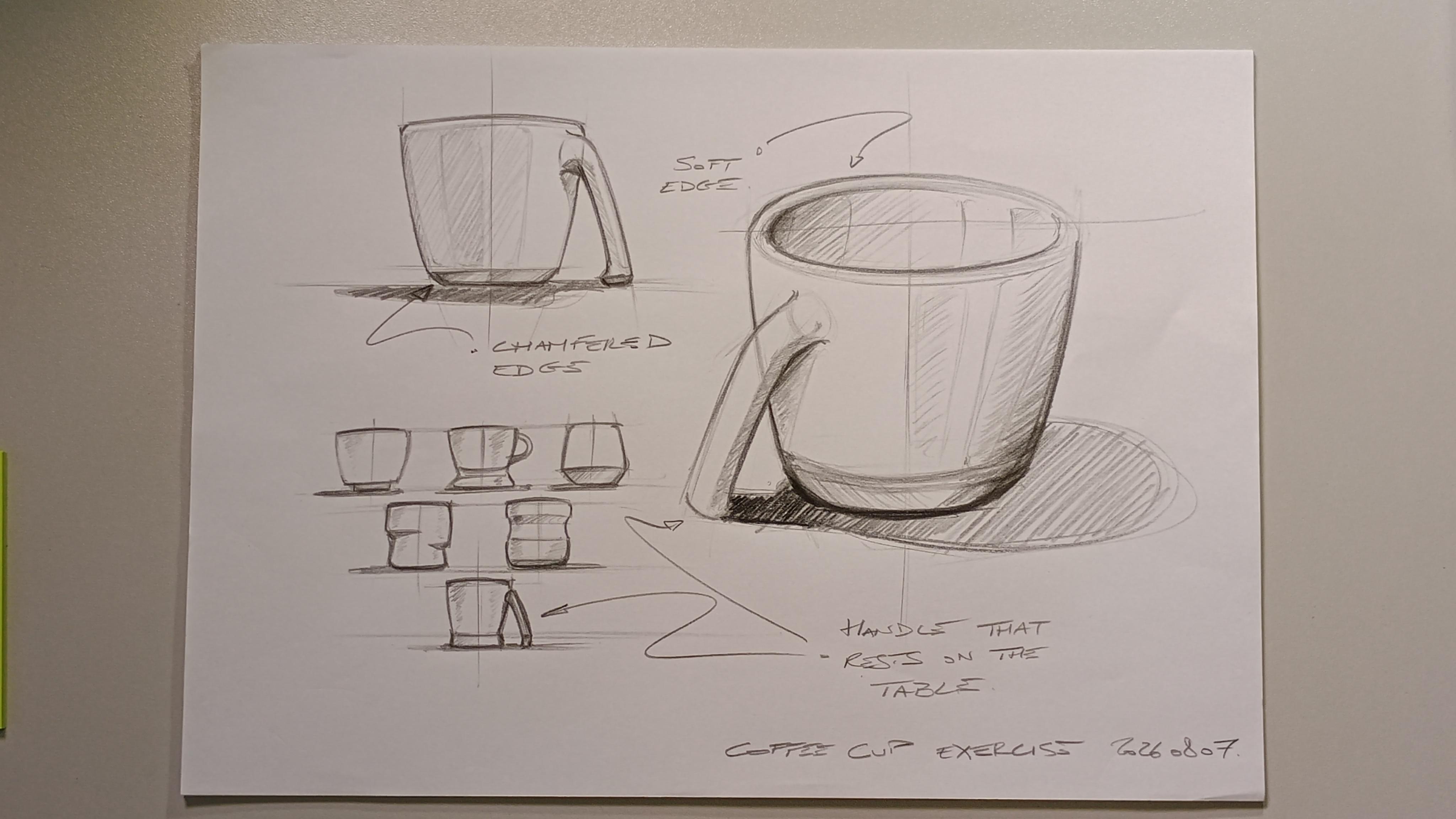
11. 09 sketch Exercise: Alright, so for the exercise, I'd like you to
sketch coffee cups. As we said, three
views, one hero view. And so think about what we said perspective,
different views. I mean, the three views
are going to have different angles
of perspective and some sharing and maybe
some reflections and try to keep a nice
composition on your page. Doesn't need to be three
views of the same. You can have three designs. It can be an exploration page, three coffee cups. Let's go. Yeah, so looking back,
there is a mistake. If the top looks like this, the bottom should have that is rounder and I
made it flatter. So, if anything, this
should be rounder. Let's try. Definitely rounder. And so perhaps this
should also somehow wait, which then maybe there is
something I miss less bad. And then this scrap
has a problem. I wouldn't way too far here. Definitely should if
this is the axis, I mean, that distance is? Interesting. So it's
down here that. So it here. Something like this would
have done a better job. Maybe we can just exaggerate the contrast and pretend it
didn't happen. Let's see. I have a hobby to kind of
frame the shedding areas. Is that kind of like a
leftover from marker era. Hmm. I'm not sure I
fixed it, but it's bad. Have fun. Take it easy. Nothing is perfect, but in
half an hour, it's fine. You can produce 16 of
those in the day at work. You're a designer. Huge.
 Tanguy Prevot, Industrial Designer / Educator