Transcripts
1. Introduction: Okay, I just did this in 20 seconds. And you can, too, for three easy payments of $5000. Just kidding. I'm Michael Clarke. I live in Salt Lake City, Utah. I'm an industrial designer at Nomadic, where I designed bags and accessories. I also have a design consultancy called Ready Design, where I specialize in soft goods, apparel illustration and graphic design. So my story started as a kid. I love sketching all kinds of things. I later started painting and making graphics and T shirts in high school for my buddies. I didn't know at the time, but this built the foundation for the design career I didn't know I was going to have now. After graduating high school, I went to the University of Utah and discovered the design program, which is where my creativity started to gain a discipline and structure which it really needed. While I was in design school, I realized that I was not being taught certain knowledge and skill sets from my professors and the people around me. So I sought out designed internships and worked as a sales rep to dial in my marketing and sales skills. All these different things helped pretty much round out some of the skills and help me get more. In the past, I wanted to go and after graduating, working with clients and being a full time designer, I started putting work on social media and have been receiving messages about how I do certain things. And it made me realize maybe I should put together some content help. Other creatives developed their own personal design style. I believe the understanding had a sketch by hand will improve your whole design process. You'll have a better understanding of proportion, fine weight, balance, symmetry and a whole lot of other design elements. This knowledge will improve your computer aided design skills. They will look even better because you're understanding will be deeper. I use quick hand sketching to communicate with my team at work. I used to talk with clients and go over concepts. I even use it toe, communicate with factories and do it quickly. So my goal with this course is to help other designers to one gain confidence to up their skill levels and three become Arad designer
2. Class Overview:
3. Materials Used: Okay, so I'm gonna go over the materials that I use and materials that, um, I'd recommend for this type of sketching. So the paper I'm gonna be using is in crescent favor for wet media. So, like ink and markers and different things like that. I got just got this on Amazon. I really like the sketch. It's a good size. And then the pens I use, I'll show you. So for initial line ways, you can see I've kind of put him here in order of kind of by line weight and kind of what stands out. This is obviously the boldest. So the first line is neutral gray one, um, co big marker like these. A lot to lay down, just kind of really faint lines to kind of figure out my perspective and make sure everything looks good on the page before I laid on a dark line. Then this line is usual. Great to co pick like, usedto find tip for when I'm just laying down lines because I could make nice, clean passes with the marker. And then if you don't want to spend a bunch of money on markers which I wish I would have not done in design school. And for the last few years, Um, you can just get a good pencil. So the Faber Castell makes a really hard pencil. That's awesome for Lincoln. Really light weight lines. It's a 58 so it's a super hard pencil. Definitely get five h five b will be soft, five inches hard. So I really recommend these and you'll save way more money than buying which markers this will last you forever. They take so long to burn through and they lead to hundreds of really faint line, you see, And they're awesome for just figuring out your perspective. And when you put a dark line over it, it makes it disappear. So you don't even notice that you don't have to erase it. I never dio all my sketches. I've kind of been posting on instagram and things like that. I've used this initially, so it's pretty awesome. Then the next line way. What you see here, this really thin black line is 0.3 a Muji. It's a Japanese pen I love these is a ballpoint pen, and they just laid down the smoothest line kind of do a past line to kind of make sure my hands moving straight and testing out your markers can also have you warm up to She laid down a few lines and get your hands loose. Then the next weight, which is this one, is a 10.5. So it's slightly bigger than the 0.3 at Muji, This place on a little thicker line. You can see that then, from there I use paper mate flair Pen. It's classic, cheap and easy to get. I just get these, like Target or Amazon. Then the last time. Wait. Well, I like to use is just a Sharpie. I had to make sure there's a good point on it cause that those get worn down pretty quick. So if they get one, eh, pretty quick, I'll choose him to fill in. But it's nice to be able to have a points. You could still lay down some good lines. You can see that how that works. So that's what I use, and I'll show you how I use them.
4. Loose Warm Up : Okay, so right now we're gonna go over warm up. What I like to do is I like to use, like, photocopy paper, or I mean, remember in design Squires to Goto library, and they have, like, a recycle bin, And I would just get all the scrap paper and just draw all over it to just warm ups. I knew. I just wanted to move around and start to learn how toe, you know, use faster lines. I do. You want to use your shoulder when you when you sketch quickly. So you don't want to just sit with your wrists and go back and forth like this. So having a piece of paper that you could just move over quickly and kind of mess up helps you don't learn how to do fast lines. And so I'm gonna use for this. I'm gonna use the 0.5 Muji. I'm just a warm up. I'm going to get my hands. Listen up. I really will just, like, move my hands around my wrist. Just kind of get woken up. And what all day long to start laying down straight lines like to go vertical with the pen for straight lines. I kind of do a lot of passes. Go over it, fill the page, a bunch of passes. So do straight line. You could even draw like point here. Point here. Try to go from point to point. Work on getting nice, clean lines across. I'll do some angled lines. Practice in different ways. There's always angles that are worse. Then you could do some ellipses, and we're not going to really be covering ellipses. But it helps to always to practice ellipses. Mr. Circles never herds get you. Loosen up. You practice going the other way. Do some kind of different angles like a little cone thing here helps you make around corners, ellipses and lines. Um, I do a few pages even. Can you even mess around with some? Do you like some cubes? Perspective? Something like that really doesn't matter. When you're just listening up, I'll do a few more lines. I just want to get phone like I'm not just sitting with my wrists and doing little squiggly lines. Just want to get moving quickly, right? So it's not the warm up. It's really simple. Just do a lot of things quickly
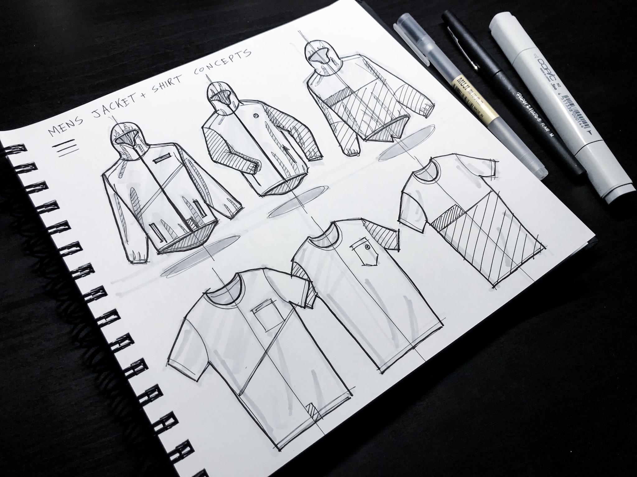
5. Apparel Sketch Warm Up: Now we're gonna go over the specific warm up that I dio. I like to get photo coffee paper and just fill it up. Just go crazy with just Muji Pan the 0.5. I really will just go mats and just go as fast as I can. Just loosen up scribbling the stuff that I'm going to be sketching during that session. Just really quick sketches. Here's a bunch of jackets with short. I was thinking about a short jacket combo for kind of a spring fall fitness collection, so you can also lay out your page because these ones, you know, if they're kind of chaotic because there's really no rhyme or reason to him. I was just moving on. Now, if you want to get more, you want to get more intentional and place lay out like a nice page you can also use. I use the n one co pick and just really quickly just, um, scribbled out these jackets. You can see I just got the perspective. I needed a lot of passes to kind of figure out what they should look like. Um, I did this a front view. There's a back view. There's a short two shores here. Some footwear, I thought, would look cool like musician footwear Concepts would look cool with these jackets. And then here's a shirt thinking of kind of like a whole collection that would go together . So when I get my 0.5 movies, I'll start to kind of just cut these out. I already have those lions I can kind of quickly just go over him. Pop the jacket out. It's nice already having the perspective right, kind of doing trial on hair and failing a good amount of times with the really light marker , the opening zipper. You can also draw that vertical line, he noticed. I do the vertical lines down, each one with a light marker. Here's kind of sticks lines. They get some drawstrings. It was a cool feature at the end. Something like that. Say, there's like a cool, tacky pocket right here. Two pockets on side, local over out of the little crosshatch. Give us some shading in between the layers of fabric. Here is the back of the jacket. Quick! Back at the herd, so did kind of a tail right here say this one has it, too. Drop that down doesn't matter, just kind of make the jacket Look. I think it's the same one. I kind of had the arm folding here at some kind of dimension to the schedules. Show a little more movement to it. Um, let's say kind of the the yoke is a different fabric. Weaken little crosshatch Cool T shirt. Oops, skin Doesn't matter. Keep moving pocket. I was cranking that out. Thanks, um, speed into it. Neck next necklace. Little crappy, but I don't really care. Just warming up for at that center line center line always makes it look a little more more handgun and sketchy, too, which I like. So there's the shorts, that center line, and I think it's really important for things like shorts, jacket shirts because they all are kind of each side using mirrors, the other ones. So shorts. It's going like to do, like kind of a little half lips. Waistband go over a few times to thicken it proper little bit. That's fabric punches out right there and have each line and come right here. I'm gonna mirror that side here. You could do the same thing with pants. It's pretty much the same when you're sketching it and you want to the same thing. If you were gonna put this in Adobe Illustrator and just mirror it, you can start idea eating on that, but a lot more fun to start with. Sketch. Let's give it, like, a cool pocket or something. Maybe we'll put that in her actual sketchily idea shorts in the next video. Okay, Waistband draw that center point center line. Could be kind of that reference. I can mere it off that make sure this angle is the same right here. Cool. Looks good. I'm gonna give this one kind of an elastic look. Waistband give us unfolds Some lines, Carol, do the same thing. I make the lines a little tighter. Show that it's little darker back there because it's the fabric layer underneath. Do fewer pastor here, poppet. Ill give it some kind of we'll cut out fabric right here. Like a little split. You seem in same. I go back and Anderson seem over here. They allowed some shading right here. Waste. I have the footwear here, and this is just for fun. Yes, I did the outline of a show just kind of making up a form of a shoe. It's kind of fun. I like to think of the whole collection. And even if you're only designing, say, 11 of the items I could think of kind of the ecosystem in 11 of like a whole Ah, whole wardrobe. Here's a really ugly shoe. There is just warm up, just fun to move around, give a little element here. Little thing here. I think it's really ugly. Skates you something. Get this a little more athletic. Maybe a little bit. Give it, like some type of feature here. Some type of type of design element. Whatever. It doesn't matter. Kind of a language. Sit on. Mess around. Thank you, Outsole. Cool. There you go. I started with this and want to kind of just laid out roughly the page. What? It would look like bin with my pen. One over quickly. Cut it out. So I'm warmed up, Ready to start the sketch
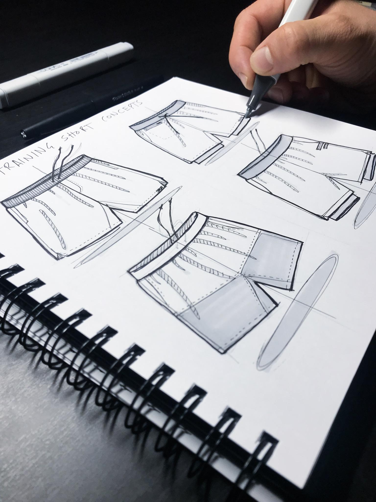
6. Sketch Layout - Training Short: Okay, so now we're going to our first guests in our sketchbook. And what this one's going to be is se men's sure men's training, short concepts, men's training, short concepts. Now, some designers air really good at just getting on a page and just kind of organically filling it up. But I like to, ah, kind of break it down almost like a grid. So for this one, I'm gonna lay down kind of a two by two grid, and I'm gonna dio a short here, here, here and here and crank out four sketches that all are the same size and that also give it some balance. You have a nice layout. And so for this one, I'm gonna use the five age favorite Castel pencil and so that I can just lightly go some lines and kind of get the get the size, right? So I don't have this really off balance. Ugly looking page just laying down some really light lines. Might even be hard to see it. Camera Really light lines. One short drawstrings course. There's one side. It was right here. It's once again I'm referencing an image I found online of just a short to give a general idea that also teach anywhere the fabric folds. And then later on, I'll show you how I can actually make it look like this is fabric. So and I said that lined in middle from over here right next to it to another one is a vertical line to kind of cut this sketch in half. I kind of do a light lips. I noticed that the front of that short kind of dips in front. Fabrice, Illustrator in the bag. Here's the waistband. Okay, Fabric on the leg comes over here a little bit. Okay. And then this one, you say, there's maybe there's some compression underneath the short attach the shores. We're gonna draw in some compression. Give kind of this short. Another idea, because the idea this is a crank out concepts. So So you're cranking out concepts for a client or for your own brand, or for you're a year ah, design team. It's good to show a lot of work on the show that you can pull out a lot of concepts and if you can lay him out nicely, it really just speaks volumes, and that gives you that Edgware. People think you're a magic designers, so that's the best part about it. People like to look at good looking drugs to it really makes it feel official. You can really feel the energy of what's happening here. Miss Drums once again, the same thing. What I'm gonna do is go through this at in Placed looks a little weird, so I noticed they didn't have enough shape. You're looking a little stiff and here's kind of your insane. Forgot to add that on the upper ones. It's one of it. A little stiff as well. If you notice I give it kind of edge, makes it feel more like a natural fabric. I noticed that I can I see sketches. People will do really like straight edges for apparel and apparel doesn't ever look like that, but I don't like that Apparel looks more natural is more, more. It's not perfect. So here's my last pair, and this is all just coming from one image, remember? So I'm just using that image for the general look to get. Like I said, the size and perspective and balance right, it's really helpful. And don't feel like you're cheating, especially If you say it's something you're brand new to designing. You didn't reinvent the short or something or like a perils, not some new thing. So I don't think it's like I don't feel bad when I'm using other images because I'm just trying to get an idea what looks right because I'm going to put my own spin on. I mean, as a designer, will you never doing something brand new, but you're just kind of putting a new spin what you're designing and kind of putting your taste and kind of your touch on it, which is really fun. That's kind of fun is part of design. I might go back through this and add now, um, soundless sees drawstrings. So say this one has, like the fold over each other. This one comes down here. Singles Here, this one drawstrings go here, say it's like laying on the ground because the angle I'm drawing on these shorts are flat, like they are laying on a surface, and you could do the same thing, like if you want to get an image of ah, I like to get an image of someone wearing some type of apparel and draw the person as well . So it gives you You can start to learn how to have sketch people to how the product would fit on someone. So most on this one. I'm gonna do that. Drawstrings underneath the shores of drama work right here. Um, cool. So there's kind of some basic outlines for the short, and then they laid out, so they're going to look more balanced.
7. Adding Line Weights - Training Short: now using three different thicknesses of pens. You got the 0.38 point five and the flare pan. I'm gonna start to lay down. I'm gonna start to outline these shorts and kind of pop him out. So first thing I'm gonna uses the 50.38 and reason is because I could do I do all the inside details and I do heavier lines on the outside. So for this short, I'm gonna kind of roughly go roughly go over it, start to define everything on the sketch using those outlines I created. Now, it's nice knowing that I have this nice kind of layout. So I'm going to give this one like a cut out here on the short. I could look a little more athletic, remember, Had that vertical line coming down. It's good. That kind of gives this. Sherman helps me keep the short balanced here. Once again, I have that take her there to give them give a cool, well design feature to the shore. We're trying to figure out what these shorts would look like that So I kind of like to think of either something I wanna wear or say that client gave me a brief. I'm kind of or were trying to think of new concepts. Try to distinguish the short, make it a little different than what's out there. But I also like this, um, the same way you can even do like, some stitch marks. A little little dashes. Give it a cool technolo because it gives it some detail. Do some stitching right here. I'm just stitching. Do a line right here. Um, there's the inseam. Okay. And save us Stitched right here. I didn't say there's pockets here. Give those lines, make him a little thicker. Right? So it's going to pop out, and I have those drawstrings and looks like my outlines. They were a little weird looking so And they were little office. They're too far away from that center point someone a redraw right here with the spot where those drawstrings would come out. Right here they come are here two lines and then tip on. Well, cap on him. There's drawstrings. And then this is Ah, bungee waistbands. I'm gonna take my time and just crosshatch this. Try to keep your lines parallel to each other, going the same direction, so it looks cleaner. It always looks a lot better when you do that. I noticed there was kind of some some stitch lines right here. Back behind. I'm gonna do the line. Since it's ah, the fabric piece behind. I'm gonna put him closer together. So what that will do is it Make it look even darker to the land, The hatches closest closer together. Okay, that's cool for our initial thin lines. And I looked at the looking at the sketch What's in front of me on my iPad right over here and noticing that, um, there's folds coming, like, right here. There's, like, a full that comes right here. Here's a full should fall. What I do is I look at the sketch and I find I look at the photo I'm referencing and I find the major fold areas. Then I will. I'll just do like a crosshatch on him. You don't need to, but I think it looks pretty cool. Starts You can start to see where the fabric as creases and folds and with lights shining and giving a shadow right here. Cross hatching right here, cross hatching. Perfect. And then right here I might do some cross hatching as well. That kind of show that there's fabric underneath toppy. So there's kind of my first weight with that 0.38 it's not gonna get Be that 0.5 kind of pop out some of the more important parts to have your lines where I should, where it needs it to kind of give it some more. Give the sketch, some hierarchy. Um, you know, I might even go all the way to the flair pen in this one and just finish it. Just do a nice good outline. Clean up the whole sketch line. Wade's like doing right here is well, I think one right here to show there's a separation that's not the same fabric. You can't even do a double learner here to show them it. I might even put like a shadow on that back inside of the waistband, and I'll just make this one bold line for that drawstrings cool. And someone grabbed that point that 0.5 again, and I might that in some, like, maybe like a ah, logo hair here on the knee. Yes, I d like maybe we could have. You could show client like, you know, have some branding here. Um, you could even do like a call out. So that looks good for now. I'm gonna move on to the next short back to the 0.38 quickly going over this thing, popping it out, carving it out. You knew it after I've already film Looser doing that. 1st 1 for short case, this one once again is gonna have that stitch line right here. It's also the compression short coming out right here. There's gonna be a fabric fold angled fabric fold kind of give that a stitch line to kind of show that every piece of fabric there's gonna be seem running up here. Foot page, around foot, the sketchbook. Kind of. Sometimes I like toe. I do best from his eye moving kind of left to right upward. I do a good line. So I flipped my sketchbooks that I can move that way. Um, so it's good. And then here's my drawstrings. These once cross over each other, So this one cross is right here. Inseam. Okay, that stitch line. Cool. Don't say the pocket kind of the more curve say in the front. There's like a cool zipper pocket just quickly add that end and zippers. I let me just do like a a black bar. You can kind of tell like that's a zipper, So let's cross over here. Maybe there's a garage right here meaning a piece of fabric that the zipper goes into. You can even show like that pocket goes like from here. There's something like kind of the depth of that pocket you could show the client or whoever you're doing that for. Just to show like that's underneath pocket. Just a quick little visualization technique and say, We don't want that waistband toe Have say it's not a bungee waistband, so you just wouldn't do cross hatching. And later you could add color and you could make that a different color, whatever. But now I'm gonna move on and do what have your line, way and group floor plan. Pop it out, cleans it right up catch kind of year. And it's funny if you plug this in tow. If you want to build this an illustrator, you do the same thing with line way. It's and you want a toe. You don't have your outside line rates the heaviest, and it communicates the best. But learning how to do this by hand is a lot more fun because you can do it anywhere. It's also looks a lot cooler is part of your portfolio in process. Get into the final deal. I mean, you can live in. You can live, you know pretty much in Adobe Illustrator to make a parallel day, but this is a lot more fun. Way to do it kind of helps me get more creative. I noticed I get more creative when I'm working by hand. No more fun ideas. So there's a sketch. Um, go back to my 0.3 and add in some kind of some rough fold parts fold areas in it. Here it looks like there was a full right there and no says I really like a lighter weight . And so it doesn't ruin the drinks. You can still tell the other stuff is just doing some quick cook folds here to show that there's some depth to the fabric show. There's some three dimensional element of the fabric. It's kind of cool and do some cross hatching in that to cross. That's there. Then, in the waistband, author Ransom Cross has to give us? Um, you had a shadow here. Go back and I'm gonna add in. Maybe just a darker line for those drawstrings. Make those. I am. It looks cool. Looks like we got some compression I'm gonna put that same logo had right here. Then I had I added in that that pocket I was at a depression looks fine. So I'm gonna get this 3rd 1 pop it out here. The editor in same center line. The center line also makes the sketch look a little cooler to looks like sketch has a little more speed to it. This one. I'm gonna add the drawstrings inside the waistband instead of the sketch I originally have on the outside coming out of the inside. So I kind of see maybe they have, like, a tie on on their tied shuts for a little no, there. I had a little stitch right here. It's again. I like to do the little stitch marks down here. There will be stitches. I can even adamant here on this inseam. Also say that there's a entail break. Say that there's kind of some color blocking going on. What in that material break you're in here, you could even add in some stitching right there. Cool. Just kind of a color block. Short. Gutzon Basic Pockets. Waistband. Let's add in some folds. See where the waistband get stitched in. It causes the fabric to fold up a little bit and bunch, so it gives it all these different fold lines. But there's a shadow here. I want to get to crowd that might have been a little too busy, even, but it's all right. Okay, get there Flair, Pan. Now a bit cool. Let's do the last one. Doing this is also a really fun way toe start your day. Like when I get to work a. Pull out some paper and just put on some music or something, or podcast or book. And just start to get in a creative mode to start pushing out whatever I'm working out for the day. So lately, I've been working on a lot of backpacks at the brand name, working with, um, different accessories, or it's all the sitting kind of move through some ideas, and the more you do it, even if you're sketching the repetitive things, just kind of accept it as part of the learning process and learn. Make it a fun thing. Don't make it something that feels like an assignment or something. But if it becomes fun and meditative, it's so much easier to Dio. And then you just start to enjoy. You look forward to it and then you have really rad stuff. And it's really impressive for people looking at your work when they see that you went through all this sketch process and if it was something that you didn't really I hate doing , and it was a lot more enjoyable than it's a win win, and it looks great in his pockets. Okay, And let's see, there's a same thing kind of a fabric, a little break right here by the knee for some mobility and the on the shore. Also just gonna go through and I'm gonna add in some compression on this too. Make him look athletic. Looks pretty rad. Cool. And then I'm gonna add in few falls based off what already did the other stuff. Looks like I missed one up here. Not even add in one, like right here. Don't even add in some folds, like right here, coming out of kind of the and same is that's, like, my basic That was all with the 0.38 Now I'm gonna add some weight to that The flare pan. Cut it out, Pop out of the most important outside lines. Make this look like can see the inside of that compression a little bit. A little three dimensional. Look, came this, but awesome. That kind of looked over the whole thing. Looks like I missed that kind of that vertical landry here. Show consistency. I like to have a consistency throughout all of them. Um, I can even go through again and be like, Well, it might be cool if Let's see, Maybe there was. Maybe there was a logo hit, you know, up here. And I can show the client that and I could go back. Can't even Chris the line way there to make that thing pop. And that's a techie. Features like that, right? You know, I could even go with this. That's probably the 0.38 And I could even add in like, a like a little drop shadow underneath him, because in that floating techie kind of cool, sketchy look, right, So now they're all kind of floating. I'm not going to anything in that. Some looks good. For now, that's a quick ideation sketch.
8. Last Details - Training Short: cool. So I have my ideation outlines. Now, I'm gonna use these to cope with markets to kind of give it some depth and kind of give it that cool, that feel that makes it feel a little more three dimensional. So I already have my kind of my shadows parts. So I'm gonna use is that, um, number one, the market, the marker side. And I'm gonna kind of just start to pop. I kind of go over those pots where I have drawn the shadows anywhere. There's a kind of a shadow on a crosshatch when I kind of give those a little bit of a and I won't even go on the outsides of him as well, you could even extend them a little bit. It gives a natural full piece. I can even there was some marker into those drop shadows I put underneath. It gives it a cool look. Just a quick way to add some to mention about. Even since this is underneath this layer, fabrics push out of their shadow on the appreciating the drop shadow. I mean, I just kind of discuss, adds another death to the sketch I like and just be loose and fast with it. Looks cool. I think markers used minimally makes the schedule look really name. Yeah, my throat on the compression is here, and I'm also gonna throw right here on the kind of these branding hits I put Pop those out and then notice. I also have done kind of ah blocking here. So I'm gonna make this bottom part b a darker fabric because that'll really show that it's okay. This could be to contrast ing fabrics that could be later in the darker fabric. But you get the idea that it's two separate fabrics and like Syria here, it could also do a darker waistband. This is what the number two, since this is the darker side will do a few passes of the marker on this back side of the waistband. Gives us a death right here. I'll do the darker we spent as well right here. I'll just darker waistband. Take the market all the way through and going the outlines as well. Make sure. And this paper is really nice to stick crescent kind of wet media mixed media paper absorbs the market really well and also doesn't believe through just nice. There you go. Had some nice kind of color from grayscale. Um, depth to the sketch looks good.
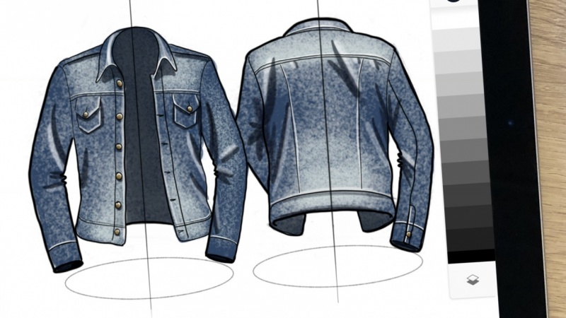
9. Rough Outline Sketch - Jacket and T-shirt: Okay, so now I'm gonna i d eight a men's jacket and a sure do some concepts. So since on this one, I used the Faber Castell five age pencil toe lay down and kind of the outlines on this one . I'm gonna use the and one, uh, co pick the neutral gray number one. So women used to find tip and something I'm gonna show you that I like to do to make sure the sketch looks right is all Look up some images on Google or some of my favorite websites of different brands I like. So I found a few jackets here that I like, um, brands. And the reason I'm using these reference images is because I used to copy, like, other people sketches, trying to figure this out or just kind of try to make it up out of my head and just always looked wrong until I realized I didn't. I just use the real thing as a reference, right. So you like I said, you're not reinventing anything with this apparel. You're not reinventing the jacket, your you know, making a new jacket. So I'm tryingto figure out where the shadows we're gonna be where the highlights were going to be. How the fabric folds I can use these sketches is I can use these actual photos as reference images. I also have some T shirt here, and there's a guy wearing it. Um, that shows me fabric folds up into a flat. I can also do it three d With this image kind of using those, there's a fabric folder here. It's a big shadow right here that shows movement that shows that there's muscle on the guy and so that you can add some shape to the shirt, and it makes the sketch look a lot cooler. So that's a pro tip. I have a kind of ah, I wish I would have done that little earlier instead of trying to copy other people's sketches or just do it out of my head. Use the real thing and start to learn what it looks like. And sooner or later you'll do it enough that you memorize it, and then you can just open up your sketchbook into start doing concepts, which is pretty cool, something bright in here, like Okay, so start laying down the sketch and markers. Awesome, because I guess it definitely looks the cleanest. Someone kind of once again do that. The grid I did with the pencil. And the reason I do thee good for this causes the square paper. So, um, make this little that more room up top into the jackets up top. So and I have these images in front of me on my iPad, so I can kind of use them as reference. Make sure my scales correctly. Even I'm gonna design my own kind of concepts, give my own twist something to that center line and tried a mirror each side of this jacket off of that center line here, shoulders. I threw the body of the jacket first. It's about right, and what I'll do is I'll add an arm. Looks good to me. Moving quick with the marker. No, where it's making a mass Doesn't matter when she put black on it, it'll pretty much you're I won't even really notice the marker looks then can. And these sleeves Well, that's pretty good for a basic shape and opening, I heard that's basic jacket there, you know, I might even add one. And here in the middle, throw jacket in the middle. I can do maybe in three concepts on this page. So you just idea thinks the more ideas, the better it looks. Osman portfolio. I'm gonna fold this sleeve so it doesn't cross over to the other sketch. Get with the body length. This would be Come here. This right here looks a little too thin right now. That's too thin. I'm gonna make it bigger, but not back tail even have a tail hang down off this one. Getting the perspective right and have this armband. I'm just making this up would have been about right there. A little weird. So I just keep doing passes until it feels right. It's getting a little money, but it's okay. Black market will help clean that up. I think I'm just getting the jape general shape to at a tail on this one. To like that. Looks cool your hair once again and another time of the over a little too far. We're putting her hair mirror each side of the jacket off. That also gonna add this hood piece. Step started there, so finish it. This last jacket, ruinous jacket has a bill tail on it. Back piece had that in mirror that here the hood should the shoulders. Sometimes the shoulders are hard to get right so that they could look to Drew Pearson is there could be two square kind of just keep doing it till it looks right. And just keep playing around there. Tell it looks feels like Okay, that's I believe that if I said it is a sketch Looks fine. Cool. Doesn't have to be pretty right now. You're just figured out a shape. Cool. So I've got three jackets up top centerline. The center line was what we were looking. And redo that one to another picture. You can see that. Cool. I could even havinsome drop shadows like I did of the shores. Cool. So there's some jacket concepts, but then right here, I'm gonna do some T shirt concepts, scroll over on my iPad over some of those teeth, look over those T shirt images and have a few in front of me so that I could use him. His reference. Make sure skills are. Even though it's a T shirt. The most basic thing. It still could be screwed up and look a little lopsided and stuff so I still want to look good. You're a designer. Things should look cool. Look good. Get shoulder angles. Right. Get sleeves Here. I'm doing the body. First you noticing all these pieces, Do the body first. Get that right. And then you can add in the extremities. Arms, legs, whatever sleeves. The shirt's pretty easy, but reason it didn t shirts with the jacket. Think be cool to have some kind of do. It does do some type of design hit that repeats in the T shirt. So it feels like, you know, they both had maybe this this color block or something across them. Right? Maybe this one has this pocket, right? And this one has. This one has a pocket here, too. Doesn't hang, but it's still a pocket. And they have some, like a logo on this right here. You know, it's right here. Cool animals. Do another T shirt, this T shirt. I'm gonna have be underneath the other one. Neg. Those sleeves overlap until they all belong together. Looks kind of cool. That vertical line there Another T shirt right here. Cool. I got three jackets, three T shirts and I'm ready to know. Start putting some darker lines on it. Pop it out
10. Adding Line Weights and Detail - Jacket and T-shirt: Okay, so I have my Outlands got three jackets, three shirts, and I'm gonna start the idea him with some black. And I'm gonna use the 0.38 0.5 and the flare paper may as my kind of my three dark line weights. And then I at the end, I use that neutral gray one and neutral grade number to call big markers to kind of add some shading in depth. Make him look a little more interesting. So from the first start, with the 0.3 a, I'm just going to start popping these out. So first kind of find that vertical line I like. Like I said, I'd like to mirror each side of each other. So do they. Heard that angle looks right. Hey, really Other side of the head shoulder looks a little weird That wrong fixed it, Mr Zain. Sketching multiple passes always looks I think you're moving looks a little cooler and that faster, looser Phil fills a little more more fun and more interesting to look at when people look at it with you like a client or your boss or just whatever in your portfolio, it just looks like helps put people feel more involved in the design process. You can see a lot of thought going into it. They heard. Here's that pocket zip pocket. I'd be kind of cool. Um, some pockets right here. I'm gonna have gonna make that be a shadow. Since it's the layer underneath, you can tell that kind of inside the jacket. Okay, If it passes right there, I do another state right here to show. Maybe there's kind of a binding on the edge. Bottom partners are binding on those addresses, appointing around the hood, opening cool. And then I have those reference images in front of me so I can kind of I can look at Look through those reference images I showed you in that last video and say, OK, um, looks like there's possibly from shadows coming right here. Cross hatching is a shadow coming right here. Crosshatch. Some right there. Have to give some lines inside. The hood is kind of shaded. Summer's gonna fill that in with some cross hatches, so that's inside. The states like neck is also noticed. A seam on the shoulders, looking all those other jackets. They all pretty much has it right here. And I'm fine with that in this design. Um, big fold right there on the fabric. It's a big full along this. This whole kind of side is folding over the arm. Cross hatching. There has I'm hearing here, give a crosshatch. And when you have kind of hard square edges on apparel, that's what makes it look to, like, really two d. So if you kind of give it kind of round it on the edges feels a lot more like fabric communicates a little more organic. Looks like there was a big shadow right here. And then down here, there were some shadows at those in. And these really are just coming from an image I'm referencing get a few images. They all kind of have some faults going on. So you started Do that, and you can see that unfolds right here on the cuff from the wrist. Big old shadow. Right here. Cool. So sucks. A little more. Um, you can see some shaded parts, and it kind of make gives the quick sketch some depth. So now move on to the next one. The hood. Right, Jack. It's kind of look like nights that full, and I'm I just did a double fault. I noticed fabric folds a couple times every time you like. When your arm moves, you can see some folder here. Besides made those up the arc a little more, because that's how it naturally would look. Once again. I'm making angle a little bit, not a straight line online because fabric doesn't move like that. This one's already looking a little more organic than the last one. Make that opening. Make that symmetrical. I forgot to do that. A vertical line down the middle that gives me kind of a reference point. You can always use that always. So use that for your zipper. I forgot to do a zip rolling here. If I go back with a darker marker, though, and add that zippers, you can even notice it. There's this. The arms. Let me make this from look a little more three D kind of give you some inside view of the the opening there. Cool. We're here. Give us some kind of really minimal pockets with zipper coming out Animal Park. It's shade that I'll put a shadow right here where I had the arm making up that shadow. So getting about kind of like a little binding along. That is the tale of the jacket. I'm gonna shade that in there. Those kind of some folds fold right here, making that one up. Have a folder here, have some folds coming up right here. Here. I'll probably fill in these shadows as well. With the neutral gray to marker. Give us post it right here. Do that opening kind of mirror that off you off each other, making look semi similar. But you kind of it. Also, some folds in marriage for your dad that I'd be like some fabric folds naturally inside of there, just in lines that will show roughly there's some shape in there. Also, give us a tick marks along the top. That'll kind of show that there's that hood was stitched in there. It was fine. I'm gonna last jacket from that center line again. The shoulders. Right. Okay. And then we get the torso right. Just about here. Arches over, make that look symmetrical and have that kind of that tail on the jacket. Having for effect adding a new element. New exploration of the design at in the sleeves try to make a mouthful of more organic. Not so it's again here. This side of the body. Have sleeves cool around those out. Do the hurdle earlier this time, there's no necessary rhyme or reason to this. Okay, I like to get, like I said, to get the body down, draw that center line, draw the body of it, then add in all the features after that kind of in any order. And it's fools there. I just stitched right here for its own On the shoulders are sewn together. All right, this would be the zipper. Remember Here, Ed. Right here, say these sleeves. A little color blocking going on. We'll add that with the marker. Say they're blocked like some color change right here. That would be cool. Kind of like maybe I can have a darker color and a lighter color up here. Um, it starts to tease out some ideas I'm gonna add in some kind of some depth to it, make it look a little cooler, adding and some falls and went like once again, I'm using those some of those images. I'm just copying Folds A C and other jackets. I've even laid down pictures of money, Taken a picture of some my own apparel. I kind of tried to sketch it to see what it would look like. And it looks a lot better than just making it up shadow right here where the fabric folds on to itself. It's gonna fold right there. Cool. And then I'm gonna go and lay down the quick lines on the T shirts. He's got really quick. Really? Basic. That center line. Remember that. Got that pocket. Have a mirror pocket upon this jacket. I forgot to do that line. I also have drawn in kind of an angled line here. So save this jacket in this shirt. Kind of have starting to add in kind of some similar design features making a collection add in the sleeves to this kind of seems here. And I'm gonna go through an AB, have your line wait to pop all this hours stitch right here. Kali would also have stitching T shirts. Hope dress, middle line the body of the T shirt. First mirror on this side sleeves. Last T shirt. You hear that? On both sides of the line? Shoulders. Torso. Right. This 0.3 is also and just lays on these really crisp lines really thin. So when you go back over with heavier line waits, it'll make any bad. So if you have some messier parts of your scatter stuff like this, you go over with a thicker mark, a thicker like that. This flare plan, which will do in a second and helps clean it up. This is not a big deal. You don't feel like you have to be perfect. Just keep moving, keep moving on ideas. I also put these little drop shadows centred these ellipses. I just to them centered around these vertical lines. I was just at a death. They make it for, like, the jackets floating kind of give us some three dimensional Phil to those. I also forgot to do some cross hatching on this tale of this jacket cold. So now I'm going to get the flair pen. I don't even think I might use this 0.5. But Flair panel probably find for the outlines because it's a little thicker than the 0.3 AM 0.5, and so we just re nice to clean it up. You want to think of everything you want your first read to be the heavy line. You wanna have a secondary read, which would be like this 0.5 Muji the little thinner and then the first read the the 0.3 s . You have your heaviest medium and lightest. So first read. Second read third read, and those really help make a good sketch. If you can stick to that rule where you have your heaviest line, always on the outside, then you kind of have the lines go thinner. As you do details. It makes the sketch look a lot better. A lot of people realized why it's looks better, but it's because those lines are really helping your sketch communicate better. So use line waits to really improve your sketches. There's the airlines from one of the next one companies out moving quickly, just going over the exterior of these. Okay, I'm a drawing the zipper line here. Toads from Mom don't even pop out of these pockets. You can tell where they are. Even you don't notice some otherwise zippers this phone. There's a big papers. I might even Yeah, it looks good. I'm gonna go into the next one, try to keep my pretty consistent. No, I have one. That's really heavy line, but have them all pretty much the same line. Thicknesses, exterior lines, All the same thickness is the interior lines all the same thing? This is what is the 0.38 late on the initial sketch? Who had those neck change quickly? Misters, ideation, sketching to you could do a lot of these and you add together like a couple of pages of this. And you can really tell that you've moved through some ideas and it shows the client or whatever. Whoever you're working with, that you've moved through a lot of concepts T shirt, hoping that out. You said right here that looked a little muddy. So I'm gonna How those out? T shirt. Cool. So there's our basic outlines of the sketches. Now, I want to add in a few more design elements. So now I'm gonna go back with the 0.5. Say Okay, this one's cool. I have, um, kind of this angle right here. This pocket right here, um maybe we have. Maybe there's a a branding hit right here. Right there had debts right here. So had any kind of this bringing feature. And right here, let's say the the sleeves are a different color. So I'm gonna do a crosshatch across the whole sleeve. And if you keeping us and doing the cross hatches all the same direction, that helps make your eyes say, Okay, those were together. Those are probably the same color you. And if it's not in color right now, I wonder the same thing on this T shirt. Make it the same. Have kind of that same design stroke or Pete. They're both the sleeves. It's kind of cool right here. I had just had that that center coffee other right here and then on the sleeves. Right, All this. What I'll do is I'll have to say the bottom half of each of these his darker should do big cross hatches to show that same thing with this big cross at just make that darker, cool surface of jackets you can start to see kind of how they're a little bit similar. It's at a pocket here to this one given angle. I get really creative with T shirts, not a whole lot to do so, so if you're not putting their logo's on them, okay? And maybe there's a cool, like circle logo. Some of these easy to do that with a quick sketch and some lines through it. Maybe right here. This one has this kind of cool half bar that goes across and it's a lot darker. Maybe that T shirt has the same thing. Cool. Real quick. I'm just gonna get this end, too. And I'm just gonna go over the fabric folds, make this thing, give this thing a little more depth because fabric folds fell a little bit more like they really are. Markers are awesome. They can just add in a quick little that a visual interest to the sketch. And this sketch is more fun to look at and communicates even more if who And then here filling in all those here too. Yeah, I forgot to cross hatching but lines. And that's okay. Age the marker. Do it here as well. Just fast and loose right here. Probably Sure. And I hadn't had done really much shadows on this. I might just adding a few. It's a flat T shirts. You don't need much, but some shadows right there. Maybe there's like a fold right there. You know full do the middle and it looks fine. Just some quick. It's funny as quick march will make it look like that. There's a fabric with folds on, and just fast Shorts are really simple fools there, filling inside of there. Film. There you go. You have some jackets and T shirt concepts and foot page. Do more. I'll go try it.
 Michael Clark, Industrial Designer and Illustrator