Transcripts
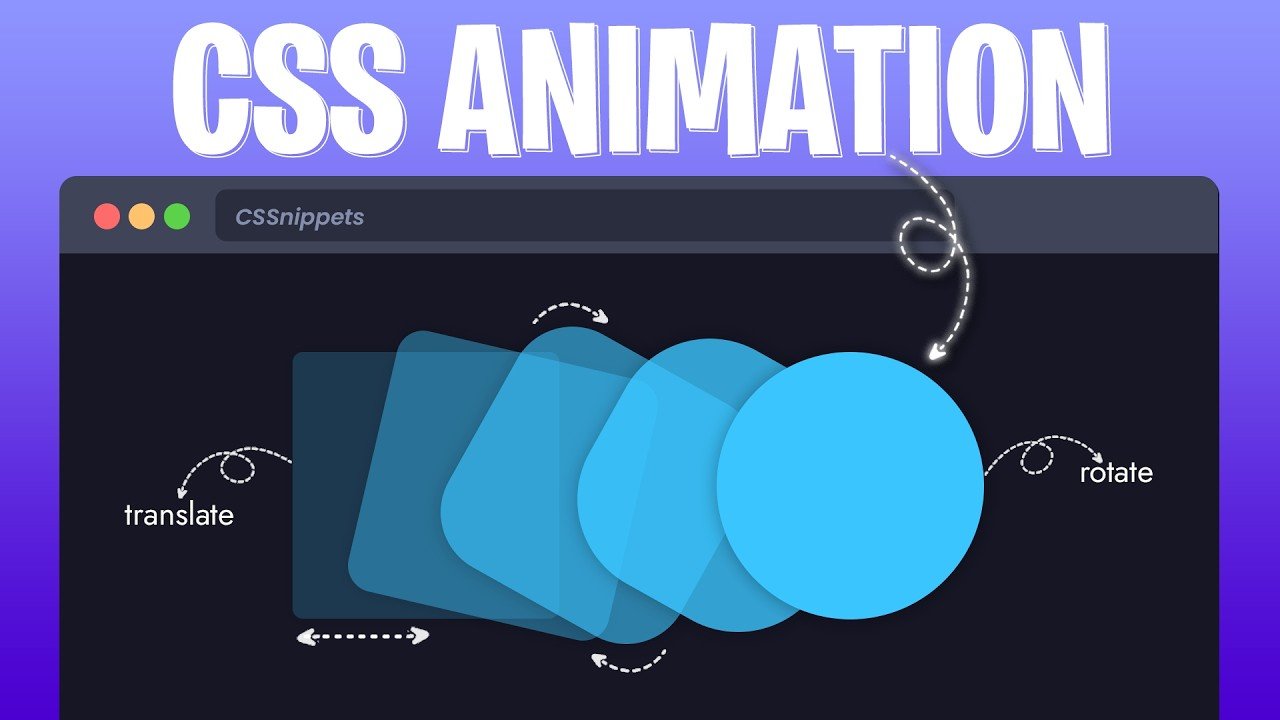
1. Introduction: Hello guy, it's good
to see you back. Today we are going
to create this beautiful loading
animation project using TML and CSS. My name is John Shortcut, and I am your instructor
for this project. It is a very beautiful
loading animation which is made by STML and CSS. Also it is very responsive. If I reduce our browser width, according to the
browser resolution, it changed the phone size, so it is pretty responsive. We can apply this kind of loading animation
in our projects. To create this
loading animation, I'm not going to use
any Javasceep library and any CSS library. We are going to use pure
estim and pure CSS. And if you are interested
in this animation project, we can start our journey
from the next tutorial. Thank you.
2. Creating HTML template : So this is the first
video related hour class. So let Jung into the computer
screen and start coding. As you can see, side by side, I open my Wiser
Studio code editor and my browser using
Lifesaver extension, and I already create
a estimate document, and also we create a
style dot CSS file. For now, as you can see, our document is
completely blank. So so now we need to create
our TML started template. For that, as you can see, we are using VS code. I'm going to praise
shaped excavation sign. Then I'm going to praise Enter. As you can see, automatically, it creates a started
template for me. Then I'm going to set a
title to this template. Here I'm going to type CS's creative text animation efect. After type the title
name of our web page, we need to link this standard CSS file
with a stable document. For that, we are going to
use ink tag LINK link, referral stylesheet, and
also we need to pass HRF. Here, we need to
provide the file path of this stylesheet. As you can see, it is in my
current routing directory. So I'm going to put the
fine name style dot CSS. Then inside the body tag, I'm going to use
heading to tag, H two. Then inside this heading to tag, I'm going to type Lodi. Also, I'm going to
type three dot. Next, I'm going to
use an attribute, and I'm going to
use this attribute in our heading to tag, and our attribute
name is data text. Data text equal to di. This is a custom data attribute. In STM data attributes allow you to store extra information
on a stable element. This attribute doesn't
affect the layout. I do not change any
appearance in our web page. Basically, we use
it with Java strep otherwise CSS to add
dynamic behavior, our data type is
test and we stored this value loading and we are going to use
this value later. This is it for this video. At the next video, we
are going to start the CSS. There's for watch.
3. Start css code enhanced : Nice to see you,
guys. Once again, I am back with another video related to our loading
animation project. So let's jump into
the computer screen. So as you can see in
your computer screen, here we open a website, Google Forms and we search
a font named Pop ins. For our loading
animation project, we are going to
use Pop in Forms. And from here, I'm going
to select this font way. 700 bold 700. To get this font, just click on Gate fun button and it will
provide Gate embedded code. Just click on this option. And then you need to select for which platform you
want to use this font for web Android, IOS flutter. I'm going to use
it for web purpose and I want to import this font. I click on Import option. And from there, we
need to copy code, this Import option code. So I copy whole font. After copying the code, I'm
back to my computer screen. To get exactly the same
result, we need this font. So let's jump into the
style dot css fun. At first, I'm going
to import this font. So I pasted the code. After that, I'm going to
apply this font to this text. For that, at first, I'm going to create a
universal selectron star sign. Then in su the Calira says, first probability, I'm
going to use margin. Margin, and I'm going
to assign margin Ju. Then I'm going to assign pan. Padding also zero. As you know, star is a universal selector. First, we set all the
element margin zero. Then we set all the
element padding zero. After set this file, as you
can see, our loading text, now it starts from the
top right corner because our heading to tag come with
default padding and margin. And we remove all the
default padding and margin using universal selector. After that, I'm going to use another property
called box sizing, box sizing, and I'm
going to use border box. Another question
is, what is that? Why do you use box sizing,
bottle box property? It changed the way the width and height of an
element are calculated. Let me clear the
concept of box sizing, why we use this property. So as you can see, Hell
created DV element and we set with 200 pixel. But this deep element come with ten pixel border each of the
direction, left and right. After using ten pixel border, each of the side, it
increase the D width. Now it become 220 pixel. At the same way, if we add
padding at left and right, suppose we say ten pixel
padding each of the side, again, it's going to
extend the deep width. Now it become 240 pixel. But we said 200
pixel deep width. Because of padding and
border, it extends the width. To resolve the problem, box sizing going to help us. If we apply box sizing, it's not going to extend
the deep element width. It's always going to maintain
whatever well we pass. Basically, it's going to shrink the content inside
the container, but it's not going to extend
the container within height. This is why we apply box sizing
property in our document. After I apply the box sizing, now I'm going to apply fonfam. I'm going to tie font family, and I'm going to
use Poppins font. Inside the single course,
I'm going to tie Poppins, and it's come from
San Serif family, San Serif. I'm going
to set this file. After I set this file, you can notice the heading one takes. It's changed the font style. I looked a little bolder. This is it for this video. At the next video, we're
going to style this body tag.
4. Style the body tag and heading tag : Nice to see you guys. This is the third video
of this tutorial, and in this video, we are
going to style the body tag. So let's jump into
the computer screen. This is what we are going
to create in this tutorial. For that, we need to
style the body tag. So let's jump into the style dot CSS file and
start styling the body tag. So at first, I'm going to target the body tag using
its name, tag name, BO, DY body then inside the Cali ressFs property
I'm going to use display. Display, and I'm going
to make it flax. Another phi is why I use
display property flakes? Because it enable
the flax layout. So what can we do with flexlou? What is the benefit
of using Flex Llaout? Because it make easier to align and distribute element
within a container. Even the size of the element
is unknown or dynamic. When we change the
browser window size, is going to change the content according to the browser
window resolution. It's work dynamically. Then I'm going to use
another property called Justify content.
Justify content. And here I'm going to
pass center center wave. This propriety
centered the content horizontally within the body. It's aligned channel
element to center. If I set this file, you
can see the result. It align our heading to
tag center of this page. It horizontally
centered the content. Also, we need to center
this content vertically. For that, I'm going to use another property
called align IN. Align items. And also, I'm going to make it center. If I set this file,
this property going to center the 11 vertical. But after set this
file, it's not working. Now you might have quotien
why it's not working? Because we do not
specify the height. So for that, I'm going to use other property,
minimum height, mean height, and
I'm going to set minimum height,
100 viewport area. Hundred VH. Harry set a minimum height for this body and Harry assigned
100% few foot height. If I set this file, now
you can see the result. Now, also horizontally centered and vertically
centered H two tag. Next, I'm going to assign a background color
to this body tag. For that, I'm going
to tie background to party background, and our color codes, and I'm going to
use RGB color RGB and inside the round
press for red, I'm going to use for Green, I'm going to use
40 and for blue, I'm going to use 53, and I'm
going to send this file. After style the body tag, also, I'm going to style
the heading to tag. Here I'm going to
create the select trot, H two, and inside
the clivsF property, I'm going to use position. Position, and I'm going
to use relative position. Then I'm going to
define the font size. Font size, and I'm going
to use font size 14 VW. If I set this file, you
can see the result. Now the question is
why we use VW unit? We have other units
such as pixel, PT, percentage, and minimum. But instead of using
other units, we use VW. VW stands for V port windth and 14 VW meaning 14%
of few foot width. So whenever we increase
the width of this browser, then it's going to increase the font size according
to the browser width. Next, I'm going to
set font color. So type color, and for color, I'm going to use RGV Value. Is the down dresses for red, I'm going to pass three. For green, I'm going to pass 40. And for blue, I'm going to use 53, and I'm going
to set this file. Basically, here I use exact
same background color. Now our text is not visible because it matches
the background color. So I'm going to add
another property. Here I'm going to
apply another property called text stroke. Type text, hyphen stroke
and to use the property, also going to use webkeat. This web keit specific style, add a stroke or a
outline around the text. So I want stroke 0.3 VW Also going to
define the stroke color. For stroke color, I'm going
to use RGV value, RGV. Then you said the round dresses, her to pass for red, I'm going to use two, for green, I'm going to
use 108 and for blue, I'm going to use 146, and
I'm going to set this file. This color is a little lighter
than background color. If I set this file, you
can see the result. Now, if you want to convert
this take into uppercase, otherwise, you can
go with otherwise, you can go with the
lowercase text. I would like to go
with uppercase, so I'm going to type text transform uppercase, and
I'm going to set this file. Now this is how it's
look. Now, it's pretty matched with our result, and this is our result, what
we are going to create. So at the next part
of this tutorial, here we are going to
create a pseudo element, which is going to
adding a dynamic overlay effect like this. So thanks for
watching this video. Stay tuned for our
next tutorial.
5. Adding the overlay effect : Good to see you back, guys. Once again, I'm back with another tutorial relatate this
loading animation project, and this is the
most important part of this tutorial
because in this part, we are going to add this
dynamic overlay fit. For that, we are
going to take help of posito before positive element. So let's start the practical. So here, I'm going to create a before positive
element of H two tag. So first, I'm going
to type taut H two and I'm going to type
colon colon BFO T one. Then inside the calibraces, I'm going to use our
first property content, content, and as content, I'm going to use attribute
function Ater function, this function here
inside the round races, I'm going to pass the attribute, which we create in our index
dot timLPage data text. I copy the attribute
name data text, and I'm going to paste it
inside the round races. Here we pass the data
content, and as you know, inside this data text, Henry pass Hentype loading. We are going to
use this text and the utter function enable the positive element to
replicate the heading text. Now we need to define the
position of this content. For that, I'm going to
type position property. Position and here, I'm going
to use position absolute. It allows the poseido element to be placed directly
over the text. I mean the original text, and then we need to mention
the top and lip position. For top, I'm going to pass zero. Then for P, I'm going
to pass also zero. Then I'm going to
define the with W Hemost with zero and height. I'm going to use height 100%. As you can see,
heist top and lip position zero because
it's going to allow to place the content
over the text precisely. And then we assign and
then we assign with zero. Why we assign with zero? Because it making it
invisible at first. Through the animation,
this width will expand and creating
a revealing effect, and then we use height 100% to ensure the
positive element take full height of
the H two element and covering the
text vertically. Next, I'm going to assign
color to this text. For that, for the overlay text. For that, I'm going to
type color property. Color, hashtag, and our colour
code is zero, one, a e87. It's a kind of green
colored, light green colour. Then there we need
to assign stroke. For that, I'm going to copy this property from this
position and paste it here. For stroke, here
I'm going to assign zero V W and for stroke colored, I'm going to use RGB Value RGV. And inside the
rounders is for red, I'm going to use two. Or green here I'm going
to use 108 and for blue, I'm going to use 146. I want to say the same color. Here we use the same
stroke color which we use for the H to tag. But you can notice her we
apply stroke with zero VW. Basically, it
effectively removing any stroke effect from
the for elements text. Next, we need to create this
horizontal line. This line. For that, we are
going to use border. Let me show you. Here I'm going to use border
write property. Border, right, and I want
two pixel solid border, and our boerstyle is solid. Then we need to provide
the border color, and I'm going to
use the same color. For boer and the text color, we use the same
light green color. Next, we need to remove
the overflow area some type overflow, heading. Then we need to
create the animation. I want to create this animation at the next part
of this tutorial. I'm not going to create this
animation in this part. Thanks for watching this video, Stay tuned for the next part.
6. Apply the overlay animation enhanced : So welcome back, guys. This is the last tutorial
related Our project. And in this tutorial, we are going to
create the animation. So at first, I'm going
to declare a keyframe, atate keyframe, keyframes, and our
keyframe name is animate. Then in the culira says, Here, we need to animate
the width Width value up before
positive element. If we change the width
value over the time, it's going to creating
a revealing effect. So at 0% position, 10% position, and 100% position. Is that the calre I'm
going to set with zero. 0.0 at 0.10 and at 0.100, it's going to set with
zero and at 70% and 90%, I'm going to set it with 100%. At the 0%, the animation start with the elements
with set to zero. And it making it invisible
for every narrow. Then at 10%, the
width is still zero, so the 11 remained hidden. And at 70%, here
we set width 100, making it fully visible or
extend across the full width, and at 90% also
with remain 100%, keeping the element
fully extended and at the hundred percent
also set with zo. Basically it allowing
the animation to start over from
the hidden state. Now I'm going to apply this animation to this
posito element. For that, here we need to
tie animation property. Animation. First, we need to provide the animation
name which is animate. Then we need to provide
the animation duration. I want to run this animation for six second and our animation
direction is linear. Also, I want to run
this animation for infinite time so I'm
going pass infinite. Animation duration is infinite. Now, before I set this file, at first, I'm going to
uncomment this line. Then I'm going to set this file. I think I did some mistake. Yes. This is our mistake.
It is not a class. It is an tag, so I want to remove the dot, and I'm going
to save it again. Now you can have
to sit this file. This is what it root. This is the border
at right position. If I make it with 10%, otherwise 20%, the set this
file, you can see the result. You can already identify
the overlapping effect. And if I increase
it more something 70%, this is how it is. So in our animation, her
we did the same thing. Here we increase the width of this before positive element. That's why it creates
this revealing effect. So for now, I'm going
to make it zero again and I'm going
to set this file. After I set this
file, as you can see, now it's invisible. And also, I'm going to
uncomment this line, and I'm going to
run this animation. Now, after I apply the
animation, this is how it's low. We create this animation, this loading animation
successfully. I hope now the
concept is clear for you how we can create
this loading animation. And if you like this project, then don't forget to provide
your valuable review. It is important for us.
Thank you very much.
 Jayanta Sarkar, Behind the Code: Jayanta Sarkar