Transcripts
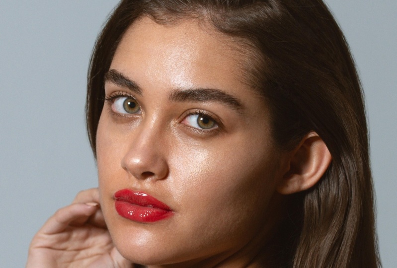
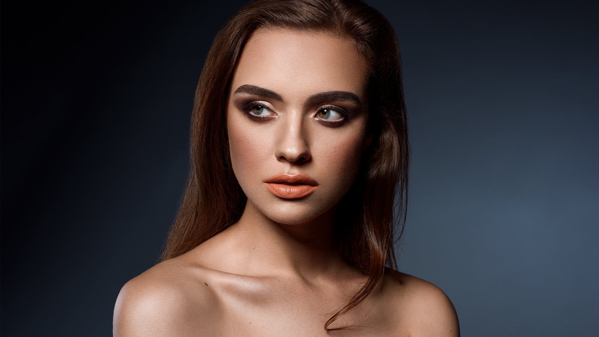
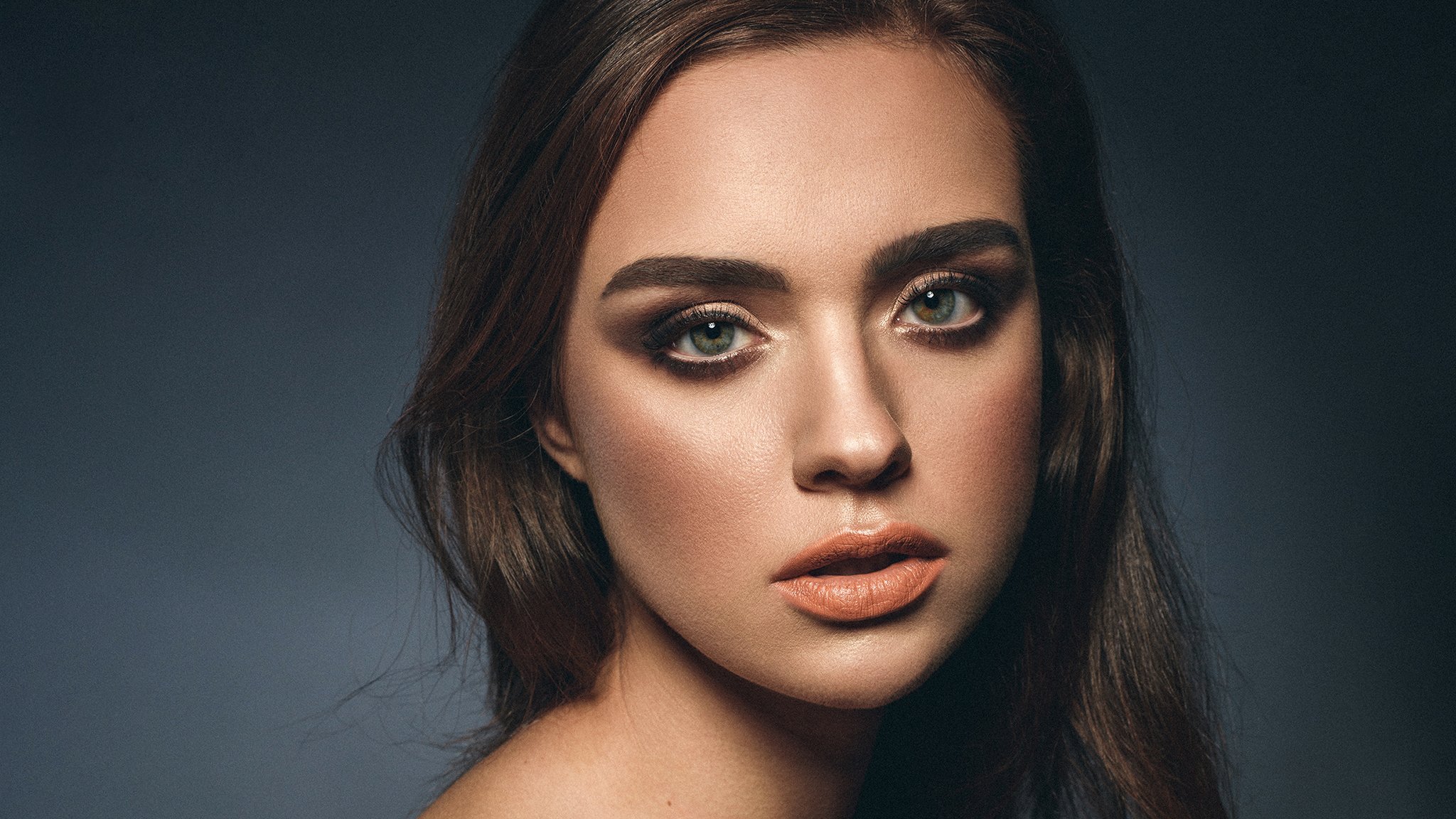
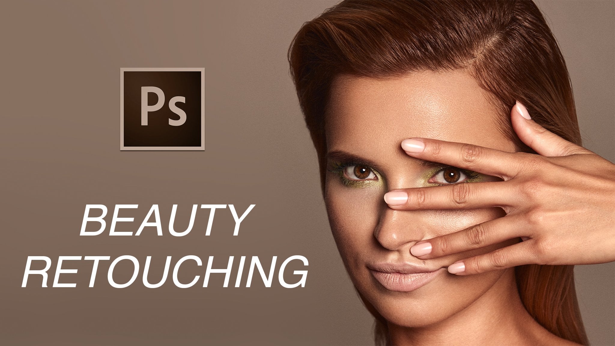
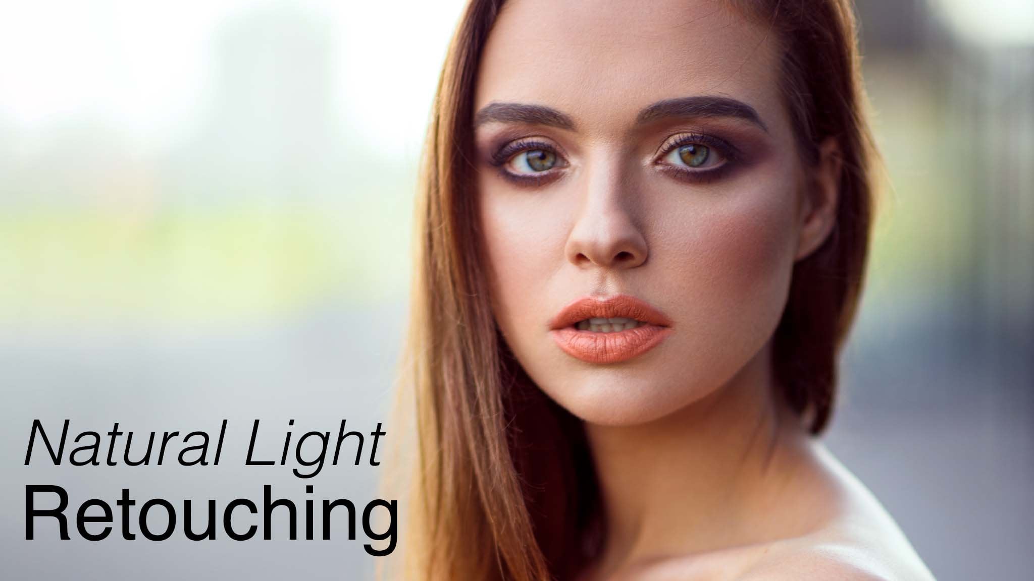
1. Intorudtcion to Studio Retouching: Hi, My name is matching. I am beauty and fashion Retailer. And today I want to introduce you professional studio portrait retouching in father shop. So let me show you what I'm going to teach you in this class from very beginning until the final touch ups. What you can see at your screens right now is the final product. And let me show you the image before it's actually the image after Rob conversion. And this is the point. Were we going toe start? I'm going to show you how to do row conversion in the camera or software, which is also the same. A slight room. So you will know above Camero and light from whether the software you choose, it's like from or camera. After this off course, we're going to jump in the front a shop, and I am going to show you all of these steps that lead you to really amazing results. So what I am going to show you in Father shop is clean up. I'm going to show you how to clean up the skin, how to clean Abdi things out makeup, how to sort out the body hair and how to clean up their cross her on the image. So as you can here a lot off useful informations about the basic cleaning up in photo shop . After this, I'm going to show you how to process professional Dutch and burn Dutch Enberg retouching the famous retouching technique. And I'm going to show you how to work with this on their elements. You need to pay attention to perform this process in the right way. After that, I'm going to show you how to work with the contrast selectively on the shadows highlights eyes her and every other element that is needed. After this, we going to jump into some color correction. So I'm actually going to show you how to correct, for example, discoloration off the certain body part or if the skin is not really matching toe their party parts. In this case, that was the hands I'm going to show you how to much of the skin tones on the body, through the skin tones off the hand after this off course color grading. So I'm showing you how to color great your image selective really again shadows, highlights and order elements that we need to do like the skin tones and everything related to this. So after everything we're doing for the shop, I'm showing you how to do the final touch ups. As you can see, I crop this image at the end for our better perspective. Also, some extra final corrections. So this is the image that we get work with. Of course, you get in this image within the course, the practice, you getting also some extra resources. So for the information on, take the details about this class and let's start from the beginning and learn some professional retouching.
2. RAW Processing in Camera Raw: Right now we are in Adobe Bridge, and we going to do at first Camero conversion begin to convert row file in the camera, and one thing I need to mention to you. To you it doesn't matter if you do rock convention in camera or light when the truth is that development panel in the light room is exactly this same us the camera. So what does it mean? If you work in the it room on your exposure shadows lights, then you work in different panel on huge saturation Luminant. It's all the same in camera, exactly the same feature. So it's more about your own personal preference if prefer light room. That's okay, many people say, actually light from its more intuitive, and it's easier for me. The camera is more into it if because that's how I used to work. So it's all about how used to refuse to work in camera, that probably will be great for you because we just going to do the same if working light from it. Still be the same because you're going to do the same in development panels on and the futures are exactly the same, so I'm going to open this image. This is the image I want to work with. And if you want resources just a middling in the description of the course and or the project, and there will be the images that will be the brush that you can work with. And it will help you to speed up your run for, and images will help you to practice. So let's start. I'm going toe open this file first. So it's the row file. One thing I need to do just double hit on this and I will end up in the camera. So what I'm doing in camera, you need to understand the photography and the type that you are doing. We're doing portrait right now, and we need to see at the light. This is most important thing. It's always up to the style photographer. I realized this images because it's really hard light and you can see can see very dark shadows and very bright highlights, and that's okay. I love it, and I want to keep it this way, but it's not always great for retouching, so that's why I'm going to take down so of the highlights I might see house above the whites if it's worth take down the wives. Maybe a little also. So the image good, darker, not necessary. Great. But let's bring up the shadows. So especially here, because I see some ma'am. Not really good skin over there. And this is something I want to work with for sure. This is our people strong. We could probably go a little down with whites and the highlights and also down with the shadows. Why down even though? And that the more could seem slightly better for retouching. I don't want to restore it to much later. And the truth is the legal we do, which is just enough for retouching. It must be just enough for you to feel comfortable how you retouch. But you don't need to do all of the process later. This is harsh. I just check where What makes easier for you to retouch once is done. It's OK, so clarity. I'm not touching it. I could take clarity on Lee a little bit down, of course, not to this level, but not stronger. It increased the contrast. It would make it basically impossible to retouch, so keep clarity at zero or down upto minus five. No more than this. What else should we mention about the basic panel temperature off course? This is your why the balance, if it's are rightly said on this image, is absolutely rightly said There was no reason to do anything here. So now we're going to jump few panels more. I'm going to skip tonic. Your It's very similar feature toe shadows and highlights. I did this. I don't need to develop anything. Sure, the details are not sharpened. They emit the same us about clarity. I don't want to touch it on gonna retouch it first. Hue saturation, Luminous important panel. You can actually do a little bit work over here. But what I want to start, I want to go toe the calibration. So the adoptee projects where there is camera or a light room half are not maybe perfect with the camera preparation. So what? I like to die like to increase the saturation on this level Just a little bit on this tree . Uh, rich green and blue channels. They're not colors once again that channels this tree color channels the street lights channels because it's red light green light blue light creates the image that you see. So I'm increasing slightly the saturation if I want the image to be slightly separated and I do want because, as you can see, that the roofies always need to be toward shopping just as it looked nice. Then I go back to huge saturation, luminous adjustments, and I see if my adjustments here, OK? And I'm trying to mainly look at yellows and oranges to see how about the skin on. Should I change the hue, or should I keep it as this? I think it's pretty decent at this this point, so there's no need to do to match. It's quite healthy. Maybe I could slide it. Eight on saturation minus two point on orange. Let me see if we're having a trunk. I think we do have it right, And that would be it. At the end, I might have a look. Is it okay? Aske. You can see some convenient ing or something appearing over here, So at the very end, I'm going toe fx panel and try toe. Add some amount for post crop vignette ing not to match because you don't want to wait. Make the other corners too bright. So just that it'll be to make sure we can back down this corner a little bit more. I can see. All right, this one getting a little bright. As you can see, we have to be careful with it. So not too strong. And this one, I will sort it out later. We might actually crop this image and everything is done here. That's our basic settings. As you can see, there is no magic. We just making image look right for the retouching and nothing more than that. So at the end, we need toe open image. Azat Ah, smart object that I'm opening image as a smart object knows as an image because it allows you to work more non destructively. Once you do it, you can come back any time to camera and change your adjustments. If you notice that something is not necessary right before I do it, I actually think that you I wouldn't change at all here and then I'm going to perceived. And when I perceived this opening each turn into open object make sure you work at least in adobe RGB space. If it's different just hit here. Change the space to Adobe RGB or Prophet Taj Bi. But it s our job is not really write one for retouching without going into all deep and details. This is the space that you have on the Internet not necessary If you do some projects more advance for printing and websites that actually have bigger spaceman So I'm going to perceived open object and we are in a photo shop So it's smart object As you can see, you can just double heat You will be back in camera as you are also that we're ready to start in front of shop now.
3. Cleaning up Image: let's start clean up process and there is a few things on me to tell you I will do is very short introduction, what needs to begin and which tools we are going to use. So, looking at this image, we have few elements. We have skin, we have makeup and we have her. I'm not talking about the background because I don't see anything that needs to be clean on the Bagram. So skill make up her three things that require a little bit off clean up. So the second thing we always work on the empty layer. You don't want to work on the actual layer because it might be destructive. It's difficult to go back once we do some mistake, but when we work on the empty layer, it's not an issue. We can always remove it, erase whatever we need to do we can so always working on an empty layer, which I'm going to call clean up Second. The third thing, actually right now is the notes. So I'm going to do some notes to make it easy for you to understand what needs to be clean . So I'm going to create a layer I'm going to name this notes and let's think of some color I'm going to choose, probably the red color, very strong and visible and just let me mark the things that will have to be cleaned. So I'm going to make the size smaller and what you can see. Our, this partners a lot of people's, some of the her and well, all of this will have to be cleaned up here soon for this very angry, unequal card. But just all of this we have some off the red spot here. We have her over here so those things will really need to be cleaned. And this is not the nation, because we'll use just killing a brush tool for these going to the face. We have some hair, so this part for sure needs to be done. We'll have a lot of smaller peoples are on the face, and it needs to be taken care off some of the more difficult some of these we don't not really going to clean because, as you can see, it's quiet, slightly planned it, and you don't. We want to clean the pores on just the spots, so mark them. If the skin texture will be too harsh. We can use some other technique toe work with this. We have some discoloration here. What else I see. Sometimes you can actually work on events inside the ice. But be really careful of this. It's easy way to overdo it. I have some colors from the makeup, some off here. So those things needs to be done also very important. I can see her coming out. Are on the face, her around her hand. As you can see, it's all over here. All of this will have to be cleaned and of course her. So you look for the cross her for the white spots that stand out from the head and all of the sports that you can not iss easily from some sort of distance like this one means well , we can actually work on this on anything more than that. Not really. You want to keep it natural, so you don't want to go too far just in major issues that you have over here. So these about the introduction words and now let's jump in tow the cleaning itself. So have a look at the notes if you don't feel confident, because now I'm going to remove this air and we're going to start clean. So what I'm going to do, I'm going to start from the skin. Andi, nothing easier. I'm going to press J on my keyboard, and this allows you to choose Hyland Brush tal and about healing brush tool. I always work with hard edged brush mode. Normal source sampled and think. Okay. And here current below. It's very important. You don't want all layers because it would affect the letters that you have a both if you already have them. So sometimes you can see this mistake. So, Karen below it's the probably the best option. You CanDo current layer would only work if you have actual layer. But we work on the empty layer. So this is impossible. And now we've hard edge of brush. Press out next to the spot you want token. You will see the circle with the cross inside your Elise, you should see brush again. It's not just the in my case, you don't see it. In my case, it means the recording software distort this. In your case, you should see natural brush again and you just clean up this parts and it should be simple , as you can see in the what I'm doing discovering and the size cannot be too big. Remember about this and just bigger than the sports and the more frequents pumps you have probably would have toe keep your brush smaller because you don't want to blow out this case. So they're not too frequent in here that don't not next one next to another, so I can keep the brush not too small. It doesn't affect the skin texture so much so there's a lot of this. I'm trying to do this as fast as possible to not bore you. Do not be worried about all of this small hair because I'm going to show you the method that concerted out quickly and that's very important. We want to do things really fast. So if you keep some of the hair, I don't really worry about this. I'm going to show you some shortcuts, even though shortcuts are are not always the best idea because many people using shortcuts that destroyed the skin, I'm going to show you the shortcuts that and how to work with them because also using short counts itself is distracted, but you can use them in a very limited way that will not destroy your skin texture and anything else you would like to preserve. So we're nearly done over here. I would go up to the face and trying to clean up the face really fast. I might speed ab this video right now with cleaning up process and then we'll jump toe another things because we just have some spots over here. So you know what to do already. And one thing that we really need to talk except, in fact, that we clean up with healing. Brush all of this parts. In some cases, you see this harsh skin texture, and many people have problem if it because they don't know how to deal with days. And often people use some filters toe break it down, which is a massive mistake. You can't use filters, and my favorite way to do this is to use clone stamp, so press as on your keyboard or just go to clone stamp. In this case, used soft Edgett brush. You can use the brush that I provide here as well, everything the same after and you just clone it and softly like Don't press your pen really strong softly. Try to break down the huge pores or a rough skin texture. It requires some practice. It requires some sensitivity, but off course, using tablet here, which is very important for professional retouching and understanding that image is really helpful. So as you can see, I don't press drunk and just have a look how nicely we can even out rough skin texture without experimenting with some filters, wasting the time. Just practice and everything can be done very quickly. So that's my key to sort off success. Successful retouching, I would say, Of course, rest of the spots. I don't think there is a need toe speed this up right now because I think we were doing well. We're doing fine, so some moreover serum. I will do a little bit off this, probably off recording some of the major her over here also on takina, because the ones the very small ones don't be bothered about this. But the major ones. It's good toe cleanup. Also another thing very important. Her around the leaps and also that this coloration around the lips, another trouble, something So what I need life to do again. I'm switching Tokelau nonstop, which is different than healing birds, because in filling brush, we copy the texture. But the color is adjusted in case which wouldn't were good. When we're getting close to the edge with constant, the think is different. We copy texture, and the color says you can see we can replace the texture as well as the color him and brush you might try. It won't work getting close to the leaves here because it would blend and leave very, not even artificial, but bad effect. Here's a little away from the lips so I can press J to switch to healing brush. And, as you can see clean, I have this spot very close. So then I wouldn't recommend him. Brush that close but crown stamp close to the edge, as you can see sorting this out. And if you want to work more on the leads because depending on body the image, of course, if that will be the beauty image it will require from you a little bit more work around the lips. So I'm not doing very like a huge amount of job now, but some small corrections, because remember one thing you want their leaps still look natural. You don't want to make it artificial. Remember whether you work for magazines for your own photography card. Here, you want to keep images natural. Next, think off course nose and all of the edge is the best way to clean it. Kristen, as you can see, very small size. You can always switch the blending more here on the top from normal to darken, and once you do it, you will be more sure it's not 100% on that. Clear the work it promised, but darkening on the affect. The bright areas and darken all of the bright hurt. So it gives you a little bit more control over the small hair and just help you to do market work. So then also have here some of the rough skin. As you can see rough colors I'm going to do. I'm going to do this year all of this small, small spots. I can't really be bothered, beautiful and natural on next thing, the hand and heard that I mentioned to you before. Very simple. Zoom in clone stamp and paint close to the edge just like this with crossed arms, soft edged brush. Remember to not cross the line and don't go to the skin on. Don't worry, if you leave some of the hair outside its natural people locally days and I can guarantee you that no one will be bothered. I've seen people live in bigger chance off the off the hair and it's not an issue. So don't try to be perfect because the perfection lies in there, all of the imperfections. So you don't really want to go too far? What else would have some of the hair over here? We would have to be a little bit more careful because who also have more texture here. So try to be more precise. Don't rush. I was rushing out of the hand, but here, off course, we need a little bit more precise. As you can see, easy to the mistake. But once you do it slowly, it won't be in issues. And I also think this her doesn't bother on anything that much So also as I'm zoomed in quite a lot Now I can see much more off the imperfections we have around her off this really tiny pimples trying to work with this a little bit. So I'm going to switch in tow, killing brush. I tried to do this with Crown Stamp, and I said You could see the custom doesn't really work that well on the spots. That's why human breath here, trying to sort out all of this tiny sports that behalf The next thing that all right told you is the I. And I'm doing this using here and brush. But also, I'm not removing everything When you can see, I'm just trying to remove just few veins. I've seen many work and many tutorials that people teach how toe make it all white, and it looks perfect. It looks like, Wow, it's nice killed tohave. But the truth is, if you think really about the professional way off working, I'm not saying as a professional recapture, but just working in the way professionals do and working in the way to make your photography work look professional. That's what you do. You remove the imperfections, but the imperfections that are natural, you trying to keep and the last part off these are the her, which might be most challenging thing. We are going to start from the cross her inside and this is actually very simple. Once you practice a few times, you will never have issues with this. So on the back, her it's actually very easy on the dark. Her from her mind eats 19 more difficult. But you to the colonists stamp and everything the same as before. Small size of the brush. And you take a clone next to the hair and you trying to paint according to the direction of the hairs. So they are crossing. Don't worry like you paint with the direction the other hair goes. So you have some cross her here and just try toe cover it. It doesn't really have to be massively perfect. I at first when I started retouching, I tried to make it, um, seen dessert perfect. But as you can see, I can still talk to you without bean older focused and then when it's very dark, the texture of the hair slightly disappear. And then we can let ourselves toe be a little faster because where the texture doesn't exist, you can go faster. He would have more texture. So then we have to be a little more careful. You can see some white part here, some white part here. So they're just sort it out. This shiny spot here. I don't know what is it? It doesn't even look like the some crossfire, but it just didn't look nice. So that's why we have toe take care of this and a little bit more here. We'll see at the end from the distance the progress that we did off course. What I need to say to you, I might skip a few things that I mentioned before. That needs to be clean and keep in mind that it's not always in a purpose. So listen to what I said. What needs to between any? If you see that I meet something that I mentioned before, more likely this needs to be clean, but making a CASS sometimes half its own right, and it's sequel toe Keep in mind. Look at everything being forecast and talk at the same time. That's why I'm trying to make you aware of that, that we all skip things, but what I always make sure. Even after I finished recording, I look at the image and I see if I skip something If I did off recording, I'm tryingto make sure that everything is fine. So a few more things here and last thing that I need to mention is the heard that stands out are usually trying to keep them natural. But if they go too far, you mind slightly blend them and you will use for this two tools. First of all, yes, you still can use a healing brush. If you will say single her like this one, the healing brush tool will be the best to do it. So also we have don't like this. Of course, you can always sort it out by him Brush if it's inside the hair, not all of them can be done this way, but some of them. So if you have single her here and brush is okay, but more likely if you want to just blend them a little more into the background. I go with Klum stamp and I'm trying to start. Sorry. Blend them into the background color a little bit more just like this. As you can see, they losing the strong color. And here I can use healing brush. It'll be small because they stand out too much and a single her so that easy to do and also the hair that stands out here. Human brush and what can I do? Just clone stamp and blended, and it'll blend it in the background a little bit more here, so it will look still natural, but it wouldn't be dragging so much attention off others. Unnecessary attention off course. So natural image, natural hair. But they don't stand as much, so do not waste more of your time. Remember three things skin, including them, her outside off course of veins inside the eyes, but off course. Be natural, the other think makeup and the turn thing on the her. We might try toe, make them a little better. Three major elements about the basic cleaning up.
4. Dust and Scratches: we cleaned up this image and I want to show you one a specific technique that it's actually short cut and can resolve a lot of issues with the small body here that are very common, actually, especially on the studio images that have really strong light. Many women's have small body her, especially around the face, somewhere around their hands. And this technique allows you to get rid of them even out the skin. Though what's really important. You have to be very careful with this technique. And I'm using this technique showing you districting because it's probably the easiest way toe do this on. There is no easier technique that this one and I'm talking about the dust and scratches. So what I'm going to do right now, I'm going to create a stamp both my cleaning up layer to create a stamp. I'm working on Mack right now. Some present command option shift and E. If you work on Windows, you will press control out, shift and eat Mac command option. Shitty windows, control out, shift and eat. Now I'm going toe. Name it. Let's name it dust, and we can also convert this into the smart object. So once we turned this into a smart object, we can have more control on the ethic to actually do. If it's too strong, we can lower the effect. We can edit this at any time we really want. So no matter which future you going to add, I recommend you to convert days to the smart object that I'm going toe filter noise. And then we have few option and noise, which is more like a last step. Sorry for this. And I'm going to use dust and scratches which basically weekly, allows you to. And nowhere they're scratches the dust small her that you have on them on the model due at the same point, you really have to be careful to not overdo it. So right now you can see disappeared because we have some settings that were applied before . But let me explain, you just and it will be the how does it work? So arranges is basically we have the pixels. We can figure it out, radios one pixel, which means that effect is built around every single peak. So so if it's one peaks of the effort would be that strong it blowout sort of blew out, even out the single pixel. So the more radius we will add, for example, now are the traders. 42 pixels. It builds the effect around each 42 pixels. And that's why we get just this blood out. Think so? We cannot go too far. Eso I'm going toe number one and think off the size of the image and the size off the dust . The dust would be probably placing somewhere between one and three pixels. So if I asked to, it's already disappearing. If I at three so not 23 off course three. It's ah, really strong already. So I would probably go with this raid use to three pixels and then fresh hold, which is basically built in the contrast around on each of these pixels. So the more fresh out I'm going toe on, are we going toe restore on the effort because you don't want to keep the fresher at zero, it looks toe blurt out. So you going up with the fresh hold. But not till the level of, for example, really high levels because it will restore your effect and it will process, So you want to restore it. You want to increase the contrast. But somewhere on the level that your scratches are not appearing. So, for example, and the $20 still not appearing at 10 would be even smaller, as you can see. So you with the fresh old and let's have a look where the affect 25 it's already appearing . I would go a little down with it, maybe somewhere between 10 and 20 and it gives me really still natural look, some of the areas are slightly blurred out, but it gives me the effort that I really want. I'm looking at the bag, and this is before and after, as he considered it really sorted this out in the nice way. You don't want to keep this all a layer as it is, because you can see it actually destroy some of your details, like you don't want this that harsh here. And also, if you find out, maybe that's too much. You can always heat. You're smart filter change, the rate used to to If you think it's more suitable for this image, I want quite quite soft effect. I'm trying to do this as soft as possible because Of course, I want to work nondestructive some lower in this. And then we want to create a layer mask on this smart object. So he'd this icon to create layer mask, and we have white layer must. So white layer mask represents everything that is visible. If you invert this in tow them black layer mask, the effect will become invisible. The black represents everything. What's invisible sounds going toe. Now I'm going to invert this to even impressing command or control, and I independent if you work on Mac or windows and then I'm looking for the areas where I have the scratches where I have this her and with the white color off the brush, I'm painting on the area where I have it, so choose their white color of the brush and paint around the rough areas. You don't want to apply it everywhere you want to keep control, so just paint over the area that you are not happy with because it was too harsh. For example, here we have seen it since the very beginning and have a look. It's really easy method, very easy method to be to be very precise on and have some hair here unless you mean the effect wasn't that strong. So let's see if pushing one pixel more, for instance, sorting up and it not starting out. And this is the limit. I wouldn't go more for this image than on three pixels already on the face will have a little stronger for it. So what I will try to do here? Maybe I will try to paint. Not a strong Have a look how beautifully we will solve this. We have some Her here point is on the shadow areas. They tend to be stronger. So don't worry that much about the shadow, Some off here, some of the hair. So already and also it kind of work on the rough skin texture as well. We're fixing this before, and I think using Crown stamp is the best way to do it. But nothing will happen if we just do you really small touch touch Sorry around this area, not too much here because I don't want to lying down all of the highlight that I have. But some of these small sports it can help us cover in this small spot. So I think it's quite useful for this, though. As I said, Be very careful with those areas because many people is doing sort of mistakes. They goingto far and you want to keep it natural. Don't go into for I'm really sad scene when my students, after listening to me and after I said, Be very careful of this and avoid when you can Actually not, not only not avoid this, but they overdo it and not even like trying to be precise but they going very far. So this is very important. Be Be careful, be precise and do not over do it. This can be really great technique, but also these is the technique where we have to think when we are using this.
5. Dodge & Burn: we finished our clean up process and everything that out, consider in this part is basic cleaning up. So everything we do, using basic retouching tools like healing Brush Klum stop and off course, some additional unjust Mints tools in for the shop I would put into the back off basic cleaning up. And then there is a second part, which is more advanced cleanup. And it's most common for studio images and especially beauty portrait. And this is touch and burn so that it doesn't burn, requires a little bit more practice and requires some of the experience. So if you start in, probably there is a month two months off, you practicing and getting usedto Dutch Enberg process. For some, it might be even more most important this. How much time daily do you spend? Retouching images? But that's and burn is everything about practicing, and now I'm going to give you off course introduction to doctrine Burn. What is the actual burn? And we going to do doctrine bird process on this image, so you will have introduction. You will have the workflow, and of course, you will have resources needed for you to start with a dodge and burn, so that would burn. Retouching is another form off cleaning up in this case, using that light so skin is not flat. We have some off the hair. We have pimples. All of these leave the certain shadows, certain marks. And these marks are not something that you can clean up using basic retouching tools. But they have different line values. So what we need to do, we need to actually feel the white spots with something darker. We have to darken this and the dark sports. We have to feel with some light. And thanks to this, we can create the skin that is flowers that doesn't have this mark. So last. Look on how the skin looks like I think a little bit more cover here. As you can see, I created another cleaning up later. It's not necessary here. I think I could even do this with the lights, but it was just bothering me. So Okay, Dajun Burn is working with the lights is retouching with the lights and for this process, the best toe most common it'll also to use. It's not the photo shopped to forget about this. We never going to use it the most common tool, as actually curves. So you're going to use the curse for retouching with lights. One kerf will be dancing, which is off course, working with lights, brightening things and the other one, I'm gonna come goingto copies will be burn and will be darkening. So exactly as I said, What is going to happen? We're going toe, feel that bright spots with something darker, and we're going to feel the bright spots with dark spots with something something brighter . So once you have this layers off course how it works, you need to invert them. So you invert dodge, you invert, burn, and it's invisible. But we were already working with layer masks before, and, you know, when I paint with the white color, I'm going to bring this up. So let's say I need to feel up something darker. I'm pain. I'm painting with the white color of the brush. As you can see, it's Brighton. I need to make something darker. I'm burning. I'm darkening painting with the white color off the brush. So these are basics off dodging and burning. To make it easier for you, I'm actually going to give you the actions with this car. So but what is going to happen? I'm using the actions, my own customized actions, which is named Dutch Burn and B W help player so I can activate the Dutch. I can activate that burn, and I have this toe doctrine by layers. I understand they look slightly the friend and let me explain why they look different than what I showed you before. So before I showed you this Dutch layer, which is curves exactly the same. But it was inverted and the burn layer, which was exactly the same but was inverted. But what I did here, I decided to put this layer into the group. So simply command or control and G to put something to the group and then into the same group just above the Dutch layer. I create that de saturate layer. It's optional because it doesn't appear on each image, but it's really good to create this de saturate layer and a both burn in the group saturate layer because when we brightened up things on the skin, they might get slightly more orangey. So that's why, above this, I'm creating the layer that the saturates these red shifts. If it doesn't happen, we can simply turn it off and there would be in effect. But it's good to have it just in case and the same above burn saturate layer, just in case we decide rate some marks. Eso the saturate layer can bring it up just a little bit. So two layers in the group and then on the group creating the layer mosque. Inverting this and everything else is absolutely the same. So this is about basic. This is my dodge and burn. So if you don't have it, you can start built your own layers, whether with saturated and whether with you saturation adjustment there. Or you can build your own groups like the ones I have no matter like use actions, you do it by yourself. All is fine, But still, we can't really see what's here to retouch. Because this images call. It's really difficult to find it. So above this, layers always create the hue saturation like him, and I'm the saturating this to make it black and white. And then I'm changing the blending mode from normal toe color because I don't want toe affect Lumi. Excuse me. I don't want to affect luminosity values, but on the color values. So now I actually can see. Look, at this year some bright spots, your and they don't really look well. We have some off the dark spots here, and this needs to be retouched. But also for this. There is also the action that I created, which is exactly the same as you can see the saturation color blending month and I also above this, I created the curve adjustment layer. So one is dark and daughters contrast. So once drag down the curve adjustment layer, the other one dragged down on the shadows. Pull up on the highlights and I can manipulate with them. I can turn off the darken layer because this image has quite dark shadows and I increase the contrast because sometimes it's too flat. So when the when, there how to say micro transitions are not so visible, you can increase the contrast. So then it's easier to actually see all of this micro transitions and how we work with this . So I have some white spots here. I'm going to choose their I'm going to choose white color brush off course I'm using my bras that I provide that you in this in this lessons and flow up 5%. I keep it somewhere between five or 10. It's really your own preference, and then I'm gonna dark and this white spots here so you don't want to get too close, because also, you want to have perspective off bigger picture that you have here. So I'm having the right perspective. I zoom it out very often to see if I'm not over doing it. Also, I turn off they sometimes to see how I'm doing is very important to have a look, to zoom out, to see perspective, to do. Not this. If you're not overdo in this to notice, maybe it's not enough. But usually it's enough. Usually the problem is with this, with overdue in this and many people, even people who claim to be themselves professional re toucher tend to overdo on many things. So careful don't go too far, and it's better to keep image more natural than overdone. This is the rule that's it's important to remember. So here, as you can see, I don't have so many contrasts. So here I am actually activating my darken layer so I can see I can retouch it a little meat but beat more efficient and uh, especially under the eyes. It's important to do this. This model had a little tired eyes. It might be just in her nature. It might be because of tiredness, but pay attention to it. Also, don't go too far. Do not flatten up for my bags because just look at the magazine's look at photos off other professional photographers. What I'm saying professional, really experienced once, and you will see the Ibrox are existing on people's faces. You don't want to remove them because if you remove the eye bags fully, unfortunately, you will lose their face features and you want to keep the natural face features. You need to understand a matter me off the people. So keep in mind, don't go too far, and I'm just painting the dark spots with the burn. As you can see, I'm just trying toe. It's nothing more than painting you. Just you see something darker with not too small brush sort off bright and a little I'm not really using. If you were seen a lot of father videos, I'm not really using extremely small size of the brush because it's first, it's waste of your time. And, um, using two small brush might actually affect, for example, pores, which is important to preserve off course. Onley issue. If you have some massive size and natural size pores, it's OK then toe maybe retouch them. But in other cases, when we keep it natural, when it's like just average size, small size and I think near that, it's no reason to do it. So you're, I noticed, quite harsh, So I want to use my dust and scratches player a little bit more toe even this out kind of back to Dutch now and increase the flow. So I'm going to lower this now and just keep continuing. So this is probably the longer process. If it comes to portray its to studio portrait, it's nothing. Take as much time a statue and burn. But my mission is to provide you with the tools that allows you to do this as fast as possible. And I don't want you to spend more than half an hour on this. Many people say, will teach you all you need to spend hours. You need to spend a lot to make image look good. This is not true. You need to remember. I know from my professional work as our retouching that time is the money. Even no matter if you re toucher photographer, just like time is the money you want to edit fast. You want good, but also fast. So someone teach you like retouch for a few hours. Well, they don't do it themselves. They might do it because when we all start with struggle and probably they say it toe make you avoid the frustration. But don't worry about this because it comes with the time. So I just tried toe. Keep doing this as fast as possible. No more than half an hour purported, and that's pretty much it. And I hope it's quite clear because, as you can see, there's not much to say except the fact soft edged brush painting. Not this in the sports, and it's easy to notice. Like you can see now I'm spotting the dark spots on Brighton in the map. Usually there's more dive spots than the bright one, so it might look like I'm using just touch and yes, in most of the cases, I could say on average, I touch my images more that then burned them. But it's not the rule, because it did happen few times that I was doing more off the burning the dungeon, so a little bit more here. I want to show you a few different areas before I just fast in the process, because also, at some point we country talk for 20 minutes here. But I want to explain your few different elements, and then we're just going to speed up the process. So let's go down over here. You have some of the dark spots. I'm going to turn off this dark and Leia, and we might even manipulate with this go out. It will be done to see all of their spots in the shadows areas a little bit better about the shadow. Syria. They're slightly more difficult toe to retouch toe work with Dutch in Bern. But there is also positive factor about that that the shadows area shadow areas are less visible, so they find that you will not be as perfect as in the meetings areas. For example, on it's OK because the shadows areas later, when he will be increasing the shadows. When you would be working with this, they might disappear. They might be covered in darkness. So it's not also the reason that should give you anxiety in this case. So read that as much as you can. You don't have to go somewhere here, This area not visible in the final product so that the shadows it's OK to keep a little bit natural. I mean, all of the image. Of course, we are keeping natural bad. I hope that shadows will not give you head inches because there was no reason for that. And let's have a look. If it does look a little better, I think it does look a little bit better if you also have some off the white flat spot. It's also to paint over it a little bit, and, um, and you will be so right now once you know what's to do and there is a lot of practice with you. But also remember to use the images toe practice have respect for for the model and photographer. What does it mean? Check, check who they are. There's informations in the description off course and do not destroy the images. Just use them for your own practice and your own resources. Remember, it's very important toe. Just be respectful about those things. So use it just for practice. Those those things ready? Um, our high quality professional photographer sign agency signed model. So the respect this key to really good cooperation for the future. Okay, so I'm going to speed up this process, manipulate with this layers, of course, and trying to do more touch and burn till the till the finish. And I'm going to catch up with you after this process will be done, right?
6. Contrasts: in this lesson, we're going to take her off the contrast. We're going to adjust the contrast and I must say some people trying toe call this contouring and also what I must say. I'm not doing any country in manually because it's very risky task and I've seen many people doing country and it just creates a very unnatural outlook. So I'm going to show you how to do contrast in simple way, using masks selectively, and you can be sure that your contrasts and right shadows will be adjusted perfectly. So I'm going to create to curve adjustment for years one which going to be called Highlight and the 2nd 1 We'll just copy this command or control J and this one will be called Shadows . And let's start from the highlights. We need to look at the image and we must understand once actually happening over here. We have pretty strong highlights here on the face, but the little less on the front over here, So probably would like toa work a little bit more with this area and less on the face. We'll see how our selection allows us for this, so I'm going to image and apply image. This is the easiest technique how it can pick up your highlights. You can also pick this up from the channels by heated RGB and then just command and heat on this. And as you can see, you have selection once again, it's exactly the same selection. I just find it easier to take it from image apply image and let's have a look. This is our highlight area so we can go to it, open curves and just go up with it for more control. What I would do, you can cut it here where the shadow start and go down with it. She can make sure your only the highlight that area will be affected. You can count it higher if you don't want. The meat comes to be affected for sure, and just go with the finest highlights which will be somewhere here on the face. Let's have a look before after very small change. But this is the reason for this. As I said to you, strong highlights on the face. I don't really want to work here too much. I prefer to be careful. So I'm not going reefer. And also another thing we changing Benny mode from normal toe luminosity. The reason why I'm doing this, because normal blending mode ah, thank the color, values and luminosity blending month affect on lee the the luminosity values. So we don't really want to change the colors working with lights, this is very important process and next step is the shadows which will be verse Inouye, image applying image and I'm just going to invert this. You can also just make the selection from the highlights and invert this on the shadows. But there is no difference basically. So these Estep this I just going every which apply image and then we manipulate. And as you can see, this image is reversed now. So we have the white Where is the shadows? So I'm going toe Gramp the curve in the shadow area just a little bit. Do you must also know when you look at the highlights? The wind areas are very soft When it comes to shadows. The white errors are very strong, which means the shadows areas are more visible. So that's why I always try to work a little more careful with this. Have a look. It's really strong affection. So I darken this ready. Ah, lot. And this is not everything I want to do Here, let me put this into the group so I can see the before and after. So command or control and G contrasts. Let's have a before and after many shadows, many shadows. And I think that too strong. So I'm going to lower opacity to 50%. And that would be enough. But I want to bring something more over here to equalize face and her back. Maybe just a little bit off course. I don't want to go too far, so I'm gonna try to do it in some specific way. If you're using the older version than for the shop, See, See, You might need to do it manually just by painting on the image. But I will try to do it with color wrench. So I'm going to curves and I'm going to name it H one as our highlights. Additional version. I'm going toe change, blending mode to luminosity and then select and color range. So what I'm going try to do, I'm going to highlight now wrench maximum. You can also define the whole highlights like this As you can see, there will be very hard. But I really care about the hunt here in this, this part over here, and I want to see if that actually allowing me toe work with this part, and I think we could get something here. I want to see also with the sampled colors how the sampled colors let me work. But the sample colors won't really go this well. It wants to find it as good. So I'm going to hit OK, and I want to see how the selection is going to look. It's really nicely defined highlights. It's just perfect. So if I wouldn't have such a harsh light on this image, old probably go with days because you can see how nicely it defines. So I told you, I want only this part highlighted. So what I'm going to do, I'm going to paint with the black color also, you see, I'm checking the visuals and I'm checking them by pressing outer option and hitting on the mask. It's not black and white. It just you can see how the mass looks like, so it's not black and white image. So now I'm just checking how the mask looks like. And when I want to do I want to paint everything over here with the color black this hand I don't want to effect. So I'm going to paint it. It will take a few seconds to do face. Also, I don't want to affect the face anymore. So I'm going to paint those areas. I don't mind, really. Part of the world. Rub that quite dark. So I think Brandon, this arm, it's absolutely OK and also neck And here this part off the hunt. I don't want to go really far with the highlights here, some trying to cover it just a little bit. And we have this area here that I want to brought up a little bit. So I'm goingto go up and I think it does work very well. Have a look included. Pretty good jump at this point. And our highlights are a little stronger on this. This part as you can see, we got really nice. Simply speaking, we got really nice control over it. And there's a few more things I want to do. So the first date I want cover with the black color. Some of the shadows on there. So because I think they're quite dark and the beautiful, they must be a little bit more exposed. Also, another curve adjustment that I'm going to name her a little bit up. I'm just going to invert the mask right now and paint with the color. Right? Uh, so the flow is very strong, so I'm going to be careful here on the top. Not too much. I don't want this to drag too much attention, but have a look really small touch on this, and I think this would be just enough. And the last part is the ice. So I'm zooming in around her eyes. I'm creating another curve adjustment layer. I'm going to name this eyes, pull up the curve adjustment layer, of course, and invert the mask. Also, in this case, I'm going to use off white brush and flow somewhere between 20 and 30 is okay for the ice. I always did this for dies. And if you want to work with guys, you need to actually understand the anatomy off them. Whether we're the light he's located. You can't just go and paid on the eyes like this. It just wanted natural. So what do you need to do? The light usually locate somewhere on the bottom. And that's what we going to do with the smaller size because we also have some sort of veins inside, as you can see, the I house shape. So I'm just going toe paint this way where the light is actually located. And here on the other side, when the light is located, let's zoom out to see if it actually looks nice. I think really nice. Small change, not too bad. This is also really important for me, and that would be it when it comes to work with the contrasts.
7. Match Skin Tones: before we jump feather in tow. Kahlan grating. I want to introduce you one technique that is extremely useful for any kind off retouching , especially when you work often with Elaine Injury or the studio images. There is often some sort off this proportion between Cullerton's. The colors don't match. And looking at this image, there's also something a little bit odd and is the color of the hand. Understand, it's different because it's the bottom off the hand, so the colors natural are different. But in the immediate not always look that great. So you need to fix it and I'm going to show you very simple technique, actually, how how to do those things. So I'm going toe open hue, saturation layers, hue, saturation adjustment layer. I'm going to name this as a hand, and obviously we're going to use this layer to feeds this. But first we need to define the hand, so I would choose simple toe quick selection toe at first, and I will try to do it with quick selection toe. I'm just hoping I will be able to do a selection, and I think I was hoping right. The selection going is pretty well, we can easily distract this from the background on the studio images. That's just the nature if you go too far simply on the top hit minus brush and I'm going to remove this from the unwanted areas. So, for example, the clothes over here and that would be it. We have nearly perfect selection off the hands of this moment. So what we need to do so we need to hit layer, mask your and press command or control. If on windows and I and what happened now let me remove the selection. What happened? We have the shape of the hand, which is black. We converted this into the layer. We want hand to be wide because we're going to work on this area. And that's, you know, with a layer mask. The white color is where we can affect their. So I'm going to naval this once again, command or control, and I and this is inverted. The edges are a little harsh, so I would go to filter, blur and gambler, and I will apply just a few pixels off the blue. It might be for maybe, maybe more, not more than the 10 just make the edges a little, a little more soft, a little soften. I would I would say so. And then I'm going toe open This this panel and you can simply manipulate with the hue in the master. Over here, we can be more specific with the color. We could go to the reds or yellows and manipulate with this because, as you can see, it would be a little bit more precise doing so. But it doesn't make a big difference because we can do the same task with the master as well. We could peak also specify ecology over here, for example, she's in the car that doesn't exist here. That could be green color. Choose this eyedropper and choose the color that exists here, which would defined this as a reds too, or somewhere here. And then we also can, as you can see, work with it so it doesn't really matter. How are you going to do this? Let me try with plus toe for Hugh, the hand should be matching the rest of the body. So, as I said, doesn't the make a big difference? How you gonna do it? I think with Master. I can do it very well. No, no problems that bury any difference because it just very specific Harry after bonded so I could go with this. But as I already made the selection here, I'm gonna go here Sometimes. There was no time. So I'm not really picking up. And I think, and this is the easy way how you can correct different areas of the body end much a little bit better skin tones.
8. Color Grading: let's start color grading and for this image I preferred are little more developed color grading. Sometimes you don't really have to do much work on some certain images. On some. You want to do a little bit more because customer ask you for this photographer asking for this, or if your photographer off course, you have certain freedom to decide. But on this image, I'm going to do our few steps and I'm going to start with the skin tones so we fix a little bit on the hand. I'm thinking maybe I could push it even a little further. Hope it's not too far, but yeah, I want to. You get to this level and we can start working now, generally on the skin tone. So first time is I want to a mask out the background. So I'm going to make the selection, and I'm going to choose hue saturation for this, so I'm going to Name is skin tones Number one, and what I'm going to do. I'm going to make the selection, so I'm choosing quick selection tool, and whether you try to do it on the model or the background, it doesn't really matter you just need to do the selection and you can. You have to extract the model from the background, of course, on the bunion on your image. But if you work on the studio images, this process, of course, will be looking similar. If you want to work with their skin tones, you want to extract the model from the background. It doesn't really have to be that perfect. You don't really have to be bothered sometimes about the wardrobe, because we'll be working selectively with the reds and yellows, and this Congress doesn't really exist on the world room. So just a selection, as I did right now, extracted the model from the background. Then command or control, and I toe extra days. And of course, it's invited. You can you can have a look, so I'm going toe press the same again, control or command. I maybe small touch of a blur as well to make a little beat seven president not to match because you don't really want their transition to be visible in the background. So you have to be also really careful with this, and then what I'm going to do, I'm going to start with yellows. So I'm opening my hue saturation panel and I'm starting with yellows. So what I want to do, uh, from the yellow side, I would like to go down just unequal beat with that with the hue over here. So something more orangey, more red, also yellows. I would like to push a little bit more off the saturation on the yellows and also want to go brighter with it. So going up, which push the highlights unequal beat, more can see. So this is the first step, as you can see, slightly different outcome. But I was working on this image before, and this was something I did like. And that's how I'm approaching, of course. So then the next color we are going to to some current that doesn't really exist. And I was choosing before on the Greeks, and I'm going to use that I dropper to choose the color and I'm an go with something very now, child, that I see somewhere here on the head and it's going to be defined us Redd's, uh, to right now. So for the Reds, as I pushed the yellows in more red area, I want their rights, push more in Tom or injury. So also a little bit more off the saturation over here and about oranges or reds, because oranges will never be called as oranges. Always as I read a little bit down, and I think it's not really finished. So I'm going to try to take another selection. I can choose Magenta as, and I'm going to peak it. Maybe somewhere, someone here from the arm, so I can be sure it will be rightly selected and push saturation just a little bit and darken it. And I think this is This is the point where I do really like it. So look before and after very small change. So this is the first step, and the next step will be working on the with the skin tones. So I'm going to do very similar selection as I did, but this time I need to exclude them a part of the world room, because I won't be working selectively with the colors as I was working now. So I'm going toe color balance, and I'm going to name the skin tones Number two. I'm going to change friend more color because here I was working a little bit with flight here. I'm not going to work anymore, so I'm going to try to define just the skin. First. It will be quite difficult, so the first selection might be similar. I'm going to select all and then I'm trying will try to remove the parts off the world room . So let's make the selection as we did before and I need to mask out. Must must out removed this area. I don't want deserve to be selected so we can use now the miners brash or we can also probably paint on it later if it will be difficult painting. It's not re comfortable. So as long as you kind of stays technique, it's probable work better for you. I mean more comfortable. I have to be really precise here, so it's not that easy as well. But of course, I don't want to forget about the head on the world up a little bit below. I know if it could be a little easier, we'll see The wardrobe is not really one color, so that's also complicates the matter a little bit more and also here, and it's not finished. I couldn't ask her a little, Beat us Well, we can't see at the end how it's going to look, look, and we might actually do it at the at the very end. So let me universities and I'm going to invert this twice again. Off course Justice before. And I'm going to apply a similar soft level of the off the guards on blow. So what I'm going to do right now, I'm going to start from the shadows what I want to do. I want the shadows to be to have a little bit more off the red color, let's see and a little bit more off the yellow. So I'm just basically making the shadows a little bit more orangey on. I will try to work a little bit with the complementary harmony for this image because the background is quite different than the skin. So we'll try to push it a little bit further, meet Tom's once again, I want toe push it a little bit more here so many times also similar values. We also Mittal's want to have our engine one, so the color is actually very reach at the moment, and the highlights also similar So basically, we warm up. All of the models have a look before and after. If it's just too much, you can always lower the values for me terms maybe. Yeah, I think maybe two would be ready to be better. But there's different ways you can lower their capacity. You come lower the values over fear. It's already after you. What you want to do. I think it required to be more work with the color. So for this, I would use selective color. And, um, I'm gonna name the yellows and in you knows where I try to. I'll try to call it down with the small touch. You will be more. Okay. So now I would like to work a little bit more on the general tone, so the skin tones we could consider as assorted. But now you can decide. Do you want to exclude the background from the tartness off the model? Or we also want to work on the background. In this case, I would like to do a little bit more with the background, with the highlights in general. So I'm going toe go to color balance on. I'm going to name this as, ah color number one since Brandon More to color. And I want O push it a little beat feather for meetings. I don't want toe apply cold color, so I'm gonna just a little bit more here. But what interests me here is highlights on day. I want to push it quite strong. So my news five maybe minus seven, minus six. Some around this for this image and also blue color. Similar value. Have a look. We applied some of the blue color on not too strong. This is also very soft color. I believe that much on then outcome. I don't want to make it to blue to Sion. It might be just ring really blue color and the shadows because for sure, we affect this even a little bit more. So shadows need to stay out. They were summer. Look before and after you can see the shadows lost the touch off the red. But it does much. I still want to work a little bit more on the highlights and I'm going to use curves for it and name it highlights. I'm going to change planning to color and I'm just going to define highlights is an image and apply image. Okay, of course, that was wrong. I just not is the invent was selected. So I'm just going to press command or control, and I and we are back to our highlights. It's not very complicated, but make sure image apply Image, if you do, highlights that universities not selected and for highlights, for sure. I need the Reds a little bit down and I need the blue a little bit up and I do like this outcome. We have to be careful to not go too far, really. So I'm checking the highlights. How they how they got there, still a little bit read for what I see, but it might be sort of misleading. But on this level before and after, I want to see this color really much. The general wants here that there or in skin tones and the bluish background, it's something I would look for too much off the blue. Maybe I think on this one it's much better, and that would be my color grading process. So now I'm going to put everything to the group. I'm going to name this color writing and let's have a look before Colon and after color grading. I'm also taking her if they are still looking natural, because this is very important. If the her color doesn't look us, it's supposed toe, which would mask it. But from what I see really have this nice and warm shine on this moment.
9. Final Touch Ups: and eventually final adjustments for the final adjustments always do a very similar step. It doesn't mean there everything will be the same. But this step is more likely the same. And I start with the Camero fielder some we need to create a stamp above everything with it . But you need, of course, make sure that everything is all right. You're happy with the process you did. And then we're creating the stamp on the dump. And to do this, we press command option shift and E if you work on mind book and if you work on windows, that will be control out shift and e. I'm going toe named this final steps or final touch cops. Then I'm going toe convert this toe. Smart object, of course. And I'm going to repeat myself. Well, was working smart object because we don't want work destructive and especially in the final steps, because at the beginning, it doesn't really happen that you're not happy and what you did in camera. But with the final stamps, you do something to change. You go back. So we found doing smart objects that would be very troublesome, and then filter and camera wrong filter. So what I want to do here, I feel it's still an evil big dark, so I'd like toe push the exposure a little bit more and the highlights just a little bit more. I like the harsh highlights, So even though it's getting blown up in some ways, I like when it's really strong. It still could be, could be more than this. I think we could maybe work before a little bit on the highlight here, but it's still OK. It's not ready to bad. And also us before I was making your way, don't go with clarity and the end. We can really at this a simple touch of clarity. And also I do work sometimes with some color adjustments. I do sometimes go to hue, saturation and work with this. But I have to say I'm reluctantly happy in with what I did here, so I don't really want to do much more than what I did before. I'm really happy with the result that I have over here, so I wouldn't really experiment on too much in this final adjustments over here. I like where I am at the moment, so I wouldn't go more on this. But there is a few more things that I'd like to do on never end. And the one thing is, I feel this area also is people weirdly, I would say saturated. So I would go to Hue saturation on and using eyedropper. I would like to peek this area and the saturate this just a little bit just like this. With white color off course, we're going to musket. Not sure if you were seeing this what I was seen, but they think this area slightly too saturated. That's why I wanted to do this at the very end. I was looking at this before, but I was thinking maybe in the final steps, that will be just okay. And the other thing that I always do at the end, um seeks saturation. So this is the, like, extra step, making sure that everything is all right. And I always like toe at some of the noise toe. Just make it really better for the printing and really crash the transition between the highlights and shadows. So I'm going to create new layer. I'm going to name this noise on and toe add noise. We need to feel this layer with gray color, so I'm going to feel content 50% gray. You have to choose OK, and then soft light soft light makes the great color invisible. Let's I mean and we can see better. How much noise you want to add? You had somewhere between nine and 15 on the standard around 12. For this size of the image, it might be sometimes a little bit more, and also I like toe blur out some of the noise I have, because it might be quite hard. So zero point toe for 12 big cells, Europe on tree for 15 pixels and really soft noise. As you can see, we could probably go stronger with it. We could probably go with, like, 15 or something like that. I don't want to duplicate. I still want to keep it quite natural. So no more than this. And the one thing that I sort of planned before, I didn't because off this shadow here that I was mentioning. But there is the reason why I didn't do it, because the planet's I want to crop this image and I want to change perspective to two on three just us here. So what I'm going to do just going toe, move it the right way. Yeah, on everything. Two feet in the image. So I think this perspective. We need to make sure that also, the eyes are on the middle somethingto crop it on this level. It was it might take a while on. I might actually need to remove some of the feats because I think it's has two big space above the head. We which happens. It's not sometimes up to you to decide, but for everyone who is photographer, it's good to keep it in mind. So what I'm going to do, I'm going to remove this fix saturation for a second, and I will go to camera future, and I will try to do something more here. I want to bring the scale up of people, beat and pull up this image just just a little bit. Let's hit OK now and see if it's still fits. Just I think Justin point two more. Maybe if you want to keep everything in the car Well, I would go down to five on this scale down. Maybe on this it would be even even better. It's really sometimes not so easy to decide about on such a matter. So let's see. Okay, and let's try to do something more with their the crop here, Okay? And as we removed our hue saturation, I want to do a little bit more here with this. With this shift I have on the face, it's not very big shift, but it's really important to take care of those things, especially when we work on portrait's or beauty. I can see they're already here. So once again, hue saturation on been to quickly take care of this dis operating. And maybe also I don't little bit more. I also want to work, and it'll be on a few. I think it wasnt enough work before, so let's do it is very Read your ass, you can see. So this is the reason why I'm doing it. And now it's so much better. So this is the final product. So they prepared in this lesson. Let's put it all into the group. I'm going to name this ended and this is the after image after roll conversion and this is our image after all, retouching we did and I hope you enjoyed. Remember to get the resource is remember to get the images to practice on your own on some other additional resources that can help you with your work from to make it faster and more efficient. Thank you.
 Marcin Mikus, Retoucher and Photoshop Instructor