Transcripts
1. Introduction: When it comes to developing for the web, what I absolutely love is that it's for everybody. You don't need to have a certain mobile phone, you don't need to have a certain computer or a fat connectivity, basically, anybody is invited to do things on the web. I fell in love with the web when I worked in radio, and I realized that anybody can become a publisher without having to spend money on it. I wanted to make sure from the first day on that the web is there for everybody, regardless of ability, regardless of where you are on the planet, regardless of your setup and what computer you have, I want to make sure that I can use my skills as an engineer to make sure that the products are available to everybody out there. Because when we do that, we get much more users and that's a very simple idea. Hello, I'm Christian Heilmann. I'm a Principal Program Manager at Microsoft and my job is to make sure that our products are accessible to everybody, and that's what we're going to talk about today. Accessibility is not this scary, problematic thing that is a legal requirement, but a lot of times just common sense and making sure that the product can withstand changes that people need to do to it. You will find out that people have different needs and your needs yourself change over time as well. If I take off my glasses, I use the product differently than when I have my glasses on. Disability is not a one-off state. It's a sliding scale that changes over time and our product should be flexible enough to actually support this. In this class, we're going to talk about accessibility beyond compliance and that means that we're building things that are accessible by thinking like users and not just thinking about what we need to do to be accessible. We're going to take a look at some of the automated systems that run over your products and tell you where the problematic parts are and we're going to talk about how that can be a false positive. We're then going to switch gears and go to the browser and use the product like a user would, and changing some of the look and feel, so you actually know what edge cases you need to cover. And we're going to use the developer tools built into the browser to find out where the most problematic parts of your product are and how to fix them. This class is close to my heart because day-to-day I have to work with accessibility for the products in Microsoft, and it's sometimes a steep battle. It's sometimes hard to do. Often it's because people don't understand that accessibility means doing things for humans and finding out about problems that humans have with your product and not just to be compliant. At the end of the class, you will go away with an idea that there's many people out there that see the product differently than you do. There's things you can do to make sure that those people are not blocked out and become possible customers and extra users of your product. You will also find out that there's a lot of things already coming with the browser that you're using that allows you to test for these needs and make sure that your product that you built is available for people out there. This class I hope is for anybody who has been thinking about accessibility and has been building accessible products with a development team and with a testing team, but hasn't quite taken action themselves. What I'm saying here is that as a developer, by taking the skills that you learn in this class, you will actually make it much easier to work with the legal team, to work with the development team and work with the testing team because you will have done the right thing before you actually get the test back and have to redo it and fix things again. To get us going, I built a project that is a website that has a few accessibility issues, some of them not obvious. I also created a fixed version of that website which you can also download and you can take a look at what I've done to work around these issues. Please go to the discussion boards afterwards and discuss this thing. Disagree with me. You might find a better way to fix that, or you might find that there's problems with the solutions that you have in your own products and other people can help you out.
2. Accessibility and Why it Matters: In this first lesson, we're going to talk about what is accessibility and why it matters. There's a lot of myths about accessibility. There's a lot of fears about accessibility. Sometimes it's seen as something that could be automated, which it is not. We want to make sure we're starting on the right foot by understanding accessibility and not just by trying to make it. When it comes to web accessibility, people make simple mistakes that have disastrous consequences. One of the biggest problems we find out there is that we keep having media like images without alternative texts. It seems like not a problem. People can see the image. But if you're blind, you cannot see the image and you don't know what the image is about. But if it has an alternative text, that would get translated for you. It's pretty simple to do the right thing. It's just very easy to forget about it. Our own experience is not what our end-users have and what nobody else but us have. Like I can read the German website, you probably can't. I can read a French website, probably other people cannot read that, so they need them translated for you. These needs are different than yours. You can see, that's great. Put an alternative text in there for people that can't see. You have a video out there that actually has a great sound and actually has good images but if somebody's hard of hearing, they probably don't know what's going on. Make sure that your videos have captions. You will find yourself that that is something that you can benefit from as well. If you're, for example, in a pub and there's a television up there and the music is blaring loud, you actually appreciate those subtitles because you understand the program without having to tell the bartender to turn off the music and turn up the TV, which they won't do for you. The same way when you turn on subtitles in foreign films, you probably can learn the language better that way. Putting that little extra effort in making sure that end-users with different abilities than yours can consume your products, actually multiplies your end-users. It makes sure that everybody can use the product and it's often just a simple thing to put in there, like an alternative text for an image, like a caption for a video, or making sure that your product has a font size that is not really minuscule, but actually nice to read even on a mobile phone in the sun. When it comes to tactics, I think the first thing to think about is get yourself into the shoes of your end-users. Don't only use your product on the great computer that you have with a big resolution and the fast Internet connectivity, get yourself a bad mobile phone with a bad connectivity, run out in the woods and look at your products there. Then you will realize it's not as much joy to wait for that 50 megabyte animation before you can actually do something. It's important that you understand the needs of your users by turning off images from time to time. For example, turn off the sound of a video or an animation and realize, is it still making sense? You can set up your development environments to make sure that when you forget, for example, an alternative text or an image, it gives you a squiggly line and it tells you that's a problem. It's annoying to have problems while you develop, but at the same time, it's a lot less problematic that when it comes to your end-users or to your testers and you go through yet another round of building the thing. To get you into the right mood for this class, I want you to take a look at the accessibility features that come with operating systems and browsers already out there, that people use to change your product and actually need to change your product too so they can consume it. This starts with resizing your font in your websites up to 400 percent. It looks daunting, but this is what people need. Make sure that your product still works that way. You can also take a look at some of the new features in operating systems like dark mode and light mode. There is a high contrast mode in Windows that's used by up to six percent of the users or Windows, there's a few million people out there. You will see that your website looks completely different. You probably didn't know about that but it's something to consider. The other day, for example, I had a keyboard that broke on me. I use the way to talk to the computer to start actually dictating my texts. That's something that a lot of people need out there as well. In the past, this meant I had to buy some extra software that got outdated, nowadays just comes with operating systems and you can try it out yourself. Take a look around your operating system and your browser and see what you can turn on and off that makes a difference to people with disabilities and makes you understand their needs much better as well.
3. Automated Accessibility Tools: Let's take a look at one of those tools that give an automated report and see how far it takes us. This is a product called Accessibility Insights, which I'm using every day at work as well. It's a browser extension that you can install and it gives you all insights about what's going on in accessibility and what problems your website has. You go to a website that has accessibility issues and you want to test, you have this little icon here that allows you to run a FastPass over it. Once you do that, you actually get a report that shows you all the issues that it found and it actually tells you where in the page they are as well. It explains to you that there is actually failed instances, seven of them. There's a color contrast issue. There's an image alt issue where images don't have alternative text. There is a label issue where a form filled doesn't have a label. It also shows you on the screen where these problems are and what they actually mean. If you expand the information you'd learn more information about color contrast where you can learn where this is a problem, what Web standards are actually defining it, that's also a legal requirement, and then actually which part of the page has that problem and how to fix it. This is great because this is not only giving you a report, but also telling you the next steps. But right now, it's important to know that these automated tests only get one part of the page. They see the page or they experience the page in one way and your end users experience the page in many ways. That's something to consider. Computers cannot actually tell us when something is accessible. You need to interact with the page like your end-users do. That's how you really find out the accessibility problems. Webhint is also an open-source project that actually tests for accessibility issues, performance issues, and so on and so forth. It's got a browser extension, but where I use it is actually more interesting, which is inside my editor. To test something with Accessibility Insights, you have to go and deploy the website and then test it there. This one tells you while you're building something, that something's going wrong. For example, the input element that doesn't have a label here has a squiggly line under it right now. When I roll over that in my editor, it actually tells me that every input element needs a label. I don't even make the mistakes that I have to test later on by having this extension inside my Visual Studio Code editor. Install those two and you're well on the way to actually do some proper accessibility testing.
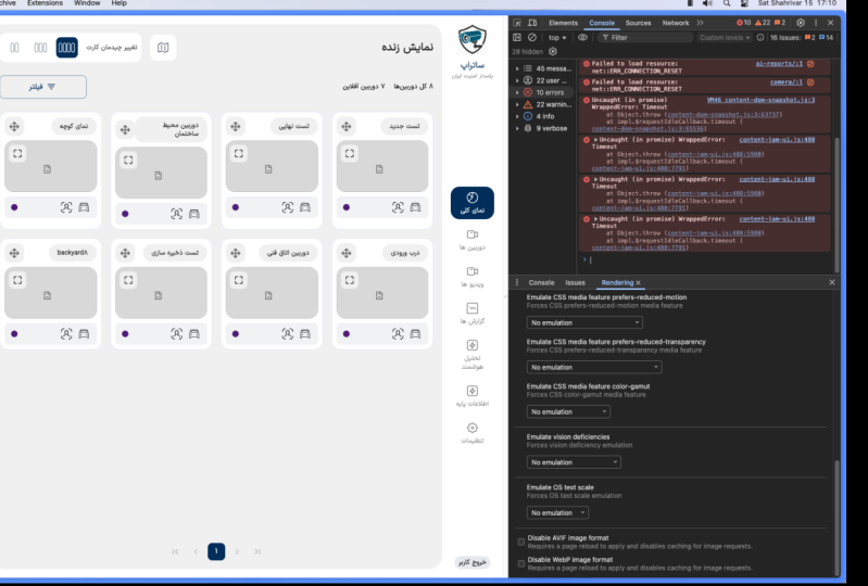
4. Testing Color and Text Accessibility: In this lesson, we're going to talk about text and color accessibility in our website and we're going to learn that what we see on the screen is not what other people see and sometimes it's rather daunting to see how people use our products, but it's important that we build them, that they work for these environments as well. Let's take a look in our website and our test website right now and kick the tires and see where we actually find problems with color accessibility. The first thing when I test any website for accessibility issues is to bump up the font size. This is rather easily done with Command plus or Control plus. Most of the time you will have probably encountered that as well in the past, you go up to 125 percent and you're happy that everything works, but that is not enough. Most of the end users out there that really need a zooming go up to 400 percent. That's actually a legal requirement from July on this year in 2021 that you have to be accessible with 400 percent zoom factor. That means you only can scroll in one direction and you don't need to scroll in two directions to take in what's going on with the website. If you take a look at this website right now, it actually fairs quite well in that zoom factor. But some of the things that look pretty cool on the normal zoom factor get really annoying in this. Like we have this animation on the navigation here that looks pretty cool if I'm on my normal zoom mode, but it's really super annoying once I actually get into this 400 percent mode. Also when I click on all of this things and smooth this scrolls down, which is a really cool thing to do in CSS right now. But in a 400 percent mode, that's actually more annoying than anything else. Another thing that I like to do is actually resize the screen and make sure that everything flows nicely. For that, I open the developer tools and the first thing I do is simulate a mobile phone device. This is something that's great anyways, because most of the end users out there will have a mobile device. Then you can see how your website fairs. You can already see here that the header is now in two lines and overlaps another elements. That's already ugly, but not an accessibility issue. But if I start scrolling the page, all of a sudden my fixed header that looks cool in normal resolution now actually overlays the search box and that means it's not actually working. Trying out your website at different resolutions also finds this. You can also put that together if you don't simulate a mobile phone, but just a responsive design and bump up the font size, you will actually find that there is all different issues in that environment as well. That's the first thing to do to see if your product actually is available to people with different needs. In this case, people who actually need a 400 percent zoom. They're more people than you think and they should be actually using your website, you shouldn't block them out. The next thing to consider is actually contrast and seeing if you have enough color contrast in all the elements that you have on your page. To do that, there's two ways. One of the ways is actually go to the Issues tab and the issues up here show up under this little icon. It says they're seven issues on the page. If you click on that one, you will find out under other that there is basically two things that don't have enough contrast, two elements. You click on them and you can see it's an lI.high, which is highlighted now on the screen here as well. It shows you that the color contrast is not good enough for this. We need to do something to do the color contrast there. The other one is a p, which is all the way down to screen. To go to that one, you can go to this menu here and say scroll into view. That way you see it's actually the footer down here. If you want to fix these issues, if you want to fix them in the browser itself, that's actually built in as well. It's something that a lot of people don't know about. If you go to the p again here, you find that there is a background, a foreground color. If you click on the foreground color, you will see in the color picker there's a report that the contrast ratio is 365. This is not good enough and it actually has this little arrow next to it saying that it's not good enough. You can select that one right now. In the color picker, you get two lines to tell you how high you should go to make sure you have enough contrast. You can also be lazy like me and just click on one of these colors here that are actually recommended to you. If you switch that one, you see that the footer now has a better coloring and that is actually a valid color with enough contrast. The browser doesn't only tell you in the report that something's going on, but you can actually use the tool directly to fix it and then go back to your CSS, put another color in and make sure that the accessibility is given for the contrast setting of it. The issues panel shows us obvious problems that are there, but it only sees the website in one state. It doesn't actually recognize that people can do different things to the website to have different states. That's where another tool comes in that's called the inspector. The inspector is this little arrow thing up here. If I now move around the page, it gives me all information about the different tools. It gives me the dimensions, it tells me what it is. We're going to come back to that in another lesson. It also shows me the layout of it. If it's got really cool layout problems that you can find and inspect there as well. But more importantly, it actually tells me the color problems of something as well. It shows me the contrast of this one is good enough. But the contrast, for example, on the element we looked at earlier that also the issues panel reported is not good enough. Instead of getting a checkmark, I get this exclamation mark. The problem is though, that the inspector only again sees one state of it. When you take for example, the navigation here, it says this dark blue and white is totally okay, there's enough contrast. But if you remember using the website, there's this rollover state that actually makes it a different color. That different color, I don't know if it's accessible now or if it have enough contrast, because as soon as I turn on the inspector, it doesn't trigger it anymore. You can work around it by using the state simulation in the developer tools. In any element you can trigger that state simulation. You can say, for example, what does it look like if I hover over it? Now it has the hover state without me having to hover over it with my mouse. That way I can use the inspector to find out if it has enough contrast. If you click on it right now and you go to the color picker, you learn that the contrast ratio is not good enough and you should pick a different color. This is interesting when it comes to interacting with different elements in the website. But what about if users actually have a different way to look at the website? One of them is called the rendering pane. You can actually turn that on by going to the dot-dot-dot menu, go to more tools and rendering. That way you can actually turn it on down there. It does all hardcore cool stuff for testing for performance. But more importantly, if you scroll all the way down, you can simulate different modes of the website that way. Now, I've got a dark mode here on my computer because I like the dark mode like most people do nowadays, but other people have a light mode. I normally would go to the operating system, turn my operating system into light mode and see what people would see the website like. But this simulation in the rendering pain allows you to do that in a simpler fashion. You can now go to the preferred color scheme and turn it to light. Of course, some of the things that we thought were okay might not be okay anymore. You can see that down here where the contrast for the yellow and the red was totally okay in dark mode, but in light mode it isn't anymore or that's what I'm assuming right now. But again, this is where the issues pane can help me. I now go and simulate the light mode and then I reload the page. You see that we have a lot more things that are actually having a color contrast problem than we had before. We had two elements before, and now we got six elements because we switched to another mode of the website. Our color scheme, our light theme needs to be tested for accessibility and color issues as well. This is not the end of it because users have all issues with their eyes that we want to make sure we work on as well. In the Developer Tools, you have a thing called emulate vision deficiencies, which allows you to see the website like people with different vision deficiencies would see the website right now. First thing you want to try out is blurred vision. This is like my glasses being dirty or the sun shining on my mobile phone. I can see immediately that there are some problems here, like the header looks matched right now, that drop shadow, that looks pretty cool when I can see it properly. Actually it's not helping the cause but hindering it. Also the font sizes might be actually not as big as I want them to be to be properly usable. That's something that the blurred vision already gives you. You can then also turn on different emulations like, different color blindness like protanopia, deuteranopia and so on and so forth. Out of your sudden you realize that green, yellow, and red don't make any sense because not everybody sees them as green, and red, and yellow. You can also turn off all the colors to see if actually there's enough contrast on all the things when people can't see colors at all. That's just a few ways how to get started. Now it's your turn. I showed you a few things how to fix some problems. Take a look at, for example, that red, green, and yellow, what you could do about that one. Do some resizing, find out some more issues. There's more issues in that website that you might not have thought about yet when it comes to colors and text. You You now what to do, you click the issues tab and actually gives you the issues information. You can actually use the inspector and you can use the simulation to try things out. You can do that on any product out there, actually products that are not on the web, this runs on your local machine. It's a easy way for you to get started on making sure that all the colors that you've chosen are not only pretty, but also accessible.
5. Testing Interaction Accessibility: In this lesson, we're going to talk about interaction with a website and making sure that we're accessible. There's many ways how people interact with your website. The mouse is the most common one most likely, but there's also keyboard users, there's people who can just blink their eyes to go from one section to another. You have to make sure that your website makes sense to all of these. We're going to talk about how to test that out, and how to find out about issues that are in a certain website, and how to fix them. Let's take a look at our website and see how it works for somebody that only uses a keyboard, which includes screen reader users and just people who can't use a mouse. We can test it ourselves by just not using our mouse, but actually using the keyboard. The easiest way is to use the tab key to go from one element to another, because that's what people do as well. There's more evolved things like enter key to send off forms and space to go through different sections. But we don't need to go into that, but that's something you can look up yourself later on. If I tab through the page right now, the first thing I do is highlight the search field, and it has this border around it. Many people think this is our key. This is very necessary, don't turn off that. A lot of people will thank you for it. Go to the go button, and there I will try return if that sends of the form. It does send off the form, it doesn't go anywhere right now that' why I just scrolled down. But it actually works with a keyboard, so we should be happy there. When I press tab again, the first thing I do is actually go through the links in the page, and that's a weird one because in essence, that means this menu up here is not in the flow, and it should be in the flow because visually it makes sense to use that one to go down to the sections in the page. With a keyboard, I'm already in the page. When I go now further up, I don't know where I am because the menu only has a hover state. It doesn't have a focus states. With a keyboard, if I access it, I get the focus state, with a hover, I'm just going to get a mouse state. A keyboard user would not know where they are at the moment except for knowing that they're on a link and a screen reader would read out to you that your on link, but you're not quite sure that you're in the menu right now, but somewhere else. The next thing to realize here is that if I go through the menu, I'm again at another search box, I'm at the other box right now, but there are keys above it. What's going on there? These keys are not keyboard accessible. With a mouse, I can click on the 200, the 50, and the 100. With a keyboard, I cannot access it. Tabbing again gets me not to donate button, but actually gets me to the main navigation. You see there's a few issues in that website that have to do with keyboard navigation, and now we try to find out why. Well, the tool to use again is the inspector, we tried that earlier to find out about color issues. Now we can use it to actually find out about interaction issues. If I go, for example, on the input element here, it tells me that it's a role of search box and that it's keyboard focusable. That's why I could tap into it with the keyboard. It doesn't have a name though. The reason is that was something that was flagged up by the issues earlier, that we do have a label in the source code, but it's not connected to the element. The input is not inside the search box or the label doesn't have a for attribute and the input doesn't have an ID. This is a label that is actually used wrongly and doesn't make any sense. To fix that, you can do that yourself or look at the fix part of the website, is rather easy. An interesting thing though is, when you think back of the automated tests that we had earlier, that the form here that we just learned about as being completely inaccessible to keyboard users is actually not flagged up because here we used a label, and if you click on the label, you can highlight the form field, but it's not part of a form. It didn't know that these buttons are inaccessible because they're not buttons, they're just something. What are they? Again, we're using the inspector and we roll over it, and we find out that the role is generic and that's it's not keyboard focusable because if you look at the source code, we actually find out that these are DIFS. These DIFS are something that people love to do because they're super stylable and they don't have any styling out of the box like this outline for example, but they don't mean anything. How did I make them actually clickable to select these different things? You can try that out as well by going to the event listeners and following that, and you can see that I've written some JavaScript to make them into different buttons. But with a keyboard user or without JavaScript, this form would not be accessible at all. Instead of that, I should have used buttons or radio button. Again, look at the fixed version of the website to see how to work around with that. You will often find that you write some extra JavaScript just because you used the wrong HTML. Most of the time, it's not necessary to do that because JavaScript is always more fragile than HTML because HTML gives you a lot of free stuff from the browser directly, and you can find that out in developer tools as well here. In general, you can go through all the elements in the page and find out if their keyboard focusable, what name and what role they have. But if you want to know that about the whole document, you can use the accessibility tree here as well. The document that you have comes in two forms. It comes into DOM tree, that's actually generated here, that comes from Watson via HTML, and also what JavaScript does to the HTML. What's on the screen and what the order of the screen is, is also what the CSS tells us to do. For example, we realized that the content here is actually before this one for some reason, but it still looks into it, and we don't know how to do that. In the accessibility tree, that is something that an assistive technology like a screen reader would get. This is another view of the page that gets actually assembled before the rest of the document is there. Whatever you do in your HTML and your JavaScript later on might not end up in there. If you go through the different elements in the page, and you look at the accessibility tree next to it, you can find out if something is generic, or it has a name, or it has a role, and if it's keyboard accessible as well. That's a very ingrained way to actually go through the whole document. As assistive technology goes by source order, in the source of the document, the HTML document, what comes first gets read out first, and second, and so on and so forth. On screen, this might look completely different, and we don't know unless we look into the source as well, which is quite daunting because nobody wants to read HTML. We built this little tool called the short Source Order Viewer. If that one is turned on, you can actually click on any of the elements in here and you can get the source order displayed for you. If you go into section, we now learn that the section with the content is the first one, the navigation is the second, and the main navigation is the third, what we also found confusing earlier. This is something that you can use to find out about these little issues. One other thing I want to show you is, we talked about Accessibility Insights earlier, and it has a really cool feature that helps you with keyboard accessibility testing as well. In addition to the FastPass that we used earlier, you also have ad hoc tools. These ad hoc tools are overlays over the page that allow you to show what's going on in the page in terms of keyboard interaction and in terms of other things like color as well. The first thing to try out is landmarks. Landmarks is a really good thing to give to keyboard users because that means they can jump directly to that section. If I say I want to go to the next navigation element, if the navigation element has role role of navigation, it can find it. If it's just a DIF, it cannot find it. This is really good to have for keyboard users and screen reader users to navigate faster through your website. Another interesting is the tab stops here. As we went through it earlier, we just could find it ourselves, but the tab stops actually are now visualized, so I can find out I'm in search box first, then add button, and so on and so forth. It doesn't overlay over the page. This page is not as complex, but when you do like at apps or very complex pages, this can look really brutal. It's a great way to do a screenshot to show people just how much work it is for screen reader users or keyboard users to go through your application. Put that into a document, put that into a presentation, and show us, this is what we've done, can we get some time of engineering time to fix it? Of course, when you use the Source Order Viewer and you try it yourself with tab, you don't need to actually do that. Now it's your turn, take a look at the developer tools, take a look at the source or the viewer. Try these websites that you have. Try your product out with a keyboard. Learn about keyboard navigation. Tabbing is only one of those things. Turning on space bars or hitting "Enter" to send forms is another one. Learn how your end users that are actually in need of using a keyboard interact with your website, and then take a look at your products and see where they get stuck. Use these tools to your advantage and you will have a nice accessible product.
6. Testing Media and Image Accessibility: In this lesson, we're going to talk about media, mostly images and animation in your websites. These things are great things, but they can be a massive barrier, so we're going to find out how to use them responsibly. When it comes to media and accessibility, it's actually more important what you can take away than what you can add. When you have an image, you better make sure that there's an alternative text. You have to actually assume that the image can't be seen. It either can't be loaded or people can't see it, so the alternative text makes a lot of sense. The same with video. Embedding a video is quite easy these days, but it's actually good if it also has a transcription. Most video services like YouTube or others would also allow you to do that automatically. That's something to consider to actually turn on every single time. Of course, it will be really great if you had a transcription for the video and just showed up on instead, but it's something that's an extra step to take right now. When it comes to animations, it's also another thing where it comes with moderation. It's like it's great to have those, but they can be really confusing for a lot of people. We're going to take a look at right now what our demo site has, why I've done it, and how I can actually make it more accessible. In the demo page we have for this class, we actually have a few animations. All of them frivolous, but the reason is I wanted to use them. You all know that you can spend hours with CSS animations tweaking things. It's a lot of fun. In my case here, we got the animation on the navigation that just shows the highlight, which looks pretty cool. If you actually scroll down to something, it actually scrolls smoothly down rather than just jumping to it. The section that you click to also blinks a bit. A "More" button here also gets bigger when I go on it. All seems frivolous, but sometimes animation can actually make a difference where a Buy button or something showing up where you're going to go, makes sense to you. The problem is right now though, that a lot of users can get confused by that. The other thing inside that I have is lots of images like images of cats or dogs, which is great, but not all of them have alternative texts as we found out earlier. Again, the fastest way to find out about this is use the inspector. If I roll over that right now, I actually have no name and role. It's just role image, it's got keyboard focusable, but there's no name to it. This image has an alternative text, so it actually says photo of Socke, which is our family's dog looking at the camera. That makes sense. If I can't see, I've got an explanation that that image is there. It's actually pretty simple to find out if an image has an alternative text or not using that one, and it's a simple problem to avoid. We talked about that in the introduction already. Hopefully, you will have thought about that in the near future as well when you're doing new things yourself. When it comes to the animations, there's a very important step that we have to consider nowadays is that most operating systems will come with a mode called reduced motion that allows you to turn off animations in the operating system. This is two-fold. One is for performance. A lot of people realized that the battery life of their mobile phone dies quickly if websites animate a lot of stuff. Of course, it's an accessibility issue. People with a knocked head get nauseous by animations. People can have problems reading when animations distract them, and people can be generally distracted and don't know where they are anymore as soon as something starts blinking. All of the things that we put in there should have a check next to them to make sure they only show up when they're actually wanted. You can do that in CSS by using a media query called reduced motion. Again, you could test this by going to the operating system and turn off all the animations and go back to your website and reload it. But we wanted to make it easier for you, so we also made that one of the emulations in the Rendering pane. You go to prefers reduced motion, and you say prefer reduced motion, reduce. Now, you click on the navigation, you'll see that it jumps. It doesn't do the flowing any longer. It doesn't do the slowing scrolling down to the other section. It just jumps to it, which looks ugly to us but for somebody who's confused by animation, it's a very, very nice thing to have. The navigation still shows the animation, so that's a problem. In the fixed version of the page, it doesn't anymore, and you can take a look how I've done that. Okay, there's a few things in developer tools that help you with checking your media accessibility. You can use the inspector to see if an image has an alternative text. You can also use the reduce animation simulation to make sure that your animations only show up to those that can and want to use animations. Now one thing you might have seen that actually I haven't talked about yet is that in the elements, in the HTML, you've got a squiggly line here under that image right now. That means that there is an accessibility issue there. If you shift-click on it, you actually jump to the accessibility pane, to the listing of the problems, and that one tells you exactly what's wrong with that one. However, this is the HTML that's already generated, that's already done. What about if you want to do that while you're writing HTML? This brings us back to something we talked about earlier, which is the webhint extension for Visual Studio Code. If you go into your editor, you will see the same squiggly lines under problematic HTML pieces. As soon as you fix them then actually these squiggles will go away. Again if you go through the issues pain and you want to see it directly there, you can hover over it and explains to you what the issue is in this case that, that image doesn't have an alternative text. If you type an alternative text, it goes away. This is annoying. This is not pretty and it actually means you want to fix it. That's something you can install in your Visual Studio Code and also in the source viewer of the developer tools, and now shows you exactly where your problems are. In this lesson, we talked about images without alternative texts that you should write it. We talked a bit about videos, but we didn't show a demo there. But actually try that out. Upload a video to a platform, make sure you get a transcript, and see if you can get the transcript somehow to show with the video, if it doesn't do it automatically. We talked about reduced motion, and we talked about different states, what people can look at your website in. Make sure you take a look at reduced motion because it's a very powerful thing to do. Think about it, if somebody doesn't want to see animations or cannot see animations, and you send them a two megabyte animated GIF, that makes no sense. Make sure you use that CSS reduced motion media query to good, and actually make sure that people don't have to load things they don't want to have and cannot deal with.
7. Final Thoughts: Well, that's the end of that class and I hope you learned something about accessibility and interaction. That accessibility can't be automated, but a lot of the problems only show up when you start interacting with the page yourself, and you start simulating the way people change your website to fill their needs. There's the website that we have in there that has a few errors in there, so take a look at that one, try to fix them yourself, and take a look at the fixed website as well, and if you find something that I haven't thought of, and I'm quite sure there's something in there that I haven't thought of, come to the discussion boards, talk to us about it, and learn more about accessibility.
 Christian Heilmann, Principal Program Manager at Microsoft