Transcripts
1. Procreate Watercolor Florals: Digital Painting Techniques: Hi, I'm Priscilla. Welcome to my skillshare class. I'm an Illustrator,
surface pattern designer, top teacher and owner
of Cardwell and Inc, a boutique design studio
based in Australia. I am passionate about
simplifying digital design. Today, I'm excited to
introduce you to painting digital florals on the
ipad in procreate. In this class, you will learn the skills to create
floral motifs and bouquets that can be used in various creative
projects and industries. From textile design and home decor to stationery
and branding. Watercolor florals are
timeless assets that add a hand crafted and elegant
touch to your creations. In this class, we will
start from the ground up with the basics of digital
watercolor techniques. In procreate together,
we'll explore brush settings and
practice strokes to help you get comfortable
with digital painting. Then we'll build on
these skills by creating individual floral elements from roses and five petal
flowers to leaves, and finally, Philo botanicals. Once you're comfortable
with creating the elements, we'll explore the
art of composition. You'll discover how
to arrange and layer your floral elements to create a balanced and visually
pleasing bouquet. We'll then learn how to
turn those floral bouquets into versatile graphic assets with transparent backgrounds. Which means you can
effortlessly apply your creations as motifs to
a wide range of products. Finally, I'll guide you through the process of adding
text to your designs, using clipping masks and
layer masks to create a beautiful typographic
poster where the text seamlessly blends
with your floral motifs. To simplify this design process, I've provided resources
with the class so that you can use the
same tools that I'm using. At each stage, a procreate
watercolor brush set a carefully
curated color palette, links to inspiration
boards on Pinterest and unsplash a gold texture to add a touch of
elegance to your work. You don't have to worry
about starting from scratch. You will also have
a procreate canvas complete with floral templates to guide you through
constructing your elements and the bouquet
every step of the way. I recommend this
class for those that already have some
experience with procreate. If you're brand new to
digital watercolor, I recommend checking out my introductory class on digital watercolor leaves
here on skill share first, it will give you a
great foundation to build upon by the
end of this class. My hope is that
you'll not only have gained new skills
and confidence, but also had a whole lot
of fun along the way. Join me in the next
lesson to find out how to access your
class resources. And I'll see you in class.
2. Class Project: Your class project is to
create a watercolor floral. It could be an individual flower or your floral bouquet
embellished with text. You can do this at any
stage in the course. If you come up with an interesting technique
or application, I would love to see it. Sharing a class project
also helps to inspire and encourage other creatives to try their hand at it as well. You can upload your project into the project section
just below this video. In that section,
you'll also find the class resources to
download on the web, not the mobile version
of Skillshare. Tap on each resource and then save it to
your file storage. From there, you can
open or export it to procreate The links to the Pinterest and
Unsplash inspiration. Boards can be found in the class description section in the interest of
convenience and respecting your time
as you work through the lesson on building a
bouquet and creating assets. If I am revisiting a technique that applies to
several elements, I will slowly demonstrate
the technique once, then speed up the time
lapse of my process for the other elements so
that it's not repetitive. Feel free to pause or
replay that initial process as you apply it to the other
elements and then continue. You can also ask
any questions about the process in the class
discussion section. I read and respond
to all comments. Okay, that's all
for this section. Let's get into the good stuff. Join me in the next lesson for an overview of the canvas set up and to start on a few
watercolor drills for creating florals.
3. Canvas Setup & Watercolor Drills: In this lesson, I'm
going to give you a brief overview
of the canvas and go through the brush settings and a few drills to prepare
for painting our florals. If you haven't already, head to the class resources
tab in the web version, not the app version
of Skillshare, and save each resource
into your file storage. Then after you've
downloaded each resource, locate your canvas
brushes and swatches and select the app procreate as the file location
to open them. The canvas will be imported into procreate gallery As
the CN I floral canvas. I would suggest to swipe
left on the canvas and tap duplicate to create a back up
before you start painting. It's a 12 by 12 inch
canvas at 300 DPI, which is standard for print ready illustrations
and clip art. Your color palette, or Swatch, will be found in the
color palette section in your color menu. Scroll until you see
it in your list, then tap the three dots on the right to set it as
your default palette. This will then attach
it to the bottom of your color wheel so that
you can easily access it. As we paint, your
brushes will be added to the brush menu
in Procreate at the top. I'll take a moment now just to go through
some adjustments in your brush preferences to allow you to use your brushes
most effectively. Head to the wrench icon
on the top left and then the preferences
tab on my canvas. I've adjusted the left and
right hand interface so that my brush and opacity sliders are on the right
hand side of my screen. Underneath that is the
dynamic brush scaling. This needs to be turned on, otherwise you may
have issues getting the streamlined features in the watercolor brushes
to work effectively. I also have the brush
cursor activated. Next, tap on the pressure and smoothing set the
stabilization at approximately 6% and the
app pressure sensitivity to mirror my pressure curve. I've added the blue
dots by tapping with my apple pencil and adjusted the curve by moving the
blue dots with my stylus. The last setting we're going to adjust are the gesture controls. The one that I want to focus
on is your quick shape tool. I'll explain why.
First. In procreate, you have the option
of making a line. Then if you hold your
stylus on the screen, quick shape is activated and changes that
stroke to a line. This then allows you to modify the line and move the
line around your screen, which is wonderful if you are wanting to create
straight lines. Unfortunately, this is not usually the case with
watercolor painting. Often you may be doing
a detailed stroke. And then the quick shape will activate and turn your
stroke into a line. Adjusting your gesture controls
will stop this happening. If we head back to our
wrench icon preferences and tap gesture controls, there is a menu called the Quick Shape Menu on
the right hand side. You'll see what it does. You can deactivate this function
completely while you paint, or you can increase the time
delay before it activates I. Now we are going to
begin with a few drills to prepare us to create our
digital watercolor florals. Select a color from either
your color palette or your wheel in your brushes. The textured watercolor
brush set the brush size to approximately 30% and
opacity On Maximum opacity, head to the layers
panel and the group in your layers that is marked drills and select
one of those layers. We're going to start
first with a few lines across our canvas using
very light pressure on our brush to practice creating those thin lines
across our canvas. Most ipads have
palm recognition. Feel free to place your
palm on the screen to get more stability in your stroke at any point in these drills. You can also pause the video and practice the drills
until you master them. Once you have about three consistent lines
across your screen, we can continue to
the next drill. For our next drill,
we're going to continue with the same
level of light pressure, but this time we're going
to practice curved lines, bending to the left or to
the right across the canvas. This drill is really useful
for creating stems or leaves and stalks for
small botanicals. We will use these a lot when we are creating
our bouquets. For our next drill,
we're going to create a series of small
C curves across the canvas using light pressure from one end of your
canvas to the other. Go slowly try and maintain that light pressure and
keep those curves thin, like the lines we have
created previously. Next, we're going to add to this technique and create
interlocking curves. As you do these, I want
you to try and maintain some white space in between your curves so that
they do not touch, but they do interlock in close proximity
around each other. It almost looks like
you are creating an S shape with
the two C curves. This technique is going
to help you to learn how to leave white
space in your painting. Especially when we
get to painting overlapping petals in
florals like roses, the white space
is what gives you that definition
between your petals. Next, try and increase
the pressure ever so slightly in the
center of the stroke, so that the center is slightly
thicker than the ends. If it helps, you can also increase the size of
the brush slightly. You want to maintain
a thin start at the beginning of the C curve, a thicker center, and then
finish with a thin point. Okay, that's all for
this first page. Head to your layers panel, untick this layer
and then we can tap a new layer
until it turns blue. To activate it on this layer, we are going to create
some thicker petal shapes. This time we are going
to start with light, heavy and light pressure, but in a larger curve shape. Continue with these strokes
across your canvas. You can always change the direction of your
petals as you move across. Some facing up and some facing down to the
left, to the right. This is going to
be useful again, drawing petals around the
center of florals like roses, as the petals will get larger, as you move towards the
outside of the flower, in the outer petals,
you're going to have more of the petals looser
and more exposed. Next, we're going to continue
with this technique, but we're going to make our
strokes a bit more irregular. In the heavy portion, no petal is going to
be a perfect curve. It's important to learn to add a few irregularities to give a more organic and natural
feel to your petals. Remember that with this
watercolor brush she created, you can always go
back and increase the size of the thick
part of the petal. As long as you don't remove
your stylus from the screen, the edges will still
blend together. It's very forgiving that way. Try a few shapes
within pressure at the edges and then that
irregular shape in the center. Okay, let's grab a new layer and try some larger
petal shapes. For these drills, we're going to try and create full petals. We'll start with a
teardrop shaped petal, and we're going to
use the technique of keeping the stylus on the screen to fill
that petal shape. Light pressure at the bottom
of the petal to create the point heavy pressure
around the top, connected on the other side, and then with your stylus
still on the screen, fill it in in the middle to
form that teardrop shape. As you continue
across the canvas, try and leave a bit of white
space on the petal shape. Act as a highlight where the
light is hitting the petal. Try to make the highlight
at different points on the petals as if light is hitting the petal
from different angles. You can also vary up the
high light by adding it as a line on the side of the petal without
lifting up your stylus. It's amazing the difference
a bit of white space makes to add a bit of visual
interest to your paintings. Petals can also be
triangular in shape, like a flex flower that
we'll be making later on. You can try a few of those more rounded
triangular petal shape across your canvas as well. Remember that you can
always make the bottoms of the flower irregular as well to add a bit
of visual interest. Okay, take some time to
practice these drills and then meet me in the next lesson to start
painting our roses.
4. Watercolor Roses: In this lesson, we are going
to put together some of the techniques
from our drills in the last lesson and create
some watercolor roses. I'm going to head
to the wrench icon and activate the
reference layer in procreate for a
moment to show you an image from the collection
I created in unsplash. For this class, you can access the Pinterest and
Unsplash reference boards in the class project section. Then as you follow
the link to unsplash, you can find the
image and save it to your camera roll using the down arrow on
the right hand side. From there you can use the
image select option in the reference layer
of procreate to import the image to
use as a reference. When creating a bouquet, you need to select some
flowers that will be the largest in the bouquet to
have as your focal point. Roses are a great
flower for this. For our painting, we
are going to create two angles of water color roses, a front on and a three
quarter side view. Created a section in the procreate canvas
to guide you first, if we go to our layers panel, make sure you disable any drill layers by
unticking and then collapsing the group by tapping that downward arrow next head to the floral
practice group. And tap on the arrow to open it. Tap on the rose template
layer until it's blue, and tick the box to
make it visible. Opacity is set at
around 20% but you can tap the N and use a slider to make it
more or less opaque. This is just serving
as a guide to direct how we will
draw our roses. Next, head to the rose
practice layer above it. And select and ticket, grab a color from
your color palette. We are going to start
with our forward facing floral and paint
on top of the template. We're going to start with the interlocking C curves
that we practiced in our drills that have the
tightest curves in the center. Then as we move out, our petals are going to get looser and they're
going to get thicker. Use light pressure to start
at the tips of the petals, then the heavy pressure
in the middle, and then light pressure
towards the end of the petal. You can always
reduce the size of your cursor for
the thinner petals to gain a bit more control and then make it larger
as you move outwards. You can also slowly increase the size of the brush
if you need to, as you move outwards. To easily allow you to make those thicker petals
with pressure, make sure to leave a bit of white space in
between the petals. As you create each new layer, it's fine to have
the new layer touch or almost touch the layer below. Aim to have each new
layer of petals overlap the breaks in the
petals in the layer below as that gives a
more cohesive look. But still make sure to leave
those areas of white space. For definition, continue as you move out slowly from
the center outwards. Remembering that perfection
is not the objective, because there are
no perfect petals. Just make your petals a bit irregular like we
did in our drills. Widening them if you need to, by leaving your
stylus on the screen and going back over the
middle of your petals. Once you're happy, try this
technique again in the area. This time without the template. I'm going to speed
up my time lapse. But feel free to pause
or keep practicing this technique until it
feels more comfortable. Next, we are going
to try the 34 rows, when the rose is at a
slight angle in a bouquet. This time, the center spiral is going to be
tilted to the side, which means we're going to have thicker petals on the
side facing towards us. And keeping those petals thinner on the side angling
away from us. Still start with the
interlocking C curves in the area of the smaller
circle of the template. And then continue on with
the slightly larger petals, but on the side closest to us, Keeping those
petals a little bit thinner on the side angled away by using less pressure
on the stylus to give that impression
of tighter curls. Continue on, making sure
you are leaving a bit of white space between your petals to give
that definition. Once you have finished
the side view template, try again without the template in the blank space on
your practice layer. You can try it in the
same direction or pick a different direction
applying the same principles. I'm going to speed up my
time lapse again here. But feel free to
pause the video and continue to practice until
it feels comfortable. Repeating the
techniques builds up that muscle memory and familiarity with
making these strokes. If you're just starting
out, when you're ready, you can meet me in
the next lesson to start to create our
secondary florals.
5. Secondary Florals: In this lesson, we are going
to create secondary florals. These florals are
generally smaller and used to fill the areas
around our focal flowers. For this exercise,
we're going to create simple five
petal florals. Head to the layers panel and to our floral
practice group. And then deactivate
the rose template and practice layers. And activate the
secondary flower template by ticking and reduce
its capacity by tapping the N and moving the slider next tick to activate
the practice layer and tap until it's blue. The template is a guide for a five petal flower in both the forward and
side facing alignment. Let's select a new
color from the palette. And still using the
textured watercolor brush, adjust the brush to about 27% loosely paint on top of the template to
create the five petal flower. Keeping your stylus
on the screen. As you do this, remember that if the quick
line is activating, you can adjust it in
the gesture controls, leave small areas of white space on the petals as
you work your way around. Indicate the
highlights by leaving gaps or by adding lines
around your petals. This just gives them
a bit of definition. Once you've completed
this shape, once use the empty space above the template
to try it again, but this time just following
the shape of the petals. As you paint with your eyes, keep trying these shapes
a few times until you feel comfortable with the
motion of drawing the petals. Remember that we are going
for a loose floral style, not a photo realistic style, have some fun with next. We are going to repeat this
with our side facing floral first using the side facing template and
painting on top of it. Note the petals facing away are larger and those towards us are foreshortened at any white space as you feel working your
way around the flower. Then try this side facing flower again in the empty
space above the template, following the same
structure, but by eye. Next, we are going to create
the centers of the flowers. Most flowers will have a deeper color radiating
out from the middle. To show this, we are
going to head to our practice layer
and tap on it. In the side menu, we are
going to select Alpha Lock. This is only going to
allow you to paint on the areas that already
have color laid down. You'll see a honeycomb in the layer thumbnail to
show that this is active. Then go to the brush
menu and select the bleed brush and a
darker tone to your color. From the color wheel, start to place color in the center of the
flower to create a circular shape on both the forward facing and
the side facing flowers. You can then reduce the
size of the brush and long press on the smudge brush to use the same
brush as a smudger, if you need to blend
out any edges. Next we are going to create the stamens and anthers in
the center of our flowers. Go to your brush menu and select the
watercolor edge brush. And then a dark brown or a value that's deeper than the color you flayed down in the center. Tap in a circular
motion to create a shadowed area that will
indicate the stamens. Next, choose a
lighter color of off white or yellow tap
over the area where you have just placed those dots to show the pollen
tipped anthers. You can make them scattered or dense by just
tapping randomly in a circular motion on top of the shadowed area
you have laid down. But try and have
it slightly offset so you can still see a bit
of that shadow beneath it. Do this on both your forward facing and side facing flowers. Take some time to
experiment with these techniques until
they feel more familiar. Then meet me in
the next lesson to create some filler
botanical elements.
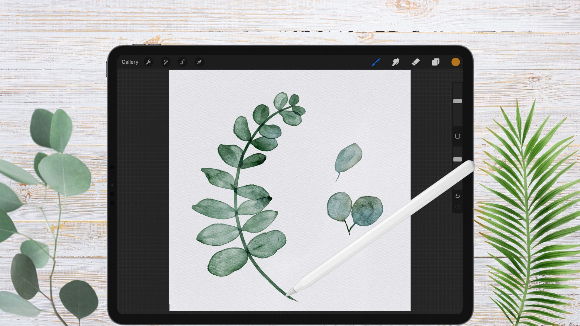
6. Filler Botanicals: Lavender and Berries: In this lesson, we are going to create a few loose
filler elements. There can be sprigs of plants
like lavender or rosemary or berries in a range of complementary colors to
accentuate the bouquet. Head to the layers.
Panel and de, select our previous
layers and activate the fillers template by ticking and then tick and
tap on the filler stalk. Practice layer, we're going to create two types of fillers, the lavender and the berries. Lavender is made up
of a basic stalk with a few butted petals
surrounding it in sections. Select an olive green from
your color wheel and create a few curved stalks in the blank space
next to the template, using the template as a guide. Next on the same layer, we're going to do
the same thing with the stalks for our
filler berries, adding several stalks
at different lengths. Now we can create the
lavender buds and berries on top head to a new layer
marked filler buds. Tick and tap to activate
until it's blue. Then starting with the lavender, select a purple color
from your palette. With the textured
watercolor brush set at approximately 15% begin to fill in the shapes of
the lavender buds. These buds are spaced
out in layers down the stalk with tiny oval
shapes with light pressure. Work your way down each stalk. Sometimes you can have
the groups more clumped together or you can have them fairly spaced
as you move down. We're using light pressure
with these buds and trying to keep them
fairly similar in size. Once you're happy, we're
going to create our berries, head to your color palette and select a color for your berries. We're going to create oval shaped berries on the end
of each of our stalks. Keeping our stylus on the
screen as we create them. Feel free to overlap the tip of the stalk because we will
remove this later on. Once they're done, head to your brush menu and select
the watercolor edge, brush and a white color. We're going to use this to create highlights
on the berries. Keep all the highlights
on the same side of the berries to show that the light is hitting
them from one direction. Next, you can head
to your palette and select a brown color to add a tiny sepal just connected to the stalk at
the bottom of the berry. All right, now we can remove the overlap
in the two layers. Before we combine them, head to the selection
tool on the top left. Make sure your
color fill is off. And then choose the
automatic selection from the bottom menu. Tap on your screen outside
of your painted area, which should highlight in blue. Then in the bottom menu, select invert to reverse your selection and highlight
the painted portion. Now in your layers panel, you can head to the
practice layer with our stalks and select it. Swipe down on your screen
with three fingers and select Cut and Paste
from the pop up menu. You've now cut out the buds and berries from the stalks in
the overlapping portions. Now on this new layer, swipe to the left
and select Delete. Then combine your bud and
store player by tapping on the top layer and selecting Merge down
from our side menu. Great, to finish up, we're going to practice a few twigs full of
leaves that we can add to our florals to make a
bouquet in our layers panel. Deactivate our fillers
layers and activate our leaf template
layer by ticking and our leaf practice layer
by ticking and tapping. We're going to
follow the template, starting with an
elongated C curve on the right with
light pressure. Then we're going to
create a few leaves along this stem using light, heavy and light pressure on our stylus for each
side of the leaf. As you're creating your leaves, keep your stylus on the screen, but just adjust your pressure. Heavy, light on one side and then still with the
stylus on the screen. Light, heavy, light
back to the stem. We're also going to be leaving that white
space in the mid line. To add a bit of definition, make sure as you are adding
your leaves to the stem, you are keeping the
leaves close together, especially when
creating a bouquet. To give that sense of density, we're going to continue to our left facing twig
in the space below. Take your time as
you work around, remembering that you can also rotate your canvas
with two fingers. And zoom in and out by opening and closing your
fingers as you paint. The thing to remember
with leaves for a bouquet is that they are an accessory, not
the main event. The C curves in our stalks are going to be
really important to hug closely to the florals and create a frame
for our bouquet. Okay, keep working on your techniques until
they feel comfortable. When you are ready, join me in the next lesson to
build our bouquet.
7. Building the Bouquet: Part 1: In this lesson, we are going
to take the skills that we have learned and combine
them to compose a bouquet. Take a moment to deactivate
any of the previous layers. And activate the build
a bouquet group in the layers panel so that you can see the process we're
going to go through. The first stage is to create
some central florals, and these will be our roses and the largest flowers
in the bouquet. Generally, you want to have them at an angle diagonally to lead the eye through the
bouquet in odd numbers, like three or five. Next, we're going to add leaves. These are going to
serve the purpose of curving around our main florals. I want you to note the
density of the leaves. It's fine to add a
few leaves in between the main florals as well to
break up the large shapes. But generally, the
leaves should be around the perimeter of the focal
flowers to frame them. After the leaves, we're going to add in the secondary florals. They are also in a
diagonal arrangement to lead the eye of the observer
across the bouquet. They are smaller than
the focal flowers, but just add a new
color combination to your palette and break up
the large objects a bit. Finally, we're going to add a few filler berries to balance out our composition
around the edges. These elements are going to
be the smallest and also have stalks that will frame
around the main florals. For both the leaves and fillers, I like to think of
the stems coming together at the center
of the main flowers, because everything in
your bouquet points towards that focal point. Now that we know where we're
going, let's get started. Deactivate all of
these template layers except the main floral lines. Also reduce the opacity
by tapping on the slider. Then head up to our water
color bouquet group. And activate our main flower one and tick and
tap to activate it. Our main florals
are all going to be forward facing roses like
we did in our drills. In your color palette, select a blush tone and a textured watercolor
brush from our brush menu. Start with the floral
at the top right. Begin with those overlapping
curve petals at the center, slowly working
your way outwards, increasing the size and the
thickness of the petals. Use the petals in
each new layer to overlap the breaks
in the layer below. Also, just make sure
you're leaving a bit of white space between each layer. To add that definition, allow your petals to be organic
and irregular in shape. That circle template is just providing an
approximate boundary. Okay, next we are going to adjust the colors in this layer. Duplicate your rose layer by swiping to the left and tapping. Duplicate. This will
deepen your colors. We're going to assume that our light source is coming
from the right hand side of the canvas head to your
eraser at the top. And select the water
color bleed on E brush at a large size. And then begin to erase
a bit of the top layer. Just going to be
adding a bit of high light coming from
our right hand side. You can also randomly
pick areas of color from the bottom layer to add a
bit more visual interest. Activate the top layer
again and head to the adjustment menu at
the top left. And tap it. Then tap hue, saturation and brightness in the
menu at the bottom. You can use the sliders to make those adjustments
to your hue, your saturation or brightness to either of your
painted layers. Take a moment and just
experiment with your colors. If you double tap
on your screen, a new menu will pop up
that allows you to preview your adjustments in comparison
to your original colors. Then you can decide if you want to apply the changes
or undo them. This applies to any of the options in our
adjustment menu and is a great way to determine if you like the changes in real time. You can always also use a two finger tap on the
canvas to undo an action. A three finger tap
to redo or use the undo and redo arrows at the bottom
of your brush sliders. When you're done, tap
on that top layer. Then in the side menu, tap the text that says, merged down to combine it with the painted
rose layer below. An alternative gesture to that is just pinching the
layers together. For our next rows
on the diagonal, I'm going to head to the main floral two layer and activate and tap
it until it's blue. We are going to repeat this entire process
for main floral two, then main floral three. Feel free to pause and go back through the process that I
did with that initial rose. Okay. Once we are
done with our roses, make sure that the
main floral layers are all deactivated. And you can also deactivate the main floral lines in the
build a bouquet template. Then meet me in the
next lesson and we will go through our
techniques for our leaves, our secondary florals,
and the berries.
8. Building the Bouquet: Part 2: In this lesson, we are going to finish building our bouquet. Starting with our leaves. Tick the leaf lines layer and reduce its opacity
with a slider. And then head back up to the leaves layer in our
watercolor bouquet group. And activate it by ticking
and tapping until it's blue. Now we're going to create
some twigs around our floral that will
frame our bouquet. Select an olive green and make sure that you are back with your textured watercolor brush and begin to build your twigs. Create that central
stem first using those elongated sea curves
with light pressure. Then begin to build your leaves around the twig using a light, heavy, and light pressure
for each side of the leaf. As you go, try and leave that white space in the
mid line of the leaf. To create that definition, remember that as you add leaves, if you are not happy for any
reason with how it looks, just use a two finger tap to undo and try that leaf again. Continue to work your
way around the bouquet. You can always adjust the canvas with two fingers to
zoom in and out, or twist the canvas around
for a bit more control. You can also adjust
the brush size, larger or smaller, so that it's more comfortable for
the way that you paint. I'm going to speed
up the time lapse, but feel free to pause
and then continue. You are happy with your leaves. Once the leaves are complete, deactivate the leaf
template layer and then we can duplicate our painted layers by swiping to the left
and tapping duplicate. Then we can head to our eraser. Brush on the water
color bleed and erase areas you would like to
highlight on the top layer. Gently erase layers on the bottom layer if you would like any other color variations, then head to our adjustments menu and make those
color adjustments. When you're done, combine the two painted
layers by tapping the top layer and selecting the merge down two,
combine the layers. Sometimes with leaves, I'd
like to add a few more shadows or highlights with
specific colors to the twigs and leaves. To do this, first tap the leaf layer and then tap
Alpha from the side menu. Then select the bleed brush from our brush menu and a
deeper green tone. Just tap it in the areas
where you want more shadows. Perhaps on the left hand
side of your canvas opposite the light source or between the roses where they
may be more shadowed. You can also do this with a
color like yellow or mustard, adding a few highlights
on various parts of the leaves just to give a
bit more color variation. When you're happy, tap and remove the alpha lock
to deactivate it, then you can deactivate
the painted leaf layers. Next, we're going to move
onto our secondary flowers. Activate the secondary
floral lines in the builder bouquet template and reduce the opacity
of this layer. Then head to the secondary
floral base layer and tick and tap to activate. I'm going to select
a brighter, yellow, orange for these florals
from the color palette. And make sure that my brush is on the textured
watercolor brush. Follow the generalized shape of the template to create
these five petal florals. Feel free to leave areas of the floral with a bit of white
space to act as a high light. The way that we
did in our drills, you can turn the canvas as you go or zoom in to
get a better angle. But continue throughout each of the three groups of
secondary florals. I'm going to speed up the time
lapse as I do each group. Once you are done, turn off. Layer by unticking. Duplicate the painting layer by swiping to the left
and tap duplicate. Use your eraser brush, set on the water color bleed to erase any areas
that you would like, that color variation
with highlights. And then head to the
adjustment menu. And adjust your colors using the hue saturation and
brightness sliders. When you're happy,
tap the top layer and merge it down to
the bottom layer. Next we are going to do the centers of our
secondary florals. Tap on the combined layer
and select alpha Oc. Then select the water
color bleed brush and grab a deeper red
or purple tone. Place the centers into the middle of your
secondary florals. And then grab the
water color edge. Brush for the stamens. Start with a deeper
tone and then overlay them with a white or a lighter
color for the centers. Continue with this technique in all of our secondary florals. I'm going to speed my time
lapse in this process. Once you're happy, we can remove the alpha lock and then deactivate this
secondary floral layer. Last but not least, we're going to finish
with a few fillers. Activate the berry template
layer and reduce its opacity. Then head to our
berry stalk layer. Select the textured
watercolor brush in a deep tone and begin
to lay down the stalks. Grab a rose tone. Then in our layers, panel activate and tap the
berry bud layers. Create your berries on top
of the around the florals. Once you are finished, deactivate that template
layer and then duplicate your painted berry bud layer by swiping and
selecting duplicate. Then select your eraser
on the water color bleed at a smaller size and
erase any areas at the top that you would like to
see a high light head to the adjustments menu and
the hue saturation and brightness and adjust
using your sliders. Lastly, select your
watercolor edge brush and a white color and just add little highlights on the
berries On the sides facing the right hand side of the canvas where
are light sources. Merge your two
layers together by tapping on the top layer
and selecting. Merge down. Finally, head to
your selection menu. Use the automatic
selection and select the area outside of the berries
which should turn blue. Then invert the selection
head to your stalks layer. Swipe down on your screen with three fingers and
select Cut and Paste. Delete the cut out layer by swiping to the left
and selecting. Delete. And then tap on
the berry bud layer and select merge down to combine
the berry and stalk layers. Okay, we have
finished our bouquet. I'm going to activate
all our painted layers. What you'll see is that there's a significant overlap on
all our different elements. Join me in our next lesson to create white filler
layers underneath all of these watercolor
elements that they are opaque layer perfectly on top of each other
without that overlap.
9. Finalising the Bouquet as a Graphic Asset: In this lesson, we are going to convert our watercolor
bouquet into a graphic asset that each individual element
has an opaque background. To do this, we're going
to use a new technique because procreate sometimes has an issue with the
selection tool. When getting a tight selection
without any artifacts, this technique
will help overcome that head to your water
color bouquet group. And deactivate everything except our main floral
on E. Then tap on the plus to create a new layer hold and drag this layer
below your main floral. One layer next, head to
your color disc and grab a really bright
contrasting color to the color of your element, In this case like
a bright yellow, and pull it into that new layer. Next, tap on this layer and tap the text mask
in the side menu. And then head back to your main Rose one layer tap and select the text reference
from the side menu. This will now allow rose to act as a reference for the
mask we're about to create. Head back to your layer mask. Make sure that it's active in blue and also ticked
on the right, if our layer mask is white, it means that everything on
the layer below it will be visible when we
drag black into it. Any areas that we
drag a black color will become invisible
in the layer below. We're going to grab the color
drop and pull black into the area around our rows
without taking our stylus off. We're going to pull it
across the screen to the right to increase
the threshold until we've selected
main white areas outside our water color rows, but not leaching into any
of our painted portion. You'll still see your
contrasting color visible in some areas
in between the petals. We're going to
address that next. Lift your stylus and zoom into your canvas using two fingers. And then continue pulling the black color drop into the
areas between the petals. In this process, take your time. It is important zoom in if you need to get into any
of the small areas, rotate your canvas
using two fingers. As you do this, if
you see any sections at the join of your petals that are still showing that
bright color through, head to your brush menu. And select the small
watercolor edge brush. And then zoom in and gently remove the pixels in
those bright portions. The rough texture of this
brush will mean that that watercolor edge
should be maintained. Once you're happy
with your selection, head to your layers panel. Then we're going to
merge the layer mask and the bright color layer together by pinching
them with two fingers. This will ensure that now
you have a perfect selection of your rose in only the
painted watercolor areas. Now to get rid of that
bright yellow tap on the layer to alpha. Lock it with the text
in the sign menu. Then select white from
your color palette. And then tap it again. And select fill layer. This will fill it in white. Now we can turn off our reference from our
painted rose layer above by tapping and selecting reference
to deactivate it. Okay, this is wonderful. Next we are going to use this selection to cut our rose out of our
watercolor texture paper. Because although we
have the selection, we still want to maintain a watercolor texture
on top of it. To do this, head to
the wrench icon, tap on the ad tab and then
tap the text copy canvas. Now head to our watercolor
texture layer stack at the top in our layers panel. Tap on it until it's blue. And then swipe down with
three fingers and tap Paste. This will create a
flattened watercolor image with the texture
above that layer. Now we need to cut out our rows from this
flattened layer. Head back down to your new white opaque layer that we created. Tap the layer. Click Select in the side menu, and then head back up to our flattened layer
and activate it. Then make a three
finger swipe down on your screen in
the pop up menu. Tap, Cut and Paste. This should now
perfectly cut out your rose on one
layer while still preserving that
water color texture so that you have a
transparent background. We don't need the cut
out layer anymore. Swipe to the left on that layer, in your layers panel
and delete it. We can now check our selection. Pop your stylus on the tick on the right hand side
of your cut out rose, which will deactivate all of the other layers except
that rose layer. You'll still see the watercolor
texture on your rose, but there is a white layer around it which is
your background. If you scroll down
to the bottom of your layers and untick
the background color, you should see your PNG rose with a transparent
background perfectly cut out. Now this will be ready to use as a watercolor asset on
a range of products. However, this is only
rose number one. We're going to repeat
this process to create elements out
of each of our roses, leaves, secondary
florals, and fillers. I'm going to do that off screen, but feel free to pause
the video and rewind and watch the process again as you go through each
of your elements. By the end of the process, your elements should
look like this, with each individual
element on its own layer. When you put them together, a bouquet that is perfectly
overlapping in its elements. To export, head up to the wrench icon and
then the Share tab. And select P and G. This is the only file type that will give you that
transparent background. If you save it as a Jpeg, it will bring that white
background back only as a PNG. Take some time, export
each of your elements into your camera roll or
into your file storage. I would suggest that
you name them as you go and then export your
bouquet as a whole. Then meet me in the
next lesson to have a play with adding text
intertwined into your bouquet.
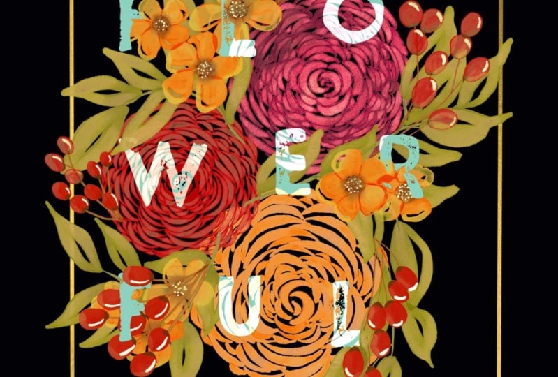
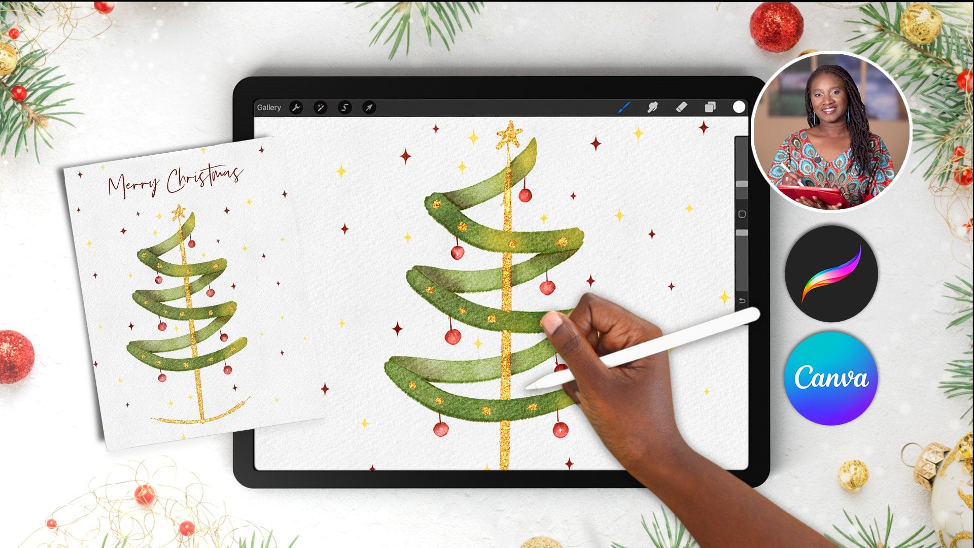
10. Integrating Text Using Masks: In this lesson, we are
going to incorporate a frame letters and make a typographic poster out
of our watercolor bouquet. Using masks and clipping masks. First head to your layers panel and highlight all
your elements by swiping to the right and then selecting group to
group them together. Then select the whole group by tapping and head over
to your transform menu. In the menu at the bottom, turn on snapping and magnetics with distance
and velocity on max. Now we can move our bouquet
until we get two yellow lines intersecting on the two axes
to show that it is centered. Next, we're going to add
a bit of contrast by going to our layers panel and scrolling to the
bottom and tapping on background color and
selecting black. Then head back up to your group. Tap the group and then use
the plus icon to create a new layer above it so that
we can create our frame. Head to the wrench
icon at the top left. And select drawing
guide to activate it and then tap the text
edit drawing guide. I have my opacity at about 36, my thickness at 64, and the grid at 113. I have no assisted drawing. My color is set to white at the top and then
we can tap done. For our next step,
we are going to need to have our quick
shape activated. If you turned it off while you were painting head
to your wrench, icon preferences,
gesture controls, and quick shape
to reactivate it. Then tap done. In
our brush menu, we're going to select the
monoline simple brush and a white from
our color palette. Brush is set on maximum. Then we're going to use
our grid lines to create a square without
removing your stylus. Wait for the quick
shape to activate. And also place one finger on the screen so that it
makes a perfect square. Select square from
the Quick Shape menu. And then tap on
your transform tool to resize and position it. Tapping on one of
the blue dots that shows up with your
stylus will bring up a number pad tap to unlock the dimensions and
enter your pixel size. I'm going to make
both 2,820 pixels. Using this number pad is
a really great way to ensure that you are
getting a precise shape. Then tap the empty space on the tool bar to get
rid of the number pad. Without adjusting
anything in your shape, you can now move the square until it's centered
on your canvas. Once that's done, we can head
over to our layers panel. And I want to hold and drag this layer to the
bottom of the bouquet, so that we can
have the effect of some of our elements
overlapping it. The white looks good, but we are going to take it
to the next level and add a bit of gold to
this layer using a royalty free image
from Splash that I've attached in
the class resources in the class project section. Download and save it
to your camera role. Then with the frame
layer active, go to your wrench icon to the
add tab and insert a photo. Find the gold texture in your images and
tap to insert it. Increase the size with our transform tool until it
extends around our frame. Then tap the layer in the
layers panel and select Clipping Mask from the side menu to clip it to the
frame layer below. Okay, that's our frame done. Now we can add our text head to our berry layer in our
element group and tap it. Make sure you have white selected from your
color palette. And then head to our wrench icon on the left to the Add tab. And then tap on Add Text. This will activate
Procreates Text Tool and your onscreen keyboard. I'm going to turn on tap lock
and then type in the text. Beautiful double tap on
your text to select it. Then this will also
activate a new text editing quick menu Double tapping in this menu will open up
the full text dashboard. Generally, when creating
a typographic poster, you want a bold font. I'm going to select
Impact from procreates, built in available fonts. I'm going to keep
the text alignment centered and set the size at about 195 by tapping on the numbers to bring up
another number keypad. You can also use the slider, but this is more precise. I'm going to set the kerning, which is the space
between the letters. At 62. And then
adjust the leading, which is the space
between the lines to about -18 And tap on the side
to remove the number pad. Now we can tap done, and adjust the blue dots
that automatically show up to make sure that you have
three letters on each line. Then we can use our
transform tool to place and center our text
on top of our bouquet. Great, now we can start to work these letters
into the bouquet with the help of some layer
masks in our layers panel. Duplicate this text layer and untick one so that you always
have an editable back up. At any stage, you can always go back if you want to
make font changes by tapping on the layer
and then tapping the edit text function on
our visible text layer. Tap and select
Rasterize to convert the layer into a flat image
layer that we can add masks to hold and
pull this layer so that it is in between where our roses end and our
other elements begin. Now tap this layer. Choose Select from the side menu in the bottom menu
on your screen. Select Invert. Now we can head to
your leaves layer. Tap and click Mask
in the side menu. We'll do the same for the
secondary floral layer and select Mask and the
filler buries layer. The layer mask will fill the
shape of the text in black. In the black areas, the
elements will appear to be hidden wherever the text is. We're now going to select our monoline brush
from our brush menu. And a pure white
from our palette. Begin to use the white
to bring back our leaf, berry and secondary florals. It looks like they are
wrapping around the letters. I'll start with the
berry layer mask tap to activate it in bright blue. And then zoom in and
use the white to bring back the berries
on the letters A. And if you think you've made a mistake in the way that you have brought
the berries back, you can always use a pure black color to
then hide the elements. Again, I'm going to keep going
with these on the and the L until I have the berries that I want looking like they are wrapping around
those letters. The beauty of masking is that you're not really
erasing anything. You are just non destructively adjusting what you see
and what you hide. Next. On our secondary
floral layer mask, we're going to tap to select it. Then we're going to bring our secondary florals
back around our letters. And a bit of I'll start with I and you finally with our leaves. I'll activate the layer
mask and bring back some of the leaves on B and in
the middle around that. Okay, I'm really happy
with how that looks. To finish up, we're going to
just turn down the white in the letters a bit by selecting
our original text layer, tapping to alpha locket. And then selecting the off
white from our color palette, and tapping again
to fill the layer, that is our final piece. Well done. Join me in the next lesson for
final thoughts about your class project
and how you can use these motifs and skills for
personal or commercial use.
11. Final Thoughts: Thank you so much for
joining me in this class. I have truly enjoyed
sharing my techniques for creating digital
watercolor florals with you. These versatile assets
have a range of applications across various
creative industries. You only have to
explore platforms like Canva Design
Cuts or Creative Market to see the
high demand for watercolor assets among
graphic designers. These assets can elevate
social media posts, stationary surface
pattern designs, and so much more. I hope this class has inspired more creativity in
you and deepened your understanding of
how to incorporate floral motifs into your
creative portfolio. I would love to see
your class project, and you can do that by taking a screenshot on your device and uploading it to the
class project section just below this video. I encourage you to add
your own unique spin on the skills you have learned. A few ideas could be sharing
an individual flower, you've painted a full bouquet, or a typographic poster. If you're a bit
more adventurous, upload your floral assets to your Canva or Adobe
account and use them to frame a quote or invitation card or even
on a product mock up. I cannot wait to see where
your creativity takes you and sharing your projects help
inspire other creatives. If you're on social media, you can always tag me
at Cardwell and Inc. I love to see and reshare student projects in my stories and on the Skillshare
tab on my profile. If you have a moment,
I would love it if you could leave a review
of the class. I take the feedback on board. And it really does help me refine my techniques
as a teacher. As I create more classes, you can stay updated
on my latest classes, tips and giveaways
by following me here on skill share at
Cardwell and Inc. Design. Have a great day
and happy creating.
 CardwellandInk Design, B.Sc, B.A, M.Teach