Transcripts
1. Introduction to Procreate: If Learning Procreate feels
really overwhelming with so many tools and so many gestures and confusing
tutorials, I get it. But what if I told you that this collection of
cozy Tim tips was made with just some
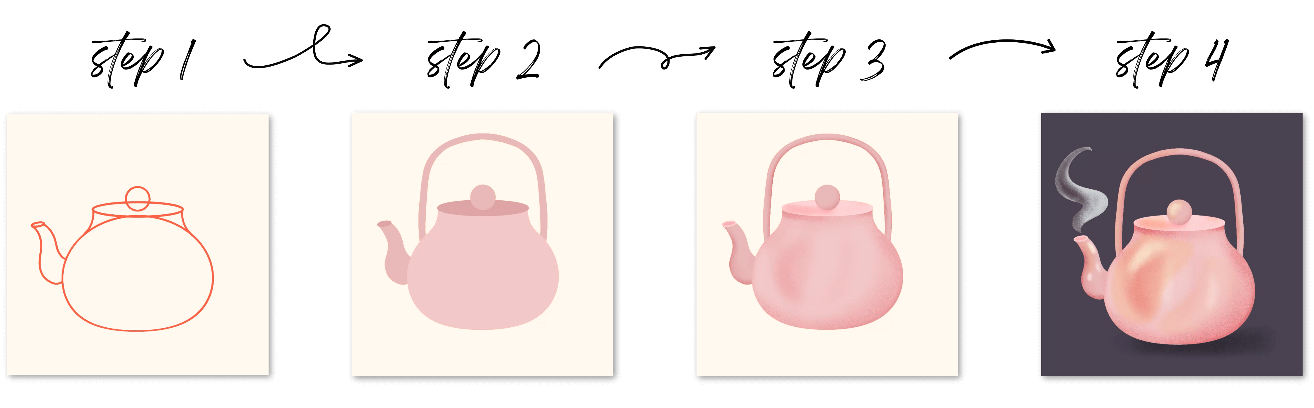
basic essential tools and one simple workflow. I'm Peggy Dean, and
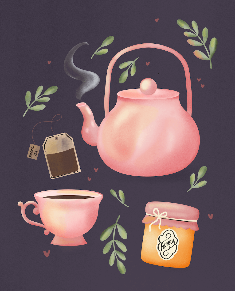
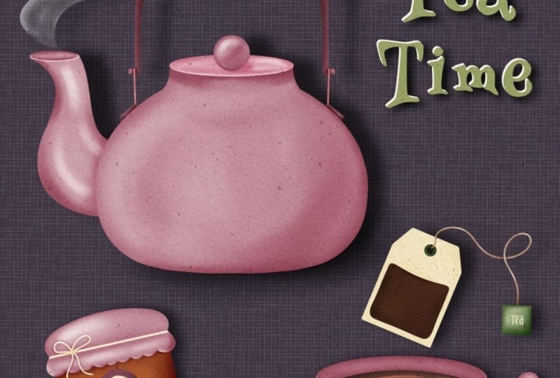
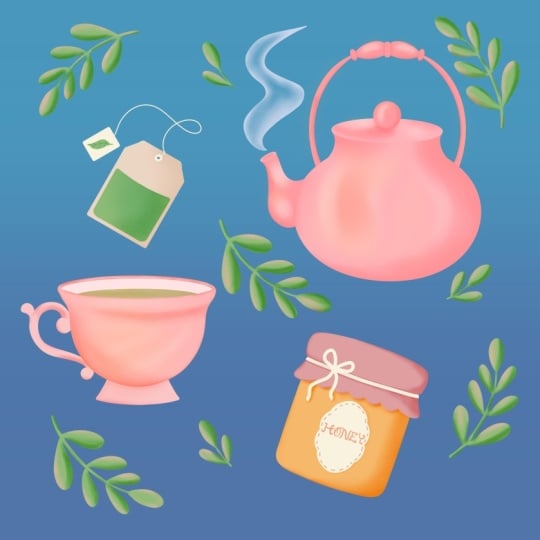
in the next 2 hours, we are going to create this
adorable tea collection while mastering all of the Procreate fundamentals, starting
from scratch. And more importantly,
you will discover the gestures and the
tricks that are going to save you hours of frustration and the
professional workflow that I personally use every
single day that separates hobbyists from
competent digital artists. No overwhelm, no confusion, just you and me and some
cozy creative time. So if you're ready
to go from Oh, I really hope this works to I know exactly
what I'm doing. Let's start with your first professional quality
artwork right off the bat. And yes, by the
end of the class, you will know exactly why I
call it professional quality. Let's start with a
simple teapot and then we'll add some cozy tea motifs, and then we'll bring it all
to life with some steam, and by the end, you'll have
this beautiful piece of art, and you'll have
the confidence and the skills to tackle
any Procreate project. So let's brew up some
creativity. You get it?
2. What to Expect: We dive into creating,
I want to paint a picture of exactly what this learning experience will look like and why it's going to feel different from
other Procreate tutorials you may have tried. Most Procreate tutorials dump features on you
one after another. Here's this tool.
Here's that tool. That's where that is without
showing you how those tools actually connect and when
to actually use them, which is an approach that I
think leaves people feeling very overwhelmed and very
scattered and it doesn't stick. Instead, we are going to be
learning through creation. Every single tool that
I teach you will be learned while making
something beautiful. You'll understand not
just what each tool does, but how and why to use it. I don't want you to
have to try to memorize every feature without
using it when I can actually guide you through
the full process to build efficient workflows that let you create smoothly
and confidently. Here's exactly what we're
going to accomplish together. By the end of the
class, you will have a darling T motif illustration that you'll actually
want to share. You'll master the
core Procreate tools that handle 90% of
your digital art. You'll have a systematic
workflow that will apply to all of
your future projects, and you'll have the
confidence to explore Procreate without the fear
of breaking something. We'll start with the
foundation to get you set up for success
in each piece of your artwork so that
you don't find down the line that you didn't have the right settings
getting started. And then we'll create
a Teapot together. Trust me, it'll be
easier than you think. And most importantly,
I'm going to teach you the gestures that
are going to speed up your workflow and give you some aha moments even before you realize
that you needed them. These are the things that
people always tell me, Oh, I wish I would have known this a year ago, two years ago. And then we'll dive into
some color strategy and learn to create some
cozy cohesive palettes. And then finally,
we're going to add those atmospheric details like steam and lighting that really
make your art come alive. And the best part is that every
technique that I show you will work for any style of art that you
want to make later, whether that's botanicals or lettering or pattern
design, even portraits. So grab your favorite tea. Get cozy, and let's turn you into a Procreate
artist. Is that cheesy?
3. The Foolproof Canvas Setup: Before we start creating, let's set up our canvas the right way. This setup guarantees
that your art looks Cris. Whether you're sharing on
Instagram, making a print, making cute tea items for your kitchen, greeting
cards, you name it. I'm going to give
you a canvas setup that works great for
most of your art so you can guarantee
that you don't run into a pixel problem later. Is probably the most technical we're going to get
this entire time. So don't let this
part overwhelm you. But basically, when
you open Procreate, you have your full gallery. I have mine set up in a way where I can visually see stacks. I'm just going to
explain this very quickly because you
might be wondering, Hey, what's go put you on here. So let's say I have a canvas
and then another canvas. And then another. Like, let's say I have a bunch of
projects going on. So to make this as easy
to explain as possible, you can make stacks, and that kind of
works like a folder. Every time that you do that, you'll see it says stack, and then it tells you how many
artworks are inside of it. If you want to do this, you just tap Select and then tap on the artworks that you
want to stack into a folder. The first one that you tap
will end up being the cover. Now, let's say I named
this already art one. Notice, I can press Select. This is the first
one I selected, so it'll be the top and
then tap the rest of them. When I stack, it then
makes it say stack. So I'll deselect that. The
reason why I don't rename that part is because
every time that I create a new piece of art and I
want to put it in the stack, I'll select, tap the stack first so that the cover
remains the same. Then the artworks or, you know, whatever,
and then stack. But I've created covers for
them all so that that name, I don't have to keep renaming
it over and over and over. And it's also easier because
it's not distracting to me. So that in a nutshell
is the gallery. So if I open this up, I see all the art I've
created within it, but then this is front
the first piece, and that's why that
shows as the cover. You can also rearrange, let's say you
accidentally did it, and this was at the
bottom somewhere. You know, you can
also drag that, tap and hold, and just
drag it back to the top. It's There we go. And if you ever want to take
something out of a group, you can do that by hovering over stack and then it brings
it back out here. Can bring them in by
hovering as well, so you don't always have to
stack. It's very gestural. When you want to delete an art from your
gallery or let's say, a stack altogether, you can swipe to the left
and say delete. That's the same
way you would also duplicate a piece
of art or a stack. But are sure are you sure you want to
delete the whole group? Yes. Okay. Oh, when we
create a new canvas, we're going to tap this little plus symbol on the top right. You'll see a bunch of
default Procreate canvases. I don't use those. I use my own. The reason for that is because I want to make sure
that no matter what, this is the most important thing I'm going to tell you is that you want your canvas
to be set at 300 DPI. On the right side,
you'll see pixels or whatever size you created,
it might be in inches. But I do it in pixels, and then I actually name the canvases in inches
because it helps my brain. Sometimes where I'm
like, I don't remember what 3,600 pixels means. I know it's 12 by 12. So let me break this down. Let's create a new
canvas together. So we taped the plus symbol. We'll tap New Canvas. There's a little plus symbol underneath that looks
like a little folder. Anytime that you create a new
canvas before we do this, it'll end up at the bottom here. So it says Untitled Canvas. I'll show you where
you can rename that. You can rename it from here
by swiping to the left, but let's rename it
actually when we make it. So tap the plus right here. It doesn't look like it's
renamable, but it is. So we can say tea
party, how about? Because that's the project
we'll be working on together. So this is where
the dimensions are. You'll see width,
height, you'll see DPI, and then your iPad is going to show you a
different amount of maximum layers depending on the size of the storage
of your iPad itself. So, if you are set to this exact measurement and your maximum layers
are different than mine, don't
worry about that. What this is telling you
is the amount of layers you can have in a project before it won't support anymore. So if I was to go up
to 10,000 by 10,000, I only have 14 layers left. This iPad is huge. So chances are it's
going to say too large. I'm not going to work
in 10,000 pixels, but I just wanted to let you
know that's what that means. The absolute minimum that
I recommend working in is 3,000 by 3,000
pixels at 300 DPI. What this equates to, let's say you work in
inches is 10 " by 10 ". It doesn't show you
right now because it keeps what we had in there, but ten by ten at 300
DPI is 3,000 pixels. So if you ever want to
go larger than that, you're going to want
to set accordingly. You don't have to
put it in pixels. It's just easier because
depending on where you live, not everybody works in inches, or not everyone works
in centimeters, so I just go for pixels
because it's more universal. I have a little cheat sheet that I have made for myself
that tells me, Okay, if I wanted this larger, I could use, you know,
4,800 by whatever. And then if it's 3,000
pixels by 3,000 pixels, I could put in here ten
by ten and then I know, Okay, 10 " by 10 ", 300 DPI. Okay. That is the
size part of it. This is the again, minimum
that I would recommend going. If your iPad supports it, see, I have 200 layers or so. I would go double this. It's going to give you
a 20 by 20 canvas, but see only 48 layers.
So let's not do double. Let's do just 4,000, just to go a little larger. Because that way,
if it supports it, if it doesn't thousand
pixels is plenty. It's going to be
great. We're making smaller elements, so it
really doesn't matter. But the larger you go, the easier it will be to take the elements that we create together and put them, you know, enlarge them or shrink them or whatever without pixelation because pixeled artwork is going to pixelate each and
every time you resize it. So this is setting you up so that you don't run
into issues later. So again, minimum
3,000 by 3,000. 4,000 If you have maximum
layers of like 50 plus, then you're good at 300 DPI. 300 DPI determines printing. So if you're
printing at 100 DPI, you're going to lose a
lot of that quality. If you're printing at 300, you're going to have nice
crisp lines and whatnot. Okay, next part of this, don't worry about anything
else besides color profile. When you come in here,
your default will probably be RGB Display P three. Don't use display P three ever. Ever, ever, ever.
This will not go from one screen to another or from screen to print the way
that you want it to. That's because this is an
Apple display profile. It's beautiful. It has a
lot of colors on the iPad, not necessarily
device to device. So always just right
underneath that, grab the first RGB profile
for color, and you'll be set. One thing I want to mention that a lot of people
will ask about is, well, when do we work in CMYK? CMYK stands for cyan, magenta, yellow, and
K, K meaning Black. This is a printing,
a printing profile that a lot of printers will use, and there's an issue with
Procreate is that this is a Procreate simulates CMYK
using an RGB preview. So that means that you're still technically working in RGB, even if your document
is set to CMYK. So Trust me when I
say just work in RGB, and if you need to convert to CMYK at some point, you can. But 90% of the time, this is going to
suffice and I've sent so many RGB pieces
of work to printers, including printers
who want CMYK, and my colors will
always turn out better than if I was to
use one of these profiles. They're not true CMYK, okay? Squash in that.
So in a nutshell, minimum of 3,000
by 3,000 pixels, 300 DPI, color profile, RGB, not display P three. Simple enough, right? So
go ahead and press Create. That because we did 3,000
by 3,000 or in my case, 4,000 by 4,000, it's
a square canvas. This is editable later. We can change the size later, but for now, the square
canvas will work just fine. Before we get started,
I want to show you two things about
your workspace, one of which is you can work on a light or a dark interface. If you go to your
wrench icon right here and then you
go to preferences, then you'll see a
light interface. If you toggle that on,
it's going to give you a light interface to work
on if you prefer that. I'll turn that off because
I like the dark interface. The other one in the same
area, right hand interface. I thought this said left before, but I would think if
I'm right handed, I don't want to
accidentally bump stuff. But either way, these toggles
are your brush sliders. I'll move them to this side. If you toggle that on, and then it'll move them to
that side if it's off. Those two items to get you just a clean workspace that works
for you, and that's it. So that's setting
up your canvas. We will use those
settings again and again just to show you real
quick where that ended up. If you go to gallery, you see untitled artwork. Don't worry because I know
we named that canvas. We named the canvas size and type, not the
artwork itself. So if I go to my plus symbol, I see here tea party, and you can drag this up
toward the top if you want to, and that's just going
to allow you to repeat making that
same canvas size. You'll also see if I make
a totally new canvas, it preserves my last settings. Cancel. Okay, so let's jump
right into the workflow.
4. Smart Layer Setup: Here's where most
beginners make mistakes, putting multiple elements on one layer or everything
on one layer, and then you won't be able
to work indestructibly. And what I mean by that is
when you have multiple layers, you are able to go
back and edit those. Maybe it's the color or maybe
you just want to add to or remove from without messing with any of the other components
on your layer panel. So the way that this works
is allowing you full freedom in your artwork to treat each item as if it's
its own element. We're going to
organize our tmtifs so that they have that room
to breathe and evolve. There are four types
of layers that I want you to consider. Main subjects. In this case, we're
diving into a teapot. So think about the base
shape of our teapot, elements that are attached
to the main subject. So those are things that might overlap it or you might want to separate from that base shape in order to make different
types of edits. We'll get into that more.
But I would call that like secondary main subject, let's just say for the
sake of explanation. And then we have our
special effects layers. In this case, we're
going to be adding some steam and some
highlights and some shadows. So those are our effects layers. And then I also want you to always consider adding
a background layer. Procreate does
have a background. This is not considered
an actual layer though, and I like to be able to
work on the background, its own layer so I can
make adjustments to it. That's just a habit
I have gotten into which I highly
recommend doing as well. I want to show you a
more complex example because it's going to help you understand why
this is important. If I look at my Layers panel, you'll access layers panel with these two overlapping squares. I think about main
elements, so we have face. We have hair, we have
clothing, we have accessories, but these are all layer groups. I'll show you how to do this. We'll do it together.
Don't be overwhelmed just giving you a
visual example. And when I open the toggle
here on this layer group, I see another layer group, but also individual layers. You'll also see I have head. I've labeled all of these so that they're
easy to understand, and then all of
these are clipped elements to this main shape. You'll see this
little arrow right here and that's showing
that it's a clipping mask. Another thing we'll go
over in a little bit. But that's essentially
going to treat all these effects being
applied to a main shape. And then within there, I have this eyes group. The same thing, I
have eyes, iris, and then I have a clipping
mask that is this iris depth. I I make this larger and
turn that off and on, you'll see that
effect being applied. This is going to make it very
easy when we're working. If we want to go
to, let's say, oh, I need to clean up
this hair part, I can just go to hair, and then I see hair
highlights. See this. I can just go
directly there and I know what I want to
work on and how. So Layer hierarchy is really important organizing
your layers, labeling them accordingly. It is helpful. Then a hot tip, you can use emojis
labeling your layers, clothing, I could tap here. I can just go in
here and find shirt, let's say, and just
put a shirt here. It's just going to be
a quick visual guide that's going to help
me. That's an option. It's really helpful
instead of having to read every name and game changer for productivity
to move quickly. For this cute T design, we'll create each element
in its own layer group. I'll break down exactly
what that means, but that's going to allow you to move and make edits to color and whatnot
without starting over. As we start creating,
you will work alongside me as we build
up this layer system.
5. Shape Your Teapot (no drawing skills required!): Let's talk about the
core Procreate tools that you will use for 90%
of your creative work. I'm showing you
exactly which tools matter and ignoring the ones that we don't need right now. So I don't know where you're
at with your drawing skills. And while this isn't
a drawing class, I still want to give
you the tools to create a really fun finished artwork. So we're going to use the
tools that are built into Procreate to give you a finished product that you're going to be
really happy with. And we're going to do
this by identifying basic shapes within an object, and then using shapes and lines combined together in a smart
way to create these objects. I'm going to be using
a reference photo in Procreate itself. And
you can do the same. So if you go to the wrench icon here and you go to Canvas, you'll see that there's
reference you tap that, you have the option to
reference your own canvas. That would work really well
if you're really zoomed in, but you want to see the
whole canvas, as well. You can do image right
here where you can import an image, so that's
what we're going to do. And I have a download
for you of this image, or you can work along with me. It's not going to matter
in the big picture. We don't actually
need this reference, but I just want to share
it with you because it's a Procreate tool that I think
that everyone should know. So then you're just
going to choose the photo that you
want to bring in here. And then you have
a reference photo that you can drag around. You can also resize
it. Let's see. Resize the reference within it, but you can resize the box as well if you go to the corner, and this is always tricky
for me. There we go. So you can make that
larger or smaller, and then the actual
artwork larger or smaller. So we'll use this. I'm going to make
this about this big for reference, and then
move our artwork over. I accidentally made
a bunch of marks, so I'm going to show
you a quick trick. We have one layer right now, and if you ever want
to scrub a layer clean without pressing undo a bunch of times,
we'll get to that. Just take three
fingers and scrub, and it'll clear that layer.
And not the whole thing. So ifever you make a bunch of marks and you're
just like, Oh, I don't want to press
undo 1 million times, but I want to start
over on this layer, that's an easy way to do it. We're going to use a simple
brush to get started. And if you go into your brushes, you will see that there
are brush libraries. If you pinch them
closed. You'll see Procreate library
and classic library. Classic was before this
update in Procreates. There didn't used to
be brush libraries, and now there is. If you have done the update, if you haven't you
go to the app store, you'll see an update option, and you'll now be able
to do brush libraries. And this is something that
I have not configured intentionally because
I wanted to show you probably what you
would be seeing. You're able to organize
these pretty easily. You can pull a brush
out of one library, put it into another one,
to create a new library. You're in the libraries. Let's say you have one open, just pinch closed to open
the brush libraries, and then you'll tap this plus symbol to create a new library. You could also import a library. Once those are open, you have brush sets
on the left side. Create a new brush set by
tapping the plus symbol here. If you pull all the way down, you'll have this search feature right here so you can
search for a brush. You'll also see right here
where it says recent. If you tap that, it shows all of your recent brushes so that
if you switch brushes, and then you're like, Oh
my gosh, what was I using? I need to go back to that brush. Just go to recent and you'll see whichever one that you
were using right there. Now, if you wanted to pull
outside of a brush set. So let's say I'm in
the libraries here and I want to create some
from my own brush sets. I can go to the brush libraries,
create a new library, and I'll just call
this TPL and I do a little bird emoji for
the pigeon letters. Apply that and then
I have this here. It starts off only with
recent and untitled, so I have to pull my
brushes in there. If I open up the
classic library, which is where all of
those are currently, all of these are my brush sets. I can take them and hold
and then pinch close, and then I can open up that brush library and now
they're inside of here. Then the other thing is
that's really helpful, let's say you have to
do a ton of those. If you grab one of them and pull it out and then
just tap the rest of these, you can grab a ton at once so that you don't
have to go through the process over and over
because I have so many of my own brushes and I need
to get them over two. That new library. Here we go, tap that and then I can just drop them in here
and here they are. You can do that with
brushes as well. You can tap and hold a brush and move it wherever
you need it to go. There's a lot you
can do with brushes, but the brush libraries
are nice because then everything is nice and tidy and the search feature is amazing because that didn't
used to be here and now I can just find
my vintage monoline. Boom, done. Enjoy
that organization. Going to go in here and
grab a really simple, easy to use brush. And that's going to
be under basics, and just go to this one. I don't know if it's
pronounced Yager, but that's what I'll
say. And just tap Yager. That's going to be
a monoline brush, and you can adjust
the brush settings, the size right here on
the top brush slider. So we're going to have
this be oh 60 ish percent. It's not going to matter because we're going
to fill that color. But you can see that
when I press down, there's no pressure variation. That's what we want we
just want easy lines. Oh, the teapot is
essentially basic shapes. We're going to have
a circle right here. We'll have an
ellipse right here. We're going to use we're going
to draw this in together. This simple spout. We're going to use
Streamline to make it nice and clean. So
let's go over that. So Procreate has something
called quick shape. So when I draw a circle, go ahead and draw
a circle with me, and then hold your Apple
pencil down when you close it. Don't lift it up. That's
going to be a quick shape. So whatever we drew, it smooths that line out completely to make
it a perfect shape. Now, if you wanted
a perfect circle, while holding it down, you can hold your finger,
your other finger tap to the canvas and you'll
have a perfect circle. I think I was going to
do a perfect circle, and I actually think that
I like this oblong shape, so I'll keep it at that
before I release two. You can change the size. And then you can see this
little edit ellipse. If you tap that top menu
before it goes away, you'll see little
nodes you can edit. We're not going to
do that. I just want you to know
it's available up here so that you can edit
that if you want to. If you drew your circle somewhere weird and
you want to move it, you can tap this arrow. It's the move and transform
tool, and when you tap it, it's going to select everything
that's on that layer, and then you can
move that around. If you notice there's
this snapping involved. That is a setting within the
transform and move menu. While it's active,
it's under snapping. Let's say you wanted to
center this perfectly, if you go to snapping
and turn it on, and then you move this, you can see how it
centers perfectly. You can also drag
that down and see this horizontal gold line that's showing you it's
perfectly centered. So that's a trick that you can use to perfectly
center things. What magnetics does, if I turn snapping
off, it could stay on, but I'll turn it off
for now so you can see there's blue lines
that will come and it's making it so that it remembers that it's exactly
along the same plane, and you'll see that guide
where your Apple pencil is. So let's say I
wanted to move it to the right a little bit
to allow for that spout, but I really like the
baseline of where it's at. I can move it to the right
a little bit and then make sure that it stays on that baseline according
to the magnetics. So that's what those
tools are for. And they can be very helpful when you want to
have that precision. But we want this to
be centered for now, and that's because
of an upcoming tool. So let's go ahead
and make sure it's centered. That's
with snapping on. We have that gold vertical line. Now, I want to flatten
this a little bit. Let's go ahead and
use the warp tool. So keep it selected or re selected if you've
already moved it, and we're going to go to warp. And that is going to allow
us to move these pieces. And so we can move the
middle or the sides, but just know that's
also going to change your linework
and make it skinnier. Doesn't matter in
this instance because we're just going to fill
this with color anyway. But that way, we can flatten that out a
little bit, and that's all. So go ahead and deselect that. Now we'll go ahead and use
symmetry to continue drawing. So we will utilize a
drawing guide to do this. Procreate has a drawing guide
within the wrench icon. This is your Actions menu. If you're under Canvas, Canvas is selected within
the actions drawing guide. When we turn that
on, we see a grid. The grid is really helpful for eyeballing and making sure
that we're on a certain line. But if you go to
Edit Drawing Guide, once you turn that
on, it will up here, there's a menu at the bottom here where you can change what the drawing guide looks like or the type of drawing
guide that it is. So, along the top, you see this color bar. You can change the color. So let's say you want
it to be like, blue, it's easier for you to
see and then change the opacity down here for how strong the drawing guide is. So that can be really helpful. The thickness of the lines
and then the grid size, we're not going to
use the grid, though. We are going to use
the symmetry tool. So there's isometric,
which is going to allow you to have
these angled lines. Perspective is great
because then you can tap and you have this
vanishing point, and so you can move
that wherever you want, just for future reference, but we are going to
use the symmetry tool. That's going to create a
line right in the center, and then you can
also go to options and change it to horizontal
or quadrant radial. We're keeping vertical,
and then just press Done. When you enable Any drawing guide, it
automatically creates an assisted drawing layer on
the layer that you're on. However, we are going to create our next element of this
teapot on a separate layer. So when we go to add a
layer in our layers panel, we tap our layers, we
tap this plus symbol. It creates a new layer. But see how this first layer says assisted and
this one does not. That means that if we were
to draw on this layer, it will only appear on one side, but since we have
a symmetry tool and we want that drawing assist, we want this line to
show up on both sides. Quick gesture. If
you use two fingers, you can tap to undo. And then if you want
it to come back, three fingers tap to redo. So two finger undo it will be your best friend anytime
that you create. And when you go back to analog, you're going to start
two tapping your paper. It's just something
that happens. So on our layers, we also have to turn assisted onto each layer we
want it to apply to. So if I tap this layer,
the new one that we made, I can go to Drawing Assist, tap and then you'll see
Assisted is now on. And when I draw a line, it
will appear on both sides. So I'm going to undo that
because I don't want that line. But now all I have to do
to make this little lip right here or whatever curve
is draw it on one side, and then it will show up
on this side as well. If you like really
smooth illustrations, I'm going to show
you another trick. So see how this looks
a little wobbly. You can use that same method that we did with our
shape with an arc. So if I curve up like this, and then I hold it, see how
now it's snapped, undo, we got that rough
wobbledge redo, it is that nice clean line. So so I can draw that
in, hold it in place, and then go to Edit Arc up here, and then I can
take that node and just make sure that's a
nice clean connection. And then I'll tap
editing to be done. And then I have that nice lip, if you will, in place. I'm not worried about what
this bottom part looks like because that is
going to be all covered. Now, between you and
I, I didn't actually want this to be a
separate layer, but I did it on
purpose because I want to show you how
to merge layers. So we have these
two layers here. We can tap a layer
and go merge down, which will merge them together. Or we can pinch them. Pinching is hard when
there's only two layers, but if you can manage it, it will then flatten those
two layers into one, and then we can add the lid, and I'll show you
why we want that separate when we add effects
and shadows and whatnot. So go ahead and
create a new layer, and we'll use the ellipse tool
again, where we just draw. And this can be really shaky. Watch how shaky this is. If we just draw that ellipse around and then
hold it in place, do you see how much
it cleaned up? And then I have another
trick before we let go. If you use your
finger and hold down, do you see how it's
snapped horizontally? When we do this
with lines as well, if you draw a straight line, if you want it to be
perfectly horizontal, just tap your finger down. And then if you
rotate with that, it will snap into 15
degree increments. So there's a lot we can do here. I'm a little off center, so I'm just going to
make sure I'm small enough and then I can
select it and move it. So I'll select by
tapping the arrow key. Oh, remember how we
had warp on before. We have to make sure that we
go to free form or uniform, but not warp because otherwise, we won't be able to move this. And then if you want
to turn snapping off, make sure that's off
within that menu, and that'll give you
a freer adjustment. So I'm just going to
put this right here. I want it to be a little larger. When you resize something
with these nodes up and down, every time that you do it, it will pixelate your
art a little bit, and the edges get
softer and softer, more pixelated and
more pixelated. It's just a honor
thing about Procreate, but if you do it once or
twice, you should be good. But I just want a little bit
of a hangover on the lid, and so that's why I'm
choosing to do it, but no more than
like once or twice. Don't worry if lines
are overlapping because we're going
to get to that later. But right now, we're
just forming this shape. And then notice that when
we drew that circle, we didn't have it
appear on both sides. Even though we technically
have our drawing guide on. That's because that layer did
not have layer assist on. Alright, I know this is
a lot, but essentially, we just have quick shapes, and you're learning
about layer hierarchy. So let's start naming these before we get out
of control, okay? So we'll go to layer one. We'll tap it again so this flyout menu comes
up and we'll tap rename. Let's go Teapot. Teapot body. I mean, teapot or teapot body. And then this one
we'll name lid. And then let's add this
tiny little lid handle. We'll do that on a
separate layer as well. So new layer. It's above the lid
layer because see how we see that on top
of that lid layer. So we want that to
be more visible. That's why it's on top here. Tap layer. Let's go rename. And then we can say lid
knob. That sounds fine. And then we'll do a
perfect circle for this. Okay? So we'll just
draw a circle. It's on its own
individual layer. And we want that kind of in
the center of our ellipse. So about right here.
And it's a terrible, terrible circle. I know it. And then I'll get that
the size I want and also tap my finger down for
that perfect circle. And then if it's
not centered and you want it to be
perfectly centered, tap the transform tool. It's going to select
it. Make sure you're on snapping so that
when we move it, it's going to snap
to the center. And if it's feeling like it's
going all over the place, you can turn the distance down and it will be less
aggressively snapping. Okay, deselect. There we go. Now, we have the
base of our teapot, and all we need to add is
the spout and the handle. So we'll do that
in the next lesson because this is where
we start to change our brush settings to
make this a little cleaner and easier to manage.
6. Perfect Curves with Streamline Power: Okay, now that we
have our base shapes, we're going to want to add
our spout and our handle, and we're going to draw
this in not using a shape. And so what I want to
show you in our brushes, you can change brush settings so that your lines are smoother. The first thing,
though, before we do anything is we want
to make a new layer because I can't tell you
how many times I will accidentally draw on a layer
that I didn't intend to. So let's just make
sure we're in the clear. So add a new layer. Rename it, and we'll go spout. So we'll go to our brushes. And when you tap on a brush, you have all these settings. Now, before you
touch any of them, these are Procreate brushes, and that means that you can restore them to the
original setting. But I always like
to make a copy of it if I'm going to mess
with any brush settings, and that way, I have
the original preserved. Let's go ahead and copy it
first, duplicate the brush, so swipe to the left and duplicate it. There
we go. Yager two. I feel dumb if it's called
Jagger. But here we are. Go into the second
one that we copied. Tap it again, and we're going
to go to stabilization. And I want to recommend
using Streamline. So the difference between
having Streamline low and having Streamline higher is the amount
of wobble it has. So if we are about
midway, it's not so bad, but if we are higher, let's go ahead and clear our drawing pad by going
to drawing pad, clear. And then see how if it's a little higher,
it's a lot smoother. I don't usually
have this above 30, but since we're doing more of a geometric type art
piece right now, Streamline is going
to be helpful. You also have stabilization, which is going to
help with that. But just know this is going to help with wobble and if you
don't want wobble in there, this is what I
recommend setting. So again, just to get to this so that you understand you're
going to tap a brush. It brings up the brush studio. Go to stabilization, and that's where you're
going to see Streamline. So from here, we can say done. The settings are saved
in there for us, and now when we draw,
it'll be a little bit smoother. So let's
draw our spout. It's about halfway down, and it's this S curve. So we're just going to
S curve up like this. Doesn't have to be
exactly like it, but it's just going to give us the shape that we're after. The second one is tapered in, so it's going to be
a little bit wider, and then there we go. And it's a little bit
shorter than this. So I'm going to take my eraser
and clean up this part. Now, I have something
to tell you before I get to my
eraser, which is. Let's say the last time
I used the eraser, it was on airbrush or it
was on some textured brush. You can actually
make it so easy to select the same brush
that you're using so that your edges remain the same and you don't
end up airbrushing away and then
having to deal with all the texture,
all the gradient. Instead of tapping the eraser to get to the eraser and
then finding the brush, if you tap and hold it, a very quick menu just
came up that said, erase with current brush. And that means that
now when I tap it, it's that exact same
brush that I was using. So that's a quick tip, but we're going to want to
bring this oh, about here. It doesn't matter if the edges are perfect
because we're going to draw that ellipse
on top of it. I want to put this
actually underneath the main base shape because I'm not going to
have this one come in front. I actually want it to
go in the back just for ease and to show you
how to reorder layers. So we're going to go
to our layers panel, tap on that layer, and drag
it underneath the teapot. And then we are going to
work smarter not harder, and we'll add the spout to either the knob or the
lid, because that way, we're not using a ton
of Tana ton of layers, and it's not touching
any of those elements, so it's okay that
it's on the same one. So let's go ahead and rename this quickly,
I'll say on lid, lid, and spout opening. How about? Then I'll just
draw that ellipse in here. You can also move it. Now,
when you move it this time, you can't just tap
the transform tool because that's going to grab
everything on that layer. What you have to do instead
is go to the selection tool. The selection tool
is this little ribbon icon looks like a little S. You'll tap selection and it will bring up
the selection menu. You want free hand selected. Free hand means you can draw around something,
anything that you want. I'm going to undo that real quick so I can show you
what automatic does. If I was to do automatic, it's going to select based off of the
pixels on that layer. Since I selected outside of it, so it's going to select everything outside of
those lines and whatnot. We're not doing that right now. We are going to free hand selection so we can
freely draw around it. Don't worry about
any other elements because we are on the layer of the lid and the
spout opening. So all we need to
worry about is that our selection doesn't go into the lid, so
we're good to go. Once we have our selection, we can tap the transform tool and move it where
we want it to go. If snapping is on and it's messing you up, you
can turn it off. But that seems fine. Don't
worry about overlapping lines. We're going to clean those
up. And then deselect. Now, you can add all
these elements and go crazy with really
ornate handle. But I'm just going to
keep this really simple, and I'll go ahead and go to the layer where the lid knob is on and just rename that
and add it to this layer. So I'll say lid knob and handle. And then I will turn the assisted layer back
on so that when I draw, it actually meets in the
middle. So it's nice and clean. So I'll go to that layer,
top drawing assist, and then just come from the
side here and come up and in. And if it's not super smooth,
don't worry about it. You can always use
the warp tool. You can also just redraw it. You can go to your
eraser and just clean up any lines that don't look quite right, and
that'll be good. And if you want to
make that thicker, so it feels more like a seamless
handle. You totally can. And there we go. So we have
our base shapes in place. So what we want to do now is add color to this and
make these solid. So I'm going to share
something with you, and we drew it this way on purpose because I
want to show you what could happen if we
hadn't covered our bases. So in this teapot layer, we can easily go in
and drop this color. But if I go to the spout and I want to drop
color into that, do you see how it
fills everything? The reason why this is happening is because I'm
going to tap undo. If I only look at
the spout layer, I'll go ahead and turn these
off real quick by tapping this arrow check on the layers so I can
only see this one. It's all completely open. You have to have a closed shape for color drop to not
spill outside of it. So that means, I'll
turn these back on. So that means what I want to
do is on the spout layer, go ahead and draw
a closed point. And then right here, I
need a closed point. So you might not see it because of the
layer on top of it. But if I turn that spout
off, spout layer off. Now I have a closed point. I'll clean this up just
because it's bugging me. But that closes it, okay? So even if it's
underneath something, it still needs to
have a closing point so that when you fill it,
it actually gets filled. So going back to
the teapot layer, we also need to fill in this
part where it goes upward. But remember, it is not closed, which means it's going
to go everywhere. So go to the teapot layer and
add that closed connection. So I will I'll just
follow this line. It's not going to matter if it's perfect because it's
going to be underneath. The lid, but just
to make sure it's closed so that it
fills completely. And don't worry about the
color choice right now. We're going to be changing
that in the next lesson, but right now we're
just filling, okay? So we're filling these shapes. So go ahead and drag and drop, drag and drop color, and then go to the next
part and this part, the circle is closed, but the handle is not, so I need to go in
here and just close that close that and then fill. Okay? So now we have a
silhouette, which is great. Our next lesson, we will go into bringing this
to life with color. But you can see how simple these very simple shapes can create these really
cute illustrations. So let's bring these
shapes to life with color that'll actually give
it that comforting vibe that I know
we can't wait for.
7. Color Strategy (Cozy Vibes): Going to be really hard for
me not to jump way into the nerd out color fun because this is my favorite
topic to talk about. But color always and forever will set the
mood for our art. And since we're
going to want to set a cozy aesthetic
for our tea scene, I have a little cozy formula. As we choose colors together, I suggest focusing on
some warm base colors. Cream or soft peach
or warm brown. And then an accent color. So this could be like a
dusty rose or sage green. We'll also have the depth, the shadows in our piece. I would choose a color
like a dark charcoal, which is going to be
a little softer on the eyes than a pure black wood. And then we'll need
some atmospheric tones, so like a really pale, like, bluish gray
or lavender gray, something really light
and pale like that. And this is the perfect
opportunity for me to show you the color interface and how to build and
organize palettes. We can go ahead and get rid
of our reference photo. So if you have it
open, you can tap that reference photo and just tap this X, and it
gets rid of it. You could also, if you
just go into the actions, turn that off and it goes away. So there's two ways
because in Procreate, there's many ways
to do many things. So we have these
layers separated. We can easily apply color. I want to turn
assisted layers off. I don't want this guide anymore, so you can tap layers, tap drawing assist, so that
it's no longer applying. You can go to your
wrench icon and Canvas, turn drawing guide off. It can be distracting. We
don't need it anymore. So let's look at these layers. Apply color to them. What I usually do is determine what I want
the main color to be. So let's import the
color palette that I created for us so that
you know how to do that. If you go to the
color panel here, you can import new palettes
by going to the plus symbol, which is also how you
create new palettes. You can create them from a file, from photos, which is
actually pretty cool. So if I was to pull that teacup in here or the Tupot rather, it will pull in colors
from that image. In which case, this one
was pretty neutral. So I'll tap these three dots
to delete that palette, delete, and then we can pull in this teapot one we'll
be working with together. So the plus symbol, and you can say new from file. You're going to find
where you saved that file and then tap it, and it's just going to import. Now, you can also do
that from your files and push it over to Procreate
because it'll be an option, but this is an
easy way to do it. So now we have this in here. I'll delete my second one
because I not need to. So I'm going to grab this light, kind of dusty rose pink color, make sure that I'm on the
layer that I want teapot and drag and drop to
fill with color. From there, I want the rest of the elements to be separated, even if I am going to
add shadows later. So I'll usually go in with the
color that I already have, and I'll go to disc, and that shows me the full
disc here. Little tip. If you want a better visibility, you can pinch open, and then you have just that hue, pinch closed, you see
the full wheel again. If you want a classic view, you have all these
views down here. Classic. Same thing. It's just in the square form. You also have your sliders
instead of having that wheel. We'll get into these in just
a minute, but right now, let's just bump this
down a little bit, so it's slightly darker, but not too much.
It's very subtle. When you do that,
when you're hovering, you will see the current selection with
the new selection. So if you need to compare colors and you just
want to subtle, you'll be able to
see the subtlety right there in your picker,
which is pretty cool. So we'll go ahead and
take that new color, go to the spout layer and
drag and drop that in. As we're doing this, before we get too ahead of ourselves, I want to show you something
that you might run into. So I'm going to undo this. And let's say, when you fill, you have these weird lines and it's not filling correctly. So I'm going to show you how to avoid this why it's happening. I'm going to tap undo.
And when we color fill, I'm going to color fill and then not lift my Apple pencil. So I'm filling, not lifting. There's something called
a threshold right here. If this is low, chances are
it can show some of this, where it's not grabbing
the color fully. So while I'm still
holding it down, if I pull to the right, see how the threshold increases. And if you run out of room, like I just did, you can just
press undo and fill again. I will remember the last
place that you were. So I was like, at 50
something percent. Now I can go all the way up. Now, if I'm too high
on the threshold, it can fill the whole screen. Usually, it doesn't
if you're using a brush like this
because it's opaque. But if you had any kind of
translucency in your brush, then it could spill over. So the same thing applies. You would just drag
that down or drag it up so that you get the
most fill that you need. Let's use that same color now for the knob and the handle. So I'll go ahead and drag this
in. Now, let me show you. With the threshold, 98%, see how it got the
handle, but not the knob. You can drag that up higher, and it's going to grab
everything on that layer. So that's pretty handy
with the threshold. And then, lastly, we have
the lid and the spout. And I'll just shift
this a little bit. Again, I don't really care the color it ends up
being because we're going to really bring that to life more with shadows
and highlights, but now we can differentiate
it, if you will. When it comes to
color harmonies, I know that I gave
you this palette, but let's say you're
creating your own. Let's say you really
like this pink and you want to create
a palette from it. So you're going to go
to your color wheel. You'll go to palettes
and you'll tap plus. Then you can say
create new palette. We can name this tea party. And then from there, anytime you select a color
on any of your palettes, it will automatically choose that as your current
working palette. So that means when
I go back to disc, it's selected right here. From there, you can grab whatever color you're
using and just tap one of these squares to save that color in
there in your palette. To remove it, you
can tap and hold, and then it'll say clear swatch. You can also drag it
to another square. It can be finicky when there's
a lot of colors in there, and it might reorder
them weird, but you can. And then let's say
you're five steps ahead, maybe your color history is missing and you don't
know what you just used, but you loved it,
and it's on here. You can use your eyedropper. So by tap and hold, I can hover over anything
and grab that color. Now, I don't remember
what Procreate's default is for eyedropper, and if it's not what I'm doing, you can set your controls by
going to the wrench icon, going to preferences, going
to Just your controls, and then you will
see Eyedropper, and then choose how
you want it to appear. I just have touch and hold, and then you can choose
the delay as well. So the amount of time it takes before it actually
grabs the color. So I can do that, and then it looks like
that's the same one. If ever you want to replace, it looks like that's
the same color. So let's say I want
to grab this one. I can tap and hold and then set current color instead
of deleting it. So that's an easier way to replace the color so you don't have to go
through two steps. It's not really necessary because it's so easy
to add a new one, but I just, you
know, the more tools we have at our disposal,
the better, right? Okay, so now that we have
these two colors in, I want to show you
what the power of color harmonies
are in Procreate. So if we go to harmony, this doesn't look
clickable, but it is. And before we get to that point, do you see how right now, we have the color
that's selected. It's a little larger with the opposite color
on the color wheel. And it's the same
distance from the center. So this is the exact
complimentary color. You can tap that directly and
see how it selected that. But I'm going to go back to my main color, tap complimentary, and you have the option
to go through split complimentary, analogous,
triatic, tetratic. And I'm not going to go
over all of these right now because this is more
of a Procreate class, less of a color theory class, although I love it, it's
really hard for me not to. But if you tap these, you will see that you
have these split. And then we have
analogous, that's going to give us our colors
that are close to it. So if you want to change
the hue slightly, let's say with this color, instead of all pink
monochromatic, you can go in and change
the spout, let's say. So see that's going to give you the same value, but
a different hue. So I'll press n but then
when you're in here, you can change the value as
well by using this slider. So that's pretty
cool. So this is a very powerful
tool when it comes to grabbing colors that work
really well with your piece. Let's say you need
something that's complimentary to this color, but you don't want it
to be the same value, you want it to be lighter or
darker, so let's say darker. I can drag that down,
and I still have this perfect complimentary color that I can add as maybe
the background color. So I'll just add
that to my palette. And that's how you can
build your palette, and it is very, very helpful. I am very meticulous
with the way that I set mine up and that's why I wanted to provide
a palette for you. I'm just going to go back to any color on there to
set it as my default, but you can, of
course, build your own and that is how to do it. Now, if you ever want
to share a palette, you can just go to your palettes and tap these three
dots and say share. You can also duplicate
palettes that way. Now, I have one tool that is so imperative that you have set up that I will not let you
leave this class without. Here's how it works. Let's say you don't love the main color here
and you want to change it. So you keep going to your
palette and you drag and drop, and you're like,
No, that's not it. No, that's not it either. And you just keep going in and you keep trying
to change it, but it's just not quite
giving you what you want. You can change the
color in live timeme so you don't have to
keep trying to guess. And so to do this, you need to know how to invoke quick menu, and then you need
to set quick menu with something called recolor. It's hidden. It
didn't used to be. But in this current
version, it is hidden. So what I want you to do
is go to your wrench icon, go to your preferences, and go to Just your
controls, and quick menu. This is how you will decide
how your quick menu appears. I have it to where if I tap the square over here in
between my brush sliders, that's how I invoke quick menu. So if you want to
do that way, great. Choose however you
want. Press done. And then if I tap here,
quick menu comes up. What I want us to do here, Quick menu lets you have
these quick actions. Tap and hold any of the outside little they don't look clickable, but tap
and hold one of them. It's going to set the action. So you can go through here. It's alphabetical, find
recolor, tap recolor. And now when you
tap on quick menu, recolor will be an option. I'm going to show
you how this works. Tap recolor. There's a
little cross hair here. If that was off to
the side off of the because that was the main
pixels on that layer, that was the main
shape on this layer. If I'm off of it, it's
going to fill everything. If I bring that cross hair
over the actual shape, it will fill that shape with
the current selected color. Now I can come in here and I can tap through and change
it in live time. I can change it from the slightest hue,
the slightest value. It is the best tool. Then we also have
a flood down here. This is the same thing as the color threshold
when your color drop and it's not
filling or it is. You just change the flood
of how much that's filling. Right now, it's not
going to be too obvious, but that is the
same control there. And so this is a game changer. You want this invoked. Put
it in your pocket for later. It's so helpful. We'll get to adding a
bunch of details to this, but what I want to do now in
the next lesson is show you some selection tools that
are going to help you so you don't have
to go and erase every little thing that has
a mistake in it because I guarantee some of
ours look like that after considering that
this layer is on top. So I'll show you a trick to
fix that in the next lesson. The cozy color palette works beautifully
for this project, but there are so many more advanced color
psychology techniques that make your art feel exactly the type of vibe
and mood that you're going for that you want to feel in your art in
the finished pieces, whether that be
peaceful or energized, nostalgic, whatever
serves your art. And if color harmony
feels tricky to you, and it does for a lot of people, Procreate color palette
Builder class is the place to go to find so many of your
own signature color palettes, because it dives deep into creating cohesive
color stories that really feel like you and evoke the specific moods and emotions
that you are going for. So I will link that should you be interested because it is a fun one to go into when you have some spare time.
Alright, let's keep going.
8. Transform & Position Like a Pro: Now let's talk about moving
and adjusting elements. This is about making
those intentional creative decisions
with your composition. So I'm going to show you the selection and
transform tools that really give
you the power to manipulate your
elements in the way exactly the way that you want
to, without losing quality. Let me show you what
I mean. So we'll make some adjustments just so you
can see how this might work. So, let's say you have this much drawn and you need
to fix a few things. So what I'm going to do first is show you
a selection trick. It's a little more intermediate, but I think it's a
good place to start because you'll understand
how selection works. So you'll see here
that this little bit overlaps the main shape of the pot, and we
don't want that. We want it to be
nice and smooth. Yes, you could erase it,
but I'm going to just show you a tool that you
have at your disposal. So we'll go ahead and go
into our Layers panel, and we're actually
going to go to Teapot. And instead of going
to our selection here, you can select a layer directly
from the layers panel. So I'm going to tap that
layer and tap Select. What that does is it selects everything that is
on that exact layer. You might be wondering why I wouldn't have just selected it with the move tool because
I don't want to move that. I just want it selected
because I'm actually going to apply the selection
to a different layer. But because I already
have the selection made, it will hold in place. So you may see it or you
may not on my screen. But there's these
little horizontal lines that show everything
that's not selected. Because I want to
remove the part that is overlapping
the main pot, I'm happy with that being selected because I'm
going to cut that away. We'll go to the Layers panel, see the selection stays intact. We'll go to lid the
knob and handle layer, and we're just going
to use the cut menu. So that is three fingers down and you'll see
all these options. Cut, copy, copy, all, duplicate, cut and paste, paste. We'll get into that,
but right now we just want to cut, cut it away. Now we don't have
that overlap anymore because it cut the
selected area away. The only thing from
this layer that was selected was the overlap there. That's why that
worked well for us. That is a very handy tool when you know you need to
do something like that, rather than cleaning
something up. If it was more intricate or something, it
will help a lot. Now, another thing I
want to show you is, let's go right here
to the spout opening. So we're going to
go to this layer. That's where this lives. And we'll go ahead and
grab our selection tool. We can do a selection
with the free hand. We can also do a
rectangle or an ellipse, automatic, you know,
grabs everything. But I don't love this because it keeps these pixels in here. Even if it has the threshold, it's still a little pixelated. I don't use that unless
I absolutely have to, which is very rarely. So freehand, I'll
just grab this. Remember, because this is the only thing on this
layer with this lid, it's okay if that overlaps. I'm just going to show
you a quick way to resize or rotate once something
already is in existence. So we've selected it. I'm not worried about
closing the selection, because it's going to
close automatically when I tap Transform. If you want to zoom in and out, just make sure you're
not inside the box. Let's just say, though, I'm
going to give you a tool. If something is selected
and it's taking up a lot of canvas and you don't
have the option to zoom outside the box, what you can do is tap and
hold the arrow and zoom. Otherwise, it's going
to resize that piece. So that's a little trick. There are nodes right here. With the nodes, the green
one here will allow you to rotate the yellow one here will allow you to
change the center part, and that's going to be really helpful when you're resizing. So let's say that it's
showing up like this, and that's going
to make it so that the center is kind of wonky. So if I wanted to resize, if I want to just
smush it or something, it's not doing it
perfectly centered. So if I change that to
be at the bottom here, and, you know, center, when I go up and down, it's going to be a lot
smoother of a shape. It's going to make more sense. So that node is really helpful, and then this one's going
to be your rotation. This tool, while it's great, we'll make it so that
every time you rotate, it pixelates more
and more and more. And it's really frustrating. There's a menu item in the
selection tool right here. It might say
something different, but it's the one just
next to the far right. It's either nearest
bilinear or bicubic. I think I've heard from everyone different thoughts on
what their favorites are. I typically like
nearest neighbor. I know people like bicubic, but it will make it more or less pixelated.
But do you see? Do you see? Look at this. So I just don't love rotating. So I'm going to undo what I did, and I'll select it. You can rotate it once, and it is a little messy. It's because of the canvas size. If you really, really need to and you want to make sure that that
shape is nice and clean, you can always go in
with your brush and just get to the right color
and just clean that up. I mean, I have done that
before where it's like, I just need to clean
that up a little bit. Then you can be fine. But I just wanted
to show you that you can indeed rotate
and just because that was so pixelated
doesn't mean that the piece always will be,
but helpful tools. Okay. I wanted to show you how you can
transform this too. I know that we looked at warp, but I want to look at liquefy. I don't think that a lot
of people talk about it. If I go to Spout and instead
of selecting and warping, you can go to the magic wand
icon, which is adjustments. If you go down to liquefy, you can change the
size and the pressure. If you have hover on your iPad, if that's something
that it supports, you can kind of see how
big it's going to be. But I'll go about midway. And if I wanted this to
be like indented more, you can indent it more because liquefy is going to
just, like, push and pull. That is pretty cool that that's a feature that we have in Procreate that's
underutilized, I think. You also can expand, pinch. So let's say you wanted
it to pinch in more. If I go to pinch right here,
I can just tap and hold, see how it pinches in, or I
wanted to expand it, maybe. I can just you know, wherever I put it, it's
going to start expanding. So there's little things in
the liquefy menu that are going to be really helpful that just don't get used very
much. So that's in there. And real quick,
I'm going to show you we'll use this little knob. We'll go to the selection tool, make sure it's on free hand. I'm going to grab that
and tap the transform, the move tool, the arrow, so we have it selected. While it's on freeform, you have to make sure
it's on freeform. You can tap and hold a node and change distort
just from an edge, which helps a lot if you
want something to, like, have a certain perspective, or you can tap and hold and, like, angle it more. So that can be really useful. The other thing is, when
you are on freeform, you can drag up and down
and change the ratio. I'm going to tap undo,
so it's circle again. If I tap uniform, if I drag up or out or anything, it will never break the ratio. It will always be
that perfect circle so you won't change the shape. So that's really helpful
to know when you are moving things
or resizing them, to be able to have that be like, Okay, don't change
the proportions. Alright, we're about to get into our next steps where we
actually bring this to life. We've gone over a
lot of fundamentals, so let's keep going.
9. Bring Your Tea Motifs to Life: Details are going to
bring so much personality to our te motifs, and the secret with detail is knowing when and
where to add them and where not to
when to stop because it's very easy to
overwork a piece. Trust me, I know.
Don't ask me how. We want details that
support our cozy tea story and not compete with our main elements or
distract from it. So let me show you a few tricks.
10. Lighting Effects: Cozy & Dimensional: I hope you are ready
to jump into some fun because this is where we are
bringing this thing to life. We have our layers here
and what we're going to do is apply some
effects to these layers. This is where we start to
look at clipping masks, this is where we look
at layer blend modes, all of these things and
they are much easier once you understand
how they work and why. We are going to start
off with just adding some simple shading and we'll do that to the
main part of the teapot. Tap the teapot layer. The reason why we do this is because anytime we
create a new layer, it creates it on top of
whatever is already selected. Teapot layer when I tap new
layer on top of the teapot. We want this to be
a clipping mask. Let me explain what this is before we get ahead
of ourselves. I'm going to draw
all over Everything. Right now, it's all over the edges. It's
going everywhere. But if I go to this layer and I tap it and I make
it a clipping mask, it's clipping to the layer directly beneath
it, clipping mask. Now, that means that
it's showing up only over the pixels of
the layer beneath it. The artwork is still intact. If I get rid of
the clipping mask, it's still right here. You may have heard of a
tool called Alpha lock. I will tell you to use Alpha lock seldom,
if that's the word. That's because I always
prefer a cliving mass to keep those elements separate so
we can work indestructively, so we can always go
back in and make changes to each
individual layer. I'm going to delete this. I'm going to show you
what Alpha lock does and then I'm not
going to keep that. Don't even do it. You
can if you want to, but we're not going
to actually do this. You can turn on Alpha lock by
tapping a layer and tapping Alpha lock or you can use two fingers and
swipe to the right. This is taking up this
space pretty well, so I'll apply it to the one
above it just so you can see, there are these checker it's like a checker
board that shows up. That's showing you
Alpha lock is enabled. I'm going to go ahead
and remove that. From that one, it is on Teapot. That is going to make it so that transparent pixels
cannot be drawn on at all. I can do Alpha lock or I can draw all
over and it will draw directly on that layer and there's nothing
you can't edit it. You can't edit them
independently. It's just there. Also, there's nothing you
can do with the exterior. Let's say, I'm going to undo that and turn
Alpha lock off. Let's say I have
this clipping mask, new layer on top of
the teapot layer. On that one, I'm going
to make a clipping mask, I'm going to draw all over. Let's say I have all
this texture and I want the texture to
actually move a little bit. Well, I can take that
clipping mask layer, select it, and move
it a little bit, and it's not going
to chop it off. I couldn't do any of that
if I was using Alpha lock. So that's why we want to
make a clipping mask. Walking through
that one more time. I have the teapot
layer selected. I'm going to tap the plus in the layer panel to create a
layer directly on top of it, and we'll go ahead and name this shadows and then we'll make it a clipping mask
to the main teapot shape. Go ahead and tap that layer
and tap clipping mask. Then there's little arrow
that comes up showing us that this layer is clipped
to the layer beneath it. Now we can work
in a darker tone. If I go to my teapot colors, I could do this plum color or this darker mauve color and I can add some
shadows in there. If you go to basics,
you're going to see under the same brush
set that we were under. We had the Jagger jigger
brush that we were on. There's one underneath
that called mint brush, which is a pretty
standard easy shader and it works pretty
well with pressure. I I press down,
it's pretty solid, but if you go a little lighter, it does a pretty good
job with shading. So what we want to do
is add some shading to this that is nice and natural and make sure you're
on the clipping mask. I'll go ahead and
start on the outside. I always start outside
and bring this in so that I can see what
it's doing to the edge. And it darkens mostly
at the edge the most. You can do this really
harshly or just nice and soft and it can
be really subtle. I also like to come in and
do this underneath the lid, and I usually start
darker on one side, a little lighter
toward the middle, and then a little darker
just toward the edge. It just feels a little more
organic with the shading. Then I'll make this
a little smaller and darken just
the edge. Whoops. Not that heavy. But I always go on the outside,
it's a nice soft. You can always pull in,
but that way you have more control over
how that shows up. Then I'll just do a
little bit on this edge, but not as heavy as
this on that one. Then I usually find one spot, especially on a round object. I'll put the brush
size up a little larger and just create a little piece here that looks like there's
a little bit of depth, the lights catching it just so we're going to add
some highlights too, but that's giving
us a a good idea. Looks like I have a stray dot on a layer above it,
so I'll find that. I think it's on this one, and just erase it, get rid of it. Now I'm going to do that same thing to the
rest of these pieces. One of the things that
I'm noticing now is that when I've added
that shadow right here, this lid color is
getting lost in it, so I can lighten
that a little bit and this is where
I'm going to show you the adjustments panel. Rather than working in
our color, interface. I'm on this lid layer and I
go to the magic wand icon, the adjustments, hue
saturation brightness, I'm just going to it has
three simple sliders, the hue will change
the color itself, the saturation will change how vivid it is and
then the brightness. I think I just want this
to be a little brighter so that it has more of that
separation. That works. Okay. Now that I'm
on that layer, what are we going to do?
I know I can't hear you. We're going to create
a new layer and then tap that layer and clip it. See what's happening
here. We have our teapot with its shadows. We have our lid and spout
with its shadow layer. We'll go ahead and
name that shadow. We have this darker
tone and we don't have to have this same
shadow tone for everything. We can see what color this main shape is and then
go a little darker than that. What we're going to do with this is actually instead of doing the very edge is we'll come in and just create a little
separation with the edge. See how it makes it
look like there's some movement there and
then maybe on this side, just a little bit and then
underneath that knob. Maybe not quite that big. We can just concentrate
it toward the base. And I'm going inside of
it so that I can see the shadow popping out from under that gives
me more control, and then I might
make this a little darker at the base. There we go. Now for this piece, this
is showing the interior. I'm going to show you a little
trick that I like to do. Instead of having
a whole new layer, I'll just do it with shadows. I'm going to have
just some shading just in the middle here. Then I'm going to
take my eraser, which is still on
the main eraser and I'm just going to create this hard edge that just
comes through right here and then it looks like that shading is
on the inside of the spell. You can also do
that where it comes up more and then it's going to look like it's inside
of the edges more. That's a little trick we can do. As we move into
this final layer, I'm going to show you a
different way to apply shadows. Rather than grabbing the color, according to what
is already here, we're going to use blend modes.
We have this spout here. We can go ahead and
add a new layer above that to
create the shadows, go ahead and new
layer clipping mask, rename that shadows then what we'll do instead of using color, we'll just go to pure black. So drag it all the
way down. We've got the clipping mask, we've
got the brush we want. I'm just going to
create a little shadow. I'm going to make
this a little larger, come out from the edge, a little shadow underneath
and then in this little dip, I'm going to go a little
bit larger and then a little larger just toward
the very very bottom, then maybe a slight
amount just at the edge so that we can
see that a little more. Then maybe a little
larger just to bring in a softer shading above that
so that we have that Depth. Cool. Now, with the blend mode, what we do is we go to our
layers panel and there's this little N that you'll
see on all of these. That is because it's
currently set to a normal for normal blend mode. If you tap that N,
you're going to see an opacity slider
which just turns down that particular layer's
opacity so the transparency. But then we have all
these modes down here. What I like to do for shadows like this is I
like to do them in black. Everything. Then I'll go
in and go to overlay. Do you see how nice that is? It's pulling the
color from beneath it and giving that
nice soft shading. There's also soft light. It's a little more subtle, these larger, you can see, but overlay Soft light is always a smidge softer
and more subtle. Depending on the color that's underneath, you might want that, but then overlays can be
really strong sometimes. It just depends on the
work you're doing. And you can of
course, go through here and see all of
the options there are. Multiply is one that a
lot of people use and then they just
decrease the opacity. It pulls the underneath color, but I actually prefer overlay. So I wanted to share that with you because it's so nice to be able to apply that and see that color
underneath pull out. Now, let's say you wanted to change the entire color of
one of your texture layers. Since we have these separate, it will be a lot easier to do this because otherwise
we would use recolor, we would drag and
drop, but this is where we can go and fill
very, very quickly. If I tap shadows and tap Select, it's selecting all of
that texture layer. It's going to be hard
to see because it's all these little
bits here and there. But then we're on the
color we want and we already know that we
want black because we're going to change this
to a blend mode. I'm going to tap that layer and I'm going to say fill layer. It fills everything
that was selected. Now I can change this
blend mode to overlay. The reason I made
it black first is because let me show you what happens if I don't
change the color. If I go to this shadow
layer and I just change it to overlay, it's
just not strong. I can select and then go back and fill and now you
can actually see it. How you choose to apply your shadows
completely up to you. There's not a right or
wrong way to do it. It creates a different vibe. I like the vibrancy of doing this with black
and then a blend mode. It also is just such
an easier way to work. Let's go ahead and do
that to this final layer. Tap above the knob and handle, clipping mask, we're on black. We're just going to create
some depth underneath here. I'll make this larger. It's a little softer
and then from there, I'll do the side of the knob. I want to make some of
these areas a little more concentrated so that it doesn't look seamless and then maybe
even some on the outside, so it looks like we see the edge and maybe the lights coming from one side
more than the other. Then this is cylinder. I'm just going to come
around here softly, bring it in a little more
and I'm loosening up on the pressure of this
brush because it is a pressure sensitive brush. Then I'll go ahead and apply that blend mode to go to
overlay. There we go. We don't even have
to add highlights, but just for funzies, let's go ahead and look at
what that looks like. Go to the spout and
create a new layer. Now, the layer hierarchy here, notice that it created a
layer on top of the spout, but because of
that, it sandwiched itself in between the
shadows layer and the spout. But since the shadows layer is a clipping mask already,
when it did that, it automatically made this
new layer a clipping mask, which is what I want.
That's perfect. But something to note is that the clipping mask
layer hierarchy is still the same as any other. Let's say you wanted
the shadows to be underneath the highlights, you would have to arrange
that so, which is fine. But the reason I did
it under the spout is because I'll delete
this to show you. If I did it on top of shadows, it doesn't automatically
make a clipping mask. Part of my workflow has just
been to go to the source, create the new layer and I know that it's going to automatically
be a clipping mask. Then if I need to arrange it or rearrange it later, I can. I'm just going to
rename this highlights, and I'm going to
go to pure white. A trick in the color panel is if you double tap
to the white area, it creates your true white. You don't have to go into value and put in a hex code or
do anything like that. You you don't have
to guess right here, just double tap true white. And we're good to go. I'll
just use that same brush, and I'll just create a little
concentrated highlight here and then maybe
here, and that's it. Very simple. That
looks good as is, especially if you like a
good amount of contrast, which I do recommend,
but I want to show you what it would look like if
we applied to blend mode. There's a few that
work really well. You see how lighting takes
a bit away. Screen is good. Add is going to be
really dramatic. I almost triple
quadruples it seems like. Lighter color is nice. Soft light will give a very
soft light as it says. When we talk about, what's the best blend mode or what's the blend mode you use for XYZ? It's the one that
looks right to you. It's not necessarily like, oh, I always use soft light. In fact, I'm going
to keep this at normal and I'm
just going to turn the opacity down just a smidge so that it pulls the color
underneath and that's it. We'll do one more. I'll go in to the teapot,
add a new layer, and then make this a
little larger and just put in a little highlight. I like to put in my
highlights right next to the shadows
because I think that's where it pops the
most and I'll just create this little
bit of interest here. So that is good to me. Of course, you can add it anywhere you want,
anywhere you want. I'm going to get out of
control if I keep going. But you get the idea. It's that simple and then it
brings it to life even more. Then we can go and adjust the opacity so it could
be a little less strong. I'm going to keep the
strength on that one. And then of course, you can
go in and clean that up. Now, the last thing I want to show you
before we move on to our next step is we've got
a lot of layers going on. Some of them are layered layer ten because I didn't
write highlights. Highlights here,
rename highlights. Now, this is shadows. That's clean, but this is a lot. There's still a lot going on, how can we clean this up? This isn't a ton. It's not like you
can't figure it out, but I really like layer
groups for this reason. Let me show you how to do that. You can go to, let's say, these three are the spout. If I highlight one
of those and then I swipe to the right and
swipe to the right again, all of those are
selected and then at the top of the layers panel, you'll see group top group. Now I see new group right here and there's a
little toggle arrow. If I toggle that, it
collapses the group, but all the layers
are still intact. Now I can rename that to spout and now I have a little
clean version of that. It depends on how meticulous you want to be with
your organization. But if it helps you, then this is a great
way around it. I'll go ahead and
group those two. Rename, and what was that? That was the lid
and spout opening. Sure. Then the knob and handle. I tap one, swipe to the right, swipe to the right, group, and then I can rename that by
tapping the group, rename, and I can go knob
and handle, not cob. Knob. Then I have a
nice clean workspace. The next lesson, we're going to add some steam here and I'll get to show you a few more fun effects that
Procreate can do.
11. Steam & Masking: Add Life & Movement: To add some steam and this
is going to be very fun. We'll start easy,
grab whatever color. I'm going to grab this
really light grayish blue that's in the teapot, color palette on
the bottom left. I'm just going to
make sure that I'm on that main brush we
were using before, which was the Jagger jogger. Make sure you're on a
totally separate layer here. We'll rename that steam, and then I'm just going to
create this flowing situation. I usually do this a few times to see what direction
I want that to go. I think just something simple
would be fun like this. Then from here, I usually go from the top and then
something like that, and then we'll color
fill and clean up any weird edges. Cool. Steam. Done. Although,
while that may seem done, what I want to do instead,
create some transparencies. This is going to be
a technique that you can use for a lot of
different things like smoke or clouds or any flowing element or transparent element that you want to have a little
more life to it. Before we do that, let's
say you get to this point, you're like, I'm off center. Now, we weren't before, but now that we've
added the steam, it's just it feels wrong. I want to show you how you
can move everything together. If you go to your layers panel, groups will select all layers, so that makes things easy because you've grouped
everything now. I can swipe to the
right to get all those selected and then
go to my move tool, the arrow and you can just
move that where you want it to be on your canvas
and then deselect. Easy way to move everything. Then just make sure
you go back and select only the layer
you were working on. We talked about clipping masks and now we're talking
about something that is a very big hesitancy for people to look
at, which is masking. A lot of people don't talk about masking because it seems
really intimidating, but I'm going to make
this so easy for you. So what a mask does is it
hides a piece of your art. Let's say I wanted some
of the steam to go away, but not actually go away. I still want it to be there because then I could
bring it back, also known as revealing it. When we apply a mask, we're going to go
to the layer and then tap it and you'll see mask. We want a mask. Then
creates a layer mask. We can still work
on the steam layer or we can work on
the layer mask. Notice, when I'm on
the steam layer, I have that grayish
color selected, but when I go to layer mask, it changes to black. Masking works with
black and white. If it has a color selected, it will just be grayish, which is going to work
as a transparent pixel instead of actually fully
hiding or fully revealing, which could be
helpful depending. But let me explain this. I
have a regular brush selected. I'm on this layer mask. It's black right now. When it's black, that means
it's applying the mask. If I go over this, it erases it. Only it doesn't because it's the layer mask that's hiding it. If I'm still on
the layer mask and I go back to true white
by double tapping, if I color that back in, or it's what it's doing is erasing the mask,
revealing the art. Basically, black hides
and white reveals. I want to reveal this back,
I can come in and do this. Knowing that, we want
to go to pure black. I'm just going to
walk through this again in case you didn't do that part with me. I deleted it. I'm on the steam layer,
I tap the steam and then go to mask and then I'm going to work
on the layer mask. That's the main selection. It's the brighter blue. I have black selected and I'm going to go to that
texture brush, the mint brush and then we're
going to hide some of this. I will start on some of
the edges and just come in and soften it and you can go real small just to break up that hard line
without getting rid of the main shape and then a little larger just to
blend it out a little. See how that just
makes that airy flow. Now, yes, you can
absolutely do that with that brush without having to remove some of
it for the hard line. But the reason why I wanted
to show you this way is because sometimes
what I like to do is keep those hard edges because I like the appearance.
I think it looks cool. So I undid the mask so far and I'm actually going
to apply the mask to the inside just to
create a little bit of transparency so that it feels like it has
more life to it, but I still keep this
illustrated shape that I like. I'll come in here and just do it enough to
where it's nice and soft, but there's some areas that
are pretty pure white, and this is going to make a difference more so when I have a background color because
you're going to see the background color through it while still keeping
that nice fun shape. Basically, I'm erasing. But if I erase too much,
let's say right here, I'm not erasing it because
I can just go to pure white and with that same
brush, I'm bringing it back. That's why I love
a layer masking and that's why it
can be so helpful. Let's go ahead and add a
background layer to this so that we can actually
see how this will work. If I go into my
background color, I don't like to do
background color. I like to have a separate
background layer. Let's create that
background layer, bring it down to the bottom. And then I will color fill that with let's say this
one. There we go. Now I can really see
how this steam is working and I can go back to the layer mask and get that with the effect
that I'm going for. I'll clean up the edges
right at the base, and then I like that hard edge, but I do want to bring some
of it back so that it has that contrast that I
want that hard line. I like the hard line personally, but you could do this anyway
that you might want to. Then if you have some that
are faded, it's faded weird, you can always blend that out just by going in between
white and black. And see how that
cleans up for you. But see, it just looks fun and it creates that energy
and I just love it. Another one that I
want to show you, maybe we like the
texture on the teapot, but not on the steam, but we can blend it more
by applying the Gaugmblur. If you go to your adjustments
panel, it's the magic wand. You have this Gaugenblur. Now, nothing's happening
when you tap it. That's because you have this
Gaugmblur 0% right now. But if I tap and drag up, I'm going to make this
large so you can see it. See how it's going to blur that. You can blur this quite a bit and take a little that texture out of there if you wanted to. I wouldn't do it
to that actually. Let's look at what that
looks like I undid that. Let's look if we did it to the spout because I think
it'll give a better example. Not the full spout. I'm
going to open that group, go to highlights, and then I'll go to the adjustments panel. And go to Gaugmblur and
I'm going to drag my brush upward and you can see how that's breaking up that texture. There's texture and I'm
just pushing it upward to two or 3% and it's going
to make that a lot softer. The more you go, the
more it blends out. I personally love a
good textured chunk, so I'll keep it at 4%, but that's going to
give you a softer glow or a softer effect. Another one that you can
use is the smudge tool, which we haven't gone over yet. You can use any brush
with the smudge tool. Now, when I see people use this, I'm going to go ahead and select the same brush that we're using, so we want to make sure
that before we tap it, we just tap and hold
smudge with current brush. What I see with people using this is coloring
over it like this. But the best way to use smudge, I'm going to just do it to this knob so it's easier to see. I'll open that up
and go to highlights the better way to do this
is to go along the edges. Look at the difference
between the edge here. It's just a nice soft change
versus an edge like this. It just creates a hard edge and you can see some weirdness. Right here, it's not
that big of a deal, but sometimes it just looks it looks like a
bad photoshop job. With respect, I say it. But smudging by tapping is going to give you a lot
more of an organic effect. Little tips for you to
put in your pocket, and then the other one that
I wanted to mention is adding a different
hue for atmosphere. If I wanted to create a highlight on top of
what's existing for a glow, let's say we wanted
to feel more warm, but we want these cool tones
on our actual illustration, what we can do is I'm going to collapse all this so
it's not distracting. Go to the top layer so that
when I create a new layer, it's on top of everything. So what we can do,
I'm just going to do a very basic example. I'll go to the main basic brush, the monoline, and then I'll
just use a golden color. So let's just go and create just some standard easy shapes right around the left side. We're still keeping all of
the shadows and the lights, everything that
we've put in here, but we want to also add in
just these main shapes. They're not going to overlap. If they do, we can clean
them up and then also here. Basically, anywhere
that's to the left, that's going to give
a better example of a light source coming
from that direction. Then I'll clean
this up right here. Then we could even have it going through the steam a little bit. This is really basic. And then on the left side of the handle right
here. All right. Then we can go to Gauge and blur and just blur that
out a little bit. It's okay if it spills over a little bit because we can clean it
up if we want to. But let's just see how this
works with blend modes because it just depends on
the blend mode we choose. One of them that I
like is pin light. It often pulls all
those shadows well, and then we can turn the
opacity down quite a bit. Another one is linear, and then you can go through here and see you
can go to color. It's going to bring that
color out a little more. Pin light I really
like, but linear hard. All of these are going
to give a little bit of a different impact as far as
the lightness and whatnot. But when you change
the blend mode, it's actually communicating
with the layers below it and the color below it
rather than just being a solid color
covering everything up. I think linear burn is
pretty good for this. But then if you wanted
to clean any of that up, I can go to the eraser and
go to mint brush again and I'll soften this side because I feel
like it's a little too dramatic and then
soften edges a little more. See how the spillover
didn't matter. Yeah, that's a way you can
just warm something up, simply and quickly
with the shading. Then if you wanted to
pop a shadow underneath, we can create a new layer, drag it to the bottom, but just above the
background layer, I'll go base shadow. Then I'll go to black. We can create a flat shadow just underneath and it's going a little more to the
right and that's because the light source is coming
from the left that we made. Then we can change the
blend mode there as well to overlay it's going to be real subtle because the
background is really dark anyway. But there we have all these fun effects that
bring it to life even more. Now of course, you can go in and change the
contrast and make it pop even more and you don't
have to do anything extra in order to do that as
far as drawing anymore. You can go to shadows and
change the blend mode. You can also duplicate a shadow layer and see how
much stronger that has become. On the duplicated layer, I usually turn the opacity down, but look at the difference
before and after. If we did that on the
pot itself, duplicate. See how much bolder that is. You can also change
the blend mode of the second one so that it has a different effect or you can
just turn that down but see the difference is quite large. Again, it will depend
on how many layers you have available to you
and all of those things. But these are all things
that you are able to do within Procreate that will bring your
work to life more. At this point, we have
all of the workflow that we need to apply these
techniques very quickly. So we're going to do
that together next, and this is the part where
it all comes together.
12. Let’s Create a Scene!: We dive into completing
our project, I want to talk about
file management and what better way to do it than to also talk about
importing Procreate files, and what even are
Procreate files. So let's talk about file types. When you save artwork
as a PNG or JPEG, you're losing all of
the layer information. It's flattening that image, which is great. That works. We want to use that
for multiple reasons. But if you ever want
to return to a piece, Procreate files
themselves, dot Procreate. So you have dot PNG, dot JPEG, dot PSD, if you're ever
working in Photoshop. All of those file types, we also have dot Procreate. Those will keep all of
your layers intact. So if you were to ever remove
it from your iPad or you got it crashed or you had to get a new one or
whatever the case may be, if you back up a Procreate file, you can import it to any iPad and have all of
those layers intact. And we're going to do that
together. Hold, please. The reason why I always
recommend backing up your Procreate files is
because it allows you to continue to preserve your
indestructible workflow. You'll always be able to go back in and modify elements and change colors and create variations without
starting over. So since we've already covered creating a drawing together, I'd like to cover
more tools with you. That's why I have drawn
some tea motifs on a layered canvas
for you that you can import and work
directly within. So I'll walk you
through importing this layered file and also
show you the workflow for organizing
multiple projects on different canvases
within one project, including moving them
between each other. Sometimes when you're
building collections, you need more space than one single canvas
layer can give you. So let me show you a few tricks.
13. Import & Build Your Tea Collection: To import a Procreate file, all we need to do is
go to Import up here. You can import a photo
from your photo gallery, but you can also import a file. Depending on where
you save a file, that's where you're
going to grab it from. In this case, I have mine just under recent to
make things easier. But within your file system, it might be in a cloud, dropbox whatever
the case may be. You're just going
to tap Import from your Procreate gallery
and open up that canvas. Now, it should open
automatically. If you've imported
it a different way, let's say from your files
and then it pushes on over. Let's say you already
have a canvas open, go back to your gallery and it should just be
right there for you. Let me show you this file
that I have provided. I've actually created
different objects as groups instead of having
them be all for one object. Right now, you can see what's
visible is this teacup. If I turn that off and the next one on, we have a honey jar. That off, the next one on, we have a tea bag and then
this one doesn't need a group, it's just leaves, it's flat. So we're going to work on these and apply those same techniques. You know how to create
these basic shapes. You can see that
there's a cup shape, there's a T shape, it's just an ellipse interior, and then the handle and the
base. We'll start here. This canvas size is
3,000 by 3,000 pixels, so it's the base size. If you have an
issue with layers, you can see how many
layers you have available to you
within a canvas. You can go to the
wrench icon here. Go to Canvas and then
Canvas information. From there, you're going to
go to your layers and you will see layers used
and layers available. Your number is going to be
different than mine, remember. It just depends on the
storage of your iPad. If you are finding that you have less than ten
layers available, what I would recommend doing
is going to your gallery, duplicating this project, swipe to the left
and say duplicate. And then on one of them, go in and just while
these are down, delete two of these groups, and then you just have
two of these elements. Then on this one, I can go in and delete the
other two groups. That is a workaround, when
it all comes together, we can make it work even without having to use
all of these layers. Yes, you can combine elements
into another canvas. We will get there. Right now, we want to apply the special
effects that we did. This is going to be a lot faster because we've
already done it. I'm going to just do a demo. With reminders on
what each step is, but I am going to go a little faster for the sake of time. I'll go ahead and
select the cup layer, create a new layer
on top of that, make it a clipping mask by tapping and saying
clipping mask, and then I'll label
this shadows. I'm on black. I'm going to go
to this mint brush and I'm just going to add to the bottom right since that's what
we were doing before, I'll add some shading. In here, just along the bottom, and then I'll go in a little tighter so that we have that
edge that's really popping. Then along this lip here, I
don't know if it's a lip, but there's a little edge where the cup is coming out or I'll add one to right there, so it feels like there's
more depth and movement, and then maybe a
little more of that shading on the right side. And then I know it
looks weird right now because it's black. But we're going to apply that blend mode from
N, go to overlay, and it's pretty
light, so I'll go ahead and duplicate the shadow, and then I'll just turn that second one down a little bit. Then I might even go in and
add a little more so it looks a little more contrast. Okay. Now remember you can
make groups within groups. If I go to cup and then
highlight those shadows, I can group those, collapse
that and name this cup. TCup open that up, and then I have Cup layer, T layer interior,
just depends again, how much detail you want
in your organization. Handle, I'll tap
the plus symbol, make that a clipping mask, rename it to shadows and then go in and add that
depth in here. I think what I want to do here is create this
separation right here, it feels like, there's
this shadow here. But then right here, I can
have a nice clean line. Go ahead and make that
my monoline brush to have this nice clean
line that rounds out, it looks like it has
some depth to it, it comes out more and
then cuts inward. I always like to do
that because I think it adds so much to it.
I'll do it here too. Basically, the whole
shading and then just go in and round that out nice and smooth and then
get rid of all of this. Then maybe even
rounder. There we go. Then it looks like it
actually tucks and comes out and you can add
shadow to this as well, even if you go over that
spot because it still has a hard line in place,
makes it very fun. I'll do the same thing
just right in this spot. Just a little shading and
then clean that up. Okay. Then we'll go to the blend mode and change that to overlay. I like that, and then we can go to the interior and
do it there if we want. I'm going to keep it as is
the T area is pretty dark. Anyway. This is going to
be small in the long run, so I feel like the cup is done. I'll collapse that and then
I'm going to turn that off and turn on the honey
jar. Do the same thing. Go to the jar, tap
the plus symbol and rename this to shadows and
make that a clipping mask. I know I'm going fast, but it's all the same steps that
we've already done. And of course, you can draw these elements at your leisure. Anything that you want to
go with your T collection. Okay. I know this is
pretty dark and don't be afraid of making it really
dark because remember, we're using a blend mode, and so we're just getting some shading in
here and I'm going to make this shadow here so that
we have some depth. Go to N for blend
mode and overlay. See what I mean? It's
just this nice depth that gets added from
the color beneath it. The cover, I didn't know
what to call that cover, clipping mask, renamed to
shadows then same thing here. I'll just go right underneath that string a little
more toward the right, and then on the
bottom a little bit. And then just some edges. I'll do it here as well
because it's showing that it's coming back in. It looks like there
is some overhang. I'm focusing more
on the right side because the light
sources from the left, but I will just put
a little bit on that side so it brings
it to life a little more and then just
along the bottom edges. Mostly on the right
side of those. Now go ahead and apply the
blend mode. There we go. Then you can do
the same thing to the string if you want
to and the label here. What I'm going to do is actually make the ribbon look like it is coming up and
off of the string, very lightly come in over
the whole thing right here and then I'll carry that through a little bit so it doesn't look like
it's just cut off. Then with that eraser, I'm just going to follow
the ribbon itself. So that we have that
hard line erase here and then follow
the hard line here. So that is nice and clean and it looks like
that is on top. Then when we apply the overlay, that's going to be too light. Let's see, because of
the light color it is. Let's instead use a color
for this instead of black. We can go to our recolor tool
and then hover over there, make sure we're on Max flood
and then we can just go and choose any color we want
and I want it to be warm. There we go. I'm going
to leave the rest and then we'll go to the T bag, turn that on and turn
the honey jar off. This one doesn't
need a whole lot. I'll just create a
layer on top of all of the T bag elements instead
of applying a clipping mask, we'll do a selection trick. I'll make this a little
larger so that it covers more and see just
over everything here. It's over the T as well. Then remember, if you
select one layer, then you can cut away elsewhere. Before when we were cutting the handles away
from the teapot, we ended up selecting that whole area and then removing what was
inside of that area. We're going to do the
opposite this time where we select this tea bag layer. By tapping the layer
and then select. Now, everything inside
of that is selected, but we actually want
everything outside of it selected because we're going
to cut all that excess away. All you need to do is with
that selection in place, on the menu that pops
up on the bottom, it says invert right here,
invert the selection, and now everything except
for that t bag is selected. Now we go up to the layer of
the texture we just added. We're going to three fingers
down and cut and now we have only texture over the
coverage of that T bag, which is perfect.
That's what we want. If you want to get nit picky, because you see there's a
little texture on the string, but not the rest of the string, you can always go to
the string layer, select that and keep the
selection as is because we just want to cut away from
the string layer and then go to that texture, three fingers down and cut and then it removes that from there. Little tricks. There we go. I'll just rename this as texture and then teabags
done, and then leaves. If you want to add some details there, you absolutely can. These elements are
to your disposal if you choose to use them, if
you want to play with them. Otherwise, you can of
course draw your own. Now I want to show you
in the next lesson how we can actually take some
elements from one canvas, get them onto the other
one without worrying about layers or with
worrying about layers. I'm going to show you
two different ways. That's going to make sure
that you can have all of your art in one place
for your finished piece.
14. Arrange the Perfect Tea Scene Composition: Right. Let's say
you have a bunch of elements on one canvas and you want to put
them on the other one. I'm going to show you a few different ways you can do this because this is going to
depend on your storage limits. Sometimes I work really
large and I only have the ability to
add four more layers. Let's say that we want to bring the T bag over into
the teapot canvas. What we'll do is we have
the T bag selected here, but I actually prefer to just select each individual layer. And then I'm going to tap all of them after
they're selected. What I did was I grabbed one, swipe to the right to
get them all selected, and then any of them,
just hover and pull off. It's not taking it away, even though it looks like it is. We take that off and we just hover and then we're
going to go to Gallery. See how our layers
are still here. Tap the other canvas. Normally, you would open the layers panel and drop
them directly in here. I don't know I just had a Procreate update at
the time of filming this. The reason why we drop it
into layers directly is because your layers will still
be in the correct order. We're going to have to
do it a different way right now because
for some reason the update it's not registering that they're
in the layers panel. Instead, I'm just dropping
it directly onto the canvas. The reason I don't usually
do it this way is because it completely reverses
the order of here, I'm going to make a group
out of all of my teapot. Elements so that I can
collapse and turn that off. I reverses the order, so then I have to drag and
reorder the whole thing, which isn't a huge deal, but it is weird,
but it does that. I promise you, whenever
they fix the bug, do what I said by opening the layers panel
and dropping it in, it will insert it correctly. Maybe a future
update will make it where you drop into the
canvas and it doesn't happen, but I just wanted to share
that with you so you don't get frustrated and you
know what's going on. I'll group all of these, and this is the T bag. And then we have it
all on one canvas. Now, you might wonder, well, this doesn't really
fit and I know I don't want to move and resize a bunch. I would say always
always preserve the original artwork by duplicating it before
you resize anything, so you have the original
somewhere safe. Now with this new
one, I can change the size of the canvas
from within it. I told you we were going to
do it and we were going to. I'm going to tap
the wrench icon, go to Canvas, and then we're
going to go crop and resize. Within this, you can
resize as far as making it a larger
piece in general and resampling by
going to settings, saying resample canvas and changing it to something larger. But you could also have
that turned off and then just drag and change to portrait or
change it to whatever. As you're doing
that, in Live time, you see how many layers
you have available. If you have only
ten or something, you should be okay, but you wouldn't be probably
if you wanted to bring in all of these layered
elements, but you don't have to. What we can do instead,
let's just go ahead and press done
keeping it portrait. With the background layer, we can take that background and we can just fill it again, or what I usually do since it doesn't matter about
pixelating because it's just a solid color is tap
the transform tool and just swipe it larger so
that it covers everything. And then what we can
do is flatten these. Now, when we have
blend modes in place, what I will say is that it
won't flatten correctly. If I take this, usually, if you take a group and you say flatten, you're good to go. See how it made it overlay. You just need to
change the blend mode. If you go over and change it to normal, you
should be good. Another way to do this, I'll
show you in a minute when we bring in more
elements because you don't have to bring
in all the elements. You can actually do
this easily just by copying and pasting.
Let me show you. If we go back to this
other piece here and we're going to
turn off the T bag and go into the honey jar, turn that on, you can copy
everything that's being shown. We don't want the background
color, so turn that off. But now we have nothing on this canvas except
for this object. If we want to bypass taking all these layers and we're happy with what it
looks like as is, if you take three fingers down, see how this is copy all. If you press copy, it's going to copy whatever
layer is selected. But if you press copy all,
it's copying everything that it sees on the canvas and
then if you go to gallery, and then open the next canvas
that you just created, three fingers down and paste. It's going to paste
it in as one layer. Then you can position that
where you want that to go. I think it would be
cute, I'll turn snapping off to have that angle. Could be in front or next to it, or even a little
smaller and I'll move this teapot so that we
have some breathing room. I'm going to rename this because right now it says base shadow. Teapot. I'll rename
this. It doesn't matter. It's very clear what it is, but I still want to for fun. Then this say background. Go back and grab
the next element, so I'll turn off the honey jar, turn on the teacup, grab. You don't have to
even grab the layer. We're just grabbing
everything that's visible. Copy all, go to
gallery, go back here. Three fingers down and paste, and there we have a cup. This would be cute on
the other side of it. Now I want to show you
something else we can do. I can move the honey up here, I think, I'll move this
tea bag somewhere for now. I'm not going to rotate a
lot until I know I like the positioning because
every time you rotate it pixelates but when
you move, it doesn't. I want to I want to make sure that I am being
kind to my sanity. Just getting that
out of the way. Let's say I wanted the handle to face the other direction. If I bring this down, I
think I like it this way, but just in case with
the move tool selected, I can flip it horizontally.
I think I like that. Yeah, I actually
like it this way. You can also flip vertically
with the selection tool. You can also rotate
45 degree increments instead of rotating free hand, which will create
less pixelation on the edges if 45 degrees
works, just so you know. I'll deselect that. Then
I think this T bag, I'll bring it over to about
here and then I will angle that I think this much. And then the honey jar, I'll bring down here. Here's where if it does
pixelate too much, it won't matter. That
actually looks okay. But if it did, remember, we have the preserved
artwork and so that means that it wouldn't matter because we could just
drop it back in again. We're just positioning these to where we are happy with them. Then finally, we have leaves, which I'll go in here and copy those and bring those over
with that sage color. I want these to be smaller, I think, because I just
want them to be accents. When I say them, I mean, yes, we're going to duplicate and
flip and rotate and whatnot. What I'm going to do is
duplicate this first one and then drag
it over somewhere, flip it, see how that looks, I'll rotate it because I only when I'm
rotating this a bunch, it's not going to matter until I actually deselect
and then reselect. As long as I'm only doing one rotation session,
it'll be okay. But when I do it again, I'm going to go to this
one again instead of duplicating this
because this one was only done once it's allowing
us to preserve the pixels. If you haven't already added those highlights and
elements like that, do that and then we can look
at how to export our work.
15. Export Settings to Share Your Art!: Look what you've created. A complete T motif
collection using a professional workflow and so many easy to use
Procreate tools. I promise you this will get easier the more
that you do it, and your muscle memory will build up faster
than you would expect because you have
already mastered the essential Procreate
techniques that you need to know. And you've adopted a workflow that will work for any
subject, any style. So let's look at
exporting your file. I know I mentioned
Procreate files, but I want to tell you when
to use each type. So a PNG. Is perfect when you want
a transparent background. You don't have to have a
transparent background, but it does support
them if you were to turn your
background layer off. And when you want the
highest quality for print. This is also the flattened
image file that I will always use if I am
printing that artwork. Now, JPEGs are great
for social media, A web use because they're
smaller file types, but you lose a little
quality if you were to upload a JPEG and get it printed on a T shirt versus a PNG. If you can just get into
the habit of exporting as a JPEG when it's
like a web graphic or you're displaying it
online versus printing it, PNG for printing, JPEG for Webs. Webs. For the web site. Web use. For the worldwide web. TIF is a larger image file. PNG works just fine, though. PDF is going to create a PDF. You'll need it sometimes
most of the time you won't don't want to get into
all of that nitty right now. PSD file preserve your layers and import it into Photoshop
later, should you want to. So that's what those
do, but I would stick to your PNG and JPEG. Now, did you also know that
you can export a time lapse? This is very fun to watch your creation go
from start to finish. And just as a reminder,
pro tip always export and save externally a Procreate
file of your art piece. It's always smart to
back up your work. This foundation of everything
that we have gone over today unlocks so much more. I have a plethora of Procreate
classes where I share even more advanced techniques
and advanced workflow that turn this solid foundation
into a lightning fast flow, including brush customization, advanced layer masking,
complex selection shortcuts. I want to invite you
into any of them. Choose your own adventure. If you're a handleter or
you love pattern design. I mean, you can do so
much in Procreate, and I nerd out about
it. I get so excited. Trust the tools that
you learned because you just consumed all of the fundamentals that
are going to set you up for so many beautiful
art pieces. Thank you for joining me. Spending this time with
me. It means the world. I absolutely love being able
to show you these tools. So I will see you shortly.