Transcripts
1. Presentation: Welcome to my new class "Procreate Essentials: the Black and White Pencil Technique". In this course, we'll delve into the power of using two basic but incredibly effective tools, a black and a white pencil. This combination offers some incredible possibilities and by learning to apply them effectively, you may be able to master a tremendous technique that will let you produce magnificent works of art. Hi, my name is Maurizio De Angelis and I'm a professional illustrator working for the film and publishing industry, with a background in traditional oil painting, drawing and scientific illustration. Our focus for this class will be the black-capped chickadee, a tiny songbird found throughout Canada and North America. Before we begin painting our feathered friend, we'll explore how the great masters used black and white colours to make studies for their masterpieces. We'll also cover some preparatory exercises to familiarise ourselves with pencil techniques, including generating shades, producing gradients and using cross-hatching effects. Using the black and white pencil will follow a specific workflow to build up the shades, starting from the undercoat and gradually increasing the level of details until we achieve a naturalistic illustration, typical of this kind. Finally, our class project will give you the creative freedom to explore the techniques covered in this class by incorporating black and white colours into your artwork, and I can't wait to see your pieces published in the class channel. Ok, ready, let's get started!
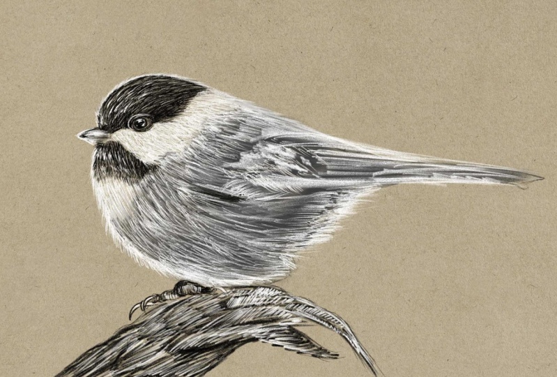
2. A Bit of History: This class will focus on these lovely black
cap chickadee, which is a tiny songbird
that lives in the Woodlands, pods and suburban areas throughout Canada
and North America. One of the most
distinguishing features of black cat chicken is, is that peculiar core, which is used for communication and territory establishment. These adorable young birds
are characterized by the black cap and be white cheeks and
great wings and back. But before diving
into the lessons, Let's go back in time and
then examine the work of the great masters
of the past and how they use the black
and white color. These amazing drawings
demonstrate the use of a pencil dealing
with only one color, the one coming from the pencil. For Eastern's consider this
magnificent drawing by Giovanni Bellini and
Italian Renaissance painter from paddler near Venice. The artist used the pencil to define the shapes, the volumes, and the shadows of the subjects, leaving the bright areas
and colored because the paper is used
as a bright tone. Another example is this paddy
by Antonio, she's ready, which demonstrated
that all shades up provided by a single color. Although the concept
remains the same, we can modify the color
and opt for a sanguine, as in the case of unbranded sad, or at a famous islands here. But what happens if we introduce a white
color into the mix? Something truly unique,
if not magical. Let's take a look. Now at other Vinci
created this study were only two colors,
black and white. Or contemplate this work
by other actuators, which depicts two hands joined
in prayer, was her beauty. What the most prominent
French neoclassical artist, Jacques-Louis David, who did the study for Lusaka
mandatory pass. So we can see that by
using only two colors and considering their fat calories
coming from the paper, we can create something
breathtaking. By the way, if you like
these kind of tone papers, you can download them for
free going to this link, which is mostly to the angeles.com
forward slash courses. So that was a bit
of history that can support our journey
into this class. In the next lesson, we're
going to do a couple of small exercises in order to stretch our muscles and
get ready to begin.
3. Pencil Exercise: So before we get started
on our acuity birth, we want to undertake a
few minor exercises to familiarize ourselves
with a couple of pencil techniques
that we'll be using. In general, there
are two methods for generating
shades with pencils. The first is about lying
and degree of pressure, and then releasing it in
order to produce a gradient. Therefore, use more pressure in darker regions and less
pressure in lighter places. It's important to vary the pressure and
build up the shading by adding layers of pencil strokes when
using this technique. The second technique is
called crosshatching, which involves drawing several overlapping lines
in various direction. The technique involves applying
consistent pressure to a series of parallel
lines, a specific angle. While we created the
initial layer of lines will need to change
the angle slightly and add a second layer of
lines that cross over the first that we change
the angle again, head keep adding layers of lines until you achieve the
desired value and picture. So these are the two
primary ways for drawing with pencils
is the a, B, Cs. Or if you compare sketch
into playing the piano, these techniques I
equivalent to the scales and it's essential that you learn it otherwise, how
could you play? Another quick exercise
is to draw a little line starting with some
pressure that is gradually eased at the end. This is excellent
for making hair, grass or anything else
that will require, such as treatment, like
the subject of our class. So try them out. And just to put things
into perspective, when I was 14 years old, I ended in an art
school in Rome. And I was super excited, ready to recreate some kind of Agile Michelangelo
masterpieces. But for the first four months
and every beat four months, we only drew lines, just lines. And that is the amount
of time required to become familiar with
a new techniques. We now ready to dive into the making of art
black cap chickadee? Let's have a look at that.
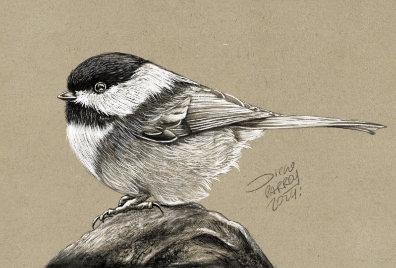
4. Setting Up the Canvas: Okay, so the first thing we need to do is to download the reference image and the sketch that are included with this lesson. So let's import the drawing. If you go to the resources tab, you can find the document that we need to download. Click on the file, then click download, and wait until it's done. And after that you can launch Procreate. And once in the gallery, you can select import and navigate to the download folder. So now we're ready to begin. I'd like to thank Aaron J. Hill for taking this lovely photo and made it available for free on Pexels. So thank you Aaron. So let's get started. What do we have? We have the toned paper, which is this layer here, the photo reference of the bird, which is just a diesel of the main image, and the drawing. The first step is to choose the brush that we want. So if we go into the sketching library and search for the peppermint brush, we click on it. And once inside settings, we want to click on drawing pad and then reset all brush settings. And if we do so, the brush will be reset to its default settings, meaning that we are all having the same brush settings, so there will be no inconsistencies. Now we can switch to black, which is in the corner, and just make a few lines to check the size of the brush. So this is too big, and this is not something that we want. We want to reduce the size to around 15%, and I think it's fine. So now that we know that we're happy with 15%, well actually it's 14, but let me set this to 15. We can click on the plus sign in order to save the size. Okay, so we can undo that. Oops, one too many. Now we want to create a new layer and rename it into black pencil. And this is the way we set up our document. In the next lesson, we're going to officially start drawing our chickadee bird. Let's have a look at how
5. Black Pencil: Okay, so now we want to
paint this dark area here and this dark
area of the hair. So we're going to
start from this. So with the peppermint
brush selected, we will just simply start
doing something like this. So you can see that the
lines are parallel, then not very long. This is a juvenile
chickadee, a young bird. And as a result, even the feathers
are rather short. And you can assume that
like young chicks, they cannot be is fairly pure. You can move this one a
little bit like that. So you also want to
always double-check. You select the correct layer. You take some time. I mean, we don't have to
rush through the process. You can slightly change
the direction of lines, kind of likely crossing each other as we did in the exercise. Now we want to go
under the beak. You want to imagine there is
some casts, shadows there. I'm applying some pressure on the screen as we practice in the exercise and trying to
build up the shading and turn, both of which are
very important. I don't even want to go into the white area is
yet right now I just want to define
these tiny feathers that pop out from
the white portion. So this is what I want to do. As you can see, we have a few
feathers, the spring out. We do that later.
For now that we want to just establish the
right shade and tone. You can see that is similar to the grass exercise in that it requires a lot of strokes
and build up and takes time. It is perfectly acceptable
to spend one day, two days, or three
days on a drawing, because there is a t equal
amount of time needed to produce something days
convincing and appealing. And I believe this
is nearly finished. We'll continue to polish
this section later. Now we're going to do this. In order to do that,
It's easier if we rotate the
composition and we can probably move the foot
reference to beat like around the same
level, so it's easier. So we want to make sure we
select the correct layer. And as you can see, the flow is traveling
in this direction here. You see. So we want to preserve
the current flow. I would start here. And first and foremost, I want to build a
flow guideline. And if I do so, I feel
more confident because I know I'm directing by
the feathers will flow. You can see here at
the top of the head, there's a curve that want
to make sure to follow. As you can see, I'm essentially creating a fairly
uniform undercoat. Only the feathers
indicating the direction. The pressure against the glass
is rather consistent here. Let me move that. We can probably put this on top of the drawing so
he's getting clear. The area around the
eye is really dark. We want to go to that
type of blackness, but still following the floor, even if he's going to be really, really dark and you can't
see the individual feathers. And this is because we want
things to be consistent. And this is a very
important aspect. And now it's really,
really dark. But I want to imagine
how the feathers would behave so that I can change
the direction accordingly. So you can see that
it's quite dark towards the lower part of the face
and lighter at the top here. And we want to roughly
replicate the same thing. I want to go back and add a bit more definition
around the eye. I'm applying the
degree of pressure. And here I want to go
back and do it again. I really like this brush, I believe is really organic
and is a great field to it, rather than on graphite, pencil is more like a
colored oil-based pencil. Here I want to follow the shape. You can see that the
rim here is brighter. Therefore, we want to
keep the aspect which is essential for the achievement
of our lovely chickadee. So you can see that I'm
modeling this area here. There's a bit of a dark strip. So that's what we
want to do now. Again, I want to define the correct format for
these darker element. Towards the end, we've
defined the perimeter with some individual feathers
popping out from the main body, from the main silhouette head. This is something
we can do later on. For the time being. We want to make sure that we represent the fact that these bird
is named Black kept, which is correct because
of the dark mass of black feathers
that form the head. So we'll keep this
process going on for a while until we get
to the correct shade. And if you get tired, you can take a break. It's perfectly normal
to become exhausted, especially if we don't practice
this activity very often. Since this is tough
work for our hens. In each surely stretch and train some hand muscles
and get used to it. As similar to how when you go to the gym for the
first style and it was sold the next day with
Alyssa amount of activity, it becomes the usual. So it's the same for
drawing and painting. Often can get into
a desired effect. You can see that I change
the angle slightly, which is what occurs
in real life. You wouldn't have all of these
feathers exactly aligned. Going to retain the outward. Grab these and move it. You might want to
deselect these, otherwise you get
a beat too crazy. So you can do snapping and then de-select this function here so you can move it freely me. So let's put the photo
here, re-select our layer. And then we want to
work around this area. And then you can see
that the Fed is C. I go everywhere, in every direction and
they have very short. And to reflect this aspect, we can do these. So you can see that I
make a large number of very small strokes,
fairly short ones. And here they would move
towards the upside, concentrating and
nesting near the peak. It doesn't have to be an exact
reproduction of the image. Our purpose is to
learn the method, not to recopy the photo. So we have complete freedom. Now that everything
is mostly finished, I'm probably going
to want to come back here and paint upside down. And when we paint
the white hair, everything will make sense. Now, just to make
things clear up, Let's do Elizabeth,
these pebbles. We can do this. You want to the Press at the start of the stroke
and then let go. You see you only want to break the uniformity some
strokes or lighter, or the strokes are stronger. Or you want to produce
something like this, which looks natural and fair. So I want to reinforce this
area at some shorter strokes, some longer and taper
off some of them. Now, we want to
do the same thing for these feathers here. So press and release. Press and release. You want to slightly change the direction
of the feathers. This could be enough. In the next lesson,
we're going to paint the beak and the eye.
6. Black Pencil - The Beak & Eye: Okay, Now we want to do the big. In order to do so, we want to create a new layer. We can rename it into beak. I want to place the
photo reference closer. Select the correct layer, has switched to the
peppermint brush. So you can see that the
newer portion is black. They some darkness
behind the feathers. And there's also some shade and reflection on the very top. Now we're going to start
from the lower part, and I'm going to apply
a very small pressure in order to achieve some fungi. These, if you've very gentle and keep adding strokes, you can really
generate some shading. It's really very
little tiny pressure. You also want to leave the
edge of the upper beak unpainted so we can concentrate a little
more on that later on. Again, you want to
keep it as soft as possible as you don't
want to press too hard. You can change the
direction slightly. You can tell depends slightly. If you do this, you're going to get these spot. If you do this, you're going to get this. Obviously this is a bit extreme, but if you tilt the
pan a little bit, you can get something like this. So that's what we want to do
for this area of the big, we want to tell
the pens lightly. It can be a bit tricky, but we here to learn. Now I can move the reference, select the beak layer, select the brush tool, and then keep painting. I want to reinforce and
define this value is more but rather the important
feature of our chickadee. And now we can move to the eye. So once again, I can reposition
the reference picture. I'll create a new layer and
rename it into I d I is the same story with the
big let me put this one on top of everything
and move it just around there so we can match
the level of details. You select the layer again. You can see that the lower
part is rather dark. There's some reflections, some whitish elements that
we can do later. First of all, these are very
black ring all around it. Here. We're going to do that
because it would be easier to identify the
eye shape once d, f, g is defined. These are very dark
green, very intense. Now I want to improve
the definition of d I, by cleaning up the perimeter, being careful not to
make the two circular, as is now a perfect
circle, as you can see. Realistic illustration, it's
soul about the details, especially focusing on
all the many aspects, the various bits and components and understanding
out things work. So going down to
explore nature and the beauty behind it is
a beautiful journey. And I'm completely fascinated
by all natural phenomena. Right? So we can some
sort of eyelashes. There are tilting
depends like I want to avail Lisa on Mount of
color around the ring. So you use very
minimal pressure here. Now it's starting to define what's going on within the eye. As you can see, the lower
area is quite black, but in the upper
part of the eye, we can see some reflections. So we start by establishing the boundary between
the two pounds. That's when it's blocking
off some reflection. An important
consideration is that eyeballs up always wet, whether they belong to animals or human beings, they are way. And as a result of this, they react to light
extremely differently than skin or in
this case feathers. In fact, you can see that
there are several reflections. And this is what makes a nice, fascinating and attractive. I want to add another
tiny layer of color to the upper
region of the eyeball. And in fact, we can detect set and reflection that
can be so in feathers. But that might be
difficult to say for sure. And probably clean up a
little bit around here. Then we're going to reinforce
all of these areas. But for the time being, we want to just calibrate
the amount of color. So you can see there's
a very fine ring and mine is at the moment
a bit thicker than that. I think it's fine. Again,
it doesn't have to be an exact replica
of the fighter. That's not our mission here. I think I'm quite pleased
with the results. So in the next lesson, we're going to add
a mid tone color.
7. Mid-Tone: Okay, now we'll focus
on the meat tone color. So we can see that we have this meat tone color next
to the white region. And these can be perceived
as gray feathers. We're not going to pay in all the details related
to the feathers, otherwise it gets
too descriptive. We want to define this error first before doing
the white area. So let's do that. We want to create a new layer
and rename it into midtone. We can probably
move this one here. It goes on top, but it
doesn't matter because we want to focus
on this area here. We can see that in the drawing
we've got this line which defines the connection where the two kinds of feathers meet. We starting by adding this, we're not going to paint the entire there's you
will take a few hours because these level of t that is rather complicated
and time-consuming, we simply want to
focus on the hat, but the principle
remains the same. So in this class project, you can finish the
bed or make your own, but do anything you want. But for this class we're
just going to paint the hat. Another important aspect to remember is to keep
an eye on the floor. As you can see, I'm
turning the angle of my brush strokes to create a continuous flow
for the fibers. We can say that we
could stop about here. So all we need to
do is to produce a nice and convincing
transition which is essential in achieving
an effective drawing. You might see that
the band least wiser. But anyway, I want to put down some strokes and I
start another pass. I can probably connect the
meat tone to the black fibers. You can see that I'm not
applying a lot of pressure. I just have to be consistent
with a lot of patient. I'll be able to get
the desired effect. We should not forget
that creating a good drawing takes time, and that can be a few
hours or few days. And there's nothing
wrong with that. It's absolutely normal
is true that today with the use of artificial
intelligence playing around with
problems like Meat, Joy and New Delhi. It's possible to generate
images from text or better known as
prompts for Eastern. See if you feed
week journey with a prompt that sounds like acute chickadee bird sitting on a branch in the style
of pencil drawing. The AI, artificial intelligence would come up with
something like this. Sometimes the result are
questionable because DAI is enabled to make a perfect interpretation
of your thoughts. But some other times, the result assembly style. In a few years there would be significant changes
in the field, but that should not discourage
those who enjoy drawing as nothing can replace
their personal experience. It's true that technology
is advancing rapidly. Individuals are still free
to pursue their passions. Personally, I found in both drawing and
painting enjoyable. And I don't believe
that technology can fully substitute for
these activities, but it would be very
interesting to see what the future holds
in this regard. So we can see there's a
bit of movement here. I believe I would
like to go over the white area with
the meet time. Specifically, I
would like to apply a subtle transition by going
over it with a light touch. Let's make a small password
shift this effect. Let's move this lively
to be on the way. Let's do this. Regarding the Fed is here, they appear to be short
and turning slightly. I will have to handle
this delicately, so they blends in seamlessly and nothing
sends out to merge. If we hide the reference
picture for a moment, we can try to visualize
the feathers in our mind and imagined
how they overlap and cast shadows or one
another is likely that we can see create a cohesive image by following our mental image. And this is facilitated by the fact that we
establish a flower. So we know roughly where
the feathers would go. Okay, Now we want to
do the same thing. Here. We want to go down
following the curvature of the belly is also true
that as I said before, this region would
be filled in white. Are we really want a
consistent look at undercoat where
the white feathers will be painted on top. Just for reference, I want to
darken this area here where the wind is located by
increasing the shadow here, the image we'd make more sense
and look more convincing, overall, unsatisfied with the
current state of the image. So I can stop here
with the mid-tone. In the next lesson,
we're going to the white pencil and
everything would come to life.
8. White Pencil: Okay, so what do we have here? We've got the meat tongue, the eye, the beak, and the black pencil. Now we want to paint the white
area of the bird so we can create a new layer and
rename it into white pencil. We have the peppermint
brush selected, and now we need to switch
to white. On the new layer. We just want to try the brush. And this is exactly
what we're looking for. This is the same brush
size as the black pencil. We can undo that festival. We can probably define
this area here. So you want to make sure you
are on the correct layer. And very much live
for the black pencil. We're going to do this. Then we start by applying the first code of white all
the way down to the belly. And like previously, we
want to gradually build up the shading is a kind
of progressive treatment, but we can reinforce
some specific areas. In my opinion, the combination
of the tone paper, we both black and white pencils
is beautiful and elegant. This is a rather
classical music. They can produce some
stunning results that stands out brilliantly. I'm applying a bit
more pressure here as this area
represents the chest. And this adds an
interesting visual aspect of the overall look
of the subject. I never had the chance to see a chickadee bird in
person since they are mostly found in North America and in Canada and
now even the UK. I'll have, I've been
fortunate enough to visit North America a few times. During one of those troops had the opportunity to
visit Yosemite Park, which will simply breathtaking. Despite the UK stunning scenery, which includes many
would demand regions and a variety of bird
species that live in North America is
much more diverse in comparison to what we have
here in Europe and the UK. Okay, now let's do this. I want to transition from
an area to another one. Again is nearly over
the black feathers because in fact they are
physically over them. Towards the end of the class, we start refining our illustration
using a smaller brush. Even though for the time being, I'm happy to describe the
details in this manner. It is essential to concede that they're
achieving realism in our illustrations
requires time and practice is not feasible
to expect to create a realistic illustration in just 30 min and to learn the technique in the
same amount of time. So one doing here, I'm adding some white strokes or with a mid-tone
we did before. Now it's time to
paint the upper part. I want to start by establishing the flower so we can
have a guideline. We can find that for
our peace of mind. And once the flow is set, it's easier to keep consistent. The feathers appear
to turns light via to conform to
the wing shape. I want to establish the separation between
black and white. Let's try and move
this one a little bit closer or even a bit bigger. Now with some shoulder
strokes then before we want to start the
definition of this area, bein patient is
essential as it takes time and it's important to
appreciate the process. I'm trying to nest these
brush strokes here. We need to consider
the fact that the closer you get to the beak, the shorter strokes should be. This is an important aspect
to take into account as we aim to achieve
accuracy in our work. A scientific illustrators
job is to the people in Asia in the most accurate
and truthful way possible. The thousands of publications
from their past in which scientific illustration
was employed to visualize and categorize various
elements such as shells, starfish, phone guy, minerals, birds, and virus,
animal and species. Hundreds and hundreds of books have been produced
over the centuries. Browsing through them is a
fantastic way to get inspired. Normally, I believe
that these artists are entirely unknown or forgotten. Nobody knows who they are yet. We have to believe
that they spent an enormous amount of time
creating this drawing. Something they could not
have done a single day or single week by a months and
months of a heart work. It's rather fascinating. I encourage you to go view
these illustrators work because they really created
silence what it is today, because everything originates
from these early studies. And they'll week technology, the knowledge became
better and better. But we must not forget the work that has
previously been done. You can see a sort
of I need under the eye and that's
what we want to do. Warm to some short
feathers here. And better define the boundary
between the two areas. I also want to prolong the white feathers towards
the back, near the wing. Feathers here start
our extremely short, but gradually they get longer and longer and we will
do replicate that. But we want to mimic
that clumping sensation. Now, I want to slightly change the orientation of
the brush strokes. Let's do the area
close to the beak. I want to move the
reference image next to it. So very short feathers, very young feathers also. I've continued with this kind of treatment all around
in this mode, Harriet, the eyelid again, I want to
add some very short strikes. And I think this is enough
for what we want to do. In the next lesson,
we're going to add the white color to
the beak and the eye.
9. White Pencil - The Beak & Eye: Okay, so in this lesson
we're going to paint the beak and the eye
with a white pencil. Also create a new layer that we can rename into big white. We can see some lights here, and then a stronger
reflection there. So let's move this one here. So it's just next to it. So we have to select
the appropriate layer. And I will start slowly adding
this color around here. I'm literally
caressing the surface of the glass very gently. We can see the slide
as shape here. And then we have
this bright light, which is something
we want to do. There's a slight curve here, almost like a hook shape. And then we can splash of light. We can probably reinforce
some bits here, but generally speaking,
that can be enough. We can possibly at some little
nosing around the bottom, like if it was a
reflected light, this is not in the
reference image, but I feel inclined to do so. And I think this could be
enough is quite convincing. Now, I can paint the eye with a white color and we also want to create a new layer and
rename it into eye white. And very gently as
we did for the beak, we want to define the ring
surrounding the eye first, very delicately,
very, very gently. You also want to break up
the line a little bit. You don't want a
continuous line, or you do want to adjust
the pressure to concentrate a little more color in certain
spots and not in others. As a result, the
composition will have a sense of movement
and dynamism. With the addition of
the white-collar, everything makes
sense that why it has these amazing power of
bringing everything to life. Now here, this is where
the strongest light is. So we can basically add some
color around this area. You can see that it did this
with only a few strokes. So it wasn't difficult. It's not even a lot of work. As I said before, you can see a sort of dotted
line here is not continuous, so I want to do the same, but most importantly, I want to emphasize a bit more here. I believe this is enough. In the next lesson,
we're going to add some details with white pencil.
10. White Pencil - Details: Okay, now what we
want to do is to make this fair this here, we can re-select the
white pencil layer as he can belong to that. I want to define to add
some definition on the cap. Something similar to this. This is not necessarily
in the reference image, but I think I want to treat
the area in this manner. I'm just painting
some highlights along some of the feathers. Then I wanted to go over
the white feathers. So we've got something
similar to this. I think I want to
increase some bits here. As I previously said, I am is not to create a photo realistic
depiction of the bird. Rather, we are specifically seeking a black and white
pencil illustration. In my opinion, these
approaches suitable for destroying and I consider it
to be a good representation. We may consider adding small
details here and there, but we should be mindful
not to add too much as these areas intended
to be the darkest. I'll have a few extra details, even if they're not
present in the photograph. For instance, high hidden
the photograph on purpose because I want to rely on
my instincts and emotions. Nevertheless, it is
crucial that we exercise control and not to go
overboard with details. Overall, this could be an appropriate treatment
for this area. And never forget that
you are your own charge. Now we want to do
the same thing that we did here, around here. So we can continue
on the same layer. I just want to have a
look at the reference to see what sort of
description days. And you can see there's
something going on here and not too much. And I think I want to
carefully define the spot with some small nefarious popping
out from the black members. And I want to do the
same thing here. Just a tiny bit to Sadie. Something's going on. Since light is reflected
in different directions, it can produce a
variety of views. And gradients are
job-based painters and illustrators is to notice and understand these variations. Before we can effectively
portray what we see, we must first be able to recognize and
comprehend what we see. Then I want to make
these short strokes having small feathers
with a thin their teeth, they taper off starting
for thicker base. So I think we can do
a little bit here. So we can imagine
something's going on. There is not completely black, even if the father
is fairly dark, but that's what we
want to achieve to get a similar effect
of the black part. I will do come here and
add some more definition. I can hide the reference. Just a few final strokes for Houston's here that
goes towards the belly. Want to play with the
amount of pressure. But overall, I can say that I'm satisfied
with the result. So in the next lesson, I'll show you a really
handy approach for adding definition
without a lot of effort.
11. Trick to add Definition: Okay, Now there is
a technique that is not possible with
traditional mediums, but it's common practice in the amazing world of
digital painting, duplicating an existing layer. So if I choose the black cap, I can swipe left and
select Duplicate. Now you can see the difference if I hide and show the layer. Because when it's visible in becomes more vivid and intense. If you think that is too much, may reduce the opacity of the mayor to a percentage
that works for you. You may case can be
around 50 per cent. He's not a huge difference, but more subtle, I would say. Then to merge two or
more layers together, I can pinch them
into one layer on. I can also do the same
for the mid-tone layer. So I can swipe left and
then duplicate key. And now you can see there is more work than what
you actually did. Again, I can reduce the opacity slightly and then
pinch the layers. This doesn't really work with the white feathers because
if you duplicate the layer, the picture becomes
a little too rough and you miss the delicacy
of the white feathers. So I wouldn't use
it in this case. As always, it all comes down to how you
envision a picture, your particular taste and
your sense of beauty. You works well with
the black feathers, but not really with
a white feathers. I can probably do the eye, so I'll duplicate the layer and probably reduce the
opacity quiet B. So I can pinch them
into one layer. That was a way to increase the contrast and the
presence of your artwork. In the next lesson,
we're going to refine our I work with a black pencil.
12. Refining with Black: Okay, Now it's time
for some detailing. What we want to do is to reduce the brush size to be
about six per cent. Then we can save it. Let's check the brush. You can see this
clearly in them before, which is exactly what
we need for this task. So we can create a new layer and rename it into black details. With this smaller brush, we only want to define some little paths at
definition here and there. And the quality
will benefit from this process even if it's
not absolutely obvious. But trust me, the detailing
phase is stereo important? I want to change the
orientation of the brush strokes as I want to
ask some dynamism. So we can increase the
detailing around the eye. Maybe some smaller
feathers that are not following the flower
trying to escape. I will also break up
the silhouette of the bed by adding these
verifying feathers. Want to Bethsaida find the cap, define the area around the big. Next we'll do the same
with the white pencil, and we'll be able to complete our naturalistic illustration
of the chickadee. So looking at this, I think that could be enough
dealing with a black pencil. In the next lesson, we're
going to do exactly the same, but with a white pencil.
13. Refining with White: Okay, Now we're going to refine our chickadee with the
same brush settings. We can swap two y and create a new layer that we can
rename into white details. And now we simply want to do
the tips of the feathers. Also breaking up the silhouette with some feathers popping out. You may not be able to see it, but I'm absolutely adding
color to the paper. Now what's more definition
around the beak? Next, I want to add a coat of paint to soften the
black feathers. I simply want to
brighten up this region, giving the impression
there's a mix of black and white feathers. And this could be enough. We can probably call
our illustration done. In the last lesson, I'll
teach you how to organize the layers and applying
as managing effect.
14. Blending: Okay, As a last step, we want to add as much in effect and also tied
up the layer stack. So in order to
select the layers, we can swipe, right? And then we can
select the layers. And then we group. You can close the group and
rename it into illustration. We can probably delete the reference images
at this point. Now you can duplicate,
then tie group. You can flatten the
layers into one. So basically if our
high the group, I've got the entire
illustration into one layer, or you can do is to swap
to the blending tool, go down to charcoals, and then select carbon stick. So if you take the
carbon Sick and reset all Brush Settings, you have some full like this. I want to reduce the scale
of the grain and Lisa B. And then press down. Using these cannibalistic,
we can reduce the brush size by around three
per cent as much or blend. Well, we painted, we're going to lose
all of the details and almost everything
we've done. But that's the point
of this phase, is to create a basis
of blended colors on which the black and
white pens who can seat. So let's hide the
drawing as well. So I'll keep working on
this constantly going with the flow since we want to
maintain a consistent look. And then you can decide
if you like it or not. It's a lethal of trial and error until you're satisfied
with the outcome. And it's not uncommon to discard something because
it's not convincing. When you've done with this, you can place the layer
underneath our group. When you show its visibility, you can see the fields, the illustration a bit. It's not a massive difference, but it can help in
some circumstances. While I normally do is to reduce the opacity of the
blended layer, it could be neat way until
you think it looks best. So I can reveal the
drawing and change the name of this
layer to undercoat. And that's all. The next lesson is the class project
in which you can paint the complete bird
using the approach shown so far or any
other subject you like.
15. Class Project: Hello and welcome to
our final lesson, which is all about
the class project. For this project, you have
the freedom to complete the adorable chickadee using the technique and workflows
covered in this class, I'll create something
entirely different, whether it's your beloved pet, your child, some
beautiful flowers or anything else that holds a
special meaning for you. The choice is yours. I'm excited to see
how you incorporate black and white colors
into your artwork. I encourage you to
share your creations in the review sections
of this class. Regardless of whether you are seasoned artist or a beginner, sharing your work is an excellent opportunity to appreciate each other's talent, provide feedback, and
learn from each other. Feel free to connect
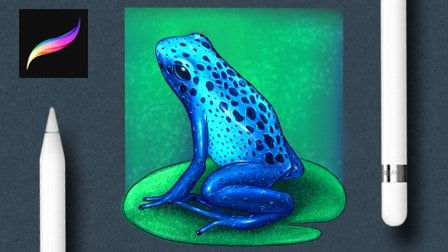
to my other classes where you can download the drawings that I provide with the lessons such as flowers, a frog, mushrooms, as now, even a portrait or
Sean didn't reveal. So let's get started and
create something amazing. I hope you found this
class informative and valuable in achieving
your artistic goals. And keep in mind
that learning is a continuous process and the knowledge and
skills you gain from this class at just
the beginning. Thank you for choosing
to take this course, and I wish you all the best. Bye bye.
 Maurizio De Angelis, Scientific Illustrator and 3D Modeller