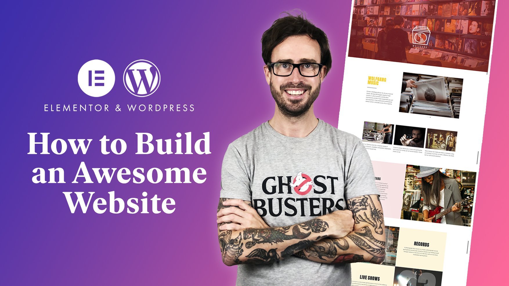
Transcripts
1. Introduction: We are all creatives here. We all have huge talents, and we all need an
online portfolio so that we can show the world
these incredible skills. Maybe you're a photographer, or an illustrator, or
a graphic designer. Either way, your portfolio
should come from you. It should show off
your personality. If you're using Wordpress, you can start with a
pre built template, well that's going to lose all
of your own personal style. If you start with a
blank page though, anything you want to
happen can happen. We could do all of that using
the elemental page builder. So let's have a
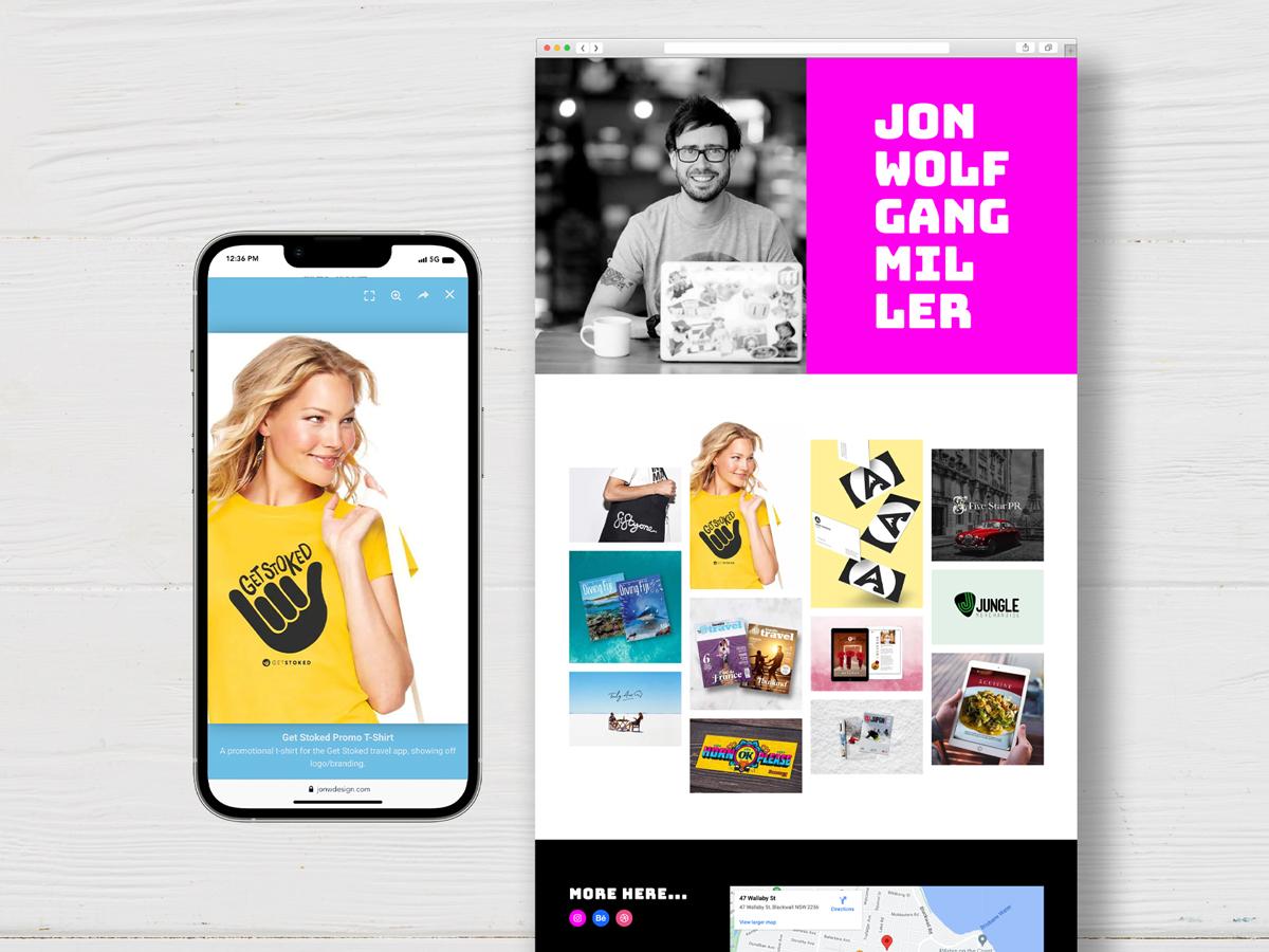
look at that one. I'm John Wolfgang Miller. I've been a professional
designer now for 20 years, and I'm here to help you
build your online portfolio. Wordpress can get a
little bit complex, especially if you have
never used it before. In this class, I
will teach you how to use the Elemental
Page Builder. That's an online program where no coding
knowledge is needed. It all just comes down
to creative design fun. At the end of all of this, you will have the skills needed to create your own portfolio and give it your
own personal style. And therefore, you will have the most awesome looking
website in the world. Go make yourself
a cup of tea and sit down with me and
let's get started.
2. Class Project: Your main project
here today is to create a single page
portfolio website. We are only going to use the free version
of elemental here, so you can learn
a lot about using this program without
having to pay anything. We will then start with
your opening hero section, showing off who you are and
what your portfolio is about. Then we will take a look
at your image gallery. I will show you how to set up a very cool gallery display and also talk you
through elementals, animation options, and
the image light spots. When that is complete, you will make the footer
section of your website where you can include any
contact or social media links. When the desktop version of
the website is complete, I will show you just how
easy it is to get everything working perfectly on
both tablet and mobile. Follow each lesson one by
one and see if you can build up each part yourself before moving on
to the next one. If you would like to make
the exact same website as I am making here just to
build up all your skills. Or you can download
the images I am using inside the
resources section here. Download this whole file and upload everything to
your media library. Or if you now feel comfortable
enough with elementor, use your own images and show me your own cool portfolio
with your own cool style. In this class and in
all of my classes, I will be covering a lot of different things and showing
a lot of different skills. I recommend as you go through to play and pause the videos. And if you need me to repeat
any part of this class, just press this
15 second button, enough time so you can just
rewatch that whole part again if you're having any problems with
the video quality. You can see here in Skillshare, we'll just come here and click
on this Cog settings icon. It is set to auto and depending
on your Internet speed, it may not show up at the
highest quality possible. Just try changing this to
either 720 or 1080 pixels, and you will instantly
see a big quality change. When you have finished
the whole class. Make sure you upload a link and a screenshot of your website Up here in the project section. I will give you my
feedback straight away. I also love getting reviews
from all my students to see what worked best
for you in this class. Come in here and leave
me a full review. Okay, let's get started.
3. Technical Set-up: Here we are at elementor.com. This is the place you
would normally come to to get started with Elementor, even with the free version. You may already have
everything set up. You may already have
a hosting service, and you may already have
Elementor installed. If you do, you can just
skip to the next lesson. However, I recommend
sticking around for a few minutes just
to make sure you have everything
set up correctly. For this class, we are just using the free
version of elemental. Unfortunately, when
building a website, you also need to set up hosting. Hosting is basically the company that stores your website for you and Elemental offer
this service themselves, however, there is a monthly cost involved with setting that up. If you hover up here
to where it says hosting and click Hosting for WordPress, you
can find out more. This is the service
that they offer, and as you can see, it starts
at just 299 per month. So it is very cheap, but it is still something you
need to pay for. If you click C Plans, as you can see, they have
different packages for this at different prices based on
the size of your website. But there is no free version, unfortunately,
available in Elemental. However, there is
another service that does offer free hosting. And for this lesson, I recommend
using this just to get yourself started without
having to hand over any money. This is WozMA. This is the free hosting service
that I recommend. It's very easy to use and
can remain free forever. If you give this one a try
and it does not work for you, just take a look at
the about section and see which other services
I am recommending. So come to this website. The URL is Wosma dot IO, and then come up here to
the top where it says solutions and choose
hosting for WordPress. Then when you see this page, click over here, it
says Deploy for free. You'll come through
to this page, and this is where you can
figure your Wordpress setup. And I'll run through
each step here, but it's very easy to
understand anyway. First of all, app
name here at the top. It's already generated a
name for you that is unique. But you can write your
own name in here, so I'm just going to
call it Wolfgang. Then server location. You have two options Belgium
and the United States. Pick whichever one is closest to the country you are
setting up the website in. Then click down here where it says Configure your
Wordpress site. And let's give our site a title. Again, I'll call
this one Wolfgang. Language is English for me. Then Admin user name and admin
password and Admin email. This is where you are setting
up your own unique login to the back end of your website. So in here, I'll
write in my name. In here, I will enter
my own password. Then I will add my email at the bottom and then
click Deploy now. You'll come through
to this page. Your website is already set up, but as you can see
at the top here, it says your site will be live for 1 hour to keep it online, create a free account. You don't have to do this if you do not want
to keep it live. But if you do, I just recommend clicking
on this button here, sign up for free and
signing yourself up for a free
account with WozMA. I'm using the same login details here as well and clicking Signup So you now have a free
account setup inside WozMA, and this is where you can access your WordPress dashboard and
get started with everything. Your domain name is up here, and this is what you
entered on that first page. That may not be the domain name you want to use
for your website, but for testing and
setting up your website, we'll stick with that for now. If you would like to
add a new domain name, I will show you how to
do that at the very, very end of this class. But for now, we'll
stick with this one. So to get in and start
building your website, click up here where it
says WordPress admin. And here we are now in
the WordPress dashboard. We can start building
everything from here. If you have never used
Wordpress before, I will talk you through
some of the basic setups. But the main thing to
know is that the menu for everything is over
here on the left. The first thing we need to
do is install Elementor. Elementor is a plug in. So to do that, come over
here to the left and hover over plug ins and
choose Add new plug in. Then in the search box up
here, type in Elementor. You will see the Elementor
website builder here, click Install Now and
then choose Activate. Then you'll see this page and you either need
to sign in if you already have an
elemental account or sign up for a new one if not. Just click this button
that says sign in and then either sign in here or click Create an account if
you don't have one yet. Then click this button
to connect the site. You may see this option
if you've already signed up for the pro
version of Alimental. However, we do not need
that for this class. We are just using
the free version, so you can even just
click, I'll do it later. Then Elemental will ask
you a bunch of questions, which you can
answer if you want, but it's not going to
make any difference to the site we're
building today. I'm just going to click
Skip and skip again. Skip. Then you will see this page, and this is telling
you to set up a theme for your website. To build a website
inside Wordpress, you need to start
off with a theme. We are going to use the
Hello elemental theme, which is basically
a blank theme, so you can build
anything that you want. So when you see these options, just make sure that hello on the left here is the one that is clicked and then click
Continue with this theme. Then elemental asks you
a bunch of questions to basically get you to upgrade
to pay for the pro version. But again, we do not need
that for this class. Just click down here, bottom right where it says
continue with free. Now you have
Elementor installed. So you will first of
all, see this page. It's created one single
draft page for you. We don't need to worry
about this page. However, it will ask
you this question. How do you want to start? Just click blank site over here on the right,
start from scratch. Then as we are not
using this page, just come over here to the very top left where you can see this elementor icon and click on this and then click
Exit to WordPress. Then you'll see the
wordpress editor. Again, just go top left and
click on this icon to exit. Now, we selected the hello elemental theme in that buildup, and that is sometimes
installed automatically. If so, over here on
the left hand side, you will see the word hello. But if it is not
appearing there, that means the theme
has not been installed. And if so, click on appearance and then come up the top here to where
it says add theme. Hello Elementor should be one of the first ones
that you see here. If so, just hover over
and click Install. If not, come up here
to where it says search themes and type
in the word Hello. And you may see a few
different options. Again, just scroll down
until you see this one that says hello Elementor
and click Install. Then click Activate. So if it wasn't
appearing there before, the word hello now appears
here on the left hand side. When you see it, hover over the word hello and
then click Settings. We just have to do one back end technical setting to ensure that our page is as
clean as possible. So when you see this window, click on this one up here that
says structure and layout. Then it will give you
two options here, and you need to
tick both of these. So first of all, let's disable
theme header and footer. And then let's hide page title. That just means we start off with a completely
blank page. There'll be nothing
there when you start building your website. And one last thing to show you come over here on
the left hand side to Elementor and hover over
Editor and go to settings. You will see a lot
of options here, and the only one we are looking at is this one over here on the right hand side that says atomic Editor. Click on that. This page will
explain a little bit more about atomic Editor. It's a new function
that elementor have brought in to help
you build a website. However, it's more of an
advanced builder service, one that can get a little bit technical and a
little bit complex, and one that we are
not going to look at at all in this class. So when you have clicked on this tab that says
atomic Editor, just scroll down to
this button that says deactivate and click this. Tick this box and
click Deactivate. And that's it. We've done
all of the technical setup. Now we can start
building your website.
4. Elementor: 101: So now that is set up, come over here to pages
and select all pages. As you can see here, a couple of pages come automatically
with the theme. We do not need either
of these pages, but that one is live. That has been published,
as you can see over here. So let's just turn
that off because it's just an empty page that
doesn't need to exist. So if we hover over
here on Quick Edit, you have a few options here, but the one we're
looking at is status. As you can see, it is published, and you can change
that to a draft. Now we're going to create
our own live page. That's very simple.
Click Add New. And you'll come
through to this page. This is the regular
wordpress editor. All we need to do here is
give our page a title. So scroll up here to
where it says add title and type in the
name of this page. Mine will be John
Wolfgang Design. And then scroll over here
to the right where it says, Save Draft and click that. Then come back over here to the left and click Edit
with elemental. Before we get started on
this part of the class, I just need to show you that
since I have made the video, Elemental have made some
tiny little changes to the menu section at the top. Everything I talk
about is still there. It's all just in slightly
different places. So I'll just show you now. When I've shown you the
site settings as being up here, it is no longer there. It is now in the drop
down menu over here, so just click on this button. If I have shown you the page settings in this cog
at the top here, it's no longer in the
center of the page. It's over here on the left
where you see this icon. And if I talk about
structure at any point, that icon used to
be on the left, but now it's over here on
the right, and that is it. Everything else is
still exactly the same. And welcome back to
the element or Editor. As you can see, we're using
the latest menu version. And it's always good
to just come in here and have a play around
with all of the settings in here just so you know where everything is before
you get started. I'll quickly run through each part of the menu
bar at the top here. First of all, this
element or logo, that's a drop down menu. And in here, we have
the theme Builder. Don't worry about that.
That's just a pro element we are not using today. History. Well, obviously,
if you make an error, you can go back to
previous versions and keyboard shortcuts. That's just telling you
all of the shortcuts to speed up the whole
process, I guess. Then the plus icon add element. This is where you'll
see all the elements, all of the widgets that we'll
be using on this website. And this drop down menu, that's set up into
different subsections, layout container and grid. That's what we use to start
building all of the elements, each section of our website. You've got your basics. You've also got
your pro section. Obviously, you can see a little padlock element on
top of all of these, but don't worry about that. We can't use any of these, but none of that is needed for anything we're
going to build today. We're just complete
using the free version. So we can close that part, and then you get all
the general settings, everything you're
going to need in here, image carusels,
testimonials, et cetera. So that's the elements. Then we have site settings. This is where you can
change settings that will work across
the entire website. So if you're building a website with multiple different pages, any setting in here will be relevant on every single
page that you build. Then if we close this one and then click on this
one that says structure, you get this little
pop up window. This used to be
called the Navigator. And if you're familiar with
older versions of Elemental, it was called Navigator. It's now called structure, but it does the
exact same thing. And I'll talk through that as we start building your website. And then next, this is
the responsive section. This is very, very important, and we'll come on to this
later on in the class. This is where we can select
different devices desktop, tablet and mobile. And then this one
here, preview changes. This is great because as you
are working on the website, you can click Preview Changes, and then you can see
how it would look for everybody else looking at your
website when it goes live. So that's everything. Now we can start building your website.
5. Portfolio: Hero: Let's start building the hero
section of your website. What I'm going to
show you here is how to do a full page opener. Scroll up here to the plus. Let's choose the flex box
as we want it. 50, 50. Let's choose this one of two columns that has
dropped in our container. There's just two things
we want to change here, the height and the width. First of all, the
height, as you can see, it splits here, but we want
this to fill the entire page. Let's just click on the dots at the top and make sure we have edits
container on the left. Then come over to this section where it says minimum height. Then this little drop
down menu over here on the right where it
says x in here, choose H. H stands
for visual height. This comes as a percentage in terms of the height
we want it to fill. 100% of the page. Literally, just
write 100 in here. You will see that has dropped every section down to the
very bottom of the page. We have our height sorted. Next we are looking at
the content width again, over here on the
left, as you can see, it is currently boxed. We don't want it to be boxed. We want it to be full width. As you can see over here, you have the sort
of dotted line and then an empty space to the
left and to the right. We change it to full width, it goes to the full
width of the page. You can, however, still see just tiny little
spaces in between. This is a default setting
inside Elementor, where it automatically
adds a margin or a padding to each container
that you put on the page. To quickly show you
how to change that, just right click anywhere on the page and bring
back the structure. Then choose the container in which you want to
take out the padding. Let's just go with
the main one here. Click on the top level here, the main holding container. Then come over here on
the left to Advanced. These are the two sections
we're looking at here. It's both margin and padding. They are set to the default
element or sizes, however, to take out that margin And that padding simply
put zero in here. And do the same in padding, As you can see, when
I change one of them, it changes all of them. And that is because
as you can see here, the values are linked together. If you ever need different
amounts on either side, just click on this
button to unlink them. And then you'll see you
can add different amounts, 50 at the top, 50 at the bottom, but still zero on
left and right, but we want zero over all. Then you can choose
to do that on all containers in here by
selecting them one by one. Now I'm going to add
three different things. First of all, I'm
going to change the background color
of the main container. Then I'm going to show you
how to add an image to the left hand side and how to add the text to the
right hand side. First of all, let's start
with the background color. Let's go to the main container over here in the structure. Then over here on the
left, choose style. This is where you can
change the background of this entire container. In terms of background type, you have a few
different options. Classic, that would just be
a straight color gradient. One color blending into another color or
video or slide shows, that's multiple images
sliding from one to the next. Have a play around
with that yourself. See what works for you. However, I want to keep this simple and just drop
in a classic color. I'm going to click on this icon. Now you have two choices. You can choose to add a color, or you can add an entire image. I am looking for a
color in this section. Therefore, I'm
going to come over to this gray box that is crossed out that is showing
no color has been selected. This is the color picker.
You can choose your color in here or you can manually
enter in a hex code. First of all, this one
up here will choose the color and this is the
opacity of that color. Let's set that one to 100% the color that is
selected in here. Well, that's black, that's
why it's gone 100% black. If I drag this one to
the left and right, it will give me
different options above. Now I'm looking for a
pink, magenta color. I'll drag it to this point. However, you can see down here, I'm still selecting the
black version of that color. If I just grab this little
icon and drag it up and down, it will allow me
to select around here and choose the
color I am looking. Because this icon is at the top. I can now play around
with this one. Just choose a color that really represents who I
am and my style. The other option is to manually enter a
hex code down here. You don't know what
a hex code is, or you need some advice
on picking colors, where to look for them. Leave me a question in the discussion section here and I will get back to you
as soon as possible. However, I have a
favorite color. What I'm going to do
is paste that in here. I'll highlight all
of the text in here. And then paste in my
chosen color, that is 00f. This is the color that I use
with all of my branding. My business card would
have this color. My logo would have this color. It's important that if you have a chosen color to be consistent. Now I'm going to add a background image for
the first container, the one over here on the left. Come back over here to structure and select that container. Now if you would normally
like to add an image, the way that is done as you
come over here to the plus, then you choose the image
section here in Basic and drag and drop it into the container you would
like it to appeal. However, there is a
problem with this. The image does not fill the entire space that we
have for this container. That is not possible, as it will be displayed
on different devices, at different sizes, et cetera. Let's delete that image, right click and choose delete. Then come back up
here to Container. Click on that. Then come over here on the left to edit
Container and choose Style. Make sure you're in
this background section again from background
type, choose Classic. This is where we're
going to choose an image rather than a
color as the background. Click here on the plus. I will click on here to select the file that I want to
upload from my computer. In this folder, I have
two images of myself. I would like to
choose this one here, and when it has uploaded,
just choose Select. As you can see, that has
dropped the image of me in as the
container background. Therefore, it fills
the entire container. Fortunately, however, the crop of it isn't quite right, is it? It's too big. So
it's cutting off half my face to edit that. Come over here to the left. Look at these
sections over here. Position, attachment,
repeat, and display site. First of all, let's
start with position. It's set as a default one, but this is where you
can choose the position. Whether you want it to be the
left, the right, the top, the bottom, I'd like it
to be in the middle. So I'm going to choose
center, center. Well, that's a very good start. That looks good then
in terms of repeat. Well, this means you
can have the same image repeated many times
inside the box. I don't want that. I'm going to choose no at
then from display size, this is the important one. You have a few options here. You can choose cover or
you can choose contain. You choose, that's it. That means you can
see the whole image, and that's why you have empty space at the top and the bottom. I'm going to choose cover
because as you could see, that has filled
the box perfectly. The image now goes
to the very top and the bottom of the page, and then the only split is
on the left and the right. However, I can see everything. I can see my face, I can see
my computer, my arm, my cup. It's all good, so I'm going
to stick with this one. Now we have that
done. Well, just a little tip for you here. I recommend just constantly
keep saving this as you go, because if your
computer crashes, you can come back to
what you've just done. You don't have to do
it again to do that. Let's just come over here
where it says Publish. Click on this little drop
down arrow and click Save Draft that's saved. Meaning if your
computer crashes now you'll still come back to
exactly what you've got. Okay, we have the left
hand side of our hero. Let's work on the
right hand side. Let's highlight this container. What we want to do
in here is add text. Let's go over here to the plus, let's choose heading, and
then drag that one in. Now this has just
dropped in already the default text to all
the default settings. You'll see over here on
the left hand side, Well, first of all we have the title, that's the text
that will appear. What I would like to
add here is my name. So I'm going to put in
John Wolfgang Miller. Next we're going to
choose the HTML tag. Click on this drop down menu, and you'll see H
1h2h3, et cetera. H stands for headed. This is a set up for Google
reasons, for SEO reasons. Meaning H one is the
introduction heading, the introduction
title to your page. And then further
headings that you have will follow
down below to you choose H two and H three if it's a subheading as this is the introduction to
our page is the main one. I'm going to choose H one. And a little tip for you
should only really only have one H one on the page and it should be the first
thing that appears. Any questions on titles, any questions on H
one headings and SEO. Again, pop that into discussions and I'll get back to you ASAP. Now we will take a look at the position of this text
inside the container. Let's come back over
here to the container, click on this one, then
you want to choose Layout. Over here on the left, we are looking at
Justified content, and we are looking
at Align items. First of all, justify content. This chooses where it
will appear inside the container it's
already set to start. We can choose the center,
or we can choose end. I'll just show you end. It's the very bottom
where we want it. We want it in the center. Let's choose that
then, a ligne items. Well, that means again, it's automatically set
to start at the end, that side or again in the
sense. Let's choose center. I have the position
of my text sorted. Let's click on the text again. Either choose Heading up
here in the structure. I actually just click
on the text itself. Then come over here to style. This is where we can change the way that this text appears. We can choose the
alignment that we want it to be left aligned,
centralized again. We can change the color, and we can change the
typography used at the moment, it's left aligned, and
I'm happy with that. However, the color, well, I don't want it to be black
on a agenda background. Let's click on this one. Let's just drag this little
icon up here to the far left that is going to
choose pure white. Pure white is always
represented with six, whichever color you have
selected down here, the far corner on this side, and that side will always be
pure white and pure black. Well, I want pure white. Next up, I'm going to
move the structure on over here so it's
not covering my text. Then I'm going to choose
this pen icon over here. For typography,
this is where you can choose everything you want about the typography
that is showing. You can choose the family. In here and you
can choose system. These are the basic ones
that you see everywhere. Google ones, the ones that
are free from Google. Then it just goes on forever. This really, there's possibly
other settings inside this, but yes, as you can see, there's just many different
fonts in here. We'll come back to that one. What I'm actually going to do is select one that I
already know about. This goes the same way as the color I have chosen
as the background. I have a chosen font that I use across my entire branding. If you would like
some information on where to find fonts, where to find ideas
for typography. Again, just message
me in discussions, however I'm going to
write in this one that I know and I know I love,
It's called Bunge. This is a great font because
it really represents me. It's very big, It's very bold and has this like
'80s style to it. With the text in a
solid white color, it works very well on top of
the bright Agena background. Let's choose Bunge. You have some other
options in here. This one weight, well, this is appropriate
if you've chosen one that has multiple
different weights, something like
Futura or Helvetica, they will have multiple
different options of thin extrate light. This one is just
one single bold one going to leave that as is as the default in
terms of transform. Well, you can choose
whether it would be upper case, lower
case capitalized. That just means the first letter of every word is capitalized. However, as you can see, this is already an
upper case font. I don't need any of
this. The only one I'm going to look at
inside here is size. It's too small at the moment, what I'm going to do is
just drag this one to the right and make
it a lot bigger. I think an about there is
how big I want it to be. I want it to fill a lot of
space inside this container. As you can see, there's quite a big problem
with that in that, well, it's too big to fit
inside the container. What we need to do here is
something which he works for, my style works for my name. I'm going to split up the
word a little bit to do that. I'm just going to
show you some very simple basic coding
things, I promise. No code, but this is a really simple one that it's
good for you to know about. Come up here to content. This is the title
that we have in here. What I want to do is
split up the word Wolfgang into two
words, Wolf and Gang. To do this, I just selected in this title box the word Wolfgang and Click
in the middle of it. All I'm going to do in
here is put in some code. First of all, on your keyboard, choose this bracket,
the pointy one, which on a Mac book is
down at the bottom light, choose the left hand side. Then write in these
two letters R and then choose the one
on the right hand side. There you go. You'll
see it has split up Wolf and Gang into
two separate words. However, well that's messed it around now have John and Wolf on the same line. How am
I going to fix that? Well, first of all, I'm going
to go to the words John and Wolf to take out the space that was
already in there and then add in another break. There we go. I really like that. That works really well now. John Wolf Gang Miller. I think even the word Miller doesn't really
split quite as well, but it's six letters. I'm going to put a little
split in between the L and the L. Again, same problem between
gang and Mill. Let's put a break in there. There we go, John Miller. That really sums up me, who I am and you know what? I think the display of
that works really well. Little tip for you here. This little arrow on
the left hand side, that's a great element or setting where you
can hide the panel. I click on that, everything
else disappears, including the structure window. Now I can see exactly
how this would look to everybody who
visits my website, because this is what
they would see. Now let's just click on the arrow again to bring
back all the tools. Then let's save it again. Up here on Save Draft, we now have a completed
hero section. Let's move on to your
portfolio gallery.
6. Portfolio: Gallery Grid: Now we're going to add another
section below the hero. Let's scroll down.
What we're going to look at here is two
things, containers and grids. It's basically going
to be a grid inside a container and then
containers inside a grid. I will show you how to use those different
elements and this will show you a very cool way of presenting your whole gallery. We're going to start with
a regular container. Click on the plus,
choose flex box, then just choose this one. A single column pointing deck. Then let's go up
here to the plus. Let's choose the grid
and drag that into the container. This is a grid. The way a grid works is you can choose the number of
columns and the number of rows in each column. It's always the
exact same width. It gives you a nice even layout. I'm going to go
for four columns. I want all of that to
display on one row. This is how my grid looks. Now what I want to do here is drop in a number
of different images so that I create a really cool display
grid that shows off a lot of the different things
I have done in my career the way you
would normally do this. Again, you'd come up here
to the plus and you drop in an image that would drop
an image into that column. However, if I then
try and drop in another image in
the same column, it won't sit in there, it automatically moves on to
the next part of the grid. You can only have one
thing inside each column. However, I want to have
multiple different images. This is what I need to do. Again, come up here
to the plus and choose a container and drop a
container in to the column. What you can see
here is a container inside a column of the grid that's inside
a main container. What this now means is
with this container, I can drop multiple
different images in there. What I'm going to do is delete these two images
that are here on their own. I will hover over
this pink icon, right click, and choose delete. Same on this right click. Delete. Now what I want to do is drop an image
inside this container, Over here to the
left to the widgets, drag the image and drop it in. Then if I want to add
another one below it, again, come over here to the plus, select image and drop it in. As you can see here, we have the little pink line that
is either above or below. That means it will sit
inside that container, either above or below
the image that is there. Let's just drop it in below. Now we go, we now have two images inside a container that sits inside that column. I think I want three
or maybe four images inside this container. I can just go up here to add element and
add another one in. But a faster way to do that, come over here to structure. We are inside the
container and we know that we have these two elements
inside the container. You can see it's
set up here with a little drop down menu where things in set to show
what is inside it. All I'm going to do is just
hover over the last image, right click, and then
choose Duplicate. I will do that twice. I now have four images
inside this container. Now what I want to do is
recreate this three more times. Again, that's going to take a long time to do
it all manually. All I'm going to do is
select this container here. I'll just turn the arrow off
so I can't see what's in it. Then I'll right click on that. Duplicate that date, that
this is what I have here. Now if I click on the arrow, have a grid that is set
up and that will show off all the different
parts of my portfolio. Let's go back into
the editor first up. Well, as you can see
from the spacing here, it is boxed and that
is what we want. We actually want a
bit of white space either side of this
main container, because from a design
point of view, white space is very important. It helps frame everything
that is inside it. First up, I just need to
play around with spacing a little bit inside
this main container. Obviously, we have a little white space on the
left and right. Let's add one in at the
top and the bottom. Let's choose the main container. Come over here to
advanced again. We're going to play around with the margin and the padding. What I want to do is
unlink the values on both. Let's put a padding of 100 pixels at the top and 100
pixels at the bottom. As you can see, now we
have a nice white space around the whole grid
that looks great. It just gives it a bit
more breathing space when you have multiple images,
that's very important. Now the one thing that is
slightly wrong here, and look, I'm a graphic designer, I always notice these
sorts of things, is I want this to be even. You can see that the
space that's in between these two images is shorter than the space that is
in between each column. That's again because
of the default setting on each container
is inside this grid. Let's go over to container one, come to Advanced, and let's
change all of these to zero. Again, you can see it
all lines up properly. Then what I will do is write to click on the first
container copy and then on the remaining
containers style style style. Now, there we go.
That's perfect. I don't get a graphic
designer headache anymore. I can see an
absolutely even space in between the columns
and the rows of. Now I just want to start adding
in each individual image. Let's go to the first
image over here. Click on the pencil icon, top right over here on the left where it
says Choose image again, you'll just see the
gray placement image in there At first, we don't want that, obviously. Let's click on this image. When I open up the
media library, I can see every single
image that I have uploaded. If you want to know a little bit more about uploading images, we'll go to my profile on skill share and look for
this video that will quickly talk you through what should be done when we upload
images to Wordpress. What matters is the
ratio of this image, the file size, and
the file name. Watch this short video, you'll understand
a little bit more. When you have all of your
images ready to upload or click on here
and select Files. What I have here is three
different image folders. They are all of
different ratios, some of them are three by two, some are two by three,
and some are square. Just open up each one
of these to show you. Let me change this to list in
terms of the three by two. Every image that I have in here is set up to that exact ratio, three by 23 by 23 by two. Then I have the same
images that are all set up to two by three. All the lungs. That worked
as a two by three anyway. Then the last choice I
have is square one by one. Again, same images,
same content, just presented in
different ways. What I'm going to do here is upload every single
one of these images. I'm not going to
use all of them, but I've made sure that all of my image file sizes are
as small as possible, therefore, it doesn't take up too much space in my
website back end. First of all, let's choose
all the square ones, light, each one of
these. Choose open. When they have all uploaded. Come here to upload files again, select files, choose
two by three, and upload all of those. Then the final 13 by two.
Upload those as well. When they are all uploaded, just choose the first one you want to appear in your gallery. I'm going to choose
a three by two. I think I'll choose
this one here. 51 Art Gallery. Now you may be asking, why have I uploaded different ratios of
all the same images? Well, this is just to
be a bit more creative. While it was important to have
all the spaces in between, rows and columns the same, I don't feel it's
important to have the size or the ratio
of images all the same. Let me just show you. Let's choose number two. Image number two in this column. In here, I want to drop
in a square image. Well, those were the first
ones that I uploaded. Let's choose one of those. Maybe this one dive in Fiji. Then I want to select
a two by three ratio, a portrait image. Let's click on Edit Image. Choose the image up here. Those were the second ones
that I uploaded, weren't they? Let's scroll down
to one of those. Maybe this one here. Yes, that's a two by three. And it's a girl
wearing a T shirt that I designed for a
company called Get. Let's select that. There we go. We now have a little bit of variety in image,
shape, and size. What this also means is that
it's not always lined up around here that catches
your eye a bit more, makes one thing stand out
more than something else. Looking at this, you know what I think on the basis that I have a lot of different
sizes inside this column, I think three images
would probably enough. I don't think I need four. Let's just go down and
delete this last one. Right click on the icon
and choose Delete. Now what I'll do is just add three different images
to each column, images that are
different ratios. And then we can have
a play around with the position of all of them and just see what works best in terms of creating
a creative grid. I will just start by deleting the fourth image
from each column. Delete that one. I may change my
mind at some point. It may work better. If I wanted maybe 43
by two images to leave four in that column,
that happens. Not a problem. I just add
in another image widget. But now I'm just going to
select a different variety of images that best show off my
graphic design portfolio. Have a play around with this and try and choose a good
variety of images. Some that can be a bit
more long distance, some that are a
bit more close up, some that have people,
some that don't. It's good to add a bit
of variety in there. Just pick what you feel best. Shows off who you are and your style, your
highlighted elements. You don't have to
show everything you've ever done in your career. Just pick the best bits. Now what works really well about this grid is I've got
a bit of variety. If I just click on the arrow, it all fits with inside
a single desktop page. I like that as people
scroll through my website, they see this hero section
where they see me and my name. And then as they scroll down, they can see
everything in one go. That's very cool. However, I think I can still just play
around with the display here, with the structure
of everything. Let's click on the arrow. I think what I want is as we have different alignment at
the bottom of each column, I don't think we should have the same alignment at the top. What I'm going to do
is just centralize the content on each
container in each column. Let's go back to
structure over here. Even if I just close the
menu on each one here, the first 1.1 I want
to do for all of them, click on the Container,
come over here to Layout, and then choose Justify. Content again to center. And then Align items
again to the center. Now, that didn't move
anything around, why? Because it's in the grid. And this is actually the
tallest columna of all of them. However, I right click
on this container, choose Copy, then choose Paste. On the next three,
we'll see what happens. Paste Style. There we go. Paste Style A Style. Now if I click on my little hide panel arrow, there we go. That looks really
great. That just feels a bit more creative. Now as someone scrolls
down from the top, they're seeing
everything displayed in a beautiful pattern the way it's not necessarily in a grid,
but it is in a grid. If that makes any
creative sense, let's just click
on the arrow here. Now, just one little thing. The more I look at
this, I don't know. I think it's just
a little bit off in terms of the
placement of each image. I think I want it to
be like taller on the two in the center and then a little bit shorter on the ones on the
left or the right. What I'll do is show
the panel again. All I'm going to do is
just drag one image from one place to another place
just to play around with it. First of all, I want
this image of the girl to sit in column two
at the top here. All I'm going to
do is hover over the pink, edit image icon. Hold down on my
mouse and drag it up to the top above
this next image. There you are, it is dropped
into that container. You can see over
here on structure two images in this container. We now have four maybe. Let's just move
this one down here, back to the place where
the last image was. Yes, there we go. Okay, I'm really happy with
that layout now. Now, each container, well, it has a different height, so they're not
lining up exactly. None of these sections line up, do they know they
don't Works like a little bit of a maze for
your eyes to run around. I think that's a
great gallery display of all of my best work. Let's go back to the editor
and let's save the draft.
7. Portfolio: Gallery Animation & Lightbox: Now I want to show you two
more cool things that you can do inside elementor
with your images. We're going to look at
the light box display. That's what your users will see if they were to
click on an image. But first of all, we're
going to look at animation. What I want to show
you for the animation, you have many different options for this inside elementor. What we can do is we
can take each element and we can make it turn
up in a certain way. I will start by
showing you how this would work for the entire grid. I'll just click on the grid and then come over
here to advance. What we're looking at
here is motion effects. The part we want to look
at is entrance animation. The moment is set to default, which just means it
won't do anything. However, come in, you drop down menu and you actually have loads of different
options here. Just pick a random
one or something. These ones are always
funny. Attention seekers. Bounce just means that the
entire grid will just bounce in as someone scrolls
down to that part of your page flash, it's quite nice actually. Pulse, yeah, there's loads of
different weird things you can do with that. This just depends on your style and what you
feel best represents you. However, even though I
like to be creative, I'd like to keep it quite
simple and quite neat. The one I always
choose for this is a simple fading and you can see that came
in quite fast there. However, you can
play around with that animation duration
set to normal. Just set it to slow. There we go. That's a much
nicer, slower entrance. What we have there is animation for the entire grid
to display at once. But what I want to be a little
bit more creative and do something slightly different for each image inside the container. Let's just turn that off. To do that, and click
on this little x here. And that takes it back to either the default setting
or you can choose not. Now, the entire grid has
no entrance animation. What I will do is change the entrance animation
for each image. Let's just go to the
first one again, 51, click on Edits image, then come over here to Advanced and scroll down to
Motion Effects. And this is just for this
image entrance animation. Again, I will choose fade in. Again, I will choose Slow. Now when a user scrolls down
to this part of the page, just that single
image will display. I want all of them to display. If I was just to select every single image and
choose the exact same thing, it all turn up at the same time. That's exactly what
we just try to avoid from the grid. Animation. For instance, if I was just to choose the next
one, dive in Fiji. Come in here, choose
motion effects, entrance, animation, fade in, and then choose Slow. We'll tell you what,
let's just have a look at how that looks. Now for users to do that, let's come up here,
let's click Save Draft. Then let's just click on
this little eye to preview the changes that brings
me into the page. This is how all your users
will see your website. Then as I scroll down
to the gallery section, you'll see both of
them faded in there. Just do that a little
bit faster so you can see it. Let's reload. There we go. So they're
both fading in, but they're both fading
in at the same speed. Let's just go back
to our editor. What I want to look at here
is an animation delay, a slight delay of when
the animation happens. We can see the first one here, 51, with a motion effect. That one can stay as it is. Let's go to dive in Fiji. Let's go to motion effects slow. Let's put a delay of
500 milliseconds. I'll show you the
speed of that in a second, then truly Oz. Let's change that,
12,750 million. Let's save the track, preview the changes then. As I scroll down,
you will see that these three images come in at
slightly different speeds. Let's reload the
whole page again. There we go. That's perfect. These three images come in
at slightly different times. All I want to do now is pick
a completely random time for every single image so
that they all fade in, but none at the same time. Let's go back to the editor and I'll change them all
to a different speed. I'll just work on each
one of these super fast, but take your time
over this yourself. Play around with different
speeds for each one. And keep reopening and reloading the page so you find a good balance that
works perfectly for you. This is how the
gallery now appears. When they scroll
down, you'll see they all come in at
slightly different times. That's a really
cool creative style that you can add to
your own portfolio. Let's just reload this one. There you go. Like that. They have a grid that's
presented in a kind of cool way, that is animated in a
very cool way as well. That will catch people's
attention every time. Now one more thing to look at that is the
light box setting. Let's go back to the editor. Now, I would like to show
you the light box setting. This is something
that you can add to your portfolio website. When users come to visit, they can click on the image, see the image a lot bigger, and find out a little bit more about what you did on this job. This is very easy to set up. Come over here to
your first image and click on your
edit image icon, Then come over here to
content on the left. What we're looking at
here is the link section. They have two options. In this drop down menu, you can add in a custom
URL if you'd like to send users through
to a different website, maybe to show the project
that you worked on. But what we're looking at
here is the light box, so let's choose media file. The light box is set to
the default settings. What this means is when someone comes to your website and
they click on the image, this is what they will see. Just click on the arrow
so you can see more. You see the image displayed almost full screen with a
couple of icons over here. This is fault, Screen
out, Share, and close. It has this light
black background that looks really
cool and that's a great way to show off
your whole portfolio. People can click
on what they like in the gallery and choose
to see a lot more. However, I want to make
a few changes to this. I'd like to change the
color of the background. I want a little bit
more information to appear down here
below the image, just to explain the project that I worked on to
all of my users. Let's close this
one on that arrow. Click on this image again, make sure you have saved your
draft before you do this. Then come over here to light
box panel and click on this. This will bring
up site settings. It's the light box inside
the site settings, meaning whatever you change here will change across
the entire website. You have a few options
you can choose from here. These are the four icons
that we're displaying on the top right when we
looked at this earlier. So screen zoom,
share, et cetera. Then you'll see title
and description. This is what will display below the image that's already
set up to display. The problem is
we've not set that up for this image or
any of the images. I'll show you how to do
that in a few seconds. First of all we want to change
is the background color. I like that light black. But because I have a very
bold and bright website, like a more bright, bold color, to go in there again, you can come over here, click on this icon and choose
your own color. Or a quicker way of doing this, or one that you have
full control over, is to click on this icon here. This will show you the global
colors of your website. These have all gone in
as the default settings. Inside element or primary color, Secondary color,
text, color, accent. If you were to click on
this icon over here, you can go where you can
change those settings. Meaning that anywhere
across the website, if you're choosing
this primary color, it will change across
the entire website. However, for now, I'm very
happy with this bold, bright blue, A Ion color. I'm going to choose
that one then. To be honest,
there's nothing else I really need to change in here. But you do have other options. You can play around
with these yourself. Tall bar icon size, let's set that a bit higher. These are the little icons
that were to the far right. They were a little bit small,
maybe. Let's set them 225. Save this and then
come back in if you need to change anything or take it back to
how it was before. Let's save this and then
go back to the editor. Then let's click
on this first icon and see what that looks like. There we go, let's
click on the arrow. We now see this much brighter,
bolder, blue background. We see slightly bigger
icons at the top here. I think they work really well. And they're great that
they're in white because I think that works well on
this background color. What you can see
down here, this is what we looked at a second ago, the title and description of the image that will
display down here. The problem is we've not
set it up to that image. Let's go back to the editor. Let's just close
this one up here. Then click on the arrow, then select your first image. Then hop over here. It says Choose Image
and click on the image. Again, this will not change
which image is chosen. It will allow you to edit both the title and
the description. The text information
for each image is always set up over here
on the right hand side. Now the title, this is what you could see already
in the light box, has automatically been
taken from the file name. Therefore, it has
all these little, these little lines in
between each word. I'm just going to
take those out. The highlight, delete,
then you description. Well, this is where
you can just write in the description of
what image is about. This is from an art
gallery called 51. I've already written
out my description. I'm going to paste it
into here. There you go. A tote bag with a 51 logo showing off the black
and white branding. Perfect. Now let's
choose Select. Now when I click on the image, you will see how it now looks. So let's click on the arrow. We have the bright
blue background and then we have the title
and the description. This is great. Users can come to the website, They can choose an image, they can click on it, and
they can find out a lot more. Click on your arrow. Now all you need to
do is go through every single image and
do this for each one, because obviously
the description is different for each one. Let's click on this
one edit image up here on the left
or image title. Let's take out these dashes again then let's write
in the description. While this was two
covers for diving in Fiji sponsored by the BG Tourism Board. And select now, when
I click on that one, you'll see the full
information below. Now all I need to
do is go through and add this to
every single image. When that is done, we are all set up. Let's just save this. Let's take a look
at the changes. You'll see what we
have. We have the hero, we have a very cool animated
gallery that shows up. And when users click
on any single image, they will see that
image a lot bigger. And they will find out
a lot more information about the job that you did.
8. Portfolio: Contact Footer: So now we will add the
footer of your website, the end of the whole page. The end of the
website, the sign off. I guess what I want to put in here links to my
social media pages and a map so people
can come and visit me. Let's start over here. Let's add a new container. Let's click on the Plus.
Let's choose flex box. What I want in here
is two columns. Again. However, I want the column on the
left to be slightly smaller because all I would like in there are
some social media icons. And then I want a map of my office over
here on the right. Rather than picking the 50, 50, let's pick this one first up, let's change the
display of this foot. We want it to stand out
differently from the one above. Obviously, up here we go from the bright pink into the white. I don't want white
to go into white. I need something separate, the opposite of
white, pure black. Let's click on these dots here. Edit container, come
up here to style, choose Classic, and then
let's just choose a color. Click on this one again,
as I said before, if you drag this little on all the way to
the bottom left, that goes pure black 00000. That's what I want. As you can see, the two
internal containers are set inside there, but they're right
up to the edge. What I want is more padding
at the top and the bottom. Same as I had above. I'm not here to advance. Let's go to padding. Let's unlink the values then let's just say
that it's 100 at the top and 100 at the bottom. No, 100, not 1,000 There we are. We now have a bit of space above and below what
we'll go in here. What would I like
to add into here? Well, I want just
a little title, a little sign off, and then
some social media icons. Then we'll add the map over
here on the left hand side. Let's come up to the plus, let's go heading, drop
that into this container. I want to just call
this one more here. Let's just change the
display of this again. So let's go to style on the
black background text color, you're white, Then typography, I'd like it to display the same way as the
header at the top. Click on default,
write in bunge, whichever typography you have chosen for your
introduction title. There we go. I love that. One last thing. Come up
here to content Again, make sure this is not an H1h2. Perfect. Let's
leave it like that. I really like the size of that. It doesn't need to be crazy big, like this one up here, just
more here, dot, dot, dot. Below this, I'd like to
add my social media, I'm over here to add elements. Then you may be able to find
it in this big menu here. But it's easier just to type
in the widget you're looking for social, social icons. Again, dragon drop
below your title. Make sure you see
the pink line below. There we go. This is dropped in all of
the default setting. First of all, the alignment
is centralized like that. To be left aligned so it sits
below the m of more here. Then shape is rounded,
has a curved edge. I can choose square, I can
choose circle, I think circle. Then in terms of the
social icons, well, I have Facebook, Twitter, or X as it's now
known, and Youtube. However, I want to show off three slightly different ones. I want to show off Instagram, hands and Dribble work in
any creative industry. You'll understand what
Hants and Dribble are. There are great
ways of showing off your portfolio on
social media as well. To change these, let's click on this first
one here, Facebook. This is the icon that has been chosen for this link,
obviously Facebook. Let's click on the icon. You will see the
elementor icon library. This is where you
can choose any icon that you would like to use here, covering most social
media channels on here. The one I want is Instagram. You can't see it straight away. Again, just type in the
name up here, Instagram, and then choose Insert there. We dropped in the
Instagram logo, Twitter. Click on the icon
Nz for Youtube. Let's change that to
Dribble. There it is. These are the three that
I want. There we go. That's showing off
the three things I would like my users
to see and click on. First of all, I need to add
in the URL for each of these. Let's start here with Dribble. As we're on this one,
you can type it in, or it's just easier
to copy and paste. But let me just
type this one in. Typing in, make sure you
include HTPS, colon, then dribble, ripple
B.com slash John design. Then just click on
this little icon to the right says Link Options. Make sure for something
like social media, for someone else's website, it always is selected to
open in a new window. It just means it will open
up a separate window. That means that people are
still on your website. It doesn't take them away.
Let me just copy this. Https here. Hunt.com slash design. Instagram. Spell it right.com slash John, design. All of my links and
my icons are set up. The only thing I want to change, I'm happy with the hunts one and the driven ones showing
their official colors. But for Instagram hasn't
chosen a color, Why? Because Instagram isn't
really one color. Is it a gradient with
multiple different colors? It's just got this
black background color that doesn't really work on our black background in
the Instagram selection Here, go to Color, click on this drop down menu
and choose Custom. What I want to do, well, I can choose any color
I want to put in here. However, as this is Instagram, and because it's our
Instagram channel, I'm going to choose an agenda color I've chosen at the top. Let's bring that back.
Let's bring up a structure, then let's go to the container at the
very top of the page. Then come over here
to the left to style. There you will see the color we have chosen. You
can hover over it. Remember that easiest, the easiest way is to click
on it and do a quick copy. Then scroll on to the bottom
on social icons, Instagram. And what I want to change
here is the primary color. Let's click on this one. Paste in my hex code,
that looks great. Just click on the arrow here. I really like that.
They look really cool. I think the only problem I have with them is
they're a little bit big and there's not enough space,
really, between them. If you want to change
anything like that, very easy, make sure you have social icons
highlighted on the. Here's a style, this
is where you can play around with multiple
different things. Size, you can just
drag this one up and down that change the
size of the whole thing. Padding is obviously
the space around the icon for that
to zero around it. Quite big, Maybe 0.5 spacing. This is the one I want
to change is allow me five pixels in
between each circle. Let's just put up a bit, press it up and down 15. There we go. I think
that looks much better. Then one last thing
you can do here, which is quite good fun icon. Click on that. Let's just hover animation so that
when a user comes to your website and
hover over this icon, it can do a very cool thing. Click on you drop down
menu means that they grow, shrink. That they shrink. Just play around
with all of these, I mean, some crazy ones in here. Let's just see what we've got. Skew. That's quite
cool actually. Yeah, Just pick one
in here that you think suits you and
your personality. I just like the shrink want to be like that. Click
on the arrow. Yeah, it just shows that
they move like that, that isn't active and people are more likely
to click on it. Okay, so that's our left
hand side column sorted. Now let's just drop
a map into here. Again, come up here to your
plus a element type in the word map, Google Maps. That's what we're
going to add in, drag it and drop it
into your container. This is automatically set
up to display a Google map. Now, it's just chosen
a default location, which is last minute, London, but we want to change that to where our office is. Now, for those of you who have ever seen the movie,
Finding Nemo, you'll know of this address in Australia which is
47 Wallaby Street. Let's just put that in. There we go. It's picked
47 Wallaby Street which is in Blackwall
in New South Wales. And what you can play around
with in here is the zoom. As you can see right
now, it's quite far out, which will show you where in
the country my office is. But let's just zoom
in a little bit or zoom out a little bit,
see what happens. I've zoomed in, I've
changed that to 13 and that has just shown where my office is just showing the towns that are around in the beaches and all the
water and stuff maybe. Let's just go a little bit
more up to 15, I think. Yes, there we go. So we can see that is Wallaby Street and we can see where that is in
relation to anything else. Now, you can play around with
the height of this as well, but as I don't have a lot
on the left hand side, I don't really want
to make it too much bigger than it are,
wants to be honest. You can just play around
with a pixel setting. In fact, I think a
little bit smaller. Maybe 250 pixels. 150. 250, maybe 300, I think. Yes, I think that looks perfect. Now my foot is all
sorted more here, Social media icons and a map of where the
office is located. Let's go back here.
Let's save the draft, then let's preview the changes. What you can see here
is now a full website. You'll see how easy and
fast that was to make. All you need to do now is
follow what I've shown you here and recreate it
in your own style. Your image over
here on the left, choose an image that best
represents you or your work. Choose your title of
your website over here, maybe the company
name or your name. Then choose your gallery display how you'd want that to display, which images you choose
and then your foot. Choose what you want in here, just have the
social media icons. You can include a
phone number or an e mail address if you want people to contact you directly. So I just want
them to know where my office is and then they can find the directions
of how to get there. From a desktop point of
view, it is all sorted. Now we need to look at how to change it for both
tablet and mobile.
9. Mobile and Tablet Design: We have the desktop version of your website of your
portfolio all sorted. However, we do need to
make sure that it works perfectly on desktop,
tablet, and mobile. The way Elementary is set
up is tablet inherits the sections from desktop and mobile inherits the
sections from tablet. You need to work on
it in that order, even though you may
think that mobile is the most important
work on that. One last just means you get everything
working on desktop, edit it for tablet, and then edit that for mobile. Desktop is all sorted. Let's click on this icon up
here to change it to tablet, and we can edit Tablet. You will see first off,
how everything looks. All it has done is
copied exactly what we did on desktop and
changed it for tablet. This is almost there, I think, for the way people look
at things in tablet, whether they're looking at
it in portrait or landscape. I think recreating what we have done on desktop does work. However, there's some issues with the spacing and the sizing. Let's start with the hero. The main problem
here is obviously the size of the text over here, right? Let's click on that one. Then let's come over here
to style, go to Typography. Click on this icon,
then let's change it. It is set to 130 pixels, which is great to have it. That big desktop, not tablet. Let's maybe go to about
half that size, 65. Maybe a little bit bigger. You can just keep
pressing this little up and down section
over here. Maybe 90. I think that works
really well, doesn't it? I think I still like that 50, 50 split from left to right. And I think that
displays really nicely. However, my face,
wow, you can see it. But a little bit,
my hair is cut off. Let's just change
the position of the background image
that as you'll remember, is inside this container here. Either click on your gray icon or come over here to Structure. Then come over here to the
left and choose Style. As you can see here,
this again has inherited what we
did for desktop. Now we have it set
to center center. I think centralized is good, but let's see what
it looks like. Centered to the left on that
loses a lot more of me. You can just see my elbow. Let's try to the right. Again, not quite enough. What I need to do here is choose the last
selection on this, which is custom in here. I can play around with the X
position and the Y position. The Y position is fine because it goes to the
very top of the image. And the very bottom
of the image, it's just the X position. Let's just play
around with this. Drag this little icon from left to right and get it
so you're happy with it? I think maybe let's run
up to a nice number, 350. Minus 350. There we go. I click on my arrow here. Bat is perfect. I
am centralized. I'm smiling, and you can
see the name of myself to the right here on
tablet. Perfect. Now let's just scroll
down to this display. Now we have a couple of
different options here. I think this does work
as a four column grid. However, you can change that
if you change it on here, it will not change
that on Desktop. If you come over here to the
right and click on Grid, you can see different
options for desktop, tablet and mobile. If we wanted it to
go to two columns, I would just change this
number in here to two. Then if I click on the arrow, you can see it is displaying
the images a different way. It has gone from four
columns to two columns. However, I don't think that
works very well because then you getting weird spaces
in here and weird spaces. I think it would only work in this way if it was four
columns or one column. Let's have a look at one column. Well, that's pretty
amazing, really, isn't it? Is displaying everything
in full width. However, I don't know, I think I'd like to add four. I think I'm going
to put that back. And I think I'll go
for a single column on mobile as we have it now. It's the same, it is on desktop. Only one small issue here is just the spacing in between
the edge of the screen. We can change this. We just need a little bit
of extra padding. Let's click on these
dots at the top to edit the container over
here to advance again, it is inherited what we
had set up for Desktop. If I was to click on this
one and type in a zero, takes it back to zero. Let's unlink them then. Panning at the top.
Well, I think they should be slightly
smaller. Maybe 50. That's good. The bottom 50. I just need a little bit of padding on the
right and the left. Let's maybe try 25 pixels
right, 25 pixels left. Let's click on the
arrow or love it. That's a great move down from the hero into the
gallery section. And guess what, When I
click on one of these, I still get the display. It is automatically changed
that to a width display. On tablet, that's the
gallery sectioned, now it's just the foot. I think I like this here still. But maybe it shouldn't
be two columns. Maybe we need to change
that to a single column. Let's click on the dots here. What we're going to do is edit the layout of the
internal columns. On tablet only, we're in
the main holding container. Come over here to layout. What you have here is direction. As you can see here, it goes
in a row that is horizontal, Two columns, one on the
left, one on the right. If I click on this one, it will change it to vertical. It is now stacked, and that works a lot
better on tablets. I feel we just need to play around the
spacing of everything here. First of all, let's go
to the main container. Let's go to advance again. Let's just do what we did above and play around with
the settings on this. In fact, I want to do the
exact same padding settings. I'll write 50 in here. Unlink the change, the right
to 25 and the left to 25. Now we have the same
padding as we had above, a nice 50 pixel
space at the top and the bottom of 25 pixels on
the left and the right. However, as you can see, well, it's like change
things around the map, doesn't go all the
way to the edge. Then the more here, well
that's on two lines. I want that to be
on a single one. The reason for this
is just the spacing of the two internal containers. This one was set to 33%
and this one was set to 66% a third, and 23. '. Now that they are sat on
top of each other, though, that should be
100% for each one. If I change it on here, it will not change
it from Desktop. Let's take this first container. Click on your gray
box, then over here, instead of pixels, change that
2% then type in 100 here. We will now see the full
width of this container is the same as the width
of the holding container. Let's do the same for the map. Sent 100. That looks much better. Now, I much prefer that display. As I said, we will
understand that whatever we change on
here does not change. On Desktop, you can always
go back and check that. Click on Desktop, that's still two columns that
goes from left to right, whereas on tablet it is stacked. That's our tablet version. That's all hero works. Gallery works Works. Now let's take a look at mobile. Again, this is inherited everything that
we did on tablet. That's why these two
columns are now stacked. Let's just scroll up to the
top and start with the here. This one is slightly different. Why? Well, because it's mobile. Therefore, a column on the left and a
column on the right. That was never going
to work, was it? It's too thin for that. What it's done is it stacked the two columns on
top of each other. All I need to do here
is play around with the sizing and the
spacing of each one. First of all, let's just change the size of
this text here. Come over to typography. 90 is too big for mobile. Let's maybe change
it to 50, maybe 60. I think that's pretty good. However, I still think
there's too much space at the top of this and
not enough space for myself at the top. I click on the arrow
showing less space there. What we need to do
is add in a spacer. This is an empty column, essentially, There is
no image inside it. It is only the size of
the containers around it, because this is stacked, that's why this one is much
smaller than the one below. Let's add a spacer from
over here to element. Click on the plus choose spacer, again, just type it in here. If you can't see it and drag that on top of the
column over here, then this is where you can
play around with the space. Let's use this drag
bar over here. Then let's just get
it to a perfect size. I think maybe 260
pixels is spot on. Let's click on the arrow. The image of myself
is a lot better. And then the text,
well, it still sits below the image and you can
see everything in one go. It still has the same impact as we saw on desktop and mobile, but now it's just stacked rather than in separate
columns left or right. Now let's just scroll down
to the gallery section. What is done here automatically is change these four columns to a single column on mobile. That is definitely what we want. As we scroll down, you will
just see how this all works. There are no random spaces
in between each one tablet. It has the same setting
between each image. That works really well. Again, this is inherited the padding that we
set up for tablet. Let's just change
that for mobile. Give it a bit more space. Let's scroll up to the top. Click on these dots or choose that container over here in structure, if you
know where that is. As you can see it's brought
in the 50 and the 25. I think that's too
much around all edges. I think maybe like 15
pixels all around. Yes, I much prefer that. I don't think it
needs a big space at the top and it doesn't need
as much space over here. Out, looks fantastic. Again, let me use a click on one of these displays like that. Now we have the image at
the top and the text below. But it is converted
perfectly for use on desktop,
tablet and mobile. Hero is looking great galleries, looking fantastic, to be honest. I think this Pota section is
also working really well. All I will do is
click on these dots. Change this setting to what I set up for the gallery above, just for consistency of 15. I think that works really
well on the left and right. However, because
it is the footer, I think it needs a little
bit more space above and below just to give the text and the icons a
bit more breathing space. Let's unlink those then. Let's just see on the top, maybe change that to 30. Double at the bottom, also 30. There we go. I love it. It was that simple to take everything that you
did on desktop and just change it ever so slightly
for tablet and mobile. Let's have a look
at all three now. This is Desktop, looking great. Again, nothing has changed because we did it in this order. We started with desktop, then we moved into
tablet and then mobile. That's desktop. This is
tablet also. Perfect. This is mobile. Love it. So now you have
a full portfolio website. Only one more thing
we need to do. Let's close this, and
let's publish it. Let's make it live.
10. Launch Your Site/Domain name: So now that your
site is published, come over here to the
Elementor icon on the left, and then exit to Wordpress. Then click up here on
this Wordpress icon. And then one last
thing to set up, come in here to appearance
and choose customize. Ignore what you see
over here on the right. These are just basic
wordpress settings. These are things that you
can do outside of Elementor, but your page will not display the way we can see it
there on the right. Now, the one thing
I want to change in here is the site identity. So click on this one.
As you can see here, it's taken in the site title. This is what I set up
in Elemental earlier. However, the tagline, it
just says my WordPress blog. That kind of went
in automatically. What I actually want
to write in here is just a single
sentence about who I am and what I can
offer to customers. So I'll paste this one in. And I have said John Wolfgang Miller, creative studio working with
digital print and branding. Just sum yourself
up in one line. This will help when people are
looking for you on Google. Then the last two things, your logo and your site icon. Again, this is
your company logo. It doesn't appear on
your website right now, but it may show up
in Google searches. And your site icon is
the tiny little one, as you can see here
that appears in browser tabs when you are
looking on the Internet, if you have multiple
different tabs open, it'll be the tiny
little logo that is next to the title
of your website. So to choose this, I'm going to use the
same logo for both. Click here on select Logo. If you already have it uploaded, choose it from the
media library. If not, click Upload Files
and find it on your computer. This is the one
that I have chosen. This is my company logo
that has my initials in it. So I'll choose that, select. Skip cropping. I don't
need to crop the image. It's the perfect shape
and size as it is. And then let's choose
the site icon. It's going to be
the exact same one. Just for this one,
and you'll see that the suggested image dimensions
are 512 by 512 pixels. That's the exact same size
I have set for this one. Then just click Publish. Then click over here on the ARL and go to this one
called Homepage Settings. This is where you
choose which page from your entire website
will be the homepage. The first one everybody sees when they
visit your website. So in here, choose
a static page, and from this dropdown menu, choose the one we just set up. So here I've called it
John Wolfgang Design. That's it. Your websites
now ready to go, click up here on publish. And then close this page
over here by clicking the X. So you now have a live website, and if you would like my
feedback on the website Build, just use the domain name that WozMa gave you when
you signed up. However, if this is a
service that you want to make live for everybody
in the world to see, we can change the domain name to one that you have
purchased elsewhere. So to do this, log back
into your WozMa account and click on recently deployed apps to the website that
we just set up. And then down here, click
on Configure Domains. So this is where you can add a domain name that you may
have bought from elsewhere. One of the most
popular places to buy a domain name is
something like Go Daddy. So if you have purchased that, you can point it at the
website you have just built. So take that domain name and
put it into this box here. And then click Add you
have a few options here. Just go ahead with the
recommended one at the top here, which means that
it will work with the WWW version and
without the WWW. And you are bought
through to this page, and these are the two
lines of code that you need to add to
your DNS provider. So that is domain
name system provider, so that maybe Go
Daddy crazy domains, one of these online services. Whichever one of
these you are using, if it is not clear
where to enter this, send me a message here, and I will let you know for that specific service,
how to set it up. So we have to go in and set up this A record code here and
this C name record here. And when that is all done, just click Refresh
on both of these. It may take anything up to
72 hours to actually work, but that normally happens
within an hour or so. So keep testing
your domain name, and when it's all set up,
this is what you will see. It will take users
through to the website you have set up using
the correct domain name, and you can share that
across the world, across social media,
tell all your friends.
11. Thank You: Thank you for watching this whole class. I hope you've learned a lot more about elemental and now have an awesome looking portfolio. When the site is ready, make sure you post it here into the project section below. And I'll give you my feedback straight away. If you have any questions about anything in the class, post that into discussions and I'll respond as soon as possible. And click on my name below to see my full Skillshare profile. In now you'll see all of my classes, more of which are about elemental and also wonder about uploading images to your website. And don't forget to follow me. So you find out every time I upload a brand new class. Okay, That's everything. Have a great day.
 Jon Wolfgang Miller, Digital Graphic Designer