Transcripts
1. Welcome To The Class!: Hello, everyone, my
name is Will Elliston, and today, we'll be capturing the playful and lively
essence of an otter. Painting an otter allows us to celebrate the unique
charm and fluid motion of these fascinating
creatures while exploring a wide range of
watercolor techniques. We'll focus on mastering the
art of light and shadow, achieving fluid
movement, and adding intricate details to make
our otters come alive. We'll explore the nuances of color mixing and
texture creation and expressive brushwork. I've been a professional
artist for many years, exploring lots of
different subjects, from wild life and portraits to cityscapes and
countryside scenes. I've always been entranced by the possibilities of watercolor. But when I started, I had no idea where to begin
or how to improve. I didn't know what
supplies I needed, how to create the
effects I wanted, or which colors to mix. Now I've taken part in many
worldwide exhibitions, been featured in magazines, and been lucky enough to win awards from well
respected organizations, such as the International
Watercolor Society, the Masters of
Watercolor Alliance, Windsor and Newton, and the SAA. Watercolor can be overwhelming
for those starting out, which is why my goal is
to help you feel relaxed and enjoy this medium in
a step by step manner. Today, I'll be guiding you
through a complete painting, demonstrating a variety
of techniques and explaining how I use all
my supplies and materials. Whether you're just starting out or already have some experience, you'll be able to
follow along at your own pace and improve
your watercolor skills. If this class is too challenging
or too easy for you, I have a variety of classes available at different
skill levels. I like to start off with a
free expressive approach, with no fear of
making mistakes as we create exciting textures
for the underlayer. As the painting progresses, we'll add more details to bring it to life and
make it stand out. I strive to simplify
complex subjects into easier shapes that
encourage playfulness. Throughout this class, I'll be sharing plenty of
tips and tricks. I'll show you how to turn
mistakes into opportunities, taking the stress out of
painting in order to have fun. I'll also provide you with
my watercolor mixing charts, which are an invaluable tool when it comes to choosing
and mixing colors. If you have any questions, you can post them in the
discussion thread down below. I'll be sure to read and
respond to every think he post. Don't forget to follow
me on Skillshare by clicking the Follow
button at the top. This means you'll be the
first to know when I launch a new class
or post giveaways. You can also follow me on Instagram at Will Elliston
to see my latest works. So let's get started with
learning fun and exciting watercolor techniques
and how we can use them to paint your
own beautiful otter.
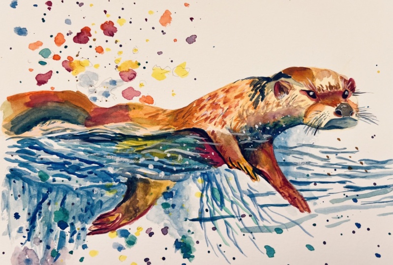
2. Your Project: First of all, thank you so
much for choosing this class. I'm really delighted
that you decided to embark on this artistic
exploration with me. So today, we're
exploring how to use water color to paint a
vibrant and dynamic otter. What captivates me
about otters is their energetic movements and the beautiful interplay
of water and fur. This is an opportunity
to use a variety of colors to create a vivid
and exciting depiction. We'll also look into the
interplay of light and shadow, the harmonious blending
of warm and cool tones, and the creation of depth
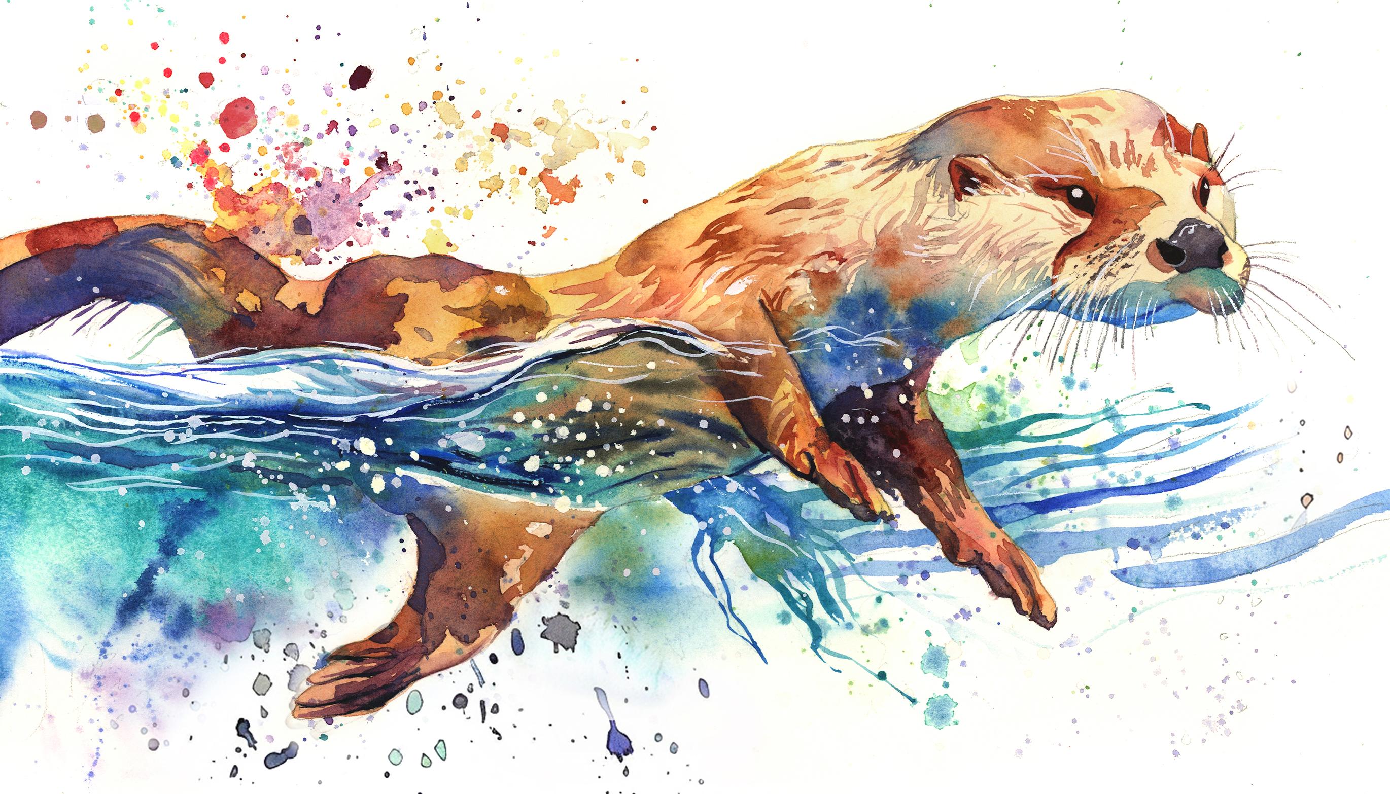
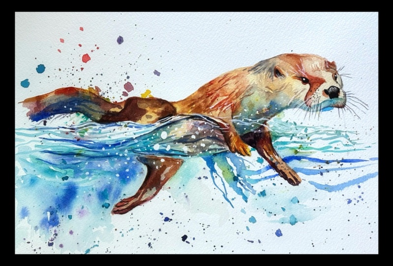
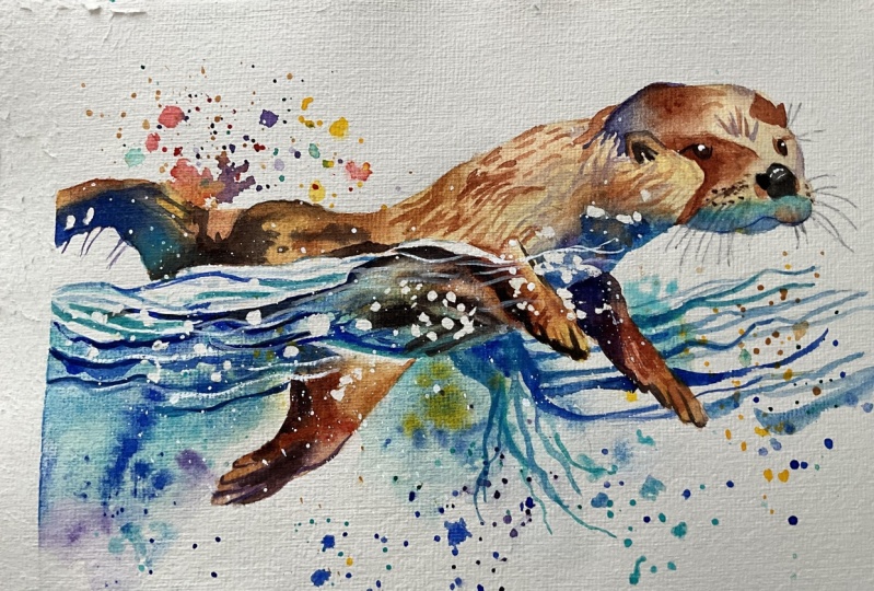
and movement in our artwork. In the resource section, I've added a high
resolution image of my finished painting
to help guide you. You're welcome to
follow my painting exactly or experiment with
your own composition. As we're going to be focusing on the painting aspect
of watercolor, I've provided templates
you can use to help transfer or trace the
sketch before you paint. It's fine to trace when using it as a guide for
learning how to paint. It's important to
have the underdrawing correct so that you can relax and have fun learning the
watercolor medium itself. Whichever direction
you take this class, it would be great
to see your results and the paintings you
create through it. I love giving my
students feedback. So please take a photo
afterwards and share it in the student project gallery under the project
and resource tab. I'm always intrigued to
see how many students have different approaches and how they progress with each class. I'd love to hear
about your process and what you learned
along the way, or if you had any difficulties. I strongly recommend
that you take a look at each other's work in the
student project gallery. It's so inspiring to see
each other's work and extremely comforting to get the support of your
fellow students. So don't forget to like and
comment on each other's work.
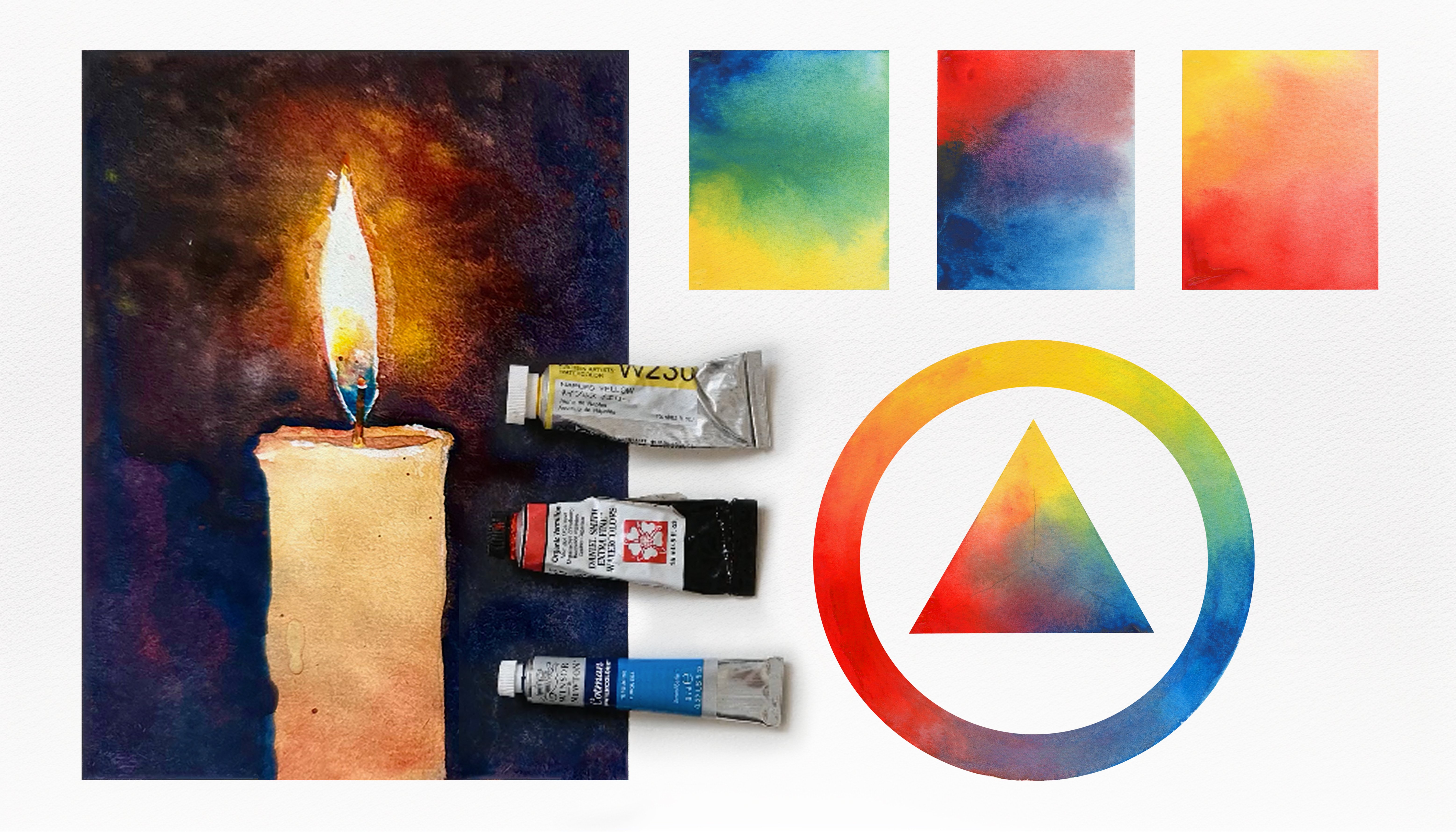
3. Materials & Supplies: Before we start the painting, let's go over the materials
and supplies I generally use. Having the right materials can greatly impact the
outcome of your artwork. So I'll go over all the supplies I use for
this class and beyond. They're very useful to
have at your disposal, and we'll make it easier
for you to follow along. L et's start with the
paints themselves. And like most of the materials
we'll be using today, it's a lot to do
with preference. I have 12 stable colors in my palette that I
fill up from tubes. They are cadmium
yellow, yellow cha, burnt sienna, Cadmium
red, sarin crimson, ultramarine blue, cobalt
blue, cerliu blue, lavender, purple, Vidu black, and at
the end of the painting, I often use white guash
for tiny highlights. I don't use any
particular brand. These colors you can
get from any brand, although I personally
use Daniel Smith, Windsor and Newton,
or Holbein paints. So let's move on to brushes. The brush I use the most is
a synthetic round brush like this escoda Purl brush
or this Van gog brush. They're very versatile, because
not only can you use them for detailed work
with their fine tip. But as they can hold
a lot of water, they are good for
washes as well. They're also quite affordable, so I have quite a few
in different sizes. Next are the mop brushes. Mop brushes are good for
broad brush strokes, filling in large areas and creating smooth
transitions or washes. They also have a nice tip that can be used for smaller details. But for really small details, highlights or anything
that needs more precision, I use a synthetic
size zero brush. All brands have them and
they're super cheap. Another useful brush to have is a Chinese calligraphy brush. They tend to have long bristles
and a very pointy tip. They're perfect for
adding texture or creating dynamic lines
in your paintings. You can even fan them
out like this to achieve fur or feather
textures as well. And that's it for
brushes, onto paper. The better quality
of your paper, the easier it will be to paint. Cheap paper crinkles easily
and is very unforgiving, not allowing you to
rework mistakes. It's harder to create
appealing effects and apply useful techniques
like rubbing away pigment. Good quality paper, however, such as cotton based paper, not only allows you to rework
mistakes multiple times, but because the pigment
reacts much better on it, the chances of mistakes
are a lot lower, and you'll be more likely
to create better paintings. I use arches paper because that's what's available
in my local art shop. A ward spray is
absolutely essential. By using this, it
gives you more time to paint the areas you
want before it dries. It also allows you to
reactivate the paint if you want to add a smooth
line or remove some paint. I also have an old
rag or t shirt, which I used to clean my brush. Cleaning off the paint
before divving it in the water will make the
water last a lot longer. It's always useful to
have a tissue at hand whilst painting to
lift off excess paint. Also, you never know
when an unwanted splash or drip might occur that
needs wiping away quickly. I also have a water dropper
to keep the paints wet. When you paint, it's
important to have them a similar consistency to what
they're like in the tubes. This way, it's easier to
pick up sufficient pigment. A hair dryer is useful
to have for speeding up the drying time and controlling the dampness of the paper. And lastly, masking tape. And this, of course, is just to hold the paper down still onto the surface to stop it sliding
around whilst painting. Also, if you plan on
painting to the edge, we'll allow you to create
a very crisp clean border. And that's everything
you need to paint along. I encourage you to experiment and find out what
works best for you. Now, let's get ready
to start the painting.
4. How to Sketch It Out: You're more welcome to draw
this out however you want, whether you want to
use my templates or draw it from scratch. If you want to draw
it from scratch, then you can follow these steps. As you can see, I'm using very light lines to map
out the general shape. I'm being quite spontaneous. I'm not being strict, being fluid with
my use of lines. There's not many straight lines here at aol at the moment, just trying to keep
it nice and organic, just to lay out the composition, and then we can use more
refined lines as we go along. As you can see,
I've already mapped out the main gist
of what I'm doing. Now I'm going back with
that same soft lead pencil to further refine those lines. You can see on the right
hand side of the page, I've got another pencil
which will come to later. This first pencil
that we're using, the soft lead pencil
is a lead that we can rub out completely and
go back to the white of the paper without indenting the paper or leaving any marks. It gives us more freedom. You can see I'm already
making mistakes, but because we're
using this pencil, I can just rub it out to nothing and then replace where
that eye is meant to go. So once I'm confident with
where the places are, the features of the
face or the body, then I swap over to
my other pencil. It takes a bit of time
going back and forth. No need to rush. It takes a quite a long time
to do a drawing. That's why people often
like to use the template, which you're more
than welcome to do because this is a class
learning how to paint. In other classes, we can learn how to draw because it's
a different mentality.
5. Starting The Painting: So once you're happy
with your drawing, you can stick it to your
paper with masking tape. I use cotton based paper, and that means we don't
have to stretch it. We can just use masking tape and it will flatten
out once it's dry. Now, if you want to
use masking fluid, you can just like I am here. And this is just so that we can preserve the
whites of the paper, and by applying these dots, they'll look a bit like
splashes of water. If you look at the final images, you can see little white dots
of where this will end up. But you don't have
to use this at all. I'm just showing what it
would be like if you do. It's just as simple
to use white guash, white paint at the very end, e splats of white paint. I'm just using the
other end of the bruh, the end of the brush just to make some of the
dots a bit bigger, so we've got a full range
of different sizes. You can use the
remaining masking fluid to create other, other dots. Like I say, this is
not essential at all. I'm just showing
what you could do if you have masking fluid
and want to explore that. So I'm creating a nice range
of different sized dots, just tapping in and out of the masking fluid
that's on my paper. And we have to completely
dry this with a hair dryer, and you can see that it goes translucent when
it's completely dry. So if you're not
using masking fluid, this is where we would
begin the painting. Take a moment just to consider what colors you want to use. I'm going for yellow
ochre at the moment. And while I look at my palette, I'm just keeping in my
mind a vision of where I want the painting to go and how it'll look on the paper. The most important thing
about painting is having that mental image
of the final image. Of course, you can look at the final painting that I upload in the resource section as a reference for where
you want to go. So we're starting off with a few splats of I've used
yellow ochre so far, cadmium yellow, and
a bit of green. You can of course,
mix your own greens, or if you've got a tube of
green, you can use that too. This is Vidian green. And Viridian green
is quite potent. So you only need to use
a little bit of it. The reason I'm adding splats is not only to convey
a sense of energy, but of course, this otter is swimming
around in the water. So there's going to be
splats in real life, too, where the contact with
the water and maybe the waves splash about
and create splatters. So it works compositionally, and it makes sense with
the painting, too. And the different sizes of these splats because we're
flicking it with our brush. You've got tiny little
splats all the way up to larger splats. I'm manually adding in
those larger splats, and it creates a sense of death because some of these splats will
be closer to you, some of them will
be further away. So it helps add a bit of
dimension to the painting. At the very end, we'll
add splats of white because there'll
be a water line, and we'll add splats that dark pigment on
the white of the paper, and then we'll add splats
that are light on dark paper. So it makes it a
bit more dynamic. Now I'm mixing a very vibrant
yellow here, bium yellow. Making a few spats of those.
6. More Splats: It's your choice how many
splats you want to make. Splats are deceivingly
difficult to do because sometimes they
can just go everywhere, and they're hard to control. The key is to load
your brush fully so that the water is almost
going to drip off anyway, so just a slight tap of the
brush allows it to fall off. If there's not much water
or pigment on your brush, then it's going to be harder
for you to splat out, and the harder that
you do tap your brush, the more sporatic it's going
to be and more uncontrolled. Now a complimentary color
to yellow is purple. That's why I'm adding
purple splats here. And also the purple
is a tertiary color, so a third related color
to green and turquoise. It's a good color to use here, and a few blue splats here
where the water will be. But you can be adventurous and pick what colors
take your fancy. Again, I suggest you, whilst watching this video, whether you're
watching it on your phone or your computer, try and have the final image
up on a different screen, so you can refer back to it. So if you're watching
it for your phone, maybe you can get
that final image up on your computer while
you watch or vice versa, maybe you're watching this at a computer screen
or on your laptop, and you can have this
final image on your phone. So I'm going quite
heavy with the splats. Because it really adds to
the sense of movement. There's a few details in
the painting that I don't actually want to paint like
the back legs and the tail. I don't really want to spend a lot of time
defining those. So adding a few slats helps avoid us from painting
those difficult details. It's obscured, so we
don't have to paint them. And that's a good
trick to try and incorporate into a composition is the parts that are
difficult to paint, you have to find a way to make
it not necessary to paint. Choose an angle or another element to make
it less necessary. So I half dried these splats just so the
edges of the splats are dry, and now I'm using a tissue to drain out the
rest of the liquid.
7. Watching Before Painting: This painting is full time. I haven't sped up
any footage on this apart from the sketch we
did in the first video. Everything is just
how I painted it. I might have cut out the sections of time when
I'm using the hair dryer. But other than that,
you will be able to see how I interact with the paint and the paper
as it dries in real time. And that might make it easier for you to paint along with me. I do always suggest that you watch the class in
full to begin with, just because sometimes
I make mistakes. Watercolor actually is
about forcing mistakes, and that's how you create
intriguing elements. Because if you force watercolor, it becomes quite mundane
and loses its magic. To capture the magic
of watercolor, you really have to allow
it to do its own thing. And that inevitably means it's doing things outside of your control and not
what you expect. So that's why it's a good
idea to watch the video in full because I might
say or do something, I might be planning things in my painting that I
changed my mind with. And you can look again at the final painting image to see how things change
towards the very end. Things like splats,
we've already spent about 10 minutes working
on these splats. And when you first
look at the painting, you probably don't notice them because they don't seem like a main element or area of focus. But the reason I'm
spending time on them is because they are actually
quite important compositional. They do add to the energy and They work well
with the composition, and it takes a bit of
time to get them right. You can't just do
random splatters. You have to control
your splatters. It's a good example
of watercolor, how you can't directly control where the
splatters go individually, but you can manipulate
where they go. Much light with
everything in watercolor. You can have intention and plan and manipulate the pigment
to go where you want it, but exactly how it does it
is outside of your control.
8. Starting The Otter: For example, if we're talking
about wet on wet painting, you can apply water to the paper and then add pigment and the pigment will
spread out into the water. You can control where
that water spreads out to by where you've wet
the paper previously. But other than that,
you're not the one that's physically pushing
that pigment out. It's the water
that's doing that. That's how we manipulate the pigment without
actually controlling it, and that is the key
to water color. I've mixed a vibrant
orange here, just using cadmium yellow
and a bit of cadmium red, even a bit of burnt
sienna in there. So I was just saying
how the key to creating magical watercolors
is to manipulate it rather than directly control it. But this area that
we're painting now is quite controlled. And that's okay because with
this part of the painting, we're not trying
to capture magic. We're trying to
ground the painting. So I'm filling out this
underlayer section now. And is basically
blocking out color. It can be a bit more
exciting in other areas. But the goal with
this section of the painting is not to be extravagant and
expressive, so to speak. We have to add control as well as chaos into our painting. So what I was
talking about before about manipulating the pigment, it doesn't always apply. There has to be contrast. So if you're going to
have expressive areas, you have to have
grounded areas as well. Because if everything
was expressive, there'll be no context, and it will just
look like a mess. So and likewise, if everything
was very controlled, it would look quite boring. So it of course takes
trial and error on both sides to find the balance between pure expression
and pure control. And what's really
interesting about art is that we are all individuals, and we all have our different
abilities and tastes, and it's so interesting to look through the
student gallery and see how different
interpretations are applied to the paintings. So some people are more inclined to be more controlled
with their paintings, and they want to learn how
to be more expressive. And then you've got
people on the other side who are extremely expressive, and they want to learn how to be a bit tighter
and more controlled. And there's no
right or wrong way, and that's why it's
so fascinating to see all these different
interpretations because everyone is unique when they paint their painting. And often we want
to paint or learn how to paint in techniques
that aren't so natural to us. So a lot of the
time I get messages or comments from students who want to learn to paint more expressive or the
other way around. Some students that
can paint expressive, they want to learn
how to be a bit more refined and work on details.
9. Being More Expressive: I often suggest if someone wants to learn how to loosen up and be expressive, they should do a couple of paintings where they
grant themselves the permission to be completely abstract to break all
the rules and not be concerned at all with
the final outcome to actively encourage a
messy outcome at the end, because with this mindset, it frees you from the fear
of messing up because you're allowing yourself and encouraging yourself to mess up, and you're pushing the limits
to see what you can do with the pigment and opening a whole
new box of possibilities. If you're concentrating
on adding details, then you're not allowing the pigment to break free
and do unexpected things. And that's what I do
every now and again, because I have trouble finding expressive
elements in my painting. So I need to push myself over the edge sometimes to just
see where it will go. And it's not like you
can paint a painting, and it will be perfect
every single time. With all the paintings
that I do for my class, I do practice paintings just to see where I
can push the limits, and I take all the
positive parts from all the paintings and
I try and combine them into one full
composition at the end. So it takes a bit
of exploration. And that's exactly what
a sketchbook is for. I never show anyone
my sketchbook because it's just for me and my permission to explore anything I want
without judgment. And there are truly
awful mistakes and awful paintings in there, but I allow that for myself to see what this
watercolor medium can do. And if I were to
show that to people, people would think
it's horrendous. And the interesting thing is that all the top master watercolor artists
that you see out there, they have these sketchbooks
for their own exploration. And I was lucky enough to do
a few workshops with them, and it is so insightful
and it's very motivating. I remember as a student
watercolor artist, a few years ago, being so inspired, not by
my favorite paintings, but the terrible paintings that they do that aren't shown. It just shows that no one can create pretty paintings
every single time. Every single person has to go through the rough paintings
to achieve the good results. So you should never, even as a student,
especially as a student, feel bad for yourself for mistakes in paintings
and paintings that you're not happy with
because it's those paintings that are teaching
you things that actually cause the
good paintings. The good paintings are a result of all the
troubled paintings. So when you look at your
troubled paintings, you should actually think Those are the ones you're proud of, because the good paintings, they exist because
they were achievable, and they were
achievable because they were actually easier
for you to do. And the ones that didn't
work, the failures, they didn't work because they
are harder for you to do, and that means you pushed
yourself harder to do them. So when you make paintings
that you're not so happy with, those ironically are the
paintings that you should reward yourself with because
you've pushed yourself, you've been brave to
take yourself there. And of course, by doing those paintings and making
those so called failures, you know what to avoid, and little by little, your paintings just
improve because you know what to avoid and you
know what to include,
10. Mixing Colours: So going back to the technical
aspects of this painting, you can see we've finished
the underlayer of the otter, and we're quite
liberal with that. So you can see there's a slight bit of texture
on the otter itself where There's uneven patches where I might have added
more water than pigment. But that's fine because it
adds a bit of interest. And now the water line, I've done swervy kind of z like lines to imply
waves or ripples. And I've added a bit
of thick pigment, and I'm just scrubbing
it out of the water. You can see I've wet
the paper below, so there's a nice
soft transition between a thick pigment above and the white
of the paper below, and it just gently blend out. And it's also interfering
with the splatter marks, which I'm quite happy
with below as well, because they're going to
blend out with the water too. And the pigment that
I've used is again, Vidian green mixed with a bit of turquoise
or cerlian blue. But if you look at
my color charts, you can see how to mix
these colors yourself. So if I ever forget to mention how I'm mixing
colors in this class, you can always look at my color mixing chart that I include in every single class so that you can mix
any color you want. And that color chart
goes beyond this class. You can use it for your
own personal paintings. Whether you go out
and paint outside or you're painting
something get home, you can look at my
color chart to see which color matches the thing
that you want to paint, and it'll show you
how to mix it. It looks like I have a lot
of colors in my palette. There's 14 pans of colors there. But the truth is about five
of those I rarely use. And most of the work is done by just about nine of those,
nine of those colors. And on top of that, those are the only colors I
really use for everything. So whichever of my
classes you follow, you can use this palette for
every single one that I do. And like I say,
you can even take this palette beyond my classes. Because you can mix any color with these colors in my palette, the options are limitless. You can use this to
paint anything you want. And you can adapt it to your
own preferences as well. For example, the top three
pans on the right hand side, the white, the Duan one, and the lavender there. I've got those all
in tubes anyway. So I rarely actually use those
from the palette itself, so you could put what
you want in there. Maybe you want to
use opera pink. You can switch that out and use Opera Pink instead, for example.
11. My Palette: I can understand how color can be a bit
overwhelming because you go to the art shop and you can see hundreds of different
pigments you can buy. And when I first started out, I collected hundreds of
different tubes of paint, and I didn't know which to
use and how to organize them. And I kept on buying more
and more and more because I thought I needed
a specific color for a specific painting. But actually, once I learned how to make use of the
main colors I've got, and how much
potential they have. I realized I could just create
my own color charts and see precisely every single
color I could make with them. And that is what
my color chart is. It's taking every color
in my palette and mixing them with every
other color in my palette. And then you can take
it one step further and mix those two blended colors with another two blended colors. And on top of that, you
can make even more colors. So really, the
amount of colors you can mix with such few
pigments is quite amazing. You can cover the
whole color wheel.
12. Brushsizes: So back to the painting, you can see where the paper is drying in the water section,
the turquoise section. I've applied lines that
are slightly blended, and that's because
the paper was damp, not completely wet, so it
hasn't blended out completely. It's just left a
blurred kind of line, which is exactly the kind
of texture that I want. By the way, I'd like
to add that I've done the whole painting
with this bruh, this single brush at the moment, and you can see how
diverse it actually is. You can use it for thick
washes and fine lines, depending on how you tilt and how much pressure
you use on the brush. Of course, I can tell you that
this brush is size eight, but it really depends on the paper size
that you're using. And even then, it's
not so important. I feel like I can
do this painting with a larger brush
or a smaller brush. It just happens that
I've chosen this one. What's important is that
it has a sharp point. These coda brushes are very good at having
those sharp points. So this underbelly section, I'm incorporating
colors of the water, the turquoise on one side, and then the colors on the otter rather
on the other side. You can see how I'm
using my palette to find the correct consistency and where I'm applying
it on the paper, depending on the dampness
level of the paper. It's quite difficult to specifically state
those different levels of pigment consistencies
and paper dampness. It's more of a feeling. You can see how
the paper reacts. You can feel how it reacts
and you can feel how the pigment in the
palette reacts with your brush to get an
idea of that pigment, and that is more of
a learnt experience rather than something I
can directly explain. I can tell you that there's different levels
of consistency and different levels of
dampness and that affects how the watercolor
reacts on the paper.
13. Pigment Consistencies: So generally, there's five different levels
of consistency of pigment. You've got thick pigment
straight out the tube, and then on the
complete other end, you've got water with a few influences of
pigment in there, a very light wash.
Then you've got about three different
gradations in between them. In the middle, I'd say that's
a a solid block of color, which would run on
your palette freely. By that, I mean, if you were to take a scoop of
paint out of a tube, a painting tube and scrub
it on your palette, it wouldn't run freely because
it would be too thick. And as you apply
more and more water, the pigment on your palette
is more likely to run. So that's a good way to figure
out the right consistency. Does the pigment run on your
palette or does it sludge about And then you've got to consider that consistency with the dampness of the paper. If the paper is completely dry, then your brush strokes
on the paper will only go where you put
them, and no more. If the paper is completely wet, then the water will, of course, spread out that
pigment and it will go beyond where that
brush stroke goes.
14. Levels Of Wetness: And of course, there's
an infinite amount of gradations between
wet paper and dry paper. But generally, I divide it into four or five
different stages. You've got absolutely
sodden soak and wet paper. Then you've got moist paper, which is still very glistening, but you can start to see the texture of the
paper beneath. Then you've got damp paper, and that's good for broken
edges or broken shapes, something that doesn't
have a hard line. This is also a good time if
you want to lift pigment out or scratch it out to
create even more texture. Then lastly, you've
got dry paper, which we've already talked
about, which of course creates a dry brush mark
or things like that. Things that create sharp edges or sharpness to your drawing
rather than smoothness. So those are the two
sides of paper wetness and consistency of pigment and combining those at
different stages effects, what result there'll be. So you can think of very
thick pigment on dry paper, very thick pigment on wet paper, have a completely
different result. And then you've got to
think very diluted pigment against dry paper, will have a very
different effect than very diluted pigment
on wet paper. So It takes a bit of thinking to get your mind around all
the different options, but that is the key to manipulating what you
want the watercolor to do. So a good exercise is actually just to forget about painting something specific
about painting a subject and just explore all the different
ranges of consistencies against all the different
ranges of paper wetness. And you'll get a good idea about everything that you're able
to do with watercolor. So these are the things that I'm thinking about with
every painting, including this painting now. I'm considering
all these things, whether the paper is
dry, whether it's wet, and the pigment that
I have on my brush, what's the consistency of it compared to that
wetness of paper? So you can see as
I'm painting this. You can try and visually understand that going
through my mind. At the moment I'm
painting on dry paper, and then as we go down, we're going into areas
that are a bit more damp. And then looking at what
I've already painted, you can see how I
must have painted it. For example, there's
a few soft lines there without hard edges, and that must have meant that I applied that brush stroke
when the paper was damp. Of course, it can get quite
chaotic halfway through a painting when you've got
multiple different sections. Some sections are
still very wet, some sections are
halfway drying, and some sections
are completely dry. So that's where it takes a
bit of thinking and planning.
15. The Ripples: Now in this section
I'm painting now, there's a dry paper. It's got a nice, hard line, a stigato line, so to speak. Often when you're
painting on dry paper, it requires a lot more control because the paint will
only go where you put it. Whereas when the paper is wet, it flows out outside
of your control. So it's not necessarily easier, but it would be outside of your control if
the paper is wet. But luckily, we're painting
something quite organic. We're painting the water
ripples at the moment. So they don't need
to be so precise because it's quite
an organic shape. It's open for
interpretation rather than being something so direct. Of course, I'm cleaning
my brush all the time. Going back to what I was
talking about before. Sometimes you don't actually
have to actively paint to learn about pigment consistency
and dampness of paper. You can look at your own
favorite paintings by other artists and work out how
they did those techniques, how they did it, and then you can attempt
to paint it yourself. Of course, by
watching this class, you can see how these
different things react. Maybe a good mindset
to have when watching these classes is not so
much what I'm doing, but seeing how the pigment
reacts with the paper. Right now, I'm making sure the paper is completely
dry on the edge because I'm painting
these kind of ripples of water that go behind the leg. And I don't want the
water to go into the leg. So I'm being very careful
on the edge here to create the ion that these lines
are going behind the leg. So it takes a bit of precision, but it adds to the
illusion of depth. And again, it's the contrast between control and expression.
16. Reviewing Your Own Paintings: When it comes to reviewing
your own painting. If there's an area
that you're not so happy with inside
that painting, try and think about how a
different consistency of paint, a different ratio
between pigment and water might have
affected that result, or maybe the dampness
or wetness level of the painting may have
affected that result or both. Rather than solely having judgment on it and
criticizing yourself. Try and look at it
objectively about what you could have done to
improve it without judgment, without
criticizing yourself. So now I've mixed a darker pigment here,
starting with blue, and I'm going on to the second layer of the otter,
starting with this leg. So I'm starting with blue, and then I'm mixing
a brown in there. And those are
complimentary colors. So they'll look nicely together. I'm taking my time to consider where I'm
going to put the paint because it's easier
to plan ahead than to erase the
mistakes afterwards. So I'm starting with
a thick pigment, and then I'm going to get
a bit of water on my brush and spread it out a bit more. And it lightens it up a bit. Bit of yellow oka. Now what I'm going to do
is soften that top edge, so I'm just getting
pure water and running it softly along the top, so it'll just blend out of a nice soft line
rather than a hard line. Now, moving down, I'm adding a bit more vibrancy,
a bit of red. Being careful with
the tip of the brush. Trying to define the toes a bit. Softening that edge, adding a
bit of purple into the mix. Sometimes I tap my brush onto the area that
I'm painting just to allow more pigment to
fall off onto the paper. Defining the border of a single line and softening it a bit
with a bit of water. S
17. Being Open For Interpretation: Mixing a bit of ultra marine, blue and black and dabbing it just in those spots while
it's still a bit wet. Now I'm going to
do a similar thing to the top of the otter, starting from the
left hand side. Unfortunately, the camera cut
off without me realizing. So I painted it all and then realized it didn't
catch it on footage. So I tried my best to
scrub it out again. Unfortunately, the
temperature whilst recording this was too hot for my camera and it
overheated and shut off. But I used the same technique
below as I used above here, and you can pause the video
or look at the final image of the painting to match
how it's meant to be to catch up with
this painting. It doesn't matter if the colors aren't exactly the same at all. I've been quite random with my use of color in this section. At the moment I'm using blue, mixed with a bit of red and a bit of burnt sienna as well. So any combination works well. You don't have to
copy it exactly at all because there's so many different
variations or interpretations, you're not limited to
do exactly the same. And in fact, I encourage
you to explore yourself sometimes as it's a useful way to learn and figure things out. So these shapes, these brush marks that I'm putting in
now are quite abstract, and they just imply some form without
directly stating it. So this is, of course, the leg and the
tail of the otter. But because of the
pose that I'm using, it's quite dynamic, and there's a lot of
movement going on. So there's not actually
that much detail. It's just implied detail. One thing I will mention
when painting the top bit of that otter is where
it meets the water, I've maintained a very hard line to create that illusion
of Ripley wavy water. Now, I'm looking at where
I've painted that water, and I'm trying to judge
how wet it is and whether it's dry enough to go over the top and if I do
what it will look like. Because I want to add
a few more lines just to add to that feeling of
flowing water, of rippling. So that's exactly
what I'm doing. I'm adding more lines wavy lines to help
the feeling of flow. And by making it quite dynamic, I'm applying dark
lines on top of light and trying to a light
lines on top of dark.
18. The Fur: Moving on to the rest
of the otter now, we've basically mixed a similar
color as the underlayer, just a bit darker now. It's a colorful brown, a vibrant brown, which is burnt sienna and a
bit of yellow ocha. And a splash of sarin crimson. Now, to get the fur effect, I'm starting from the left and creating almost
curved spikes, which look like wet fur
all clung together. And then as we paint
the different sections, I soften out the right
hand side as a gradient. So we've got spiky
like fur on the left, and then we grate it out
on the right hand side. With pure water, as you can see, I'm using pure water now just
to soften that edge out. And we're going to do that a few times layering
them as we go along. So we're not painting
every individual fur, we're just applying
a few details to indicate that's what it is, and then the rest of the tones will imply that detail for us without actually
having to paint it in. So whilst that's dry and moving down to the paw or the hand, whether the fingers are, I guess, they're called fingers. Again, I'm not
being too detailed. Just trying to use s
little textures and tones just to imply because
we look at this and we assume that that's where the arm is and
that's where the poor is, so we don't need to put
in too fine details. As long as the tones make
sense, it should be okay. Now, I need to think about
what I'm going to do next. Clean my brush. And I'm going to have to use the hair dryer to clean
that section at the top. Like I said, I'm going to lay on different parts of the fur and it'll take too much
time to dry naturally. I'm going to paint one
layer of the fur, dry it, and then paint the next and
go back and forth doing that. I only takes a short amount
of time to dry. Okay.
19. Cool Colours For Shading: And now we can go back and
paint the next set of fur. So I'm just holding
my brush at an angle. Before we get up to
paint the fur up there, I'm just going to paint the shaded area in
between the legs, and I'm going to use
blue for that shading. Because blue and brown are
lovely colors together. Because the otter
is in the water, it makes sense that there
might be a blue reflection. Few dabs of purple in there too, and I fw few dabs of green, just to keep it
interesting and varied. Then I use water on the edges to make sure
it's a soft edge. I'm really, you can see
me applying a bit of pressure just to make sure
there's no hard edge. No hard edge where I don't
want there to be one. Then I can go back and dab in more pigment where
I want it to be darker because it's
wet at the moment, it'll spread out quite
nicely and evenly. I'm using the brush to
manipulate what's on the paper. So if there's too much water
or pigment in one section, I can spread it or move it
to a different section. You can see how this relates
to what I was saying before. I pre wetted the paper there. So when I put these dabs in, they blend out nice and softly because this
consistency of pigment I've got on my brush
is quite diluted, so it's going to spread out with the water that's
already on the paper. Just at the edge here,
I'm going to use the fine tip to
convey a bit of and maybe some whiskers a bit of the ear going on there. So we're using tones to convey the form and
shape of the otter. It looks a bit more
spherical now. Adds to the three
dens of the painting. So again, using the
tip of the brush, just to add a few swirly lines which can be
interpreted as wet fur. Wet fur is, of course, easier to paint than dry fur because it's
all clked together, so they're thicker lines. If it was dry, it would be
quite difficult to paint because it's all
tiny little lines. Few slashes of orange into
that blue because they're complimentary colors
when they blend out, it'll add a nice effect. That's often how
I do my shading. I fill an area with a mid tone, and then I go back and forth dabbing more pigment where
it's wanted whilst it's wet, and then sponging out liquid or pigment with the
brush in different sections.
20. More Freedom With Wet Paper: When the paper is wet, you have a lot of freedom to
go back and forth. It's only when it starts drying that your options
get a bit limited. So now I'm going back up to
the top where the fur is, and you can see how
I'm using the tip of the brush starting very thin and then getting thicker as we move along to
create that illusion of fur. Then once I've gone
from top to bottom, I can go back to a bit
more water and thin it out as we go along and
blend it in to the paper. And that's only a
few sections of fur, but it gives the illusion
that it's all fur. Now we can paint the front legs. So I'm taking some
dark pigments, ultramarine blue and mixing
it with a isarin crimson. Those are very dark
pigments when they're concentrated, and
they're useful. Those three pigments, Aserin
crimson, ultramarine blue, and burnt sienna are my most used pigments because combined, they
actually make black. So they've got the
full tonal range. And within them, when
they're lightened up. They can be mixed in
many colors themselves. So you've got blue and
red which make purple, and then burnt sienna
is like a burnt orange. It's a brown, which is
low saturated orange. So when that burnt
sienna is mixed with ultramarine
blue, it grays out. It compliments each other. So you've got three colors that work very nicely
with each other. Now I'm drying that
section we just painted, and whilst it's drying, I'm actually splatting
pure water on there. Because it creates a nice
bit of organic texture. Going back over to
this water section, softening some bits,
adding a bit more green. I feel like it needs to be
a bit darker at the top, because later on we're
going to add some white. So the pigment
needs to be darker for it to contrast with that
white we'll paint later on. And of course, the
masking fluid is there, so we need to make it a
bit darker around where the masking fluid
is so that again, it has that contrast with
the white of the paper.
21. Dark Tones: I feel like there needs to be a bit more
contrast here, too. To define that poor I'm just using purple and
ultra marine for that. It looks very thick
when it's wet, but once that dries out, the color will show, the translucency of the pigment will show against the
white once it's dried. Making this reddish
burnt sienna hue down and blending it
with that purple color. It's areas like this
that you have to trust the pigment because it's too dark to see what
the pure color is. But as we dilute it
and as it dries, the color will reveal itself. So I'm painting up until the top of the leg where
it meets the otter, and there's quite
a hard line there. To create the illusion of form, we have it dark on one side and lighter on the other side. I always try and
think about how I can convey what I want to convey with a brush
strokes as possible. So it takes me a bit of time to figure out
where I can put the brush strokes which are impactful but at the same
time, the most simple. And sometimes it's difficult to take something
that's very complex and make it as simple as possible because there's a
lot of complexity in life. It's overwhelming the amount
of details there are. So it takes a bit of concentration
to filter through and think about what is essential and what can be skipped over. Often, simple paintings can be more difficult than
complex paintings because with complex paintings, you're just painting
everything that you see. But with simple paintings,
you're not doing that. You're going beyond
what you see, you're simplifying and
having to work out the core of what you are
seeing and only doing that. So it takes a bit more, a bit more creativity. So I'm going to give
those legs a bit of time to react with the
paper and the pigment, and I'll come back to it later. Now we can go back
up to the fur again. And you can see
how I'm going back and forth to different sections like the fur and then the legs, just because we need time
to allow them to react, we can't paint every
section in one go. The nature of watercolor with the drying times of the paper means we have to be quite sporadic and move around
the painting quite a lot. So those are a few
strands of hair, a few single brush marks
that again apply the fur.
22. Starting The Head: It's a bit too strong, so I used the tissue
just to dab it out. And I had to make sure
the paper was dry. That's why I used the tissue
to really make sure that it'll be a hard line when I
apply these brush strokes. I'm enjoying using cool
colors for my shadows, such as purple and blue. I'm painting the ear here, which is basically
defined by shadows. Most things are
defined by shadows. And to make it interesting, I'm blending out the
blue into a nice orange. And it's getting lighter
as we're going down, going back and forth
between picking up more pigment and
picking up more water. And another reason we move
back and forth between different sections is so that we don't
overwhelm ourselves. We're breaking things
up into small steps. So for example, I paint a
little bit of the foot, and then when I'm somewhat
comfortable with it, I take a break from it and move on to a different
section like the fur. And then before I get caught
up with that and confused, I disconnect from that and
move to the head for a bit. So with the eye, it has to be
a bit of a darker pigment. We'll come back and add
a bit of black later, but to really make the eye pop, we need a bit of contrast there, so I use darker pigment
in that section. Starting to connect
these two points, the shadow below
with the shadow of the head up above coming
down to the nose. This is where the drawing
is important because really everything is in a
different section. We are on, of co creating
the ill of depth. So we've got to think of different sections
and different tones. And we use the
drawing to guide us. Of course, it sounds obvious, but it can get very confusing when we're combining
different tones and colors and things like that. I've moved from left to
right with this painting, mainly because I'm right handed. If you're left handed, you can use the flipped
template to sketch it out or you can paint
exactly the same, but from right to left. B because I don't want to smudge my hand on the paper as
we're moving across.
23. Simplifying Details: You can see me twizzling
the bruh around. And that's just a
thing that I do when I'm considering
things. It's not essential. I'm just it's like twiddling
my thumbs or something. It's just I'm contemplating
what to do next. The nostrils. So there are quite a few
details on the face, but if you try and forget the fact that it is a face and
purely look at the shapes, you can see that
it's not so complex. If you forget that it's n and
forget that it's a nostril, you can just see
it's a simple shape. It's a unique shape with
different tones into it. But that's how we use observation to try
and convey details. And I squint my
eyes a lot when I'm looking and observing
these shapes because by squinting the eyes, we're minimizing the tones, so we can just turn it
into a little block, and then as we want
to get more defined, then we can go back and forth with pigment and pulling pigment out to get
the tones correct. For example, now,
we're adding more tone to this section because
as it starts to dry, it looks lighter, and
it was a bit too light. So we're adding a bit
more pigment in there. It might look too
dark right now, but I guarantee in 10 minutes time when it's,
it'll look light again. Using a tissue just to
define that edge again. Getting rid of seran
blue and painting the shadow on the chin
or the lower jaw. Of course, this is a
very unnatural color. Otters don't have blue in them. But because we're
getting the tones right and the shapes right,
it's somewhat believable. Now we can start sorting
out those tones, going back with darker pigment. Now that it's wet,
it'll blend out softly. Few whiskers using
the tip of the brush. Again, the whole
painting is being painted with this brush. There's a very versatile brush. I'm going to get the hair
dryer again and dry this leg. Whilst it's drying, I'm going to splat pure water so that it creates an
interesting texture. Double that water in
there whilst it's drying so that it has a nice interesting texture
and natural unevenness. It's another example of allowing watercolor
to do its thing. We can manipulate it
to create a texture, but we can't control exactly how that texture is
going to look like.
24. Stubborn Areas: So a bit more. At this stage, you can go back
and forth between your painting and
the final painting that I've uploaded into
the resource section, and you can just go back and
forth matching it and trying to get the shapes
same as the ones that I'm painting
at the right tones. T. Again, with this
class, it's real time. So I haven't been editing out the times when
I'm thinking about it. In past classes, I
try and edit out these little moments
right now where I'm just thinking about something
without doing any thing, which might be boring to watch, but I just wanted
to give a show what it's actually like for a change when I'm
thinking about things. I'm not constantly painting, and I'm not all knowing
with what I'm doing. Sometimes it does take
a bit of time to think about what I'm going to do next. For example, this
tiny little section here where the mouth meets. It's taking me a bit of time
to get the tones right, even though it's a
small little section. I'm going back and
forth and I've spent a considerable
amount of time on what is actually quite
in significant detail. But for some reason, it
doesn't feel right to me, so I'm having to work on
this small little bit. It's because the
face is probably the most important
element to get right for a painting
to work or not work. The arms, the waves, the water, and the tail, and the fur can
be a bit more suggestive. But people tend to relate to the face or the
head of something, and it's more noticeable
if it's wrong. So even though it's
a small detail, it requires a bit more
time and precision. Adding a bit of a darker tone right where the ear is in
the corner of the ear. And now we can start
thinking about the whiskers. Now, the pencil lines
that I've drawn for the whiskers actually
work very well. And unless someone's
very, very observant, they wouldn't acknowledge or realize that the pencil marks are actually pencil
and not painted in. But I'm always going to add a bit of paint for
the whiskers anyway. But it's not
absolutely necessary. If you're not
confident with getting a nice thin brush stroke
for your whiskers, you can just use a sharp
pencil mark for that.
25. The Nose: So I'm not going to rub those pencil lines out
for the whiskers. I'm going to keep them in there. And now painting the nose with a nice diluted
wash of gray. It looks dark at the moment, but you'll see as I use the
water to spread it out, it lightens up, and
then it'll lighten up even more once it's dry. And then once it is dry, I'll go back with even
darker pigment to help define the form
of the nose even more. And whilst we're
mixing this pigment, we can go to the eyes and
darken the eyes a bit, using black and burnt sienna. The eyes are probably the most important thing to get right. Take your time with
the placement of them such tiny little areas
of the whole painting, but the most important aspect to get right because
it's so subtle. But if you get your drawing right and you're happy
with your drawing, there should be no
problem with just filling in those little dots. If you've got
cotton based paper, then you should be able to
rub them out and try again. There's no harm in using a small brush list to scrape the paint off and repaint it. That's the good thing
about cotton based paper. If you're using more
economical paper, then it might be a bit trickier to rub that pigment
off and try again. Now I'm mixing a
darker pigment and I'll be going back
to paint the nose. Because it's not completely dry, like I was saying before, the paper is still a
bit moist and damp. So we are add this dark
pigment and it softly blends. In fact, the whole nose dried
to darker than I expected. So I'm going to repaint the whole nose to
make it darker and then suck out some pigment from the top to make it lighter
at the top than the bottom. Then darken these little
tips of the cheeks here. A few more whiskers in
this light space here. Making sure my pigment
is dark enough, so when it dries, you'll still be able
to see the lines, maybe a few dots to
imply where the whiskers are coming out of. A.
26. Finishing Touches: Using the end of my brush
to scrape some texture in there in the tissue to lift off some pigment
where it was too dark, where the nose is still damp. I'm just dabbing in
some pigment along the edge so that
it's nice and soft. See how I'm being a bit
precautious with my nose. I'm adding more pigment as we go along rather than overdoing it and making it too dark
at the beginning. Defining a bit more further. Now, unfortunately, my camera overheated and turned off again, just as I was explaining
how to apply the white. But luckily, I noticed before
completing the painting. You can see how it's different, though I've gone over
the water area with pure white and I added a white dot,
just where the eye is. You can pause the video and catch up with where
it is at the moment. The temperature
is extremely hot. There's a heat wave where
I am at the moment, and the camera couldn't
stand the heat. So it packed up. So sorry about that. Not much left to do with
the painting now, just a few minute details
that are barely seen, but just to bring the
painting together, just a few fine lines
that connect it together, details around the ears, and even I'm going to get
the pencil back out again and draw in some whiskers
rather than paint them, just because there's
much more control there. And again, no one will notice, whether it's pencil
or fine brush marks. And it allows you to
get a tight angle. I'm of course recording
this painting, so I'm not going
to move my canvas, but you can pick up
your painting board and rotate it to get the perfect angle for a good
curve of your whiskers. Then lastly, if you used masking tape
masking fluid rather, you can dry out the
painting completely and just rub away
the masking fluid. Now you can see it's not
completely essential to use masking fluid.
It's only if you want to. You can just flick paint on at the end and achieve the
exact same results. But if you want to
use masking fluid to preserve the whites of the paper, that's how you do it. And you can see as this
masking fluid is coming away. It creates a lovely kind of
splattering of white where bubbles are mixing around in the water because
of the splashing. Makes it a bit more dynamic
having those dark splats on white paper above and the white splashes on dark
pigment in the water. And that's everything. We can take the tape off
and review the painting.
27. Final Thoughts: Welcome back and
congratulations on completing this watercolor class
on painting and otter. It's been a real joy to guide
you through this project. From capturing the
playful spirit to depicting the intricate
details of the fur and water. We explored what makes the otter such a
delightful subject. Throughout the class, we
experimented with a variety of watercolor techniques to
bring our otters to life. From wet and wet
blending to laying, and using stato effects, each method played a crucial
role in creating depth, texture, and dynamism
in our painting. Remember, watercolor painting is not just about technical skills, but also about expressing your creativity and
personal style. I encourage you to continue
exploring, experimenting, and pushing your
boundaries to create your own unique
watercolor masterpieces. As we come to the
end of this class, I hope you feel
more confident and comfortable with your
watercolor painting abilities. Practice is key when it comes
to improving your skills, so keep on painting
and experimenting. I want to express my gratitude for each and every one of you. Your passion for watercolor
painting is so inspiring, and I'm honored to
be your teacher. If you would like feedback on your painting, I'd
love to give it. So please share your
painting in the student project
gallery down below, and I'll be sure to respond. If you prefer, you can
share it on Instagram, tagging me at Williston, as I would love to see it. Skillshare also loves
seeing my students work, so tag them as well
at Skillshare. After putting so
much effort into it, why not share your creation? If you have any questions
or comments about today's class or want any specific advice
related to watercolor, please reach out to me in
the discussion section. You can also let me know about any subject wildlife or scene you'd like me
to do a class on. If you found this class useful, I'd really appreciate
getting your feedback on it. Reading your reviews
fills my heart with joy and helps me create the best
experience for my students. Lastly, please click
the follow button up top so you can follow
me on Skillshare. This means that you'll be
the first to know when I launch a new class
or post giveaways. I hope you learned a lot and are inspired to paint more in
this beautiful medium. I look forward to
seeing you all again in future classes until
then happy painting.
 Will Elliston, Award-Winning Watercolour Artist