Transcripts
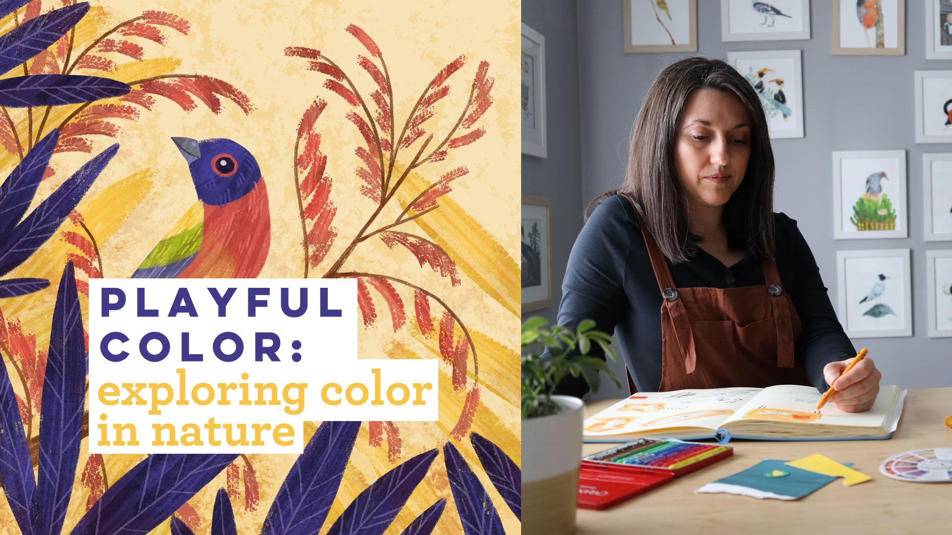
1. About This Class: Depending on who you ask, color is either the most exciting part of the illustration process or the most terrifying. I'm one of those people who feels like color is the most exciting part of the illustration process, especially, because I'm a nature illustrator, you get the fun job of creating illustrations that still speak with the true spirit of the animal that I'm illustrating but I also get to be a little bit playful with the color so that I'm bringing my own unique artistic voice into the piece as well. It's a really fun thing to balance once you get the hang of it, once you get past that terror part of approaching color. One of the things that is going to make the coloring part of illustrating a lot easier is just having a basic understanding of some color theory and having some basic understanding of how things like saturation and value will help you create a strong illustration. That's what we're going to learn in this class. This class is going to be taught in Photoshop, but you can really use any digital art app you want to. I'm going to go through the process of just showing you how I pick colors from a reference photo, how I adjust those colors based on what I know of color theory so I can create a more pleasing color palette to start with. Then I'm going to use that palette to color the bird that I've drawn. Then I'm going to take that same palette to a whole bunch of digital color mixing and come up with a secondary palette that I'm going to use for the background of the illustration. In the end, I'm going to show you a few final tips and tricks that I use all the time when I need to adjust the colors on my nature illustrations. It's going to be really fun if you are ready to be playful and confident with your color. Head on over to the first video and let's get started.
2. Color Theory Basics: Let's get started by revisiting some basic color theory. Most of us learned this when we were kids and some of you revisited the concepts in art school. But when is the last time you really thought about color theory? Let's just do a quick refresher. Now there are tons of classes and tutorials and books that go deep into color theory, and this lesson is not that. This is just a quick reminder before we move into working with color because we're going to be thinking about some of these color theory basics as we work on a nature illustration. This is a color wheel. It's divided into your primary colors, which are red, blue, and yellow. These days sometimes the primaries are actually defined as cyan, magenta, and yellow. Whatever version of primaries that you choose to use really depends on a bunch of factors, but for this class, I'm just going to stick with the classic red, blue, and yellow. Next step, we've got the secondary colors, which are green, orange, and violet. You get these colors by mixing the primary colors together. Red and blue make a violet, yellow and blue make green, and red and yellow make orange. Next step, you start mixing your primary colors and your secondary colors and you start getting tertiary colors. Those are yellow-orange, red-orange, red-violet, blue-violet, blue-green, and yellow-green. Now the colors you see on the color wheel are 100 percent pure hue or color. Those words are interchangeable, hue and color. You're not often going to be using these specific 100 percent pure hue selections in your illustrations, instead, you're going to be using tones, tints, and shades. If you mix white with a pure color, you get a tint. If you mix black with a pure color, you get a shade, and if you mix gray with a pure color, you get a tone. Honestly, the terminology isn't terribly important, so don't let yourself get bogged down with it. Just keep in mind that you can mix white, black, or gray to change the color that you're working with into something less than 100 percent pure hue. For this class, we're working digitally and I'm going to be working in Photoshop but you're going to have a similar color picker options, no matter what digital art app you're working in. If it's Procreate or Photoshop or Illustrator or Affinity, whatever, you're going to have a similar color picker situation. We're going to be working digitally. We're going to be mixing our colors digitally, so let's take a look real quick at just the basic layout of the color picker in Photoshop, and where you're going to be mixing those tints and shades and tones. In the upper right-hand corner of our color picker, this is going to be the most pure version of whatever color we've selected. I've picked red, and you can see right here I've got this little warning box, and this warning box lets me know that the color I've selected is out of gamut for print. If I'm making art for a kid's book or greeting cards or any number of other things, this lets me know that this is not going to print well, if it prints on paper or a product or whatever. I can actually just tap this and it'll take me to the corrected version of the color that is within the printing gamut. That's just a fun thing to know, but let's talk about how we can do some basic mixing of colors by making our tints and shades and tones. If we just take this color and move it over to the left on our color picker, we're adding white. Every time we move this further over to the left, we're adding more white in with the red, just like if we were mixing paint, and that's how we're creating our tints. If we go all the way over to the left, of course, we're going to get 100 percent white. Now if we go back over to the right corner, back to our 100 percent pure red, now if we move down, we're going to be mixing black into this, and as we're mixing black in, we're going to be creating a shade. Again, the wording of this isn't super important. It's just important to know that if you pull your color picker down, you're mixing black in until you get to this rich black in the bottom right-hand corner. Now if we go back up to the top, to our bright red color, instead of just going straight over, if we start pulling it down as well, we're mixing in some gray with our red and we're starting to get to some more of those neutral colors instead. That's just a quick basic overview of mixing in white and black and gray with the colors. Now, you can actually go a little bit deeper on this, you can actually change your default setup. This defaults to hue, which is your color that you're selecting, you can also change it over to saturation. You'll just have a saturation slider here that lets you make your colors more or less saturated, which is the same thing that you're doing if you're pulling your color over to the left on the hue saturation brightness scale, you're just adding the white in. Then you can also adjust your brightness too just by using the slider, which again is just going to add some black, and it's going to make everything a little bit darker. If you want to, you can mess around with mixing, and say you want to add a little bit of a green tone to your red, so you can try that if you want to add a little bit of blue to it, you can use the sliders to try that. There's a ton of things that you can do just using this color picker. But if you feel super overwhelmed by all that, don't worry about it because you're not necessarily going to need it. It's just something that you can use to play around and explore a little bit with your color. As long as you know that in the upper right-hand corner is your pure color, as you drag over, you add white, drag down to add black, or drag at an angle to add gray, you're good to go. Then if you're making art for print, just keep an eye on this little gamut warning here that will tell you when you're using a color that is not going to replicate when it is printed out. I know that the Photoshop color picker makes life really easy and mixing colors digitally makes life really easy. But I really recommend purchasing an artist color wheel like an actual physical color wheel, or make one. If you don't want to buy one, just get some paper, some markers, or paint, go crazy. Just having a quick tactile reference for choosing color schemes makes such a big difference when it comes to not feeling overwhelmed by color, and you'll be able to easily choose harmonious colors that way. That's actually what we're going to talk about in the next lesson. Head over to the next video and let's go ahead and get started with that.
3. Color Harmony: Now that we've done the quick version of basic color theory, let's do the quick version of color harmonies. Monochromatic color schemes are based on a specific hue, just one hue. Because of this, they are very cohesive. For this color scheme, you will choose a color like blue-violets and then you can choose any number of that color's tints, shades, and tones to create your own palette. Even though you're starting with just one color, you can really create a broad palette by using all the tones, tints, and shades. Analogous colors schemes are made up of three colors that sit next to each other on the color wheel, like yellow, green, and yellow-green. Now, with any color harmonies, you're going to be using a variety of tense shades and tones. For this example, maybe you'll choose yellow-green as your most saturated color, your most pure color. Then you can add a little bit of white to the yellow and the green to come up with a couple of other varied color options that aren't 100 percent pure. Complimentary colors schemes are based on two colors that sit opposite one another on the color wheel, like my favorites, blue and orange. Again, you can use tense shades and tones to build your color palette. So although you start out with just blue and orange, you can actually create a color palette that looks like this. You can see there's a ton of flexibility in this. Split complimentary color schemes feature one color plus one color on each side of its complement. Going back to our blue, we know that it's compliment is orange. To find that split complimentary, the colors are going to be on either side of the orange. In this case, our split complementary color scheme is going to be blue, red-orange, and yellow-orange. Triadic color schemes are made by using colors that are spaced at equal distances on the color wheel forming a triangle. You'll find some classic color combinations here like blue, red and yellow, or violet, green, and orange. Finally, tetradic color schemes are just two complimentary pairs arranged together. These form a rectangle on the color wheel. One example of this would be blue and orange, and purple and yellow. Remember that you probably won't use the pure colors that you're starting with when you look at the color wheel, you'll be playing around with your value and saturation and getting those tones, tints, and shades. So all the colors aren't boldly battling for supremacy in your illustration. Head on over to the next video. Before we talk more about color, I want to show you some inspirations that I'm going to be thinking of as I work on the illustration for this class.
4. Getting Inspired: Before we get started, I want to take you through some things that I find to be particularly inspirational when I'm thinking about color. I'm going to show you some children's book illustrators whose work I really love from the mid-century era and also from the '70s and '80s, and then I'm going to show you some bird illustrations that I also find to be really inspiring. I am starting off with Brian Wildsmith's work. Brian Wildsmith is a nature illustrator and a children's book illustrator, and his work was just so bold and colorful and textural and gorgeous. This is one of my favorite pieces of his and if you know my work at all, you know that I love a blue and orange complimentary palette and this really is built on that. You've got your nice blue skies and then we've got some of these beautiful orange tones in the reindeer that are just repeated amongst the herd. This is just really gorgeous, just a really successful example of using a limited color palette in a way that's still really varied and layered and beautiful. Let's take a look at the next example. Next up we've got Eric Carle, who I think his work is known by pretty much everyone who has ever seen a kid's book. This is not the Very Hungry Caterpillar. This is just his animals book. I really wanted to show you this gorgeous eagle piece right here, which is with a monochromatic color palettes. But it is just so lively and layered and gorgeous. If you feel like you're limiting yourself by only choosing one color or two colors, you're really not. It's a starting place, and then you just build upon it and create something gorgeous and lively like this. Next up we have Seasons from John Birmingham. This is obviously a book about the seasons. This is one of my favorite spreads. This is one of the seasons about autumn and I just feel like he's done such a beautiful job, just capturing the light of an autumn day, there's harvesting and you're in the forest. We've got all these beautiful yellows and oranges and browns, and then just some hence of greens as well. This is just a really beautiful use of an analogous color palette where all the colors are found next to each other on the color wheel. It's very harmonious, very textural, really gorgeous. Of course, I can't leave you without sharing some bird illustration, color inspiration. This is in a larger book called The Art of the Bird and it celebrates 40 different bird artists. I just want to show you really quickly the work of James Lansdowne. The colors are so gorgeous. You can see here like in this bowl finch illustration, he is basing his illustrations on nature, on the bowl finch and the actual colors and then building the rest of the illustration around those colors. That's what we're going to be doing in this class. We're going to take what we know, which is the colors of a bird and then we're going to build the rest of the illustration based on those colors. It's just really beautiful and cohesive. Then of course this is one of my favorites. The colors on this bird are just so wonderful and it's such a gorgeous pop against the more neutral colors of the female bird and the backgrounds. It's really masterful how these colors stand out from everything behind it. All right friends, I hope you enjoyed just a little peek at some color inspiration and I really hope that you take some time to look around at some illustrations from the past to gain a little bit of color inspiration for your own work. All right. Head on over to the next video and we're really going to dive in on using some colors in an illustration.
5. Exploring Saturation: All right, so let's explore some color saturation. Now, one mistake that new illustrators or digital illustrators tend to make is using colors that are too saturated. Basically, you are choosing the 100 percent pure version of the color instead of using a tint or a shade or a tone. It's really funny because our eyes will tell us that a frog is green, so of course we choose the greenest green to express that. That's what our brain feels is correct, but the reality is that very few things in the natural world occur at the most saturated color, and even if they do, we don't necessarily need to illustrate them that way, especially if we're making art that will be printed in books or on products, because those most saturated colors like this bright red are not actually reproducible in prints. We always have to keep that in mind as nature artists. Now, to demonstrate this exact point, let's take a look at this photo of this bright green tree frog. First, let's just make some guesses about what colors we might use to illustrate this frog, and I'm going to go a little overboard with this. What I'm looking for is a nice green, looks like a reddish-orange, a blue, and a yellow. I'm just going to turn this off, and I'm just going to do this from memory, I'm just going to use my color picker, and see if we can get some decent colors. You might pick this bright green color. Again, I'm really going over the top here with this, so just keep that in mind. Let me grab a brush, and let's just scribble in some colors here, and then I need to get a red. It's a red-orange, let's just pull it down a little bit, red-orange, and then I also need to grab a yellow. The yellow wasn't very bright though, so I might be able to get that one. Then also we need a blue, so let's just pick a blue, and you see, I'm really going for some only saturated colors here and I can tell by looking at this that this is not correct. This is going to be fun to see what the correct colors are. Now I'm going to use my eyedropper tool, and I'm going to pull out the exact colors from specific areas that I can use for my illustration. I want to start with this green, which is a little bit darker than I thought it was. Let's go over here, and let's just scribble that green in, and you can already see the difference between this green that I guessed at and this green that is reality. It is more of a muted color, and when we pull it up in our color picker, we see that it's got some black mixed in with that bright green tone. It's definitely toned down. The next one that we want to grab is this red-orange from the foot, and it's also in the eye. This is a red-eyed tree frog, but it's kind of a red-orange. Now, for this one, this is actually almost a pure color from the photo, but we're going to run into a problem that it's going to be out of gamut. I'm just going to go ahead and just change that to the toned down version so that as I'm making my art, I know that I'm making something that is going to be printed, that isn't going to have a ton of color shift that's going to make me super sad. Next up, let's grab this yellow color, which I felt like I was closest on, but look at the difference in those two. This yellow that is actually in the photo has got some more gray mixed in with it, it's not as pure of a hue. Then the last one that we need to grab is the blue, and let's just grab from right here. Again, look at our difference. This blue has actually got a little bit of green mixed in with it. It looks like it's more of a blue-green, and it's a little bit further down on our color picker. On the left-hand side, is what I would have guessed the colors were in this frog, and then on the right-hand side is what the colors actually are in this frog. This is a really fun exercise to do with photos so you can really see the color relationships between different colors in a photo, especially if you're working on a nature illustration. This is really important to understand those relationships. It's important to understand that just because we think a frog is the brightest green, doesn't mean that A, that's true, and B, if that is true, it doesn't mean that we need to illustrate it in this color. If I draw the frog using these colors on the right, it's still going to look vibrant and beautiful because of the relationships between the colors, whereas this would actually look pretty garish, it would over the top in the end. This is a really fun practice. You can do this with photos, and you can also do this with illustrations. If you're curious about how another artist or a painter or a graphic designer used color, grab an image, pop it into Photoshop or Procreate or whatever, and use your eyedropper tool to explore the colors. See what colors were used, see how saturated they are, how desaturated they are, really gain a deeper understanding of how the colors are working in some of your favorite pieces of art and I think you'll be really surprised by some of the things that you'll discover. Head over to the next lesson, and we're going to talk about exploring value.
6. Exploring Value: In this video, we're going to be exploring value. This is another common mistake in using color palettes and not it is that they don't have a lot of variation in value, which makes an image look really flat and boring. All parts of the illustration that tend to have value issues just tend to blend together. Nothing really draws the eye into the illustration or around the illustration. It's just flat and fair. Value is how light or dark a color is. This is what a value scale looks like from the lightest color, which is white to the darkest color, which is black. Again, this can be tricky when we're using color because sometimes color makes value difficult to discern. Here's an example of two colors that appear very different. But when we convert them to grayscale and we see the values, we see that they are the exact same value. If I made an illustration with these two colors, nothing would really stand out. Everything just looks like, there it is. You can also use value to direct the eye around an illustration to really show the viewer where they should be paying attention. You can also use it to define areas of the illustration like the foreground, the mid ground, and the background. Here's what that looks like. A really quick way to check your values in any digital art app is simply to make a new layer, fill it with black, and then change your blending mode to saturation. Now you're going to be seeing everything in grayscale. This is an illustration that I've made. If I wanted to check to see if the values are too close to one another because maybe I'm worried that it isn't reading really well, I can just go ahead and turn on my black saturation layer. Now I can see everything in grayscale. You can see here that I've got everything in the foreground in the darkest values. Then as we move back into the illustration, you get your mid values and then you get your lighter values as the background. Now if I have this illustration with dark values for the leaves and stems, and then I also had a really dark color in the background, everything is just going to blob together and nothing is really going to stand out and let the illustration read crisply to the viewer. Let's take another quick look at that. This is a concept art piece for Sleeping Beauty and this is by Eyvind Earle who is amazing with values. Same trick, I'm going to make a new layer and we're going to fill it with black, then I'm just going to swap this over to saturation and it's converted to grayscale now. You can see how beautiful this illustration is, because everything that is in the foreground area right here is dark values. We've got a few dark value shrubs right here in the middle ground and then everything that is in the background is lighter values. Your eye really just swoops across this illustration and then is drawn back to the castle because of those are some of the lighter values in the entire illustration. That's really successful. This again, just like the eyedropper thing is a really good thing to practice. If you want to see how other illustrators are using value, check this out. Sometimes you'd be surprised that they're not using values very well. Then sometimes you'll be surprised that they're being really clever with them and using them to lead your eye around the illustrations. You can also do this with your reference photos. If you're drawing a landscape or something like that and you're unsure of what should be the darkest parts of your illustrations and what should be the lighter values of your illustration, grab a photo, add this black layer over it and convert it to saturation, and then you can see where your darker and lightest values would need to be if you were drawing something similar to that landscape or whatever. This is another really fun trick to have in your tool belt of learning how to be comfortable with color. In the next video, I'm going to take you through my process of creating a color palette for a nature illustration. Head on over to that lesson and let's get started.
7. Nature-Inspired Color: Now that you know some color theory and color harmony basics or you probably already knew those things, but you've had a little refresher, let's work through an illustration and apply some of that color knowledge. I'm a nature illustrator. I love drawing birds and animals and everything from the natural world. We are going to be drawing a bird today. Now, I am challenging myself to draw a bird that I don't usually enjoy drawing, because I don't like the colors of it. But I'm going to use a little bit of color theory, and I'm going to show you how I make it work. If I got an illustration assignment for this bird, I would have to figure out how to make the colors look harmonious even though I don't particularly think that this reference photo on this bird is the most beautiful colors in the world. Here is the sketch that I'm working from. It's just a super simple sketch of this painted bunting, and then I've got some foliage in the foreground, the middle ground, and the background. My idea is that I'll have my darker values in the fronts, and then my lighter values towards that back of the illustration, but we're not thinking about that yet. What we want to do first, is we want to get started on drawing the bird. With any nature illustration, the easy thing is that you know where to start with the color. A lot of illustrations you're like, "Oh, I don't know what color I should make this. I don't know where to start." But the cool thing about drawing something that needs to look like an actual thing that exists in the world, is that you have a starting point for the color. What I know starting off right now, is this bird's colors. I'm going to use those colors to pick a color palette for the bird, and then I'm going to build the rest of my color palette around that. Let me go ahead and just grab my reference photo right here. I'm just going to use my eyedropper tool. Again, I'm working in Photoshop. You don't have to use Photoshop to do this. This is just what I am most comfortable in. I'm just going to eye drop the four main colors, which are going to be this blue in the head, this red from the neck and chest. Then there's a little bit of like a bright yellow on the wing, and then there's also a bright green on the wing. Then there are some other color variations in there, but I just want to keep this fairly simple for building my palette. Then once I've chosen my colors, I'll be able to build on my color variation from that. Let me just scribble down the four colors that I just eye dropped from the photo. Again, eye dropping from photos is a really fun way to understand how colors work together, what the relationships are, and you will see some surprising colors situations. When I look at these selection of four colors, I am definitely reminded of why I do not enjoy drawing this bird for sure. This is not a colored situation that really thrills me. With the red, the yellow, and the blue primary would be fine, but with throwing this bright green in here, and it's tough. But if I was drawing this for an assignment, I need to make sure that this bird is recognizable as a painted bunting. I need to maintain colors that are harmonious. I need to make sure the relationships between the colors are correct. That means that even though I'm building my own color palette right now, I am not going to change the top part of this bird to a baby blue, and blue the body part to a dark burgundy or something like that. Because it's going to be hard to recognize that bird, so I really have to work with the color palette that I'm given, and I need to figure out how I can make that more pleasing. Now, this is actually pretty easy, other than the fact that I don't like the colors. But the easy part is we know, we have four colors here. I know that I'm going to have to pick a tetradic color scheme. I'm going to have to choose four colors. If we just pop back over to our color wheel, remember that tetradic color schemes are two pairs of complements that sit across from each other on the color wheel. In this case, we would have these purple and yellow, and red and green could be our tetradic color palette. Let's build on what we already have and see if that works. Now, the reason I think that's going to work is that we've already got blue as one of our main colors, and I think that just shifting that over to a violet is actually going to work pretty well. It's not going to be really shocking and it's still going to make this bird recognizable, but it's visually going to be a lot more pleasing, because we are working within the bounds of color theory here. Let's start picking some colors. Now you can use the color picker if you want to or you can also just use the swatches, if you have swatches that you've used that you really like or if you have colors up here that you use all the time. Anything that works for you. I want to make sure that the violet that I'm choosing has a little bit of a blue undertone. I'm going to go with the dark violet, I think for the noggin. Now, that might be too dark. We'll see. The red, I would actually like to choose a red that is a little bit toned down from this very bright red. I think it's just going to work better in the illustration. Then the same thing with the yellow and then green. I just want to pick versions of those colors that are maybe not as purely saturated. Always remember when you're picking these palettes, you have access to all of the tones and tints and shades of this color, so you don't have to use just the pure hues. Again, you could be using the color picker for this. You can see here, where my yellow fits in here. It's in the middle of adding a little bit of white to this pure color of yellow, which I think would be a bit much. Then for the green, I want to do the same thing. Now the green is a little tricky, because I would like to tone it down, but I still need to have that brightness to it. I'm just going to pick a bright olive green, and I think that this on the right-hand side is going to be a workable color palette for our illustration. Let's take a quick look at that. Let me just pop back over here, and I'm going to make a new layer. Then I'm just going to start blocking my colors in, just so I can get a sense of whether this is going to work or not, and just like an overall sense of what it's going to look like. I just again, want to make sure that what I'm doing is going to remain true to the actual bird that I'm illustrating. Now, this little section right here, here actually just a neutral color that looks like would be made from mixing some of the other colors. But I'm just going to go ahead and make this a lighter version of the dark purple that we've used there. I think that's just going to look really nice for our eyeballs. I think these colors look good. I'm a little concerned that these violet on the head is going to be a little bit too dark, but I'm going to go ahead and start working with it anyways, because it always make small adjustments as I work. As you can see already, just from seeing this basic color palette here, this still holds to the spirit of the bird that we're illustrating. If you see this, you would still know that it was a painted bunting. If you knew what a painted bunting was in the first place, it would be really easily identifiable. Even though I have taken the color palette that I dropped from the bird and I've transitioned it over into something that fits into basic color theory, it still also works together as a nature illustration. I am just going to start painting in this little bird now, and then in the next lesson, we are going to talk about the background colors and how we are going to color all these leaves based on the colors that we've just chosen for the bird.
8. Secondary Color: Here is our progress so far on this painted bunting illustration. This is what the color rough looked like and then this is where we're at with the color so far. You can see, even though we've shifted the blue of the top of the head into more of like a blue violet or violet, this still works really well. It's still recognizable as this particular bird. The next step is to take this color palette and use it to color in the rest of the background of this illustration. Obviously, we had our starting point which is the colors and the bird, and then we're just going to use all of those to build out. When we start from these four colors that we use right here, we're going to be choosing background colors that are going to give us an overall feeling of cohesion instead of just picking random colors off the color picker or from the color swatches. This is going to give us a nicer overall sort. Now, this part does take a bit of trial and error, but with patience and practice, it does become more intuitive over time. I want you to start by thinking about what you want to convey in your illustration. Is there a specific mood or emotion you're trying to convey? A specific time of day or maybe a certain season, like spring or autumn. Ask yourself, what is the visual narrative here? What am I trying to say with this illustration? What am I trying to evoke with this illustration? Always start with what you know and build from there and the more specific you can be, the easier building a color palette is. I know that if I want an illustration that is going to showcase a nighttime scene, then I know that I'm going to be relying on a lot of blues and purples in my illustration. If I'm thinking something is going to be taking place in the autumn, then I know I'm going to have lots of yellows and oranges, some pops of red and some brown, just some really earthy colors. Thinking of that before you even start to work on any of your color, is really great idea. Again, this is a really intuitive process and this is really where you begin to see the relationships between colors and you start making adjustments, you really are going to get comfortable without trial and error, a theory of working on color. Even though you might start with a specific palette like this, as you start working, you might be making little tweaks and adjustments just based on what you see and based on how the colors work together. We're going to start out by building a palette for the background of this illustration and then as I use that pallet to actually draw this, I may be making some adjustments as I go along the way. For this illustration, I know two things. First, I know I want to be playful with the colors of the leaves and the branches. I don't have to be literal and make the leaves green and the branches brown. I can if I want to, but I don't want to right now. What I really want to do is just experiment with some of these colors that I've already used, the violets, the reds, the greens and the yellow. I want to do a little bit of color mixing and just see what I can get to work with. Now, the second thing that I know is that I want my darker values to be in the foreground of this piece and then my lighter values in the background. This is the original sketch where I've already locked in that I want the leaves and the front to be darker in value. Then as we move back through the illustration, everything gets a little bit lighter than that. Using those two bits of knowledge, I can start working on colors for the background elements. To do that, I am going to do a little bit of color mixing. I'm going to create some new colors from this original color palette right here. It's going to give me that beautiful sense of cohesion that I wouldn't get if I was just picking random colors from everywhere. Now, if you are a traditional painter, mixing colors with paint and mixing colors in Photoshop or any digital app are obviously not the same thing. That's okay. Things are going to work a little differently, but we're going to relax and we're just going to work with what we got and we're going to have fun anyways. Starting with my original colors, I'm just going to go ahead and choose a brush. It doesn't matter what brush you're using, but I'm using Kyle Webster's new pastel brush. I'm going to go ahead and let me just grab my four colors here and I'm going to go ahead and just scribble some pretty big swatches of each one because I'm just going to mix some colors over these and just going to see what I can get that might be useful. Now, I think that I want to have a little bit of an autumn vibe in my illustration. I'm thinking that what I want to go for is maybe a orange possibly, maybe some autumn colors. Let's see how that goes. I'm going to switch my brush to multiply and that's going to let me layer these colors on top of one another. I'm actually just going to start by mixing some yellow and some red. Because I know that I want an orange and that just gives me a darker red. If I layer the yellow on top of another yellow, I get a rich yellow, so that's a possibility. Since I have this color selected, I'm just going to go ahead and layer it over the purple and also over the green. See what colors I get and then let's go ahead and do the same thing with our red. You see when I layer this over the purple, I'm just getting some really dark darks which are probably not going to work for this illustration. I'm going to try to reduce the opacity of my brush. I'm going to reduce the opacity down to about 50 percent and this is going to give me some transparency. Imagine that you are mixing colors with watercolors and that's basically what this is. If I just layered this over, what I've got going on here, you can see I just get more subtle variations. See if we got a nice orange. Then we're just going to keep layering and experimenting, seeing what we get. Every time I do this, I'm just going to grab my eyedropper and see if I have anything that looks like it might be interesting. I'm just going to keep experimenting. Now, this looks it might be a nice orange that I've laid in here. Yes, so this orange right here looks like it might be really good. Let's go ahead and put it over here as a possibility since I do want to have an autumnal color palette. This yellow might work really well, we'll see. This dark brown color. This is a darker red color. You can see here just from looking at these four colors that even though when you look at this mess on the right, it doesn't look good or cohesive at all. But because I'm building colors based on these original four colors, I'm just layering them over one another and getting these really pretty cohesive results and just really building color palettes that I'm going to be able to do a lot with. These are a possibility for sure, but I also feel I want to have a little pop of purple, say that four times fast. I'm basically just going to continue to do what I've been doing. I'm just going to add a little bit of purple to the colors that I just laid down just to see if I can get anything that might be useful. Oops. I'm always making sure to switch my brush back to 100 percent opacity when I'm testing out these colors that I'm making, otherwise I'm going to get the transparent version instead of the full color version. I want the full color version. I like this orange brown right here, I think that was going to be nice. Then I also like this red right here. That's looking pretty good so far. Then another thing that I can do is, remember, I can mix in some neutrals. I can try to go in with a gray and see what colors I get from doing that and see if I get anything useful. Can also just go in with black with my opacity set to 50 percent and just do a little bit more mixing and see what else I can get. That's way too dark. I think that purple is going to be way too dark, but man, I really like it. That's a really nice dark purple that I got there. Let me go ahead and just make a new layer. I'm going to go ahead and fill it with white. Then I'm just going to make it a little bit smaller here so I can see my colors that I am choosing from. I'm going to go with a little assortment of colors here. Then we're just going to test and see what works best for this illustration. Just like the last time, we're going to do a color rough. We can get a sense of what's going to work best. Then we can go from there and just work on our colors. This is the potential palette that I'm going to be working from for the background colors. This is based on the colors of the bunting. Everything should really be cohesive and really lovely as I start to pull all this together. I'm going to make a new layer. I've got my brush set back to normal again. I'm just going to start blocking in some colors super roughly on this color rough. I'm not trying to be neat by any means, I'm just trying to get some color down so I can judge if my values are going to be good. I'm going to show you the value trick that we've already gone over. I'm going to show you how I use it at this point to make sure I'm good to go. Now, for this, I am putting my various layers of my illustration on their own because I have a feeling that in this color rough, I'm going to want to change some things like what's happening right now. Say definitely freak this ride is too intense for this so I'm just going to do a quick color overlay and I can swap it for this orange instead which I also don't like. Let's leave it with the red for now. Then let's grab this orange color. I've got a few leaf shapes that I'm going to want to add in the background here just to add some depth. Then we'll also have a background color and I don't think it's going to be this yellow. I think that this yellow is going to be too bold. Yeah, way too bold. But again, we're just going to do some trial and error. If I mix then some white, that works a little bit better. I'm not sure it's 100 percent successful yet but we're almost there. We're going to do some tinkering, it's going to be fine. Let me just draw in the branch. Not that color. There we go. It's got a really autumnal vibe going on right now with this. Now, let's add a new layer, and then let's go ahead and fill that layer with black. We can switch it to saturation, and now I can see if this is holding true to my original vision. My original vision was the darker colors in the front, the middle values in the middle, and then the lighter values in the back. That's working out so far. I feel a little bit like I would like the middle values to not be as dark so that what I'm really paying attention to is the bird. I don't know, I actually do like those values how they are. It actually does look surprisingly good, but I'm not a 100 percent sold on the colors. Let's take a look at those again. I'm just going to start doing some color overlays. Let's try this dark purple which initially I didn't think I was going to like. But let's see what happens if we just have a little tinker with the colors. This purple and yellow might be nice. I'm a little torn about whether I want to leave the violet color or if I want to go with more of a blue violet color. Then the leaves will just sort a primary from blue, red, and yellow working back. Tentatively, I'm going to use some of this blue, but I think I'm going to layer it on top of the purple. We're definitely just going to have a moment where we just go with the flow a little bit and see what happens with this illustration as we're working on it. But again, because these aren't just random colors that I selected, they're colors that are based on this original color palette of the bird, everything is going to be feeling more cohesive. It's just going to have an overall better vibe. I'm going to go ahead and get to coloring and let's take a look at what it looks like when I'm finished. So far I have blocked in just my rough colors of the leaves and branches in the backgrounds. I've just used some rough brushes to block in the shapes here. I'm really going to start layering on a little bit of color now, just like I did with the bird. You'll notice that I toned down the yellow in the background just a little bit, the background leaves, because it just felt a little bit aggressive as far as the brightness goes. I just toned that down a tiny bit and I think that it's looking a lot more cohesive now. I'm just going to continue along with adding in some more texture. I'm using this really great Kyle Webster brush from one of his winter brush updates; it's called a broken brush. It's just got this really gorgeous texture and it's also got a lot of color dynamic built in. It's really nice for layering on different layers of color and texture. Another brush that I like to use to do this is his Gouache a Go Go brush. It's also got some really nice texture, but it's a little softer, a little less aggressive. I'm actually probably going to use the Gouache a Go Go for this. I'm going to go ahead and just keep on layering in all of those colors now. All right friends. That is it for this painted bunting illustration. I'm finished adding in all of the leafy colors and the background and everything. Just a reminder, this is what we started with; a bird whose coloring I truly do not enjoy, my eyeballs do not love it, and I challenged myself to create an illustration using some color theory basics as the basis for my color palettes and then building upon that. You can really see how we moved from creating our original color palettes to try to layer a lot of different colors and Photoshops so we could see what different color combinations we were going to get. Doing that really helped us find this really pretty harmonious color palette that stays true to nature. This still looks like a painted bunting, even though the colors aren't exactly right and it is actually a little bit more pleasing to the eye because it's not this original crazy bright color palette that we got when we color-picked from the reference photo. This is why color theory is so important when you're drawing from nature, because you can color-pick directly from a reference photo and get a palette that is fine, it's the exact colors, but it's not going to have that beautiful nuance that is going to come from understanding how colors work together and how to create a really nice harmony with your colors. Refresh yourself on that basic color theory from time to time. It is so important to go back to. The last thing that I did in the process of illustrating the leaves was I just added a little bit of texture to all of my layers. Then I picked up this light purple color from the wings and the legs of the bird and then I used it as a highlight color on the dark leaves that are in the foreground, which I think is fine. Now throughout this process, you noticed that I had my value layer turned on. As I was working, I was continually turning my value check layer on and off, so it could make sure that I was keeping up with my original idea; which was my darker values in the front, mid tones in the middle, and lighter values as I move back in the illustration. That was super helpful to check and then of course I kept referring back to my color buff, which it did change a little bit as I progressed through here. Because again, a lot of this is just trial and error, and really learning how to make adjustments that work with the colors that you're picking. Most of the adjustments that I made here were either adding in some of this blue violet because I thought the purple was too intense. Then in some cases, just mixing in a little bit of white with some of the colors just to make them a little bit lighter than they were, because I didn't think that it was quite working. Head on over to the next video. I've just got a few final tricks that I'm going to show you so that if you're a digital artist, you can make some quick color adjustments whenever you need to.
9. Final Color Tricks: It's not uncommon to finish an illustration and feel like the colors still aren't quite right. Usually, a quick adjustment will fix that. I'm going to show you four ways that I I make these adjustments in Photoshop. If you're using Procreate or another digital art app, the same basic theories will also apply. You should be able to do something similar. My first goal is usually to just add a hue saturation and brightness layer over the entire art or maybe as a clipping mask to a specific section. Maybe it's like one of these groups if I felt like one specific area needed an adjustment. Everything that I'm going to show you in this video is non-destructive. That means it is not going to affect this art that I created. I'm just going to add layers on top of this art that I can delete if I don't want, or I can turn them on and off to get a feel of whether whatever I've done is working or not. To add my hue saturation and brightness adjustment layer, I'm just going to tap the little half circle icon down here. Pick "Hue/Saturation". If I go back and look at my layers, it is on its own layer on top of everything else in my illustration. Any adjustments that I make under this Properties menu, are going to affect my entire illustration. I have a slider where I can tinker around with the hue if I want to, but I definitely don't want to do that. What I do want to think about is maybe just adjusting the saturation a little bit. It feels a little too bright so I can turn it down just a little bit. If I want to see the difference here, all I have to do is hit the eyeball icon. This was my original art. Now if I hit the eyeball again, it shows me my hue saturation and brightness adjustment layer, which doesn't really make a huge difference here, it's just a tiny bit of an adjustment, but sometimes that's all you need in your illustrations. The nice thing about these adjustment layers is that you can add multiple different adjustment layers and toggle them on and off and just see which version is really going to work best for you. The next thing I'm going to do is another adjustment layer, and this is just a brightness and contrast adjustment. You can see it added its own layer here. If I go to Properties, now I can use my brightness and contrast sliders to adjust my brightness and contrast of my illustration. I can either bump it up or take it down, and then of course I can toggle this on or off if I want to see what's working. Then I can switch back and forth between the two adjustment layers that I have already. Another trick is to add a color fill and then use a blending mode to create a cohesive overlay on your entire illustration. You can do this with a cool tones or warm tones or even neutrals. If I felt like this illustration was looking a little too warm toned, I could do a blue overlay and then test out some blending modes to see what would work best. What I'm going to do is I'm actually going to create a fill layer. I'm going to go to Layer, New Fill Layer and then solid color. It's just going to fill it with whatever I have selected so far. Let's just say that I want to cool this down a little bit. This takes a little bit of experimentation, so don't be frustrated if this doesn't feel like a streamline process for you. It definitely takes a little bit of trial and error to find the things that work best for the art that you want to create. From here, I can just go ahead and cycle through my blending modes. Again, we'll just do some trial and error. Usually, I feel like the opacity as best at 50 percent or less, usually around 50 percent to 35 percent is going to give me the look that I want without really affecting my underlying color too much. I'm just using the down arrow to scroll through my options. Again, I can turn this layer on and off to see what happens when I add these colors. Because I've done a color fill layer, I can double-click on the color, and let's see when I try to add a warm tone instead. Now, I can pick an orangey hue or whatever I want, hit "Okay". Now you'll see the entire illustration has really got more of an overall warm glowy tone than I had before. Let's turn that off. We've got three different options for adding some last minute adjustments to the color of an illustration. One of the last things that you can do, is you can just add a texture overlay. Now when you do this, you usually want to do overlays that are neutral tones or like graze or browns. But you can also do a similar thing to this layer where we're adding warms and cools. You can also use a texture overlay that has some color to it. Again, this is just a little bit of experimentation to see what works best for you. I've copied my texture overlay and I have pasted it into my bird document. This texture is actually pretty big, so I'm just going to re-size it just until I get a good amount of texture. You can make this as big or as small as you want when you're doing texture overlays. Now again, I'm just going to choose a blending mode. This time I'm going to turn the opacity down to 35 percent, and I'm just using the down arrow on my keyboard just to scroll through the options to see if anything looks like it might work. Overlay is usually a pretty good option. It's just adding a little bit of texture and just making everything cohesive. But we've also got some other options that look like they might be interesting as well. Really just depends on the overall effect that you want to get from your illustration. If you want to tone down your colors a little bit, living down here in hue saturation and color, is usually a pretty good place to exist. Maybe take that down to 25 percent. Again, I can turn this off, I can turn it back on again and I can use any of these adjustments and combination with one another, so I can do a texture overlay, and then maybe I also have my hue saturation and brightness turned on. Just takes a little bit of fiddling to get everything exactly how you want it. You just have to test these things out and see what works best for your illustration. Or if you're feeling confident in how your illustration looks without any adjustments or textures, stick with that. You don't have to make any of these last-minute adjustments. These are just for those moments when you feel like something is just a little bit off, and maybe you just need to make your illustration a little warmer or cooler, or maybe just tone it down a little bit with a neutral. Head on over to the next video and I'm just going to talk really briefly about getting inspiration from nature when you're choosing your color palettes.
10. Color From Nature: Whether you're a nature illustrator or not, nature provides the most inspiring color palettes. As you begin to pay attention to those, you'll find that you're less intimidated by color. Snap photos of nature whenever you're out and about or save nature photos that you see on Instagram or Pinterest or wherever. Obviously you don't necessarily want to draw directly from someone else's photos, but you can build color palettes using them as a reference. You can also build color pallets from these bits of inspiration and just create a library of them for moments when you need a quick and easy color palette, or when you need to get started on an illustration project and you're just unsure about the colors. The more you notice color and the relationships between colors, the more confident you are going to feel about using color. It's such a fun practice just to start paying attention to the color palettes in nature that make your eyeballs really happy, so just go forth and have some fun with that.
11. Final Thoughts: Intimidated by color, the best way to get beyond that feeling is to practice. Remember, patience and practice. The only way that you're going to get better at doing anything, really, is by being patient and practicing. Spend some time paying attention to the colors that you are naturally drawn to, especially the colors in nature. Use Photoshop or Procreate, or whatever your favorite app is to eye drop color pallets from photos or illustrations, and you'll really began to understand the relationships between the colors, and the assumptions that we make about color that may or may not be true. You can start thinking about how you can use all of those things in your own illustration work. You can also use the value check tricks to see how other illustrators, designers, and artists, use value to lead the eye around the piece, and anything else that they're using value to really convey. You can start building your own nature-inspired color palettes. Use those in your own work. Remember, even if you are not a nature illustrator, you can still be inspired by the color of nature. You can combine the colors you see in nature, with what you know about color theory and build beautiful cohesive color palettes that will make beautiful illustrations no matter what you're drawing. Thanks for watching this class. If you enjoyed this and you want to get weekly emails about making art and building a thriving, sustainable illustration career, sign up for my email list, the Illustrator's Greenhouse, and you'll get all the good stuff delivered to your inbox every Friday. Thanks for watching. Have fun exploring playful color.
 Stephanie Fizer Coleman, children's book illustrator/bird artist