Transcripts
1. What am I going to Learn: We have photographed more than 200 windings and edited thousands of images. Lightroom is the main tool we use. Our goal is to make the editing process fast and easy while bringing out the best in every picture. In this class, we will be covering all the essentials that you'll need to start editing photos in Lightroom quickly and easily, will walk you through the interface, catalogues, how to import images. And then we'll dive right in the editing process, will explain everything in human language with no complicated terms. What is luminance? What does texture and shadows do? How to smooth in the skin in a portrait? How to weaken the colors so they look really good. We won't overwhelm you by explaining 100 ways of doing things. We'd rather show you what you really need to know to start editing images beautifully. We are born and Mark photographers from beautiful, shiny control affairs. Over the last ten years, we have photograph hundreds of weddings around Europe and photographed hotels for clients like Hilton and relational dot. And we are happy to share our experience with you. This class is for you, even if you have never opened Lightroom before, a beginner. But it's also good for more advanced users to refresh their skills. Whether you shoot with a big camera or just within iPhone, the same editing principles apply. Once you've completed this course, you will feel comfortable with Lightroom classic to edit images on your own. Even if you're not planning to become a professional photographer, the editing skills that you learn will be useful lifelong. So let's get started.
2. The Easiest Way to Edit Images: What is the easiest way to edit an image? Is there some kind of secret? Yeah, there's a big secret. Well, actually, there's no sick. The thing that you need to do and that you have to understand, is that good edit starts right here in the camera. You have to take an image as best as you can. The quality off light, the quality off colored everything is at its best in the original image, right in camera. So she anything at the computer is just very minimal. When you're photographing, never think that I will fix this in a post production. Do it good on the spot, not in the anything. So, for example, in a landscape if you have the horizon tilted a bit, you see there in the back of the camera. So it's much easier to retake the picture with a straight or eyes, implying then to do that in post production for in a portrait. If you have a really bad light on the portrait and you take a picture and you see it here and you think, Oh, I will fix it in post production. No, it's much, much, much easier to retake that picture in a better light than to edit those in post production , because every little fix it takes time. And in the end of the day, you spend a lot of time just fixing little imperfections that you could have done good in the camera. So we want to stand more time photographing on last time. Edit So anything starts at the shooting face. Think about the end result while shooting, so have a very clear picture of how you want the final, the end result to look like on a shoot. With that in mind, do you want it to look dark and moody? Or do you want a bright and airy? These are things that you need to think about when photographing on choose the appropriate life showed a darker shirted, brighter or used one light or the other. Those are small things that are really important in the final edits in this course will be using light from Classic nine, the desktop version, not the mobile Glover's. You can follow us on a older version of light room. They don't differ that much, but just so very slight. Although the main analytics principles applied without any editing software that you use, So let's get started
3. Which One to Edit: RAW or JPEG: As a photographer, you often hear a term called profile. So what is it? So if you go to your camera, you can always select which MODY want to shoot your images in? Is it raw file, or J Pack? So different camera brands call their profiles in different names. Nick on calls it net file. Canon calls it CR to. Sony calls it a R W. Fuji cause it Raph. And there's also a universal raw file called D and G. So what's the difference between Raw Files and J. Pecs? A Final explain it in simple human language. Rural files are much bigger files, which have much more data, so they're more flexible for editing. I will not go into technical details. We leave that for the advanced course. Let's have a look at a few samples like this image, for example, I shouted way too bright on disguise, completely white. But since it's a raw file, I can decrease the exposure highlights and bring back the tones in this guy. On this image, the interior looks very dark, and you can hardly see any details. But since it's a raw file, you can easily recover architectural details inside if those were Jake, but files, I could only recover very little information from there. Like in this sample. This is a J pic file. And if I push the exposure down and highlights down the color and the sky will not appear and some digital artifacts might show up, you can still edit Jay Peak files from your camera or from your smartphone. But you have to be very careful, and don't push it too hard. So my advice. Whenever you can always shoot in raw, you have way more flexibility to bring out the best out of your picture.
4. Catalogues and How to Use Them: So let's open light from classic for the first time. So I locate my creative cloud suite. I locate light from classic and it loads up. So what you see here is light room interface, which is a new default catalogue empty of any photos? What is a light room catalogue? So when you start light from classic for the very first time, an empty catalog is automatically created. You can find this cat look file if you go over to the user name folder under Martha's Us here and if you go to pictures light room and there you see a folder called Light Room Catalogue, and inside of it you'll find files, which are database files. So light from catalog is a database that records the location off all the photos that you import and also all the information about those pictures. So whenever you edit photos give star rating, give keywords or anything that you do to the pictures, all the information is stored right here in those files. But the images that you import, they're not stored here in the database. They remain in the location that you specified so light from catalogues database Onley tracks the location off, where you store the raw files that you import light room works in a principle that is called a nondestructive editing process. That means you create a catalogue. Then you have to import the images, do all the editing and then export the images. This way you have the initial images, the untouched ones, the ones that you took with your camera or your phone. Then you import them into light room catalog. You do the edits and light from catalogue stores, the history off all the steps off editing that you did. So this way you can come back to this same catalogue to the same picture and see what edits you did before and make some changes if you desire. So that's very useful. If five years down the road, you want to get back to the old photo and re edited because now you know more about it, and you don't like the old version so you can always come back. Find the image. Andi, tweak the edits to the way you like it now and then export this photo again. So this nondestructive approach is very, very useful, and it's at the core off light room editing when you start with life room for the first time. Having this initial default light from catalog is perfectly enough. You can import here as many pictures as you like one time, then later at some more than add some more. But there will be a time in the future when you see that this light from catalogue got so big that so many pictures are imported on. The catalogue started to work quite slow, so you can decide to create a new catalogue. That means on your computer you can have several or as many catalogues as you like so we can have one catalogue. Let's say, for your family pictures, you can have another catalogue for your studio portrait. It's on. You can have 1/3 can look for your commercial clients so you can import family pictures into family catalogue on your studio port with pictures into studio portrait catalogue. This way you can organize thousands of images much more easier now when we work as professional photographers, we take tens of thousands of images every month. The way we organize our files is we create a new catalogue for every client of ours. So we shot a wedding. We create a new catalogue, import the richest, do the editing, and we leave the catalogue in an external drive just for future on. We create this new catalogue for every wedding client we have or every hotel that we shot. This way, we keep our files organized and we can always go back to an old image. And do they re edit? So we have a newer and better version.
5. How to Import Images: Let's import SEM images. Well, there are a number of ways how you can import images into Lightroom will show you our favorite way. Let's say we just came back from the holidays and we had a bunch of pictures that are one to edit. Some of them are on the camera and others are on the phone. So the first thing that I do, I take out the cart. We never Alex thought all the pictures on the cards long-term because it's not say clots can break and stop functioning anytime. I want to download them onto different hard drives. So I would have at least two independent copies of every picture. So I insert the card into the computer and start downloading the images. Memory card is in the computer. If I go over there and find the images that I want to import. So this is the folder, and these are seven images that I want to import. So the way I like to do it is I choose those images and copy them and paste them into a location that I like them to be stored. For the purpose of this course, we'll store the pictures in the pictures folder. I'll create a new folder next to this Lightroom folder, where I will store all the images from my Nikon camera. And I'll paste the images from camera over here. Now, I also want to edit a couple of images that I shot with my iPhone. So I have just downloaded those images from iPhone to my Mac computer. And if I go over to downloads, I see those four images that I want to add it. So again, I copy those images and create a new folder next to Lightroom catalog, which I name iPhone original images, and copy those images here. So now I have two folders with original images. One folder with Nikon camera images and other with iPhone images. Nagana images are RAW files and iPhone images are JPEG files. Now, this Lightroom catalog is fresh and has no images in it. First, you have to go file and import photos and video. You press this one and then an import window pops up. On the left side, you have Folder System of your computers. So here you have to go and locate the images that you want to import. So I've put them in the directory of pictures. So to go to users my name and then pictures. And over there I see Nikon camera original pictures. If I press on this folder, then those seven images that I want to import that I shot with Nikon camera, they appear over here. Now by default, Lightroom chooses all photos to be important. If you uncompress this, then the, all the images gets grayed out and none of the images will be imported. You can manually choose which images you want to import. But since we want to import all of those images, I simply press check all and we can start importing. Now, there are a bit more settings like here and here. But since we are just starting with Lightroom, and this is your very first import of images. The basic default settings that are set over here are perfectly fine. So you open the Import dialog, find the appropriate folder that you want to import, choose all images and press Import. And so we have seven images appear in the middle of Lightroom interface. I want to import additional images that I shot with iPhone and they're in a different folder. That's why you cannot see them here. So again, go to File Import and then go over, find the folder with iPhone original images that is over here. Press it here and I can see for other images that I want to import, It's all selected and I press Import. And that's perfect. They appear over here. But now you see what happened. The previous images are no longer visible in this window. There not here, neither here. That's because whenever you have a new batch of images imported into Lightroom, it automatically shows the last input. So you can see it over here. And below, you can find the names of imported folders into this Lightroom catalog. So here you can find the folder with Nikon camera images and iPhone camera images. So if you press Nikon, You can see Nikon camera images. If you press iPhone, you can see images that we imported from iPhone. And if you want to see all the images combined together in one window from both of those folders, you can simply press here where it says all photographs. And now you can find a mix of images from Nikon camera as well as from iPhone.
6. Lightroom Interface Explained: light rooms interface at first might seem a little bit confusing. There are a lot of things going on, but I assure you that after some time you'll get used to it and you love the software. Light Rooms Interface is based around modules. You confined modules over here at the top, so the main two modules are library and develop module. So if you go to a library module, it is meant for rating the images, giving them stars, picking your favorite ones, sorting them out on you know, finding the images that you want to edit. The develop module is for doing the actual edit off all the images. You can find all the main settings here and everything. There are some other modules for geo tagging your images, creating layout for a book or creating slide shows, printing or web. To be frank, I never used those modules. I have, ah, different software to create albums for weddings to create. Slide shows Andi, even for printing. So in order to make the interface cleaner on work a bit faster, I simply close all the modules over here. So if you right click with the mouse on this black area. You can disable all the modules one by one on the interface Looks much cleaner over here. The next little thing that you can do is personalize your light room. So over here this area is called identity plate. So if you go over toe life from classic on identity plate, set up, press it here. You can write whatever you like here. If you choose personalized, I can put my name over here or I like to put my business name here. Urus Door photography. You could even upload your studio logo here if you prefer. So I like my studio name here on press. Ok, and now 19 feels a bit more personalized. We start with library module over on the left side. Here you have the navigation tamp. And over on the right side you have hissed a gram tab and key wording tap now in light room , you can always customize the look of your module. So if you press this small triangle, you can hide the tab on this one too. The same goes for the top tab on the bottom. Filmstrip damp so you can hide everything by pressing shift tab on your keyboard or show everything by pressing shift up again. Library module is meant for organizing your images and picking your favorite ones. So I like to hide the top tamp on the corner temps so I can see the images. Andi, start looking for my favorite ones. If you go over to the develop module, you have the same principles. Here you can hide and show the tabs that you like. On the left side of the develop module, you confined several temps in the Navigator tab. You can choose housing than you want the image to be. We'll talk about the recent stamp in a separate lesson. Snapshots and collection stabs are a bit more advanced, so we will not cover them in this basic light from course. And in the History tab, you can find all the small editing steps that you have made to this particular image. And on the right side you'll find all the sliders where you do the actual editing off this image. In the bottom filmstrip tab, you can find all the images that you have selected to be visible in the library module. Here, you can go over and select image that you want to edit
7. Selecting Favorites: Sometimes we take thousands of images on a photo shoot on. We don't need to add it. All of them. We need just a handful of images for editing on for our clients or for ourselves. So what's the easiest way toe Pick your favorite images. One way is to delete the images that you don't like and you don't want to edit. The other way That is more convenient, I think, is to go over the images and select the ones that you like. Pick your favorite ones. The second way is faster because you choose only the best ones, so you simply need less clicks, and later you delete all the rest from the catalogue. Okay, let's get back to light room. These images that we have imported previously are already selected, and they're all going to be edited. So for demonstration purposes, I'll import another folder with much more images, and I'll show you are way how we select our favorite images. If I go to import on, locate the folder that I want to import that it's this month picking favorites. Here you can see 67 photos that are nearly identical on just some micro expressions differ on. I don't need to edit all of them. I need to pick one or two images out of this bunch. We're looking for the best one, so I click import light from take some time to import the images. Andi, it starts building previews for every image. It takes a couple of minutes so we can wait. Now that the import is done, we can go over and make a selection. So library module is where you want to make a selection and become your favorite images. If you double click with the mouse on any of the image, it will zoom in to fit the screen that you see in front of you. If you double click again, it will zoom out to see the thumbnail view. Now you can do that by pressing fit, so this will fit the image inside light from window. If you breast fill, it will fill their previous area off light room with your image, and if you breast one on one, it will zoom even more to 100%. If you want to inspect it even more, you can zoom to 200%. Press back fit now in library mode, you can choose the size of thumbnails you see in this window over here. So if you go to view and show toolbar, then another toolbar appears over here and here you have time Neil size slider. So if you slide over to the left, the thumbnail sizes decreases on, they might increase if you go over to the other side. It's a nice tool to have when you wanna have a general overview off all the images that you shot or you can zoom in. If you want to pick some favorites on this thumb, they'll be. You can also decrease or increase the size of the button toolbar over here, and the same applies to the tabs on the left and right side. Once I set up my interface, show less distractions in here I can go over through images using arrow keys on my keyboard , right, right, right with the right arrow and left with a left arrow. I can go over the images, and whenever I see an image that I like, let's go and see. Now I like this expression. I press one on my keyboard on. This gives a star rating off one and you can see a star appear in here. So for the first time, when I go over through all of the images, I give one star rating to every picture that I like. So I don't spend too much time examining every image, just the ones that I like. I like this one. No over more. Probably this one is nice. I go over more even more then I like this one. Ah, this one's good. So I go over all 67 images and find the ones. She's smiling a bit here. This one's nice. So I find the ones that I like most and give them star rating off one star. Once I went through all the images, I want to filter them so I would only see images that air started one star or higher. If I press here, then life from shows me only the images that I start one star or higher. Then I go over the filter images a second time to assign them a bigger star rating. Let's say three stars from this batch. I only need one picture, so I go through all of them again and find the one that I like most. It depends what kind of mood you want. Is it more Smiley? Is it more serious like that for now, I'll go with this image. He has a little smile on, but I love it overall. So I pressed three on keyboard and it gives me a rating of three stars, and now we five press on three stars. Light room will show me only images that has three stars or more. So that's my process of picking the favorite images. Now, in order to keep light from catalogue cleaner on Not that heavy. With so many files that you will never use, I would always go and delete the images that I didn't start. So we five breast three stars again. Life room gives me all the images combined, start and not start in one window, and I want to filter them so I would only see images that has no stars to filter them out. I need to press this button and I want light from to show me only the images that has rating less than or equal to. And then, if I don't choose any stars, light room gives me images that has no rating. So 59 images out of 67 photos are visible here, and I want to delete them because I will never use them. I have enough for future editing. Now I want to delete all the images that has no star rating. So the light from catalogues cleaner. So I go over to this image, and on my keyboard I press command A or control A on windows. But it does it select all the images that are here on the screen, and then I can right click with the mouse and choose remove photos. Then a pop up appears. Which asks, Are you sure you want to lead the 59 selected master photos from the disk? So you have two options here. You can remove them from light from catalogue so they won't be visible in this catalog, but they will remain as files on the disk, or you can choose to delete them from the disk so they won't be visible in the catalog, and they will be deleted from your computer entirely. So this time I want to delete everything because these files are nearly identical to the ones which start before, and I will never need to use those in the future. So I delete them from the disk. And then in my picking Favorites folder, only eight images appear. And if I choose back to see the all the images that are rated, I can see the selection of images I have. This is our method to select the favorite images on. Then in the next step, if we go over to the develop module, I select the images only with three stars and then do the editing.
8. Getting Ready for Editing: Now let's have a quick look at the develop module. So here on the left, you have the same options to zoom in the picture on below that there are taps for presets. We'll explain them later on. Here you'll find history. That means all the anything that you do here, the and it's appear over here, so you can always see what you did to the picture, and you can always come back to the previous state. Now, here in the bottom, filmstrip, you can see the images that are selected for developing. Now there's only one picture, and in the develop module you cannot select the folders that you want to edit. So you need to go back to the library module, and you see now, with only one folder is selected. I want to see all the images that I want to add it while holding the command key or control key on Windows. Choose Nick on camera folder, iPhone camera folder on the one we chose with the lupine fields. So I choose the appropriate folders in the library module and go back to the develop one. Now I can see all the images that I want to edit in my filmstrip, and I can start doing the edits now before the start. There's one important symbol trick to make, so your images look as bright as it should. Here around the picture, you can see gray background if you right wing here with the mouse. Probably Indo appears where you can choose the color off the background you see behind the image. Now I always recommend to choose pure white color for that, because white color gives a reference for how bright is your image. Now you can clearly see that in this picture, the skies a bit great, not bright enough. Having white background is especially helpful when you're doing the islets in the night. Let's say late in the evening, when it's dark outside and you do the edits on your happy with it. But the next morning you wake up, you open up the same photos and then you instantly see that they're too dark. That's because background here was set to grave on. Now the picture looks quite OK, but actually if you posted on Internet on Facebook or if you printed, it would look too dark. So choosing white is always a good idea on all the editing in the develop module is done over here on the right side so you can see the basic tab, and then there's also all other settings that will go through soon.
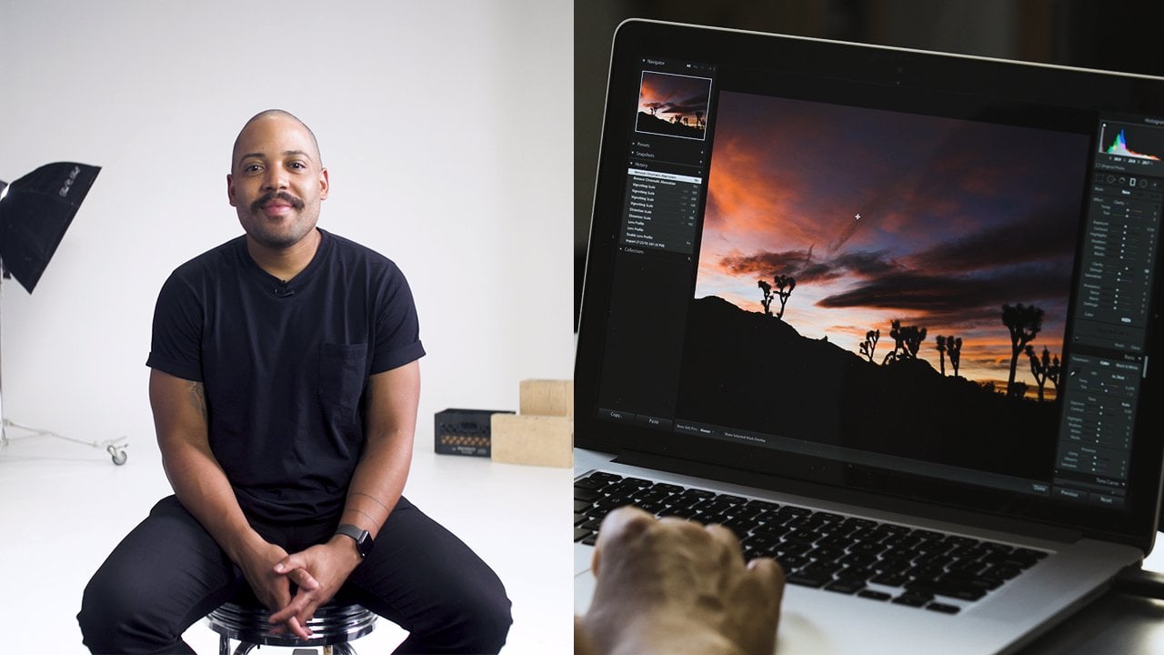
9. Adjusting Brightness in Your Image: Now let's go over the basic exposure adjustments in light room. First of all, you see, hissed a gram and hissed a gram is just a reference. It shows you where the tones off this particular picture are located on the left side, hissed a gram indicates that in this picture there are a lot of dark areas, and on the right side it shows that there are not so much very bright areas. And in the middle, the Middletons are not that prominent in this picture. If I opened another picture, that's a lot brighter. You can clearly see that a lot of the tones of the picture are in the highlights on not that much in the darkest parts on. If I opened something that is properly exposed, you see not too much in the blacks, not too much of the highlights. And most of the details are in the middle. So hissed a gram. Here is just for reference for you to see how well exposed is your image. I'll close the history, Graham, because we'll have more space for the basic adjustments to be visible now. I don't need this time, so it's easier for me to see the picture and then under the basic stamp, we have a lot of basic adjustments that we can make. First of all, I'll go over the basic tone adjustment, sliders, exposure. It's basically how bright is the image overall, if I slide it to the left, darkens damage. If I slide it to the right, it brightens damage and does it evenly. Throughout all the tones in the shadows, mid tones and highlights. This image is fairly well exposed, so it doesn't need any exposure adjustments. But if I select this image, I feel it's a little bit too bright and it needs to be darkened down. So the overall exposure slider fits here very well. So just this much, and I feel the image is much more impactful right now. The next slider here is contrast. So what did us If I slide it to the right, it darkens the darkest parts like here, and it brightens the brightest parts like here. And if I do the opposite, it does the opposite, so it gives more contrast or less contrast. It does in the overall fashion, so you have little control over finer details. Then we have these four sliders highlights shadows, whites and blacks. What these do? They also control the contrast of the overall image, but they do it in a much more precise manner. So I hardly ever touched. Contrast. Lighter. We're here. I do my contrast. Adjustments using the's four sliders. Let's bring back the history, Graham. So you have a reference to see how the sliders work. Let's go to another picture. So this bright image, the highlight slider. If I move it to the left, it brings back the details in the brightest areas of an image so you can clearly see in this part of the scent. Now it's kind of blown out, and you can hardly see the texture of the sand. But if I slide it back to the left, it brings out some fine details, and now I can see that it's really beautiful sand. Now the sky is also white, but no matter how far I slide it to the left, no details come up here. That's because there are no date in this image. It's quite overexposed, and the white sky looks just plain white. No matter how much I adjust the highlights or even exposure. It just looks dull green. And if I slide highlights to the other side, it just washes away even more than brightest areas of the image, the Shadow slider does much the same as highlights. But for the darkest parts of the image, this image illustrates how well it works. If I slide it to the right, I recover the details in the darkest part of the image. Now you see all the nice architectural details, which were normally in the shadows in the dark. So now it looks unnatural and a bit fake, so we hardly ever slided that much up to 50% fine to recover the details in this case, Now we find slide the shadows to the other side doesn't affect much because it's already dark. The white slider effects also the bright parts of the image, but in slightly different manner than the highlights. The highlights. They controlled the very brightest parts of the image and whites they control kind of more in the mid tones. But the brighter part this image would illustrate quite well. If I increase whites over to the right brings out some brightness in the bright areas because that image was a bit too dark. Same with this image. It's over all too dark. But if I slide the whites up, it brings up fine, brighter details to the image for comparison. If I were to slide, highlights up, nothing would change much because the image is already quite dark on the whites. They bright in the brightest areas on highlights, are more meant for recovering the blown out details, which are not present in this image. Now I like increasing Weitz over here instead of exposure, because exposure brightens all the areas in the image. And I want the darker parts the blacks in here to retain dunker so I don't increase exposure or just very slightly and use whites to write in the image. And the black slider effects only the very dark parts of the image. So you can clearly see in this image if I slide the blacks back down, it darkens only these concrete blocks that are the darkest parts and pulling us here over here. And if I slide it to the other side just doesn't work that way. So what's the difference between shadows on blacks? Well, they're quite similar, but used for different purposes. Blacks are used to darken the darkest areas in the image to create contrast there, and shadows are used to recover the details. In the dark areas of an image, slide this one over to the left and shadows to the right. It's a bit more clear in this example with shadows. I can recover the details in these areas, but if I slide the blacks the same way, it does not recover that much. So it's not used for this purpose. So I would need to recover shadows over to that side and decrease the blacks over to the left side. So whenever I used these four sliders in the majority of cases, I bring out the details in the brightest parts of the image by sliding highlight slider to the left. I bring out the details in the darkest part of the image by sliding shadows to the right, and then I increased some brightness with whites, and I slide the blacks to the left to darken the darkest parts of the image so it doesn't look so flat. So in majority off my edits, these four sliders looked kind of like that and actually hardly ever. I used the sliders all the way down or up, because if you do that, there might be some digital, unnatural artifacts appearing in the image which don't look that nice. So sliding those up to 50% minus or plus it's always a good idea and very really, I use it more.
10. What's Texture, Clarity and Dehaze: then if we look further, there are sliders for texture, clarity and D haste. So what it does the texture Slider brings out fine details in the image. So if I increase it like the fine details, like here in the snowy ground you can see it appears to have more texture. And if I decrease it, it's MoveOn's out the picture. Actually, the texture slider was designed more for smoothing the skin. So whenever you have a more close a portrait and if I slide the texture slider over to the left, it's smooth things out the skin for a better look. Clarity is quite similar to texture, but clarity is a bit more harsh. It brings out details in a much more rougher manner. So if I slide it to the right, it brings out all this small contrast in the leaves. And if I bring the texture up, it affect smaller, finer details like here, here and here. So quite often I combined those two for the nice feel that I want, like in this picture off ice lining horses increase the exposure of it. Andi, I I'd love to see more texture in the for of the horse on over here on clarity not so much . It makes the image look a bit unnatural on the final slider. De Hayes is meant to reduce the blurriness, the haze in the picture. If you have a dirty lens on your camera, you can slide it over to the right to make it look less obvious and also what it does. It brings back some contrast, and color saturation like this picture is quite good. An example for the hazing slider. You see, I have a few lupine plans very close to the lens, so they give this little blur and dreamy feel. Now, if I slide the D A slider over to that side, it decreases this effect. It saturates the color a bit more on it lessens the feel off haste in this image. And if I were to slide the D a slider to the left, it reduces the contrast of the image dramatically, and the effect is not so pleasing. So it's not used in this way. So that's it about basic exposure and texture. And these are the very main sliders that are used for every every every image edit that I do
11. Basic Ways to Adjust Colors: Let's go through basic color correction. So it is done primarily using wide balance tools. Andi using vibrance and saturation. What has the wide balance do? Let's select another picture like this one. Now White balance to has two sliders to make the picture colder or warmer, or to make the picture more green or more pink. By combining these two sliders, you can always color correct image so that the white color in the picture would stay white . In this picture, it's the white dress. So using these two sliders, we can make the whole picture have a neutral white balance. According to the white dress. To my eye, this image is a bit cold. I would like it to be a bit warmer so I can warming up just a notch like that. And now I feel that the color of the dress is quite neutral compared to the original. Now you can also do wide balance color correction using the wide balance picker tool. So if you selected and you go over, you should point out where is the white color in the picture? So obviously, you go over the dress and simply click there on it adjust the color of the image according to this dress. Now this tool works okay, but it's not always correct. Like in this time. It made the picture to warm to my liking. So if I use it, I click there and then I readjust a little bit. So I like the image to be a bed colder just like that. Now it looks good to me. The other two basic color adjustments air down here. Vibrance and saturation saturation slider will decrease the intensity of the color or increase the intensity. Now you need to be really careful here because otherwise the picture might look totally fake. So here we have really nice color of the plant, but it might look too saturated for my field. I would like to reduce a little saturation here, maybe minus seven. Now it looks according to what I like. If you reduce the situation maximum 20 you make an image black and white. That's a good way to convert image to black and white this way on vibrant slider. It also affects the saturation of an image, but it's a little bit more subtle. So if saturation slider affects the whole range of saturation vibrancy. Slider affects the situation off the mid tones of the image. It doesn't touch the very dark areas and very bright areas. If I reduce the vibrancy slider to zero, some color will still remain like the darkest and then the brightest areas of an image. Actually, I really use vibrant slider, so saturation slider is very useful on, you know, Sometimes I combine it with vibrance.
12. More Creative Color Adjustments: I'll show you a little bit more advanced tools how you can edit the colors of an image. If you go over here, go down, you confined hue, saturation lieutenants Color tab over here. So here you can change attributes off every individual color, like red, orange, yellow, green, Akwa blue, purple and magenta. There are three main things that you can adjust the colorant. It's you saturation and luminous. So what is the difference? Maybe let's switch to this image so you is primarily the shade of the color. So if we have lupine flowers over here, they're primarily purple color. So using the hue slider off the purple color, you can change the shade off these lupine plants. So if I slide over to the left, the lupine plan becomes blue. And if I slide over to the right, it becomes much more red and notice how it doesn't affect the tones of the skin at all. It only affects the color off the plants. The skin tones are the orange color, so if you touch the orange bar it effects the color off the skin. It makes it more red, or it makes it more great. The skin tones in this picture look great, so you don't need to touch the slider so you adjust the shade of particular color. Saturation adjusts the intensity of the color so you find move the slider to the left in decreases saturation, and if I move it to the right, it intensifies the color and luminous. It's the brightness off the color. So we find moved the purple slider down. It darkens the purple colors, and if I move the slider right, it brightens the color. So that's the main difference. You is the shade of the color saturation is the intensity, and luminous is the brightness off the color. By manipulating these sliders, you can adjust the color in much more precise way. Let's have a look at another's image. I feel that green color in this picture is a bit over saturated, and it distracts from the overall image. Also, the skies a bit too bright. I'd like to see more of a blue color there, so let's see if I go to saturation here and decrease the saturation of the green. Just a little saturation of green also comes with yellow, so I need to decrease yellow as well. So not too much. But now the color is much more natural. If I also go to hew off the green, and if I slide it over to the right, it makes the bushes look more mint on defy. Go over to the left. It makes them more yellow. I like to have them just slightly more minty in the huge off green like that. Now this kind I went to darken it and recover the blue color a little so I can go to luminous blue color Andi. Slide it to the left to darken the sky. You see, that's way too much. So just a little bit more color to be visible. The building itself, The color is more like oven orange. I like it to be maybe a bit darker, just a bit on. Increase the saturation to have nicer color off the building. That's it. That's how I love to see the colors in this image. And if I would like to see before and after of this image, I can go to view before, after and pressed left right over here. So here I can see before and after
13. A Tweak That is Mostly Overlooked: one commonly overlooked aspect of any image. It is sharpness and noise reduction in light room. You can find this under the tamp off detail, so you feel breast. Here. You can see a lot of settings. What you can do, basically the most useful is sharpening and noise reduction. So, first of all, for any image, I said the noise reduction toe around 28 on sharpening settings to around 60. When you do adjustments on small emission like this, you cannot see any difference. But if you zoom in, you'll notice it right away. So if I increased noise reduction, you can see that her skin became much cleaner. Look there again like this. Unlike that. So her skin tones became nicer. And if I increase the sharpening here, a lot more details pop up, so you can clearly see the details in here versus here. Uh, some glasses pop up more nicely on over here. The whole sharpness of image is much better. That is especially visible in images where you should with higher I s o, let's have a look at another example. So this picture we took it in Iceland with a drone and this one. It's a raw file, so by default, sharpening is set to 40 on the role files. And if we go and have a look at the one before this was a J pic file, so it has default sharpening set to zero over here. If we zoom into this image by 200% the sky's clear blue. But we have here what is called the digital noise, like these small, pixelated areas. So if I reduce the noise by some 50% the sky becomes cleaner on reduces this digital on one in noise and then for the image to be a little more crisp and bring out the details. I like to sharpen into something like 70. Now here. If I press this small button, I can toggle on and off the detail, sharpening settings so you can clearly see the difference off the original file over here and now, the one with sharpening a noise reduction settings applied. These are small touches, really unnoticeable in an image of this size, but if you print them or you want to store them for future, you should always adjust noise and sharpening settings. Here there are a bit more sliders over here. But for the beginner, these two are just fine. We'll go over the rest of them in more detail in our advanced light from course.
14. Crop and Fix Tilted Images: now, what should you do? If you have an image that is angled or tilted like this one, you can see the bottom line of the architecture is angle. Here you have what is called a crop to. If you press it, then the lines appear. Then you can recompose the image, cut some corners of it. Or if you go over here at the corner, you can press with the mouse and then you can rotate the image. Correct the angle and tilt of that particular image. So here, I want to do just something like this. Cry, Let go and press Enter. Now we have this architectural line parallel to the bottom line of the picture on the picture looks really good here. Also, if we went to this image, I don't really like the top part of this grey sky. I mean, I think it takes away from the overall impact of the image. So if I want to crop it down over here just like this, so it's not visible. Only the purple color is visible. Piper center. Now I believe the images a little stronger now when you go over to the crop to you can crop freely like you can make a square image out of it if you want. Or even you can make a horizontal one like that so you can do it quite freely. But if you press ah, lock sign over here, then if you try to recompose, it stays locked to the original aspect ratio of the image. So it remains like a portrait vertical image over here. I think it's also a good crop, something like this. Now he wants the image to be not vertical. Let's say you wanted squared. You can go over here and select the aspect ratio to be 11 That means it gives you a square aspect ratio like this. There are some other aspect ratios that you can choose. Here he want to crop a picture to horizontal from vertical like this. You can press over here and choose horizontal angle outlets. You play with the horizontal crop only. Let's see one more image like this one with our cute dogs. So I believe here. This top part of the image is a bit distracting, so I'd like to crop it on if I make it like that Now, I believe the images you know cleaner, and you can really focus on the eyes of our dogs
15. How to Clean an Image: Sometimes you want to remove unwanted objects from a photo. In this image, for example, there are a lot of dirt in this bottle at the bottom of the picture. I would like it to be cleaner and nicer so it would match this guy better. Light Room has a special two called Spot Removal. It's found over here. If I breast there, I can go over the spot that I want to remove. Let's say this black dot and press it with the mouse on what it does. It puts over this area on top off the spot that I marked before. And now, if I turn it off now, the black dot is gone from there. Now, when you choose a spot toe, you can choose the size off How big you want the cursor to be, so you can choose the size by going over here, increase the size or decrease the size. You can also do that with your mouse. You can increase with the mouse wheel and decrease with the mouse wheel. Let's go over and remove some more spots here in the puddle. Now, when you press with a spot removal tool, light room makes the best guess which spot to put over the area that you mark so you can always move on show light room that you want to put clean areas on the spot. You can mark not only the spot, but if you dress with the mouse, hold and drag. You can choose area off any shape that you like. So this, for example, it looks really good right now on this spot over here. Now what light from did it made its best guess. Andi, you can see the edges of the area that we marked, and it's not really that night, so you can always adjust the area that you want to put over there. So I want the edges to match like that. So now there's some little black area on a lot of blue and hear the same little black area and a lot of blue. Andi, it's healed perfectly on over here on. I don't like these also black areas, so I'll mark, like bigger area over here like that on this one, too. Now the bottle is much cleaner than it was before. Let's see the before and after. Over here on you see a lot of dirt, very little there, like this image. I don't really like this wide trash in the picture because it says bright spot among the darker tones. So I really want toe remove it. I use again the same tool over here and mark the area that I want to remove. And again it made a guess, and it's totally bad place. But if I move over to a very similar area like this, here you go. Now it's gone and it looks really good. One last thing about the spot removal you can choose to modes. It's either hail that we just did right now, or you can choose clothes mode. The difference is like if I want to remove this spot if I market with a hell to so he chooses an adjacent area like this and it looks even. It's gone now if you choose the same spots, but you choose the clone tool. Now you see there's a different circle because Clone Tool takes the exact spot that you marked on, puts it on top, he'll to takes the same spot over here, puts it on top and then blends it in with the surrounding area to match it much more. Well, in this case, clone doesn't work at all. You need the heel to toe work now. In the final example, if I want to reduce the wrinkles, which obviously she doesn't have very much off like this wrinkle and this wrinkle, I can choose the same spot removal tool. And if I go over the wrinkle, it removes it completely. Now, if you remove all the wrinkles, the portrait might start to look unnatural. So what you can do? You can go over this and mark this spot that you just healed and then reduce the opacity off this spot removal to 50%. So the wrinkle is still visible, but just like 50% can do that with with these other wrinkles. She was on adjacent area on this one a little bit more. Okay, and these air 50%. So the wrinkles are less visible, but the portrait still looks natural.
16. Editing Only a Part of an Image: now what if you want to just only one part of the image Now she's a little too dark over here. I'd like her to be brighter, but if I brighten up all the image, this guy gets washed away and I don't want that. I want to brighten just the area where she stands. So in light room, there is a perfect tool called adjustment brush. Right? Click on it so you can go over the picture and brush over the area where you want a certain effect to be applied. So I want to brighten up her and a little bit the area around her. So I just pressed with the mouse and swoop like this just like that. And then I can increase the exposure in that area you can see brightens up in the place where I just brushed over. So if I do like that, maybe a little bit more, maybe a little bit here and now, you can instantly see that the picture has a bigger impact because she's just brighter on the overall balance of color tones is much more pleasing to the eye. We went to the horses picture again. I can brighten up all the bottom part with the shadows lighter because it sold in the darker tones. But if I'd like to brighten up only these two horses, I can choose the adjustment brush brush over them aan den, increase the shadows. So now I have these two horses brighter on these are still dark on. It's kind of nice play of the towns in this picture for the adjustment brush size, you can always choose it by rolling the mouse wheel bigger or smaller, you can see two circles around it. This is how hard is the edge of your new adjustment brush. If you feather it more, it softens the edges off your adjustment. And if you decrease the feather now, you'd have hard edges. So if I brush over here on increased exposure, you can really see this hard edges. And if I make a new brush with softer edges, means increased the feather on, do the same here on increase the exposure. You can see that the fall off off the adjustment is much more gradual. Reset the changes here. Now, using the adjustment brush, you can brighten a certain areas of the picture. Andi, if you choose new adjustment brush, you can dark in another area of the image. This is a technical dodge and burn. Now, with the adjustment brush, you can do all the basic adjustments we have discussed before. You can change white balance in only parts of the image. Do the contrast, exposure and clarity. Adjustments also decreased saturation in certain points or increased sharpness. There are a couple more things that you can do, but I feel there more for an advanced user, so we'll go over them in our advanced light from course. Now there are times when do you want to adjust the portion of the image, but not a spot, but like half the image or top part I'll show you here. This image is quite darks, and I want to brighten it up. So if I increase exposure, decrease highlights a bit on blacks of it. Now I like the bottom part, but the top part is a bit too bright. There is a tool which works very similar to the adjustment brush. It's called graduated filter. If I choose it and I dragged over this area, I can decrease the exposure. So what it does it decreases the exposure off everything above the line, then it gradually falls off until this line on the bottom part of the picture has no effect through this. I can't decrease it more so you can see the effect where it goes so you can do all the same things as with the adjustment brush, but not as a spot but as a gradual filter off certain parts of the image. You can also increase or decrease the zone where the adjustments that you made falls off. So adjustment brush and radial filter are two men tools to make local adjustments on your image.
17. Quick Way to Smoothen the Skin: I'll show you a couple quick tips out to smooth in the skin of a portrait. Let's zoom in a little closer now. Her skin has a couple of spots over here, here, here, in here. So if you want to smooth the skin, first of all, I like to remove those spots. So I chose this spot to make sure the capacity is set to 100. Choose the hell and then go over every blotch and fix it that, like here, here, maybe closer distance. This one, This one, this one You're okay. I feel the remaining blotches are not that visible. The next thing I do as I choose adjustment brush and go over loosely over plain areas of skin on. Be careful not to touch the eyebrows or the nose or the lips, just where the skin should be smooth and nice. And then I would decrease the texture over there. And it's smooth things out the skin and maybe just the touch. Clark, if you hover over with the cursor over the adjustment brush spot now the red zone appears and it shows Where is this adjustment brushed in? So it effects only the areas that are marked in red. Now, if we compare before and after, you can see that the skin here is much more cleaner than it was here. But still, it retains some texture and some details, so it doesn't look too plastic. Don't go overboard with this trick.
18. What is a Preset: you have probably heard the term called preset. You can find the preset stab in the develop module over here on the left. If you expand it, you'll see some presets created by Adobe and some presets save by us. So what is a preset preset is like a filter that contains all the adjustments that has been made to a certain image. So, for example, if I like the edit of this image, the particular colors and the particular tonal adjustments, I can go over here in the present stamp press. The plus sign and press create present. What will this do? It will save all these adjustments that you made to this particular image as a pre sit over here so you can see some samples that we have saved before. Like we like this type of anything. So we saved it as a preset. So if I press here with a mouse light from applies all the saved and it's in this preset onto this image, you can see all the editing adjustments here have changed. 95 breast, black and white. They change again according to the ones saved In this precept, you can find plenty of presents to buy online. So essentially, what you're buying, you're buying someone's set off adjustments that they made to their particular image. Someone's way. How they edit an image presents often contained color adjustments like white balance saturation on all these specific color adjustments, as well as tonal changes like contrast, exposure, clarity, shadows or anything. All the adjustments that you can make in line from you can save them as a preset. So if you have bought someone's preset online, you can go over here, press the plus sign press import presets, and then when you apply this preset, it's a good starting point to edit the image. So, for example, you like this preset. You apply this here on, then you can tweak it to your liking like increased exposure. Maybe decrease the blacks to make the image look the way you want it. So that is a short explanation of what is a present
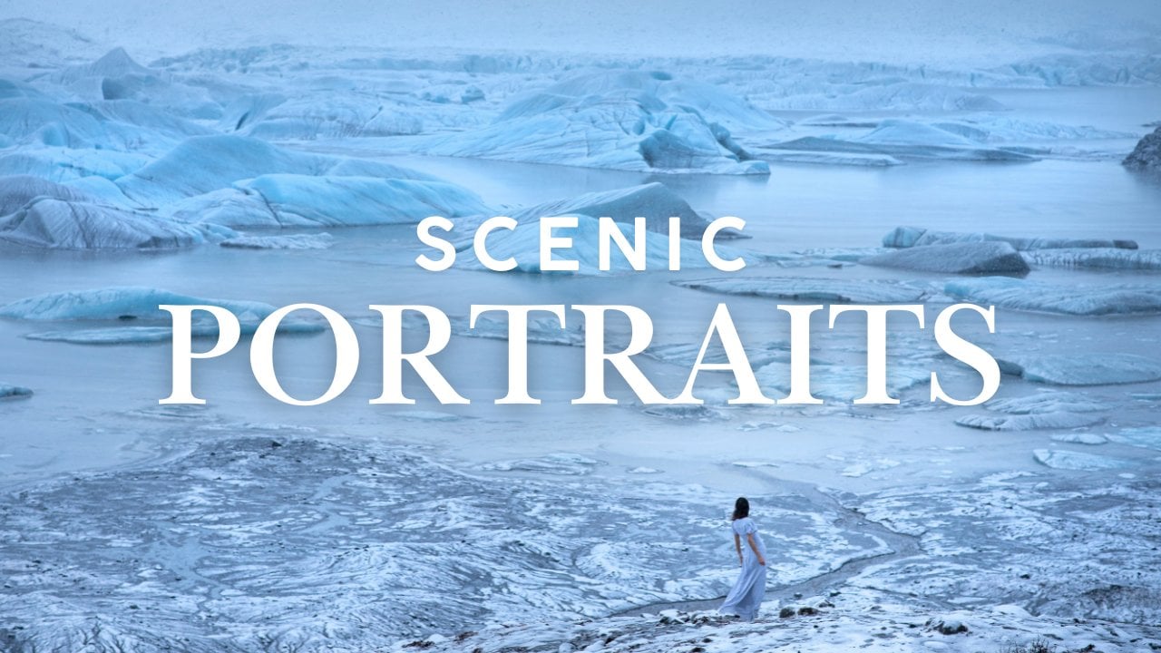
19. Start to Finish Edit: Glacier Portrait: We have covered a lot about light room already. Of course, there are a lot more tools like here and settings, but we believe these air for more advanced level. So as a beginner you can start editing and we will discuss about those in our advanced light, of course. So before you go and do your own and it's, we'll show you how we added a couple photos from start to finish. So I'd really like to show you how we've edited this image. We shot this in Iceland last year. We drove up to this glacier on it, started snowing on the whole scenery, looked surreal. We thought We need to make a cool picture here, but it was cold. So we had just a couple minutes before Polina got too cold. So she took off her coat. We did a picture on it turned out to be super cool. So first of all, I like to edit sharpening a noise reduction settings. So in this image there is a lot of noise because it was quite dark. So I think less 25 is good, and then I want to sharpen it a bit. Something like 70 It's very good now, the images overall, too dark as you see compared to this wide background. So I want to go up on increase the whites quite significantly, yes, So the picture brightens up and even exposure a bit. Yeah, you know, it's more like that now. Some of the highlights air blown off too much, so I want to decrease the highlights, so it's more pleasing to the eye now. Still, the top part of the image is a bit too right, so I want to reduce the overall brightness of the top part of the image by using gradual filter and decreasing exposure just a bit. Here you can see the top part is now a bit darkened, and I would brighten up the overall just slightly more. Now. Some of the blacks are a bit lost, so I need to cover a bit more blacks over there. Now I like the overall exposure and contrast levels. I bring up a little more texture on, and maybe some more on a bit of clarity. Now the image is a bit cold cold, but I mean, it was a cold environment, so I don't want to make it like pure wife. I went here now it looks kind of though I don't want to do that. I'll select as shot, but I want to warming up just a notch. Just a notch. Too much. Yep, something like this is perfect. I really want to enhance this blue color a bit because you see this blue shade is a bit different than this blue. So I want to separate these shades even more, so I'll go to color. Andi, we've you off aqua color just a bit more. Let's see how close becomes blue, and it becomes a bit more green about slide it over to this sign. So we have slightly more shades of blue color in this image now as the last thing. I want to brighten up her Ellen because she's a bit lost in here. But I don't want to bright in the whole image just the area where Polynice standing. So I'll take adjustment brush on, do the brush over here on increased exposure just a bit, so it's not really visible when you see it like that. But if you want to see before and after without the brush, you can clearly see that this area is much more bright. So that's it. I'm happy with the edit of this image. Let's have a look at before and after. What are the differences that we've made Mars darker? This is much, much nicer image. Overall, it was easy and fast. Now let's edit another rich. You can download the original and follow US alone.
20. Start to Finish Edit: Black-White : I really like the mood of her on the wind and sand and everything and this interesting concrete pillars. But this guy's too much washed away on. We cannot recover any detail over there. In those cases, black and wide helps a lot, so let's make black and white image out of this one. So first of all, I'll go to details and reduce the noise on increased sharpening. See something like 74. Now I like that, and we'll go over to saturation and degree saturation to zero. Now the picture became black and white. Now what happens in most of the cases when you decrease saturation to make black and white , the image becomes a bit flat like dough, so you need to manually adjust the contrasts so it looks more impactful. So here I'll recover highlights, so the sand is much more visible. Over here, I'll decrease the blacks, so there are a bit more blacks in this area. I'll increase, whites told images. Not that dark and even degrees lacks is a bit more. Now. The contrast between blacks and whites is somewhere where I like. I think clarity helps in these images, especially with black and white. I really love clarity. Brings out the details, even the texture like this on. I'll do a little dodge and burn here. Maybe I've darken the corners around here so we can concentrate more on Paulina. So I'll brush it here, reduce exposure and also in the sky. I want to make it a bit darker over there. Just a notch. Maybe new brush. I'll do some more darkening. Been getting around here. Let's see. Okay, we start some more. Now is the last touch. I'll bright enough. Her face just a bit, using same brush on increasing exposure Just a bit on. I will also writing up these pillars just a bit just a bit, because they feel too happy right now. On. Here we go. We have an image that looks really great. Let's have a look at before and after.
21. Start to Finish Edit: Landscape : and as the last sample, we let it this picture we made with a drone. Now it's really over exposed, so the sky's nearly blown completely away. And down here we have too little contrast and too little blacks. So, as always, start with details. If I zoom in a little noise reduction on some sharpening, I believe that skirt. Let's go to the top So the exposure is too bright. So I'll dark in the whole image, but the skies still too much blown out. I'll recover the highlights. Yes, increase the whites. Bring back some more blacks over here. Maybe even D Hazel. Ooh, yeah, plus 16. Cool. Now the top part of the image is still a bit a bit too bright. So I love to reduce that brightness with the radial tool. Decrease the highlights. Even more exposure. A bit more. Andi, I'd like this guy to be a bit more blue of cold. So we have balance between colder tones in the sky and the snow on warmer tones in the ground. Okay, this that's cool. I believe. Now I want to bright and just brighten up this corner just a bit. The exposure. Yeah, so it's not that dark. That's cool. Now some clarity will help here to and texture just a bit. Not too much. Now. I don't really like the shade of the blue on top. Okay, let's go with Luminess That's dark in the blue J just a bit aqua. Let's go with you. Also just a bit more over to the signed. And let's decrease saturation just a bit. So it looks natural. Now let's see if we need a little bit more whites. Yeah, just on a bit more. Blacks, maybe. Let's warm the image just in a little Now I believe this landscape looks amazing, so we made edits for three images we can have a look at before and after. This was too dark on. Now it's much nicer tones. We can't color image now. We have really nice black and white image on the last landscape picture
22. How to Export Images: we did all the end. It's the last step is to export images back into the hard drive so you can choose how many images you want to export. You could export just this one image, but we did start to finish edits for the last three images, so you can select those images and export them because we don't want to export the rest. They're not finished yet. So in order to select multiple images on the filmstrip, you should hold command or control key. When you're keeper on, just select the images that you want to export. Now three images are select, and if you go over to file export, it says, three files will be exported. So the ones that we have chosen here, as with everything in light room, there is a lot of choices to be made. But the most important ones are you have to choose the location where you want to export the images. So my choice is I always said it to choose folder later. So when you press export, a new window comes up and then you can select the destination where you want to export the images you could rename all the files, and you can also set the quality settings. So whenever I export, I choose J peg and set quality to around 90. You don't need 100 because he cannot possibly distinguish the difference between the quality off 90 and 100. They look identical, but their file size differ. So I feel nineties, a good compromise color space. You should leave it at this. And don't bother about other choices and the rest. While I won't overwhelm you with information, basic settings are enough, so three files press export. Then I'll choose that this nation next to the original images that we have pictures over here and I'll create new folder, which I'll name final edited images. Create an expert to this location. Now light from takes some time to export the files in the appropriate folder. On If we Go to Pictures final edited images, we find our three images that we have just edited in light room. The names of files remain as if in the original
23. Final Thoughts & Class Project: We are through with the class. Thank you for watching and we hope you found it helpful. We believe Lightroom will become a tool that you really love and use a majority of your photo editing. It has a lot of capabilities and we use for our work nearly every day. And for the class project, we invite you to choose one of your favorite images and edited using the techniques that you learned in this course. Or you could also use one of our images for this project. You will find those images along with all the steps that you need to do in the project section. We'd be very happy to see your before and after. We really hoped it was helpful for you. And we honestly want to know what you think of it. If you liked it, we would be beyond grateful if you could rate it and leave a review that would really help us grow in scale Shia community. If you did not like it for any reason, please send us a message to this email and let us know why. We'd appreciate your feedback very much. So we could do better next time. By the way, you could follow us here on skill shit, so you could get notifications about our new classes. Thank you so much for watching and happy editing.
 Paulina & Matas Jūras, Wedding Photographers