Transcripts
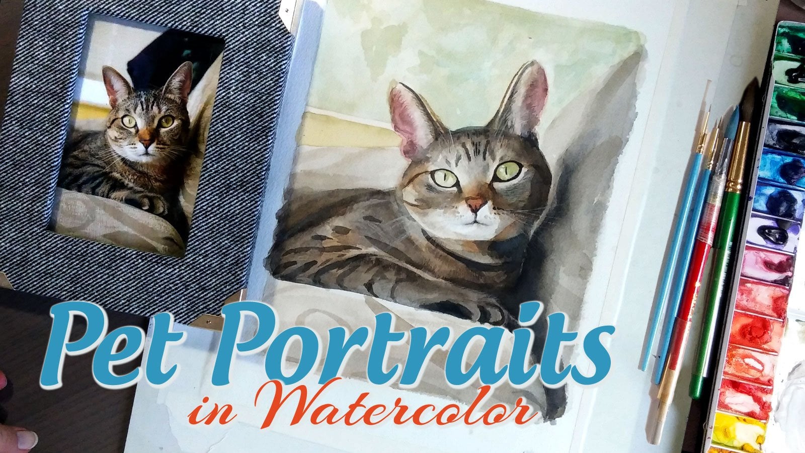
1. 01 Pet Portrait Ginger Introduction: Thank you for taking a
look at this course. My name is Johan Corkalsa. I have about 25 years in watercolor experience and a bachelor's
degree in fine arts. This course is going to look at watercolor port pet portraits, and we're going to paint
this lovely ginger cat. The work is going to be done more on an
intermediate level. We're going to do some hand
drawing, as you see here, to get the image transferred
onto our watercolor paper. Will give it a more
personal touch, and it also helps us
to learn to draw more accurately as we're doing
images and paintings. And we'll take a look at some different
painting techniques. Again, more on the
intermediate level, color mixing techniques,
textures, colors. Wet into wet, layering,
different things. And because of some
of these techniques, I would recommend either using a Cold pressed watercolor paper, which is what I use
most of the time, or what paper I used for
this particular project was at Stonehenge Pescia um, printmaking paper is more
of an etching paper, and it absorbs a lot of water like very similarly
to watercolor paper. The sizing is fairly similar, and you get lovely
results with it, but Cold pressed
watercolor is also very beautiful and would work just
as well for this project. So also with materials, paints, I would recommend Windsor and Newton or something
of a similar grade, more of an artist grade paint or even a student
artist grade paint. Stay away from very inexpensive, either cakes or tubes that
are sort of hobby grade. Um, I would also recommend
a nicer set of brushes, maybe a size six and a
couple smaller brushes, a couple larger brushes. I tend to work with
a six to a ten and then a couple of
smaller brushes, but not much smaller. Um, because when you have
high quality paint brushes, they come to a very fine point, and you will be able to use those to do very fine details. Um, so we'll look
at details, work, and creating this sort
of full composition to display our ginger tabby cat. So I hope you enjoy this
course and hope to join us. Um, we will be taking a look now at different
ways to determine photos to choose for our project and how we came
about choosing this one.
2. 02 Pet Portrait Ginger Choosing an Image: So taking a look at some photos, just to give you an idea of
different things to look for, um, the one on the left, the lighting is okay, but
most of the lighting, the light side of the
body is focused on the body of the cat rather
than on the face of the cat. And so to get a good
portrait out of this at this kind of
awkward looking down angle can be very
difficult to make your brain figure out the actual structure
of the cat's body, and it can kind of create
difficulty in terms of trying to make a realistic
painting out of this one. One on the left, could be
kind of a meme at this point. But the bright flash right
in the cat's face and that sharp shadow in the
background will kill any sense of volume
in a painting. If you try and mimic that. So you're basically painting
just colors and tones, really just colors rather than any kind of shadow
and volume that your eye perceives through the different levels
of shade in a picture. So those are ones
that I would avoid. These next two photos, while they're up
close and could give you a full body
image of the cat, the one on left, the cat
looks a little bit annoyed, in my opinion, and I feel like even though you've got
some directional lighting, you could probably make
it work as a portrait, especially if you tried to kind of adjust it to where the cat maybe didn't
look quite as grumpy. So it's a potential one
that could be used. The background is obviously clattered and will make
it a little bit hard for your eye to follow where the cat is as you're painting. Uh, can make you feel
a little mixed up. And then the picture
on the right, the cat is squinting and so you're not going to get
a good sense of the eyes. The other issue with this
picture is the flat lighting. It's an above above the head lighting from like
a kitchen lamp or something. And it's just got kind of
a flat orange color shade from that lamp. And so it's giving sort of this kind of fronty
look to the picture. Um, the one on the left
has window lighting, so at least it has
that going for it, even though the body is a little bit kind of difficult
to figure out the feet, what they're doing
in that picture. While you could, if you know cadenatomy probably
figured it out, it might be difficult to make
it look sane in a painting. And this next picture, although it's cute, and it appears to have
directional lighting. As you look at the
bedspread there, it does not have a lot of directional lighting
on the cat itself. It's very subtle. You
might be able to bump up the contrast in your computer to make it kind of
look a little more. Um, like you wanted to see
the directional lighting, but that's also going to change the kind of look of it to a kind of strange yellow
color and not give you a very nice feel for that image. And so you're going to get a
kind of flat painting again. You could be creative
with it if you wanted to. And obviously, any
picture can be a source. However, I like to pick images that have already a
strong sense of contrast. Um, or at least a
little bit more of a mood to the
lightings to where it creates this point of interest and helps you to understand and model the volume of the
animal's face and features. In this picture, obviously, the cat's also laying down. So while you can get a
good sense of his paws and tail and body, how it's kind of laying down, his eyes are closed
and you can't see that sort of personality
coming through the eyes looking at you and getting that sort of
portrait feel for it. And so we kind of come
up on this last picture. And, you know, the cat in this one also looks kind of a little bit
grumpy, in my opinion, but I don't feel like
it's grumpy enough to make or break the photo. It has a very sort of cat
personality kind of image, and it also has a kind of volumetric lighting
to it that helps you to figure out where the
body is and how it's sitting. And we'll also use
a second picture that is from actually
a different cat to paint the lower part of the picture for this
particular painting, just so we get a sense
of the full body of the cat and we're kind
of working on a couple of different pictures to
show us how we can use source photos from a few
different places to create something that still
looks amazing and that, you know, somebody looking
at the painting will never know that we
did because um, they'll never see
the source photos. So it's a technique
that you can use to create something interesting. And also the
background is created, you know, using other
sources as well, where we can use our
imagination to create this kind of grassy landscape
with a kind of cloudy sky. You know, some people talk
about the rainbow bridge for animals that
have passed away. And a lot of these
portraits I've painted after the cat has
already passed. And so, you know, this particular cat enjoyed
eating grass outdoors and so having the grass in the
painting and the sort of outdoor feeling for a cat that enjoyed being
outdoors a lot. It creates more of
a personal feel for that painting for the person
that it's being painted for, you know, who is
kind of remembering this animal that they were
close to at some point. So there's some things
to think about as you're preparing to paint
for a pet portrait, just to keep in mind
that the subject is not just an animal, but it is a very specific
animal because we are painting a portrait
rather than just creating a painting
of a generic cat or another pet that
we are working with.
3. 03 Pet Portrait Ginger Drawing: Alright, we're going to get
started in just a minute. And I want to make sure that
your materials are ready. So let's take your board, your paper and
make sure that you either have a watercolor
block where the paper is already attached
down or that you're taking your watercolor
paper and taping it down to a solid surface so
that it will not warp and buckle as you put
a lot of paper water on it. So you want to make
sure that you get that watercolor paper
drying straight. I use acid free artist
tape to do that. Um, and then for
your watercolors, we're going to start
with drawing so you don't have to worry
about the colors first. But it's always good
to have your colors already laid out on a palette. I have mine usually
in, you know, a metal palette with each of the little wells filled
in with a color already. And have some paint
brushes ready. We're just going to
begin with, like, a regular, maybe a number
two pencil or something. You just want the pencil lines to be very light so you don't need a very dark soft pencil, just a very light
pencil, a hard pencil. And an eraser just in case you need to
adjust the lines at all. And so we'll get started and
jump right into the drawing. We're going to
start right in and start drawing our cat here. I'm going to look
at the shape of the head and get kind of a
general shape as we draw. So we're going to look
at that and I've already determined kind of
where on the page he's going to go so that we get enough space for the ears and a little space
for the background. I mean, it's kind of
a nice in the middle but not smack in the
center of the page. Now we're going to look
at the kind of angle of the face where you have
the snout in the mouth. And you're going to be
able to draw in that face. You can kind of see
little details there. I take my hand and I
measure the distance between different
spaces on the face, so I get an approximate
approximation on where things go. The eyes, for example, are in the middle of the head right about halfway point from
the top to the bottom, at least at the angle
in this picture. And so that's where
I'm measuring and making sure that I get the eyes right into that space. Since the eyes are an
actual circle or a sphere, rather than just ovals, I'm kind of giving
myself an idea of the full size of the
eyes in the head. It's not necessary, but it's something I
sometimes like to do to get a more three
dimensional feel to what I'm doing. And what I'm adding here
is actually the place for the whiskers and some of
the lines around the eyes. And some of the
markings on the head, as well as the light
areas around the eyes. This gives me a guide
space for when I start painting where everything goes. Now, the ears I try to
sketch pretty lightly, so that when I'm finished, there won't be much
visible under the paint. And then when it's time, I do give myself a little
bit of time to erase anything that's
outside the actual pat in areas on the page. The paper that we're using is actually a printmaking paper. It's a stonehenged
printmaking paper. It's in a worn white. I believe it's called Pesha and you can get that at
any art supply store. When you use printmaking paper, you need extra water
because it's going to suck up a lot more
water and not allow you to move the paint as much if you put it on
without enough water. So you want to make sure
that you have enough. Now, sketching some
of the features in the face and then
getting into the body, making sure that we
have enough space for where the body goes. First kind of the shape of his sort of rough man shoulders. He's definitely an orange
tabby tomcat. Very peaceful. Man his manners Now, the feet, we're gonna look at actually a different picture
for those because, um, from here, this picture doesn't have
an image of the feet. So we're gonna be looking
at another photo. It's actually another cat. This orange tabby, one of his legs was either
dislocated or broken somehow. And when he stood, paw his leg literally
looks broken. It was very odd kind
of bend in his legs. So, um, we had to kind of well modify that for this so it doesn't look strange
in the final piece. No, I'm measuring the
length of the head as, um in proportion to
the body so that you can kind of get a sense
of where certain areas or markings go on the body and how kind of a better idea
of where to put shadows and light areas to make
this a little bit easier during the
painting phase. And I'm just checking some
measurements, some locations, little details that
I want to be mindful of when I'm painting so
that I know where they go. And some of it will
get covered up before I even paint it. But sometimes this part of the phase is not just for
the physical drawing, but it's also for the
mental familiarization with what you're painting because your brain
has not usually taken the time to measure distances between a
cat's face or body. And so if you take
this time to do it, then you'll have some extra
time to be able to do that, and your brain will understand
the painting better.
4. 04 Pet Portrait Ginger Painting: Let's get into the painting. Make sure you have your
paints and your brush and your water cup and
some paper towels, 'cause that will be handy.
So we're gonna start. This is sort of burnt
sienna and some um, raw umber with a little yellow
ochre mixed in together. I tend to use those kind of combined rather than one
or the other at a time. And I'm just going to
start putting in kind of the undercoat into
the cat's fur. And one of the reasons I
chose this warm paper to go into this painting is
that even though the cat actually has a lot of
white areas in his face. When you use this
dark around it, the warm tone ends up actually looking white
because of the contrast, and it gives a nice sort
of warm creaminess to the whole fur of the
cat and his whole body. And it looks very pretty and warm once the
painting is finished. Now, I'm taking a little
more yellow ochre to add to the colors. You'll need to moderate
the amount of water use. Sometimes I'll just use
straight color from the ochre. Sometimes I'll have a little
bit of a mixture going on. For this underlayer, the yellow ochre
gives it a nice kind of yellow warmth that's sort of common with
the ginger cats. And then with the burnt
Sienas and the umbers, you get kind of the darker
stripes in the fur that gives it a nice kind of orange tabby feel where the
tones are very similar, but you have the nice
contrast in the fur. Yes, you'll use some slightly darker, slightly lighter tones in and out through this
kind of top of the face. It's not hugely important at this stage because right now, we're not establishing shadow. What we're establishing is
local color for the face. So that's something
that's different between, um, the different types of painting you're doing when
you're painting in color. With black and
white, you can just focus on shadow and light. But here, we're also adding
what's called local color, and that is the
color of the face. Now, right there,
you see, there's a little bit of shadowing, but also a little
bit of tonality into where the face starts to, um, merge and where
you're going to have some darker areas and
lighter areas because of the fur patterning. Yeah, we'll just keep
with this yellow ochre. I will go into the
body a little bit. Add some tone into
that, as well. In this part of the body, I'm doing these sort of
semicircular strokes, a little bit curved strokes to mimic the curvature
of the body, the curvature of the fur, as well as the curvature
of the breaks in the fur and the sort of stripes of the tabby stripes
that go through that. You'll see these spaces
where we're adding, um, some pieces
just into the ear. And there we're going
to be taking some umber and mixing that into
what we're working on. And taking some sienna, as well. No, often they say
not to mix colors together on your palette because you'll never
get them clean. You'll see that I do that a lot. And then I'll sometimes
clean them out at the end. And now we're adding
some of the more colorful areas into the face, some of those ginger stripes. And this is kind of the
first phase of that, and there'll be more color
added later into those areas. Some people like a step
by step kind of painting. And if you're looking at
actual artist paintings, they're generally not
that paint by number, step by step kind of
things where you end up really adding a
little more here and a little bit there
based on how the paintings doing and taking
time to evaluate what you have in front of you
to improve the painting and add the things that
it needs rather than the things that you
just want to add to it. A paint by number painting
will end up looking like a paint by number
painting as opposed to an artist painting where you
have your own vision and you want to have a specific look to it that
you're looking for. And here, you're seeing me mixing very wet into wet paint, and you seeing that kind of blurring and bleeding
that comes out of that. And it's very pretty in certain areas of the fur because that's how
the colors are. They don't just don't just necessarily look at each individual hair when
you're looking at a cat. You can, if you want to
focus on that hyper detail, but in a lot of ways, we just look at the colors
of sp and into each other, and it gives us that feeling
of what the cat looks like. And so having this picture
of the especially the sienna and a little bit of umber
and the yellow cir, giving us that very gingery kind of red color into the fur. And now we're taking
the umber again. And the sienna, and we'll be adding a little bit
of pain's gray. This gives it a little
bit of a smoky quality. Doesn't kind of tones
it down a little bit, so it's a little more muted. And this shadow
area kind of under the mouth is where we're going to add a little
bit of that shading and, you know, kind of wet into
wet it out a little bit. So it's not super dark, just giving it a
little bit of color. So that we have that
sense of shadow there under the chin. And sometimes when you feel like something's gone too dark, you can pull it back
with a little water or with a little
bit of paper towel, and that will move you
forward in your painting, and then you can kind of
go over it as that's dry. And we're adding some
of that shadow into the eye area so that you can get a sense of the
three dimensionality of the eye rather than having
a flat eye for the cat. And his nose gets a
little shadow there, too. It's a sort of continuous,
um, mark there. And sometimes you got to
soften it up a little bit, so you can go back in
with a clean wet brush. I use paper towels a whole lot. Some people like rags for me.
That's not really a thing. I'm gonna add some
more paints gray and continue this
sort of shadow area. Cause the side of the head
is obviously in shadow. And the photo is
very strongly lit. So if you like that,
you can keep with that, or you can make the shadows
a little bit lighter. You know, it's kind of just
a personal preference there, which way you to want to do. I put a little bit of
shadow under the chin since the light is coming from sort of the top right
of the picture. And then you get the shadow
on the kind of left going down on the underside. We'll add a little bit of kind of where the shadow
on his back is. I'm getting a sense
of where that goes. I'm giving myself a
better placement for. It helps with the
three dimensionality and the kind of full
shape of the body. And then adding a little
more of the color in there. So that ginger orange
from the burnt sienna. Now that we have a little
bit of the body in, we're gonna add some
pinks into the ears. Now, this is a mixture
of azar and crimson. Um, and some of the
Qudnacrome pink. That is, or like a rose pink. And then you can kind of mix in whether you want
it more purply or you want it a little
more pinky, sort of orange. You can add, like, a
cadmium red into it. I tend to keep it
pretty Alizarin. Alizarin is a
traditional color used in portrait painting because it mimics skin tones very well. For lips and things like that, it's a little more brown
rather than being very strong. And here I'm dropping in
some of the paints gray, just add to the
shadow a little bit. Sometimes I will do
lighter washes of just a single color
into a shadow depending on how I want that
to be warm or cool. Here again, mixing some, um, of the sienna with an ochre, just to get a little
more color into the ears and some
more of the markings. So like I said, I work a little bit here and a
little bit there when I paint because it gives you
a better sense of what you need to do with
the painting when you do sort of an overall working. If you focus a lot on one
area and build up one area, when you build up
another area around it, it's going to
change the contrast in the original spot
that you built up. It's going to make
things look different. And so as you go through different layers,
you're adding contrast, you're adding tones
based on what's around the original colors and tones, as well
as the new ones. And so it's a sort of back
and forth play between your eyes and your um and your subject that
you're painting and painting in front
of you so that it becomes a sort of like a game. Say, How can I improve this? What do I need to do next? And you're constantly
evaluating. You can take a break,
stop and look at it. And you'll see kind of my brush hovers sometimes
over the paper, it's a time when I'm
actually just looking at the picture a little
bit while I'm also internalizing that as I'm painting and just adding
some things here and there. So I might be painting
one area and still looking at another area going, Okay, I need to change this. Um, and here I'm adding some little bit of
shade into the ear, where the tufts kind of um the sort of lighter
colored fur comes in front, and then there's a
little bit of shadow on the inside of the ear. So just adding that in and then going in with
a little more of this sienna to give that more gingery color
into the hair in the fur. The ochre helps too.
It's a little bit more yellowy and lighter
in some areas. But the sienna is a very good
kind of gingery cat colour. I tend to think of
ginger cats as orange, but there really is, you know, Halloween orange is very
different from, like, a natural orange, like
a pumpkin or a cat. There's a little bit of
brown mutedness to it, that's a little more natural. And again, adding some umber into some of the
stronger striped areas. And he has a little bit of, what I would call kind of
shadowing into the stripes as well that kind of goes
into this chest area here. Breaking up some of those
lines in the tabby stripes will make it look a
little more natural because the fur naturally breaks up the patterns
a little bit. And then we mix a little
bit more umber and sienna again with the more pains gray because we're going to work a little bit
on the shadow area. And like I said, this back and forth
is because in some areas that darkness is going to need to
be more intense. When I add the stripes to the right side and give
them a stronger color, then I see that the shadow on the left side is
looking really pale. It's confusing and
distracting to my eye. So then I go to Fix Sap
because I want that to be a little more representative of what the image is actually
going to look like. So I have a better sense
of whether those stripes on the right are too
strong or too light or, you know, what do
I need to do to them if I need to do anything? And when they do look too dark when I
first put them down, that's often because
another part of the picture is
not dark enough, and the paint also dries a lot lighter once it's
dries so that we'll go back into these
areas a little more as the painting progresses.
5. 05 Pet Portrait Ginger Color and Grass: So let's add a little
bit of color to this. And we're going to start
that by doing a little bit of grass into the front. So even though the picture
was taken indoors, I'm going to add a little bit of intrigue because he was
mostly an outdoor cat. And one of the things that I enjoyed doing with
him was feeding him, you know, little
stash handsome grass. He would, you know, eat them and probably throw them
up somewhere outside. But, you know, it's good
for their digestion, and it was something that
he would just like to do. I'd hold a piece of grass out, and he would just
come and chomp on it. And it was kind of a fun memory. So something that I kind of wanted to incorporate
into this is him outdoors and with some blades of grass and things around
him to kind of sit near. So because the drawing
is basically there, and I have a sense of where
his body's going to be, I'm going to take a
little bit of time and just add some of that background intrigue
into this painting. And you can see, I'm kind of
moving into the greens here. And I like to have a couple
of different greens, either a aridian or atheogreen. And then a sap green
or a hooker screen. Right now, I have a hooker
screen on my palate. I do like sap green, but it's not always available. So if I don't get
it from the store, I will add some
yellow ochre into, like, this mixture
of hooker green and a varidian
green ortho green. And that helps to add a lot
of kind of warmth into that. And there's some more
yellow adding into it. You can even add some
of the sienna or the umber and just kind
of mute it a little bit, so it's a more natural green
because if you look outside, you're not going to
have these sort of, um, toxic looking blue
greens into it. And these first pieces of grass are gonna be very
tall and sort of long and kind of flat. And we'll add some, like, warmer yellow green
in there with a little ochre and just add a few different strands
of grass next to it. I know later I'm
going to want to just add a little bit more. And to get that
shape of the grass, you know, I sometimes will tap lightly just to make
a little bit of green. But for the leaves
themselves, you know, there's a sort of
point on the brush. You gently put the tip down, and then to get the thicker part of the leaf, you press down. And then to go down to the
tip if you're going down to another tip is
to just gently lift at the end to get that sort of nice thin gradation into
the shape of the leaf. And now I'm going
back into the face, adding a little more color, um, a little bit of ochre
and some of that Sienna. And mixing all of that together. Oh, into the body.
Rather than the face. And just adding a little
more shape into his belly. Now, he actually has a
fairly light colored belly, in actuality, but
we're going to kind of keep with this orange orangy
theme as we go into it. And even though I'm
putting things on dry, I'm adding a ton of
water cause like I said, this is a printmaking paper, and it soaks up even more paper even more water than a
watercolor paper would do. So just adding in a
little bit of color here as almost
like a base color, a base coat, if you will. And then just a little
bit of shape to the feet. Um, those are gonna
be coming from a different photo
just to give it a sense of what we're gonna do and for the legs to be
a little more straight. And I'm taking a little
more of that yellow green because he does have sort of
a yellowy green in the eyes. I just giving it a little
bit of that color. And sometimes, if you
drop in a little bit of that color into other areas, it'll kind of something that's opposite will
make the orange pop. Obviously, opposite of orange
on the color wheel is blue, but occasionally because it's
a little bit of a reddish, brownish color, the green will help it pop a
little bit as well. I like you see here
with my brush hovering, I'm considering
what I'm gonna do. I'm switching colors and
washing off my brush. I'm adding some, um, umber, as well as cadmium red, getting a little bit more, um, reddish tone into the nose. So it's got a little bit more of that kind of warmth to it. Um, you know, some cats
have a very pink nose. His is more of a sort of a
mauve, not even a mauve. It's just, like, a kind
of brick red almost. Um, just a very soft color. So it doesn't it
doesn't look exactly the same as the fur orange, but it has a similar tone to it, a little more sort of
a warm red, perhaps. Now just adding a little bit of color around the
eyes just to give them shape where the
tear ducts are or where certain shapes
go around the eyes for the whiskers to come out of. I don't know if they're
actually called whiskers around the
eyes, but they, um, they do look just like
the whiskers around the nose, so we'll call them that. Now, we got a little
more paints gray here. And you're gonna see me outline the eyes to give them a
little bit more definition. Now, the green is wet, so it's gonna kind of bleed
in there a little bit. And I will probably go in and clean that up just a little bit. You can see it kind of
blobs up a little bit. So putting in a little bit of clean water on the brush and just gently
pulling that back. And sometimes I do that where I forget that I need to
let watercolor dry, so I will pull it back and then go back in a little bit
later once it is dry. So I just because you make
a mistake doesn't mean you have to scrap your whole
picture just means, you know, work on something
else for a little bit, and you can find a solution to an issue that you might have. But you can use some of the
same darker color down here, give the mouth a
little bit of shape. A little bit of the shadow area. Cats have a separation between the top of the jaw and
the bottom of the jaw. There's a little bit more
shadow there than you would see on a human because it's
not an actual lip. It's just a sort of the snout coming out a
little bit further forward. And the chin needs a little
bit of dimension as well. So that's another reason
why I work all over the painting doing a watercolor
because when you do that, you let one area dry while you're working
on a different area, and then you go back in and you can do that part
again in a little while. But and then adding a little bit of ultramarine blue into these shadows can kind of make
the orange pop sometimes. So it's something that I'm
doing here in the face. And I'll also be doing
that into the ear shadows, kind of towards the
tip tops of the ears. And adding a little bit more of the sienna again into the face, adding some more of
markings under the eyes, a little more color there
as the face is very orange and building up
the layers of the fur, adding some markings just
around that edge of the face. Gives a little more dimension when you could see which
way the stripes are going. And now adding a little
bit more coolness into some shadow areas. Now we're adding a little bit of shadow area into the fur, whereas fur looks a little
bit kind of bunched up, and it's giving a little
bit of that kind of shaded. Now, this is a very blue color, and I decided later on
I did not like this. So if you're going in, I would
suggest more of a sienna, umber mixture that's
a little darker with maybe just a tint of blue, but not to the extent that I did it because
it ends up looking a little bit strange in this particular picture
for some reason. Um, and maybe just because
gingers are very brown. And it just looks a little
strange afterwards. And that blue is
just the extra touch that wasn't quite needed. But, you know, sometimes
you do something, and then you decide, well, I'll have to
go over that later. And that's a little bit
of shadow on the leg, just to give it some place. And then, again, stopping to look, where do we need to go? And then adding a little
bit of brown into that mixture with the blue trying to kind of tone
it down a little bit, as well as creating some
of the tabby stripes. And just pulling back
some of that darkness. No taking a minute to look at
the picture a little more. I'm gonna take some
of the umber and add a little more shadow under
the ear, but also just color. The umber, even though it
is a more muted brown, it is still a fairly red color. And it works well on top of the sienna to create these sort of tabby stripe markings
that are on the cat's face. Adding a little bit of
ultramari blue under the chin, just to cool the
shadows a little bit. And some of this stuff is very slow going, one thing at a time. I would love to see your
progress and your work. It's sometimes interesting
to look afterwards at the different layers once
your piece is done and just have kind of a track record of what you were doing
when you were painting.
6. 06 Pet Portrait Ginger Face details: Now taking a look
at the picture, um, I want to add some
markings to the face. And so I'm going back
to our sienna, um, it's going to give us and kind of mixing it into
that umber mixture that's there with the yellow
ochre and everything and just adding
around the shadows, the face, just adding
a little bit of toad here and there, um, to where I want something
to be warmer or darker or whatever it is, you know, kind of small wisps of fur coming off the
side to give his, um, the outline, just a
little bit more intrigue. So you can't see a huge
change in the picture, but just adding a little
bit of roughness to the outline that kind of makes
it look more like a cat, because once you look at a cat, you realize there's
a little bit of fuzziness around the
edges just from the fur. And then, you know, also
looking at the markings on the face now and adding some of that ginger ginger character all of his unique
markings on the face. And even though these markings seem really dark on
the face already, as the layers progress
in this painting, I'm going to go back and
darken them even more. And that sort of
layering, to me, gives it a little more character because it feels a
little more lively. There's a little more going
on beneath the surface, just like there is when you're looking at a person or a cat. There's many layers to the fur, many layers to the person, and adding these very
light little tick marks gives it sort of an
illusion of the fur. Even if you go over it later
with another layer, um, you'll have these
sort of little marks underneath that build up a
little texture in the fur, and then you can
go back in and add some more sort of definitive
markings as you want to, and fuzzing up even some of
the facial markings with these stripes that are just
very tippy tip of the brush. This is like the size six brush. It's probably the smallest
I'll go in this painting, except maybe for the whiskers. And even for those, I'll
probably just stick to the six because
that's what I'm used to. Bigger brush for whatever
you're working on as possible. And you can obviously do things with really
teeny tiny brushes, and that's something you can
do if you want to really drawing each single hair
onto the cat's face. But this is a little
more painterly, a little more loose
and fun to give it a feeling of being
close to reality, but maybe not quite reality. And here, we're adding um the dark shades into the eyes to give it
a little more definition. So we don't have this
sort of ghost cat staring at us for much longer. I always find once
I put the eyes in the I can see the picture
a little bit better. And until I put the
animal's eyes in, I tell her the person's eyes
in when it's doing people. Um, I sort of seems
a little lifeless. Doesn't matter how
close it is to the actual painting or the picture that
you're painting from. Until you put the eyes
in, it just doesn't quite have everything in
it, character wise. And I draw those in with
that same six brush. It's just a matter of
how much pressure you put on your brush and that's something you can
teach yourself, you know, how much
pressure do you put in. And something that can help with that sounds kind of unrelated, but calligraphy
exercises doing sort of, if you're doing pointed
pen calligraphy, practicing thin and
thick strokes with your pointed pens will
help you also practice, some more control in your hand, as well as doing those same
exercises with the brush. You could just practice that. But how much pressure
are you putting on your brush and how much how thick is your line
that you're putting down. Regardless of what paint
brush you're using, can you make a really fine
line with a larger brush? Because you have
that control over your motor skills from just
taking the time to practice. And here adding a little
bit of intrigue into the ears for the fur that kind of sits there
on top of the ears. I often wondered if that affects the sound
that they hear. But cats hearing is so good that I doubt it would
make much difference. Maybe it just keeps fuzzy things and bugs from getting
in their ears. A lot of the fun in
paint watercolor, too, is making suggestions of
things rather than being very, um, literal with
your brush jokes. So giving the idea that there's like fuzzy hair in those ears rather
than painting it with a white paint
brush or white paint on top kind of gives you just
kind of a fun effect to it. We will go back in
with a little bit of white just to give it a
little more definition, but really, you don't need it. The picture is fine without it. Your eyes will kind of figure
it out as you look at it. Sometimes it's fun to test different things to see
which one looks better. The nose is kind of interesting because
you have to look at all the little crevices and see which parts
need the shadow. You obviously have to follow
the way that the sun is shining or the lamp is
shining in this case, and place the shadows in logical places to the left of the nose to the left
of the nostril, on the inside of the
nostril, you know? And then whether
there's any kind of shadow underneath the nose
as it goes into the snout, and now adding some
fuzzy shadows into the legs and to the
side of the body. A little bit of painterliness. And here again, I'm
adding some blue here to these little stripes, and it's just a little bit too blue by the
end of the painting. So I would recommend you kind of tone down on the blue
in this and use more. The umber, maybe a little
bit of paints gray with the sienna and just keeping it kind
of on the warm side.
7. 07 Pet Portrait Ginger Shadows 1: Looking at the feet now, we have the second picture, and we can see he's in
a similar position. This one is facing a
little to the side more, but since we can't see his feet, we're going to use these
from the other picture. And we'll take again
some of this umber, Sienna, ochre mixture and just
kind of get into the foot. And first we're going to
work on getting the shape of the foot and some of
the shading in it, and then we'll get into
the details as we need to. Sometimes mixing of paint, it just takes a
little bit of time. So taking your paints
here and there, adding some paints gray,
adding some sienna, adding some umber,
deciding it's too dark, wanting to dilute it down, adding a little bit more then testing it on the side just to see how dark it is,
whether you like it. We're going to kind of go
in and do this sort of paw shape where when
it's on the ground, you get a little bit more
of the toes coming forward. In the middle. And then
you have this sort of shape that goes back, recedes back into space. Reminds me a little
bit of the shape of the nose at the same time. And then adding a little bit of shadow to the sides there. You want to keep the top of
the foot a little bit light so since the light is coming kind of from
the right and the top, you want to make sure
that you get a little bit of curve on that foot. My hand was a little
heavy there and we but dark paint over
the top of the foot. So it's going to
look a little bit darker than I actually
wanted at the end, but it's still workable. And since the face is
the foot good point, it's not something you're
gonna notice right away when you look at
the final painting. You know, adding a little bit of darkness to the bottom so that it looks like
he is on something. The bottoms of the feet are
a little more in shadow than the rest of him because
they're touching the ground. And then adding some more
shadow into the side of the body and mimicking
somewhere in between the two pictures that
we're looking at so that we get this sort of tubby back leg, sort of chubbiness that the
fur sometimes makes for these Um, these cats. And then adding
some of this sort of darkness of the
back leg in there. We're not gonna define it really strongly, make it look like, Oh, this is a back leg, but
it's there and you kind of get the sense of it as
you're looking at the picture. And that's a nice way to make
things recede in spaces. It's a little bit
fuzzier than, like, the main focal area of
a picture like this. Sienna is gonna add
a little bit of that redness to the body. I'll get a little bit of kind
of direction to the fur. You can pay attention here
which way you're pointing the brush so that it kind of follows the curvature where you think the fur is pointing, and you get a sense
of that even in the under layers of color. You want to try and create
some definition between the front legs and the back
legs through the shadowing. It's a little tricky in
the shadow because it sort of muddles that
edge a little bit. But when you give it some
shifts in color and shade, it does start to
kind of have that. This is the front of the body. This is the back leg sort of
coming forward as they sit. And it will start to kind of take shape
rather than looking a little bit amorphic while
you build the shadow. Now, sometimes when
you are painting a three dimensional object and
you're looking at a photo, your job as an artist is not necessarily to
replicate that photo, but to make a painting that
has believable dimension. And so sometimes when a
picture might be kind of ambiguous on
where something is, you're the artist and you
can make a decision about, okay, this is where I
want it to look like. This leg is in the front, this leg is in the
back, and this is where I'm going to
make that shape, even though it's not very visible in the pictures
that I'm looking at because the people that look at the painting are not the people looking at the photo. So they're not going to
notice the difference in the photo versus the picture
that you're painting. And so as long as you make
your painting believable, then it does not have to be completely faithful to
the original photograph. Adding some of the sienna here is gonna add some
of the markings. Again, for tabby stripes, a little bit of redness
and a little bit of softness to the
side of the body. Some of those fur
pieces sticking out. Little bits here and there. Then adding some into the
feet as well or the legs. And I went a little muted
on the bottom of the body. It's not quite as
bright and vibrant at this stage as the faces. And that's just because
it's not as important. So you want kind of stronger
contrast up towards the face because that's where you want
most of the um focus to go. And then as you see
the rest of it, it's sort of something
that you can investigate, adding some fun
little fur details and things like
that into the body. But most people say, Okay, it's a cat and seeing the face, it's this cat that
I'm looking at. Um, and that's what
portraits are. It's sort of a memento
of the animal that, you know, you want to have for yourself or just a cute
cat picture for your wall. But either way, you have that
opportunity to distinguish between the focal point and
what else is in the painting, sort of the secondary support. And you can see that in
older master paintings of portraits and
things of that nature. I'm going in and futzing
in here with the toes, and it looks a little
bit ridiculous. And it is because
really the distinction between the toes is based
on the shadow of the toes. So you're needing to
create and you see ACI, like, just smudged it out
because it's not working. You wanting to establish
the roundness of the toes, and now this areas
going to need to dry and you're going to
go in after this. The shadow is still establishing where the foot is,
so it's useful. Um, but it needed to be. Those lines would have stuck out too much and
made it too much of a focal point if I
hadn't wiped them off. So it's going to
pull back again. And then when it's dry, adding these sort of wedge shapes into it
to kind of create this sense of the toes
being a little bit rounded as you delineate
where they are. And they're adding a
little more shadow to distinguish that leg from
the back of the body. And still adding layers
and layers of color. Now, if I had a bigger brush, it's like I keep
talking to you about, I could have filled this
area in a lot faster with sort of larger brush
jokes because it's the fur, I wanted to give it a
little more texture and use a smaller brush. But I could have largely used a number ten brush and had
a similar effect to it and probably been a lot less fuzzy with it as time went on. So it's sometimes good to be mindful I get a little
lazy with my brushes, and I don't always switch
out when I want to, which is also another
reason I tend to use the bigger
brush that I can. And you can see here on the back foot is what I'm talking about where you're not drawing
lines between the toes, you're creating a sort of a shadow for where each toe is kind of curving
behind another toe, where the toe is
curving away from the light in the darkness, the shadow is kind of hitting
it there at the bottom. We're going to be adding
a little more green into A leaf again. And just to create a sense of the grass having a little bit of a wedge shape in some areas. I don't know if you're used
to seeing grass that way, but there's usually
a lighter side and a darker side and just
kind of working it up, deciding that I
put the shadow on the wrong side because I wasn't thinking about where
the light was. And so then going and
kind of darkening it again with the full
color and knowing that I'm going to back in with a darker color on
the left side of the leaf so that
that darkness is there on the correct
side of the shadow. Um, you know, if you go fast and you're not
paying attention, I can tell you my daughter was talking to me the whole
time I was painting this, which was very helpful. Sometimes my brain would kind of paint put
the paint somewhere, and then I would
look at it and go, Okay, that's on the wrong side. The shadow is not
where it needs to be, and I need to put it on a
different side of that. Um piece of grass. Now on these pieces, I put it on the right side because I feel like that's a
piece of the grass that's kind of on
the underside as it's folded the top is in light and the
bottom is in shadow. So if you're putting
in grass like this, pay attention to where you
want that shadow to be so that it's starting to look a little more consistent
throughout the painting. That's sort of the
telltale sign of a bad photoshop job is when you have your light
sources are mixed up, and you're trying to
put pictures from two different light
sources together. The same thing can happen
in your painting if you're not paying attention to where the light
is coming from. So just be mindful. And with this sort of grass that I'm adding
towards the bottom, it's just these
quick little wisps where it's a little
thicker on the bottom, and then I lift the brush up as I go brush towards the top. And I'm trying to make him
a little haphazard because obviously that's kind of
what uncut grass looks like. And he was always
really into tall grass. So having this sort of
grass that's pointing every which way is kind of
fun in the front of it. And then we'll make it a
little bit taller behind him so that it's not
like covering him up. But it's part of the
background that's sort of fun. And playful. You're not quite sure
it's not quite a yard. It's not quite a meadow,
somewhere in between. So it's, again, a
mixture of those sort of siennas and the hooker's green or yellow ochre and
the hooker's green, and mostly a mixture
of all three. And I will have
pictures that I'm painting where I've got paints that were mixed
for a different picture, and I just sort of coop
them into whatever color I'm mixing in because it
just happens to work. So the colors I blend are not always very specific blends
for each little piece. I kind of play with them until I get to a
color that I like, and that is close
enough to what I want that I will put
it on my painting. People that would probably drive you crazy you want
exact mixtures. But if you look at
color mixing theory, and you do it yourself, you have a warm cool or
warm red and a cool red. You warm blue and a cool blue. You have a warm yellow
and a cool yellow, warm green and a cool green. And depending on how
you mix those together, is how you make these different
sort of muted shades, whether it's going
to be more gray oriented or brown oriented, or you know, is it going
to be more yellow? Is it going to be more brown? Is it going to be more purple? Whatever it is your color needs? Once you add it together, it it improves that
experience of color mixing. I'd rather teach you how to mix your own colors than to tell you what colors to mix together. Yeah, so now he's got
some grass behind him, some grass in front, some
grass around the sides. And we'll go on this a
little bit more as well. It's a little bit
tough to see here. But I've taken a
mixture of the CPA and some of the
other darker colors, kind of a greenish brown mix. I'm dotting in the
little lines around the snout where you will have
the whiskers coming out of, and you can see little
peaks under my arm there. And I'm just really taking
the tip of the very, very tip of the paintbrush
and very lightly tapping little rows of lines because usually you see the whiskers and kind of
lines around the face. Um, depending on how much you touch the tip
of your brush there, it will affect how much,
how big your dots are. So it's very delicate. You know, if you want
a teeny tiny brush to do that, that's
completely understandable. And then you can see it
a little bit closer. And I would go into the ears
and add a little bit more on this side of some of that kind of fuzziness,
into the ear. You could have obviously done at the same time
as the other side, but this side will be
a little bit lighter than the other,
little bit warmer. So it's a slightly
different color in there. And then just
adding a little bit of that redness to the inside of the ear to create a little
more dimension in there. Sometimes I look at it and
I try to do something and I decide I don't like what
I'm doing, so I change it. And so, instead of using
this color inside the ears, I decided to change
it and use it on the face to kind of create
a little more drama on the side of the face in terms of the shadow and just kind
of bleeding it out into a wet and to wet style paint
rather than a very dark, strong lined paint and adding just a little more
shadow into the body, as well. Then you can pause
and take a look. What does your painting need? Obviously, I'm looking
at my painting, seeing, Okay, what
can I do next? Now, let's take a little red, some of the cadmium red
medium cadmium red light, mix it in with
some of the browns a little bit to mute it down, and then add a little
bit of that red and pinkiness into the ear to
give it a little color. That looks really strong there. So I'm going to go in with
water and just dilute it a little bit so that it gives it a little tint without
being overwhelming. Once this dries, it'll
look very much sort of a muted pink color
that will look nice and fit well with
our color palette. And that's something to consider when you are painting is, how does the color you're mixing fit in with the
rest of the painting? Is it going to stand
out and be garish, or is it going to work well
with the paint that you have. You see me dabbing
out a little bit with a dry paper towel. And that's just sometimes
something I like to do. When I feel like a too
much color has gone on, I will take a dry paper
towel and just dab it out. It's almost like a
little mini eraser. It doesn't take quite
everything out, but tones it down
just a little bit. And here I'm adding a
little warmth to the eyes, just that space
around the eyes and giving a little more definition in terms of shadow and shape to the eyes and even the
front of the mouth. Just adding a little bit
of color in there will make it seem like part of the face is receding
back in space, even though it doesn't
make a huge change to the actual look of the face. You could make it a little
darker if you wanted to, because as we're going
a little further, the face is going to start darkening and the
body's going to darken, and that colors gonna look a little lighter
than it does here. And so once you have that in, then you'll be able to kind of build the shadows in
the picture as it were. I'm adding a little bit of these little dashed lines in here, and that's just sort of mimic
the direction of the fur, give the fur a little
bit of feeling of sort of that
fuzziness that's there. It doesn't add a huge amount
of color or darkness. Face itself, but it just give
you that feeling of, Okay, this is some hair here, and I get I'm still using
the numbers to express. But if you felt like you
wanted to go in with a slightly smaller brush here, you could, of
course, do that. It's really a matter of how much control do you have pressure wise over your hand. Then changing the
directions of the hair as it curves around the face
and goes back in space, it changes direction slightly and looks a little
bit different. As long as you're
controlling the direction, you don't necessarily
have to control exactly where each hair is going because the hair changes
directions on a cat's face pretty frequently and
their body, as well. You're adding a little more
dark tone underneath the chin and just giving a
little more definition between the face and the head. I'm looking at the direction of the sunlight and just kind
of looking at the fact that I need a clear definition
between the face and the neck and the face and the body so that
I get a sense of, Okay, this is where the head is. This is where the body is. And even though it might
not look that in the photo, it's very important
to place in there, just to make it work
for all of that. I give it more dimension. Now I'm adding a little bit
more of that sort of sienna and adding that sort of stripiness and kind of
hairiness to the fur, just a little bit of dashing, as well as just more reddish
color in there because the body's gonna be a fair
amount darker than, um the rest of it was. And even adding
some cadmium red in there to give a little bit
more variety of the color. So it doesn't all look
like just sienna. And sometimes that's a
trick that you can use. It's just switch the
color up slightly, and you get slightly
different tones, as long as it's
still within kind of a pleasing color scheme
on your painting, then it still looks
kind of nice. And in the finished piece, the sort of blue areas
that are in the chest, they sort of play
nicely off the blue in the face and create a
little bit of dimension, a look like, cast
light that's coming, kind of reflected light
that might be coming from the side onto the body. So it does work with your eye, your brain can make sense of it, even if sometimes it's hard for the artist to make
sense of it while painting. It sort of textured, almost dry brushy mark. It's also just to give
the fur a little bit more of a scruffy kind
of textured look. And I'll go over the
layers a few times so that it does soften
up with the layers, and doesn't look quite as stark of a contrast
as it does here. In terms of texture. We're going to continue
adding a little more shadow into the lower body
and into the legs, giving a little more definition, a little more sense of
it being in shadow. Um, and that's going to give it a little more
kind of unity with the face. You might even go a
little bit darker, as you get towards the edge
of the paper than I have, just to give it a little more
consistency with the face. However, when you create contrast at the
edge of a painting, it does create some um kind of a focal point
where that sharp cut off with a dark
tone in it can kind of trick the eye into seeing the picture as flat or
flatter than it actually is, not not flatter than it is, but fatter than you're wanting it to make to be unless you're putting in a
darker colored frame, in which case, that's
not a big deal. But if you are putting,
like, a white mat around it or something
or a white frame, then that contrast can
create a little bit of flatness in the picture. So adding shadow to the feet requires a little more finessing because the area
is a little bit smaller. The anatomy is smaller. And being mindful
of where that's going can be a
little bit tricky. So I'm trying to lift some paint off of the foot
here because I feel like I got a little too dark on the top where it needs
to be more light. Wanted to have some of that
redness and tone to it, like the Sienna is, but it's not doing it for me, so it looks a little bit fuzzier and overworked than
I would like it to be. But it was just a matter of
me going too fast while I was painting and not paying
attention to what I was doing. So here we we add a little
bit more of the umber, some of the more shadowy
colors into the legs to give it a little more volume in terms of from the
left to the right, how the leg is turning. And then also into the feet, adding a little bit more tone in these sort of almost, like, tear top triangular shapes that kind of help to create the illusion of these toes here. And it takes a little
bit of finasing to get that right shape in depending on the picture
that you're looking at. Um, just kind of
practice the feat. If you feel unsure about it, make a couple on a scrap piece of paper and practice painting on them to give yourself a
chance to figure it out. I sometimes will just keep
going with the painting, even if I don't like something, the way it exactly turned out, and I will keep kind
of working on it sometimes until it's
beating a dead horse. But it does sometimes
improve it, and that's how kind of my process ends up
being a lot of times. So I still adding
that sepia onto the toes and working on some of those sort of
tabby stripes into the legs, gives it a nice continuation
of the fur color, and gives them a
little bit of, um, shape to the legs because you get to sense of this roundness as the fur kind of goes in
a band around the foot, so you're making the stripes a little bit curved rather
than straight across, just to give them a little
bit of that feeling. And then we're adding a
little bit of hair onto the outside of the sort
of shape of the cat, just so you get to see a
little bit more of that. Um kind of fuzziness on the edge so that it
doesn't seem so hard. And, you know, I
looked at the grass, and I decided I wasn't
quite finished with it. So now I'm going back into it and adding some
around the sides there, adding some down to the bottom. That kind of goes over the foot, gives it that sort of three
dimensional feeling of layering things and as
we go over the body, some more, it's gonna
cover up some of that green, and it's okay. You know, there's some areas that will be a
little more fuzzy. Some of them it'll be
a little more defined. And that's all part
of the process. You know, again, this is not the focal point
of the painting. It's part of the
supporting cast. So what you do here is less likely to make or
break the painting. You know, a lot of
people have the opinion of Less is Moore. And I tend to agree, but I don't usually follow that with my watercolor paintings. I do as much work
on them as I do on an oil painting sometimes
just because of the layers. Obviously the top of the background needs a
little bit of work. You could leave it white if you really like
that sort of look. If you're making an illustration
for a book or something, obviously, a lavgna is fun. I'm going to add a little
bit of color here. It's just a nice blue. And this is going
to be a sort of mix of ceruleian and
ultramarine blue, largely ultramarine blue, because of the yellow
in the background, it's actually going
to look quite pretty without much added to it. But the cerulean is more
kind of sort of bright blue, whereas the ultramarine blue might be a little more purply, and mixing them
together, in this case, creates a nice kind
of color in the sky. A sort of feeling of
clouds behind him in this yellow color and of the
background of the paper, and then the blue
adding this sort of smoky haziness that kind of gives us a feeling
of being outdoors. I'm using a lot of
water here to make sure that the blue is
kind of bleeding into the paper and
creating these sort of puffy wispy shapes of the
sky in different shades. And you're getting a
little bit of that sort of bleeding of the paint all around it to create
the softness. No traditional landscape
paintings, like, especially oil, a little bit of yellow was put either
in the underpainting. It's called Hansa yellow. And it was either put
in the underpainting. Oh, sorry, not Hansa
Naples yellow. And it was either put
underneath in an underpainting, of the painting to give
that yellowness into it. Or it was mixed in
with the colors that you're using to
create the clouds and the blueness of the sky because
painters discovered that apparently creating just blue in the sky was not
the right color, that there's a little
bit of yellowness to it. So it adds the color of this paper actually adds that
nice little bit into it. Be careful not to put too much yellow if you're mixing it
into your paints because that will create more of a green tint to the sky, and
you don't really want that. The Naples yellow is
a very sort of um, Creamy, almost, very pale
peach kind of yellow, so you don't want to go
overboard with that very much. Adding just a little bit of
color into the body again, just a little bit of sienna to just kind of orange
it up a little bit. Some of the umber
was making it feel a little too muddy brown. And so to make it back
into that ginger, adding just a straight
sienna on top is helping to kind of bring that orangy light
back into the coat. You can see it there kind of just brushing it,
washing it on top. Very light colour,
you know, light coat. You could do this with
a much larger brush much faster if you wanted to. I'm going back into the grass a little bit and just
adding a little more green. Sort of that hooker's green, a little bit of yellow
and orange mixed in, adding a little bit of darkness, creating a little more
depth in that leaf. And this bis feel a little
bit like jumping around. But again, it's that sort of
artist's feeling of, Okay, this is what needs
work right now, and this is what's
wanting to dry, so you're taking steps to kind of choose where to add
things right here, adding some leaves, a little
bit of grass in there making a little more full just because grass is pretty full
when it gets to that. And then just connecting some of those points in the grass. And I get to a point here where I start to
feel like we need a little bit more of these
strong heavy blades of grass, and I kind of go in and
add those as well after I add some of these light
kind of wispy grasses. So you're going to see some of these heavy blades of
grass just pop in. That part did not get recorded, but really it's just a
couple of little bits. Ignore what's going on with the body of the cat right now. I'll get to that in a second, but I wanted to include this grass section kind
of together with the other part of
the grass and just show you where those kind of
heavier blades are added in. And, you know, you can kind
of work on it yourself, figure out where you
would like those to go, whether you want them to
be a little thicker or thinner, heavier or lighter, where they're coming from
is they're tough kind of closer or further away from
where the other ones are. Um and then adding kind of the directional lighting
into those blades of grass to create a little bit more of that dimension in them. And I'll go over them
a couple of times just to kind of get
them to blend in a little more with
what's going on around them and even add
some to the bottom of the grass to kind of
integrate all of that together. I'm using some yellow ochre
to add some of that color in, even though it's
so bright already, it does help to tone down some
of the greenness of that. One of the sort of blueness
of the color, actually.
8. 08 Pet Portrait Ginger Stripes: So looking at this
tabby right now, I feel like, Okay, we need a
little more of the Sienna. We need a little more orange, gingery tabbiness to us. So that's what I'm
doing is washing in some of the sienna, darkening this area under the head because this is
clearly part of the shadow, and it should be much darker, even though in the photo,
it does not look that way. To make this make visual sense for someone looking at this who is
not seeing the photo, it's something that
I need to put in because it's going to
confuse people otherwise. So there was a kind of light area there behind
the head or next to the head, and it wasn't making sense. So now it's going to
be part of the shadow. And I'm adding here some
more tabby stripes, some more ginger kind of orange sienna to give
it more of that color, and you're seeing me take it
straight off the palette. Which is not something I do
with a lot of paintings, but in this case, it's just very appropriate
for those tabby stripes. And with everything
else mixed in, it just kind of pops that
color in the right place. You see this kind of washes
out some of that texturines of those earlier darker layers and gives them a little
bit more softness. And here we're getting
a little more of that kind of thick tabby stripe onto the back to match the ones on the other
side of the body. And yes, even the fit needs
to be a little more orange. It helps to unify this space because with some
of that texture, it was starting to break
apart a little bit visually, and adding just a little
bit of that helps to kind of visually
bring it back together. I added some onto the
right side, as well, and then adding to
the mouth and face, like I said, to make
it a little darker. And you know, on the
right side of the body, the orange helps to unify
some of those stripes so they don't stick out
quite as garishly, while still maintaining the kind of light side of the body. It's a sort of play between
what's called local color versus kind of the dark
and light of the piece. You can look at a white ball, and you can look at the shades and lights very easily there. When you have a local
color like orange, then you need to pay
attention to what is the intensity
or the dullness of the color that's on the animal as well as the darkness or
lightness of that color. So something can be intense but not necessarily
light or bright. And something can
be bright but not necessarily light or dark. So there's a lot of kind of
variance that goes into that. So just adding a little more orange everywhere in this body, the legs and the side, really, especially working
on that shadow area to give it a little more color, adding a little
bit of fur texture out to the side so that there's no it's not a super
smooth edge because cats, especially outdoor
cats can, you know, have a little bit of
texture to their fur when they roll around in
different places.
9. 09 Pet Portrait Ginger Ears and texture: Work on adding some
detail to the face. We're gonna be doing
whiskers from the eyes, the nose, and some of the
fuzziness in the ears. And to do this,
we're going to be using a more opaque white, something like a titanium white. This is a guash from Acryla. Windsor Newton has a nice, which is a little bit
more water based. This is plastic based,
but it is opaque. It is not translucent. So being mindful of how
much water you mix with it will kind of affect the
translucency a little bit, but it will stand on top
of the other paints. And if you put it in just
one area of the painting, it will kind of um, stand out and look
a little bit weird. And so having it in a
couple little areas like the eyes, the ears, and the snout for
the whiskers will add a little bit of kind of uniformity to the pining where it's not going
to stand out as much and look a little strange being on top of the other paint. So now looking at the
pure white of this tube, when you put a color
onto the painting, especially when we're
using a warm white paper, you're not going to
want to use pure white on your painting. Nothing in nature is pure
white or very little, if that, usually, it has a
little bit of a tint to it. And so we're going to mix this a little bit with kind of, like, a yellowy CNI, just a tiny bit so that
it's not a pure white, but it has a little
bit of warmth to it. And we add these little
tiny things to the eyes, it's got these little
whisker eyebrows. Um, I still using
the size six brush, and now moving into
the face and adding some of them short ones
and some long ones and just kind of giving them a little bit of a curve as they go on the body just as they go. Sometimes cats have
very strange whiskers. They go in every
different direction. And we want to honor that. And if you've ever
noticed, sometimes, cats will not just have white, but they'll also have some
black whiskers mixed in. So we're going to do
a little bit of both. And if you notice some of
these are not going perfect, there's a little bit of, like, thickness to some of
them, but the paint is diluted enough that
it's slightly translucent. And once it dries, it's not really the most
noticeable thing. People are not going to be
looking at that as an issue, and we'll be taking off some
of that a little bit of smudging it out just because it's a little
bit too long anyway. So a little bit of water will
wash it a little bit out, and adding some color in
afterwards we'll kind of hide that and give a little
bit of a spotch. Now, it does exist in
the final painting, this little area,
where I washed that out because it washed out some of the other layers as well. But it's not something
that most people will really notice and go,
Oh, that was a mistake. They just kind of see it
and wonder what it is, maybe if they notice it. And now using sort of an
umber, that's been diluted, adding some of these kind of darker hairs into
the whisker mix, just to get a little feel for it and give a little variety, makes it a little
more believable. Nothing is quite perfect or simple the way things
we want it to be. No, it's add a
little bit of color, a little bit of this
white into the ears, 'cause these fine little white hairs that
are sticking out. So we're gonna use
that same color from the whiskers and just add
a little tiny bit in here, to give it a little sense of, like, little hairs coming out. And then you can make this
a little bit lighter if you want to um, maybe a little thicker so that the lightness
stands up against the lightness that's there in the ears because the
body's obviously darker, so that light colors gonna stand out against it a little bit easier than it will
be in these ears. But just adding a
little bit of hair, and there will give
it a little kind of integration of that white into the body of the cat and other
parts of the painting. You know, adding more
sienna into the body, mixing it with a little
umber and starting to add a little bit more
of this texture of these little
hairs into the body. They're a little bit larger
than what you see in the face just because of a
little bit more pressure. But adding some of this to the body just gives
a little bit of feeling of some of these hairs on the chest might
be a little bit ruffled. They might point up and
down a little bit sideways, gives a little bit
of whimsy and later on in the body because the body hairs are a
little bit thicker, the body's a little bit thicker
and bigger than the face. Um the hair is a
little bit longer. I get a little bit
more variety in that. Some of this color has a
little bit of umber in it, it's just a little darker sienna and just different layers depending on whether
it's in a shadow spot or depending on if
it's in a sunny spot, making it a little bit lighter. And this is kind of going
to add dimension to some of these shadier spots
where you have a little bit more color, a little bit more
texture going in, a little bit darker kind of lines to mimic the
hair that's there. And it gives it a
little bit more layer, more of a layered effect makes a little more intriguing as
far as the surface goes. Obviously, you're not going
to dry a little hair. But for this particular instance with the texture of the fur, I felt like it was very useful. For an animal, if you're
drawing from far away, it's maybe a little bit less, you know, individual hairs. But this one because
of the portrait nature of it and sort of the
texture nature of it. This adds a little bit more a description of what the cat looks like
as you're looking at it. Gives you a more
tactile sensation, I feel like, of the
fur of the cat. I'm pulling out this
to take a look at the feet again just to
get a better sense of the shade and the shadow around there and how much of
the fur you can see. And you can kind of play
around with that what feels natural to you
and what doesn't. You know, some pictures,
especially on a white cat, it can be kind of
difficult to see how much hair you can
actually notice in that. And that particular cat has very fine fur, at a younger age. So the fur was a little
bit softer and smoother, whereas here the cat was older and his fur was
a little bit rougher. I just adding that kind
of into the feet to take a look from the picture. You're adding a little bit
more to the shape of the feet, kind of giving a sense
of which way they're pointing a little bit more
of those tabby stripes, a little more definition
into the legs. So we know which way they're turning where that
body is going. He might be a little
bit of a chubby cat, but that's okay. We
don't judge, right? These hairs around the edge. Like I said before, add a
little bit more of just break up the outline a little
bit and give it a sense of, like, a little bit
more reality of especially animal for
not being precise. If you ever tried to photoshop a person's hair or
an animal's fur, it's almost impossible
because of the way they capture it's captured
on a camera. And so this kind of mimics
the idea that, you know, it's not something
you can really make up. It's just there. You can't cut it
around it, you know, sort of easy convenient
cookie cutter kind of way. It's a multi dimensional animal, and that's just
part of what we do. And, you know, once you know
just adding a few pieces of grass down there at the
bottom, because why not? Let's integrate it
completely into the painting because that's
what it feels like it needs. And maybe adding even a
few thicker blights of grass to the front
would help that integrate a little bit
more to the right side. I didn't do it here,
but looking at it now is sort of after the fact, that might have
been a good choice. Sometimes it's hard if you don't step back and look at it from, uh, you know, leave
it for a few days and then go back to
it kind of thing. Adding this darker
grass helps to create a sense of
shade and light.
10. 10 Pet Portrait Ginger Shadow texture: So adding a little bit more, um, well, one more
little whisker in there, but also just adding, um, little bit more
texture into this fur. We go to kind of
continue on that note. And, you know, sometimes when you see what
you did with the whiskers, you want to add one or two more. But here, the body still needs a little
bit more darkness in there. You see how the
actual shadow area is lighter than the shadow
areas in the front, so there's a little bit of a kind of issue with
the contrast there. So we're going to go in
and add a little bit more of these darker
textured hairs, and that will help
to improve some of the darkness of that
side of the body. We'll add fairly dark
stripes in there. A little more to the outside of the body to kind of
fuzz up that outline. And again, using the
umber and Sena mixture. You know, of course, if you feel like
adding something else, 'cause your eye looks at it and says it needs
something else, then, you know, go ahead. There's nothing wrong with
that. And these lines are just pretty self explanatory
short little dashes to kind of give that
illusion of the fur. Maybe some are a little darker because
they're in the shade. So are a little bit lighter. Some are helping to create that illusion of
the tabby stripes. And it has this
sort of you know, I don't want to say
painterly quality to it, but it almost reminds me of writing a little bit, you know, sort of handwriting quality
of these little marks. They're dancing
around on the fur. Makes me think of
calligraphy practice where you practice directional
lines over and over again. So if you ever want to gain more control over
your brushing skills, um, calligraphy
practice, oddly enough, can improve that a little bit. Um, I didn't realize how much. And yoga, also,
because you're using um you're holding postures and help working on
your nervous system, which helps, which helps with that control over your
muscular movements. The kind of fine motor skills. And here adding a
little bit of hair into the toes and a little bit of darkness in there just to give it a little more dimension. Now, making sure that there's
a little bit of shadow on the bottom of the feet, as you see on the
one on the left, kind of that sideways backfoot, that helps to kind of
anchor down to the ground. Having a little
shadow underneath it, as well on the ground
will help that, as well. You know, see in
this one, there's almost like a halo
around that back foot. And that can cause the um cat to seem like it's levitating rather than sitting
on the ground. So just something to keep
in mind as you're painting. You know, they say
practice makes better. And when you chase perfection, you'll probably
reach excellence. Motivational quotes.
A little bit of just sort of straight
sienna adding in there to add a little bit more of
that ginger cat quality. And it dries much browner
than it looks when you first put it on and it looks
sort of garishly orange. But it looks much nicer once
it dries and has that sort of browny gingery quality to. Also going into this little
shadow to the left side of the leg here because there needs to be a very clear delineation where that part of the body is and
how it sort of separates. And so I worked fairly
consciously on that, um, kind of anchoring that
plane shift into the painting. And wouldn't you know it, I just felt like the grass
was still looking too flat and wanted to add a
little more to the tips, sort of shift from light to dark across the length of the leaf, as opposed to just left, you know, from the
width of the leaf. I felt like it just needed
a little bit more of that. Now, I should have
probably been looking at actual grass as I was painting this to make it
a little more convincing. Um, but it is where
it is right now, and sometimes when that happens and I don't
do all my research, then I will, you know, futz around with it until I feel like
it's getting better. And then, but if you want
to avoid that, you know, looking at grass
outside and doing a small study of it
with your watercolors can really save you from doing this sort of futzing
around that I do sometimes.
11. 11 Pet Portrait Ginger Remove tape: So now that we're finished
with the painting, Whoo. Yay, happy dance.
We're going to look at how to remove the
tape off the edges here. And when you pull, you don't
want to pull it straight on. You want to kind of peel up
the corner and then pull so that your tape is at an angle
rather than straight on, because that will keep it from kind of tearing
the paper as you pull. And you'll see right here,
if you look closely, some of that paper is pulling up and it is tearing
a little bit. You want to make sure that
your paper is completely dry, your paints completely
dry before you do this, or it will peel more
and break things. So and your paper will warp as it dries if you don't
leave it taped up. I'll work on fixing
that a little bit. And show you hopefully you can see the texture
of where it came up. So the hair is kind
of fuzz up and look a little bit uneven and ragged. So what you can do is
take a piece of paper and either a bone folder
or the back of your nail or something else that's kind of smooth
and slides easily. Place it above that
paper and then rub into it because that will make it kind of push down the fibers. You can use kind of a side
of a pen or something. And now the fibers
are smooth down, and sometimes you can even
use back of your finger. Because it's clean otherwise, your paper will get dirty. The kind of the back
of the nail will fold the fibers down and will kind of give you a sense of flatness to the paper,
even if it wasn't. So this is a bone folder. This is what a lot
of artists will use, especially people
that work with paper, you'll see these bookmakers. It just works well with
folding paper down. It is made from actual bones. So if you're vegan, you know, maybe find an alternative. But that is something
you can do. Animal bone, not human bone. And here, again,
trying to go slowly, but sometimes it
pulls up faster, and it kind of
fuzzes up the paper, and it will get fixed just
using that same method. And again, just turning it around from one
side to the other. That's why I like
this, pre gesso kind of artboard it peels off
pretty easily off of that. So again, making sure
you don't pull straight, but you're pulling at an angle so that you don't tear
the paper as easily. And go slowly. Move
your fan closer to the tape so you have more
control over it as you pull. And it's coming loose, and you get this nice crisp
edge to where the paint ends, so that when you frame
it, it looks very nice. And the bone folder again, you're just pressing down
gently with the side of it, not the edge of it,
but the kind of flat rounded side of it to keep those fibers
down as you're going. And I'm pressing on the
white part of the paper, not the painted
part of the paper. And I'm just peeling off
the corner of the paper, but it doesn't fit
on the screen. And there you go
again, just pulling up at an angle,
pulling the tape. And once you're done with that, you can kind of use that bone folder to
clean up the edge. Back and forth, just pressing down the
fibers of the paper. You can use kind of sort of the paper that they use
in the post offices, might have a little
bit of wax on it to help press dose down. But sometimes that creates
a sheen on the paper. So I'm not a huge fan of that, but I've seen other
artists use that, too. Glassine paper. So there it is.
12. 12 Pet Portrait Ginger Closing: Thank you so much for
joining me painting this sort of ginger
cat, Tomcat picture. So grateful that
you've joined me, and it's a pleasure to teach, and I hope you've
learned something valuable from this lesson. And please do leave a picture of your painting that
you've created. You know, you might think, Oh, everybody's made
their own painting, it looks better than mine, but really, you know,
I'm happy to leave feedback and encourage
you because I love seeing the different
interpretations that everyone has of these pictures
and these animals. It's a really rewarding
experience to teach and a really rewarding
experience to get feedback from all of
you about the course, you know, that helps
me improve what I'm doing and helps me to create better courses
for you in the future. So thank you so much and love to see your work, and I
wish you the best of luck in your painting journey
so that you can get as much reward out of
it as you possibly can.
 Sohan Khalsa, Artist, Graphic Designer, Illustrator