Transcripts
1. Intro: Drawing and painting
your pet can be a great exercise for
your creativity. And also a way to show love and care while
learning a new skill. Hi, I'm Julia. I'm an
artist and an illustrator. And in this class
I will show you how to create a portrait of a pet while telling
you everything I know about creating art
with colored pencils. In this class, we
are going to go over all the material
that you need. I will show you how to
get inspiration from Pinterest and how to create a board to
use as a reference, how to sketch an illustration, and how to create a
gorgeous portrait of a pet. I will tell you about different colored
pencil technique and I will guide you
through some exercises. At the end of this class, you will have the
confidence that you need to create artworks with colored pencils and to create a portrait
from start to finish. This class is great
for all levels. It's perfect if it's the first time that you're
creating an illustration. And also if you already
drew in the past, This class can give you
lots of information about creating art
with colored pencils. At the end of this
class, you will have a beautiful portrait of a pet to frame or add
to your portfolio. I will share with
you my personal tips and tricks so that you can have a new set of skills to use once your
illustration is done. I'm so happy that you
are here in this class, and in the next lesson, I will tell you more about the project. So let's get started.
2. Project: For your project, I would like you to create a portrait of a pet incorporating
all the techniques that you will learn
throughout the class. I suggest you follow me in
the step by step process. I really cover in depth
the inspiration part, sketch and creative process. You can post the class and draw or watch first
and then create. You can check what materials
we need in the art supplies lesson so that
you're ready to start. You will also find a list of
everything that you need and also suggestions
on other supplies if you want an experiment
with other media. In the inspiration lesson, you can follow along
with the Pinterest board that are created for
you or create your own. In this case, feel free to share the link to
the Pinterest board. In the project section,
you will gather important information
about the sketch and the creative process. I suggest you follow
along with the lesson, But just in case you want
to go straight to painting, I made a JP fire
with the sketch, so you can download and copy it. I will then guide you
with some exercises. Take your time to practice and upload the exercises in
the project section. If you have any questions,
feel free to ask. I will share with you
some of my favorite tips. I will tell you
about interesting techniques I developed over time and some
special suggestions on how to add the final touches. All you need to do is follow
along with my lesson and then upload what you created
in the project section. Just click on the Submit
Project pattern in the project section to share your artwork with me
and other students. I can't wait to see
what you will create. Follow me in the next lesson, in which I will tell you more about all the
supplies that you need.
3. Supplies: In this lesson, I will tell you everything that you
need to get started. It's easy to get lost
with the great selection of art supplies that you
can find on the Internet. But in this lesson, I will tell you everything you
need to get started. In the resources section, you can find an easy guide
with all the information that you need if you need to buy your supplies from scratch, or if you wish to
broaden your equipment. For today's class, I will use a hot pressed watercolor paper. You can also use specific
paper for colored pencils. My suggestion is to experiment and try different kind of paper. If you want to use what you already have. That's
a great idea. Just avoid thin paper like printer paper
because that could be really fragile and would bear the pressure
of the pencils. I will use printer paper
only for the sketch. When filling the
artwork with colors, we will work in layers. And we need the paper to
support the overlap of different layers
and the pressure that we will put on the paper. For the sketch, you will
need printer paper, a pencil and a razor. You can use both normal
erasor or need able eraser. There are lots of brands and quality pencils
that you can find. For today's project. I
chose their Went Chromopl. I find they have a
great price value. Some pencils are more
expensive than others, that's because of
different factors. They may have different
life stability, or they are made with
selected premium materials. You only need few
pencil To begin with, I made a list of the
essential Ras that you need. In the resources section, I usually work with my
ipad to get the reference. And to do so, I use Pinterest. But you can also access Pinterest from your
computer or phone. I tell you a lot about
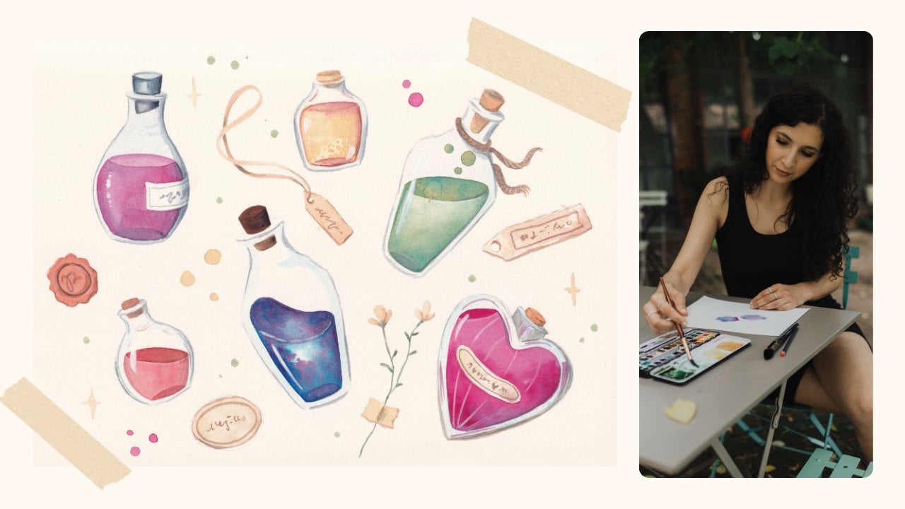
supplies in my other class, Watercolor illustration, create a set of
magical portions. In the next lesson, we will find some inspiration with
painters. I'll see you there.
4. Inspiration: Before starting drawing, we need to decide what we want to draw and what style we want
to use for our illustration. Let's start by opening
the Painters app. I decided to draw a cat. My cat Olivia. So I created a board with
some other pictures. You can find the link to this board in the
resources section. If you want to
portrait your own pet, you can use your phone
gallery to get inspiration. I'm sure that if you're
a pet owner like me, you have thousands of
pictures of your pet. If you want to create a
portrait of another pet, I created a different
painters board that you can use
to get inspired. So here I have all
the information on how my cat looks like, but I need to find the
style to get inspired. Here you can find
the search icon. And I will write down
cat illustration. I can find straightaway photos and illustration that I
can use as a reference. While looking at this
board for inspiration, I will start gathering some
information and having a general idea of what kind of style I would like
for my pet portrait. I am mostly looking for
different styles so that I can compare them and see
what I'm most drawn towards. When I find an
interesting picture, I click on the same button and create a new painters board. I will call it Cut
illustration styles at the pictures I just found and
keep going in my research. Every time I find an
interesting image, I add it to the board
I just created. You will find the
link to this board in the research section. Once one image is selected, I just need to scroll down. Pinterest shows me
similar images and allows me to create a
board quickly and easily. You can see I have
loads of boards. Since I found Pinterest, one of the best resources
to get inspired. I like to browse and
select images carefully because it's easy to get lost
in all this information. So I need to make
a clear selection. Once I have all these
different styles, I can decide what am
I more inspired from? I think I will use a range of colors similar to
this illustration, but a style that resembles
this order illustration with clear lines that defines straight away what
is the subject. And big bold color
blocks creating the cut features in a
clear and defined way. In the next lesson,
I will gather all these ideas on paper
and start drawing. Not that we've gathered all
the information that we need, we are ready to start drawing.
5. Find the Characteristics: Before starting
sketching, I want to show you a very useful exercise. I will write down
the name of the pet, in this case, Olivia the cat, And write down some of her main characteristics that
I can see in the pictures. So she has colored nose, her tongue sticks out
in most pictures. She's a taxidoct and
she has blue eyes. Then I want to write down, what do I know about this cat? She's sleepy, she's clumsy. And I know that she likes
flowers because she plays with those every time there are
flowers in the house, what do I want to
see in the portrait? I will jot down everything
that comes to my mind. Then I will circle the characteristics that
I like the most. You can incorporate
the behavioral characteristics of your own pet, or if you don't
have one, you can choose anything that
you like the most. You can be inspired
by a movie character, or you can write down anything that you find funny or sweet. So feel free to experiment
and write what inspires you, not that we have all the
information we need. We can start drawing our pet.
6. Sketch: In this lesson, I will
show you how to plan your illustration and how to transition from a dominate
to the final sketch. If you prefer to skip the sketching part and
proceed directly to coloring, I've prepared the
sketch for you. You can find it
in the researched section and print it out. In the final part
of this lesson, I will demonstrate
how to use it. Before commencing
the actual sketch, I need to establish
the subject and the space that it will
occupy on my favor. I begin with various
attempt to draw the cat. I already know what
I want to draw because I established that
in the previous steps, when I found all
the characteristics that I wanted in
my illustration. I begin with various
attempts to draw the cat, focusing on key features such as the shape of the
eyes or the nose. I explore different pauses considering whether
the cat is standing, lying in a love shape, or with the tail
hanging to the side. I then proceed to draw the
cat within a small rectangle, a crucial step to understand the balance of the illustration. I experiment with
various attempts, such as placing the
cat in the middle of the scene with three
flowers on the background. I also try a composition where only one flower is in the foreground and another
one is in the background. In the third and final attempt, the cat is slightly moved to the left side with two
flowers on the right side. In the background, I include a few block shapes that point towards the center
of the composition. Usually I create more thumbnail, about six or seven, before making a final decision. Feel free to experiment
by rearranging elements until you are
satisfied with the result. Keep in mind that the
process may take some time, and if you struggle to find
the right composition, consider brainstorming six
or seven or more thumbnails, setting them aside, and
then returning after an hour or two to see which
one looks best to you. Now that I have decided which one is going to be
the final sketch, I will transfer it onto
another four sketch paper. This time, the sketch will
occupy the old space. This step is crucial for
achieving clear lines into the final project
and establishing the tonal values of
the illustration. I start by drawing a frame
to define the spaces. Recognizing that
breaking the white paper can be a challenging step. I start by drawing the
frame to define the spaces. And I recognize that breaking the white paper dividing
the square into parts, I draw a line where I
will place the ice, ensuring that they are at the
center of the illustration. Dividing the space helps me understand the
composition better and gives me a more clear idea of where all the
elements will go. I am now free to make mistakes
and erase and redraw. I draw every detail Preparing
for the coloring phase, ensuring that each lien is
clear and not confusing. Next, I define some
tunnel values. Even though I'm
working with graphite, these steps gives me a clear
idea of the brightness of all the parts of my final work acting as a preparation
for the coloring past. It's like having a black and white version of the final work. Guiding me on what
colors to use later on. Usually start with the darker
parts of my illustration. But this is just a
personal preference. If you already have an idea of what values you are going to use into the final illustration, just start from those sections. Now it's time to
transfer the sketch onto the watercolor paper or
your chosen final paper. I use paper tape
to secure paper in place and then carefully
tape some carbon paper. If you don't have
any carbon paper, you can fill the back of
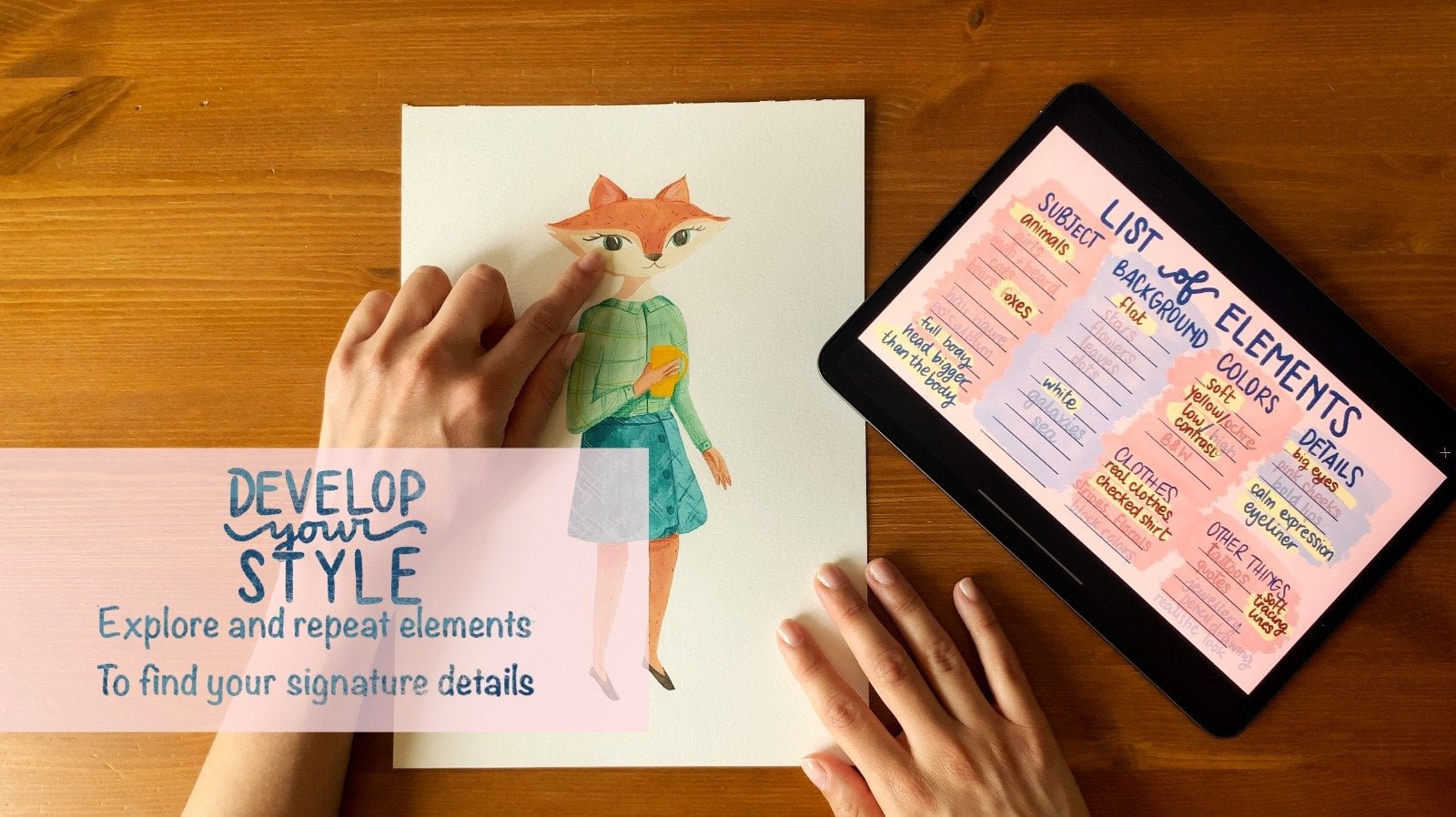
the sketch paper with graphite. Check out my class. Develop your style for a
detailed explanation of making your own carbon paper with
a really sharpened pencil. I proceed to copy all the lines onto the watercolor paper. If you want to skip
the sketching part and proceed directly
to coloring, I have prepared the sketch for you in the research section. Simply print it
and use it as you would use the pencil sketch. Instead of using
the pencil sketch, use the printed one after
taping the carbon paper.
7. Know your Pencils: I will now guide you through some little exercises that you can use to get confident
with colored pencil. I always make us watch of all the pencils
that I'm going to use. This process gives me
a general overview and gives me more clarity
in the coloring phase. The colors that
I've selected for my illustration are
white, sunflower, mango, melon, autumn blaze, coffee, periwinkle
denim, and slate gray. I've only selected nine, but you will see that these are the only colors that
I need to understand, how I can modulate the
intensity of each pencil. I overlap multiple layers
of the same color, starting from one and
going up to four. As I add layers, the color becomes more intense and opaque. The first square has
only one layer of color. The color is uniform
and very delicate. For the second square, I overlap two layers
crossing the strokes. The color intensifies but
the paper is still visible. I proceed in the same way
for the third square. Crossing the strokes
three times, I can modulate the
intensity with control, in the fourth square, I
achieve very high coverage. You can see how with
just one pencil I can control the pressure on paper and achieve four
different tonal values with just one pencil. Now I'll show you how to transition gradually from
one shade to another. By blending colors from yellow, I will gradually
move towards red, obtaining a third shade orange, starting from the left, with the lightest color reaching
just over halfway. And being careful to
decrease the pressure on the paper where I
want the blending. To begin with red, I start from the right,
reaching the center, and going over the yellow, applying a little
pressure again, I use yellow until I achieve
the blending I had in mind and proceed to even out the color, gradually
increasing pressure. I do the same with
yellow and blue. Here again, yellow, then
blue, then yellow again. I also use the lightest colors to blend the colors together. The application is
uniform and I can transition from one
color to another with. This method is
called burnishing. Shortly I will show you more
details on how it works. In the next lesson, I will tell you more about this material. And I will tell you
how I incorporate different techniques
into my artwork.
8. Burnishing Technique: We can now set our sketch
aside for a moment and focus on how
colored pencil work. Burnishing is a technique for blending colors
directly on paper. I'll show you three
ways to burnishing. Burnishing with white and
burnishing with a blender. I'll start with ton
burnishing using yellow. First, I lay down the colors
that I want to blend. In this case, a layer of yellow and a layer
of periwinkle blue. Once I achieve a more
or less uniform result, I go back with the yellow
applying pressure. This way, the layers blend
the color that I use. In this case yellow. The two colors used are no
longer distinguishable, and I obtain a green that tends towards yellow
burnishing with white, the process is the
same as before. After the two layers, yellow and blue, I use
white to blend everything. In this case, the final
result is different. The U remains the same, but the brightness changes. In the previous example, the final tone
tended more towards yellow burnishing
with a blender. For the third square,
I use a blender. The result here is very neutral. The blender puts the layers together without changing
their tone or brightness. I find it very easy to
blend the color and blur it covering the paper completely quickly and in a uniform way. Compared to burnishing
with white. The brightness doesn't change because the added
layer is neutral. Now that we have all information
about our supply works, we are ready to add some
color to our sketch.
9. Coloring with Pencils: Let's use colored pencil
into our artwork. Now let's start with
the actual illustration so I can show you the
colored pencil in action. On the watercolor paper, I drew very light lines. With the pencil, I started coloring the various
sections I outlined. Starting from the
center of the image, we use the different
layers and shading techniques I experimented
with before. I start with the melon
shade on the cat's nose, and I add more layers with the same color to achieve
the saturation I desire. This process will intensify the color In areas where I
want to add more dimension. I use a darker pencil, like the autumn blade shade. I move to the
bridge of the nose, and then I use white to blend the transition between
the two shades and add more brightness. I'll do the same with various
sections of the drawing, choosing the shading
technique each time for the eye area and the upper part
of the eye sockets. For example, I'll use periwinkle
denim and slate gray. I can modulate the
darker color to allow a smooth and
gradual transition. The color is very pigmented
so I can start with the light gradient
and then gradually proceed to better
define the tonal value. I proceed in sections. Filling the space helps me understand how to arrange
the colors on paper. Then with shading, I define the transition from one color
to another in more detail. The process is simple
because I have three colors of the same
with different brightness. This way I can correct
and manage the gradients. I proceed this way,
intensifying with darker, neutral colors, like slate gray in the areas that
define the head. To start defining the volumes, I proceed in the same
way around the eyes. I always alternate
these three colors. Very winkle blue
denim and slate gray, gradually making it darker. Where I see that I
need more intensity. The lines are not parallel. I work quite randomly, however, the shading
is still controlled. Once the entire
section is filled, I use white to define
the brightest points. I move again to the cat's
nose using the melon shade. The color I got is
darker than I wanted, but I easily make it lighter
with a nedable eraser. I use yellow and white to
achieve a very delicate theme. With the coffee being color, I define the outlines
of the shapes. I apply, melon and sunflower
yellow to the cat's neck, intensifying only for the
parts that are close to the other section to keep
dimension to the subject. Always with melon
and orange pink. I color the ears
with autumn blaze. I define the shadow part. I burnish it with white to
achieve a softer gradient. I returned to Colton's
for the pose. This time I only use
periwinkle blue and denim to achieve a lighter
shade than the Ed. And I will use
white for shading, with coffee being brown. Then in blue and slate gray, I fill the tail section
in the s palette. I didn't choose a black pencil, but as you can see, I can
achieve a very dark shade. The pigments blend
and I can modulate the intensity to obtain
a rich and dark color. With denim, I define the ears using it
with pervincle blue. Now it's time to move on to the flowers returning
to warm colors. For the first flower, I
used two colors, Autumn, blaze for the petals, and mango for the very saturated
and interesting orange. I use some flower yellow for the central
part of the flower. For the second flower,
I used only one pencil. Adjusting the pressure on the
paper to avoid a flat ton, and obtaining a lighter yellow On the other part of the petals. I use white to even
out the color, making it a little bit lighter. I can decide about the color
of the flowers center, so I will decide it later. Once the background is defined, I start from the
upper right corner. The outer part will be more intense than the part
next to the cat's head. Here too, I cross
the strikes quite randomly to achieve a gradient that I will then
blend with white. I've decided that the center
of the flower will be green. Even though I don't have a green pencil among the
nine colors I've chosen, I use the layering of yellow and blue to achieve
the desired shade. Once I get the green I want, I use the blender for shading. I will not change the
hue or brightness. Finally, I use white to make the background gradient
softer and more gradual. As you can see, using white makes the entire
background brighter. You can choose whether to create a delicate layer and leave
the strokes visible, or apply more pressure
to get a seamless layer. The final details with
the coffee being pencil, I go over the shaded parts between the various
sections with delicate and striking where I want the shapes to
have more contrast. For example, between
the flower petals and under the cat's
pots and eyes. I define the blue part of the eyes and add white
to give brightness. I define the outlines and add the final details with
a coffee bean pencil.
10. Final Thoughts: Thank you for taking part
in this skillshare class. Don't forget to
upload your exercises and final illustration
into the project section. Work in progress
is always welcome. So that I can give you
a personal feedback. You can follow my
Skillshare page to get notification about new
classes getting released. Or if you want to practice
a little bit more today, you can have a look at the
other classes that I created. Once again, thank you for following this Skillshare class. I can't wait to see
what you created. I'll see you next time, bye.
 Giulia D'Andrea, Illustrator - Artist