Transcripts
1. Introduction: My art is a combination
of different forms. Low writer's tone, Hip Hop, mix them all together. You get this form
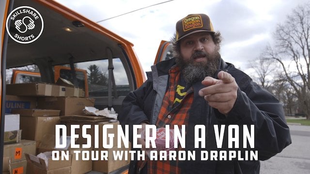
of visual arts. My name is Mr. cartoon. I'm an artist best
known for my tattoo, but I'm very passionate
about other forms of art to growing up and hanging out and auto body shops
and tattoo shops. You realize that these are
forms of lowbrow society. Back in the day it
would be frowned upon. Nowadays is much
more celebrated. It's this hardcore
form of varargs. I will turn on the streets of
us Angeles and now accepted globally as some of the most
elegant, beautiful words. In this class. I'm going to help you develop a personal icon. We're going to sketch it out, bring it in to the
digital tablet, and then we're going
to take it places. The final frontier really jump out there with some spray paint. And I'm going to
show you the method of sketching widespread pain, feeling then making sharp. This won't be overnight process. This is something
new. Build over time, little chips that diamond. One day. I really loved spreading this word because you can
learn it and a lot of schools. But with the simple techniques
that you can pick up, you can use these for
the rest your life. You can help people
along the way.
2. Getting Started: My name is Mr. cartoon. I was born here in LA. I'm from Mexican descent. Works consider Chicanos,
which is Mexican-Americans. I grew up in San Pedro
and the harbor area, and I fell in love with
art as a young kid. Some kids are playing sports, some casino, and
move towards ours. But once I got in
my teenage years, I started doing a
little graffiti art. I started to use spray paint cans as a way to do signage
in my neighborhood. That eventually evolved. And I started to get
into Chicano low riding, tattooing, fine line black
and gray, old school style. That really blew my mind. I love retro art. Gold leaf, Old English letters. I take a little bit from there. And I match it with
some street art. And I'm mixing it up with a little fashion. And
I put it out there. We wanted to take tattooing is such a lowbrow art form and bring it up to
respectable art form. That was our goal. To do that. We had put it on
some ball players. We had to put it on
super successful people. But there are
already successful. They looked at the
tattoos, jewelry. Look at their tattoos as a spiritual way to show their
commitment to the culture. One of my goals in this
class is that the end, you'll have an icon logo. You'll have some lettering
for your name or your brand. And you'll learn
how to take it on different surfaces when you sit down to draw a don t
have to be my style. Literature culture,
looking at where you were born and raised, pull those things out
that unite everybody. Put that down and you can see people really respond
to your work. In this class, I'm going
to walk you through how to pull out icons
and inspirations. Being inspired is
very important. Sometimes I inspired
through music. Sometimes I inspired
through automotive design. It could be something randomizing on the
street and I'm like, wow, that's beautiful
and draw there. So that's what I
want you to get to. How to use your mind to notice the beautiful
things around you. Notice those hand painted signs. Notice something
that's been sculpted. Notice something has been done
well, but it's weathered. One of the things
to expect out of this class is to be able to learn how to
sketch with pencil. Learning how to
loosely create ideas. Some are bigger, some
would be bad, right? Plot the good ones
and keep refining it. I'm starting off with
pencil and paper because that was the
beginning of my career. But really to move on, you're going to need one
of these giant tablets. The program uses Adobe Fresco. That way when you
do the artwork, you can send it
straight to client for approval or straight to
the person to get printed. You gotta have it. We're going to create an
icon and some lettering. And then we're going to take
it to put it on a wall. And it's also going to live on a tattoo pattern that will eventually be
on somebody's skin. So learning how to take this image and make it live
in different environments. That's the challenge,
that's the fun part. There's a few things you're
going to need for this class. Number one, you're
going to need a pencil. I use a mechanical pencil. You can find them pretty
much any supermarket. Then you're going to need
a ruler. Lot of stuff. You can find that the pad, an eraser matter, steal this
from your kids, aren't box. Then this is my brush pen. This actually has a fine point and a brush tip on the end. This is a Tombow
Japanese brush pen. Very desirable. You need to have one of these. So these are pretty
simple tools. You'll need some paper
for this project. You can go from using typing paper that you
get to remove it. Or you can buy a
little bit nicer Bristol Smooth paper pens glides a little bit
easier on there, but go to the Resources
page and you're going to see all my
favorite pencils, erasers, pen so you can get at your local art place
or just order online. Come with me on
this next lesson. So we can talk about how
to conceive your icon. How do we conceptually create
something that reflects it? Let's go.
3. Gather Inspiration: In this lesson, we're
going to dive a little bit deeper to find out
what inspires you. For me. Number one, I'll put tattoos. Tattooing is deepened culture. There's so many things
to pull from it. It's a real strong
iconic art form. A coy fish or a beautiful sun, or some type of
script lettering. These things are classic and they're very
beautiful to the eyes. So tattooing extremely
important on my list. Number two, low riding. Low rating means so much to me. It's called culture. And when I look at a car, I can dissect the car
with the body lines. I see how the chrome
bumpers wrap around. I see the wet paint
with a reflection. I use all this to inspire myself to try
to emulate such beauty. But I'm gonna do it
in another area. So I like to pull from obscure references and
put them together. Number three, signage. Signage is all over
your neighborhood. These are signs that either
say barbershop jeweler. So start to study signage. Letter forms. Look at the weights of the
letters, look at the flow. Some of them are easy to read. Some of them were
very difficult. But I'm obsessed with letters. Graffiti is something that first captured my eyes as a kid. Seeing big wall murals, seen someone carved her name in a phone booth or bathroom wall. These type of things
caught my eye and I was amazed how underground
it really was. A lot of it is not
just a graffiti, but the attitude of
a graffiti writer. So being able to think about
doing it fast is dangerous. Even though I'm at
home in my studio, my brain is still goes back to that kid riding on the
side of liquor store. That keeps me on edge, that keeps me in touch
with what's going on in the street. Music. Music is just as important
as the drawing part. Because in order
for me to get in that space into their
flow, into that mood, I need my music to
be right when I'm doing something kinda hardcore Gita up low rider are put in
WA I'll put Cypress Hill, something getting
hyped in that arena when I have to do
something kind of mellow, maybe someone's moms portrait or something that's more
spiritual, angelic. I'm, I put on some
soul of balance. So choose your music. That's right for you. Art Deco. That error
is beautiful to me. In automotive design
and architecture. I love back into the
forties in the 30s. And I loved those big teardrop
fenders of the bombs. I love the design
of the building, the extra ornate
way they would do. Entryway into the ballroom or
entryway into the building. It will be so many
beautiful engravings, lettering notched
into the stone. I like to take that
old era and bring it into my modern art form. When I was in London, I would notice the old gilded
reverse gold leaf window they would do in the pubs. And man, that really got
me going because I wanted to emulate that
form of lettering, but adapt it to my
law rather culture. For me, Los Angeles, I think about that
downtown skyline. One of the tallest buildings
are old school buildings. For center state. I always
use that in my art work. When I draw, I want people to feel like they're
in a West Coast. There's a cool breeze. Palm trees are flowing. The low riders are
shiny, glistening. And as a barbecue going on, this is California
culture all year long. So I put it in my art. Notice your surroundings,
notice your neighborhood. Put those things in there that
people will identify with. I wanted to talk about
creating references for each one of these
inspiring words. Reference is very
important to me. What I mean about
reference is doing a little homework on the project you can do
before you get there. Now go find my reference
from different places. The Internet, an old book
I might have the sum we gave me or I've been collecting
before back in the day. We would have a 100 books, encyclopedias, Dog
works, animal books. We had to use those
as reference. Now, the Internet, man, you can reference so
many different things. And the reason it's
important to me is because you are looking at
either a professional image. Or something that
is real, right? So if you have a
little reference, okay, I see how the dog's
nose goes right there. It actually comes from. So if you don't have
that reference, you're just going off
of your memory and that dog might end up looking
like a possum or something. So if you have the reference, you're more likely to come
up with a better product. So I have a full list of
things that inspire me. I'm going to jump down a little
bit and go to number two, which is low riding. Now I have a bunch of
different examples. Click on this one right here. This is actual car painted. Just happened to come up. Now I'm going to take the
color panel, the car. To me, the quarter panel
of the car is like the hips or the car just
shows a lot of the body trim. It, guide your eyes, make the car even longer. I'm going to use the 150th
and Paula, as my inspiration. Notice the body lines on here. Notice the way the Chrome
hugs the hips or the car. This is one of the wildest
cars ever designed. So I'm going to take
a screenshot of that. So the same way I went and found an image that
I liked online, screenshotted it, saved it. I want you to do the same. Put that word of inspiration in and see what images come up. Courtroom, there might
be a couple of them. There might be one
that hits home, grab that, and save that. My goal is to start this
new animation company. I've been thinking about
it for a long time. And now I'm ready to sit
down and put it on paper. I want you to do the same thing. Narrowed down to one image that you feel that
represents you, that one thing that's simple icon that you
can push forward. And then we're going to add
some type the notes you, once I get this
idea, streamlined, one, I'm going to put
it down on paper. And from there we're
going to grow it. This art can live in
different locations. It could be a bus bench, it could be a billboard. It could be on a TV screen
moving with animation. So I want to design this knowing that it's going to go
in different places. So I want to keep it
simple enough so we can breathe and
visually be seen. So that's my challenge to you. Narrowed down Kathy icon. Let's get the name and be conscious of where
does art might live. It's important when you
start to be relaxed, to be down and make
some mistakes. Be a little bit loose. Let the pencil go. Once we start to get that down, then we start to sharpen it. But right now, I
just want you to focus on what the icon is. And loosely sketching. Don't get discouraged if it
takes you a little bit to get motivated, don't get frustrated. No one's going to
see it right now. But what I want to get you to is confidence because
you have this method. If you have your reference, Every it takes you to get to their final polished product. Beginning can be a little rough, but we're going to
sharpen it as we go. Up until now, we've been
talking about concept theories. How to approach these
things in your head. Inspiration, looking
at other references. That's all. For now. We're going to put
that down, put the technology to the side. Put your phone down for five
minutes, let that thing. Who laugh? You get a pencil. We can get some paper. And we're going to start
to get loose a little bit. Just give me five.
4. Practice Hand Lettering: In this lesson, we'll be
talking about lettering. Fonts to me are
extremely important. Some of you can do very loosely. Some of them you
really have to plan. I think the best
one for you guys to start off is a script. You can start off by
writing your name, right? Mom's name, whatever
it is of that loved one or yourself
that you can put down. There's different ways
that you can go about it. Let's just say you're going
to write the word love. Start off with an L. Here's a quick love. Now mind you, I've been doing this for over 30 years, right? I'm gonna teach you
how to build this. So eventually, you just
be able to freestyle. So to get started, what you need is your
pencil and a ruler. My eyes on here real quick. Let's put some guidelines. Very simple. Just the size of the ruler. Then little bit past
the halfway mark. I'm going to put
another guideline. Gently. When I teach this, I'm trying to break it
down from the beginning. So the letters have a base, then they have a connection. So we're gonna be
talking about is pulling the base of the letter and snapping
the connection. Pull the base of
the letter, snap. It will look like
I'm reading an eye, but it actually can
be used for you. And a, any of these type of letters pretty much have
this base. For now. We'll keep it simple and
we're going to try to understand lettering as a whole. You been doing lettering
your whole life, imagining elementary
school and high school. The head, you write an essay, you had to read things, staying in those blue lines, same things we did in school. This is an extension of that. We're really starting
to go in deeper and study the roots
of the letters. But the letters have in common the leaning of the letters, the height of the letters. And even sometimes we will put swishes or tails on the
ends of the letters. I'm going to start
with the middle line, not the top of the middle line. The start here. Sure you have enough
pencil lead there. Pull your line. Turn a little bit. Snap. Your line. Start to snap. Pea. Put the pressure here. The pressure of snap. My kids or teenagers. I hadn't gone crazy. Just doing these techniques. Because it's not
really saying nothing. But it is, you'll
find out why later. Now, I like to keep my letters somewhat at an
angle such as this. So you can add the beginning to also throw these guidelines in to make sure letters are
all flow in the same way. Because when you start out, sometimes the letters
could go this way, that way, this way
that you want these to have a consistent
lean, if you will. With these other little
guidelines I've added, you can tell if you're
on the right path. And even if you're
not just readjust, readjust, keep
pulling those use. This will take practice. You don't have to worry
about years of practice. It just takes practice and
consistently doing it. Ten minutes a day.
You start to pick it up between system
with it though. So for the next line, let's try to write
something simple like Mom, you'll make your
mama protect card. You waited to the last minute. So the night before and now you get to read your mama card. So you're going to
need this technique. Start with this M. I'm going
to use that same angle, poll and I'm going
to snap upwards, pull down, snap upwards, pull down, and snap again. Now instead of that, you are
going to use the same idea. Pull down and snap up to there. So your left side ends up being thicker
than the right side. Democrats there. Oh, hold down. There's a guideline again. Use that. Snap up. Pulled down thick. Snap up, pull down thick. Now I'm going to snap up just currently to show
you mommy lover, one way to apologize for all the bad things
you did to her. And I'm gonna show you how to
add weight to the letters. What I mean by weight
is making some of the letters a little bit
thicker than the other parts. It's the thin parts in-between that make the
thick parts come out right. Here we go. Now I'm going
to go back and I'm going to thicken the base of the letter. Notice how it
starts jumping off. All I'm doing is I'm sticking to my left sides of the letters, making them bolder so
they should be readable. From the left side. I'm going to add a
little bit of weight, just a little bit of
thickness to it right? Here's thickness. The thickness. See this was leaning
a little bit, so I'll go in front of
it, straightened it out. Sometimes coloring
that take part in. Now you can start
to see a little bit more visually
pleasing to the eye. And it's a little
more impactful. So I mean, you can literally fill up a whole page
with these youth. And if you get good at this, it's a good way to break
the ice with people. You know what I mean? Talking to someone you
want to get to know. Hey, how do you spell your name? Let me, let me write
you something. You write their name. That goes a long way. I think I did that from
my wife and I first met her and now look at us. So it works. Now we're going to jump in
to me wanting to do my logo.
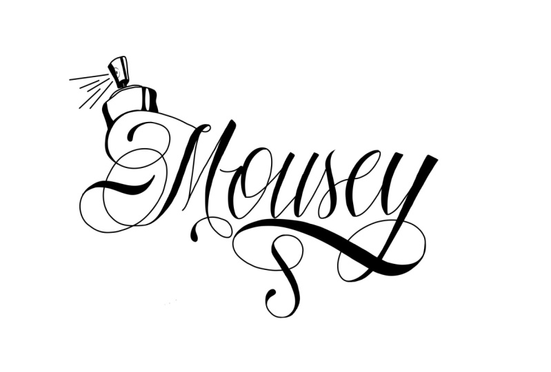
5. Hand Letter Your Icon: So during the pandemic IS
oneself a couple of questions. If I won the lottery would kind of business when I started. For me. One of my dreams would be to have
an animation company. My name's cartoon. I want to live up to
my name and I want my characters to interchange, have some action,
I have some drama. So for my company, I'm going to call it C
tunes, animation. See tunes. I'm going to do by hand
the word animation. I could also do that, but I'm going to choose
to use a font for that. So easily read from a distance. And there's a nice quality of hand-on and type mixed together. I encourage you to write your name or a name that
means a lot to you. Let's just say that's too deep for you to think right now. You can write my
name so that way you can copy exactly
what I'm doing. If you can get my
little logo down, you can use that as reference
on how to get yours done. I'm going to draw my name. No, just start with
the C Tools first and then we'll deal with
the animation later. Draw your guidelines here. My first guidelines are here. Now I'm going to want
to do a big capital. There's something
about the first letter to me being capital. It just looks better, right? So let's draw on too small. I would say it would be
somewhere around a half inch. Pass the lines you
did here upon bottom. And up on the top. I'm going to leave these
as the top of the letters. And I'm gonna be
able to use this, these two center lines
as a top to my script. Now, let's say I'm looking
at my reference, right? I got a reference of my logo. I'm going to put it right here. Now before I do
that, let me draw some angle lines for you guys. So if you can see
this type of a grid, I'm going to keep my
lower-case letters in here. And then I'll bring my caps
all the way right here. And I'm going to want to keep my letters SLO in
a similar angle. So let me take my C right here. When it come, I'm going
to swirl, loop in it. Here. I'm going to put
a little tail on it. Now I'm going to
thicken up the weight on this letter on the side. Then even that can tear drop in at the ends of the letters. Now, even on this part, I'm going to want to
thicken up this part. Bam, this line that came
through the little tails. I love throwing a little
weight on the answer here. Since we have the capital done, Let's start to do our
lowercase letters. So now I'm going
to start with a t, really pretty much in
this block right here. I'm going to lean
towards a little off of the center close and I'm going to pull my base
down just like I showed you, forced or to bend pool. Okay. Let's give this a little
bit of weight to that. I'm going to the left of it. Teardrop in with a bear and bam. Now my next letters and o, even though this went
a little bit far, doesn't matter because I
wanted to cover it up. I'm going to use
these guidelines. Real, real light. Let's put the weight on the left side that they're
coming down at teardrops. Now let's drop another OH, right here, which would
be somewhere here. You got to eyeball this stuff. You know. Let's pull the weight down here. But with this, so we want to connect it by going like this. Bam, political
weight right here. Bam, I got my, OH, same thing with
the next letter C, this guideline right here. We're going to use that and we're going to
match it like this. Teardrop the bottom. Pull up. Sometimes I'll even want to
put a little tail on it. Just my preference. Connect this, oh, come
down again, pull snap. Chair. Now I kinda put
this little bridge right here. You don't
have to do that. Let's just say I
certainly get too complicated to erase
that a little bit. And let's just bring that, oh, right to the end of
the n right there. Bring this around. Let's put another little
weight to a letter. Now for the n, When we
come up, twist around, pull back down and snap again, put that weight on. Sometimes awake and go on
the right or the left. You just have to feel you worked at how
it's balancing out. Now I'm going to throw
S on this, right? Because it's just how my friends say my name
withdrawal, see tones. I'm going to pull this
loop, this tail up. And that's where I'm
going to start my ***. I'm going to take it
a little bit over the top. Cool like that. As to drop down. Now with this, I'm gonna do something a little
bit different. Sometimes you can just
write that in there. For this, I'm going
to add a little tail. And then sometimes I can add
the word animation in them, circling, coming up like a
baseball smoosh underneath it. Make that a little bit
thicker and pull back in. Now the balance that I
want to throw the t on the top to kind of give
me a similar vibe. So even before I draw, sometimes I just invisible. Feel how that's going to flow. See that for Apple. So when I pull it, I've already been
practicing that motion. Thicken up the top, back down, taken up that part j. So now I have my
first, first sketch. Balancing the flourishes
can be something as subject to taste, right? Subjective to the way
you like to do it. Sometimes that flourish might be short because you're going
to run type underneath. Now let's just say,
I was like Man, I'm going to run this
type underneath there, probably don't need
that bottom one. So you can go back and
you can do a light race. That's why you
have to stay real, real light with this stuff. Don't commit to any hard, hard lines until you get
a lot more experience. Because I'm going to have
animation written right here. I'm just going to take this
S and bring it like this. And it just teardrop here. This time. When I'm doing this logo on, thinking about where
it's going to live. Isn't going to live on
the side of a truck door, isn't going to be
on a billboard, isn't gonna be seen on
your iPhone where it needs to be more of
a vertical look. Even when I finished this logo, if I have to fit it in
one of those things, and it doesn't necessarily fit. I'll add some other
elements, so it does. But for right now let's just
say we're drawing something, we're going to do a
banner for an event. So this is going to be
your horizontal in a box. Now I'm going to
kind of just goes in the animation letters so
that you can get the idea, which I would go back
in and doing a font. Let's draw these little
animation editors and bam. Now with the technology on these iPads and stuff like that, you can do each one
of these on a layer. That way if the word
animation is too tight to the logo that's
on its own layer. You can hit it and
it will go down. We'll go into that
once we start inking this on this computer. But for now, just on
the paper side of town, I could spend a lot more time on this and kind of clean up, makes sure that everything
lines up Perfect. You know what, this over
a little bit too big, let me shrink that down. And if it's with pencil, it won't be the craziest chore. But let's just say, for argument's sake
that this is right on, this is what we wanna do. So for now, we're going to
eat this on Adobe Fresco. But let's challenge
you that don't have the computer to get a fine tip pen
impatiently, ink this day. J, you still get a good result. Let's take a picture
of your first. Then we'll drag it
into the program. So now that I took a
photo of the image, I want to drag it from my iPhone photo into
my Adobe Fresco. Let's try that now.
6. Ink Your Sketch: Now we're going to
take the paper sketch. I have a picture of it. Drag it in to Adobe Fresco. You hit the little picture. And then I'm going to
go down to photos. I'm going to choose this one. The cleanest, right? I'm going to reduce
it a little bit. Bright here. You can pull from the corners. You can kinda reduce it. Center it right there. Now. Press Done. And you can go back
and put a little grid on CSS grid right here, just turn on the grids. This top button right
here, add-on layer. I'm going to take
my trusty pen right here and we're going
to start to ink. I tend to go from left
to right with tattooing. If you're doing a tattoo,
you go from right to left. But for illustration purposes, we're going to
start on the left. Now to the sides right here
you have different brushes, pencils and air
brushes right here, a watercolor looking one. And then this is
like the ink in one. Then there's an
eraser underneath. Okay. And let's go to the
third one down. Which would be depends. Okay, click on that thing
looks about normal. Let's pick a size. Your sizes will be
downright here. You can kind of
test, this is a 3. You can just pull a
line right there. That's not too bad, right? So let's, if you
don't like that, up here, is the
reverse and forward, I'm going to put reverse
and take that out of there. I'm going to start
with the C right now. Mind you, I draw
this all the time. So if you guys are like now flowing smooth or whatever,
don't worry about it. Because with this program we can go to clean all that stuff up. Now when I'm pulling a line, I don't want to look
so much where I'm at. I wanted to look at
where I'm going. So I literally put it down and start pulling and
looking a little bit forward. And your hand will
just amazingly follow where your
eyes are going to. Let's try that technique, some starting at the top. Be careful you
don't want to hold my pen somewhat up
and down like this. Not too much of an angle. I'm going to pull. Then I'm going to start pulling the inside of this letter flow. Let's go down the way I wanted to just pull
it up and stop. Now I'm gonna come back and
we'll start at the top again, very gently nap,
applied pressure, get a fatter, and go. Now the beautiful thing
about Adobe Fresco is you can go back in
here into the smoothing, which is this little squiggle
letter in the center. And I can put my smoothing
up just a little bit. The reason I'm gonna do that, I'm not going to go to the top, but it slows it down. And then let me
pull a clean line. Instead of me coming up
like this at a weird angle, which is really hard,
I'm going to pinch my screen and I'm going
to turn it up right here. Now as you notice before, I did a downstroke. I'm gonna do the similar thing because during the upstroke can be more difficult for the
more advanced people. So let's just start with
the downstroke and try to match what we did in the
flowing of this side. I'm going to start at the top. Put my pressure and look
ahead of where I'm going. Let the pen follow. Boom. Now notice this part's a little rough right here where
I had machinations. Don't worry about that. We're going to go
clean all that up. Let's just get the basis
and the letter first. Let's pull this has come on
the inner part of the sea. Pull up Pam. When I'm pushing down, when I'm ready to stop
or pull back the pencil, use a sharp line. Now, personally, I think this is going a little
bit close here. I had the weight on the outside. I'm going to flip
it to the inside. Sometimes you have to make
these adjustments as you go. Here. Keeping conscious of the other letters,
weight, pointing down. Bam, Let's go to the top part. I like to try and
put it at this angle because I'll start back here in my letter
a little bit way. When we come back and now
I'm going to start turning. Try to keep this fluid. Don't go too slow. Down. Feels good. Pullback. Let's start from here. Let's bring that weight up. I don't really like
that annual limit. Turnover. Start to go to the
angle that you do want. Teardrop. Pretty nice. Now I can go back and
start filling this in. Now let's just say for
the filling and purpose, I wanted to go back to my
smoothing and I want to drop it off right in the middle
so it doesn't move slow. The reason I do
the smoothing high it because you can do long lines without getting
a bunch of squiggles. This program is so smart, it understands that you got
to do it straight like that. So now I'm going to
turn my ink up to the, say, double a 6.5. So now that we're in there, Let's see how fast
it gets pretty fat. Beautiful thing
about these pens, is there pressure sensitive? If I barely, barely touch it, I can get a fairly thin line. But if I push into it, I'm getting a fat line. That's what I want
because I'm filling in, start at the top and
start to fill in the sea. Look to where you wanna
go, not where you're at. Connecting my C on to
be very, very small. Such that sometimes
I'll even go back down, take it back down to
a three-year two. And I'm going to adjust this just a small fluidity. There's a little hump in it. Don't worry about it. We'll go back afterwards or sharpen up all
these little things. So now we're starting
to get somewhere. Now we're starting
to see the letter. It looks strong. Go back to the, see. This in C. Some people like a downstroke, both of them are
necessary to know. This tail got a little
bit long because the eraser right
next to the pen. And let's raise that tail off. That little bit too
crazy with that, right? There's your seat for that. See, I took a little
bit extra time. I walked you through it. The little small
details on that note, I'm going to flow a
little bit faster. So for sake of time, and later the whole word.
7. Refine Your Sketch: So let's just say
we're on a deadline here and we've got to
keep it moving, right? I'm going to start
back with a t, put it back on my brush. And let's start later on. Our hidden somewhere. Or to look like word, I'm going to look at
the top of the sea because I don't want to
go to the top of the sea. And ray here kind
of goes to the top but the bottom line of a dozen. So I'm going to use
that as my top line. The C is the master of the word. It is the beginning letter, so it's the strongest
and the boldest. I don't want everything
else to kind of bow down to the sea, if you will, and be
lower in only mean. Visualize that line. You don't really want
it above this line. Okay, find that line, that lines up right here. And so I'm going to go under it and start right about here. And I'll still get
the same cool. Except it will actually be
more pleasing to the eye because is measured correctly. Bring your mind to
the end where you're going and you pan will meet that even this
part right here, I'm like, man, it's getting
a little bit close to that. S, I might want to
go to my eraser. And let's just shorten
that up a little bit. Race a little bit down here. Raise a little bit down there. Right? Now I'm going to have it stop little bit shorter so it doesn't compete with the S t. Let's just say I
want this S even go a little bit higher because a C is so high and I'm going to add a
little more weight on it. Knew that when you using some of these lines for guidelines, you can actually make them a little bit
fatter or thinner. You want to use that
guideline and stay with it. Sometimes you are
looking at the width between the line
more than the line. You're using that empty
space as a guideline. I'm going to make my brush
a little bit bigger. Start middle C of fat. Okay, it's not too bad. Let's pull that down. The reason I fill in like this two is because I'm
assigned painter. I think about the strokes
and the brush. On Adobe. You won't see the
strokes on a brush, but if you pick up a lettering, will try to use someone shot. You didn't wanna do that. So everything looks pretty. Madison, I'm going
to fill in here. Which you know what?
There's actually a little bit cooler
place to teardrop it. So I wanted to go down and
drop this back down to 1.5. And I'm going to put this
cool little tail on. It. Adds a little bit
of flavor to it. Now let's take it back up to our six where we're filling in, bringing this down,
fill that in. Go to the t is now there's a tool on
here where you can tap and it will fill it all in. That's cool. Once you're
more advanced for now, let's just fill it in by hand. There's so many tools and
techniques and things that help you with
shortcuts on this program. I haven't even learned
a mall really. But that's okay. Because you want to
practice your line work. You want to practice
pulling lines. So now we're gonna
go into these owes, start to fill them in. Now I didn't pencil on this, but I'm going to do a free hands because I've
been doing them for awhile. Bam. It's a little bit thicker
on the O's right there. Let's blow that up. Let's make this curve
just a little smoother. Might have to take my
pen down a little thick. If you notice, I start
a little bit ahead. I lead ahead on this. And I turn sheep. Sheep it up. Yes. Back then, repeat, put the brush bigger
and get this done. Now we're kind of just like
knock this out for you guys because you guys
got to get those. There's RC tools right there. Now, what I'm gonna do
at this point is I'm gonna go back to the layer
that I originally imported. That was a photo. And I'm going to make
you go away by this. Under the add layer. Underneath that is this
little eye you clicking on, shows your original sketch. Click it takes it off. Okay, now have a clear
vision of what I'm doing. Now we're gonna go back very quickly and we're going to erase the imperfections, right? So let's raise this up
a little right here. Make this eraser
down a little bit. One of the cool features on Adobe Fresco is that if
you double-tap your pen, it goes to the ink. You double-tap it
goes to the eraser. Let's say, I'm drawing this. I get to the t. Man. I tease a little
rough at the top. There's chop it up here. Clean it up, make it
close to that line. Can you go through
your whole piece and just fine tune the
areas that you like. Now look at these two over here. One's a little bit thicker, ones a little bit thinner. I'm going to
double-click to my pen. And I'm going to make this
one a little bit thicker. Let's go back down
on the pen though, to take them about a
1.5 rounded out more. If I'm doing this for
a client or something, I'll literally take
a picture of this, o, duplicate it and
put it over there. So I have exact same owes. But for this sake we just
freestyle and having fun. Let's also take this n down. Put it back on eraser. Chapters up a little bit more. Reaches deadline. At the bottom right
here I can see that's a little rough comeback
flowing, not snapping up. Same thing that we did with
learning how to draw them. We're going to use the
same technique for racing. Okay. Take that off there. Come back in here. Graham, that the S here. I can already see a blend. I'm going to fall away back
here and flow. Look the end. Bam, back to this little
tail, It's erase that. So now we're looking a
lot better right here. In this next lesson, we're going to pull
the C Alpha by name, which is the strongest letter. And I'm going to use
that as an icon. But I'm actually going
to add a character to it so that C in that character
to be used in smaller areas. Or I want to actually start putting out there for
people to recognize this. So let's go into the next scene and I'm going to break
that down for you.
8. Add Some Character: Now that I have the
letters the way I like it, Let's add our icon. Let's get into some characters. Now when I look at my
list of inspiration, I wanted to pick out of
all those maybe one image. So saying with the tattoos, you can put a little ink
bottle or something like that. Now what does this have to do
with my animation company? It's where I wanted to do. Because when I go watch a
movie, the movie theater, they have these cool
little short animations for the production company. That's what I wanted to, so something that I want to
be different with, right? I don't want to just
put like a piece of film or something like that. I want to go out the box and put something that
represents me. So let's say we wanna
do an ink bottle, have tipped over the
ink color coming out. This is an old
school tattoo image of explaining tattoo analyst. Normally we run in the
word ink right here. But I don't want
to confuse people, read it and thinking it's ink tools or anything like that. So I'm going to leave
that up just for a visual where you
can see it is. I'm going to write the
word ink in there so you recognize that it's
old ink bottle. I like retro things and I
think from the past, you know, cars may have vintage
cash registers and vintage sewing machines. I just love that art deco, that time of life. You know, I would like to have lived at
that time except for the segregation part near her to be minority parts
of the skip all that, jump into the future right here. Now there's my
little ink bottle. Low riding. You could add something
like a wheel. Right? Let's put the
traditional wire wheel. Date and wire wheel. Of course, these are real quick and you want to keep
them real simple. The more detail,
sometimes the worst because you're gonna be reducing a lot of
this stuff down. And we reduce things
down real small. All that little
detail turns to mush. So here's my little
wheel that we can pull this off some times. I have something in mind, even a little more simple. I have this idea of a
pencil burst in our 3D. Everyone use a pencil, right? So you can kind of
identify with that. We're maybe not everyone's
built a low rider, know what it looks like. They probably have used
a pencil right now. I'm just busted it out right. Because I don't want to bore you guys with long drives
and stuff like that. But you should always
get some reference. Let's just say you want
to bust out a pencil. Go online. Look at the crazy
fisheye views or pencils or something cool
that makes you feel good. Screenshot that
bring it in here. Take the opacity
down, make it very, very light, and trace over it and make it
the way you like. You don't have to trace
exactly what's there. You can exaggerate a
little bit, right? So that's what I'm
doing right here. And that's what I would normally do if we add a lot of time. That way it saves me time. I don't look at it as cheating. I look at wherever it takes you to get to quality
finished product. That's what we're
going for right here. I've narrowed it
down to the pencil. The pencil is very simple
to digest and understand. And I've been drawn with the
pencil since I was a kid. I started in the
pencil and now I'm coming over here to animation. So let's show my foundation. I'm thinking about having
a camera rather by EA. Now I'm incorporating
my logo with icon. Now sometimes even I
might not even want to have that whole
pencil going through. So for now, I'm going to erase the tip of it
and have it like that. Now I still have room for
my type to come underneath. If I saw incline. Now we'll use this
C2 logo animation. If I was making business card, I will use it for promotion. People asked for my logo
here, essentially my logo. But from this point, once I go to a wall, I'm going to put just the sea. And the pencil that's
killing be my icon. That's gonna be my mask. So my next challenge
for you guys is to fill up a whole page
with cool little pencil, light sketch, outlines of
the icon that you want. That's the hard part, the mental part of
narrowing down, of streamlining your ideas
to pick the best one. Sometimes all narrowed
down to three of them. Must show my wife
and my kids, Hey, which one you like best and see which one people
gravitate towards. Go with that icon,
simplify it, right? Because the reason
I say simplify it, because sometimes it
gets shrunk down real little and sometimes
you're going to blow up. So I go with trying to
hit it in the middle. Still want some detail. But you don't want
too much detail. Now that have my
name the way I like it and the icon is connected. Let's do something
different and separate icon from the logo. How am I gonna do
it to still keep it connected is I'm going
to leave the tunes animation out of
it and just leave my iconic see that
the pencil cover. Let's just put it in
another layer on. Let's raise the other
thing we don't want. When you create your
logo and your icon, sometimes they get separated. Sometimes you have to simplify, sometimes the area
you're going to fit it, it won't allow it the
whole name across. Plus, I want to create a tattoo that all my friends
in the shop can get. And they might not necessarily
want my full name on them. You don't really mean it might think were
dated or something. So let's lock it
down to the sea. The pencil coming through. That's a universal
icon that everyone can digest and
represents the sharp. But it doesn't have
a full name on it. So now we have a C with
an icon next to it. So why don't you do that? Why don't you take your
name, how that image, and try to maybe pull the
first letter of your name and the icon and mash them together and see how that looks. You might have to go to the top, you might have to
go to the bottom. It might work on the side. My work intertwined.
That's the fun of it. If you learn these
type of skills, you will be needed. And that's how I built
my first show cars, is by bartering and
trading my artwork, my concepts to help improve their business
and make them money. You do some of the
t-shirt graphic. They can make money
out there for the next 20 years as you want
as your stereo installed. So that's how we'll do it. Causes the sound sharp. I look round. It'd be like you guys
need a nice sign, like a mural right here. Well, I noticed
your business cards need to be updated and these are skills that I had that I can go out there
and make things happen. Now I have a mural
that everyone's walking into that
audio sharp is o. Who did that mural provide a
phone number on the corner. I started getting calls. It will snowball
once you start to commit and dedicate
yourself to this, amazing things will happen
that you never thought was, let's just say you're
an adult with tattoos. I can go do graffiti on a wall. That's cool. Still keep going with
designing your image, your logo, what
represents you, right? Because you can use that. It's so many different places. If you do want to be an artist
and do stuff for people, you should always put the icon at the
corner of the paper. Be the invoice. Make stickers. Now, on the internet, you can make so
many cool things. Match Berg coffee mug, wherever it is that
you can afford that you could do get your logo, your image out there. I've done a person the anode through evidence of experiencing things that sometimes I can just pull my little clown face off and stamp it somewhere. And people are tools did that. So you could do that too. You know, he confident, don't get too cocky. Will be confident,
love what you do. Amazing things will happen.
9. Explore Tattoo Creation: Now I'm going to
take this artwork, take it from the digital world, and walk it into a tattoo shop. Real deal. And we're gonna
place it on the arm. We get it right, get it clean. And then slang, some
ancient times of change. Back in the day. We are
principally those zeros copy, cut it, paste it. It was a big process. Now, I could use my iPad. Take a picture of the client's arm or leg or wherever they're going to put the chair
to upload the picture. Take the designer
been working on, and place it on their arm, and then show them how
it would look on them. Never before we do that. Now, many tattoo
waters are doing it. I'm going to put this on my son. This guy is brand new equipment. His skin is fresh, So it's gonna be an
easier one to do. I've uploaded a picture
of my son, you know, me and my wife created the skin. Now I'm basically engraving with the things that
represent him and his life. That's why I get
away with putting my logo there
because this is me. He's an extension of me. So now I'm going to bring in the design that we
just created and drag it in over this photo so that we can see how
it looks on the body. People have muscle structure. I carry some real
good shape right now. I have to fit the tattoo to
flow with the cousins arm. Let's move that around. Go to the layer properties. Hit Multiply. I go right here so I can
adjust the movement of it. Here's how it would
look if I pretty much blasted on his shoulder, but thinking of doing
a little smaller so that it's more of an
accent to his arm. So I can throw a big, pretty mural tattoo over top. So let's just say I, I
keep it right there. We'll do this. I can
even go a little bit smaller to fit, perfect. Bam, blow that up
and fit right there. Cool. So this is a great
way to show the client how it looks on their arm because you don't want
to put a pattern on. And then you got to start
moving stuff around, wiping, laugh, moving it up. It's torture, right? So this erases all that. So once the client is happy
and can see yes, Yes. That's where I want it. Go to the next step. And that's making a pattern, carbon paper pattern
from my old school. But it works. The fastest way to get
to that point is to make three different sizes on
a piece of paper, right? Let's blow this up
just a little bit. Che, that size. I'm going to
duplicate this layer. Come back over here to resize it or blow it up a little
bit bigger right here. Dope. Duplicate layer once more time. Just to hear. Now I have three different sizes for the clients choose from. So when I do a printout, I can cut each one of those out so that the client
can hold up to the arm. Because a lot of times you
might not have these tablets. You forgot the
tablet at the pad, whatever that may be. You need to know how
to do it this way. And if you have
little more time, you can number them 123. That way the customers
like on number three, put the pattern on, clean it up, let it dry for about 20 minutes. And after that, the ego then that's going
to last a minute. This class is not
about tattling. This class is about design. Thinking outside your
normal thoughts. Grabbing images
that people like, noticing what people
are attracted to. Narrowing down this
icon that represents you and take you to different
places in the real-world. These digital
tablets are amazing. They make my life a lot easier. But you still have to have the skill of drawing
with a pencil. Still have to add the skill
of picking up a spray paint can and pulling off
the street crisp line. In this next lesson, I'm going to show you
how to take this icon and put it on a walk outside.
10. Learn Spray Paint Basics: Now we're actually going into the graffiti side of
town, if you will. Yet. We're not really
doing graffiti. We're using spray paint as the same painting tool
for this project. So let's just say C2, that animation was my client. The next step I would do after they loved the logo
and everything, I would take a picture of the wall that they
want a mural on. I'm going to drag in the image of the sea with the pencil
onto the brick wall, I put a white base behind it because a lot of times
it could disappear. And you want that white base or that opaque base code
base to make a jump. I'm going to color it on
here and get as far as I can before we go outside and actually lay
some spray paint down. Now I'm going to
add another layer. Go to my colors, go to like gold
is yellow, right? And put this on a
multiply layer. Let's blow it up a little bit and add it with the pencils. The reason I'm going to add
color on this is because it's outside and people are driving by and they
want to see it. I'm just using the
smudge of color. 90% of my work is
black and white. But learn to use color. Sometimes you have no choice. So now I'm going to find a
tan color and something, their remarks, a pencil picture
of an old school pencil. Try to blow this up. Screenshot it. I'm going to use
this color here. This brings imaging real
small to the corner. And let's use that. Okay. Another layer on there. Make that multiply. So to put the tail of
the word in there, you can always have
a different look. You know, it has right here. I'm not going to create a
little wood grain right there. Now you got a little
color, pop it in there. You can also go back,
add another layer. So some regular, I'm
going to go to the white. And I will add a few
little highlights. This really makes a luxurious. Now, I want to add some gray and let's just say
the customers, one gray after flows and gray. Fill it all in like this. She's going to do
real fast levels back with my little eraser. This is just really
to show the client. So right now, real fast, but you take your time on that, you can make a profit. Now, for fun part, I might add a couple of
little white highlights. Our clients love it
and it looks good. Big. There's my little character. So really the world is yours. And go back in, say, a black shadow. Let's make it a gray cool
little shadow right here. You know, when I was
first coming up, I didn't know how
to use lettering, quills, or any type
of one sharp pain. I did everything in spray paint. And it took me around the world. I used to do the movie sets for crime shows and
stuff like that. They give me a blank
fake wall and Tommy to destroy it and then give
me a check afterwards. As well as a man. That's like getting paid for
ice cream, eating ice cream. And now this is pretty much it. On to show the client is
really like what you take. Once I'm happy with the design or a client
gives me approval, next is to do it
on their business. There's a lot of different
factors that go there. The texture of the wall, how high how low
do need ladders? You need a scissor lift. I want to step back and I
want to look at the wall. Right. But sometimes I can just sit there all day
staring at the wall. So I'll take a
picture of the wall, come back to my studio, put the artwork on it, make sure it fits. Sometimes as the
drainpipe right there. Sometimes it's electrical
box getting in the way. Different factors, right? So what I did here is I
took a picture of the wall. I drag the artwork good. I'm going to place
it on the wall. It really helps me
for grading the wall. You know what I'm
saying? Like how do you know how big to put it? Blah, blah, blah. So even
if on this picture I took, I can count the
bricks all the way to the bottom of the letters and I can count the
bricks from the top. These are all school
graffiti methods. I'm saying if there's
lines in the wall, use that as a ruler. So I showed this to the client. Client says, I
love it. It's ago. Now there's other factors
that go along with that. Now you gotta go outside. You got to paint the sun. Best have when your
friends there with you, traffic control, someone is the hole that ladder to
when you get up there. I recommend putting
a table out there. Have your little wireless
beat box right there. Have an ice chest
with some food, have some folded chairs,
some extension cords. All that type of stuff
is extremely important. These are all things that
are not really related to the drawing that you gotta do or outside of
the drawing, right? These are outside preparation
that you got to do. But it's fun because once you start to get the hang of it, starts to flow, you real grateful that you brought
that ice chest out there. And then you start
painting the wall. That's when it gets serious. The first thing I do when
I go out to paint a mural, I make sure all my tools right. I have the correct
colors from my paint. I got some rags right there, got some latex
gloves I can put it on and I have the correct tips. The tips are the
caps on spray paint. Can you guys are very
fortunate now in 2022 to have an
assortment of caps. Back in the day, we
only had one size. Now. They have the wide spray
medium down to a fine line. I like to use what they
call fat capitals. Clean, medium line. They can get sharp. If you hold the king
close to the wall. Once again, you can find
all these caps online. You could probably, you know, as the pain sharp, which one's the
most popular kid? A fat won't get a medium, it a liner, and
get a skinny cap. You use those the most. Don't worry, because
on the resource page, you're going to see all my
favorite tools from the caps, the paint depends to the tablet. So don't try it. Next step, get my cans ready. And I'm going to have to shake the **** out of
this chance, right? Don't just give them a couple of shapes and things that
couldn't be cool. You really have
to shake it hard. When I lay out a wall, I want to use a
color that is very close to the wall
that I'm doing today. It's a brick color. I'm going to find that color. And I'm going to
sketch my C out. Once I'm confident that I'll go back with the background
color and work in reverse. So I'll get my gray, which is probably the
biggest area to cover. Start filling that in. You're going to go over that C outline a little
bit, but it's okay. Just fill it in. Try to get into
solid as possible. And now we move
on to the pencil. Sometimes you might want
to lay a little wide down first and then go
over with the yellow. The yellow can be transparent. Then I want to go on
to the wood color. Finally, spray paint
can and closer to that. And then I would actually throw a little
shadow around it, being that it's
your choice really but little white outline around it or something
to bring it out. Once I get the colors
settled in and pretty solid, I started thinking about
going back in with the black. Now this is the
most final thing. But if you make a mistake, don't worry about it. Because when painting,
you can take that gray color and you could chop and clean the
black outline out. When I'm pretty much
satisfied with all that, I'll get my white. And that's like
the cherry on top. I start putting a
little highlights on where I think
the son would hit. After that, I can even do a
shadow off of the shadow. So adding multiple drop shadows
in is kind of your taste. If the client's cooled, let you just do what you do. Just keep doing it
the way you like it. It's important to have
a reference nearby. Sometimes you want to hold it in your hands on a printed
piece of paper. Sometimes it's your phone. You need that
reference right there. So you can look back and remind yourself
what you're doing. A lot of times we'll
start adding stuff, but maybe the client
don't want that, right. So have their reference
close to you, have some different tips. You're going to need different
tips that they clog. Good to have some backup cans, backup colors, chair takes on fold-out chairs,
little things like that. When you're on the road, you're going to
figure out how to pack so that you're comfortable.
11. Final Thoughts: Well, we've reached
the end of the class, not the end of your journey, the end of this class. Hopefully you guys got
something out of it. And you can see the
potential for your future. You know, this takes repetition, time after time, practice, after practice, after practice. The main thing is just
to have fun and love it. Look at the other things on
Skillshare to other artists. Anything you can pick up
on really, really helps. Main thing is to flow and to do things you never
touch, you can do. It's not going to
happen right away, but I guarantee you, you follow some of
these techniques. You use this method
usually get better. Because I grew up in
people told me no, you're lucky, you're
blessed to this. They put these titles, you know, what they didn't say is a
heme even working in 20 years at the same thing I look
at is more of a skill. That's what maybe jumped
on this whole platform. The word skill and
the word sharing. That's really impactful for me because the scale
is something that you develop over the time. It's no shortcuts. Can finance it, you can
put it on, lay away. You got to earn it yourself, be down and start at the bottom. Be down to learn the basics. If you can get your foundation
and your basic solid, you could do things you
never touch it and do. When we started this class, all we had was a piece of paper, ruler, pencil and pen. And as we kept going
to the computer, we even got outside. We sprayed. Now, we've gotten a
piece on the wall. Now what? Now you need to repeat
this method over and over. But you can change the imagery. Like now you do urinate, have a dual mom's name. How about doing the auto
body shop on the corner? I really want to see what
you guys are working on. A really tripped me out. If I see some of these pieces, I really want you guys to upload your art in the project gallery. Don't get in trouble,
go riding in an alley, get busted or anything. Go to Home Depot, get you one of those
four-by-eight panels put in your backyard
and practice on that. I have confidence that you
can do it if you follow these methods and you
don't accept failure.
 Mister Cartoon, Artist, Creator