Transcripts
1. Class Intro: Hello. I'm Daniella Melon and author and artist here on skill share. Thanks for joining me for today's class patterned watercolor Christmas trees. Today's image is a little abstract, a little whimsical and very unique. We'll start by sketching or image onto watercolor paper. I've included easily downloadable template with basic tree silhouettes from their Alter your shapes to make the pointy rounded, scalloped or completely abstract at a decorative tree topper. And then the fun begins selector color palette and make a color swatch. Then start painting the trees using your color scheme. Once dry, add simple patterns to the trees, unifying the peace and making your image unique for your class project. Create your own pattern. Christmas trees using five colors and lots of fun patterns, take a photo of your artwork and posted in the project section. Be sure to follow me here on skill share to get notified of future classes, and please consider leaving a review. Now let's get started. You
2. Class Supplies: the supplies you lied for. Our patterned watercolor Christmas tree class include the class template, which you can find in the project section. You can just download that. Then there's some optional supplies. I have a page for my sketchbook, also in the project section, and you could download this. It kind of gives the class in a nut show, with some ideas just recorded on a single piece of paper. I have a Christmas card that whether I found the colors to be inspiring, so just you can choose one of your own. You can use this one if that inspires you, or you can use any colors that you choose. But I think it's fun to work from a an image that's motivating my watercolor paper. Cut into five by seven sheets and this is £140. I have my water color pigments and I use a variety of brands. I have koi holding in Daniel Smith, and I'll include the exact shades that I use on a downloadable class template of class supplies. I also have a pencil and an eraser to make my sketch three brushes, a 10 a four and a one. I'll use a bucket of water and then to add our patterns. I'll either use a white gel pen or I can use just some white acrylic paint. And I like this golden fluid. It's opaque and it's very runny, but it has a lot of pigment. Standard acrylic paint that you find in the craft store will work. You may have to apply to cults two coats if you want to get a truly opaque color, but play around with it and see what works in the next chapter will go over making her sketch and using her template.
3. Using the Template: to make our sketch. I use a template, and it's a very simple Leinart template. I just put it on the light source either a window with sun behind it or a glass um, layer like a framed picture frame that's empty with a light bulb underneath. Or you can cut out the template and sketch it out. But it's fairly easy enough to just make a random image based on these five trees on your paper, so I just take it on my paper, center it and find out where I want. Now there are two sizes here of trees. There's these larger ones, which make for a fun, um, larger and easier to color and make patterns on, or the smaller one, which is a little more delicate. So choose the one that you like, find where you'd like to put it on your paper. I have some guides here, but you don't have to use them. You can put it wherever you like on your paper, like if you want to add a sentiment or something, you might add, you might move the paper around, and then I just sketch in my image with light pencil and I just kind of make a very rough sketch, and the reason we make a rough sketch is in the next. Few chapters will go over altering this image to really personalize it. What I like to do is just have my placement of my trees down first, and then I'll go back and alter it to the way I really like. So here I've made my sketch, Um, and that's good enough for me to start my painting. What I'll do before he actually put paint on the paper, though, is alter it further, maybe making the trees shapely or squiggly, or I can leave it plain. And I also want to add a tree topper. And before we do that in the next chapter, I'll go over some ideas for altering your sketch.
4. Altering the Sketch: So here we have our template, which is our original sketch. It's a really good starting point because thes Christmas trees are kind of abstract. We just want to hint that there a Christmas tree and really make the I focus on the pattern that will add is the final step. I want to show you some modifications on what you can do if you want to just alter your tree in a very simple way. So here we have kind of just the solid line, and here we have just a slight variation to that line. You don't even have to sketch it with a pencil. You can just alter your brush to make those little wiggly shapes, and you could see here the perimeter of these trees really quite beautiful and sharp. Here's another example done with a larger size tree instead of a small one. Here's when we have multiple squiggly lines, kind of a rough image where here it's really squiggly. Here. We've got really big hills, and here we have a straight line and it gives an interesting look, and lastly, we have one here with just slightly altered lines, more like our template than really squiggly lines after you've decided on how you'd like to alter it, take your sketch and go right to work doing that. So I just take my sketch, my pencil an eraser, and I'll decide how I want to do it. I like the shape of this first tree and then this trail come back here and all. Maybe make that a little squiggly. Same thing, hero. Alter that. Give that a little shape. And I just do this, giving just a slight shape again. It's a very abstract image, and it's kind of fun to Dio. And like I said, if you don't want to do it with pencil, you can just jump right in with the paint. We do have one step before we start painting besides this, and we'll go over that in the next chapter, and that's adding the tree topper. So once you have your image, just erase the lines that you don't want, and then the next chapter will go over adding the tree toppers
5. Adding Tree Toppers: So now in our sketch, we want to add the tree topper. And on the sketchbook page that I've included, I've included five tree toppers star A little bright light, a standard Christmas bulb, the top of the tree. Ah, heartened and a snowflake Want to show you the different looks? So here's just the Standard Star did it all in one color. It was kind of effective. Here we have just the bulb just around bold, not even the one with the point here we added The star. I had a star with the light, and what I think is most effective is because my trees have different patterns on them is to keep the tops of the trees uniform. And lastly, I have my snowflakes on top of the tree, and this works because I added a background that really made a nice contrast so you can play around with what effect you're going for in the next chapter will go briefly over choosing a color palette
6. Choosing a Color Palette: when choosing my color palette for this project, I'm gonna choose five colors toe work with and here I just took a greeting card that I thought the colors were great in. So it has pinks and reds, blues, greens, browns, golds, whites. And so then the next question comes, Well, what colors do you choose when you have so much to work with? And the answer is just simply, just choose what you like and you can go to a generator, a pallet generator online. Just do a search for palate generators and they'll come up with color schemes for you and color palettes if you don't want to make the decision. But since, um, I have something that motivates me, I'm gonna make my decision. And I'm also gonna mix enough of these pigments on my swatch here that I can use it when I'm doing my painting as well. So I'm just gonna wet my brush and I'll start and I'm gonna choose. I know I'm gonna choose. My 1st 2 colors are gonna be the red in the pink because that, really, is that the 1st 2 colors I notice in this picture. So I'll make a nice bright red over here. Put it down on my palette that can mix a little green with this. But I really like this red. This is the parallel in red from Daniel Smith. I'll take a little more water. Just put it down, clean off my brush and I'll make some of the pink. And there are many shades of pink on this image, and I'll just choose the one that I kind of like the best, and that's gonna be like a medium pink, not light and not too dark. So I'm gonna take some of this brilliant pink, put it down on my pallet and add just a little red to that and I'm gonna make that swatch right there and see how that color looks. I'll go back with my brush, dry it off and take that first color that we mixed and put that down on the paper as well. And so far I'm really liking those colors. It's a flamingo pink and a brilliant red. Then I'm gonna go in and I'm gonna choose, I think could choose to blues and a green I could easily choose to greens in a blue or any I can add a yellow from that ball. Um, but I'm gonna do to blues in a green So I'm gonna take the Prussian blue just because that's one of my favorite colors in the blue I think it's just so rich and lovely. Reminds me of the midnight blue from a Crayola box of crayons So that's a little too dark for the color that I'm seeing here. So just rinse off my brush and I'm gonna add some of that French ultra Marine blue, which is my medium blue here. I'll answer that to the color and see how that looks on my palette. I think that's gorgeous. Then I want to make a lighter version of the blue kind of similar to what's in the sky here . So I'm gonna take my cerulean blue, and that's a beautiful color on its own. But I'm gonna add a little bit of this, um, French Ultra Marine blue to it as well gives it just a little more up coordination with the blue that we already put down on our palette here. And lastly, I'll choose a green and I can choose a dark green, a light green or anywhere in between. I'm gonna take some of this deep green and again that's a color that I happen till just like. And it is far darker than any of the colors that I see there. And I'm gonna mix it with some of that meridian, Hugh, which is my medium green that I have on my palette. And I'm looking at this color. It's kind of a little dark for me still, So I'm gonna mix in a little of that permanent green, which is my latest green. Sometimes I use a yellow green gonna mix that in, and I love that color. So now I'll add this to my palette. Now, I can let this dry and see how it looks when it's dry. We know that these colors will dry lighter than they are here. But to me, this is a nice color scheme. Um, it's kind of on the darker side, but I know that from a tree topper, I'm probably gonna use yellow or gold for the either the light or the star. So I am really happy with the way that looks. So that's my color palette that I'll choose and I'll just continue to use these colors for my tray after they dried. In terms of making my own palette, I tend to mix my colors, put them on the power to see if I'm happy with them like an audition. 80% of the time, I stick with the colors that I mixed on my first go. But if there's one color that either dries light or doesn't coordinate well, I'll just do my hand, makes my hand in another color and give it a shot really quickly. Quickly. I want to show you some other colors and inspiration photos and how you can make pallets from them. So here's a really fun card, and I just love those colors. So I went and I chose five colors, and it was a little tough on this one, so I chose the background. The teal shows the red from the Santa hat, and then I chose the green from the tree, and that was fairly easy. And then I had to figure out what to more colors. So I chose a lighter green from the lighter tree, and then I went with the Santa Face, that little peach color, that little skin color, so I kind of thought that was cute. There were other colors I could have pulled either the grey or the brown, but those are the colors I chose. You don't have to choose the same ones. We might look at the same picture and really different colors speak to us differently with this card. I just love those colors, those air so unusual to me. So I chose to shades of purple, a blue, this gold and this deeper gold. And I just loved how that looked. And then lastly, I had a little bit of a problem with my last one because there weren't five colors to choose from. So in this card I chose the deep blue. And then the lighter blue and the lighter blue of this star in the lighter blue of the dress kind of match did the gold from the wings. And I did the little rose color there from the cheeks. And then I was still at a loss. I had one other color, and I knew that I was already using white in the background, but I still wanted a different color, so I just took the gold from here and I toned it down with a little bit of yellow Oakar in it. And so it's a different shade of gold. So here I have five colors and they could use those as well. I could also throw in a totally different color that is not in my inspiration photo just because it's a color I like. And that's the beauty of working with color palettes. You get to pick and choose. The next chapter will start painting.
7. Painting Step # 1: So now that I have my color palette ready my image drawn and sketched right before me with , um pencil I'm gonna take my brush. And I mixed my paints already, so I'll just take my brush and dip it in the water And I'm gonna work on three of the trees first. And I'll just do the odd trees or the 1st 3rd and fifth gonna wet the paper, saturating the area up until leaving like a millimeter of space between the perimeter, my pencil mark and the tree. So I fill in the center, Then I choose which colors I'm gonna dio. It really doesn't matter what order you put them in. It's totally preference. I'm gonna start, and I'm gonna put the pink one in the center. I want that to be one of my dominant colors, my flamingo pink. So I'm going to start with that one. And I was struck that pigment in, and I want to make the nice, crisp edge here. This is where you can play around with making it is dark or as shapely as you like. So we do about half the tree, and I'm gonna do my left hand side darkest that I'm gonna go with my brush, dip it in the water a couple of times just to make it lighter, and then I'll come over here and I want my right hand side to be lightest. So I'm gonna go around here again, making the edge just with the lighter toned brush here. Then I'll go back, pick up some pigment. So it's nice and thick and rich again and drop it in on the left hand side. So there's a nice contrast between one side and the other. Then I'm gonna come here, work on this tree and what I think I'm gonna do is pink followed by red here. And so this tree, I think I'm gonna make a nice dark blue. So pick up that dark blue in the same procedure Gonna make my edge on the left hand side the darkest and again I'm making a little bit of ah, squiggly edge Very shapely right on the left hand side Dip my brush in the water So that's a little lighter And then I'm over here. I'll just make the edge. So I have a nice perimeter. Fill that in with the lighter color on my brush, pushing the pigment to the left hand side and then dropping in more pigment on the left hand side. So just to recap, I'm gonna do my blue tree. When this dries, I'll add my red in the center. I have my flamingo pink tree, and then I can decide if I want this to be light blue or green in the back tree here. I'm gonna make this nice and green just gonna wet my tree just to make sure it's nice and the paper is wet. And then I'll do the same thing. I'll make my shape. You can either make the trees all identical or slightly different. We're very different. That's totally up to you. You want to have some repetition, though. And so for that my color is not being repeated. But I'm gonna work on the shape to be repeated, and then I'm gonna have my topper the same. So go brush the water to its latest on the right hand side, pick up more pigment and drop it in the left hand side. So now I have three trees done. I'm gonna let these dry and then I'll paint my two trees in the background. I don't want them to bleed into my other trees.
8. Painting Step #2: So now that our 1st 3 trees are odd number trees, air done, we can go in there and add the final two in the background again. I'll go in, just wet the paper, Clearwater, and then I'll go and I'll choose my colors. And I think I'm gonna do, um, the red tree back here and then the light blue tree over here so I'll start with that deep red scandal Press it down, make my color and I want to make it darkest right over here behind the trees that are in front of it Give my shape and I'm gonna add some more pigment to the left hand side And I'm just pulling the pigment over here on the right hand side Rinse my brush And again I want my lighter color blue on this tree So this is quite a light pigment to begin with So I'll do the whole tree. Then I'm gonna mix in a little more of this cerulean blue in a little more of this French Ultra Marine. Just so we get a darker color and I'll drop it dear here on the left hand side. Now we'll those layers air drying I want to go in here and just make a little background. Something to ground are trees. So I'm gonna take some of this lightest blue here is just because I like that color and add a lot of water to it. So it's just a hint of blue, Really? On my brush, I'm just gonna create the little background here, the little horizon line and just underneath the trees, I'll put in a little of that color as well. Just for some shadow, the shadows are gonna fall to the left. So I'm just creating just a little shadow. I'll rinse my brush, just make it so there's no harsh edges and then we're gonna wait for this layer to dry. I'm not gonna clean my palette yet because I want to add some spatter to the top of the painting.
9. Painting Step #3: So now we have all our trees completely dry. They're not fine tuned, but because we're putting the pattern on top, I don't have to do a lot of that. So what I'm gonna do is just go back in with my little brush and I'm gonna paint the stars . And here I have a little bit of this Hansa yellow, and I'm just gonna put it here. And I'm gonna makes a little deep yellow with that comix A little orange if you'd like. And I'm gonna go in and get a paint each star. So I'm gonna paint the stars on the kind of on the left hand side and then dip my brush in water and carry that over and again. That just makes for deeper pigment on the left hand side. Do the same thing Next, star, and continue this on all five stars. It doesn't take very long to finish this, especially with this smaller version of the trees. And again, I'm just kind of hinting at star shape. So now I have a little brush in my hand. I'm gonna go back and look at some of these trees and just do that little fine tuning I was talking about. So I'm gonna take some of this blue. This is our cerulean blue are lighter of the two blues, and I want to add a little shadow here, two behind the screen tree. And I'll also add a little more shadow on the left hand side as long as I'm here and to blend that out. So it's not so harsh. I'll just wet my brush. If I as I did here, I made a mistake and bled into the star. I'll just take a paper towel very carefully, dry my blue, and I'll just go back in there and add more color. Went my brush just to get that area on the left hand side on the right hand side light and a little bit of shadow behind that tree Again. I can look and see that there's only one other tree in the shadow here, and that's this red one. So add a little bit of red on the left hand side and just blend that out. So now I'm gonna take my number four brush, and I'm gonna introduce some spatter. I could wait until my stars or dry, but I think I'm just gonna go right ahead right now. So I'm gonna take my brush, and I'm gonna use the colors I have in my palette. I like to put down just a little something to protect my work surface. And I'm going to start in the left hand side and I'm gonna kind of divide the paper into quadrants where I'm gonna have heavier color assigned to the areas of the tree, the same tree color. And by that I mean, I'm gonna take some of this brilliant blue was darker blue and I'm just gonna spatter it over here, clean my brush, come back to this red, spatter it over the area where there's red and so on. I'll do that with the pink in the blue. And if I get some on the wet star, I can go back in and dry it and then repaint this star, which I'll do in a moment. So I added my spatter and now I'll go back and remedy, but particularly that Red Star. The Pink star has a little bit of that happening as well. So I'll go and I'll try and just absorb the pigment with a clean area on my paper towel, and then I'll come back in with a damp brush, picking up my gold pigment and introducing that back in. And this is a good point where I can go in and introduce more pigment on the left hand side to make that supersaturated the blue. I had a little spatter of blue. Try and pick that up in remedy that as well. I'm gonna let this layer completely dry and then we'll start our patterns after this is dry .
10. Adding Patterns: So now that the painting is dry, it's time to add our patterns. And this is where our image starts to come to life. So on the sketch sheet, I have some sample patterns you can use any patterns you want. You can either do garlands across the tree or you could do the whole tree as an image here . These are all kind of triangular shaped. So I'm gonna start here. I'm gonna start on my left hand side just because I'm a righty and I'm gonna make just some patterns here. Things are just gonna be kind of swirled lines, and I like to stick to a non number. So I'll stick to three. And I'm just gonna create kind of like a pine garland lines going either way coming out from the center. And I can go in and ADM. Or add additional patterns as well. So I do my line here, then I think I'm just gonna add a pattern of dots kind of echoing the shape. You just think it was a fun effect. We can really have fun with this and make it as intricate as you'd like from the next pattern. I'll just do a little squiggly line. I'll continue just across all the trees. I like to keep one pattern on each tree or one syriza patterns on each tree. And then here I'll just make little kind of leaves or figure eights around this one. And then from here, I can choose to add some pattern to my tree topper as well. So for this, I think I'm just gonna make stars in the stars. I'm just gonna make dots. I think that's a fun effect. And so here we have our completed image.
11. Bonus Class: for a bonus class. I wanted to show a technique using the acrylic paint instead of the gel pen on the image. So here I did my trees. I did the first layer of trees and balls on top, using the colors from this card. And here was my palate. But I chose. And then so here. I'm just gonna use my acrylic paint and I'll speed this up. The images will be thicker than the lines used for a gel pen, so it's the same procedure.
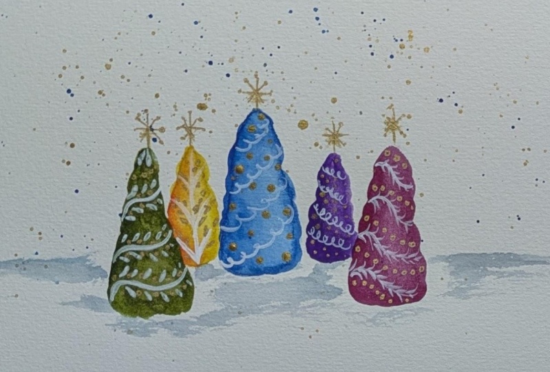
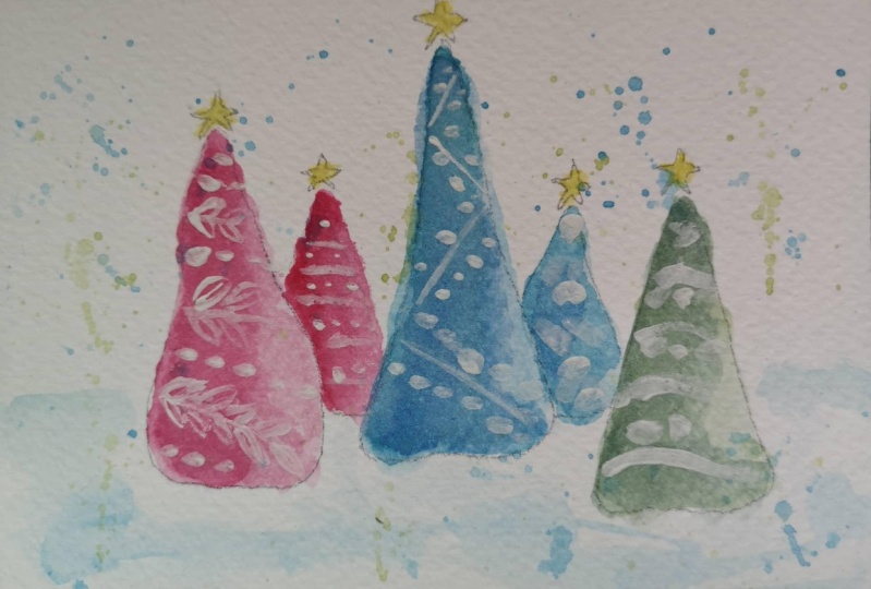
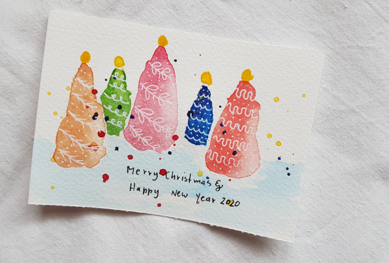
12. Class Wrap Up: So to wrap up the class, I wanted just to review what we've done and show you a couple of variations. So here we took our card and we were made our palette from our color scheme. And then we painted the trees just the five trees onto the paper, made a slight little background with a horizon line, spatter painted and then added our patterns. Here I took that pallets watch, and I just played with some of the patterns again, using paint onto the color swatch, and that made a little work of art in itself. But it's really cute when shown with the actual painting. Here's the painting that I did a Sabonis class fast in fast time, and I used paint instead of the gel pen. As you can see, the gel pen is far more delicate and easier to control in the paint. The paint gives thicker images, and it's a different look, so it's kind of a fun alternative to using the gel pen. I think it works better with the larger scale trees as well, just some variations where we did, um, paintings based on cards in Christmas cards. Here's a painting that's just based on greens, and it's very simple. No spatter. I used acrylic paint to create the patterns, and they're very simple patterns. I over made the trees oversized and just use some very basic stars where I didn't even touch the stars to make a pattern. So that's another look. You can get using simple colors. And lastly, here's an untraditional color scheme where I took purples, pinks and blues, combined them and then used a gel pen on top. I added some spatter painting and a slight horizon line, and it gave a really fun effect. I hope you'll try your hand at one of these patterns watercolor Christmas trees and post your work in the project section. Be sure to follow me here on skill share to get notified of future classes and please consider leaving a review. Thanks for watching
 Daniela Mellen, Artist & Author