Transcripts
1. Intro: Hey, I'm Maya Faber, and I am a surface pattern designer from Stockholm, Sweden. This is a class all about textured motifs and patterns. I will show you how to create this with three different techniques. We will use Adobe Illustrator to draw and add texture. For those of you who have an iPad, I have included how to add texture to motifs in both Procreate and Adobe Fresco. You will also learn how to create your own unique handmade textures and vectorize them to be used in your artwork. For those of you who want to dive straight into adding textures digitally and want to skip the steps with getting your hands dirty of paint, I've included free downloads that you can use in this class. It is 16 vector textures and four vector brushes to be used in Illustrator. As a bonus, I have also included five free Procreate brushes from me and my husband's online shop, Faber Company, which I will show you how to use the texture your motifs in Procreate. By the end of this class, you will be able to draw textured motifs and create a textured repeat pattern in Adobe Illustrator. This is an intermediate class. You do not need to have an iPad to take this class, but you need to have at least basic understanding of Adobe Illustrator to be able to follow along.
2. Class Project: Your project in this class is to create a textured repeat pattern using one of the techniques that you will learn in class. Feel free to draw any type of objects. I will create a cupcakes pattern. If you don't want to focus so much on ideas as learning the techniques in this class, you can create a cupcakes pattern as well. Suggests a note here for learning purposes, it's totally fine to copy my cupcakes and draw the same. But you are not allowed to copy my artwork and share your pattern as your own idea and style on other platforms does skill share. If you copy my artwork for learning purposes, please share them as a project here in class, but don't share them outside of skill share, as that would be an infringement of my copyright. However, if you create your own unique artwork, you are welcome to share it everywhere you want online. If you share it on Instagram, feel free to tag me with my art favor. Let's get started. I would love to see what you create.
3. Preparations & Supplies: In this class, I will show you three different techniques of creating textured motifs. You don't need to use them all, it all depends on how you like to work and what tools you like to use. The three different techniques are, create your own handmade textures, digitized them, and vectorize them in illustrator. Draw your texture motives in Procreate, import, and vectorize them in Illustrator. Last, draw your texture motives in Adobe Fresco, import and vectorize them in Illustrator. When we created our texted motifs, I'll show you how to create a texture repeat pattern in Adobe Illustrator. I will move through this part rather quickly as I have other classes here on skill share, where you will learn more in detail how to create the repeat pattern in Illustrator using my techniques. If you feel that the pattern-making part of this class is to advanced or moving too quickly, go check out my other class from sketched repeat pattern for the basics of creating a pattern in Illustrator. If you want to learn more advanced techniques such as half drop and layer patterns, you can check out my other class, level up your pattern design. To the supplies that you need to take this class, there are only two you absolutely need is Adobe Illustrator, which will be our main star of the class. If you want to join me and learn how to create your own handmade textures, which is a really fun part of the process, you need some basic drawing materials. My suggestion is to use what you have at home. You don't need to go out and buy an expensive materials for this class. I'll show you more in detail the drawing materials that are used in the next lesson. If you want to skip this step, you can download my free textures and use them as you wish. More about that in a minute. I used the scanner on my printer to scan my hand-drawn textures on to my laptop to be able to digitize them in illustrator. But if you don't have a scanner, you can try out to take a photo of your textures in good lightning with your smartphone, and that might work out fine as well. You don't need an iPad to take this class. But if you do have an iPad, I've included lessons to show you how to draw your texture motifs, both in procreate and Adobe Fresco. This is not an introduction class to either Procreate or Adobe Fresco, so you need to have some basic knowledge on how to join these apps to be able to follow along in the lessons. If you want to learn the basics of drawing an Adobe Fresco, you can check out my other class, sketch and draw motives with Adobe Fresco. As a bonus to this class, I've included some free downloads. You don't need to download these assets to take the class, but if you do want to download them, they are 16 vector textures, and four texture vector brushes to be used in Illustrator. Five free procreate brushes from me and my husband's online shop Faber company. If you want to download these free resources, I've included instructions and the links to where you can download them in the description of this class. That was a little bit about the preparations and supplies. Let's head over to the first real lesson in this class, where we will draw our handmade textures.
4. Create Your Own Textures: In this lesson, we will create our own handmade textures. We will draw the textures by hand. Then in the next lesson, I will show you how to scan them in the computer and digitize them in Adobe Illustrator so you can use them for your vector artwork. But first, let's just go through the supplies that I use. You can use basically anything you have at home. You don't need to buy anything new for this. First off, I just covered my table with this oil cloth. You can see that it's a little bit dirty already with paint because it can get a little bit messy when we create our textures. Then you can basically use any kind of paper. These are just regular printer papers. I found that they are a little bit too thin, but they can't work perfectly fine if that's what you have at home. Personally, I'm going to use this really cheap water color paper. I just bought it online. It's nothing special at all, but it's a little bit thicker. Now to the drawing materials, I'm going to use this ink, India ink. You don't have to use ink. You can use any black color. It's always easier when you scan in your textures if you use a black color. I'm going to use this because I like the effect. You could also use something like this or any black colored paint. Then I have some drawing materials. I have some different brushes. Whatever you have at home really works. What I like to use a lot is this sponges. This is just something like a shower sponge I think, and this is like a dish sponge. Whatever you have at home, this will make perfectly fine textures. Then I just have some papers so that I can make more dry textures, a little bit of water and something that you can pour out your color, mix it with water and dip in your drawing materials. Let's start. I will just take my plate, pour a few drops of ink, add some water to mix it up. Then I take my paper. Let's try out the sponges first. We can make some textures with this a little bit more large hole, sponge or whatever you like to call it. I just dip my sponge in the ink and make sure that it's covered. Let's try this out. You don't need to think that much about shapes when you create textures, because you can always edit the textures and the shapes in Illustrator later on. I'm just going to press this whole side down. I will press it hard down to the paper. That's a cool texture. Then for every time I press, I have less ink. Then I can just press a little bit light with my hand to get this more dotty looking texture. Maybe something like this. Let's move on to another. I think that I will try this little sponge with like smaller holes in it now for a more grainy look. I don't want this so wet. I'm just going to try to scrape it off and also use my paper and dry a little bit of the ink off the sponge. Let's make a little bit of grain texture. As you can see here, I'm just pressing the sponge really light to the paper. I get this grain texture that covers the whole paper. I don't mind even if I just wanted to have this little dots are grain and I get this little swishes of color. I won't mind that because I can always edit that later on. I think I'm pretty happy with this one. It's a pretty light grain texture. Let's move on to the brushes. I'm just going to try out this little brush or big brush. Maybe make a little bit of switches. Something like that. Maybe some thing like this scratchy looking textures. As we're making vector textures, we're going to scan this in and vectorize them. You don't need to mind the size of the texture that you draw that much. Although if you make it this size and your art board or the objects that you draw are say, A4 size like this. When you draw them in Illustrator, if you increase the size of this texture, you will get like larger scratches. That's really what it comes down to. You can decide from the start how large textures you want. Or you can just try it out and you can always redraw your textures. Maybe we can draw some textures with a brush. Maybe you want some dotty textures. It's more like mark making texture thing. I think I'm going to try out this. It's not really a brush. I don't know what it's called or what it's for actually. It's also my husband's drawing materials. I'm just stealing it for this class. But it seems like it can be a good thing to make textures up. Maybe something like this. Now we have these three different textures and you can make as many as you wish. If you don't want to go through this step of creating your own handmade textures, if you think it's messy or just takes a lot of your time, then you can download my free assets that I have included in this class. There's a link in the description of the class where you can download my vector textures and even some texture brushes for Adobe Illustrator.
5. Vectorise Your Textures: Okay, so now it's time to scan in our textures to be able to vectorize them in Adobe Illustrator. What I will do is to scan it in with my printer. I have nothing special when it comes to a printer at all. It's a Canon MG7550, and it has an open scanner. This is how it looks for me. It will probably look a little bit different for you depending on which printer or scanner you have. What I want to do here is to first select which area. I will scan in and that is my A4 size paper, then I choose the highest DPI. I have 600 as my highest DPI, black and white, and I will just scale it to the desktop and name it, Texture Green. JPEG is fine as file format. Then, I will just make one more setting, and that is this image correction. I will go to manual here and on contrast, this is the normal contrast and I will bring it up to the maximum contrast. You can see the difference that the black becomes more black and the white becomes more white. This is the result that we want and then I just hit scan. There we have our finished JPEG with our grain texture. Let's head into Illustrator. To vectorize this texture, I will just create a new document. I will go for A4 size as it's the same as my paper, and all of these other settings, RGB color, height, 300 ppi. All of these are fine, so I'll just hit create. When I have my new documents, and I will just drag in my grain texture, and now we will image trace it. You should have a panel up. This is image trace. If you don't have it, you go to window image trace. Here you can make some different settings as this is a black and white photo. Let's just try a simple black and white logo. Just hit okay, and here's our first try. I want some more of the black parts of the texture, so we can go in and increase the threshold. Really, you can just play around with all of these settings. There's no right or wrong. It all depends on how you want your texture to look. I think I will go for something like this, and then I will tap in the box which says ignore white. Because if I drag out this texture to the side, you'll see that there's still a white background. But if a check in the box, Ignore White, the white will be removed from the image. When you're happy with your result, you can hit expand up in the top menu and here we have our finished texture. That's really all there is to it to vectorize the texture. A little bit later on in class, I will show you how to use this texture on the objects. If you want to skip this step with scanning in, then vectorize your own textures. You can download my free vector textures. Just follow the instructions and click on the link in the description of this class.
6. Create a Texture Brush in Illustrator: So in the next lesson, I will show you how to use these textures in the shape and form that they are, and add them to the objects that you draw. But in this lesson I will show you how to create your own texture vector brush which also can be handy when you want to add texture to vector objects in Adobe Illustrator. So we'll start with our texture, I will just make a copy, hold down my Option key, click, and drag to make a copy so that I have my original texture saved. Then I will go ahead, and just create a circle. Let's make that in another color so we can see it and then you can place the circle on the part of your texture that you want to use as a brush. Because my idea here is to make a round brush with a part of this texture. So let's just go for something like this. So the part of the texture that are behind this circle will be the part that we make our brush from. When you place your circle, select both of your circle and texture, go to object, clipping mask and make. So now you've made a clipping mask of your texture as a round object. But if you go to view outline, you can see that your texture is still outside of your circle, you just hidden it with a clipping mask. Now we need to merge these, bring out your path finder menu and when you have made your clipping mask, you can hit merge. If you go to view outline, you can see that the parts of your texture that was outside of your circle are now erased, and left you have a circle with your texture in it. Now you can choose which size you want to brush to be. You can always change this later on, but let's just make it something like this and then we want to bring out our brushes panel which we have here, select your circle which you takes there. Click on the little menu in the brushes panel, New Brush and here we will select Art Brush, click "Ok". You can try out different settings, and experiment with them. But the only thing you need to do to be able to change the color of your brush is to change the coloration method to tints and shades and then click "Ok", there you should have your new brush. So to try out this brush, let's select our Paintbrush Tool, click on the Brush, and draw with our new texture brush. So if I just remove these and drag that up, you can see that this is now a stroke with your new brush. In the next lesson, I will show you how to use this brush, and add texture on your objects.
7. Add Texture in Illustrator: In this lesson I will show you how to add texture of this that you draw in Illustrator, or that have scanned in an image traced in Illustrator. But I will show you how to draw an object in Illustrator and add texture to that object in this class. Here I have a document. I usually create my pattern set 1000 pixels square. That's what I will do here as well. I have a color palette that I will use. I've saved it to my CSE Library, which means that I can use it in Adobe fresco swell. With this first cupcake, I will do a chocolate cupcake. I will go for the brown and the pink beach colors. To add swatches to your swatches panel from the library, you right-click and click, "Add color to swatch." There you have your palette. I think I will go for this one as well and maybe the White. Here I have my palate. Let's just start to draw. I normally don't draw that much in Illustrator anymore as I have my iPad. That's much more handy and easy to draw in. But when I draw in illustrator, I use the brush tool. You can double click to select the size and other settings, but I will just go for 10 points for this cupcake drawing. Maybe I will go for this little darker peach color. Just draw a basic shape of the cupcake and fix the details a little bit. I think that this is fine for this example. Then I will draw the middle layer with lighter pink color. Let's call this the cream layer. Choose the group selection tool and just delete the inner shape, which will fill your soul shape. Select the blob brush tool again, and a brown color to add the chocolate frosting to the top of the cupcake. Delete the inner part of the object to fill it in, and then just fix the details a little bit. May well just erase at the top to create the little pointy tip of the frosting. I think that this looks fine for this example. Now we want to add textures to our cupcake. What I will do is to bring in all of the textures that you can download for free here in class. You can follow my exact steps if you wish, or you can use your own handmade textures. I will just duplicate my whole cupcakes. I have my original objects. That I have my original parts. Then I will remove the top layers of the cupcake and focus on the bottom layer. For this bottom layer, I think that I would try out this gray me texture. I just drag it on top of my object and change the color, not the stroke color, but the fill color to a lighter color. If you want to see how it looks, why you have the texture selected, you can hit "Command H." There you have some texture to that object. That looks pretty good. Maybe I want to add some thing. Maybe I want to add a little bit more texture. Let's try out this one. Change the color to the pink. Make sure you have it to the front, arrange bring to front. Then we can just pull it in. Maybe twisted around. Since a size. That's a little bit too big for my taste, I just want a little bit of texture, a case or something like that. Then I will go on and select my original bottom layer of the cupcake. Hit "Command C," select everything. Hit "Command G" to group everything together, and then paste my original part in front by hitting "Command F." Then I will hit "Command seven" to make a clipping mask. Which means that if you go to view outline, you can still see the texture outside of your object. But if I now go to the Pathfinder and select "Merge," that will erase everything that are outside of my object. That looks pretty good. Let's move on with the next layer of the cupcake. I'll just lock the bottom layer, place the middle layer, and arrange it to the front. Then let's see what we want to do here. May be we should draw a little bit with our brushes. I will go to the paintbrush tool, select the "Brush" and try it out a little bit. I think that I will go for the text your brush number 1, you can download for free in this class. Then I will try to select a red color and see how that looks. Needs to be the stroke color. One more stroke. I don't know if I like the rain. I think that I will go for a lighter shade of the pink instead. Just drag that color in so that I can use the same color for my next. Here we have some light texture on the middle part. I will just go and copy that one. Then as we have strokes, if you go to view outline, you can see that we have two strokes here with our brush. We need to expand those strokes before we create our clipping mask. You can just let everything and go to expand appearance. Group everything together. Then hit "Command F. " To paste your original middle layer to the front, and "Command seven" to make your clipping mask hit "March" and there you have your textured objects. Let's just lock that part and bring in our last layer of the cupcake, the top layer.. For this, I think that I will use this little texture with a brown color. As Fill color, make sure that you have it arranged to the front. Then you can copy that part and move it around so that you get a little bit more texture. Maybe I want to add some more texture. Let's try out this one. Make it brown arranged to the front. Twist around. That looks pretty good. I will copy my original top layer, group everything together, and then paste it to the front. Then I will create a clipping mask. Either "Command seven" or go to object clipping mask and make and then hit "Merged." If I add this stage, figure out that I want to add more texture to my top layer. I have saved my original layers here, but I can also just continue to draw on the top layer as I have that one copy to my clipping board. I will just try to add some more textures. Let's try out this one. Maybe something like that. Then makes sure that you expand the appearance. Group everything together. Now you have your saved object in the clipboard. Select everything, hit "Command seven" for the clipping mask and merge your clipping mask. There you have your textured object created in Adobe Illustrator. If you hit "Command H," you can see that you have all of these little anchor points. Which means that the more anchor points you have in your vector artwork, the heavier the file will becomes. To try out to decrease the anchor points, I will just make a copy of that. I will just hit "Command H" and then we can go to objects path and simplify. Make sure that you tap a little books so that you get your menu. Here you can play around with your anchor points. You can see when you drag down your anchor points, you can see what happens with your object. If you hit the "Premium box." You can see that you go from 62,000 something anchor points to 41,000 anchor points. Let's hit "Okay" and see how that looks. For me that looks the same as the original object. If you create, takes the obvious in Illustrator, and especially if you were supposed to make a pattern of them, you should try to keep your anchor points low to make sure that illustrated on crash and that you don't make this super heavy pattern files. That's it. Now we created our first texture object in Illustrator. Really you can create any textures. I used my handmade ink textures. They are grain textures that you can create like stripes or grunge textures or scratchy textures, or whatever textures that you wish to use. If you're finished with this lesson, let's move on to the next lesson. The next couple of lessons will be for those of you who have an iPad and want to learn how to draw textured objects in procreate and Adobe fresco and bring them into illustrated to vectorize them. If you don't have an iPad, you can skip those lessons. Or if you are curious on how to do this on an iPad anyway, you can watch them, is a really fun process. In the end of this class, I will show you how to create a pattern with your textured objects.
8. Draw in Procreate: Let's draw our cupcake with texture in Procreate. Just leaning off before we start, this is not an introduction course in Procreate there are full course in how to draw everything in Procreate, I will just show you how to draw a textured object. You need to have some basic understanding of how to draw in Procreate before you watch this lesson. I will just create a new canvas. I usually go for 1,000 pixels square when I create my patterns and 300 DPI. Then I will use our favorite company, monoline brush, which you can download for free if you follow the link in the description here in class. I will use this lighter orange brown color and then just draw the first part of my cupcake. Fill it in, maybe fix the details a little bit. Something like this. Then I will create a new layer. What's important here is that you build every part of your object on a different layer, as we will add textures to different parts of our cupcakes. That's much easier to do if you have your objects in different layers from the start. Now I will go for this light pink color, same brush and draw some frosting or cream or whatever we want to call that. Add a new layer on top and I will that for a pink color and fix the details a little bit. Then I use the Eraser tool to just get that little tip at the top of the cupcake. Maybe something like this. Then I go back to my first layer and tap the layer, hit Alpha Lock, which basically means that you can only draw on the object itself and not outside of the object, which is really good when we want to add texture to this part of the cupcake. I go for a little bit of darker brown color. For this, I think I will use our favorite company, grunge number 4, which you also can download for free if you click on the link in the description here in this class. Then I'll just add some text here to my cupcake and tap the next layer, Alpha Lock. I will go for a little bit of darker, pink there. Our favorite company, gray number 1, which you also can download for free. I'll just add a little green, tap the third layer, Alpha lock, I'll select a darker pink color. Maybe I will use our grunge number 1 here just to add a little shading to the cupcake. I'll also try out our green number 2 brush. Then I go for a light pink color and add a little bit of highlights to the cupcake. No, I didn't like that one, so I will go for the grunge number 2 instead. Back to the darker color and maybe just add some green and a little bit of the grunge number 4 brush here as well. What you want to think about with the colors and textures here is, does you create contrast between the flat image and the textures? This will make it easier to vectorize your drawings in Adobe Illustrator later on and still be able to save some of these tasters. It won't look exactly like this when we vectorize it, but we will try it out later on in Adobe Illustrator and you will see what I mean. I'm pretty happy with that, now we have our three layers and we've added textures to all three layers. I think I will try to add some sprinkles to this cupcake as well. I will just add a new layer and a go for red, orange color and our favorite company, dry ink number 1, which also can download for free. That was pretty good. As I know that it will be a little bit hard to vectorize the sprinkles on top of the cream layer. I will just move my sprinkles layer to decide so that it don't touch my cupcake. That way I can vectorize this whole image and add the sprinkles later on in Illustrator.
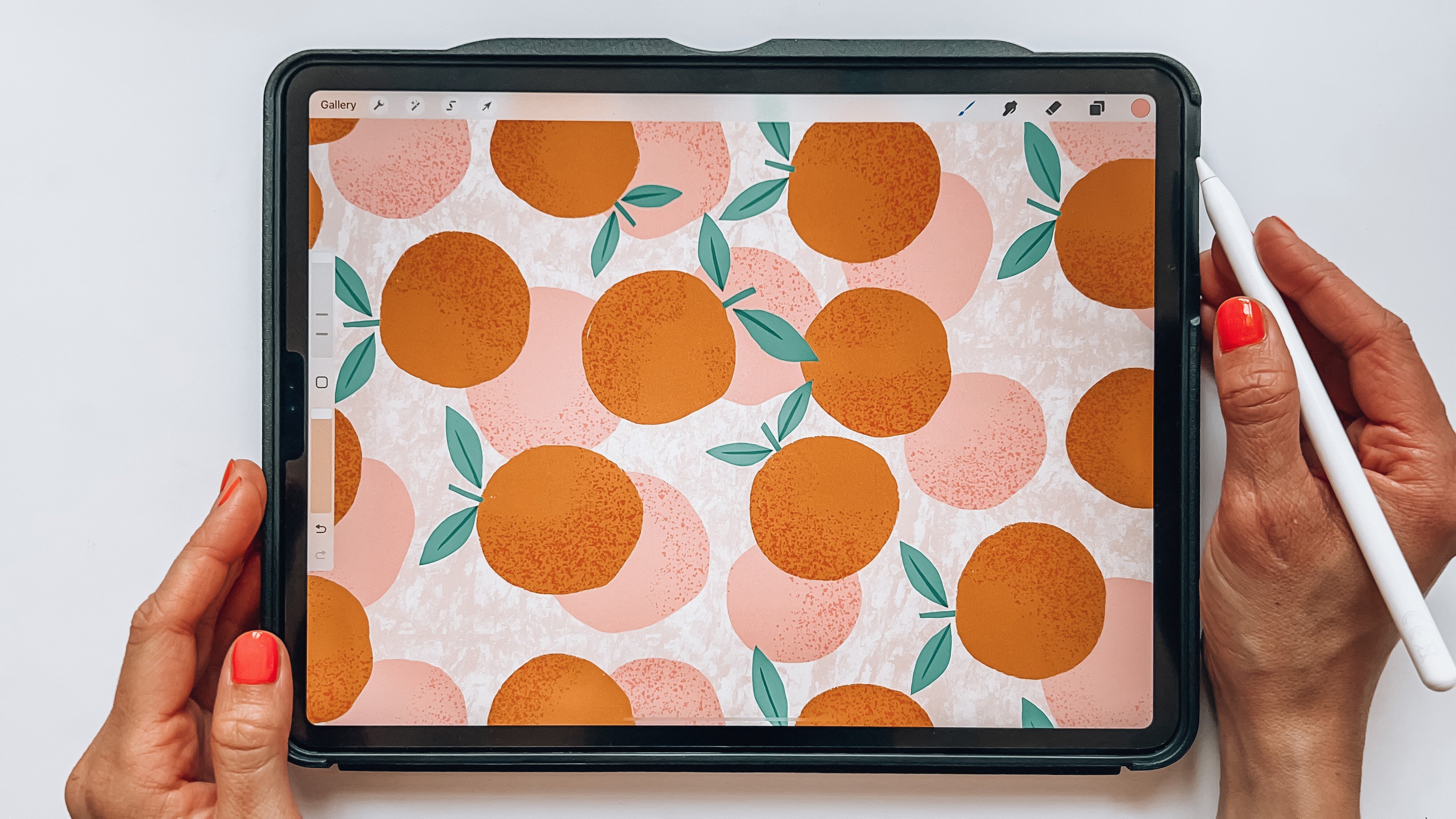
9. Procreate to Illustrator - Export and Vectorise: Now that we have drawn the cupcake in Procreate, we will explore it and vectorize it in Illustrator. We'll just go to the actions panel and share PDF, best quality, and AirDrop it to my own MacBook. Now we will vectorize the pixel sketch that we made in Procreate. To do that, I will just drag in my PDF in Illustrator that I saved to the desktop and then I will make sure that I have my image trace panel open. If you don't, you go to Window Image Trace and to image trace this cupcake that has so many different colors. I will try to go for 16 colors. I found that if you go for more colors, you will preserve more of the texture. Let's just click on 16 colors and see what happens. As you can see, there's some loss of textures so let's try out and increase the colors to 20 and try to bring up the path to high, which added some more texture and let's just experiment a little bit with the settings. The noise made it a little bit more smooth, but it also removed the texture of the cream so bring down the noise again and let's increase the path. Let's try to increase the colors as well to 27 colors. As you can see, you can never get the exact same result as you have when you draw textures in Procreate. I didn't think that that made such a difference. I would just bring in the colors a little bit more. Maybe we will get a lower amount of anchor points and then I will just be satisfied there. I will try to ignore white and see what happens. That looks pretty good and then we can hit expand and here we have our vectorized drawing from Procreate. If you go to object on group, I will just make sure that I group all of these red sprinkles. I use the lasso tool to drag around them and then have command G to group them. Then we can group this whole cupcake together. Let's try out to simplify their path so that we get a little less anchor points and see what happens. Go to Object, Path Simplify. Hit the little dots for more options and bring down the simplified curve. You can see that we lose a little bit of the cupcake here and there so I can bring it down that much. That looks pretty okay to me, the original was 9,000 points, and now we have 5,000 points. I'll just hit Okay. Let's try to add the sprinkles to the cupcake and see what happens. Make sure that you bring them to the front and there you have your sprinkles. If I zoom in, I can see that something happened here with the sprinkles. There are some pink parts of it and maybe I don't want that so I can just go in double tap as I've grouped this object, and then go in and select the pink color. Go to Select, Same, Fill color. Make sure that you have command H. Press down so that you can see which areas you delete and here is some other pink color. Just delete that and now I think we only have red color. If you want to check out, if you only have red color, you can select your whole object and hit the color group in the Sources panel and if you only see red as color there, then you only have the red color. Double-click to go out of your isolated group and add the sprinkles to your cupcake. That looks pretty good and that's actually how easy it is to vectorize a sketch from Procreate in Illustrator. We drag in the original. You can see that this doesn't look exactly the same as this is a pixel drawing, which makes it easier to get a more smooth and nice texture and this is a vector drawing with anchor points so you can't get the same smooth look in your textures. But for me this looks pretty okay anyway and that's it for this lesson. Let's head over to the next lesson, where I will show you how to draw your texture motif in Adobe Fresco.
10. Draw in Adobe Fresco: In this lesson we will draw our cupcake in Adobe Fresco. I've just opened up Adobe Fresco and create a new document. A 1,000 pixels square. If you watched my other class here on Skillshare sketch and draw motives in Adobe Fresco, I went through how to draw vector motives in Adobe Fresco and also the basics of the app and how to draw in it. But as we're making textured motives in this class, we will actually draw our objects with the pixel brushes. That way we can add texture and then we export the artwork to Illustrator and vectorize it in Illustrator. This is not a lesson where I will go through all of the basics of Adobe Fresco, you need to have basic knowledge of how to use Adobe Fresco to be able to follow along in this lesson. If you want to learn more you can check out my other class here in Skillshare, sketch and draw motives in Adobe Fresco, and then go back to this class. With a new layers selected, I have saved my color palette in the CC libraries, so I have it here. I will start with this peach color. For this I will just use the pixel brush, basic and hard round variable, then we'll just bring up the smoothing a little bit because my table is moving around the limit so it's hard to be steady on the hand. Then I will just start to draw my different parts of the cupcake. Here's some buggy I think because it doesn't fill the whole area, so I will just fill in those white parts, and then go in and fix the details. Then I'll add a new layer on top and I will draw the cream and fill that in, and just fix this little mysterious white line, then I'll add a new layer and make a blueberry cupcake. I will just fix the details with the eraser. Something like this. Now I will begin to add the textures. Then I will select the brushes that I will use to add texture. I have some favorite brushes. These are the Kyle's different brushes. If you don't have these brushes, you can hit the little plus sign at the bottom of your Pixel Brush menu and select, Get More Brushes. I'm going to the Swedish Adobe site but you can go to the US Adobe site or wherever you are in the world, and here you can select some different brushes that you can download and use in an Adobe Fresco. Let's download this Dry Media, and tap Download. Up here in the top right corner, you have your download working. Then you tap that icon, tap the File, then you tap the little square with arrow, and you select Copy to Adobe Fresco. There you have your new brushes. Some of my favorite brushes are these ones. I think I will go for the Kyle's dry media rough, rowdy, variant to add some texture to the bottom of the cupcake. For this, I will actually go a little bit lighter than before in color. In Adobe Fresco, to be able to draw only on your object and not outside, if you have a pixel layer, you can go to Mask Layer Content, and that will get you a little black and white box here. If you swipe that black and white box to the right, you can draw on top of your object with your selected text and brush. I will just try to add some texture to this part of my cupcake with the rough rowdy variant. I think I want to change the color to maybe just a little bit lighter than it was before. Maybe try out another brush, the dry media, new pastel with a little darker color and a bigger brush. That looks pretty good. Then I will just continue with my other layers. Tap the layer above, hit Mask Layer Content, swipe the layer to the right. Select a new color. Maybe try out the dry media soft pastel, and be a little bit lighter on the hand. Then on the top layer, Mask Layer Content, swipe the layer to the right and try out the soft pastel again. No, I didn't like that. Maybe the rough rowdy variant again. Just add a little bit texture to that blue. For this cupcake, I think I will add some lines with the Kyle's dry media deliciously dry brush, and red orange color. I will just add some textured lines at the bottom of my cupcake. I'm pretty happy with this. Let's move on to the next lesson where I will show you how to export this file and import it to Illustrator where we will vectorize this textured cupcake.
11. Adobe Fresco to Illustrator - Export and Vectorise: In this lesson, I will show you how to vectorize the sketch that you draw in Adobe fresco. What I found is that if you create a PDF that you export from Adobe fresco, you will get a really small sized image and it's hard to vectorize it. But if you create a JPEG, you will get the right size of the image and you can make the rest your sketch. Let's just remove the PDF. Drag in the JPEG, and let's see how this looks when the image trace it with 16 colors. That looks pretty good. Let's try out to increase the colors a little bit and pull up the path too high. Maybe something like that. Then we hit expand. But we forgot to remove the whites. Let's us go back. That's good. Let's just tap in the little box to ignore white and then hit expand and there you have your textured cupcake. Let's drag in the original and see the difference. I will say that this is about as good as it can get from this pixel image that we draw in Adobe fresco to the vectorized object in Illustrator. If you're finished with this lesson, let's move on to the next lesson, where we will create a textured pattern.
12. Create Your Pattern: In this lesson, I will show you how to create a pattern of your taste and motifs and we will even try to add that texture to the background of our pattern. If you watch one of my previous classes here on Skillshare, for example, from sketch to repeat pattern or level up your pattern design, then you know that I create my pattern in the pattern tool. As I think that it's the smartest and easiest way to create patterns in Adobe Illustrator. I create the first part of the pattern in the pattern tool to be able to visualize the pattern, then I bring out my motifs on my artboard to create more manual pattern tile. The first thing I will do is to go to "Preferences" and change the user interface to white, which I like to have when I create patterns. You might see that this isn't the exact same cupcakes as we made previously in class. That is because I cheated a little bit and created all of these three cupcakes in Procreate and vectorize them. Because I feel that that is the best alternative to get the nicest textures, to draw your motifs in procreate and then vectorize them in Illustrator. That's what I've done. I will just copy my objects, and select objects, go to "Object", "Pattern", and "Make". I will change the size of my pattern tile to the same size as my artboard and drag my pattern tile to my artboard. Then I hit "Command V" to paste my cupcakes and start to build my pattern. In the pattern tool, I don't create any background for the pattern. I talk more about this in my other classes here on Skillshare, but this is because it can mess up how the pattern tool shows the pattern. I will just place my motifs and let's see how I want them. Maybe if I drag them another step away and this one, and the blue berry to over here. I we'll get a bit of variation with the colors. I think that I will like a pattern that looks like this. Although, I know that I need four rows for it to be able to match in the edges. I will just bring down the size a little bit and add pink cupcake there, brown cupcake here. Let's try to just bring these down, make them a little bit smaller, and then continue to arrange your cupcake. As you can see here, if you have textured objects, it will take a little longer time for Illustrator to work with your pattern as it's so many anchor points. Just make sure that you keep your anchor points as low as possible. Or just hit "Command K" to make sure that I have maybe five pixels in the keyboard increment. As you can see, Illustrator works really slow and I have so many objects with so many anchor points. I will actually delete most of my objects and then delete that copy. Let's see what I want to do, maybe have larger cupcakes and just a few of them to make the file size a little bit smaller. That looks pretty good. Let's try to increase the size of them. Go to "Object", transform each, hit the preview box and you can scale all of your objects horizontally and vertically. See how that looks. That looks pretty good. If you want to align your objects perfectly, you can go to the align to selection, and tap the different settings to make sure that you align them in a good way. Zoom out a bit to see how your pattern looks. I like how my pattern looks here. I'm pretty happy with this pattern. Then, I will copy my artwork from the pattern tool, hit done, and then paste them to your artboard. This is my technique if you use any other technique that works fine too. But this is the technique that I feel is the most efficient and smart way of using Illustrator to create patterns. When I am outside of the pattern tool, I will just copy the artwork that are falling out of the edges to the opposite side. Then, I will create a background layer that is 1,000 pixels square rectangle. I think that I will go for maybe a light pink color. Let's try that out. Align it to the artboard, make sure that you arrange it to the back. Maybe I need to go for some lighter color for the background. Then we copy our background, paste it to the back and make sure that your background box have no fill, no stroke. Now we can see how this pattern looks. We can zoom out "Object", "Transform", "Scale". Make sure you only had transform pattern and zoom out your pattern. I'm really happy with this pattern. But if you want to add a textured background to your pattern, I will suggest that you go back into the pattern tool. But before you do that, you fetch a texture, copy texture and then go into the pattern tool and paste your texture. You make sure that your texture is placed in the back and then you can drag it out so that it covers the whole pattern tile. Maybe I don't want, I think I only want the grain parts, something like that. Then I select everything again. Head out of the pattern tool. I will just lock the background layer and the pattern tile layer. Remove my cupcakes, and then I will paste the texture and the cupcakes. Now we can change the color. Let's try out the red color. No, I didn't like that, so let's try out the pink color and that looks pretty good. We can just arrange the patterns so that it looks as we wanted to look. Then I select my cupcakes that are falling out, copy them to the other side of the pattern tile. Then I will lock all of my cupcakes. I will ungroup my texture and select everything that are falling outside of the edges. It's not totally sure that you need to do this. It depends on if you have something, here we have a little green that falling outside of the edges. First we can just delete a little bit of extra that are on the outside. Then we select everything that are on that sign. Make that fall in, and the same on this side. Maybe I forgot to do this side. I won't mind that it's a copy somewhere there. There you have a textured background. If we go to "Unlock All" and drag in the pattern to the pattern swatch. Let's check out the difference. Here you have texture in the background of your pattern. We created a finished pattern with the motifs that you draw, either in Illustrator, in Procreate or in Adobe Fresco. In the next lesson, I will show you how to create a finished pattern tile and save your file as a JPEG so that you can upload it as a project here in class.
13. Export as a JPG: In this lesson I will show you how to create your finished pattern tile so that you can use it and print on all source of product or use it however you want, and also save it as a JPEG so you can uploaded it on the product page here in class. As the pattern with the textured background is the most complicated pattern, I will show you how to create a finished pattern tile of this. Let's bring out our swatches panel and if you ever need your original pattern, you have it here. If you drag out the pattern swatch from your swatches panel. You don't need to save this on the art board and what we do is that we copy the background layer and then we group everything together. We paste the background layer at the front. Select everything and I will use a shortcut command seven to create a clipping mask. If you go to view outline, you can see that you have objects outside of your clipping mask that doesn't show on the preview. Now we need to merge our tile. Have your clipping mask selected and hit merge in the pathfinder panel. Where we go to view outline. You don't see anymore objects on the side of your pattern tile. There you have your finished pattern tile. If you want to try out your pattern tile, you can drag it to the side.You can either make sure that you have your smart guides selected or you can tap in 1000 pixels in the keyboard and command the same size as your pattern tile and hit your option and key to create duplicates of your pattern. Zoom in to see that everything looks good and for me it looks really good. We'll just delete those and now if I want to, I can drag in the pattern tile to the swatches panel and check it once more to see if everything looks good and for me, that looks really good. Now to upload this pattern as a project here in class, you can go to the asset export panel. If you don't have it, you go to Window asset export and you can both bring in your pattern tile if you want to and also a more zoomed out version of your pattern. Maybe I want to scale it up a little bit more. I go to object transform and scale and when I do that, the pattern tile changes in the asset export panel as well. I will export this as a JPEG 100. You can go to the menu and format settings and just make sure that you have baseline optimized as the compression method and anti-alias art optimized, super sampling and I have my embedded ICC profile, sRGB. I select both of my patterns and hit export. We'll just export it to my desktop. If I go to my desktop, I can see that I have a folder that's named 300ppi, where I can find both of my JPEG files. Now you've created textured tiles and created a pattern of them.
14. Final Thoughts: That's all for this class. I hope that you learned a bunch of new stuff and had fun watching. Working with textures in Illustrator can be challenging. If you constantly work with textures in your patterns, you might want to consider creating your patterns in Photoshop instead, where you can use pixel textures and work more freely. But if you are like me and prefer to create patterns in Illustrator, then continue to create your patents in Illustrator, even if they're textured. But remember to keep the anchor points as low as possible for a smooth and easy workflow. Otherwise, Illustrator might shut down due to the heavy workload and it will be annoying to create patterns if you need to wait for the computer all the time. With that said, thank you so much for watching. If you liked this class, hit the Follow button by my name here below. If you have any questions at all, please ask them on the Communicating page here in class, and feel free to leave a review to let me know if you enjoy this class. I would love to hear your thoughts. I would also love to see your pattern, so make sure that you share your predict here in class. If you posted on Instagram, feel free to tag me with @maja_faber. Thanks again for watching.
 Maja Faber, Surface Pattern Designer