Transcripts
1. Trailer: Hi, I'm Katie and I'm the artist behind Paper Fashion. I started Paper Fashion about five years ago. Ever since I was little girl I've been using watercolor and illustrating and art always just been this thing that's been inside of me. Now, I'm based in New York City and I work with a lot of the world's leading fashion brands and digital media agencies, and kind of bring to life different campaigns, runway shows, all sorts of fashion related things. It's really made a huge comeback. Nowadays, everything so digital. It lacks like a human touch, so that's why, I think, fashion illustration has become so popular again. I mean, you see it everywhere. Designers taking inspiration for prints on their clothes, being watercolor prints or just things that are very organic and hand done. Even if you're not necessarily a fashion illustrator, it's important to have drawing skills behind what you do because at the end of the day, a lot of designers do create the final looks on the computer just to save time and it's more accurate. But, some of the most creative new ideas just come from simple pencil sketches. The better you can draw on paper, the more you understand how to draw on the computer also. so they kind of link back together. So, my first two classes I covered the basics of watercolor. In this class, we're not going to go over the basics of watercolor as much. In my second class, I covered how to draw fashion illustrations to bring them to life in different ways. So, for this class, what we're going to do is we're kind of going to combine both of those things. You're taking your basic fashion illustration and you're putting this girl into a whole world, maybe make up a dress, make up an outfit or you can choose something from the runway. Sometimes, that's the way I work is I'll find something really dramatic, something really beautiful that I want to illustrate, but I want to take it someplace more. The purpose of this classes is to really take fashion illustration and turn it into something more, to really capture a narrative and a story where you're taking the viewer beyond just the fashion, and you're bringing them into an entire world that maybe came from your head or somewhere you've been, creating an entire composition.
2. Introduction: Hi I'm Katie, and I'm the artists behind Paper Fashion. I started Paper Fashion about five years ago. Ever since I was a little girl, I've been using watercolor and illustrating, and art's always just been this thing that's been inside of me. Now, I'm based in New York City, and I work with a lot of the world's leading fashion brands and digital media agencies, and kind of bring to life different campaigns, runway shows, all sorts of fashion-related things. It's really made a huge comeback. Nowadays, everything is so digital, it lacks a human touch. So, that's why I think fashion illustration has become so popular again. You see it everywhere, designers taking inspiration for prints on their clothes being watercolor prints or just things that are very organic and hand done. Even if you're not necessarily a fashion illustrator, it's important to have drawing skills behind what you do because at the end of the day, a lot of designers do create the final looks on the computer just to save time, and it's more accurate. But some of the most creative new ideas just come from simple pencil sketches. The better you can draw on paper, the more you understand how to draw on the computer also, so they kind of link back together. So, my first two classes, I covered the basics of watercolor, and in this class, we're not going to go over the basics of watercolor as much. In my second class, I covered how to draw fashion illustrations, to bring them to life in different ways. So, for this class, what we're going to do is we're kind of going to combine both of those things. You're taking your basic fashion illustration and you're putting this girl into a whole world. Maybe, make up a dress, make up an outfit, or you can choose something from the runway. Sometimes, that's the way I work, is I'll find something really dramatic, something really beautiful that I want to illustrate but I want to take it someplace more. The purpose of this class is to really take fashion illustration and turn it into something more, to really capture a narrative and a story where you're taking the viewer beyond just the fashion and you're bringing them into an entire world that maybe came from your head or at somewhere you've been creating an entire composition.
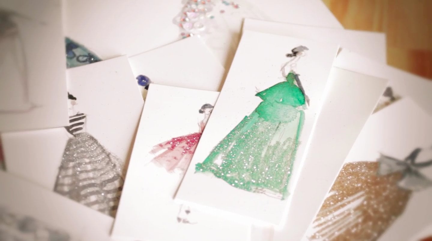
3. Initial Sketch: So, this piece that I did, which is kind of our bone in the class of today, I took one of the Oscar design into their into gowns and I really loved it. I thought it was very dramatic and bolt with a giant bow and I thought it would make a really beautiful illustration, put into this kind of ballroom world. This is a little more complex than my usual fashion figures because I'm adding so many more elements to it. I'm taking this girl and putting her in this gown and making up this entire world around her kind of to create a little story. So, it's sort of like a narrative piece in a away. So, for today's illustration, I chose an alley sub-gown, I really loved this gown from the fog collection and I think it would be a very striking in a piece. So, I've kind of taken inspiration from a few different gowns. So, another example of how these pieces is, I start with a sketch and I kind of drew a rough pencil sketch and I always start with a figure. Just to place around the world, but if you prefer starting out with the background, you can do that as well. It's kind of whatever your preferences and this is another example of a final piece that I've done, putting this girl into this kind of narrative piece. When you start sketching your first figure and the gown, you want to think about maybe an idea of what you want the background to be, what you want the story to be. So, you can figure out how you should pose her or she should be facing the audience or you see or back or whatever you want. Okay. So, now I'm going to start sketching. I usually start on a girl's head and kind of just do a very loose sketch and you can go back later and clean things up. I love drawing kind of the whole body and then drawing the dress over it, and I think you should definitely start out sketching really lightly so that if you need to change anything, you can easily erase that. Because normally when I do these sort of compositions, you never get exactly what you want. The first try. You kind of have to move things around and make the composition look good. All right. So, now I have my first initial sketch done of the girl and now I'm really going to start thinking about where she is and if she's interacting with anybody and how I can add that and make it look nice together, and I think when you look at any painting like even this here, you want to think about the composition where you have one main focal point like this girl is what you see right away. You see this main girl. But then it makes it interesting when you start looking around and you see things and you start to understand where she is and what she's doing. So she's out of vanity and she has her make about and then in the background, you see there are other dancers back there or maybe they're not dancers, maybe they're just in a dressing room. You can also look on her face and see there's something not right there. So, it's kind of whatever the viewer takes from that. It could be a story that goes in a million different directions. So, just thinking about the composition of a main focal point and then adding in little elements around her that compliment that. So, I'm going to make this girl standing in a doorway. So, and you can clean this up after. You get the sketch down and you want to sketch this part really loosely again just because you're going to go back and clean it up, like I'll go back and use a ruler and get the lines straight, or you don't really have to. Also really love the messy look. As long as you can convey what you're trying to tell, then I think you're fine. So, this girls at a party and everyone's dressed up and she's maybe talking to a few girls which is where I'm going to include these other gowns in. So, kind of base what other girls are wearing off of these. So, you can make up your own gown also. You want to position the girls so that they look like they're actually interacting with each other. If you do multiple figures and you're drawing, which you don't have to, this girl's obviously, she could be looking, you can't see your eyes, but she could be looking at either of these girls. So, you want to make sure since you see their faces that they look like they could be looking at her or just interacting with each other. So, this is very rough but you can kind of see how they're all standing together and then you can start adding a little more detail too, and then once you start getting a good idea of where you're going with it then, maybe you want to stop for a minute and kind of figure out what else is going to be happening. Then go back and clean up these girls just to make them look a little more detail, so you know what you're going to be painting over. Okay. So, I've cleaned up the girls a little bit just to make them a little more detailed. So, I've sort of figured out what they are doing. This girl's drinking champagne and this girl has some in her hand. So, you can keep building on what you've done and add more detail as you go, and you can stop sketching on each area when you feel like you have enough that if you're painting over it, you kind of understand enough what's going on, that you can easily know where to paint and what's happening within it.
4. Background Sketch: Okay. So, I have the basic idea of what I want to have down here, and I want us to talk a little bit about how I'm coming up with this and how you can figure out what's going on in the background or how these figures are interacting. A lot of times I'll just make it up as I go. I'll sketch one girl and then I see oh she's positioned this way and it would look nice if there's another girl looking the other way, and just making it up completely out of my head. But, when it gets down to the architecture, the room she's in or maybe they're outside, sometimes I'll go and look at reference photos. I'll look up ballrooms and see what some old ballrooms still look like and what kind of ceilings they had with this chandelier, if there's whatever. Even like here on this door I have some molding that's starting to give it an old world feel. So, I think it's nice to reference back to an actual place and just gather details from that. So, a lot of times I'll use Pinterest for that and I have certain boards where I will gather interior inspiration which a lot of times inspires where these girls that I draw live in. So, now I'm going to really start sketching the background, and like I said before you really want these girls are upfront, and you want them to be the main focal point. So, it's important to think about perspective and how you're looking through this realm and it's not just everything all up close which doesn't give it much depth. So, to add depth to a piece, you really want to think about, oh there's something further away in the background, what's going on there. Maybe it's a little less clear because it's further away and it's a little fuzzy, really whatever you want, but it helps to add so much more to a piece to add those elements. Again, here you can see how these girls are so much smaller because they're further away, and it gives the realm this idea of space. So, I'm going to start by adding some windows to this piece in the background. So they'll be arched also, but they give the viewer an idea that the room is pretty large because it goes that far back. So, it's just really rough, and then maybe there are some other people dancing back here. So, maybe there's a lady back here, who is dancing. So when you're sketching the background, I like things a little bit loose and big. So, I'm just sketching enough detail that you understand what's going on, but you don't necessarily need to see as much detail as you do with these girls, because they're still the focal point. So, this can be a little bit fuzzy. Coal out where the ceiling might be. Just say you have this view of you're walking into this giant room and it's a big ballroom and an open floor. Once you get the basic layout of the room figured out which sometimes can take a while, and just play around with it. See what looks good and is visually simulating, and then you want to start adding details to that to make it more interesting. So, right now it's just a really empty plain room with big windows and one girl dancing in the background. So, you want to add a lot more to that because it's obviously a party. There's stuff going on. So, I might add a chandelier. So, and then also in this old style maybe there's molding on the wall. Okay. So we have a little bit of the background more worked out with little detail, and you're starting to visualize the entire piece and you can always go back and change. Maybe these girls don't look right. You really just want to really figure out your sketch before you start painting. So, and I personally don't mind when you see the pencil lines through the panel a little bit, I think it adds just like the sense of layering to it and I think that's really nice. So, I don't worry about that too much. I know some people try to get rid of all the pencil lines but, sometimes it looks nice with them. If you want to get rid of them though just make sure you sketch really lightly on the entire piece, and then you can go back with a kneaded eraser and pick up some of the lead after you figure it out. So, now I'm going to start adding some more figures to this, and maybe there's a couple of dancing here. So, I'll just loosely sketch over, and it might be hard to tell what I'm sketching just because I see it but I'm sketching it so loosely that it might be hard for it to appear right away if you're not sure what I'm sketching. But this is a man and a tuxedo, and the end of his jackets flowing because he's dancing. Okay. So now I have a little bit more going on in here, but I still want to add something else maybe something that's closer to these girls just to give another layer. So, I'm going to add a waiter who's maybe carrying a tray of champagne around, but you'll only see part of him because he's coming off of the side of the page. These people are going to get covered up by champagne, but they'll be able to see them a little bit. Adding something like this like somebody walking, and you only see part of them adds movement to your piece. So, everyone else, the people up here might be standing still, but you can see in the background a girl dancing and there's a guy that's obviously walking across. So, it adds some more interests to your piece and gives a little more movement. All right. So now I've figured out the background pretty much and I've cleaned it up a little bit. You can see this tray with champagne on it, can see his hand with a little towel and his shoe walking through. Then you can see some people in the background still.
5. Adding Detail and Shading: I'm almost done with the entire sketch. So, now I'm just going to go through and add a little more detail just to completely figure it out and then maybe a little bit of shading just so I know where I'm going to be adding the shaded colors in my painting. Also, I'm going to add a little more detail to the faces on the girls. So, that will be a little more figured out too. When you're adding shading to a piece like this, you need to have a light source of sorts. So, obviously, there's a chandelier up here. So, maybe the ceiling is the bright area. Then anything underneath that, under this guy's shoe walking, it's very shaded because the light is blocked. So, you want to think about those sort of things just to make it a little more realistic when you're sketching. Add a little bit more face, and then I'm also going to clear up this area a little bit. So, add a little more detail even though you won't notice it too much. So, also, when you start making a composition like this, you really want to think about framing it. If you've seen some of my other work, I like to use door frames as a nice viewpoint because it really ties everything together and you see this one view into a realm, other than just seeing a bunch of random elements with nothing tying them together. So, there are a million ways to do this, but I chose to do a door frame just to really give it a base and foundation. So, now I'm pretty much done with the sketch. I feel pretty confident in the sketch right now, that when I start painting, I'll know what I'm painting. It's really whatever you're comfortable with. If you need a little more detail to know, more detail on the face, then maybe you want to add more of that. But really it's up to you. I don't like to add too much just because I also figure it out with the paint as I go along, but it's nice to have enough detail that you can just know vaguely all the details that you're going to be painting. Also, when you're sketching, I added a little bit of the shadows here and there, but not too much. I mean, you can tell it's mostly pretty bare besides the outline of the sketch. The reason I do that is because you don't want too much pencil ticking over in your painting. I mean, if that's the style you want, you could do that. But the more you really get into those details with the pencil, it's going to be harder to make the paint show that in a really simple way. For instance, I'll probably have more vibrant colors up on these girls just because they're upfront and then the background will be a little more faded just to give it that depth again.
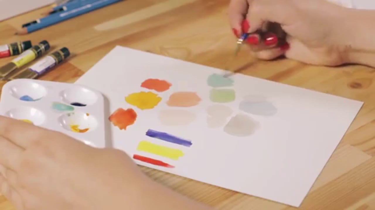
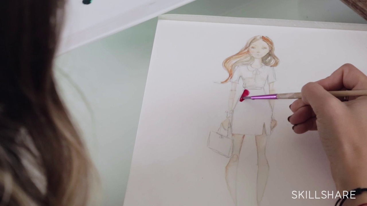
6. Painting: First Layer Watercolor: So, I want to talk a little bit about color before we start painting. In this piece, you can really tell how I use color. I based everything, again off of this gown, which the actual gown has a giant pink bow in the background. So, I really went off of that color. I just thought it would be nice to tie that into the background. So, in this area you see in the front, which is the foreground, because all of this areas are similar color in pink, you really see her right away. Then after that, your eye moves to the background. I chose to do blues and this grayish color because I thought it complimented the pinks nicely, and also it stood out from it in a subtle way. So, if I had chosen maybe, I don't know, like a bright green, it would have been too vibrant I think for the pink, because they would be challenging each other. So, the pink in this painting is the really vibrant color, and then as a compliment to that, you want to pick something that's maybe not as bold. It can still be bold, I mean there are some pretty nice blues in here, but you want it to be more subtle than the pink just so it's separating the areas. So, you have a foreground that stands out and then you have this background that's a little more subtle. Also, I tied in some of the pink into there with this girl's dress just to carry it through the entire piece. So, for the painting part of this, I'm using watercolor, Winsor & Newton watercolor. Then I'm also going to combine it with a little bit of gouache, which I've put on here just a few colors to work with. The reason I'm using both is just because I love the look of the airiness of watercolor mixed with the more opaque gouache. For this painting, I'm going to use this number six watercolor brush and it's a Kolinsky sable brush, this kind of pointed shape, it'll let me get a lot of details. Then when I get down to the very minute details, I might use one size smaller. So, I'm just going to do a light wash of color over the entire painting just to make sure I have color figured out and that before I get too detailed, I can see all of the colors together and make sure it's working before I put too much down. So, I'm going to start with the dress since we know which color that is. So, I'll just put a light blue wash over it quickly. You don't have to worry about detail really, right now. The only thing you want to pay attention to is where the highlights are in your piece because you can't get the whites back unless you go over it again with an opaque white. But I don't think it looks as nice because with watercolor, the great thing about it is you see the paper through it so it's transparent. So, just pay attention to the highlights, like on the dress here. I'm not going over the entire thing because on this fold maybe there's the light is hitting it so there's highlight there. For these other girls, I'm going to go with the coral color. I'm not sure if I'm want to do this dress coral also just to mix it up so I'm going to leave her for a minute and focus on the background. So, this front part is going to be much darker because it's in the foreground and just kind of coming into the room, so I'm going to have this outside area of the room be much darker just so it looks like there's a lot of light coming from this room. I'm using a purplish black, and then I mix it with a little bit of blue just to tie in the main dress. Like I said before, to keep everything pretty light, so you can go back over and add layers. I'm going to add this coral color like I did on the other paintings to the background just so it ties through. When you have a bright color like that, it's nice to add it in the background somewhere to carry your eye through the piece. So, this lady dancing can be wearing the same color or a similar color, and then for the background, I want to do a greenish or yellowish gray which I might change but for now I can just put a light. So, I'm just painting the walls around the windows. Also when you have windows, you of course want to think about whether this is happening in day or night. So, for this I think I'm going to keep it day when it's still a little bit light out. So, the windows, I'm going to keep mostly white because when you're in a room from a distance, the bright light of the sky will keep them looking pretty white. Then I'll do the waiter a little bit. Maybe he has shiny shoes so you'd see some white on there, and you'll see the sleeve of his jacket. As you're building it, you want to pay attention to all the colors you're using and make sure that they're playing off of each other. Otherwise, if they're not or something looks a little weird, then you might want to readjust before you add more layers.
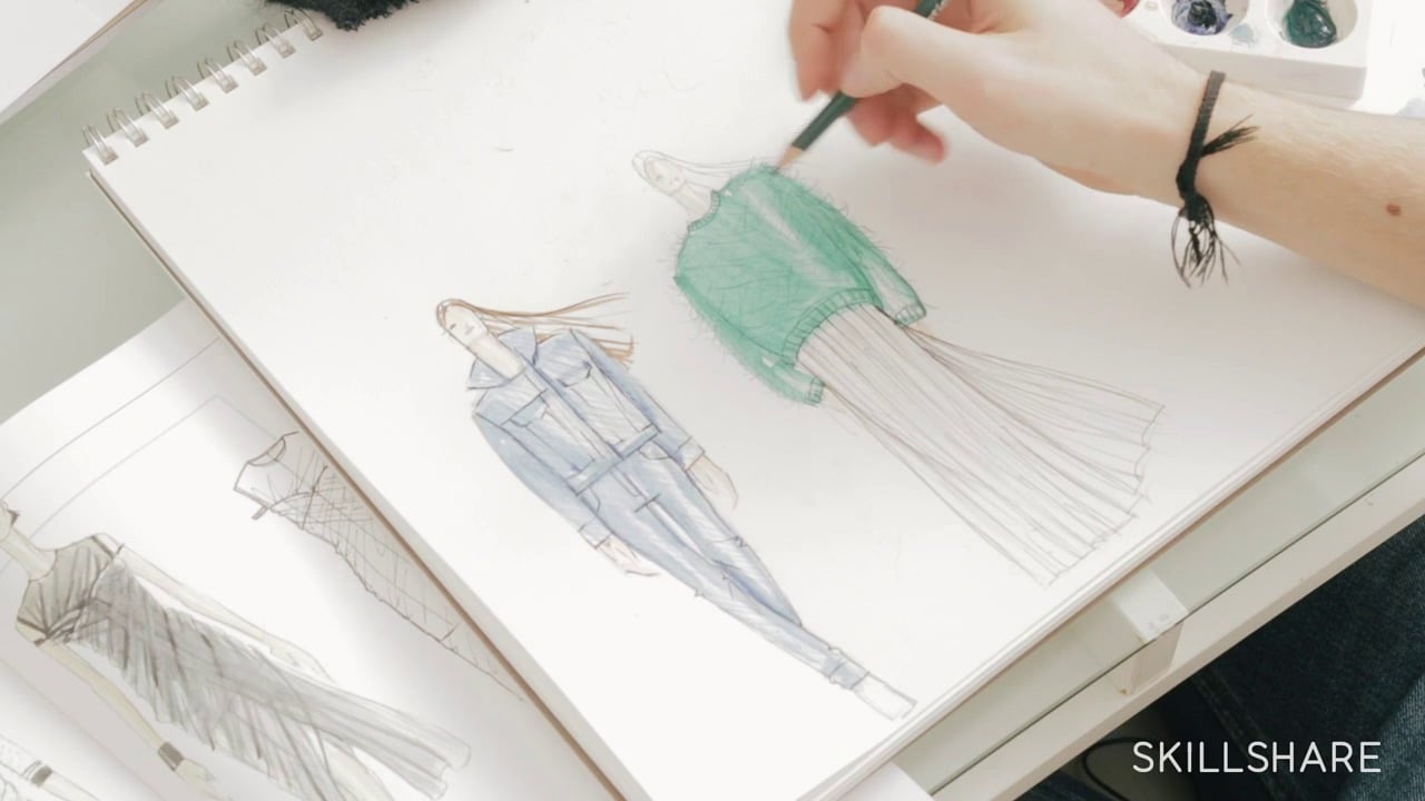
7. Painting: Second Layer Details: I'm going to start adding the hair color, and even though I want her hair to be dark black, you don't want to add that right away because you want to see some of the lighter highlights through it. So, start out with it being much lighter, and then build up. Then if you get too much color, you can always go back and blot it off. Okay. So, I have, kind of an idea of how this is all going to come together, colorwise, I want to get a little more detail to make sure everything's going to look nice once the colors are more saturated in the background. Most of the colors I'm using are going to be a little bit more faded because you want that to create the depth, and bring more color up to the front. So, let's start with our blue gown, and I'm just adding more layers to make it a little more 3-D. So there'll be a little more shading near her waist because the fabric's coming together, and it's being covered by her far a little bit. When you're painting, it's nice to think about the different textures of things, so everything's not the same. So, like the waiter is probably carrying a silver tray, so I might go back over that with some silver and bring it out a little bit. Different dresses will have different textures from different fabric. Like I said before, his shoes probably, like a patent leather. So, I'm going to slowly go back over that, and add more detail that makes it look shiny. I sometimes like to add like some black line detail. Maybe this girl would be a redhead since there's going to be so much blue and oranges or the opposite which could be a nice mix. I'm moving around on the page a lot because once I paint one layer, I like to let it dry before I add anymore. So, while they're drying, I kind of go to another area, because if you paint all of the layers on top of each other all at once, the water blends them together, and you get kind of a muddy mix. So, now that I have a lot of layers on this dress, I'm going to start adding a few more details, like on her fur. I'm using the gouache on this, brings out more texture which is kind of nice for stuff like fur. You can kind of add some white, and go back over to add highlights. Then I'm going to add, to start adding some skin color. When you're mixing skin colors, I do it a few different ways. So, right now I'm mixing kind of like a really light pink with some white, and then a little bit of blue or yellow, and that kind of makes it a peachy skin tone. But, you can make so many different colors, you really just need to mess around, and see what you're going for, like right now, some of these girls are pretty pale, but they have kind of like that peachy tone. Then over here, I'm doing a darker skin tone. So, I'm using some browns, some reds and yellow. Just like you do with the dress and the hair, you want to layer the shades of the skin tone to add highlights. One thing about the drawing is sometimes you don't always get it perfect the first time you're painting it, or it take some time to kind of figure it out. So, sometimes I like to scan my drawings as soon as they're finished and then if I don't like how the painting turns out, I can always reprint my sketch and try it again. Okay. So, now I'm going to do this other girl's dress. We're going to add up a lot more detail to it after, but right now I'm just getting all of the base coats on. Now, I'm going to go back and fill in some of the background. I'm making the floor like an orangey color, maybe it's a wood floor, because it'll play off of the blues again. All right. So, now that I have a lot of, all right, I have the floor in a little bit. So, I'm going to start adding some shadows on it to kind of hint that there are people all around, which adds a little more interest to it. I'm just going to use this darker shade than what's already there. Then you have hidden areas in the painting, like behind this doorway, you can't see it, but you can add little shadows that show people doing things, which kind of hints that there's somebody back there. I'm still not giving too much detail on the background, even on the sky, just enough that you can tell who or what he is back there. As long as the viewer can kind of tell there's a guy back there, sometimes that's all you need to do. So, now I'm darkening the foreground to make it, the actual room seem brighter.
8. Painting: Final Touches: So now, I'm going to work on this girl's face a bit. It's still going to be a little bit abstract and big, but you just want to add shading where you would see shadows. Then, to the chandelier, which I'm going to use some gold gouache for. Sometimes, if you put pencil over a part that's so wet, it'll kind of blend with the water which looks really cool. So now, I'm going to go back with some white gouache and add in a few glass details. Kind of looks like diamonds. Maybe she has some in her hair. So, I'm just dotting a letter gouache over. I'm doing a light blue, but then I'll go back and use white on top of that which will add even more. Adding them a toxis would be nice when you see the painting in different lighting, because it kind of shines off of it, which makes her dress looks gold shiny. I'm actually just going to use some gold acrylic for this. Then, I just sign my artwork with paint at the end. All right. So, now that I've finished my piece, I'm going to take them into the computer. I like to scan my work mostly because I share at digitally. So, I'm going to scan and clean up the background a bit. I've brightened up the white background, just to make it very stark and contrasts, and pop off the page. Then I also clean up any mistakes that I have, like, I've splashed color up here so I'll get rid of that. Depending on the piece and how it looks once it's scanned, I'll sometimes play around with the color for the digital version, but we'll see. It depends, sometimes it works and sometimes that needs a little bit of enhancement, so.
9. More Creative Classes on Skillshare:
 Katie Rodgers, Artist