Transcripts
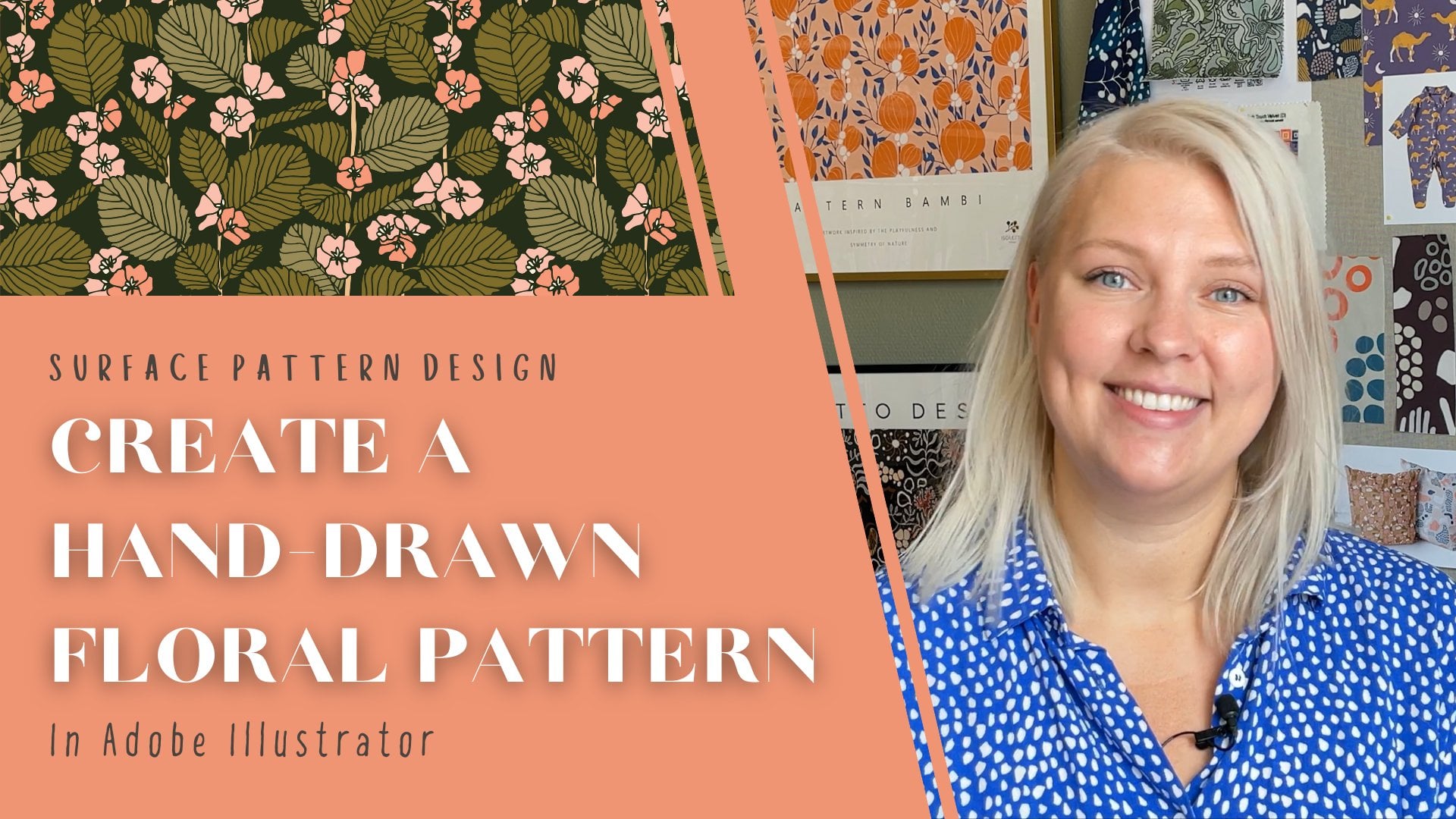
1. Intro: Hello there and
welcome to this class. My name is Sama and I am a surface pattern
designer from Sweden. I run a small design studio
called Letto Design. I'm super passionate
about prints of all kind, especially those
printed on fabric. In this class, I will
show you how to make a standout digital pattern
out of paper cutouts. We're going to be very hands on using scissors and paper
to make our shapes, Then build the pattern in Adobe
Illustrator step by step. Finally, we will
give the pattern some texture using
the texture effects that comes with the illustrator. This is a super fun
exercise to try if you need to mix things up a bit or are looking
for new inspiration. We're going to create a unique
texture pattern design, fully vectorized with all the benefits that
comes with that. Most of the texture options out there are made
out of raster, like the ones in
procreate, for example. But learning to create vectorized texture allows you to be more flexible
with your print. It makes it possible to scale your pattern in any
dimension you want. It's also so much easier to
work with specific colors, pantone ones, for instance, or any other color book that a client might
want you to use. You can of course, use this
method on more than patterns. It works just as good on digital illustration
or other designs that you might want
to vectorize as well. The class project is simple. Use this technique to create
a paper cutout pattern or illustration of your own and upload it in the
project gallery. All right, with that said, let's dive into class.
2. Making Cutouts: Are going to start by cutting
some shapes out of paper. I'm going to do floral shapes, but you can of course, do whatever feels
exciting and fun to you. I'm going to do three
different shapes, flowers, leaves and stems, and then build them together. In Illustrator, later on, I'm using a regular scissor
and some black paper. You can use any paper here. It doesn't really
matter, I'm going for black because
that's what I had. I'm going to begin with
cutting a large flower shape. I'm just going with
the flow here, not thinking so much about the end result that I
want some flower shape. I like the paper cut look. So I'm trying to cut pretty straight lines so you really can tell
it's paper cutouts. Yeah, that might do it. Now I want a kind of triangular
shaped flower, I think. Then I want to cut
it again here, so I get separated
petals or something, cutting that in a
little softer shape. I'm going to do one more flower, and for that I'm just going to cut some paper strips like this. Okay, let's see. Now I'm just going to put this together in a floral shape. All right. Like that. I think I can work with these flowers. I'm going to take a
photo of them so I can vectorize them in
Illustrator later on. If you have a
scanner, you can of course use that just to put
them in there and scan them, but I'm taking a photo
of them with my phone. Before I do that, I'm
going to transfer the cutouts to a white
paper background. I do that since it's
going to be helpful when I'm vectorizing the parts
in illustrated later on. Helpful to have a clean
white background. Having this wooden
background in the photo will make it much harder to separate the motives
from the background. I'm going for a white one like that. Now I just take a photo of it and making sure none of the parts
are overlapping. Everything should be
laying nice and separate. Now I'm going to
cut some leaves and some steps. There we go. Here I have a couple of different leaves and
stems to work with, big and small, and
thick and thinner. And now I'm going to do the
same thing with these guys. Put them on a white background
and take a photo of them, something like
that. Al, right now it's time to start working
in Adobe Illustrator.
3. Vectorize: Now it's time to get our paper
cutouts into Illustrator. I have created a new document
named it paper cutouts. Now I'm going to import the
photos I took of my cutouts. I go to file and place select my images and drop them just
anywhere on the artboard. As you can see, I got some
of the desk in the picture. I don't want that since it's going to make the vectorizing. I'm starting by the a bit. I go to object image
and then I'm just making sure none other wooden
desk gets in the picture. Only the black and white. I do the same thing
with this one. Now I'm going to vectorize these motives by using
the image trace too. I have a shortcut here
under properties, but you can also find it
under window image trace. I'm going to use a preset in the image trace tool called
black and white logo. That's a great one for tracing
black and white images. But if you have cutouts with multiple colors or
another color than black, you might want to use one
of these presets perhaps. But I'm using the black and
white logo. Yeah, like that. I don't want any
white in my motives, so I'm going to rule that out. I go to the image trace
panel and under Advanced, you can click this little
arrow here to access it here. You can check this box
to ignore all white. I'm pretty happy
with that result. I think I'm going to go back to the properties panel
and expand and ungroup. I'm doing the same thing
with the other photo. Going to the image Trace Tool, black and white logo going
to Advanced settings. And ignoring white hitting Expand and Ungroup, I think I got a little
hole in that one. I'm going to fix that. I'm using the Pen tool and
delete anchor points. If you write Click, you can see there are some options here. Delete anchor points, then you just delete the
points you don't want. I'm going to check if I have any other weird little parts, there's something
deleting those two. All right, I think
we're good now. Okay, now I have all of my
motives vectorized here. I'm going to give
them separate colors and also multiply them. So I have a couple of
more options to work with when I'm building my
flowers and pattern, starting with the big
flower shape here, lining them up,
selecting all of them, and making a copy of them. Under here in Properties panel, I have a button
for flipping them horizontally and
then vertically, I'm changing the color
to may be light blue. Yeah, doing the same
thing with these. I think I want the
parts of these to be a little closer together. Actually, I'm just making them a little tighter,
something like that. Grouping them together
by hitting control. Let's line them up over here. I'm selecting them
and making a copy. I'm not going to flip
these vertically, just horizontally. Then I'm coloring
them, maybe peach. Yeah, repeating that
with these two. I think I want a little.in
the middle of these flowers, actually I'm using these round
shapes over here for that. Scaling them down a bit and
coloring them this orange. That one, maybe I need to
bring them to the front. Just right click, arrange, bring to front and then
place them on top like this. Yeah, then I group
them together. All right, moving
on to these guys, these leaves I'm
actually going to make four copies of since I'll probably need
some more options when I'm building my flowers. First I'm copying these,
flipping them vertically. Then I select all of them. And copying them again, and flipping those horizontally. Now I have a lot
of leave options when I'm going to
build my flowers. Coloring them may
be bright orange. I'm doing the same thing with these leaves, yeah. Okay, so now I have all
of my motives lined up and the next step is to start building the flowers
and then the pattern.
4. Motifs: Now I'm going to
build my flowers. I'm building them here
directly on the art board and then making the pattern
in the pattern tool. I'm starting by building the biggest flower
going for a stem, maybe that one here. You can just play around
with your motives. Scaling them upward,
down, rotating them. Just make sure to have fun and
let your creativity speak. I think I want some dots
on these big flowers. Actually, I'm using
the round shapes here, copying them, giving them a
new color, white, I think. Let's scale them down a bit. Oh, I need to move
them to the front, right click, arrange,
bring to front. And then place them on
top of the big ones here. Now I'm going to
give it some leaves. Using these orange ones, I think I actually going
to make a copy of them. If I need more later, then I just place them
where they look good. I actually really like this orange and blue color together. When I'm happy with the result, I'm grouping the parts together
and moving it over there, and then I just keep on building
the rest of the flowers. Okay, I think I'm good with
three of these flowers. I'm deleting the rest and
moving on to the peachy ones. I actually want this
not to overlap. I like it when it's a bit of
a space between the parts. I'm going to trim the stem a bit in the angle
of the flower. Same on that side. I'm using
the eraser tool for that. Cutting a line here
and one over there. Then with the direct selection
tool that you have here, I'm deleting the overlapping
parts for the peach flower, I'm going to use
the darker leaves. I think just building them in the same way
as I did before. Okay, So now I have three
different kinds of flowers. These ones I'm actually going to use as they are without stems. I think they can manage that. The next step is to go to the pattern tool and
create my pattern.
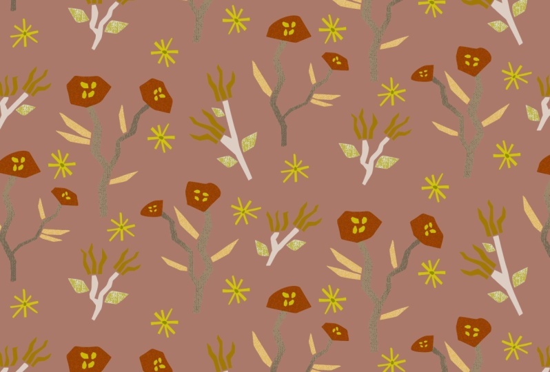
5. Pattern Making: Here are my flowers all
lined up and ready. Now I'm going to
build the pattern. In the pattern tool, I'm selecting them, going
to object pattern make. As you can see, they all end up in this default pattern tile. I'm just dragging
them outside of it and changing the options
of the pattern here. I'm going to set the
tile size to 300 by 300 millimeters since I
think it's a good size. In relations to my motives and also a easy
measurement to remember. You can, of course, go with
any size you like here. I'm choosing the brick by column tile type and
brick offset one, two. You can play around with the
pattern tile types here. Going for one that
speaks the most to you. Okay, let's start
build us a pattern. I'm starting with
this big flower here, just dragging it into
my pattern tile. Then I just add the other ones as I go where I think
they look good. I'm just going with a flaw here, trying to find a balance
with my motives. You don't want your
motives to create any visible or annoying lines or shapes that might make your pattern look
crooked or uneven. Just move around
your motives until the repeat disappears
or feel seamless. I like to zoom out a bit
to see how it looks. You can choose more
copies over here if you need to get a better
view of the repeats. As you can see, I have
a diagonal line here, but I actually don't mind it. I still think the print looks
pretty balanced and fun. Actually, I'm going to place
these white ones as well. Yeah, that looks good. I think maybe tweak
that one a bit. I'm going to hide my
artboard to see how it looks with a more
even background. So I go to view
and hide artboard. Yeah, I think that looks
pretty good actually, I'm happy with my pattern. I'm hitting done here is
my new pattern swatch. I want to give it a
background color. I'm dragging it out
to the art board. As you can see it has a
tile in the back here. And that's what we want to, I'm double clicking
to access it. Then I'm going to
give it a color blue, I think. Yes. Then I need to make
a invisible copy in the back to make illustrator
understand it's repeat. I'm hitting control C
to copy the background and control B to paste
it in the very back, make sure it has no stroke and no and then I just drag the repeat back
to the swatches panel. I'm testing it by making a rectangle and filling
it with my new pattern. Zoom out a bit. Yeah, that looks pretty nice. The next step is to give
my motives some texture.
6. Texture: Now it's time to give my
motives some texture. Getting my patterns watch, double clicking to
access the flowers. Here are the ones
that's repeated. As you can see, they are
all grouped together, copying them with control C and pasting them on my artboard. As you can see, they are
still grouped together. I need to access the
parts separately. Since I'm giving the stems and flowers and leaves
different textures, I need to ungroup these. I'm selecting all of them, right click and ungroup. As you can see, the
flowers are still grouped. I'm repeating that step now. I can access each part of
the flowers separately. I'm going to show
you how to work with textures and illustrators
own effect library. It's not hard at all, actually, it's
pretty neat to use. I'm starting with this flower
over here, selecting it. I want to keep the shape
in the background, making the texture a
new layer on top of it. I'm starting by making a
copy and pasting it on top. Control C for copy control, For pasting in the front
with the top shape selected. I'm going to Affect
and Affect Gallery. Here you can see, let me just make this window
a little smaller so you can see that's better. Here is my shape. Here you can see all of the available effects
you can choose from. You can just click
on them to get a preview and have
a look around here. Just browse around and
see how they all look. If anything catches your eye. I think I like this one here. You can change the
details of the effect, the intensity and
contrast for this one. You can also change
the grain type I'm going for. I think that looks nice. Yeah, heating. Okay. As you can see, I got this black and white
effect on my shape now, but this is just a
preview of the effect. I want it to be vectorized in the same manner as the
rest of my motives, so that I can scale
it up and down. Just use it in the same way as the rest of
the parts of the pattern. To do that, I first need
to rasterize the texture. I go to object and
rasterize here. I want to make sure that the transparent background
is checked and then hit. Okay. Now I'm going to vectorize the texture by using the image trace two as
I did in the beginning. Go to properties image trace. Just pick that up
so you can see. I think I'm going to try the black and white
logo preset again, but it probably won't work
that well. Let's see. Yeah, as you can see, the texture became
pretty rough and big. To refine it a bit, I'm going to go into the advanced settings again
in the image trace panel. The first thing I'm going to
check is to ignore white. I just get the texture
not its background. Now I can play around with these different bars
until I get a result. I'm happy with decreasing the noise will give
it more detail. So I'm dragging that down. Down here you can see
how the amount of paths and anchor points of the texture is increasing
or decreasing. Scaling down the
threshold, for instance, will give you fewer anchors and therefore a lighter and
easier file to work with. The more detail and
paths your shape has, the heavier your file will be aiming for as few anchor
points as possible is good. This will give you a much more
easier document to handle. Your document will be
pretty heavy anyway. I like that look. But before I'm exiting
the image trace tool, I want to save this preset. I want all of the
light blue flowers to have the same effect. I want to trace them
in the same way. Saving the settings
here as a preset will save me a lot of
time To do that. I'm clicking this little button here called Manage Presets, and then save as a new preset. I'm naming it light
blue flowers. Okay, I'm closing this
panel and hitting Expand. As you can see now all of these little shapes
are vectorized. I don't want the texture
to be black, actually. I want it to be the same
blue as the flower, only darker or lighter. Maybe I'm selecting the texture. And then using the eye dropper
tool, you find it here. Or by hitting on your keyboard. I'm taking the
background color of the flower and then
double clicking on the color fill and just finding
a shade that looks good. I think lighter
actually, yeah. Okay. Now I'm pretty happy with
how that structure looks. The last step here is to select both the background shape and the texture and
group them together. I'm going to do
the same thing to the other flowers in the same way I did
with the first one, selecting the flower shape, Making a foreground
copy with control C and control going to Effect
and effect Gallery. Here the gallery has saved the latest effect that I
used with all its settings. I don't need to make
any changes here, since I want the same texture. I'm just hitting okay. Now I want to restorize it, go to object and restorize, make sure transparent
background is checked. Then I need to vectorize it. Going to image trace Here you
can see the preset I saved. I'm using that and expand. I wanted to have the
same color as this one. I'm using the eye dropper again. Yeah, that looks pretty good. I'm repeating that
with these four, two. Okay. Now I'm done with
the blue flowers and moving on to the blue stems. Before I apply the effect, I want to make them one shape. Actually, as you can see, some of them have several parts. Applying an effect to two separate shapes might
look a little weird. You'll probably get lines
where you don't want them. I'm going to merge these parts
together before I start. I'll do that by going
to the Pathfinder tool. I have it here, but
if you don't see it, you'll find it under
Window Pathfinder. Then I'm just clicking on
Merge to get one shape instead of two sending
it to the back. I'm doing the same
thing with this one, selecting it, going to
Pathfinder and Merge. Okay. Now I want to give the
stems some texture as well. A fun way to play
with texture to get a slightly different look is to, before you apply the effect, give your shape a gradient. To do that, you
select your shape and go to window and gradient. This little window pops up here, you have some different options. One that goes from
left to right, one that goes from the middle. You can click around
here and see how the options look and behave. I think I want the
side to side gradient. If you hit the edit gradient, you'll see this little
bar where you can move and change the
amount of light and dark. I think I like it
like that, yes. Oh, I forgot to copy my
stem. I'm doing that. Now I get the texture as a
top layer, I'm selecting it, copying with control C and pasting it in the
back with control. Using the eye
dropper tool to make it blue as the rest of them. As you can see, I now have a
shape there in the back and the gradient in the front,
closing that window. Now it's time for some texture and making sure the
top shape is selected. And then going back to
the effect gallery. As you can see, the effect is following the gradient
we set for the shape. You can try and see what happens when you change these
settings a bit. I think I want another
effect for these stems. Maybe that looks pretty cool. You can choose different
kind of textures here. I think the B is nice. Yeah, as you can see, because I have a
gradient on the texture, follows that, and creates
this shadowy effect. I'm going to try that.
Yeah, hitting, Okay. Then I'm going to
object, rasterize. Now I want to image trace it, but I don't think I can
use the same preset as the flowers since the
effect is different. So I'm just going to try black and white logo and
change the settings there. As you can see, a lot of
the effect disappeared. When I use that one, I'm going into the
advanced mode, again, ignoring the white and playing around with the
different options here. Yeah, I'm good with that. I think I'm going to save this preset as well
as the new one, so I can use it on
the other stems, naming it big stem. Okay, Expand as before, the texture is black. I'm going to change that
color too. I want them to. Here I have the
color guide where I can find shades of
a color selected. Maybe that one, yeah. Then I'm selecting both the stem and the texture
and grouping them together there I have
a pretty nice look. Actually, I want to do the same thing to
the other two stems. I'm giving them a gradient. To selecting that, making
a copy in front of it, then make it a gradient. I think it looks nice that the gradient looks
a little different, that the light comes from
different directions. It creates more
life in my pattern. Actually, I'm going for that. Then I go to effect. As you remember, Illustrator saves the latest effect for me. I'm just hitting okay
here, rasterizing it. And under image trace, I'm choosing my big stem preset and changing the color
with the eye dropper tool. Same goes for this one. I'm not going to give
all of my motives a texture since it will give me such a heavy
document to work with. But I also like the mixture of texture and non
textured objects. Actually, I think it's going to create a nice
balance to have both. I'm going to
texturize the leaves, leaving this, this stem and
this flower as they are. I'm choosing a new texture
for these orange leaves. For the image trace, I'm going to try the big stem preset and see how that looks. You know what? I
think that works. Expand and change the
color to dark orange. Yeah, that's good. Let's do the rest of them. Okay, that's all of
the orange leaves. The last one I'm
going to do and give a texture is these dark leaves. Oh, that's pretty cool.
Let's go for that. I don't want the
black here either. I'm changing it
to a lighter one. I think I like that. But I might want to change
the two colors here, making the little squares
light and the background dark. I'm selecting the entire
leaf and going to the recolor tool under
Properties here, I just drag the color
boxes, they switch places. Yeah, that's better.
Let's repeat that for the rest of the leaves. Okay, Now I am done with the
texture part of this class. The last step is to put my
pattern together again, give it a background color, and then see how
it looks repeated.
7. Pattern Making (Again): The last step is to
rebuild my pattern. Since I haven't
moved my motives. That's a pretty
easy step actually. I'm just selecting all
of the motives here and going back to object
pattern and make. I think my computer will
operate a bit slow here since it's a lot of paths to
consider with the texture, but it's all about
being patient. I'm choosing the tile
type brick by column, as I did before with
the brick offset one, two, I'm changing the tile size back to 300 by 300 millimeters. Then I'm hitting done. As you can see, I have a new pattern swatch here
with my textured motives. I'm going to give that a
background color as well, in the same way as I did before, selecting the background,
making it blue, making a copy and
pasting it in the back, make sure it has
no fill or stroke. Then I'm selecting
all of it again and dragging it back
to the swatches panel. All right, let's
see how that looks. This is how the
print looked before. This is how it looks
with some texture. I like them both actually, but I think this one brings a little bit more
life to it, actually. I'm not really sure about
that color on the leaves. I'm going to change that a
bit In the recolor tool go. It's that blue one, I think. Let's make it a little darker, a little bluer maybe? Yeah, that's better. Okay, there you have it. This is the, wait a minute, I seem to be missing
some of these dots here. Let's fix that. Immediately,
adding those dots again. Okay, much better. Now, my pattern is done
with all of its motives. I hope you have enjoyed this class and learned
a thing or two. I think building a pattern with a very hands on media like paper is such a great
creative exercise and it really got me inspired. I played around a bit
more with this pattern. Here, I tweak the
peach flowers a bit, giving them a line and a
additional flower on top. Here is another color way
and another color way. Here I added some
line drawing to it that I think
look pretty cool. Finally, here is the pattern
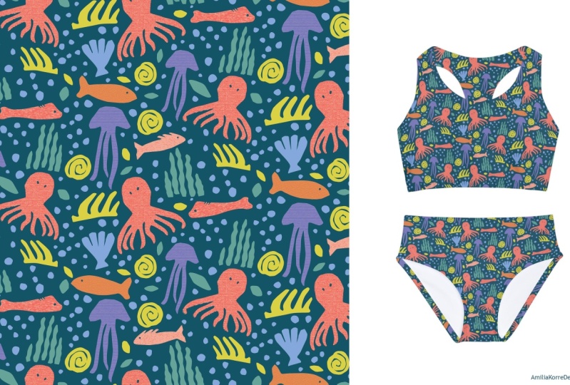
displayed on a mock up. I would totally get
that for kid, actually. Yeah, I hope you
feel inspired as well and that you'll
give this a try. Feel free to upload your
finished pattern on the product page so that I can
see what you came up with. Thank you so much for watching and take care out there by.
 Sanna Isoletto, Surface Pattern Designer & Illustrator