Transcripts
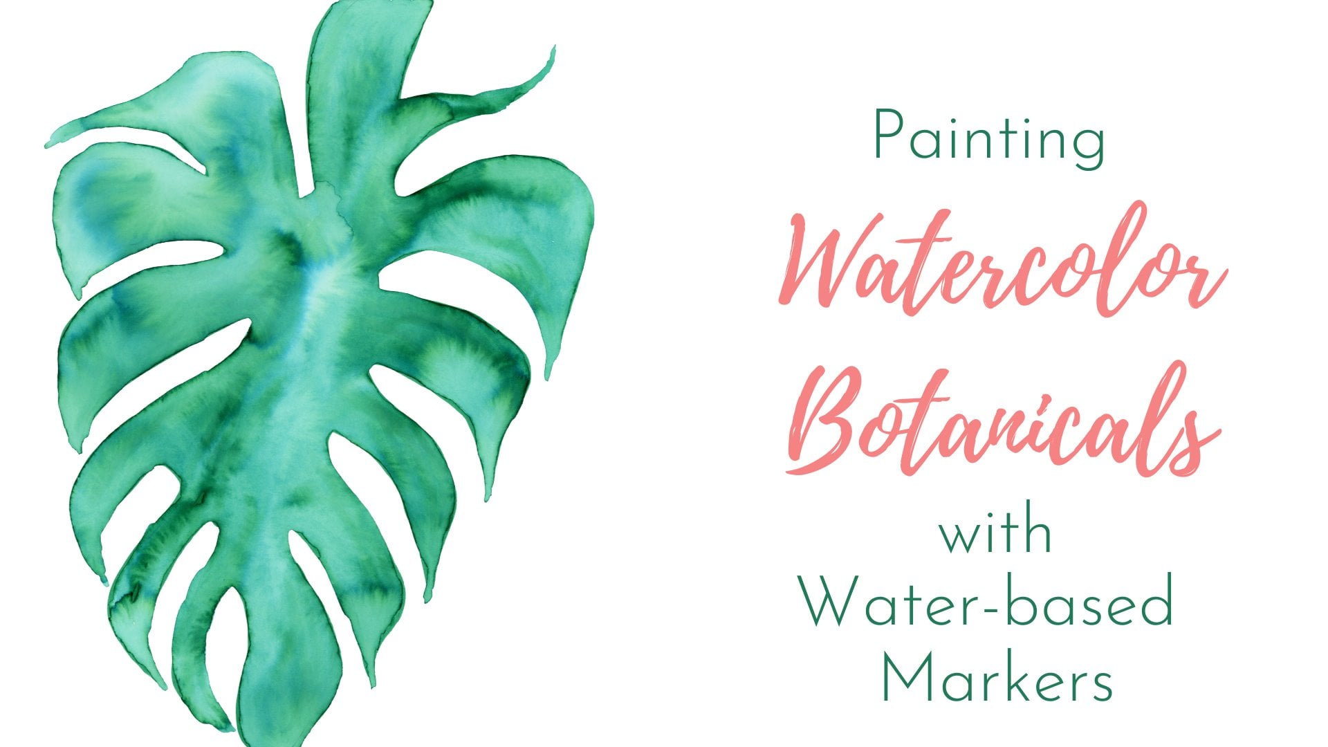
1. Introduction: Welcome to painting
watercolor topicals with water-based markers. This is my third class
on this subject. I have fallen in love
with this technique. It's simple and it's
absolutely beautiful. You can create an
exquisite painting with just a few supplies, even
inexpensive supplies. In just a few steps. I'm Charlotte demodulate. I'm an artist, writer and a little bit of
an art world vendor. For me, art is as much about
the process as the product. I love experiment
and play around and see what my different
materials can do. I currently live in
coastal Florida. And the inspiration
here is incredible. I'm a gardener and I love
all the tropical flowers. I feel like I'm living in
paradise all the time. And needless to say, it has given me a lot of
inspiration in the studio. That's why it was
perfect to pair this technique with
tropical flowers. I cover some
different techniques in watercolor botanicals
with water-based markers. You don't need to
have taken that class first for this class, they're completely independent
and each one shows some different techniques to use with water-based markers. Will try using one color
for highlights and shadows. We'll also explore
leaving the white of the paper and how that
affects your painting. We'll get a little
bit loose with some color blending
and water blooms. Then I'll show you how to
take a complex flower, the bird of paradise,
and break it down. So very, very simple
and very beautiful. And then the last demonstration, we'll use the background
to illustrate the flower, which is a great technique for white flowers or light
colored flowers. So join me for painting watercolor tropical oils
with water-based markers. Thank you.
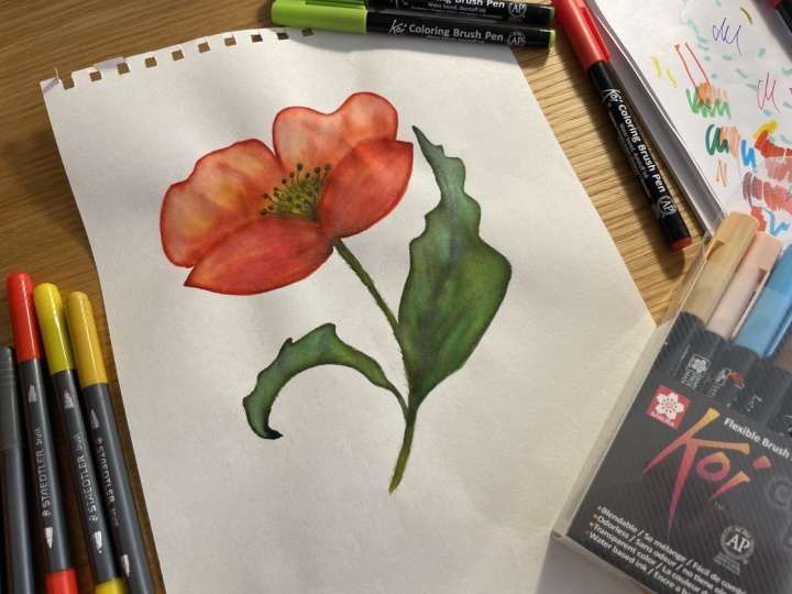
2. Supplies: Let's talk about the supplies you're going to need
for this class. First, you're going
to need some sort of paper that is made
for water media. I've been loving these Canson
mixed media sketchbooks. I've been doing a lot of work
and needs with the markers, but any sort of
watercolor paper will do. Try and get something
made for watercolor, not like card stock though. Or you'll get a lot of
buckling while you're working. Next for markers,
my favorite are the Tombow markers. I
have a ton of things. I love using these. I think they have the most
color and saturation, but you don't need
to run out and buy something
special, inexpensive. You can also use Crayola
is one of our project. We'll just use this very
inexpensive kids pack of Crayola markers
not to paint with. You obviously need water. So you can have a water source
and a regular paintbrush. I just get inexpensive
brushes from Michael's. I don't spend a lot on brushes because a lot of times
on teaching with kids. So I've just learned over the
years to use what I have. You can also use these brushes that put
the water in the handle. These are great for painting
on the go when you may not have a cup or something,
have water in. Now, for inspiration, I take
a lot of photos myself, and I also use unsplash.com
because it has a lot of copyright-free
photographs that you can use as inspiration. Now word of advice on
using photographs. I like to use them
just as a guide, not as a straight copy. So you'll see my end product doesn't look exactly
like a photograph. That's okay. That's part of my process. Abilene from Unsplash
tropical collection over in the resource section, as well as the
photos that I used, including one of my
own personal photos that I use for the
bird of paradise. I also have drawings of each of the flowers
that we'll be doing and then demonstrations just in case you're a
little drawing challenged. I don't want that to
stop you from trying this technique and playing around and see what
you can do with us. That's it for supplies. So now let's talk
about your project.
3. Your Project: Your project for
this class will be a finished watercolor painting from the water-based markers. The easiest way to do this as paint along during
the demonstrations. That's why I'm telling
you about the project. Now. See he gets set and ready
and paint along with me. As we go through
these demonstrations, it looks like I'm
painting really fast. I actually have the
video sped up to twice the speed that I'm
actually painting in. I find for myself it's a little boring to watch somebody paint. And sometimes you don't have enough instructions to fill that in as you're going along. So I'll put the videos
at twice the speed. But please feel free to
stop them and catch up. It's what I would
need to do if I was watching myself, I would stop. Catch up to that point, listen to the next
set of instructions. Stop it and do it at the pace
that you feel comfortable. If you follow along with
me in the demonstrations, you'll have possibly four beautiful paintings at
the end of this class. Please take a picture
of at least one of them and upload them to
the project section. I would love to see
how you interpret this technique and how
you paint tropical. And I will comment and like on each and everyone and
if you have questions, please feel free to post
and asked me about it. Also, if you could please
leave a review for this class, It's very helpful for both
myself and Skillshare to know. Is this a level of quality and instruction that you'd like
to see here on Skillshare. Thank you. I hope you enjoy painting watercolor tropical oils
with water-based markers.
4. Single Color Highlights & Shadows: We're going to start
with a flamingo flower. And this technique is using a single color for both
highlights and shadows. So we'll start with
drawing the flower. I learned this yellow piece
inside is called the speed x. So I'm going to draw this, but I won't go all the way around it. I'm just putting a
little bit at the base, again where the darker part is according to our
reference photo. Now I'm going to draw
the petal or what is actually called the space. I think I'm pronouncing
that right? Anyway, I'm going
to draw each of those ridges that we see in it. And again, this isn't a
100% accurate drawing because the painting is our
end goal, not the drawing. As we're drawing
with the marker, we're laying down our pigment
pole will be painting from. So that's why I added a
little bit thicker on where the darker and the shadows show in our reference photo. The whitespace I'm
leaving is going to create a natural highlight. Once we get to painting, I'm just going back and adding a little bit where it's darker, where the shadows
are going to be. And remember to outline your speed x because we didn't draw it
all with the yellow. Now, the stem, very simple. I'm not going to draw any leaves in the
background of this. I kinda want the flower itself to be the main subject for this. So you can see this
technique and we risk having a lot of bleeds and stuff with the background. We'll do that with a
different demonstration. Okay, let's start painting. I'm using a loaded water brush. It gives me a little
bit more control, not so much water, so that I can pull into
pigment and not lose some of those
highlights and shadows. And again, just kinda wet
where the pigment is, pull it over, keeping it
light in-between the ridges. And that gives that
highlight look where the darker part
gives the shadow look. And make sure it grew
around all the edges. Because this keeps it
looking like a watercolor, not like a marker drawing. Be very careful going
around the edge of this Vedic so
we keep the shape. They are. Like
traditional watercolor. The white of the paper is part
of the highlight for that. I'm having some
issues with my brush. I'm just going to switch
over to a paintbrush, but I'm using a very
tiny ones so that can keep control of the amount
of water in this painting. Again, go around all the edges so you lose that hard line from the marker and then pull from your pigment over
into your highlight. And repeat this for
the last flower. The same for this film. Pull it down, pull
it a little bit further so you get
the painterly effect. Now notice the red bleeds into it a little bit
and that's okay. That kinda helps create that shadow and increases
that watercolor look. In fact, I liked that so much. I'm gonna do it on purpose
here under this flower. I'm going to go back and
add just a little bit of yellow for the
highlight as well. You don't have to do this. I felt like it sort of gave
a little more dimension. This painting. And
there you have a flamingo flower with single color highlights
and shadows. Yes, cheated slightly at the end there with a
little bit of yellow. Again, that's optional. Okay, let's move on and
try a different technique.
5. Leaving White: I talked about
leaving the white of the paper with the
flamingo flower. Let's take that a little bit
further with a lobster claw. Gave already got my reference
drawing down in pencil. So I'm just going to start
filling in with the marker. If you notice I'm not
drawing completely around. I'm laying again,
laying down the pigment where the color is darker
in the reference photo. And you're not creating
accurate drawing. You're just laying down
pigment for the watercolor. Okay, it looks yellow and
the reference photo on here, but it is a bit of
green in there. And I'm just putting
a line where this is and then adding some
yellow again as well. Green is the darkest
part of this. And then the yellow
comes up on top of it. Okay, Let's paint. Try and use a small
brush so you can keep control of the water
and the pigment better. And remember this is
our pigment pools. So go over the edges, get it watercolor looking. And we are going
to leave some of the white work from your darker areas and then move inward keeping
the insides lighter. You don't want a uniform look, you want to give it that
dark and light effect like we used with
the flamingo flower. I've never seen a lobster
claw here in Florida. But they are
fascinating looking. I'm going to have to see
if I can find some in the wild or botanical garden
or something like that. Be very careful as you're doing each piece and leaving the white before if you need to move to a smaller brush to help
control the water. Another tip is when you dip
your brush into your water, tap it onto a paper towel that takes some of
the excess water. Okay, Now, with the
green and the yellow, I am blending those in
together because the green is the dark portion of the yellow and don't paint up
all the way to the peak. You definitely want to leave white in-between the
yellow and the pink. That's the whole point of leaving that white line in
there is to keep it from bleeding and together and have a good delineation for
each part of this flowers, especially this is a
very, very crisp flower. Each segment of color is
very bright, very crisp. Be very slow and use
some control when you're painting and leave
that white in there. There we go. We have
a lobster claw. Three simple colors
using the white of the paper, which
is just beautiful.
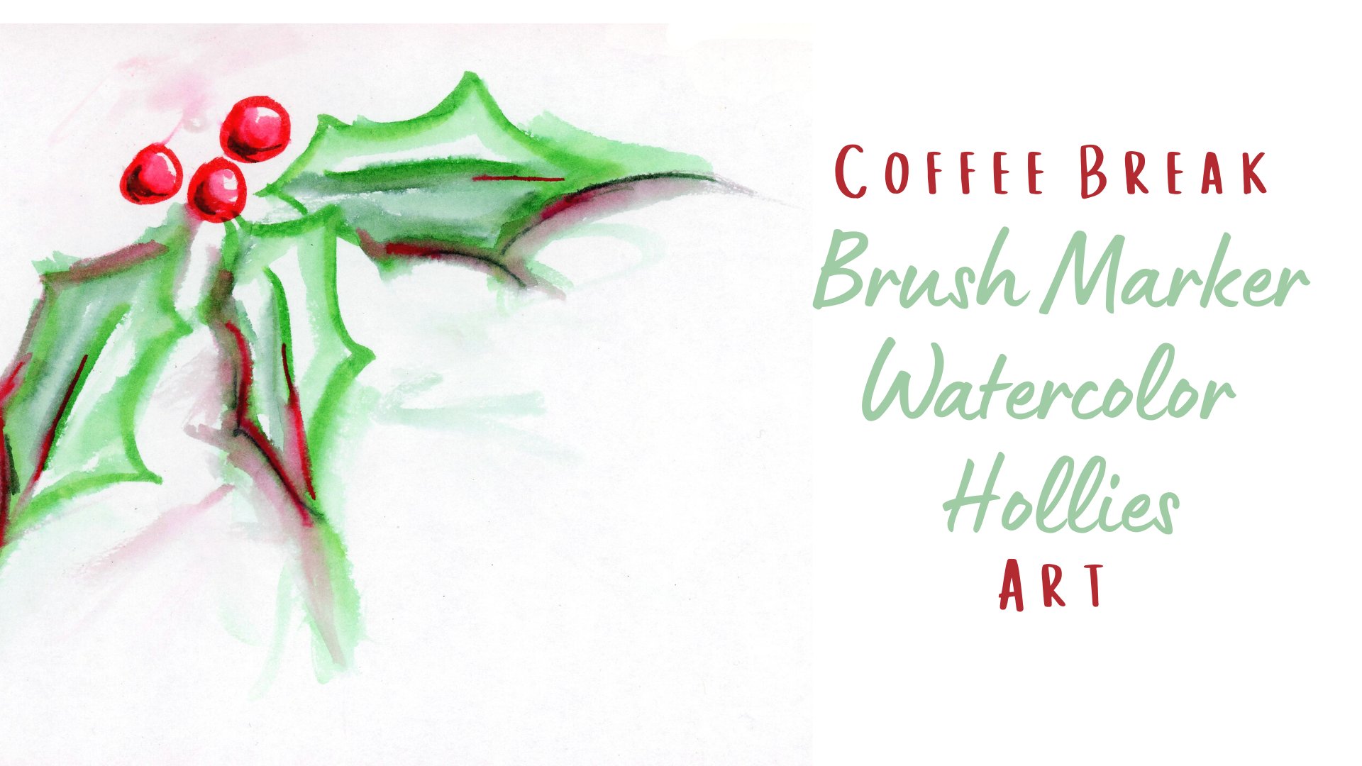
6. Blooms & Blends: Now we're going to do one
of my Florida favorites. So hibiscus, I have painted this so many times since
moving here to Florida. Have them growing
all over my yard. I have photograph them
and I just love them. I think they are
exquisitely beautiful. They bloom year
round where I live, and they are most
definitely my favorite. I've already got my
pencil drawing on here. Now I'm going to lay
down the pigment. I'm not going exactly by the colors in the
reference photo. I'm going a little bit pinker really loved the pink hibiscus, although they come
in many colors. This is where you can
with any of this, and especially with
a flower like this, use some of your
artistic creativity. Grab whatever color
that appeals to you. Just use your reference for
the lights and the darks to kinda know where to lay down the heavier pigment
with your marker. And this is gonna
be a bit looser, inferior or not going to use the white of the paper like
what the two previous ones. We're gonna be a lot
more relaxed with our water and with our pigment. And we're going to
work with those blends and bleeds instead of trying to avoid them like we were in the two
previous paintings. Now I'm choosing a
red color to use for my darker areas of the
flower are my shadow areas. Again, I'm not doing
a precise drawing. I'm laying down
pigment to paint with. I am be more care from down
here and what they call the stigma on the hibiscus flower. Let's paint. Again. I'm going around the edges. I'm going to start with
a lighter sections and pull them towards
the darker sections. So that way I don't
get too muddied up up here and my picture is
faded out, that's fine. I'm kinda, I'm using my
imagination at this point anyway. You'll notice this peak is
leaving some of the lines that I put down with the
drawing. That's fine. Some workers dry a
little bit faster. They don't blend as well. I'm just kinda learn
to work with that. Let it leave some of the texture and interest in the flower. I'm going to pull
the lighter pink down into the darker red color. And again, you can see some of my drawing lines. That's okay. That's kind of part of the disk is really as having
some of these lines in here. This is a much looser, freer look than
our previous two. We want our colors to blend. Want a lot more
water on the paper. And point out that pigment. Again, always go over the
edges so that it looks more watercolor than
marker drawing. I am being a little bit careful leaving a little bit of white around that stems stigma. I get confused on the parts there, but that's centerpiece. Have just a little
bit of purple here. They are in the center
for the deep dark shadow. I'm not letting it
bleed out too far, but I'm pulling it into it
a little bit to give it, letting it have a little
bit of that shadow look. Now at this point, my
papers fairly wet, so the colors are
going to start to bleed a little bit on their own. And that's okay. That's
kinda the point of this one. I grabbed a much
tinier brush to paint the stigma because I don't want it bleeding
all over the place. I do want a little bit
of control with it, but you definitely
want to paint over it. So it looks like a painting, not a marker drawing. And I turn to my picture
back on to show the pistol. I didn't draw the pistol out. I just pulled it out from the pigment that was already
on there from the markers. And then now I'm going back
and adding some yellow dots. Let's zoom in on this
just a little bit. You can see a pit
done yellow dots. And I'm adding just a
little bit of water. Just a bit. It does again, have that
watercolor look in there. Okay, There you
have a much looser, more water was used. The colors were allowed
to bleed together. Smith's White left, we
lost a little bit of it. One point. That's okay. This is a much looser, freer type of watercolor.
7. Simplifying Multicolor Images: Okay, Now we're going to take an image that looks complicated, a bird of paradise. And we're going to simplify it down into just a
few basic colors. So I took this picture of a bird of paradise,
and I love it so much. I like it better than the
ones I've found on Unsplash. So I'm actually
providing it over onto the side for you to use. And for this one, I'm
just going to use plain Crayola is just
to show you that you don't need fancy
expensive materials and paints to make a
beautiful painting. But I have kids pack of plain
washable Crayola markers. I'm just outlining on top
of my reference drawing. And again, remember you're
just laying down pigment, not doing a complicated drawing, leave lots of white because that transparency is what gives watercolor
its signature look. And I know what
the Tombow colors. I put up the numbers in the name in case you want
to replicate it exactly. The Louisville silly
doing this with Crayola. But just to keep it consistent. Crayola may have fancy
names for these, but I was used on a basic apec and didn't seem
very fancy domain. Again, this is super
simple, super easy. That's what makes this a
really great technique. If say you're at
a garden to want to paint something
right in front of you. You're in your yard, you visited a garden,
you're sketching on the go. This means you can just
take a simple pack of markers and create a
beautiful sketch or painting. Now for the water, again, the same way we do
the others just pull in the colors together. Keep control of your water. Go over your edges to
erase that marker line. One thing I have found Crayolas
have a lot of pigment, so you don't need much. That's why there's not much
color in this drawing. There's a lot of white paper. But when it's done, it's
gonna be very rich looking. And you can see it pretty
much erases the drawing lines from the markers because
the pigment is so intense. I clean off my brush and use
some plain water around. Want the color lighter. And a switch to a
tinier brush to keep control of this piece up here, I have no idea what
the different parts of a bird of paradise flower is. So we're just going to say
this funky pointed piece here in purple. With this one, I want to leave the intensity of that
purple where I put it down. So I'm pulling off
of it a little bit, but trying to leave
that core base for the intensity of it. And then use a dryer
brush to blend the colors together so you don't end
up with a big muddy bleed. Water control is a key thing with this technique and
with regular watercolors, the amount of water you
have on the brush earn your loaded water brush can mean the difference between
a beautiful blend and again, muddy mess. So be very careful
when you're loading with water or choose
your brush size is carefully tap off the water onto a paper towel
if you need to. If you get too much water, it's okay to blot it, to dry it, take a little tissue or piece
of paper towel and just kinda lay it down where you have water paddling or pooling. As we're moving through this, you can see the purple
is dried a bit more. So it's leaving
some of those lines in there. That's okay. They kind of gives
it a texture look. Little things like
that don't bother me. I think it's what helps make each painting
unique and different. And may have 100 students paint the same flower and
they're all going to look completely different
from each other. So there you go. A bird of paradise, many colors, kind of intimidating looking, but we broke it down
and made it simple. Just a few colors. You have a beautiful painting. Up to this point, we haven't really done anything
in the background. So let's try a technique
where you're dependent on the background to
create the flower.
8. Using the Background: Now we're going to draw
a plume, maria blossom. These grow on the oddest
look and trees here, they look like sticks. And you can literally
break off a piece of one, a branch or a piece
of a branch and then just stick it in the
ground and it will grow. I had a piece that fell off the neighbor's tree and I just
stuck it in my front yard. It's already got leaves on. It was a little
past blooming time, but I'm looking forward to getting some blooms
on it next year. Okay, since this bloom is white, we're actually going to use the background to help
us create the shape. So I drew a little
bit darker this time. So you can kinda see it
because I'll be going up to the edge, the painting. So don't mind the pencil
being in there as much. And truly, I'm not one of those
at the pencil bothers me. If you're a purist and you want to draw and
then erase it out. Or you can see just the, just the very bare lines. That's fine. Leave the pencil
however you wanna do it. Okay, so again,
the background is going to create
the shape of this. So I'm going in with
this very dark blue. I want a lot of deep
dark pigment in here because I'm gonna be using
this for the background. I'm going to need a
big pigment pull to pull up there that say
that five times fast. I'm going to need a big pool of pigment to pull out with
my water, my paintbrush. I just need a little bit inside the flower where it has
that yellow in the center. And then some oranges. Well, you definitely don't
want to go to the edge. I mean, this is a white
flower and you're gonna leave most of that
white on the flower. Okay, let's start
painting the background. I've got my brush fairly wet. I'm using a bigger brush. Be very careful and want to go around the edge of the flower. But after that, I'm
using a lot of water and pulling it out
away from the flower. And in fact, you can see, I'm going for
blooms in here now. I only used one color
for this background, but you could do
this with two colors and see how they blend
together as well. Again, lots of water
pulling it out on my paper. The same way we use the blooms and bleeds with the hibiscus. I'm counting on that and this background to
get the background some interests. Just a fun fact. They use these flowers to
create Hawaiian ladies. Okay, I'm going to touch
in and add some drops of water to create
some blooms in here. To me gives it a little
bit more visual interests, a little bit of texture
in the background, because there's no way
to control a bloom. You touch it, it spreads. It's all dependent
on how much water is already on the paper. How well the pigment
spreads out. And it's probably why I love it. It's just adds a very unique
effect to your painting. And take my tiny brush and going around all the edges to have a nice crisp edge
and to be sure that it looks painterly
instead of marker like. And you can see how
those blooms have spread out in the background already. Alright, for the inside, I'm going to stick
with my tiny brush so that I have more control, less water and more control. And you can see there's already a little bit of a
bleed in there. That's okay. Again, that keeps up with
that watercolor look. Don't stress about
things like that. But also try not to go up
to the complete edge of the flower petal because the background is
wet and oblique. Then the other thing you can do if you want to prevent that, is wait until the background
is completely dry. Either just walk away from it
or use a hairdryer and dry it and had kind of a big bleed there. That's okay. I'm actually going
to fix that after it completely dries
by using a white pen. Just to go over it a little bit. It doesn't completely cover it. But it's enough that
it doesn't look like a complete bleed
or you can leave it just depends on how loose
you want your painting. I felt like the center
got lost a little bit. So I'm going in with
a little bit darker red and join that back in there. And since the paper's wet, it blends in a little bit, but grabbing that tiny brush and blending it out a
little bit more. Okay, to add the shadows around those petals and give them a little bit more
dimension to their deaths. Not flat white. I'm going to use the
tiny brush and dip into the pigment from the
background just a little. And just add a little bit
around the edges of the petals. Not all the way to the edge,
leave some whitespace. And this gives that
shadow that you can see in the flower
reference photo. It doesn't take much. It just gives it just a little bit more dimension in there. And there you have watercolor botanicals
with water-based markers.
9. Conclusion: Thank you for joining
me for painting watercolor tropical oils
with water-based markers. I hope you enjoy this
technique as much as I do. If you do head over to my profile and check
out my other classes. We'll also see
where to find me on social media and
you can follow me. So when I post more
classes or discussions, you'll be the first to know. And please, please take a
picture of your project. I can't wait to see what you do. And I will comment on every
one of them and answer any questions if you'd like to see me demonstrate
anything else, drop a line down
in the discussion, give me some ideas
because I loved doing.
 Charlotte DeMolay, Art | Writing | Nature