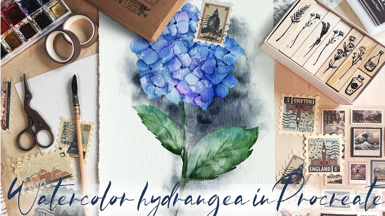
Transcripts
1. Introduction : Hi guys. Hello everyone. Welcome back to
my today's class. Today I'm going to
teach you how to paint beautiful floral illustrations
in watercolor style. And I prepared for
your toothbrush set, was the first trial is
actual watercolor brush set, and the second one is
called flower builder set. You are asking me to teach you
how to use a set properly, how to build flowers
froms, two petals. So I did it today and I
hope here to likes it. And if you're ready,
grab your iPad, Apple Pencil, ls band together. Guys, I'm Inger
freelance illustrator. Welcome back to my class
and less dive into floral illustration and paint altogether beautiful
compositions, these botanicals in
watercolor style. My class, you will learn more about Procreate and composition, especially how to use layers, colleague and mask Alpha
Lock Selection tool and how to texture, volume and color variation
to your picture. And most importantly,
you will learn how to paint watercolor florals
in a simple way. And new painting technique I will use to brush sets today. Watercolor set and
flavor built-in set. You can use the illustration
you create for posting on Instagram editor portfolio or sell it on Etsy camera,
and, and so on. Or just share it with someone. Call me, I really like. I am sure they will
be so happy to get an illustration
set is created by you. Today. I want to show you, is it watercolor is so
simple and it's a real fun. And in the end, my class, you can see it. Today. I will teach you how
to create texture paper. How to build a flower
froms a petal. How to use sketch. What is composition? How to create traditional
watercolor illustration in Procreate? How to use watercolor
stem brushes for watercolor effects. How to use ink brushes, how to use stamp brushes, how to paint a picture from and without
reference picture. How to use my default Procreate brushes for watercolor painting. How to fly my new
watercolor technique. What as in you and
says you need to know if you want to create
watercolor illustration, how to use Alpha Lock and clip. How to texture to your artwork. I will also show you how to
add shades and highlights. I will show you my whole
process from start to finish. And as a bonus, I will share with you my texture paper to
custom brush sets, color palette, sketch
set I created high. You'll also add file all
my pictures that I drew. Feel free to use it for
your own art projects. This class is great for
intermediate level, also can be useful
for beginners. If you watched my
previous classes. Appearance artists,
probably here, you can find an inspiration and your ways how to paint
botanical illustration. Your class project will be next. Paint flowers using
Zoom tips and brushes. Said, I gave you today. I will use Procreate
was his class, these iPad and Apple Pencil. So if you have it or some as a drawing paths or just regular watercolor
paper and pains. Please join our
class and good luck.
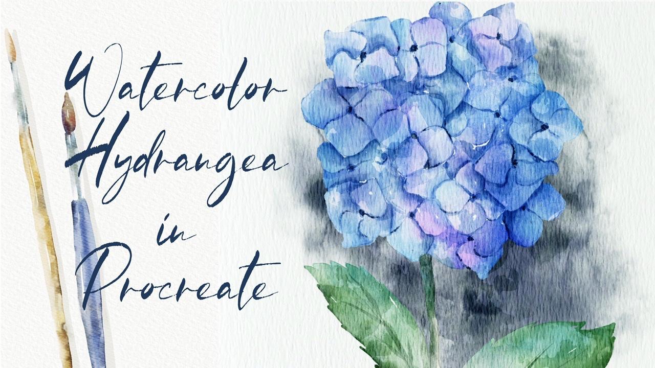
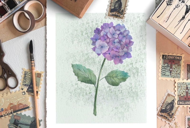
2. Creating Paper: Hi guys. Hello. Welcome
back to my class. And today, as I
promised to pay into our floral illustration style, hydrangea and Vivo, use
my flower builder sad, and I will show
you how to use it. How froms a petal flower. Also, I prepared for your second brush set is
bought a car crashes. And I'll show you how to create an authentic quality art in procreate and in Android class. No one will tell you said your painting is
actually digital. So let's get started. Grab your iPad, Apple pencil, pen, Let's pions altogether. So first of all, we need to create a paper, how to do that? So you need to open,
Procreate and after say, add from the right corner
you see is a plasma data. We need to tap at plas. Next tab, classic act. And after switched
from into inches. And the right 9, 11 inches
weighs 300 DPI resolution. Maximum layers
that we might use. Iv is 56. Tab. Create a paper. Next step, I'll show
you what a cornetto. We need to export
all our freebies. So for a store, where to find them. In, my class said, you need to open in a browser. It can be wrong. Or Safari in the projects
and sources section in the right corner. And just the headline resources you can find all
my free purpose. Also, for today's class, we're going to use
very simple mockup that I created and I shared with my lovely Skillshare
community and Ivo your SysML cap today
in our class as well. He's pretty simple one. So where you can
find this mock-up. And in the description
of my class, you might find the link said
you need to follow tab, Download and download my
mock-up. It's very simple. So what is our next step? We need to go to Layers, create couple of new layers. After zag, we need to export our watercolor paper
into the Procreate. Once again, is in the projects
and resources section. There's a headline resources. Once again, guys,
why you need to open my class in a browser? Because you feel open my
class in the Skillshare app, my freebies, MyNode
peer visible. So please pay attention. So when you download
all my freebies, xA should begin
downloads folder. You need to Coser,
tap our paper. Hates in the jetpack format. You need to go and
experts of paper here in Procreate how to those ad server need to take action button, tap, Add and tap user to File. Find. Our paper, can
export it in a procreate. That's our paper. Now,
let's duplicate it. And we need to change
the blend mode from normal to Linear Burn
and calor rubor. Calor, next decade, linear
burn TO times merge together. Then a kid color
burn merge together. I have to move some
capacity of linear burn mode to the
50 percent around. And after the select tool
layers and press group. Next we need to rename it. And they created our paper. Guys pay attention
when you paint. You need to paint underneath
our paper layer group BY, because if you paint above, so XL watercolor texture, we will not be visible. I'll show you when I demonstrate my brushes that I
prepared for you detect. So on Denise, we
even can rename it and dried paint here. Navigate. Okay, good. So Ve created our
watercolor paper. So what about watercolor? And our brush sets? Speaking about his
color palette. You're going to use
this color palette. It's called flowers, this mat. And for today's class
we're going to use so scholars and bluish ones. I'll show you and
also greenish as well because we need
to paint leaves. Next theme, Let's
move to brush set. So I have four, use a brush set. These laws of watercolor
brushes that I created and some native
Procreate brushes. Let me show you a sack example. You have mercury brush, 6-bit pencil and
Terrell airbrush. So as practice on native
Procreate brushes. So we're going to
use today as well. Next poll oriental dry brush. There's a branch
which is perfect for add in some details. Next book, 0, 0. So border color background
for adding sound kind of shades or watercolor splashes
will base kind of sharp. You see as edges
are pretty sharp. And by controlling,
these are paths that you can make it
thicker or thinner. You can make it more saturated. So it's up to you. For regular watercolor. Very simple branch that also helps you to add color effects. Where would it go stamp? This time we're going to
use today a lot of times. And second motorcar stamp
can increase the size. It helps us to reach
sauce watercolor. Speaking about as a
watercolor texture. Let me show you. So you see now here we
have watercolor texture. It looks very organic. If you paint the fields it is, watercolor is a color
blends into the paper. But if we move our layer above, you see if you lose is
watercolor texture. It doesn't blend into the paper. So that's important to put it underneath our
paper layer Chrome. So they've done with this part. In our next part, we're going to create
sketch thanks to the 10 brush set
flower built-in sat. And I'll show you some
references that you can find. You can find in the internet. And step-by-step, we will
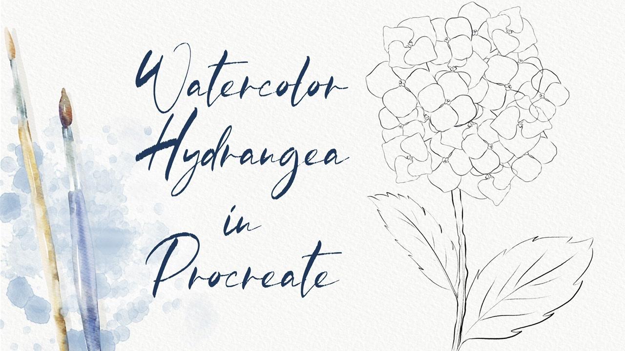
create beautiful sketch. Let's go.
3. Creating Sketch: I can, some variety guys, thanks to this flower
builder said you might find different kinds of plants. You might use your creativity, imagination, or create some
other flowers that you want. It's totally normal. So what I wanted to
tell you that we found our hydrangea and we have some different
kinds of flowers, some petals so that
we might use for creating our beautiful
illustration. But because I've, of course, we need to find some
reference pictures. We need to see how
hydrangea looks like. What as a killers of parallels, we can learn how to
paint leaves and so on. But let's do it. So for Zed, need to go to
the website unsplash.com, where you can find
the pictures for your personal and
commercial purposes. We're going to use pictures
as some references. Thank you. So we need
to type hydrangea into a search engine here. And you see it's so
beautiful, such as fine, safe use of pictures that
you think are most utero. And after you can
just saves act. Very, very beautiful
picture promptly, I'm going to use it. And you see as the
colors of these flowery might be very different, thrombo to a purplish color. That's why I told
you that when I use exactly the calories in our color palette because every
suitable also pink color. So find hydrangeas at you like probably I want
to save this one. Let me find saved his picture. Nafta said, I will
export paid from our camera, roll into Procreate. Let's tie it to have actions after a tap Canvas and we need to tap on reference. Next, go to Image
and expert image into Procreate. Okay, perfect. So V out on a new layer. After sad, I need to
grab some petals. Here last creates similar
illustration like step-by-step. It takes some time, of course. And radon actually
needs to like create so many different kinds of
flowers just like basic ones. We can rotate it a little bead. Also try to avoid overlapping. So that's important.
So we're going to blend everything together. And now we need to
remove the overlap is we can use mercury
brush as an eraser. Now, let's create one
more layer and nice. And I went to play sees planned like behind
the rest of flowers. That means that I'm going
to erase biggest part. There are so many
flowers is hard sometimes to see murders. The end of this plan
will key point. Now next step we want to
merge it to CAS and replicate says part because it's rotated. And puts it summary here, same. Let me erase my pants. So I lower SAT
passage of one layer. In this case, it helps me to understand where as overlapping. And if you'll have
any of you again, make it reasonable again. And I think we can
duplicate it one more time. Rotate it. And we can make it seem
a little bit smaller. Fixes to same lovers haphazardly
and erase our leptons. Now that's possible player. And I think from
this side we can use the same part from suicide also need to place apart Felipe. Felipe. Don't make it bigger. I
don't want to change. Yeah. Something like this. Henry matched
everything together. But you see that a shape is S for me in some little beards, rectangle, psi 12, change it. So I'll create one more layer. You have hydrangea flower. And I want to put
a summary here. Make it smaller. Place it from this side, create one more layer. Change, set brash. Don't want to use around
our software runs here. And place it terms of set. Now merge all three
layers together. Longer SAP, acetate and
erase the overlapping. After said, being curious, EGN merge together, then recreate an
amazing, amazing flower. Here. Next, we need to keep
paint in some tiny details. And you see from our
reference picture we have some leaves and we actually
see how the leaves look like. So now I need to come back to the floral set and we're
going to grab mercury brush. So we're on a new
layer and let's try to imitate and draws the same leaf. I'm going to draw it on a separate small piece
of papers that is empty. This is a one type of leaf. Now let's create a new one. Smaller. So totally use B
can replicate them. And seeing gradually
went to place. So sleeves. So we
need to paint stem. The patron, a hydrangea has very thick stem and has
some kind of texture. So I'm going to show it as
not like some push farmers now it's a little bit
thicker. Like sad. Okay guys bakery
heated on leaves. So next step we need to
place some leaves here. On oh, stamp has a McCain Sam moves them
all and group of glands. Honest here. Probability. Let's make it a little
bit more nature. And one more leaf. Let's find a figure on how to perfect pen. Let's finish painting. Now, we're going to
merge everything together and our sketches ready? Max was moved to next
part where I'm going to teach you how to add colors
to our illustration. Hence, it's so simple
and step-by-step, we start to create an
authentic aquatic kind of art.
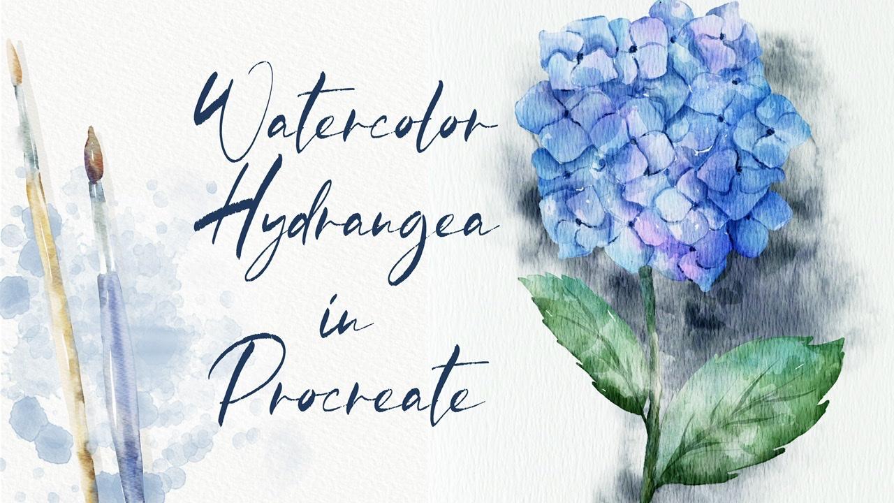
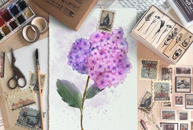
4. Adding Colors : To start coloring. So what
you should take Catch and lower SAT
passage of his cage TO like 40 percent or
something like that. After Viva Locke says catch, that means it's the paint
on this layer anymore. Because later we're going to
turn off our sketch layer. So we need to be careful and
don't paint on this part. After that, we
create a new layer underneath and you're going
to pay in on this part. Next, let's grab brush. And I've chose pull off a brash. So as you see we have
some bull hydrangea, purple hydrangea, I will stick to bluish Guan
Bowden. In the same time. A sheets will be below a shade lighter. And let's start painting. He does take some time, so I'm going to
speed up city data, purpose, shade. Say it's not a big difference, but of course we can't
completely change the color of plotters because overall it
should have won one sheet. So you see, it's barely
seen that it's small. Fish. Even. Have anyone to make it slightly brighter. For kVp, huge business. Now let's move to
stem and leaves. Okay. How can I added some colors? And it looks wonderful. In our next class, I will show you how
to add shades and highlights and some
kind of variations. Hence, it would be so beautiful. So let's jump into
the next class.
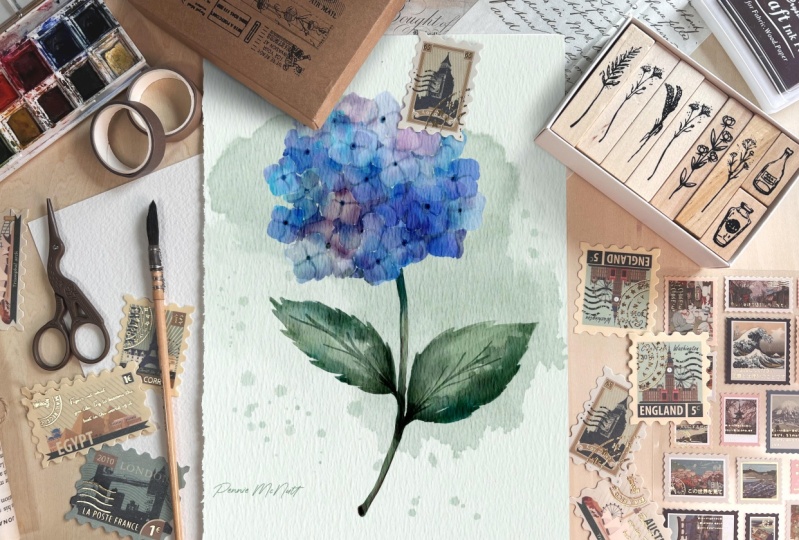
5. Adding Shades and Highlights : Next tab, you're going to add some shading and
highlights by before mistype going to hit Enter and go to transparency
and blend. So as a blender,
I'm using a brush. So as a size up to crash
and carefully I will finish our blend and part. I want to unlock
layer and lower self, pass it to even
more to 20 percent. After that, I will
look at again in order to avoid p
Internet says layer. And I will create one more layer and place it above our floral. So you're going to
add our shades here. But once again, like I told you before we
start doing said, we need to remove
the transparency. Because as you see
when we turn off our background color
and the paper, you see we have agreed here, and we might see our plans
underneath our planes. We also have some greets, so we need to remove it. So once again, why we need
to know that in order to make our paint
and more saturated. And also when we
add some shades, if our painting is transparent, when we add shades on the top, there are also pretty
transparency will be barely seen. This five-year most
of transparency. So how to do it? We're going to duplicate this
layer like this two times. Very lovely. Go to lower layer. After that, go to Adjustments, press hue saturation
and brightness, then moles of
brightness to 100%. Next, I will duplicate
it two times. And after that merge
together with our plant. Now of the background-color
and the paper. You see if you don't see
greed anymore because we removed the transparency and that's what they
actually needed that. So now we are ready to add some shades and highlights
and kind of variations. Let's dive. Okay, perfect. So we create a new layer above. We will move as a blend layer mode from
normal to multiply. Because when you use
Multiply Blend and layer mode is the
shades will be very saturated and it
would be so beautiful hiking I sphere ready to
start adding some shades. The blend also occurs. Now it looks more natural. So now I need to
create a new layer above and we need to clip it. So press clipping mask once again is in the
clipping mask mount. Now I went a tiny bit of shades, San Jose cyber grab your
watercolor background rash. And I will grab, let me think this bluish color a little bit brighter. I think. Anytime you see when
I add some colors, it looks very nature. Also, you can then
leave a bit of a bluish shade to
the leaves as well. Like you see here
from this side, we have timing needs of shades. So I'm going to add some
shades here as well. Our aim is to make our
registration like colorful, add more color variations
is very important. So leave can have
just one solid color. So your flower can't be just totally purple or
totally like blue. It might have some
dark blue shades or light purple
shades and so on. Also. Now let's move to purple color. Next. Guess. If you want to duplicate a layer and it
would be more saturated. I like it but I don't
think too saturated. It would be fine for us. So I duplicated the layer, moves up positive of one layer, deal with 35 percent. Nafta have a merged
set together. I'll create one more
layer in-between and automatically this layer also
in a Clipping Mask Mode, moves the blending
mode to multiply. Now, I want to add a
little bit of sheets. Okay, so what do you
need to remember when we pay into
the illustration? You need to remember
when you add some highlights and shades. One part of a leaf
should be in the shadow, and on the contrary, in nasa part should
be pretty bright. So I created one
layer underneath everything and I want to add some background color,
same brush size. And I want to shade a
little bit of shapes here. Because this is background. Us to separate our flower
froms a background. I erased some overlap pins here. So be careful cell
areas v left some gaps, tiny bit wide gaps. So I'm going to
keep some white so I erased. Some overlapping. Okay, Perfect. Now what we should
do next, Rida, need our background
color for now, so I will turn it off just
for a while. Neck thing. What we're going to need
to create one more layer and set it on top grade. As a multiplied. Change the brush. Now I want a tiny bit of
shades will base color sharp. And now what we need to separate leaves one from each other. So you take some times it's y. And then Torrey later
you can controls that layer to just
separate silos. So I'm going to be different
next to each other. Tried to separate them
by adding more colors. So many fish I
didn't some shades. My suggestion grab
blending tool controls the size and blends that edge is to try to make
it more realistic. Next is so is it dark? Is it will be just in the area where two objects are
next to each other. So I actually painted those pedals is one of the
most time-consuming parts. So I'm going to spit up with us. And from time to time, thanks to the shades, we can separate the petals
Swan from each other. And we can show some volume. Because if you just add just
one color, it's not enough. Because when we turn off
the kitchen layer becomes, sees a difference between the petals because
he's a volume. Of course you might not turn off the sketch layer and keep
it set to buy is also fine. But I think it would be even
better if you could turn off the sketch layer and still
sees embed some paddles. If you want to hit W. And then lower saturated mode, what? I think it's too much. So I moved a passage of one layer and then 2%
and not to say that I merged together our layer or
obese shade. Okay, perfect. Let's get back and change
also little by little. Create one more layer. You see it's automatically
in a Clipping Mask Mode. We will move it on top. Also move it to Multiply. Now we can grab a
slightly different brush, real grab oriental dry
brush for adding shades. And we can show some
card of pedals. You see him on a picture, it's very dark here. We can increase the size. Next TC betweens a pet house. Also say no to some
tiny dark shades. And also cramp land and to
carefully planned sunlight. We can lower that passage of our sketching layer even more. Unlock, move TO 15 percent
and lock it again. And let's keep blend in. Because the lines
shouldn't visit. All. We need just to show it
like tiny shade of a line. Like maybe some 70
percent of positive it can't lawyers are
positive because of the heart of safflower. It should be The Dark Sky. I would keep it centered.
Now let's grab, push or pull brush. Let's just saying create
one more layer in between, moved to multiply. And because this brush
has very thin TPP, we actually can show some gaps. We can separate petals
one from each other. And then after that we can
love or SAP acetaldehyde. So again, you don't need
to show all the paths to flex biggest one
the most important. You also can show that pinches makes him
slide Good, Doctor. And after some blended, all ours have BASF to hand. You can just same
way as this part. So he grabbed dark green color. And I also wanted to show
some timing, like edges. Make some parsley the
bit darker as another's. Okay, Perfect. Now,
if you want to become lethal be it
might get nonsense. Office. But in the
same tends to keypad. And I think now it's time to
turn off our sketch layer. So you see what it is we
turn off the sketch layer, but steel we can clearly see is a petals and we
can separate it on them. One from a chatter. Saying from this part by this is
known as the ends. We're going to add
more shades to our plant and I want to
separate more leaves. So where you feel that we
need to add some shade. And then we have some edges. Human just blends
it just tiny bit. Key, wonderful as
creed one layer, Clipping Mask Mode to
multiply like he did before. Grabbing even darker shade
and steal. I grabbed pool. So I want to assure plague
even darker shades. Okay. So you blend just one part
of the shaped neglect the whole shape of our key
unit blended frames a side. Okay, So he's, he's, he's made him a better. Once again, it's up to
you whether you want to make it more or
less saturated. Contrast. Just wanted to
make it in lethal beat. Somebody halls is poverty
looks so beautiful. So I want to add tiny
bit of shades here 2 says to the stem, and our lovely beliefs ends at the opposite end
for aid and colors. And how does it will move
to next part by an eagle, add the final details. Some crap and unplanned and all. Just blend this tiny bit here and it looks so beautiful. And now we have our, the
background countered. Reach also had some kind of
volume to our illustration. And if it allocates a layer
more saturated, so I like it. And I'm going to
merge them together. Maxima, if you want to change the color of your
background, you can do it. How to set v are on our
layer recent background. Go to adjustments, hue,
saturation and brightness. And play is a huge incapacity. Keller's at you like. They might be more suitable
for your illustration. I want to make it a
little bit purplish as well. Okay, great. So I've done with it and
shades and kinda variations. Now let's move to next
part two final details, where I show you how to
add some splashes, pans, stamps to our illustration set will help us to reach human like more realistic
watercolor look like died.
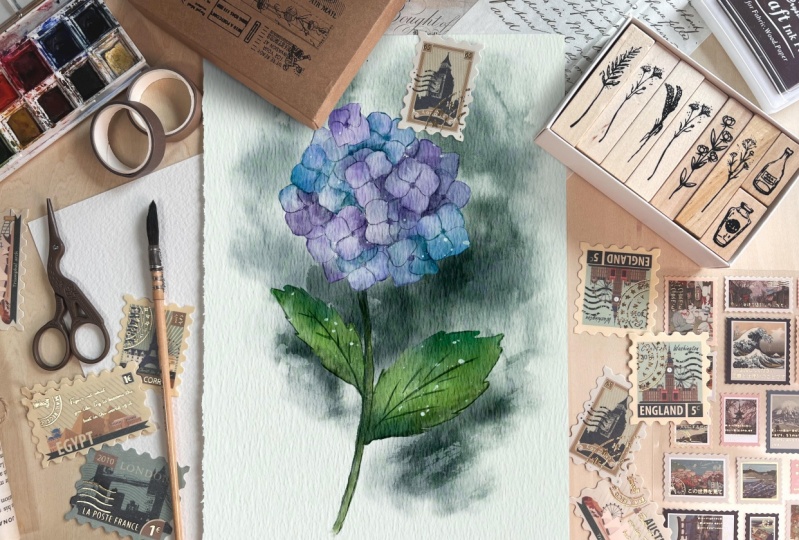
6. Final Details : Sorry, I hear again. Now, we need to merge
everything together. Thanks. It accepts a background. We don't need some
background for now. Okay, now let's
create new layer. Perfect. We'll move it to Multiply, Blend and layer mode, and we will cleave it. Next, we have some stamps, which is very convenient. Going into business. We will
use this vertical stamp 19. And I will grab bluish color that you
see when we adds a stem. It helps us to reach better for release to cloak because it
adds some kind of splashes. I will mostly opacity to 40 percent and after merged
set together, Perfect. Also, if you want
to add some kind of color variations,
you can do it. We are on the layer
beneath our stamp. Go to Adjustments, Hue,
Saturation, Brightness. And here by moving around, you might decide which
color you want to have. It can be purplish here or
even bluish. Keep it purple. Like six, same. You can go to Curves. And thanks to the curve so
you can control that poverty and controls like
dynamic of a color. Perfect. Let's create one more layer. And in nice, it's also
in a Clipping Mask Mode. Multiply. And I want
to add more steps. Now as you see, stamp is, thanks to the curves,
is more colorful. But here I have tiny gap
which I want to blend, say, and we're going
to deal with leaves. I also want to play around
and add some stamps. We will create one more layer. Find a nice move to multiply. Go to hue saturation
and brightness and think about colors. So we can add more saturation. Brightness can be a
little bit darker. So I want to make tiny
bit, little bit darker. We have tiny overlap bins here. So once again, if
you don't like, you can erase some parts, but my daughter likes
away how it looks. So I'll merge that together. I'll create one more layer
to multiply, clip it. Moved to another stamp. We have what goes
stem four to six. And this term is brighter. You see it's very,
very situated. Of course we don't need to
have it says saturated. So it's nonsense pride. But once again,
thanks to the edges, it still helps us to add some watercolor, beautiful
watercolor look. If you want to can move it around and think where
you actually want to put. I wanted to keep it here. Cars and play. We said colour, intensity. Like sad. Now let's just same
as our beautiful, lovely floral. Move to multiply. Bluish color. Same stamp. Any AAC, it's better to edit
two edges because it keeps and amazing splashes here. And also can play around
with the capacity. Also go to curves. I'm going to keep it at all. So guys, we had so many shades, but I want to add tiny
bit of highlights. How to translate, actually same. We create a new
layer automatically. It's an a Clipping Mask Mode. We don't go to multiply. Pay attention, your goal
will still stay on a normal and even move
nearly to the white color. I will grab with
the kind of stamp 90 controls the
opacity of the stamp. And think where you want
to add some highlights. You can just place it randomly
likes is some highlights to power plant. Yeah. Go to curves and see you
can make it brighter. And just make it brighter. Again. You made it brighter. If you need to allocate
it to be even brighter. You see. But I don't want to
have it said pride, so I'm going to load this up. Positive deals, this
part, I think it's fine. Merge together and merge
everything together as well. Okay. Like SAT and
the last, last part, I would say at a
little bit of stamps to the background as well. So I'll create one more
layer and a nice flower, but on a top of shading
layer, how clip it. And I will move to multiply. Grab political stamp for 46. Okay, Perfect. You say, I already added some stem
and looks so saturated. Guys. Why is the shade is
not that bright? Because I actually didn't
remove the transparency. That's what I was talking about. Because if ZL layer
he's transparent, so shade moving,
not set up various. But for us it's fine
because I don't want to have very solid
background color. I want to have it
half transparent. So for me it's totally fine. Okay, Alex had now
we can go to Curves. Also append play around. We can make it more
or less saturated. Now let's merge
everything together. So we have coal plant
with a background color. We don't need our
reference picture animal. So it will turn
off the reference. And as you might see, we created an amazing
illustration. Hen guys, final, final touch. I will show you how to add our lovely illustration
into some mock-up, lends itself simple.
Let's do it together.
7. Using Mock-up : The expert at our mock-up. Once again, how to do is add, you go to description
of a class. And in the description, you'll see you can
see something. So you just hold it in. Downloads is freebie
mock-up PSD format, and it will be in
downloads folder. So you need to export this
PSD file into the procreate. And yet they are ready to start creating
our illustration. This is just an example of that. I'll turn it off
as you might see. So as this picture
is empty, of course, this mock-up will not give
you a watercolor of touch, but our illustration is
already what account? So we don't need set. So if you go to the layer
routes region your picture. And next we need to go and export our file and go to
Action button and tap, Add and insert a photo after we export it
out as titration and let's move it accordingly
to the size of our paper. Pay attention and should
be uniform, not free form. Because if you use free-form tool set portion to be changed. So we need to move a
minute, increase the size. Maybe an x hat. K. Perfect. Also guys, as you see, we have
a shades here. So if you don't like, you can turn them off, batteries, Shays, it's I
think it's more realistic. So this is the end of
our today's class. I hope it was very
useful and you learn how to create thanks to
safflower and both are sad. And illustration
and flour petal. How to paint realistic
watercolors. Touch how to turn
your illustration into actually traditional
watercolor part, thanks to procreate and how
to use mockup and guys pain. During my next class, I will teach you how to play Flappy Birds in different
styles in Procreate, I hope you like set. Once again, I will prepare
for you different brushes that will help you to
reach different effects. And guys API shall act
museum and art projects. And this is the
end of our class. And I hope now it's clear how to use my flower
builder said. And you know how to paint lovely floral illustration
in watercolor. Guys, I would be very happy
to see all your artworks. I wish you luck. And UIC jazz
in a new video, Bye bye.
 Inga Yoon, Digital illustrator and teacher