Transcripts
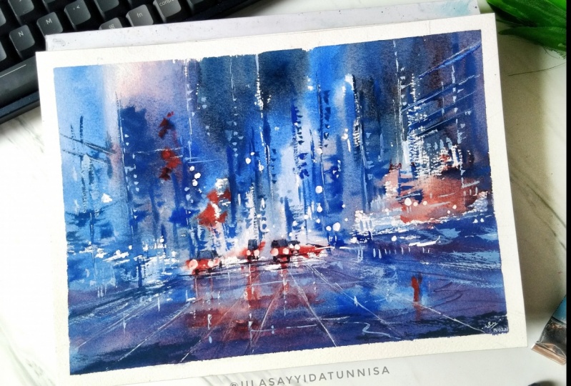
1. Introduction: Hey, everyone. My name is Rainbow and welcome to painting watercolors cityscapes. This is the third class in our series where in each class we explore the step-by-step process we run one cityscape painting. We go all the way from sketching, looking at the reference photo, transforming that into our composition, and then painting layer by layer until we have our final piece. The focus of this class is to give you insight to the process of this specific cityscape painting. The painting that we're going to look at today is a night cityscape. This is a little more advanced and will require some experience in watercolor. We're going to talk about how to paint wet on wet, how to do layering, and things like that. In the first two classes of the series, we explored other cityscapes. If you want to start out with something a little more simpler just to warm up, I recommend walking through those classes first or I have some other beginner friendly classes as well. Back to this class. By the end of this class, you will be able to paint this painting here. I will go through each and every step slowly so you can follow along clearly. Hopefully, throughout this series, you will be able to accumulate a wealth of examples, and that it will equip you in painting cityscapes of your own in the feature. It's great to have you here. Let's get started with our class.
2. Structure of the class: Before we begin, I'm going to talk a bit about the structure of this class and the different sections and what we'll be doing in each of them. First, we're going to start by looking at the materials, tools, and supplies that we will need. In this part I'm going to talk about what I'm using for this painting, and also I'll recommend some alternatives of what you can use as well. Then we're going to look at our reference photo and plan or composition. So this part is really about understanding the reference photo, understanding what we're painting and how to simplify those different shapes, different elements, and transform that into the sketch that we're going to do. Once we have understood that, the next step would be to do the actual sketch. In this part, I'll show you exactly how I sketch it. Once we have our sketch ready, we're going to start painting. First, we're going to paint the background layer, this layer is going to be split into two parts; so first, in the first video we'll look at the top half, painting the buildings and the lights, and then in the second half we'll paint the cars, the ground, and the reflection. Once we have the first layer, we're going to look into the wet on wet technique and how to add details to the first layer, and then after that in the next step we're going to add some dry details. After that, we're going to then add more details and look at how to add the brightest colors and blend the lights together. In our final video, we'll add some of our finishing touches. I'll show you different techniques of how to create some of the white in you're painting. Feel free to work out this in your own pace. You can skip ahead or watch the videos again, slow down, it's completely up to you and I hope that you will enjoy this painting process. Let's get started.
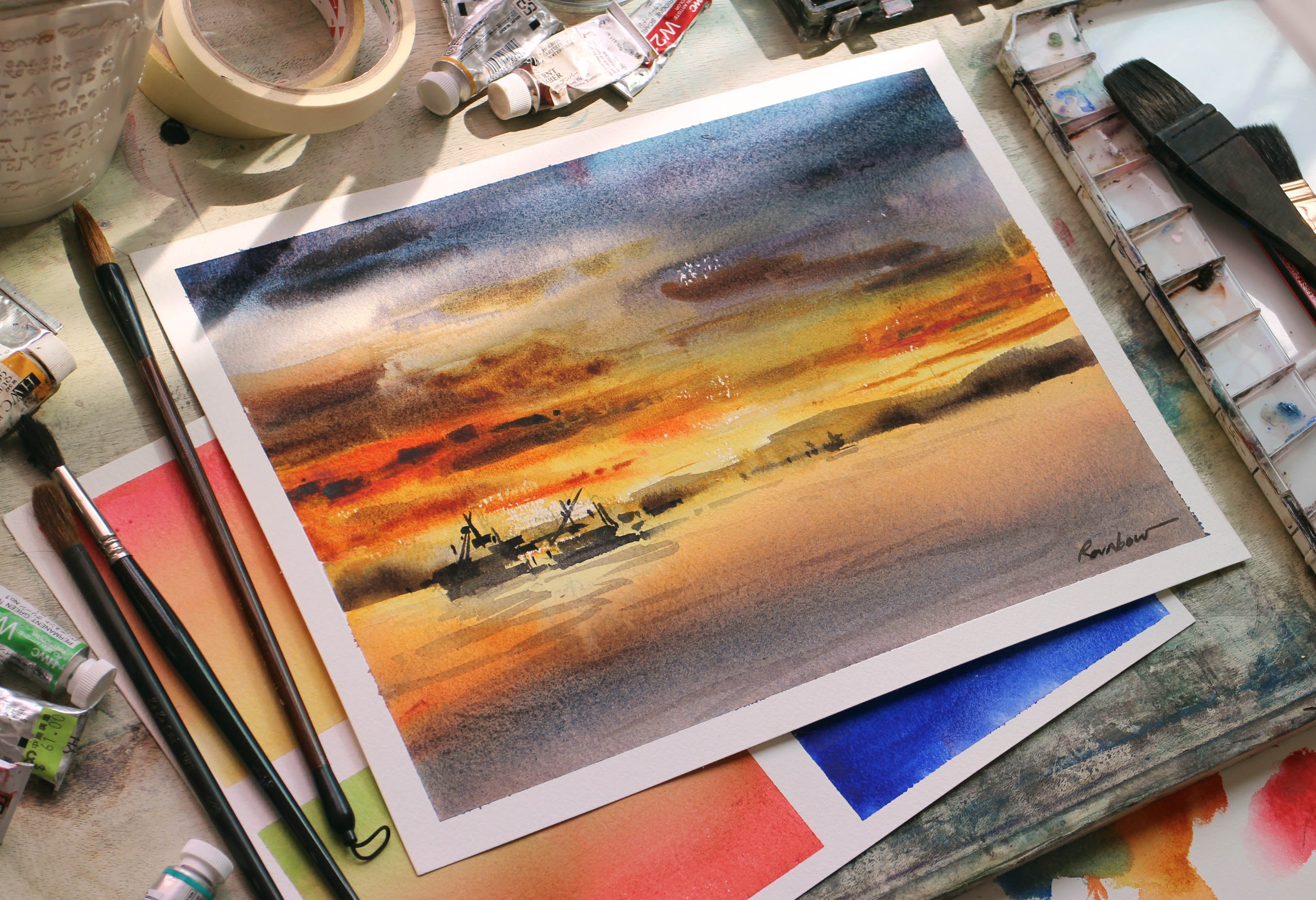
3. Materials, tools & supplies: Before we begin the painting process, let's go through the materials, tools, and supplies that we will need for this class. First we have our watercolor paper. Here, I'm using a watercolor block. It's essentially a stack of paper glued together and just make things a little more convenient. But you can also use loose sheets, it's the same. Mine is 300 gsm, which is a good weight for this type of watercolor painting. Because what we're doing, is that we'll be painting layer on top of layer, so we'll need something that is thick enough to withstand the amount of water. The paper here also has a rough surface, which gives our cityscape painting a little more texture. This is just specifying what I use, and my preferences for paper types, but you can of course use other types of watercolor paper. Experiment with what works and what fits your preference. Moving on, we also have our paints, and this is my palette here. I squeeze out fresh paint and keep it in this airtight container. You can also use watercolor pens, which are pre-squeeze paints densely packed into this tube. However, I would recommend using fresh paint over watercolor pens, because you don't need to mix as much water to get the paint mixture going, and in parts of our painting we'll be needing thick paint, so not watery paint at all. This would be important, because with our nightscape we're going to be using a lot of darks, and this is a lot easier to mix with fresh paint. The specific colors that I'm using in this painting, is Ultramarine Deep, Verditer Blue, Quinacridone Scarlet, and Burnt Umber. It's definitely not a very big list of colors, we're keeping it simple. Of course we have our watercolor brushes. Here I have a combination of flat brushes and round brushes. The flat brushes are great for creating angular shapes, and we'll be using this big flat brush for a lot of the buildings and the background wash. The round brushes aren't great for details and for lines. This brush here specially has a tapered shape and it's very useful for thin lines. Last but not least, we'll also need a cheap small brush. You can also use a toothpick or anything you have at hand to be honest. But the reason that we will be using this, is because of the masking fluid. This brings me to our next item, which is the masking fluid, and this will be used for the lights in our composition. It's better to use a cheap brush to apply this, because it's very difficult to wash off, and we wouldn't want to ruin our favorite brush because of the masking fluid. Other than that, we'll also need a mixing palette, water, a towel, masking tape to tape the edge of our paper, leaving a white edge, and of course we'll need a pencil, eraser for sketching. Now that we have all of our materials and tools, we will begin looking at the composition in the next video.
4. Planning the composition: Before a sketching, we're going to take some time in this section to understand and to break down the structure of our composition. This will help us learn what to include, what to omit. How to simplify these different shapes and elements of our cityscape. We'll be able to transform what we have in our reference photo into the sketch that we can use in our painting. So let's look at our reference photo. There will be a few things that we want to notice, so this includes the vanishing point and the perspective. The values, so the lights and the darks of the composition, as well as the focal point. First, let's identify the vanishing point which is here and notice the lines that form this one-point perspective. You want to draw this out and mark it. This will be important for our sketching process later. We also want to notice and identify the lights and the darks areas of this composition. We see that the lights are concentrated into the middle, into this part, while the darks are overall in these areas. On the side which means that when we paint later, we would want to frame it similarly. We want to emphasize the darks on these areas and the lights in the middle. As we're looking at the values, we also want to determine the focal point and where our eyes are drawn to when we look at the composition. Usually, this works in combination with the perspective lines and the placement of the lights. We see that when we're looking at this composition our eyes are focused to this point. We want to make note of that, so that when we're painting later we know what to emphasize on. Now that we know a little bit more about the structure of our reference photo, we will move this into the next part where we will sketch it out and I'll talk more about it in that part.
5. Sketching: Now in this part we're going to start sketching the composition onto our paper. Have your watercolor paper ready, with your pencil and your eraser, have your reference photo on the side. The first thing we're going to do is to identify the vanishing point. So similar to what we've talked about in the previous video about the composition, you want to mark out the vanishing point and then draw out the perspective lines from there. This will help us a lot later in the process of making sure the structures are in their right place in the space within the composition. After that, you're going to start by drawing the vertical lines, the buildings. Just roughly get a sense of space and the objects, their structures in the composition. You want to refer back to the buildings in the reference photo, roughly where they are. We also want to sketch out and take notice of the intersection between the vertical lines and the perspective lines, and that is where you'll begin to see the window structure. You'll be able to sketch those out as well. Moving on, we're going to sketch the cars. So when we're sketching the cars, you want to imagine them as rectangles or squares with these big circles in front, that is the light. This will help us to simplify them a bit because cars can sometimes be perceived as a very complicated structure, and with the car on the left, you want to follow the perspective lines so then you're drawing almost a 3D shape like a cube. Make sure to draw the shadows on the ground and also move on with the structures towards the front. There is no need of too much detail, just to get a sense of where everything is in the space, and of course we want to mark out the lights off the composition. We want to draw out the street lights on top and notice how they also follow this perspective line. It'll be important to mark this out because later we're going to use the masking fluid. So once you are more or less satisfied with your sketch, you have all the major structures in the composition and you're okay with it, we're going to use the masking fluid next. Use a cheap brush, or you could use a toothpick or even anything else that works for you. You're going to put it on the areas that you've marked as the lights. So this includes the light in front of the cars or the street lights on top, you can add more or less. After you've done that, wait for it to dry and make sure that it dries completely before moving onto the next video. We're also going to take the edges of our piece. Use the masking tape and tape the four edges. That's it for the sketch and in the next part we're going to start painting.
6. Background wash (top half): Now that we have our sketch, we can finally begin painting. We're going to start with the background layer, and we're going to start with the top half painting, the buildings and the lights. To begin, we're going to take the flat brush and going to wet it and paint some water on the lightest parts of the composition. Don't use any paint first, just brush them water onto our paper. After we've done that, we're going to take the lighter blue color. This is verditer blue. I'm going to paint this from the middle back, blended it in with the water so then it creates an illusion of light. You also want to paint in a vertical direction, matching the direction of the structures of the tall buildings. You can also make use of the flat brush shape, the angular and square shape for our strokes. After that, we're going to take a different color. We're going to use the ultramarine deep and connect it with the lighter blues using a similar stroke pattern. This is a very similar process. Then after that, we're going to go a step darker and mix a darker blue. Here we're going to use ultramarine deep with burnt umber together. A brown and a blue, and with this color, we're going to connect the previous blue to this blue. Again, with vertical strokes, connect them and blend them together. Looking at the reference photo, we can see that there is a distinction in color that separates the sky from the building on the left. This is where we're going to paint a straight line down here, so that we can make the structure clear. Then we're also going to fill in the rest of the sky. We will continue to add more darks to the surrounding blues. This will help us define the lights and the dark areas of the building structures and of our composition. Now switching back to the lighter blues, We're going to connect them so that it fills the majority of our page. Here I've also added some red and here I'm using quinacridone scarlet, just to add a bit of color and to mix it in with the blue, blending it into a nice purple shade. Notice that this whole process is done on a single layer while the painting is still wet. This allows us to blend the colors smoothly together. Because of this, the main thing to notice is the timing. You have to work fast enough before the paint dries and also maintain a good paint consistency by controlling the water ratio so that it doesn't flow too much or spread everywhere. If it helps, you could mix the colors beforehand so that it speeds up the process a little. Now that we have painted the top half of the composition, we're going to move to the bottom half in the next video.
7. Background wash (bottom half): Now we will move on to the bottom half, and this is very similar to what we've done in the top. Again, we're going to start by painting some water. We're going to wet the brightest parts of the composition. In this case, it will be the rear lights in the cars. After that, we're going to take a bit of some bright red, and here I'm using [inaudible] scarlet, I'm going to brush this over to the rear lights, and to extend this downwards as reflections on the floor. Now, obviously in our reference photo, this is not that obvious and we're doing these reflections in exaggeration to create more color contrast. Feel free to experiment this to your own liking. Then we're going to use the blues that we've used before. Here, mainly using the ultramarine deep, I'm going to fill in the blank spaces next to the red so that they blend well together. While this is still wet, mix some thicker paint. This time use less water, add more blues, and you're going to brush this along the ground and on the sides. This is our first layer. In our next video we're going to begin to add some details using a wet-on-wet technique. Don't wait for it to dry, go straight to the next part because we'll need this layer to be wet.
8. Wet on wet technique: In this part we're going to use a technique called wet on wet. So basically we're adding details to our composition while our first layer is still wet and you'll see later that the details that we'll add will become very soft. It won't leave harsh edges and harsh lines. Here we're going to mix a dark blue and I'm using ultramarine deep and burnt umber together. This time try to mix less water, so then the paint has a thicker consistency. Using a small brush start by adding some details in the middle. You can add some lines and dots to create the shapes of the buildings, the windows in the background and slowly extend this to the side following the perspective lines, on this part of the right. Now, if you notice that your paint is spreading too much and that it's creating almost like little puddles in your paper or that the color completely blends in with the background, then your paint consistency is too wet. So try to use paint that is fresh out of a tube. Sometimes pre-squeeze paint that has already dry and is being re-wetted, usually end up to be more watery and it'll be much harder for us to paint with this wet on wet method. Now, we're also going to add some darker colors to the vehicles, the cars and buses in front. Remember to add the wheels, I find that emphasizing on this helps to form the shape of the car, even with very little detail. After that, we're just going to add some darker shades to the broader view of the painting. So switching to a bigger flat brush with the same color, same consistency, you're going to add more darks between the building structure. Similar streaks to what we've done before in the first layer and add some shadows to the ground as well. That's about it for the wet on wet technique and we're going to let this layer dry completely. In the next video, we'll be adding some more details once it has dried.
9. Dry painting: Now that the previously layer has completely dried, we're going to move on to add some more details. Start by working from the buildings at the very back. Again, adding some the dots and strokes. Very similar to what we've done before, except this time the surface is dry, so the strokes would be much more defined and you'll find that a lot of the steps in this painting process is repeating and layering the same strokes over and over because we're refining and adding more clarity to the subject that we're painting and more details. As you can see, I mainly paint with horizontal and vertical lines, some geometric shapes, rather than really exactly trying to paint a structure that is exactly the same with the reference photo. The amount of detail that you use, and that you paint is a personal preference. You have a freedom to experiment with how abstract you want the scene to be, but try to focus on the overall balance and weight of the composition. So use darker colors towards the edge or the side, maybe in the sky so that it contrasts clearly with the light areas, making those areas shine brighter. Now, define the shape of the cars a little bit more and add the shadows beneath across the floor. This helps in a sense that the cars don't look like they're flying in midair, but really grounded and staying on the ground. Switching back to the large flat brush, we will once again add more depth. Like I said before, this is repeating the process of refining and layering. Especially with painting night scenes, we need to paint a lot more darks in the composition. We're going to finish off with adding some shadows to the very front while this is still wet and going to draw out the perspective line like this. So use your fingernails and lightly scratch the surface of the paper. Do it swiftly, fast. Then the lines are straight and you'll end up with something like this, where there's a bit of a lighter line on the page. This adds a bit of texture to the ground. Make sure to wash your hands after doing this, and we're going to wait for this layer to dry before moving onto the next video.
10. Adding details: Now that the previous layer has dried, we are going to start by removing the masking fluid we first applied in the very beginning. Just use an eraser, or you can use your hands to just lift these masking fluid bits off, and this will help us to clearly see the brighter bits of our composition, the lights and how we can further add to them once we see them clearly. One thing we're going to do right now is to blend the lights of the cars by adding a soft red to the edges of the whites. This will help us make a smooth transition from the lights to its surrounding areas so that it looks a little more natural. You can also add a bit of red here and there, just for some color emphasis and balance. Now moving on, we're going to add some details in the top, but rather than using a darker color like we did before, this time we're going to use a light blue. Here I'm using [inaudible] blue again, which we've used in the very beginning, and for this process, you want to pick a color that is semi-opaque. This would help it show on top of the dark background. This part of our painting is all about adding and connecting the lights to the darks. The bright blue color that we're using bridges the colors that we already have in our composition, it blends the white of our composition with the darks of our composition, making this transition smoother.
11. Finishing touch: This will be the final step of our painting. Here we're going to add some of the finishing touches, details. As you can see after adding the lighter blues in the previous video, we're going to repeat this process by adding the darker blues again. Further refining and finding a balance between the colors in our composition. Now, let this dry completely. Then I'm going to show you a special way of adding whites to a painting. Make sure that this is dry. Here I'm going to use a very normal cutter, and I'm going to scratch the surface very lightly to reveal the white of the paper. Try to lay the cutter perpendicular to the direction that you are going, so that it doesn't slice and cut the paper open, but rather it's just scratching the surface. Now, this is a fun technique that you can try. I find that it creates very nice texture to it. But if you prefer not to do this, you can always just use white paint. The effects are very similar, and at the end of the day it's up to you if you want to add that last step of adding the whites. Once you are satisfied with your painting, and you feel it has enough of the darks and the lights. It's emphasizing on the right things, the right focal point, and you are happy with it, then you can wait for it to dry, and remove the masking tape. Once you've done that, then you're done. There you have your watercolor, nice cityscape. Good job.
12. Sharing your work: Thank you so much for taking this class. I hope that you enjoyed it. Now, it is your turn. We all know that the best way to learn is by doing and practicing it hands-on, so definitely, try this on your own. Feel free to share your work here in the project section below. I've also attached the reference photo which you can download and follow along with. You can also tag me on Instagram and connect with me there, I'd love to see your work. If you have any questions, feel free to reach out, I'm always happy to help. If you like this class, I also have a few other classes in this series with a similar format, so we are exploring different cityscapes. I also have some other content like painting a sunset or painting figures, and feel free to check them out as well. Well, that's it for today. Thank you for taking this class, and I hope to see you in the next one. Bye.
 Rainb.w Watercolor, (Rainbow) | www.rainbw.art