Transcripts
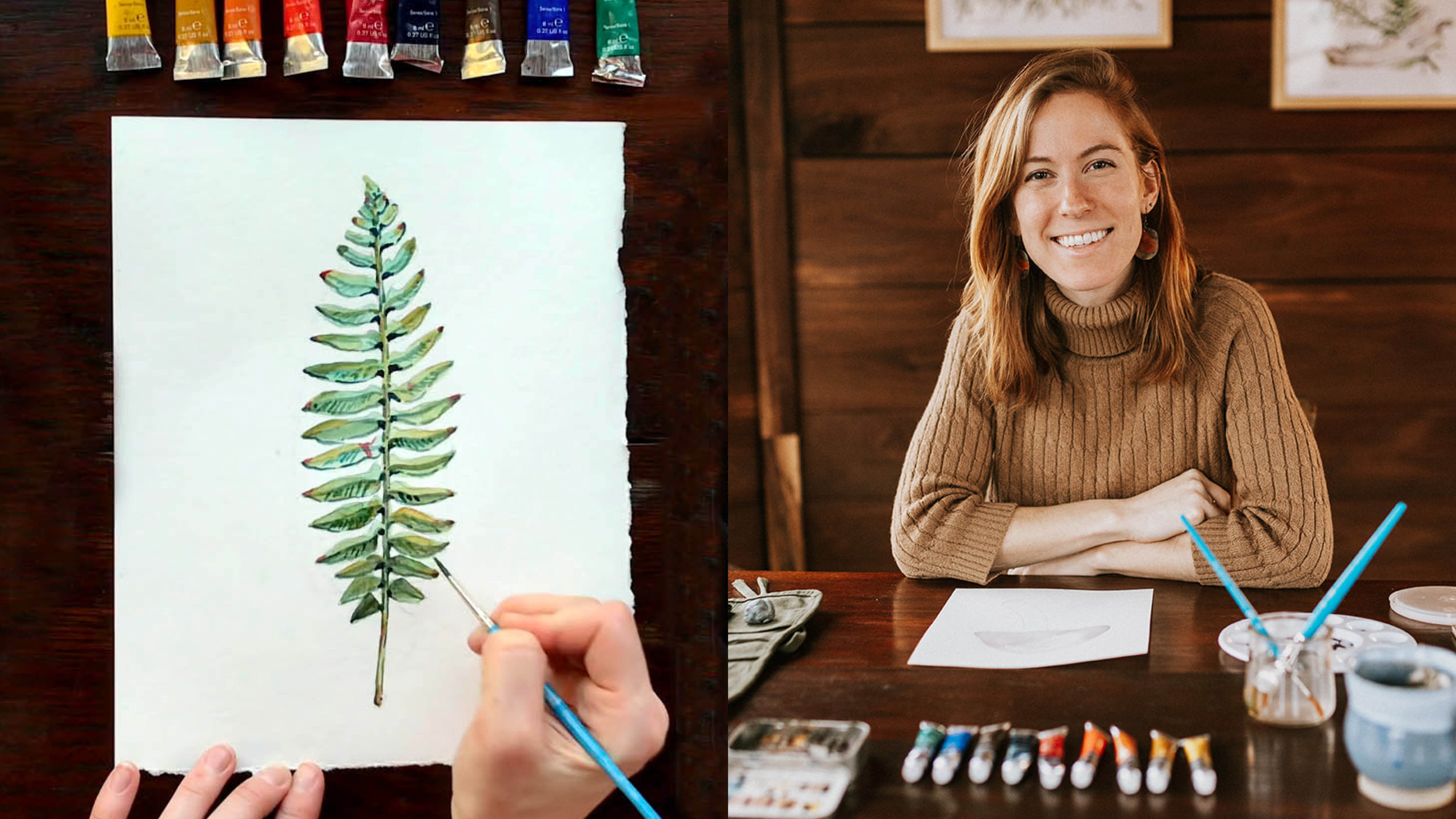
1. Welcome To My Class!: [MUSIC] Hi, I'm Rosalie Haizlett and I'm a nature
illustrator and artist. I've been really fortunate to get to work with clients like the Smithsonian and the US
Fish and Wildlife Service. Most recently, I illustrated
and wrote my first book, which is called
Watercolor in Nature. For this class, I'll be guiding
you through how to create a complete nature
illustration using watercolor and gouache together. I'll guide you through the
materials that you'll need, differences and
similarities between watercolor and gouache, some pro tips that I've
picked up along the way. Then I'll take you through
the entire process of pairing together a plant and animal in one
cohesive composition to create a nature illustration. Watercolor was my
first true love but in the past year I realized that I was
stuck in a rut. I was a little nervous
to experiment with other mediums because I knew the results that I
could get with watercolor. But then I started to see some really interesting
gouache paintings from other artists and I was inspired to go to the art store and pick out
a set of gouache paints. I remember when I
got out those paints and started playing with
them for the first time, I had butterflies in
my stomach because I just really had no idea
how it was going to go. I decided to start
combining watercolor and gouache to ease into
that transition. It turns out that they
pair together really well. I was able to take the
[inaudible] kind of watery look of
watercolor that makes it beautiful with
the really bold, punchy, flat gouache colors. Together it creates something
that's really unique. I'm here at this really
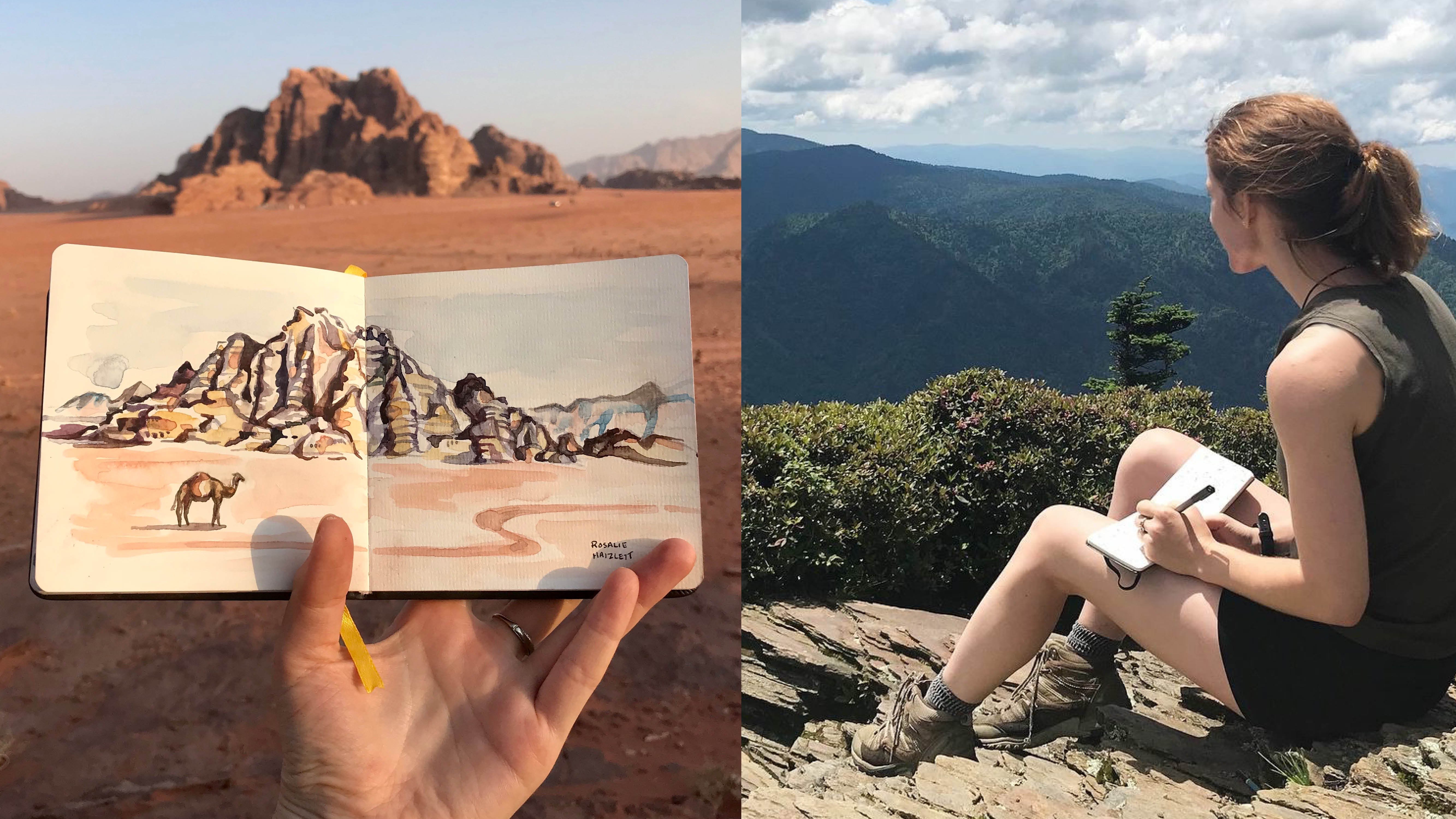
beautiful relaxing lake in rural Pennsylvania and I'm actually going to
be going out and taking my own reference photos
based on what I see here. You're welcome to use the
photos that I provide, or you can find your own
reference photos to use. If you're someone who has
experimented a bit with watercolor and you want to break out of
that a little bit, add a new medium to
your artistic toolbox, then this class is
perfect for you. I'd love to have you in my
class. Let's get started.
2. Class Project: Your class project
today is to create a complete nature illustration that will combine one plant and one animal into one composition using watercolor and gouache. Under the Resources tab, I'll be sharing my plant and animal photos
so you're welcome to use those or if you have your own photos of a
plant and an animal, you can use those as well. If you're just getting started with gouache or watercolor, it might be helpful to follow along with my
reference photos so you can see exactly what I'm doing and replicate those steps. If you're totally
new to watercolor, this might not be the best
class to jump straight into. I'd recommend taking my
other Skillshare class, which is called watercolor
in the woods and beginner's guide to
painting the natural world. In that class, I go over all
my watercolor materials, my process and I think if
you take that one first, this class will make
a lot more sense. Once you've finished your
nature illustration, make sure to take
a quick photo of your completed work
and upload it to the project gallery
page so that we can all see and comment
on your work.
3. Your Materials: [MUSIC] Let's quickly go over the over the materials that you'll need for this class. Don't worry about remembering
all of this information because I've created a
handy-dandy little PDF that has all of this info
and that's available with this class because we will be focusing on gouache
and watercolor. You need a watercolor set. It doesn't have to
be anything fancy. I'd say somewhere around the $20 plus range is probably
perfect for our needs. I'm using a travel palette
that I filled with a combination of schmekey and
Daniel Smith watercolors. I also love Winsor and
Newton Cotman watercolors. Those are great for beginners
and intermediate levels. [MUSIC] You'll just need a few different
colors of gouache. I recommend getting a primary color set because then you can mix all colors with just a
few tubes of primary colors. This is way cheaper than getting a huge mega set that has
24 different colors. Because gouache can
get pretty expensive. I like to stick with
a primary color set. It's also really
helpful because it forces you to learn how
to mix colors as well, which takes a lot of time. But it's a really
awesome skill to have if you want
to be a painter. One super important
thing about gouache, when you're getting your
gouache paints together. There's something called
acrylic gouache and then there's artists gouache
or designer gouache, and they are totally different. While they might look the same, acrylic wash is
not water soluble. If you put that
paint down there, you cannot blend it
around on the page. Once it's dry, you can't rehydrate the paint on your
palette and use it again. Once it's dry, it's dry
just like acrylic paint. You can't actually blend it very well with
watercolor paints. You'll also need some watercolor
or mixed media paper. I'd recommend watercolor
paper because it's a little bit thicker
than mixed media paper. There are lots of
different thicknesses of watercolor paper
that you can use. For a long time, I was using 140 pounds
watercolor paper. I thought that was the
cream of the crop. It was working
pretty well for me, but I did notice that
sometimes when I added a lot of water to make
a loose background, it would start to
wrinkle and bend. In the last year, I discovered this amazing
thing called 300 pound paper, and it's almost
double the thickness of the previous watercolor
paper that I mentioned. It holds so much water, so it won't bend. It's definitely more expensive. I reserve the thinner paper for all of my
practice paintings, and then if I want to make
a really awesome piece, I will get out the
really more expensive but also really great
quality, 300 pound paper. You'll also want some
scrap paper around because we'll be
working through some of the compositional issues
in our sketchbooks or on sketch paper before going to
that nice watercolor paper. Another incredible invention
that I only recently discovered was colored
watercolor paper. It's incredible because
you can add gouache to it. There's something
amazing that happens where the gouache
just really pops when you have that toned or colored watercolor paper
as your background. We won't be using it for the
main project in this class, but I'll be doing a bonus
lesson where I show you what gouache on that colored watercolor
paper it looks like. I think you're going to be pretty excited
about the results. For a pencil, you'll just need a regular sketching pencil. I would say it's helpful to
look for a pencil that has a little bit of a harder lead because if it has softer lead, it tends to leave more graphite on the paper and then that makes a
bigger mess that you'll have to erase later. For watercolor brushes,
it's helpful to have 2-5 brushes in a
variety of sizes. My go to's are a two
round, eight round, ten round, and a one-inch
flat mixed media brush. You could use brushes that are
for watercolor or acrylic. Both will work for
watercolor and gouache. I do know that some artists prefer using acrylic brushes for gouache because they are stiffer brushes and
they feel with gouache, you can really move
that paint around on the page better if you
have a stiffer brush. While watercolor brushes
tend to be softer and have longer bristles to hold more water but it's
really just up to you. I'd recommend trying a couple out and seeing what you like. Other miscellaneous
materials that you need include an eraser, any kind is fine, a jar of water and a paper towel for
blotting up any mistakes that you make and
also getting rid of excess water that's on your
brush if you need to do that. If you're working with a
thinner watercolor paper, then sometimes it's
helpful to use an artist tape to tape
down the edges to your table so that it doesn't bend or warp as much
as your painting. Now that you know what
you need for this class, I want to go over
the differences between watercolor and gouache. [MUSIC]
4. Gouache Vs. Watercolor: Maybe you're totally new to gouache and
you're wondering how it's similar and different
from watercolor. Some of the similarities
include the fact that you can dilute both watercolor
and gouache using water, and you can use water
to clean your brushes. You don't need any special
solvent or anything like that. Another similarity
is that they're made up of primarily the
same ingredients. There's a pigment,
there's a binder, but with gouache there's just
an extra chalky ingredient that makes it more opaque. With watercolor,
there is only one way to make your color
lighter and that is to increase the
amount of water in your combination and decrease
the amount of paint. I'm going to give
you an example of a complete gradient
from light to dark or dark to light
with just watercolor. Here I'm just adding
more water to my brush a little bit at a time, and then dragging
that pigment out to the right to make a
nice smooth transition. That's how you make something
lighter with watercolor. Now with gouache, you have
two different options. You can either work with your paint as though
it's watercolor and make your colors lighter by just thinning out the paint
or you can add white in. I'm going to show you
how you can make a color lighter using both
of the two methods. When you're comparing
the two you can see how this one is much more luminous and this one is
a bit thicker and bolder. Then when you compare the
watercolor version in, you can see how it's slightly different colors so
it's not going to look too similar but I think
watercolor just tends to blend really nicely, fade and blend, and
I don't think I can get the same exact
results with gouache. With watercolor, say you
put a background color in, and then you're like, "Shoot, this is not the look
that I was going for." You can play with
it a little bit, but you're stuck with it. With gouache you can mix up
a new color and paint over the whole background and there's no problem at all with making
a huge jump like that. The only thing you need to
remember is try not to use too much water because
you will start to reactivate the layers that
have dried underneath. It might take a couple of
layers of the gouache, but it is possible. Some of the differences
include the fact that with watercolor you typically
work from light to dark, so you put on your light
layers first and then you slowly work into
those darker layers. You also have to
make sure not to put any paint where the
highlight areas are, you let the white of the paper shine through with watercolor. While with gouache, you can
work from light to dark, or you can work
from dark to light. You could put in a big dark
layer and then you could add white paint to create
little highlight areas. If you've ever been
frustrated with watercolor because you have a hard time preserving those white
highlight areas, then maybe gouache is
a good medium for you. Another difference
between watercolor and gouache is that with watercolor, if you want to create a
really vibrant painting, you're probably going
to have to go through and layer tons of
glazes of color on top of each other
and so it might take a lot longer to build
up that vibrancy. While with gouache, if you mix up a really bright color
and you put down one layer, it can immediately
be bright and bold. So it's great if you
have limited time, but you still want to create a really bright
colorful painting. Now I'm putting in the
same color of watercolor and gouache and just
one layer and you'll notice when I first put the
watercolor down it looks really bright and it almost looks like it matches the
intensity of the gouache. But over time, the
watercolor definitely dries quite a bit lighter while the
gouache stays really bold. Hopefully now you have a
slightly better understanding of how gouache and watercolor are similar and how
they're different.
5. Demonstration: Tropical Leaf: To help us visualize the differences
between watercolor and gouache, I'm going to paint the
same tropical leaf. It's a really cool leaf that
I saw at a botanical garden. I'm going to paint the leaf for the first time using
only watercolor. I'm going to try to showcase
all of the luminous, transparent qualities
of watercolor. Then over here, I'm going to paint the same leaf
using only gouache. Then for the final demo, I'm going to be combining
watercolor and gouache to show how both mediums
can complement one another. To start the watercolor leaf, the first thing
that I want to do, because I'm using
only watercolor, notice all of the places that I should leave paper
white in my painting and I'm going to
just sketch those out so that I know not
to paint in those areas. Here's the completed
watercolor leaf. I worked from light
layers to dark layers. Even though I tried
really hard to reserve the whites of the spots, there were a couple
that as I was painting, I just got sloppy and
I painted inside of, which will happen, but it did lose the whiteness of those spots and I
can't really get that back with just watercolor. Now I'm going to move
on to my gouache leaf. My lip isn't big enough. Here we have a gouache leaf
and a watercolor leaf. I now want to think about how to combine both of these
mediums together. I want to look at what I
really like about each one. For the watercolor leaf, I really like the green is not quite so flat as
in the gouache one, and I think that was
achieved because of all of the different
shades of green that I used, also the fact that watercolor
is just way less opaque. If you hold the
leaf up to the Sun, the Sun will go
through the leaf. I think the watercolor
greens capture that luminosity better
than the flat green of gouache, I think. Starting with green
watercolor for the background of the combined
leaf that I'm going to do next and then pairing it
with the reds and pinks of the gouache will make
for a nice painting. Decision I have to make
when I'm combining watercolor and gouache is how I want to handle the whites. I think I prefer actually the whites that we created using gouache because I feel like it matches the whites in the
reference photo more. They look chalky, so I'm going
to do white with gouache.
6. Creating Your Composition: Now it's time to plan
out our painting. Grab your scrap
paper or sketchbook, and let's start planning
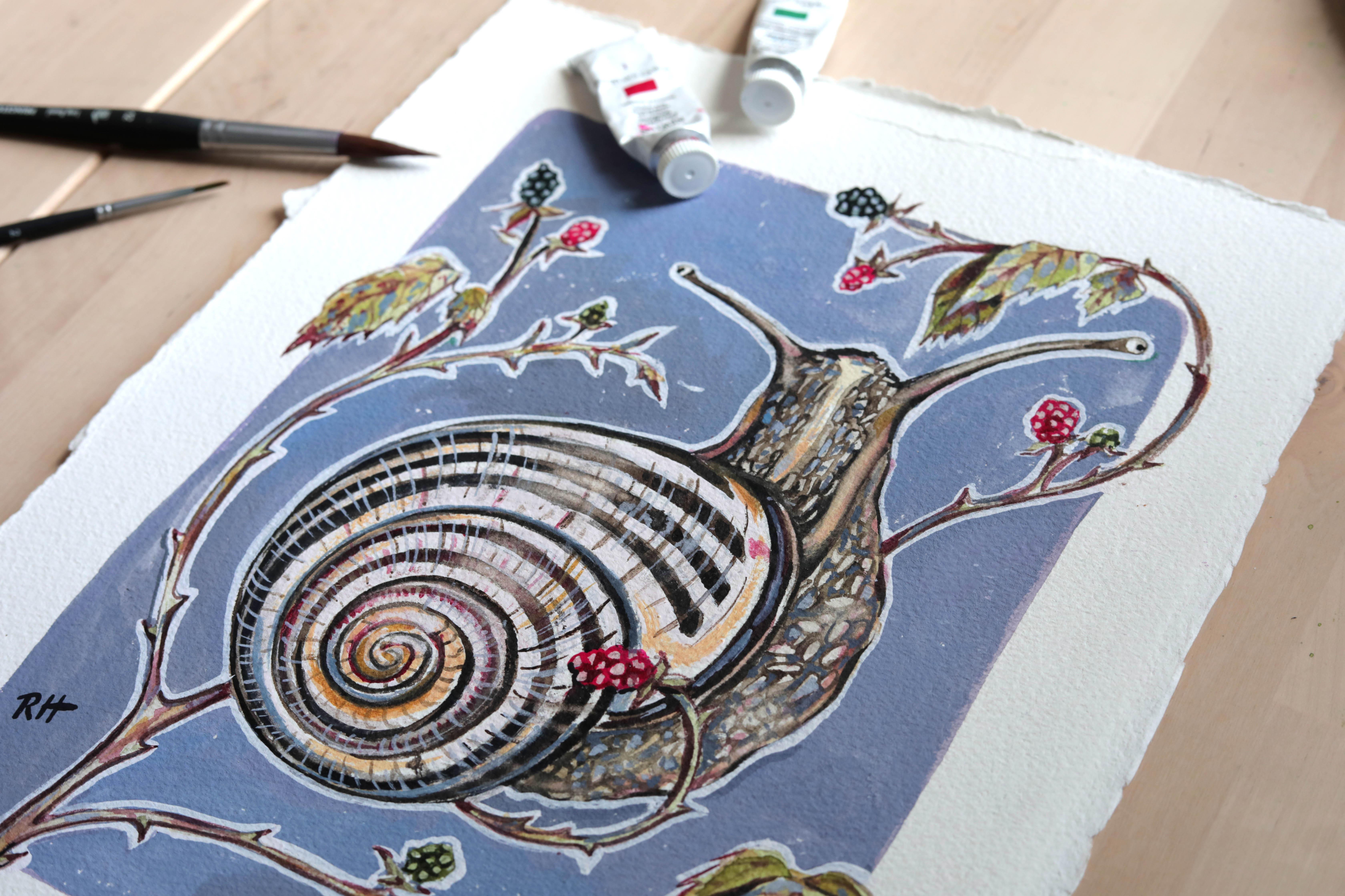
out our composition. Today I'm going to
combine this snail with some blackberries that
I saw at the lake. I'm going to use the
blackberries to create a complete composition
around the snail to really fill out my page. As we work through
the sketching phase, just remember that you can keep things really loose
and you can use your eraser and you
can start over on a new sheet of scrap
paper if you need to. Feel free to just really use this phase to play
with a couple of different compositional
ideas and work through any issues
that might arise. Now, instead of after you've
put the paint on the page. This little sketching phase is also nice because it
helps you to get to know your subject before you
start on the painting. It has these awesome antenna
with the eyes at the end. I don't know if
you all knew that, but snails have their eyes
at the ends of the antenna, which I think is so cool. I have my main snail shape. Then I use something that
I call the ribbon trick. I try to see how I can best fill up the space
around my subject. Early on when I
started painting, I did a lot of
paintings that were just the subject in the middle
with a white background. That was a really good way
for me to start to build up my skills because I
could really just focus on just the subject. But then I started to feel like my paintings
were pretty boring. I now try to always add
in something extra. I found that botanicals
are perfect for that because there are often long stems and you can
manipulate them to wind and bend around your subject to overlap and play
with your subject. Here's just a quick example
of two ways that I use botanicals for the same type of piece and the
one isn't complete, it's just the sketch because
I sketch this one out and I used my ribbon trick
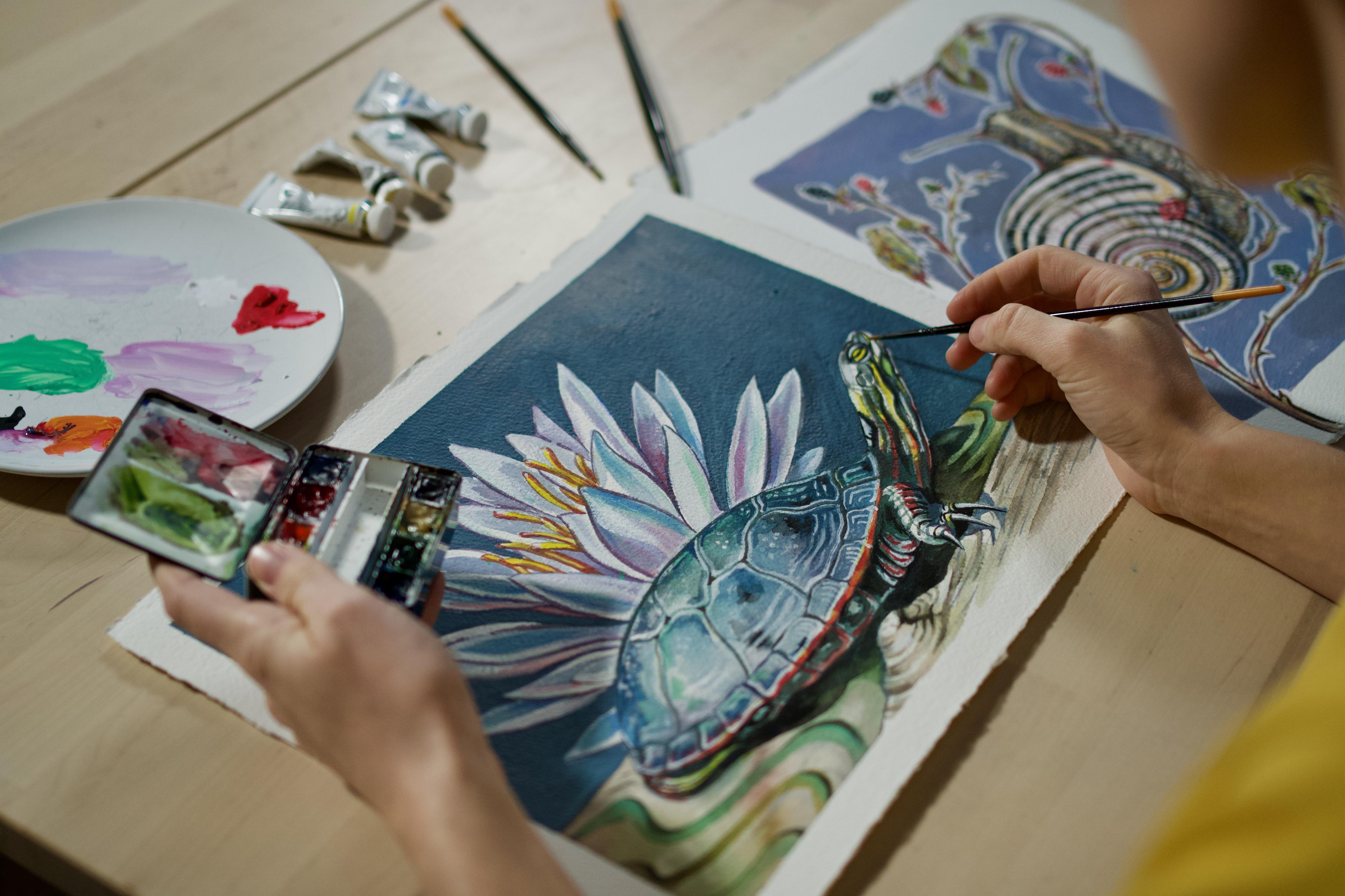
to frame my turtle. This is actually
a painted turtle that we found at the lake. You can see how I
frame my subject. I also created energy in
my composition by having some of these sprigs going
in different directions. In the end, with this piece, I decided to go with something
that was a little bit more bold because I wanted
it to be a little spunkier. I used a white water lily, which was also around there to mimic the curve of
the turtle's shell. It's not totally
realistic looking. But I like the
impact that it has because it's such
a big cool shape like a starburst shape. If you don't want to
use the botanicals framing it around, you could always put
in a halo effect. I often like to do that. I think it's a
really easy way to add or enhance a focal
point in your painting. That could be like
a sun or it could just be like another
fun pop of color, like making it a holy snail. Another fun composition
might be to have some leaves or
something coming out of one side and then mirroring that
in the opposite corner. This creates nice
balance easily. Remember, you don't
always have to make things look exactly
like they do. You can add in your own jazzed-up version
of things if you'd like. Just have fun with it and
see what you come up with. [MUSIC]
7. The Pencil Sketch: [MUSIC] Now it's time to start
on the pencil sketch. When you're working
from a reference photo, I really like to have some photo that I can
increase in size, like on a tablet or computer
or even on your phone. You can see all the details
or I like to print out my reference photo to be about the same size as I want
it to be on my page. That way you're not
trying to work from a little tiny image and figure out how to adjust the proportions as you scale up, because that can be confusing. Now I'm going to take a couple
of simple measurements of my subject using what I
call the pencil trick, even though today I'm
using a paintbrush. All I'm going to do is take my paintbrush and I'm going to lay it down as
close as I can get, lining up the bottom of my subject with the
bottom of my brush, and it's almost the complete
length of the paintbrush. Then I'm going to
bring it over here and just center it on my page. Put a little notch at the top
and a notch at the bottom. That's the height of
your subject roughly. Then I'm going to
measure the width. Then this is my whole
area within which I will paint my snail friend. I can take a few
other measurements to that can help me to have an understanding of the
length and width of things, like the head, for example, how high, how tall is
this head section? The width of the shell. Here's where my shell will go. [MUSIC] Now I'm going to go in with my eraser and erase any marks
that I don't need. I'm going look at the
blackberry reference photos and figure out how I want to incorporate them
into this piece. Here's an example of how
sometimes I use an iPad or a tablet to mock up my
illustration before I create it. I will take a photo
using my iPad and then I'll bring this
into my Procreate app, and that gives me the freedom to really play with
my options here. [MUSIC] Each of these berries is just made up of
lots of small circles. [MUSIC] Then the leaves have the serrated edge. I just took a step
back which is always really good to do when you have your sketch down and you're almost going to start
painting because it's harder to get rid of things after you've put paint down. I noticed that I feel like
there are too many thorns. It doesn't look very realistic because there
aren't actually that many. I think I just got
carried away with them because I was having
fun drawing them. I'm going to erase
a few of those. I'm almost there
with the sketch. I'm just going to add in a
couple of final details so that I don't forget to paint anything once I start
with that process. I'm going to do the lines, I have been really
looking forward to doing these lines because they
are very cool looking. They are 1,2,3,4 main
lines on the outer swirl. [MUSIC] If you're getting confused at this
point, do not worry. When we start with the painting, it'll become a little bit clear how these
swirls should go. We're just basically getting
the basics swirls down. [MUSIC]
8. Starting With Watercolor: [MUSIC] All right. Let's get out all of
our painting materials and get started with
the painting process. Before we start putting
down the paint, it's nice to look at
the subject and think what qualities of
gouache or watercolor would really lend itself to
certain parts of the subject. I'm noticing right
away that the head and foot of the snail are
very see-through, and I think watercolor would be perfect for this
section of the body, and probably the antenna too, because these little
eyeballs they're clear. For the shell, it
has this milky, creamy, chalky look to
the white of the shell. So I think that would be
perfect for white gouache. With the berries, they could be a blend of the
watercolor and gouache, I'll probably use
the bright red of the gouache to get
the most red berries. I'm going to do just a
little layer of light brown. I'm also noticing that the foot gets to be a really light brown, so I'm going to add more water to make it nice and light, and translucent. Well,
I have my brown. Now, I'm going to
continue on and start painting in the
stripes of the shell. I'm doing this in
watercolor for now. One of the reasons that I
really like watercolor and gouache together
is that watercolor because it's all more muted, it helps you to
practice restraints. You're not just throwing in really bold thick
colors everywhere, but by starting out with a
few layers of watercolor, you're starting out soft, there's that nice play between
the softness and the bold. If you don't have
a steady hand and your swirls are getting really crazy-looking, don't worry, because we're going
to go over the space in-between these swirls
with the white gouache, and so you'll be able to remedy any wild stripes that you make. I'm going to erase
any pencil marks that are visible from
this little area. [NOISE] I'm just going to
take my smallest brush, and I'm going to use that same brown that
I was just using, which is just a sepia brown. I'm going to add a little
light outline to this area, and picking up my brush
every few strokes to make a dotted line
so that it's not too bold of an outline. Once I get it all
blocked in and outlined, then I go back and add more
layers and more details. But right now I want to just get all my first watercolor
layers down. As I looked at my reference
photos for the blackberries, I noticed that some of the
stems and branches are light green and some are a little older looking, they're
reddish-brown. So I'm going to just make a couple of them, reddish-brown. I'm going to try
to add a balance, so I'll probably have some brown here and some brown down
here to balance it out. Then I'll make these ones
green and green [MUSIC]. I think I'm going to lighten up the pencil
marks on these leaves. All I need is to be able
to see that as a guide, but I don't want it to
show up in my painting. Using sap green, I'm going to just
fill in the leaves, keeping this layer nice and light because we'll add
darker layers after this. In order to make them
look more natural, I'm going to mix
in a little bit of my yellow ocher
with the sap green. Now I'm going to
mix up some red. Mixing up my nice cool red and I'm still using watercolor, I haven't used any gouache
yet because I'm trying to have that nice subtlety
of watercolor right now. All of my berries that are red, I'm going to just
add a layer to them. When you're using red
or any intense color, you really want to
practice balance. If you use red on one side to make one of
these berries over here red, you definitely need to have
that on the other side too. Now I'm going to add
in the blackberries, so I'm mixing up a combination, dark blue and dark brown. You could also do this with
gouache if you'd like. We'll add the highlights
later on with gouache so you don't have to worry
about those right now. Then there are those really
light unripe berries. Now I'm going to
paint the thorns in with a brownish-green color. I'm going to wait for
that part to dry. But now I think it's time to start with gouache on the shell. [MUSIC]
9. Incorporating Gouache: [MUSIC] Now that we've built up a few of those
watercolor layers, let's begin to
incorporate Gouache to create those pops of
really bold color. This is where we'll start
to really mesh and meld watercolor and gouache together
and see what comes of it. I'm starting with white first
because I think this is probably the most area that we're going to
cover with gouache. It's not a pure white, there's
a hint of yellow in it. I also think there's a
little bit more warmth. I'm going to add a tiny hint of red, and that's too much, that's pink so I'm
going to add some yellow to cancel it out, make it a little more orangey. I'm just going to fill in all of these white areas on the shell. Now, this section is dry
and I'm just going to erase all my pencil marks
to clean it up. Now, I'm going to return to watercolor for a
little bit to start adding in the textures
of the body and head. I'm going to get more sepia brown on my brush
and watercolor. Again, I'm using
watercolor here because it helps add to the
translucent nature of this part of the snail. I'm noticing that the texture
of the head and foot is really just a lot of little
blobs that are lighter, and then there's a darker
brown around them. I'm going to go
in and not really think too much about it, not trying to make it exact, but I'm just going to fill up this whole part of the body with all
these little circles. In fact, it's better if
they are very irregular because that's how they look in the texture that I'm seeing. Next, I'm going to add
brown to the antenna. The middle of the antenna
is a little bit lighter. I'm just going to
leave that area, the color that we had below, and that will make it look
rounded because it's darker on the left-hand side and the right-hand side
and lighter in the middle. That's my top secret for making anything like a stem
or a tree trunk, that's rounded, look
three-dimensional. Now I'm going to use this
brown and I'm going to fill in the spaces between these
little dots that we just made. Now, I'm going to mix up
yellow ocher with gouache. I'm using yellow and red
because yellow ocher is warm. I'm going to bring it into
my white to mute it down. This is going to
be for the yellow that is on the snail's shell. I think I want to
add a tad of blue. A lot of this is just,
it comes with time. Color mixing is something
that you really have to just practice a lot and
eventually it'll become way more intuitive. I'm going to add a
little bit of that to this yellow area. I'm going to really
water it down. I'm just going to be
using a primary red to add the really
bright red color to my red blackberries. One of the differences between
watercolor and gouache is that with gouache
when you use black, you can get really
deep, bold, rich color. When you use black
watercolor paints, it's often a little bit faded
and not super striking. I don't even use black
watercolor paint because I feel like you get a much better dark
color by combining dark blue and dark brown together because it's just more
rich and vibrant. If you're combining a
couple of different things, they're not actually
in the same scene and so you're not
really sure where the light should
be coming from to make it have nice shadows, you can just reliably add the darker areas to the
bottom of the subject. The bottom of these stems
would be in the shadow, the bottom of the shell
would be in shadow, bottom of the foot
would be in shadow, bottom of the antenna
would be in shadow. Also, while I have the blackout, I'm going to very cautiously add some little touches of it
to this part of this now. I don't want to overpower
the watercolor, but I do want to enhance a
few of the shadow areas. Cute little eyeballs,
love those. Now I want to add all
of the dense lines that I see working their
way around the swirl. This will immediately
make your snail look more realistic and also it'll make it look rounded
because we're going to follow the form of this curved shell. Now I'm going to revisit the watercolor layers of the branches that
we've already put down and I'm going to make them
look crowded by adding a shadow to the left and to
the right side of each one. To simplify things, I
just decided to use the same cool red and
brown combination and outline everything. The reason that I'm
using watercolor for this and not gouache is because I want these
outlines to be pretty subtle, I don't want them
to be too bold. [NOISE] There is a
common misconception going around that
painting should always be really relaxing and
therapeutic and meditative. However, I'm here to
tell you today that often I feel a little bit stressed when I paint because
I want the outcome to be so good and that's very normal. Anytime I teach workshops, a lot of people
get stressed out, so definitely, it
takes lots of breaks. Step away from your
painting for a little bit. It's fine to start it one day and come back the next
day or the next week, give yourself time and know that you're trying to come up
with a really good result. It's normal to have those
moments of frustration. [MUSIC]
10. Adding the Background: [MUSIC] At this point in my painting, I need to decide if I want
to add a background or not. One way that I like to try to decide what I want to
do is to take a picture with my iPad and then use
the Procreate app to add in a background digitally and see what I think of
that color scheme. I can play with a few
different colors. I'm going to try
out a muted blue, purple color because it's nice and soft and will
go to the background, it won't call too much attention to itself because I really want these nice subtle reds to pop out and I want the snail
to be the main center. I want a color that's cool and will sit
to the background. Obviously, if you do not
have access to a tablet, you can totally achieve
good results too. Remember that with gouache, you can put down a color, paint a whole background. If you don't like it, you
can always paint over it. So you still have
that flexibility. This is just a little
bit of a time-saver. Actually going to
mix up a lot of this because I have to fill
up the whole background. This background shade
is a mix of my red, my blue, a little tiny
bit of black and white. When I put it on the page, it might look a little
bit different, so I'm going to be ready
to change it if I need to. I'm going to put in my
gouache background now and then I'll go back and do the
final details on the plants. This order doesn't
really matter. I'm just excited to
put in the background because I really like this
color that I'm going to use. You can determine your own order for some of these things. As you're adding
your background, you might decide
that you want to do gouache or watercolor. Gouache is just
going to give you a really flat
background that can be a nice contrast to some
of the delicateness that we achieved in the botanicals. If you want to go
with watercolor, it'll just be looser. It'll be more watery and flowy. That would also look great. [MUSIC]
11. Refining Your Painting: [MUSIC] Now I'm revisiting these branches with the
combination of cool red and brown and I'm just
increasing the shadow areas. I'm adding a little bit
of paint to the tips of every thorn to make
them stand out. I'm also adding some of this reddish-brown to
the veins of the leaves. I want to make the shell look a little bit more
three-dimensional. I'm going to take my watercolor, mix up a really
light cool color, probably brown and blue. Then to the sides of my shell, I'm going to just
add really lightly. I do not want to disrupt these layers that have
dried underneath. I'm going to add really
lightly this layer. You got to be really
careful with this because I just reactivated some of this black swash
stripe underneath and it made it a little
bit darker than I wanted. If that happens,
you can always dab up some of that
with a paper towel. I want some of the red
of these berries to be incorporated into
the snail so that the red is carried
throughout the whole piece. Using watercolor or gouache, it doesn't really
matter for this. Actually going to do some
little strokes to match, following the form of
those other lines, all the way around,
to add some texture. All these slight imperfections are really nice to try to get. To make it look a
little more realistic. I'm going to add some
yellow to the botanicals in a few places because a lot
of the leaves are yellowy, definitely a little
bit past their prime. All these little
loose final touches help to make it just a
little bit more nuanced, a little bit more colorful, look a little more natural. Now I'm adding some
green in because I think I overdid it
with the yellow. Now all of my plants look dead, so I'm going to try
to liven them up again with some of my bright lemon yellow
and my sap green. We're so close to being done. I just wanted to let you know that you don't need to go in and add all of the details
that I'm adding. I didn't do this
painting ahead of time because I really
wanted to work through the process with you
and show you a peek behind the curtain and all of the problem-solving that goes
into making a painting. It's not so easy as making
a plan and going for it, but you're constantly changing
things along the way. A big part of the final
result is the mistakes that you make and
figuring out how to creatively correct them. Every time you create a painting with this process
or another process, you start to notice
patterns in what it takes to make something
look good and look successful. So you know for
future reference, this didn't work out so well, next time I know that and
I won't try that again. It's really just
doing it enough that you learn those formulas. For example, I did this painting last week and one
thing that I noticed that helped it to
come together was to incorporate some of
this background color, this deep blue, into the turtle and the
water and the lily, and that tied it all together. As I'm working on this one, I was just thinking it's
not quite there yet. What's wrong with it, stuck, and then I remembered
last week that worked, so I'll try that again. I think I'm going
to try to mix up that same color that I used for the background and incorporate
it more into the snail, maybe some little flecks
of it in the leaves. Now I'm going to be adding little white highlights to showcase the grooves
in the shell. Here I'm just lightening up several different
areas where I wanted to add a little bit of the
white paper highlight back in. This trick also works if
you make a mess like I did, I have gouache all
over my hands and I keep stamping it on my painting. Just fill it up with clean water [MUSIC] and dab it straight up. It's done. Well,
it's done for now. Well, clearly, I could keep going on it, but I think that we're to a
good place where I like it. This was a very
complex painting. There were a lot of moving
parts and combining the two mediums means
that there's a lot of decisions to be made and
a lot to think about. But if you made it this far, I'm very proud of you
because like I said, this is a complex
full composition, so good work. [MUSIC]
12. BONUS: Black Paper Demonstration: [MUSIC] Now it's time for the
super juicy bonus lesson that I'm sure you've
all been waiting for. I'm going to be using gouache paint on a
colored background. I'm going to be using
black watercolor paper, but you can also use
tan or gray there, all sorts of different
colored watercolor paper. It really can take your
painting from something that looks traditional to something that looks super funky and cool. I decided to paint a moth on
the black watercolor paper because moths are
typically found at night and I just think
that it captures their spirit as they're
lurking in the shadows. [MUSIC] With black
watercolor paper, the pencil shows up really well and doesn't always
erase super well on the paper depending on
the black watercolor paper. Sometimes it picks up little pieces of the
paper when you erase. You have to be careful not to do too many pencil
marks because they might be difficult
to erase them. [MUSIC] If I were doing this painting
on white watercolor paper, I think it would take a little
bit more effort to make the painting look
really interesting because the background
is just boring, but it's funny how with a black background
it immediately makes your subject look like very
bold and royal almost. It's just a shortcut to creating a painting
that has a lot of impact but beware of this combination is addictive
so if you try it once, you're probably going
to make a million of these because they're
really fun and it doesn't take that long to
create a really cool piece. [MUSIC]
13. Final Thoughts!: Thanks so much for joining me on this
journey into gouache. I hope that you feel
a little bit more confident in your gouache skills and that you're
inspired to play with new styles and new mediums. Remember that in the beginning of experimenting
with a new medium, it's very probable that you'll create a lot of paintings
that you don't really like. But that just means that you're growing and that's
a great thing. If you struggled with the reference photos that
you used for this class, I'd encourage you to try a
different reference photo because that might be
what's tripping you up. Maybe it's not so much that you couldn't get the
grasp of gouache, but maybe you just need to try a different reference photo that's a little bit
easier to depict. Or maybe it's not the
reference photo and you just need to experiment
some more and put in some time in creating multiple paintings with this watercolor and
gouache technique, or just with gouache to become more and more familiar
because it does take time. As you're going on this
creative growth journey, I'm also here with you
growing as well and I would love to see the work that you created as a
result of this class. Don't forget to upload a picture of it to
the project gallery. I'll be uploading my
finished project as well and sharing a lot of
the in-process photos. Make sure to share that with me and with your classmates
via the gallery. If you're on Instagram
and you want to tag me in a project that you've
uploaded, feel free to do so, I'd love to see your
progress even beyond this course if you continue to paint with gouache
and watercolor, I'd love to see
your future work. Who knows you might inspire
someone else to branch out and try new medium as a
result of you being brave.
 Rosalie Haizlett, Nature Illustrator | Top Teacher