Transcripts
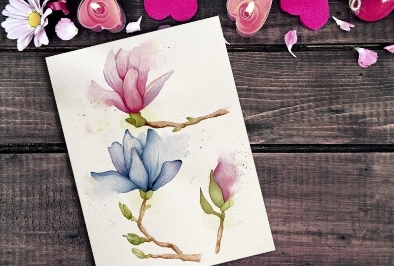
1. Intro: Hi everyone, and welcome to my Skillshare channel. In this class, I'll take you step-by-step through my entire process of painting a magnolia flower. My name is Anna Cutino, and I specialize in watercolor painting. I'm mostly inspired by nature and it's vivid colors. It's the beauty of the world around me that makes me pick up my brush every day. Before we start painting our project, will practice creating the subtle veins typical of magnolia petals. and I'll show you how to use a spray bottle to create a loose background, soften some of the edges, and add sense of movement to the painting. You'll have access to my line drawing of the Magnolia to the reference photo and to my final painting. I've also included a supplies list you can download in the resources section. So let's get started.
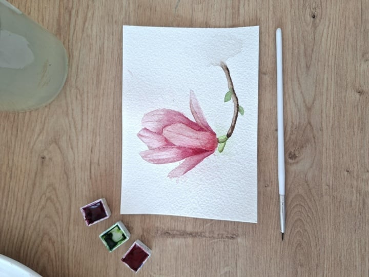
2. Supplies: Let's go through all the supplies you'll need for this class. I've included the supplies list you can download in the resources section for easy reference. The first and most important thing you need is a good watercolor paper. I highly recommend using 100% cotton watercolor paper. I'll be using Arches watercolor paper. It's cold pressed and 300 GSM. The original size of my paper was A4, but I cut it into a square of 21 by 21 centimeters. You'll need some watercolor brushes. I'll be using round brushes in size 8 and 4, then a small spotter brush and a small detailer brush. As for watercolor paints, I'll be using magenta, In this case, it's quinacridone rose by White Nights. The rest of the colors are Winsor and Newton paints, namely quinacridone red, cobalt violet, And then I will mix a yellow-green color using sap green and Winsor yellow. And I will mix brown from quinacridone red and sap green. However, don't let my list limit you - use it as a general recommendation. My main pigment will be magenta and then I'll be using quinacridone red in those areas where I can see a slightly warmer color, and cobalt violet where I can see a cooler hue. I included the outline for you in the resources section. You can download it, print it out, and either trace it using a light box or by holding it up to a window. To draw the Magnolia, you'll need a pencil. I'll be using a HB pencil. And it's also useful to have an eraser to get rid of any unwanted pencil lines are to remove excess graphite. Most of the time, I use a kneaded eraser. For erasing large areas of drawing I also use a common plastic eraser. So that's another option. You will need two water containers, one for clean water and one for cleaning your brushes. You'll need some paper tissues and an old towel or cotton kitchen towel. For this class, you will also need a spray bottle filled with clean water. To reduce buckling of the paper. I'll tape it to a piece of cardboard. So I'll use a masking tape and this piece of cardboard, which is actually the back of a watercolor paper block that I always keep after I've used up all the sheets of paper. Last but not least, you'll need a paint palette or an old plate.
3. Process Overview: Before we start with our exercises, I like to mention a few things regarding the process so that you know what to expect. First of all, we're going to paint in layers. There will be two layers for the brand and three layers for the flower. In the first layer, we established the lightest tones. In the second layer, we deepen the values and paint the veins. And in the third layer, we further deepen the colors in the darkest areas and add some more detail. And definition. Layering gives us a controlled method for adding tonal values gradually and also for correcting tone if a part of our painting, is too light. To make it easier for you to see which petal I'm currently applying water to, I've included a black and white drawing to the bottom right corner of the screen where you can see the petal marked with blue color. Another thing I wanted to mention is that I did some modifications to the branch. So when you refer to the original photo during painting, be aware that the branch is slightly different than in the original photo. As for technique I used wet-on-wet technique all of the time in this project. Meaning I will wet the area I'm going to paint first and then add the colors to the wet area before it dries. To add some organic structure to the branch, I'll use a technique called watercolor bloom. It refers to these irregular shapes created by adding very wet paint or clean water into an area that's drier than our brush, but not completely dry. This can happen by mistake. However, in this case, we are going to create them deliberately. I'll show you what the effect looks like when created in different stages of wetness of the paper. First, I lay down a wash of paint. In this side view, you can see the three different stages of wetness. When I did my brush in water and I touch it to the paper where I want to create the bloom. As you can see, the drier paper, the more defined the edges of the bloom. In the first example, the paper was wet and the bloom is hardly visible. In the second example, the paper was damp And this is for this project, we ideal outcome. This is the ideal brand structure. In the third example, the paper was almost dry and the blooms are small with very sharp edges. To create lighter areas on an already applied wash, I use a technique called lifting. While the surface of the paper is still actively wet, I take a clean, damp brush and pressing it firmly to the surface. I pull the brush in one clean brushstroke, cleaning and dabbing the brush again on a paper tissue. I repeat the process going through the same line to lift more paint. When needed we can also lift paint using a green paper tissue. That's very useful when we make a mistake. We can, for example, lift and unwanted droplet of paint. Notice how in the next example, I pulled the brush outside of the rectangle and it leaves a stain behind. This is due to the brush also picking up paint as it's drawn through. So when I went to maintain the edge of the rectangle, I pull the brush upwards at the end of the brushtstroke.
4. Practice Part 1 Painting the Veins: In this exercise, we're going to practice painting the subtle veins typical of magnolia petals. For these practice lessons I included outlines of some single petals. at the bottom of the downloadable line drawing template. I traced one of the petals a few times on a scrap piece of paper. I'm going to use the wet-on-wet technique. So I first apply a thin layer of water to the entire surface of the petal. Then I add a very diluted, watery quinacridone red to the upper half of the petal. Next, I apply a pigmented mix of magenta to the base of the petal. I wait for a little while until the water settles a bit and the surface has a soft sheen. For illustration, this is about the level of wetness that works best for me to create these soft veins. Then I take my smallest detail brush and I'll start painting the veins from the base of the petal, pulling up the magenta paint that's already on the paper. And then I pick up some agenda for my palette and I emphasize the central vein. So this is the optimal outcome. The veins are soft and we can later emphasize them in the next layer. Now, I'm going to demonstrate what happens when I don't let the water settle and I paint on a surface that's too wet. So I repeat the process. Quinacridone red to the top, magenta to the base. The surface is really glossy. When I start painting the veins, you can see that they spread. In the third example, deliberately wait too long. It's too dry. You can see the veins are too sharp. In the fourth example, I paint the veins on a completely dry paper to show you what it looks like. As you can see, the lines are completely sharp and they look very unrealistic. So to sum up, I find the veins in the first petal are just perfect. There are soft and subtle and the central vein is a bit more pronounced as I can see in the reference photos. In the second example, there was way too much water and the veins spread too much and almost disappeared. In the third example, the paper was almost dry and the veins are too sharp and defined, but they spread at least a tiny bit, as we can see in comparison to the fourth example, where the veins where painted on a completely dry paper. So give this exercise a go and try painting the veins. Always check the level of sheen on your paper to find out what timing works best for you. Because settling time depends on the type of paper you use and the temperature in the room, it can differ from day to day.
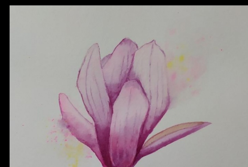
5. Practice Part 2 Using a Spray Bottle: In this lesson, I'm going to demonstrate how I use a spray bottle combined with some splatters of color to create a loose background, creates soft edges and add a sense of movement to my painting. Like in the first exercise, I traced one of the petals included in the bottom of the line drawing template. First, I glazed the entire surface of the petal with clean water. You can see how glossy the paper is in the side view. Then I paint it with magenta. I want to create soft edges and loose background on both sides of the petal. But I want to keep hard edges at the base and top of the petal. I pick up my spray bottle. I position the nozzle so it faces the direction I want the water to go to. And I press two or three times on each side of the petal. Your bottle will probably give different amount of water than mine. So this is very individual and you'll have to check your own painting to know when to stop spraying. Here you can see the entire wet area. Notice there are recognizable droplets of water. The spray doesn't create a coherent layer of water. And that's exactly the effect I'm aiming for in this case. Then I load my number eight brush with magenta and I tap it so that I get droplets of water onto the paper. Notice in the side view how some of the droplets spread in the places with more water and how they stay clearly defined where the paper is dry. I love this effect. I like using the spray bottle at the very beginning of the painting before I start working in a more detailed style. If at this point I'm not satisfied with the background I've just created, I can still start over with my painting. And that's exactly what happened to me in this case. This was my first attempt at painting this magnolia. And at that time, I felt the background was way too bold and it could overpower the flower. So I put this aside and I started over this time creating much softer background and later adding another layer of it while covering the rest of the painting with a clean paper tissue. I would advise giving this technique a go on a scrap piece of paper to practice and to find out how it works out with your spray bottle before you start painting your project.
6. Painting the Background: First of all, I want to create a soft background on both sides of the flower. I start by applying clean water to this petal on the left side. Then I take my painting from the side and against light to see whether I've covered the entire surface of the petal evenly. Now I paint the petal in a very diluted, watery mix of quinacridone red using my number 4 brush, painting carefully around the edges. Now, I pick up my spray bottle and I position the nozzle so it faces the direction I want the mist to go to. And I press once. Then I check how wet the paper is and I spray some more. And then once more. However, your bottle will probably give different amount of water than mine. So this is very individual and you have to check your own paper to know when to stop spraying. Now I take my brush number 8. I load it with a very diluted quinacridone red. And then I pat my brush a few times so that I get droplets of color onto the paper. Then I add a few drops of the watery yellow-green mixture I've mixed from Winsor yellow and sap green. It should be a very pale mixture and I want only very few droplets. The reason is that red and green when mixed together, they create brown color and we don't want to create a brown background in this case. Also, I wanted to add the green droplets only outside of the petal. And I accidentally got two drops onto the petal directly. This wasn't intentional, but I like it actually. Now, I pick up my spotter brush and while the paint's still wet, I tidy up the edges in those areas where I want them crisp and tidy. Okay, Let's move to the large petal on the right side. First, I apply clean water with my number eight brush. I check the paper from the side and against light to see how glossy the wet paper is. Then I add some watery mix of quinacridone red to the base of the petal. I start pulling it up and then I let it spread to the top of the petal. Now it's time to pick up my spray bottle again. I position the nozzle so that it faces the direction. I want the mist to go to, which is diagonally with the background on the left side. And then I press the nozzle once. I check the amount of water with a side view and I think I want it a bit more wet, so I spray once more. Now I take my brush number 8, I load it with a very diluted quinacridone red and I pat it so that I get droplets of color onto the paper. And as before, I add a few pale yellow green droplets. But I'm trying not to overdo it. To finish off the background, I'm going to add pale green behind the green part of the branch, right under the petals. So first, I moisten the area, making sure I don't moisten the petals as well. With this side view, you can see how big the area I moistened is. And I add the watery yellow-green mix of Winsor yellow and sap green onto the part of the branch right under the petals and onto the adjacent leaf bud. Now I let the paint spread freely into the wet area. In this case, I let my painting dry without using the hair dryer. The reason is the stream of air from the hair dryer might spoil the droplets on the background in case there were still a bit wet.
7. Petals First Layer: In this lesson, I'm going to finish the first layer on the remaining five petals. You can see me applying clean water to this large petal on the left side using my number eight brush. Now I have a look from the side to see whether I've covered the petal evenly in a thin layer of water. Then I drop in pale, watery mix of quinacridone red. I start at the tip of the petal and I pull the paint down, taking it carefully to the edges . This is the part of the petal we see as white in the reference photo. I stopped about two-thirds down the petal and then I switch to a diluted magenta. I start applying it from the base of the petal and pulling it up. While still checking the reference photo to see where exactly to apply it. The two colors merge slightly and create a variegated wash. Then I switch to my spotter brush and clean up where necessary. Next, I apply water to this small petal using my number 4 brush. Then I add some watery quinacridone red to the what is actually the inner side of the petal. And then I add some cobalt violet to the part that represents the outer side of the petal. The two colors will merge slightly, and that's exactly what I aim for at this early stage of the painting. All right, Let's paint the next petal. First of all I make sure both adjacent petals are completely dry. And then I start with my number four brush. Then I add very pale and diluted quinacridone red to the entire area of the petal. Now I add a very small amount of watery magenta at the bottom part of the petal. Still checking the reference picture. Before I can continue on to the next petal, I have to let this dry. In this case, I'll actually use the hairdryer. I use the back of my hand to check whether it's really dry. If it felt a bit cold, that would mean it isn't completely dry. It's okay. So I can moisten this tiny part of petal I can see. And then I paint it with watery quinacridone red. My next step is to moisten the remaining petal in the middle of the flower. I check whether it's evenly covered with a thin layer of water. Then I paint the entire surface of the petal in a watery Quinacridone Red, watery magenta at the base of the petal. I tidy up the edge when needed using my spotter brush. Next Step is to add some slightly more pigmented mix of quinacridone red to the very bottom of the petal. As I can see, a warmer color in this area in the reference photo. And then some slightly more pigmented magenta right above the quinacridone red, following the tonal variations I can see in the reference picture. And now I let it dry completely.
8. Branch First Layer: In this session you'll see me painting the first layer of the branch. First of all, I moisten the green part of the branch and the adjacent leaf bud, then I applied the yellow-green, I've mixed from sap green and Winsor yellow. I think I made it a bit too dark, so I pick up some of the paint using a damp but not wet brush. Now, I use my hairdryer to dry this area. I check whether it's really dry before I go on painting. It's okay so I can start applying clean water to the rest of the branch and to the two remaining leaf buds. Then I add a drop of yellow-green mix onto the 2 leaf buds. ... ... now I pick up the watery mix of the brown. I mixed from quinacridone red and sap green and I apply it onto the wet branch. The brown of the branch and the green of the buds well partially merge. And that's exactly the effect I am aiming for. I add a little bit more yellow-green to the buds. Then I switch to my spotter brush and I start adding more pigmented mix of the brown to the bottom of the branch. But I skip the part where the bud is. And I also skip the end of the branch, which I want to be kind of out of focus and I want it to kind of disappear. This dark area at the bottom creates an illusion of volume, which is exactly what I'm aiming for. When it starts drying, but is still a little bit damp. I add a few drops of water here and there using my spotter brush to create watercolor bloom and to add some organic structure to the tree bark. And now I allow it to dry completely.
9. Petals Second Layer: Making sure that the paper is completely dry. I carefully erase the visible pencil line, and then I start working on the second layer. You can see me in glazing the large petal on the left side with clean water. Then I load my number eight brush with darker, more concentrated mix of magenta, and I apply it to the base of the petal. The paint spreads slightly throughout the bottom third of the petal. And then I tidy up the edges where necessary using my spotter brush. Now I switch to my smallest detailer brush, and while the surface is still shiny, I pick up the darker, more concentrated magenta and start painting veins from the base of the petal up. It's absolutely key that the paper is still damp. If it were dry, the veins would look to sharp and unnatural. As it is still wet, I can add a little bit more of the magenta to the very bottom, and then I tidy up the edge. Then I repeat the glazing process for the next petal. Even though I erased most of the pencil line, there is still a very pale rest of it, and that helps me see the border of the petal. I load my number eight brush with darker and more concentrated mix of cobalt violet. Then I used in the first layer, and I start adding into the lower half of the petal. Then I pick up a little bit of magenta and I apply it to the very base of the petal. Switching to my spotter brush, I tidy up the edge in the area where I've just applied the darker colors. I've decided to add a little bit more of the magenta in the lower third of the petal. As I want to maintain soft edge in this area where the petal blends with the background, I carefully moisten the background too with clean water and join it to the still wet petal. By doing this, I make sure the colors I've just applied there can spread slightly beyond the borders of the petal. You can see the whole wet area in this side view. Now I pick up cobalt violet using the detailer brush and paint two subtle veins that I can see in the reference photo. And I can start working on the next petal. This time I moisten just the lower section of the petal as this part doesn't touch the petal I've just been working on. So I can do this without risking any unwanted bleeding of the color between the two petals. Then I apply cobalt violet to the wet surface using my number eight brush and tidy up the edges with the spotter brush. Now I use my hairdryer to dry this small area to avoid smudging it with my hand. As I continue working on the next petal, I lay down a thin layer of water onto the small petal on the left and onto the background. In the side view you can see the wet area Then I apply in magenta to the left edge of the petal. Let it spread slightly onto the background and creating a soft edge in this small area. Using the clean, slightly damp brush, I pick up some of the paint, That's spread to the right side of the petal, which I want to remain a bit lighter. Then I switch to spotter, and I add a small amount of magenta to the base of the petal. And to the left-hand edge. In the lower third Then I blend it gently using a clean slightly damp brush. Moving to the next petal, I start Again in the same way with an even glaze of clean water. Then I pick up some of the cobalt violet and in the lower part of the petal, in the places where I can see a little bit of color in the reference photo. Next, I use the spotter brush to add a tiny drop of magenta into the two corners where the petal meets the other two petals and the subtle veins I can see in the reference photo. The final step in this petal is to add a tiny amount of very diluted magenta to the very top of the petal. But this should be really very subtle. Then I start working on the inner part of this petal on the right-hand side. First, a glaze of clean water. Then I add a diluted quinacridone red, muted down with a tiny amount of brown. And then I tidy it up using spotter brush where needed. To finish off the second layer, I'm going to paint this large petal in the front of the Magnolia. I lay down a thin layer of water to the entire surface of this petal. Then I add quinacridone red to the base of the petal, and I pull it upwards while continuously checking the reference photo to know where exactly to put the color. Then I introduce magenta and I lay it down so it forms a kind of a V-shape as I can see in the reference picture, the surface of the paper is still wet, but the water has settled a bit and my brush with paint is only slightly damp. That allows me to put the paint where needed without it spreading too much. All the time, the surface has at least a little bit of sheen, I can also lift some of it to create a highlight. That's what you can see me doing now as I'm using a slightly damp brush to lift some of the color along the right edge of the petal as seen in the reference photo. Then I add some more quinacridone red to the bottom half of the petal. And then I lift off highlights on both sides of the petal. Always cleaning and dabbing the brush on the paper tissue, I repeat the process, going through the line to lift more of the spreading paint. Then I check if the paper's still a bit damp. And as it is, I start painting the central vein using a bit of magenta. There's this most prominent central vein, and then there are a few very subtle veins that I create by pulling up the paint that's already on the paper. I don't add any additional paint to form these very subtle veins. My final step is to lift a bit more of the highlights on both sides of the petal. Always cleaning the brush. And now I let it dry completely.
10. Branch Second Layer: In this lesson, I'm going to deepen the colors on the branch. I start by applying clean water to the long brown section and do the 2D, but then I use my brush to apply a dark mix of brown to the bottom edge of the brand, leaving out the area of the bottom. Then I switched to the yellow green mix and I drop it onto the 2D, but the green paint will spread a bit onto the branch to I add a bit more brown to the area where the wooden branch connects to the green section. The closer I get to the flower, the more detail I add to the branch. And the other way around, I make the part of the branch that's the most distant from the flower, lighter, more loose and generally with less detail. Now you can see me, Lytton, some of the brown and the end of the branch using a clean paper tissue because I want this part to be even lighter. Then I let this dry completely. When the wooden part is completely dry, I moisten the green path, but the adjacently but dry. Then I start applying more pigment yellow green to the left edge of this small section using my spotter brush. I also pull the paint a bit to the right. Then I pick up some concentrated sap green on its own, and I apply it to the left edge onto the stem with yellow green paint and I let it spread. Then I make a kind of olive green using sap green and a bit of brown. And then I add it to the left edge and try it on the petals. So the left edge is darker than the right side, and let's create an illusion of volume. Now I let the branch dry completely.
11. Petals Third Layer Part 1: All right, We are getting very close to the finish line. In this lesson. We are going to take the painting one step further with the third layer. Our goal is to add more saturated pigment in some places to further deepen the colors and increase contrast and detail in the painting. Now you can see mean glazing the large petal on the left side of the flower using clean water. Then I load my number 4 brush with a highly pigmented mixture of magenta, and I apply it to the base of the petal. I carefully pull it up, but I keep the paint only in the bottom third of the petal. Then I switch to my spotter brush and I pick up a very dark magenta straight from the tube, or in my case from the pan with only a tiny amount of water. I apply it to the bottom quarter of the petal. I want this part to be the darkest area of the flower. while the petal is still damp. I pick up a small amount of more diluted magenta and I paint the shadow here. It's actually part of the petal that's behind this one and we can see it through. Now, I pull the magenta a bit up in a few brush strokes following the direction of the veins. Then I use the spotter brush to add a bit more magenta to the left-hand edge of the petal, making the line gradually thinner until it disappears in about two-thirds of the petal. To emphasize the veins I painted in the second layer by pulling up some of the still wet magenta. Okay, let's move to the next petal. I apply a thin layer of water to the large petal on the right-hand side of the flower. I also moisten the variegated background and I connect the two wet areas in the section where I created the soft edge in the previous layer. You can see the entire wet area in this side view. Then I start applying magenta to the base of the petal. I switched the cobalt violet, and I stop at about the bottom third of the petal. Then I take my spotter brush and I apply more pigment in magenta, the base of the petal. By doing that, I create a slight shadow that allows the lighter petal to stand out. I pulled the magenta slightly up along this front petal. Then I start emphasizing the veins I painted in the previous layer. While this is still wet, I add more cobalt violet using my number four brush. I dab the brush in the area where I want to create a soft edge and encouraged the paint to spread slightly beyond the outline of the petal into the background. Then I go back to the veins and emphasize them again using a tiny bit of magenta. Now, I moisten the outer section of this small petal on the right side of the flower. I add a bit of cobalt violet starting at the base of the petal. Not the entire section in this layer, only the half, that's closer to the base of the petal. Then I move to the small petal on the left side of the flower and its entire surface with clean water. Next I cover the rest of the Magnolia with a clean paper tissue and I use my spray bottle to moisten the background as well. You can see the entire wet area. Then I use a slightly more concentrated magenta and I apply it to the bottom edge, only up to the soft edge and let itspread gently into the background. Now I load my number eight brush with quinacridone red. I cover the rest of the flower and I tap my brush to get some more droplets onto the background. Then I remove the paper tissue and I use the number eight brush to gently blend the magenta into the rest of the petal.
12. Petals Third Layer Part 2: Okay, We're almost there. I moisten this petal up here. Then using my spotter brush, I apply a small amount of magenta to the bottom part of the petal, where I can see a slightly darker color in their reference picture. Next you can see applying water to this leaf bud. I paint its entire surface using the yellow green mix muted down by a bit of brown. And then I paint the edge facing away from the flower using olive green I created by mixing the yellow-green with a bit of brown. I add even more brown into the green mix and add it to the same area to increase the contrast and create a sense of volume then I allow it to dry completely. I want to make the transition between the green and brown part of the branch less obvious. So I moisten the green section and about 1 third of the brown part. And then I apply a bit of the brownish green I mixed before, where these two sections meet. I add a small amount of brown to this edge here. While the paper is still wet, I drop in a small amount of quinacridone red onto the branch just under the flower. As I can see this reflected red in the reference photo. Now it's time to emphasize this tiny part of petal. So I moisten it and then I add a very small amount of quinacridone red muted down by a bit of brown. Then I add a drop of slightly more pigmented quinacridone red into this corner. Okay, let's finish off this inner section of the petal on the right side of the flower. First glaze of clean water. Then I add rather diluted quinacridone red to the top half more pigmented quinacridone red to the base of the petal. I feel I made it a bit too dark, so I lift some of the paint using a clean, damp brush. Finally, a glaze of clean water to the front petal. I'm going to spend a bit more time on this petal as I want to accurately depict its shape, tonal variations and details. I am applying watery Quinacridone red I deliberately painted the tops of the petals darker than they are in the reference photo and this petal is no exception. Now, I use a clean, damp brush to create lighter areas, as I can see them in the reference photo. Next I add some magenta forming V-shape and pull it in the direction of the veins. Switching to my detail brush, I emphasize the central vein using magenta. Emphasize the V-shape. The softer, lighter veins by pulling up the paint that's already on the paper. Or only very little magenta. I lift off highlights on both sides of the petal. While the paint is still wet, I lift paint on both sides of the petal. And finally, I add more concentrated magenta. Up and down brush strokes in the direction of the petal. Now I allow it to dry completely.
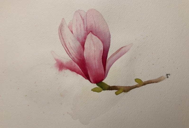
13. Final Touches: After looking at the dry painting, I decided to deepen the colors and add more detail to two of the petals. I moisten the petal in the front of the Magnolia again. I deepen the color of the central vein using the smallest detail brush and magenta. Then the vein that's right next to the center vein. I also add a bit of magenta to this area on the left side of the petal. I'm using the spotter brush and very small amount of paint. Now I allow it to dry completely. When it dries completely, I can start working on the neighboring petal. Again. I start by glazing it with clean water. And using the spotter brush, I add magenta to the base of the petal and generally to the areas where I want to deepen the color. I also add a tiny amount of quinacridone red to the top of the petal, but this should be really very watery. Then I emphasize the shadow on the right side of the petal. And I emphasize the most prominent vein. Our magnolia is finished.
14. Final Thoughts: I hope you enjoyed painting this magnolia flower and that you learned something new. I would love to see what you were able to create in this class. So don't forget to upload your projects to the project section. I would also love to read your feedback on this class so I can keep on improving my classes is for you. Thank you again for joining me and I'll see you next time.
 Anna Cutino, Artist & Online Tutor