Transcripts
1. Welcome to class: Hi guys, I'm Camilla and I'm in watercolor illustrator from Denmark. Today we're going to talk about the very hot topic that is painting from reference photos. We're going to cover four things today. We are going to talk about why we even bother with reference photos. Number two is taking our own reference photos when we are out and about. Number three is going online and finding reference photos without getting into all the copyright issues. That is a very interesting topic. Number four, we are of course going to paint, this is a painting class after all. We are going to cover how to paint from reference photo or photos and making it our own. We do that by painting from four photos from my vacation to [inaudible]. That is also going to be your class project. Not to pick from my vacation, of course, but to paint from your own vacation. I hope you'll upload the class project in the project section so I can see it and tag me on Instagram, if you'd like to. Let's get started.
2. Tools and materials: Let's start by looking at some materials. First, of course, we have some watercolor paper. This is the Canson brand, 300 grams, so it can hold a lot of water. Then we have different types of paints, and use whatever you have laying around. This is a Prima-pen, the [inaudible] and some different types of Windsor & Newton's, I just had laying around. Use whatever you have. Then there are different types of brushes. I use a flat brush to apply water in the beginning, a water wash, and it's a fairly big brush, not a watercolor brush, so you can use whatever you have. You can also use a big round brush. Then different types of round brushes. Just make sure you have some that are fairly big and some for finer details. This is 0.01, I think, something like that, it's very small. Then tissue of course, for lifting and mistakes and stuff like that, water, of course, the usual suspects. Then I use a masking tape for this project to make the frame for the paper. I use a fineliner as always, it's waterproof, it's a Staedtler, 0.1, and I use the pencil, this is a 3H, so fairly hard. Then of course I use reference pictures as well. That is what the class is about. I think that's it, so let's begin.
3. Why use reference photos?: Let's dive into this very hot topic that is painting from reference photos. I think a lot of you wondered how to paint from reference photos and should you do it? Should you just go outside and painting in real life? There's a lot of advantages to painting in real life. Of course, you have all the colors and the angles and the different depths and textures and stuff like that. But it's not always a possibility to go out in real life. For example, if you wanted to paint a giraffe and you live in Denmark like me, that is really hard to find. So I can go online, I'm very fortunate I have internet and I can find reference photos there. Painting from reference photos it is an opinion if you can do it or not. But my opinion is, of course you can do it. Especially if you want to study a subject, then find reference photos, figure out how they look, what are their shape and texture and color and paint from that. The good trick is not to copy the picture if you find online, but use a more like a reference and use more than one to see how they look. I would like to see my giraffe from several angles and figure out how the proportions is and how can I work with this and then make my own giraffe from that. There will be copyright issues when you are looking online for photos. The easiest way to go about that is of course, to take your own reference photos. In the next lesson we're going to cover how to take a very good reference photos before we're going to dive into the online world. I'll see you there.
4. Taking your own photos: As you know, I'm a painter and not a photographer. But I still have some basic tips on how to create a good reference photo. But if you want to go more in depth with photography, you can always search for photography on SkillShare. There so many great classes and you can learn a lot there. I'm going to cover the very basics in composition and how to manipulate those reference photos so you can do a good painting. I think the most important thing when you're taking a photo is to figure out what is your focal point, what are you actually taking the photo of? You can see these two different examples, the left one, I'm going to focus there, but I'm pointing at the distance and that indicates that focus should be there, but it really isn't, so that's confusing. In the right photo, I'm sitting quiet still and just concentrating on being the focal point and that works a lot better. The next thing to consider is foreground, middle ground, and background. This is a super basic stuff that you probably know already. But you can see I'm in the foreground here and pointing at the background, which is blurry, and it should probably have been focus if that should have been working. On the right, you can see I'm in the middle ground and there's some exciting foreground and background. That makes for a composition that is easy on the eyes. You probably heard of rule of thirds. That is a method to get some harmony in your pictures and to find a place to place your subjects in the frame. What you do is that you divide your picture in threes, two vertical lines and two horizontal lines. Where they intersect, you can place your subjects that are most important. You can see I've actually done this in both these pictures, so that is pretty great. Of course, there's a lot more to consider when you are taking a picture and there's a lot of details and how to place your subject in negative space and a lot more and check out other classes on photography. There's so much to learn. The biggest advantage to using reference photos that you took yourself is that you have, of course assisted license. I'm not that good at taking pictures and as you can see, I have wrong perspective on the building to the left. I have some wrong lighting and there's weird mistake in the right photo. All of that you can totally manipulate when you're painting the pictures and feel free to do whatever you like with the pictures. The most important thing to take away from this lesson is to take more than one photo when you're out there. Take photos from distance, details, shuts, photos of the light. All photos that you can really imagine taking from this subject and you have a lot of stuff to work with when you come home. You don't have to copy of just one photo, but you can actually capture the place and the mood of the place. That is important, remember that. Now let's get on to finding references online.
5. Finding Photos online: Now, it's time to cover some of the hot staff, which is of course, finding your reference photos online. Even though I am wearing these glasses and looking super smart, I'm not that smart. I'm not a legal advisor. Please check up on the rules before you use the sites and the reference photos. It's always better to be safe than sorry, especially with copyright issues, because they can really kick your butt if you break some of the rules. We're going to look at two different ways to use online references. We're going to look at derivative work and how to transform online references. First, we're going to derivative work, and that is when you're highly inspired by a photography or photo that you found online. There's ways to go about that. You can find good free photos and there's a lot of great free resources out there. I created a download PDFs and you can find it in the project section with a different websites so you can find these free photos. Then of course, there's buying photos and there's a lot of stock photos out there that you can buy for some amount of money. You can check that out as well. If you find a photography on Pinterest or Google Search or something like that, contact the photographer and ask permission to use it. If there's no reference, don't use it. It's easier that way. Of course, when you use it with a permission, credit probably. On Instagram, you tag the photographer and both mention in the caption and in the photo. When you are using stock photos, there's two licenses that you have to be aware of. There's the personal license, which is photos that you can use and you can create out based on it, but you cannot sell it. Use it for training and stuff like that. Then there's the commercial license where you can use a photo to create art that you can charge for money, can sell this art. But check up on specific rules and they can vary from site to site. It's better to be safe than sorry. Then there's a different way to go about this and that is to transform the work. That's when you use several photos as reference. You don't copy a single photo but you study the subject instead. When you took all those pictures that I talked about in taking your own photos, you use the details in the light and the distance shots to create your own artwork. Don't copy, just transform it and make it your own. There's no rule as to how transform the work should be to avoid copyright. If you're in doubt and you're not sure you transformed it enough, just don't do it. It's easier that way. You don't want to get in trouble. Now, I want to go into the next lesson to show you how to actually transform different photos into your own artwork. I'll see you in a second.
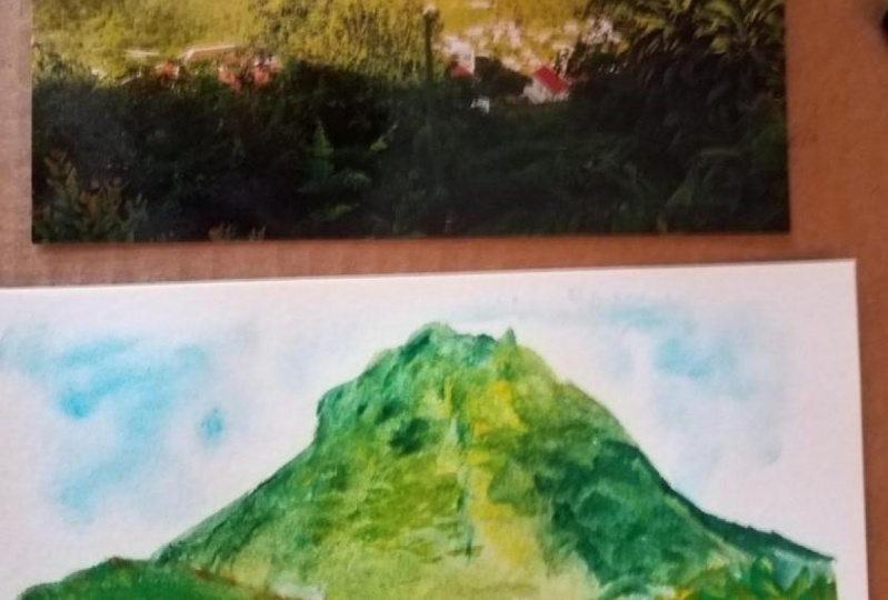
6. Painting from references: That was a lot of talking, and now we've finally arrived at my favorite part of this class, which is of course, painting. We're going to paint this, which I created from four different reference photos from my trip to Cyprus, and I'm going to show you how to use the different photos in details in the photos to create this artwork. This is of course also your class project, and I would love to see your own favorite vacations spots, and please upload both photos and the piece that you create, so I can see how you transform reference into a piece of artwork. Please tell a little story as well. It's always fun to hear about people's trips, and that would be so fun. I always comment on stuff that is uploaded, so please upload it in the project gallery and tag me on Instagram if you like, and I think that is it for now. Let's grab our brushes and start painting. I'm just going to show you which reference photos I'm going to use, and you've seen this throughout the class. It's a sunset, it's a beach, it's some flowers, and I have my focal point, which is a square viewpoint. We'll begin by sketching out our motif. I use my viewpoint here, the focal point as my base for the sketch, and I'm just trying to place it in a rural third way on my paper. I'm making it a bit bigger as you probably can't see at this moment, but I am, and I'm trying to make the composition a little nicer, and I'm going to make more room for the sky as well, so I can place a sunset there. You can see in the photo there is no sunset, but we'll put that in there. That is all the sketching we need. Now it's time to tape down our paper. Here I'm just using my regular masking tape and you can use the artist tape or whatever you have laying around. Make sure you wrap it well so paint wont get under the tape and just place it on the edges, and that is it actually, just make a frame and it's going to look nice. Now we begin wet on wet technique. We do that by wetting the paper that is in the name of wet on wet, and I use my flat brush here and just applying water to the whole Canvas in the horizontal motion first, and then I'm just trying to get the water to have an even layer and shine to it, so no pebbles. It's a lot easier to control it like that. As I said before, I'm going to have a sunset in the background. I'm going to use a very light yellow around the sun, and the sun is just going to be white-paper here. As you can see, it's going to spread in the water. Make the circle a little bigger than you'd otherwise. Then just applying warmer colors to create this sunset look. As you can see, I'm placing the sun in the left side of the picture and the not center like the photo, and that's because I'm just going to use the colors for this artwork but I'm not going to use the composition because I want the focus to be on the right side where the viewpoint is. I'm just working with colors and mixing them on the paper and trying to get them bright enough to be able to see when the paint dries as you know it. It always dries lighter than you apply it, and you know that of course. But it's always good to remember. I think it's 20 percent actually, so it's a lot lighter. I'm just going to speed up this process now so you can follow the process, but it won't be just as long. I'll talk to you in a second. Now I let the paint to dry a little, and I'm going to work in those mountains. As you can see, I'm just painting a crust, the paper as you know from the sketch, this viewpoint somewhere in here. But I'm going to lift that up afterwards. As you can see, I'm trying to lift up some of the paint because it wasn't quite dry yet. But you can always fix mistakes by using a temp brush and lifting the paint. I actually really like the wet on wet technique for mountains as well. As you can see, I'm lifting up where I want the viewpoint to be, the sides here, so we don't have a huge amount of dark Payne's gray, where I want my very light sunlit viewpoint to be. Now I'm just dropping in some more colors to define the mountains a little bit more, and just dropping in some yellow as well to make it a little more sunlit and warm. Now I'm going to begin working on the foreground. As you could see in my reference photo with the viewpoint, it was a blend foreground, but this one I took was all sunlit with the sunset light, and I really like that. I'm going to try to incorporate some of that light in the colors in this foreground. As you can see, there's a lot of rocks and there's a lot of texture, and color, and there's actually a lot of darks as well because the sun creates a harsh light. I'm going to try to incorporate all of those details in this foreground, but I'm not going to be super detailed because the focus is still on the viewpoint. I'm going to make this a little bit blurry. You can see here, I'm working on a rock formation and trying to just create the grass around the rocks. I can create shadows and the details in the rocks later. You can see I'm not coping at all. I'm just trying to use the texture and the color and just to dabbing in some different shades that I see in the picture, and some darks as well. I'm going to make this foreground a little more dramatic because of the sunset because I just like that, so you can see I do use a lot of dark here, things are Payne's gray. Also because I'm in love with Payne's gray at the moment. But I'm also going to use a lot of this very warm, yellow and green to create the sunshine in the grass. You can see it's a lengthy process here. It's just a painting all these strokes to indicate the texture of the ground. That's also because the reason I spit this up quite a bit because I wanted to show you, but it takes forever, and a lot of this is done in wet on wet, so you can see it's blending and I really like that too because it creates a smooth texture alongside the strokes. Since we've worked very much wet on wet, we're going to apply some details now in dry on wet. You can see I turn to my fairy smaller brush. I'm using this reference photo for the detail. I'm using this one because I have the flowers and I have the rocks. Of course some of the grasses as well. I can see that the grass is not soft. It's very beach, rocky landscape, and I'm trying to replicate that. But I'm not going to go super much in detail and you're not going to see me paint the exact flowers because I wanted the focus to be on the viewpoint as I mentioned. But I'm trying to apply some shadow on the rocks and trying to create some texture on those as well. I'm just going to speed this up as well, and put on some nice music. Now it's time to work on the most important thing in this painting, and that is the focal point, the viewpoint here. I'm using quite big amount of paint here. It's the very warm yellow I'm using here, and just filling in the sketch where I put this viewpoint, I'm trying to get the dimensions right. You can see I'm painting a bit over the mountains where I didn't lift all the paint up, but we can totally work with that, so no worries. I'm just being careful here because it would be a shame to make mistakes. I would like some clean lines since it is the focal point. No bleeds or wet in wet here, therefore I am going to let this dry and work a bit more on some of the details in the foreground. You can see this is a full time job working on those details. Even though I don't want it. Super details I still want to texture and that does take a lot of time. Now that it dried, I can go in and work on to more details, on the viewpoint. I'm going in with a fairly darker tone to create some more dimension here, I'm going even darker in the bottom. I am doing that both because I like some dimension and some texture in the viewpoint as well, but also because I want to make it blend a little more with with that bleed from the mountains. I'm just creating this shadow that you can see on the photo, Just trying to even out create a little bit of that wood texture. We want more detail here in the foreground to get the eyes to wonder that way. Just being super careful with these tiny shadows, they make or break the painting I think, I'm just taking it light and then going darker slowly so I don't mess it up. I'm trying not to put my hand down in the paint, that would be a little bit stupid. If I wasn't filming this, I would have not taped this to the table, but I've taped it to something I could move around because it's hard to create these lines when you are sitting like this. It would have been easier just to tape it down to something else, like a blog of paper or some wood or something. You can see it really starts to shape the viewpoint when I apply the shadows, shadows are huge thing in watercolor, it really makes the piece pop when you have light and shadow. You can see even the bleed from the mountains doesn't stand out as much anymore. Now for the small bench and I'm just using a, my pen is gray and it's almost not diluted in water. I can easily paint on top of the mountain and make it visible. This one is going to be in silhouette, so the focus is on the wood and not on the bench. Now I'm just creating teeny-tiny strokes to mimic some grasses around the bench and the viewpoint to gather the middle ground with the foreground and make them blend a little more seamlessly. Now it's time to create some details in ink. That's my thing. I grab my fineliner, and as you probably know by now, my focal point is right here and that is the only place of goods use ink. That's because the ink highlights the stuff that it outlines. I'm only going to use it where it's important and what way I want my eyes to go, that is of course here on the viewpoint. I'm sorry, I have my head in the shot sometimes, I was just trying to get a little closer to get the details right. I'm being careful not to create a thick line. That's why I'm using a second one, I don't want it to overpower the piece. It could easily be the very overpowering and create almost a cartoony painting and I don't want that. I just wanted to emphasize small details in the wood and in the structure of the viewpoint. I do that by drawing ragged lines and mimicking the silhouette here. That was actually it, now it's time to remove the tape, so I make sure that everything is super dry and I peel off the tape in a very flat motion here, so we don't rip the paper. That would be sad. You can see I'm being super careful to remove the tape in a very easy manner, very flat. Take your time with this, so it doesn't rip. That is actually the final piece based on full reference photos from Cyprus. We used one reference photo for the arch, one for the sunset, one for the details, and one for the sunlit foreground. I really hope you enjoyed the process and are ready to tackle your own.
7. Let's wrap up: Thank you so much for taking this class with me. It's been super fun to teach and I actually really learned a lot, and I hope you did as well. Copyright issues are such a big deal, I hope you learn how to use a reference wisely and if you like the class, please leave a review and a thumbs up. That helps a lot and it helps students find the class easier, that would be amazing and thank you a lot, and if you want to know about my next class, which is probably going to be a little lighter. I think it's going to be something about [inaudible] and of course, watercolor and ink. Hit the follow button up here and you'll be notified as soon as it's out and if you can't wait that long, I have several other classes on watercolor as well and one of them on trail sketching. It's a little bit on this vacation route as well. You can check that out as well and please remember to upload your class project. I would love to see it and it's definitely the most fun about teaching. Please upload it and I think that is it. Grab your brushes and start painting and see you next time.
 Camilla Damsbo Brix, Teaching Whimsical watercolors