Transcripts
1. Introduction: Hi, everyone. I'm Larissa. I'm a teacher, Illustrator
and surface designer in Melbourne, Australia. Today, we're going to talk about warm colors and cool colors. By looking into the
theory of the two terms, we will learn how they work
and how to identify them. And to show our understanding
of the concepts, we will learn how to
create warm colors and cool colors by painting a color study doing
all the color mixing. We will then pick some
of these colors to pink florals in a warm color version
and a cool color version. After taking this class, you will have a
solid understanding of warm and cool colors. You will know if a color is warm or cool by just seeing it and you are able to create warm and cool colors by mixing
different colors together. I recommend using
guage in this class. You can also use qualic or
qulicGg to follow along. Get your painting
supplies ready. We will dive into the world
of warm and cool colors.
2. Class Projects: In this class, we'll be
doing two activities. We will firstly create
a color chart by mixing our own warm
colors and cool colors. We will also create
tins tones and shades of these colors by adding
white gray and black. It's a color study and a good way to practice
mixing colors. Then we will use some
of these colors to paint florals in style. We'll paint subject twice, one in warm colors and
the other in cool colors. I'll explain more about
it later in this class.
3. Supplies & Resources: We will use the
following supplies in this class, Guash pints, pink palettes and
watercolor paper, preferably in A four size. And these two things
are optional, a ruler and washi tapes. I use the ruler for
the color study where I draw boxes
to paint the colors. You're more than welcome to paint them free hand
if you want to. I use washi tapes to tape
down the watercolor paper, so it doesn't move when I paint. Masking tapes will
also do the job. I don't recommend using sticky
tapes because they're very likely to damage the watercolor paper when
you remove them. I have also prepared a
guide for this class. It has all the key points
and my week examples. You will find a
Pinterest board in it, which we will use
throughout the class. There are also a few
pages of exercises for you to do when we talk about
theory in the next lesson. You can download the class guide under the projects
and resources tab. If you're watching the class
on the Skillshare app, you will find a link to the class guide
under discussions. That's all we need
for this class. We'll talk about warm colors and cold colors in the next lesson.
4. Warm Colors & Cool Colors: In this lesson,
we're going to learn the basics of warm
colors and cool colors. It's a theory
lesson and we'll be doing some exercises
along the way. So please have the
class guide ready. I'll be referring to pages 3 to five throughout the lesson. First things first,
we can't talk about warm colors and cool colors without mentioning
the color wheel. So in my last class painted
color wheel in gage, I've explained how the color
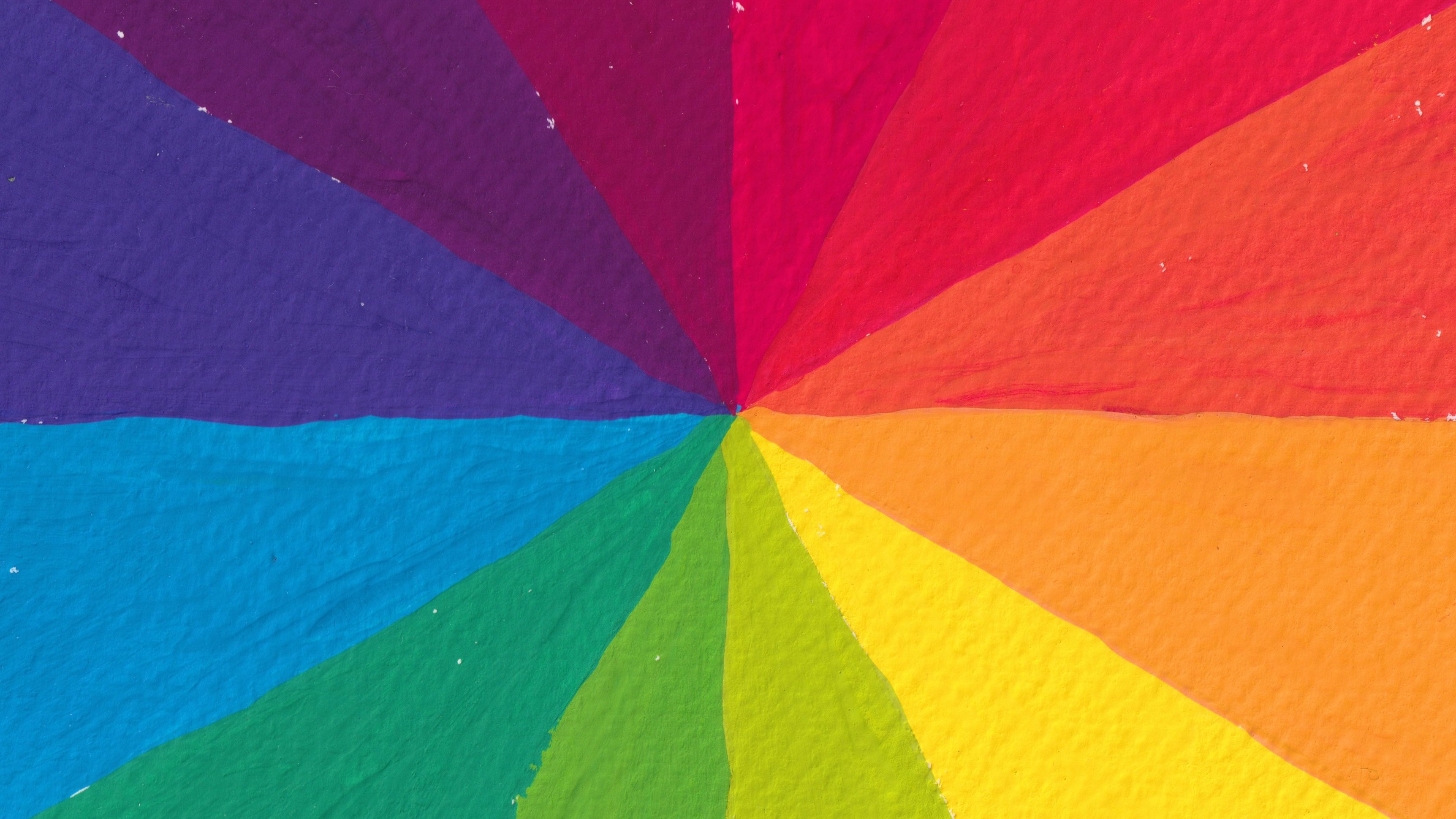
wheel works in detail. So here's a recap. The color wheel contains
the following colors, primary colors, secondary
colors, and tertiary colors. Red, yellow, blue
are primary colores. They are the foundation of all the other colors being made. Orage, green and purple
are secondary colores. Each of them is created by mixing two of the
primary colors. The rest are tertiary colors. Each of them is
created by mixing one primary color and
one secondary color. The terms warm colors
and cool colors are referring to the
temperature of colors. By looking at all the
colors in the color wheel, can you try to identify
which ones are warm colors and which
ones are cool colors. You can pass the video here and fill in page three
in the class gut. In general, the
following colors in the color wheel are
considered warm colors, yellow, yellow orange,
orange, red orange, red, and red purple, and the ones on the other side of the color
wheel are cool colors, yellow green, green, blue green, blue, blue purple, and purple. So why the colors on
the right hand side of this color we are warm and the
ones on the left are cool? To answer this question, I would like you
to have a look at the printers board I
prepared for this class. You can find the
link to the board on page four in the class guide. In the printers board, you
will find a section called warm colors and another
one called cool colors. I would like you to look at the pictures in the
warm colors section. These are painting, photography, and design images
in warm colors. Browse the whole
selection and write down how warm colors
make you feel. Just a few words would be fine. After that, do the same for
the cool colors section. Write down a few words to explain how cool
colors make you feel. You can pause the video and do this exercise on page
four in the class guide. So warm colors tend
to make you think of things that are
warm and energetic, such as the sun and fire. That's why the colors
of these things, red, orange, yellow, and the like
are considered warm colors. Cool colors on the other hand, tend to remind you of things
that are calm and peaceful, such as ice, water, and the sky. Of course, the colors
of these things, blue, green, bluish purple, and the like are called cool colors. What we just talked about is the general perception of
warm colors and cool colors. But we also need to understand the warmth or coolness
of a color is not fixed. It can be relative. For example, we know all the red colors
are considered warm colors. But take a look at
these two reds. You might be able to see
one of them tends to be warmer and the other
one tends to be cooler. But how can we tell exactly? Well, in this case, we need to look at a
different color wheel. I was able to find this one on the Wikimedia Commons website where all the colors in the
wheel are fused together. We can see each color is transitioned smoothly
into the next one. Let's try placing these two reds in the color just roughly. You'll see the one on the
right looks a bit like orange and the other one
looks a bit like purple. We know red and
yellow makes orange, which means the one on
the right leans towards yellow or we can say
it has a yellow bias. Since red and blue makes purple, so the color on the left
leans towards blue, or we can say it
has a blue bias. That's why the red
on the right is warmer and the one on
the left is cooler. That's how we tell if the
color is warm or cool. We need to compare it with a
different color and try to find if it has a primary color
or secondary color bias. Let's look at another example. There are two types
of orange here. I'll give you 5 seconds to tell which one is warmer and
which one is cooler. And the answer is the one on the left is warmer and
the other one is cooler. Now, this one is a bit tricky
because when we place them in the color wheel and find
the nearest primary colors, we can see the orange on top, leans towards red, and the one below leans
towards yellow. But that's not enough
information for us to tell which one is because they both
lean towards a warm color. In this case, we need
to look a bit further. We can see the orange below
not just leans towards yellow but also towards green because green is
right next to yellow. Now it has become a
bit more obvious that the orange on top
has a red bias, and the one below
has a green bias. If you're still not sure, let's bring in the
line that separates warm colors and cool
colors in general. You can see this orange
color is closer to the cool color section than
the other orange color. With all these clues, we can say the orange on top is warmer and the
other one is cooler. Now it's time to test your
knowledge in this part. Please turn to page five
in the class guide. You will see four
groups of colors. So use the method that I
just showed you and try to identify which color in each group is warmer or
cooler than the other one. You can post the video
here to do this exercise. I'll show you the
answers in the sec. Now that we've understood how warm colors and
cool colors work, let's do a coloor study
in the next lesson.
5. How to Do a Color Study: In this lesson, we're
going to do a color study. We'll create several
warm colors and cool colors by mixing
different colors together. We will also create tins turns and shades
of these colors, so we have a range of colors ready for our
final paintings. I have explained the terms tint turn and shade
in my last class, paint the color wheel in guash. Here's a quick recap. A tint
is a color mixed with white. A shade is a color
mixed with black. By creating tints and
shades of the color, we are changing the
value of that color, which means the color
is getting lighter by adding white and getting
darker by adding black. A turn is a color
mixed with gray. By creating turns of a color, we are decreasing the
saturation of that color, which means the color has
become muted or desaturated. Okay. Before we do
the color study, I would like you to
gather all the pans you have and lay them
all out on the table. Then arrange them
into two groups, one in warm colors and
the other in cool colors, just like what I'm doing here. I have different
types of yellow, red, and rose red as warm colors and different types of purple, blue, green, and
turquoise as cool colors. What we need to do
is to mix some of these colors to create warm
colors and cool colors. I'll show you what I mean. For example, we know mixing blue and yellow will make green. As we've talked about warm and cool colors in the last lesson, a green color can
be warm or cool. How do we make a warm
green and cool green? Here I have these three colors, sky blue, primary yellow, and permanent yellow deep. Obviously, I can make
two types of green by mixing sky blue with
each of the yellows. However, when we compare
the two yellows, we can see primary yellow
appears to be cooler and permanent yellow
deep tends to be warmer because this
yellow has a red bias, which makes it
almost like orange. We can imagine when mixing
sky blue and primary yellow, we will get a cool green, and when we mix sky blue
and permanent yellow deep, we will get a warm green. Here's what I'd like you to do. Mix two or three colors to
make a brand new color. Decide if this is a warm
color or cool color, depending on the warmth or coolness of the
colors you mixed. Then on the watercolor paper, we will do the color study
in the following way. Create four warm colors
and four cool colors. Under each color. Write down the names of the colors you have mixed to create this one. This is to remind
you how you made this color so you can
make more of it later. Then next to these colors, create a tint to and
shade for each one. In the next lesson,
I'll show you how I do the call study
from start to finish.
6. Painting a Color Study: A
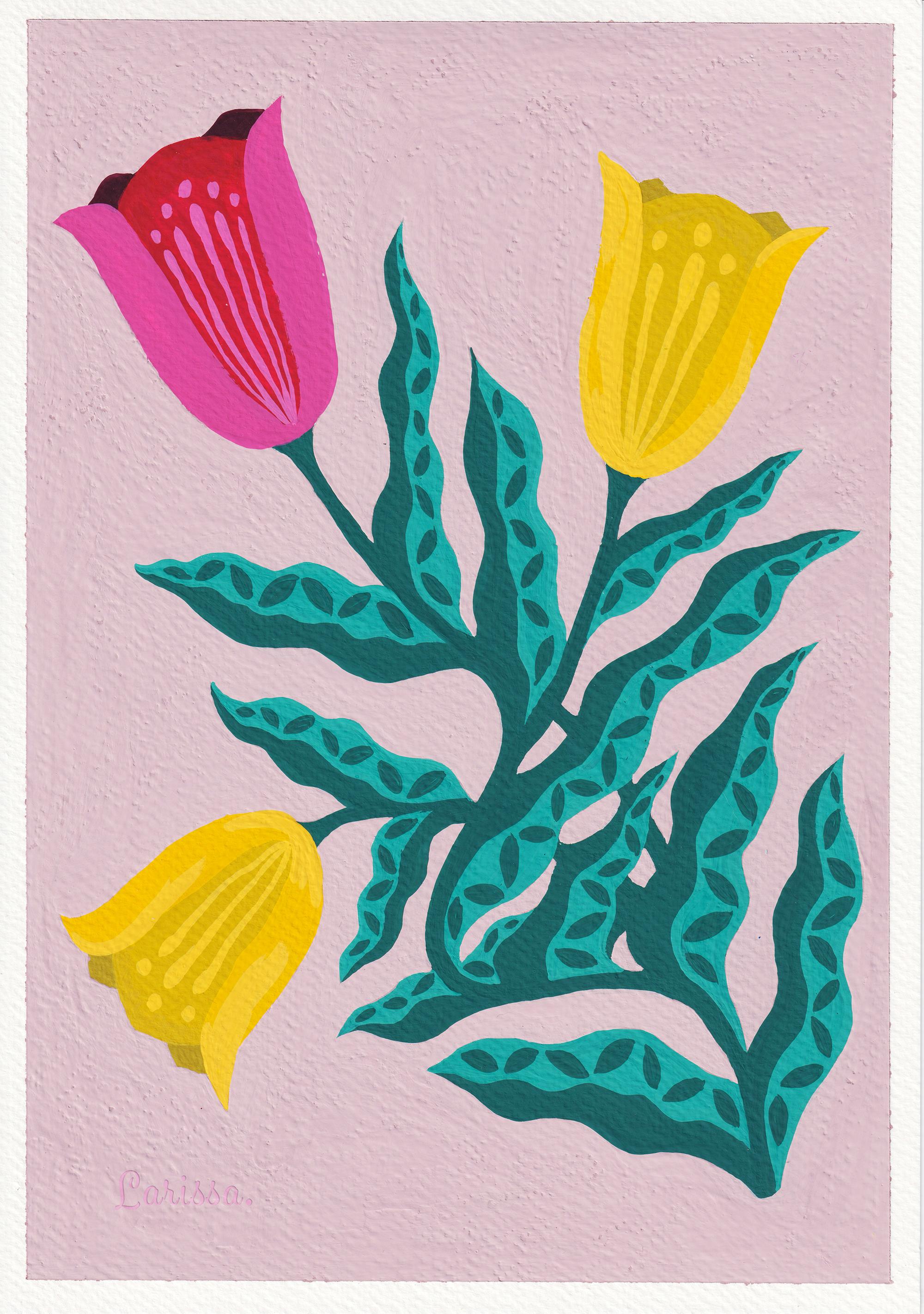
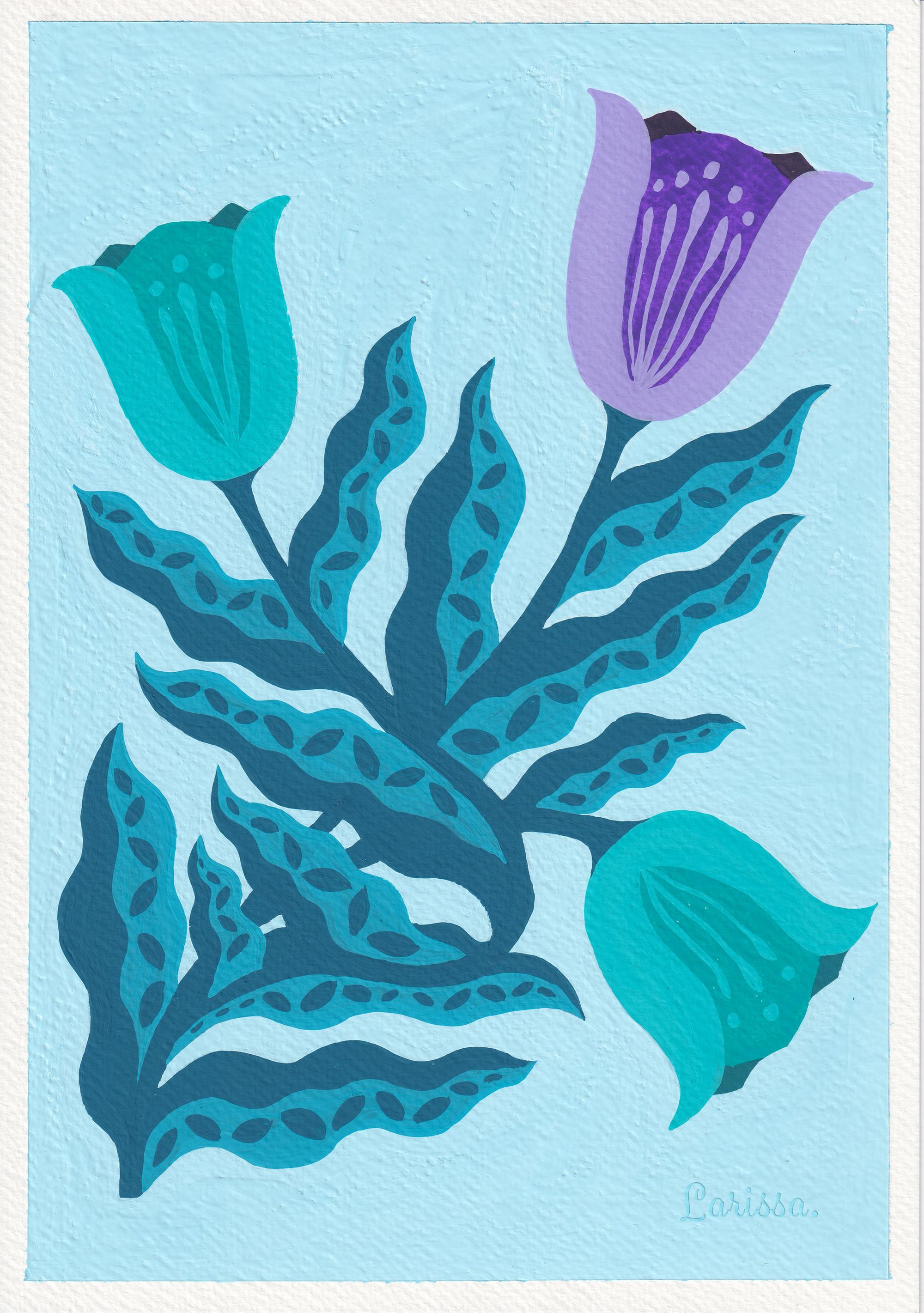
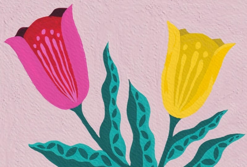
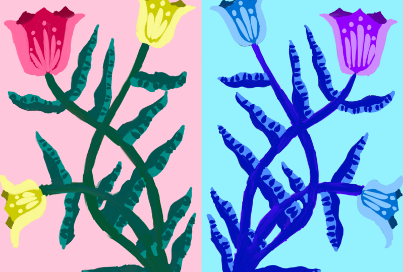
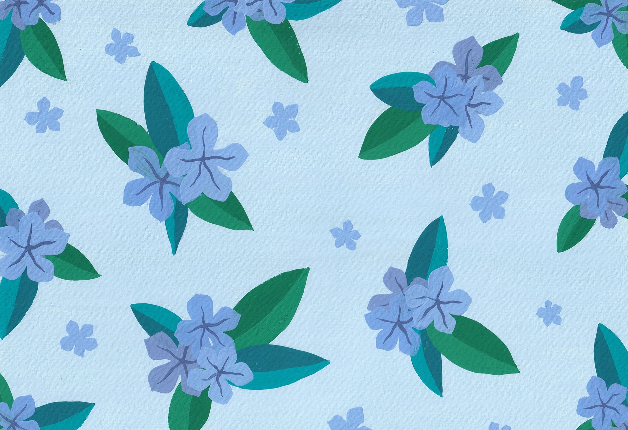
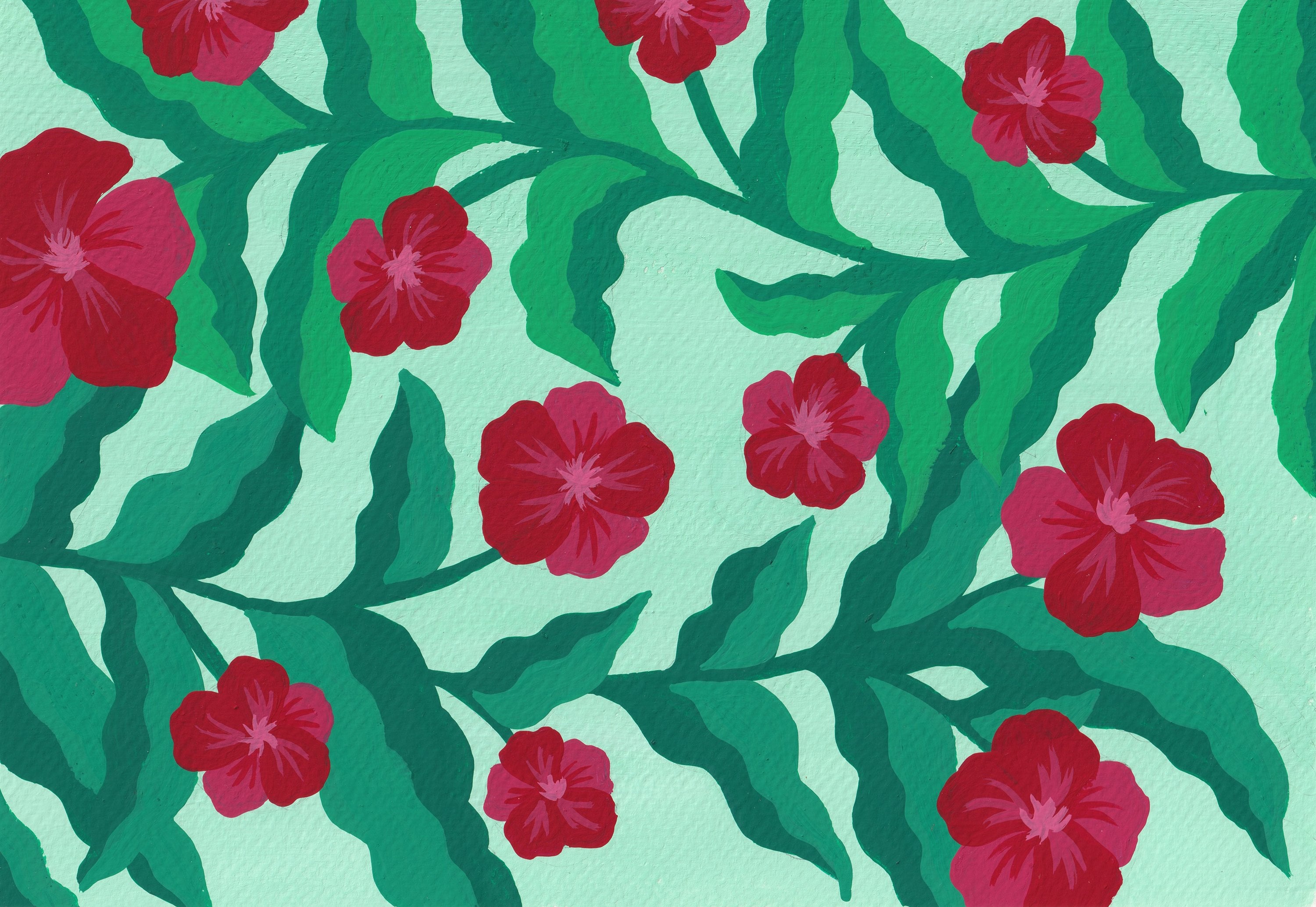
7. Exploring Folk Art: For our final work, we'll be painting florals in focat style. We will paint the subject in warm colors and then
again in cool colors. When we finish, we will be able to see how
warm colors and cool colors can create such different fields
for the same subject. Before we start, I want to
briefly talk about fart. I suppose many of you have
heard of the term before. It's actually pretty
hard to define focart because it refers
to a lot of things. To simply put focart is
the art of the people, meaning the work is
created by someone who's not professionally
trained in art making, and in many cases, it represents local
culture or traditions. In fact, today, a lot of
professional artists love creating focard It's a
highly decorative art style, and it seems like there are no rules for it, at
least not a lot. People find it very relaxing
and enjoyable to make. Let's look at some examples. Back to our printers board, you will find a section labeled floral focard Have a look
at the artworks inside. There were lots of different
types of fo caard but here we're just talking
about focart in general. Try to find some similarities
between these examples. You can see they're
all flat designs. They are very decorative,
as I said before, and it looks like a lot of these artists use
color shapes to build the structure
of the motifs and then draw
patterns on shapes. These are some common
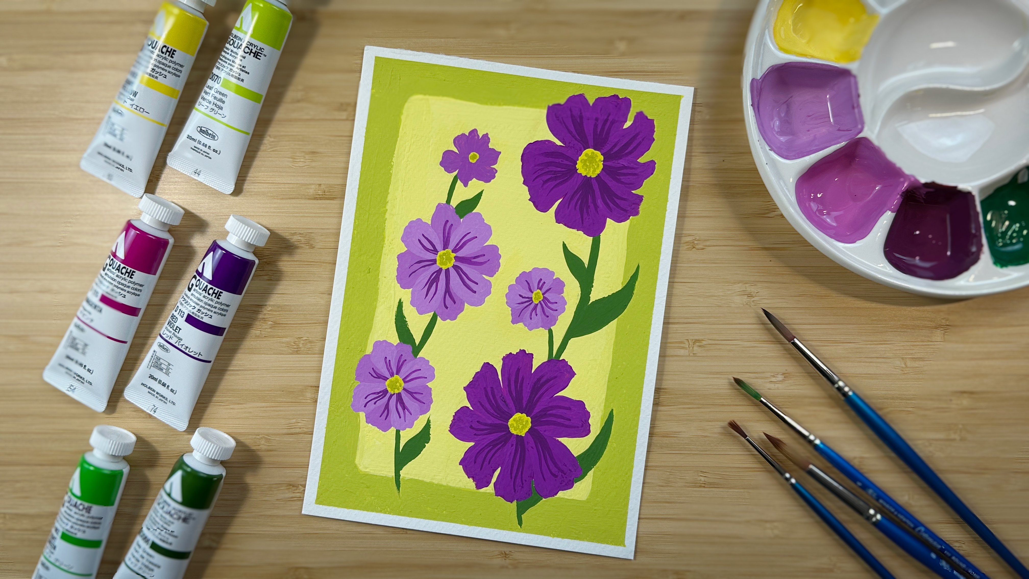
characteristics of focard. Go back to our class project. We will paint florals
in focus style. Since we're painting
a warm version and a cool version of it, we need to put together a warm color palette and
the cool color palette. You can pick the colors from the color study we
did in lesson six. So go ahead and spend some
time to curate your palettes. When you're ready, just go to the next lesson so we
can start painting.
9. Painting Folk Art Florals in Cool Colors: At the end of the class,
I would like you to place your two paintings
side by side and think about how they make
you feel differently. By looking at my two paintings, I will definitely place them in two different
environments. I will most likely put the
painting with warm colors in my bedroom where I
feel cozy and relaxed, and I will put the one with
cool colors in my work space, so it helps me calm down when
I'm stressed about work. So go ahead and appreciate your paintings and try to find
the right place for them.
10. Parting Thoughts & Thank You: Thank you so much for
taking this class. I hope you have fun doing
all the painting exercises. If you can only take one thing away from this class, take this. The warmth or coolness
of a color is not fixed. It's relative. That's pretty much the whole point of
me making this class. I hope you are now
able to tell if the color is warm or cool
by just looking at it. If you have any questions
about this class, or you just want to
give me some feedback, feel free to leave a comment
under the discussions tab. You can also DM me on
Instagram or send me an e mail and don't forget to share your work
in the project gallery. I look forward to seeing it. Thank you again. I'll
see you next time.
 Larissa Yeung Fung, Art Educator | Illustrator | Surface Designer