Transcripts
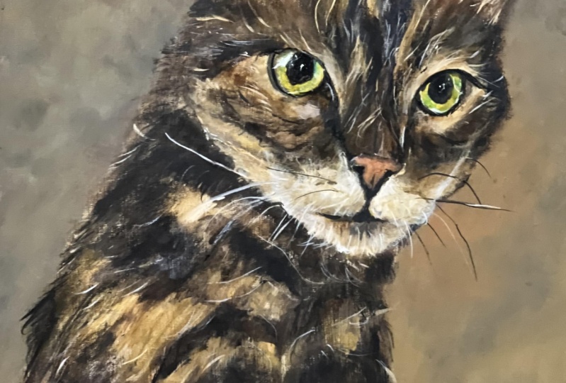
1. Introduction: In this skill share class, I'll guide you step
by step on how to paint a tabby cat using
just four colors, red, yellow, black, and white. You might be familiar with
the famous artists and Zorn, who frequently used
these four colors as a limited palette
in his paintings. Zorn palette is excellent for painting both
people and animals, as it really helps you to get to grips with color temperature
in your artwork. By limiting your palette, it helps prevent
random color mixing, making it harder to go wrong. In this class, I'm going
to teach you how to mix warm and cool color tones to create transition
in your painting, and just give it more
depth and interest. I'll also show you how to avoid getting caught up in
all those tiny details, so you can achieve a
more painterly style full of life and energy. So let's get started
and first of all, talk about your class project.
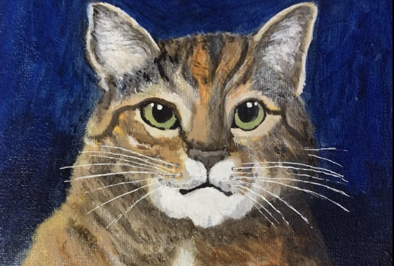
2. Class Project: For your class project, I would love you to have a go at painting your own tabby cats. You can use the reference
image that I'll be using, which I got from the
website Unsplash, which is a great website to
find royalty free images. I'll attach the photo down below in the Projects
and Resources section. Please share a photo of your finished
painting down below. I would love to see
them, and I will give comments and feedback
on every single one.
3. Materials: You'll need a few
materials to get started. The first thing being
some acrylic paints. Don't worry too much on the brand. It
doesn't really matter. As long as you go for a reputable
one that is well known, even their student grade
paints will work really well, and there will be
slightly cheaper. You'll also need a
surface to paint on. For this class, I'll be using a six by six inch canvas board, which is canvas stretched
over a backing. You're going to use
a similar size, then you won't need
much paint at all, so just squeeze out a tiny bit onto your palette to begin with. Make sure that any
surface that you use is suitable for
acrylic paints. What paint brushes, I have four that I'm
going to be using. Make sure you choose a variety of different
sizes from large to small. I'm going to start
the painting with a synthetic filbert
brush from Rosemary. Rosemary is a very good brand. Their paint brushes are slightly more on
the expensive side, but they're well worth it. A general rule of thumb, you can buy cheaper
paint brushes, but just make sure that
they're not losing their shape very easily or their bristles are falling out. That means that you've
maybe gone too far to towards the cheaper
end of the scale. I'll also be using a
large soft filbert brush for large areas in the cat's
fur and also the background, and I'll be using a
fine detail brush for areas like the
eyes and the whiskers. I want to go for a medium
sized round brush. Something similar to
this kind of size. For my palette, I'll be
mixing all my colors on this gray glass palette
that you can see behind me. I will have this
upright on my easel for filming purposes so that you
can see me color mixing. If you don't have one
of these at home, there are lots of other
options for acrylic paint. You could use a stay wet
palette or a tear off palette, which is single use. You could also use
an old plastic plate or even a paper plate
if you have one. Just remember that acrylic paint dries out really quickly, so don't squeeze out too much
paint onto your palette, particularly if you're not using a stay wet palette that
keeps the paints moist. I mentioned in the
class project section, you also need a reference
photo to work from. Ideally, you will need
to print this out, so you've got it
as a paper copy. If you don't have
access to a printer, then you could freehand sketch onto your
painting surface, or you could use an
online grid drawing tool. I will link to one
that I use down below. Alternatively, please
fill three to use your own reference photo of your own cat or
someone else's cat, because the principles
that I'll be teaching in this class will still apply no matter which photo you use. And finally, you'll need a glass jar or a plastic
cup full of water, which are going to
change regularly and an old rag like this one just to
wipe your paint brush onto. Next, let's look at
the colors we'll be using and how to mix
them on your palette.
4. Your Palette: Four specific colors I'll be
using are titanium white, carbon black, yellow
ochre, and cadmium red. As you paint, it's
important to remember that your warm colors are
your red and your yellow, and your cool colors are
your black and your white. If you want to create
a more warmer color, then add a touch
of red or yellow, and if you want to
cool your color down, you add black or white. To darken a color, add black, and to
lighten it add white. Since a tabby cats fur is generally made up of
four colors white, gray, brown or black, we'll be mixing these colors and warming them or cooling
them accordingly. I'll share some color
mixing tips with you now and demonstrate some of these mixes that I'm explaining. But also I'll go
into more detail when I show you the
entire painting process. To make a gray, simply
mix white and black. If you want to warm up the gray, add a touch of yellow, and to darken it, just
add a touch more black. For warming up black, you can introduce red, yellow, or even orange, which is a mixture of
your red and your yellow. You will see where I've
added a touch of white to the mixture of the black and the red is creating
a purple color, and this is because the black
has a blue leaning to it. To mix a brown, combine red and yellow, and then blend it
with a darker gray. If you need to cool
down the brown, add black, white, or more gray. As you work, always ask
yourself if the color you're working with is warmer or cooler compared to
the one next to it. If it is warmer, add yellow, red or orange, and if it's
cooler, add black or white. For the lightest areas, you can use white
straight from the tube, but you can also warm it up by adding yellow, red or orange. With these four colors, you can mix everything you
need to paint the tabby cat. It's amazing how
many variations you can create just from
these simple hues. When you create the transitions from warm to cool
in your painting, it will give you
a sense of form. This is very, very important when painting
people and animals. Consider having a go at
this exercise before you get started on your
painting is a really good way to understand how mixing
just these four colors together can give
you all the colors you need to paint
your tabby cat.
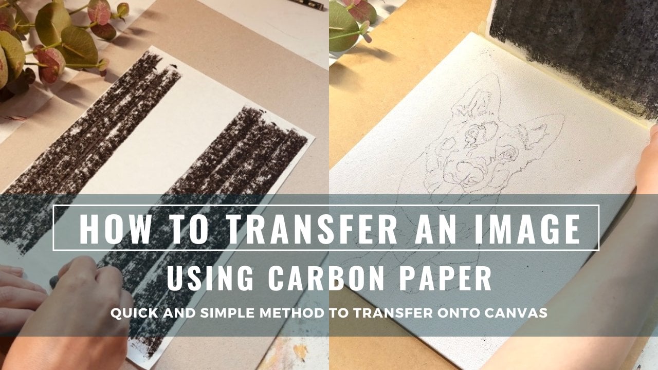
5. Image Transfer: I'll be using a method
known as carbon transfer to sketch out my reference
photo onto my Canvas board. I've made a whole
skill share class all about this technique, which I will link down below. I'm going to use a
technique called carbon transfer to sketch my reference onto
the Canvas board. I explain this method in greater detail in another
skill share class, which I will link down below in the projects and
resources section. In short, you place
carbon paper, face down on the Canvas, and then place your
reference image on top. Using a pencil
lightly trace around the outline and the carbon
will transfer onto the Canvas. This technique is
great because it saves time and ensures you
get an accurate sketch, especially if you're not
confident in free hand drawing. To prevent your carbon from smudging when
painting over it, use a spray af fixative. I recommend the one
from Dala Rowe. If you're unsure
about this technique, you can always use
the grid method, which I cover in my
skill share class, all about painting a
pet from a photograph, which I will also
link down below in the projects and
resources section.
6. Your Underpainting: I'm starting my painting with a long handled synthetic
filbert brush from Roseberry. For the base color, I'll mix a warm brown using cadmium red, yellow ochre, and just
a tiny bit of black. You'll notice that black
is a very strong color, so only a small
amount is needed. I've only squeezed out a
little bit of each paint. When we add black to the orange made by mixing the
red and the yellow, it turns the color into brown. This happens because
the black has a blue undertone and mixing blue with orange creates brown. A thin layer of the brown color over the
dest areas of the cat. This is the stage
and it is where we block in the co by applying
the paint fairly quickly. At this point, we're
focusing on averages, so we want to get average
values, temperatures, and colors, and Using these
averages will make it easier to refine and adjust the painting in the
subsequent layers. As you can probably
see, I'm holding my paint brush
fairly close towards the I'd say beginning of the
last thad of the paint bruh. So I'm not holding it
too close to the b here. That's because I want my strokes at the moment to be quite loose. You want to create this kind of soft edge from the
very beginning, because that will show through
later on in the painting. And it just creates the
illusion of that nice, soft fair This brown that I've mixed is a
fairly warm brown. It's got quite a lot of red. This is called
scumbling because I'm rubbing my brush
over the surface. I'm not just laying
on paint like that. I'm rubbing back and forth. I want to have a
dry brush as well. I don't want it to be very wet, and I don't want a
lot of paint on it. I want it to be quite. Also paying attention to
the direction of the cats. Fir. For example,
on the legs here, rather than going horizontally, I'm going up and down
vertically because you can see here the hairs are
going in that direction. You want to get that direction of the fur in fairly early on. So I can see here on the nose, it's slightly more orange juice. I'm just going to add some of the yellow ochre
into that brown. Then again, not too much
paint on the brush. I just scumble out
over the surface. I think I may have had
a bit too much paint on that brush, but never mind. Continue with that
color further. Also to cats mouth. Now I've got this
color on my brush. I'm scanning around to see
where else I can use it. So where else in the cat's fair, are those warmer
tones coming through? So I can see this half of the cat's face is probably
warmer than this half. So I'm going to use a lot
for this on this side. I'm rubbing the brush so hard, it's making my this palette. Move around. And there's a
tiny bit more orange there. It going to move this up
a bit because I want to do some work down here. For more of this orgy
color down here. Again, be mindful of the direction that
the f is going in. Here, I'm definitely getting
a lot of cooler tones. I'm going to mi in black, white. This is where I would
normally reach for a blue. But obviously, I don't have one. In order to make a bluey tone, I'm just going to use
some of the black, which has a blue leaning and
some of the whites as well, which is a cool color. That will give me my
toe for this side. I'm going to use a bit more of the cool color
down here as well. And again, H. Then I'm just going to put a touch of I think I need
a little bit of w, just to loosen this
up because it's going acrylic dries so quickly. That's starting to
dry on my palette. I've just added a
not too much touch of water to loosen it up. If you notice, I'm not mixing a new color
every single time. I'm using the same base color, just adjusting it by adding
different colors to it. You don't want to have loads of different blobs of
color on your palette. What I've got here
is a warm purple. So I just using that. This poor here, and
come over here as well. This area is warm here, which will contrast
nicely to this area, which I'll make a
cool light color. So this will really make this poor come forward
if I use warmer tones, and then the cooler
tones here will push back the arm there, which will make a really
nice contrast in that area. And the same here, I'll
probably make this pore slightly and then this
area slightly cooler. Add a bit more. Black is so
strong. Don't add a lot. You can always add a bit more if you need it, but
if you add too much, then it's really hard
to take it away again. You can always add some white
to lighten it slightly. You're going to add that up. It's definitely too my brush. If you do think you've got
too paint on your brush, just take a paper towel,
rub off the excess. I'm just putting a bit of
me say gray color up here. It's the black and
the white and a touch of the yellow cha. Also put that between the ears. You can see at the moment, we're not being too precious
about fine details. We're just adding in the
overall and cool tones. This is your underlayer and it's going to
all be painted over, but these initial
layers of paint will show through any
subsequent layers on top, which makes a
really, really nice effect and just adds
depth to your painting. I'm just looking at
the nose now and it is pinky orange color,
just going to make Separate little color here. I'm just going to
wipe off a lot of that excess onto
my kitchen towel. And then just scumble
that in there. Now, the eyes because
we don't have a blue, we're going to be fairly tricky. But I'm going to mix a bit
of white bit of yellow cha, and just going to put
that in there for now. Et's go yellow cha
and black by itself. I think that's gonna
make our green. I'm actually gonna
switch paint brush. That one's look too
much red in it, and the color is coming out red. I'm gonna go for a
small soft brush. And I'm going to mix. Yellow
oka a tiny bit of black, a bit more yellow
oka a bit more. L, better. And just put this in as
a base layer for now. Just to get those
white areas gone. I'll leave that there for now. I'm going to come back
to my original color. Might mix a bit more. Just making that
original brown with the yellow red and
black. Bit more black. Bit more black. Quite warm red. So cool it down a little bit. Add in a bit more
detail down here. Bit more black. Yeah.
7. Adding a Wash: Just squeezed out a blob
of the yellow ocher. Now I'm going to take a
medium sized filer brush, and you want to add
quite a lot of water. You want to a consistency
similar to thick water color. Just mix up a bit you need
it to cover all the canvas. Then we're going to use this
as a wash over the canvas. Now, you're going
to wash it over and just make sure that
the paint is dry. Shouldn't take too long for it's especially if it's a nice thin layer
like we've done. So cover the background. Okay, that's reflecting some of the light, but there we go. So we've warmed up
the whole canvas now with that yellow ch. Put in there. Now we just
that d for 10 minutes.
8. Your First Layer: If you aren't using a stay wet palette and do you feel like your paints are drying
out at any point, it's handy to have
a spray bottle and try not to get
any of your painting, but just spray them lightly. To keep them wet and workable. You don't need to go overboard, but yeah, just if they're
drying out slightly. That yellow oka is nearly dry, and what I want to do now is
just work on the eye area. I like to get the
eyes in fairly early because I feel
like it just helps the rest of the painting. So first of all, I'm going
to use pure black just to do the pupil and the area around
the outside of the eye. So I've just got pure
black on my paint brush, I've got a fairly
fine rigger brush. You don't want
anything too large for this part of the painting. Put the people in and this
area around the edge. Put more paint. I. And while I have this black
color on my brush, I'm also going to do
the nostrils, as well. They're very, very dark. So I'm just going to
use the pure black. And just outline
the areas that Dog. Look in on our reference image. This side of the nose is
definitely in more shadow. We must have the
light coming from this way and hit in
the cat's face here. I'll just bear that in
mind for the future. I'm just going to
slightly scumble a bit at the black over
the surface here, not too much, and that
will show through later. Just bring that down to the
mouth and the whiskers. Take a little bit more.
I'm still just using that pure black color. T. Now, whilst I am
using the black, that is going to be
my darkest areas. That's going to be
the eyes, the nose, and possibly the
shadow area here. I'm putting in my darkest areas. Whilst I'm doing
this, I want to now put in some of my
lightest areas. Looking at the reference image, I think that's going to
be here here and here. It's going to be all on
this side of the face. I'm just going to put
some of those in now, and I'm going to mix a
very light warm gray. To mix my warm gray, I'm going to use this
mixture here and just add a bit more white and a
bit of the yellow ocher. Then I'm going to
put those areas of light in this one here
next to the nose, and area down here and around here. Again, not being precious about details of each individual hair, we're just getting
in the main shapes, but also being mindful of the
direction of the cat's fur. Again, I'm not holding my paint brush too
close to the end. I'm holding it sorry, too close to the top
here by the bristles. I'm holding it fairly far back. This just helps you to paint
looser and not to worry too. At any of the detail
at this point? I'm going to use
that same mixture. Add a tiny bit of the black just to cool it down a bit more. Then I'm going to put
in this area down here, Ms before we're going to
have a nice contrast between a shape here and a cool shape
here alongside each other. I'm just going to
mark that in now. I'm now mixing up a gray
again with my white, my black touch of the yellow cha and to make
it more of a bluy gray. I'm going to add in
slightly more black. As I said, black has got
a cool leaning to it. I'll give the illusion of
it being a bluey gray. I'm going to use that in areas where I can see these
grays coming through. We have quite a big cool area
down here under the mouth. Goes up onto this side. I'm going to add some of
it over here as well. As I said before, we're going to have
a nice contrast this side with the
shape of the poor, which is going to be with the area directly next to
it being slightly cooler. I'm going to add a
bit of that there. We just have that going up
into the leg here as well. Overall, this shape of the
pore is going to be warm, but I can see little
shapes within it, which I'm going to make cooler. Some of this color.
This will really give your painting interest by having larger shapes and smaller shapes next to each other that
are cool and warm. They are all of the
same temperature, but you're using
variety of the two. I'm going to take a touch of
pure white and pop it here. This is where I want my
lightest light to be. Nothing is going to be
lighter than that area, and The other place is going to be here and
also the highlight of the eye is going
to be pure white. But I'm not going to
put that in just yet. I'm now going to do some
more of the background. It's pretty much dry now. It's still a little
bit tacky up there. But for the background,
I'm going to mix because overall the
cat is fairly warm, as you can see from
the reference image, it is a cool background anyway, but that works really nicely
because it really makes the cat come forward in the painting and makes it
pop out of the background. I'm going to mix a cool gray. I'm going to take my
medium bert brush again. I'm going to mix quite
a lot this time, so white touch of
the yellow cha, quite a lot of white and a
fair bit of the black as well. Bit more black. Bit more yellow, and a touch of red. Not too much because I
don't want it to be too warm, bit more blue. Sorry, a bit more yellow. Just to make it more of a bluey color rather
than gray. Quick good. Now, when you put
the background on, you don't want to be too
precious about it at this stage. You want it to be more of a broken color rather
than a solid color. This really helps to create. Having more of a broken
rather than a solid color. In your background really
helps to add some interest. Pop it in. Background again
is fairly watery. Not too thick because we are going to add another
layer on top. You want to paint fairly thinly
so that it dries quickly. It's going to add a touch water. Using a limited palette like
the Zorn palette really helps you to think about the
way you're mixing color. Because you've only
got a few choices. It just simplifies
everything and takes you back to the fundamentals
of color mixing. Actually, a lot of the
paintings that I do nowadays are using the Zorn
palette plus blue. So I wouldn't
necessarily use black. I don't really use black
in any of my paintings. I would use a ultramarine
blue instead. But Now, with the line
going around the outside. I'm going to cut in with the background
slightly in places. This just helps to
create a nice soft edge, especially in areas where the cats going to blend into
the background like here, for example, we don't want
a harsh, straight edge. We want it to recede
back into the painting, and a good way of doing that
is to give it a soft edge. Same here. And here. T. Then with the background
color still on your brush. We have already added it to various places within the cat, but maybe just go back again
and use it in places where it's got a similar value
and a similar temperature. This really helps to harmonize the whole painting by using the same color of the background
within the foreground. Me use it just here. And this is going to be
fairly cool in here. And again, I'm going
to leave that to dry.
9. Your Second Layer: Okay, so I have given that
a little while to dry. These drips on my
palette because I've just moistened up my paint, so some of the mixes
have dripped down. But I'm now going
to work on some of the darker areas here up
here and on the head here. I'm going to mix
another dark color. I think I'm going to make
this slightly cooler in tone than the original
dark brown we mix, that had quite a
lot of red in it. Yeah, I'm going to mix a
little bit more black. I'm going to get some
Black, first of all, I'll use the original
as the base and a little bit of yellow and a touch of white
because at the moment, it's a bit too dark. Just warm up slightly. I don't want to
warm up too much, but I also don't want to
be really cool and dark. I think that's
looking quite good. Again, I'm going to take a
little bit of the excess of of the brush and then I'm
going to come in here first. Just add in some of
that darker color here. Again, being mindful of
the direction of the fur. You can still see that
I'm not painting in every single little hair detail. Up here, there's some mix
between the dark and the light. I'm going to scumble some
of that dark in there, but I also want some of the underneath lighter
color to show, so don't completely lay
a paint over the top. The trick to doing
this is not to have too much of that
color on your brush. And you don't want
a wet brush either, so I keep it fairly dry. V lightly, I'm just
going over this bit. As you can see, where
I'm doing it so lightly, is making a nice
transparent layer so that the underneath is
also shining through. I'm not completely covering it with an opaque
layer of paint. I just very lightly
going over the surface. Again, here, Notice have not put any more
paint on my brush. I'm just going over with some strokes showing
the direction of the hair. Still, my hand is, quite far, not too
close to the bristles. The we'll do the same over
here as well. Around there. I'm now mixing up a warmer dark. I've taken some of the
black and some red and a touch of yellow and
deep win bit of white. You can see how that's dark, but it's slightly more on the warmer side because
I've added in the red. I'm going to go up and
do some more detail in the cat's face
with this warm dark. I want the lower half to be cooler than the
top of the face. I'm going to do a
bit of work here. Again, just take off
some of the excess. You don't want a lot
on your brush at all. In fact, if you're painting
the same size as me, you're not going to
use a lot of paint. Just squeezing out a tiny amount onto your palette is fine. This painting in this
way and of this size, you're not going to
need a lot of paint. I'm just taking that
and scumbling in it here, very lightly again. Key to this is not a lot
of paint on your brush. The more you practice, the
easier it will become, I'll just become more
of an instinct thing. Sometimes when I'm
mixing colors, I'm not even really thinking. It's just something
that I've done so often that it's second nature that's when you go into a
flow state of painting. You're not really thinking,
you're just enjoying it. Let's just take a bit
more on the paper brush and I want to put
in a bit more of this shape coming down here. Then for this side, going to go in with a
bit more yellow och. Add that in there and
a touch of white. Well, let's just
put some of those. Now, this area that I'm painting
in here now is lighter, but I don't want to
go to light just yet. You want to save
your lightest colors for the last layers. I only put this area
in here because I know that's going to
be my lightest area, so I don't want anything
to be lighter than that. So have a bit more yellow roca. And just a little bit
more to this area. Now, as you can
see, I'm not just focusing on individual areas, finishing them, then moving
on to the next area. I'm bringing the whole
painting up at the same time, and I'm scanning my eyes around if I've got a certain
color mixed on my brush, just seeing where else
I can add that in. We've got a fairly light
orange going around the ear. This area here is similar, a bit more white. That's a similar
lighter orange gray. I got a fairly light patch here. Let's just hitting light there, a little bit of detail. And let's bring some
of that over here. Now let's add a little
bit to the paw violaca. As I said, I want this
shape to be warm. So I might actually
take a bit of artistic license here and make it even warmer than it is
in the reference photo. I think this will
be nice as it will really this area forward. Let's take a bit
of the dark here. As you can see, just by adding that tiny bit of yellow ca, it's really pushed it forward and made this
recede backwards. Now, the eye area has
caught my attention again. I'm just come back here and make that a bit lighter. And let's use some
of that same color for the top of the paw. Let's get a bit
more in the brush. And also along here. This is actually
lighter but cooler, so I'm going to add some
white and a touch of black. A bit more white. Probably add a little bit too
much yellow there, so that's add a bit more of
the black and the white. Now, hopefully, we've got
a nice cool add down here. Oh, so just come out. Now I'm going to make this area lighter by adding
touch more white. I'm also going to use
that color up here. Just gently stroking it on. If you find you get a bit of a harsh edge and you
don't really want it, you want it to be a bit
softer to shoot your finger. Putting in some of
that color into the e. Now I think I'm going to work on the
eyes for a little while. Let's go back to our
very fine rigger brush. Here I've mixed black, white and a touch of yellow cha. Now, when you're doing the eyes, it's really about
adding layers in, so just add one
color, let it dry, add another layer, that will really create a nice
depth and just allows you to add array of
different colors, which really helps when
you're painting cat's eyes. They're not just one color. If you look closely at them, there's so many different
colors in there. I think I'll let that dry now with that same
color in my brush. I am going to add in some
very fine hairs here. Now you don't want to
do this everywhere. You want to create the illusion of individual hairs by just
putting a few here and there. They're quite noticeable
around the eye, and that's also where I
want my focal point to be. I some nice hairs here
will draw your eye to this area, put some aside. I can definitely go
lighter with these hairs, but again, I'm not
going to do that yet. I'm going to save
that for the end. You can see these lovely
whiskers here as well, which I will put in at the end. I think that's great
for the first layers. Now I want to add another
layer of background in. I'm just going to take
this mixture here. Again, don't start a new mix. Just use one of
the existing blobs of paint that you've
mixed already. This will just really help
to harmonize everything. Of the white. I want
to go a bit lighter. Also a bit cooler. Let's put that on.
Yeah, like that. Now a good tip when you're doing your backgrounds
is if you've got a light area on the cat's body. Say for example here, you want to make your
background slightly darker. This will really
make this area pop. Vice versa, if you've got
a darker area here, say, for example, then make the background on this
side slightly lighter. I'll show you that a second.
I'll just add a bit of white into that to make
it a lighter mix, and I'm going to pop
that on that side. As you can see, you've then
got light, dark, light, dark. That again will add interest
into your painting. Where you want your foreground and your background to blend. Here, for example,
choose a similar value. Don't go lighter or darker. Choose a similar value to that. That is a similar value to that, and that will help
it to blend in. A touch more white to make
this a little bit lighter. Again, I don't
want a harsh line, so I'm going to make my brush strokes at
right angles like that. Et's go back with a bit
of a color on this side. Again, at the bottom here, I'm going to choose
a similar value so that it blends
together a bit more. This creates a soft edge
rather than a harsh edge. I want my harsh edges to be up here because that's my focal
point around the eyes. Now as you can see there,
I've gone quite a bit. Maybe a bit too dark, but it's okay because
it's acrylic. We can layer over the top again. But this is going to be my darkest area of
background I've decided. See how that's really
made this edge pop. It's going to add
a bit of water. B. Now with acrylics, I
obviously don't blend as well as oils. You're not going to be
able to blend the edges. You have a short
window. Then before you know it, the paints dry. But if you make sure that the values are similar where you want your
soft edges to be, then they'll blend together. Here we've got quite a
dark edge to the ear. I'm just going to lighten
that background slightly. So here, for example, we have dark to light, to light to dark
and light to dark. I'll make this
side a bit darker. Just pop a little bit
of dark paint here as a guide to myself. There. So it's really
starting to take shape now. I want this bit to be lighter See how I just added a bit of
white straight in there because the
paint is still wet. So that's an example of that short window where
you can still blend.
10. Refining Your Painting: I've had a little painting break and I've just
refreshed my palette. I've just squeezed out the
four dawn colors again. I'm going to continue
with the background, just to try and get that to
a more of a finished state. I'm just going to mix my
background color again. Change the angle of the cameras. Well, I think this might
be a bit better so you can see me mixing the
colors a bit easier. I'm just mixing up that
same background color. I don't know if you
can see here, but this really looks like a used blue. You can really see a blue
undertone to that color. That's just from using the black in my mixes with a touch of
yellow as bit more black. I don't want to re. I want to go tes a bit lighter, just a a tiny touch
of water into that, just to loosen up a little
bit, a bit more white. Now this side, I'm just going over with another layer because I do think it's slightly too. I don't want to completely
lose this nice dark edge here. Mix a bit of yellow
och into the edges. I'm just having to
hold the canvas up here because the lip on my easel means that I can't
paint the very bottom. I'll just lifting that
when I do this pat. I just going to and lighten the mixture with
some white and some yellow, and then just come back up here. Guys get touch of older again. This area here where the body is receding
into the background, going to add that in now. I'm going to use the
same background color. Make sure it's light. Also added a little
touch of black. I'm just going to put that in. It's quite light.
So that will make a nice contrast between the
dark here and then light, but I don't want to go
to light because again, this is not my vocal
point down here. And that's got a bit lot
now with the background. Going to darken that
background slightly. And Let's add some
warmer color here. Let's be more of a warm brown. So let's mix up a warm brown
with the black yellow oka. And a bit of red. Let's
just pop that in down. Now, with that warm
dark of my brush, I'm gonna go round. I'm now going to start working
on refining the painting. I've got my main areas
of light and dark and cool and warm and my main shapes all in
and my background. This is normally
the longest part of the painting process is just refining what
I've already done and adding in some
more detailed work. So I'll try and talk through
this as best as I can, but I think a lot of the time I will just be painting quietly. There's no systematic
process to this part. It's just about going
around and scanning and looking for places where you can adjust or where you
want to add detail. You don't want to
add in every single tiny detail as you would if you were painting in a realistic
photo realistic style. I still want my painting to have that painterly feel to it. I'm only going to add in
details I think are important. This is probably
where you want to use your own personal style and what you think is
important in your paintings, and then leave out
detailed work, which you don't think
is as important. I'm just working
on the area again. I think at this point, I am going to put the
highlight in of the eyes. I'm going to put
one here and here. And on the other side, there's one on the pure
and also one here. Find as soon as I put
in that highlight. It really makes the
eyes come to life. I would really love to
use a blue now as well. Actually, if I was painting this as a commission
or a painting to sell, I would use blue. But I'm challenging myself
to only four colors. I'm not going to do it. Going to add in some of the whisker area
now, mixed up, very, very dark black with a touch of some of the warm brown
that I made earlier. Don't be too precise with this. If you're too precise, we lose that painterly effect. Maybe we have been a
bit too precise there. Just mixing all these
together because I want to make a warm browny color. Now, as I'm putting that
color onto the painting, I can see it's almost purple, so it's going to be a
purple and I've decided I'm going to use it on this side because this is the
cooler side of my painting. As you can see, I'm covering up a lot of this lighter
color here with this dark purple and
been fairly detailed, putting in some hairs. I'm there's a little touch of orange show here
from earlier layers, and I like that, so I'm not
going to paint over it. Just like that
little to show th. I'm gonna take some
of that same color and just put it above the nose. And a little bit
here. Under the eye. I think this orange
area here I like, but it's a bit too bright, so I'm just going to take
that same color over the top. I don't have a lot
on my brush again, just gently painting
over the surface. So you can still
see a little bit of that color underneath
coming through. I'll do the same here, to knock this lightness
back a little bit. I want that to be darker and this area here to be
a little bit lighter. And I can see. I've just got a little bit of pure yellow och on my brush, and I'm just rubbing it over the surface there because that's a really nice tone, and I want to emphasize that. I'm going to have it
coming down here as well. Just make that really
n You can see there, I slightly went over the top
of these darker marks I just made because they are a
bit too in your face. I want to tone them down a bit. I'm also going to take some
of that over this side. And here we have
quiet warm area. Now I'm just scanning
around the painting, around the reference photo
to see where else I can add some nice yellow ka. I just going to put a little
bit over here, not too much. I touch up here. Again, not a lot on my brush. I'm just kind of scumbling
over the surface. Touchdown there as well. I think I am going to
put a little b over here just in some of
these lighter areas. This is the beauty
of acrylic paint, where that's already dried. I'm able to now come on top
and add some more paint directly on top because yellow is in general
a transparent color, you can get some
yellows that are more transparent than others. But because it is transparent, I'm just putting it on
lightly in order to see those colors underneath
that I've laid down. The nose is very warm, so I've gone over
ale bit with that. A and I can also
see some over here, I'ving a field day with the yellow canal and
a bit down here. Although I have said that I want some areas of the cat to be
cooler in tone than others, overall, as a whole, the cat is warm and the
background is cool. Also don't forget that. It's all relative to what is next to the color that
you're laying down. I'm quite happy with that.
Now, I'm just going to add, first of all, I'm going to
loosen up with a bit of water, bring it down here and
lighten it ever so slightly. Again, now as I'm
progressing in the painting, my shapes that I'm working
on are getting smaller, and my details are getting a
little bit more intricate. There's a little shape
in the nose there. And to make this a bit lighter. I think I'm at a point now where I want to put
the whiskers in. Doesn't necessarily mean
that I am finished, but I want to get
some whiskers in. I'm taking a actually, this brush isn't that small, but this brush I can
get a flat edge to it. I'm just loading up with
of the white paint. Probably touch of water
actually, it's a bit dry. You want a nice smooth flow, so make sure you've got a nice amount of wet paint
there when you brush. Oh, let's say that one that one. Thank you. And. Those further details. Do you sum up here now? The end of the end. Now, with regards to the
colors that I'm using to do these fine
details on the fur. I'm going slightly lighter
than the color underneath. If you can remember, I mentioned
earlier that you don't want to go to too early on, and this is because if you look, most of the time your base color is and then the detail of the fur that you
can see is lighter. I've mixed up a
fairly light color with the white and actually it's got a little
bit of all of the colors in, but I've just added more white to light in it and more yellow to make it
slightly warmer. Here, I want to
get this shape in, which has been lost
somewhere along the line. Let's get that back in. Light color comes here. Yet, down here on the body, I really want to get
the impression of thick lustrous soft fair. I'm just trying to
create that now by using this light
color over the top. I do want some of the fur detail to come out
into the background as well. That can look really. I'm going to pull some of
these hairs on the side. And Let's just put this
light area of the ear. So you've got a lighter line
and then a dark line on top. S on the side. Hey. Now, remember I said I wanted this bit here next to the nose
to be the lighter, it's going to lighten
that up because I think it's lot that slightly. And Let's take some more whisker detail here. We've got some very
short hairs here. I'm just going to add
a few of those in to create the illusion. I want some lighter short
hairs coming off the top here. White's probably
going to be too. Let's try an orangey. Let's take some of
that here as well. It's all about
mixing up a color, using it where you
intended it to go. And then keeping that color on your brush seeing if you can use it anywhere
else in the painting. This creates that harmony. But also, you're not going to ever find a cat that hasn't got colors in its fur in one place and not anywhere
else on its body. Well, that's a bit of
a sweeping statement, but I hope you can see now how the cool and warm
temperatures alongside each other are really
starting to make the painting pop in some places.
11. Final Thoughts : This is the stage I've got
to with my tab at painting. I'm really pleased with the
progress that I've made, but I don't think it's
quite finished yet. So I'm going to continue
working on the painting using the techniques that I showed in the last lesson all about
refining your painting. I hope that some of the
techniques that I've taught you in this class will help with
your color mixing, especially when it comes to
mixing cool and warm tones. It's definitely been
a great exercise for me to do as well. I'm so used to using a palette that has ultramarine
blue and burnt umber. Not having those colors
to hand was a real test, but something that I really enjoyed and something
that made me realize you don't need to have a lot of
different colors squeezed out onto your
palette in order to achieve a successful painting. Hope this is the same for you and good luck with
your painting. As I said, I would
love to see them, so please post a photo down below in the projects
and resources section, and I will give feedback and
comment on every single one. I look forward to seeing
you in my next class. Take care, and good luck.
 Alexandra Goddard, Pet Portrait and Animal Artist