Transcripts
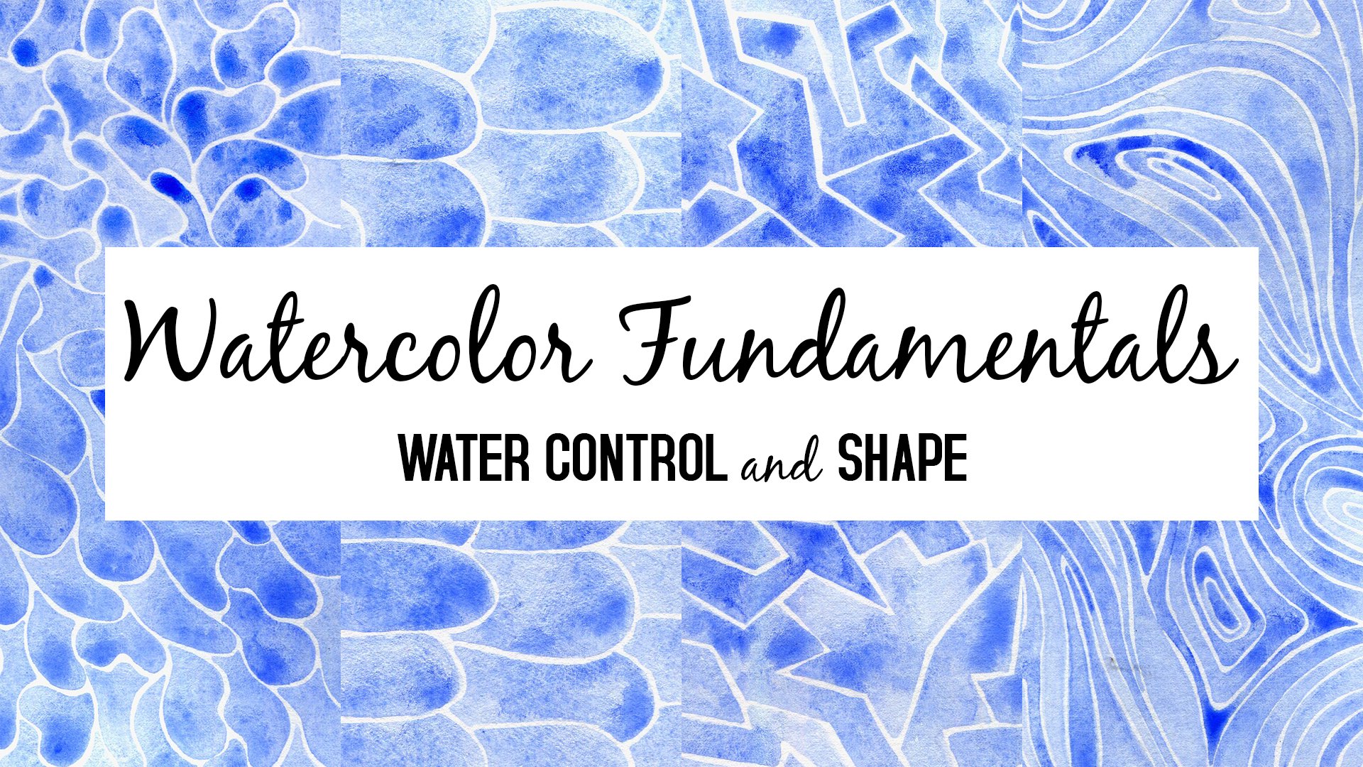
1. Intro: In this class, we'll paint what I call a feather forest pattern in watercolor and gold. I'll guide you step by step in choosing your paints and applying them to get a variety of hues, values, and intensities. I'll walk you through my process so that you can learn from the considerations I make as I work. These often get lost when watching a speeded up video, so I've provided plenty of real-time speed video as well as commentary on how I work and why. Paint along with me and try out these methods. See which of them work for you and which you prefer to tweak and do differently. Since this is a focused, slow-paced class with a lot of guidance, it's perfect for beginners and for those who feel somewhat intimidated by watercolor. It's also a great class for those who want to paint this pretty pattern along with me. If you're in the mood for a challenge, I'd love to see how you tweak this pattern according to your own design and interpretation. I look forward to seeing your feather forest watercolor paintings.
2. Watercolor Shapes: Let's set up our watercolor paper for painting. I like to cut down my watercolor paper to a smaller size and tape it down using masking tape to a piece of cardboard. But if you don't want to cut your paper, that's totally fine. You can just mark out a rectangle on a larger sheet of watercolor paper. When I tape down my watercolor paper, it makes it easier to work with. When the paper gets wet as you're working on it, it will buckle and the tape holds the paper down a bit more securely, but it's not a must. When you take down your paper like this, you're also going to end up with a nice white border around the edges. Grab your watercolors, it really doesn't matter which brand or which type of watercolors you're using. I like to use this watercolor palette that's filled with tube watercolors. You're also going to need a jar of water and a paintbrush. I'm using a synthetic round watercolor brush size six but you can go up or down a few sizes, whichever works for you. It's good to have a paper towel handy because sometimes your brush is filled up with too much paint or water and you want to get rid of that excess, or sometimes you want to remove some of the water that's on the paper. The color palette that I've chosen to use is blues, greens and turquoises and for that, I'm going to use my blues and my yellow. I'm also going to be using this concentrated watercolor in ice blue because it's very vibrant and I wanted to have some vibrancy and saturated colors in my painting. Once you know which colors you want to use in this painting, you can start to wet these colors and mix some of them together. Try and notice how watery or how concentrated your prepared paints are. The more watery they are, the paler they'll be and the more concentrated they are, the darker and more intense they'll be. We're going to try and use a little bit of pale washes and a little bit of the more concentrated washes. Since I'm left-handed, I start at the top right. If you're right-handed, start at the top left and that way, your hand will always have a place to rest while you're working without having to touch any wet parts of the paper. Paint a scallop shape in any color you like and then you can go back to mix another color and drop that color into this scallop. In this second scallop, you can see that I'm using a very pale wash. I want to have a variation of different colors, but I also want to have a variation of different intensities. So some of the areas I want them to be very pale and some of them I want them to be darker and more saturated and vibrant. You can see that I'm jumping around the page because I want to have the scallop shapes looking a little bit disorganized, like some of them are behind the others, and some of them are taller than the others and so on. You can decide how orderly you want your scallops to be or how disorganized you want them to be. Try painting shapes that are so pale that they're even just plain water on the paper. You can play around with the colors that you drop into this pale area. You can paint part of the shape in one color, then go back to your palette, choose a different color, and continue painting the shape with that different color. This will give you a variation of colors within the scallop. Try to get that variation inside each shape so that you're getting some different colors in different areas of each of these shapes. Another thing I like to do is to load my brush with water and go back to a wet shape and drop some water into it, and when this dries you'll see that it's going to look really cool. Now, if your shape started off as very puddly wet, then if you drop some water into that shape, it's not going to have the same effect as when you drop water onto shape that's just a little bit damp or just a little bit wet. Try and see how much water you have in your shape and try and drop some water into your shapes at different stages of wetness. You are going to have to wait until it's completely dry to see the effect. The way that these shapes look when they're wet is different from how they look when they're dry. We're working on this first row of scallops which will be our feathers and we are trying to vary our colors, so trying to use different blues, different turquoises, different greens, but don't worry too much about the colors that are actually resulting on the page. Don't overthink which color you are picking up with your brush. Just go for it and be mindful of how pale or how saturated your washes are and try to vary this up. Try to use some pale washes and try to use some saturated or darker washes. Here you can see me going back and picking up some more water with my brush in order to make a paler shape this time, because the shapes next to it are pretty dark, pretty saturated and I want to add a little bit of a contrast using paler colors. You can see that I'm leaving a white space between the shapes because if I don't leave a white space, the shapes will just merge into one. Don't worry about having this space between the shapes be perfect or precise or very narrow, just go with whatever feels comfortable for you depending on your level of control of your watercolor and your brush. You will see that in some cases my shapes touched each other and that's totally fine. When I work sometimes, I want to be very meticulous and very precise and sometimes I want to be a little bit more loose and I'm not sure that one is necessarily better than the other. Go with what feels fun for you and what works for you and don't force your hand or don't force yourself to do something that is too difficult at the moment. Once you finish the first row, go on to the second row and do the same thing. You can already see the interesting textures and colors that emerge just by mixing up your colors onto each shape without having too much of a plan in mind. When you use a very thick, saturated pasty paint from your palette, it might just sit there. It might be very heavy on the paper, and so you might want to add some water next to it to help it flow and move. Try not to create puddles in these shapes. Try not to add so much water that it's puddly because that will just make the paper buckle more and it'll make the paints mix more on the paper. If you want to have different colors in different areas of the shape, it's better to have less water so that the paints do mix together, but they don't completely merge and make the color uniform. Do experiment with this by yourself. Try and see what happens when you use more water or less water. Since you're constantly remixing paint on your palette, you're inevitably going to get a variety of colors without thinking too hard or trying to control the colors a lot. You see here that I have on my palette, a puddle of blue next to some red and this isn't something I planned but since red and green are complementary colors, they cancel each other out in watercolor and make a gray. Then the red that infiltrated this color, neutralize a little bit of the blue and so it's a more of a grayish blue. You can paint a shape in one color and then drop in a little bit of another color, or you can paint the shape in pieces and switch the colors up as you go along. Remember that pale colors are colors too, so if you use a color in a very saturated version of it, try and also use that very same color but in a more diluted version, so with a lot more water. The end result, when it dries, is going to look like a different color. It's nice to have that variation of lights and darks, saturated, and pale. I'm varying the height of my scallops, but you don't have to do that. It's just one version of this kind of feather forest painting. You can have your scallops being more uniform or you can have them being more wonky. You can even have them tilted a little bit. When you pick up a more pasty concentrated paint from your palette, you can get variation just by wetting your brush and painting the rest of the shape with a wetter brush. You'll have a part of that shape be more saturated with color and a part of it be more pale, and that will add some variety. We can have contrast between dark and light, contrast between different hues so between greens and blues, and contrast between different tints of color, meaning whether they're very dark or very pale and we can have a contrast between how saturated or how muted our colors are. The more muddled the color is, the more muted it is, so in order to mute a blue, you can add a little bit of a reddish orange to it, or an orange. It all depends on the specific blue that you have. So this is a great opportunity to try and add just a touch of other colors to the paints that you're using. This scallop is painted part in blue and part in green and I added just a drop of water onto the blue part. Now let me speed up the video and you'll see what the water did in this scallop. Sometimes you'll add a drop of water and the effect will be very subtle and sometimes it'll be more dramatic. It depends on how dry or how wet your paper is, and it also might depend on the pigments that are used. Rather than trying to control it, I like to just enjoy the unpredictable nature of it. For the final row, I'm just going to paint the scallops as if they were cropped at the top in order to fill in the whole page. We are done with the first stage. We're going to let this dry completely before going on to the next step.
3. Gold Lines: Now that our watercolor scallop shapes are dry, we're going to add some lines using gold watercolor. If you don't have gold watercolor, that's totally fine. You can use gouache or a darker color in watercolor. If you do use watercolor for the lines, make sure to use a very concentrated and dark color so that it will show up against this background. The gold watercolor that I have and I like to use is made by a company named Coliro and the line of their product is called Finetec. This particular shade of gold is called champagne gold or moon gold. It's a bit of a whitish gold or a silvery gold and I, personally, like it a lot. I also have Arabic gold which is much more yellow and a little bit greenish. You can get these gold water colors in single pans like I have here. They costs about $5 or you can get a set of them. These little pans last for a very, very long time. I, personally, don't see the need to get the entire set of golds. I think it's more cost-efficient to get a very small pan and just use that, but that's just my personal preference. I like to take some of the gold out of the pan and prepare a mixture in a separate little palette. The reason for that is if you work directly from the pan, you're sometimes going to be picking up a more watery consistency and sometimes, a thicker consistency. That makes it just that much harder to work with. It's definitely possible but I prefer to use a separate palette. This palette that I'm using is actually an egg holder from IKEA. I like having a separate palette for my golds far away from my regular watercolors because the little glittery pieces from the gold tend to find their way into the other colors. I like to keep them separate for that reason. The best way that I find to prepare a good mixture of this gold is to put down some water onto the surface using a larger brush and to let that water sit. When the water is sitting on the surface of this gold, it's going to slowly seep into the top layer and soften it up, so that you'll be able to pick it up using your brush and transport that concentrated gold into your palette, and then you can adjust how much water you have in there. But even though I've found that it's best to leave the water sitting like this for a while before picking up the gold, I'm usually impatient. I just scrub away at the top surface until I get a good thick consistency of the gold. Again, since I'm impatient, I usually get a consistency that isn't very thick, and so the gold isn't as strong or as thick as it could be. Then, I adjust that by coming back and adding more gold. If your gold is too thick, it's going to be difficult to make thin lines and it's going to be goopy on the page. If your gold is too thin, it might be semi-transparent, that might not be as opaque. Try and find a good middle ground that works for you. Sometimes, I work with a thinner gold. Sometimes, I work with a thicker gold. In any case, it's going to look cool, so don't worry too much about the consistency. I'm using a larger brush in order to prepare the paint but afterwards, I'm going to use a smaller brush. I'm using a size 0 round brush to make the lines. My lines aren't super thin, so you might want to use a brush that's even smaller than a 0. You can see here that the first line that I put down is a little bit thin. You can see that some of the gold is a little bit see-through. I still decided to go on and keep using that gold because even when it's not super, super thick, you can still see it very nicely reflected in the light. Start at the top right if you're left-handed, start at the top left if you're right-handed and move gradually down. You can see that my feathers are basically upside down. The reason for that is because I find it easier to pull my hand in this direction to make these diagonal lines from the center going out. You can see in the light how golden this looks and you can see where the gold is thicker and where it's thinner. It doesn't really matter. It's going to look pretty either way. At some point, I decided that my paint was a little bit too thin and I decided to add a bit more of the gold to it. This is the design that I like to paint on my feathers. It's a very schematic, graphic feather, imaginary feather. I like to make a line across the center and then add diagonal lines going in on either side. I don't worry too much about matching the sides. I don't make sure necessarily that each line on the right has a matching line on the left. I just add some lines on the right and add some lines on the left. Turn the paper around as much as you like. This is another one of the reasons why I like to work by taping my paper down to a piece of cardboard because I can easily turn it around without touching the paper. It's pretty small, so it's not like I have to turn a huge pad of paper. I just like concentrating on this one small piece of paper, but that's just my personal preference. See what works for you. When you're using a round brush, the tip of the brush is a little bit thinner and more pointed, and the body of the brush is a little bit wider. What that means is that if you barely graze the paper with your brush, you'll get a thinner line. If you press harder on your brush, if you press down on your brush, you'll get a thicker line. In this case, I was not meticulous about just grazing the paper that's why my lines were a little bit thicker in some places and I think that it's totally fine. The beauty of using a brush and not using a pen in this case is that variation in the quantity of paint that the brush puts down and the thickness of the line. It adds more character and texture to the lines. I'm starting at the center line and pulling my brush. As I reach the end of the line, I, sort of, a little bit, lift my brush in order to get a tapered edge. I haven't done that perfectly on every line but this is a good exercise for practicing lifting your brush at the end of the line, in case you want to get a tapered edge. You don't have to be super, super meticulous and perfect for your work to look beautiful. It's just going to have more of a quirky, wonky, slightly-wonky character to it. Let me speed up the rest of the video, so that you can see the process start to finish. I think it's very satisfying to see speeded up version. Many artists, both on Skillshare and on YouTube, post speeded up versions of their work. I think there's a lot to be learned from that, but there's, also, I think a lot to be learned by looking at real-time video of artists at work because sometimes, the important things are in the details and in the little tiny considerations of how you use your brush and what kind of consistency you use for your colors, and in which angle you hold your paper. Now, we've reached the really, really fun part, which is to take off the tape if you've taped down your work. This way, we get rid of all of those messy edges and we see that beautiful white border without crisp edge all the way around. If your tape is very sticky, do this carefully and pull the tape away from the picture so that there's less of a chance of tape picking up the edges of the paper and tearing it. Here is the finished piece.
4. Inspiration: In this last lesson, I wanted to share with you a few of my creations that I've made using this feather forest pattern in the hopes that it'll inspire you and encourage you to go ahead and give this a try. I think this is the first I ever made. You can see that the background is pinkish, an overlap pinkish background. I painted the shapes in various colors. You can see that my feathers are pretty slim and tall and tilted in all sorts of directions and I used Payne's gray to make the lines. This is one of the many ones I made, very similar to the one we made together in class and mostly in blues and greens. This is made using just one color and you can see that the scallops are very uniform. Believe I used ultramarine blue in this case and pretty pale overall. It's the same ultramarine blue but this time the feathers are more irregular in the way that they're organized on the page. Here's one where the colors are rusty orange. I believe it's transparent pyrrole orange and greenish blue, they look blue in this case. This is using those same colors but the feathers are arranged differently. I think this would work really great as a cover for a greeting card. Here is just a bunch of colors of feathers without any stripes. You can see that when you use these different colors you get a totally different fill. These pinks and oranges, lusin greens. See how it looks when you add a dark color at the base of the feathers. This is another one with a greenish turquoise and orange. These aren't colors that I would naturally be drawn to but I'm really glad I tried them because I think this is really nice. Here I used apricot gold for the line work instead of the moon gold. You can see that it's much more orange and a bit of a greenish orange as opposed to the moon gold which is more whitish. This is a really cool example of how you can mix it up. You can definitely make the feathers on one side and make the feathers on the other side and then fill in the space between them. If you like to do hand lettering you can also write something nice in the middle. This is an example where I wasn't being meticulous and you can see that the water color bloomed from here to here and I think it still looks fun. Here's another example of that same design. But here I also added some line work in between the feathers. These were all done using watercolor and now I'm going to show you this very same design that I made using acrylic ink. You can also do the seizing ink. Just for your consideration, if you want to give it a try with ink, you can get a very similar look to the watercolor look or you can get a different look depending on which inks you use, whether they're transparent and whether you dilute them before you use them. I made the background using fluorescent acrylic inks, I really like how it came out. The foreground, the line work is still in the gold as we did in class. I made this using diluted acrylic inks. You can see that the same brown was used here and here or maybe I mix this brown a little bit with the green and the same green. You can dilute acrylic inks to get similar results to watercolor and you can drop in some acrylic ink to get watercolory effects. This is also made using diluted acrylic inks. I think they look great and are a great alternative to watercolor. I made this using opaque acrylic inks and I also went over the shapes more than once. You can see that the shapes are much more solid than when you use watercolor or diluted acrylic inks. Here as well, I went over the shapes more than once so that the colors are very solid and there isn't much of a variation inside each shape. This looks very much like watercolor but again, this is acrylic ink which was diluted. I hope this inspires you to try this project. I hope you enjoyed this class. Thank you so much for watching and I look forward to seeing your projects in the project section below. So be sure to post your work below. Happy painting.
 Keren Duchan, Doodler, Teacher