Transcripts
1. OIL PAINTING: BASE LAYER MAGIC PART 1: Hey everyone, My name
is Sarah McKenzie and I'm a Canadian
realist painter. Today I'm gonna be
walking you through two beautiful landscape
paintings on the smaller side. For one's none of these
big canvases today, we're going to focus
on background work instead of the detail work. And these skills that you create are gonna be
essential as you move forward within your
craft in building really beautiful,
realistic paintings. We are going to
be using the same palette for both paintings, keeping the cost
down and showing you the versatility of these
really simple colors. I'm gonna be working
through these paintings relatively quickly, but feel free to
pause your video at anytime if you need more time
and that certain section, the reason why I've chosen
smaller Canvases and to work at a quicker pace is
to give you the skills you need to really start building up that confidence with your
base layers and to show you that you don't need
great detail work to achieve a really beautiful
realistic painting, you can find a list
of all the materials that we're using on the website. So check that out. If you have any questions,
feel free to reach out to me. If you do not have the exact
colors that are listed, do not sweat it, use whatever similar color
you have on hand. I'm really excited to
show you how simple brushwork can really transform
your creative journey. One of the biggest things I
hear from all my students, it's so hard to locate all of the materials
for these classes. Well, I have fixed that
problem completely. I have sourced out all the
paints and brushes and mediums that you need to create any
single one of my tutorials. You can find them
in my online shop and have them shipped
right to your doorstep. Just go to Sarah
McAndrew dot ca, and click the link and you'll
find everything you need.
2. OIL PAINTING: BASE LAYER MAGIC PART 2: We are using a very simple
palette for this class. We have indigo, Payne's
gray and green Earth. Feel free to use
Prussian Green or charcoal gray if you have
those on hand instead, whatever works for you. Over here, I have titanium white and my medium which
is liquid like Joe, This just really speeds up the drying time of my painting. Walnut alkyd oil
really works well too. But for now I'm just
using my liquid Nigel. As you can see, I've already
established my horizon line. I've come down about one inch from the center of my canvas. The reason why my horizon line is in the middle and
not on the bottom. Third sign is that the
focal point is gonna be the Island of trees
right in the middle. Now, we're gonna be using
really rough, loose brushwork. It's not gonna be
super detailed. What I want you to
practice is really getting your base layers
really fun and flowy. You don't want to focus in on detail work so much
at the beginning, you really want to
allow yourself to play. And in that play you
really grow as an artist. I'm using the number 18
is go-to blending brush. Feel free to use whatever
brushes you have on hand at the small canvas so you
do not need big brushes. I'm going to work through
this painting really quickly. Feel free to pause at anytime and slowdown in the
sections that you need. I'm just going to show
you how you should find flow within
your base layers. Because that is where the
magic really happens, really makes things pop
in your final detail. Work, take a little bit
of medium on your brush. We're going to start building up the base layer
behind our island. It's the darkest part
of our background. We're going to get
that on first. I'm taking a little
bit of medium and pushing it into the bristles of my brush just really helps move that paint along the canvas when we're doing our base
layer blending, it's important to
find the right amount of medium to add to your paint. You don't want it to run it because then it's
going to all blend together and you won't
be able to really differentiate between all
the different sections. So I have just a
little bit of medium. I'm going to take
some of my green, some of my gray, and a tiny bit of my blue. And create a nice deep color. I'm going to add a little
bit more of my blue. I want this color to have hint more blue than green because it's gonna
be in the background. We're going to have green
trees in our islands. And so this is just going to
compliment it really well. With that dark color. Pull it across your horizon
line about an inch up. Maybe come up 2.5 inches
from the horizon line. You don't want to
come up too much. You just really want a little bit of color here that we're going to be blending. You don't want a lot
of paint on your brush just a little bit because
it's such a small canvas. We don't have to do
that circular motion. Underneath my horizon line. I'm transferring that same color because this is a reflection seen as you're working through a painting
that's a reflection. Always remember to transfer whatever color you use up top, down below by taking
the time just to transfer that color while
you're working in each section. You don't have to go
back after and guess what a color is if
you forget to do it. I'm going to add a
little bit more indigo and a tiny bit of white. I'm just going to add
one more brush width of color on top of what
I just established. You have a little
bit more indigo to that and the
type of more white, I've kinda want that blue
to be a little bit more prominent in those two sections. So taking a rag or a
paper towel to take off all the excess paint
from your brush by just rubbing it
into its surface. Your brush doesn't need
to be perfectly clean. It could still have
that dark color on it. You just don't want
any excess paint. We're going to be
using the same brush to add some more titanium white into that same color
we had on our palette here. Now I'm adding the
titanium white on top of the color
that I just created. The reason I did
that is because it's very small amount of colors, so it's not going to transfer
too much into the white. You've created a lot of color, just makes your wife beside it. In a different part
of the palette. You don't need to do
exactly what I'm doing. But because I had very minimal
color left on my palette. And I'm just trying
to conserve my space by using the same space
over and over again. That's what I've done
with this lighter color. Transfer it directly above your transition line
that we just did, and directly below your
reflection transmission line. Now, I'm going to add a
little bit of Payne's gray into this mix because
I want my misty section of the sky at the
base here to have a little bit more
of a moody feel. So I'm just going to
add a little bit of Payne's gray to that. I don't want to be too blue. Picking up a shop towel or a rag, whatever
you have on hand, get rid of all that excess paint that you just put on your brush. I know we repeat a lot of these steps
over and over again, which is great because you're
creating muscle memory. And then you're going
to stop thinking about certain things eventually. It's just going to flow
up from within you without having to give
them much thought. I'd take it all that
excess paint off. The reason we're doing this
is because we're gonna be using a lighter color up here. And we don't want
it to be the exact same color that
we just put down. Taking a little bit of medium and a clean section
or your palette, add some titanium white. Transfer that white into the top section
of your painting. You don't need a ton of paper. You just want it to be liked. And do the same with the bottom. Just transfer that white
into these two sections. No surprise, surprise. We're gonna take some of
that excess paint off our brush with a fresh
shop towel or a rag. Just get all that extra white paint with that lighter
color off your brush. We just want really
minimal amount of paint on our brush
because now we're gonna do the blending work out a little bit of Titanium
white without any medium. With a lot of pressure
on your brush. Work it down towards that
shadow layer we just put in. Don't pull it all the
way down to this color. Right now we just want to
create a misty shadow layer. So we're just coming down to
that first transition line. I'm going to actually
pick up a bit more of that Payne's gray color I created and add it to
this transition line. It I don't want to be
a very harsh chance. I don't want to be really bright white and then a soft gray. I really want it to be a
little bit more pronounced, so I'm adding a bit
more of my gray to my brush and I'm just going to re-establish my shadow
in this section. Since I added a very
minimal amount, I'm actually going
to keep working my brush off the canvas. The minimal amount of pressure. Just reworking the first
maybe three inches of those transmission lines
back-and-forth until it really softens up
using a fresh brush, pick up some of your
darker color that you used to block in
this background behind our island with a circular
motion really gently. We're going to
just really create the illusion that
there's a tree line or a hill full of trees back
here behind this island. As you can see, I'm
using a circular motion, very gentle amount of pressure. But by staying in one spot
and bringing my brush about a half-inch up into the gray section
we just blocked in. That circular motion continually pulls a little bit of that grade down onto the top of our
trees that we're creating. And some of that color from our brush up into
that gray section. We're not creating
any detail back here. This is just gonna be
the hint of something. It can be trees are hill
or just a distant Valley. What it's about the
width of my brush. And there's no detail with that same dark
color on my brush. I'm gonna do the same
thing in my reflection. Coming down the same amount. I'm working that same
transmission line with the same amount
of pressure and just working from the
left to the right. Taking my time to make sure that that little
transition line really softens and
blends itself. See how easy it is
to instantly create a misty feel off
in the distance. That was what the
simple brushwork. That's why I really wanted
to focus on this with these classes because you can create a lot of
scenes from here. You can do so many
different things. These are tools that will really help you grow within your craft. I'm not going to wipe
off this blending brush that I was using in
this section because I want the water to be a little
bit darker than my skyline. So I'm just going
to transfer some of that same color that was
all my brush already. I haven't picked up
any fresh color. With that circular motion, just working it down towards that lighter color I put on
this base layer down here. And then as that
transition softens, so does my pressure on my brush until I barely
have any pressure. Just keep working that section until you have
no brushstrokes left. Now, I lost a little bit
of my treetops there, so I'm just going to come
back with my darker color. And right along that transition, I'm just going to gently, you turn over your brush. There's more darker colors. So if you find that
you're picking up too much light color
as you work across. Just flip your brush
over and see what's on the other side of
the darker color. You don't have to grab any
more paint from your palette. You can just use what's
already on your brush.
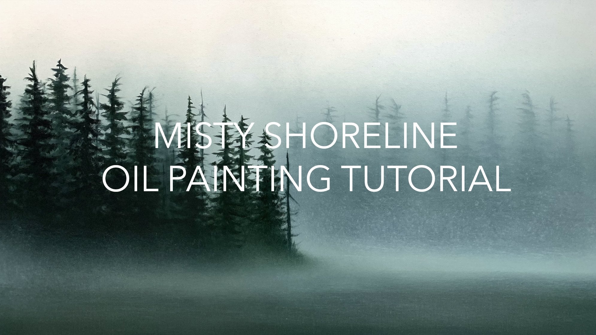
3. OIL PAINTING: BASE LAYER MAGIC PART 3: So as you saw the
beginning of the painting, I've used a piece
of painter's tape to block out my horizon. You can actually just
use a pencil line on pull your measurement down and
eyeball it if you need to. But I use painter's tape
just so you can really see where the horizon is sitting
on this little piece. Whenever you're out in a misty
seen in the natural world. Often there's this
very thin layer of myths that's resting
along the shoreline, especially on the west coast. It's one of my favorite
things to look at. What we're gonna
do is instead of bringing this darker
color right up, we're going to add
just a tiny thin layer of missed along
this section here. So pick up another
blending brush. I'm using the
one-inch brush here. And what you're gonna
do is grab a little bit of the titanium white
that you've already mixed around on your canvas and a tiny bit of that missed color. You might want to add a
little bit of mediums just so it's a little easier to
pull across the canvas. And what you're gonna do is
you're just going to pull that color along
your horizon line. I don't have enough
paint on my brush. I'm just going to
add a bit more here. It's okay if it's
not a straight line. We're gonna be really softly blending that in
by going back and forth. And eventually it'll get
that seamless misty look. So I had barely any
pressure on my brush. I'm just going
back-and-forth above and below that horizon line that I just pulled the
white paint across. Then I'm moving my brush on its full flat face and going
back and forth a few times. And what this is doing
is it just softens that misty field because this isn't the background,
There's no detail. And really gently I'm gonna
take this brush and move it down the missed a little
bit and the reflection. And then up in that
background section. And now we've created
what looks like a layer of missed along
the horizon line. We're going to be painting
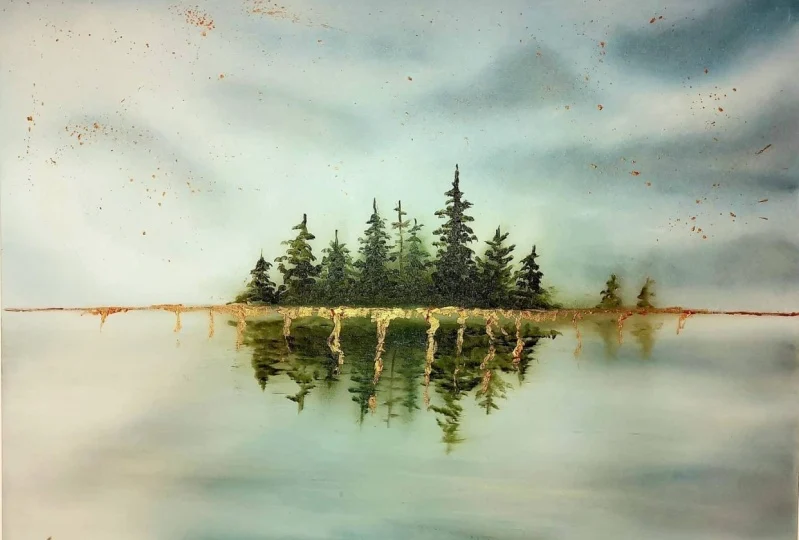
an island over top of it. So it's gonna look really
beautiful in the finished seen, picking up a fresh brush
or clean off one of the brushes that
you're already using so there's no extra paint on it. We're going to build up
this island in the front. All we need to do is grab
a little bit of medium, mix it into the
bristles of your brush. And we're going to
create a really beautiful deep dark green. So I'm grabbing
the green I have, I'm going to add a tiny
bit of the Payne's gray and a tiny
bit of the indigo. I don't want that into go
to overpower the screen. I really wanted to have
a nice fresh papa color. It's really going to look
cool as an island here. The bottom of our island is
going to rest just maybe a quarter inch below where
our horizon line was. So what I'm gonna do is I'm just going to establish where I want my bottom of
the island to sit. I don't want it to come
all the way across. I really want this
background to stay visible. So I'm just probably putting four inches of ground
down here with this green. You don't need a ton of
paint on your brush, but makes sure it is
fully coded and others enough there to be
able to pull up into this section without really having to push
against that base layer. And then it comes
up with your color. I'm just going to gently
come up probably one-inch, pass our back treeline there. What this is gonna be is the middle point of
my little island. That's the highest point
of the trees I'm going to establish with my brush. I'm just pushing the color off my brush into this section, I'm going to go back and do
detail work in a minute. But this is a fun way to establish where you
want your trees to sit. Make sure you pick up a
little bit more darker color. It's not going to be globs
of paint in this section, there's a bit of color
because you do want it to be a little thicker
in this island, but you don't need tons
and tons of color. By using that sharp
edge of your brush, you can just play around with
different sizes of trees. Transfer paint off your sides of your brush by just
gently pushing the side of the brush against the
canvas that we don't have to keep dipping your
brush into the paint. Don't come all the way up with this brush for any detail work. This is just going to
block in the color. Then underneath, I'm just going to pull some of this color down. This is a reflection, so
it's really going to be muted and not detailed. But what you do want
to do is establish the same treeline
in your reflection. So just gently using
the side of your brush, follow those trees
that you put up, top down into the reflection. We're going to add
more detail to these trees in a second. But getting this base layer down of these trees
is really important, especially in this
reflective layer. So don't forget to do that. Alright, so I'm
really happy with how this is starting to look. Now I'm going to show you
some really basic detail work to do on this island
to make it pop. I'm using the number six
Princeton select brush. You can use any smaller detailed brush that
you have on hand. Without adding any medium. Pick up some of that
green on your brush. When I work on a smaller
canvas and I don't want to push my hands
against the canvas. I like to anchor my hand with my pinky on the side of
the canvas like this. It just allows my hand to stabilize and it allows me
to work in a little detail, work without smashing
everything because usually have a very unsteady
hand if it's not stabilized. So I have my pinky on the side
and I'm just going to come in to these trees
and make them look. A little more tree-like. So what I just noticed
about my brushes and some chunks of paint
at the bottom. So what I'm doing is
I'm just going to you just kinda squish your brush against the palate to get
rid of that excess paint. You can wipe it
off with a cloth, but I don't want to lose
too much of that color because I do need
it for my trees. But getting it off the base, you just squish it into
your palette like that. And then pick up the
color again with the top of your brushes so you have more of the top instead
of at the bottom. So again, I'm anchoring
my pinky finger. I'm just creating branches
coming out from the center of my tree and bringing them down. Then I'm following
that treeline down. Without any detail work. I'm just kinda pushing my
brush across where that line was and just creating the hint of what the tree
looks like from above. The reflection of this tree
does not need to be perfect. And we're not here to
focus on perfection today. Right now, we're just
getting some basic skills in your tool belt to really
create some fun scenes. So I'm just whatever tree
I create at the top, I'm creating the same one and the reflection really rough. No detail to it, but up top
there'll be more detail. So just work your way
across your little island, grabbing some more green
on your brush as you go along and create
unique looking trees, make sure they're all different. Have some fun with it. I'm going to grab some
more green on my brush. You will notice that that under color is coming
up into your green. That's just because you're
painting wet on wet and that's why that base layer is so
important to do a thin layer, you are welcome to wait until the base layer dries
before you do this scene. But it's also fun to practice getting the right amount
of paint on your Canvas. It's a good skill to know. And that way if you're
in the flow with a painting late at night
or early in the day, you don't have to stop
and wait for it to dry. You're building the skills
to be able to paint through different layers and understanding your paint more. Just really important. Alright, so I'm
just going to build these last two trees now, if you've ever taken one of
my courses on tree creation, try and make sure to have an odd number of trees
right now I have six trees. What I'm gonna do
is I'm going to add a dead standing tree right
in here in a minute. But first I'm just going
to finish blocking in these trees here. I really like how this is
starting to come together. I'm going to pull
down my reflections. This tree is the
biggest, so it's going to be the tallest. It, It's really simple. Brushstrokes. Don't
overthink it. If you are not happy with what your reflection looks like, your
trees look like, grab a rag, wipe
off that island, re-establish your
base and try again. You can do that a 100 times and each sitting until
your paint dries. There is so much freedom with
oil paint in that sense. Yes, if you're
impatient and can be very challenging medium because you have to wait for it to dry. But if you use an
accelerator like this, like Liquid Light gel or
your walnut alkyd oil. You only have to wait
a day or two and it's safe enough to
paint over top of. But in each sitting you
have that versatility, that freedom to really make sure you're happy
with the painting. You're not stuck with it with whatever you put
on the first time. I'm really liking how
this is coming together. I have my reflection. I have all the detail
I want on these trees. I'm going to take a little bit
of Payne's gray and mix it into a corner of
that green color. And I'm just going to create one dead standing tree
just to make it an odd number of trees
in this island because odd numbers are
very pleasing for the, i just going to pull it down. And also into my reflection. Then we're just going to really
soften this reflection a little bit and that
painting is finished. So using the brush that you
use to block in this island, wife off all the excess paint. All we're doing right now is
softening this reflection. Once you get all that excess
paint off this brush with the most gentle touch right along that water's
edge under your island. Gently pull it across and go back and forth really gently. You just want to
make it look like it's part of the water. And by creating
these brushstrokes, you're giving it
the illusion that it is a part of the water. Now if you get any
paint on either side, you can go back and use your
brushes just to tidy it up. But remember to have
fun with this and it doesn't have to be perfect. I'm just going to
use this brush here, this lighter brush just to soften up the
reflection down here. And I'm actually
going to call that painting finished for now. What I want you to do is play around with all the different
detailed work on the trees. Play around reflection, and find balance within
your painting that you are happy with. I've given you a great
base to start with, and now I want to see
what you can create.
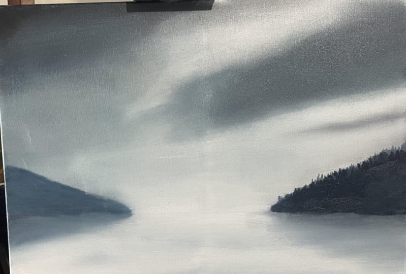
4. OIL PAINTING: BASE LAYER MAGICPART 4: For this second painting,
we're going to create a really moody coastal scene. I really want to show you brushwork that you
can play with to create really cool mist and
rain effects on the horizon. And just overall how to create a really neat shoreline
for this painting, we're gonna be using
the exact same palette. We have indigo, Payne's gray, green earth, titanium white, and your medium which I'm
using liquid like Joe, feel free to use charcoal, gray, or green if you
have those on hand. I'm using a dark blending brush that I just used in
the last painting. I'm using Payne's gray and some indigo blue and adding
a tiny bit of medium. A hint of the green,
but not too much. So using this dark color, we're going to establish
where the base of these treeline mountains are meeting our coastal seen here. To establish my horizon, I pulled a very thin piece of Painter's tape across
and stuck it down. What that allows me to do is pull that tape off at the end. After I've done all my
base work for blending, I have a perfect line. Now you do not need to
use painter's tape. You can just use
your measuring tape, pull down your horizon
line and use a pencil to draw across the ruler. My focal point is
going to be right. In this section of the painting, I've pulled my
horizon line about an inch down from the
center point of my canvas. I want it to be just a
little bit below the center. I want my focal point
to rest over here. So this is going to
work really well for the composition
of the piece. Now, back to our blocking in of these awesome little
sections here. So I'm gonna do
the exact same on the other side of
my horizon line. I'm just establishing
where I want these hills to reach
the shore line. I'm doing very basic
brushwork here. I'm not adding detail. This is a thick blending brush. It's just establishing where
they sit in the piece. And I'm going to transfer
some of that color down into the
reflective area here. I'm not going to come too far down this bug the same distance. Maybe one or two inches, just transfer some of that color into this section just so we know where the reflection sits as we work
through this piece. I have barely any paint
on my brush and I'm just pushing this brush around trying to establish
those neat little hills that are coming
down from the side. I think on the
signing in to make this one a little
different shapes. So I'm going to
have it maybe come straight across and
create a little cliff. You can have fun playing
with the different shapes. I'm sure all of you
have been out on a shoreline and see something that's really spoken to you. You can recreate that
here very easily. Before we begin
working on the sky, I'm just quickly going
to establish where I want maybe a sand
bar to come out. Something interesting
for the eye to focus on. What you want is the same color down here because it's gonna
be darker than the sky because it's just how
we're going to achieve that realistic and look within
this little ocean scape. But I'm not adding any
other paint to my brush. I'm just pushing all the excess
paint into this section. It does not lead to look pretty
or balanced or anything. We're going to be coming
back to this and really playing with it and
a bit up in the sky, I want it to be a little
bit more blue and gray than any of the green
color that's in the trees. Clean off the brush
that you were just using on your palette. Grab a little bit
of your medium. Some of your indigo blue
and your Payne's gray. You want a little bit
more Payne's gray than your blue in
this darker color, we're going to create
a little bit of a moody stormy seen in
this little paintings. So what we're gonna do is take that dark color and transfer it with a lot of pressure on
your brush and just jiggle the brushes circular motion down probably to
about this area. Just transfer a brush
width of that dark color. Then over here, along the top, transfer some more
of that dark color. Now, don't add any more paint to your brush if
you can handle it. The less paint you
have in this layer, the better because it's
really going to make blending and creating these
misty seems really easy. If you have too much paint,
just wipe them off with your shop towel or your reg. But we just want to establish some really beautiful shadows in the clouds we're
gonna be creating. I'm going to pull one
more little piece of shadow across here. We're going to be coming
back and rebuilding up these little sections
of the painting. So if you're blending
worker racism, don't worry, we can
reestablish them. Now I want you to pick up the
lighter brush that you were using in your last painting
or a fresh clean brush. Grab some titanium white and a little bit of medium and mix it into the bottom of your bristles so it's
nice and evenly coated. Start filling in the
blank sections of the campus between your
shadow layer with that color. Just gonna be transferring
a tiny bit of it and come right down
towards your horizon line. Tried to pull too much
dark color into this. We're just going to be
blocking in this section just so there's no more blank
canvas and there's a nice coat of paint
covering the whole thing. Grab a little bit more titanium white if you run out of
paint on your brush. And just really roughly
fill in this section. Take your dark
blending brush again and remove the excess
paint from it. We're gonna be using this
to really start working these transmission
lines and creating some really neat misty effects. So to do that, you don't want
excess paint on your brush. You can have a dark
paint on your brush. Just make sure there's
no extra paint. You don't want it coming off too much into our
blending work here. Once you've cleaned
off your brush, we're going to really
start blending in these shadow areas with
their surroundings. Working the transition
line between your dark and your light with a
circular motion and lots of pressure
on your brush, begin really erasing
that transmission line, really blending it
into a seamless, smooth looking area in the sky. Have some fun with what happens when you move your brush
in different directions. Where you live, your brush
and how you move your brush really helps create the
misty look in your piece. So always keep that in mind. Pick a direction you
want things to flow. And makes sure after you
do some blending work, you follow up with making sure that your brush goes in
the direction you're hoping things will flow
within your painting. It really helps create a really nice mood and vibe within the piece
when you're done, I'm not adding any extra
paint to my brush. I'm just going to be
working with what is on my brush and what's
already blocked in. I have a lot of pressure on my brush moving in
a circular motion. I'm going to pull this dark stormy clouds out
this way, a little bit. Coming down and easing that
transition line there, I'm going to add some more
definition eventually. But right now I'm just want to create the look of a
really misty moody scene. This blending is really
important because it really sets the stage for
your final painting. I'm just moving this brush along the canvas and softening
transmission lines. And you'll notice that as
you work along the canvas, if you push really
hard on your brush, you establish a new cloud
layer really easily. So play around with that. As you're working
through your scene. Make sure you've pushed down sometimes and transfer some of that extra color into certain
areas and see what happens. These base layers are really important to really get comfortable with and
play around with. Because if you get
really skilled at taking your time and
developing these skills, you're going to create really
realistic paintings because as you move forward
in your painting through different
levels of detail work, your base is already set and
looking at really realistic, see how quickly the sky is
starting to come together. I'm really happy with that. With the same brush. I'm gonna grab some
titanium white. And I'm just going to establish a little bit more lightness down here towards
my horizon line. The reason I want to do
this is because I really want to create a really miss the effect that
I'm going to show you. Like almost like rain
falling from the sky. And I really want there
to be a good contrast on this side so that it
really pulls the eye down to this section with this light color that's
already on your brush. Transferred into the
reflection just below the horizon line and come
down about the same width. That's your light
color ends up top. Come down about that far
into your reflection, doesn't have to match
perfectly. It's just a hint. And instantly you
can start to see how the scene is starting
to come together. Since we've come down, started
playing with this section. Let's work on the sides here. So this is the brush
I was just using to transfer that light
color down into here. On the other side, is
that darker color still? I'm going to pick up a little
bit extra darker color that we've already made
on my palette here. And I'm just going
to go back and forth and transfer that
darker shade into this area. We're going to come back and reestablish this shadow color. So don't worry if
it gets knocked down a little with
this lighter color. But just go back and forth and transfer this color that's
on your brush into the rest of the areas that are blank or where the canvas is peeking through and picking up a little bit more darker
color because I picked up a little bit of that
light color on that side. I have a lot of
pressure on my brush. I just want to fill in
all those blank sections of this face area down here so that no canvas
is showing through. Instantly. You can start
to see how it feels like a really moody ocean scene, which is what we're going for. Having the differences in color and shading is really important.
5. OIL PAINTING: BASE LAYER MAGIC PART 5: I want to re-establish this
dark area and the reflection. So I'm just grabbing some
more of that color we already have on our
palate that dark color. If you run out of that color, It's just Payne's
gray and indigo with a hint of the
green, not too much. And we're just
pulling that along the horizon line and slowly pulling it a little bit lower so it looks
like a reflection, but don't come down too far. You want it just to be within the same height as
what's above it. Do that on both sides. Then with that dark color
that's on your brush, gently pull it across the entire canvas with
barely any pressure. Back-and-forth. Just in the bottom. Be careful not to push too
hard and the lighter section. But what we're doing
is we're making it look as if it's still water. I'm coming up about
a half brush width every time I make a pass. And now it looks like a beautiful reflective
water seen on the bottom. I'm going to add
some detail work to this side
whenever we're done. But this is actually gonna be mostly covered in a rainfall or a heavy fog using a
darker brush that you have, transfer some of that dark
color that you have on it into the base of this cloud space with a medium amount of
pressure on your brush, you're going to pull this color in a circular motion down towards your horizon, over and over and over again. Come back up to the top
and then come back down. Come down at a bit of an angle. Because again, you want
it to feel as if there's a cloud front moving
through your piece. That's how you're creating
movement within your painting. And doing this, you're
going to really hide this behind the layer of rain or missed whatever it is that
you're hoping to create with your brush and give it the illusion that this
is in the foreground. This rain is falling in front of that little hilly
tree side there. By coming over just
before halfway, you're keeping the focal point in this bottom third section, which is really cool. Play around with this. You don't want to push too
hard on your brush because you erase this hint of
the hill behind it. You wanted to play around
with that gentle pressure. You can keep going over and over it and playing and playing. And if perchance
you do happen to erase this whole hill,
just start again. Just wipe off your Canvas, rebuild the base
layer and the hill, and practice this brushwork. I think I'll add a little
bit more here, just a hint. Often when you look
at these scenes, there's a few really small hints of the raincloud
that lead the way, but have some fun
with this brushwork. The last thing we're gonna
do is take a clean brush. And over here, this is
really far in the distance, so you do not want
a ton of detail. But going up and down like
this with your brush, keeping the same angle on your brush all
the way up and down. You create the illusion of little treetops in the distance. Do that all the way down
to the water's edge. And then come back a little bit lower than the last
layer you did. And do that all the
way back and forth until you reach
your horizon line. This is covered in
rain and missed. So it doesn't need to be
detailed, but this isn't. And this is really
gonna be pleasing to the eye because it gives it that little bit of detail work
to see it's really subtle. With your lighter brush.
We're just going to add a few little
highlighted sections in the water reflection
that's just pull the eye out and down from
our focal point. Not too much. But we just want to lighten up that middle section
and make sure it spreads out towards the darker
areas of our reflection. Now, for the fun part, I'm going to take off my tape. I'm just going to finish up
with this reflection area on my horizon using a brush that has light
colored paint on it. I'm just going to go across my horizon with that
nice light color. It's going to pick up
the colors underneath. So not too worried about
it being too light. And I'm just going to pull
that light color across here. Then I'm going to pick up my darker blending
brush I was using. Add that darker color, even though there's
a little bit of light paint on it,
it doesn't matter. Just a couple of back-and-forth filling in that horizon line that's leftover from my tape. If he did not use
painter's tape, now's a great time to take
your measurement back down. You can just take
a straight edge. After you grab
your measurements, hold on straight edge
along your Canvas and use a paintbrush to pull your
horizon line across. I'd use a lighter brush
just so establishes it, then you can come back and
play around with it after it's been re-established
on your painting. So I'm just bringing this
color up into this white area. Then in one final pass with barely any
pressure on my brush, I'm just going to
soften all those brush strokes that I just made. Make sure you play around with the different brushwork
in this section. I'm not going to be
doing too much more here because I really
want you to run with this painting and have some fun with these
new techniques. But I'm really happy with
how it's looking so far. I really hoped you enjoyed this color palette
we played with and these two fun little paintings
that we've just created.
 Sarah Mckendry, Canadian Realist Painter