Transcripts
1. Introduction: Hello and welcome
to this course. I'm truly happy
to have you here. In this class, we will continue developing your
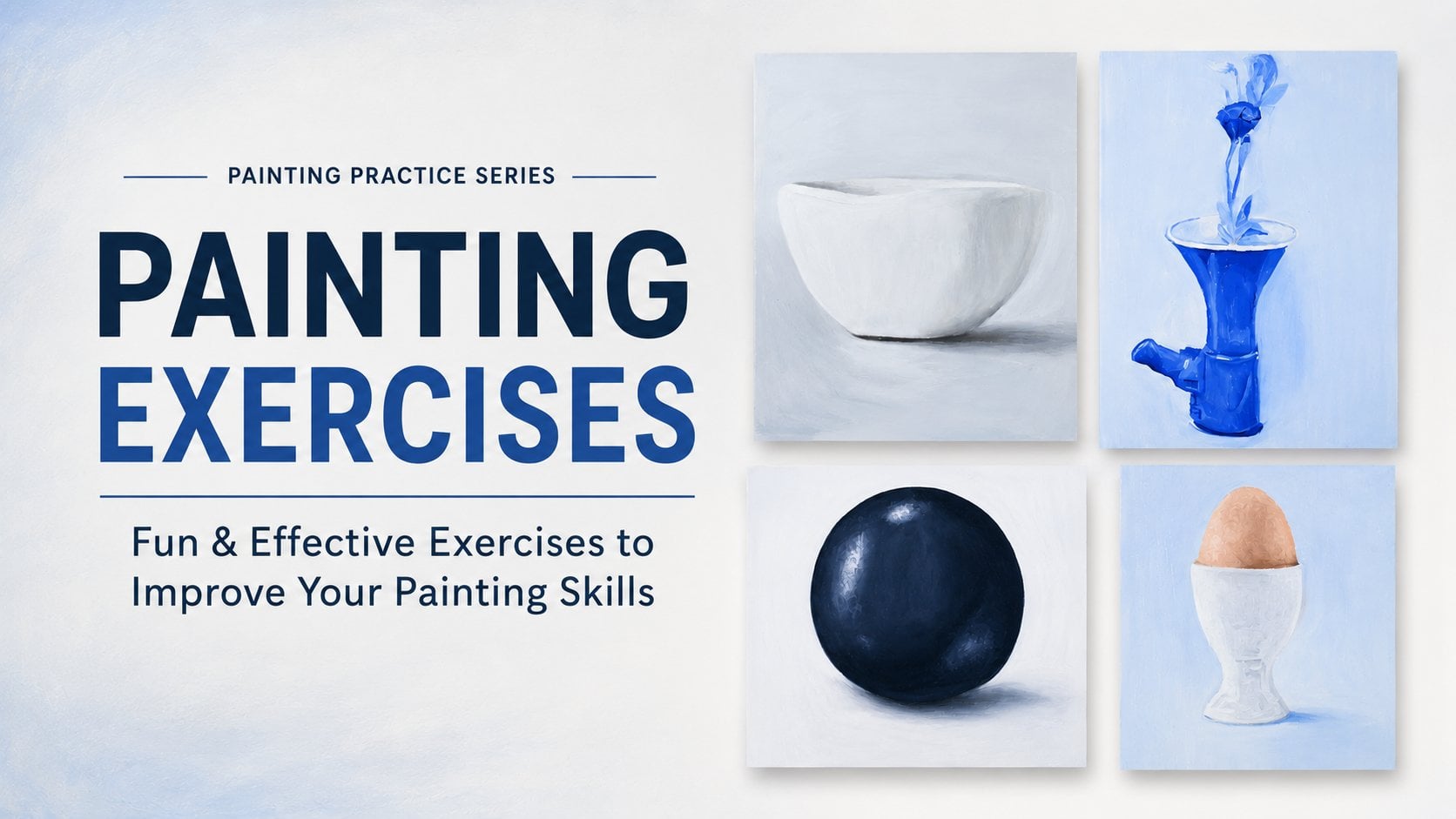
painting skills with a new collection of
practical exercises that are slightly
more challenging. Each one focuses on a
different technique that will help you paint with greater
confidence and accuracy. We'll explore exercises such as painting an upside down cup
to train your observation, painting an apple using
different brushstrokes, learning how to paint soft edges and creating realistic
folds in fabric, painting a vibrant
orange ribbon, and finally bringing everything together in a complete painting. As in the previous class, I will be using oil
painting paper, my five color palette, and synthetic brushes, although you can work on
canvas if you prefer. If you need more information
about the materials, you will find a
complete explanation in my fundamentals of oil painting
class here on Skillshare. Let's get started right now.
2. Paint an apple in 5, 10 and 20 brushtrokes: In this video, we are going to focus on a very
stimulating exercise, painting an apple
with only five, ten or 20 brushstrokes. So we'll create three
different artworks using each time an painting paper and the format will be
15 by 15 centimeter. This is a really nice exercise
to make some progress because it forces you to
paint only what is important, to make some choices, and also to have some very accurate and precise
gestures and to see how just a simple limited number of brushstrokes can
be enough to create some volume and how
you can improve paintings with just a
little more brushstrokes. That is to say, from
ten brushstrokes to only 20 brushstrokes. With just ten more brushstrokes, you can create something
even more elaborate. So that's pretty fun to do. And if you want to go even
further after this exercise, you can really paint this apple without any limitation with the number of brushstrokes
that you want. And for that, you
have the tutorial in the still life course in the
still life module where I show you and guide you
through the painting of this apple precisely with
something realistic. So grab your brushes, and well, you just
need one brush. Grab your brush, and let's
paint these apples together. As usual, before we start
painting this apple, we are going to observe the different colors
and analyze them. So first of all, what
we notice is that clearly there is a part
in shadow, a dark area, which is already
dark on one hand, because of the
color of the apple, you can see it is a
reddish side and even more so because it is in shadow. So this means we'll have dark
reds, but not only that, there is a very
pronounced core shadow, and we can see
that these shadows have a slightly
dark purplish tone. And we notice this, especially because in the
slightly lighter area, the color shift a bit
towards purple hue, which means we know that
in this very dark zone, it's going to be a
very dark purple. Then as we move closer to
the left side of the image, it gradually becomes lighter, but this lightning doesn't happen abruptly.
It is progressive. We will start with some
intermediate oranges and gradually on
the far left side, we have very light colors with lighter oranges,
for instance, but also some pale yellows
that are really light and sometimes almost close to white in the area
near the highlight. And then as we go
up progressively towards the upper part
of the image to create the dip that is
visible where the stem is a brown stem with a
really intense brown. Well, in that area
around the stem, on that upper part
where the dip is, we have some yellow greens, but really not intense at all that we will need
to mix properly. So we realize that for an
object as ordinary as an apple, there is a whole range
of colors that we need to blend carefully and
create several values. We'll create a lot of
colors on the palette, but then nothing stops us from mixing more along the
way during our painting. To create intermediate colors that we can blend
together as we go. And so that's it
for the analysis. And now let's move on to mixing all these
colors together. So here we go, and I'm starting by mixing
my darker colors, and I will begin by
creating the dark area, that area that was slightly
purplish, as we had seen. So I mixed some purple
with some burnt timber, but I think I ended up with something that was
a bit too dark, so I added a little bit
of white to my color. Now my color is
really nice and dark, which is exactly what I wanted. You can't quite see
the dark effect yet, the purple effect I mean. And in fact, on
the apple itself, you only see it moderctly. It's especially when
it lighten up that you realize it has
this purplish tone. So that's what I
will be doing next. So here I am creating a
slightly purplish red that is a bit lighter than
what I had mix next to it. And now I would say it
is still a bit too dark. So I'm adding a touch of white, and it is also a
bit too intense, in terms of purple for my taste. So for some areas of the apple, so I have added the
complimentary color to purple, which is yellow. Now I have a color
that's not too bad, but it wasn't shifting
enough towards red. Remember, the right side of
the apple is rather reddish, a little bit purplish,
but mostly reddish. So here, I've got a red
that's not too intense, and I am pretty happy with it. I'm thinking of that
for the side area where we have that slightly purplish tone with something
a bit lighter, this color I'm creating
now could work well. Because on the
side of the apple, where you have this
whole arc of light, this bound slight, I thought this color could be a good fit, and now I'm going to create a slightly intense orangy brown. Actually, it's more
of an intense orange that leans slightly
towards brown, which I am mixing now. So for that, I mix
red and yellow, and I have added
a small touch of burnt umber to make
it a bit darker. To get something even
a bit darker still, I'm adding more red
and more burnt umber. And I am also going to add a little bit of ultramarine blue to tone down this orange since blue is the complimentary
color of orange. This also reinforces its slightly brownish
tone at the same time. Now I am going to
mix the oranges that we see in several
areas of the apple. So I will start with an orange
that is moderately dark. What I am doing is giving it a generous amount
of red and yellow, a bit of white too so that
it doesn't end up too dark. You saw that I also
added a touch of blue to make sure the
orange isn't too intense. Right now, I figured I wanted
to make it just a little bit darker but not necessarily adding too much into brown. So I increase my amount of
yellow and red again, which, as a result, lowers the
proportion of white, and I ended up with
the right orange. Now it's not too bad,
but I'm going to make another variation for
the other orange areas. So I took a small portion
of the orange I had make and decided to lighten it with some yellow and white. But I noticed that by doing so, my color wasn't red enough, so I added a bit more red. Now, I was aiming to create a very pale yellow we can see in some places,
which is really bright. But my brush was a little
dirty and not clean enough. So I decided to change
my strategy and go for the pale yellow green that we can see at the
top of the apple. So I am steering towards
something more yellow and much less light
than I originally plan. But that's part of the process. I feel like I'm getting closer right now to my target color. Adding some burnt umber
can also really help to give it that slightly more neutral, slightly brownish look. But burnt umber also a bit a bit brings in a greenish tone
that is a bit too strong. I want something slightly
green but not that much. And so that's why you saw me add a small touch
of red as well. And now with a clean
brush this time, I can create the pale
yellow color that is extremely light and that we can see in the highlight area. I'm just adding a
tiny hint of red to give it a very
subtle orangy tone. For the apple itself, I would say that we
have a good base of colors, which is great. We are also going to mix the colors for the background
and for the shadow. It is true that
they were part of the initial analysis, but
that's not a big deal. We are going to mix them anyway, and you will see that it's going to be quite
straightforward. For the background, I am
starting by mixing a base of gray or more or less or
more or less light gray. There is a good amount
of white in it, but I don't want it to be too light either because the apple is already quite bright and the surface it's
rating on is too. So this medium dark background will help the apple
stand out properly. This gray and make
some burnt timber with ultramarine blue with a good
portion of burnt umber. Then for the cast
shadow of the apple, meaning the apple's shadow
stretch across the surface, you can notice that it leans
quite a lot towards purple. So that's what I'm
starting to mix. The fairly dark purple with a good amount of burnt
timber and ultramarine blue. I also added some
yellow to tone it down, but I think I may have
added a bit too much. We'll see how it turns
out, and if needed, I will adjust it slightly with a bit more ultramarin
blue, for example. And for this shadow, there won't be just a
single flat color. There will be several.
That's what I am doing. I am creating several colors for the shadow, getting
progressively lighter. This way, I will be able to accurately recreate the
shadow of my apple. And now I think we are
in a pretty good place. We have a well prepared palate, and so we can get started. So let's get started, and we'll begin
with the first step in just five brushstrokes. And with only five brushstrokes, we are very limited, so we need to ask ourselves
the right questions. What are the elements that
are really essential? What do I absolutely
need to highlight to make sure it is clear
that this is my apple? For me, I would say what's important is first the
shadow on the right side. Then there is also
the central area, which is orange and
seems really crucial. And finally, the left side area. So with just that, we are
already at three brushstrokes. Then we also have the
top area with the stem. So if we count them so if we count the top part
plus the stem, that makes of five brushstrokes. So we are there and we are
not allowed to do anymore. It also makes us wonder, is there anything
else I could skip and still have something
that resembles my apple? For now, I don't
have the answer. We'll see once it's all done. So I start with this
very dark shadow area, and I go in with a really
dark color to clearly mark the zone and make it obvious that it is
the shadow element. Also, just to clarify, one brushstroke counts
from the moment the brush touches the paper to the
moment it is lift off. So here I have started
with the shadow area. It is important to make
sure your brush is properly loaded so you
can cover a large area. Since the next color is really different from this
area that we have done, I am switching to anova brush, and I am using a flat brush, which is quite wide to
work on larger section. So here, I have
chosen this orange, which I feel is a color
that really represents the overall tone pretty
well. To paint this area. And again, I apply it
with my flat brush. Now it's true that I have a rather awkward
transition between the shadow area and
this central area. You can see that it is lacking some intermediate brushstrokes
and intermediate colors. But unfortunately, given that I have such a limited
number of strokes, I couldn't really do
it any other way. Now I am going to paint
the area on the side. It is quite a light area, and I'm thinking that maybe this color on my palette
would work well. However, it is a
little too light, so I adjust it a
bit, as you can see. And if I had to choose a
color to define this area, I would say this
one is pretty good. So once again, I apply broad brushstrokes to cover
the entire area properly. Next, I try to create a blend
with the adjacent color. Although it is true that without an intermediate
color between the two, the transition is really abrupt and the blending
isn't great at all. So as I mentioned before, I'm going to now
paint the upper part, and I'm going to give it a try with this color on my palette. This kind of yellow, slightly reddish green color. And I'm going to
use it to give it a bit more volume and
show that there is a clearly difference
between these two areas. And then for my
last brushstrokes, my fifth one, I will use it to paint the stem because here, while you can already
tell it's a round object, we have managed to
give it some sense of volume with these
first four brushstrokes. The stem is still a pretty distinctive feature
of the apple, which can help define
it a bit more. So there we go, with
five brushstrokes, we have managed to create something that looks
somewhat volumetric, but it is true that
it's almost mission impossible with so few
brushstrokes available. Still, it has the advantage of making us think carefully
and ask ourselves, What is the dominant color in each area if I want to paint it? Now we are allowed to use
twice as many brushstrokes. Let's try to represent this
apple in ten brushstrokes. So now I am asking myself, what could I had to make it
a little bit more realistic? So what I can do is use the
same five brushstrokes, but also work a little bit
more on the transition. For instance, between
this core shadow and the central zone, at the bottom, I have something a little bit different as well. Work on the transition between the central area and the
light one on the left. Also work on this left side
with something a little bit darker and work on
the dip of the apple. And then I think that
will be pretty good because I still have a
limited number of strokes. Ten is not very huge
amount of brushstrokes. So here, I'm modifying a bit my purple color and
adding some red to it. And so I can get started with this core shadow of my apple. And this time, this area will be smaller since I am going to
use some intermediate color. So now I'm switching to something lighter that
will help me create a transition from
this core shadow area to the central zone
that is much lighter. And I think that
this one could be a great deal to create
that transition. So I am applying
some right here, but I will also apply some of this color to the right where
there is this bound slide, sorry, and this lighter element. Even though it's not the
right color for this area, it's still pretty close, and this helped me to have a better sense of volume by adding something
lighter in this area. Now with this orange
that is pretty intense, I can use it at the
bottom of my apple, and I can progress a little bit towards the middle of my apple. But I won't touch this
area I painted before. I think that right
now I could use another color to create a transition between
these two zones. So we are now at
four brushstrokes. And what I am going to do is
move on to the next area. And here I will use
something orange, a little lighter, I would say, as the dominant
color for this zone. And there we go. We've already reached half of our
allowed brushstrokes, and we are doing
pretty well so far. Now I'm going to move on
to something even lighter, closer to a pale yellow to
paint the area right here. And then I would need
to create something a bit new for the left
side of the apple. You can see that in
the upper left side, there is a bit more of
a reddish orange tone. Okay. So I'm going to
take some of my red and mix it with a bit
of yellow and also some white because I don't
want it to be too dark. Then I can paint this edge
of the apple right here, even though I think that my color is a bit
too reddish here, but it's not a big deal. It's just an exercise. So now I only have three
brushstrokes left, and I will use one for this
upper part around the dip. And I will also grab
some burn timber to reinforce the shading and
the dip painting like this. Okay, and then my
final brushstrokes will be used for the
stem of my apple. Now we can clearly compare
our two results and see that with five
additional brushstrokes, we have achieved a result that
is definitely much better. This exercise really
has a valuable purpose. It helps us develop
our painting strategy, making us think carefully
about where to place each brushstrokes and which
areas should take priority. It also really
helps to understand the hierarchy of values and colors because with
so few brushstrokes, every color matters enormously. This exercise
allows us to select the most relevant colors to express light,
shadow, and volume. And I would also say
that it teaches us to work on our brushstrokes and the precision of our movements. Since every brushstrokes counts, there's no room for
hesitation in this exercise. So we'll continue,
and this time, we are allowed 20 brushstrokes
to paint the apple. Let's continue and start
shaping this form, but this time with
20 brushstrokes, which gives us a lot
more flexibility to work on smoother transition. In other words,
we'll have shifts between colors that
are less abrupt, and as a result, our blends will likely look a
bit more natural. Now, my brush was a bit dirty. It had some darker paint on it, so it slightly died my color, so I will need to fix that. So here I can start by
painting this lighter area. Until now, we have been
starting with the dark area, but we can absolutely start
the other way around. So my first brushstroke, I work on this area. And since I have a
bit more freedom, given that I am allowed
20 brushstrokes, I can now place this highlight
in a very bright area. I am also not hesitating to create some
intermediate colors, as you can see here by mixing
different colors together. This way, my transitions will be smoother when I move from
one area to another. Once again, with an
intermediate color, I can work on this hedge
here, the one on the left. And this time, I have
a tone that's a bit less red than when I
painted with ten stroke, and it's closer to
the desired color. So we are now at four strokes, and already this side is
starting to take shape nicely. So I can continue with
this color in this area. That makes five
strokes, and already, we can notice that with
more brushstrokes, we are able to apply more different values
in different colors. This way, the
transitions between our colors look
much more natural. It feels like we are
creating a blend, even though we
haven't actually done any blending or specifically
worked on soft transition, but simply by using colors that are very
close to one another, we managed to create
smooth transitions. Unlike what we had, for example, in the first exercise,
in the first part, where the colors were
extremely different, and no matter how much
we try to mix them, there were no smooth transition because these colors
in the first part, when we were allowed to
only five brushstrokes, these colors were way too
different from one another. I am taking a bit of burntor to work on
the dip of my apple, just like I did earlier when we only had
ten brushstrokes, which brings my total
to nine brushstrokes. And the tenth brushstroke will allow me to paint the stem. So we are Alfred through, and that's great because we have painted about half the apple, focusing on the lighter areas. And there we go. The apple is really starting to take shape, especially thanks to
all these transitions. You can clearly
see the difference compared to what we were
able to do earlier. Now I think this
color might work well to start addressing
the shadow area, but I will need another color
to work here on this band, which will allow for
a smoother transition to the adjacent zone. If I had been a bit
more attentive, I probably wouldn't
have needed to apply these 14th
brushstrokes and could have painted this area at the bottom using the same color as
before, but that's the game. Now, to begin softening the transition in
the shadow area, I would say that these
colors seem quite good. So with this one, I apply my 14th brushstroke to start defining the
heart of our co shadow. For my 15 brushstroke, I can paint along the edge
with this purplish tone. The problem is that I'm not really happy
with this purple. I find it doesn't
stand out enough. It needs to be lighter like
it is in the reference photo. Well, I've wasted a brushstroke,
but it's not a big deal. So here the 16th stroke. Now I like it a bit more
and it stands out better. I can apply a
brushstroke right here to close off this area, and then I will be able
to paint my core shadow, the heart of the shadow with a very dark color so
that it stands out well. So here it is. Now I will only have two
brushstrokes left, but I'm still trying to
create a bit of a blend with the surrounding colors still using the
same brushstroke. And there's definitely a softer transition here compared to the earlier exercise when we only had five or
ten brushstrokes. So I think it's already better. For this 19th brushstroke, I am going to work a
bit more on my stem. And finally, for my
last brushstroke, I'm going to work a little
more on the central area, which isn't dark
enough for my taste. I want to make it a bit
more of a dark orange. This way, I will get a
slightly better transition between the shadow area
and the light area. In the end, what we
should take away from this exercise is that it was incredibly valuable
for many reasons, as I mentioned earlier,
but above all, it proves that taking your
time truly makes a difference. It allows you to create a result that feels more
realistic and lifelike. If you look closely, between
the second and third apple, the number of burst
strokes almost double, yet well, it doubled, actually. Yet the extra time
it took was minimal. And still the
improvement is striking. And this shows that for
our final painting, dedicating a little
more extra time to add extra brushstrokes, bring in more depth of color, and so add more colors
and different values. Refine a few more details doesn't actually require
much more effort, but it significantly
elevates the end result. And in the end, that's
what really matters. No how quickly you finish or
how many minutes you save, but the quality of the
artwork that you create.
3. Painting a blurry scene: In this video, we are
going to learn how to paint the blur
in our artwork. It is something that
is very powerful for creating some very nice
backgrounds with a landscape, for example, or with a portrait. And so we are going to
learn how to do that. And for the artwork that
we are going to paint, it will be a very small
landscape that will be completely blurred
without any sharp edges. And so we are going to
see how to do that. And to paint this
little artwork, I'm going to work on a paper
that is 21 by 13 centi Mero. But you can definitely adapt
it and create something a little bigger or something a
little smaller, if you want. And for the drawing, I really did something
very quickly, a small sketch because it's not something very accurate that you need to have
for this drawing. So, grab your brush
and let's get started. Before we start painting this subject and working
on the blur effect, let's first ask ourselves
what defines the blur? What makes elements appear blurry when we want
to paint them. What we can notice is that
because it is blurry, all the sharp edges
tend to disappear. For example, with my trees, it is hard to tell exactly
where the outlines are where they really begin for the trees on
the right, for instance. And it's the same
with the foliage or even the outline
of the mountains. All the crisp
outlines fade away. Then we also observe
that there are no visible details within
the blurred areas. Those details also
completely disappears. So that covers the theory. Now, let's see in practice
how to actually paint blur. So before we start mixing, let's first take a look at the different colors we
are going to need to mix. If we look closely, we can see that we'll have
a multitude of greens, especially in the field. So in the field, when we start at the upper part of our field, we can see that we'll have a
fairly intense yellow green. Then gradually, we'll move towards more regular
greens at the bottom. For example, in the lower part, these are fairly neutral greens, not too yellow, not too blue
that we will need to mix. And if we look closely, we can also notice that our
fields won't be uniform. That is, we'll have
a multitude of greens even within small areas. For instance, in the lower area, we will indeed have fairly
regular fairly neutral greens, but it won't be just one grill. There will be many
different ones. Then we also notice that
in the central area, there is this bush with
a fairly dark green. So you have pull out just one
green color for this bush, but there are still several. We'll also need to use multiple greens to bring
realism to this bush. And then as we move toward
the upper part of our image, we have those eels
in the distance, where there is indeed
an intense green like the one in the
upper part of the film. But with these els, there is also a fairly
intense blue green that we will be able to create. As for the trees for
the tree on the left, we will have something
more like a black brown. But for the ones on the right, we will need to mix
different grays, and we'll also have
gray for our sky, which will be a very
light gray sky. And also all around
these trees and hills to enhance that
slightly blurred effect, we'll need some gray. Well, I meant for the sky, we need some light
gray, not light green. So these are the colors
we will need to mix. And so let's get started right away and
begin mixing them. So let's get started with mixing the colors
for this landscape. As you can see in some areas, the green are fairly
intense yellow green. So I am starting by
mixing that color, and as you can see, I am using a large amount of
yellow in my mix. For the next shade, we are going to move towards something
a bit more blue, but I still want to keep
a fairly balanced green. To get a balanced green, you need to use a lot of yellow, since ultramarrin blue
is a pretty dark color, a pretty strong color,
meaning that if you put the same amount
of blue and yellow, your color will turn much
more blue than green. Now, the blue will
be more dominant than in what I had mixed so far. So we are going to get a slightly bluer
version of the color, and I have taken a bit
more to enrich my mixture. I also added some burn
timber to darken the tone. Now for this new version, I am adding a little more blue to get
a different version, something more green,
blue than what I had. And so I keep mixing
my colors right here. I'm getting something blue
green that is pretty light. And well, even though in
this exercise about blur, the goal isn't to get
the most perfect lens, but it's always good to practice
and to train yourself to mix colors properly as this is something that is
very important in painting. Now I am creating
a new one that has more burnt umber
because burnt amber, besides darkening
my color also helps to prevent the green
from becoming too blue, as it had been up to this point. When I darken my color with
only ultramarine blue, my green tends to be too blue, whereas right here, it's not as blue as the other
green I created. And then in some areas we
have some very light green. So that's what I'm
creating now with a lot of the white color. And finally, to get
a very light sky, I took a large amount of
white, added some blue, and also some orange
to make the blue less intense and more muted with
a slightly grayish tone. Alright, let's get started with this acise on painting blur. So I'll begin by applying a slightly yellow green
color in this area here. I'm going to adjust it
a bit to make it more yellow and a little lighter
by adding some white. Blur, in fact, isn't
very difficult to paint, but you do need to pay close attention to
what you are seeing. Like we said before, when
elements appear blurry, the details simply disappear, and you focus on applying the colors, blending
them together. Most of the elements tend
to merge into one another. For now, I am focusing
on laying down my color properly because I will come back later to work
on my blending. So I'm creating a kind of gradient between the two
shades to paint in this area. And now I'm going to take
slightly darker green applying here on the upper
part and on the right. The Over here as well, I can apply some of these
slightly darker greens, and I try to blend
them gently as I apply them next
to my other colors. Even though I am not fully focusing on blending right now, I can always come back
to refine it later. As I apply my
structure of color, I can try to blend
them like this. And over here, I am applying
the colors side by side. I just realized that
I had forgotten to mix the browns for
painting the tree, especially for the area
where it overlaps as well. So I have mixed some now, and I am going to
apply little touches of brown like this
over my green area. And I also gently blend this brown with the green
so that it all becomes one, making sure that all the
elements are truly connected. So I have applied these
small touches like this and at least they
blend nicely with the rest. Later on, I will
be able to paint the tree properly and entirely. Now, looking at the
upper the entire part of the upper sorry, now, looking at the entire
upper part of my film, I also notice that there are
some slightly darker colors. So I am adding some,
applying them lightly, and then making sure they blend well with the
other elements. Since we had already built a pretty good base
for this film, I can now refine it and add some more elements and
blend them together. And even though this
area appears blurry, that doesn't mean it's
completely lacking in details. What I mean is, of course, we won't see the
little blades of gray, tiny flowers and their
precise outlines. However, we can still see that our field is made up of
several different shades. Even if I start with an
area that's a light green, I'm not going to keep it as
a flat uniform light green. There will be
multiple variations. So parts a little darker, some a little lighter, and that's what will help keep the painting realistic
even if it's blurry. And even though I am working
on a blurry painting, I still want my
blur to feel real. To achieve a blur that looks
natural and convincing, I need to work on all
these subtle variations. So this exercise on
blur is great because not only does it teach us
how to handle blurring, but it also helps
us create something realistic without
focusing on tiny details, without trying to paint
every single little thing. Instead, we concentrate
purely on the colors and the small variations
we can add here and there to make our
painting for realistic, even though it is blurry. I can continue with
the area below. And in this section,
we can see that it is generally
darker than the rest. So I'm going to darken
my greens and go for something less vibrant
than the area above. What I also start with is marking the
darkest elements first. They stand out nicely and
give me reference points for painting the other elements
around them later. In this area, I
noticed there are some elements that
are a bit whitish. So I'm adding them now with a pencil to avoid having
to paint over them later. It's true that I didn't draw them during the initial sketch. Sometimes I am so eager to
start painting that I tell myself it is fine to skip those elements at
first when drawing. I only draw what's
essential, the main parts. Then I had other details progressively as I
paint or I figure out how to paint without having the
outlines drawn beforehand. That's what happened here, but I thought that to make sure I stay precise and avoid
accidentally painting over them, it would be better to sketch
them in with a pencil first. So now I can go ahead and paint between these darker
elements that I had already applied using a slightly lighter green less intense
than the previous one. With bush strokes
scattered here and there, I can make sure that these
different greens blend nicely with one another,
as you can see here. What I am also doing
is adding some darker, bluish green elements in the darker area near
that sort of bush, you can see, because I felt it wasn't
standing out enough. Just like I did a bit earlier, I'm improving this area, emphasizing certain elements to make them pop and
to ensure we have enough dark accents and variations in our grass to
make it look truly believable. Now that I am applying this, I make sure my elements
blend well with the others. And to really create that
well defined blur effect, I'm also aiming for
a certain softness. Blur introduces a kind
of visual uncertainty, and that's exactly what I am trying to achieve
here in my blending. In other words, I am aiming
for controlled imprecision. I place brushstrokes
here and there to the left and right
deliberately so that I end up with something that
doesn't look too sharp or precise once all my elements
are blended together. I had already started blending
and now I'm going back over it over these
dark elements. Adding random
looking brushstrokes to the left to the right, up, down almost at random, and this gives me a result that ends up looking
completely natural. So now I can start
painting this buche. You will notice
that we don't have exactly the same
colors everywhere. There are several
shades that help give it volume and make
it look realistic. Here I'm making my
color a little lighter. I lighten it with white,
but unfortunately, the white made it a bit too desaturated and not
green enough anymore. So I adjusted it with
a little blue, yellow, and now I am creating
something even darker with burnt amber and more green. Because I want something to get slightly darker for some area. And so little by little, I'm finishing this area, trying to apply my colors
in the right place. Then the little
challenge will be when I start blending all
these colors together to make sure that each color
stays in its place while still keeping a smooth and
harmonious blend overall. To achieve a smooth, harmonious blend with
the surrounding colors, I am using this brush,
which isn't too big, and I lightly tap here and
there along the edges to help my bush blend nicely with
the rest of the areas. Up here, it is a
little bit trickier because there is
a real difference between these two colors. But the small brushstrokes I am adding here and there help create a transition that feels natural between
these two elements, even though they are quite
far apart in terms of value. I really have something dark
and something very light. Within the bush itself, I can also gently tap
with small strokes. And when I notice as
it is the case here, that it needs
adjusting and that I need to add some darker
elements back in, I don't hesitate to do it. When blending, it is
common for some color to fade away or for certain areas
to become a bit lighter. That happens quite often. Here, as well, I am adding some um some dark green because
you can see that at the base, the bush spreads out a bit and creates a transition
with the ground. So to do that properly, I needed to add a bit
more of that dark green. And I keep going adding little brushstrokes here and there until I am
fully satisfied. On side on the right side, I also noticed that there were lines that
were too visible. The blur wasn't chaotic enough. So I'm going back over those
areas to improve the effect. Now I can start painting this little whitish spot that
we can see in the grass. What you notice with them with these whitish spots or
rather slightly grayish, is that they blend
in with the rest, just like the other elements, and that's what I'm
trying to achieve. Then once I have finished
this base with this color, I will add some lighter
touches to them because they are not
completely uniform. They are small there are some small lighter areas
that stand out on top, and that's also what I'm
going to try to create. Now, let's move on to painting the upper
part of our subject. Between the field
and the mountain, you can see there is this
slightly lighter band. So I will start by applying a base layer with
this light gray, and then I will have some
greenish touches over it, which we can see here and there. And that will help me create
a bit more atmosphere. Just like with the field, we won't settle for
just a single color. There will be a whole
range of shades that will make this area
look more realistic. And I make sure to
run my brush along the edge so that it blends
well with the field below. When you are painting blur, there really isn't any element that stands out
completely apart. In other words, all the elements are more or less
connected to each other. There are no harsh breaks or sharp boundaries between
different elements. They all connect with one
another at some point. Now that I have done this, I will be able to move on to painting the els
in the background. So what I am starting with is this slightly intense blue green that we'll see in
several places. So I observe in my photo where I can spot these
different colors, and then I go ahead
and apply them myself. Once that is done, I will apply the light greens that will
find in the other areas. So I would say that now we are pretty much good at this
point with this color. And now in the central area
and near the tree trunk, I notice that there
are these light green. So I'll go ahead and
apply them as well. A On the left side, we have the slightly darker
green element, so I have changed colors. Now I am blending all
these colors together, applying a ladle fade like this. I don't hesitate to wipe off the paint that
builds up on my brush. And then this blending
will also need to be applied to the
grayish area below. As I mentioned before, all
the elements when painting this blurred landscape are more or less connected
to one another. So I am also trying to
create that connection, as you can see here. And I do it by going over the edge and
between these two elements. Now, what I am also
going to do is take some of that slightly
grayish color again, not necessarily very dark, but just to paint a little
strip above these heels, which will create the
transition with the sky. So I am applying this
color as well to make sure these elements blend nicely
together once again. Now I have applied a good base
on these grayish elements, and I'm going to add
small touches of paint. Once again, sometimes
a little lighter, sometimes a little
darker because if we look closely at our photo, we can clearly see that this grayish strip is
not completely uniform. So I am now going to create the tree. And if we look closely at
this tree, once again, it is not going to be made
up of just a single color. We can see that there
is a light gray, and on top of that, inside, there are darker elements. So what I have chosen to do as my approach here is to
start with my light base, and on top of that, I will go ahead and paint my
darker elements. I think working this way
will be the simplest. So that's what I
have decided to do. In the same way for the foliage, we can see there are grays and there are also
greens, of course. So what I have chosen
to do here as well, is to start with the gray
first and then to apply my little touches of
green on top like this. And for the green, I am
applying for the foliage. I try to observe in which
direction my little strokes are going and especially where
the darker areas are located, and I try to reproduce. Once again, if I
am not 100% exact, it's not the end of the world. We are creating
painting, own artwork. So it's not the end of
the world if there are a few elements that are in place with perfect
precision every time. And for the tree, though,
on the lower part, we can see that the
darker elements are the most prominent. There are very few
light elements, like in the upper part where
I started with the gray. So here I have chosen to go directly with this dark
color at the bottom. And as you can see
in the upper part, I try to add a few
darker elements as well. In these dark parts of the tree, I will try to connect
them and make sure they blend nicely with
the elements below. So I am adjusting my
brown a little to get one that's well suited for painting this tree
because this tree, unlike the ones on the right, has more of a brownish tone. On the right side, the
trees had that blurry, slightly bluish
look, whereas here, it is less noticeable. That's why this work with the brown seems like the
best approach to me. And at the same time, as
I am working on the tree, we can see that on the
lower part, near the tree. We also have what is
probably the tree's shadow, which will blend a
little with the rest. So I have added some
small touches of brown, and I try to soften them a bit, blending them with my grass. And that's what and that's how I am gradually making progress, making it a bit darker, a bit more brownish. In this brown, I am going to try to blend it on both side, both with the light gray we have on the right and with
the green at the bottom, or the green of the hills, so that each element is well connected to the
others once again. I am going to mix myself a green that is a
bit more bluish, a bit darker, which is why I
added a good amount of blue. I might have put in a little too much there,
so I adjusted it. And now I'm going to start
painting this foliage. What I find really interesting
with this exercise is that we are painting the entire landscape
in a blurred effect. So it's really
great to practice. We really get to see how to approach lots of different
things like the bush, the grass, the trees,
or even the foliage. That's why I find it so
interesting because it allows us to explore lots
of different elements, whereas when we paint
a complete subject, we rarely have the entire
painting in a blurred stye. So here, the fact
that we are working on all these elements
really prepares us for painting where we would only have a few
blurred areas to do. At least this way, we
have covered a lot, and it really gives
us a solid practice to be able to paint blur. So I have painted
the little branches that we could see
with this dark green, but all around the
trees, overall, we will have quite a
few much lighter areas. It's going to be a
very light green. So that's what I
am doing here now. I am painting between
these lines I had made to finish off
this part of the tree. Just a few more brushstrokes to had like this between
the branches, and then I will be
able to paint the sky, a sky that is very light, very close to white. For the sky, what I'm going
to start by doing is really making sure to connect it well with the different
surrounding elements. This way, there
will be less risk of going over the
edges with my color. And like this, in
the central part, I will be really able to make sure I have something
nice and bright. So with my brush, I try
to connect it properly, and that will wrap up this video and this work on creating blur. And so that will
conclude this tutorial. I hope it was really
helpful for you. Don't hesitate to
share with me and let me know your thought, and I will see you very
soon for a new video, feel free to share with
me your final artwork. I'm really excited to
see what you have done. He
4. Paint a drapery : part I: This video, we are going to
see how to create a drapery. This is a very classical
and traditional exercise, both in painting and in drawing. It is a very useful
exercise because it helps you to concentrate
on the different values, the values of the grays,
if you are drawing, the values of the green, if
you are painting the drapery. And to see where
are the highlights, where are the dark zones, the medium tone,
the medium zones. And all of these will help you to have a better
understanding of how to create some volume
because basically the drapery is just
some clothing, some kind of clothing, but that creates some volume
through all its folds. And that's the aim
of this exercise, to be able to create some volume on a two dimensional
piece of paper. And so it will be
very interesting to look for all these
different zones of value, to look for all the transitions. Where is it going from something really light to
something a little bit darker and to work on this blending between
these different values. So this is a really,
really great exercise for training
your skills, painting skills or
drawing skills. So for painting this drapery, I will be using 20 centimeters by 30 centimeters
all painting paper. And, of course, I will
use the grid before to make sure that I
have a nice drawing, one that is very accurate. So grab your brushes,
and let's get started. Let's take a closer
look at the colors in this drapery because
it is the colors, all these greens and their
variations that will truly make the difference
and help us create volume. If we observe this drapery, there are five main
greens that stand out. We have some medium greens, intermediate tones like the two I selected in
the per section. Then there are quite
dark greens really deep, which will help define
the shadows in the fold. Below those, there is the
fourth green from the top, which will serve for
the highlight areas. And finally, some areas
are deeply shadow. There we will use
greens that are very close to and that's about it. Of course, we'll be able to
mix these colors together to create different
variations as we progress. But with these five
main green tones, we will be able to build
volume in the drapery, give it texture, and
make it look realistic. And as for the background, we are working with
three main grays. There is a light gray which we see across most of
the background, a slightly darker gray
for the softer shadow, and finally, a
darker gray that I selected for the
stronger shadow areas. And we can even find
an even deeper gray in the small central shadow
just beneath the drapery. And so that's it
for this analysis. Now let's move on to mixing
these greens before we begin working on the drapery and
bringing out the volume. Let's begin mixing our greens with these slightly
bluish greens. That's why here in my mix, I'm using roughly the
same amount of yellow and ultramarine blue
to get something that leans just a
bit toward blue. Although, at this point,
my green is way too blue. So I remove some of the
green because otherwise I would have to add way too much
yellow to balance it out. And even then I still found
it a little bit too bluish. So I rebalance it with
a big amount of yellow. And then, well, now I think
it's getting even better. So I'm getting something to disagree a little
bit more neutral. And now step by step, I'm just adding a little bit of blue to get it slightly bluish. And now I have a color
that's looking pretty good, and I'm going to create
a lighter variation. So I am lightening
it by adding white, but also a touch
of yellow because I don't want the result to
end up looking too chalky. Unfortunately,
because of the white, my color turned a little
too pale and chalky, so I rebalanced it again by adding a bit more blue
and yellow just a bit. And so I keep adjusting until I get green that
looks more balanced, and now I think it's
looking pretty good. I really like this version of all the lighter areas we
will paint on the drapery. Now I want to make
something darker, and to get a darker green, am I need to add some
burn timber along with the green because if I just keep adding more
blue to darken it, I will end up with a green
that is way too blue. Sure, it will be dark, but
it will also be very blue, and that's not
quite what I want. And in this case, the
burn timber really helped to get a dark but
well balanced green. Now I'm making something dark but not as dark as
what I just did. I want something in between, a green that is slightly
lighter so that the variations between
my different elements, my different greens
aren't too extreme. I don't want there
to be too big of a value difference between
the first colors I mix. This green here
looks pretty good, and I will be able to
use it in various areas. Now I can start creating the grays that we will
use for the background. I begin by mixing a very light gray using
ultramarin blue and burn timber and a large amount of white to paint everything
around the drapery. At first, I realized I had
made it far too little. The quantity of grad was
really insufficient, so I mixed a much larger batch. But by doing that, unfortunately, the color
turns out to be too dark. That's why I add a generous
amount of white again. Then I can move on to create a slightly darker mix for
the shadowed areas by adding more burn timber and tramline blue for the parts that will be in deeper shadow. And with all of this, we'll
be able to start painting and remember along the way we can always readjust the
colors if needed. So here is the drawing I
made using the grid method. The lower part is missing
because I zoomed in as much as possible so you could get a closer look at
the brush strokes. We are going to work on this fold on the right
side of the drapery, and we will process fold
by fold from there. From this fold, I am
starting by applying this medium green color
that we see in the area. It seems like a good
dominant color. We will be able to other color elements on
top of it later. And I am starting with
this one because I feel like it is the most
visible color in that zone. But on top of it, we will
add lighter touches and more refined details to complete and enhance the texture
of the drapery. I am also leaving a small space on the left side,
as you can see. On the left part, there
are some very dark areas, and I will be able
to add them during the color application
in a few minutes. Similarly, on the right
side of this fold, we can see that there
are quite a few dark areas like here, so I can start marking them. On the very bottom
right of the drapery, we have an even darker section
that stands out clearly, so I will go ahead and paint that little
part on the right. And at this stage,
our color application is still quite basic. Right now, I am just
trying to lay down the main tones and the
dominant colors in the one. I am making sure to
spread the paint evenly to get a great
blending afterwards. And later on, we will
refine everything, adding lighter and
darker touches that will bring really bring it all to life with a
realistic effect. In this area, especially
the lower part, we can see that overall, it is slightly lighter than the upper section we
worked on earlier. So I feel like this
color I am using right now could be a
good dominant tone for this first layer of paint. On the lower part
of the drapery, you can see that it
is slightly darker. It's not a huge difference, but it is a bit darker, just like on the right side, which I will work on later. And actually, that's also the whole point
of this exercise. We are working on an entire
green object with a lot of volume created and a great deal of subtlety in the value shift. This exercise is a great way
to train your eye to notice all these subtle
variations and then apply them correctly to create convincing volume
in your subject. To finish applying the color
in this part of the drapery, I can work all along
with this dark green. It's not the darkest green I
have mixed, but in the end, we can see that
in terms of tone, it's not an extremely
dark shadow either. So I am going with this green. It seems like the right
color to work this area. And then, well, in here, I think it's not as deep
as dark as what I did. And then we can start blending
all these colors together. You can see it here, I'm
showing it on purple. I wiped off the
paint of my brush, and then with small strokes and gentle back and
forth movements, I can make each area blend
smoothly with the rest, creating a good transition between the different tones and a soft gradient where
the changes between the various greens
become almost invisible. That's what I am doing small
back and forth strokes. And once it looks good, we will be able to refine the zones and start
working on the texture. Now, we can start working
with more precision. That's why I have switched
to a finer brush. With this brush, I will define
the areas more precisely. What I notice is that
in the lower part, there is a fairly dark shadow, and I can also
redefine the one on the left side a bit because
during the blending stage, it lost some of its darkness, so I am reworking that. And while I apply these strokes, I make sure they blend well with the surrounding area so I don't have to go over the
blending again later. At this point, I'm working
on very small area, so I apply the color and I blend it into the
rest right away. This allows me to
refine the transition between the shadowed part
and the rest of the drapery, because even though this
left section is in shadow, it is still an integral
part of this fold, and the shadow needs to stay visually
connected to the rest. Through these small
brushstrokes, I have made sure
that both elements are properly connected. And on the right side as well, I can rework this area a bit. I have added some darker
paint to make it stand out. And just next to
this darker area, you can see it's very subtle. There is a small lighter
section that helps emphasize the contrast and
creates a sense of volume, a difference in depth between the central area of the fold and that small
section on the right. These two aren't
on the same level, and that is exactly what these light and dark contrast help express within this
part of the painting. Oh so I am really trying to bring out all the small elements
that make up this drapery, all the little zones
with different shades. For example, in this part of the drapery from
top to bottom, in the area where I had applied some of
the mitton greens, you can see that there are
a few lighter touches. They are very small
but still noticeable. So I applied those just
small dabs of colors, and I made sure they blended nicely with the green I
had laid down underneath. This way, these
elements look natural, and the drapery as a whole
feels more realistic with sub touches that help convey the idea of texture
throughout the fabric. So fold is part of the
drapery, the first fold. I would say that we are good, and we can now move on to
the one right next to it. Now, now this is
going to require real precision because we are dealing with a very small fold, and I am using a finer brush
to apply the colors here. What I am aiming for now is to lay down the
dominant color. It is a bit tricky because
in this small area, the space is quite narrow, but the green values vary a lot. For example, right
in the center, we have some pretty
light greens. On the left side, there are much darker greens
and on the right, more medium dark tones. So it's a bit delicate. What I have decided is to start by applying a me ton
green like this one. That seems like a good idea. This way, it will
be fairly easy to a slightly lighter
touches on top afterward, as well as some
slightly darker ones. So it's kind of a compromise. This me ton green gives me a base where some of it
will remain visible, and it will also make
it easier to build up the lighter and darker
accents over it later. So I am now going to try
working with precision. But the issue I am noticing
is that on the right side, the shadow area is
a bit too large. I think it extends
too far to the right. So I am correcting
that slightly, and then we can
begin working with more precision on
the central fold. We can see that
on the left side, there is a shadow
that is quite strong. So I am going in with
a very dark tone. I know it's going to be tricky to maintain that very dark band. The sharp shadow line, we can see because
all the colors around it will end
up blending together and therefore would lighten this very sharp and dark line. So that very dark line we
see right in the middle, which is really intense, I will probably come
back and add it later once I have painted the fold on the
overside as well, and once above
fold are finished, the one on the left that
isn't painted at the moment, and the one I am working on. Because this line sits
across both sections, so it is better to have both areas painted
before placing it. Now, in the central
part of this fold, I am adding some lighter
green touches because we can clearly see a highlight in
this area. It is lighter. So I am adding it even though that value difference
isn't extreme. It's not a dramatic contrast, but you can tell it's lighter, so I don't want it to
be too light either. And the color I am applying
here seems just right. And, of course, once
I have placed it, I make sure it
blends nicely with the rest using small
brush strokes. Now, what I am going
to do is start working on the
overside of this fold. You can notice that
on the right side, there it is just a bit darker than what I
have painted so far. It's almost as if the
shadow from the fold we worked on to the right extends
slightly into this one, this central area, and as if those two parts are
somewhat connected. So that's what I kept in mind when I apply these
small touches, but it didn't take very long, and now we can move
on to the overside. On that side, I have decided to start directly with
more precise work. Earlier, I could have
taken the same approach on the fold with just finished
and both methods are valid. But here, I thought it might be a good idea to begin with
a more detailed approach. That's something I sometimes
do when I am working in tighter areas like this
one, which is quite narrow. Sometimes it's worth
going straight in with this brush and working
precisely from the start. So that's the approach I'm using for this
fold, and this way, you can see different techniques each suited to
different situation, and you can choose
the one that feels right when working on a
specific area later on. So now along the entire edge
here, it is a bit darker. So I am going in
with this green to make that transition stand out.
5. Paint a drapery : part II: And in the middle of this fall, I can go in with this slightly
lighter green like so. I am placing it carefully, trying to be a bit precise. You will notice that
as we move upward, it becomes slightly less light. There is a subtle difference. So here, the idea is to
make sure it blends nicely with the slightly darker
greens we have already placed. That can be the
approach for this area. And now that my
colors are in place, I can use small dabs, little brush strokes to
work on the transition. But even within
this lighter area, there are also a few
slightly darker touches. That's what blending with the small brush allows me to do. And with this little
back and forth strokes, I can create a result where
within the light zone, some darker elements
are gently worked in. And s in the darker areas, a few lighter touches
are added as well. And that kind of
soil blending helps achieve a result that looks
a bit more realistic. A So this little
drapery section, the small fold is
almost finished. All that is left is to add a very dark line that runs
between the two elements. Now I'm moving on to apply
color to this other wide fold, and here I am using a flat brush to do
it more efficiently. You will notice that the video is slightly sped up because this color application
is essentially the same process as what
we've been doing so far. It will return to normal
speed when it's time to work more on the texture
and detail in this area. So don't worry. But for you, make sure to take your time and carefully apply the colors. There's no need to
rush this step. We are now back to
normal speed to work a bit more on the texture and
details of these elements. As you can see in the lower
part and on the right side, there are some
very dark shadows, so I am going to make sure
to mark them clearly. What is also visible is a small fold within this
larger drapery fold. So how do we paint that? Well, there is a slightly dark
shadow on the right side, and then just next to it, there is a small highlight, just a slightly lighter
touch, and that's it. That's what allows this
inner fold to stand out. So I am carefully
working on that area, adding the slightly
lighter tone, but be careful not to
make it too light. For example, I felt right here, it was a bit too bright, so I gently blend
it back in with the surrounding colors to soften it and make it a
little darker again. Now I can move on to working on the central
line right here. I didn't paint it earlier, but now I think it might
be a good time to do it. Before I paint the line itself, I am adjusting the shadow
that is right next to it. And to paint this line requires that really
requires some precision, I'm going to use
my swathe brush. It allows me to paint fine
lines very accurately. And I am starting from the top. Personally, I find that easier. But if you prefer to
start from the bottom, that's perfectly fine, too. Just do whatever feels
most natural to you. And now painting a long line
like this is a bit tricky. It is hard to get
it right in one go. So don't hesitate
to go back over it, to build it up gradually. That's what I do, and also to reload your
brush with paint. That is important
because when you paint over this
lighter green area, the paint naturally
appears lighter two, even if it is a very dark color to begin with on your brush. So you need to reload
it to keep it strong, to keep a strong and dark value. And there that is
looking pretty good. It stands out nicely. I'm going to rework
that a little bit more. But what I also notice is
that just next to this line, especially on the right side, there are areas that
should be a bit darker. So once I am done going over the line to make sure
it is clearly visible, I will rework that right hand area because right now
it's not dark enough. The contrast is too strong, and that is because this
right side is too light. This drapery study isn't
just a technical exercise. It's a real training
ground for your eye, a way to learn how
to observe more carefully to interpret volume, light, and slow
transitions in color. At first glance, a drapery
might seem simple, just some folds in fabric. But in truth, it is
an ideal subject to practice and develop nearly
every skill in painting. Why? Because it includes
everything, light, shadow, gradient, subtle contrast, and most importantly,
shifts in value. It is these value changes, whether soft or strong
that allows us to create depth and give a sense
of three dimensional form. And in drapery, the
values shift constantly, sometimes gently,
sometimes sharply. It's perfect for training
your eye to detect those changes and learning how to translate them in paint. And working on a drapery
also teaches patients. You can't just brush it
in a few brushstrokes. You have to build
it step by step, laying in broad shapes first, then refining forms, adjusting color,
correcting transitions. And with each you improve, you become more precise, more focused, more
sensitive to what you see. But most importantly, this exercise will help
you in everything else. Whether you are painting
clothes on a figure, a curtain in the background or even a soft landscape shape, you will face the
same questions. Where is the light coming from? Where are the shadows? How
do I work on the transition? How do I show depth, texture? And drapery teaches you how to answer these questions
with confidence. So really take this exercise as a valuable
moment of training, a chance to focus on the
quality of your strokes, the accuracy of
your observation, and the quiet
satisfaction of bringing a believable volume to life from a single
patch of colors, a simple patch of color. And I think that is
the magic of painting. For this fold on the left, I would say that most
of the work is done. You probably notice that along the left edge
of this large fold, there was a slightly
darker section. I hope you saw that clearly because I added that
darker edge intentionally, as we see it on the reference. Now we can move on
to the other fold. This one here is a
very small fold. You can see that on the left
side, it's extremely dark, and as we move toward the right, it gradually gets
a little lighter. So I also adjust my
values accordingly, and I try to define a
small tip at the end. And right next to this fold, especially near
the darkest part, there is a small
and lighter touch that helps create
a sense of volume. This small fold stands out in contrast to the larger
one we worked on earlier. It's really thanks to
this value contrast, these very light areas, these highlights
placed right beside the shadows that we can
effectively convey volume. And this part of the drapery is another perfect
example of that. Uh Here I am just adding this
tiny light touch to suggest that smoot fold, and that's all it
takes to create a sense of volume once again. And finally, I have this last fold to paint
in the central area. This one is very similar to all the others we
have done so far. And since the area
is quite small, I am working directly
with this fine brush, and I am applying
small touches here and there to build a bit
of volume in the area. We are almost there. The
drapery is nearly finished. Just a few final
adjustments here and there, and then we'll move
on to the last step, working on the background
and the cast shadow. These final touches will
really anchor the subject in space and make all the volume
we have created stand out. So hanging there, you have already done you've already
done the hardest part, and the result for
this little exercise will definitely be worth it. Here, I feel like I was
a bit too generous with the darker colors because the lighter areas aren't
standing out enough. So I am reapplying
a good touch of light green and making sure it blends nicely
with the rest. And there we go and placing
it carefully and making sure there is a smooth
and soft transition with the surrounding areas. Three. Before moving
on to the background, I am taking a moment to go back and refine
a few elements. For example, some of
the lines that define the folds aren't standing
out enough, in my opinion. So working those a bit. The same thing on
the right side. Once that's done, we will be ready to focus on
the background area. Something I have also
noticed about the background is that my shadows aren't
dark enough on my palette. Right now, I basically have two shades for
the background. One of them is okay for
slightly lighter shadows, but in some places
the shadows are much darker and what I have
just isn't enough. So I am mixing a
darker gray using burn timber and ultramarin blue. That also allows me to
create an intermediate tone, which I will use to work on
those smaller shadow areas. For example, on the right side, you can see a small shadow
that is quite pronounced. Then as you go down, it gets a bit lighter
before darkening again. Right next to the drapery, there is also a
slightly darker touch, which I have added in. And as I mentioned, some
shadows are more intense, but be careful because right where the shadow
touches the fabric, it actually becomes
a little lighter. We get a softer gray there, and we need to paint that carefully all along the drapery. When we were working on the painting of the
drapery itself, we applied a lot of precision, and we'll need the same level of precision here
with the shadows. These background shadows
play a crucial role. They are what will metal drapery truly appear three dimensional. Right now, the fabric does
look like it has volume, but we can't quite see
what it is resting on yet. To show that it is
hanging against the wall and casting real depth, we need to paint these shadows
carefully and precisely. For now, I am applying the
shadows with my brush, making sure to spread the color well and focusing on
the main shadows, the one that are most
visible and darkest. Later on, I will
need to make sure that there is a
smooth transition between the shadows and
the light gray background. With these shadows, we
don't want any hard edges. You can see how the edges blend softly into the
surrounding grays, and that is exactly the
effect we are aiming for. The goal is to create a
smooth gradient between the dark shadow tones
and the lighter areas. And now that the main
shadows are in place, I can work on the small
white gaps I left earlier. As I mentioned before, right next to the drapery, there is a slightly
lighter touch, and it is important
to include it to give a shadow a more
realistic effect. That's why I left a
small blank space there, and I will now go
in precisely with this fine brush to define
that part of the shadow. And along the edge, I am also
using this brush to create a smooth transition between the shadow and the
light gray area. Just like we did on
the drapery itself, it is through these small and careful strokes that
we will achieve good blending and
soft transitions in our different shadows. As I continue working
on these shadows, adding that slightly
lighter touch, this slow and repetitive
process gives me a chance to talk to you about another important aspect
of this exercise, our relationship with
time and attention. Painting drapery isn't just a
study of flight and volume. It's also a lesson in slowness. It forces us to slow
down to truly observe, to absorb the shapes. In a world where
everything moves fast and we are always
looking for quick results, painting asks us to do
the exact opposite. It asks us to take your
time to really look to understand what we are
seeing and to have the patience and courage not
to rush through the work. These little shadows,
these solo blends, all the work we have
done on the drapery, every brush strokes matters. None of it can be automated. It is you, your eye, your end, your focus. And over time, you will
see that a certain kind of pleasure emerges
from that slowness. I'm seeing a form take shape
gradually through small, simple and almost
meditative gestures. You might find yourself
enjoying these quiet moments, these quiet moments of
focus where nothing else exists but the
surface on the painting. That is also when
you begin to develop a more personal connection
with what you are painting. A simple piece of fabric
starts to feel alive, and thanks to all that time you have spent with
your painting, you form a kind of
attachment to it. For example, I always feel a little pang when
I sell a painting. Of course, I am happy. It's part of my job, and
it brings in income. But I spend so much time
with each painting. That they become a part of me, there is a real bond that forms. So don't be in a rush. Let this moment be
like a breath, a pose. What you are learning here will, of course, help you
with other subjects. But more importantly,
it will help you find a different
way of painting, one that is calmer, more focused, and more peaceful. Now that the shadow
work is done, I'm going to move on to
painting the background. But before I start
on the background, I am going to work along
the edge of the drapery. This will help me
create a sort of protective barrier to
keep the gray paint. Which I will be applying with a slightly right
brush to keep it from spilling over
onto the drapery area. It will be a bit
messy otherwise. So I am working
along the edge now, and I am trying to
brush just slightly, belly touching to make sure the two areas met
but only very soy. I am not trying to
create a full blend. I just want them to
touch ever so slightly. I I really like the subtle
effects that gives. So, there we go. I have done the same thing
on the other side, and now I can start painting the background using a
flat brush like this. I am making broad
strokes and really trying to spread the
paint evenly like that. And with that, we will be
wrapping up this tutorial. One important thing
to keep in mind, especially when painting the
lower area is to make sure the light background color blends smoothly with the
colors of the shadow. So we will need to work
carefully on that part. But with all the
blending practice we've done throughout
this piece, I think that shouldn't
give you too much trouble. So now I have applied the
background color at this point, I can go back and rework the
shadow on the right side a little because I feel like
it got a little lost. Especially over
here on the right, there was a small sort of shadow that I didn't add
earlier because it is so faint that it wouldn't it would just have been
covered up by all the paint. So I am adding it now. And in the lower area, my shadows are no
longer strong enough. They have faded a bit. So I'm going to
repaint over them, and we wear the edges to
avoid having sharp lines. I want softer irregular edges that blend nicely into the rest. And with that, we are done
that wraps up this tutorial, and I hope you enjoyed it. And more importantly,
that you gave it a try yourself and painted
this drapery along with me. I also hope that you learn a few things and that the help you make progress
in your painting. So thank you very much
for watching this video. I will take another minute or so to find you
in the shading, and then I will see you
very soon for more videos.
6. Paint a ribbon : part I: This video, I'm going to show you how to paint
an orange ribbon. This is an exercise
that this is an object that may seem pretty
simple at first glance. But actually, there are
some folds, some loops, some twist that make it a little bit more difficult and
that creates some volume. And to create some volume, we will have to create some
different orange colors. And so that's a great training
for mixing these colors on our palette and also to create some volume.
That's a great training for. Also this exercise will be very good to see how to
add some details, some small details,
not many ones, but that will make
some difference. That will make our
painting go for something pretty good to
something really good. So we'll see how to do that. And for the creation
of this painting, I will be using 20 centimeters
by 20 centimeters paper, and to have a correct drawing, I use my projector. But if you don't
have a projector, feel free to use the
grid technique that will help you to have
a drawing that is very accurate and so you have the right foundation for the
creation of your artwork. So grab your brushes and let's get started
and paint together. So here are the
colors for ribbon. The colors we need
to mix to paint it. If we look closely, we
can see that we have a whole range of oranges
with different values from very dark oranges
that lean towards red to much lighter oranges
that are closer to yellow. And, of course, in between, we'll have more
intermediate oranges, not leaning too much
toward red or yellow, but really right in between. And then for our background, we'll need different grays, especially for the
grays that will be used to paint the
shadows of this ribbon, shadows that will be
absolutely essential to give it volume and
three dimensionality. So let's get started and
begin with our mixes. Let's start mixing our oranges. You can see on my palette that
there is much more yellow and red than blue since I
barely need any blue for this. So we'll start with
the first mix. We are going to mix a
slightly neutral orange, something in the middle. And you may have noticed that I am still using a larger amount of yellow than red because
red is stronger than yellow. Meaning if I put the same
amount of both colors, I will end up with a color that leans much more towards
red than yellow. For this first slightly
intermediate orange, which we will be able to
use in various places, I'll create another shade
starting from this one, a lighter and more
yellow orange, a slightly more vibrant,
brighter orange. Adding yellow like this
seems pretty good to me. Now I'm going to make an even lighter variation
by adding some white, but especially by adding more yellow because if I had too
much white to my color, it will indeed become lighter, but it will lose its
brightness and intensity since white slightly
desaturates the color. Now I will make a darker one. So this time, I'm going to start with a slightly
stronger base of red, but still, I will add a
good amount of yellow. Otherwise, I would end up
with something far too red. And since I want
something a bit darker, I'm also adding a small
touch of burnt umber. Burnt umber is a very good
color for darkening on mixes. The only downside is that it sometimes tends to give them
a slightly greenish tint, especially when mixing
it with yellow. So to counteract that, I added a bit of red to my color since red is the
complimentary color to green, and as a result, I end up with a darker red that's
also fairly intense. Now I'm going to create a
slightly lighter variation. To lighten it, I'm adding a bit more red and
yellow to my mix. This way, I reduce the proportion of
burtenbr in my color, and I'm choosing not to add white because as I
mentioned before, white tends to reduce the
intensity of the color. Sure, it would make it lighter, but it will also make it
less vibrant than this one. For example, look, if I take a bit of white and
add it to my color, the color is indeed lighter, but its vibrancy
is still reduced. Whereas here I have a color that is slightly lighter
than the previous one, but still a really
vibrant orange. Now finally, I would like to create a color that's a
bit between these two. So I will take some of
my orange and mix it, and we'll see how it turns out. If needed, I will adjust
it with either more red or more yellow to get something
really halfway between. Here, I'm going to
add a little bit of red because I think it's
a little too yellow, a little too orangy. It was too light. And we can see that in the end, we have a lot of
different orange values, which is really great for
creating something realistic. And we can see that even for a simple object like a ribbon, we still need a lot of different oranges to create
a three dimensional object. So I've taken a bit more of this orange in the
middle because I like to have an orange
that's a bit more reddish, like the ones we can see
along the edges of a ribbon. And then I would say that we are good to go and we
can get started. So let's start working
on the ribbon. You might notice that I trim my paper a little to
work on a square sheet, whereas, originally, the
subject was more rectangular. But that's not a big deal. It won't prevent us from getting a credible and realistic result. We'll start with this upper
part where we can see that the oranges are a
bit darker at the top. I have chosen this
one, this orange, which seems like the
right choice to me. And let's see how we
can manage to make such an ordinary object like a ribbon look fairly realistic. So I make sure to apply
my colors carefully, and I am using a medium
size brush to maintain some precision and not go
over the lines of my outline. Here I am slightly adjusting the color
of my brush because I felt it was just a bit
lighter in this upper area. Now I am going to move
down to the lower section. And since we are changing
color, it is much lighter. I wipe my brush
with a paper towel. There's no need to
use any solvents like turpentine or gamsol to
clean the brush from now. Since we are working
with values and colors that are very similar
and close to each other, it's still the
same color family. So there's no real need
to use a solvent here. So I am applying my color in
small touches like this to start blending these areas together nicely as
I apply my color. When working with paintings of small elements like
this, you can, as you apply the color, also create some blending by
using small brush strokes. And as you saw, I
change my color again to get something
lighter in this area. Now I am going to add some
yellow to my color to get a more pronounced yellow
orange that comes closer to what we see
in the reference photo. So it really pops and we
get this highlight area, so to speak, that
really stands out. And so we can see that
the blending between these different
colors happen, sorry, quite naturally because
on the one hand, we apply a whole
range of oranges gradually making
smooth transitions from one color to another. And most importantly, each time I made sure not to
overload my brush. I took care to spread
the color well, and as a result,
just by dabbing, the blending came
together quite naturally. Along the edge of my ribbon, I noticed that there are, again, some slightly darker elements, so I go ahead and
add those as well. At this point, I would
say that we have built a good base for
this area of the ribbon, and I'm going to start
working a bit more on the texture and getting
into the details. So I am using a rather
fine brown brush, and I'm going to try to spot
which details stand out. In this case, I noticed that along the entire
edge of the ribbon, there is this
slightly dark line, so I will go ahead and add that. Then I can also add some
slightly lighter touches. And on this ribbon,
we can see that the texture is created by small touches placed
here and there, sometimes lighter,
sometimes darker. So I have started by
adding some lighter ones, and I could also add
some darker ones later if I feel that it's not
standing out enough. In my light area as well, I'm going to add some details. I can add some lighter details, but also some
slightly darker ones. And it's really the combination of all these little details, all these small dots and touches that we place
here and there that will help to create a very realistic texture that stands out well. But overall, I won't
need to add much more. Here on the side,
I am emphasizing this dark line a bit more, so it stand out better. But in the previous areas,
I would say it's good, and there's no need
to work on those as aspects any further. So now we can move on to the
lower part of the ribbon, and I'll stick with
this fine brush anyway, because in this area, the zone is really narrow
and I need to be precise. So we'll keep working with
this fine brush and had those dark marks that we
can see here on the ribbon. Here, too, I am adjusting
the outline I had done with the pencil because
the area was too narrow. I worked it a bit
with the brush. Sometimes when we draw, we do it quickly and we don't notice these
little mistakes, and it's only once we are
painting and working on the area that we
become aware of them. So then I am switching back to a medium size brush since this part has become
fairly large again, and to paint it efficiently, this brush seems like
the right choice. By the way, the brushes
you see me using here are basic entry level
synthetic brushes that I bought at a store
named cultura in France. So when you are painting, you don't really need to buy excessively
expensive brushes. Entry level brushes like these are actually ideal to work with, and they have to be
synthetic, remember. The only brushes where it is
worth spending a bit more are the brush called the
sworn brushes for details. But for the rest, I wouldn't recommend
buying brushes that are extremely expensive
because even if you take good care of them with
the products available, they still end up wearing
out fairly quickly. I have experienced this myself, and it can get pretty costly. So that's not really where I would recommend
spending your money. If anything, it's
better to invest in extra fine quality paint
like extra fine oil paint. That's more worthwhile, sorry, than buying ultra
expensive brushes. And even then, extra fine
paint is something I would only recommend you once you really feel
comfortable with painting, once you have already created
a good number of paintings. In the same way, I think that
buying good linen canvases, once you feel at ease is a better investment
than spending money on very expensive brushes. Another important
point, in my opinion, for this painting so that the tutorial will
be easy to follow. I kept the outlines of my
drawing and graphite pencil, and they are still
quite visible. But normally, if this
were a finished piece, I would make sure to erase
them or make them barely visible because
yellow and orange are not very opaque colors, and if you don't erase the pencil lines, they
can show through. So make sure to
erase them properly when you're working
on your painting. So we continue, and
here you can see that gradually as we move
into this middle area, the orange became
lighter and then it chipped back again
to darker oranges. So I make sure to follow these changes to achieve
the right effect. The colors I am
applying blend well and naturally with one another because I am not
using too much paint. And if I ever notice that there is too much
paint on my brush, as you have seen, I clean it off and wipe off the
excess on the tissue. This way, my colors can
blend nicely together. Blending is very important
because it allows us to create balance between the colors without the transitions
being visible, so they stay as
natural as possible. In the middle area, I think that my yellow, orange color doesn't
stand out enough. It is too subtle. It doesn't look bright enough, so I will need to come
back and work on that.
7. Paint a ribbon : part II: So I'm going to rework this
area in the middle because, like I said, it is
not light enough. So I'm going to use this
brush and try to load it up with lighter paint
with a more yellow paint. And then I will make sure to make sure to clean
my brush properly beforehand and try to repaint over it with a bit with
this lighter tone. I I I see that is enough,
I will leave it like that, but I think I would
still need to work on it a bit more with the detail brush by adding little touches here
and there afterwards. And, of course, when I
apply paint over an area, I make sure it blends well
with the color underneath. Now I have darkened my color a bit more to work on
the side of my ribbon. We can see that along
the entire right edge, there are areas that
are a little darker, so I try to bring those out, and it's the same
on the left side, which will be even
darker than this. So I will need to darken
my color even further. So here I am gently dabbing
with this small brush. Adding the mark still
fairly settles, but they help giving my
element a bit more volume. Creating volumes comes from
fairly strong contrast, often between light
and dark areas, and you shouldn't be afraid
to use dark elements because if you hesitate to
really add those dark parts, it won't stand out enough. You can also notice that I have extended the slightly dark
line along the edge a bit. And as I add these few more, it also helps to work on
the texture a little, even though I will refine
that more precisely later on. Now I'm darkening
my color even more. And to do that, I am adding more red and
also more burnt umber, and now I can work on this
upper corner of my ribbon. It's really this dark
element that I am adding that will help
create volume in this area. The same thing go on the edge. I felt it wasn't
standing out enough, so I added a little more. Here too, I am adding some, but I then realized that
this color is too dark, so I wipe the paint off my brush with a tissue
and to soften it, I simply blend it with the surrounding colors
that are lighter. This way, I would say I have the right value and just
what I need for this area. So I keep working on my
texture with small touches. And what I am also doing is
adding more dark color to this upper part because I still feel it doesn't
stand out enough. Often, you need to
go over it once, twice or even three times
until you are fully satisfied because as we blend the elements
together like this, when we work on the texture, it tends to soften the dark areas a bit and
make them too light. So sometimes you need to go back over them several
times like I did here. So now just a few more touches, and then I would say that for this part of the ribbon,
it will be done. You're So let's keep going with this area and very
interesting area because the ribbon is in the
overway and there is this band that
creates a lot of volume. So right here, I keep
going with this line that is just the extension
of what we did earlier. So I keep using this
color right here, a color, a red brown color
that is pretty dark. And this color, I think
I can also use it at the very bottom at this
area with another line. Then in between, for
the area in the middle, I think that this color will
be a little bit too dark, so I won't be able to use it. What we also notice is that
right here in this corner, we will have
something different, something a little
bit lighter as well, lighter than what we
will have in the middle. So now I'm going to readjust my color to have
something better for this area in the middle because I think the
color is pretty good. It's a little bit
not orange enough. I want some orange that is
a little bit more intense. So that's why I added some more yellow to it and some more red. So I'll give it a try
with this new color, and I keep adjusting
my color until I am fully satisfied
with what I have. What I want for this color is something that is a little bit darker than the orange
that is at the top, but a little bit lighter than these lines that
I initially created. And now I think that this
color looks pretty good. As I was saying,
now I'm going to take something a bit lighter
for this upper part. We have a lighter orange
element that will help create volume at
the curve of the ribbon. And where I am going to have lighter elements is
also in the lower part. I feel like in this lower part, I went a little too far
with my dark color, so I don't hesitate to paint
over the dark element I had done and to apply a good amount of paint to make sure
that when it blends, it leans more towards this
new color than the old one. Finally, for the
very bottom part, we are going to have a
fairly strong contrast with a fairly intense
orangey yellow. So I will make sure to
clean my brush well before using it and moving on to lighter tones like
I am doing here. Even though I think that I will need to make
this even more intense so it stands out
more and is even lighter. And I will do it when I will add details with the fin brush. I will paint on top
of that to have something that pop a
little bit more than this. So here I am reworking my line a little bit because
it wasn't dark enough, and I'm going to start
working a bit on the texture that we are
going to have in this area. So I'm going to take some
slightly darker elements again and gently dab with
the tip of my brush. Here and there, I am adding small almost random touches that help me achieve a pretty
realistic result. So I'm going to do that
across the whole area. Then we will gradually
move towards the lower area where the elements are going to
get lighter and lighter. So I adjust the colors
on my brush to add some lighter touches that will really help the whole
thing stand out. Here, I realize that
these little touches I am applying won't be enough to
really make the area bright. So what I am doing
is I have taken the tissue and removed a bit
of the paint from the area, and now I am readjusting
my colors with the right values using
nice and bright elements. Sometimes when it feels
like it's not enough, like you could keep adding
more and more paint, and it still doesn't
get bright enough, the only solution is
to remove a bit of the paint you have applied
and then work back over it. So now I am moving back
towards orange stones that are much better and more in line with what I should
have in this area. Next, I'm going to
paint right next to this element on the other
part of the ribbon, where we again,
have something nice and dark that will make
everything stand out. And for the ribbon, the
video will stop here since the rest of the ribbon follows exactly
the same process. So you are definitely able to do that after what
we have been through. So that's why I'm going to cut the video and we'll meet again for the
background painting and to see how to work on all those cast shadows that will give our ribbon its volume. Here is what my
ribbon looks like. Take your time to finish it, work on it on your side, and then move on to painting
the background with me. Or you can paint the background first and then come
back to the ribbon. It's really up to you to decide
how you want to proceed. So let's make the
colors for background, which are made up of grays, and gray is really nothing more than blue that has
been desaturated. Basically, a blue that we
make much less intense. So here I have taken my blue, and I'm going to add its complimentary color,
which is orange. This way, my blue
will become less and less intense and turn into gray. Now it's going a bit too green because there wasn't enough red. But then my complimentary
colors took over too much because I
didn't have enough blue left. So what I have now is too
dark, that's for sure. So I'm going to add some white
to make it a bit clearer. And now we are getting quite
close to the gray we want. I'm going to add
just a little bit more blue to make it
slightly more bluish. And this color here looks
pretty good to me for the areas where the shadow
will be among the darkest. Then for the areas
that will be lighter, what I'm doing is
to take a bit of this gray and mix it with some white to get a
much lighter tone. Oh. Well, now it's maybe
a little too light. So what I'm going to do is go back and add a bit
of my first gray, and I think this should give me a gray of the right value
to paint the background. So before painting the
entire background, what I'm going to do is paint
all along the ribbon in some areas where you can see these strips that
are very light. So I am painting
it with some very, very light gray color using this flat brush and
the edge of the flat brush, even though it's not the more
suitable brush for that, so I will switch to a
new one, a rounded one. And you can see that there is this very thin light element in all the areas where you
don't see the cast shadow. So it's basically on a very large part that
you can see that. And so I'm going to do this
on this entire ribbon. Then I will paint
a little bit of the background in some areas
that aren't tricky at all, and we will paint the cast shadow together
then once this is done. So basically, I'm going
to paint all around the ribbon except this area
right here on the bend. Also in this area where is the curve and inside the ribbon. So you can see it right
now all these areas that I have painted where you have
these very light elements. Now that we have this
area as defined, we are going to work
on the shadows. But to work on the shadows, our current colors
won't be enough, and we need to create grays
that are darker than this. So we have seen one way to get gray, but there is another, which is to think of gray as simply black that's
been lightened. And with this five
color palette, we create black by mixing
ultramarine blue and burn tum. Of course, you could also
think of just taking white and ivory black
as you would buy it in stores and adding white.
Sure, that could work. But the goal is still to stick with this five color palette. And personally, I like to create my own black
because you can decide if you want to have
warmer gray afterwards, leaning more towards burnt
umber or cooler ones leaning more towards blue. So here I am managing
to get a gray, but it felt a little
bit too bluish to me, so I balance it out by adding a bit more burnt
umber, as you can see. But I only add a
little each time because I still want to
keep something balanced. And otherwise, it takes a bit too long to
get the right shade. Now I would say that this
is looking pretty good. And I have created a
somewhat dark gray, and with this gray, I can make a lighter one by adding
white like this. Now that we've got
that, we can start painting and working
on our shadows. The cast shadow is
actually a bit white, and you can see that the farther
it gets from the ribbon, the lighter it becomes and blends in with the
surrounding elements. So here I am starting roughly defining the size of
this cast shadow. I can see that it's
going to take on the slightly curved shape all around my ribbon, so I apply it, and at the same
time as I apply it, I use little brush
strokes to help it blend nicely with the
surrounding colors. Now, along the edge,
the whole hedge, I still have something
fairly dark, so I'm going to use
this gray here, as you can see, but
that won't be enough. I will also need to add an even darker touch on
top so that it really stand out. And so here we go. I had small touches and my brush isn't too heavily
loaded with paint. Or if it is, I wipe
off a bit of paint to make sure that when I
work and apply my color, I can blend better with
the neighboring color. And as you can see
with my brush strokes, I'm keeping it soft
and I'm making small touches here
and there to create that slightly irregular
texture you can see in our shadow on this fabric or at least what looks
like gray fabric. And as I was saying, I need something a bit
darker to work on the edge. So that's what I'm doing. And then I soften
it very gently with the surrounding colors so that it blends
naturally together. So that's it for the shadow. You can see I have done
others in the same way. Now we are going to look at one last shadow that is quite
interesting to work on. It's the one on the side right
where the ribbon curves. This one is really important because it's going to give
the ribbon more volume. So I start by working along the entire edge
with my dark color. It's true that I
am not following exactly the same order as I did when shading the other area, but that's not a problem. You can do it either way. Also, the further we
move away from the edge, the darker it's going to get. So No, sorry. The farther you
move from the edge, and the less and less dark
the shadow gets sorry. Oh, also, there's one little
thing to watch out for here is on the lower part
where I haven't painted yet. There's going to be
a thin light strip between the ribbon and
the shadow that we need to live because
it's like a bit of a reflected light that makes the shadow fade a
little in that spot. So we need to leave
this small gap. Otherwise, the method
and the process will be exactly the same as what we did earlier with overshadow area. You will also notice
that here I am using a fairly fine brush
to keep things precise while I paint and to
avoid messing up or going over this orange
area I painted before. And now that the
elements are painted in this area and my
shadow is finished, I can move on to finalizing the background on
this left side. To paint it, I am using a
flat brush because it allows me to spread the paint more effectively and
most importantly, to avoid having my brush
strokes throw too much. In this part of the background, there isn't really any
texture to create. So we want to make
sure the brush strokes are as invisible as possible. You might think the
piece is finished, but not quite yet, because there are
certain areas that, in my opinion, don't
stand out enough. This is the case with
some of the darker area, darker areas on the ribbon, often in the spots
where there are falls or where the ribbon overlaps another part of
itself or where it bends into. In these places, we should
have darker elements, and I feel that in my painting, they are not pronounced enough, so I go over them
to reinforce them. With experience, I have learned to develop this
critical eye toward my work and to spot the elements that are
missing or not quite right, although, to be honest,
sometimes I still miss them. But what you can do when you're starting out
and you don't have yet this eye for noticing
what could be improved is, first of all, to place your
work in front of a mirror. Mirror is really
something that will help you tremendously
because you will almost instantly see
where things are missing by comparing with your
reference photo and which areas aren't working. It points out flows right away
so much that at one point, I was almost afraid
to look at my work in the mirror because I wondered what mistakes
I was going to see. So the mirror is really helpful. Alternatively, you can
ask someone close to you who has a bit of a critical
eye to look at your work, but always with
kindness, of course. Don't do it with someone
who will just tear your work apart and discourage you that serves no purpose. But someone who doesn't
know your artwork, who discovers your
reference photo or your model for the
first time can offer a threshold perspective
and point out areas where there might
be things to improve. Or another option is simply
to set your painting aside for a few hours or a few
days, even though, of course, this means that the
painting will probably dry and then come back to it with fresh ice to
see if there are any elements you
could fix or improve. And that concludes this exercise to see how to work
well in detail. In my opinion, it is a very
useful exercise for also working on values and understanding how to create
volume through them. So I hope you enjoy
this exercise, and I'll see you very
soon for another one. And feel free to
share your artworks with me. See you soon.
9. Paint an upside-down coffee cup : part II: Now that I have applied my
base for this bright area, what I can start doing is adding some even lighter marks on
top of the red I had apply. Since in this area, we can
make out a few highlights, even if they are not as visible as they are
further to the left. Then in the central part, we can see that there are
some slightly darker elements that stand out,
like I said before. And right in the center, there are also
much lighter areas that I will try to
bring out as well. So now I am placing
these lighter elements, placing them over the top, and I am trying to blend
them gently with the color underneath while making sure they still stay fairly bright. So if needed, if they
don't stand out enough, don't hesitate to go back
over them with your brush, and you'll to color to get
something bright enough. Meanwhile, on the side, I am applying a really
strong highlight with something that
is almost pure white. And for this part, I would
say it's pretty much good. After these last few details, we'll be able to move on and
try painting the handle. Before painting the handle, there's also this
little corner on the right that I
hadn't painted yet. And here, I would say
this slightly purplish, slightly red light red
works pretty well. Now it is time for the handle, and I am starting with a very dark red because what we can see is that there is an entire
edge that is extremely dark. So I start by painting
that edge above the inner edge on one side and the outer edge on the other. Then we can see that the handle overall is still quite dark but not
uniformly, so. So I adjust my color, and as I am applying it, I try to gently blend it with the color I applied
a little earlier so that we already start
to have a bit of a gradient forming
within our area. And here again, in
this lower part, I can apply a nice dark red. Here, I find that my dark red is taking up quite
a bit of space. So I blended it out a little, but I do want to
have something a bit darker along the outer edge. So I am trying to work with the tip of the brush,
but as I said, I want to stick with a
medium size brush so that we don't end up working too
much into the fine details. That's not the goal here. And it is also pretty nice to see that
with a medium brush, you can still manage to get
some fairly fine elements. So it also pushes you to adapt and to better
control your brush, which is an advantage when working later on more
realistic painting. Here as well, what we notice is on our handle is that there
is a slightly lighter spot, a little highlight, but it shouldn't be too strong either. So as you can see, at first, I applied a red that wasn't
very dark to begin with, and then I am adding a
slightly lighter red, but only in certain areas. Not the entire endle is going to have
highlights this bright. Now I would say that for the endle we are
pretty much good. Just a few darker
touches left to add on the lower part to better separate the handle
from the cup. But now we can move
on to working on the saucer underneath
or rather on top, since the page is flipped. And what we notice here is
that in the upper right area, there is a sort of purplish,
slightly grayish tone. So for my color here, I'm going to had some bird
and bur because it helps give this color a slightly
more neutral look as I apply it now. So let's continue
with the saucer, and now I'm taking a bit of
my red and mixing it with this slightly purplish
gray since we can see these two colors blend
together around here, and that's what I am going
to try to do as well. Now it's true that the
saucer is a bit blurry with lots of spots and small elements blending
into each other. So that's what I will
try to recreate. Even though it's true this
area isn't very easy. And since we are painting
with a medium brush, it's going to be tricky to get it as precise
as we would like. But we'll give it a try, and I think that just placing a few small touches of color in the right spots
should be enough to create an area that still
looks very realistic. What we also notice is that
right next to the cup, there's these slightly
lighter elements that is important
to add in order to create depth and clearly mark the distinction between
these two areas. Then I notice that
in my central area, there are a few highlights that are a bit more pronounced. So I am adding some
lighter colors on top. Depending on how light I
want this color to be, I will try to blend it more or less with the underlying color. Here we were in the
hollow of the saucer. But when we move to the
next part on the right, we see an area that is a little higher up with
a bit more volume, and there we have another
lighter elements, which I have added. Now I'm back in the hollow area, and there was a dark element between our lighter ones
that really stood out. So I tried to add that too. Just like on the edge
of my grayish area, where I felt it needed to be it needs to be a
little bit darker. And like that, by adding one element after another,
we make progress. And this saucer that seemed
a bit tricky at first, is gradually taking shape, and in any case, it's really only at the end, once we have painted all
the areas that we will be able to step back and
decide whether it looks good, if it pops and feels realistic, or if on the contrary, the area las death and
we need to go back in and work with some lighter or darker elements, for example. Mm. I can continue then
with this part of my plate. We can see that there
is an area that is a bit reddish purple,
a bit grayish. So we are going to
have a little edge here that will define the
slightly darker area. And then right next to it, there is slightly
lighter element, but still with the color, it's just a lighter value. And it's really good to spot areas like this where
there is a change in color and within this area to pay close attention
to the shifts in value because we can notice here that this area doesn't have the
same values throughout. There are some small
variations that are important to give
realism to this zone. And then all around the
slightly grayish area, we have lighter elements, and it's the combination
of these highlights of all these elements that helps to create the
sense of volume. Here, I have wiped a little bit the paint of my brush to load it with something
much lighter, so I can paint this up apart
where we can see that there is a highlight that is even more prominent
than the others. It really stands out a lot more. So I go over with my brush so that it is nice
and pronounced. Now I'm going to move towards slightly more
intense red because I'm going to paint what
is underneath the cup. Here, my red was
still a bit too dark, since there needs to be a clear difference between
this cup and the plate. And now with a red like this, I think it will look better. But then I'm not just going
to stick to just this red. I'm also going to add a few
slightly lighter touches because it's these
little differences in value, once again, that will help to create volume and make this
plate appear three dimensional with a slightly spherical, slightly
rounded edge. For the areas that are left
to paint on the plate, I'm going to speed up the
video because it is basically the same process as what we did with this part on the right, which I thought was a
little more complex. But overall, everything
that is left to do on the plate is very similar to
what we have done so far. That's why I'm spinning up
the video a little bit. I have fewer comments
to share with you for these parts as it will look a lot like what we
have already done, but I'm still keeping the visual support on
screen because I think it can still be helpful for you to
watch what I am doing. We'll meet up again for the next step to finish our
work where we will paint the coffee inside the cup and also see how to paint
this background. Lower part of the plate, I'm going to try not to go over the upper part,
which is lighter. But at the same time, as
I apply my brushstrokes, I am trying to very
gently connect the areas together to create
a very slight blend between these two colors. And that's also the
advantage of painting wet on wet and not waiting
for the areas to dry. We can connect the
elements together easier. So let's get started now
with the coffee part. Here on the lower section, we are going to have colors
that are fairly orange. When I applied my color, I realized it wasn't orange
enough, so I adjusted it. That's also what we
have on the palette. So there's what we
have on the palette. And then once it is placed on the paper compared to all
the surrounding elements, you can realize that it
might not quite work, so I adjusted it a little bit. I am trying to paint
along my edge and not go too far other
onto the red color. Making sure it stays
nicely within the limit. And at the same time, as I am adding these
little brushstrokes, I am also trying to very gently connect my cup
and my coffee together. I really want the elements to blend just a little
bit with one another. I like having these
subtle blends like this, making sure that
all the elements are more or less
connected to each other, and we don't have any sharp
edges or at least very few. At the same time, as I was applying this
slightly darker base, you probably noticed that I added a few lighter strokes of paint on top to work this coffee area because there isn't just
one single value. And here, as we move
towards the left, we can see that it gets even more orange and a bit darker. That's why on the left
side of my palette, I mixed before this new color. And now I picked up a bit more burnt umber
because I also want my elements to be even
darker than what I have so far and a little more
neutral, a bit more brownish. So the burnt umber
helps me achieve that. With this slightly darker,
slightly brownish color, I can apply it here
on my left side, but I'm not going to
leave it like that. I'm going to make sure
it blends well and mixes naturally with
the surrounding areas. And elsewhere in my left zone, there are another
slightly darker elements, so I have added
some there as well. But we also notice that as we move toward
the central area, there are also darker parts, but they are not as neutral. They are more orangish, orange. So that's what I am doing here. I am creating a brown that
is a bit more orange, and I am adding little touches
of it in the central area, which will help make it look more realistic
because it's really this combination of
several colors and different values that helps
give the area realism. I am being very light
when I apply them, as you can see, I am not loading my brush
too much either, because if I do, it will
leave big blobs of paint, and that really doesn't look good and doesn't
blend very well. Now I take my white
and mix it with this slightly orange color
to get something really, really light and use it to paint this little milk foam that
we have in our coffee. And I try to blend it very delicately with my orange color. But when I get close to the
reddish area at the top, I try to barely touch it, really blending it very, very slightly because I
don't want the red to bleed into my color
and mess up my work. What I also notice is
that on the left side, there is this little white
line that really stands out. So I try to apply
it using the tip of my brush to be a
bit more precise. And I do the same thing
on the overside as well. There are still a few elements
to add to the coffee, a few more details,
and then we'll be good and can move on to the
painting of the background. Now it is time to
paint the background, which is really going to
make the cup stand out. Each time the background
is an important step. It's like the cherry
on top that really makes all our
elements pop because the environment around
the subject we are painting truly changes
the way we see it. For my background, I am starting with this
very dark area. You can notice that as we
move towards the left, the tones get lighter
and shift toward a lighter orangy brown. Now I am trying to apply these gradient myself and make sure these
colors blend well. I do a bit of blending each time mixing my colors with
brushstrokes here and there. To do this properly,
my brush isn't loaded with too much
paint, and if needed, I don't hesitate to wipe
off the paint that has built up on my brush to
make my blending cleaner. Then on this left side, we can see that it
becomes even lighter. And as we get closer to
the top of the plate, it becomes even lighter still. So I always try to adjust
my color accordingly. What I can also do is mark the separation with the
rest of the background, which has a different color. This way, I know that
up to this point, I will need to work mostly
with light and brownish tones. For the central part,
I'm going to try to create that slightly
blurry effect myself. I chose to go with some
grayish colors like this thinking it will help
the background and the cup stand out better than if I reuse brownish tones that are too close to the color
of the coffee. So with this purplish gray, I actually quite
like the result. So I am going to apply colors
like this around here. Now, I've got a bit too
much paint on my brush, and I realize that blending isn't going to be
easy with that. So I whipped a little bit of I whipped off to try and
blend these colors together, and I am going to do this
across the whole background, and then we'll meet
again once it is done, once the background is finished, so I can show you
the final result. And here is the final result, the right way up this time. I really hope you enjoyed this exercise and that you painted this piece upside down. I thought it was a
really great exercise, and feel free to let
me know what you thought about it and to share
your final result with me. So I'll see you very soon for
a new exercise. Thank you. Oh.
10. Final Project : presentation: This is the final subject on this course on the basics
of all your painting. So for this course, we will be painting this beautiful Amphora, white one with a very
pretty flower on top of it. And so this subject, the final subjects will be very good to put into practice, again, everything that we've
seen during this course, how to apply the
colors, of course, how to mix our colors, to create some nice blending, to paint a background, how to create some volume with the amphora, and
with the flowers, and how to create something very realistic with some very
tiny details on the flowers. Many things to see
for this subject. So that's why I felt it was an excellent subject to
conclude this course.
11. Organization of the painting: Since this final piece is
a bit longer than what we have done with the
previous exercises, I think it is
important to organize our painting and planify it. Planning your work before
starting really help you to structure and to know what areas you can
paint independently. Indeed, you may not have
three or 4 hours or even more in a row to paint the
entire painting all at once. So that's why you can
divide your artwork, and we are going to
see how to do that. When you are painting a
big subject like this one, it is essential to find the different areas that you
can paint independently. That is to say that there are some sharp edges
between these areas. And we can see that
there are several areas that can be painted
independently on this subject. There is the Amphora that
has some sharp edges. It is really clearly separated from the background
and from the stem. Also, so there is also the background that can
be painted independently, the stem that has
some sharp edges, and finally, the flowers. So there are four
different zones that can be painted
independently. So you can organize
your painting this way. For example, the first day, if you have one or
2 hours in a row, you can paint the
entire amphora. Then the next day, maybe you will have
only 30 minutes to dedicate to your painting. So why not go with the stem? Then in three or four
days or in a week, you will have more time to
dedicate to your painting. So maybe this time, you can paint the flower and
if you have time, the background or leave the
background for another day. This way, you can really take your time with your painting and make sure that you
have a good result. It's better to take your time and to plan your painting on several days than do wanting to do everything
in one in 2 hours, and obviously the result won't be as good if you
don't take your time. When you start a section, it's best to finish it
completely before you stop painting or finish it before
the painting actually dries. Let's say an example. For instance, you start
painting the background, and you stop in the middle because you don't
have time to finish, and you say, Okay, I will
go back to it next week. But the problem is, if you
go back to it next week, the background will
be probably dried. And that means that you have to remix the color and to get the exact same color because if you don't get the
exact same color, you will see that
there is no continuity between what we did
before and what you did and what you're going to do this day when you go
back to your painting. So that's why when you start
the background, for example, it's best to finish it the same day or maybe the
next day it won't be dry, so you can finish
it the next day. And so that's why it
is important to take into account the drying
time of your painting. That's what I talked about in the part on the color mixing. For instance, if you
start the infora, you can relax because it
has a lot of white in it. So the drying time
will be pretty slow. So you can start
the infora and go back to it maybe
four days later, it won't be dry because
it has a lot of white, titanium white, which
takes a long time to dry. However, if you start
something that has a lot of burn timber in it,
then you might think, it's best to finish it today or tomorrow because otherwise it
will be dried very quickly. So that's the thing to take into account
with your painting. And now I think that
we are completely ready to start painting
the still life together.
12. Colors and painting of the amphora: Before we start
mixing our colors, let's begin by observing those
that make up the subject. First, looking at the amphora, we can see that we
will be working with grays and not
just a single one. There will be a very
light gray where the light hits our
object directly. Then we'll have a slightly darker area in the center where the gray will need to be deeper and also some more
intermediate gray. So we need to create
several different grays to accurately
represent the amphora. As for the stem, there's
a predominant green, but once again, it won't
be just one shade. We can see that it is made up of several small touches
of varying greens. Regarding the
flowers, the flower, this time, we have a
very wide range of reds. We can see that on the
part of the flower, on the petal to the right, the reds are rather
intense, quite vivid, while on the left side, the reds are not
only darker but also tend to shift towards
a purplish red. And the lighter red area
the lighter reds in this area in this
purplish red zone will have the
slightly desaturated, slightly gray, somewhat
lighter effect. So we need to create
that as well. And finally, for the background, we see a kind of orange brown. It is quite nice,
but personally, I would go for
something warmer and more intense as you
will see later on. And for the ground, we'll
go with neutral tone, neutral tones,
slightly brownish gray that we'll create later. So that's it for our colors, and now let's start mixing them. So let's start mixing our colors with the
colors of the amphora. As we saw, it consists of
several shades of gray, and remember that gray can be
achieved in different ways, notably by mixing blue
with burn timber or blue with orange or even by
combining both methods. So, for example, I'm mixing now with burn timber
and ultramarine blue, and I notice that it
is a bit too bluish, so I can tone it down, reduce its intensity
with some orange. So there are several
ways to do it, and it's really up to you to
choose the one you prefer. So here I am getting
this first gray, and as we saw in our analysis, there won't be just 1 gray. We'll need to create several. That's what I'm going to do. And for that, I will either decrease the amount
of white in the mix or increase it depending on whether I want lighter
or darker grays, since we saw that there are
extremely light grays and slightly darker grays in
the central shadow area. So each time I adjust by adding more white or more burnt timber and blue if I want
to darken the mix. And for this, I
constantly compare with my reference photo asking myself whether my color is
too dark or too light. And in this case, whether
it's leaning too much towards ultramarin blue or
too much towards Burnt road to know which of
the two colors I need to add. And here I can create
one final gray a bit darker than the others for that central area I
was talking about. So there we go, and that's
looking pretty good. Now I can also start mixing
the green for my stem, and I will begin with a
fairly neutral green, meaning it doesn't lean too
much towards blue or yellow. Here, as you can see, I thought
my color was pretty good, but I wanted to
darken it a little. I darken it with some burntmbrd because if I had
added more blue, I was afraid of ending with
a green that's too bluish. Whereas here with Burntmbrd, it allowed me to get something darker without it
becoming too blue. And from this
color, I can create a slightly lighter
version by adding white, not yellow to avoid making
it too yellow green. Right here, I am creating a
darker one with Bn tuber, but I felt that my green was going too much
towards the brown, so that's why I added a little bit more of
the ultramarine blue. Now, for this kind of flour
that we can see at the top, we have this part that
is a little bit green, and we can see that there is a green that is pretty intense. So that's what I'm creating now with a lot of
yellow in my color. And also some white to create
something pretty light. And right now, I'm getting closer to what I want,
which is pretty great. So I'm just adding a little
bit more of green because I felt that the color was
a little bit too light due to the white color. And then I'm going to create a darker green because
in this area, too, there is some dark
green, dark blue green. So that's why I'm
adding a lot of blue to my mixture in comparison
to the other ones, but also some burn
timber to make it dark. Right now, I think that
my color was too intense, so I give it some red, which is the opposite
color of the green. And then we will
have also some kind of green gray colors. So we'll be able to mix
these colors together. Now I'm going to mix the
colors of the flower. And as we have seen, the flour is really divided
into two parts. So I will start with the colors for the intense
part of the flower. And we can see that
in some places. Well, a red that is just
a little bit lighter than my permanent red like
this wouldn't be too bad. It would be a good idea. Then there will be areas where the red is
slightly darker than that. So here I am taking
my permanent red, but this time, I am not
adding any white to it. On the contrary, I am going to add some burn timber
to darken it a little. However, we can also
notice that there are areas that are much darker
than that on our flowers. So this time, I will darken
it even more and give it a slightly more
purplish tone by adding just a tiny touch of ultramarin
blue. So there we go. This darker color looks
really good to me, and what we can do is create a slightly lighter variation by adding a little bit of white. Oh Okay, now we can move on to mixing the colors for the other
side of the flower, where we can see that the
colors are much more reddish and purplish than on the
right side of the petal. So where than on the right side, where we have more intense
and bright red tones. So here I will do the same
as the color next to it. I will mix burntimber and
ultramarine blue with my red, except that my portion of ultramarine blue
would be greater to give it a stronger purplish
look. And there we go. I've got a color that
looks really good. And from this one, I can
create other lighter ones, for example, by
adding some white. So And finally, I'm going to create
the background color for I'm going to create
the background color, and for the ground, we'll
see about it later. For the background
color, I had said, I would like to have
something a bit more orange and a bit more intense than what we
can see in the photo. That's also the freedom
that painting gives us. We can really adapt
the model and make whatever changes
we want on our canvas. So I start by adding
a large amount of white because it's still a
fairly light background. So orange made with my
yellow and red and a bit of blue to make it slightly less intense than
a bright orange. Now I notice that my color
is leaning a bit too much towards red and not
enough towards orange. So I had more yellow to
bring it closer to orange. And little by little, I will get closer and closer
to my target color. Here, I add a bit
more yellow to get closer to my orange color again. And each time I will make adjustments based on what
I see on my palette. For example, here I think
it should be a bit darker and I need to reduce the
amount of white a little. To do that, I had a bit of
my three primary colors, trying to keep the same
proportions as before. And here, I think
that we are pretty close to what I would like
to have for the background. A few more tweaks,
maybe a bit of buntebr to make it
slightly more brownish, and then we'll be good to go and ready to start our painting. So let's begin our work, and I will start with the
painting of the amphora. I'm going to start with
a slightly medium gray like this one, this
intermediate gray. I'm starting with this because it's a gray that works well overall in the sense that it will cover a very large area. It's going to be the
somewhat dominant gray of my amphora in many places. So I'm going to
try to apply it in multiple areas on the right
side, on the lower part, and it's also present
on the upper part and a little bit on the left side
of the amphora, as well. So for now, I am just focusing on applying my grays
in the right places. I am starting with this one, and I call it the
consensus gray in the sense that it is the
dominant gray, and later on, it will be perfectly possible to come back and add textures had slightly darker details or slightly lighter ones
without any difficulty. So if I had started
with a darker gray, it would have been trickier to had lighter details on top, and it would have
taken more time. And the same goes if I had started with a gray
that was too light. Now I notice on the
upper part that there is an area that is actually a bit large and quite
a lot lighter. So I adjust the gray on my brush to pick the one
that is a bit lighter. And with this lighter gray, I can also apply some in
the lower area of my paper, and we'll also see it
on the right side. On the right side, there is this whole band that is very
that is really very light. So I even reloaded my
palette with white to have And to be able to paint
that area properly. So I am applying my
colors and trying to place them in the right
spots to make sure I have the right colors and
the right values to create volume and make sure we don't have just a simple
circle on the page, but a real three
dimensional object. Now that I have a good base, I can start working
on top of it. I'm picking up a slightly
darker gray this time, and I observe on the base I have created where the slightly
darker gray can be applied. You can see that
there is a little bit of it at the bottom, but there will also be
some on the right side. We will have this entire curve, which is important because
this is what will allow us to create three dimensionality and really give volume
to our object. So I observe in which
direction it goes, what elements we
can see where it's going to be darker than
in other areas and so on. In this way, I am able to make progress and really
give depth to my area. There's also on
the upper part of the amphora a small and
slightly darker touch. So I don't hesitate
to reload my brush if needed as soon as I notice that it's not dark
enough anymore, but make sure to not load
your brush too much and to really stretch your
painting so that your blending will be
easier afterwards. Now I can remove the
paint from my brush because I think that I
have applied most of the painting that was needed
to start my blending. And I am going to blend this darker grays I have
added with the rest. I really want to
achieve a result that looks as
natural as possible. Like this, by blending,
gently dabbing, I managed to make this
dark band visible and also ensure that it
looks completely natural, that it blends perfectly
well with the rest. And so that is the goal. As soon as I see that my brush
has too much paint on it, that it has built up from
doing this building, blending I removed the paint
from my brush to continue. Even though it's true
that I didn't load my brush too much at first
when I applied my color. So I didn't end up with areas of paint that
were too thick, and so I don't need to remove
paint every 5 seconds. My area is looking pretty good, but I still want to improve it a bit more to create more volume. So what I decide to do is to add a few darker elements again because we have done
a good blending, or elements have
merged well together. But unfortunately,
they still didn't stand out enough in some places. I found that in my
reference photo, some areas were darker
than what I had. So I simply go back over. Sometimes you have to go over it several times until you get a result that is fully
satisfying. That's the case here. I have applied these
slightly darker grays, and of course, just like
I did with the rest, I blend them with a few
brushstrokes here and there, and in this way, I get a result
that is quite satisfying. In the same way, what I'm
also doing is picking up a lighter color and
apply a few small touches here and there to reinforce
the light areas of my infora to really manage to create even more
volume in this area, and to have a contrast
that is really well defined between
this area where I added darker elements and the lighter touches that I
am adding here and there. A few more small touches to finalize the work on this area, and then it will be done. And then we will be able
to move on the overside. But before working
on the overside, I really want to work on this
upper part of the amphora, this little element
that we can see. For the upper part
of the amphora, which I'm going to work in
a moment because right now, I'm just finishing up a
few last small touches on my central area
to make sure that my brushstrokes aren't visible and that I have a good texture, meaning a texture for this
amphora where there aren't really brushstrokes going more in one direction than another. You see, I'm keeping my
hand very flexible with the brush to make sure that my elements blend well together. And so now I'm thinking
that this is okay, and we can move on to this area, this upper one I was talking
about and to work on it. I'm going to go directly
with this round brush, slightly fine brush because
this area isn't very big, and I am afraid that if I work
on it with the flat brush, I won't be precise enough. Fold this up apart, I start with something very
light, as you can see, and then gradually as we
move towards the right, it becomes a little bit darker. Of course, this is not something that will happen abruptly. There will be a
smooth transition and we'll once again have
to do some blending, but this time over
a very small area, so we need to be very
precise to achieve this. So as you can see,
I start by applying this very light gray, and then I switch to something more medium gray in this area, and I will try to blend it well with the other
elements afterwards. There's also an
interesting little detail. It becomes a bit lighter
again on the right side, even though that's
the shadow side. We had already noticed this with the lower
part of the enfora, but it is visible here too. And that is simply the bound
slide, the reflected light. In this area, the light is
heating from the left side, but well, I mean, on this subject, the light is
heating from the left side, but because of the
floor or the wall, the light reflects here. So we end up with a little element like this
that is a bit lighter. I explained this
in more detail in the drawing course
because when you draw, you sometimes want to
imagine the things you're drawing and not necessarily
draw from reference photo. So it's important to master and understand how
light and shadow works. So that's why I go into this in more depth
in the drawing course, if you'd like to check it out. When it comes to painting, it's true that we
need this a bit less. Since most often we
work from a model, whether it's a photo or
something in front of us. So we paint more from observation
than from imagination. So with this grays, I make
sure they blend well together. And here we have
the central line that is a bit darker
and stands out nicely, and I've been able to add a few darker elements
on top of it. So you can see
that on this bend, we started with a
fairly dark gray base and then added a few
more dark touches. And now I can move on to painting the opening
that we see. We can see at the
top of the amphora, it will be a little
dark in some places, so I'll try to be precise
with my brush to clearly define the different areas of shadow and light
that we have here. So now we are going to
paint this left side of the amphora and this is a
very large and light area. So this time, I'm going back
with my large flat brush, and I make sure to really stretch the color well so that I don't end up with big patches of paint that would be
difficult to blend. So I still try to be precise, making sure that the light area stays well defined
where it should be. And then I can paint
right next to it the area that will be a
little bit more in shadow. This way, my work on the details and the
blending will be easier. So for now, I am really focusing on applying the
colors in the right place, taking my time to
make sure that it is the correct areas that
are properly covered. For the next part of
this amphora painting, I'm going to speed up the
video a little bit because it's basically the same thing
that we have already done. I would even say
it's a bit easier. The right side seemed a
little more complex to me. So let's continue
with this amphora. And here I'm going to apply
some slightly darker colors, and I'm going to
remake some gray on my palette like
we did before, but a bit darker because I want this dark band to
really stand out. This dark curve, I mean. So I start by applying it, defining where it
will be placed. And once that's done, I will be able to blend my
elements to make sure that this dark band has a
really natural look just like on the overside. So I blend it small with some brushstrokes
here and there, just like we did
on the overside. And each time I make sure to remove the paint
that has built up on my brush so that my blending
is as smooth as possible. On the lower part, I
would say I hadn't quite defined the path
of the curve perfectly, so I'm adjusting
it a little bit by adding some darker elements
to this lower section, as you can see,
and the bottom of the amphora is
also a bit darker, so I have adjusted that as well. But overall, the amphora is really starting to
take shape nicely. So now just a few
more little elements to add here and there, and then this part will be done. And then we will be
able to move on to working on the flower that
is above the amphora. And here is the finished and fa. So if you haven't finished yet, take your time to
do it properly, and I'll see you afterwards for the painting of the flower.
13. Painting of the flower: Now it is time to
work on the flour, and I'm going to start
by painting the stem. It is a stem that
is overall rabbit, and I'm going to begin by applying this light
green that I had mixed. And on top of that, we'll have some slightly darker elements. So here I am creating a my base. I tried to be quite
precise to avoid going over too much onto the background
because otherwise, it would be a little
bit tricky with my orangy color to cover
up that green later. Or, I will have to remove
it with a paper towel, a tissue or possibly wait for the stem to be fully dry
before going back over it. But that's not really something
I'd like to do because I really like all the elements to be more or less connected. I like my paint to stand generally fresh for
the whole composition. So here I'm mixing up a bit of darker green because on the
lower part of the stem, you can notice that there is this little touch of dark green. So I am adding that, and now with this fine brush, I am using a round brush
and extremely fine. I'm going to make sure to add some small dark touches here and there that will
improve the look of my stem and make
it more realistic. It's not a huge amount
of work on this stem, but still, it is important
to make it look realistic. And for that, it
comes down to adding a few well placed touches of different greens
here and there. Now to stay with the greens, I'm going to paint this little
element above my flower. What we notice is that it
is really divided between a fairly light area on the top left and a much
darker area on the right. So I'm going to make sure
to apply that as well. Before getting into
the details of this element where there
will be very precise parts, I make sure to apply
the right base color. For that, I am also using
this burg because it's an element that is overall very fine and I really
need to be precise. So that's why sometimes I apply my colors with a
brush like this one. And as I apply my color, you will notice that
I make little strokes so that it blends
very delicately with the edges and color to create a sort of mini blending
effect right from the start. Now I'm going to mix a slightly yellow
color, but overall, extremely light, so with a
large amount of white to paint these little
spots that we can see here and there
on this element. For that, I started more
with a yellow base, which I slightly darkened with
some burnt timber and red, and this made it a bit orangy. What we can notice about these
small details is that we won't have the same value for all the little spots
we are going to have. So here, I'm going to start with the ones on the left side, which are extremely light. But then for the
pot on the right, it will need to be a
little bit darker, so I will adjust my color. Even with details like this, it is important to
carefully adjust the value because these are details that
really stand out. And if we make them too
light, unfortunately, they will stand out too much
and that won't look natural. You can also notice that on the stem at the top
part of the stem, I left a little space
because you can see it is slightly reddish and to create a connection
with the flower, I didn't want to paint
it directly in green. Now I can go ahead and paint it. And for that, as you
can see on my palette, I am creating a new color, a sort of slightly greenish red. And in this way, it will blend well with my
stem, as you can see. Now, let's move on to
painting the flower. We are going to start with this area where the
red is quite intense. You can notice that I have
made a fairly precise drawing to separate the
different red areas that we are going to paint. I'm starting with this
red at the top part, which is a little darker than the other areas we will
be painting after. I am using a fairly
fine brush because it is a zone that requires
a good amount of precision. So I try to apply
my color carefully, and especially in
an area like this, I make sure not to
overload my brush. Otherwise, it could
be difficult to get all the elements to blend
nicely with each other. I can also apply some paint
to the top part right here. On this little detail of
the flower, the small fold, you will notice that
all along the edge, there is this
slightly darker area, and I have added it as
well, as you can see. This won't be the only
value in this area. Just next to it, there is a slightly lighter area that
I am applying right now. When working in areas like this, you really shouldn't hesitate to use some thin
brush like this one, some very fine brush, even if it does
take a bit longer. Otherwise, if you don't
use a brush like this one, it becomes very difficult to be precise and to
apply the colors properly while respecting
the different areas dedicated to each shade. Next, we are going
to be able to add a bit more detail to this
part we have just painted. So what I am doing
here is going over the entire edge that we have painted with something
a bit darker, since you can see that that's how it is and it
stands out more. So here with my detail brush, I have tried to mark all the
darker elements in the area, and that shows up
as little lines, small additions here and there. Sometimes little
dots, which helps to include which helps to create
a better flower texture. Now, next to these darker
elements that I have painted, I am taking my lighter color, and I'm going to apply
some lighter details. As you can see, we have these much lighter touches that will help our element
to stand out. So I had them, and delicately, I try to place them carefully, making sure they
don't blend too much with the color I had
already applied underneath. So I really tried to work
with the tip of my brush. Then we can move on
to the area below. And what I'm going to do for this flower is try to
progress zone by zone. I have worked on this
first area at the top, and now we can distinguish
another area down below. So I'm going to work
on that one as well. And in this way,
I will be able to achieve a really
realistic painting. And the advantage of working
like this zone by zone is that you really see the flower
develop before your eyes. It truly comes to life, and it really becomes
realistic step by step, one area at a time. So here, you can notice there is a slight color change with red becoming just a little
bit more purplish. So I have taken this slightly
purplish red that I had and lightened it with some white to apply it here in this area. And now, to really
finish this area off, I'm going to add these darker
elements that we can see. These details elements that I am adding are quite irregular. You can't really say they
look like anything specific. They are just little
spots here and there, so you don't overthink it too much when you
are painting them. Try to observe the areas where you can see
elements like this, and then you just add them place a few
touches here and there. But it's not a problem if these small details
in zones like this don't look exactly 100% like what you see in
your restaurant's photo. Just the fact of adding a
few darker touches like this will be more than
enough to create a realistic area for your flour. A few more little elements to add here and there in this area, and then it will be done. And we will be able to
move on to the next part. For the next one,
since we are now quite familiar with
painting this flower and since we've really
got the hang of it, we can go a bit faster and paint this larger area all at once. So I will start by applying
my color over the whole area, and then we had details and work on it just like
we have done so far. Here I have clearly defined these areas with a slightly
dark and bright red, and now I am going to
paint in between them. So I notice that we have
a slightly pinkish red, a bit lighter, so I am
applying delicately, and I am using this
fairly fine brush so that as I apply my color, I can also try to blend it very gently with the
color all around it. This way, we get a
realistic result with elements that are more or less connected
to each other. Then I notice that as we
move towards the edge, there's this slightly
darker bend, even much darker in some places. So I will need to add these slightly darker details to really make
everything stand out, and I will do that afterwards. Now it is time for
the detailing phase. So as we did before, I'm going to observe
where I can see a few little patterns here
and there, more or less dark, but once again, try to carefully look at where these
elements are located, and then lightly tab adding a few darker
touches here and there. That should be enough to make my elements look more realistic. Here, I'm going to add a few slightly darker
lines at the bottom of my petal and also in the central area to
make it stand out more. I also need to really bring out the upper edge
which is lighter, so I am going to
reload my brush with this pink and work on the edge to make sure
it stands out well. And then it will be done, and we'll be able to move on to the next area of this flower, this reddish purple area, which is noticeably
darker and which will create a real contrast with
this first part of a flower. For this new flower, we are going to work
in pretty much the same way as we did
for the first part. That is, we'll work zone by zone because I am afraid
that if we decided, for example, to do the
entire area all at once, it will be a bit complicated since there are a lot
of small sections that require a lot of precision with values that are quite
different from one another. So if I were to say,
for example, Okay, I will paint everything with a dark base and then apply
lighter touches on top, I am worried that
the lighter touches wouldn't stand out enough. And on the other
hand, if we had said, Let's paint everything with a light color and then add
the darker touches on top, I'm afraid it would have it will take a lot of
time to make those darker touches really
pop because they will blend in too much
with the lighter base, and we would have to go
over them several times. So I think this method
is the best approach, meaning we'll try to go
one area at a time um, really being as precise
as possible each time. That is, I started by applying and working on
the darker elements, and then right next to them, I place the lighter
area and so on. So I will try to continue like this because as I was saying, it seems to me like
the best strategy. So each time I will
try to be precise with my brush to apply the
right color in each area. And as you can see
on my palette, I am constantly adjusting my colors to adapt and make
sure that the color is correct and matches
what I want to have in my model because it is true that we have what
we see on the palette, but then when we
apply it and see how it looks in
reality on the paper, there's sometimes a slight
difference that make us think, my color isn't quite right,
I need to adjust it. Uh, I know that this part requires a lot
of precision and patience, but this is really where
everything comes together. Take your time, observe the solo color
variations carefully, and remember that it is exactly these little details that will bring your
flower to life. Even if it feels like you
are progressing slowly, every single brush
strokes is a step forward toward the final result. Think of it this way. Every detail you
are adding now is strengthening the overall
quality of your painting. And even though it can be
a bit tiring at times, it is also in moments like
this that you are making the most progress
in your technique and in your observation skills. So take a deep breath, relax your hand, and
enjoy the process. This is exactly the
kind of careful work that will help you improve
your future paintings. The more time you invest here, the more confident you will
become in your next artworks. Consider this step as a
real artistic training. Today, you are not only
building your flower, but also developing your
painter's instincts. So stay focused, keep enjoying the painting process and move forward calmly and
little by little. When we work zone
by zone like this, it might feel a bit slow, but it's truly the
best way to be precise and to achieve
a realistic result. You have much better control over the color transition
and you really start to understand how light interacts
with your subject. Even if you are
moving along slowly, what matters is consistency. Think of it like building
a puzzle piece by piece. Each element fits into place, and little by little, the
whole picture come together. It's also by working this way that you sharpen your
artistic eye and learn to anticipate values
and contrast even before placing the
color on the canvas. So don't test this day to adjust your mixes
as you go along. It's perfectly normal
for the color on your palette and the one on your canvas to have
slight difference. So adapt, test, and correct. And this is exactly the process
that helps you improve. And above all, remember that the patience you are
investing today will allow you to be faster and more confident
in your future paintings. H Now I am going to mix a slightly
intense red to apply all along the
edge of my flower. You can notice that there are a few small elements
that really stand out, and those are the ones
I want to work on. So I will start by applying this red, and then afterwards, I will be able to add a slightly darker touch on top and a few lighter
marks as well. As for the rest of the flower, I didn't film it
because it's basically the same process
as we have already done for this first upperpart. So hanging there,
you've got this. It is the same
approach as before, and then we'll meet again
for painting the background, which will really change
the look of our painting, or at least I hope it will. So I'll see you in a bit.
14. Painting of the background: Let's move on to
painting the background. And for the background, what
we notice is that we will have a slightly lighter
touch on this side here. So for this light a part, I think this color
will do the job. However, for the rest, I find my color a bit too light, so I'm going to darken it by reducing the amount of white. Concretely, I am adding I am adding back a bit of the colors I used to create my initial mix, except that this time, I am not adding any white. This way, I will get
something darker while keeping approximately
the same tone. So I have mainly added a
good amount of yellow, as I found there
wasn't enough of it. And I can also add a bit of blue to make it a little
bit less intense. So burn timber, too, which helps to darken it nicely. Now I'm going to start,
and the first thing I will do is paint all around
the edge of the amphora, the edge of the flower, also. This approach allows me to secure the area,
meaning that later, when I work on the background
with my flat brush and apply broad strokes
to paint large areas, I will have a kind of
protective barrier that will greatly reduce the risk of spilling over onto the amphora. This way, I preserve
it from any accident. So that's what I am going to do. I will paint around
all my elements, and then we'll meet again
once that is done to finish the background and
paint the whole areas. I have painted all
around the edges, and now I'm going to apply
the rest of my background. So I'm going to
paint large areas. I will start by applying the lighter color like the
one we can see on the side, it is true that
the difference in value is more noticeable
in my painting, but then I will also had some slightly darker
touches in this area, which will make the
contrast a bit less harsh. On the side, I can also
apply the lighter color. There is also a bit
in this area in the middle of the
amphora, right here. So I can start by doing that, and then we'll apply
my other darker color. When I apply my color, to paint larger areas like this, I obviously try to
spread it well so that the elements blend nicely
with each other afterwards. I use broad brushstrokes,
and above all, I don't overload my brush too much so that it
spreads more easily, and I don't end up with
thick blobs of paint. When I am at the junction of these two different colors area, I make multiple back
and forth movements with my brush to make sure
they blend together well. And I go from top to bottom, sometimes from bottom to top and also from left
to right, sometimes. The main thing for
me is to make sure that the background looks fairly smooth and that the brushstrokes are as invisible as possible. This way, I will get the
most harmonious result. The goal is also
to make sure that the transition between
my light colour and my dark color is really subtle so that it is
barely noticeable. You might have seen as well
a moment ago that when I notice that there is too much paint
accumulated on my brush, I wipe it off with a tissue and then continue the process. Now I am going to do the same
thing on the other side. So there is nothing
particular to mention to you. Take your time to work
on your background the same way as it was
done on the left side, and then we'll meet
again to paint the floor in the bowl or the table. I don't know exactly
what it is on which the cenfora is placed. So here is my background
now completed, and now we are going to mix new colors for the surface on which the amphora is placed. So what I'm going
to do is start from the grays I originally
mix for the amphora. But this time, I will
make them a little less intense and therefore
a little less bluish. Since the complimentary
color of blue is orange, I am loading them with much
more red and yellow to get something that looks less blue and that contrast
well with my amphora. So we see the difference
between the amphora and the floor on which is
laid down the amphora. I am going to start by applying my color
on this left side. You can see that
on the left side, we have elements that are a
little darker compared to the central area where there will be a
fairly strong light. What is also noticeable is that along the edge
of the amphora, there are slightly
darker elements, so I will try to bring those
out a bit more as well. Then as we move
further to the left, this effect fades slightly, and when we reach
the central area, it will be particularly bright. For this section, I have sped up a little bit the
video because overall, it's not very complex. It's the same approach as
for the background area. So for this entire lower part, it is the same process,
and I've sped it up a bit. Then we'll see how to handle
the cast shadow of amphora, which is quite pronounced
and which will give us some interesting
details to work on. We'll get to that
in just a moment once this lower
section is finished. For this part of the shadow
I mentioned earlier, the shadow of the amphora, what I am doing is
adjusting my gray a little. In the same way I did
for the lighter areas, except this time, it
is a darker gray. This way, I will get a gray
that is warmer leaning more towards something a bit brownish like what we can see in
our reference photo. So I start by applying
my color in the area, and then I notice
what I notice is we won't have the same value of the gray throughout
the entire shadow. There will be areas
that are much lighter, so we need to make sure to
emphasize those as well. Overall, what I will try to do is really create
a blend between this fairly large shadow and the surface on which
the amphora rest. I will create this blend
in the same way I did for the transition within
the amphora itself, or for the rows always by giving small and delicate
brushstrokes here and there. So I apologize. I was a little careless
here because for this area, I forgot to move my end away
each time I was working, so sorry about that. But you can still
see what was done. And these were elements we had already worked on thoroughly. So I have no doubt you
will manage it just fine. Now we are really moving
on to the final touches, and I'm going to add
the last details. Among these details, we have the shadow right
under the amphora, which is a fairly dark
and pronounced line with a slight touch of this kind
of orange and then some gray. And, of course, when
I have applied it, I will make sure to blend
it properly to create a smooth transition with the surface the
amphora is resting on. I'm going to need to go back to the brown on my palette
for the final details, and then the palette will
have to be set aside because it is getting in the way for the last touches
I need to add, and I need to be very accurate. This is really the
finishing stage with the final details that will truly help bring out
my piece even more. What you can notice is that
all around the amphora, there are some slightly
darker marks that make the amphora
stand out even more. You can see this
in several places, so I'm going to add those, keeping in mind that it
will really help to enhance my amphora and give it an even stronger three
dimensional look. And on the other side, it's the slightly gray
effect that I am increasing. I have added a few darker
gray touches, and that, too, will help to make my infora look even more
three dimensional. So it is a very small detail, but it is an important one. And this will conclude
this tutorial. And here we are at the
end of this tutorial on painting the amphora
with this beautiful flower. This was the final project of, of course, to learn the
fundamentals of painting. I truly hope you
enjoy every step and that it helps you improve
and build your confidence. Keep practicing,
explore other subjects because it's through repetition that real progress is made. So thank you so much for
following this course with me, and I will see you very soon
for new creative adventures.
 Tristan, Teacher and Artist