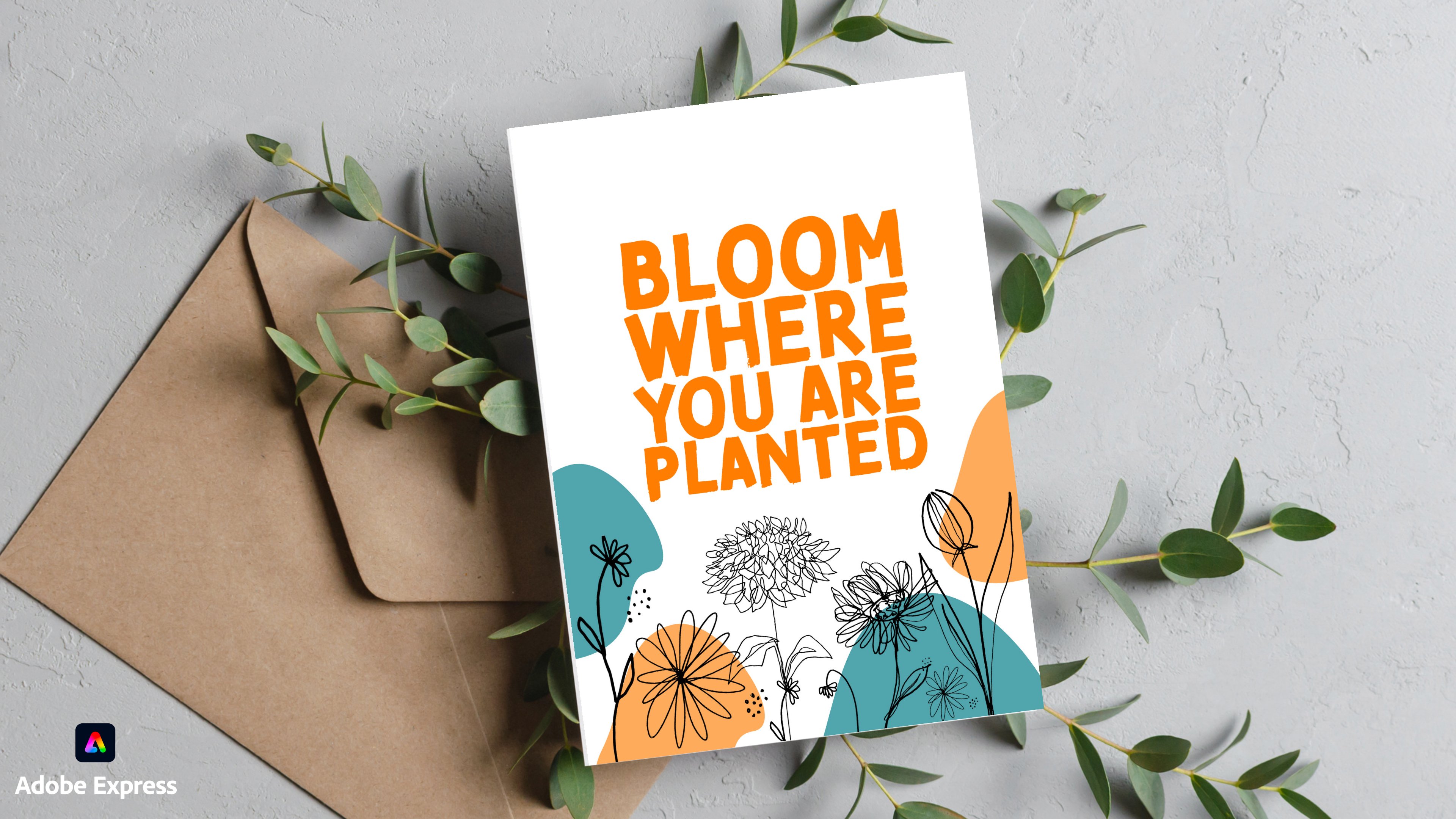
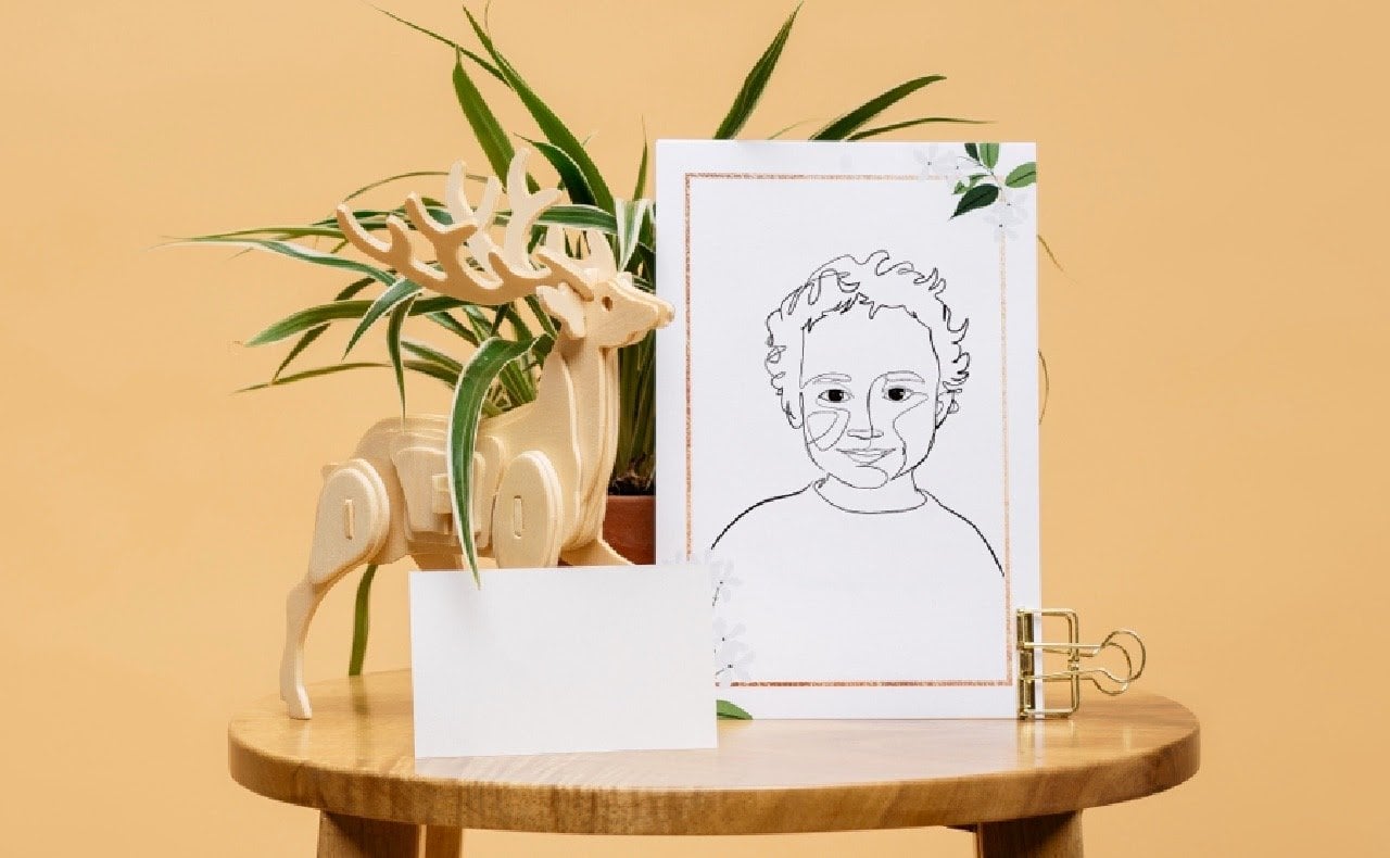
Not Quite Right! 3 Instant Ways to fix your One-Line Art on Procreate
 Attabeira German, One-Line Illustrator
Watch this class and thousands more
Watch this class and thousands more
Lessons in This Class
-
-
1.
Intro
0:47
-
2.
Project
0:35
-
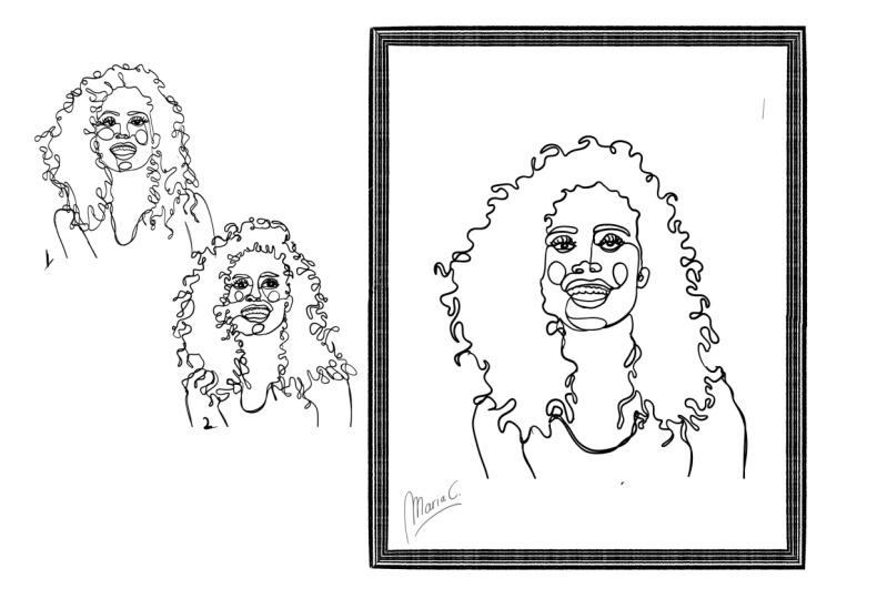
3.
Adding Expression
3:18
-
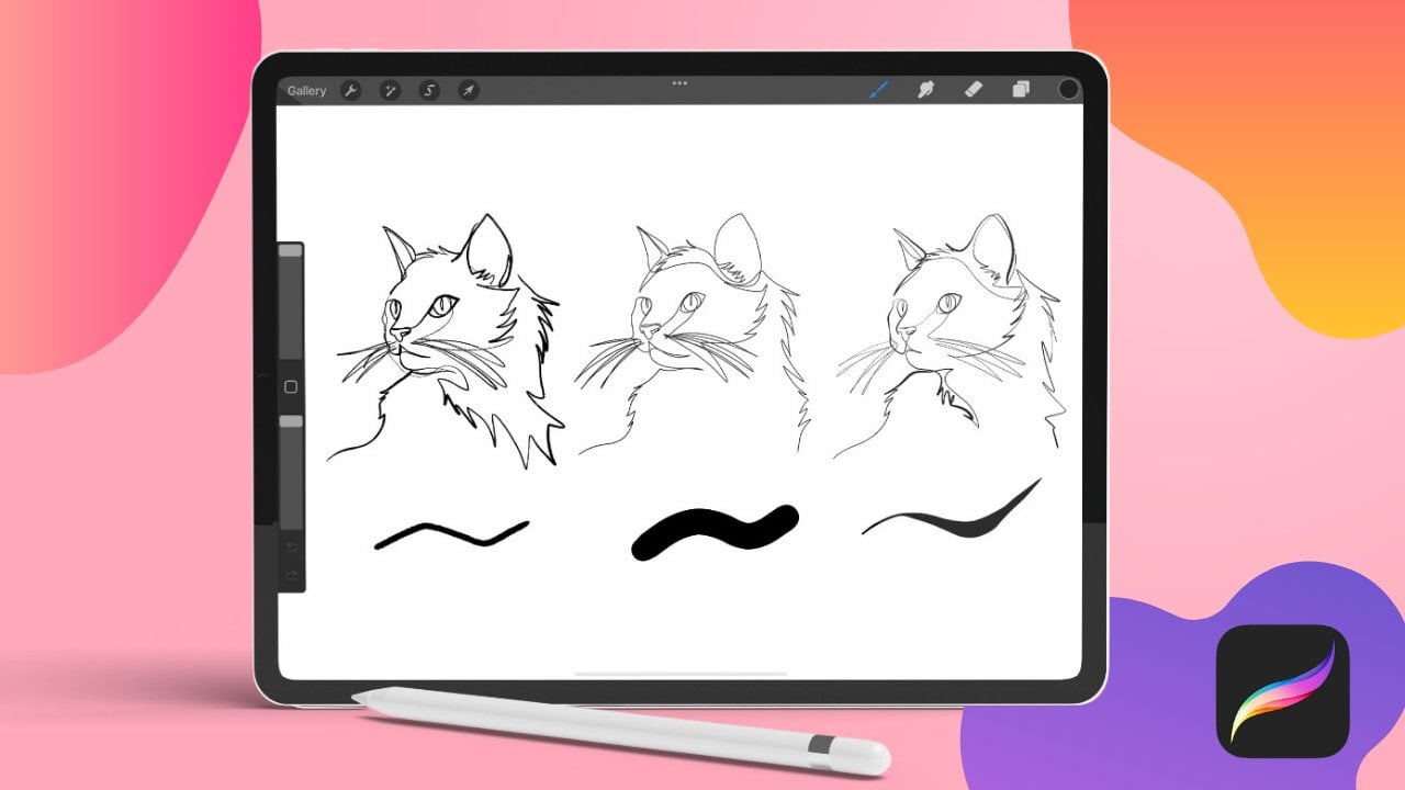
4.
Adding Texture
2:46
-
5.
Adding depth
2:56
-
6.
Conclusion correct
0:37
-
-
- --
- Beginner level
- Intermediate level
- Advanced level
- All levels
Community Generated
The level is determined by a majority opinion of students who have reviewed this class. The teacher's recommendation is shown until at least 5 student responses are collected.
91
Students
3
Projects
About This Class
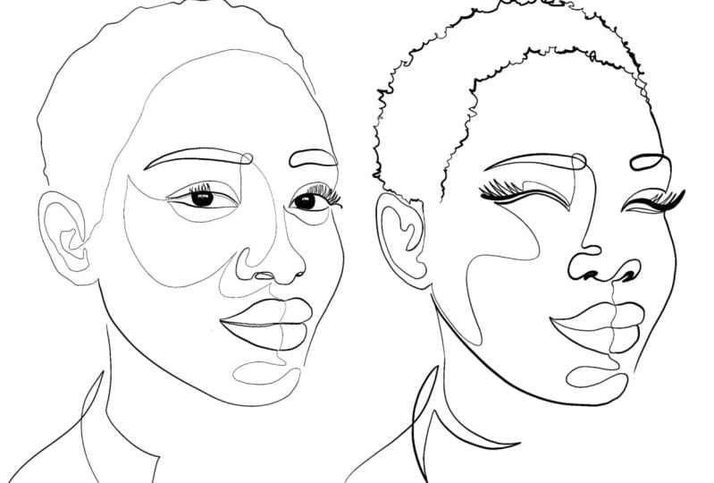
Have you ever completed a one-line drawing and felt like something was missing—but you couldn’t quite put your finger on what? This mini-class is your immediate troubleshooting guide to refining and enhancing your one-line art.
In this quick and effective class, we’ll explore three essential skills—depth, emotion, and texture—to instantly elevate your drawing. Whether your artwork feels flat, lacks expressiveness, or needs more visual interest, these techniques will help bring your lines to life.
Perfect for artists who already understand the basics of one-line drawing but need guidance in taking their work to the next level, this class will provide clear, actionable strategies to transform a “not quite there yet” drawing into a finished piece that feels complete and compelling.
By the end of this class, you’ll have a simple yet powerful toolkit to improve any one-line drawing that feels unfinished. Let’s troubleshoot together and make your lines more dynamic!
Meet Your Teacher

Hi! My name is Attabeira and I am thrilled to see you around here.
I'm a full time one-line illustrator & Social Media Strategist.
-------------------------------------------------------------------------------------------------------------------------------------
In 2018, I turned my passion for one line art into a business, and I've never looked back. What started as a personal creative journey quickly grew into a full-time career. I've dedicated myself to sharing this unique art form with others, offering online courses and 1-on-1 sessions on Skillshare. Recently, I landed a book deal that brings together over a decade of teaching experience and my deep knowledge of one line art, all aimed at helping people master this incredible styl... See full profile
Hands-on Class Project
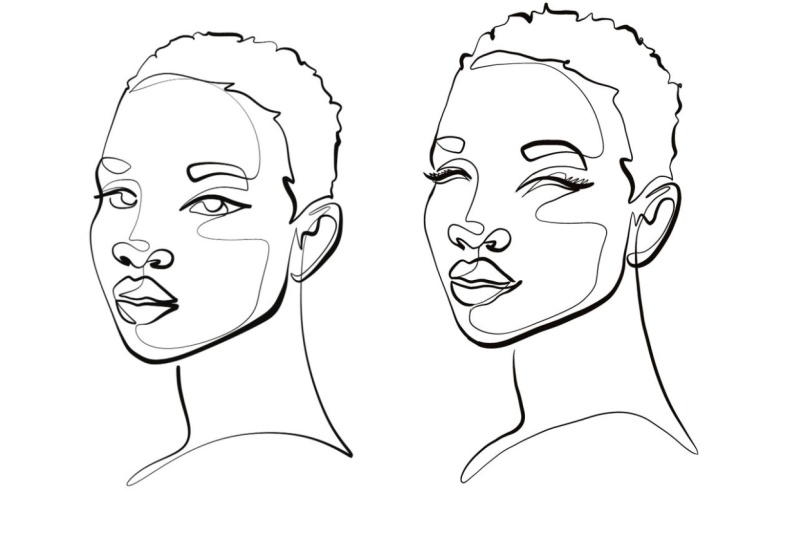
For this project, you’ll improve three one-line drawings using the three key techniques taught in class:
1.Emotion – Enhance expression and mood
2.Depth – Make your drawing feel more dimensional
3.Texture – Add visual interest and detail
I’ll provide three one-line drawings for you to refine. Your task is to apply each technique to one drawing, experimenting with how depth, emotion, and texture can improve the artwork.
Once completed, upload your before-and-after drawings to the project gallery and share your experience!
This is a hands-on, immediate solution to troubleshooting your one-line drawings—let’s dive in!
Class Ratings
Why Join Skillshare?
Take award-winning Skillshare Original Classes
Each class has short lessons, hands-on projects
Your membership supports Skillshare teachers
Learn From Anywhere
Take classes on the go with the Skillshare app. Stream or download to watch on the plane, the subway, or wherever you learn best.