Transcripts
1. Introduction: When working with watercolors, we often encounter the
same old challenge. I'm talking about painting very intricate details
like leaf veins, bird feathers, or
tiny highlights. Unlike other mediums,
where we can use lighter color on
top of the dark color, watercolors require an
entirely different approach. This is why I created
this class, so together, we can explore and
practice what I think is the most essential
watercolor technique that will help you instantly
elevate your work. I'm talking, of course, about negative painting or painting around and
in-between various objects, revealing the shapes and intricate details with
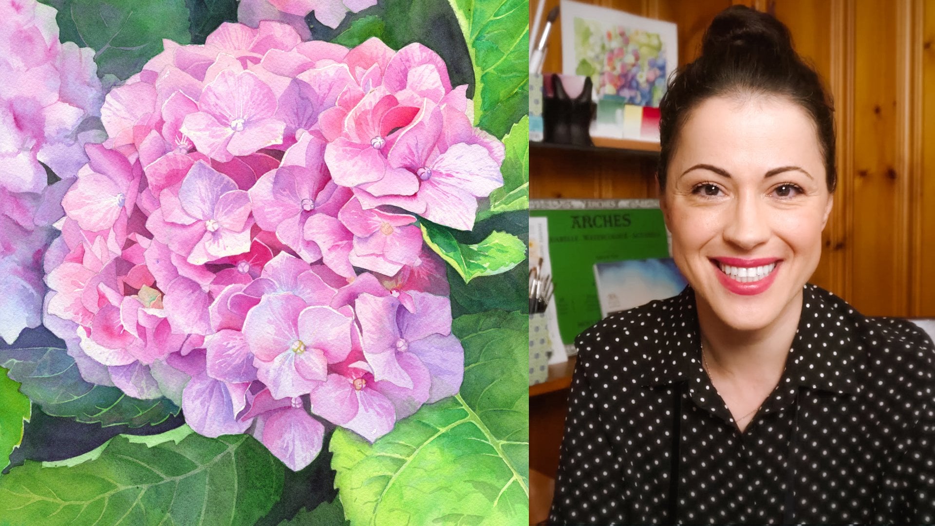
each brushstroke. Welcome to the class. My name is Anna Bucciarelli. I am a professional illustrator, designer of Canadian money and I'm passionate about
sharing my love for watercolors and all the
wonderful techniques that make this
medium so special. Negative painting
technique is one of the most requested subjects on my social media channels
and on my Patreon. It's no wonder if you haven't tried it yet, I promise you, it will open up an entire world
of possibilities allowing you to paint new things that may have seen
very difficult before. We will start by learning the fundamentals of this
technique and I will show you three different
scenarios where negative painting will help
you really elevate your work, creating intricate
details, highlights, and this is always super
useful watercolor backgrounds. For class project,
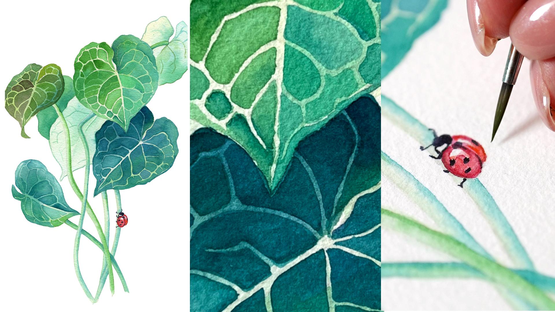
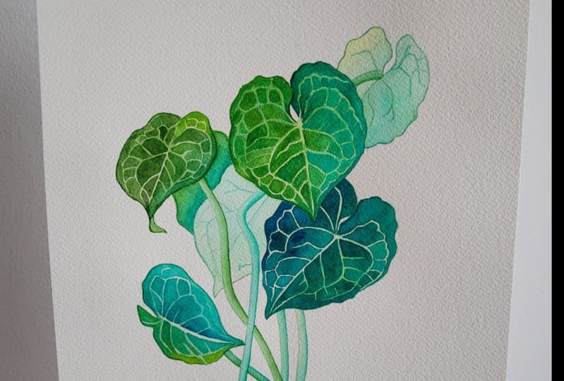
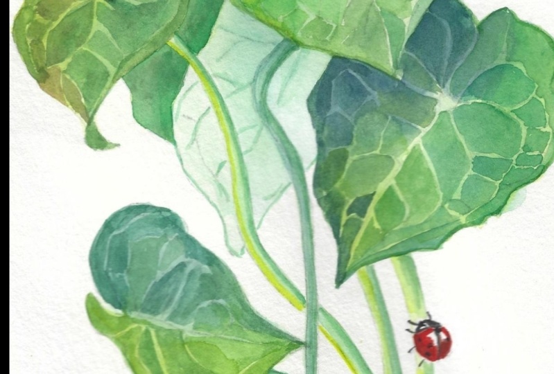
we will practice and master two of these scenarios by painting this tropical plant with very intricate veins and a tiny ladybug on one of the stems all using negative
painting technique. As a bonus, I will
share all my tips and tricks for mixing and
working with green pigments. Even if you have a very
limited supply of pigments, like green, yellow,
red, and blue, I'll show you how to mix
these basic colors to achieve realistic natural
look that we all need for painting
greenery and landscapes. Other useful techniques
we will cover include painting stems
and glazing shadows. The project in our class is particularly tailored for
those who love botanical art, but any beginner or intermediate
watercolor artist would benefit from understanding negative painting technique and related materials because
it can easily be applied to any subject and will
really expand your skill set. All supplies,
reference materials, and outline are saved in the resources section
of this class. I hope you're
excited to learn and practice this negative
painting technique with me, so join me in class and let's build some new
watercolor skills.
2. Class Project: Thank you for joining me. In your class project, we will paint a tropical plant with lots of light
intricate details. This will help us master
one of the few scenarios where negative
painting is absolutely indispensable for
watercolor art. In addition, I've included a small lady bug with
some highlights, so we can practice
the second scenario where using negative
painting technique will help you bring more
realism to your work. If you want to
trace the outline, you will find it in class resources on
the right-hand side, simply download it
and trace it on whatever size paper you
find most comfortable. I'm really excited to see all the different
versions you will create. Don't forget to post
either scans or photos of your work in the project
section of this class. In just a minute, we will go over the
key fundamentals of negative painting technique. But don't forget, you can always practice one fragment at a time. No need to do the entire
plant right away, trace one leaf or
maybe just a lady bug. You can even include
some of these elements in your own unique composition. Do whatever is most
comfortable for you. Whatever approach you
choose, enjoy the process. If you have any questions, you can always post them in the discussion section
of this class, so I can answer them promptly. Now coming up next, is an overview of our materials and negative painting
technique fundamentals and case studies.
3. Class Materials & Color Palette: Welcome back. Let's quickly go
over the materials we will need for
the class project. Since we're working
with watercolor medium, we will need watercolor
cotton papers. So the best choice is
always 100 percent cotton, and I will be using
cold pressed because I like how it takes
a while to dry, allowing me to manipulate the
paint a little bit longer. But you can go with a
lower cotton count, so 50 percent cotton paper
will work just fine. If you prefer the smooth
hot-pressed surface, then use hot-pressed paper. The technique works just fine on both types of
watercolor surface. The size of my paper
is quite small, only seven by nine inches, which is why I will use my smallest round brushes
in sizes ranging from 1-4. You can use this black-and-white
outline provided in the class resources
to trace an image on a much larger sheet
of watercolor paper. In that case, you can use
slightly larger brushes. Lately, I am loving my synthetic round Escoda
brushes called Chronos, but any round brush will
do for this type of work as long as the tip is precise. You may also occasionally use a larger flat brush to
cover larger surfaces, but this is entirely optional, we can get away with
just round brushes. We need water, of
course, a pencil, and an eraser for tracing, or you can freehand looking at the reference
photo like I did. I always say that when you're
practicing watercolors, there's no shame in tracing. I do it often because we're not really focusing on learning
the drawing skills, rather we need an
accurate outline so our project is successful. Make sure to capture those small detailed
veins on the leaves because we're going
to be painting around them using negative
painting technique. Lastly, let's talk about
our color palette, and this is a good
opportunity to learn a little bit more about
mixing your watercolors, specifically mixing your greens, which will help you
with any type of work, whether you're painting
flowers or landscapes. First thing I'm going to
mention is you can complete this entire project just
using one shade of green, mixing it with water to achieve different values
or different light and dark variations
of this green. You don't need to get
heavy into the mixing. But I thought it would
be a good opportunity to demonstrate the ever
useful mixing techniques. If you want to go
one step further and level up your painting by playing with
color temperature, let's take a look
at what we can do. If you consider the
color spectrum, you will notice that our eyes are capable
of distinguishing an entire range of green
colors from moody dark, blueish greens,
and all the way to sunny-warm, yellowish greens. The easiest thing to do is
to take one green pigment. Let's say I'm going
to use Hookers green as my base green color, and we can create
new shades of green from this base green. First one, we will create by adding yellow into
our base green. You can see the resulting
mixture is pushing our green pigment all the way to the yellow side
of the spectrum. We can use this sunnier, warmer, yellowish green on the
sunny side of our plant when we're working
on our projects, so the leaves that are facing up directly towards the sun. On the other hand, if you're adding blue to
your main base green, let's say I can
add Phthalo blue. We will push our green
all the way into the cool side of the spectrum
closer to the blues, creating a new
color that will be suitable for those leaves
that are in the shadow, because things that are closer
to blue on the spectrum always appear like
they're further away and more in the shade. As an option, and this
is for convenience only, you don't need to
buy these pigments, but you can use variations of different greens
straight from the tube. That's what I'm going to
do using green gold for my yellowish green to
skip mixing and really focus on showing
you the technique. I'm going to use
Phthalo green blue shade for my blueish greens, occasionally adding some
Phthalo blue into it to make it even cooler and even more close to the blue
side of the spectrum. Again, I'm doing this
for convenience only so that I can focus on
showing you the technique. But you can use your basic
supplies, yellow, blue, green pigments that
you have on hand to arrive at these different
shades of green. Lastly, and this will help
you tremendously if you're trying to achieve more natural
greenery in your work, is to mix your red
with your green. Red and green are on the
opposite sides of the spectrum, and you will arrive at a
beautiful, warm olive green, almost like an olive
shade of green depending on how
much red you use. You will see me demonstrate this when I will be mixing
my hookers green, my base green with a bunch of Quinacridone red
towards the end. We will be able to add even more natural variation to our palette with
this new mixture. Lastly, for the lady bug, we will only need
two colors of red. I'm going to be using that
same Quinacridone red that I'm using for
mixing with my greens and any shade of red you
have on hand will do. Of course, we'll need
some dark black. I personally don't like pure black straight
from the tube, so I always recommend
going for indigo if you have it for a
more natural look. Indigo has a little
bit of blue and so it comes off a
little bit less harsh. That's all for our pigments. Use my recommendations
or mix your own. If you want to simplify
the technique, just use one shade of
green to practice. As I mentioned in the beginning, our focus is on the main
technique we're studying, The Negative Painting.
4. Negative Painting Fundamentals: What is negative painting? Let's talk about
the fundamentals. I will show you
three case studies where negative painting
is absolutely essential and will really help you
elevate your skills. Helping you paint things that you may have been
struggling with before. Negative painting is a technique
where you paint around the shape like a leaf
or highlight and then add more color
around this shape, sort of building more
and more pigments surrounding the shape
with darker colors. In essence, we're working
with negative space, never actually
touching an object. The resulting shape,
or maybe a line or a dot comes out
looking much lighter than everything else
you've painted. This is very useful because
with traditional watercolor, you know that we can't add light details on top
of a dark background. The paint will simply sink
into already painted surface and we can't achieve
the same effect. There are three main scenarios, three case studies
that I'm going to show you in just a moment where this technique
is absolutely indispensable for
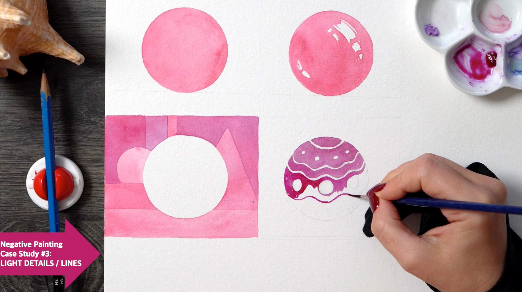
watercolor art. Here in these thumbnails, I drew a circle, and the easiest thing
to do when painting the circle is simply to cover the entire
shape with color. That's what we
would typically do without using any
fancy techniques. Now, what if we draw
a small highlight, and instead of filling the
entire shape with color, we paint around
this white detail. As you can see,
the small addition instantly creates a sense
of volume on our shape, making it look more
three-dimensional. We just used negative
painting technique to paint around the highlight. By doing so, we created a
much better form on paper. This technique is
particularly useful for painting eyes
because including a small highlight
makes them look much more realistic and any shape, especially glossy things, can be enhanced
using this trick. In our class project, we will use it on a lady bug. Very simple, very effective. Now let's see what
happens if I paint around our circle instead of painting the inside
of the circle. We're using negative
painting to create a light shape against
a dark background. The cool thing is, if you let this layer dry, I gave it a few minutes. Now we can come back to add even more details using again, negative
painting technique. Painting around the shapes. This background technique is my absolute favorite for
creating watercolor backgrounds, especially ones with
lots of leaves and organic shapes behind
the flower, for example. I use it all the time
in my botanical work. Carefully painting
around the leaf shapes, glazing darker colors around these shapes using negative
painting technique. I highly recommended if you want to level up
your watercolor painting, specifically the background
of your paintings. The final scenario where
negative painting, will be absolutely essential is, let's say we have a few lines
and grooves on our circle. Maybe it's like a
Christmas ornament. I mark them up like
this and then I paint around them very slowly
with the tip of my brush. Just like that, first on top of the line, and then at the
bottom of the line. Leaving the line itself
completely blank. All of a sudden we have
these smooth light lines, very thin, very intricate
on top of a dark shape. This last scenario,
the thin line details, is what's so useful for painting realistic subjects,
particularly leaves, because they always
have a bunch of light veins that would
be difficult to capture with watercolor
because we can never layer a lighter color
on top of the dark. Painting around these
light details is very, very helpful and
you can see it in so many different scenarios, for example, in this painting, I've used this technique
to paint lotus leaves. You can also use it to
paint feathers on birds and let me know in
comments below, if you can think of a few
other different scenarios where this would
come in very handy. This last scenario is precisely what we're going to practice
in our class project painting around a light details, creating beautiful
intricate work. Get your outline ready and I will see you
in the next chapter.
5. Leaf Background: Once you have your outline, we're ready to get started and
you can see on my palette, I have lots of different greens as I mentioned in the
previous chapter, I'm going to be
using three of them, right in the center I
have my medium green, which is Hooker's green. On top I have my yellowish green and you can simply
use your base, Hooker's green and add a
little bit of yellow in there. At the bottom I have my
cooler, bluish green. I'm going to be using all three, but very lightly you can see I've added a bit of water
and I'm going to try to lean towards the
warmer yellowish green on those sides of the
leaf that are facing the sun. On the ones that
are in the shadow, I'm going to be using my cooler, bluish green and
where I'm not sure, I'm simply going to
grab my medium green. Now, you can do the
same thing using just white shade of
green to make things a little bit more
straightforward. The main thing
right now is to use a super light mixtures so your pigments should be
really diluted with water. We're simply creating a little
bit of a tint on our paper so that in the second layer, when we start working with
negative painting technique, we can paint on top of
this first layer of color. It's going to shine through
looking almost white but not entirely so just a
little bit of a green tint. You can see the first
leaf that's facing us and facing the light I've used
a lot of yellowish green. Now the one that's facing away, we see the back of that leaf I used a little bit of
my bluish green there, so that's just the variation. For larger areas of color, you can switch to
a large flat brush if that's easier
for you to cover big surface in one stroke. Just make sure you don't go over the edges and
as you can see, I'm not super concerned about my colors bleeding from
one leaf to another. We will have plenty of
time to work on the edges. This is just our
background layer and so we're using
very light greens. If you're using a variation
of warm and cool greens, then don't worry about them bleeding from one
leaf to another. It's going to be a
very subtle transition if your paint mixture
is light enough. Just continue working
through your outline and I always tend to
work left to right and top to bottom
just to avoid smudges but you can also use
the little glove just to protect your paper and I'm going to
pause and slow down when I get to the stems because that will require a little
bit more attention. Just going to finish this
last leaf up on top, including the little tip. Now just using my medium green, just my Hooker's green
I'm going to clean up the edges and then
work on our stems. I'm going to try to get
them in one stroke, but you can also just slow
down and do it in sections. Making sure to work carefully
around the lady bug. If you're including the
lady bug in this project, you can skip it or
paint it separately on a different sheet of
paper just for practice. But if you included the
lady bug like I did, then just avoid covering the
outline with green color. Just do the stems, same very light mixture of color we don't need to go dark and you can see the top
leaves are already drying out and there's a little bit of a
variation in color temperature. The three leaves
that are more at the bottom are a little bit
cooler and then the shadow, the ones that are facing
the light up on top. I've used a little bit more
of my yellowish-green, so already there's a little bit of a color temperature
difference, a little bit more dimension, but we will definitely
reinforce it when we work on our veins
in the next section. If you're using just one
shade of green, don't worry, it's going to look quite nice either way
and the only thing we have left to do is the
last leaf on the left. Here I'm going to use my Hooker's green maybe
go tiny bit darker. It's on an angle so I'm
just trying to capture the way light illuminates each side a little
bit different, then I'm going to
use clear water just to spread out
that Hooker's green and then switch to my cooler
green on the other side. Very carefully, just finishing
off around the edges. Our first layer is done
really quick and simple, just a light wash of color. The main thing right
now is to make sure that this layer
is completely dry before we move on
to the next one. I gave it about an
hour-and-a-half to make sure that when we're working
on the next layer, we don't disturb any of
the underlying paint. Maybe add a little
bit of variation in color temperature on
the strokes as well, just so they look like
they have some distance. The one where you use the
cooler blue, the cooler green, we'll look further away and
the one with a warmer green, we'll look closer
and we'll reinforce that sense of distance
in the next layer. I will see you in
the next chapter.
6. Negative Painting: Leaves Part #1: Welcome back. In this chapter, we will start practicing the
negative painting technique. The main thing right now
is to make sure that the first layer of color
is completely dry. I switched my palette just
so I have more room to mix my colors because
we're going to be playing with different
shades of green again, but this time, let's
go a little bit more saturated and you can switch
to your smallest brush. I'm using Size 1 round brush, and let's start on the top
leaf on the right-hand side. We have these really faint
outlines of the leaf veins. What I'm going to do is using maybe a cooler
shade of my green, so a little bit of my
Phthalo green blue shade, mixed with hookers green or just pure Phthalo
green blue shade. I'm going to start
working around the edge very slowly painting
the first slice. I'm painting around my
outline of the vein. It's not smooth,
it's not straight. There are lots of details. When I finish the slides, I'm going to go on the
other side of that vein. You can see I'm painting very carefully outlining the vein, maybe leaving one millimeter
in-between my color blocks. You can see as I move along, leaving my vein outline blank, it's going to suddenly
stand out and that is the essence
of negative painting. Instead of doing something like covering everything
with green and then using white pigment like you would do with
gouache or acrylic, here we're painting
around our white detail. Because we're
working wet-on-dry, meaning wet paint on dry paper, there's no need to rush, our small sections of
color are not overlapping. If you're finding it too
difficult at this point and you're maybe
covering some of the details that you
don't mean to cover, don't worry about it because
you can always simplify and skip some of
these small details and cover some of the
whitespace with paint. Even if you do it by accident, as long as you capture
some of the outlines, the overall effect
will be the same. You can see I've painted
the first slice, the second one, and now I'm
going to do the same thing. Follow along the bottom side of my vein outline with
the tip of my brush. Paint the slice and
the way I do it, you'll learn as we move along the way is I outline the slice and then I fill it in
because it's easier to get that shape
correctly first, very lightly with the
tip of your brush. Then when you're happy
with that shape, you can add more color. You can add some
variation of color, drop other colors in
your small slice, as long as you're
happy with that shape. I'm trying to capture
two types of veins, so the ones that are really long and follow the edge of the leaf, and also the ones
that connect them. Once again, I'm going
to mention this. You don't need to capture
every single detail. Try one or two, see how you like it, how comfortable you are. You may want to switch to
a larger sheet of paper and do the first leaf
just to practice. You may find that you will
need even smaller brush. As long as the tip of
your brush is sharp, you will be okay. We don't need large brushes here because we're not
really loading them with lots and lots of paint. Just a little bit
of saturated paint and if you look at
the value scale, which is a very helpful
tool to assist us when we want to judge how dark or how light things need to be. We're working with
medium values right now, so somewhere around five or six, not completely saturated, not all the way dark, just so we have a little bit
of wiggle room and maintain that beautiful transparency that watercolors are famous for. So there's a little bit of that first layer
shining through. As I mentioned, you can
always adjust your colors, make new mixtures
for every new slice. That's why I want to demonstrate the way I'm going to do it is slowly start switching
to my warmer green, adding a little bit of
that yellowish green as I move down the leaf and add more and
more tiny slices. Of course, getting
closer to the edge, I'm going to slow down, make sure that I paint
along the pencil outline. Here, I went a
little bit too dark, so you can see I just
grabbed a little bit of water and help that color spread on to the next block so that the transition is
a little bit more smooth. With watercolor, as long as
you're quick to follow up, you can always fix your
mistakes to a degree. If you go a little bit too dark, just grab a little
bit of water and help that color with
the tip of your brush. Lighten it up a little bit, and here I'm trying to get
very fancy and very detailed, leaving just a tiny white
strip along the edge. Once again, do what is
most comfortable for you. Capture as many of
these small details as you feel works for your brush
and for your size of paper. The main thing is
to just practice and grasp that concept of
painting around something. I hope you can see as we're moving all the way towards
the tip of the leaf that suddenly we have this beautiful mesh
of light green veins. They may look lighter or darker depending on how dark
your first layer was. But either way by
glazing our colors up on top and
skipping the veins, leaving them blank, we suddenly created a beautiful texture. Now we can just work with
this initial layer of color, these shapes that we've created and you can adjust
the temperature, so take a look here. I'm going to put a little
bit of my cooler green along the edge of the shape and spread it with a
little bit of clear water and you can do that on
any slice you want. I'm going to take a little
break from negative painting and work on the
back of this leaf. Because it's the backside, the way we see the
veins is in reverse, so they're not light, they're actually
going to be dark on the back of the leaf, so we won't need much
negative painting there. I'm just going to outline
the edge and then maybe help that color spread with
a clean damp brush. I just dip it in water and
then tap it on tissue paper to get rid of excess water and then help that color spread. On the other side, I'm going to attempt a
little bit of wet into wet. I'm going to color
everything with clear water and then
drop a little bit of green just to create some shadow as that leaf disappears
into the background. Just very loosely following the shape of the shadow that I see in the reference photo. Once again, you can play around with different shades
of green here. Primarily, I've used my cooler
green, my blueish green. As my paper is drying out, there are a couple of
places where it's dry, a couple of places
where it's wet, I'm just going to indicate
a couple of those veins. Once again, we see
them in reverse, so they're actually darker
than the background side of the leaf and you can do
it wet-on-wet or wet-on-dry. Right now it's, for the most part, wet-on-wet, my paper is drying out so the
lines are not super crisp, and maybe a little shadow
on the stem leaving a little highlight
up on top because our source of light is
coming from the top. Very simple, just a suggestion
of a leaf shape and a few veins to take a break from the intensity of the
negative painting. Now we're going to
move down and work on this leaf that's
partially covered. It's in the shadow, we want to make it a
little bit darker. If you're using a
simplified palette, simply follow with
your main green, don't worry about
color variations, but if you want to play
a little bit with me, add some blue to
your main green. I can even bring
some silo blue into my already cool silo
blue-green shade to make it even cooler. Whatever green you're using, just add a little
bit of blue into it. Let's start with the top slice. Here as you can see, I could manage the small
veins sticking out, so I ended up covering
it with color. Just like I said before, you don't need to
capture every detail, so don't worry about skipping some of your outlines. It's fine. As long as we get the
majority of them, we're going to have a really
nice texture on our leaves. The first slice is done. I'm going to bring even
more blue into my green and continue down just like
we did on our first leaf. Now that we have
the first slice, we can follow along
the bottom side, leaving just a tiny strip of blank paper without any color. Create the next slice, clean up the edges, and then move on
to the next one. Once again, I'm going
to outline the shape and fill it in just like that. By the way, this entire
process took me about an hour just because I'm
working very slowly, so it might take you
longer or maybe less time. But I decided to split
it in two sections so that in this chapter, we're going to finish
the side of the leaf and then do the
one at the bottom, and then the next half an hour, we'll spend painting the
other halves of our leaves, and for the stamps, because we're going to be using a slightly
different technique, I saved that video as a
separate chapter as well. It's pretty short
because the technique is going to be different
from negative painting, I wanted to organize it in a way that's a little bit
more straightforward so you can focus on
one thing at a time. Adding saturation
now with my blue, you can see how much
darker my slices are. Once again, this is deliberate. I want to create a
subtle difference in my color temperature and my values in order to build better dimension
for my subjects. The top leaf is lighter and
features a lot more yellow, and the green a lot warmer
and it's going to stand out. Using those yellows will help the leaf appear closer to us. Using lighter values will
only reinforce this effect. The leaf we're painting
now is darker, so darker values
and cooler colors both help us push this leaf
a little bit further away and help create a more
dimensional effect as if there's some space
between the two leaves. Just a subtle trick that works, not just in greenery on
anything you're painting, our eyes perceive blue, the entire range of blues on the spectrum as
being further away. That actually
explains the way we perceive the blue sky
and the night sky. Everything that's
closer to blue on the spectrum appears like it's further away
in the distance. Just a subtle little trick that will help you
with greenery, it will help you with
shadows that you're painting and really any subject
that you're interested in. This half of the leaf is done. Even though I didn't capture a lot of detail up on
top and in the center, I'm quite happy with it. The main veins are there and now we can switch
to the next leaf.
7. Negative Painting: Leaves Part #2: Recall in the first
background layer, we used warmer greens, yellowish greens on
one side and more of a cooler shade of green
on the other side. I'm going to work with
this cooler green color and start with this side that is facing us since I already have some
blue mixed in with my green. I hope you're getting used
to the process by now. All we're doing
is just following the long outlines
of the veins and maybe trying to
capture a few veins that connect these long ones. Those shorter ones
that connect them, they're a little bit
more difficult to paint, so do a few of them or skip them altogether
if it's too intricate. But the technique is the same. I'm outlining each slice between the veins and
then I fill it in. You can see the whole process
from a different angle. This may be more helpful. My brush is not very long. I find that shorter brushes and this is just
a quick tip based on many years playing with all different brush
shapes and length; I find that shorter brushes
allow more control. For smaller details, it's actually beneficial to have
a slightly shorter brush. There is a type of watercolor brush called
archival length, and those are super short. The thing about them is they obviously won't
carry a lot of pigments, so you can't load them up
for large blocks of color, but for small details,
they're super useful. Those will be even shorter
than the one that I'm using. The one that I'm
using is irregular. Here I want to lighten up
my slice is a little bit. Another little trick, it's
called watercolor blooms. All you do is just
drop a little bit of clear water into your
wet paint and it's going to push the pigment out because we have
such small slices, such small segments,
it's going to push that color all
the way to the edge, creating a little bit of a
highlight in the center. Just use a little bit of water. No more than a tiny drop. I'm going to clean up the edges and finish this
side of the leaf. Move all the way to the tip. You can see I've
simplified quite a bit, skipping some of
the smaller veins. Really simple at this point. Just finish it off and make sure that the edge is nice and crisp. In the last couple of
minutes of this chapter, I'm going to finish the
other side of the leaf. It's a lot smaller,
it's on an angle, so even less detail is visible. Let's just do maybe
a couple of veins, and if you're playing with
different shades of green, you can add a little
bit of yellow or switch to a more yellowish
green straight from the tube. Hookers green will
work just fine. We can complete this side
with just a few slices. I might go a little bit more saturated around
the edges just so that we have good contrast
against the white paper. Continue down just a
few small details left. I'm going to do a large slice, fill it in, and then finish
the edge and the tip. As I mentioned before, when we were just
starting on the top leaf, when you complete this
layer and you're happy with all the shapes and the negative shapes
that you've created, you can play around and
adjust some of the colors, make them darker if you wish. I felt like maybe
adding a little bit more saturated bluish-green
on the other side. Now that I have this
left side painted, I feel like I need a
little bit more contrast. I'm going to add a little
bit more of my bluish-green, still maintaining those
lighter highlights in the middle of these slices. I'm going to use
clear water there and drop a little bit more
saturated color along the edge along the central vein, just to reinforce
the shadows there. We're done with the first
half of our leaves. In the next very small chapter, I'm going to show you
how to paint the stems. It's going to be helpful for any botanical art that
you may be doing. I have an entire video tutorial
on my YouTube channel. Just about painting stems
and understanding the light. This will be a helpful
technique to learn before we move on to the rest of the
leaves and finish them off.
8. Leaf Stems: Now that we've painted
half of our green leaves, Let's take a little break
and switch to the stems. What I'm going to do
first is up on top using my medium green,
my hookers green. I'm just going to add a
little bit more color. Maybe darker at the bottom since our source of light
is coming from the top. Now I'm going to show you the way I always paint my stems. Even the smallest
thinnest ones can have a little bit of dimension
if you use this technique. First, note which
side is in the shade, here I think the bottom
and right is in the shade. Apply a little bit of color
with your small brush and then clean your brush,
tap it on tissue paper and apply clear water
on the other side. Let's carry it down using
the same techniques. You can see on the
left-hand side, I'm using a damp brush and then applying more
saturated color on the right so that it appears like there's a little
bit more dimension. It's not just a straight line, there's a little bit of
light and shadow variation. You can always add a little bit more saturated
color on the darker side while the surface is still wet. Let's do another one just
to demonstrate the effect. I'm going to pre-wet
the stem this time, since we already have some
color in the background, and then drop just a tiny bit just with the tip of my brush
on the right-hand side. You can see it's gently
spreading into the wet area, creating like a highlight
on the left-hand side. Let's move on to the next one. Again, I'm going to wet the stem and then take a little
bit of my hookers green, my warmer green this time, since I feel like
there's a little bit more sunlight up on top and carry that color
only on one side. Very subtle, very gentle,
letting it spread and cleaning up
the edges as I go. Now I'm going to continue on
the other side, same thing. Clear water or you can use
a little bit more color, just a subtle hint of
color, cover the stem. Then go for much more
saturated green, keeping it just on the
tip of your brush, and then drop it very gently. Just painting a line on
the right-hand side. It's not always going
to come out perfect. These are very, very
thin, intricate details. It would have been a lot
easier if this was like a thick stem or if
our paper was larger. But you can still have
a hint of 3D form by introducing this variation
in lights and darks. Two more stems, we have
not fully visible, so much shorter and this one is all the
way in the background, so I'm going to cover
it with clear water. Going carefully
around the ladybug, just around the wing area. I'm not really worried about
the legs of the ladybug because they're going
to be much darker. Just go around the wings
that are going to be red and then add a
little bit of green, and I'm going with
my cooler green just to put that stem
to the back visually, just sort again, that
color temperature trick to make sure that it looks
like it's further away. Applying my cooler green and the last stem, we see three sections of it. Let's paint them separately. And here I think I'm
going to use the method that I used in the
very beginning where I paint with
my darker color and then I blend
with clear water. Maybe I'll make it
a little bit darker just so that it stands
out a little bit more. Finish the second section
and the last one, again, I'm going
to go darker here so that it looks like
it's further away. That's it for our stance. Let's come back to
our leaves now.
9. Negative Painting: Leaves Part #3: Welcome back. Our
stems are finished. So before we continue working
on the remaining leaves, practicing negative painting, I'm just going to cover
this small section, the leaf that is all the way in the background
with solid colors. Maybe just Hooker's
green and I'll drop a little bit of my
blue-ish green just to set it back further visually. Since, again, adding blue always helps us set the
subject backward a little bit so that
it looks like it's behind these other leaves
that are facing us. You can use more
saturated paint, finish the other fragment on
the other side of the stem. Let's come back to our
very first top leaf. Now, it's time to finish
off our main top leaf. Let's switch to the left side. The right side should
be already dry/ But just in case, I'm wearing my gloves so
I don't smudge anything. Notice that I'm going to add a little bit more of my
warmer yellowish green, and this is just a subtle
way to indicate that this side of the leaf is
facing our source of light, the sunlight, a little bit more. Just as an option, you can add a little
bit of yellow into your main green
to warm it up. By doing this, you will add
some dimension to your leaf. You will make the
left-hand side look a little bit different
from the right-hand side. By adding this yellowish green, we're accentuating the fact that this side of the leaf
is facing the light. Just like we did before, I'm working very slowly
around those pencil marks. There is no need to rush. I simply pick one
little block of color, outline it, and then fill it in. Here, I made a mistake. Didn't follow my outline, so I'm going to extend that
little block and continue. One of the things
you will notice is because we're painting
in small sections, the consistency of your paint may be different every time. My advice here is start a little bit lighter than
you think you should, and then once you're happy with the overall shape,
like, for example, this large one, once you're happy
with it, fill it in. You can always add
a little bit more of your green
pigment, wet on wet. If you're familiar
with watercolor, if you have some
experience already, you know that adding additional pigment
onto wet surface, onto your wet paper just simply creates a
nice little blend. You can always follow
up quickly after you've painted a section with
some additional color. This one is practically dry, so I'm just going to add my green and then
maybe help it spread by grabbing a little bit of water and just spreading it out. You can see as I'm moving closer and closer to
the right-hand side, you can see the
subtle contrast in my yellowish green and my
cooler blue-ish green, and you can also see that
now I'm adding tiny bit of extra Hooker's green into the sections that
I've already painted. The most important thing is to get the overall shape correctly, try not to cover
the white lines, and then you can
finesse the values. By values, of course, we mean lights and darks. You can always add darker green once you're
happy with your shape. Here, I'm going to
try to get fancy and add additional detail,
a smaller vein. But remember, you can always simplify and skip
some of these lines. The overall effect will
not be much different, but you can always add more
and you can look closer at your reference photo and add as many of these little
slices as you wish. Another thing I
wanted to show you is you can always
follow up on top. Look at this large slice
that's already dry. I'm going to add some
detail on top of it, split it in three, and again, using negative
painting technique, create an extra set of veins. Just another option for you to play around
with this technique, you can always add additional details by painting
around certain elements, building more and more
detail as you go. As we're getting closer
to the tip of our leaf, I'm going to slow down a bit and just really try to work
with the tip of my brush, but I'm still going to
try to add a few slices. If you want to
simplify this section, just add one continuous slice along the edge and
that would be enough. Or if you can, maybe if you're working on
a larger sheet of paper or maybe you have
a smaller brush, you can always add as
many details as you want. When we're done, we're going to move down and do the second half of the
leaf that's underneath. You will notice it's going to
have a lot more blue in it. So cooler green closer to
blues on the color spectrum. That's to indicate that
that leaf is in the shadow. Here, once again,
I'm going to try to add a little bit more detail, but that slice is still quite
wet so it may not come out. Usually, we do this wet on dry, but because we're painting
such small areas, the slices are
drying out quickly. So you may be able to add
these details right away. But if your paint is spreading, just give it a few minutes and you can always
come back after, add additional details
when everything is dry. Before we move on to the
leaf that's underneath, I want to allow a few minutes
for this section that we just painted to dry so that
our paint doesn't spread. Just to give it a few minutes, I'm going to switch to
the back of this leaf. We see just a few
fragments of it. Because it's the back, we don't need negative painting. It's the opposite of
what we're doing. So the veins are
actually indented. They're more in the shadow. I'm going to paint
them really lightly, just following my brush marks and I'm going to
outline the leaf, making sure I don't
go over the stems. There is the main vein going along the center of the leaf. What I'm going to do is try to apply the negative
painting technique there. I'm going to paint the
shadow along one side, and then I'm going to blend
it out with clear water. Just another way of doing negative painting instead
of sharp color blocks, you can always blend them
and then do the other side. Suddenly, we have that main vein a little bit more defined. But overall, I
don't want a lot of contrast because that leaf
is in the background. Just very subtle light detail. Now let's work on the
other side of this leaf. Here I had a little accident. Just a quick note
before you start, make sure you start
from the center of the leaf and not around
the edge because you will see it's way too soon to paint close to the area
we just worked on. The paint is going to
run onto the other leaf. But not to worry, this happens all the time
with edges or paint flows. I'm going to leave it for
now and then come back when everything is done and lift
that paint, clean up the edge, and I'm going to show
you how I do it. So this will be useful, but, of course, don't
follow my mistakes. Make sure that you're
starting maybe from the center of the leaf so you avoid little
accidents like that. I'm just going to continue
right now as if nothing happened and work on
all the other slices. As I mentioned earlier, here, one of the optional little
tricks that you can do to add some dimension to your work is add some blue into your green. No matter what base green
color you're using, it doesn't matter which
pigment you're using. You can always drop a
little bit of blue, and I'm going to
use Phthalo blue, green shade. It's very close. I'm going to add just a tiny bit of that pigment to make it even closer to the blue side
of the spectrum and use that mixture to
paint the slices. Notice, too, that my mixture
is a bit more saturated. I'm using just a little bit
more pigment and less water. Again, the reason
for that is because this leaf is in the shadow. It's covered by the one we painted just a few minutes ago. You can go a little bit darker. A combination of
these two approaches, so adding blue, which
is a cooler color, more indicative of a shadow, and using more saturated
pigment will help you instantly push that
leaf to the back, creating more dimension and
more depth in your work. I'm going to show you a different angle
now just so you can see my brush strokes
a little bit closer and my technique, again, is very similar. I outline the slice with
the tip of my brush to make sure that I get
the shape correctly, and then I add color
in the center. Once I'm happy with that slice, I'm going to let it sit for awhile and I may come back and add a little bit more
pigment if I feel like it. Now I'm going to come
back to the edge. It's surely dry now and add a little bit more
color there around the little mishap that I had. Once again, I'll remind
you that towards the end, when everything is
completely dry, I will come back and I'll
try to fix my mistake and lift that little bit of green paint with a damp brush.
10. Negative Painting: Leaves Part #4: We're almost done
with our leaves. On this last one, I
thought I would show you yet another trick for
working with greens. This is a very useful
thing to know about green pigments in
general that will help you for any
kind of greenery. I'm talking about adding
red into your green. The cool thing about
greens in general is that you can easily mix them with various shades
of red to create more natural warmer, brownish
looking greenery. These leaves here, they're
more vibrant, tropical, but I'm still going to make
use of this technique. If you're painting greenery
that's more common to European or North
American climate like, for example, here in Canada, the majority of greens
are on the warmer side and contain different
shades of brown, mixing your green with red
will really come in handy. It creates a really
subtle natural effect. You can see that I've
dropped a little bit of my quinacridone red
into my hookers green. I'm going to work with
that mixture to paint the slices on our last leaf. Of course, once again, if you're simply practicing, you don't have to add
this variation in color, but I couldn't help
but show you this. Because it's such a useful
technique and it adds variation to your greenery
in a very natural way, you don't need to
introduce any new colors, we don't need different
shades of brown, simply add a little bit
of red and play with your mixture to arrive at
different shades of warm green. It's almost like an olive green. You may have olive green
already straight in the tube. This is very similar, but using a mixture
instead of paint straight from the tube gives you
much more variation and opportunity to play with different shades
of warm green. You can see here, my slices are looking
all different as if they're reflecting
sunlight in a more natural way even though we're
painting on flat surface, it adds a little bit of
dimension to your work. Just like we did on
our main top leaf, the one that's facing us, here I'm going to use
the same trick and use a slightly different mixture on the other side of the leaf. I'm going to lean heavier
towards my hookers green. Less red, more green, a little bit different from
the side that we just painted. By doing so, I'm going to really accentuate the
different angles, left versus right
side of the leaf. The way they catch light
is different and so by adding more of a yellowish
green and less red, I'm going to create a very
distinct look on this side. Both sides are facing
away from sunlight, but it feels like this
side would be getting some sunlight coming through and maybe coloring it
a bit more yellow. That's my logic as I'm looking
at the reference photo, but also playing around
with my palette. I'm also adding a little bit of my yellowish green now
to really warm it up and move away from
the green-red mixture that I used in the beginning. We just have a few slices left. I'm going to outline them, fill them in, and
then do the tip, the backside of the
leaf that we see, just a little tiny slice
and our main job is done. We've covered the
entire surface of our plant with green details using negative
painting technique, we've captured lots and lots
of subtle variations in color and created lots of veins
using this technique. That's the focus
of this tutorial. As an optional more
advanced step, you can follow me
for a few minutes to add some shading, wet on dry, just make sure that your leaves are completely dry at that point and you'll see how
much more dimension we'll be able to create
with this final step, this final glaze of color, but it's completely optional. I think even at this stage, the leaves look
already quite nice. The last thing I'm
going to do is add just a tiny little bit
of detail on the top leaf. Again, it's the back of the
leaf that we're seeing. I'm just going to mark
up those veins with green color without
using negative painting.
11. Negative Painting: LadyBug: Welcome back. In this very brief chapter, I'm going to show you
how to paint a ladybug. I've included this
subject specifically so we can practice a
different scenario where negative painting
is extremely useful. Recall in the exercise section, I showed you a sphere
with a highlight that we've painted around. We're going to do
exactly the same thing now, grab your red. Any transparent or
semi-transparent red would do and outline the left wing. Just go around up on top, on the left, and on the right. Then outline the highlight
with saturated red. Now clean your brush and
tap it on tissue paper. You can carry this color down
all the way to the bottom. You can also just use
a light mixture of red and this helps us create a nice, beautiful shiny
highlight on the wing. You can also do the same thing on the right-hand side again, just with the tip of your
brush, paint, the outline, and skip the highlight. This may be a little
bit more tricky, but even one highlight will
enhance the look of the bug, capturing that
beautiful sunlight and adding some dimension. Let's leave it to dry. You can switch to
the next section while the bug is drying or maybe have a coffee or tea. I had a coffee just
to make sure that we can follow up with
our dark details and not disturb that nice
red color on the wings. For the legs and the
head and the spots, use your block or as I
often do instead of black, indigo always looks
very natural, and using the tip of your brush, just do the head. Maybe a small leg. Antennas. There's a little spot up on top. Notice that I also use
negative painting technique to capture that white spot on the left side of
the ladybugs head. Small legs. Now we can do the tiny spots. This is why it was important to let that first layer
of red dry out. If you don't, that black pigment is going
to muddy up the red. Our Lady Bug is done. But if you feel adventurous or maybe you're not happy with
the saturation of your red, you can even paint a
little bit more up on top just make sure your blue is
also dry when you do that. I've added a little bit
of orangey red just to boost the vibrance
of my ladybug, this is not essential, but I often like to come back
to something I've painted because watercolors always dry out looking a
little bit lighter and I glaze a little
bit of color afterwards just to increase the saturation
and add some vibrancy. Now, when you're done
with the ladybug, let's move on to
the next chapter and finish off our leaves.
12. Glazing Shadows: Welcome back. This is the last
lesson in our class because our leaves
are pretty much done and the lady bug
is done as well, and I wanted to show
you a simple technique that I often use
when my painting is practically done
that really helps add more realistic
dimension to my shapes. I'm talking about glazing. Glazing is an amazing way to add just a subtle variation
in light and shadow and maybe adjust your
colors a tiny bit. Watercolor is a
transparent medium, so if we apply a very thin, watery layer of paint on top
of already painted sections, everything that we've painted
before will shine through. All we're going to do is add just a hint of extra
shadow and color. The most important
thing is to make sure that the underlying layers
are completely dry. I'm going to work primarily
with my medium green, my hookers green and
my cooler green, my more bluish silo
green blue shade. You can see on the
right-hand side, I've made a very
light watery mixture for both pigments and
I'm going to start off by glazing just a tiny bit on the right-hand
side of the top leaf, closer to the main central vein and then I'm going to blend
it out with clear water. Similarly, on the
left-hand side, I'm going to glaze a little bit on this section of the leaf where there's a little
bit of a shadow and you can see that by covering just a
section of the leaf, I'm adding just a
hint of shadow. But the beautiful
white lines that we've created in
the second layer, they're still shining through. It's just a hint of
color up on top. I'm going to do a little bit
of work on this top leaf. Cover the right-hand
side with clear water, then drop a little bit of
green and then up on top, I'm just going to
reinforce that shadow, put a little bit of color in the darkest area and then
blend it out with clear water. I want to make this leaf that we see in the background
a little bit darker, add a tiny bit of dimension. I'm going to put color at
the bottom of the section and then blend it out
with clear water. This light leaf, we
see the back of it, I'm just going to add
a very light shadow where it disappears
under our top leaf and then blend it out
with clear water. Just a hint of cooler green, just a little bit of shadow. Now recall this leaf that we worked on right after
our main top leaf? It's in the shadow, it's covered by another leaf, and so we have an
opportunity to reinforce this effect, adding
more contrast. I'm going to add my
bluish green around the edge and then blend
with clear water. To reinforce the
color temperature difference even further, on the right-hand side, I'm going to glaze
my yellowish green. The surface is still wet
so I can continue dropping just a little bit more blue, and once again, notice that all the beautiful
veins are still there. We can still see them, they just look a
little bit darker now. I might come back
to the top leaf and add a little bit of
a shadow there as well with my bluish green,
blend it with clear water, and we have one more leaf, this one recall we've painted with bluish green on the
slides that's facing us on that half of the leaf
that's more visible, so I'm going to
add just a hint of that bluish green closer
to the central vein to indicate that there's
more shadow there, and then switch to
the other side, blending with clear
water towards that area that's facing
more direct sunlight. The final leaf, I'm going
to do something similar, more yellowish,
green on one one. On the left, very subtle. I'm going to blend it
out with clear water, and on the right-hand
side I'm going to apply my cooler bluish green, creating a really nice contrast, a play of different
shades of green, adding a little bit
more visual interest. Some Some happy with this
very subtle enhancement, and I'm just going to clean
up the edges on my stamps, maybe reinforce some
of the shadows. As you know, watercolors
always dry out, looking a little bit lighter than when we first apply them, because once water evaporates, everything looks just a tiny bit less intense and that's it. Now, I feel like our plant
is finally finished. I hope you found this little glazing
technique useful and you can apply
it for any subject as long as you're glazing
transparent colors, everything that you've painted, everything underneath
will still be visible. That's the beauty
of watercolors.
13. Fixing Mistakes: [MUSIC] Earlier on, I told you
that I was going to show you a quick way to
fix small mistakes. When you're painting,
sometimes edges bleed, there might be some spillovers. What I do is if I'm not able to lift that paint right away, I wait until my painting
is completely dry, then I get my flat brush. I find that stiff flat brushes work really well and
this one is from Escoda. It's 90 percent synthetic. I dip it in clear water and make sure that
it's completely clean. Tap on tissue paper
just to get rid of excess moisture and then I
do what's called lifting. So you can see I rub the brush back and
forth very carefully just around the area that I want to lighten
up a little bit. It's not perfect, but it does improve the
overall a little bit. So I hope you've
found this helpful. Here is our final painting of the green plant
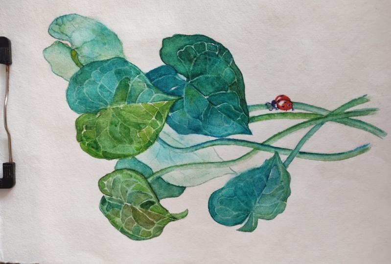
and the ladybug.
14. Final Thoughts: Congratulations on
finishing your project. I hope you enjoyed learning about negative
painting technique. I look forward to seeing
your project don't forget to post it in the class
projects section. If you liked the class, I'm going to ask you to please leave a review because it really helps me understand better what you like or
maybe don't like. Any ideas about improvement or new topics are
always appreciated and it really helps me plan and build new content
for you going forward. Thank you so much for watching and painting with me. I will see you soon.
 Anna Bucciarelli, Professional Illustrator