Transcripts
1. 1 Introduction: Hello. I'm Julia, an
illustrator and nature journal. Thank you so much
for joining me. In this class, we'll
take our sketchbook out into nature and
sketch the summer. I will share lots of
different ideas for drawing in your sketchbook
now that nature is in full bloom and how
you can explore sketching outside in
this wonderful season. This class is one of the four classes that
guide you through the seasons and give
you inspiration and ideas for sketching nature
throughout the year. We will go for a hike together and take a look at
different nature journaling techniques and I'll
share several step by step demonstrations of what you can paint in your
sketchbook in summer. We will explore together drawing tree shapes
and portraits, summer field flowers,
small landscapes, water birds and watercolor maps. This class is perfect for anyone who wants to get
started or continue with nature
journaling and anyone who wants to keep creative
throughout the season. The different techniques shown in this class will help you to find new ways to explore
nature with pencil and paint, and you can use them for
any creative project. Your skill level doesn't
matter as long as you have curiosity and
an interest in nature. This class is great for
sketchbook beginners. I hope you'll be
inspired to explore summer in your sketchbook
by the end of this class. Grab your sketching tools,
and let's take a look.
2. 2 Tools + Materials: Let's take a quick look
at my sketching kit. In this class,
you're going to see a few outdoor demonstration as well as studio
demonstrations. But this is what I basically use when I'm outside sketching. I have my sketchbook with me. This is a self made sketchbook just with regular
watercolor paper. Cold press paper is great, but any sketchbook that will work with
watercolor is fine. Then I have this fanny pack that I carry everywhere with me. In this, there's
my sketching gear. It's actually not very
much. Just some pencils. I have this very
practical pencil that comes with an integrated
cap that has a sharpener, and it also has an eraser. I have other pencils floating around here and even
a colored pencil. Then my fountain pen, which is great for adding ink, and it is filled with
waterproof ink so I can apply water
colors on top of it. And then my brushes, I have these small sort of
travel brushes and then some regular brushes that I simply I shorten the
handle on these. And I do have a larger round brush than
a larger flat brush, which is not quite
large actually. You can see it will do fine
for sketchbook sized work, but it's actually
quite the small brush. And then I have two
even smaller brushes, so this is a size two, and this is a rigger brush, and I use these for detail work when these other two
don't work that well. And of course, these plastic caps to protect the bristles. And then in the big compartment, here's my watercolor palette, the same metal palette
that you know by now. I use this all the time. I also have this very handy
thing that can go on here. This is sort of like
a brush holder. You can just simply put
your brush in there. I actually don't know
where I got this from, but I attached a magnet to it, and now it can hold my brush in the field when I'm using
a different brush, and stuff like that can
really come in handy when you're out painting in nature. Here is also a small
water jar with a lid that closes so that I don't
have to worry about water getting everywhere
and a painting rag. And then to put it all together, I have this contraption, which is just a big
piece of plastic or two boards that I have
fastened with a few clamps. I usually put this on my
knees if I sit down anywhere, and I attach my
sketchbook to it. Sometimes with clams
and sometimes it holds like this on its own. And then I can then I can
fasten my palette with clams and put my
water jar down here, which is fastened with cro. I have my brushhlder and I will usually put a
painting rag somewhere. Near my workstation. So this is what it looks
like when I paint outside, and you will see a few
demonstrations with this set up. So it's actually quite practical,
and I really like this. It's also lightweight,
and it sort of follows me around everywhere
when I go out for sketching. So these are basically all
the tools that you need. If you also have some
colored pencils, these are great. You
don't need them. I have some demonstrations with colored pencil
in this class because the paper is more agreeable with colored pencils
than with water color. But I don't carry them around everywhere,
but in the studio, I like sometimes to add little details and textures
with colored pencils. So these are also
great to have around. And that's basically it.
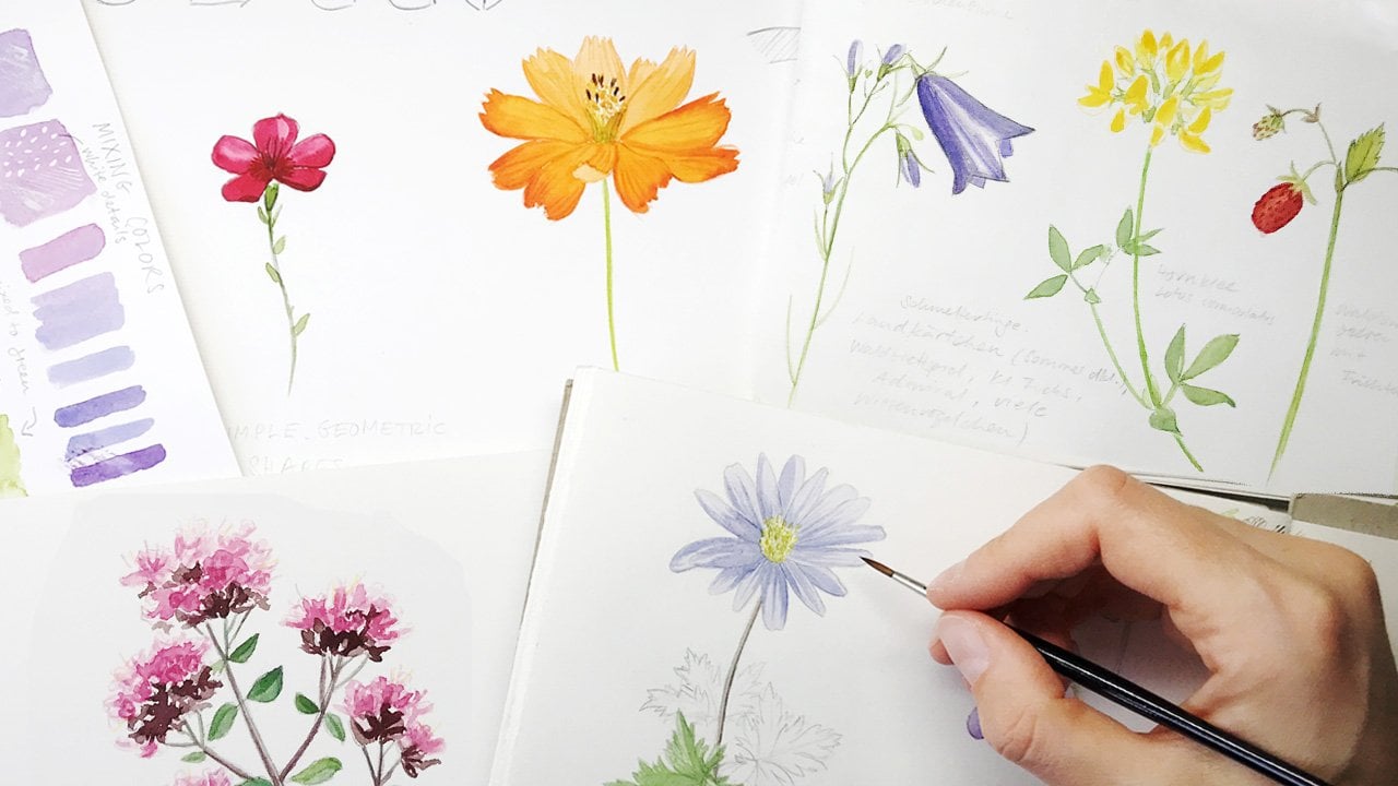
3. 3 Sketching Summer Flowers: Let's take a look at sketching
different summer flowers. And what I have in
mind is a full page of our field flowers
that I found on my adventures
outside and that I brought home to sketch
together with you. So I'm starting with
this red poppy here. And I've sped up things a little bit so that
you don't have to sit through all of my
drawing activity. So you can see, I'm just very roughly sketching
the plants here. And this is mo Mill. And I'm trying to sketch
each separate pal, each separate leave
of the plant. I'm looking at my
reference for this, but I'm not counting each petal. I'm just trying to render it
characteristically enough. And the speed of
this video will slow down again when we come
to the painting parts, so don't worry about that,
if you can't see details. You can always slow
down this part of the video as well if you like. So part for part, I'm
filling up my page. I don't have a particular plan. I know I want different
colors in different areas, so I've thought a little bit about where I want
to place each plant, and then also I draw these very light rectangles that I want to
reserve for my page. So I've thought just a little
bit about the layout of my different elements
on these two pages. So in the left corner, I sketched a kind of burn it. And then, right now,
as you can see, this is a kind of spare word, has a really beautiful
intense yellow. And I'm holding it
so that I can see better the individual
parts in the flower, the petals, and the inner
parts of the flower. I'm always trying
to draw some of the elements over
the middle part over this crease in the middle so that it won't sort
of divert the page in two different parts so
that I sort of have this whole composition that
stretches from left to right. This is a crane mill, another especially
beautiful flower with this lovely violet. And I'm sketching one
from the front so that I can get clear identification
even from my sketch, and then one from the side, so that I have another view, and I find this especially
helpful when a flower or a plant has very interesting
outer and inner side, and this helps you
to later identify the different features
of it and just remember what it looked
like from different sides. It's like drawing animals from the front and
from the side. And the last thing on this
page is a red clover, particularly large and
beautiful specimen. Again, I'm adding a few of the leaves of the
smaller leaves too. If you don't want to draw these
elements with an overlap, then you can always draw the stem a little
bit longer and then get a clear view on a leaf
or on a petal or on a cusp. I'm almost finished with these lots of small
flower elements, and now we can go into the detail into the color
application for the poppy. So in this sketchbook
and in this class, you will notice
that I use a lot of colored pencil for
the first layers and sometimes for
the last layers. And this is not because I
don't like watercolor anymore, but because the paper in
this sketchbook is not very well suited for lots and lots
of layers of watercolor. So I figured since it takes
colored pencils very well, I will simply use those for most of the layers of
color application here. So it's a bit of a
different technique. You definitely I happen to have a lot of different
colors of colored pencils. Some are water soluble like
this one, and some are not. They have this sort
of waxy residue, and this can make it sometimes a bit hard to paint over
it with water color, but usually it works, and So you don't need all of these different kinds
of colored pencils. Usually, a small
selection will work well. And yeah, they particularly work well on this sort of hot pressed paper
that I'm using here. Basically, you would use them in the same way as you
would watercolors. So you build up layers. Here you can see, I'm
adding a little bit of paint of water color to the larger areas
trying this out, but I ended up not being that content with the water
coloring part on this paper. So I went back two more
colored pencils later. Essentially, the two techniques work in the same way and that you build up layers and
intensify your colors that way. You can see I'm dropping
a little bit of paint into the areas where I
want my red to be darker. Then you can also see
that this paper creates these little loose
bits of fiber. I don't know what that
doesn't really look that great when you paint
on it with watercolor, and a little bit of it
disappeared when the paint dried, but I didn't really like to paint with water based
media on this paper. So the red poppy has this
sort of has the dark stripes, these dark sort of
landing strips, which you could call them. And I assume this
is for the insects to center in on the part of the flower
that's interesting for them. I have no idea if this is right, but it would make a
lot of sense to me. So my watercolor
layer has dried, and I'm going over it again with the colored pencil
that I have here, which incidentally
is called poppy red. There are different
brands, of course, of colored pencils, and I don't have an
absolute favorite. I tend to use those
by faber Castel because I can get them
most easily here. Then I have some andara
believe they are called and also
the poppy red that you just saw is a Dervan
ink tense I believe. And so there are
different brands. They all behave a
little bit differently, but essentially the same, and some of them, as I said, are water soluble,
and some are not. So onto the camo Mel. And for smaller
areas on the paper, for these delicate
parts of the flour, I decided that watercolor
would work just fine. And so I'm adding
with lemon yellow, I'm adding these yellow
parts of the mole. Really characteristic, and
really nice to look at. Dropping in a bit more paint to intensify the color
and dropping in a little bit of light green and now adding with colored pencil, the stems and the
leaves of the plant. And I always find it's
a bit easier to draw these really delicate
parts of a flower with with the tip of
a colored pencil, rather than with a brush. But you can, of course, use what you like and what you prefer. Darkening a few areas with
a darker colored pencil, just to show that there's
a three dimensionality. And now for drawing these
white parts of the flower. So one technique you can do is do it like this with a
light gray or a light blue, and then just reinforce some
of the pencil lines with the darker color to show that there's
just a bit of shadow, little bit of contrast. Another technique would be
to paint another color, a darker color outside
of the flower heads. So onto the next plant already, this is the delicate and very fragile looking
burnt sexy Fraga. I hope that's the
right name for it. And yeah, I'm again using
my colored pencil with a very sharp tip for the really delicate and
thin stems of the plant. And I don't have to do too
much about the petals, about the small flower heads. So I'm adding just a
tiny bit of blue to indicate a bit of
contrast, a bit of shadow. But I don't want to
add too much color, too much background
or anything to this plant because I think
it works well the way it is. The next one is the spare word, the lesser spare word, after adding the thin stem areas with the color pencil,
as you've seen before, I get out my lemon
yellow water color and mix in a little bit
of a darker yellow, a little bit of
chrome yellow to get this rich dark yellow color, and I fill it in
in the whole area, and in some parts where I can see the light is
shining on it and there's a reflection that I lift it out again a bit to have this
three dimensionality. And I'm also intensifying
the color in some areas with my
yellow colored pencil. But you could do this all with
watercolor if you wanted. The middle part of the flower is the same light
green as the stem, and this area around it where the polen sits is the
same color as the petals. It's a bit hard to see, but
I have my pencil lines, and I'm just dotting in a few of these polen areas so that they stand out just
a little bit better. On to the next
beautiful field flower, this is called Paclia it's particularly beautiful and
insect friendly flower. So there are always lots of bees and bumblebees around it. In German, it's even called
beef friend for that reason. This is a very
delicate plant with very pale and not really
that intense colors. So I'm really trying to be
careful with my colors here. There are these soft greens and changing into soft
pinks and reds. And I'm trying to
stay true to that, and I'm using a lot
of watercolor for that because I want
to stay true to the character of
the plant and not overwhelmed with very
intense or harsh lines. So you can see me applying different shades of green here. A cooler almost
turquoise kind of green near the top of the plant where it
curls into itself, and then a warmer, slightly brownish green on the parts that are already
opened and blooming. And then there's this violet, and I have to say the exact violet
that I was looking for. I only had in the form
of a colored pencil, so I went with that and tried to add all of the flower
heads with that technique. Darkening them in some
places a little bit. And then they have these
beautiful, interesting spikes. That stand out and that give the plant its very
characteristic look. So these were fun to sketch. Then there's the
meadow crane bill, which is also violet, but it has a slightly
different violet color. I'm using a dioxsine
violet here, mixed with a little
bit of dark red. I'm dropping in more paint on the outer edge of the petal. I'm even lifting out a
little bit of paint in the inner area because I want this gradient to be visible. Okay. And applying paint to all of the petals and then dropping in more paint
in the outer areas there. And in the inner
part of the petals, the violet changes into
a more redder version, I want this to be
reflected in my sketch. I'm adding more red to
my purple mix here. I'm bringing out
the colored pencils again for the leaves
and the stems. Okay. And this plant has a very complex looking
leave with lots of different parts in
different directions. And what I always
find helpful when sketching these sort
of leaves is to really take my time
and really look at how the different areas in the leaf work
together and then maybe even spread it out so that I can look at it not from an angle but straight ahead and then just try to sketch
it very lightly. And only if I have sort of
captured its characteristic, then I can commit to stronger lines and
colored pencil lines. So this is what always
helps me when I see a more complex leaf, and a lot of it is
probably also practice. If you do this a lot, then you get a little bit of
practice in these things. I'm reinforcing, so to speak, the outer parts of the petal with a slightly
darker colored pencil. Just to give the lines a more clean look and to make it stand out
a little bit better. And the red violet is also taken into a second layer
with this colored pencil. So this layering technique, I find works best when
you have a light layer of watercolor wash and then work with colored
pencil on top. Sometimes colored pencils. If you use them for
the first layer, they won't react well
with watercolor, if you add it on top,
and some of them, the water soluble
ones will, of course, dissolve if you
add water to them, but it can also be
a lovely effect. So it's worth trying out different things with
these two techniques, and to see what you like best or what works
best on your paper, I find myself shuffling around these different
mediums from time to time, if I use different paper or if I find that I want
a different effect. And I'm bringing out
my white gel pen for these veins on the petals that
you can see on the plant. So Gel pen doesn't always work that well on already
painted areas. You can see it. It's
a bit streaky here, but I suppose it does the job. I'm tapping a little bit on
it to make it less intense. And for the last
one, the red clover, I'm starting with a very
light wash of acdon pink, which is my go to standard
pink magenta tone. It's a very good mixer, and it's a nice color
on its own, too. So for the sort of pink flowers
or rose colored flowers, it works very well. And then I'm adding
just a light touch of this warm light green.
This is May green. So this very first layer of everything is always more like a color reference for me and making sure I apply the color in the places
that it needs to go. I always keep
looking back between my reference and my drawing. And this is to
establish the colors, the light and dark areas. Only later, you can intensify what you've done
in your basic first layer. And that's basically
what I'm doing here. I'm using a slightly darker
mix of this ronagdon pink with just a
bit of my dark red. So this is a liar and
crimson or matter red. And I'm going over all of
these single petals again. And Colred pencils or a really fine tipped
brush will give you these really precise lines and nice thin lines
for exact results. I find that colored pencils work particularly well on this. Now for even more
details on the flower, I'm bringing out this darker colored pencil,
the darker violet. And on the other
side where there's a bit of a different
light going on, I'm using this pink
colored pencil. This is also always
worth a thought. What is the light situation even in a very even
light at your desk? You can bring out the three dimensionality
of an object such as this round flower head
in different ways by adding a shadowy side
and then a lighter side. And with all of that in place, the sketches are finished, and I want to add a title and the names of the plants so that I can remember
what they are. So I'm using my
fountain pen here, as I often do adding the German and the English
name with the fountain pen, and then I also have a dip pen with a
differently colored ink. So this brown would be similar to yellow cha or raw sienna. And I'm measuring again the areas where I
want the text to be so that everything is sort
balanced and nice looking. And bit by bit, I'm
adding the text. So it can really look
nice if you take different colors for different
aspects of your text. Of course, if
you're in the field and you're sketching out there, then I often find myself
when I feel sketching, I write down
everything in pencil. And when I have the time
and I find it's worth the time to spend for maybe a page that turned
out really beautiful. Then I go over everything with fountain pen or dip
pen to make the page really look interesting
with these kind of different color codes. You can see, I'm really
taking my time to add the text in places where it won't disturb the
drawings too much. So this is really worth thinking about it for a little while. And that's the whole page
of field flowers in summer.
4. 4 Tree Shapes: Let's take a look at how to
sketch different tree shapes. Deciduous trees come in
lots of shapes and sizes. I have to say I always
found it a little bit confusing as how to draw differently looking trees and render their
characteristics so that you maybe even get a tree drawing that actually looks
like a specific tree. And then there are, of course, these basic techniques
that can help you render trees so that
they look believable. They have light and shadow and so that they look
three dimensional. I'm starting with a very
rough basic outer shape. And I'm adding in
the darker trunk to this and the branches that
a branch out from this. And again, I've speeded the video up slightly so
that we can take a look at different trees and not spend too much time on each
of the single sketches. But you can see me
adding in these, different ellipses, these
different clumps of leaves. And this is essentially
what you want to be looking at if you
want to draw a tree. You divide it up into
these clumps of leaves so that you don't have
just a big green blob. But you have these areas
of the tree that each of them is round and each of them has a light
and a shadow side, and you can add like I do here, add a shadow to the darker
side of the elements. Basically, if you think
of basic elements, think of a sphere that has a highlight and
then a shadow side, and then you can break down a complex object like a tree
into these basic elements. I'm doing the same here
again with an oak tree, and Oak trees are sometimes pretty complex looking
trees because they have these these weird
looking branches, sometimes that stick out
of the rest of the tree. But you can see the same
principle I'm using here. I'm just drawing these ellipses for the different clumps
of leaves that I can see, and I'm adding just
a few shadows, just a few areas where
you can see the branches, and I'm adding more
and more ellipses, maybe even a few too many. But this oak tree has a pretty interesting It's not even round, so it has a pretty
interesting shape. I'm bit by bit. I'm adding shadows on the underside
of the spheres. And what I'm also doing is refining the outline
with more details. I'm thinking here about the individual form
of the leaves, about the characteristics
of the leaves, are they small, are they round? Then I try to add these little irregular outlines around the outer
shape of the tree, and also around a few of the inner elliptic parts around these inner clumps of leaves that I want
to bring out more. Bit by bit by adding
more branches, more shadows and more
of these textures, you can see the
tree takes shape. This is what a typical
oak tree could look like. A bit different from
the beach tree above, more rectangular, and a
bit more chaotic looking, if you can put it like that. And then I decided to
add a popular tree to the page because it has a
slightly different outer shape. It's larger and thinner, so it stands out from
that perspective. I found it's actually
pretty easy to draw, so it has this easy to
grasp basic structure. It's basically just
a elliptical shape, and of again, there are these outlines with
characteristic leaf shapes. And from there just
a few shadows and then this crease in the middle
that indicates that these are these two main branches or the two main areas of leaves that you want
to pay attention to. Then a little bit of shadow. And basically, I'm
already done with a tree. So this felt a little bit easier to draw than
some of the others. The next tree I decided
to sketch is a maple, and I'm starting with
the same concept. I'm outlining the basic
shape, these round areas, and then adding the trunk, which is a pretty thin one, maples come in all kinds
of shapes and sizes. So I'm working out the
different leaf groups, the different clumps
of leaves here. And I'm already thinking about the structure and the
shape of the leaves. So these look a little
bit more chaotic, a little bit less round than the other trees that
we looked at earlier. So I want really sharp
squiggly outlines for some parts of the maple. Because it has
these pointy leaves that are quite characteristic
for this tree. Again, I'm adding
a bit of shadow, darkening the trunk
a little bit more, and I'm basically
done with this tree. You can see I'm adding
the shadows always on the same side of
these leave groups. The light always comes from
one side and the shadows are always on the opposite side. The next tree I'm sketching
here is a birch tree. And so this is a young birch. It's still quite small, and I'm starting with a lot of squiggly and chaotic lines to render the outline
of this tree. In birches there
are usually less of these round leaf groups, these round clumps of leaves, but more I find that most often the leaves are
organized in this sort of, you could call it a
chaotic carpet of leaves that just
swings in the wind, and you have to find a way to show this
and to redden this. And the way I try to do this is show the outline
that's slightly chaotic, and then just add a few a
few small shadows here and there to add a little bit of three dimensionality
to the tree. Adding the titles quickly so that I can remember what
this is supposed to be. Then for the last tree, I decided to add an evergreen tree fir
because this also comes up quite often as a
question from you and I wanted to have one of
them as an evergreen tree. And the overall shape is
quite different, isn't it? I'm thinking about these
individual branches more like arms that are
reaching out from the middle. The first step is the same. I'm trying to do
the overall shape. And then I need to work out the roundness of the
tree by showing branches that point forward or point to the sides and branches that are pointing in
different directions, and I can do that
by foreshortening the branches and also
showing shadows and showing which of them
in the background and maybe more in the
shadow and which of them point more to the
foreground and get more light. Okay. This might seem more complex than
rendering the other trees. But I find it's
essentially the same. So instead of these
group of leaves, you just have branches pointing
in different directions. I actually find it a bit easier than rendering
deciduous trees. And adding color over these kind of sketches
is quite easy because you don't
have to do a lot of light and dark work. You already did this
with the pencil sketch, and I decided I'd just add a little bit of green to these tree sketches
to show you how easy it can be to have light and shadow with water color with
these kind of sketches. So I have a lighter
color, warm green, and then I have a darker green, which has a little bit of
ultramarine blue mixed in. I basically apply this in
all of the areas where I have my shadows defined. So I know where the shadows are based on my pencil
hatching and I can just drop in the darker color into
my already wet wash. I'm doing this for
all of the trees, trying to find a characteristic
green for each of them. But I have to say in summer, they almost look the
same, all of them. I use a technique for applying the color that I don't just
slap on the color everywhere, but I try to leave little white spots and little pockets where
there's no color at all to show that there's
a texture going on in a structure
and that this is not just a mass or
a smooth surface, but that there are
different leaves, small elements that
I want to show. Mixing the next color
for the popular tree. You can see I'm leaving
the trunk in pencil, so I don't add any brown
washes or any color to this one because I don't think the sketch needs
it in this stage. That popular tree
didn't need much work. Now I'm mixing a nice warm
light green for the maple. Again, I'm applying the
paint with my brush in the squiggly chaotic lines
so that there will be an interesting structure to the way the pig man
settles onto the page, and also that there will be a few white spots where
there's no color at all. I find this always makes for a slightly more interesting
rendering of a sketch. You can see how quick this is. I've speeded this
up a little bit, so this is twice the speed
it normally would have. But this doesn't take long. When you have a good sketch,
a good pencil sketch, then the rest is just very
easy to apply color to it. I'm doing the same technique
for the birch tree. I'm using an even lighter and
warmer green for this one. I'm thinking about these small delicate leaves
that birches have. Even adding a few dots
here and there to indicate that there are loose leaves swinging in the wind. For the fir tree,
I want a darker green, darker warmer green. The first thing that I'm
doing is I'm applying a base color to all of
the areas of my sketch. Then for the shadow areas, I will go back with
a second layer and render them darker. So you don't have to get fussy with these kind of sketches. I worked very quickly on the
first pass with my pencil, and now I'm working very quickly to get the
color onto the page. For the darker color,
I add more blue, more ultramarine and
I'm dropping it in in the areas where I've defined the shadows and
that's basically it. Due to all of it still being the colors will
blend into each other. If you don't want that,
then you need to wait until everything is dry and then go over it with a second layer. Okay. I'm also adding a few squiggly lines
to the branches to show that there's
more structure and more texture also in this tree. That's basically
it. This is what it looks like when
everything has tried, and these are
different tree shapes.
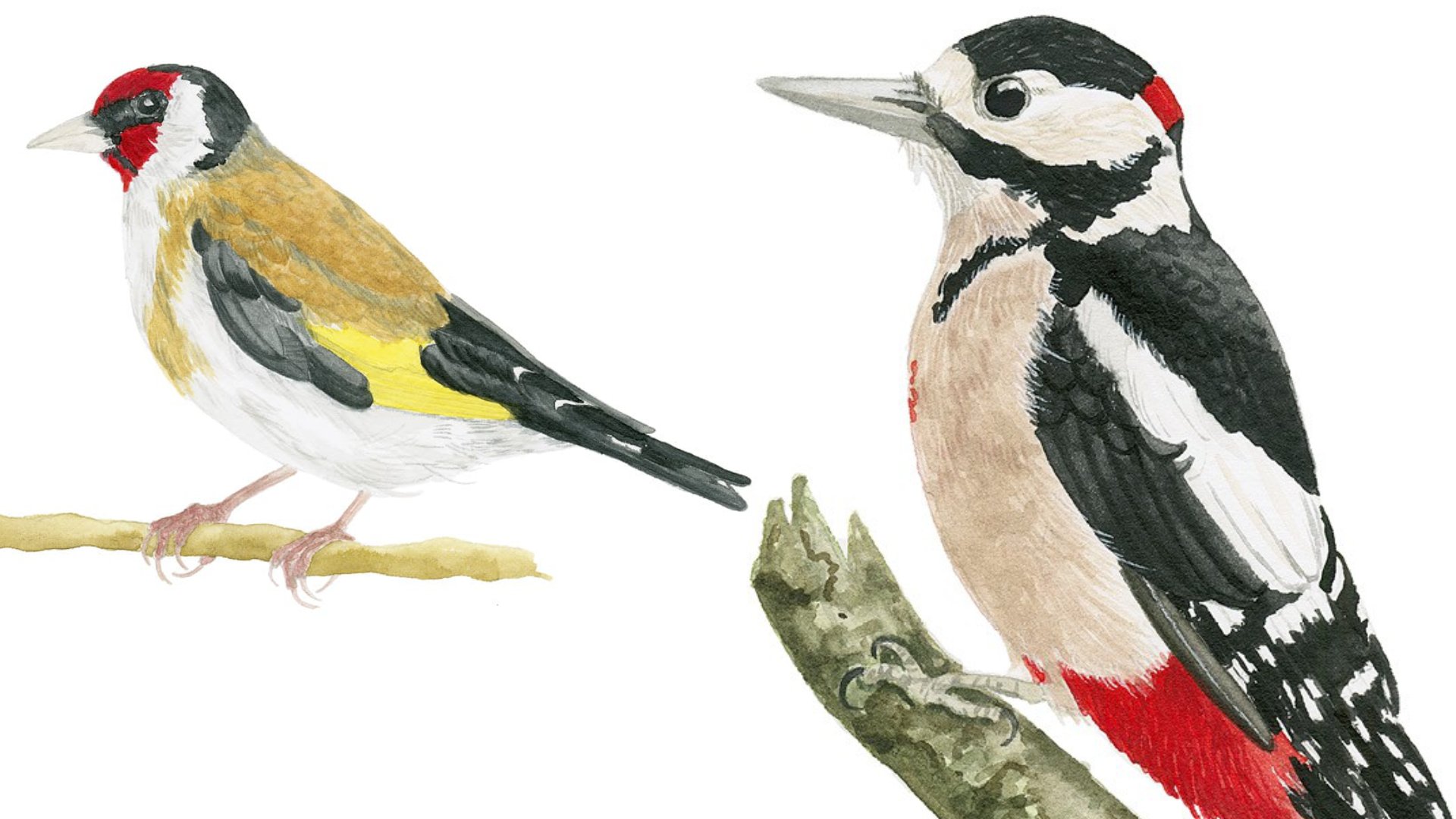
5. 5 Tree Portrait: One technique that I really like is taking a closer look
at an individual tree. And looking at the way the leaves are organized,
the structure, and then also researching
more about these trees, and when they are blooming, when there are fruits
maybe on the tree, and then writing it
down together with my sketch so that I have an information
document about this. I call these pages tree
portraits or plant portraits. You can also do this with
plants or with animals, whatever element of
nature you like. Here I have chosen
an oak tree that I saw on my research
adventures out there, and I decided to
sketch one branch of it and fill the page just
with this one branch with different leaves and then add a little bit of information about oak
trees in general. And I've already started with a very light pencil
sketch that I'm now refining and I'm sort of committing to the exact
lines that I want to show. I'm drawing this on
location outside. So I apologize for any weird
noises that you might hear, but mostly it should
just be bird chirping. So I hope it's enjoyable. And I hope my lighting
and the angle of the video will be good
to watch for you guys. It's always a bit of a challenge to film these kind
of videos outside, but I wanted to
include it because it always has sort of a
special atmosphere to show the immediate process
of outdoor sketching. I'm a leave by leave and the
leaves in the background, I'm adding with
slightly lighter lines and I'm working from there on. Oak leaves have these lovely
undulating wavy lines, these outlines in their leaves. I'm showing just a little bit
of the veins of the leaves, not in every space
because you don't need that the brain will
usually fill in the rest. Leave for leave,
I'm taking my time and I have my light
outline to follow. Now there's an area
where something has n on the leaf and eaten
bits out of the leaf. I've left that part
a bit lighter so that I can return to
it and look at it in detail again and add the different kind of
outline for this part. There's another big leaf
that has the same problems, probably a bug of some kind
that has not on the leaves. So it might also be an
interesting project to look at these aspects of this
particular oak tree, to find out what
animal could have caused these bite
marks or to find out what animals usually use oak trees for
different purposes. We have our pencil sketch, and I'm adding a little
bit of writing with my fountain pen that these are oak leaves and that I found these bite marks
on some of the leaves. I apologize that I do most
of my note taking in German. Is just what comes
naturally to me. Sometimes for these classes, I try to do as much of the notes as I
can in English also. But usually my text
notes will be in German. Let's get out the watercolors.
This is my field kit. It has this very handy
brush mound with a magnet on the underside so that I can put down my brush and
not lose it anywhere, and I'm mixing up a nice dark warm green
for the oak leaves. The surface of this
is slightly tilted. As you can see the
The water color is all running down
to this one bead, especially when you add a
lot of water as I did here. I'm trying to spread
all of the paint very evenly and very quickly
around on the entire leaf. I don't mind if
the painted parts overlap the pencil
parts a little bit. That's just the result of doing
a quick sketch like this. Here comes the second leave, adding more paint to
render it a bit darker. And I've decided I will not add color to all of the
parts of the sketch. So this will give it
the characteristics of field studies of a leaf study that doesn't
need to be finished, and it can actually look
quite beautiful, I think. So if you want, you can focus on one or two elements
of your drawing on your page and really take them to the most detail
that you want to apply, so you could take
one of these leaves and really work on them
with a lot of detail. And this wouldn't look out of place or wrong because you can incorporate different stages of the sketching process
into one object. I've changed my brush, so this is a smaller brush that I carry with me in my field kid. And I'm adding a second
layer to intensify the green of the
leaf and also to show the the individual
veins on the leaf. So a little bit of texture
and structure for this leaf. And as mentioned before, I won't do this on every leave. I will just indicate
it on a few leaves. And as you can see, I'm
working quite quickly, so I don't spend too much time. This is not going to
be a detailed study, but rather very quick sketch. Okay. And to mention a
very practical aspect, I've cut a part of the handle of this small brush so it can fit better in my fanny pack that I take with me when I carry
my field kit outside. Don't be afraid to configure your tools and change them
in the way you need them. I'm also adding a little bit of detail to the third leaf here. And I always find when doing sketches like this that having an odd number of objects that
you treat in the same way. So maybe three leaves that
have detail works quite well It's a pleasurable
thing to look at. I'm adding a few more details
about oak trees that I researched and then a
little graphic element to set apart the title
from the rest. Okay.
6. 6 Insects: I want to take a closer
look at insects in this lesson and sketch a few different ones
with you together. And first, I want to take
a look at insect anatomy. And I've just done
a very rough sketch of a typical insect. And so insects, there are
millions and millions of them out there and so many species that we don't even
know all of them, and Essentially, some of
them are disappearing right now in areas of the world where humans reduce
biodiversity. And so we don't even have the chance to get to know
each species of them. But all of the insects
out there follow the same building plan that I've sketched very roughly
in a basic manner here. There's the head region
with the eye and the antenna and the mandibles, what's like the
teeth for insects. Then there's the thorax or the
breast region to which are attached the legs and the wings if an insect has
wings, not all of them do. Then there's the back
side, the abdomen. And what's special about
insects is that all of them have this sort
of hard exoskeleton, so they don't have bones
inside of their body, but they have this exoskeleton
and they need to some of them need to shed their skin
this exoskeleton to grow. And if they're in the last
stage of their development, then they have this hard shell outside of them and they
don't grow any further. So even if you see a tiny, tiny beetle, out in
a meadow somewhere, then you definitely know
that this tiny beetle won't grow any bigger or
maybe an ant or something. They have the mature stage, and they won't get any bigger. They just stay that way because
of the hard exoskeleton. That's basically it.
I don't want to go into any exhausting
detail on this. Just know that there are
these different parts that the legs are always attached
to the breast region here. There are different
segments in the legs. We don't have to go
over all of them, but you can see
that the front leg or the first of the three leg pairs is
always pointing forward, and then the second
and third leg pairs always pointing backward. And you will see the same or
very similar building plan in all of the insects, whether it's a beetle
or whether it's ans or bees or bumblebees,
or butterflies. So all of these basically
have the same building plan. And with that said, let's
sketch a few insects. So, insects can often be observed quite
well in the field. But with all animals, they tend to move around and they can also take
off and fly away. So what I like to do is get a good look at
them while I'm in the field and maybe make a few preliminary sketches or even longer sketches
if they sit still. Then I also make sure to get a few good photos of them
and then later look at my reference books and see
what the characteristics of the specific insect are
before I even start drawing. This is a little bit easier than just relying on a bug or on a butterfly to sit
still and then go halfway through your
sketch and be very disappointed when it
takes off and then you can still fill in the
rest from memory. That's also possible, but sometimes it's just a little bit easier to have a photograph to work with these
kind of animals. And that's what I did here. So I didn't bring any of
these insects home with me. The first one that we start with here is a soldier beetle. Which is quite
interesting al gay. It's really a common
beetle around here, and you can see the
different anatomical parts that I was talking about
in the introduction. So you have the
head, the thorax, and the abdomen,
which is covered by the hard shells of the wings. So for beetles, you have the outer wings are
these hard shells. And then we have the legs, as always, with an
animal in motion, The legs don't just point outward in this
nice and tidy way, but some of the legs
can't be really seen. Some look foreshortened. This is also a great way to practice drawing
different angles and drawing foreshortening too. I'm trying to get in as
much information as I can in my pencil drawing
before I switch to color. As you've already learned from the earlier lessons
in this class, the color will mostly be
colored pencil this time because the paper won't work that well with
watercolor, but that's fine, and you can get pretty nice insect sketches with this mixed technique of colored pencil
and watercolor. I'm even adding in a few
shadows with my pencil. I'm switching to colored pencil. And I'm starting to add in
these different elements. Part of the abdominal
structure that's peaking out behind the wings. I'm using the slide ocher then almost a black or
for defining the antenna. These are all, as you can see, these are all single segments
that are put together. The Thorax region of
this beetle and part of the head region in this
interesting dark red. I read when I researched
these beetles that the name soldier
beetle comes from the fact that red color
was reminiscent of the red coats of
British soldiers at the time when the
beetle was discovered. Make of that what you want. I found it very interesting. I'm adding in the
different colors bit by bit and with colored pencils, it's not really that
hard to work quickly because you don't have to wait for drying times and
stuff like that. So I can add in the
nice dark legs. I actually have a
pencil extender that makes it a
little bit easier to work with these very short
stumps of colored pencils. And the legs, the last part of the legs also come in
these small segments. The rest of the wings, the rest of the abdomen is
this middle to dark gray here. I don't want to
make the hind part of the beetle too dark. This is why I'm
switching from my black to a middle or dark. There are different ways to render the texture of beetles. There are glossy looking ones and then there are
mat looking ones. This one has an
interesting texture, looks a little bit
streaky or stripy I tried to reflect that in the application of
the colored pencil. I'm smoothing things out
just a little bit with a very fine layer
of gray watercolor. I didn't like the
overall streakiness of the colored
pencil application. Okay. Now I'm adding
the name of the beetle. Sometimes those Latin names are a little bit confusing or
complex. But that's all. Let's draw another beetle and this one is called a
green Tiger beetle, a very beautiful and
interesting animal T one has a little bit of dicence we'll take a look at
how to draw that. I'm drawing the outline from light to more
committed lines, and I'm taking my time to
finding the right shape. So all of these insects and beetles have
different shaped bodies. And that's what makes them
so diverse and interesting. This one, this reference I had was slightly more
reference book like, so it was sitting there
in a very classic stance. And this is another chance to
practice this leg posture. And remember, all of
the leg pairs are attached to the middle
region to the Torrex region. The legs don't simply appear from the belly,
from the abdomen, but they all need to go back at least theoretically to the Torrex region
in the middle. So there will always be
parts that you can't see, but you can't just make
up a position of a leg. It has to follow back to the thorax on the under
side of the beetle. I'm refining my sketch
here and there, and there are these two
light dots on the wings. And now I'm ready
to switch to color. The first thing that I saw about this beetle was the ritcens
it's mainly a green beetle, but it has these beautiful
changing colors. Part of this was that it
appeared magenta in some places. I'm getting out my pink, mix it with a little
bit of a cool red and then I apply it to
the legs of the beetle, which we're shimmering in the sunlight and looking
quite beautiful. And there are also parts of the head and the thorax region, which appear to be in this changing color
and this dicent color. And the color changes from this pink to a light blue green, which I then applied. And the same green goes
onto the rest of the body. I'm being careful to leave out the white spots so that I don't have to
repaint them later, or at least not as much. This green is still very light. I will have to add a few layers to make it come closer
to the actual color. Adding a bit of texture and structure with my
colored pencil here. So this is a black
colored pencil, but I'm leaving enough
color information. I'm not simply drawing it over. I'm leaving enough
information to show that these parts are
actually green and red. But seen from a
different perspective, they can also appear black. And then with my purple pencil, I'm darkening and refining lines so that the beetle will look
a bit more clean overall. Then I'm going over the green part with more pigment with more
water color pigment. The green part is
actually quite dark, but it's still a
beautiful intense green and I wanted to glow, so I don't use too much
colored pencil at this stage. Watercolor tends to keep
the white of the page. I don't know. It just
looks a bit different, so I try to use
watercolor for this part. Of course, it's a bit
difficult with this paper, but I think I have gone on
enough about the paper here. After this has dried, I'm using a blue green
pencil colored pencil for adding another change of color to what I already have. The dicens is changing
between this magenta, then this blue green and the grass green
that you can see. And as a last step, I'm bringing out these white
dots again with the gel pen. You could also do
this with guage. I'm also adding a few highlights because this one is
slightly glossy, not a lot, but there are just a few areas that
catch the light. And I want to show
that. I thought it might be nice to also
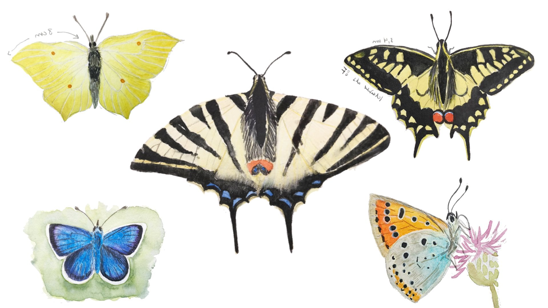
show a butterfly sketch. I also have a whole
class on the topic, but for a quick introduction, you can start with this
sort of shortened triangle that I'm sketching here and then find the basic
shapes of the butterfly. This works for most butterflies
that you encounter. This is a small species. It's one that I saw In a blooming meadow.
Quite beautiful. We'll only do a black
and white sketch here because this will be enough
to show what it looks like. But, you go from this
triangle and then refine the wing shapes and add the head and the
body and the antenna, and then you can
already start as I do here to add the markings. And this is quite the
beautiful little butterfly. It's called a speckled yellow. I'm taking my time here with the markings because these are characteristic for each species of butterfly and I want
to get this right. I know that after
I've done my pencil sketch and placed each
marking at the right spot, then I can relax a bit and
just start to render it. Okay. I thought for this lesson, it might be interesting to show a few different techniques. I tried out to use a
ballpoint pen for rendering. This will be a black
and white sketch, and I'll solely be doing it
with this ballpoint pen. As it turned out,
I wanted to use my fancy nice metal
ballpoint pen. But it turned out not to
work so well with the paper. I will switch in a minute to a different ballpoint pen
that doesn't look at fancy, but it works much better. Here you can see
the alternative. What I've heard interesting
about ballpoint pens is that you can get a range
of markings out of them. The work a little bit
different than fountain pens, and you can apply the ink in different strengths in
different line qualities. The work much more like
pencils in this way, I find. You can have very faint lines and then also very strong lines depending on the amount of
pressure that you put on and you can also go
over your lines. And it's waterproof. If you want to go
over a ballpoint pen drawing with I don't know with ink or with watercolor,
then you can do this. As you can see, it's
really a quick process once you've placed all of
the markings with pencil, you just need to
fill them out and it's really not that
much hard work. This butterfly is
black and pale yellow. So think this ballpoint
pen drawing does a really nice job of showing the characteristics
of the butterfly. And that's almost all
that there is to it. Refining a few places, adding a few creases
in the wings, refining the body, but that's our finished
sketch, I would say. I'm adding the name
back with fountain pen. In German, this would
be a Panther butterfly, which is also interesting. Probably because of these spots. I did another of these
ballpoint pen drawings of a potato beetle, but I decided not to include it because the video would
get longer and longer. Instead, I wanted to show you
the last one on this page, which is a blue wooden B, quite the beautiful and big B. One thing that I wanted
to mention about the composition of this
page is that again, I've chosen an odd number. Of objects of species. And this, again, this makes it from a compositional
point of view more pleasing and more
interesting to look at than if I were to
choose an even number. And for the B, I
have chosen a photo, a reference that shows
it from the side, but you can still see all
of the parts, the head, the thorax, and the abdomen that I'm working on right now. And I'm even indicating the
flower that it sits on, even though I won't
render it in color. Bringing out the
colored pencils. And this is another insect
that has reticence to it. So when you look at it
without any special lighting, it seems to be this
dark black blue. Then there are sometimes
changes in the light, and you can see that
the be appears to have these purple aspects
or lighter blue, and this is again really beautiful and
interesting to look at. And it's also fun to sketch. This is what we're
trying here right now. I'm rendering all
of the darker parts first with pit and blue so
that I have this basic layer, this undertone set
in the right color. And then I will go
over some parts of it where there are shadows,
which will be darker. But first, I want to have this blue color established so that I can work from there. Okay. When I saw this be in
the field the other day, I was really surprised
because it's quite large. It's about 3 centimeters, which would be more than 1 ", and that's about one of the
segments of my fingers, just as reference for you. It's quite the big insect. It's also quite loud,
but really nice to look at and really beautiful
with this dance. Now I'm adding my
dark colored pencil, black, I'm trying to show the different
parts of the body, the legs, the abdomen. It has a little bit
of a hairy butt, I'm trying to stay
true to that too. Also, there are a few hairs around the thorax and the head. Some of these bees have
really like a pelt on them, they have a lot of bristles
and hairs and some of them don't have
that many bristles. I'm adding a bit of paints gray, dark water color here so that I can get
really good contrast. I don't want to get
lost in detail. I'm working fairly
quickly on these parts. I just look where
the shadows are, and then I try to render them
very quickly with my brush. And now that I've
added these darks, I can see that I need more
a little bit more color. You can see I've added this
in a step that I didn't film. So I've added back in a bit of purple and a little bit
of blue for the wings. And then adding the title. And I'd say the composition
of the page is finished, so I have a selection of different insects with
different techniques, and I'm quite happy about that. I'm adding a little bit more
interest with violet pencil. And then I saw that I didn't
have a title for the page, so I added that in quickly. So it's just called
insects in the field. Okay. And that's
the entire page. And I'm still going back one
more time to the Won't be to show more of the dark color
and the dark contrasts. And that's the finished page.
7. 7 Small Landscapes pt 1: Also, I wanted to take a look at sketching quick
landscapes in this class. As you can see, I did
this on location in the morning hours and it was a very calm and serene place and was lovely to
sketch outside, especially in the summer. T always a very nice activity. I wanted to give
you a few pointers for sketching landscapes, and especially sketching
quick landscapes with only a few colors so that
you can include this maybe more often into
your sketching activities and get a little bit more comfortable with
landscape sketching. The first thing that I would do is to keep your landscape
sketches small. The one that I'm drawing
here is already quite big. It fills half of the page of
my A five sized sketchbook. I did this sketch a
little bit larger so that you can see what's going
on with this camera setup, and this is why I
decided to make a more detailed
and bigger sketch. But usually, Some of
my landscape sketches, especially when I
just want to do quick rendering of
the place where I'm at are not larger than a stamp or maybe
than a credit card. And this is great because you
can sit down or even stand, look at a scene, do a few
quick pencil sketches, slap some color on it, and then be out of that. Are seen in maybe 10 minutes, and then you have a
finished landscape sketch. You can even do one
more if you want to get a different perspective
or a different direction, and this will not
keep you busy for more than one quarter of an hour or maybe
even half an hour. I find this is this is
beneficial because you get the positive effect of
having achieved something of getting a feeling for the scene. And you also get down more of these very important pencil
miles that we all need to stay fresh and active
without sketching. And even if something
doesn't work out, you can just do the
next little sketch, and it will be a very
pleasurable activity instead of being stuck with
one big painting that you can't seem to finish, and then the light changes. So This is most often the
reason for me to abandon a certain sketch because
the light has changed and I see I can't finish it with the amount of
detail that I want. It's all certainly very
different if you work at home in the studio from
a reference photo, which is also a
great possibility, and I'm all in favor of working on this rendering and
painting aspect of things. But if you're out in the field, then it might be
better to work on a smaller scale and restrict the time that you need for
doing such a landscape sketch. All of this said, I've
already progressed a bit farther in my pencil
rendering of this scene, and I've added a lot
of details that I wouldn't usually add if I
were to do a smaller sketch. But since I'm using
this larger format, I can get away with
adding more details. I really like this
technique of having more pencil details and maybe even a few contrasts and light and shadow situations, and then only
having to work with the color as a second
layer of information. So I already have an
established scene that works quite well from
a value standpoint. And this would be my next tip. You should work out how you want to render the values
in a landscape sketch. So you need to have
an understanding of how values work
in a landscape, that you usually
have more contrast and more color in
the foreground, and then paler colors and less colors and lighter colors
in the background areas. Starting with the sky here, it's still very light blue
because it's morning. I also have the green tones that I'm adding always
have a little bit of blue in them because those
trees are in the background. I'm working very quickly with
my small travel brush here. I try to render these
different trees that I can see in
the background. I try to apply different greens and I also try to stay true to the pencil lines that I've
laid down earlier because this will make the whole
thing just a lot easier. So this is still very much
a wet and wet process. I don't want any harsh lines in this background area because I want all of the visible
details in the foreground. I'm adding some of
the reflections from the trees on the water because there's a water area in most of the image
that I can see. I'm also adding slightly
darker water area, slightly darker blue
in the foreground. The water is blue
because the blue is reflected from the sky
and in the areas where I don't have reflected
foliage or reflected reads, then the water will appear blue. And after I've
established that I can go on to the next layer. So by layer, I don't mean watercolor
layering in this case, but I mean the layer sort of the spatial
layer in the landscape. So I tend to think about these landscapes
that I've in layers, similar to a diorama
where you would have different stacks of
elements behind each other. So from a compositional
point of view, and from a painterly
point of view, I know that the elements
in the foreground and in the front will
have more detail. They will have more contrast. I can add more color to them. And this is just not necessary
for the background area. So you will want to have one area where you
place a lot of focus on and usually it's the foreground or some element in the foreground at least. This way, you can
stack these layers and stack this point where you want to have
a lot of attention. And then of course,
it's helpful to know other elements with which you can achieve
deaths in an image. So in this sketch, I have several overlapping areas that sort of disappear
behind each other. So the grassy area that
I'm painting right now is slightly behind the
other area on the left, and I have these
different landmarks that are layered
behind each other. And this also helps our minds to see that there's a
certain depths to a picture. And another technique
may be changing your brush strokes depending on the distance you have from
the different elements. So in the foreground, you could use larger brush
strokes for rendering detail. And in the background, you want more smaller and paler details. So you don't want
as many details. You see I'm blotting out the
the flower heads here again, but you still want a little bit, but they need to recess into the background
and they can't be with the same bruh
stroke intensity and the same brush stroke size. These are all things
worth thinking about when you structure and
plan a landscape painting. We're talking about really what we're talking about
here is doing sketches. I'm not talking about a fully
rendered landscape painting that you could
hang on your wall, but I'm talking about
these quick sketches that you can do under a half an hour I'm adding a few more
shadow areas here. I'm trying to keep
them very close to the original color that I laid down so that I don't
have too much contrast, so I want to keep the
main point of contrast in the front left area because
that's closest to me. But I still need to add
a bit of information a bit of detail and a
little bit of contrast. And you can also see I'm not working with very
many colors here. I have two different shades
of green that I use. I used Sap green and may green, then I added in a
bit of ltramoen blue for making the greens
bluer for rendering the water. Then I have this yellow
ocher tome that I use to add yellows and to add these
reds into the picture. And I also use a little bit of cerlian blue to for the sky, for the water part, and also for making my green
a bit paler and bluer. And that's essentially it. I think I added some co world violet for the flower heads,
but that's about it. You don't need more than
four or five colors in the landscape sketch, and this will also mean that
your painting will look more harmonic because the
colors that you use play well together and you don't have too much information
and too many colors. I'm continuing to work on the contrast in the
foreground here. Some of the bushes there
have a little bit of shadow, and I'm really punching
in those darks now. I'm really trying to
get the attention in the foreground that I need to stand apart from
the background. I've worked on this
for a little while. Now with my small brush, I go in to add more details, more of those reds. And a few more shadows. You can see essentially the
scene is already finished. All that I'm doing
now is noodling in more detail and more texture
that I wouldn't even need. I basically could
call it quiz and say, Okay, my sketch is finished. One element that I wanted to add was this water bird
in the distance. So I added a goose to the water these kind of small details
give a sense of scale to your landscape because
sometimes landscapes can be very vast
or very small and you don't really
have a reference until you place maybe a figure or an animal
into the scene. This can be helpful too. And I'm still noodling
away at some details here. So it was a really nice
place to paint at, and it was a nice morning,
a nice atmosphere, and I was enjoying myself, so I just continued painting. And you don't always find
these nice painting spaces. It's something to enjoy. So the last few strokes, and then I think I'm finished. The sun is also coming around, so I know I need to
stop in a minute. And this is the
finished sketch. Okay.
8. 8 Small Landscapes pt 2: Let's do another
landscape sketch. For this one, I had difficult
lighting conditions, so I chose to recreate
it for you at my desk. This time, I'm choosing
a portrait format. Usually landscapes go
with a landscape format, but you can also get
beautiful scenes in this portrait format. I'm starting with the
foreground here just because I need something
to anchor my image in. And then we talked
about the layers, the diorama layers that you want to have
in your landscape. It always helps to
have different areas and different lines leading
into and out of the picture. And although I'm looking at this scene from a pretty
straight standpoint, I still have a few elements that are following lines that can lead you
into the picture. I basically have a little
bit of background trees, and then the these triangles that I'm filling right
now that provide the eye with a line to follow until you've entered into the picture. Again, I'm working a lot with my pencil lines this time to define contrast
to define values. This also helps me to
structure the picture before I even start to add
color or before I even start to
think about color. So this would be a tip from me to get your value
structure right, to think about values. And you can do a small
sketch like this on even smaller sketch before you get started on your
watercolor painting. This is also a great
technique to sort of have this practice sketchbook with just the small
thumbnail sketches that are all value studies. So the sky in this scene
was a very pale blue. It's also early in
the morning and the sun has come up from
behind the trees there. And now I'm mixing a darker blue for the reflection of
the sky in the water. So this is an artistic
choice that I made because I want the
foreground to be slightly darker
than the sky blue. I'm being careful that I
leave a few areas with these white deples
where there are other reflections in the water
and where are small waves. Since I can't add any
paper white back in, I want to make sure that I
leave these areas white. There's a reflection from the
trees in the background and then this triangle of reeds
that grow out of the water. Then you can see that at
this size fora sketch, you don't think about any individual leaves or
individual plants or any detail. You just take the
biggest brush you have, and then you make
the best of it. It's a great
practice to do this. Okay. And for the background, I use colors that are paler, I use bluer colors. To be honest, it's
a bit reversed in this image because we
have the blue foreground, the blue water, the
reflection of the sky. But I still want to
make sure that I don't have as much warmth in
the background trees. Then there are some kind of algae that are
floating on the water. I try to very
lightly render them, and I still want to leave most of the reflection area white. Now I'm adding
this purplish gray for the trees in the back. There's a little bit
of red in this because this is what I saw in the scene, and there's also blue, so this is mostly purple. Again, I'm thinking about
stacking these layers. There are trees and then there are trees in front of them, then there are bushes,
and then comes the water. Then the reds on the right, again, water and the
reads in the foreground. By doing this, you achieve a
natural illusion of deaths. Right now, it doesn't
look like much, but we can let it dry and
then go over it again. I know the reds
need to be darker. I want to punch the contrast in. They are almost in
the foreground. Then, I need to work on
the immediate foreground. Those reeds that
frame my sketch. I'm switching to a smaller
brush for this because I want the reads to be sort of thin and a bit more elegant than I would be able
to do with bigger brush. Usually, when I'm
out in the field, I only have two brush sizes, this smaller one, which
I believe is size two, and then this bigger one, which is I don't know
size six or size four, maybe, probably size six. And I also usually
carry a flat brush, a smaller flat brush
that you can use for larger areas or straight areas where you want to push
around a lot of color. I've added a little bit more color to the
background there. Those trees are not in
light. They are still. It's the sun has just come up. And that means I have
to add more contrast and more dark values to the
rest of the painting too. The reflection of those trees will get reinforced
a little bit. I will also add more of the algae and more of the
reads in the foreground. I'm also darkening the sky slightly to add a nice
framing for the sketch. The last thing I do
once it's all dry. I add one layer of
colored pencil. As I've mentioned earlier, it's sometimes easier to
get these small strokes and interesting textures
out of colored pencils. I'm just reinforcing some of
the lines I've laid down. And I'm adding a little bit of purple in the background also with colored pencil because I think it has an
interesting texture, and it helps to define the
shore line back there. And with that, my sketch
is finished. Okay.
9. 9 Bird map: Another fun technique that I
want to show you is how to draw a map and this could be
a map of almost anything, maybe an area that you're familiar with
or that you live in, maybe a place that you visited. I often do maps when I return from my hikes
to see where I've been and where interesting
things were so that I can remember what I
can check out next time. And so what I will draw in this lesson is a map
of an area where I could watch a lot of birds and where I'm frequently
visiting with my bicycle, and so overall, it's an area with a river and a lot
of different lakes, and there are a lot of
birds to be observed. And so I'm starting with a rough outline
of the geography. I have opened up a map on open street maps so that I
can get a grasp of the area, how everything is laid out. And then I'm deciding on things that I want to
add on top of that. So like the title
in the top left, the names of the landmarks. The title of the map itself. I'm also planning
to add a frame to everything that makes it
look a little bit nicer. And then I'm thinking
about where I want to add little map
elements, little icons, and also, Detail icons like portrait images of birds that I observed
in this area. I'm just doing this in a very rough outline
style with pencil. There's the path
that I usually take when I'm around in this area. So it's a nice round path. I believe this is the area where the wildlife
conservation area is. I thought it would
be nice to show these heads of different birds that you can observe
in this area. So there are swans, cormorants. Then this year, there's
a stork and there are also lots and lots of
geese and other birds as well, lots of ducks, herons, all kinds of
different water fowl. But I only have limited space, so I have to decide on what birds I want to
feature in this map. At this stage, you can
still change things around. I decided I wanted the
stork in the upper left. Okay. So it's the most
interesting thing. This year, a stork has built a nest in a nearby park area. And so it's really
an attraction, yeah, it's become
really popular. And I knew I wanted to feature this nice big bird in my map. And I also saw him in this area, probably looking for food. So I knew I needed
to include him. Then the Comors always there, always hunting for fish. Also beautiful dark birds with these interesting
green eyes. You can see these sketches
are really rough. They are really nothing
to write home about there just to get
everything in place, and I will refine
them in a minute. You could also if
you're not certain, if you want to include this into your sketchbook or if you
can do it in one shot, then you could prepare the map sketch on a
different piece of paper and then copy it with the lightbox or
something like that. But for me, part of the fun and joy of
drawing maps is figuring out as I go and then also
accepting little imperfections. I mean, it's a sketch book. It's a place for
experimentation. Why worry about details that may not have g. You
can always refine this in in a later attempt or in a later sketch. This is a goose. Also quite loud birds. The first thing that
I'm adding color to is the bird portraits because I want
them to stand out. I want them to be in front
and on top of everything, and so this is the first
thing I'll actually paint. So my stork looks a little bit like it has too
much eyeliner on, but that doesn't matter. And because some of those are white birds that need a little bit of
background to stand out. I've decided to do these sort of vignettes around them
and ultramarine blue. And I think this
works quite well with the rest of the map
and the color scheme. And just like that, I have defined the outline of my stalk. So it's just that easy. The next one is a
white bird too, so my swan will get this
beautiful orange bill. Then a little bit of shadow that I will also add
to the stalk here. And of course, the dark area
around the eyes of the swan. So this very characteristic
for this bird. And he will also get
this blue vignette. I'm careful not to touch any of the areas that I just
painted because I want the color to be clear
and not to merge too much. So if you have time to let these layers dry,
then absolutely do it. So the goose also gets
a nice orange bill. And then I'll have
to mix a bit of a gray brown for the head. I'm dropping in a bit more
color in some areas to show that this is not just a
uniform slab of color, but the bird has slightly darker areas around the bill and at the
back of the head. While this is drying, I'm adding the yellow of the bill of the. It's a mix of yellow and gray. Then there's the beautiful
dark plumage of this bird. Okay. They're really
interesting birds really quite interesting
and beautiful to look at. They're great divers and after they're done with
the hunting and diving, you can see them hanging
around and drying their wings because
they can dive so well, they don't have the
sort of in the wings to keep the moisture to keep the water from seeping
into the feathers, so they have to dry their
wings to be able to fly again. And they have the
most interesting, green, intense eye color. Now it's time to add
another vignette. And looking back on this, while doing the voice over, I wish I had extended
the bill of the goose, a little bit outside
of the vignette. So I think I drew it slightly
too much like an egg shape. And you can see from the stalk
painting above that this works very well if the bill just comes slightly
out of the vignette. And I should have done
the same with the goose. But well, you know, this doesn't really matter.
It was still fun to do. The same thing here,
I could have done a slightly rounder
vintte and then left the last part of the
bill outside of it. This way, it looks a little bit undecided and a
little bit uneven. Just a tip for you if you're
doing the same thing. Now, I'm preparing
to do my background, and I've chosen
my flat brush for this and salon blue for the
water parts of the map. And I'm just adding nice big
brush strokes for the water. This is the river and the river extends into this
lake landscape. And switching brushes
again because you can't do everything
with a flat brush, so I'm painting the rest of the water with
my round brush. This is really similar
to painting by numbers. This is really just filling in the areas where I know
I have to have water. Okay. Okay. And up
there in the right, you can now see the bird
island is starting to emerge. So this is a conservation
area for birds. It's an island that can
only be reached by birds, and it's very well populated. There's always a lot of activity from different bird species. The next thing that I'm adding is the green areas, the land. And since this is mostly
meadow and just a few trees, I'm using this bright
war may green here. So this is my standard
warm light green that I use for stuff like this. Yeah, and about
the island, again, I mean, it's not a big
place or anything. It's not a big island. But there are a lot
of birds living in this area and also
in the nearby park. And if they ever get annoyed
or disturbed by humans, then they can retreat to this island and they
know they are safe from any inion or from
any outside influence. So I think this is really,
really great place. And there are also
two points where you can safely observe birds from the shore,
from the distance. And these are also
places that are not really seeing
that many visitors. So the birds really have their
own space for themselves, and there are always
many of them around. I'm adding color to all of
the different elements. Sometimes adding second layers to intensify the
color a little bit, but you can see the map
as coming together, and now it will need a bit more contrast and
a few other elements, a little bit of text to
make it more map like. I'm starting with the names of the animals. In my vignettes. I'm more or less following what I already outlined
with my pencil. I painted over my pencil lines, that means I can't
change them afterwards, and I'm pretty happy with
where everything sits, that doesn't matter that much. The name of the lake,
the name of the river. The name of the park. And
the name of the Bird Island, which is just called Bird Island because what else
would it be called? Then here's my path, my round
that I usually make through this area when I'm around there. Then with a green pencil, I also added in the
conservancy area. And the outlook points where
you can observe the birds. Then there's a
building, which is, I think, not really used for
anything, but storing boats. Now for the title. I decided
I would do the title also in colored pencil because the rest of the text was
also colored pencil, but I wanted it to
be a little bit more colorful so that it
would stand out. Okay. Then all there
is to do is to add a border and I'll use
the same colors for this so that everything has this really
nice color scheme. And a second color for the border because
I think it looks nice and that's basically
it. That's the whole map.
10. 10 Waterfowl: Let's sketch some birds. So I was planning
ongoing live sketching with you to watch birds and
then sketch them in nature. But that didn't turn out the birds weren't
that agreeable. But I brought some
photos home with me and we can sort of simulate the sketching
process right now. The first thing I
want to focus on, and we will be sketching waterfowl water birds today that live near or in the water. And the first thing I have
for you today is a mute swan. And so these are
really beautiful, large birds entirely white
except for the face. And right now they're taking their small chicks for a swim. Well, they're not
so small anymore. But what I wanted to focus on here was the different
postures of the bird, how they are reaching
for food, underwater, how the chicks change
the direction, and how the neck, the especially long
neck can look different when the bird is just swimming around
or reaching for food, and this was what I
wanted to focus on here. And I'll be doing an
entire page of this, and this is a great
warm up exercise or a great exercise for learning
how to draw and seeing the different shapes
because often these birds sort of come out with the most interesting
shapes that are so unusual, they don't fall into
this pattern of what you might have learned
about drawing birds. And so this is a great chance
to focus your observation, really take a look
at what's happening. And I'm so sorry that I can't show this live because
it's really challenging, and it's really
fun to do this in a live environment when the birds are on the
move all the time. And yeah, well, all I can say is maybe next time we'll
get a chance to do that. And if you don't
feel comfortable yet with drawing from
live moving animals, then what I'm demonstrating
here is totally fine, so you can take reference photos and then start
sketching from there. I'm almost finished
with my page, but essentially what
I've been doing over and over was starting
with a shape or with a line that stood out
most to me and then taking it from there and thinking
in different shapes, thinking in volumes and not just applying what I think that the bird should look like or
what I've learned about it, but just really starting
to trust what I see, and then yeah, drawing
this on the page. And if this means erasing a few areas and drawing
them again, then go for it. Don't be shy to correct
what you've drawn, redo sketches, where you
see that they need them. You can see me doing this
here in a few places because this post that this swan has is really
not that easy to draw. Okay, and I'll be
switching to watercolors here to show you a few
different techniques of how you can approach painting white birds and making them
stand out on a white page. So I'm starting with the bill with this beautiful
orange color, which is really characteristic
for these birds. And then I'm starting to
add a few faint shadows, a few areas where you can see that the bird
isn't quite white, but you can see
the local shadows. This is a great technique, if you don't want to add
anything around the bird to show that you have an
object that has shadows, that has mass and volume. And so this is a
great way to bring attention to white object
that isn't really all white, but that needs to send
out from the page anyway. And your brain will read
this as a white bird, so don't worry about applying don't apply
anything that's too dark, but you can get really creative with various shadow colors like blue or violet or green depending on the lighting
situation that you have. And up there, I'm adding a
small scene to the two birds, the big one and the chick. And I'm adding
just a few touches of water reflection and light. And so this already
reads as water. And what I want to
do now to bring out the white bird
is add a darker. So this is another great
technique that will work well for any kind
of subject flowers, butterflies, whatever you have, that's white, and that
needs to send out. I'm simply applying
a darker wash. It doesn't even have to
be really that dark. This is a mix of
blues and greens. And so I'm carefully
surrounding the outline and then just supplying a bit of a watercolor
wash around there. And this makes the white birds really stand out
from the background. So this is another
great technique to bring the focus to white
objects on a white page. And the last thing
that I need to add to those birds is a few eyes, and then the black sort
of this face mask, this area around the bill. That's black. And this adds even more contrast because it's the darkest color
in the sketches. I don't worry about
leaving all of the other sketches
just in pencil. This can work as a study page, and I want to leave it at that. And so this is my
decision to just have a few of the elements in color in the rest in pencil. So on to the next bird, we also have a
stork in the area, a white stalk this year, and so this is a rare site, but a very welcome site. And I was able to
observe this guy when he was just looking for
food near the lake here. And I'm starting this sketch
like I always do with birds. I'm looking for the
most prominent or easy to draw feature
that I can start with, and then I take it from
there adding lines, adding outlines or shapes. And for bigger areas like
the body and the head, I will add ellipses and
then make sure that I don't just draw
this rounded ellipse, but that I look at the different angles
that the bird has. Often, they're very
angular looking. And I want to reflect
that in my sketch. So taking a good look, again, not just drawing
what I think I see, but drawing what I
can actually see. And if you can't see something especially from afar
when the bird has moved, then don't draw
it, leave it out. And in the end, this will give you a more
realistic sketch. So I'm adding a few lines for the areas where the plumage
is white and black, and then the big bill, which is so characteristic
for these animals. Don't be afraid to turn
around your sketch book if you can draw lines better
from a different angle. And onto the watercolor. So the first thing that
I'm adding is again, this nice red bill with my
smaller brush this time. And the white stalk features these nice red legs in
the same red shade. So I want to add this too. And you can see that the
hind leg is slightly darker, so it was in shadow. And I added a little
bit of pencil hatching, and now I'm also adding a bit of a darker red to show
that it's in shadow. And the next thing to add are these beautiful
black feathers. For birds that are
black and white, it's often enough to really bring attention to the dark part of
the bird and draw the black areas and then have really prominent pencil
outlines for the rest, so you can enclose the white
areas with your pencil line. Make it a little bit more solid, and this will be
enough to show that there are white areas
that belong to the bird, so to speak, and that are not part of any
background or paper. And here, I'm adding
just a slight shadow to reinforce this white area, the neck of the bird
and the shoulders. And this will, of course, depend on the local color of any bird. So white stalks often have these sort of Baje
looking areas. Okay. And onto the next sketch, I also saw two gulls, two black headed gulls. They're not that
common around here, but from time to time,
you can see one. And again, I'm starting with the same searching
outline drawing. So I'm not committing
to any harsh lines yet, but I'm just trying to make sense of the shapes and
volumes of the bird. Starting with one line and then think about the volume around
it and then reinforce it. And now I'm committing
to my lines. I'm applying more
pressure with my pencil, and I can make darker lines. And I'm still trying to keep it fairly loose so I don't want to have a very labored
precise drawing. I want this to be
a loose sketch. And these small gulls have really attractive
dark face masks, and I want to do
a detailed sketch in a minute when I
finished this one because I think it's a really
beautiful feature in this bird and I want to bring it out a bit more on the page. I'm adding the few areas where
there is dark on the bird. So the dark legs, then the tail, and of
course, the face mask. Okay, and I don't
want to overwork it, so I'll just focus
on the head again, overlapping the sketches a bit so that I have enough room to add a head with a bill
sticking out of it. You can see that I'm not simply drawing an elliptical
shape for the head. I'm trying to think of the angles that I can
see in my reference, even reworking them again so that they will come out more. And this is really the
case for a lot of birds. They don't simply have
this rounded head shape, but they have different
quite sharp angles. Also for the bill. And
from time to time, I'm cleaning up my lines with the eraser and
then committing to a nicer quicker line that looks more elegant
and more dynamic. So these gulls also have this sort of white
eyeliner around the eye, so I have to be careful
when I add watercolor in a minute that I don't go over this area and
leave it white. A bit of hatching to indicate
the dark areas in the face. And there's this area
on the top of the head where there's sort of a
rim where you can see the light is hitting and
it's not quite as dark as the rest of the dark
area in the face. So I also want to make sure that I leave this
slightly lighter. And I've mixed up an ice mix
from CPA and a tiny bit of red so that I get a nice dark brown, and
I'm applying this. With my small brush, I probably could have used a slightly larger
brush for this. But you can see I'm fading the color out near the top because I don't want
the top to be too dark. I want the areas
near the chin and below the eye to be the
darkest areas here. Adding a bit more
red around the bill. Long as everything is still wet, I can drop in more pigment, more paint so that the
area will dry darker. And then I'm letting things dry. And the next thing
that I can paint in is the eye with paints gray. So I want this to
be really dark. This is the darkest part
that I can see here. I'm also going over things with my colored pencil because it gives a really nice
texture to everything. And I can get really
fine lines from it. So it's a great tool to use
on top of a water color. And while this sketch is drying, I can tend to the other sketch that I decided I want
to have in color too. I'm adding a bit of the
gray areas of the wings, and then the dark areas for the feet for the tail
and for the head. And this doesn't have to be too detailed or too elaborate. This is just a small sketch. It's supposed to
be really rough. I just want to show how the bird sits and sort of z. It stands. And again, the
technique that I use here to show the
difference between my white bird and
the paper white is that I focus a bit
on darker lines too. So I exaggerate the outline
of the bird a bit more. Adding contrast to
the darker areas, but also adding more
prominent outlines. This is the technique
that you will often see in our scientific
illustration where you have a really prominent
outline because you can't have anything but a white
background for these drawings. And this is what the
full page looks like. So I want to add a few
text areas, a few titles, the names of the animals as always in German and
English and in Latin. And by adding texts, I can add a bit of interest to the rest
of the composition. I'm also taking a
few notes about what the Swan was doing here,
searching for food. So overall, we have
taken a look at three different ways to bring out white elements
from your page. You either add a
colorful background around it, a darker background, or you add shadows
to the element itself so that it will stand out from the
white of the page, or you can add more
prominent outlines, and this will also define
the object a bit better.
11. 11 Your project: I'd love to see your
summer nature sketches. Please create a
project with one of the techniques or ideas that
are shown in the class. This could be sketching summer flowers,
exploring tree shapes, sketching small landscapes,
observing or drawing birds, or creating a watercolor map or something
completely different. Upload your work to the
project gallery to share your results with me and
with the other students. Please let me encourage you to also post any experiments on maybe failed drawings because you can always learn
a lot from these. I hope you've enjoyed this
class on exploring nature and creating art in your
nature sketchbook in summer. I hope you've learned
a few fun ways to observe nature
and draw outside. If you want to be notified
about more classes like this, then make sure to follow me
here on Skillshare and I'd also be really happy if you left a positive
review for the class. Thank you very much. I hope that this was a
useful class for you and let me know if you have any questions in the
discussion section, if you want to see
something specific. I'll see you in the
discussions or in the next class and until
then happy sketching.
 Julia Bausenhardt, Nature Sketching & Illustration