Transcripts
1. Introduction to Mystical Watercolor Landscapes: Drawing, layout and composition: Over the years I've had students ask for tips on layout and composition. I understand how exciting it is to dive deep into painting, but sometimes you may find yourself stuck on what to actually paint. I'm happy to finally be able to share a method of drawing that is simple and accessible to everyone. To take this class, you don't need to be an expert, all you need is a pencil, and paper, and an openness to delve into sketching. We will be exploring topics like balance, symmetry, depth, feeling, intuition, framing, and detail as we draw mystical landscapes together. I will start by sharing a list of recommended art supplies, templates, and drawing tips. Followed by a real-time demonstration of the watercolor illustration, which we will be completing by adding details using optional mixed media, including colored pencils, and iridescent watercolors. Your final projects will be to create a clean version of your landscape sketch and turn that into a one of a kind watercolor painting. Recommended Skillshare classes to take before creating your final project are modern watercolor techniques, watercolor mixing, finding your color identity, and watercolor textures. You can easily access these through my teacher profile. My name is Ana Victoria, I'm a watercolor artist, author, and teacher. I hope you enjoy this course I prepared for you with much care and joy. Now get your supplies ready and let's get started.
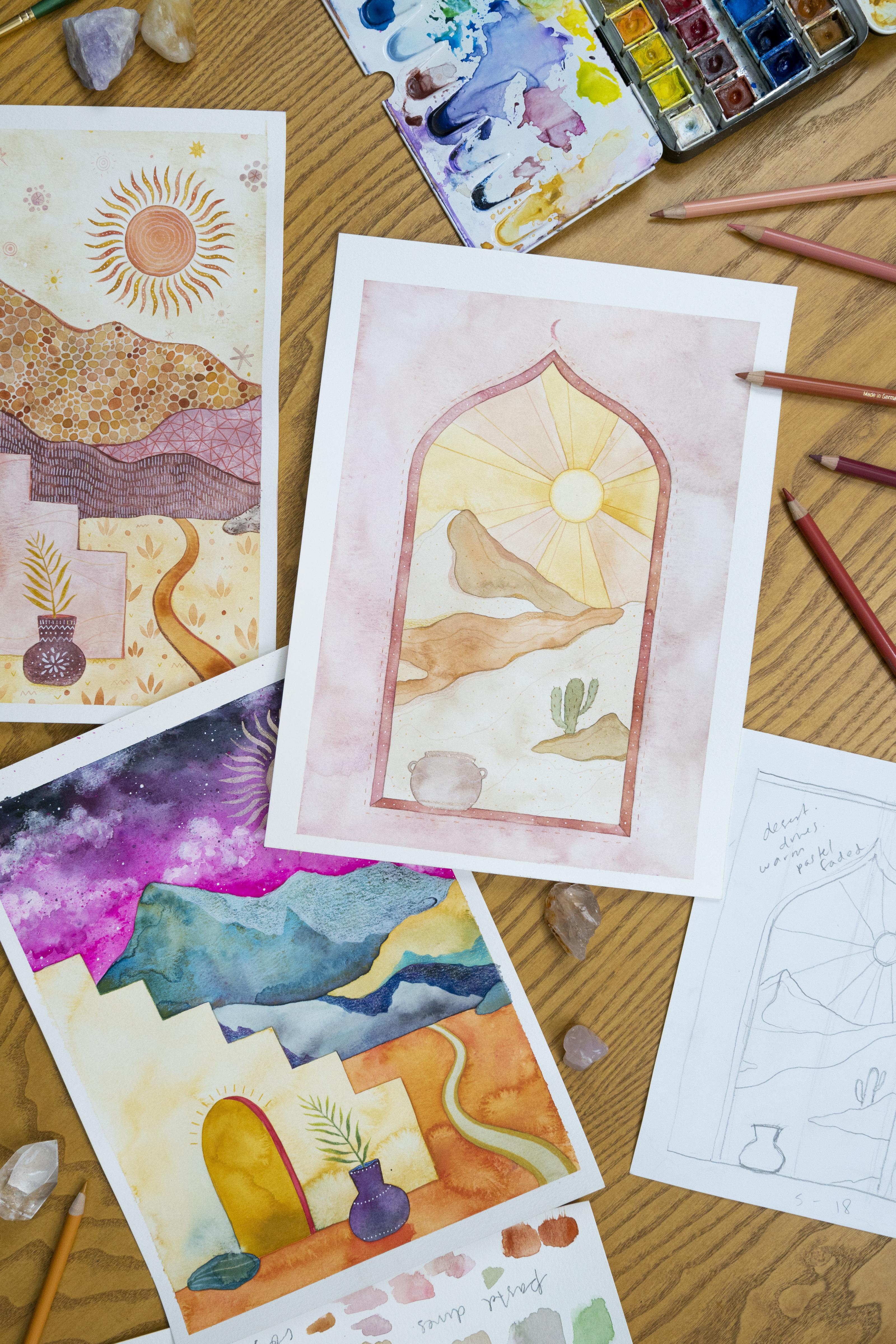
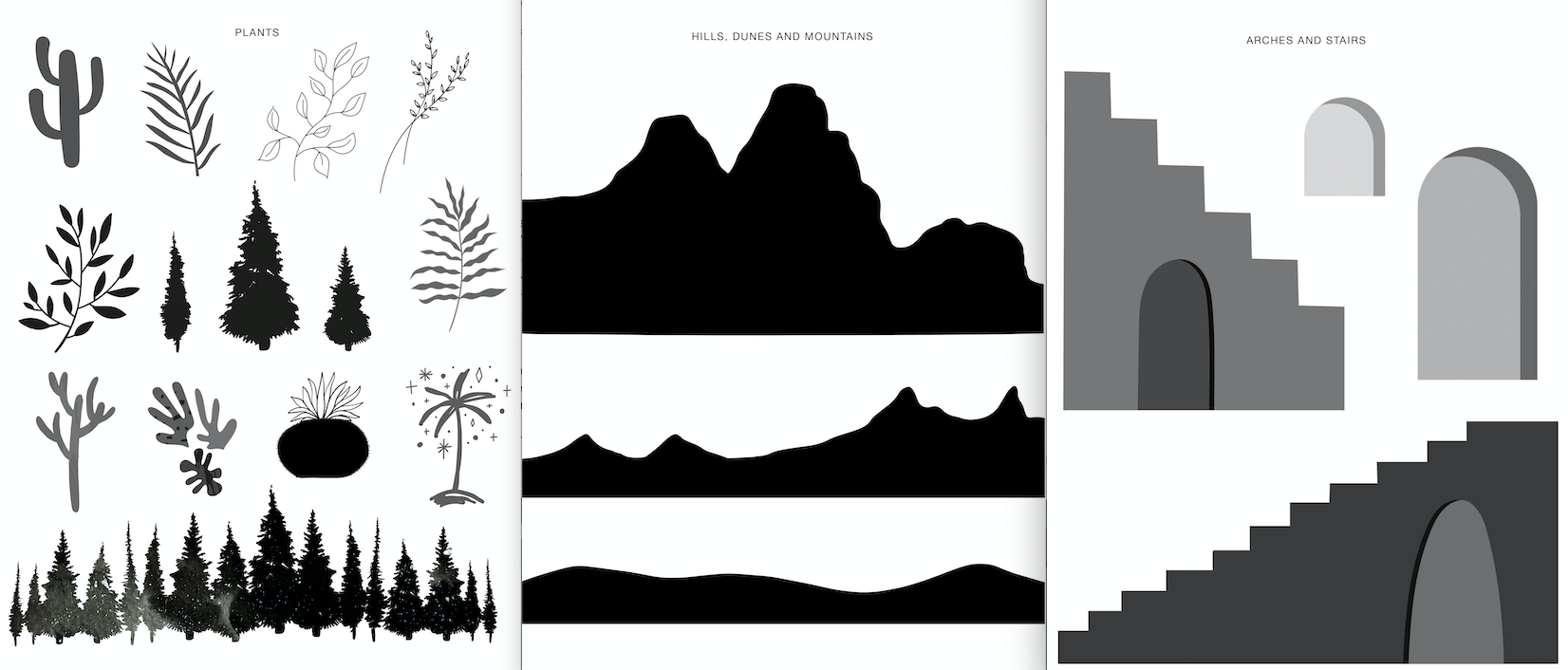
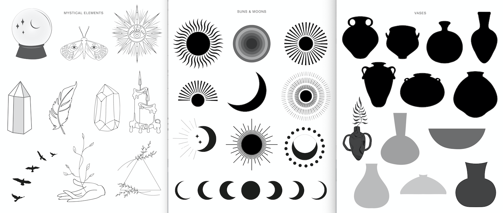
2. Supplies: These are the supplies that you're going to need for this class. This class has, it's divided into two sections. One is going to be where we're going to do a lot of drawing and sketching because I'm going to be teaching you my personal tricks for layout and drawing. I've gotten tons of requests for this, so I thought. Let's start out by drawing. You're going to need some sketchbooks, some drawing paper. You can even use just regular scrap paper. Maybe you want to recycle something because we're going to be sketching and just playing around a little bit, just with a pencil. Then you're going to need some watercolor paper for your final project. You don't want to use watercolor paper to just sketch because it's more expensive, it's bigger, it's better quality. Save your watercolor paper until you're ready to actually do your final drawing. Drawing and watercolor paper are the two types of paper you'll need for this class. Also for reference like mixed media paper would also be good or even just a blank sheet of paper like you would use in your printer is fine. That's for paper. I've talked about using Canson in past classes. This brand I think is pretty good, especially for practice runs. Obviously, there's much more high-end watercolor paper. But I like this one, especially for everyday stuff, for things that I'm going to be scanning. For example, all the content in my books or a lot of things that end up being like prints are done on this type of paper because it's actually a really good price and the quality is pretty good and it doesn't have too much of a texture on it. You can see here, even though it's cold press, it's not super rough, it's pretty smooth. I like using this paper for everyday stuff. Also for your watercolors, you're going to need watercolor brushes. I like to use synthetic brushes. The brands that I've been enjoying lately are Princeton. Winsor & Newton is always really good. Here I have this flat brush here that I bought at Jackson's in the UK. Brushes are really a personal preference of each artist. I always make a point in saying that. In general, I like to use round brushes that have a bit of a pointy tip and they're not super soft. That's why I use synthetic brushes instead of animal hair brushes. Animal hair brushes and softer watercolor brushes are really good for that loose, flowy watercolor style where you need a lot of water. The style of watercolor that I teach is a bit more illustrative, it's a bit more precise, and I don't work with ginormous brushes either. They're pretty good, decent size. I usually have like an eight, a one, a few liner brushes like a zero. For example, this one here is a double zero. Just a variety in sizes is a good idea. Continuing along with watercolors, this is my go-to watercolor pan set. This is Sennelier. It's a French brand of watercolor and it's a pan set. You could also use tubes or liquids. Any type of watercolor will work perfectly fine. In my past classes, you can hear me talk a lot about different brands and in fact, I have an entire class called watercolor paints and brands where I dive deep into all the different types of watercolor if you're interested in going super deep into that. But for now, for example, if you would be using tubes, you would need some palette on this side to mix your paints. But I like pan sets because they have that integrated into the tin box. This is where I make all my paints and then this is my pan set. Then sometimes I have some of my favorite paints here, for example, this is a Winsor and Newton ocher. It's a color that I use quite a bit. I usually have a little bit extra here on my pencil. Watercolor is really great for mixing and matching, they can all interact with each other, no problem at all. A couple of other things that you need when painting watercolor would be, you need some water. If there's any other cat owners out here, a trick that I like to use a lot in my studio is to have my water in a little jar like this and then I can cover it when I'm not painting to avoid any accident. I think I took way too long to pick up on that trick, but it's been really helpful for my studio. Then you're going to need some, this is a kitchen towel, like kitchen just paper. You can also use any rag or cloth. This is just to dab some of your excess paint off or you'll just need it now and again. Then we have some super basic supplies that any craft room will have. You'll need a pencil and eraser and you'll need something to sharpen your pencil with. I have another pencil here, which is a little bit different led point, and then I'll show you a little bit that you don't need a ballpoint pen. But if you're going to be tracing in this class instead of drawing, you'll need this will be really handy. But it's always nice to have washi tape if you want to create borders around your painting. I have a couple of different sizes here and types. Having scissors is handy and I always like to have a small ruler on hand just in case. These are super basic everyday supplies that you'll probably have lying around in your home office or your craft table or wherever it is that you start painting with your watercolors. Then there's a couple of extras. These are totally optional, but you can use them if you want. Once watercolor's dry, it interacts really well with a few details and colored pencils over it. I've been doing this a lot lately in my work and I do get quite a few questions about it. FYI, these are not watercolor or colored pencils. These are just regular colored pencils and they're just professional grade. I have Prismacolor, premier, and then I have a couple of different brands. I'm just sharing the ones that I've been using lately. I also have fiber-Castile. These are the pulley chromo Caesar, are pretty good. Then I also have a couple of pens that can come in handy. White gel pens are fun if you want to do some tiny little white details. I've also shared a bunch about using white ink or dark inky, you can do that too if you like that. This is just another variation. Again, this part here is 100 percent optional. I'm just going to share a little bit of my personal, what I've been into lately, and how you can have your colored pencils interact with watercolors as well. It might be a little fun extra for you. Then another fun extra, which is 100 percent optional again is I always like to add a couple of just metallic details into my artwork. These are Kremer pigment, iridescence paints, and I loved these. These were my very first set of metallic watercolors and they're just great. Again, if you want to dive deep into all things, watercolor supplies including neons and metallics like this, go back to my class, watercolor paints and brands. There's tons and tons of information and also you guys have shared your favorites from all around the world, so it's a great resource. Also, I would suggest my book, Creative Watercolor and Mixed Media. I also really dive deep into the whole metallics and paper brands and etc, like [inaudible] watercolors. Just throwing out a few tips there if you're interested in learning more. I have this here. This is a set that I've been using for a really long time and I think they're really great. Finally, I have prepared something special for you in this class, which is a bunch of different templates. I created these to really help you out and get that spark going where you're able to draw landscapes. That's what we're maybe going to be doing in this class. I have all these different shapes that I have been collecting throughout the years. I purchase them on sites like, for example, Creative Market or different designers create vectors for this. This is all different shapes that I've compiled of all different. For example, I have dunes and mountains and we have suns and moons. I also added a couple of mythical elements if you want to add something fun to your artwork. I have some arches and stairs. A bunch of really, really fun elements that you can use for inspiration in your landscape design. All of these will be up on the class. There's a section where you can find all the resources. I'll make those available as a JPEG so that you can download. You can print these at home or you can just observe on the screen. Whichever you prefer. Again, it's all sorts of inspiration here. There's plants, there's celestial elements. All of this, I've been creating collections for the past months for you guys. Tons of really cool inspiration here. I will make this available in the class resources for you. That is it. That's what you need to begin to class. In the next lesson, we are going to just go straight to actual drawing.
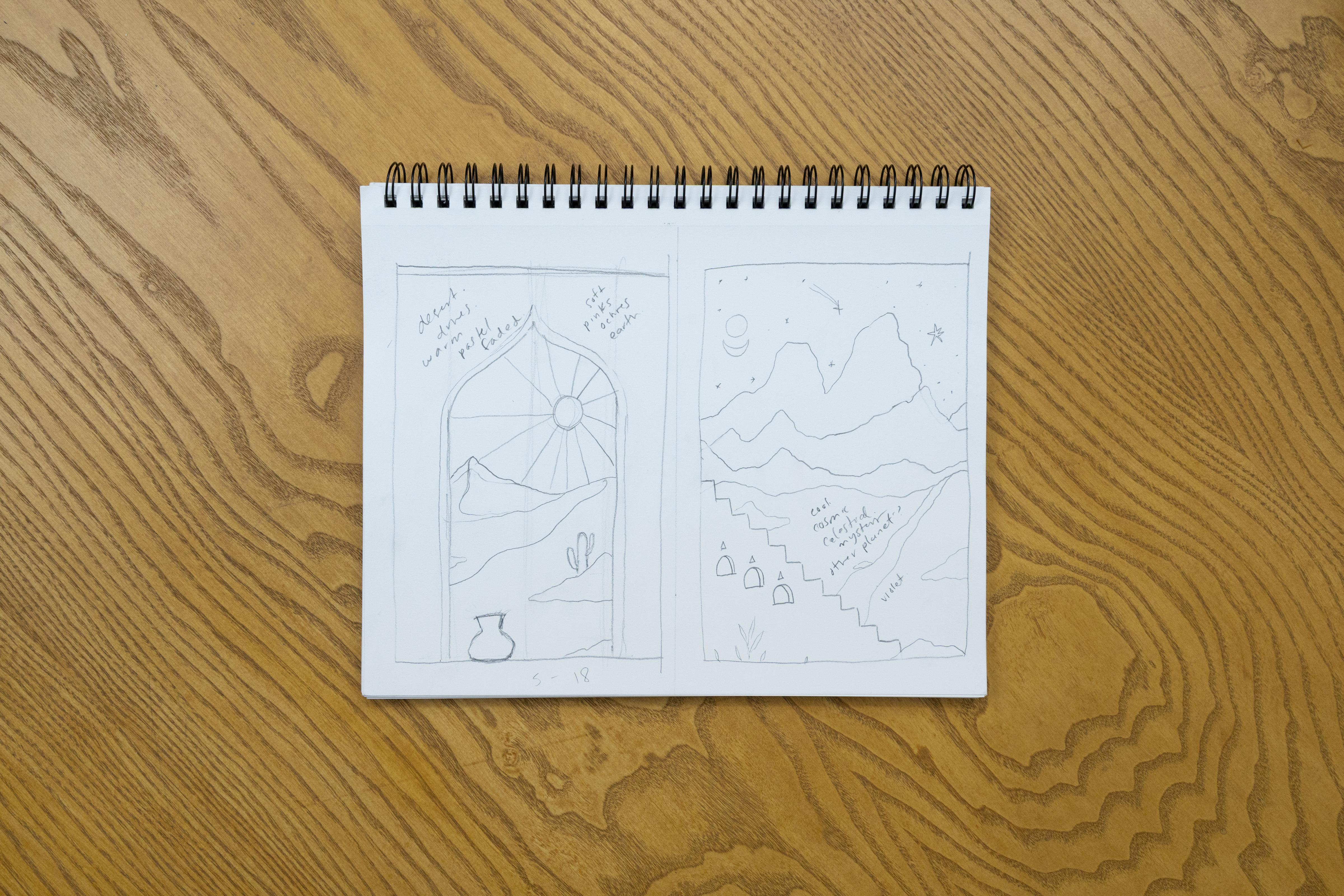
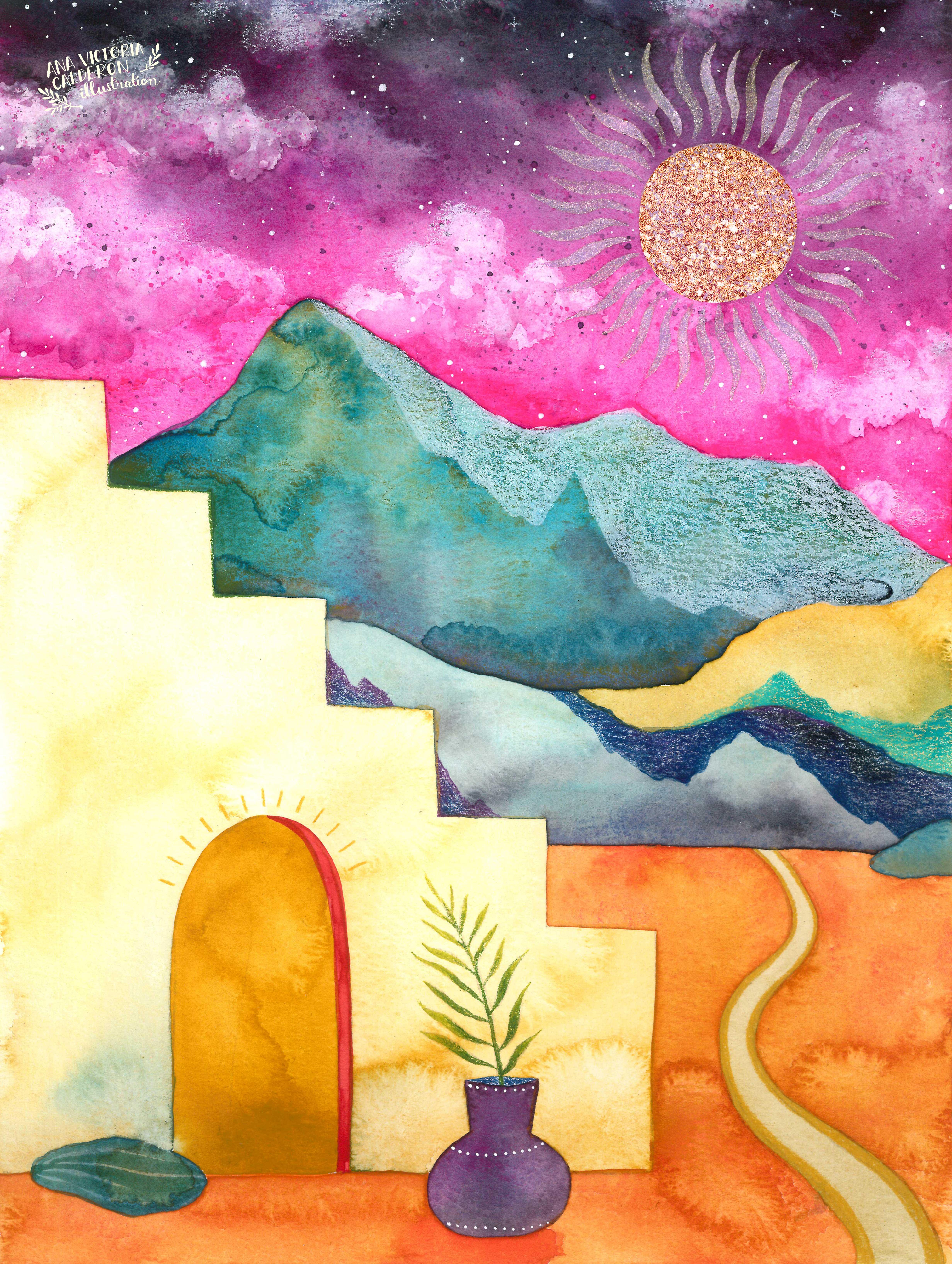
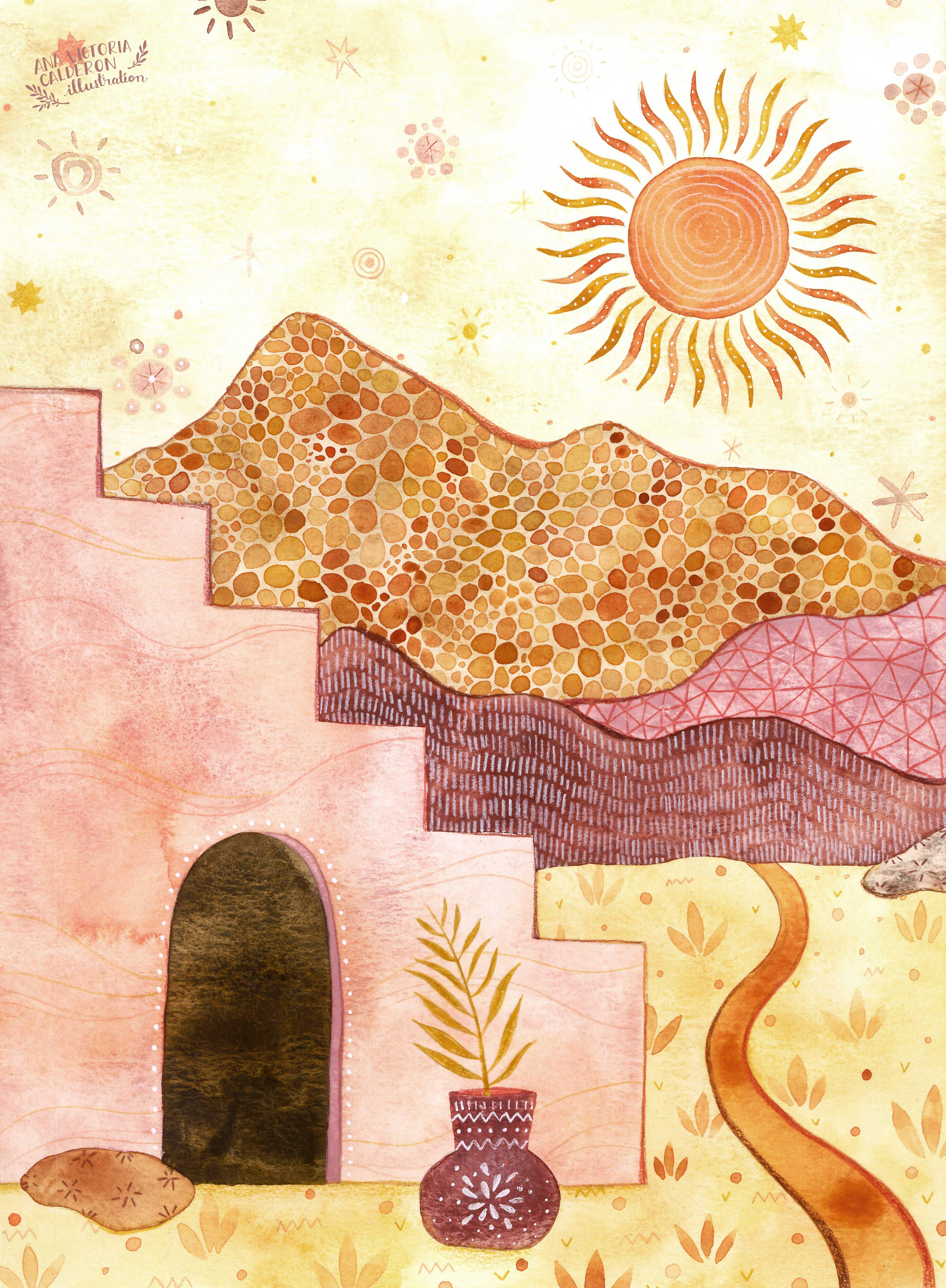
3. Sketching: I'm really excited to share this with you because for the past years I've been getting a lot of messages from you guys, from students saying that you wish you had more idea of how to sketch, how to create compositions and layouts. I started really thinking about this, and I came up with a topic that I think that is easy to draw for everyone, which is landscapes. As you know, my art has some, a little bit of a mystical touch to it. I think a lot of you might be into that too. Just for fun, we have some fun little mystical elements to it as well. But in general, landscapes are very easy because the shapes are not difficult to draw. It's not something like, for example, human figure, the proportions need to be right maybe, or it's a lot more about your personal style. Landscapes are pretty easy, they're nature, nature is one of my favorite topics to paint. Then we have some fun architectural elements that we can mix in there too, as well as celestial elements and just general really fun stuff. What I'm going to do here is actually take you through my process and explain a few elements that I think that are really important when creating landscapes, and for layout in general, for composition in general. As you can see, I have some little guides here in the back, and then I have my drawing paper here. What I did is this is drawing paper. These are going to be sketches. These are drawings that we're not going to be using as our final paintings, but we're going to just work it out. We're going to have some inspiration, and then in the end, we'll choose one of our sketches to be our final project. All of these templates are printable worksheets actually that you can use to create the landscapes that we're going to be making in this class. These are all visual references that can really help you out. I noticed that many times students really want to dive straight into painting and are really excited about painting, but wish that they could maybe have some ideas on how to create these different compositions and just ideas in general. Landscapes are fail-proof, they're beautiful, they have all mystique behind them. What I did, all of these are going to be available in the class resources again, so you can either download these or look at them on your screen. I'm going to share with you the elements that I prepared for you. I have a little bunch here of hills, dunes, and mountains. That's all in black and white. This is purposefully so that you just focus on the form right now and not necessarily the mood or the color. There's all different shapes and all of these can be mixed and matched and you can use them as inspiration or you can actually even end up drawing your own. There are some roads and rivers here too that you can integrate into your landscaping and all different shapes and sizes. Creating these hills are really great for especially when we're working with different depth. They're very organic in nature for your composition. These will be a lot of help, and we'll actually start out with the hill part. Then I also prepared for you some arches and stairs. These are some very simple architectural elements, this is optional too. But I thought these look cool. They look like they're in some mystical desert, or you can create a little fantasy world for yourself. Optional too, but I think these are fun elements to integrate into the artwork. Then obviously we always have a sky. There's always a sky behind the landscape, and I prepared a couple of different shapes of suns and moons here, and we have different moon phases. Again, these are meant to spark different ideas and it all depends on your personal level of how advanced you are in drawing, or if you're a super beginning. You can even trace some of these, and I'll share a little quick video after we do this part on tracing if you need help with that. Some very simple elements here, but they can really give you ideas on how to interpret such a simple shape, like sun or a moon. We also have some celestial elements here, like the same category. But you can even add a bit more of abstract figures into your landscapes, which is fun. It's everything. We're not painting something that's extremely realistic, here, we're really having fun in just creating a fantasy world basically. Here's some other celestial elements that can help you out if you want to add some of these to your sky section. Then obviously we have some plants. There's all different plants here. I have some that are a little bit more forest-themed. I have a little bit more abstract shapes here, more classical. We have desert-inspired plants. Again, these are meant to help you out with some inspiration. They're all really basic silhouettes and outlines because for me at the end, and you guys know this by now, if you've taken more of my classes, it's about you really tapping into your personal style. Even little details that you do at the end really impact how different your work and how special your work looks. I tried to keep this pretty simple and easy for me to explain the process of layout and drawing. Then we have some really fun vases, different shapes here. They're all pretty simple as well. You can even grab these as inspiration and then maybe add a plant to one of these vases or something like that. But I think it all goes in with this mystic vibe of the landscape and especially with the architectural elements. These will be really fun to add into our landscapes. Also, they'll help you out with a little bit of depth, proportion, layering. These smaller elements would be maybe more towards the front of our illustration. Then these are totally just for fun. There's some mystical elements if you want to add a bit more of an abstract touch to these. We have a crystal ball, a few crystals, a candle, an eye, some hands. I don't usually draw hands in my personal artwork, but again, this is not about you drawing exactly like I would. It's some inspiration to get the creative juices flowing. We have a meditation silhouette here, a scarab, a little key, just some fun elements that I thought you might enjoy, and also to feel free to explore this for yourself. It's all these little tiny details that we do in our artwork that end up making it look different and special. These are the elements that I prepared for you. Again, they will all be available in your class resources. There's a section where you can download them, and I'll also post that in the discussion boards so you have quick access to them. Now that I've introduced you to all of our landscape elements, I want to talk a little bit about basics and what these basics mean to me and which ones I believe to be important. Again, you'll find many, many different drawing classes out there. This is just my personal perspective and how I go about it. I think you might find it interesting. There's a couple of things that I find to be super-important. These elements would be balance, symmetry, adapting layers, feeling, and intuition really, because art is about that self-exploration. Art is about getting to know yourself. Feeling, intuition is really important for me. Then we have framing and detail. Those are the elements that I would consider to be most important when we're doing any kind of composition. In this case, we're going to go about it with landscapes. I divided my page into two here. You can do that too, or you can sketch on the full page. But I like to do this to have different ideas on the same place. What we're going to do is you're going to pick a couple of different elements. You might want to start making your own little collections. This is actually really fun, so you can start by choosing. Let's do a first one. I'll have a different mountain. I think I'm going to start with something around this which looks more like a dune to me. It looks a little bit more sandy. Again, I'm just imagining this right now, remember, as you continue to move forward, whatever colors and mood that you choose will actually end up giving it that true characteristic. For example, if here I were to choose sandy colors like ochres and really soft yellows, maybe that would be sand. But again, if you just switch this around and turn it into different browns and greens, that could be a mountain. You start to think about these things. For now, I'll choose this one as my base for my hills and dunes. These are good for layout, for example, since these have a little base here, as I continue to draw, you'll see what I mean, but I'm just going to put this aside for this one and then as for arches and stairs I actually do want to add one of these elements and I think I'm going to do a first example of what I mean by framing so I'll put this to the side. This is how you're going to pick out, try to choose one of each or whatever calls you. We have the landscapes here. I'll put this to the side and you can choose to do choose of them or all of them, or I'll grab this here in case I need it, but I might not. Then I'm going to choose maybe a couple of plant pages here. This here is just collecting different elements that I think are going to help me out with this first layout. I think I want to do a little sunshine here and a base might be fun too. I think that's going to be it for the first layout example. With these different elements, I'm going to teach you how I would go about the drawing process. Hopefully, this will be a nice boost for you and it'll just get you going and just ready to dive into painting, well into drawing actually, which is what we're going to start doing. The idea that I got also a fun thing about observing different elements like this, is that sometimes an idea can spark. What I was thinking of doing is when we talk about depth for example, I looked at this shape and I said, hey, this might be a cool entryway. Then my landscape can be inside this little arch here. Again, I'm just sharing my personal sketching process with you. Again, this does not have to be perfect. I'm not measuring anything. This will not be my final painting. I'm just playing around with the elements and trying to get ideas for which what will end up being my actual final painting. I'm just drawing a little idea of where this shape will take me and I'm observing the shape. Again, it doesn't have to be super perfect, but I want to trace a little bit of a guide here. This is a very organic process. Again, there's a lot of feeling and an intuition that goes into it. Then so I'm copying this here. Having these little guides here helps me out with the symmetry part that I was talking about too. It's all about balance, proportion, symmetry. You can feel it out, but for example, right now, I'm basing it on having this be right in the center. It has a little border and I'm just going to create that. What this indicates to me is that this is a little entryway and my magical landscape is going to be behind this. The entire page would be this. If we're talking about layering and depth, this would be my first plane. I'm going to move this to the side right now. Then I also like to go from larger to more detailed elements. What should be next in this case would be the sand dunes, which are our largest nature element. I'm going to go ahead here and observe what this looks like. For example, I have these two different options now. So I see this and immediately think, oh no, this looks too similar to this doorway entry here to this little arch. I'm not going to do this type of shape. I'm going to do more of this type of shape to be able to have a little bit more play. I don't want it to look exactly like this is cut in the middle. You'll see what I mean here. I'm just going to be very loose about this and start sketching here. I'm just drawing right now. It's not a super perfect drawing or anything. I'm observing shapes and playing around and then taking inspiration from one of these. This can be like a side little hill here. Again, these shapes are very organic. They're not difficult to draw. You just need to loosen up your hand a little bit. Now I start to get some fun movement here. I noticed that this side is a little bit higher so maybe in that case I would be having my sun beyond this side because I have a little bit more of height on this side. I can even make that a little bit more evident here. Kind of going around and doing that. Here's where I start to go into this balance and symmetry and feeling an intuition. All of these elements that I'm talking about, where you're going to start feeling it out. If I have more weight on this side, maybe I'll put my celestial element on this side. That's what I'm going for right now. I already have the shape here that's really symmetrical so I want to make the inside, what you're looking through a little bit more free and organic. Now the next thing I'm thinking is hey, it might be fun to maybe add maybe like a little desert element into here. I'll go back and look at some of these plants that I chose. If I have a plant and then I also think it would be fun since I already have this architectural element, it might be fun to think, how about if this was my entry way and then maybe there's a base line here. You can just go ahead and choose one of these shapes. I'll choose a simple one for now, something like this. Again, I'm not being super precise with my drawing or anything. Right now it's just to figure out the composition and the layout. This is like the proportion is bigger because in reality if I was a human standing here and I'm looking out. This is in my field, my depth, and the space here. I could go about it different ways, I could think, well maybe I could integrate some of the desert plants into more of the background and have maybe a cactus. You can think, well, maybe I can have a cactus back here. Right now you're sketching, you're just playing around and nothing has to be set in stone. You can think that might look good or maybe I would like to add more of this shape of plant in here, it can actually be inside of my base or the base can be left alone. Then maybe you start thinking, well, this might be too much double plan, so it's all about sketching and feeling it out and just working on what you feel will be a good final element. I think that in this case, the cactus, looks better like that, just on its own. It's like a solitary, mysterious cactus, and then this would be just a decorative base. Our first plant here. Then maybe you can play around a bit more with a similar shape to this that comes out from the side up here or playing around a little bit like that. This is a very simple drawing, and it didn't take too long to make. But what's going to make it really special is when we actually start to begin with the creative process. What's the painting going to be, what's the color scheme it going to be, what's the pallet, what's the mood, do I want this to be nighttime, do I want this to be daytime, do I want it to be cool or do I want it to be hot, like all these different things really matter when you start adding all this intention, detail, and color, and right now even I have this sun, but I have a lot of place, a lot of movement that I can start creating with that. I have the suns and moons here and maybe it might be cool to create something like that similar, maybe can be like a larger burst like that, where you can have your sky be really interesting. Maybe it can be something like this and that already looks like a really interesting idea for me, or maybe if you decided, I think this looks more of a moody nighttime thing, you can go back and maybe erase this and turn this into a mood and have these V-star. This is where we start to get the ideas going, and this sketching part is really important because what I'm going to do is save this, and then maybe right now I'm just going to create another sketch. I'll see, I'm doing this in real-time with you, so I have no idea which one I'm going to choose for my final project, and I'll do that with you because I want you to see the actual process that I go through when I'm creating my paintings. I'm going to leave this one like it is. I think it's an interesting idea. Right now what I'm going to do is go back to all of these different sheets that I have and I'll choose some more elements and we'll do a second one together. For my second sketch, I went ahead and picked out a few different elements here. We're going to work with these. I have, again, a few different hills and mountains. These look a little bit higher. These don't necessarily look like sand dunes. These remind me a bit more classical mountains. I'll put these to the side and then I feel like doing maybe a little stairway after the corner, something like that. This is a very organic shape, s I'll be able to play a lot with this idea of symmetry and balance and having the layout be an interesting shape. Then maybe I'll try to integrate a little river somewhere, or maybe a little road, a little path. Then I have the suns and moons. I feel I did a sunny one here, that it's more of a desert theme. I feel like this one is looking a little bit more warm and maybe even paler colors. I don't know. I'll see, I'll start feeling it out more. This one here is starting to feel a little already like, even at this point as I'm starting to think of what I'm going to do, you already start to feel out what the environment is going to be like, what the mood is going to be like in the painting. So I'm thinking, well maybe I'll make it more lunar and a bit more cooler tones. I have this out here and I think that maybe the moon phases might be interesting or a variation of that, and then I have these little celestial elements that are fun because I see a little shooting star here, maybe a planet. There are some fun things that I could play around with, with that. Then also mystical elements. I'll see you at the end how it feels, maybe I'll be able to want to integrate some abstract shape to make it even more interesting. We'll see how it goes. I'll, I'll leave this part to the end and that's more of the detail section. That goes at the end when we're done with the larger objects. So again, always trying to start out with the largest objects. I think that really helps out with proportion, with depth, and especially with framing at the end, depending on what you want to do. So I'll have these mountains be my first reference. Again, I'm just going to go in and draw here, I'll use this site now, and very loosely, I'm not being too perfectionist here, I'm just having fun. I'm creating a little border, and by this point, for example, I'm already deciding, well, these are vertical sketches, but if you wanted to trace horizontally, you could also do that, so there's many decisions that start to come into place at this point. I'm going to take this outline as an inspiration. It's a bit more of, I feel like it's like a higher mountain, it would be higher up. That means that my sky is going to have a little bit less space and the mountain is going to take up, let's say about 70 percent of the proportion of my paper, so you just start to think about this stuff. Again, I'm just starting and I'm going in and observing the shape. At the end, I'm not trying to make it exactly like it, I'm just taking it as a reference, so this is where your personal drawing cycle comes into play too. Having fun with that. This will be like my foreground or, my ultimate background because the background would be these guys, but what I mean is this will be in the layout, this will be the mountain that will be behind all the rest. I wanted to start thinking about, well, what other shape can I start to integrate? I'm thinking, well, it's a little bit higher up here, I have a little peak here. You just start thinking about the shape. I actually think something like this might work where there's a little bit more, there's some mountains here and a little double mountain, and you can even go over this one and you can erase here. This way you get some really interesting depth. You get some depth here. It implies that there's something behind here, but this one has a different shape. You just start playing around like that. I'm going to go in here and maybe I'll do a couple more little mountain shapes up here. For example, right now I just had a little observation, so I said, well, this one came out and went up like this, and this one came out and went up like this, so maybe I want to do something different on this side, start on a higher note. I'm just going out like this. Then maybe it'll be a little bit wider around here. At this point I'm even just making up the shapes myself, but I'm taking this idea as a base. You can see here that I already started to play around a little bit with the shapes, and I don't want them all to look exactly the same. I want to play around with movement. Finally, maybe I'll do a little, something a little bit flatter here. That this can be my field. Like the more flatter area. We have that, I like this. It looks fun. I can tell I have enough room so that the mountains are big enough, and they're interesting and then this will be my sky. Then I still have some room here to play around. It's taking up almost a third of my page, which I like. It's interesting, I think that there's something to that. When you start thinking of a proportion of layout. You don't have to use a stairway, but this would look pretty on its own, and maybe you can just do some florals here. But since I have these elements, I'm deciding to play around with them, experiment a bit. Again, so I'm noticing that my drawing is going a little bit, it's higher up on the right side. Maybe I want to balance that out and have a larger element on this side versus this side. Just start to observe and see, well, where do I need a little bit more weight? To have a bit more balance. I'm going to take an idea, something like this or the staircase, and thinking it might look fun here, and maybe I want to even start it all the way up here so that it's a good way to integrate my little mountain shapes. I start going down like this, and erase this part because if we start thinking about depth, the stairs would be in front of the mountain. I would have to erase whatever is behind it. Then I have this, but I'm really not feeling this doorway too much. I think that something more maybe like this with little smaller windows might be interesting. I'll go ahead and play around with that. Maybe we can have, I don't know, like three little windows like this, and create a little bit of a rim here. I'll give it some a little bit of 3D action there. Again, these types of drawings, they're not technically perfect, they're actually 2D, they're almost like two-dimensional. But this is the style that I like to draw in basically. I actually want it to look a little bit strange. I want it to look a little bit abstract. That keeps your artwork. It's all personal preference. Again, this is about your art and whatever you feel like doing, but I'm just sharing with you my personal process, and how I feel about art in general. I want to always make it a little bit interesting. I don't paint hyper-realistic or anything like that. What I want is for whoever is looking at the art to think, oh, that's interesting. That looks like a weird made-up place. Or when I began painting, I used to really like painting landscapes that were inspired by outer space. Something that you would see on Mars, or even a made-up planet. That's just like a personal art thing that I really like. You have to think about those things. Like, what little universe am I creating here? I like it to be a little bit strange, and not too realistic, or too perfect. We have these three little windows here, which wouldn't necessarily make sense. Like who lives in here? What is this? But it looks interesting to me. We have that going on and then I see, I actually have a little bit of extra, I'm starting to feel it's out. I feel like there's a little bit of extra room here. They can either be some plant or a base or something like that. I also want to add in maybe one of these little paths or rivers that we had around here. I think this would be interesting on this side. Maybe I'll do something in that direction because I have the stairs going down in this direction. Let's make believe that this is going behind this staircase. It would be coming out through here. Again, this is all like little fantasy world. It's all made up. It doesn't have to make perfect sense, but I think that that does look pretty interesting. Then these little guys are really helpful too because they helps me give a little bit of texture. It's going to be almost like little rocks or any type of little formation, but it'll help out in texture. I'm feeling like keeping this actually pretty simple. I don't know. I'll play around with maybe if I can have a few little, or one of these little formations down here. That'll give me the idea that this little rock is even a plane, more closer to the spectator than the actual staircases. You just start playing around with depth, proportion, layering. All this stuff becomes interesting. Then here I can decide, no, maybe I want some plant, or maybe I want a vase. You can play around with that and see what it feels like. Again, this is all sketching, so it's not your final drawing or anything like that. You can decide to either do this or not, but it's worth it to try it out, and then you can erase if you feel like it's getting too heavy. Then finally, as I said, I think this looks a little bit more nighttime vibes. I think that maybe a lunar phase might look interesting. Maybe I can do a couple of shooting stars. I can even do some abstract element, or even have some symbol on top of these windows that'll make it abstract. You start playing around. This is a pretty fun part because you start playing around with detail. I think I saw a triangle somewhere around here. No, I'm not doing exactly this, but little triangles might be interesting there. It can be some icon. You just start really playing around. Then here, since I have a little bit more weight on this side within the sky, maybe I'm going to do some little abstract moon here. Something like that, inspired by this. Maybe I can do a couple of these little stars or a shooting star here. You just start thinking of this. Again, it's not a hyper-realistic paintings or anything like that and it's not perfect, but that's the way that I do it intentionally. I think that you can have a lot of fun playing around like this. Here are my two examples. For your class project. I want you to upload photos of the two sketches that you made. In the end, you're going to choose one of these to make your final project. There's a couple of things going on here. First off, you start to really think of, well, what is this? You start to think of what mood is going on here? You're going to start thinking about your color palette a lot. You're going to start thinking about whether it's a cool environment, a warm environment. If you want the colors to be really bold and bright, what does it feel like? Maybe you want it to be very muted, and you want to have this almost like a sun died vibe. All these starts to really get you thinking. What I'm going to do is in our next video, I'll actually work out a little bit of color palettes for you. Then from there we can choose which one we're going to use for our final project. Make your sketches, upload this to the final project. I'll also have a quick little video to show you how to trace in case you have a lot of trouble with drawing. I'll do that before we go ahead with the color.
4. Tracing Trick: Before I continue with our actual color scheme and working out our final project, I wanted to add this little video here for those of you who have a lot of trouble with drawing. I see this in in-person workshops sometimes and I have a little trick where I like to do this a lot with in-person students that I notice that they might be stuck, that they just feel like they're frustrated, and they're having a lot of trouble with drawing. Even though these are simple elements, I understand how you sometimes just want to be confident and dive deep into painting. While you build up your drawing skills, there's a little tracing trick that can help you out if you want to just get it over with and just have your drawing ready for painting. I don't really recommend this to be your full-time style of creating artwork, but it can be very helpful, at least, in the stage where you're still building up your confidence. What I'm going to do here is, I have a tracing trick and I've shared this, I think in another class too. This tracing trick is actually really helpful when you have a shape that you want to draw and you just feel like you can't get it done. This is my first book that I released. It's called Creative Watercolor and it's a step-by-step guide for beginners. On page 66, there's a really cool tracing trick that I like to share. I understand how drawing can be intimidating and that's totally fine. For those of you who are having a little bit of trouble, we're going to actually do this little tutorial right now with one of these elements. You can print out any of these elements and actually do this. You can trace the silhouette of this mountain. You can trace one of the suns. You can trace maybe one of these more complex objects. I'm going to trace this little hand here. It's a simple silhouette, but hands can be difficult to draw in general. What you're going to start up by doing is you're going to flip your page over. Usually, when you print out, you might not be able to see it that well on camera, but what I like to do is just draw around the shape where I know I'm going to need to trace. You have that here. I'm just going to do this quickly here. What you're going to do is you're going to need a pencil. For example, an HB is a really good pencil for this because it's a bit of a softer pencil so it'll work really well for tracing. You're just going to scribble around this area. Making sure to cover the entire area where you outlined here and you know that there is a shape that you're going to want to trace. Pretty simple like this. Just going around. Then sometimes, I like to scribble on the opposite direction so that I know that I'm covering all of the area. That's pretty much it. This is your first step here. Again, you can print out any of these that I made for this class are available for you. You can print them all out. If you're having trouble with the actual drawing, feel free to use this little tracing trick. I'm just cutting this little area here. I'm going to put this to the side. Then a very important step and I've seen students try to skip this and I'm always like no, make sure you actually do this part. I'm going to just center this here. You really do need some washi tape or masking tape so that your tracing area doesn't move around. Make sure that you just secure this paper here. That's good enough so that you'll be able to draw freely. Then a good tip for this also is to use a ballpoint pen. I like to use a color that is pretty light. A red ballpoint pen, I think is a good idea because you can actually observe where you've been tracing. You're just tracing around this area and make sure to apply enough pressure so that the pencil marking on the back is actually visible. We're just going in here tracing. The reason that this type of trick is important is because watercolor paper is not translucent at all. If you're doing a watercolor painting, you won't be able to, for example, the classic tracing trick, you'd be using a light box or even holding it up to a window, but with watercolor paper, that doesn't work because we use really heavy paper in watercolor. This is why we use this little tracing trick in case you ever need it. Going in here. Again, this is totally optional. It's just for those of you who are having a really hard time with drawing. This can just help you get going and practice something. Hopefully, eventually, you'll feel secure enough where you can actually just draw free-handed. All it takes is practice. In the end, it's all about your personal style. I'm a really big advocate for that and I always tell students that the best way to draw is just whatever comes naturally for you. At the same time, I understand wanting to achieve something and feeling like you're stuck. Just a little trick for that or maybe there's a specific element that's really difficult for you. Hands are hard. A lot of people have issues with hands. I don't really draw human figure at all in my artwork, but I know many of you are interested in that. I think I'm just missing this little area here. The thing I like about the red pen is you can really go back and observe and see if you're missing any section. That's pretty much it. The big reveal is that you just lift up your washi tape and voila, you have your beautiful drawing here. If there's a little bit of extra pencil dirt here, you can just erase that. This might be even an interesting way for you to draw. Let's say that this was a really difficult element for you to draw, but maybe you feel secure enough to draw, for example, landscapes. Maybe you feel okay and what if your composition is something like you draw one of these little landscapes here. It can be a good way to integrate maybe more difficult methods. Again, playing around with symmetry maybe. I have a little bit of organic play here. Maybe here, I start to observe that this shape goes up like a triangle like that and maybe I want to compliment that and add a little moon shape here. I always feel like this is going up towards the heavens and maybe I want some burst going out like that. We can maybe add some elements like this. See how maybe you just need something to get you going and that's totally fine. I've started playing around with this. As you can see, maybe you had this more difficult element here and I wanted to add some of the more organic shapes later. That's just a little trick for you. You can actually cut out all of these. If you have a lot of trouble with drawing, you can even cut these out and start to place them like this on your paper and trace the entire thing. Feel free to use whichever method you want. If you can go totally freehand, please do that. If you need some tracing, this is that little trick and it'll really help you out.
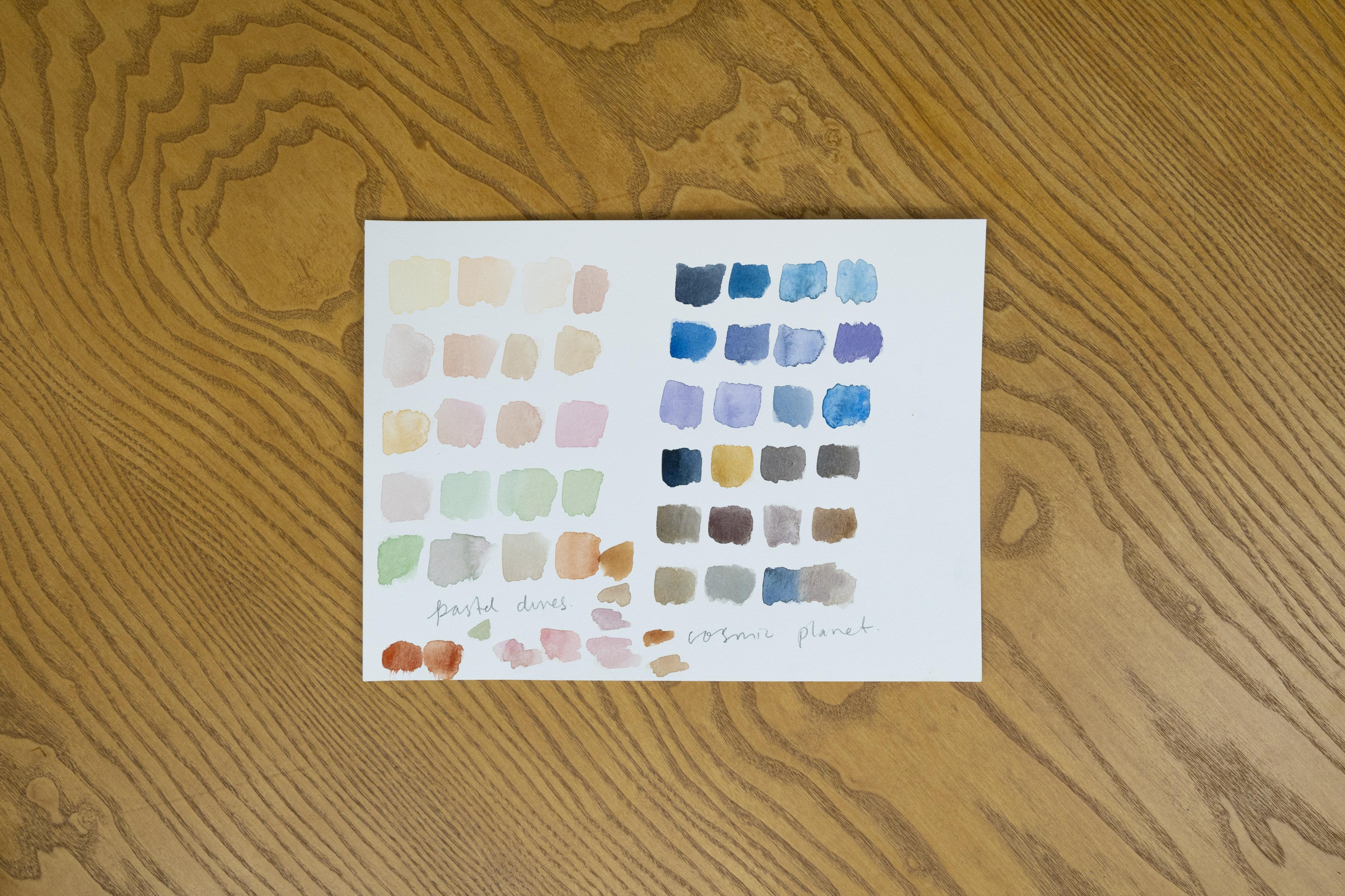
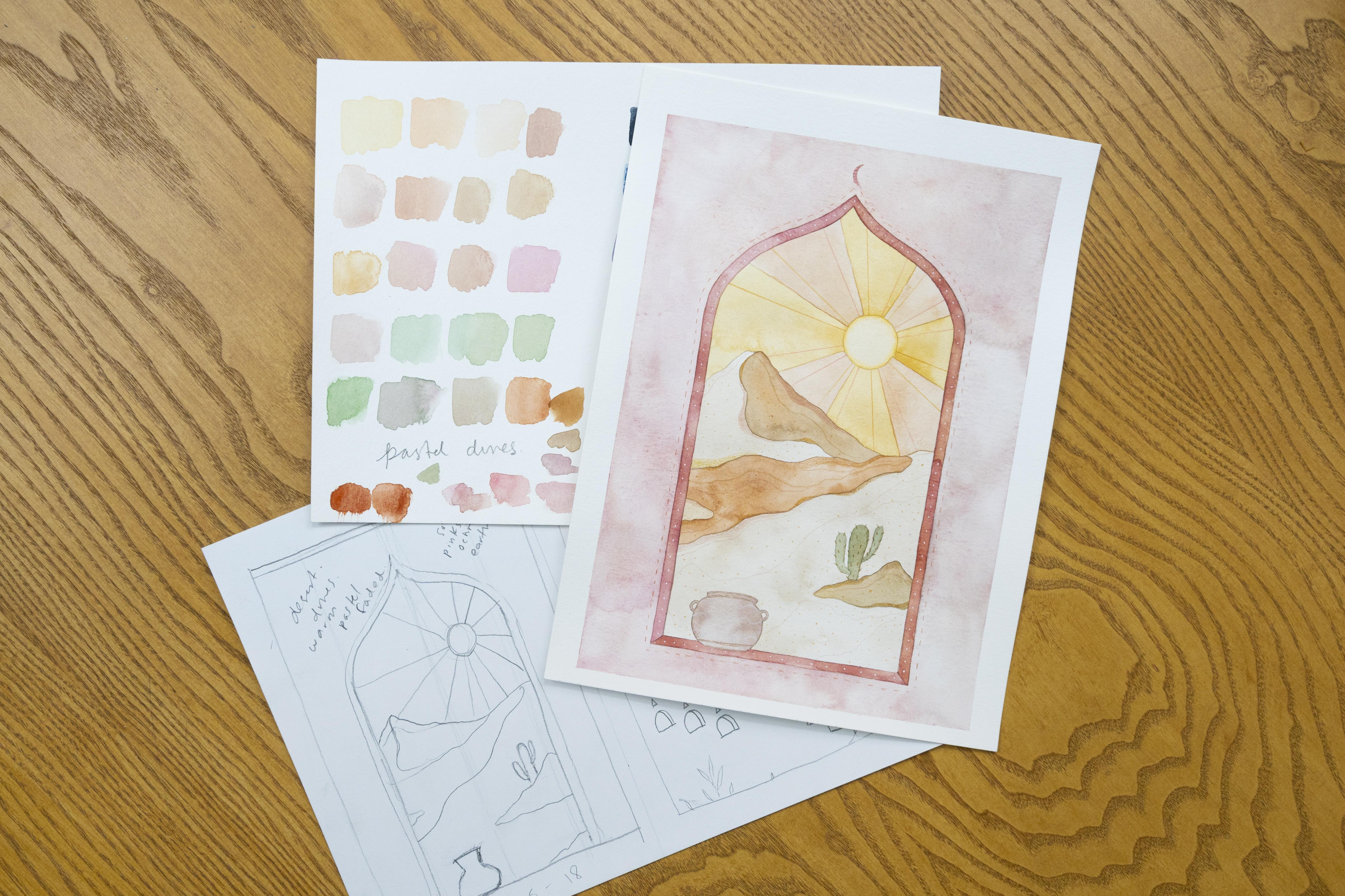
5. Mood + Color: Before we actually start our final project, I really like to talk about color palettes and how important they are to set the mood for your entire painting. Really it's going to be a very important factor in what the general almost emotion and mood is to your illustration. We're going to take these two examples that we sketched out. I have some watercolor paper here too. We're going to start actually working a bit with color and you'll see how that really gives personality to what we're going to end up doing. In the end, I think depending on these two color palettes, I'll choose which one I'm feeling more today. Then that's the one that I'll work out with you in the final project and you do this in your own process. Whatever two landscapes that you came up with, think of different color palettes for each of them. The first thing I'm going to do is open up, this is my watercolor paper and this is my sketch paper. I have the watercolor paper here. Even observing these, you can go in totally different directions for any of these. Again, maybe you have already developed a personal color palette that you really enjoy painting with. For those of you who want to learn a bit more about color theory, color mixing in general, go back to take my class, it's actually called color mixing and it has all different harmonies and schemes and stuff. I think that that will be very helpful for you, if you still want to work out a bit of color. For those of you who already feel secure enough to work with color palettes, go ahead and start doing this along with me. What we're going to do right now is I'm going to just begin by observing. I'll choose this one first. What I like to do is almost start writing out words I feel that resonate with me depending on the drawing and what kind of mood I was thinking of. There's obviously here; desert, dunes, warm. I think for some reason I'm feeling almost pastel, faded. I like to write out little words here that help me set the mood and in this side here I think cosmic, celestial, mystery, other planet maybe. That makes me start thinking a little bit more of cooler tones. Just the sky in itself makes me think more of maybe blues and violet around that area. This one here, faded, pastel, desert, dunes, I think more of soft pinks, not bright. I think this one would go more bright. This was more soft, even ocher Earth. These little keywords are helping me out to start to think of the mood and color is incredibly emotional when we start painting. I think for me, color is the element in art. It's what really helps you define that final mood that you're going to be painting with because these could go either ways. If I decided that this was going to be a darker landscape, I could do that too. I can remove the sunshine and make the background here be also some galaxy or something like that. It really depends. The color palette is really going to help you out with the final look and feel of your artwork. This is a really important step. I've already determined that these are the two vibes I'm going to go with. What I'm going to do is work out little color palettes for each. I'll do this little pastel soft desert one here and then this cosmic one I'll do on this side. We'll start working with that. I have my watercolors here. I don't need much except for, right now I'm just going to use my pen set. This is my daily watercolor pen set and just work out whatever I have on here. I'm going to work. I'll do the pastel one first and when I think of pastel, you think faded really light colors. That means a lot of water. I have a little bit of ocher here that I've already pre-used. Remember that watercolor reactivates with water. That's one of my really favorite things about watercolor. It's how practical it is and just there's really not much waste. I think ocher might be a good base color here. I'm working that out. The way that I really like to mix color and if you took the color mixing class, I have a little example on this, where we have a couple of base colors and then we mix between those. The way that you would use your color palette here is, I have a little bit of, in this area, there's some oranges that I already created and this really gives an organic feel to your paintings. Sometimes I get a lot of comments from students or even on Instagram saying, hey, what color is that exactly that you're using? There's no way for me to respond that. I think that the reason that they actually look interesting is because it's not just one specific color. It's this natural organic mix that you start creating as an artist. Right now I'm just adding a little bit more of the original ocher to this orangy mix that I already had blended here. I'm going to go ahead and just start swatching that and notice how I'm using a lot of water. The reason for that is that I really want to make this almost like a washed out color palette. I want it to be very dreamy and very Earthy. I'm even playing around here with this original orangy that I had here and just seeing what this looks like. Again, it's turning to be quite warm. This ocher is almost like the base for everything else and maybe I want to add a little bit of a deeper or even cooler tone. I have this little one of the browns that I have here, which is not too warm. It's a bit of a neutral brown. It's almost like a burnt color. Maybe I'll play around a little with this and then go in and add some of that ocher here to warm it up a bit. Start playing around with colors like this. This is a very warm palette and sometimes it's okay to try it out. For example, I did write down pink here, so that's what I was feeling initially. What if I play around with a little bit of that pink? But I don't want a bright pink red, I want a muted really faded out pink. I'm going to mix it with this watery brown that I had and it has that pink undertone see, it's almost like a dusty rose. I think that's pretty interesting. For those of you who have taken the color mixing class, you know how important mixing complementary colors are. A quick recap on that is that complementary colors are opposite on the color wheel. For example, red and green are opposite colors. That means that they're complementary colors. If I mix a bit of green into red, it's going to dull it down. I'll get more of a brownish tone almost. I'm going to play around with that a bit. I had a pink here, but it was a bit too cool. This is how you get those really interesting colors. Mixing complementaries is a great tip for this. I'm going to grab a little bit of a warmer green here to try that out. I have some of this warm green, some of this dusty pink. For example, I have a little cactus here. I'm thinking, well, if I want to add a touch of green, it would be a green that's been mixed in with a bit of the complementary color. You can see that this goes well with this because there is a bit of green already in this pink. This is the way that you really mix a color palette, and have it all be cohesive, is that you really want to mix within the different tones whenever possible. I'm going to create another green. I have that green and then I'm going to add a bit of this original burnt orange that I had around here. That orange is like a little variant. It's a warmer red. Well they're called split complementary. If you go in and want to learn more about that theory. I have that in that color mixing class, and also my book, Color Harmony for Artists. It goes really deep into all the color mixing. I don't mean to talk about all the other books or classes that I have, but there's just really good resources there. Each class would be seven hours long if I went into all the topics that we covered. Remember, this is not necessarily a beginner class, so it would be nice for you to take a look at that if you feel that you need help with color theory or color mixing in general. Referencing again one of my original foundational classes, which was modern watercolor techniques. We did a lot of transparency work, and this would be a level 3. If I added less water to all of these paints, I would get very thick, more opaque colors like this. I don't think that's what I'm going for here. I want to keep it very faded, very pastel, very soft. It's basically pretty much comes down to the decisions that you take when you want to create these environments. Again, if you noticed, I have that ocher. I have this brown. I added a little bit of green, and a bit of pink, and some of this orange that I had left over here, like a burnt orange. That's pretty much it. Those three colors gave me this entire color palette, and it's just mixing within each other, depending on what you want to accomplish. I think that this looks like a very dreamy color palette that would work well with this first version. Maybe, for example, for these dunes, I start to think well, some of the parts are meant to be more light and other parts are meant to be a shadow. Maybe the lighter part can be this more pure ocher, and the shadow part can be the ocher that I'm mixing with a little bit of brown. You start thinking about where you're actually going to use these colors, this burnt orange can be the base, and I can play around with that with different tones or even water it down sometimes with more water. You can start choosing what you want to use these colors with. I think it's a really helpful guide to just give you that entire mood and feel. I'm going to take a quick little break, and let this dry a little bit and then continue with this cool cosmos color palette that I have on the other side. Continuing on with my other landscape here, I had already written down some keywords. Reading them, I'm thinking cool, cosmic, celestial, mystery, other planet maybe, violet maybe. Right now I'm starting to observe it. I'm thinking that I want to keep it actually, almost more on the serious side. When you start to think of color palettes, what's really important is limiting the color palette. That's one of the biggest tricks because I love rainbows too, but I've said this before that not everything necessarily needs to be a full rainbow, especially, when you want to have a specific mood. A really good trick here is actually limiting that color palette. I think I'm going to have this be very blue and brown-based, but there's tons that I can do to play around with this. Even if I feel that it needs to go a little bit warmer, maybe I can add a touch of violet in there to play around with that. When you know that you're going to work with a specific palette, sometimes you like to add little drops of water just over your pens for the colors that you know that you're going to use, and this way they start to activate a bit, so that they're really ready to use once you want to pick them up. That's just a little trick there. Then one of the colors that I like to use a lot in my personal color palette as an artist is indigo. I usually have some extra indigo lying around on my palette, and I just reactivate it with water. For these colors that I use a lot, for example, indigo, ocher, they're my go-to. I usually buy those in tube, and just always have an extra dab on my watercolor palette. That way I know that I have really nice consistency here too. I'm just going to go ahead and go in with my indigo and just start adding these little swatches of color. Then what I'm going to do is start playing around with different blues and see how they integrate with this indigo. That's a really good trick for color mixing is always mixing within the colors that you already used. Then I'm just grabbing a little bit extra water here to see what it will look like with some more transparent shading. Going around and playing with the blues that I have here. It's a very organic color palette. I'm not really using the color directly from the pigment source, but I'm mixing it in with everything else that I've used. All of these blues have, even if it's a slight touch of that indigo undertone, and that really helps me out with having the whole color palette be really cohesive. Then here I had some blue mixing with a little bit of violet, so it's a really deep violet. I'll go in with that and also maybe add a touch of this indigo around here to make it all work together. This can be almost like that violet tone that I was imagining when I wrote down the color palette. I have a little bit of almost like an eggplant purple here. That's a very deep purple and I'm mixing it in with what I already had here used. I have gotten questions from students like, "How do I replicate the exact color palette that I had?" For me, it's always about with watercolor especially, you might not ever get the exact same color, but what you do have is you start to work up your general color theory knowledge. That really helps you out, especially when you need to know, is this a warmer violet? Is this a cooler violet? What kind of undertones I'm I using? Right now, what I have as a general reference is that I have this indigo as my undertone as a base, then I have a couple of different blues that I'm using to mix in with that. Here if you notice, there's two things going on too. Number 1, I'm using a little, it's not as much water as I used in this really pastel color palette, there is a little bit more paint. Also, blue pigment tends to be pretty powerful. That's something that just happens with blues in general. I think I have a really nice variety of blues here. What I'm going to do now is I'm going to grab a little bit of this indigo mix and just place it. I'll move this here so you can really see. I'm going to play some of this here. I'm going to start to play around with a bit of browns as well to see what comes up. I have a little bit of a warmer one here. Just add a tiny touch of that indigo as an undertone. It's actually going to even cool down these browns a little bit. I'm going to go in here. Again, going back to color theory, a quick refresher here is that the complimentary color for blue is actually orange. That means that those two colors are opposite. Many of these browns have an oranges hue to them. That's why they not only mix well together, because we're creating this entire fusion, but they also actually complement each other. Complimentary means that one color brings out the other, so it helps it pop. Those are just some general color mixing tricks that are really helpful. You can see how I'm really limiting the color palette and just sticking to these tones. I'm not adding reds or yellows, it's very blue based. Then having this mix of complementaries with these browns that I have. FYI, if you have a very limited pan set, for example, let's say you only have six paints, you can actually make brown by mixing blue and orange. I'll do a quick demo of that. Here's a little bit of orange, we'll just place it here. Let's grab a little bit of blue, see whatever I have here when you mix these two together. Right now, you have a little bit of a warmer tone here, so you get a nice brown. If you want to make it a little bit cooler, you'll add in more blue. These are very basic color tips. I have entire classes and books on that. If you want to discover more colors, one of my favorite elements in art, for me it's the most intuitive one of them all. I like to see how they mix together too. Having this color palette really helps me. It's like, okay, now having my sketch, and having the color palette, I can have a bigger picture of what I'm going to make. I can start to imagine that the blues might go more with the background, and then I'll use the browns for the mountains, then this mystical stairway here, maybe I can use that bit of ocher with the indigo undertone, so you start thinking about. For a final touch, something that I always really like to do with color palettes is just name them. For me, it's just a fun, creative exercise. I think this one might be pastel dunes. Then this one can be cosmic planet. Even giving your color palettes a name can really help you identify with the mood that you're trying to create for your landscape. I really like painting landscapes because there are so many different ways you can go, especially depending on the color palette. I think this is a really fun complement to our final project, which we're going to start out next. What I'm going to do in these few moments is actually choose to see which one I'm going to pick. I'm going to sketch it out in a more of like a clean way. That just means that I'm going to be more careful with measurements, and maybe having cleaner pencil lines, but it's going to be a simple drawing based on the sketch that I did before. I'll see you in the next lesson where we actually start our final project. Make sure to upload your color palettes too. These are very interesting to share. Now I will see you in the next lesson.
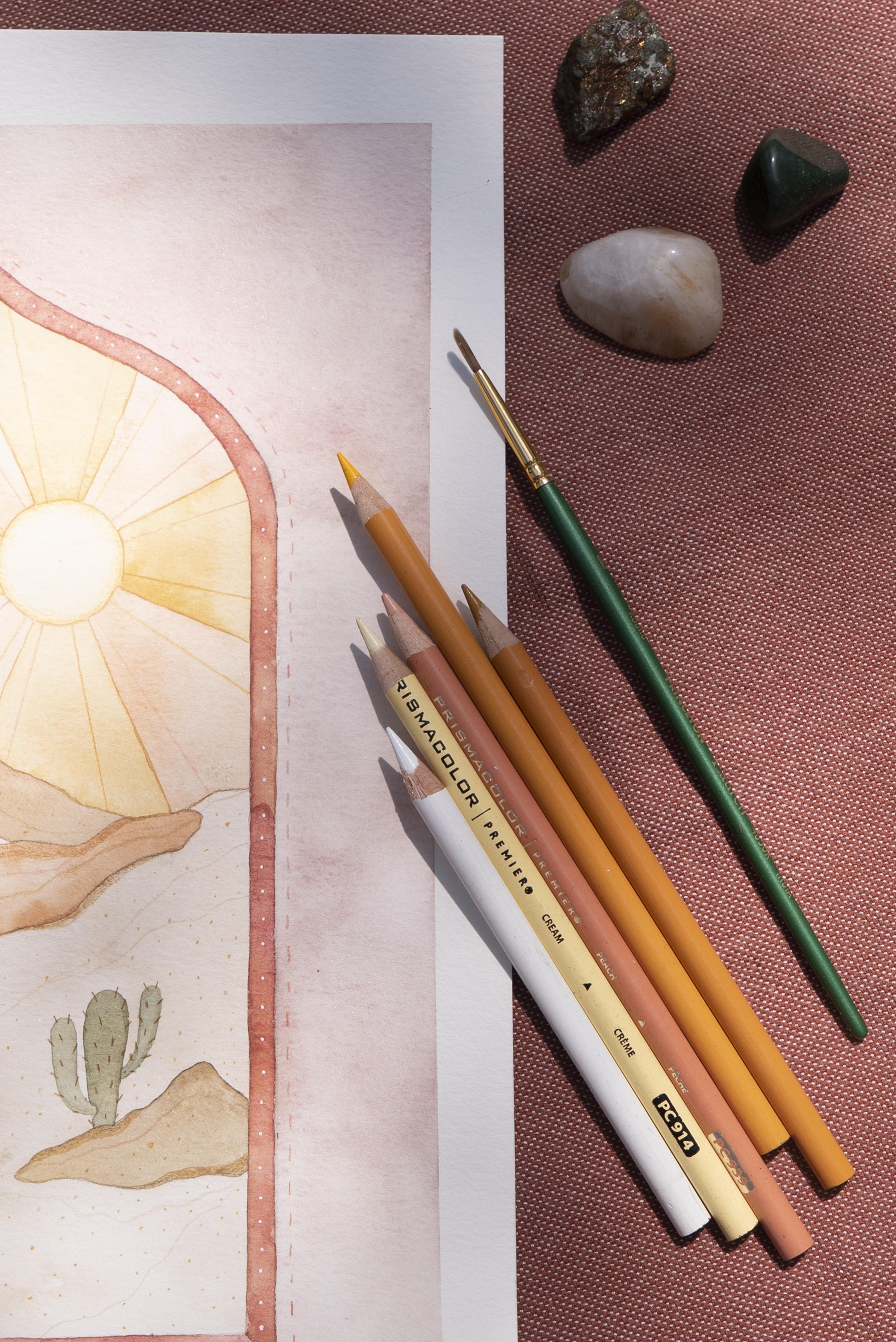
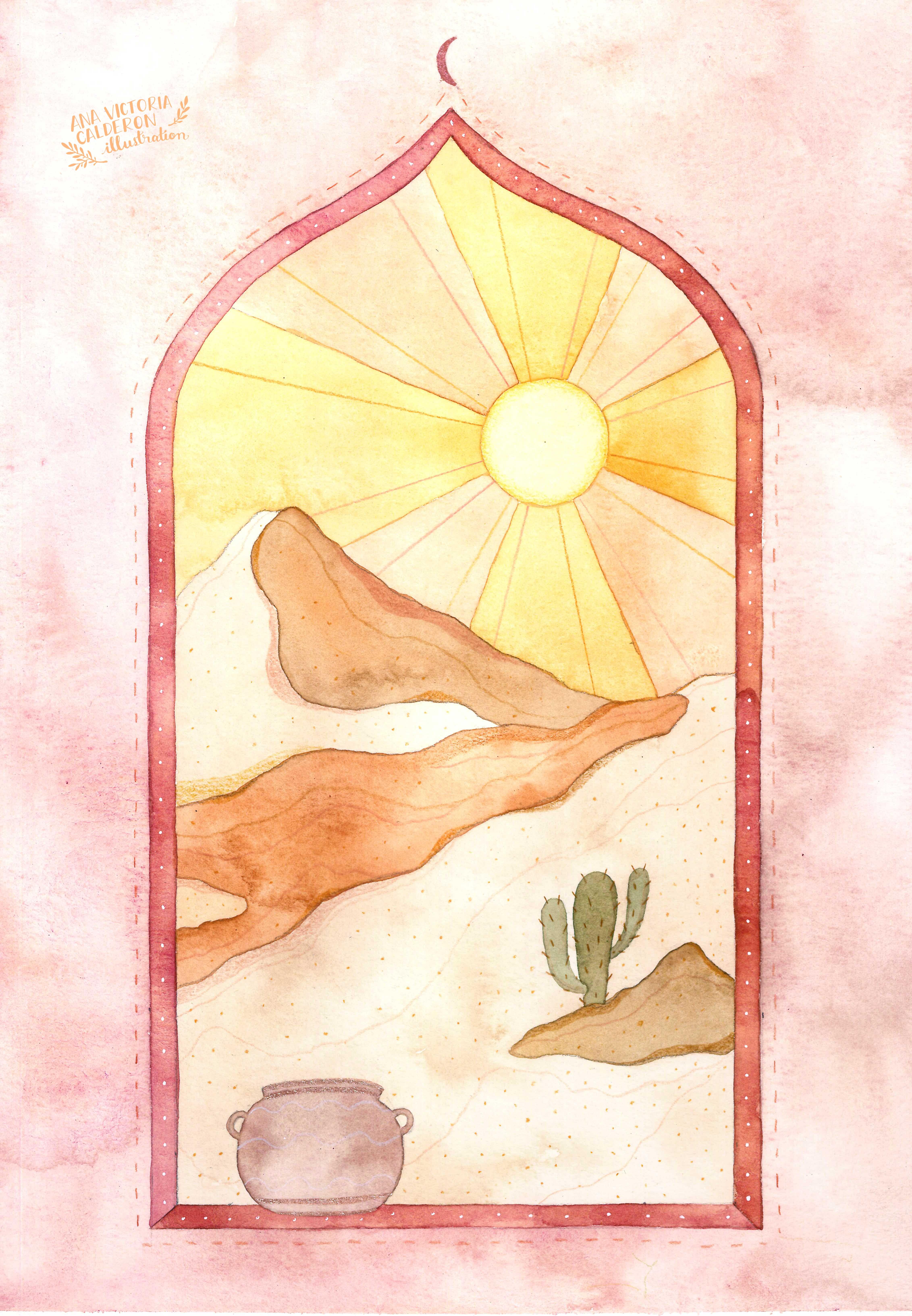
6. Final Project: Watercolor Layers: As you can see, I ended up choosing the pastel dunes landscape. Therefore, I'm going to go ahead and paint it in this color palette. I just wanted to point out a few things that you might have noticed. When I went ahead and drew this is, Number 1 the lines are much clearer. I apologize if you're having trouble seeing these pencil lines, there's really no way around it. In order to paint watercolor, you need to have very subtle pencil markings. Because once you start painting over with watercolor, it's really hard to erase those lines. I tried to do it as dark as I could but I don't want to ruin the painting either. I have this, I made it a clean version of this. I kept it pretty much the same as the original version which is up here. You can see I just refined a few details. I was really careful about. I took a couple of measurements, just made sure that I traced the window here with a ruler actually turned this into more of a window shape than a door that was at the very bottom. Added a little bit of just a tiny bit of up here with the rims of the window and the edges here. Basically, it's just a really clean version of the sketch that I did here. It gives me a lot of room to just be very airy and flowy with my watercolor. The next step that I'm going to do now and I'll leave a camera rolling is just, I already worked out the color palette, so I already have this. I already know which colors I'm going to use and now I'm going to choose these different variations and fill in all of these different areas and I'm going to be very watery about it. There's really not much to say for this section right now, I'm just going to leave a camera rolling, so that you can see me painting in these different spaces. Once that dries, I'll come back with you and we can talk a little bit about final details and texture. I'm going to go ahead and start painting. Same color palette, all I'm going to do is fill out these different areas. As I continue to paint these different sections here, just a few comments, tips too that can help you out. One of the things that I did and you might have noticed is that I put a little washy tape border around this and this helps me Number 1, keep the paper flat and then I have a little natural really crisp border. That helps a lot. One of the things that you're going to begin to notice is how I'm painting in different sections. Again, this is not necessarily a beginner watercolor class. I have tons of really great foundational classes here on Skillshare that can really help you out with basic watercolor technique. But, I'll do a little refresher. Just one other really important things to mention with watercolor is that you don't want your different sections to bleed into each other unless you're doing it intentionally. Let's say, you're doing a really loose watercolor floral painting or something. In that case, you might want some bleeding to go on but in this case, what we're doing is we're painting in different sections. It's more of an illustrative style. What you're really going to have to be mindful of is letting different sections dry before you paint whatever is next to it. In general, for example, right now I have this pretty big puddle of water and I want to have this be very watery in order for me to get these interesting blooms and textures in the background. Also it helped me out with the pastel tones. It keeps it very muted, very faded. That really nice look that we want. I have a lot of water going on here and I'm actually even going to wait for a little bit before I continue to paint into the different sections because what's going to happen really is that even though, for example, this cactus won't be really touching, it doesn't border with this doctrine window construction. Let's say you need to place your hand somewhere. If I placed my hand here, this area would still be wet and I would ruin the painting. Watercolor is really about having a little bit of patience, stepping back once in a while, waiting for certain areas to dry, and then going back in there and starting to paint. For example, one of my next moves right now would be waiting a bit, maybe like five minutes for the entire background, well, it's actually the foreground to dry completely, this pink area. Then I'll go in and I'll start painting in different section, let's say here the sun part. These rays, I will paint this one and then this one, I'll skip one in between, let that dry and then continue to paint within. You really have to think about order, layering, which one goes next, preventing bleeding within the layers, etc. Another thing that's also helpful to keep your painting very clean and crisp, is to once you let certain areas dry, you can go in with your eraser and actually erase anything that you can. Maybe you have a little bit of excess pencil in here. I always have my eraser handy and what I do is I actually erase as I paint, so that that way when I do my next layer I will have no pencil markings whatsoever. I'm always really mindful of eliminating the pencil whenever I can. Those are a couple of tips. Now as you can see, I'm following my color palette, but I'm not being insanely strict with it or anything. It's a really nice space. Then here I have a couple of pinks that I used these two for reference and I'm working them out here and that's what I used to fill in the entire window that we're building. Just a couple of little tips and right now I'm just going to wait for this to dry. I'll keep the camera rolling so that you can see how I continue to painting these sections and then I'll come back with more commentary later on. As you can see, I've continued to paint in all of these different layers. It's actually very simple, I didn't even do any shadow work or anything like that, it's just all of these different watercolor sections are painted in carefully, just making sure that areas don't bleed into each other. I already had my color palette figured out here, so I already knew pretty much how it was going to look. Right now what I'm going to do is just finish off this little section here. You can see this is pretty much my first layer, and then what I'm going to do is once this is totally dry, 100 percent dry no wet areas whatsoever, I'm going to go in and start to add a couple of details. These little tiny details I think are what really make a painting unique in the end. I'll go over some tips that I have for a painting in details, I'll even mix in a couple of mixed media elements here. I have couple of colored pencils, stuff like that, that'll make the painting look a little bit different. This is really cool. Right now we have the first section of our final project finished, and in the next video we're just going to finish it off, top it off with all these little textures and details. Wait for this to dry. Just for reference, this took me about an hour and a half to paint in. I know that you saw it in a little montage or maybe sometimes we sped it up just for class purposes, but it's okay if this takes you awhile. Take your time, enjoy the painting process. Watercolor is such a joyful medium that you can really just have fun, flow with it, take your time, make sure to be patient enough to wait for areas to dry. That's what I'm going to do right now. I'm going to take a little break, wait for this to dry, I'll be back with you in the next video actually.
7. Final Project: Texture + Details: By now I've finished filling out all the different separate sections that I have here with water color. As you can tell, I did it very translucent, pretty transparent and that's really cool because it gives me a lot of room to add a few little details and some texture here. There's a few different ways that you can go about this. I really like adding little touches even if it's just dots or little decorations. This really makes your artwork pop and really unique. One of the things you can do is actually with your watercolors, you can add different lines or circles, texture etc. If you have not had experience with this, again I'm going to reference one of my foundational classes. Go ahead and take watercolor textures. I walk you through all the practice rounds and really help you develop different textures that you can create with watercolor. Actually I have a little example that I'm working on here. I do this from time to time just for inspiration and I just paint these really translucent circles. Then I just play around with adding different types of textures and maybe even pattern using different mediums over that. I wanted to show you this just so you can see how sometimes I like to develop these different textures by playing around first. Go ahead and take watercolor textures. It's here on Skillshare too, if you need a little bit help with that. For now what I'm going to do is, I could just go ahead and use my watercolors and add different details in here. But for this class, I'm going to just have a little bit of fun and do something a bit different, so that you can see something new from me too. I'm going to put away these watercolors for now. I think I've pretty much finished up with this section of the class. As I explained a bit in the supplies video, we can also play around with pens. We can use colored pencils and then you can even add some detail using some metallic paint like this. This is the Kremer pigment iridescent set. It's quite beautiful and actually these colors, I think they remind me of this artwork. It goes very well together. What I'm going to do is I'm actually just going to add a very small detail of using here my Double 0 brush. I think this copper color here will look really nice as a little bit of decor for our window that we have. I'm just preparing the paint, adding a bit of water, having some nice texture. I'm going to go ahead and add a tiny icon up here. I'll have a little half moon and I'm going to be really careful here. All these details are with a really fine brush. This is my Double 0 brush and it's these little things that make your artwork be really unique and special. Sometimes as an artist, you'll find certain motifs that you like to add to your artwork and it even becomes some recognizable style. Again, I'm adding these smaller details and maybe I'll go ahead and add a bit more of this, where, for example, maybe using another one of these colors, I can add a little rim to the space that I have here at the bottom. Again, if you happen to not have metallic paints, remember, that's totally fine. I'm just showing different ideas of how you can add texture and embellish your artwork a little bit. Also, for example, gold pens can work perfectly, maybe even gold leaf, gold wash, gold acrylic. All this is perfectly fine. Art is always about experimenting. I encourage you to try it out, if you have maybe some supplies at home that you haven't had the chance to use yet. Super tiny fine details, I'm just going to add a little rim here. Again, if you're newer to watercolor, I'm going to suggest you go ahead and take modern watercolor techniques. It's my first class here on Skillshare. That's where we practice all this kind of pulse and precision work, where we paint these fine lines. I have tons of classes that really help you build up confidence for that. Maybe to tie it in together, I'll add another little detail down here. All these little fine details, really going to help our art work out. I'll put these metallics or iridescent watercolor paints to the side for a bit. What I've done here, I've preselected a few colors that I think will go well with this color palette. Again, I'm using a really Prismacolor Premier. Usually, I actually end up using the white color a lot, so I order packs of 12 of these and these are really nice for detailing over your watercolor paints, especially in darker areas. These can be of some help. We'll see how it goes because the background here is pretty light. If I add a darker background, I would be using that white a lot. But again, I have tons of colors here and I also have these Faber-Castell Polychromos. These are all pretty professional colored pencils. Again, they're not watercolor pencils. There's no water involved here, it's just regular colored pencils. Then also, in case I want to use these Gelly Roll pens, this one is by Sakura. These are pretty handy especially, for example, if I'm doing a starry night, I may add a couple of little tiny dots at the end to help out with stars or something. We'll see if I'm going to use this, but I like to have it around here just in case I have the urge. It all comes down to sudden inspiration. Also I have my pencil sharpener here, I like these fine lines to be pretty detailed. The first thing that I notice is that, I have a little trash can here for the sharpener so I'm going to be out of frame for a bit, but this cactus needs some of these little prickly details. I might go ahead and start adding in these. The fun thing about using these colored pencils like this is that you can get really fine lines. They're very subtle, they don't draw too much attention, but you can really tell in the end. Watercolor is a great medium because it lies flat on your paper. That means really, for example, if you were using acrylics, you could probably still add some details in with color pencils, but you might have a little bit more of texture. Watercolors, since they're translucent in nature, it's almost like you're just drawing directly on the blank paper, so doing these little details like this. I'm doing this all in real time, figuring it out as I go. A couple of details like that. Then I realize, for example, these sand dunes, I think that they could use a little bit more, it's like interesting shadow work. Again, I'm using color pencils right now, to add the details, but if you take the watercolor texture's class, you can see that you can also do all of this using watercolor. I think that I have a couple of these colors that I think that might work well here. Let's see. I'm going to begin to very subtly add a little bit more shadowing in here. I'm not really pressing too hard or anything, it's very subtle. I'm even almost matching the original watercolor tone. You can even fade it out a little bit. With colored pencils, it's all about the amount of pressure that you apply. If you apply less pressure, you'll start to get a lighter and lighter color. I'm going to continue to play around with these little mountains and dunes for a bit. I'm not doing anything too complicated, just adding a little bit of extra depth and shadow work here. Then I'll come back and begin to decorate the rest of it with some commentary. I'm going to leave the camera rolling for a bit while I do these details.I have these little dots. I think what I might do next is, I feel like there could be some simple detail around the edge of this window that I have here. I might add some line or maybe larger circles. I'm going to think about right now a little bit of a detail. Then I was thinking of adding something to this little vase or this pot here, but I'll see how it works out. Then the other thing that I want to do is also, I was looking at these, the sun rays and I think that it might be interesting to add with my ruler and the colored pencil some extra rays within each one of these larger sections. I'm going to continue that. It's all very organic. I'm thinking of it as I go and doing these little textures along with you so that you can see how it's up. It's a pretty organic process as well. You can think of all things. It really depends on what you're aiming for in your personal style and all that. I'm going to continue working on these little details and then I'll just come back for some final commentary about your final project that you're going to be uploading to the class. I think I'm pretty much done. When you're doing all these little details, it's about filling it out and making a point to say, I think I've finished, it feels good to me, it feels balanced enough. I wanted to keep this one a little bit more simple. I don't want to overcharge it or oversaturate it in any way. Now, comes the really fun part, whereas you can remove the little washi tape or masking tape that you have around the edges. It'll give you this really cool border. A little trick here is I sometimes get questions from students saying, "The tape lifted up all of my paper. I think that one of the tricks is to number 1, not leave it on too long.If you leave the tape on for a few days, it might get a little bit permanent stuck there. Then the other is to be really careful with how you're lifting it up. For example, what I'm going to do here is hold the paper down and very slowly and gently start lifting it up like that. It really shouldn't lift up. But also if your paper was still wet from the paint, you'll also lift it up. Those are a couple of practical washi tips. Now, I'm revealing my final painting here. This is your final project. This is my final landscape illustration. This is what I want you to post on to the project gallery. What you're going to do is, I want to see your process. I think that that's a really important part of this class. Share with me and the rest of the class and I can give you comments. I'm always checking out whatever you post in the project gallery, how it all started, what your process was. You might have started doing one idea and then maybe you changed it up a bit, that's fine, but I really want to see where you started and other sketches that you created and then having a little color palette before that. We can see the entire progression of your artistic work. You're going to be uploading your watercolor landscape, your sketch, and your little palette, if you have it handy.
8. Final Thoughts + More Examples: I do want to share a couple of different illustrations that I created before this class while I was preparing, just to give you an idea of how different something can look when you use a different color palette. I did the same method here. I did a little sketch with some mountains and the stern. It's actually pretty similar to this other sketch that I have here. Yeah. This is the exact same drawing, I replicated it twice. I just wanted to share with you how different some artwork can look if you play around with different color schemes and even textures. For example, here, it's a bit more of an electric look and I have these. It's a little bit more abstract too because the sunshine and these clouds that the colors in the sky are strange. I used a little bit of colored pencil here and the colors are brighter. It's like a weird little environment, but I like it. It's fun, it's different. On this side, I have a color palette that's more similar to the one that we just did together, which is these really muted pinks and ockers, and more of earthy tones. But I did add a bit more texture, different texture into all of the little mountains into the sky. Again, if you're new to creating texture with your watercolors, make sure to take my class watercolor textures. In that class, our final project was painting an animal, but you can totally apply it to painting a landscape too. If you haven't taken that class in a while, it might be fun for you to look back on that. Even these little rock formations, the base, it's all of the exact same drawing, but I used two different color palettes in two different textures to create just totally different environments. I really did want to create this for you specifically, to share with you how different your artwork can look. If you even feel motivated to do the same drawing twice and see how it looks in different environments, I think this is a really good exercise. I do this just for my own creative practice quite often, to just remind myself how important it is to choose your color palette, what the mood you want to achieve is, there's all different things that come into play when you choose texture, color, mood. This is just a little fun extra that I wanted to share with you. I'll post the scanned version of this or a nice photo and the project gallery as well so you can take a look at them. If that's your final project, I can't wait to see what you make. I'm excited for you to draw your watercolor landscape. Remember, what I want you to post in the project gallery is your sketch, your little color palette, and then your final piece of work here, which is your final watercolor landscape. Thank you so much for taking another class with me. You guys know that I always appreciate seeing your work and I have a hashtag going on, hashtag Victoriano watercolor class. It's on my Instagram profile. I'll put that in a little class description, as well. Any questions that you might have, I'm always there in the class discussion board. Just ask away and I'll happily answer. I hope you enjoyed this beautiful landscape class, super inspiring, and I hope that you gained some new skills while drawing your layout, balance, imagery, feeling, intuition, framing in detail. See you next time and thank you so much.
 Ana Victoria Calderón, Artist