Transcripts
1. Introduction Movie Poster: Can you think of anything cooler to design than a movie poster. This course is for
you if you want to learn some cool
compositing techniques in Adobe Photoshop and geek out about some amazing
movie posters. I'm Martin, I have over 20 years of experience as a
graphic designer, illustrator, and Adobe
certified instructor. I have worked with companies
like BBC, Disney, Google, Ikea, and I cannot wait to share my best
practices with you. This is a streamlined
hands on course focusing on a real
life design project. I will be walking you through
everything step by step, and you will get all
the exercise files so you can follow along. In case you prefer
not to copy me. You can also follow
my workflow using alternative assets provided and create something
completely unique that you can showcase in your
creative portfolio. I am pretty sure
this course will inspire you to create
something amazing. First, we will explore
the role of a poster, common layouts used in
the movie industry and the importance of thumbnails for finding the
right composition. We will then jump into
Photoshop to create an alternative poster
for an existing movie. I will be using the iPad
version of Photoshop, but you can follow along using the desktop version using the same techniques
and features. Besides all the technical stuff, we will also cover some important graphic
design theory that you will be able to apply in any of your future
creative projects. You can join this course
without any prior knowledge in graphic design illustration
or Adobe applications. But to complete the project, you will need access to
Adobe Creative Cloud and the desktop or
laptop computer. But now, it's time
to start creating, so I will see you
in the next lesson.
2. Theory poster design: Posters are the most common promotional products
in print design. There are lots of different
categories and types. Depending on the
promotional subject, the main categories
are movie posters, advertisement posters, awareness posters,
and event posters. The most important
thing about posters is that they need to be eye
catching and engaging. You want people walking
on the street to stop and look at your poster for at least a couple
of seconds until they find the relevant
information they are looking for, like when a movie is coming out, when and where an
event is happening? Why should they buy a product or a service that is advertised? Or what is the main message in case of an awareness poster? Now, typically, posters
use a combination of typography and
imagery or illustration. In some cases, one of these elements can be more
dominant than others. Like in case of
these posters here, a few of them uses
mainly typography. While in other
examples like some of these superhero
movie posters, where it's the image
that takes center stage. On this board, you will
be able to find lots of examples
thematically organized. And part of these examples, we analyze further in the
other parts of this course. But there's a couple of
general things you can notice. Looking at them from
this distance is that most of the time posters
would be in portray format. Although the aspect
ratio can slightly vary, this is probably the
most successful format. In poster design. However, when it comes to adverts in magazines,
for instance, they can take two pages
or a full spread, and in this case, they would
be more landscape format. And although these are
ads within magazines, they still can be considered as posters because they are
very similar in format. And in case of billboards, which are the largest format
prints for poster design, you would be working in this panoramic
horizontal aspect ratio. Another common thing that
you can see in most of these posters is that
they utilize contrast, whether it comes down to
color or tonal contrast. And a few examples
that really stand out would be this poster here or another poster right here or another one in
the awareness category. Essentially posters
that use black and white would be the
highest in contrast. And remember, the main aim of a poster is to grab
people's attention. So this is one of the methods
that you can utilize. But whether it is by using
contrast or other methods, a good way of testing your
design and whether it's effective or not is to actually look at it from this distance. This is what we would normally
call a thumbnail size. So even in this size, your poster should work. Of course, you won't be
able to read the details, but you should be able
to understand what the poster is about and have
a general feel about it. You will see that some
of these posters, even from this
distance are still successful in conveying
the main message, either by using
large typography, high contrast or large imagery. But another important thing
to keep in mind is that although you are trying to put as much information in a poster, you should never fill up all the available
space completely. So make sure to let
your design breathe by including negative
space or wide space. And for this, we can again
see some amazing examples. Of these illustrated versions of the original star
wars trilogy by Olimos or the Bathtu posters for the Oscars in 2016
by Lavante Sabo. But even animation
posters would commonly utilize negative
space in the designs, which helps to give
a much clearer and faster read of
the composition, which is probably even more important for younger audience where the attention span is
even less than an adult. Good technique, whenever
you are designing posters, is to actually start in this small thumbnail
size and come up with various ideas before
you commit to one and refine it into the
final detailed version. This interesting
and fun series by Gabqere shows how some of the iconic movie posters
can even be recognized by overly simplifying them into these extremely
minimalist designs. Try to time yourself to see how quickly you can recognize
all these posters. And in case you cannot
figure out what they are, you can always
check out the link here on the board
where you will be able to find this illustration and also other work by the artist. You may have seen these
examples already, but this is also a great
example of showing, how certain compositions work
really well for posters, in this case, for movie posters. So these are the very
commonly seen cliches, like the silhouette of
a person from behind, whether they are looking away or maybe looking back towards us or seeing people from the
side standing back to back, very commonly used for romcoms. The use of black white and red or orange for action movies, mainly and close up view of the main actors in a movie or having big heads on the top, and then beaches at the bottom. This is also interesting
that's very commonly used for drama category, again, which involves romance. And it shows that the seaside is a great metaphor for
longing and romance. So now that we talked in
general about poster design. In the next couple of videos, I'm going to go into
detail analyzing first a few superhero
movie posters and comparing them
to each other, seeing how the compositions
can be more effective. And after that, we
will take a look at a crowd sourcing
competition that was for an illustrated
movie poster for the movie Godzilla.
3. Ranking superhero posters: You can learn a lot about
composition and layout used for movie posters by analyzing existing posters and
comparing them to each other. In this video, I'm going to
take a close look at some of Marvel's superhero
movie posters, and what we can
learn from some of the weaker or less
successful compositions. Let's get started
with number ten. So this is the worst
one on the list. And it's no surprise that it is the Spider
Man homecoming. You probably are
familiar with this, and it was a very
controversial design. The colors are off. The balance is off, and most importantly,
the proportions are off. We have floating heads, especially Tony Stark
here on the right side. So he's lichly just
floating around in space, which makes him look really odd, and the general composition fails mainly because
of that, I would say. I want to just quickly
mention that, of course, every movie comes with multiple different
versions of posters. And this was just one of many. We have another version, which I think works
much better already. Less characters, but they form a really
interesting composition. It's very dynamic. It's also in terms of
colors, works much better. But let's move on
to number nine. I chose Batman versus Superman, the Don of Justice poster. First of all, one of the
biggest problems I have with this poster is that
it is very static. So in general sense, it is not a bad composition, or it would be quite
a good composition because it forms a triangle. The three main characters
forms a triangle, sort of, which is not bad. But then here are the
problems with that. First of all, we have
Batman completely lost. So we don't have a good
silhouette of him. He is actually the only thing we properly see of him
is this silhouette. The problem with that
silhouette is that we don't even see
properly the ears, which are so crucial to Batman, to his character, to
see his character. And that is a big problem. So if I just draw
this back again. This is all we see of him. Then if I draw the
outline of Superman, we see sort of
something like this. We can't see much more
because the cape is so dark, it's sort of lost
in the background. So again, even though they
tried to show the cape, which is a very important
detail for superman, it is lost because
of the darkness and the general atmosphere or mood that they created
with the colors. So once again, silhouette
is really bad. One of the other
biggest problems that I have with this poster, it is hard to tell where the horizon is because we
have a very bright spot here. We can't actually say
this is the horizon. And because there is the
sword of Wonder Woman, that actually is
very misleading. It almost feels like when you
first look at this poster, almost feels like that is the horizon,
something like that. But then this line
here wouldn't work, so you would feel like
something is off. And in a general sense, I feel like the perspective is really poor in this composition. We have sort of a dent in the buildings here
in the background, which I can't really say for certain that we
have in the foreground, like Superman should be
standing something like that, if that was the angle. But he's actually
standing more like this. There's a contradiction
between the background and foreground and
even the foreground, this pedestal or whatever
they are standing on is a very distinct
perspective we have here, so we can see that defined. And to be honest, even one woman standing
close to the edge of this doesn't really feel grounded
in this perspective. So I would say she should be standing something like that. So the leg should
be something like that to feel like she
is in that perspective. Obviously, I'm just making
very rough notes here. But hopefully you
can see what I mean. So they feel like they
are just put together, stacked on this background, and the background is
also just sort of placed in there to make it work
and giving some depth. So yeah, I'm really
not happy with the general perspective and the composition as
well in this poster. And just out of interest, if I flip it around, it helps to see it
with a fresh eye. We have a lot of details and
things going on on one side, while the other
side is very empty. Sometimes when you
have a composition out of balance can
create tension, but in this case, I don't
think it worked well enough. So even though this poster has
the potential to be great, unfortunately, it fails
on many different levels. And that's why I counted
as number nine on my list. But let's move on
to number eight. So the X man poster that I chose the last stand
is an interesting one. We have a lineup of
characters all looking at us and walking towards us
with Wolverine in the center, you can see that when I
have the center lines, he is pretty much
exactly in the center, although we have a slight
tilt in the composition. So if we were to
have them straight, it would be something like that, which would make it a
little bit too static, I guess, and that's why they
chose the subtle angle. But the problem with subtlety sometimes is that
it falls short. So if they wanted to create
a diagonal composition, they should have added a
little bit more of an angle. So something like
that or even maybe more of an angle
would have made it more interesting
and more dynamic. But then the biggest problem
for me is the background. So we have a very flat
boring background. And again, the
clouds don't really feel like they are in the same perspective
as the characters. So we have a very
strong venishing point going somewhere around there, and the sky just
doesn't follow that. So if we were to see the same thing in the
sky, the clouds should be receding towards that point, but they are really
flat and they don't follow this
perspective at all. Another problem that I
have with this image, and we can see that really well, if I turn on this adjustment,
the threshold adjustment, which creates a
more graphic look of the poster is that we have a very strong contrast on a character that's
not really relevant. I don't even know the
name of this character, but the guy with the wings, he is the one really that
is the focus point or focal point of the composition because that's where we
have the biggest contrast. So once again, if you look
at the threshold option. Of course, we have contrast
on Wolverine and storm. But as you can see, the guy with the wings who stands out
because of his wings, and of course, also because
of his naked upper body. Here's another issue. When you have things overlapped
on top of each other. Like in this case, we
have a lot of characters, you have to be very careful
how you place them, making sure that the
silhouette again is not lost. One of the most important
characteristic features of Wolverine are
obviously the close. So we have the close in
here and we have them here. If you blur your vision
and look at the poster, you won't necessarily be
able to see those clothes. And there's a reason for
that because it is very closely aligned to the wings
and in brightness and color, it is almost exactly
the same as the wings. So when you blur your vision, these clothes here on
the right will get sort of merged together with the
wings of that character. Again, he is one of the main problems that I
have with this poster. And on the left side, the
highlights of the cap that Storm is wearing, again, is sort of blending
together with the clothes. So this was number eight, but let's move on
to number seven, which is another
DC Comics poster. The Justice League, again had
lots of different posters, and some of them are
brilliant, like this one, which is much more successful to the one that I just
showed you before. But coming back to this one, My main problem here is that the poster is just
too closrophobic. All the characters are
really squashed together. It makes it feel weird and odd to have them standing that close to each other
in the first place. But then there's also the
issue with the lighting that they chose a specific
lighting for Batman, making sure that we
can't see the eyes. So they are lit with a very strong light
coming from above, and that creates the
shadows over the eyes. And we can see that
on all of them. But this lighting is not
really helping in general. Apart from making
Batman look menacing. It doesn't really help Wonder Woman or any of the
other characters to be honest. But another thing that I
wanted to mention about this poster that still
is a little bit forced, in my opinion, is the
actual typography. So we have a very
condensed font, but then it has these characters replaced with the symbols of
each of these superheroes. So we have the S for
superman, we have Bat symbol for Batman, Wonder Woman's W, and
so on and so forth. I don't want to go
through all of them. It's smart that they managed to put them all into one sentence. But in my opinion, it ended up being really forced. But again, this is number seven, so let's move on to number six, which is the IMN
poster from 2008. First of all, this is
getting definitely better. So if I were to make notes here, so we have a very strong
sense of diagonal lines. So let me just draw
a few more of them. So in general, this is what we can see in the
composition immediately. So this is emphasized by the rocket lines that we
have here on the right, and then we have also the
planes going that direction and also generally the
placement of the faces. But then if we look at the composition with
the center lines, Again, quite a strong differentiation between the
two sides of the poster, we have Man really close
up of him on one side, and then we have all the rest of the characters and details
on the other side. It is also interesting
to have a look at this composition with
the golden spiral. If you're not familiar
with the spiral, this is based on the
Fibonacci sequence, which is sequence of numbers. Artists have been using for a long time to create
engaging compositions. If a poster is following
the golden spiral, then normally here around this point is where you
place your focal point. Now, if we see it like this, we can clearly see that the focal point is
iron man's mask. And if it's on the other side, then it sort of
shows Tony Stark. Also, it's worth mentioning that when you're
using the spiral, this line is quite important, and it is actually
used for placing her character and aligning
her exactly to that line. And another important line in the composition
would be this one, which again, helps to direct attention to this character
here at the bottom. In terms of composition, I think this poster
is doing well. But the reason I chose it to be number six on the list
is because there's a couple of additional
things that I don't think work as well,
like the lighting. So we have a very
strong lighting or most of the characters
coming from the right side, which is fine. But then her characters
lighting has also a very strong light
coming from this angle. And both sides to be honest. So that doesn't really match. And then obviously here with the Man suit has a completely
different lighting. It's more like a back light. But my biggest concern and
the reason why it didn't go higher on the list is this negative space
in the design. So it just has a very big gap in the
center of the composition, and it is not really an
interesting division between the two
sides of the poster. So what I mean, they would have been able to make it a
little bit more clever, the way the two sides
collide instead of just leaving a huge
gap there in the middle. But yeah, so in a nutshell, this is not a bad poster. It's getting better, but let's move on to the
next one in the list. So that's number five, and we have the first Thor
movie poster from 2011. Now, what I love about this
poster is that we have a sense of action Thor
landing on the ground. It is a perfect comic book, superhero pose, and we have
an amazing silhouette of him. So a really well
defined silhouette. We can see the hammer
as well clearly. So it's just really
well defined. And plus we have
in the background, all of these concrete
slabs flying, which again, creates that explosion
and sense of movement that he just arrived and everything is
shattering around him. But what further emphasizes
this movement are the vertical lines that we
have dividing the faces above. So these lines again help to
achieve that movement that he's arriving on the ground and everything is
shattering around him. But even though it's a great composition
here at the bottom, so I love this area, I'm not too fond of the
details here on the top. My biggest problem with the upper third of the composition, which we can check by having
the rule of thirds on, which divides the
composition both vertically and
horizontally into thirds. We have the
characters too tight, again, cropped into this frame, the individual frames
we have there. Yes, we can argue that
this is a great way of getting really the
attention to the eyes, so they are all staring at us, which is great, but it doesn't really give a good
outline to them. And I would say the worst is
Loki's character where he's not even centered within
that space that he has. So there's more space on
the right than on the left. And we can hardly recognize him because of the
light and the colors, and in general, that tight
crop that I mentioned before. So even though the bottom two third of the poster
is doing really well, the top third is not as great, and that's why, in general, I couldn't give this poster a better ranking than
number five on the list. But let's move on
to number four. Which I chose the Avengers Age of Ultram poster from 2015, and we are getting very
close to the first three. So here what I love mainly is the perspective that we have. It's a very tricky perspective. So we are looking
at them from below, and we have a very interesting
circular composition. So when you look at
everything in the image, you will get these curves, so you will notice them. So that's first of all, the perspective was
set up like that, but also all the alignment
of the characters. And even here in the background, all of these things
are placed in a way that we get that
circular composition. And it is a really
tricky one to get right. Even the ball here, and even the big mostly arm of hulk is further emphasizing
that curved look. So because it is a very tricky
perspective to pull off. And because they
managed to do it right, I think this deserves a really high opposition in the list for
ranking these posters. And the main reason why this
didn't make it to my first three is this area around here. I feel is probably the weakest
of the whole composition. So Black Widow and IM Man
sort of gets merged together, there's not a clear
division there. So we can see a
very clear division between Captain
America and IM Man. But as I sat here
on the left side, that's sort of lost
that line there. And this is an
unfortunate placement because when you have things so closely aligned
to each other, they almost feel like
she's holding that letter, and I'm sure that
wasn't the intention. So you have to be very
careful with these things. Why thing would have
worked much better if they had her a little bit
phase more like there, so the arm is going this way, and that actually would
allow her other arm as well, maybe to come a
bit further down. And as I said, have a
little bit more distinction there would have made it
work better in my opinion. And just one other thing
about depth and perspective, I think Nick Furious
character is the one that doesn't really integrate with
the rest of the character. So even these characters here in the background work really well in terms of
the composition. I'm not even sure whether
he's supposed to be in front of Hawkeye or behind him, let's just zoom a little
bit closer to this. Hawkeyes quiver and Bow is
clearly in front of Nick Fury. So that makes it
look like he's in the background, so he's behind. But because once again, we don't have a clear
distinction here, and his shoulder is
almost perfectly aligned with the quiver
and outline of Hawkeye. This again is a bit
confusing here. So just like we had that
confusing outline around here. To be honest, this is still better than that one
in the background. But these two confusing
outlines make that corner the weakest
while I love what's going up here with this spiral or whirlpool that we get
from all those curve lines. And now we are ready to
move on to the first three. But before I show you them, I wanted to show you a
few special achievements. So I gave the awards to these posters because what
they managed to achieve. First of all, we have the
Avengers Infinity War. And now you might be
upset that this is not my first or even
second or third, It is an amazing poster, but I gave it the
special award of being the poster that
managed to pull off the most difficult thing to have so many characters on it at the same time and still
work as a composition. And there's another version of the same poster where we have
this cool distinction of the characters into
groups by using the light emitting from
the central avengers logo. Again, it is doing
a really good job. So these lines are
both cropping details. Like here, we can
clearly see it. But also we have details
coming out of those frames. So that's really smart. Again, we have a
strong crop here, but then details coming
out of the frame. Again, cropped there crop there, but then details coming out, and so on and so
forth again here, we have the strong crop. But then the heads are
popping out of the frame. So that is a very
smart composition, again, with a lot of
characters in it. And last but not least, I wanted to also show as
a special achievement, the complete opposite of this is the N Man and
the wasp poster, which is coming out soon. It's not even out yet. But I was really astonished
by the poster when I first seen it in the cinema and realized that we have
the two characters, the tiny characters
here in the poster. So if I zoom closer, we will see them better,
but because it's a low resolution version
of the poster, we Can't really see
much detail there. So this is the ultimate
negative space in a movie poster
I've ever seen. So obviously, the
title is really big. But compared to that, there's
nothing else going on. So all this background is empty, and we have the tiny
little characters there. And they actually chose
to put the characters in the center and a little bit
higher than the center point. So the vertical center is here. But the actual visual
center normally is a little bit higher around 60%
within the poster. So that's what they chose, it seems like, which is a
good placement for that. And just to show
that, obviously, there's another version
of the same poster, where we have all the
characters, and by the way, this is a really cool
diagonal composition. Remember the X man where they force that tilt on
the characters, and they try to get the diagonal composition going on like that. Here, we have the character
standing straight, but the holding devices and these crops are creating
that diagonal action, which I think works
so much better. But still, you can see the little characters
there in the poster. So it uses what we've seen in the one with
the negative space, but also manages to put all the additional
characters in it. Really smart, clever
poster. I love it. Now that we talked about these, let's move on to number three. So the third one that I
chose is the Civil War, Captain America Civil War. And there's a couple of reasons why I pick this one
as number three. First of all, it is an amazing
symmetrical composition. So it really works for this title because we have
the two opposing sides, also having a hierarchy from the most important characters to the less and less important
ones in the background. If I bring up the golden spiral, you will see that it was again used perfectly
in this case, having the focal point on
man's eye or like his gaze, which is the most important one. So this is really a face off. They are staring at each other. So the two main focal
point will be the eyes. So that's Tony Stark's gaze, if we are looking at
it from this side, and obviously we
get the same one on the left side because of the
symmetrical composition. So that is working brilliantly. Even the subtitle,
United we stand divided we fall is equal on
the left and the right side. So they really paid attention
to a lot of details here. We also have the different
colors in the background. We have the blue, and
then the red again, for the two opposing sides. Not to mention that these colors are complimentary colors. So if we look at the color heel, we have the reds and
on the opposite side, we have the blues,
so that again, creates that strong contrast
in terms of colors as well. Although I love this one, Let's move on to the second one. This is the Guardians of
the Galaxy volume two. This is a very
graphic poster with a lot of things going
on similar to the infinitive W. But in my opinion, this is better because of
the overall composition. So first of all,
we have obviously that big circle in
the background. So that is already a nice framing for the
whole composition. Then we also have the star. So if I just reduce
the opacity of this, you can see it really well
showing in the composition. And because of the
main character is Star Lord, and obviously, the whole thing is in space, that just really works
and emphasizes the story. But apart from the shapes
that we can see here, we have a very cool
dynamic composition, with a lot of things going on, but still working a very
strong perspective, everything going centrally
to the center of the image. So if we bring up
the center lines, you can see that
composition working there. And then if I bring up
the rule of thirds, that again shows us the
interesting focal points. So we have drags exactly
placed in one of the first most important
focal points if we are looking at it from the rule
of thirds point of view. So the top left is usually the first one that most
viewers would jump to. Then we have this
one here, which is, well, sort of it is
grout, to be honest. So this focal point
would be around grout, and then we have the
bottom two points, the gun that Rocket is holding, and then I don't want to go into more detail the other
point is pointing at. But yes, so in general, this is a brilliant composition. I love it to bits. And most importantly, I love the poses of
these characters. For example, Star
Lord has that cool, almost like a dance move
that he's doing there, which works perfectly
with his character. And if you just
remember going back, to what we've seen before,
like in this case, these poses are just so stiff and static compared
to what we see here. Of course, you can argue
that the Batman versus Superman wants to
show that depressing, dark atmosphere that
goes with the story while this one is a very
colorful and upbeat poster. But still, because we are talking about superhero
movie posters, poses that we get
in the characters are very important and the
silhouettes and outlines. So even though it's so colorful
and bursting with detail, we can still get
an amazing outline of all of these characters, and they have a very interesting dynamic pose on all of them. And yes, we arrive to
the point that I can reveal the overall
winner of this contest. But before I show you that, I wanted to quickly show you
without damaging your eyes, the worst superhero movie
poster ever made in my opinion. This one is just really
bad on a lot of levels. I don't even want to go into listing the issues
that I have with this, but feel free to comment if you think there are worse
movie posters than this. But without any further delay, harsh contrast in
terms of composition and excellence here is
the overall winner. Drum roll, and let's turn on
the Thor Ragnaroc poster. Again, you might not be
happy with my choice. You might think that
there are better posters. Again, feel free to
comment if you have a better idea or a choice for the best
superhero movie poster. But the reason I chose this
is because first of all, we have nine rings
in the composition that can be interpreted
as the nine words. So we have Asgard,
Midgard, Nil Pi, Masplheim and so and so forth, from the Scandinavian folklore. Then we also have a
reference to the tree of life or Udrasil
which in this case, we presented with
these details that look more like branches
here on the top, and then we have the
trunk down there. So a very simplified way of showing you where the tree
is in the composition. And on top of all of this, we have a really cool 80s vibe also that obviously was
present in the film as well. But they managed to
get that right using this type or treatment
that we have on the type, the colors in general, and these funky outlines that we have on
these containers. Now, even though I pick
this as the overall winner, of course, you can argue
that it has its flows. So, for example, these
very strong black lines in the background,
in my opinion, are a little bit too strong
and they sort of gap blended in with the head gear that the villain is wearing, also they sort of resemble
the radioactive sign, which might be a reference to the gnarc end of the
world or maybe not. But I just feel like
this is a little bit too strong in terms of
the overall composition. Plus, also we have
this strange shape going across the composition, which is the only thing
that is not symmetrical. Or the only dominant detail
that is not symmetric also, we don't see another
shape going this way. This might be useful to
break up the whole symmetry, but I feel like again, it's a little bit
too overpowering, especially around here. So on the bottom, around
this part, it looks fine, but here it's a little
bit overpowering, especially because it's sharing
the same color as hulk. So even though it's
an amazing poster, There are a couple of flaws. But overall, I don't want to be too critical because
I love this poster, and to be honest, most
of these posters, I really admire and love. Even the last one in the list, I think it has its merits, and I don't want to
come across harsh or negative about any of the
things that I mentioned.
4. Poster Design Contest: This video is for you if you
like illustrated posters of huge monsters and would
like to learn about compositional techniques and
graphic design principles. I'm going to take
a close look at a recent art competition
hosted by Talent House, where the task was to create illustrated posters for the Godzilla King of
the Monsters movie. I will analyze the five
winning posters and also some of my
personal favorites from the hundreds
of submissions. We have this amazing
competition and some brilliant
artwork submissions that we will go through. First of all, let's see
what was in the brief. So, most importantly, they were looking for
an illustration, digital painting or
alternative poster design, which is a captivating
and imaginative poster that can help to
promote the movie. Now, the main reference
for the style and inspirations were these posters that were obviously
created for the movie. These were all the
official artwork. And then a couple of restrictions that
they mentioned that Godzilla shall not speak any human language
in the posters. Also, Godzilla shall
not be killed, so he shouldn't be
dead in the poster, and also Godzillas use shall not be derogatory to its image. And from a stylistic point, it's important that Godzilla should be depicted
with scaly skin, four fingers on each two hands and four toes on each two feet. The arm should be short and three rows of
fins along the back. It's still three rows like
in the previous design. But obviously, it should be
with the new fin version, which we can see it already
here in this poster. Now, whoever entered
this competition could download these images. These four posters were the
main references included. These posters also
show really well the four monsters or Kaiju. So we have Rodan,
we have King Gidora and we have Mothra
besides Godzilla. By the way, I really
like these posters, they all show the
scale really well. So there's always indication of something that
we can relate to. And then in comparison to that, we see the scale
of these monsters. And also, I love the way they use these
monochromatic colors. So we get a sense of each
of these characters nature. And also, they are very well color coded
in the film as well. So these colors actually
come back in the film. I don't want to spoil it. So you should watch it if
you haven't seen it already. These original
posters are great. Now, let's take a look
at the selected winners. So here we have the
five posters side by side with the names of the
artists underneath them. And I would say out
of all of these, probably my favorite is
this one from Gus Murtha. Which is a really
nice composition, but also I love the
flow in this poster. So we have the flames
flowing in the background, leading the eye from Godzilla to Kingdora even these details
here in the foreground, which I guess are either scales or it could be
even rubble or buildings, or I'm not exactly
sure what that is. But again, there's a nice
diagonal composition that leads from one
side to the other. My only comment would be that
the heads are overlapping. So we can clearly see this
head here, which is great. This is where the highest
contrast is by the way, and we can also
make out this head. But even this head is
overlapping the neck. So there is already a bit
of an overlap issue here, but there's definitely a big overlap issue
on the left side. So where Godzilla's head is completely covering
up the third head. The character on
the right, Didora, having three heads is obviously a very important
element of the design. So that should be a slightly bit more emphasized in my opinion. But apart from that, again, I love the style itself, and I really like
the fact that we go completely black
on some details. So the artist only had to
indicate certain areas instead of creating a texture on the whole body and
even on the wings, we have indications of
texture and detail, but not covering
fully everything. And that is a very
hard thing to do. So when you're doing
illustrations, the least amount of
details you can use to indicate something
is usually the best. So instead of adding
so much detail, try to simplify your designs, and here's an amazing example
of that when it works. Now, these are the other four selected winners for
the competition, although I like
them, I'm not 100% sure whether they were
the best to select. Let me go through
again, pros and cons. First of all, let's start with Chris Ramirez' work
here on the left. The general style is really cool and I like the colors used. But I'm not too keen on the
actual monster designs. Again, we have some
overlap issues. For example, Godzillas hand, Being on a tangent, so completely aligned
to Gdora's wings. This building here on the
left almost perfectly aligning or following the
shape of Godzilla's leg. Also, I feel like
the proportions of perspective is a
little bit strange. Godzilla's perspective
would indicate that we are looking at
the scene from below, which is the normal
way of looking at it. But then Gidora feels
like it's much smaller. It doesn't have that
perspective or scale. So even though the heads
and the height would indicate that this monster
is taller and bigger, somehow the perspective
just doesn't perceive that. This is a very
tricky thing to do, and you have to make sure you
get the perspective right if you want to include two
main characters in the poster. I whenever you are
doing illustrations, just make sure you think
about these relations. Moving on to the second
poster, I again, really like that there's
only small indications of details and there's big
empty area all around. Then It's an interesting concept to have all the other
monsters present. So we have Motra
here at the bottom. I guess we have Rodents win
maybe here on the right, and then we have also Gidora here on the
left, one of the heads. But it is so abstract
and so simple or minimalist that I'm not 100%
sure what I'm looking at. And also the general
outline is a bit strange. So if you just look at
the outline itself, Again, it doesn't
really mean anything. There's no smart play
on negative space or any special thing that I can see could be a merit
of this design. Maybe it's just me and I don't see something that is hidden in this poster and maybe
it's just too clever for me. But generally, I feel like
although it's a nice concept, it could have been elevated if it was a little
bit more laid out. Now, to the right, we
have Pablo's design. And here, compared
to the previous one, we have a really smart
use of negative space. So using these big bulky fins
in the new Godzilla design, the artists managed to squeeze in all the
additional characters. So it's amazing that
we have Gidora here, then we have Rodents heat here, and then we have Mtra
here underneath. And additionally,
obviously, we see Godzillas outline. So this silhouette reads really well
and it shows everything, all the characters
important for the movie. Out of these four,
I think that one is a very smart and nicely
executed design, clearly relying mainly
on negative space. Finally, we have the last design here on the right from tuck, which has a nice symmetrical
composition. So we have monster on the left, a
monster on the right, and we can see the colors used. Again, the monochromatic
theme from the main posters. We have the oranges on the left, and then we have the
blues on the right, representing each
of the monsters. Apart from all of this, we also have this big
burst in the middle, which has all these
lines coming out, emanating from the center, creating again interest and
movement in the composition. So again, it's a great
composition, nice execution. Although having said that, I'm not 100% keen on the
shading on some details. So especially around here
on the legs and the tail, Some of the shading
details could be improved a bit and even
here around the next. So it's not bad, but it could
have been slightly better. Again, great designs
all of them, and I'm not saying they didn't deserve to be
selected as winners. But now, let me show
you a couple of additional entries
or submissions that, in my opinion, could have easily deserved to be
selected as winners. These are just a few highlights from the hundreds
of submissions. The reason I selected them
is because they really stand out in terms of their
composition or style, or they just simply
being very creative. Now, normally, when I
look at the design, the first thing I
look at is the idea, so how creative it
is, how unique it is. And then second, how
good is the composition. So you can have an amazing idea. But if the composition fails, then nothing is going to
really save your poster. And then third and
also, of course, a very important element,
the actual execution. So the quality of the final details and
the general design. So based on these three things, I usually judge every design. So let's take a closer
look at each of these, and I'm going to again tell you my opinion and pros and cons. So we have, first of all, a really cool symmetrical
design here, again, showing all the monsters, and here we can clearly see the three lines of
fins on Godzilla. And that's actually one of the best scenes
from the movie, and we can see Gzila coming towards us under the water
again spoiler er there. But that's one of my favorite scenes or
shots from the movie. And this illustration
captures that really well. So I love that detail
there at the bottom. Now, just to come
back to what I said, I think the creative idea and composition is
brilliant here. However, the execution could
have been slightly better. I think the bottom
half of the design, So this part works really well, while the top area
is slightly weaker. So again, the shading is mainly
what I'm concerned about. It's a bit too flat, also, especially road and is very flat compared to the
other characters. So that should have been a little bit more
detailed in my opinion. Now, moving on, we have another great example
of a unique style. It's more like a
comic book style. And I love the way half
toes were used here. So when we zoom closer, you can probably
see this better. So we have the little dots, which is more like that
printing technique. If you're familiar with it. Where we have the dots representing each
of the colors used. But this is obviously a
really nice treatment. And also, I really
like the pose, and especially, I
love the waves. They are really nicely detailed. And even the treatment
and style of the title, I think is really good. Also, we have a nice overlap
with the hand coming over the type and gzila
standing in front of the sun. These details both creating
nice sense of depth, and generally, the colors
work really nicely as well. So overall, I think this
is a brilliant poster. Moving on here, we have
another very creative poster. Instead of showing
any of the monsters, we only see a footprint, and although it doesn't really look like
Godzillas footprint, because as we talked about it, in the original design, it looked more like I would say, probably something like that. I think as they
mentioned in the brief, it should be four
clothes or toes. It would be more
something like that. But still, I really
like this composition. And I love the way that even the names of
the monsters are represented as locations or points of interest on the map. We can even see
the highway names, although they don't
really mean anything, but that's also a nice touch. But most importantly, this is actually something
on the water, so it's like a deep
crater filled with water, and the elevation shows
how deep we go in. Of course, the underwater world is very important for the movie. That's a really nice touch. Instead of showing
something like a mountain, we are actually seeing
a deep sea elevation. Now, this submission
is a great example of an extremely unique
and creative idea, a good composition, but something that is
lacking in execution. It's not bad. Again, I'm saying the illustration
itself is good, but it was just a little bit
overcooked in photoshop. There's too much effects, and the main problem, I think, is that it lost focus. The whole thing is lacking
focus on crucial details. Of course, as you can see, this design resembles more of a stained glass church window where Godzilla looks
more like a St., very unique and smart. As I said, the composition and the idea is just brilliant. I think if it was rendered
or colored differently, it could have been also
a winner for sure. At least if I was judging. Now, this composition,
of course, can also be slightly
risky to have a religious connotation to
something like Godzilla. And I'm not sure
whether that would have worked well,
internationally, especially. So it could be slightly
sensitive to do this. But I think it's not like 100% obvious what religion
it would be used in. Of course, it's more resembling Christian stained
glass window designs, and maybe that's why it
wasn't selected as a winner. As I said, again, it might
be slightly sensitive topic. But going back to the quality or the treatment that I think
was a little bit overcooked, it's mainly the
blurriness and also, there's a lot of
effects going on instead of focusing on
the important details. I think especially
Godzilla's body should have deserved a little bit more
high contrast detail, making sure that things like the hands are clearly
separating from the body, because at the moment,
that's not really the case. And also, I feel like
the type here at the bottom really clashes
with the whole design. So maybe this could
have been done again, more like part of the
stained glass window. Also, I'm not sure why
the artist included the signature here in the middle almost like a water mark, But I guess that's
not big of a deal. That's probably something
just to protect the artwork if someone
is trying to steal it. Moving on here, we have
another really cool example. This one is actually
a lino print. If you're not familiar
with the technique, we actually have a video in our 365 days of
creativity series where Shome shows you how to use this method
to create prints, and then turned that
into a pattern. If you're interested, check out that quick 1 minute video, which will show you
exactly how this is done. But of course, in this example, the artist used this technique
and created a very unique Treatment, which is more
traditional media than digital. I'm not sure whether it was touched up or
improved digitally, but it's a really nice
example of again, a unique composition but
also a unique media. Now, I'm not sure why it
wasn't selected as a winner. Maybe because the monsters look quite different from the
designs in the movie. But maybe it was just
overlooked because there was literally
hundreds of submissions. Anyway, I think this is
just a great design, great composition and
great final treatment. And there's a really
cool detail here. I'm not sure if you notice, Godzilla grabbing Gdoras tongue. I just love that design, so I just remove my mark from there so you
can see it better. And this is also a good
example of showing that even when we work
with the three heads, there can be a way
to show all three of them without having overlap
por tangent issues. One thing that I'm not too keen about is this UFO
here on the top. I'm not sure whether that's actually works with the story, and maybe that was one of the reasons why this
wasn't selected, but also the planets, not really sure about those, they are probably not needed. Instead, it would have
been good to include Rod, the other monster because we only have three of
the monsters here. Maybe Rodan is also there
somewhere I just can't find it, but this would be my
only negative criticism for this otherwise
amazing poster. Here we have another very
different and unique poster, extremely simplistic
or minimalist, but it and smart, especially the smarter
the bottom where it says. You can actually see the
scale difference between a person and all the
rest of the monsters. It almost works like an
infographic where you can clearly see the size of these monsters and the
differences between them. Although it's a
minimalist design, it still has some
nice textures and grunge details around the
edges, which works well. Although there's
only two colors, I think they are
really well selected, gives enough contrast and white, red and black, even
though with black, we only have a little bit
of detail here on the side. It's a very strong combination, and it works well because
it's almost like a warning. So these colors definitely
work for that to grab the attention and to warn
us about the monsters Now, in terms of illustration, this poster does probably the
best depiction of Godzilla. So it's a great design. Lots of details went into it, and it really represents well, the new version, again, with all the new fins and the
proportions and everything. And also, even the environment, I really like the clouds, the lightning and the smoke, the buildings, the destruction in the back and how Godzilla is enveloped in the clouds
and is emerging from it. So I think this is a
great illustration, mainly in terms of execution. The only argument
against it would be that it's a little bit too
simple for a composition, and also we don't see
much action going on. It's quite static in a way. Again, going back to the three things that
we talked about. In terms of the treatment, the third aspect,
this is superb, but in terms of composition
and creative concept, it's a bit lacking. And last but not least
we have an example, which again, is totally unique. Concept is very unique. The composition is great, and also the treatment
is brilliant. This, I would say, definitely would have deserved to
be selected as a winner. It feels almost like a wire frame or like an
instructional manual, the actual graphic style itself. But then we have all
the monsters present. We have a really interesting
diagonal composition again, which is almost like a V shape. So we have these lines
coming, and again, directing the viewer's
eye to the center, and that is where
Godzillas head is. So really nicely leading there. All these leading lines are directing our eyes
to go in the center. And also, this artist took the time to redesign
the title for this style and really nicely incorporating it into
the full composition. And if you are looking
for Godzilla's name, which would normally be
sitting here on top, it's actually here on the side. So we have it both in Japanese. And in English. And we also have the
other names here. So it's really nicely presented. We even have some additional
information which just works well with this
instructional menu or style, so we can see that the
size is explained here, and then we even have the
monarch logo there on the top plus a made
up page number here on the bottom right. So all in all, I think this is again a winning design
in my personal opinion. So here we have again a few of my personal favorites
from this competition. But if you want to check out
all the other submissions, I highly recommend to
follow the link from the description below
and go to submissions, where you will be able to go through all the
hundreds of entries, either based on the popular vote because people can vote
on each other's designs. So if you choose
the selected ones, the most liked
posters will come up. And obviously, the
selected artists are also here on the top. By the way, the
judges normally on talent house don't choose
based on the popular votes, so don't get confused by that. But you can also search by which ones are the
most recent ones. Of course, this is a
close competition, so don't try to submit
your work because the binners were already
selected and it's finished. The whole point of
this review was to learn from all the
entries and to go through a couple of design
principles and illustration ideas which
can hopefully help you and inspire you to do
something and also maybe to motivate you entering competitions
in the future, either on talent house or
other sites like 99 designs.
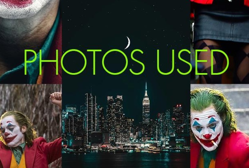
5. Joker project: For the project of this course, I chose the movie Joker, but you don't have to
stick to this film. You can follow
along and work with the same images that
I will be showing in this workflow or feel
free to be creative and pick other images from the
board that I included. Or alternatively, you can also pick a completely
different movie, collect the images that you can work with and create
a composition, either in the same
style that I'm using or you can be again, creative and come up with
a completely unique look. These type of compositions are best put together in photoshop. But just to mix things up a bit, I'm actually going
to use the iPad. So I will be working with
Photoshop on the iPad. However, if you don't have
an iPad, don't worry. You can just work on
Photoshop on the desktop and follow along using
the same techniques. Now, to get started, I am just simply going to
create a new document, and I will work with
an A four portray size for a white background. So these are just
default settings. And once I have my
document ready, I will bring in the images
that I'm going to work with. Starting with the hero
image that's going to be the central piece
of the composition. So I already have these images downloaded or
uploaded on my iPad, so I can just go to photos, and from the album
that I prepared, I will pick this first image. Once it's placed
onto the canvas, I can just tap on done on the top right corner to
accept the placement, and it shows up as a
separate new layer. Now, for the selection, the best one to use would
definitely be select subject. You can access this by double tapping on your selection tool, then tap on select subject, and it will make the
selection already, which we can refine because I see this pool being added to the selection that
we can remove by using the other tool
called object selection. So this is the second one
just after the Lasso tool. And to remove from the
current selection, I just make sure that this
third option is highlighted. And then simply draw over that shape and wait for photoshop
to refine the edge. Now, I feel like it
works perfectly. So we can turn this into a mask with the option
here at the bottom, and that creates a layer
mask from the selection. If I double tap on the mask thumbnail
in the layer spanel, I can have a look
at the mask itself. And I can see that this part
here needs a little bit of refinement for which I
can use the brush tool, and I'm just going to
increase the hardness of this brush and paint over
the edges that I don't need. So I can just refine this
quickly and zooming out. I can take a look at the
rest of the details, and I feel like it
looks quite good. So once again, I can just tap on the layer mask to go back to
seeing my selected image. No matter what images you end
up working with, usually, it is always best to start
with subject selection and then refining it with
the other selection tools, and at the end, once
you have a mask, you can further refine small details by just simply
using the brush tool.
6. Adding shapes to the composition: So we jumped ahead
a bit and we have the three masks ready for
all the three pauses. So if I select any of these, I can still show
how it looks with the background by using this
icon here on the right. Again, this one as well, we can see nothing is
lost at this point. So we have still everything, all the details on the layers. We just hit them with
the layer masks. There's one thing
I really miss in the current version of
Photoshop for iPad, and that is smart objects. So at this point, before resizing and
rotating these layers, what I would do is
to turn them into smart objects if I were
on the desktop version. But unfortunately here,
we don't have them yet. I know it is coming or planned
to be introduced later on. So in a future update, hopefully soon we will get it. But at this moment, we will have to keep on
working like this. And the reason why I'm really
missing smart objects is because by resizing and
rotating these layers, I know I'm losing some quality. So I'm a bit more careful, but I already know the
composition of what I need to do, so I can just simply
use the move tool or select tool and I can
move these layers around. So I'm going to put this
one here on the left. I'm going to move this one here. Slightly down to
somewhere around here. I think that's roughly the
composition I used before. I'm just going to
zoom out a bit and see if we need to move a
little bit everything down. I think it's roughly
in the right position. I'm going to select
all three layers. When you drag right
on the layers, you can select
them all, and then using the move tool now,
we can move them together. But also, we can resize
them with the second tool. So I just go back. The
second one from the top is the free transform
tool with which we can resize the
whole thing a bit. I think something
slightly even smaller will work for this poster,
yes, something like that. I'm going to click on done. And then now we can start
adding some shapes. For this, I'm going to
create a new layer. So tap the little
plus sign here. And then on this layer, again, I'm going to use the Lasso tool. And with the Lasso tool, we will draw the
shape that we need. I'm just going to try to draw it similarly to what
I've done before. Let's try this again. Yeah, something like
that, like a bean shape. I am going to fill
this with a color. Now for the color, I'm going to pick a color from
the image for now. It doesn't really matter
we can change it later. That's going to be fine. I'm going to deselect this now, and I will move this
layer further down. I think I have it
somewhere around here. So just simply change
the stacking order, and then we can move this slightly down,
somewhere around there. Now, the first thing
that I wanted to do here is to create depth, and we already have an
indication of that by having this character here behind the shape while the other
two characters are in front. To make this more interesting, the character on the right, so this one, I would like to have that clipped
into this shape. So all we have to do for that is to create a
selection of the shape. So we can do that from going
into the menu and choose load as selection so that creates a selection
based on the shape. This would be commando control, click on the layer thumbnail
on the desktop version. But it's pretty much
the same thing here. And then after this, I go into the layer
on the right, select the mask and I'm going
to invert the selection. Here at the bottom,
we can tap on invert. Now everything is
selected above the shape. Now we can use the brush tool, maybe make it a
little bit bigger and just paint over
around the edge. Now I'm going to change
my brush back to the normal hard round brush, and then we can just
get rid of all of that. We are masking out
those details, and this helps to
make it look like the character on the right is
standing within this shape. We can now choose D select. I think we can move the
main character down a bit. Yeah. Something like that is more similar to the way
I've created before. Now, I would like to place
a scene into this shape. For that, I'm going to
bring in another image. Go into my album, this scene, I think is a very recognizable
scene from the movie. I'm going to just
maybe a bit smaller. Something like that, tap done, and then I'm going to place
it just above the shape. Let's just drag this down
just above the shape. And then this is
the icon here on the right to create
a clipping mask, so I can turn it off,
turn it back on. And what I want to do is to have Joker visible on the left, but I also want to see
the guy on the right. So they were quite important
in the whole story. I want to make sure that
they are both visible, and it's a quite
nice way of having two interesting details
within the same shape. But then have the characters in the middle divide
the composition. But I don't want this
to be too strong, so I don't want it to be
in its original colors. I would like to use
a gradient on it. So first of all,
what we can do is using these properties
here, the layer properties. Having this layer selected, I can change already
the blend mode. Maybe I can change
it to overlay. Now, this is going
to mix the colors of this layer with the
colors of the shape, which could work really well. And at this point, I can select the layer itself, and use a clipped adjustment
to change the colors. Remember I said the
original colors doesn't really matter because I'm
going to change it anyway. So add clipped
adjustment here in the layer properties and
then choose hue saturation. Now notice that there's
only a limited amount of adjustment layers here, not as many as what you
would get on the desktop, but most of them are here. One thing I'm really
missing is the curves. But hopefully that will
be edited soon as well. For now, I'm just going to
click on hue saturation, and with this, I can
start to change the hue. So you can see already we can experiment with
different colors. And I think I'm going to go with something along
the lines of that. Now, at this point, also, I'm going to change
the background color. I'd like to already set
that up in the beginning. So I'm going to use the
paint bucket tool again. I'm going to tap
on the background, and I will actually change this to something a bit more purple, and I think it needs
to be a little bit more desaturated,
maybe brighter. Yeah. I think that's quite nice. So what we need to make sure is that this
shape is darker. I just go back to the shape
and reduce the lightness. But also, what I'm
going to do is to reduce the opacity
of the image. So the image doesn't
have to be so strong and maybe even
set it to soft light. Okay? Something like that, maybe reduce or increase
the opacity a bit. But then what we can also
do is to add another layer, just an empty layer. This can be on top of
the adjustment layer, can even be above the image. It doesn't really
matter. At this point, maybe I can just put it above. I'm going to use the brush tool and reducing the hardness. You can see we can create a very soft edge for this brush, make the brush size quite
big, something like that. Now we can start introducing
different colors. All I have to do is to
switch to a different color, maybe orange and start
painting over now. It's too strong at the moment. We can reduce the opacity
with this slider here, going to go down and
then paint over it. That's quite nice. Something like that on the top. Then we can make
the color darker. Something like this. With that, we can paint around the edges, and that's already starts to
create a bit more contrast. We can also introduce maybe darker purple
around the edge. Maybe a bit bigger,
something like that.
7. Changing colors on characters: So for now, I'm going to
just keep it at that. And we can already see
how this is working, but I want to also change the colors on the
joker characters. So I'm going to do the
one on the left first. I will select that layer. It's this one here on the left. So I'm going to create a
new layer on top of that, and I'm going to clip it. So I'm going to use
the clipping option. And whenever you see the
little arrow on the thumbnail. That's when it means
it's clipped onto it. So now that it is clipped, we can use instead of the fill
color or the paint bucket, we can switch to
the gradient tool. And this is quite handy that we have it here
because with this, we can create gradients
and it's going to create a gradient
between the two colors, so your foreground
and background color. And you can just paint over
it and it will recognize the direction and you can very quickly set it up
to whatever you want. I'm going to use a
different color. Maybe use something like this. Okay, that's more interesting and then just
reduce the opacity. Because I also want these
to be a bit more faded, so I don't want them to
be so high contrast. So something like this
actually works quite well. But then we can also
combine effects, so we can create a
duplicate of this layer. From the extra options, we can choose duplicate layer. Notice that this is
automatically set up as a clipping layer again and I'm going to choose multiply for this and maybe just
reduce the opacity a bit. So that is quite good. Now, what we can also do is to add the mask on
these gradients. So for example, if I want the face to be a
bit more visible, I can tap on the mask icon and
then using the brush tool, we can paint over the face, maybe with a bit smaller brush
size, something like that. Actually, let's just make
the opacity size bigger. Yeah. So notice how we can lift details and show
the face a bit more. Because I think that's quite important still,
something like that. It doesn't need to
stand out that much. Now, once again, I would do the same thing on
all of the images. The one in the middle, I would keep almost with its
original colors. For that, maybe I would just
use an adjustment layer. So I would going to add
clipped adjustment, most likely hue saturation. But another cool one
is color balance. I'm just going to show
you how it works. So with color balance, you can start adjusting
these three sliders, and once again, this
is very similar to how you would do
this in photoshop. So it works exactly
the same way. You can turn off the luminosity option
or turn it back on. That just helps to keep
the same tonal values. And I think this already
looks quite interesting. So if we turn off this
adjustment layer, that was the original colors, and this is the new colors. So it's almost like adding
a bit of tint to the layer. So I would continue
adding effects like this. But another thing
that I would do at this point already start
to organize my layers. So I would have separate
groups for everything. This is the main composition. So for this, we can just
select all these layers, so I can hold down the little touch shortcut
here on the left and just tap on all of the layers here apart from the
background layer, and then I'm going to click on the little group icon
here on the right, create a layer group, and we can call it jokers Now, another important
shape that we have to create is that ring or circle. For that, I'm going to
again create a new layer, just a simple empty
layer and then use the elliptical
marquee selection tool. Holding down the touch shortcut. I can click and drag
to create the circle. Roughly around that
size will work. Now, after you
created the circle, you can fill this
in with a color. Again, it doesn't really
matter what color, so I'm just going to use
the paint bucket tool. Tap on it, and then what we will do is to click
on the more options. I really like the fact
that they have this. There is the transform
selection option here, and then simply pinch somewhere in the center
of the selection. With this, you can create the
ring, something like that. Tap done on the top right
and then hit the erase. So that's how quick and easy
it was to create this ring. You can use the selection
tool and move this in place. So I think it needs to be
somewhere around here. Maybe we can use
the free transform to make it slightly smaller. And I think that's
going to work. Now, I'm going to already add
to this adjustment layer. Add clip adjustment, and I'm
going to use hue saturation. Let's just increase
the brightness a bit. I'm going to change the color. I use the bright yellow.
Yes, something like that. For now, it's going to work. And I'm going to use
the mask option. So add a layer mask on this. Using the brush tool, I'm going to set my opacity up and also the hardness
all the way up. And then let's just test this brush out yet,
that's going to work. Now, when you are
using the brush, Obviously, you can
just paint over it, and then with this, you
can make it look like certain details are in
front or behind the circle. But to make it even easier, because we already have these
selections saved as masks, all we have to do
is to find them, like with the main joker
character in the middle. I can select that
mask and then go into the extra options and
choose load as selection. Once we have that there, we can go back into
the mask of our ring. And then if I were
to paint over here, you see immediately, it just deletes exactly the
details from the arm. And this makes it look like the arm is in front of the ring. Also, we want the head
to be in front of it, so we can just very
quickly paint over that. And I will keep the other arm
behind the ring to create this nice interaction between
the ring and the character. But then I'm going to make
another selection now. So I would like to
make sure that we have the other
joker selected now. So I do the same technique. So load a selection, and I think that's it. Yeah, load the selection. Now we go back up here. And also, I want to
make sure that we can see him properly. And then I would like
to make sure that the ring goes behind
this other shape. So I could also move the whole
thing behind everything, but then I won't be able to
create these interactions. So that's why I prefer
to do this on top. Anything that I create as
an interlocking shape. I like to keep on
top and instead, just use these mosques. So what I'm going to do is similarly to what I've done
with the joker characters. I select that shape,
the bean shape, and I'm going to load
that as a selection, then go back to the mosque and just quickly paint
over this thing here. So now, what we need to do is to select the other joker
character on the left. So load that as a selection, go up, paint over him. He's also in front. And then I want this also to be behind the
central character. So once again, I just
load that as a selection and make sure I'm on the right
layer, start painting and
8. Adjusting the selections: So we have the interlocking
shape created. We started adding
some adjustments. Now, notice that there is one
issue with the selection in the middle that the shoes are obviously not
completely visible. And that is because he
was standing on stairs. Now, the quickest way
to fix this would be to actually paint
in those details. So I'm going to create
a new layer quickly, and I'm going to
use the brush tool. If you use the touch shortcut, and then drag to the side. It will become the
eyedropper tool, so we can very quickly pick a color and then start painting. So I'm just going to go
a little bit closer, and make the brush
size smaller as well. And in the settings, I will make sure we have the pressure set, maybe also a bit of smoothing. So when I'm painting,
it looks like this. One thing for drawing
that I'm really missing is the ability to rotate the
screen, rotate the view. That's also something that
they plan to add later. I'm really looking
forward to that. Just going to put
this actually on top and that way we can paint over it and blend
it a little bit better. Okay. So this is
just going to be a very rough drawing
just so I can show you how I imagine having
this quick fix. You already see that that shoe
looks quite good already. And then the other one, we have to do a little
bit more work here. So I'm just using the brush. Then again, touch shortcut, pick this color, and then
paint, something like that. Now, you could also use the
clone SM tool for this, but I just feel like I'm faster working with
the brush tool. I try to imagine how
this would look like, probably a bit further out here. And then that needs to come
out as well a bit more. Okay. So I'm not going to
waste too much time on this. Now, I'm going to be just wrapping it up around
somewhere around there. Also, if you hod down the touch shortcut
while you are painting, that temporarily turns into the eraser which
is really handy. So you can paint and then
erase with the same tool. Let's see without
and with this layer. I think it looks quite good. I want to make Joker look
like he's floating in space, almost like he jumped up. I'm going to create another
layer at the bottom, and I will use the lasso tool. Just draw very quickly,
something like that. Fill that in actually on a separate layer.
I forgot to do that. On a separate layer, fill
that in with a color, then deselect, and
then we are going to use this additional
options here. At the moment, we only have two filters here,
Gsmbler and invert. Invert will just
invert the color. But that's not what I wanted. I wanted Gs and blur. So I'm going to create this very soft shadow
because he's up in the air, so it shouldn't be too harsh, the edges of this shadow. And I'm going to yeah
around there is fine. I can adjust the
blur, obviously. I'm just going to keep
it around 70 it done, and I use the free
transform tool and just squeeze this
together a bit, make it a bit more
flat, drag it down, and then reduce the opacity
in the blending options. So there you go. That
looks quite good already. Maybe one additional thing
is to set this to multiply. I think it will blend with
the background a bit better. It doesn't make much difference, but it still, I think
looks slightly better. Now, of course, I can
always tweak this further. But for now, I think
this will work. Now, of course, we
can always check how the whole thing looks
on different backgrounds, so we can create a new duplicate
of the background layer, and then we can fill it in
maybe with a darker color. It looks quite nice
with dark as well. But I'd like to have
several backgrounds, and then I'd like
to experiment with that while I'm working
on the design. Now, going back to the ring, there's an additional thing I
wanted to do there as well. I'm going to select the ring, create a new layer, and this is already
clipped onto the ring. So I'm going to use
the brush tool. And with the brush tool, we
will pick the original color. But then I'm going to change that color and make it darker, make the edges soft, make the size slightly bigger, and the opacity or I'm
going to keep low. Okay. I really like this little selector here on
the left with my left hand. I can very quickly adjust it. And of course, if you are left handed and you draw
with the left hand, then you can move that little
selector to the right side, so you can customize
the location of it. But what I'm going to do
here is to simply paint over this Having the layer on top of the adjustment
will work better. Let's make the size
of the brush bigger. What I'm doing
here, you will see, I'm just adding a little bit of shading with multiply
adjustment layer. I think it works better. I can create a bit of
shading around these parts, make it look like there is some car shadow around
the ring. Very quickly. I'm not going to
waste too much time here as well. There there. Okay. So without and with just a subtle
little addition there. Now, of course, if you feel
like it's a bit too much, you can always reduce the
opacity because once again, this is completely
non destructive. It's on a separate layer. One thing that I find
not that good at this point is that we have
here a very strange thing. I'm going to show you, I
would call this a tangent. So this point here. The problem with
this is that we have a ring coming and then we
have this shape coming, and then we have the jokers trouser also in the same place. So this point here is an
intersection, which is not good. It would be better
to have this ring slightly visible there,
something like that, or maybe have the ring
further going up, so it's not feeling
uncomfortable. That it feels like almost
like a mistake now. So it's good to avoid these, and even this here is a little bit too small
that negative space. So I would make sure if
I have a bit more time, I would refine these
negative spaces as well to make sure
that they read well. Like here, we have a nice
negative space there as well. These are working really well. So I don't feel like there's
a clashing between them.
9. Adding Type: All in all, I think
with the image and the composition we are
already doing quite well, and I'm going to
just very quickly show you how I would
add the typography. For that, we can
use the type tool, and with the type tool, we just click somewhere
on the image, and then I'm going to just
type in a capital S. Actually, we need to have
the text selected, make it white, and then let's increase the phone size
to something like that. Okay. So we have the
first letter there. I actually had
another shape here, which I'm going to very quickly
create in the background, new layer, less so tool. I'm just repeating the same
things that I've done before, so I'm going a
little bit faster. I'm going to create this shape. Okay. And then we
can feel this on this new layer with a color, maybe using an orange. The typography, if we go back to our text layer now has a
place where we can put it. So I'm just going to place
it somewhere around here. I'll just make it
slightly bigger, and for this, we can also
use the free transform tool. Just have to make sure you
drag one of the corner points, otherwise it's going
to stretch it. And by the way, whenever
I'm going back and forth, so I'm redoing undoing things, I just tap with two fingers so that's undo and
with three fingers, you can go ahead,
so that's redo. Now, I'm going to
duplicate this layer, and there's also another
handy shortcut for that. With the touch shortcut, you just press and then
drag to the side of it and then drag the shape or the layer
that you have selected. So that's a quick way of
duplicating something. Let me show this again. So if you just hold down the center of the
touch shortcut, with that, you can
constrain the movement. So that's like holding
down the shift key. But if you then
drag to the site, that becomes the
alter option key, which is to duplicate. So what I'm going
to do now is to double click on the second one, and this is going to be a, then double click
on the thumbnail of the third one,
that's going to be. Then I'm just going to
very quickly duplicate this two more time as
one and another one, and then this one is
going to be L and the other one is going to be
the top one is going to be. The reason why I
created them all in separate layers
because I wanted to create this more dynamic
composition on the text. So we can place the L
somewhere around here, the somewhere around there, and then the M can go
somewhere around here. Now, what I want to make sure is that it will definitely
read in the right order, so I don't want it to be
too complicated to read. Now, I would like to just create a little bit of
interaction on the text, so they are not just sitting
on top of these images. So first of all, maybe the M. I can move further down
in the composition. I think it would work quite
nicely behind that shape. So here you can see
that's quite nice. Make sure it's still legible, so don't hide it too much. I'm just going to keep one of the details behind that shape. And then what I'm going
to do with the letter I is to add a mask on
it. I'll lay a mask. Use the brush tool
set the brush up, make sure it's hard edge
brush, smaller size, and then all I'm going to do here is to paint
over it and make it look like it's hidden under the jacket I gets
smaller as well. Yeah. Something like that. Then an additional layer
on top of this clip it, and then just simply on
this separate layer, we can paint over the top. Okay. And keep adding on it a bit just to create
that depth effect. Something like that.
You can see it feels like the is under the checket. With little bits of
tricks like these, you can create a more unique,
interesting composition. All I would do after this is to refine things and obviously add the additional put on a happy
face on the bottom right. But essentially, these were the techniques I wanted to
show you and you can see that we could create
a composition on photoshop for iPad quite
quickly and efficiently.
10. Conclusion: Well done for
finishing this course. I hope you had just as much fun going through it as
I had recording it. And of course, don't forget
about the class project. Because remember,
practice makes perfect. I can't wait to see your work, so make sure to submit it. And in case you
like this course, and you would like to
learn more from me, then there's plenty of other courses that
you can find here. Go and check them out now. I can't wait to meet
you in the next one.
 Martin Perhiniak, Graphic Designer, Illustrator & Educator