Transcripts
1. Introduction: We delight in the beauty of the butterfly, but rarely admit that changes it has gone through to achieve that beauty. What a fantastic quote from my Angelo. Hi, I'm Samantha and illustrator and YouTube Walker. In this class, I'm sharing you my passion for coloring by teaching you how to create your own butterfly collection through colored illustrations, you'll learn how to color impressively by using a variety of color tones. You'll learn how to work with a black and white console to achieve extra depth and color. And we'll also explore a variety of texture patterns, all with colored pencils. The class is broken into three manageable sections. First, we'll look at the anatomy of a butterfly, so you'll be able to know exactly what essential parts you need in order to have an illustration that is officially classified as a butterfly, or scientifically speaking, a Lepidoptera. Then you'll be practicing the coloring skills we'll be using in this class so you can text them out on some practice swings. And finally, you'll start coloring your butterfly project. I'm providing all the templates that you need so you can truly focus on just practicing your coloring skills. Like to draw your own butterflies. That's awesome. But if you're not comfortable drawing, you can just use the templates that I'm providing in this class. By the end, you will have a beautiful collection of three butterflies that you have colored that you can just slay and frame to hang on your wall or you can give to a friend for a beautiful gift. There are no essential skills needed for this class. If you do have previous coloring or drawing experience, that can be helpful. But I'm going to show you everything you need to do to follow my coloring process. So feel free to take this. Even if you are a complete beginner, you'll be able to conquer so many projects like birds, small animals in more butterflies, botanical flowers. The possibilities of drawing with nature are truly endless. Are you ready to start your first nature collection today? Join me on this journey of modern taxonomy.
2. Project: For this class project, you're going to create three butterflies that you are going to design for a collection, just like the one that I'm doing behind me. This is the piece that I'm going to show you in this class. I'm giving you the templates for this exact piece, or I've also created a Pinterest board. You can use that to design your wing patterns, to choose your colors. You do not have to do it like mine is something that you want to display that fits your home and your color theme into core. By the end of the class, you'll be able to frame your work and be able to display it on your wall, just like I've done here and have a beautiful piece to enjoy, just like the Victorians did and the 1800s and the 1800's only it's been modernized. So we are not harming our animal species in any way. The focus of this class really is to enhance your coloring skills and your techniques. We'll be working with coloring in layers, creating contrast, learning how to work with lights and dark tones to create extra depth and really enhance your work to give it that wow factor. And we'll also be exploring a variety of textures that you can use, all with colored pencil. Once you become familiar with this coloring process, you can really apply it to anything that you want to color no matter how big or how small the project is. And most importantly, you'll feel confident with how to approach the coloring technique and process. So you can actually achieve this style and texture that you want in your piece. The project gallery is for you to post pictures of your progress and project. Post a picture after you've completed your wing practice midway through your butterfly project, at the end of your butterfly project. And lastly, you can post a picture of your framed work in your home, mounted on your wall or wherever you are displaying it. Next up, let's talk about the supplies you're going to need for this class.
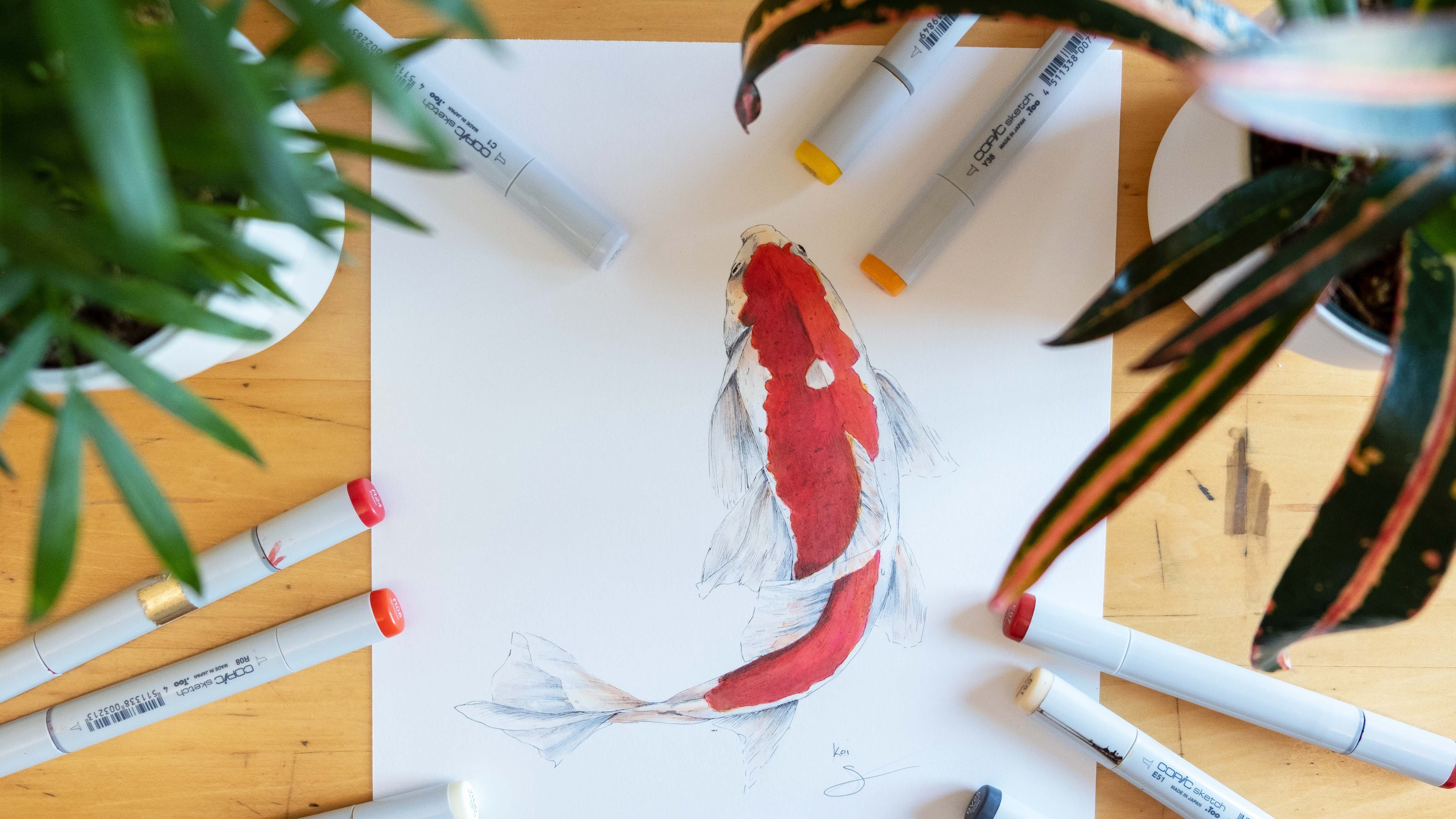
3. Supplies: Let's review the supplies you'll need before you start coloring. First up, a variety of colored pencil shades. I'll be using three types of pencils. The first is a very fine point, very thin pencil, some Faber Castell pencils and Prismacolor pencils, but feel free to use whatever brand you like most. And I'll show you some of the benefits of each of the three types I'm using. Favorite, Castillo is my favorite because they give the least amount of pencil flakes on your page. And prismacolor has the widest variety of color tones. I often will use prismacolor, especially for a purple shades because the purple tones are quite limited within the Faber Castile collection. Prismacolor are a lot softer and the tip, so they do break easier. And the very thins are best for creating really fine lines and sharp T tails because they are such a hard pointed tip. If you took my previous class where we made the floral stickers, you are familiar with coloring cards. I'm using these so I have a reference with all of the exact shades that I'll have in my project. And it just eliminates trying to guess and find the colors that you're using. Plus it also gives you a really nice visual shade before you're actually putting that color onto your illustration. I have a ton of color pencils to choose from. You certainly don't have to have this many color options. It's nice to have three to five shades available for each of the color tones you choose for your project. Copic markers are completely optional. I'll be using them to create my base color. If you don't have Copic markers, you can do this entirely with colored pencil and it'll still be completely beautiful. Artist's tape is helpful to attack your page to your art board just so it doesn't move around. You'll need a pencil sharpener and eraser, just the basic supplies, some plain drawing paper to sketch out. Or you can use a journal like I have here. I really love using this one that has my name on it, but use whatever kind of paper you like best just to do your, your sketch practice. Transfer paper is helpful, especially if you are using a journal so you don't have to tear out your page. For our fine art paper that will be coloring on, you want to make sure you use something like Bristol Strathmore 500 Series paper. I think this is the best paper for coloring and blending because it's nice and smooth and it really blends in like butter when you are trying to mix colors. And then up next we're going to cover a very brief history of taxonomy and you'll learn what it means to be a modern taxonomists. So join me there when you're ready.
4. A Brief History: First of all, I want to assure you that this is not a history class, this is decidedly an art class, and specifically it is a coloring focused class. But I do think it's important to explore a little bit of the history behind this modern taxonomy so we can see where it came from in the past and explore why it's such a great thing to do now and keep it going. So tradition in the future, but in a more modernized friendly approach, butterfly collecting has actually been around since the 16 hundreds when scientists would collect live butterfly species to classify them and study them into a different organization of different types. And they also were examining them for medical benefits, which I found very interesting. And that was something I am personally did not know before I started researching butterflies. Later on the idea of this butterfly collecting and a showy kind of ornamental display was started in the 1800s when the Victorians would go out into the meadows and they would collect butterflies for their beauty. And then they would bring them home, mount them and display them into showcase on their wall. If you're interested in amazing and empowered women in history, you might be interested to know that a woman named Margaret found teen was a famous female butterfly collector, which is called a Lepidoptera. Just a Lepidoptera just as someone who collects butterflies or models to study them and get to note the different varieties. And she was a woman who have independent means. She was a single woman who went out and explored all kinds of different countries simply to collect and enjoy butterflies. Because you are going through this class with me. You are officially from this point forward a Lepidoptera, just like I mentioned, Lepidoptera is someone who is collecting and studying butterflies and that's exactly what you're doing with me. The term Lepidoptera is the Greek word which is used to actually refer to the butterfly and moth species. It literally means scaled wing. And scaled wings are the patterns of the wings that butterfly has. They actually do have a sort of texture that is on their wings. If you've ever touched a butterfly, you'll notice that kind of powdery substance that comes off and that's from the scaled wing. One thing that's interesting is that scaled wing will give a certain texture, almost a feathery like appearance to the wing and certain portions. And we will explore some different coloring techniques that you can use to create that feathery effect on your butterfly wing. I've mentioned a little bit about this, but you've probably been wondering, why is this class called modern taxonomy. Why modern and wide taxonomy, as I mentioned in Victorian times, the collecting and mounting of real butterfly specimen, that process is referred to as taxidermy because you are killing species to mount them for a collection. And today's modernized world, it is entirely unnecessary to kill any species, especially for the selfish reason of mounting it on your wall to enjoy it. This class is taxonomy and not tax at Derby because we're not killing any animals. We're simply looking at the different species to draw our collections. And anytime you are classifying species, It's taxonomy, which just literally means the class of different species. This idea of modern taxonomy is something that I've recently started because it's such a wonderful hobby you that introduces you to the different species and it's an animal friendly way to enjoy their beauty and also practice your coloring skills. At the same time, it can be quite difficult to take your own photographs of butterflies. So to solve that problem, I've created a Pinterest board. It's really hard to take photographs, number one, because butterflies are so fast if you try to capture them, they often fly too quickly and your photo turns out blurry, which is what always happens to me. Or secondly, many of us live in a city or an area where we don't have butterflies available to explore and view all the time. So definitely use the Pinterest board as you're coloring that will help you see where you have light areas and dark areas within your wing. And the next time someone asks you, what do you do for a living? Try this me. I'm a lip adopt trust, currently studying the rare and exotic species of Lepidoptera. Up next, we'll enjoy a quick review of some butterfly anatomy before we move on to our first coloring practice.
5. Anatomy: In this situation, just to kind of lepidotrichia. Today, I am dressed up as a modern vintage Lepage OK, trust, like I am from the Victorian era, only existing in today's modern society. And the thing I love about this as dressing up really helps you get an ad creative mood and totally immerses you into the project that you're working on for this, I want to feel like I'm completely engulfed. Like I'm actually studying scientific Lepidoptera. I've drawn some essential reference images for us to look at, to help us explore the essential parts that every butterfly needs in order to be categorized as a butterfly, the body is divided into three main sections with the head here before ax is the chest area or the mid section and then the abdomen is your tail end. The arrangement and the size, the spread of the wing span, all of that can be quite varied. And this class, we're using these butterflies like the images from the Pinterest page as a reference. So that means that you as the artist, are free to experiment and play around with your wing patterns and the actual design. Feel free to change up the colors. You can combine different wing patterns if you like, so it doesn't have to match the actual Pinterest images exactly. You can switch things up, make them whimsical colors, or just pick and choose the patterns that you want on your butterfly. And you'll notice for the butterflies I've drawn behind me here, they don't have any legs showing because when you look at butterflies from that angle, you can't see their legs. So unless you're drawing your butterfly from a side view, you don't need to worry even about the six legs up they have. So my pupil let the dog trust, are you ready to dive into some coloring? Join me for the next lesson where we're going to cover off first.
6. Wing Practice: Coloring in Layers: The first thing I'm gonna do is put down some artist's tape to keep my paper and place on my art board. And this will help so that the paper doesn't shift around and cause me to make mistakes from the paper moving. It's easy to remove this tooth won't damage your paper like ordinary tape. For this practice, I want you to just pick one color. I'll be using this brown color for this particular practice, but you can choose any color that you'd like. We'll only be using one pencil for this exercise because I want you to feel the shading and layering process with a single color tone. Before we start adding in multiple color tones. You can just draw a triangle on your page for this. Or you can print out and trace the practice file from the class resources section, which has these exact templates that I'm using. First step is to lightly outline your triangle wing like I'm doing here. And then softly mark out the areas where you want to add your butterfly markings. I'm doing an edge here and some oblong shapes and the corners and at the wings center. And I know it's kind of hard to see right now because I'm keeping it super light. And that's what you wanna do is keep this step very, very faint to start. Then you can go ahead and start filling in your shapes very softly. The key here is we are adding color in layers. So this is just the base color that we're working with. So we want to keep it very light and think of it as just a, really a way to mark out our spaces. Once we have our base layer, we can start adding more layers to create darker tones. And I think I want this area here to be a little bit darker, so I'm going to start working with that in circular motions to keep it nice and light and blended, but it'll slowly add another layer over the top. If you work in circular motions, you can make the color appear smoother. If you work in back and forth motions are straight lines. It might give your work on more feathered look which we will be using later. But for anything that you want to look soft, definitely use circular motions to get that really blended appearance. And I'm going to keep my background very faint just so it adds more contrast and comparison with my wing markings here. And we're not done yet. Get your wing to a place where you're happy with sort of a medium range of color. And then go ahead and head on over to the next video. Because in that video I'll show you how to add even more depth and more detail and contrast using the power of a black and white pencil.
7. Wing Practice: Black & White: One of my favorite ways to add contrast is using black and white. For this, I'm using my favorite Castile pencils, but prismacolor works really well for this two. Starting with the black, I'm going to add a very light layer just to the places and the wing markings for I want the darkest color tone. Don't press down hard. Just really the purpose here is to add the darker tone, but you don't want to make any harsh lines because it won't appear to be blended. So just lightly add the black color to all the areas where you want your darkest markings. Now to make it look more blended, we're going to take the same color pencil that you used in the previous video. So for me that means I'm using my brown pencil again. And I'm going to go back over the black areas that I just added. And I'm going to add another layer of brown over the top. What this does is it mixes in the black tone so that it now appears to be your darkest brown shade. Why is this helpful? Well, you can add as much color as you want with this brown pencil, but it's only going to get so dark, even if you keep trying to add more and more layers to certain areas, it will only get as dark until it's eventually saturated. And then what happens is the paper will be fully absorbed with color. And if you keep trying to darken it there, you'll actually end up just putting a hole into your page. So to get that extra little bit of darker color to add more contrast, you can add that slight layer of dark black and then mix in your original shape over the top of that and it will change it to whatever color you're using. In this case, it will look dark brown. We can now do the opposite effect by adding white over something. When I put a layer of white over this area here, it's going to actually soften up the whole marketing. So this is a great technique to use whenever you need help blending colors together. Or also if you just really want to add some emphasis to the lightness of certain areas. Lots of butterflies also have what I like to call a feathery appearance. And this is where the colors almost seemed fuzzy, where they're blending together. If you look, you can really see in the markings where the black trim comes into the butterflies and the really dark colors, they will often have this sort of feathery blended appearance. So to create this look, you can actually take your black pencil and just make very short, simple straight lines and straight strokes, keeping them really close together. And try to just follow it in nice curved line like I'm doing here. Some will be a little longer and some little shorter than others. That's actually good because that's what will give it that feathery texture. Minds are really effective for creating these fine details. You can use them here to help increase the contrast of a darker appearance and using lines for veins and your wings really helps them look more realistic. So these are just simple lines I've added here what these veins, but see how much texture they've added into the wing. Post a picture of your progress from this exercise in the student project gallery.
8. Design & Plan: Now we can get started planning your final project. To do this, you're going to need your sketch book like this one, or just some plain drawing paper is fine. The Pinterest board is going to be a tremendous help as you start sketching out and planning your project. Even if you're not doing any sketches and you're just using the template that I provide. You still have to think about your color planning. So use that Pinterest board to help generate some ideas and get you motivated. I have created a traceable template for you that is exactly the same as the butterflies that I'm sketching out for my final project. You can download that and trace it onto your fine art paper. That's perfectly fine. This class was all about coloring. So really I want you to do whatever makes you comfortable to focus on perfecting your coloring techniques. Since I'm doing this linear design, I drew out three butterflies and then I transfer them onto some transfer paper here, which I have drawn a straight line down the center to make sure I evenly spaced the center of each butterfly and then I planned it. So I had the heaviest butterfly on the bottom. This one is a little wider but he's shorter so it looks a little lighter. And then the lightest, smallest butterfly on the top. So it kind of gives us a slight increase as you go up and everything is on a vertical line. If you don't want to do a vertical line like this, you can do three sporadically space. You could do them linear, but if you are doing anything vertical or linear, definitely make sure you put down some kind of ruler markings so you can line them up in space your butterflies out evenly. And these are routinely in my art journal. Here. These were the three that I had sketched out in my art journal, but I complete took this transfer paper. Who's the ground, put it over the top of each one. So I could easily traced the butterflies and get them exactly how I wanted them arranged on my case. And that's how I space them here. Now I will go ahead and use my light box, and I'll use this piece of paper to go ahead and draw out my butterflies with a nice piece of paper on top of this so I can easily trace. If you don't have a light box like this, just tap this paper up to a window and put your nice paper over the top of that. It will work perfectly fine through tons of images of real life butterflies. And I'm going back and forth between two ideas. I tested out some colors on this illustration here. And it's beautiful. I think it looks lovely, but I wanted something a little livelier and brighter up here for my cottage home. So I started thinking about doing a rainbow scheme. I really like that idea of getting creative with my artistic license and going with the rainbow scheme that really draw off and a lot of vibrant color into this room. Shoot something that gets you excited and motivated. That's the most important thing is to keep that passion going. To test out some colors if you're not sure what you're doing onto your sketches, make your color car use the Pinterest board, do whatever you can to get a good plan in mind before moving on to the next step, finished getting your butterfly illustrations together. Have your color plan and mind and join me for the next lesson when you're ready.
9. Red, Orange, Yellow: Base Layer: I suggest watching this video all the way through, then watch again and color along with me, pausing as needed. Having an idea of what you want to create before you start will help you color plan your butterfly. The first thing I recommend you do is create a color card so you have a reference for all the colors you want to use in your butterfly. This is really helpful because it allows you to see the colors before you physically put them into your illustration. It's a great way to help you color, plan, and visualize what your butterfly is going to look like. Just like we did in our practice. We're going to get down a base layer. I've already done one side of my wing and here's how I did it. If you're using Copic markers, it can be helpful to outline small areas like this with the colored pencil before you use the Copic marker, this little block off the space and prevent the marker from bleeding into areas where you don't want it. Then you can add your Copic marker and fill in the entire section so you have a nice base layer. For the upper section of my wing, I want to add light colored yellow. I tried this one on my color card and realized that it was much too vibrant. This color would be really difficult to tone down, so I decided to go with a much lighter shade here. Same process as before. I'm just going to outline the area and light yellow and fill it in with my copic base color or fill it in with your colored pencil if you're not using capex, the rest of the butterfly is going to follow the same process. Outline your section, fill it in with your base color. We're not really concerned with adding any depth right now. We're really just getting down color planning and marking out the different color areas will add all the depth and texture and details in a future lesson. If you're not sure where you wanna put your colors, you can use the Pinterest board to see where butterflies have light and dark areas in their wing. Fill in the body with just a very neutral color. We'll go over the body of butterflies and one of our last videos. Even though this butterfly is in my red, orange, and yellow rainbow scheme, I decided I want to add a pop of blue for some vibrant contrast. I've seen this strong contrast and real butterflies. And it looks so stunning. Less my butterfly is focusing on this rainbow pattern. So adding this little bit of blue will lead in nicely with my blue and green butterfly and that I am putting above this one. Keep working on your base color until you filled in all of your spaces and when you're happy with your design, join me in the next lesson, we'll start coloring the base tones for your second butterfly.
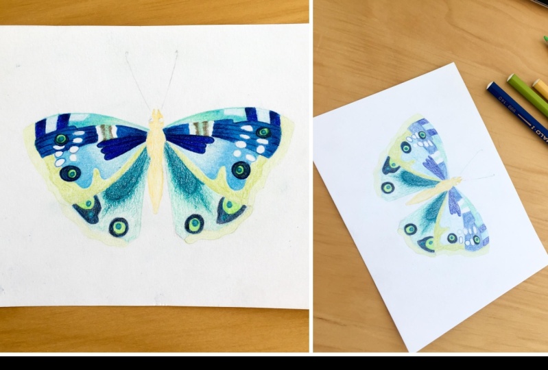
10. Green & Blue: Base Layer: For the next step in my rainbow scheme, I'm focusing on a variety of blue and green tones. Three greens, three to four aqua colors, and three to four blues. Again, feel free to follow along with this rainbow scheme or choose your own color palette. Since this butterfly has a lot of tiny details, I'm definitely going to outline in pencil before I put my copic marker down. The other nice thing about doing this as it can really help you remember what color you've chosen for a specific area and with so many sections and markings on your page like this, it's easy to get the markings confused, so this will help you remember the whole purpose of your base is to get down your first layer of color. So whether you're using these Copic markers for this or all colored pencil. Don't worry about adding any details yet. In the workplace. Here's something interesting for this portion of the wing, I know that I wanted to add some of the feathering technique that we worked on in our practice. So I'll put on my darkest Copic color here. The background is the lightest color. And then I'm going to sort of fade into that lighter tone from the dark into the light. So I'll add a medium shade to do that. And I really want the mark in this area to be feathery. So just like the teardrop shape we worked on in our practice, I'm going to go over this with my darkest color and a back-and-forth motions. So the color will actually bleed a little bit into the other colors. If you're working with capex, this technique helps that ink bleed out, which will enhance our feathery appearance that we'll be adding later on. Keep filling in all your background tones and your markings with the colors you want. In general, It's a good idea to have a contrast so you notice the fine lines and details within your wing. If you're markings are dark, then use a white background. If you have light markings and go with a dark background. I've intentionally left the four markings on the upper wing white because I want those to be mostly white with just a slight tend to blue. We'll work on that section when we discuss details and one of our upcoming videos. Up next, I'll show you a time-lapse of the purple, pink, and gray tones I'm using for the third butterfly. There aren't any new techniques for the next video, I'll use a combination of everything you've seen from the previous videos, but I still want you to see and enjoy the process and to use it as inspiration for your own project.
11. Purple, Pink, & Grey: Timelapse: Hello. And that's all. Hi. The second specimen. Resistance. Traits. Stable conformation of the receptor.
12. Red, Orange, Yellow: Depth + Contrast: This is where you'll really get to explore the power of your colored pencils. This is the variety of tones that I'll be using for my red, orange, and yellow themed butterfly. And you can see that I have about three to four tone varieties for each color I'm using. Think of choosing a light, medium and dark for each color. It's especially important to keep your pencil tip sharp when you're doing details. Don't get lazy about this and let it wear down too much. I sharp pencil will really help you get those nice, clean sharp lines and edges. And that is what is really going to help you emphasize your contrast. I'm starting with my dark red and I'm adding a light layer to all of the points where I want my wing to have some darker spots. I'm not coloring in the entire area. I'm just adding it to the spots where I want that darkest red to appear. Now I can go back over it with my black pencil to enhance the red and get it even darker. So just add a very light layer of black here over the places where you want to add your darkest red pencil, then you can go back and like we did with the practice and go over that with another layer of the dark red on top of the black pencil. This will mixture two colors together so the black tone is no longer blank, but it actually appears to be an even darker read every section of the wing as an opportunity to play with color. So with this orange section and look even prettier if we fade this into a lighter orange and even a slight butter yellow color. For contrast, I want these lines between the orange sections to have a lot of depth. So I'm gonna go in here with my black pencil and really enhance the colors. So it almost looks like it fades into a deep blood red. For these blue dots, I want them to look a little bit feathered and kind of blended in with the red area of the wing. So I'm using my darker blue to mix a little of the red and the blue together. And I will then add the lighter blue shade into the center. The rest of the wing follows the same process. So for this yellow portion, I'm starting light by adding just a little bit of the darker yellow to the corners and the edges. In general corners, edges, lines, those are good areas to add your contrast. And then for the line sections, I want the lines to look like veins on the wing here. So I can use a little bit darker brown to enhance them just in a very sharp thin line. And I can do the exact same thing repeated in this golden section, but I can add a little darker tone to the edges in the corners to accentuate the veins of lines as a darker brown shade. Keep working this way, adding layers of color until you've gone over all of the remaining areas of both sides of your wings. And remember it's like an algebra equation. Whatever you do to one side you do to the other side, leaves the body plane for now because in the next video, we'll start working on details for our second butterfly and we'll come back to color all three of the bodies at the very end.
13. Green & Blue: Feathering + Blending: For this video, we'll focus specifically on feathering and blending. I've already started coloring the circular markings here and the background of the upper wing, following the same process we worked on in the previous video. Here you can see I'm using my white pencil to enhance the lightest areas. So it looks like it's fading from a medium blue into a faint baby blue shade. And on this section of the upper wing, I want this strip to have that feathery appearance like it's fuzzy. So I'm going to use my small straight lines just like we did in the practice. And then I'll go over it with a white color to soften it up and enhance the white areas. Now, let's add more texture to the lower wing. I want this section to have those straight vein lines. This is where your sharp pencil tip is essential. And this dark teal area, I want this whole teardrop shape to appear feathery and fuzzy. So I'll just add a light layer of this aqua teal into the lightest aqua area. And if you do get your color a little bit too dark here, you can always go over it with white. I'll keep this feathery look in the bottom markings as well. And for this section, I'm making it more faint at the bottom because I really want the focus to be on the teal colored tool drop section where the colors, the most concentrated. Stop and examine your butterfly, often step away from it for a minute, come back because you might notice that you want certain areas to be lighter or darker. I noticed that I want a lot of contrast on the edge of my wings. So I'm going to switch between a very dark green and a black shape here. And I've also changed my mind about the feathery gray portion. I felt that looked a little too dull. So I changed my mind to go from a gray to contrast it with a darker blue. And now the colors really going to pop because I have that dark blue there and the color tone is so different from the light, whitish, kinda blue portion. Sometimes life brings little interruptions. Whenever this happens, I take time to enjoy the moment. Breaks are good because they help refresh your mind. When you come back to your work, you might notice something you didn't see before. So take breaks as you need them and always treasure the precious little moments. Next step, we'll tackle our third butterfly.
14. Purple, Pink, & Grey: Highlights + Veins: This butterfly has a lot of detailed line markings and veins. So we'll focus on ways to achieve that affective look. Just like we did in all the previous videos. You're going to start by marking out your areas lightly. Remember, you can always go back and boost the color later on. You just really want to get a visual reference here for where your light and dark tones will be. The nice thing about doing this light is that it is a lot easier to fix a mistake if you do something you don't like. If you're pressing really hard and getting a lot of heavy color down right away. It's going to be so much harder to blend and fix it and you risk over saturating your paper and putting a hole in it. So keep it light. I love this part logo. What happens when I take this flat section and start adding some simple veins? It gains a ton of interest and starts to look more realistic. Veins are really interesting because they also have light and dark areas. So you can go over some of them with a little bit darker shade to enhance the deeper tone and make it look like the vein is fading from dark into the light. I really like the dark accents on this butterfly and the light background here. So I'm going to make all of my markings and varying shades of dark tones. Gray is really helpful for this because you can start with gray as a light base color just to get down your pattern. And then you can go back over that with the darker shade. If you're working in patterns like this, focus on getting your background done first, then add the darkest markings Azure. Final step. Here I'm using a variety of dark purple tones, working with the butterfly like this one. The markings are the final details. Again, take a break, reflect on your work if needed, when you're ready, come back and we'll focus on coloring the bodies of our butterflies.
15. #Bodies: To create the butterfly bodies, you'll be applying all the concepts you've learned from this class. As a challenge, I suggest trying to keep each body unique. This creates interest in your piece, and it really is true to life because real life butterflies are all very different, even in their bodies. For this first body, I'll start with my black pencil and softly mark out some of the areas where I want the darker layers. And using my feathering technique here to create some simple straight lines. And when you look at real butterflies, you'll notice that they have a portion on the side of their thorax where the body actually blends in with the wing color. My wing portion is orange, so I'm going to take that orange tone and blend a little bit into the side of my butterflies body. Add layers of color, switch between your light and dark shades, mixture tones together, do whatever you need an order to get the appearance that looks good to your eye. Use the Pinterest board as a reference if you need help for what different butterfly bodies look like. I'm going to give my green and blue butterfly a completely different look. He has one of those exoskeletons shells with this circular patterns. So I'm adding a lot of color layers to create the depth of this linear marking around his exoskeleton. And I'm also drawing in some green and teal color so that his body matches the color of his wings. Lastly, the pinky purple butterfly is going to have a dot sort of pattern to match the dotted markings in the wings. And I'm using a variety of blues, light grays, and black here. The final step is to create the antenna. Two important things here. One, a sharp pencil tip is essential. Number two is patients. Take your time. The sharper your pencil tip, the smoother and cleaner your antenna will appear. It takes time to do this because you do want to press lightly. If you press down too hard, you risk breaking your pencil tip and that can cause you to accidentally just strike your page with the pencil. Then you get a mark on your page. The frustration sets in. It's just not pretty. So be kind to yourself, spare your nerves. Thrombin, upset a disaster with that. Go slowly and you'll be fine. I'm going over the antenna and layers just like we did with the rest of the butterfly and slowly getting them darker. Small strokes can really help with this as well. Remember to keep that pencil tip sharpened often just a half a turn on your sharpener will do it. You can add some small circles at the antenna tips to make them a little thicker here. Or you can just sort of increase the width at the end. I'm using a brown pencil instead of black because I like this softer look that brown ads. And really just depends on your preference. O happy with how this turned out. As I mentioned, this is the first group of butterflies that I've created and my butterfly collection, and I can't wait to work on more pieces. I couldn't be happier with us. Next up, we'll put this into a frame so we can proudly display our butterfly beauties. Join me there when you're ready.
16. Frame + Display: In this section of the class, we are going to go over how you can display and frame your work. I have an old frame here that I'm going to show you. This is one. The frame is still really nice and I loved the frame, but I don't really like the style anymore. This is a P50 had done previously years and years and years ago. It's quite old. And hopefully I have progressed. I created this piece and I want to add something that is just a little more updated. So I'm going to repurpose this frame. I'm going to clean it up and then I'm going to be using this to put my butterflies in here. While you're working, just keep your nice clean piece on a clean surface, put a towel down, put a cover on top of it just to you don't mess up any of the areas of your beautiful colored work. Take this off and give it a quick cleaning before I put my new piece in here because I want it to look really crisp and pristine. Can see I've taped this one from before. And I'm going to do that same thing again. So this is what your piece will look like when you're finished. Nice to hold it in place. So it doesn't move anywhere. And it comes right off. Goodbye to this piece. I'm going to take these out because I think it distracts from the artwork and I don't need them. So I'm just going to use this glass piece that actually fits perfectly in there. So I don't even have to do any trimming, which is lovely. If your piece does not fit perfectly like this one. I really thought that I was going to happen trend those one, I'm completely surprised, but this was wonderful. So if you do need to trim out your piece, just put it in here and just make sure that it's in a good placement so its end the center. But wow, I am really shocked that I do not have to trim that. So it is a nice detail, but I do not have to worry about. But just take your time if you do after tram again, just mark where you need to tread lightly on the backend pencil so that way you can center it and it will look beautiful. So I will just pop these into place. We're going to take a look and see what this looks like. Oh, that one popped off. Well, this is an old frame, so it lost relay-based, but it has plenty of others, so it will be fine.
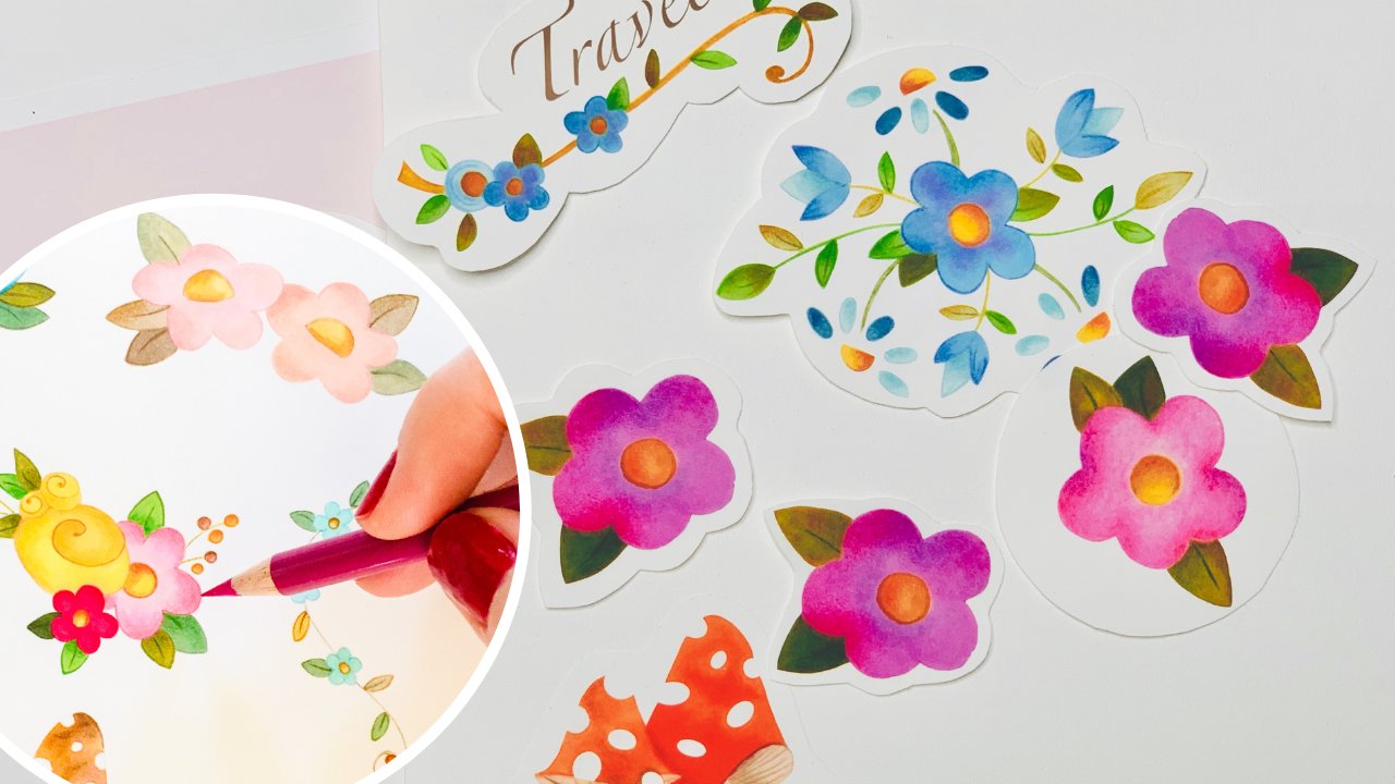
17. Final Thoughts: I hope you've had a wonderful time enjoying an exploring the history of this beautiful past-time presented in a modern way. The fact that I love about modern taxonomy is that it gives you the ability and the skills to keep exploring and loving nature through a beautiful hands on way, whether you're collecting illustrations for flora or fauna, you can now have a way to collect those and enjoy them without harming our environment. Did you know you can also turn them into stickers that you can put on stationary to send out to friends or are used to put on your gift times, or simply to decorate with different labels around your home. If you are interested in finding out how you can turn your butterflies into stickers you can use, you can check out my other Skillshare class where we look at vivid coloring techniques to create stickers. I highly suggest you check that out as well because you don't just have to make stickers. You could also take the same digitizing process to put your butterflies onto stationary and greeting cards. You could put them on two shirts to print logos. Really any product that you want to print or something you want to digitize for the Internet, that class will give you the powerful tools that you need in order to do that. So please check that out. If you enjoyed this class, I would love to hear your feedback. If there's something you'd like to see more of or less over something you think could be better. Feel free to share it with me. I'm always interested in learning to enhance and improve my courses. So we can both enjoy creating more and even better projects together in the future. On a final note, if you'd like to find out when I post more classes because I will definitely be posting more in this taxonomy series as well as other classes for you to enjoy if you'd like to find out when that happens, the best way to do that is hit the Follow button on my teacher profile. That will notify you whenever I have a new class coming out. I also invite you to join me for my weekly vlogs on YouTube where I explore art, I chew travel vlogs and I share my entire creative lifestyle here in Cape Cod and the USA, where I live and enjoy so much beautiful nature that inspires me and surrounds me every day. Mantle Lorraine and the cozy life. The link for that YouTube vlog and all of my social media is in my teacher profile. Thanks so much again for joining me on this journey of modern taxonomy. And I hope to see you back for my next class.
 Samantha Loraine, Illustrator, Artist, YouTube Vlogger