Transcripts
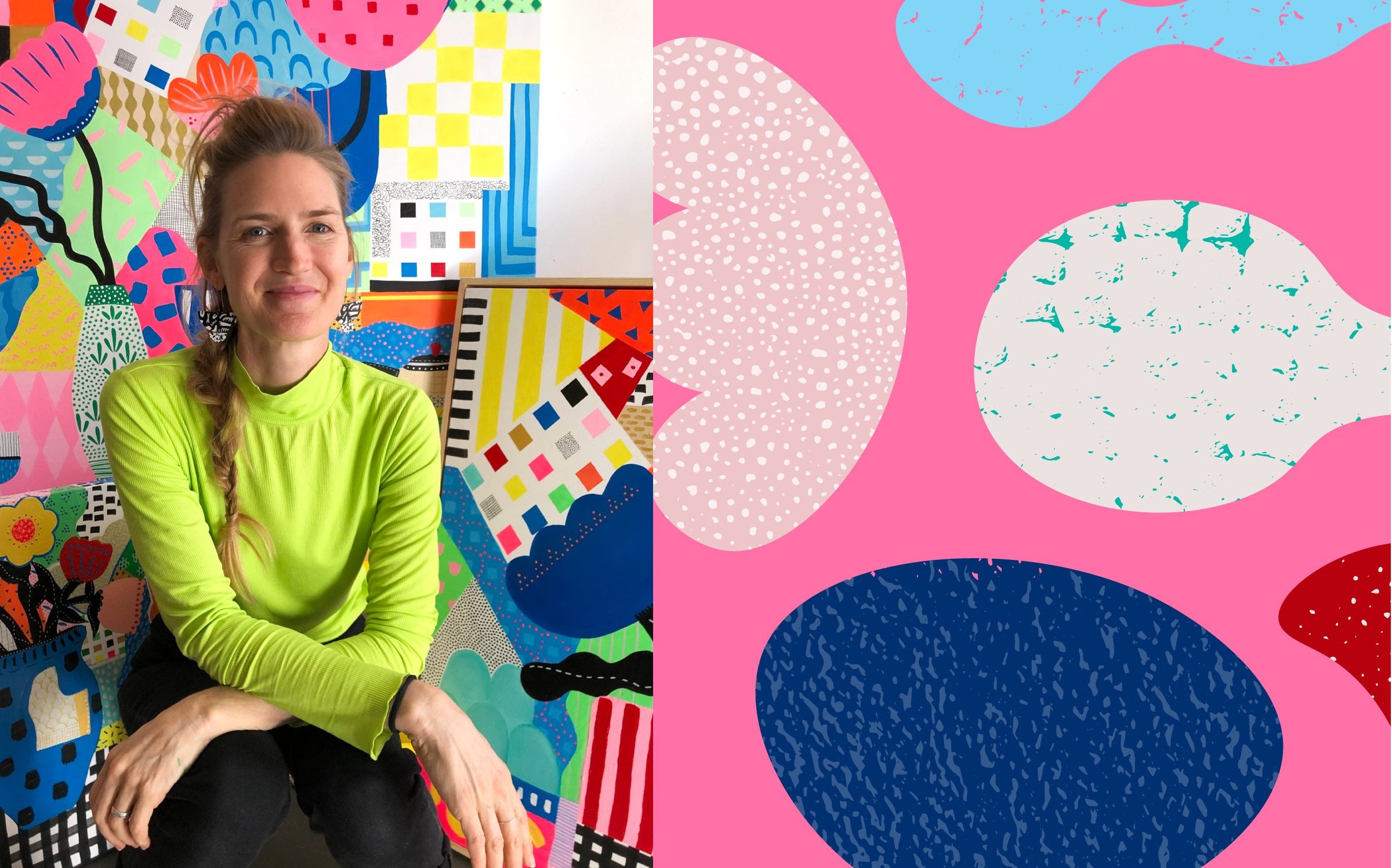
1. Intro bold patterns: Hi, my name is Christina Forest, and I'm an artist and
surface pattern designer from Brisbane Australia. I love creating bold, beautiful artworks and patterns. And today, I'm going to show
you how to create a fun, funky, abstract pattern
in Adobe Illustrator. I absolutely love
making patterns. It's one of those things that once you start, you
just can't stop. There's something so
satisfying about watching a design come together
and repeat seamlessly. It's playful, creative, and I know you're
going to love it.
2. Class project: The class project
will be to create hand drawn shapes
with paper and pen. We'll then bring that
into Adobe Illustrator and create our seamless repeat. Once we've done that, I'll
show you how to create a custom color palette with
colors that stick to you, and then you will
use those colors to recolor your artwork. I would love to see
your class project at the end. Please share.
3. Lesson 1 Drawing Shapes By Hand: To start with,
we're just going to do some simple
drawings on paper. I've just got some
standard printing paper here and a black
acrylic paint pen. You could also use
sharpie or fine liner pen or even black paint
is fine as well. We just need some really
simple shapes for this, don't get carried away with
making it complicated, and you just want
to make sure that every shape you make
is a closed shape, so you're not leaving a gap, for example, if I
was to do a circle, just make sure
you're closing off your shapes properly
so there's no gaps, and I'm just going
to do a triangle. So just feel free to play
around with different shapes. You might want to do
some that aren't shapes, but just lines as
well. So squiggles. So I feel free to just
have fun with this, you can maybe fill
up a few pieces of paper and just come up with some cute little shapes that you're going to
use for your pattern. So I'm pretty happy with that. I'm going to now show you how to digitize that
in the next lesson.
4. Lesson 2 Digitise Your Drawings: We need to take a photo to bring these shapes into
Adobe Illustrator. You can also scan them, but I will often
just take a photo because the contrast between the black and the white
is really strong, and a photo will
be pretty much as good as a scanner anyway,
and a lot quicker. Let's just go ahead now
and take this photo. Just get your phone
and line it up so that the phone's
not on an angle. It's nice and flat
and overlooking the image. And there we are. So once I've got that photo, I then go into it
and I just edit it, press it down the bottom, and then go into
these settings here. I'm going to go to exposure, and I'm going to bring
the exposure right up so that I've got a
really good contrast. And then also I'm going to go to contrast and bring
that right up as well. So now you can see all the
shapes really clearly. Also just going to
crop that little bit of line out where the paper is. It doesn't really
matter, but I'm just going to do it
to get rid of it so that I don't have to
get rid of it later. And done. So the next step is to bring that
into Illustrator, so I'll show you how
to do that next.
5. Lesson 3 Vectorise Your Shapes: Okay, I've opened
up my Illustrator, and now I'm going
to bring the photo in that we took of
our shapes earlier. So I'm going to go
to File and Open, and it should be
in my downloads. There it is. Open. Okay,
so there's our shapes, and at the moment, they're
in a pixelated format. So if I zoom right in, you can see that they get
very blurry around the edges, and they're made up
of tiny little boxes, so that's called pixels. So we want to create a
vectorized version of this, and to do that, we need
to image trace it. So we're going to
go up to window and go down to Image Trace, and this brings
up this box here. So you're going to
choose from the presets. You're going to choose black and white logo and press Okay. Then we're going to go down
to the Ignore color box here, and we want it to ignore
all of the white. And so you can see
this little rectangle here is filled with white. So it's asking
which color we want to ignore and that's the
color that we want to ignore. We've pressed Ignore color. And I'm just also going to change the paths a little
to be a little more smooth. You can decide how you
want your shapes to look. You might want yours
to be a little different to mine, and
that's totally fine. Just whatever you
like to look of, have a little play around
with these sliders here. And then when you're ready, we're going to go up to expand. And now we have these same shapes, but
they're vectorized. So if we zoom right in, you can see we're not getting
that pixelation anymore. Okay, we're going to go over to the tool bar here and we're going to choose the
black arrow tool. You can also press V on your
keyboard for a shortcut. And now we're going
to move these, and you can see that
the moment they're all moving together because
they're in a group. So we need to ungroup them. To ungroup them, we go up
to object and ungroup. So now they're ungrouped, so we can move each one
separately away from each other. So this little group of dashes here I want to keep in a group. So I'm going to go up
to object and group. I could also press
Command G on my keyboard, and that would also group them. So now they're still
grouped together, and everything else is separate. The next step is to fill
these shapes with some color.
6. Lesson 4 Edit Your Shapes: At the moment, it doesn't
matter what colors you choose. You can just choose any
colors because at the end, we're going to go through and
actually color our design. I'm going to go for this
flower shape here first. I'll just zoom in so
you can see it better. Now I'm going to press
Shift M on my keyboard. And you can see
that that's created that dotted area here. So what I'm going to do
is I'm going to drag from the black area and the
outside into the white area, and it's going to fill that
space with color. Like that. So now this is one color. I don't love this bumpier, so I'm going to press
you on my keyboard, and that's the
shortcut for smooth. And I'm just going to drag over it and smooth it out a bit. If it's not smoothing enough, zoom out, it's a
more drastic smooth if you zoom out than
if you zoom in. And I'll just smooth that
out a bit there, too. Now I'm going to press
V again to get back to the black arrow tool and click on the white
to make that happen. Let's do this circle next. We're going to select it
with a black arrow tool and press Shift M and drag in. And you can keep doing that
with all of these shapes now. Just make sure when you finish creating your shape that you go back to the black arrow tool by pressing V on your keyboard. Okay, those shapes are
looking pretty cute now. So let's just keep it
black and white for now. And what we're going to
do is drag over all of them and press Command C or Control C. And then we're
going to go up to file new. And let's just
create a new file. I'm going to make a
file that's 8 " by 8 ", and I'm going to do CMYK color. And high raster effects at
300 PPI and press Create. So now I have this
blank artboard here, which we will be using
to make our pattern. I'm going to get rid
of the image trace box and a few things here. Now I'm going to
press Command V or Control V to paste those
shapes into this file. There they are.
They're quite big. So I'm going to hold
the shift key down while I drag the corner to make my shapes a lot smaller because I want them to work with this small box I've created. If you don't have this
arrow in the corner that I use to change the size here, just go up to view and
make sure that you have show bounding box selected. I've got hide bounding box here because I have my
bounding box selected already. So now if I press hard, you can see that I don't
have that anymore. So view show Bounding box. So we've got our shapes ready, and the next step is to
lay them out as a pattern.
7. Lesson 5 Make A Pattern: So this square here, we call an artboard,
and we're going to use that to lay
out our pattern. So I'm going to just
start by choosing one of these shapes that I've created
and moving it to a corner. And I'm going to
just start arranging these shapes around the
board on this one side. So when we're making
a repeating button, we need to make sure that
everything on this side is placed perfectly on
this side of the board in exactly the same position
so that we can create a repeat that's perfect
without any problems. So these four shapes
I've just popped in, I'm going to move across 8 " because that's the
size of our board. To do that, I'm going to
press Shift Command M, or you can go up to object, transform, move, and it
brings up this move box. Now, we need to move
it 8 " horizontally. And 0 " vertically because we do not want the shapes to
move downwards at all. We want them to stay
in a straight line going exactly 8 " to the right. And we're going to press Copy. Next, we're going to do the same thing with
these top two flowers. We're going to press
Shift Command M, or we're going to go up
to object transform move. So this time, we're going to
move them 0 " horizontally and 8 " vertically because
we're going down this time. So now that flower is in
each corner of the box perfectly placed so that it will repeat when we make our
repeating pattern tile. Now that we've done that,
I'm going to start creating some more spots for
these shapes to go. You don't have to
use everything that you've made. You can
just play around. You might decide you want
to make some bigger. You just use that
shift hold shift down and drag out
the bounding box. And then you can rotate
them by pressing R and just dragging it around to the way
you'd like them to sit. There's a lot of trial
and error with this. You just want to play around. You might want to change
things a fair bit, but this is a good
first step is just to start moving things around
and seeing where you're like, making sure the spacing is nice. There's not too much white
space and that sort of thing. Starting to get a
little bit full now. I'm going to move this
triangle down so that it repeats on this
bottom section here. Again, Shift Command M or Shift Control M on
a PC or object, transform move,
zero horizontally, and 8 " vertically and copy. And that's there. So now
I can see that this is a bit close to that triangle,
so I'm going to move that up. So when you're making
your patterns, you just want to make sure that the space is all working really well with the motifs
so that there's not too much background
in one area. I'm not sure I'm going
to use that squiggle. I might just see how this looks before I do anything else. Next I'm going to go over to the rectangle tool or
press on your keyboard and tap on the white screen and bring up a box
that says rectangle. So now I'm going to make an exactly the same
size rectangle or square in this case, which is going to be 8 "
by 8 " and press Okay. Now it's black,
so at the moment, we won't be able to see
anything if we move that on top of the we can't see. So let's change
the color of that. Just choose any color like. At the moment, it's in
front of the shape, so we need to put it
behind the shapes. So to do that, go up to
object, arrange, center. Now let's just move that
up near the artboard. Now you can see it's not quite lining up with the ardboard. We want it to be
lined up perfectly. So if you don't have
the align toolbar open, go up to window and align and just select that
so that you have it open. And now we're going
to just press a line left and then align
vertically at the top. Now it's perfectly
aligned with the up or once you have it
aligned perfectly, then click on the
background color and press Control or Command
C and then Command B. Now you've got two
blue rectangles, one on top of the other, which you can see
by going to layers, which I had opened, and I just closed Whoops. Layers. And if I click on
this little arrow here, you can see if we go there's all my black shapes and
then at the bottom, you can see we've
got a blue rectangle followed by another
blue rectangle. At the moment, this
little blue box indicates that that's the one that we've got
currently selected. So that's perfect because we want to change the
color of that one. If you don't have
that one selected, you might have
this one selected. Make sure you've got the
very bottom one selected. That's the one we
want to change. So go up to the color
up here that you have chosen and just
select no color. So we want no fill and
no stroke on this box. Now we're going to drag right
over the top of our design, and we're going to drag that over to this
watchers panel here. And now we've made our
first repeating pattern, which is very exciting. So we're going to go back
to the Black Arrow tool. And just click on the background so we don't have this
selected anymore. Now, press on your
keyboard or go up to the rectangle tool here and just drag out a rectangle
as big as you like. And now I'm going to fill that rectangle with the
pattern I just made. And you can see the result of
what we've just done there. It's pretty cute already. There's a few things
I would change. So the layout, I can just see a few areas where there's
a little bit too much yes. For example, in this area here, I feel like I need to maybe move this
squiggle up a little, and let's just do
that for starters, and then we'll see what
else we need to do. I'm just going to
drag over it again, drag it into this
watchers panel and see how that looks.
It's looking better. Now this spot here is
poking its head out to me, so I'm just going to maybe
I'll rotate this flower, which means I'm going to
have to change all of these flowers, but that's okay. I'm going to delete
these flowers here. And I'm just going to rotate this flower by pressing
R on my keyboard. I think I want it to face down. And now I'll just
move it up a little. Now I'm going to
show you how to get these flowers back
into this position because I showed you how to
bring it from the top to the bottom to get it to the top, I'll show you how
to do that next. So we're going to go to
object, transform move, and we're going to go zero horizontally because we don't
want it to go sideways, we only want to
go vertically up. To go vertically up, we
need to go negative 8 ", and that will take it vertically up to the top corner
and press Copy. Now we have that in two corners, and if I select both of them by tapping shift on my keyboard and holding it down while I
select the other flower, and then press object
transform, move again, and we're going to
go negative eight, horizontal and zero
vertically and copy. And now it's in all
four corners again. Let's just see how that looks. I'm going to drag over it all and see if that's
improved or not. Mm it has, but I don't like how there's this gap here
now and the flower is there. So I'm just going to play
around a little bit more, and then once I'm happy with
it, I'll come back to you. So I finished arranging
those motifs, and the next step is to create some bold color on here to get a really fun
pattern happening.
8. Lesson 6 Colouring Your Pattern: I want to create a more
multi colored pattern, so I'm going to change a lot of these black ones to
different colors. Don't worry about which color you're choosing at the moment, but just make sure that you
choose all of the ones on the edge so that they
all have the same color. Otherwise, you'll get a problem. If you don't do that, I'll show you what will happen. At the moment I have
these two pink ones, and these two are black. So if I drag that in here, you'll see that they're
going to be both colors. So we need to make sure
that all of them are selected and change
to the same color. Just use your
generic swatch color in the Swatches
panel at the moment, and don't worry too
much about what colors you're using because we'll
change them afterwards. We don't need these
two shapes here, so I'm just going to get rid of those. And that one there. We don't need those anymore. Alright, so now we've got a multi colored looking pattern. It's not the greatest colors, but it's just to get us started. We'll just drag that over to
the watches panel, as well. So you can see how it's looking. So it's already looking
a bit more fun, but we want to choose
colors that we love. So let's get started
making a color palette.
9. Lesson 7 DIY colour palette: Next, I'm going to
show you how to create your own
custom color palette. So if you just go
over to Pinterest and search for anything colorful, really, you don't want to
steal colors from artworks. But if you can find, like, for example, this
house one here, I'm just going to
take a screenshot on a Mac that is
Shift Command three, and I'm going to use that as
one of my color inspiration. This room's really pretty. I like the colors of
the rugs and the sky. Shift Command three. And I'm just going to crop
that, as well. You can also go
out in your garden and look for
inspiration out there. I love this picture here, so I'm going to screenshot that. And I'm just going
to crop it down, so this is not so big. Take your time and try to find colors that you
really like the feel of. I like the look of
this house here. That's a nice color. We're just getting a bit of a
mood board together. So I found some cute
pictures on Pinterest, and I'm just going
to add them all to the same page by
copying and pasting. They've just got some
colors that I really like. So another way to do this
is to go out and get inspiration from places
in the natural world. Maybe you want to go take
some photos of the garden. This is just a
quick and easy way to work on a color palette. So I'm just going to
paste those images into this place where we've
got our I've just copied them and
press Command V to paste or you can go to
edit and paste here. So now we're going to just create our own unique
color palettes. So press your tool and drag out, press Shift to get
a nice square box. And now I'm going to just
with my black arrow tool, select that box and drag it down by pressing the
option key or the old key. And now, if you just press
Control or Command D, you can keep going
and then option, drag it out, and there
we have some boxes. Okay, we're going to
feel these boxes up with color that we see on these
images that we like. So press V and select
your first box. Then press I, and we
have the IdrapperTol, and you can see that over
on the left here as well. I'm just going to start grabbing colors from these images. Now I'm going to
select the next one, pressing V to get
the black arrow, then press I and select
nice blue for the sky here. Press V, then press I V, then I V. I I'm just choosing
colors that I like the look of that I think
might work well together. It's good to have
a combination of dark and light
colors so that you can have good contrast
in your images. I feel like that's a
pretty nice selection. I might just make one more square because I
want a bit of red. From there, you can adjust
these colors a bit by clicking on them
and going over to this square in the left
and double clicking. It brings up this box here. I think I want it to be
more of a white color. And I think I want this screen
to be a bit more vibrant. So I'm going to now select all of those squares
that I've just made, and I'm going to press this
new squatchGroup folder. We'll just call it
bold and press okay. And now you can see that I
have all of these colors here. So we can get rid of these now and we can get rid of these. And now we can have a
look at our pattern again and let's color it.
10. Lesson 8 Recolour Artwork Tool: So we want to make a beautiful,
bright bold pattern. So to do that,
we're going to use this colour group
that we've created. Now, select your pattern, and then we're going up to
the recolor artwork tool. And you can see,
these are all of the colors that are
currently in the design. We've also got black, and you can see that
there's no arrow there, so we need to go up here
and tick both of these. And now black is also editable. And now you can click on the color palette that
you made earlier, and you can start
sifting through these. I really like that, so
I'm going to press Okay. So you can see that that's added that color way to
my swatches panel. I'm going to go back into
the recolor artwork tool and I'm going to check the
bold pattern again, and I'm going to keep sifting through to find
others that I like. I like the lighter background. I feel like this
color is too light. So I'm going to change it to a different color
maybe a orange. And I think I want this
to be more yellow.
11. Lesson 9 Deeper Editing: So you can have so much fun with the rear color artwork tool. You can just play around with it and decide which colors
you really like. You might want to take it down so that there's less colors. If that's the case, for example, I'm going to take mine
down to five colors, and you just need to also click the scale Tints box or
else you're going to start losing some of your
motives and press apply to all and just have both of those selected
and then press o. Now you should be able to
see all of your colors. So I quite like a more limited
color palette sometimes. I even want to take
it down to four. Let's try again. I'm pretty
happy with that one. I just want to do
some extra changes, and I'm going to show
you how to do that. So I'm going to drag that swatch out here now so that
I can get in and just change some of these colors
a little more because I actually really want to see
some red next to that pink. So I need to ungroup this
because at the moment, it's all grouped
together again when I drag it out of the
swatches panel. So to ungroup it
go up to object, ungroup, and now I can move
these around if I wanted to. I don't want to move
them. I just want to select them and
change the colors. I'm just gonna see how
it looks to add a bit of my own touch to
these colors as well. Let's try that again. Yeah, I don't love the red
now that I'm looking at it. So really, it is just having
a play around with things, and you decide as you go
how you want it to look. This can take a long time, but just enjoy this process of just playing with colors
because it's so much fun. Think about what
colors speak to you, which ones you
really love to see. Which ones make you feel really good 'cause that's a
good place to start.
12. Lesson 10 Further Colour Refining: You can also use the
recolor artwork tool in a different way
where you actually switch between the colors
that you have selected. You can see it can start
to look a bit blockish. Can you see how the pink ones
are looking a bit obvious? So I feel like I want to make
this one pink or actually, no, this one pink, just to make the pink have
a bit more movement. Yep, so that's that one there. So what I'm going to
do is drag this pink into that box to make
a bit more pink. And then I'm going to actually
make more green as well, so that the movement
between the two colors is a bit more relaxed
and not so rigid. I'm going to make the
dark green squiggle into a blue color as well so that there's a bit more
blue happening there. I feel like that's a
pretty cute pattern for now, so I'm
going to press Okay. It's really fun to play
with the recolor artwork, too, and I can't wait to
see what you've made.
13. Lesson 11 Save Your Files For Print: So once you've
created your pattern, you might want to actually
print it on some print on demand clothing or
fabric or water bottles. I've created a few more
versions of this pattern here. So I'm going to show you how I would then get this
file ready to print. So I'll just delete
this, and I've decided that I might like to
print this one here. So to do that, I'm
going to take this over to that artboard
that I had set up, and I'm going to
line it up so that it's basically in line
with the artboard. For print on demand, I always recommend that you drag
out the base color. So for me, this is
the dark blue color. I'm going to drag it
out to make it a lot bigger so that it spills over
the edges of the artboard. Sometimes you can end up with white lines if you
don't do that. So I always, always do. Next step is just to save this. And there's a few
ways you can save it. You can go up to File Export As, and you want to export
it as a JPEG or a PNG, depending on who
you're printing with. Press use artboards. I've only got one artboard
there at the moment, so it's going to use just that
artboard and then export. And usually print on demand
will be RGB and Press O. Now that that has been exported, you can then go to your
favorite print on demand place, and you can print it on fabric or wallpaper
or water bottles, clothing, pretty
much anything you
14. Final Chat: Thank you so much
for taking my class. I hope you've learnt something new and that you've enjoyed it. Don't forget to share
your class project. I really would love to see it. And if you have a moment
to leave me a review, that would be really awesome.
 Kristina Forrest, Colorful art & surface pattern design