Transcripts
1. Introduction: For me, looking for inspiration in the forest and in nature is very intuitive. It's my way of appreciating and integrating the beauty of nature into my work. I like to use a mixture of different tools and techniques to paint animals and plants that I encounter on my walks. Welcome to my Skillshare class. My name is Claudia. I'm an illustrator, artist and graphic designer. In this course, I will show you how to create unique collapsed greeting cards using both the traditional and stitch medium. I sometimes felt restricted in my creative process by only sticking to one medium. Mixing different techniques gave me a lot of freedom and helped me achieve the results that I wanted. Today's class is aimed at artists who are looking to expand their artistic skill set. If you're interested in experimenting with different tools and techniques, or if you're interested in trying out mixed media, this class is for you. I'm going to show you my process in an easy to follow step-by-step guide. By the end of this class, you will be able to create your very own greeting card design. Another thing I really hope you can take away from this class is the confidence to experiment with different techniques and also have a lot of fun with it. I'm very excited that you're here. Let's start.
2. Materials: I've chosen a greeting card as our class project because I think it will combine all the skills that you are able to learn in this class. I'm really excited to see what you create. Let's get started. The materials we will use are pencils and an eraser. I would recommend using a white eraser or a kneaded eraser. Coloring pencils preferably Faber-Castell Polychromos. Have at least two colors available, a light gray tone and a second color, like a red or earthy tone. The light gray we'll use for sketching the base of the animal. The second color for a more refined drawing. Maybe keep in mind that the second color might be visible later. The coloring pencils can also be used for drawing the assets. Acrylic paints in the colors Payne's gray and whites. We will only use the acrylics for a layering of a wash. It doesn't need to be expensive paint, just make sure it mixes well with water. I usually use three types of brushes with synthetic bristles. A bigger square brush, one medium round brush, and a smaller brush for the details. Black drawing ink and a dip pen. Watercolor pencils. As you can see, I have to set for the watercolor pencils for a while, but I really like to work with them. They are by Rexel Derwent and Koh-I-Noor. Watercolor paper of any brand, at least 200 grams. I like to use A4-sized cold press paper. The cold press paper has a slightly bumpy and textured surface. A paper towel or a piece of cloth for cleaning the brushes and water jars. I usually have a few jars of water available, one for ink and one with clean water for the watercolor pencils. A third jar with only a small amount of water for mixing the acrylic or the ink wash. I recommend changing the water from time to time to keep it clean. Finally, Photoshop. In case you don't have a Photoshop license, you can install a trial with the link I provided in the class description.
3. Inspiration & Where to Find It: In this lesson, I will talk a little bit about where to find new inspiration for your illustration. If you, like myself, enjoy spending your time in nature, watching animals and plants can be a great source of inspiration. I really like to paint animals that I see, and also add drawings of herbs and plants that I find into my illustrations. A great way of gathering reference images is to take your camera or phone with you whenever you go outside. Another great way of finding inspiration are, for example, books or exhibitions, and of course, the Internet, with great platforms like Pinterest or Instagram. Whenever you're planning an illustration, it's always good to keep in mind what the final purpose will be. In our case, we will decide on an animal and a few simple elements that will accompany it to create a birthday card. The elements to get reference images for would be a party hat, presents, flowers, confetti. The possibilities are endless. You can be very creative with this. Once I decide on an animal, I start gathering reference photos. I create a collage to get a better overview and feel for the character of the animal. This step is optional, so feel free to draw from any reference photo of your choice. The reason I'm doing this is sometimes I will be combining two images to draw from, and it's nice to have it all in one place. For example, I sometimes use the head from one photo and the body from another. What I always look for in my reference images is good lighting, high resolution, nice facial expressions, and appealing poses of the animal. If you're shooting reference photos yourself, also try to look out for the same things. For the collage later on, I collected a number of elements and some reference photos taken in my mother's garden, especially some flowers I would love to paint for the final illustration. If you don't have a clear vision at this point, that is totally fine. I usually change my mind a couple of times in the process. We will decide on what to paint in the next step, which is the sketching of different composition and ideas.
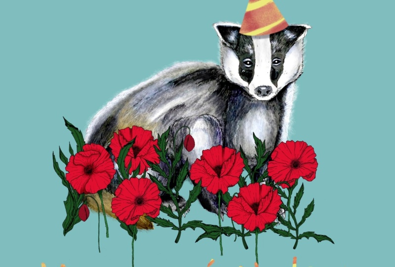
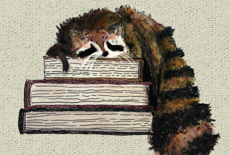
4. Sketching: Once you have an idea of what animal you would like to paint and also have some good reference photos, you can start the sketching. The most important part about the sketching is that you try out different compositions and variations with different animals and different assets. If you already have a clear idea of what animal you would like to paint, or what the card should look like, try at least three variations of this idea. You never know what you can come up with. I have an idea where I would like to have an animal in a sitting pose with some flowers and a balloon. I'm going to try sketching a badger, a raccoon, and the penguin. I would like to have the animal stay as realistic as possible. I'm choosing an animal that can have a natural pose that is very close to my idea. I hope you had some fun with this exercise and you tried out a few different versions. As you can see, I roughly sketched out every animal and in every thumbnail, I tried out different compositions with different assets. For all the raccoon thumbnail sketches, I used a very similar pose and changed around the assets a little. The one I like the most, is this sketch where the raccoon fills almost the whole page holding a bunch of flowers, and has a tiny party hat on his head. For the badger sketches, I tried a few variations of the sitting pose that were close to what I had imagined at the start. In all my sketches, I couldn't find a pose I was totally happy with, so I tried out something different where I put the badger in a flower bed of poppies. I really like the result and it became my favorite badger sketch. I also sketched the penguin in a few poses. Penguins have this funny character and would be great for a birthday card. I'm happy with the thumbnails, but my favorite is still the badger in the flower bed. This time I think I will draw the badger with the tiny party hat and the poppies. Before you move on to the next lesson, make sure you have decided on an animal you like to draw, and also have a number of good reference photos for the animal, but also for the assets. See you in the next video.
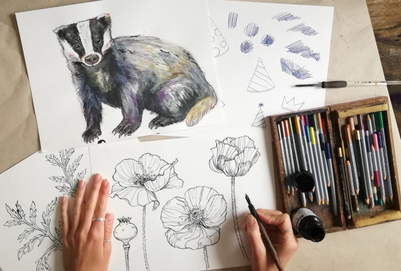
5. Drawing the Animal: We've got our thumbnail sketches ready so let's move on to the drawing of our main star of the illustration, which is the badger. I'm starting off with a very rough and general sketch of the badger. For this sketch, I like to use a very light gray coloring pencil. You won't be able to see the lines later, but it will give your drawing a first general guide. At this stage, I make sure I get the shapes right, that the whole animal fits on the page, that I get all the proportions right, and I layout the most important landmarks on my page. Even though this will be very rough, I make sure it is correct. We only go into details after we are happy with the proportions and the general shapes. For the more refined drawing, I like using coloring pencils. Especially red, or earthy tones, or colors I feel could fit the animal. I use this instead of a regular pencil, but you're free to use whatever you like. The reason I like to use coloring pencils for the drawing is because I think it gives the painting a very subtle extra dimension of color. Even if you're not able to fully see it at the end, it will peek through in some areas, which I really like. I spend a lot of time on this step because I feel it is very important that my drawing works. That it works proportion wise, that the posture looks good, and that I'm happy with it in general. If the drawing is not working or proportions are off, you will notice this at a later stage and you really want to avoid that. Something I learned along the way is how frustrating it can be to spend a lot of time and energy on finishing a painting to realize at the end that something just looks wrong. When I'm drawing, I will focus on several things and put the marks on the paper, like on a map. I always search for reference points and compare with the rest of the shapes and relation between them. While drawing this, I'm constantly looking at my reference image and try to avoid drawing from memory. I used the light gray marks, from the previous step, as a support and not just to outline what I did there. I add more details. I want my drawing to look as realistic as possible. At this stage, I also start adding shadow and darker color blocks. I like working in layers and slowly building up and shaping the forms to give my drawing volume and dimension. Here's the tip. After working on a drawing for awhile, it sometimes gets hard to judge if something looks right or not. There's a helpful trick I like to use to get a fresh view on the drawing. I take a picture of my drawing and mirror it directly on my phone. Or another easy way is to just hold up your drawing in front of a mirror. It's very simple, but if proportions are incorrect or something else is off, you're usually able to spot it like that. Once you're happy with your drawing, you can move on to the painting. For this, you will need your acrylic paint and your water jars. See you in the next video.
6. Acrylic Wash + Inking: We now have a nice badger drawing in an appealing pose, good proportions, and nice expression. Let's start painting. We're starting off with a mixture of water and a small part of acrylic paints. For this, we will use some of the Payne's gray. We want this wash to be very thin and with a very light tone of color. This very soft tone will give your painting the first layer as a base. I test my wash on a separate piece of paper before I move on to the badger drawing. Depending on the light of the reference image that I'm drawing from, I like to keep the white of the paper for the very bright parts of the painting. I try to make sure I don't cover everything with the wash. But also keep in mind that the darkest areas are the places where it will build up the most. That means every layer of the wash will need to cover these areas. I like to repeat these steps several times until I'm happy with the result, adding a tiny bit of acrylic paints with every layer to get slightly darker. I used a bigger square brush for the general shapes and switched to a smaller round brush for smaller, more refined areas. It usually takes three to four rounds. I find layering the acrylic wash, gives the painting a lot of volume and nice shapes. Between the rounds, I let the paints dry a little so the layers don't mix too much. After layering the acrylic wash, let it dry and we move on to the next step where we do a similar process with an ink wash. For the ink wash, we mix some water with a little bit of ink. The ink wash, I like to use for the darkest area of the painting. Make sure you don't use too much ink for this. Ink has very strong pigments. If you feel like areas need to go darker, add another layer of ink wash rather than more ink to the water. If your ink wash is dry, we can add some ink into our drawing. For this, we will be using a dip pen and some ink, but you're also welcome to use a black fine liner. What I like about ink is the very unique look it gives the lines, but it can be very messy too. With the ink, I really want to add detail and texture while I'm still checking with my reference photo. In some parts, I will use hatching and sometimes cross-hatching to create shadow areas or patterns on the fur. What I want to avoid while doing this is to draw an outline all around, this would make my drawing look a little flat. In some areas, I like using some outline, but here I can break it up with little lines to imitate fur. Also in this thickness of my linework, I like to have some variations. Experiment a little and enjoy the process. I'll see you in the next video. Bring your watercolor pencils, because we will be adding some color to our painting.
7. Watercolour Pencils: Now that we have a couple of layers of acrylic wash and ink wash, we will add some color with the watercolor pencils. Make sure your painting is dry so the pencils only dissolve in places where you really want them to. A reason why I really like working with the watercolor pencils is that they're really easy to use. They're good to control and you can also take them with you whenever you go outside and want to draw. I pull up my reference image again and select the colors of the pencils. What I am looking for are the right tones and also colors that I can mix with. I like to mix the colors of the watercolor pencils, just like I do with regular paint. Traditional color mixing techniques can be of help. For example, if I would like to get a cooler tone of a color, I'd be adding a little bit of blue or the same for the warmer tones, where I would go in with a red or orange. Some shadow or very dark areas, I might want to add a little bit of purple or blue so that it doesn't get too black. The way I'm using watercolor pencils is very loose. I'm not too precious about the shapes or lines and don't mind if I'm not filling the areas precisely. I really just want to get some pigment on the paper that I can later dissolve and move around with the brush. Before using the water, I am layering colors on top of each other that I later want to mix. I inked my painting before. If in this step I'm covering the black ink lines, this is what I want. The ink lines will still be there, but they are toned down a little bit with the paint on top of it. Once I added color in most places, I can grab my brush and go over the pigments to mix and dissolve them. Depending on the size of the area I'm working on, I will choose a suitable brush. Is it a more general area? I would usually use my bigger, square brush and in more refined areas, I will work with the smaller, round brushes. In some areas, I like to keep the sketchy pencil lines, so I will spare them out. This is probably a matter of taste. It's up to you how you want to use the watercolor pencils. Last step, we will add a few highlights with white acrylic paint that is mixed with quite a lot of water. This mix should not become too thin, but it should also not have too much pigment in it. Once this layer of white acrylic wash is dry, it should merge with the previous watercolor pencil layers. This whitewash I use mainly for the highlights in the fur or for the reflection in the eyes. If you're happy with the result, we can move on to drawing the assets. For this, you will need all the reference photos you gathered, like in my case, these are the photos of the poppies that I took in my mom's garden, and the material you would like to use to draw these assets. I will be using the ink and some coloring pencils.
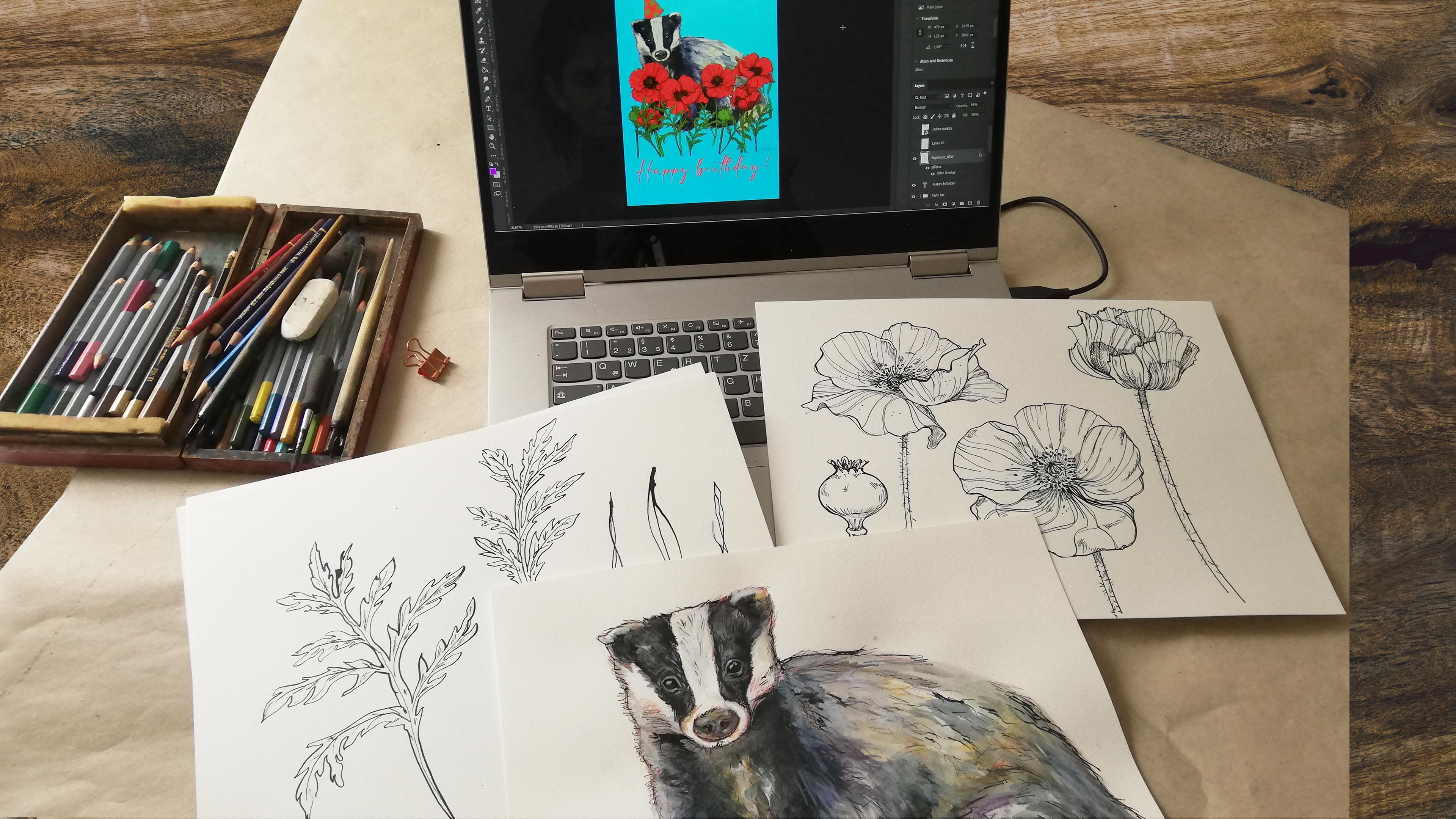
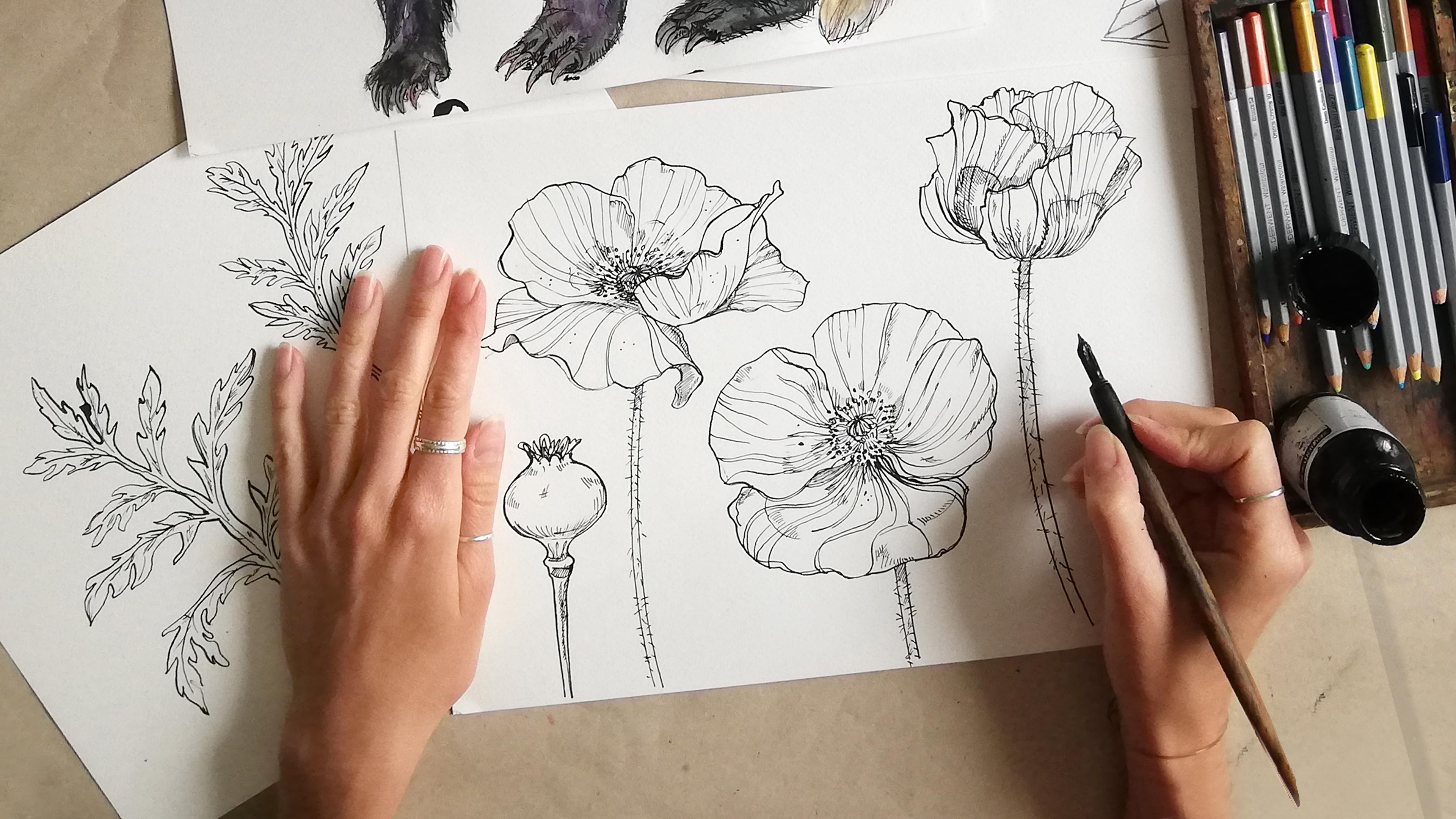
8. Drawing Assets + Experimentation: Now that we have finished our animal painting, we get a much better idea of what our final illustration could look like. Also, what the assets are that we will be needing to arrange around the animal. In my case, I will be creating some ink line drawings of some poppies and leaves, and later on use the coloring pencils to create an abstract shape as a party hats. For me, contrast is really important. What I like to do is have the fine art animal painting as a main focal point of the illustration, and then add some abstract or more simplified shapes around it. For the birthday card illustration, I will have my badger sit in a flower bed of poppies. I'm starting off with a pencil drawing of a few different poppies. Once I'm happy and have the general shapes down on paper, I start the inking of the lines with the tip pen. For some texture and the shadow areas, I'm using hatching and crosshatching. With the poppy drawings, I'm looking for clean lines that I can easily cut out and change the color in Photoshop later on. You can also use a black fine liner for the step, but the reason I like using a tip pen is because I like the character it gives the lines. If the inking is dry, you can erase the pencil lines and take a photo, to later transfer the ink drawing to Photoshop. Once I'm happy with the flowers, I move on to draw some leaves. I felt like the flowers needed some leaves to create a nice flower bed composition. I'm drawing some poppy leaves in the same style as the flowers. Especially with the assets, you can experiment a needle. I found these wooden barbecue sticks in my kitchen and I will try to get some nice lines with them. This is just to give you an idea, if you're searching for new ways to make your illustration more interesting. Let's see what that looks like. For the party hats, I'm using coloring pencils. I like to use a continuous pencil line to achieve a different effect in contrast to the clean ink lines. The colored areas will be very sketchy and rough, and I make some color patches on the side to combine them later in Photoshop. If you're happy with the result, you are now ready to bring everything into Photoshop. This part can be a bit time-consuming, so prepare yourself a nice cup of tea, and I'll see you in the next video.
9. Photoshop Part I: Let's open a Photoshop document. I like to work on a scale that is a lot bigger than the result. For a greeting card, which is usually around A6, I create an A3 document with 300 dpi. First thing we're going to do is to go to File, place linked. By pressing "Command J", I am duplicating the layer. We can turn the initial layer to invisible and keep it in case we need to reproduce something at a later stage. The first thing I like to do is roughly cut out the area of the image I am working on. For this, I'm using the Lasso Tools. When selected, I press "Command Shift and "I" to inverse the selection and delete the area around the badger. Useful adjustments to do right at the beginning of the levels. We go to Layer, New Adjustment Layer, Levels, and create a clipping mask, so it only works on the layer beneath it. I accidentally added the adjustment layer on top of the wrong layer, so I simply move it up. We push the slider to adjust the white areas and the contrast. This might not be necessary if you have used a scanner instead of a phone. We merge the adjustment layer with the painting layer beneath by pressing "Command E". We create a new layer beneath the painting that we fill with the Paint Bucket Tool. This colored layer we only use to check what we are doing. Now, use the Wand Tool to select all the white areas of the paper around the painting. Set the Tolerance to about 10 with Contiguous on. You can also use the Quick Selection Tool to get additional areas that we want to remove or to deselect areas that were accidentally added to the selection. When all areas you like to remove are selected, go to Select, Modify, and Expand, and expand the selection by 1 pixel to get a very clean selection. I will use the Pen Tool to get a more precise selection of the areas around the claws. Once the selection is closed, right-click, make selection, and delete. I will do the same thing to get a cleaner edge on this area here. Also use the Eraser to get rid of everything else you want to remove, like leftover spots. Now that we have our animals separated from the background, I will do the same with the poppies, the leaves, and the party hats. Don't forget to save your illustration every now and then. Like with the badger painting, I am pressing "Command J" to duplicate the layer. I go to Layer, New Adjustment Layer, Levels. I create a clipping mask and push the slider to adjust the white areas and the contrast like before. We merge the adjustment layer with the painting layer beneath by pressing "Command E." With the Lasso Tools, I am roughly cutting out the important areas again. With the Magic Wand Tool, I'm selecting all the white areas. This time we want Contiguous to be turned off. Make sure all the white areas are selected and press "Delete". I will add a color overlay to this layer of the line drawings by double-clicking on the layer to add a layer style. Go to Color Overlay. I want the lines to be overlaid with a warm brown tone. Press "Okay". I am adding a new layer beneath the drawing to merge it down by pressing "Command E" with the top layer selected. With the Lasso Tool, I am selecting every flower and paste them on a separate layer. I select the stem with the Marquee Tool, press "Command T", and transform it so they are all the same length. I rename every layer to keep the file as organized as possible. This will help us later when we have many layers on top of each other. I do the same thing with every flower to have them on separate layers. For the one poppy, the stem was too short, so we'll copy it from another flower. I place it and merge it together. I select all poppy layers and simply drag them over to my illustration file. With all the poppy layers still selected, I group them by pressing the Group icon. I Copy, Flip and arrange the poppies around the badger like in my sketch. Once I'm happy with the composition, I add a layer mask to the poppy group to have them all end at the same level. I adjust the placement of the badger and move on to the leaves where I do the exact same thing as with the poppies. Once I have all the leaves in my illustration document, I group them and arrange them to a nice composition with the flowers. By holding down the Alt key, I drag to copy the layer mask of the poppy group over to the leaf group. I open the party hat picture and adjust it in the same way as the other drawings. I cut out the hats that I like and the dots. I merge the levels layer by pressing "Command E". I select all white areas and delete them. I will add the same brown layer style like in the other drawings. I'm selecting the dots with the Marquee Tool, cut, and paste them onto a new layer and drag them into position. I select one of the dots and duplicate it, pressing down "Command J". Like before, I will drag the two layers over to the illustration document.
10. Photoshop Part II: I created a color palette of colors that I'd like to use for this illustration, so I also place this file. You don't need to work with a palette like that, but I collected a few over time that I sometimes also reuse. I changed my background color with the paint bucket tool by choosing one of the colors of the palettes. I go to my badger group, press Command, and click on the layer of the painting. Create a new layer and fill it with one of the colors of the palette or any color that you like. Play around with the blending mode of the layer and the opacity. Now I will start coloring the poppies. Inside my poppy group, I will group every flower separately so all corresponding layers are grouped. I add a new layer beneath the drawing layer and select the shape with the Lasso tool. With the Paint Bucket tool, I fill the base color of the poppy. I do the same thing with all the other poppies. Now that all poppies have a base color, I select the layer of the base color in every poppy. Choose a color of a slightly darker tone and paint some details and shadow with the Brush tool. You can also change the layer blending mode and the opacity until you're happy with the way it looks. I repeat the same thing for all poppies. As a next step, I choose an even darker tone of the red and paint some dark areas especially in the center of the poppy. I adjust the blending mode and the opacity again and also repeat the same for the rest. As last layer, I'm adding some black dots on a separate layer on the green center as well as the green stems of every poppy. If you notice now that some of the flowers in front are covering the flowers in the back, you can add a layer mask. Simply click on the certain layer and the "Mask" icon, and then paint over the areas that you would like to hide. Once you've colored your flowers, turn the poppy group to invisible and move on to the leaves and the grass in the background. I adjust the position of the badger and continue to finish its little party hats. I go to the party hat group and position it. With the Lasso tool, I select the area of the hat and fill it with a suitable color of my palettes. I select the layer of the red hat by clicking it while holding down Command. I inverse the selection with Command, Shift, and I and go to the dots layer to delete everything that is outside of the hat area. I changed the color of the dots by creating a color overlay in the Layer Style menu. I will add a few highlights on the badger, especially the reflections in the eyes, and the nose, and a few areas in the fur. I changed the opacity of the layers to fit. As a last optional step, I'm adding a texture layer. You can find nice textures on sites like Unsplash where you can download them for free. I placed a texture on top of my background layer and play around with the layer blending mode until I like the look of it. I do the same for the poppies and the leaves. For this, I create a layer mask on the texture layer and select and fill only the areas that I want to add the texture on top of. In case you fill the area with the black color like I do, this is fine as long as you do the same for all the layers. You can inverse the layer mask afterwards by selecting it and pressing Command I. I change the layer blending mode until I like the look of it. Well done that you made it this far. I know depending on your Photoshop skills, this can be a lot of information. Congrats. Your illustration is finished. In the last step, we will add some text.
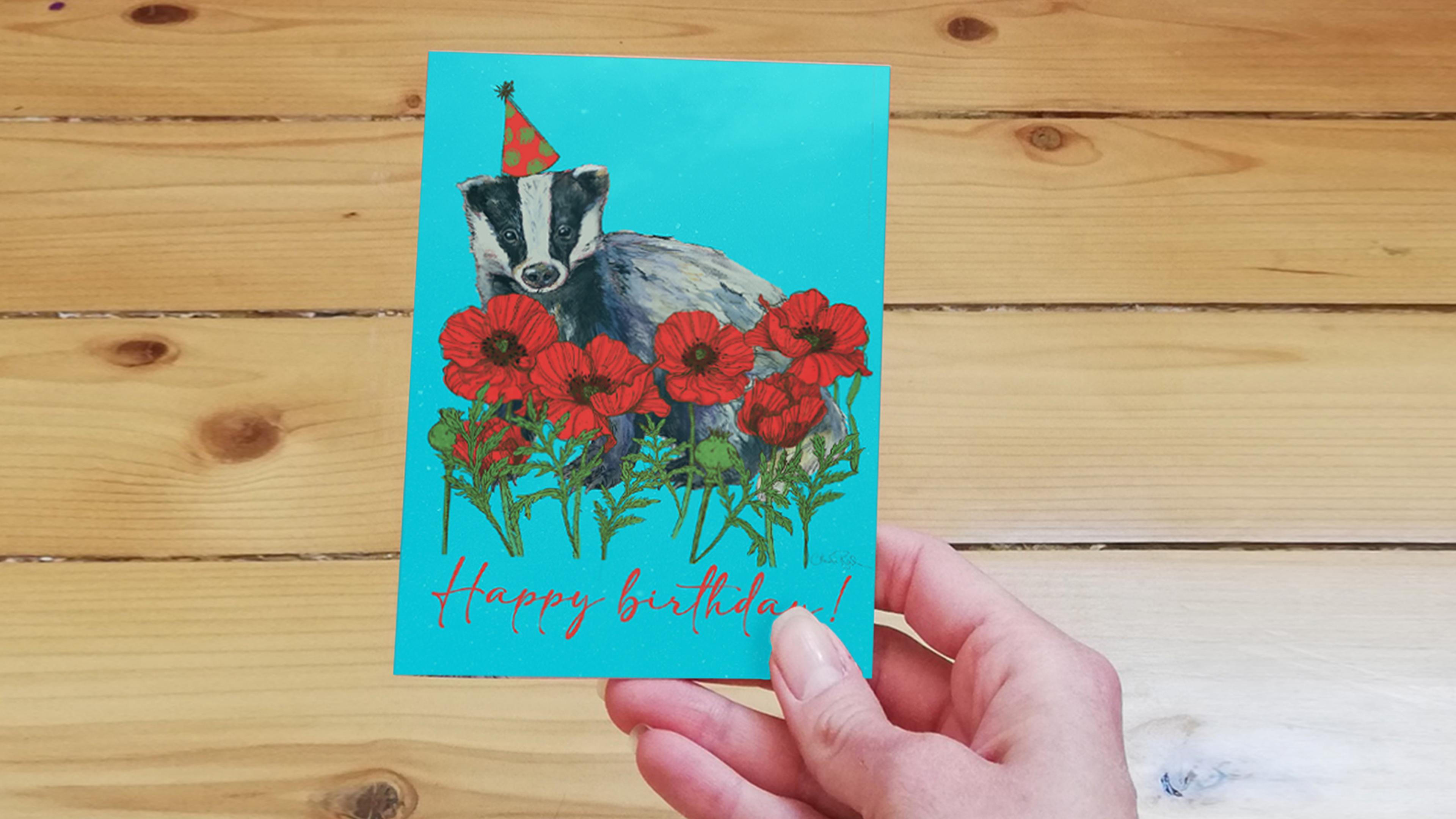
11. Typography + Final Thoughts: So the hardest part is over now, we have our finished illustration. What we're going to do now to turn this into actually a greeting card is adding some texts. There are millions of fonts out there. Some of them you can buy and some of them you can download for free. A good site to find nice fonts is for example, dafont.com or you can use your own handwriting or experiment a little with calligraphy. I like to use a general or downloaded font and add some extra lines here and there. Once you're finished, don't forget to sign your illustration and you're done. Congratulations, you have finished a very unique greeting card illustration. Now go and print your beautiful artwork and send it to all your friends and family. I'm sure they will love it. Also makes sure to post your final product in the project gallery, so I and the rest of the students can see your beautiful work. Thank you so much for joining me and I can't wait to see what you create.
 Claudia Bucek, Artist / Illustrator / Graphic Designer