Transcripts
1. Introduction: Hey, I'm Jess, and I'm a lifestyle and travel photographer currently based in the Gold Coast of Australia. In this class, we're going to be talking about all things to do with minimalist photography. One thing that draws me to minimalist photography is the sheer simplicity of it. The motto less is more applies to this style of photography perfectly. I like to consider myself a bit of a minimalist, someone who lives a life with less materialistic objects. I don't even have a TV. Some people think that's strange. We'll talk about the different elements of a minimal photograph, what you should have, what you should leave out, composition, leading lines. Plus, we'll touch on basic tips and things to avoid when delving into this style of photography. Once you understand the fundamentals of what constitutes a minimal photo, I find it helps to unlock that creativity inside yourself. You're free to break compositional rules if you feel that it adds to your image. I find that it opens your mind to experiment with different ideas that you might not have thought of before. But it's important to at least understand the basics first and then you can adapt to your stuff from there. This class is for anyone who wants to experiment with minimalist photography and challenge their creativity or find some inspiration in a different style of photography. This class is also great for beginners learning the art of photography because it challenges you to be really intentional with composition, framing, and how to best tell your visual story with as little elements as possible. The best thing is you don't need to have a DSLR or a mirrorless camera, you can simply use your smart phone if that's all you have to work with. I can't wait to dive into this class with you, and I'm excited to see what your beautiful artistic minds create in the class project. Thanks so much for being here, and let's get to it.
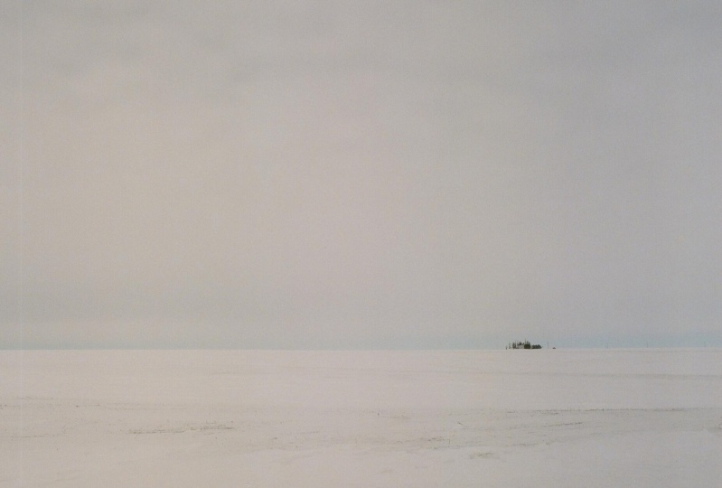
2. What is Minimalist Photography?: What comes to mind when you think of a minimalist photo? Do you find it boring? Does it make you feel at ease? For me, it focuses on what is important and meaningful to that story, and removes everything else that distracts the eye from it. In artistic terms, this style is based on her simplicity and uses the least amount of components as possible. Minimalist photography works with clarity, purpose, and intention. I think the saying, less is more, is a perfect representation of minimalist photography. It embraces negative space and allows the main focus of your image to really pop. Although this doesn't have to mean that it's boring, and it can be combined in different ways from artist to artist. Take for example, Ivana Cook. She's a California based photographer, with a focus on the ocean and surfing. Her style is clean and minimal, yet beautiful and calming to look at. The captions that go with her photos are short and simple also. She uses vast open skies and empty ocean waters, which gives her subjects space to breathe and really stand out. Your eyes have no choice but to be drawn to it. We'll break down the elements a bit more throughout this class.
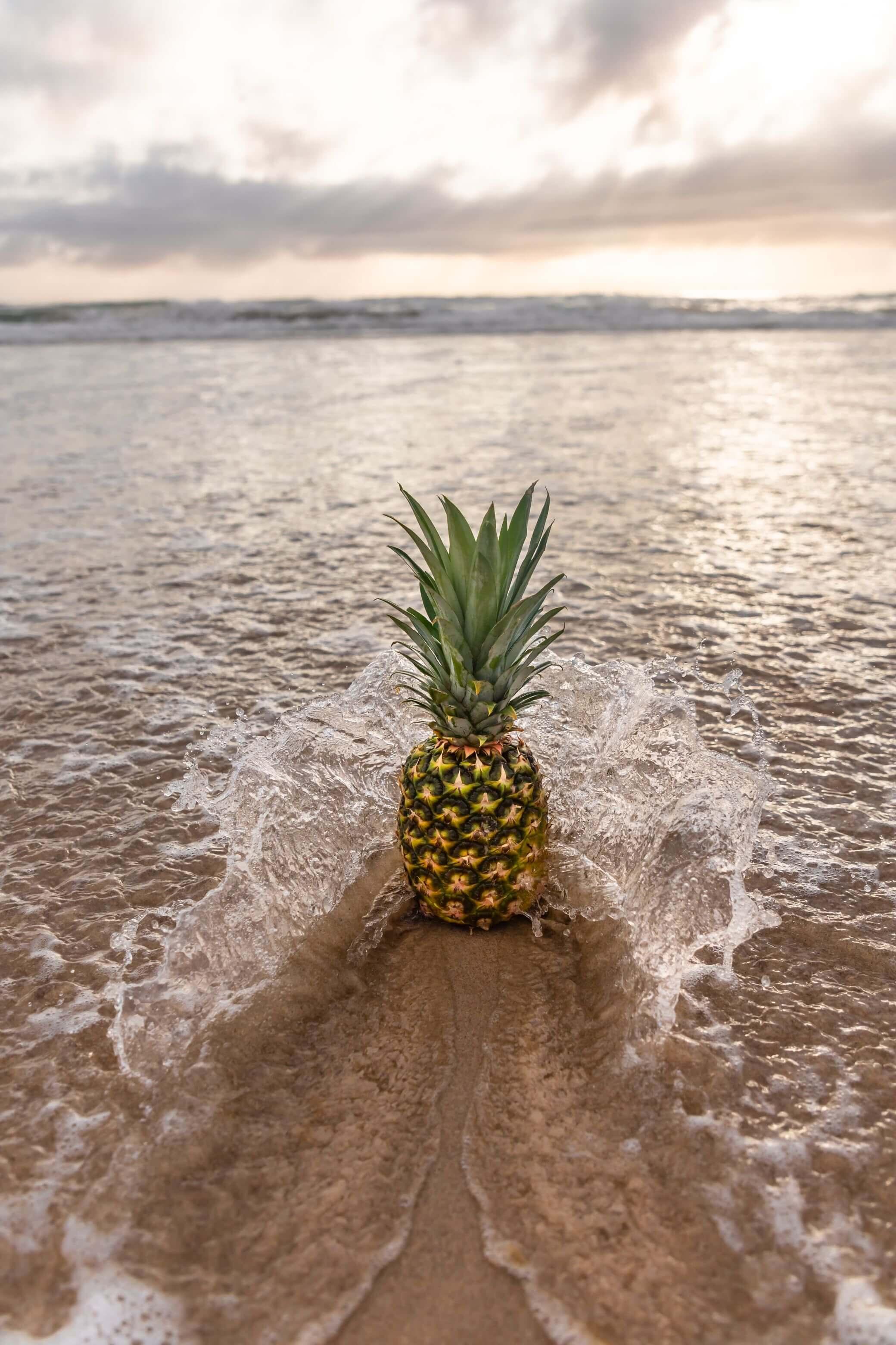
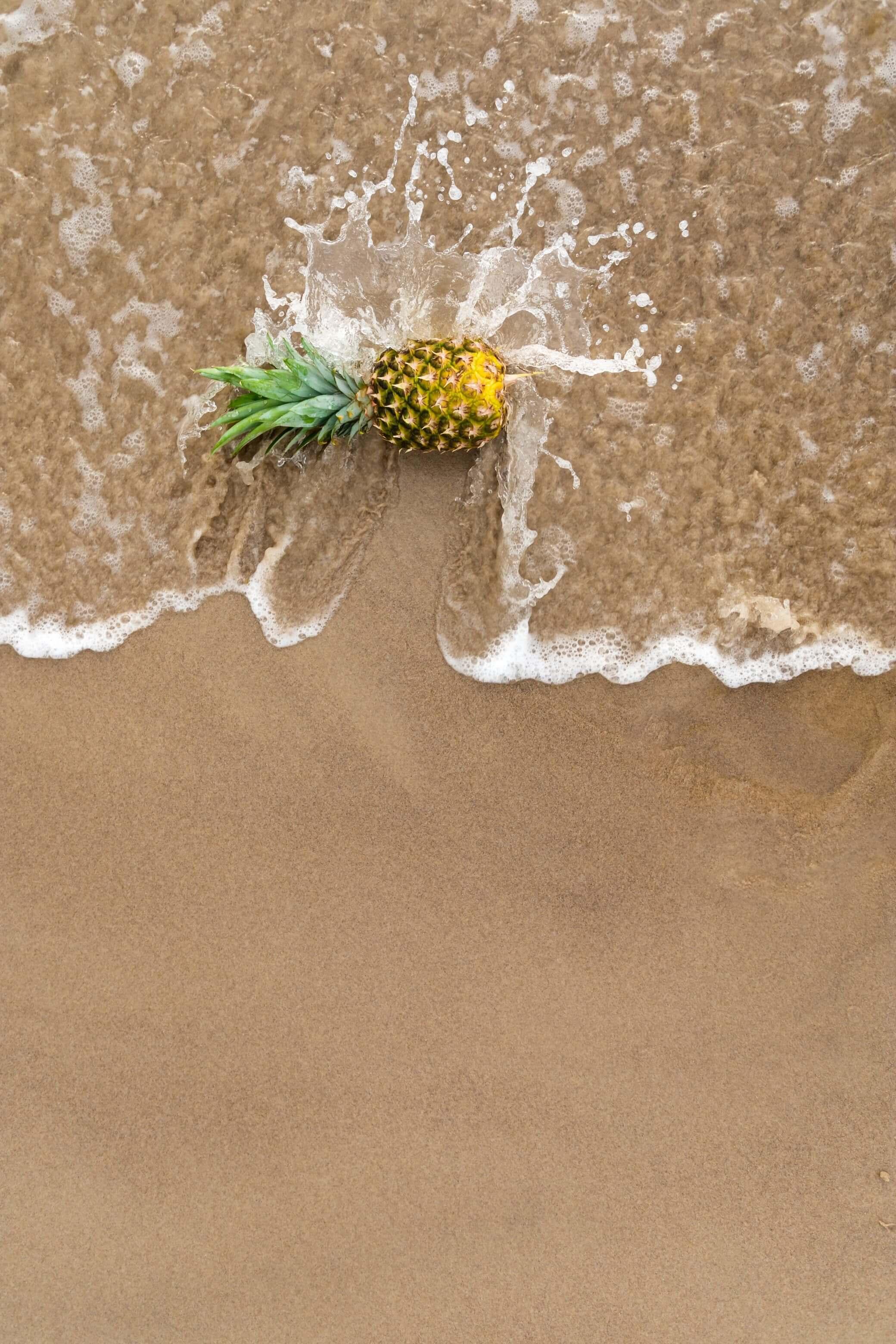
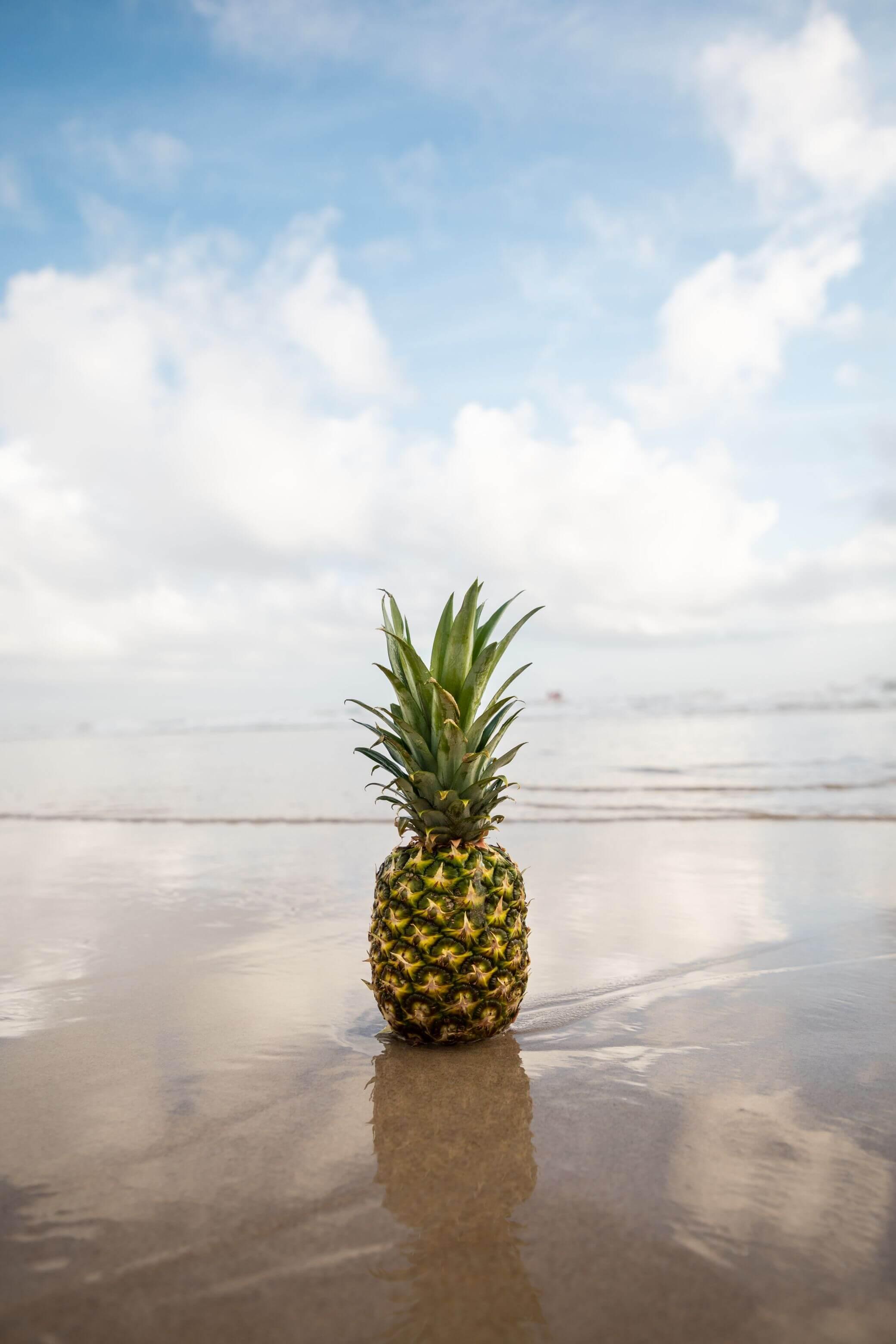
3. Class Project: For this class project, the aim is to create a minimal photo collection of three images centered around one theme or subject. It could be of an object, a place, a person, or even an animal. You can choose something that symbolizes or represents a piece of you, or it could be completely random, abstract, and quickie. Let's take, for example, pineapples. I love pineapples. They're one of my favorite fruits. I love eating them. I love drinking pineapple juice. They're healthy, they're full of vitamin C, and they are tropical fruit. If you've seen my self-portrait photography class, you'll know that I'm a lover of all things tropical. Using the example of the pineapple, you could do a miniseries of three different minimal photos centered around one pineapple and just photograph it in three different ways. Get creative. Really think outside the box as to how you can best capture the pineapple or whatever it is that you're willing to showcase. Once you've decided on an idea that you want to focus on, do a photo shoot and select three of your favorite images that best tell the story that you want to convey. Upload your final results to the class project gallery. I'd love to see what you create. If you needing some inspiration, simply search the hashtag minimalists photography on Instagram. Hopefully, you'll find some ideas that spark your creativity.
4. Elements of a Minimal Photo: A minimal approach takes creativity to make even the simplest of pictures interesting to the viewer. But with a balance of the right elements and knowing how to use them appropriately can make it easier to capture a great minimal photo that really engages our audience. Let's break down the key elements of a minimal photo to help us understand this style of photography a little bit more. Negative space. Negative space is a key feature of a minimal photo and it allows the subject of your image a chance to breathe. Areas with distraction free backdrops work well. Beaches, oceans and lakes, vast open skies, interior or exterior spaces with white or single color walls work well for the style of photography, providing that there are minimal distractions. Colors. Blocks of color and neutral tones can really add that extra element to a minimal photo which gives it life and really makes it pop. Sometimes a color itself can be the main focus of your image. Although I'd aim to have no more than two to three different types of colors to avoid it looking busy, messy, or distracting. Shooting in black and white can also produce a minimal effect because it removes the distraction of colors in an image and it all comes back to that saying, less is more. Textures. Textures can add an extra element in a bold or subtle way, depending on how you use it. Sand on a beach, the rough surface of a brick wall, natural elements such as plants, grass or wood grain, or even concrete and carpet are really good examples that you can use. Sometimes I like to look through interior design books because they can have really good examples of minimalist photography, and that can give me some new ideas to play around with. Single objects. When you only have one single object in your image, the eye has nowhere else to really wonder. Therefore your audience is forced to pay attention to the main subject. This intentionally promotes the most important subject and removes everything else that distracts their eye from it. Lines. If used well, lines, in particular leading lines can successfully help draw your viewer's eye into an image. This is where composing the frame intentionally is important because it guides your eye into the direction of the main focus of your photo. Because leading lines are more pleasing to the eye, they can hold the focus or attention of your audience a little bit longer than an image say without leading lines. In some cases, leading lines can actually be the main focus of your image. Lines in the road appear, or a jetty at the beach or a lake, or even a bridge in the mountains are some good examples, or you can use lines that you'd see in your everyday life. For example, pegs on a cloth line, or bird sitting on a power line, or even the trails that you see behind airplanes in the sky. Geometric shapes and patterns. Practice paying attention to geometric shapes and patterns in your everyday life. The architecture of buildings, stairways, and windows are really good examples of these types of elements. Another way that you can look for these types of elements is to find out where there is an art exhibition near you and use the most abstract sculptures that you can find to get creative with. I went to an exhibition of art installations down on the beach, which was also a good way to incorporate negative space with the geometric shapes and patterns of the abstract artworks. In the next video, I'll take you through my editing process and show you how I touch up an image to create a more minimalistic style.
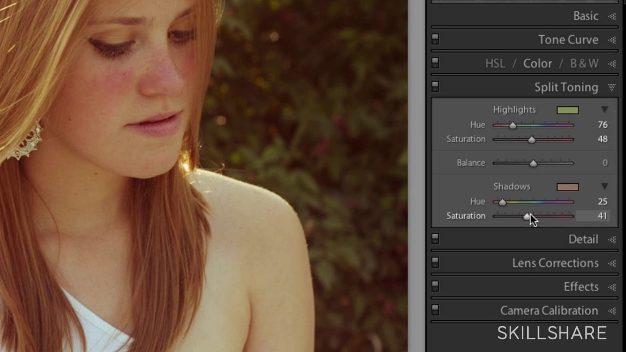
5. Editing + Touch-Up Process: I believe some photos aren't really complete without a little editing infused with your own unique style. Sometimes there are elements or subjects in a photo that are distracting to the eye and you might want to remove them to help clean up your image a little bit. Every photographer has a different way of editing depending on the unique photography style. Let's walk through a few examples now, and I'll show you my process for editing in Adobe Lightroom, as well as touching up in Photoshop. Here, we are in a Adobe Lightroom, and this is where I edit all of my images. I've already gone ahead and imported the photos from my camera, which are stored on my external hard drive. I never store them on my laptop just because they take up way too much space. The way that I organize my photos is dependent on what I've shot in any particular photoshoot. Everyone does this differently in a way that works best for them, but for me, I organize my photos by name and date. That way, it is easier for me to find whichever folder that I want whenever I want to go and work on it. You'll see those folders down on the left here. This is my minimalist photography collection, and I'll drop down. It'll tell me the year that they were taken in and also the date. Once I've imported those photos into Lightroom, I then head over to the Library tab, and this is this tab here. I've just selected a folder of photos that I took recently down at the beach during sunrise, and this beach had a festival happening that ran for a couple of weeks where they had a variety of different sculptures and installations on the beach. Once I've imported in this Library tab, I go through the process of selecting the best images. Any photos that I like and I want to edit, I will flag them. You can say this one here has got a little flag here. The way that I flagged that is I just hit the letter P, and that will say flagged as picked. So P is for picked. If I want to unpick it, if I don't want to have a flag on it anymore, I just pressed the letter U, and it removes the flag. You can see that I have flagged a few photos already because I've already gone through and sorted these ones out. If you want to be able to sort them a bit quicker, if you have already flagged some photos, then you just go to the Filters tab and you click on the flag once, and then that'll filter out all of the photos and only show you the ones that you have flagged. Once I'm ready to edit, I'll select an image and then I'll head over to the Develop tab, pressing D on my keyboard. Let's actually use one that I haven't yet edited. Let's go with this one. I can already see a few things wrong with this photo, so it's a good example to use, and I'll go through my process now of how I'm going to edit. The first thing I do is I look at my Lens Corrections and decide whether I want to correct that or not. I head over to the right where I've got all of my editing tabs, and I'll drop down the Lens Correction. I will toggle the Enable Profile Corrections on and off. Once it's on, it will come up with the information regarding what make your camera actually was or your lens, I should say. It's depending on what look and feel that I want to go for the image. I'll either have it on or not. This one, I think I will leave it on. I always just tick Remove Chromatic Aberration just in case there are any abnormalities around the edges. Coming back to Enable Profile Corrections, one thing you'll notice is turning it on removes the vignetting around the edges, which is actually caused by whatever lens that you are using. Sometimes I lack the vignetting, so I will leave it as it is. But for this photo, I'm going to leave it on. Next, I head to the Details tab to make sure that the image is clear and sharp, and using the Mask tool, which is this one here. On my keyboard, I press Alt and I heard across using the slider. I just want to make sure that only the outlines of the hand and the sand are visible, and that's what's going to make it really stand out, it will. Sometimes I will add a little bit of luminance depending on if I want the photo to be a little bit smoother in texture, but not an unusually go too much. Next, I head up to the Basic tab, and this is where I will adjust my exposure, my highlights, my contrast, shadows, blacks, and whites. At this stage, it's really just a matter of playing around with the sliders to see what you like. In this case, I want to drop the exposure a little bit just to give that little bit of an extra contract, and I'm not even out the contrast a little bit as well. The highlights are a little bit blown out, so sometimes I might just bring them back down. This was taken probably mid-morning, thereabout or early morning, and not long after sunrise. The sun was right behind the hand as it had come up over the horizon. I'm not just leave it around here out there. The shadows, I might just drop a little bit just to give a little bit more contrast and definition from what. Sometimes I will bring them up if I want to brighten into it a little bit. In this case, I think I want to drop them, just want to create that background separation between the hand and the sky and the blacks and whites. Yeah. Drop from just a little bit. Texture, I never really touch clarity. Sometimes I will bring it up a bit, and Dehaze, depending on the photo, I might add a little bit of dehaze to make it a bit more realistic and true to what was actually locking on at the beach or I might choose to just get rid of it. Then I head down to the HSL tab. This is where I play around with the HSL slider, which is the hue, saturation, and luminance. Generally, I usually only use the Saturation and the Luminance tabs to bring the colors up or down. Sometimes if I feel a color is not quite how I want it to look, then I can change it in the hue as well. Let's have a look. I don't have a lot of colors in this image, which makes it great for our minimal photo, and it won't be so distracting. But you can see, there's a little bit of blues up in the sky here, so I might just bring that up a little bit, but I might also bring the luminance down on it just so you can see it a bit more. If I don't really like the color, I can always change that, so I might go around of that. Sometimes it can look a little bit too orange or not orange enough, so then I can always just bump up the saturation on the sand, or if I wanted to get rid of the color in the sand, I can just bring that back down. But I still want to keep a little bit of contrast between the sky, the hand, and the sand, so I'll just bring up the saturation a little bit. What I do want to do is check the horizon because it looks a little bit skewed, so I want to make sure that I crop it right. What I'm going to do is I'll use the straighten tool, and this tool works particularly well if you do have something that is straight like a horizon. I'll just drag my line across the horizon and see how it strains. It hasn't really worked in that one, so I'm just going to "Control 'Z'' and undo it and maybe try it again. That's quite a bit better. I'll show you the before and the after. Another thing that we can do is if there are a few distractions that are small enough, I'll use the spot removal tool to clean up the image. If it's too big, I open the image in Photoshop and I'll fix it in there. But with this image, everything is pretty small that I can do it in Lightroom in itself. I head up to the spot removal tool and I will go over to the navigator panel and I'll actually zoom in and I'll drag the box over to these people here, which I want to remove from my image. What I'll do is I'll go over the person that I want to remove. You want to have the circle as smallest possible around the object or the subject that you're wanting to remove. Because my circle is a little too big, I use my Bracket key. I will just bring it down to size and then I'll click my "Mouse" and then it will select an option to clone and use in its place. If I'm not quite happy with the selection that it's chosen, I press my ''H'' key and that will show me where it's selected from and then I can gently move that selection so it looks better. Perfect. That's that one. Next, we'll do this person here. Same thing, I just want to make sure that the circle is only around that person or that object that I want to remove and then I'll click, let it select. That's actually done a really good job of that selection to remove that person. I'm quite happy with that, I won't change it. Now we've obviously got this sign here as well, but I did see another person over here, so I'm just going to go and remove that one. Just want to make sure that I get the sand lined up with the other sand. I think that's worked pretty well, so I'll zoom back out just so you can see. You can barely notice that those people were there and those corrections have been made. This one here is a little bit bigger than those people were, so I'll make my selection a bit bigger, just big enough to cover the sun. Click it, that's actually done not a bad job. I'll just double-check and there we go. Then if we just click ''Done'', that will take us out of the spot removal tool and I'll hit my "Backslash" key and then that will show you the before and afters. I think that's pretty good. Obviously that's just a basic edit of that one. There's a lot more that I could go into by using the adjustment brush or the radial filter or graduated filter. I won't go into that here, but that's where you get an idea as to how I edit. Let's try another photo. This one is a perfect example of a photo that I would need to edit in Photoshop, so I'll hit the Develop tab. You can see that I just wanted to get this sign in the photo, but unfortunately, there was a telegraph pole here as well. I am going to want to edit out those lines and the pole, but it's too big of a job to do in Lightroom. You can try but the result just is nowhere near as good as what you can get in Photoshop. What I will do is I'll right-click on the photo and I will select ''Edit'' in Adobe Photoshop so I can edit it in there. Now we're in Adobe Photoshop and we're going to go through how to remove this telegraph pole from an image. First thing I want to do is duplicate this background layer, so I'm going to right-click and select Duplicate Layer. I'm just going to leave the name as Background copy and click ''Okay''. What I'm going to do is unlock it, so that way we can work on this layer. I'm going to keep this background layer locked to protect our original image. Just make sure the background copy layer is selected. I'm going to come up to the quick selection tool and this is the tool that I'm going to start out with. You can also use the Magic Wand tool, both work pretty well depending on what it is that you're working with. Or you can use the clone stamp tool and that will duplicate or sample the area that you want to replace it with. I'm going to start with the quick selection tool and I'm going to ''Control Plus'' to zoom in on my image and I'm going to just click to make sure that it selects everything. Then I'm going zoom in a little bit more just so I can really see where it's selected. Make sure it's selecting everything as much as possible. I'm just going to go up here and select the Magic Wand and I'm going to press ''Shift''. Sometimes you just have to figure out which tool to use for the scenario that you're working with. I'm just going to zoom in a little bit more just so I can get a bit more accurate with these lines. The quick selection tool is pretty good for the little detailed areas. Oops, sometimes it goes a bit haywire. I want to just controls it that and just come in again, pressing my "Shift" down while clicking and I can see that's selected that. I'm going to come down to this line as well, zoom in and "Shift" and click, and that's done a really good job with that. I can see it's just missing a few bits here, so "Shift" click to get that. I might just zoom in a tiny bit more so I can try and get this line here. Just "Control Plus" to zoom in, "Shift" select. I'm going to zoom back out now and just see where we're at. Awesome. Now that's all selected. What I'm going to do is go up to Select, Modify, and Expand, and I'm just going to expand this by three pixels. Go "Okay" and now that's done. I'm going to click ''Shift'' and my ''Backspace'' and it's going to bring up this new box. You want to make sure that content aware is selected and click ''Okay''. Photoshop will do its thing, it'll do all the heavy lifting, just give it a moment. Awesome. Now that's done its job. It's removed the telegraph pole and now we want to remove the matching ends, so I just press ''Control and ''D'' and that gets rid of it. You can see it hasn't done 100 percent of a good job, but it's done a pretty good job. Then what I will do is I'll go and use the clone stamp tool and I'll just zoom in a little, so you can sort a bit of an outline here and at the bottom as well and up here. What I'm going to do is click ''ALT'' and I'm going to click my "Mouse" and that's going to select a sample that I can use to cover up the bits that the content where I missed. I'm just going to increase the size of my clone stamp. Going to zoom in a little bit and I'm going to select an area to clone it. I've just used a bit of a bigger area size just so it gets a little bit more around the edges. I'm going to minimize this now a little bit, select ''Alt'', sample, and go with that. Next, I want to increase the size a little bit more now, sample here, and I just work my way down just making sure that it's getting everything. If you ever feel that it's not selecting a good sample, then you can just press ''Alt'' and click from an area that you think is more suitable, just so you make it look like it's blending in really well. I'll just come down here as well. I might just zoom out to see how that's work. Awesome. If you wanted to go a little bit further, you could get rid of this as well, get rid of some of the trees. If you want to see the before and after, so just click the little eye icon on the layer and that will hide the layer and hides the edits and then you just toggle that on and off to see how it looks. I think if you didn't know that there was no telegraph pole there, I would say that's done a pretty good job. That's normally my process on how I would edit in Photoshop. Then you just export and save it wherever you save your images.
6. Recap: Let's recap what we've learned when it comes to minimalist photography. What is minimalist photography? In short, it's imagery that uses the least amount of components, such as shapes, lines, colors, and subjects. Be really intentional with framing and composition, and how to best tell your visual story with as little elements as possible. Elements of a minimal photo. Lots of negative space, blocks of color, textures, and patterns, single objects, lines, and geometric shapes are all elements to help you create a minimalistic photo, but they all don't have to be used in the same image. A few simple tips. Use contrast to help separate the main subject from the background, focus on one single-subject, keep it simple. Negative space doesn't have to be boring it can consist of multiple colors, but try and aim to use no more than 2-3. Be intentional with composition and your framing. Use leading lines to help draw the viewer's eye to your main subject. Don't be afraid to try different perspectives, get low and shoot high to the sky or get higher up and shoot down over the top of your subjects, such as a flat lay. Using the rule of thirds grid lines can help create that minimal feeling as well. The editing process, clean up images in Lightroom or Photoshop to emphasize the minimal outcomes of an image only if you think it's necessary.
7. Final Thoughts: Thanks for joining me in this class, I enjoy hanging out with you. Hopefully, this class challenges you to try a different style of photography. A font, it's a style that makes you think differently about photography as an art form, and challenges you to be a bit more intentional with your practice. One thing I want to remind you is, like most things in life, it's all subjective when it comes to photography. Everything that we've gone over in this class is merely a guideline to help you get started with the art of minimalist photography. Be free to make it your own and put your own unique spin on it. I'd love to get your feedback on this course. I enjoy hearing from and connecting with you, so feel free to leave a review and let me know your thoughts. Don't forget to upload your minimal photo or mini collections to the class gallery, I'm super excited to see what you come up with. I'll leave you with a quote from jazz musician Charles mangers, who said, ''Anyone can make the simple complicated, creativity makes the complicated simple.'' Thanks again for joining me, and I hope I catch you in the next one. As always, go get creating.
 Jessica Munro, Artist