Transcripts
1. Introduction: Hello, everyone, and welcome
to many abstract paintings. Play with color marks
and metallic details. I'm Denise Love, an artist
who loves exploring texture, color, and creative
play in the studio. I'm so excited you're here. In this class, we're
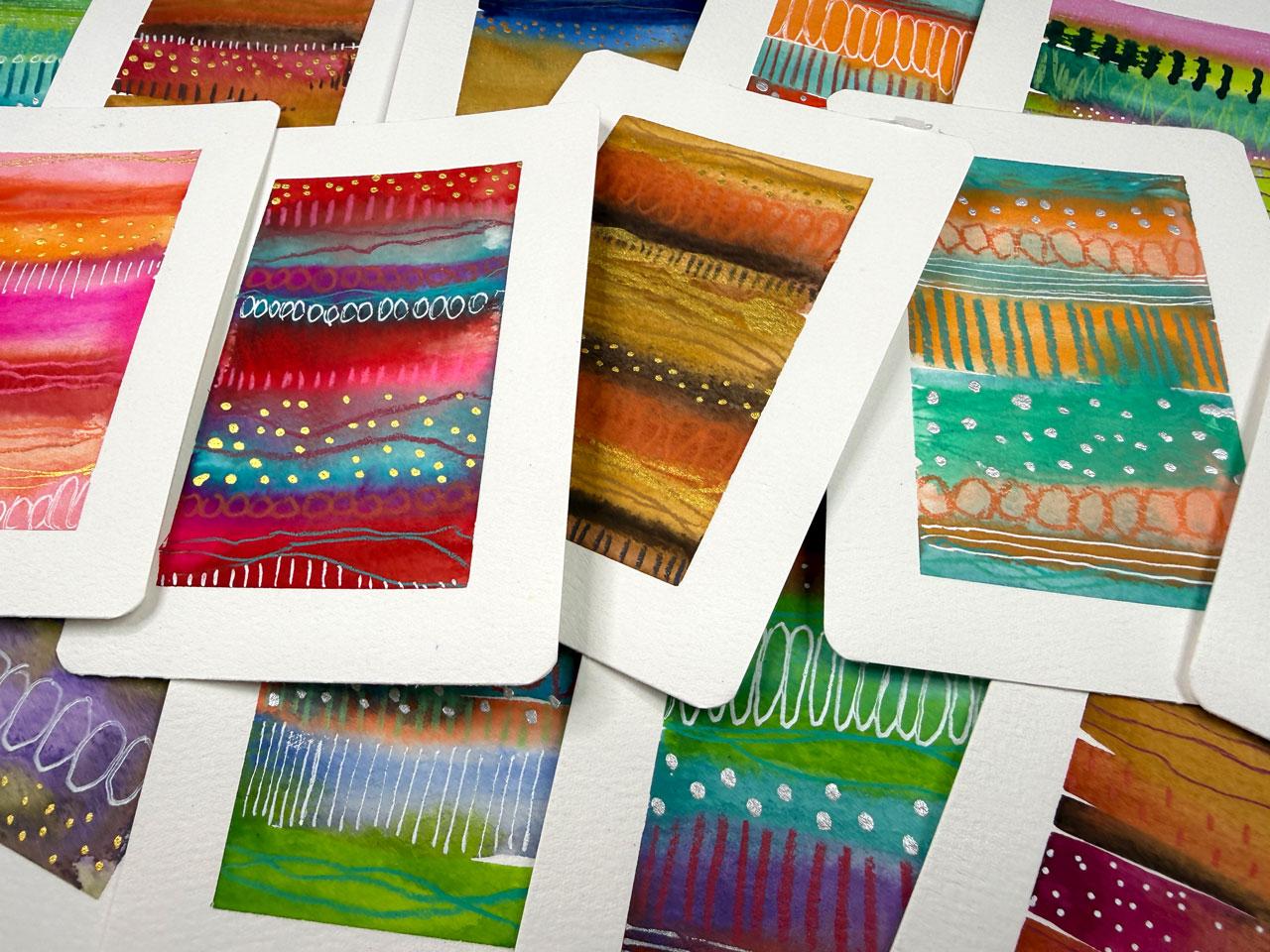
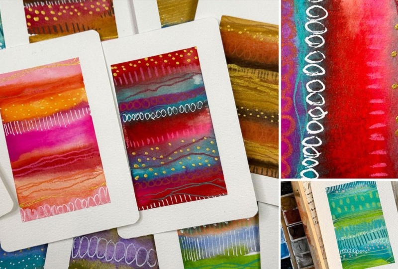
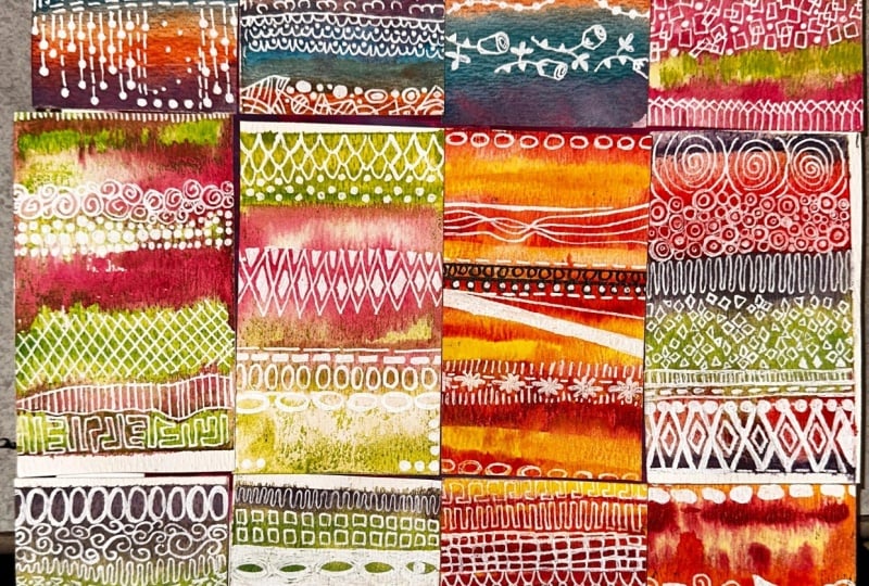
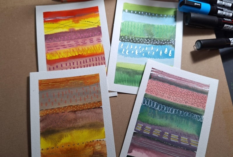
going to create colorful, many abstract stripe paintings. These small paintings
are fun and a relaxing way to
explore watercolor, experiment with color palettes, and play with simple
mark making techniques. We'll start by painting loose watercolor stripes and letting the colors
blend naturally. Then we'll add layers
of interesting dots, lines, and metallic accents to create texture and movement. This class is perfect for beginners as well as
experienced artists who want a creative warm up or a playful way to
experiment with color. By the end of class, you'll have a small
collection of vibrant, mini paintings and
a process you can return to anytime you want
to spark your creativity.
2. Class Project: For your class project,
you'll paint a series of many abstract striped paintings using your own color
combinations and marks. By the end, you'll have a
small collection of vibrant, mini artworks and
a fun process you can return to anytime you want to play with color
and creativity. These paintings are perfect for sketchbooks, art journals, greeting cards, small art pieces or simply experimenting
with new ideas.
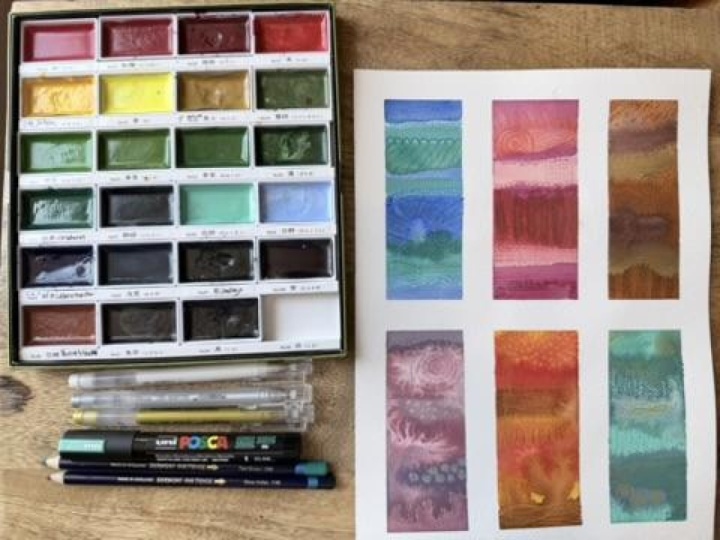
3. Supplies: Let's take a look at
the supplies that you might consider
using in this class. This class is all about, for me, using what you got, experimenting with the
supplies that you got. But I have pulled out a set of supplies and
put them on my table, and this is what I will be using today. That's
what I recommend. Pick the supplies
that you want to use, put those out on your table, and then just leave those
out for a little bit so that every time you
come up to your art table, you're ready to stop
and paint something. Let me show you some of my
inspiration for this class. I've been painting a whole
bunch of abstracts and stuff. I did this lovely piece at the backside of my
handmade art journal. Is is one of those Bar
Spine and beauty journals from the Bar Spine Beauty class. I painted the whole thing
as part of a series of videos that will be coming out throughout
the year on my socials. The very last one was a stripe. I fell in love with this stripe. This was done with the
Holbein artist gouache. This is the colors in that collection because
it was so beautiful and I got so inspired that I then started painting some minis, some little mini paintings in the whole buying gouache
in different color ways. Again, I just got so
inspired that I'm like, Oh my gosh, I love these. They're easy. They're lotress. They have lovely colors that you can pick from
with the gouache, and you could just paint one
of these every single day. And show up for your art
practice and end up with all these lovely
little paintings that are low stress and lovely. So this is where I came up
with this class and thought, oh, this would be so fun to
continue on as a project. And you can use any
paper that you'd like. My personal favorites are the
Hono Mule watercolor paper, 100% cotton, the nine by 12, or the Bao Hong Academy paper is my budget friendly option, which is 100% cotton also and I like that
surface a lot to paint on. For this class, I
have been using some newer watercolor
papers that have come out by Flanbroto FLUN BR ATO. This may not be available everywhere depending on
when you watch this class. It is new. What I like about these is it comes in
several different sizes. Let me just show
you. It comes in. I got several different
sizes because I loved it. This is a three
inch by three inch, which inspired a ton of my little mini paintings
that I have been doing. And then I like
this, I don't know what size this one
is 2.5 by 3.3 ". I like this and it'd be
perfect for stripes. If you wanted to
go even smaller. You could tape that off and
have really lovely many ones. Then this one is a
good size and it's about 4.7 " by 4.7 ". You can see there's
lots of choices. This one is 3.5, about 3.5. What I like about these
is I like the surface. I have really enjoyed painting on this
cold press surface, and it's already cut. It's easy to use. I just cut it off of the block. It's a block of 80
sheets of paper, you have 80 that you could do, perfect for something like the hundred day project because it's already cut down
and prep for you and I just pull them off that block. It's glued on two ends and it's not glued on
the other two ends, so it's pretty easy to get off. Then it made it super easy
just to sit and show up. But you can cut large pieces of paper in any size you want also. If you wanted to do something like the size that I'll
be doing in class, it's basically 3.5 by five. Then if you have a paper
cutter corner rounder, you could round the
corners and then that would be exactly
what I'm using. But I just like that
it's already done for me in this format, but
it's not necessary. I just thought I'd show you
something fun that I have been using that I have thoroughly enjoyed
with that paper. I'm also going to
go ahead and use the Holbein artist squash
for this class because I like it and the colors
are fun and I've just put the tube colors into a little palette that
I got off of Amazon. I just wet these down when
I come and sit at my table, and then by the time
I'm ready to use it, they they bulk up and
get nice and juicy. These do take a little tiny bit longer than a
watercolor to activate. That's why I go ahead
and put water in there before I sit down to
really get going. And then by the time
we're ready to paint, it's soaked up all
that water and it's ready for me to just grab whatever color I want to grab. I did these not too long ago, maybe within the last month, this is what that pallet
looks like when they've been drying out
for about a month, but I've also been
rewetting it every day to be able to do different
paintings and stuff. So that's what I will be using. The goal here is not to
use everything I'm using. The goal here is to play and experiment with
your supplies. If you've got a watercolor
or if you've got the KuratakiGanza Tambi ones, those would be perfect
for this project. Oh, my gosh, because
they're very gouache like. I like the opacities differences that you
can water them down a little more to be more watercolory or you could
water them down a little less to be very pigmented and matte they're a
little bit different than acrylic paint
because acrylic paint is very shiny and these
are not shiny. I like that they're
really easy to draw and mark on top of compared
to most acrylic paints, which are very plasticy and they're hard to make on top of. That's why I'm going
with the guash. I like the opacity difference. I like that it's
still water soluble. I basically use guash
like a watercolor. I just like some of the
differences that it offers. I'll also be using my fine line bottles
in silver and gold. I have put my
KuratokiGld mica ink and the Kuratoki silver in in the fine line bottles and
I do that with a pipe et. You just squeeze it from here and squeeze it down into
there and it makes it very easy to fill your
bottles with no pressure. No stress. Those are on the
table that I'll be using. I'll also be using probably some Neo Color two
crayons, possibly. It is one of my favorite
mark making tools. I'll also be using
my very favorite. I have decided after a year of playing these and everything that the fabricstel black
edition pencils are my favorite pencil and what
I like about these is they are like a 14 B pencil because if you are on
any of my channels, I love the black
wing, 14 B pencil. It's very bold. I like the
14 Brate graphite pencil, which the black wing
doesn't say it's 14 B, but it's about the same to me, I'm calling it about that. These are basically
that same boldness but in a color pencil. Man they go on top
of anything that I'm doing rather easy and lovely
and give you that bold line, but in a color rather than
say in a graphite pencil. This has become my favorite pencil set and it
comes in all the colors and I've just put these in
a pencil sleeve and I can leave this propped up on my table instead of
putting these in a binder. I like that I can see all
the colors at the bottom. Those will be on my table. We'll be using those in class. Then I also have
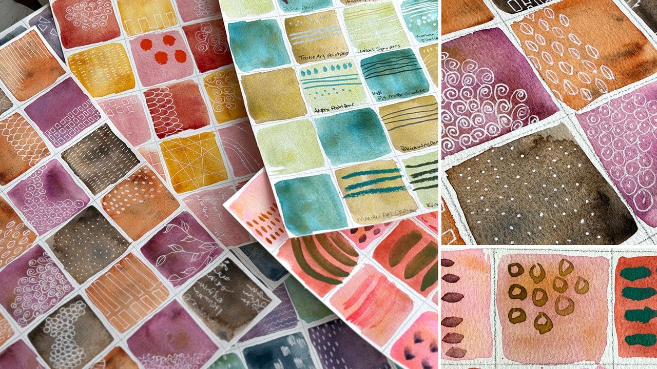
some ideas for you. These I made in the watercolor mark making class that you can
go watch that one. Watercolor mark making create a beautiful patterned
reference library. I love having stuff like this. I've done some older ones. This is from the master class that you could go watch where we study old Master paintings
and then make ourself a mark making reference library of things that we liked
in different paintings. This I've also done in the past and it's from
the Rolling Stones class, so you could um, go download these PDFs, if you want to copy of these
that I've already made. This is just a mark making
guide where I did marks in a little square and
punched them out and stuck them all on
here. So it was prettier. But yeah, just ideas for
mark making because as we're marking in our little stripes, we'll want to look up maybe and think of, well, what
else could I do? And now you've got some ideas. These I made in the
watercolor mark making class. And what I like about these is they're colorful and
they're pretty and I've come up with lots
of different marks to inspire you and you can just paint some of
these for yourself and hang them on the wall in front
of you as you're working, and then you have something
lovely to refer to for a reminder of different
marks that you like. But I did put the
PDF over there in your downloads of these sheets. I photographed these
sheets for you just so that you have
something you could look at and reference
and get ideas if stuck on different things that you might do as mark
making in our stripes. I'm trying to keep
these more simplistic. It's all about the color, but I do want you to
have some ideas. I have included these in the colored ones
in your download, and then you can go back to
the Rolling Stones class or the Clempt class to
get those downloads, if you want to go
to that PDF page. For those, and that's about it. That's where I'm also going to maybe use those pencils
I talked about, and that's what's going
to live on my table. I do like to tape these down. My favorite tape choices are the Blue painter's tape and
the Holbein artist tape. I have decided that I
really, really like the Holbein artist tape because
it's like a washi tape. A weight, and it peels off of the watercolor
paper really nicely. That's the tape I will be using. And so there we go. That's our inspiration
and our supplies. So grab up whatever it is that you want
to experiment with watercolors or gouache or you could do acrylic paints
for the stripes, but they're not as easy
to mark make on top of, so that's why I have
chose to go with a watercolor or a gouache
with this type project. Then gather a few mark making tools and just have
those out and ready, and I'll see you
in the next video.
4. Color Palette Ideas: Let's talk about choosing
colors for our striped pieces. You could get out your color
wheel and go with that and work with some of the
standard color palette options that are recommended as some of the most interesting ones that you could paint
with that give you the most dynamic colors where they pop off
of each other and they really compliment
each other really well. You could do the
complimentary where colors are across each other
on the color wheel. Those are proven
great color palettes. You could do split
complementary where you pick a color and then it splits
off on the two side. I like having a color
wheel like this that shows you some of
those color palettes. You've got the triad one
that picks three colors that are equidistance from each
other on the color wheel. You've got the tetrad, which
picks two side by side, and then two side
by side azure um, others or you could
equidistance around for those. Those are some tried and true. You can also do analogous colors that sit beside each
other on the color wheel. I do like a good color wheel. This one is a mixing
a guide to mixing color color wheel and
the other side just shows you add if you take this color and you add in blue or you add in white or
you add in whatever, this is the shades
that you will get. So it's a nice color
mixing wheel too. I like it a lot. Um, yeah. So that's one way
you can pick colors. Another way you could pick
colors is by looking at your colors and seeing what
looks most interesting. And so I tend to like
blues and greens, which are side by side. I tend to like red, orange and yellows,
which are side by side. I like blue and orange. So for this color palette, I've done pinks and oranges, side by side, blues and greens. Here I did some blue
green and a funky color, this olive green, but they're still side by side
on the color wheel. This one I did the red and teal, which is their cross, you got red, goes to green, but the red and teal tends to be a super poppy color palette. Look how much that just pops off the page and I've always
liked that color palette. These were a little
more neutral, so you might do your
browns and oranges and yellows and green and
orange pops off each other. This was the blue
and orange idea, but I scooted it more to
an apricot green shade. You can see how just
experimenting with some of these colors gave me some very interesting
color palettes that then I might use or I
might look at it and I think, did not like that green
in this color palette. Then you'll know
what not to do too. But here's what we're going
to be doing with those. That's my ideas for color
palettes with a color wheel. Another thing that I love to do if you've
been around any of my channels for any length of time for a couple of years now. I like the color palettes
that get ideas off of photos. These are the color
cube color palettes by Sara Renee Clark. This is my very favorite
art tool to use. But you could do this exact
same thing by looking up color palettes on
Pintrist and there are just thousands out there
to be had for free. If you're stuck for
a color palette that you might want to
do with your stripes, go looking at color palettes. If you've got the color cubes,
pull some of those out. If you don't, then go
to Pintrist and look at color palettes and 1
million options come up. That's what we're going
to be playing with. Those are some of
the ideas I have for giving you some
color direction. I'll see you in
the next video. A.
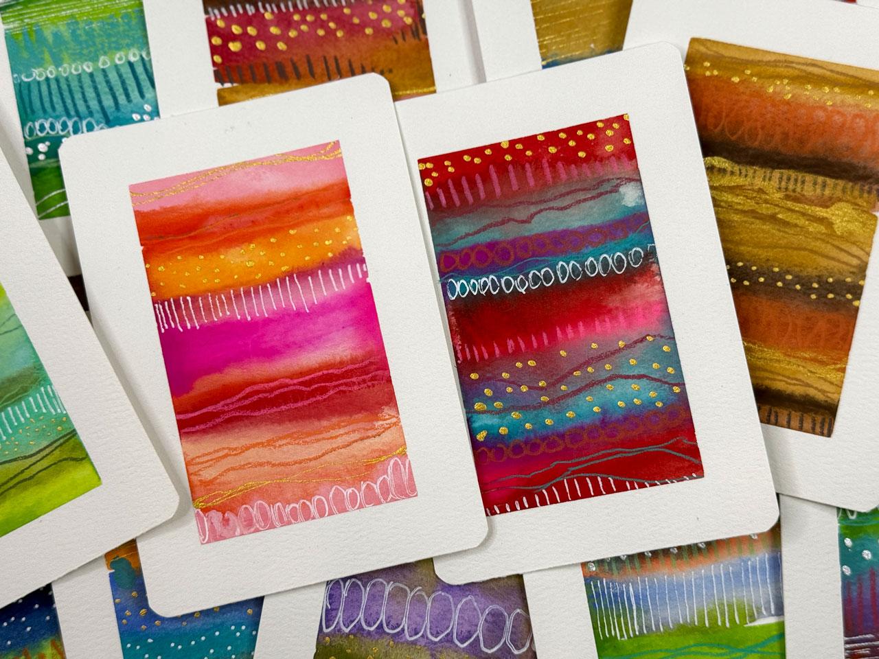
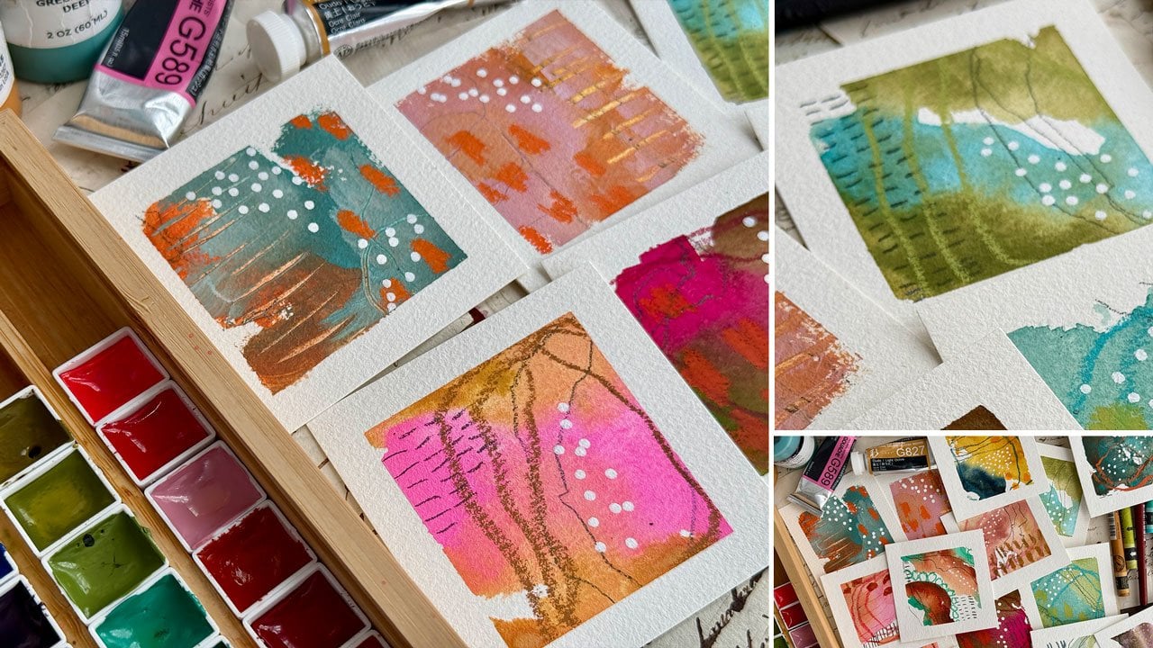
5. Analogous Colors Stripe Painting: Video, let's do our
first colorway. I want to do a couple of
color ways with you guys. I thought for the
first one we could do some type of analogous color, something sitting side by
side on the color wheel. I'm going to make these go
up and down a little bit, so I've got tape room. Or maybe you don't have
tape room, but what? That's what I'm
going to do there. I'm taping off these 3.5 by five inch pieces
that are pre cut. You can cut your own with
your watercolor paper. You could do it any
size that you want. Don't feel like you need to do the exact size
that I'm doing. You could do little
business card size. If you wanted to go
really micro mini, you could do something
larger like I did in the sketchbook
that I showed you. This really nice large one here because I'm
obsessed with that. These work in any size that
you want to do them in. I thought that for
the first project, we would do colors
that are side by side on the color
wheel basically. I personally want a larger white border
around the stripe, but you can do a thin border. I just thought I would tape these down with you
to get started. I want to say, do it in sets of three because if you do something on one
that you don't like, you got a chance to fix
it on the next one, whereas if you're just painting one painting at a time
and you mess it up, then you get discouraged. I love painting in multiples. So there's always a chance
that one might not work out, but then the other
two will there's a chance all three
will be gorgeous. There's a chance that two
won't work out and one will. Your chances of success are greatly improved if you do
more than one at a time, so I thought we would do
more than one at a time. Let's do colors that are side
by side on the color wheel. I've already made
these nice and juicy. Let's call these
analogous color schemes. If you're doing
three side by side, that's the perfect opportunity to then pick different ones. They don't have to
be the same colors, or they could be the same, but maybe different
sized stripes and different dominance in the
ways that use the colors. But I'm thinking we'll do something with the
reds and the greens. I'm sorry, the reds
and the pinks and the oranges is
what I'm thinking. You can use any
brush that you want. I'm using a half inch square
wash. You could do these also with a number ten
or 12 round brush, anything that's going
to get you a stripe depending on what you have, it's not about having anything that's exactly
like what I'm using. I just want you to get creative. Play with what
you've already got, vary your stripe sizes, and then just layer
these in there. I'm doing wet besides wet. The paper is dry. I did
not wet that paper down. The paint is very juicy, so I'm getting pigmented color and I'm using a lot of water. This brush soaks
up a ton of water and so it's just fun
to see what we can do, how the stripes run together. You could leave some
space in between the stripes if you wanted to have some white
space in there. It's not really my goal, but you could have white
space to then mark make in. Then I want them to run
and do their thing. I want it to be perfect. I
want them to do funky stuff. We've got red and
orange and pink. Maybe we could do the
blues and greens. Let's pick up a
blue and green and do blue and green as a
second color side by side. You could you put a blue stripe here
and a blue stripe here and fill it in that way. The reason why I'm
doing side by side and fairly quickly is so that
I get it to run like this. I am doing that on purpose. Let's pick this crazy green. Just because a lot of
times I'm thinking, Okay, these are fun
and they're dull. How can we make them less dull? Then I pick a crazy color
and I'm like, that did it. Like what? How can you throw the whole thing
with a different color? You could come right back on here with a different
color on top of your stripes and stripe right into the color
that is still wet. You could also wait until some of these
colors dry a little bit and then stripe into
some of that dry color. Just get creative here. There's no rules. It's
about having some fun. With your paints and exploring the paints that you've got
and not getting hung up on composition and I'm
doing color palettes, but it's not necessarily to hang me up on the color palette if you've got some
really thick areas of water because I
use a lot of water. You can take a tissue
and come over to the edge and pull that off a
little bit with the tissue. I try not to leave a spot where you can
tell that's what I did, but I do think a tissue
works good if you've got just a huge water puddle that's not doing what
you want it to do. We've got the oranges and pinks, we've got the blues
and the green. What is the other color
that we want to do? I could come over
here with these that are really
bright and yummy. It's the pink pilled again. Could come in here
with the purple. You know what? Let's do the I was going to say we could
do purples and blues, but I think I want to do these
browns and neutrally ones. We're going to
come down here and do that color set, I think. If you set your
palette up because I actually put these
in these pans, if you set your palette up, you can put them in the
order that you want, which might make it easier for you to then decide
on something like this, what colors would
you want side by side because they're already
sitting side by side. Yeah, but I'm keeping
it nice and juicy. I want the colors to
be really popping off my page and I want them blending in in ways
that I didn't expect. I want to vary my stripe sizes. I am on some of these using
the edge on some of these, I'm using the flat part and some of these,
I'm doubling it up. Just trying to give
you some ideas here on different ways to think
of this. Look at that. Yellow. Let's go
back to this orange. I love it. These are fun. I love how vibrant these gouache ones are in
the way that I use them. I do wet them down really, really good, and then I
saturate it onto the page. I like that right there. Now we got three
different sets of colors that are in the side by side range
on the color wheel. We're going to let these
dry and then we'll come back and mark
make on top of these. Alright, so we are dry. Look how fun these are. One thing I forgot to
mention in our supplies is the favorite white pen or
gold pen or silver pin. I like the panda fly. Gel pens for most of what I end up doing for
these because they're more consistent usually
than the NIBL Cigno pins. I just get them started and
then we're ready to draw. I add that to your supplies, some type of yummy white or if you like fine
liner pins for black, you could go a good
fine liner pen. I want to do some mark making in some colors that go with
what we've got here. I've got my um, black edition pencils sitting over here in front of my table. I sometimes think, what
colors are in that? Then how can I throw
in a surprise? Gray pink. I love it. This is why I
like using color paltes too because I can't be trusted sometimes with
the color choices. They may go off in a
direction that might not have been the
best idea, but still. I'm just going to
pull a couple of these black ones out as some mark makekrs
for each of these. And just see where can
we end up? Just choices. I'm not decided that
these are definitely going to be what I use,
but I've got choices. So maybe those. Then
for the blue green, let's just pull a couple of
blue green ones in here. Then I like white, which is what made me think of
the panda fly set. I like these extra bright
choices here for this maybe. So I'm kind of thinking that possibly this super weird
color with that tea, look at that. Oh, look at that. Oh, my gosh, look at that. I also like a few
of these maybe for the Karen dash No
ColorTo crayons. And I've just got a vintage tin that lives on my desk
that I dig through. So it's like my little little
vintage tin crayon box. The adult edition
of your crayon. Look at that color.
Oh, my gosh, yes, yes. So you see how you can
just kind of look. You can have a few
supplies just ready to go, pull some colors out
that are cool to go with that color way and
then just go for it. There's nothing that says
there's anything right or wrong about any of the
choices that you make. It's all about experimenting
and being like, what if I did this or
what if I did that? There's some fun fun color. Let's do that. And
some mark making. Let's do some mark
making now that we've pulled some colors
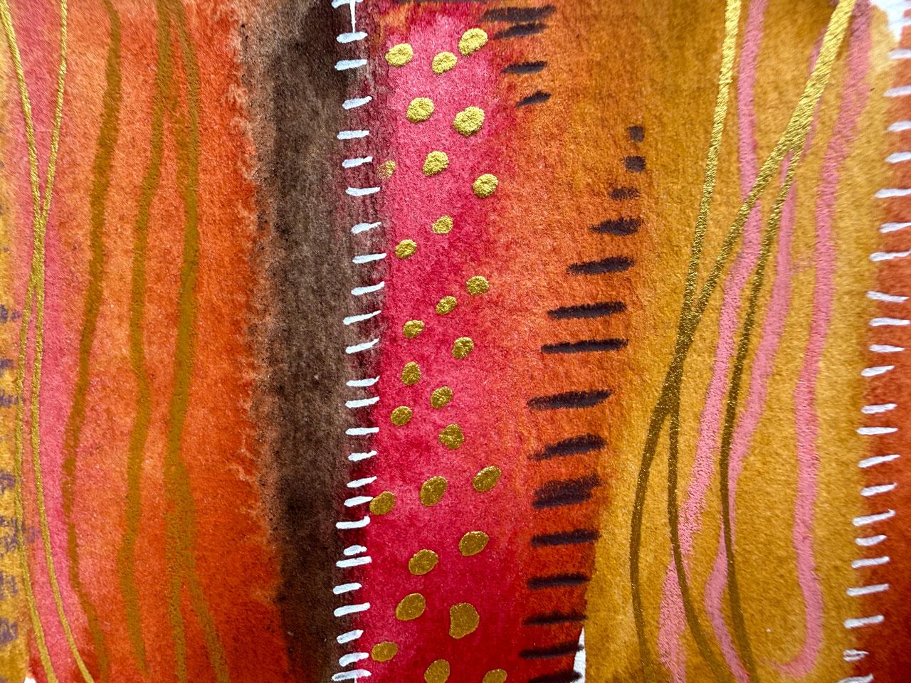
out of our stuff. What I like to do is I like to do lines, I like to do dots. I've got my gold over here, I've got my silver over here. I might do gold on
warm color palettes. I might do silver on
cool color palettes, just because in my mind, that works a little
better temperature wise. So yeah, I'm thinking some lovely extra
thin stripes within our stripes continuing
on in our stripy game. It doesn't have to be too many. It's about adding some
interest, maybe some subtlety, maybe instead of just short
long lines going across, we do some short lines going across one of the
stripes, in that case, I use the colors themselves
to be my start and stop point gives me
some boundaries. And these pencils have
just been the best. Somebody recommended it to me a year or two ago and I did an art hall video and they're like, I really think
you'd like these. I'm like, oh, okay. Then after I used
it, I was like, Yes. Okay, I like those, and then you didn't see them for a while. Then lately, I'm like,
Let's use these. I'm like, Oh, my gosh, totally turned into my
very favorite pencil now for mark making because I do they recommended it because I liked my bold graphites and I'm like, you're
exactly correct. New favorite, thank
you very much. Bold mark making, I'm all there. Like all that. Feel like this could use some white something. I feel like I need to
bring that white back in. So maybe we could do something
like some lovely ovals, giving us a different
shape than what we used on the stripe
above and below it. I do try to keep in mind, how can I differentiate each stripe a little differently
than the other stripes on the piece just
to have interest as you're going through the
whole thing looking at it. I love that. I feel like we could maybe use
some little dots. Another fun pen that
you might consider with these are your Posca
paint pens, obviously. The smaller one would give you the best tip for
finer work like this. Uh, so I'm just trying
to give you some ideas, things to keep in
mind, to think of, to look around and say, Oh, yes, I have that or oh,
I really like that. Okay, look at that. I was cool. Okay. I love that. All right, let's
just move to this one a little bit over here. I like this kind of fun
green here. Oh, yeah. And see how that very thin line works in with the
very fat lines. I love that contrast of
size and texture and color. That's why I love doing
stuff like this because that's what I enjoy
color, texture, pattern. I don't like to draw
recognizable things. Uh oh. I've had plenty of art classes
through all the years, and in all of those years, I always come back to texture and color and pattern
and abstract art, and, you know, it's
not for everybody. You have to decide what you
like in your art practice, but it has really turned
into be what I love. And so once you figure
out some of the things that you love, you
know, lean into those. Lean into the things
that bring you that hello that bring you that joy. And then you'll
want to show up and create I love that. We could do a scribble. It's same with what I just did right there,
but that's okay. We could break it up with
some little white detail. That's why I don't get
too concerned about what you do on one
strike versus another. I want you to look at those as opportunities for
creative problem solving. Not as uh oh, I didn't like that or uh oh, I made a mistake.
Nothing is a mistake. It's an opportunity
to creatively problem solve something and make
something that you're like, Oh, I didn't think that's where we were going to end up because, you know, I let the plan go in my mind.
I don't plan it out. I like the serendipitous nature of where can I end
up? Where can I go? Nothing's truly a mistake. It's more of, now
that's on there, what can we do to
make that work? Oh, look at that. See, now we've brought the
white from down here, up here, so it's not like hanging out there by itself
in that one area. Yes, I like it. Oh, okay, so let's go ahead and
move to this one. I'm coming I'm gonna do the metallics last because
I almost said, Oh, I forgot the metallics, but I didn't really forget them. Alright, so again, some
nice, lovely thin lines. And with the thicker lines, I almost want like a pink. Can we throw this pink
in here and it work? Let's just do it. Yes. Yes, that did actually do better than I expected
there. Good job. And then the pretty
brown. I like this brown. See how lovely and bold
these colored pencils are. I just love them. Oh, look at that. We can just make that die
off if we've got a color that dies off and
pick it up over here. Start thinking of how can I add some interest without just
going straight across? Here, I've got the little
circles that don't quite meet. With here, we can do
some lines that don't quite meet. That was super fun. I could do some
scribble in here. I feel like I need something. Let's do the scribble right here because I feel
like I want it, that made a fun little
W all the way across. That was super fun.
Okay, I like the Ws. All, let's put some
white in here. I feel like I need some white, maybe we'll do some
lovely little lines. Kind looks semi semi
with that, though. Let's do another one
down here though. I'm going to ride that wave since I already committed to it, and then it's not by itself. I do feel like this one could
definitely use some gold. Okay, let's go back into the metallics. I
feel like the gold. The secret on using these is
to shake it up good when you got the ink in it and you put any ink you want in
these fine line bottles. I do like the blue
line fine tip one. There's another one
that's a bigger tip, but these inks are so liquidy that if you um have
the bigger tip, you're just not going to
have any control at all. The way that you mostly
control this tip is almost parallel to the paper. You don't want to use
it like this because then too much comes
out and you can't control it and you can't
control how big your dots are. But if you'll have it almost
parallel to the paper, lightly squeezing it, you have a lot more control
over that ink flow. That is my recommendation
with the ink. I got to set this where I
don't put my hand in it. Because the ink will take
a little bit to dry. There we go. Feeling
like we need some dots. Hang on. I need to I got to
think on a second. Do I want the dots right in here and maybe some lovely
swirly lines going? I feel like let's just start over here
because I just had an idea. Maybe some through there. We love that and then we'll
do some good dot action. Okay, what I like
about the metallics and you don't have to do
metallics in your piece, but I do love the
extra element of shimmer and shine that I
get from the metallics, which I have completely leaned into when I'm making
stuff because I love it. I love it. Not everybody does. If it's
not your thing, don't do it. I love that. Let's
do that up here. I feel like I need some
shiny bits up here. Oh good choice. I feel like I need
a little more gold, like one more tiny little
stripe of something. Maybe wreck right there, tiny. Ooh, just wreck right across,
not even swirling it. Just real light lines
down the bottom. Good one. Oh, my gosh. This is why I do
stuff like this. It's super exciting when
they kind of come together, and I know you still can't
even see the finish bit yet because it's
still taped down. But then pulling the
tape, super exciting. This is the silver ink. Let's just get that
one. Let me get a little piece of paper again
just to get it started. I like getting it started
on another piece of paper. It gives it time for the
ink to come down into the tip and then it'll get
rid of a water bubble or two. Then once you've got
that, let's go ahead and then stripe it right across. Yeah, yeah, yeah. Then maybe
some dots down here where we have let those lines of stuff not really
actually connect. Super fun. Maybe some
little dots right there. I love it. Oh, my
gosh, Cam feeling. Maybe a swirl down here. Yes, yes. Okay. And maybe a tiny, tiny, little bit of dot action right
up here. How about that? Then the silver is going
to take a bit to dry. I'm going to take my
heat gun and dry those, and we will be ready to pull the tape because
I feel like we're there. It's not about picking 1 million different patterns or a ton of different supplies. It's about picking three
or four mark making things and a set of colors and just seeing
what you can get. Okay. Now looks dry enough. Let's peel some tape and reveal
our three pieces that are side by side colors
on the color wheel analogous kind of in the color
families that are similar. Man, Oh, my gosh, see. Tape pull every time. Tape pull. Make some magical. Look at that. Oh, look at that and we
got a pretty little shine. See, I just like
that extra element. I'm already into the texture and the color and the pattern. And now we got to shine. Love that one. That might
be one of my favorites. But I love this one, too. Oh, my gosh. This is
why I make classes. So I sit down and I create more art in a style that
I was already loving. And I create amazing stuff. Look at that. And that silver, I didn't like the
silver at first. I was all about the
gold, but that silver by Kurataki is nice
and shiny silver. I really like it in
the fine lime bottle. So look at that little thin
set of lines going in there. So pretty. Just subtle, very pretty. Can't
like that one. These are so good. This was
such a good paint day, guys. I hope that you embrace
simplicity like this, just stripes and just see
what can you end up with. Look at that one. So pretty, and then you see the shine. It's like that extra little
wow element. Alright. That was fun. Hope you enjoy trying
out analogous colors, ones that are side by side on the color wheel and just seeing what you
can come up with. I'll see you guys
in the next video.
6. Complementary Colors Stripe Painting: Video, let's do
complementary colors. We did in the last video the analogous colors that
were colors side by side. Now I'm thinking colors opposite each other
on the color wheel and then we just see what we come up with.
You've got red green. You've got this reddish orange and this turquoise
blue green color. We've got orange
blue, we have yellow, orange blue violet, we've
got yellow and violet, which is yellow and purple. Then we've got this
yellow green color with this red violet color. Violent, violet,
green, red again. That's where we're thinking. I particularly love
orange and blues. I'm thinking this
blue, green, red, orange color palette would
be a good one to start with. When I'm looking at that, I'm
looking at this thinking, and we're not have to be
exactly exactly here. It's about getting close, letting this lead
us in a direction. But if you don't have
the exact color in here, you can certainly
do color mixing. Um I prefer to just get close. I'm thinking since we've got
red orange that we could do this two orange
colors that would be similar and this
aqua color here. This here, we've got this
lighter and this little darker. It's where I'm thinking
with that color palette. Close is good enough. Don't get hung up
on colors being exact or not being exact or you can't find something or not. I want you to get close. We're just looking to
experiment and play in new ways with our paint
colors and our paints, and I want you to
have fun with this. I don't want you to
be stressed about, I do or don't have a color
or I can't get it exact. I really want this
blue to be even bluer. All right. Fun. These
are already fun. Look at how those colors pop. I mean, you can see why
colors like this are super popular for how they pop off
each other so amazingly. Okay, I really want more
pigment in this blue. There we go. A little more. I might have to pull
that color back in with a pencils and stuff
with my mark making. I'm just going to pick up
some of this water that just traveled so they don't just have a big
puddle hanging out. I kind of did some fun stuff kind of doing what it did there. Right, so now we've got that. What color do we
want to do next? I'm feeling like I want to
do something with a purple, so we've got blue violet and
yellow ochre, yellow orange. I'm thinking. That's
what I'm thinking I'm thinking this yellow
ochre down here. And something in
the blue family. So let's look at
our color palette here and see what's
going to be close. I pulled this six oh two kind of thinking these two right here
might go good with that. So that's kind of
where I'm thinking. Oh, look at that color. Oh, yeah. See, that's totally
something I haven't done before in any of my paintings. Keep in mind, you
can do really fat stripes, little thin stripes, a you could do
transparent stripes, solid colored stripes, all
kinds of directions you can go with this to
make it interesting. It's all about
texture and opacity. Now we've got that one.
Let's see what else we got. How can we get something totally different? I want
something with a green. Oh, how about this
red violet with this yellow green,
the funky colors. In that red violet range, we've got this 588 and
yellow green wise, we've got this funky
bright color here. Okay, looking at that thinking, and then I might, who knows? We're thinking this
color up here. If you get off the color
palettes, not a big deal. It's just about showing up and experimenting and creating
some super cool stuff you never would have
created any other way. Basically, let's use
whatever this color is. I'm getting a little off, but I am I did start off
with good intentions. Oh, we're so funny. We are so funny. We're
cracking ourself up here with these lovely colors. Color just brings
me a lot of joy. I want color to do
that for you, too. I want you to enjoy the colors. Let's do this darker one again. Let's do a little
strapy striper here. That was a lot of
a stripy stripy. It wasn't a little
bit. It was a lot. Alright, let's do the funky
one cause there we go. We're at the end. I like it. Oh, oh, look how cool
that turned out. Oh, my gosh. That's kind of wow. Now, what we could do is
we could let these dry. We could do watercolor
mark on Mark. Let me dry this a little bit. I want to do a
little bit. Hang on. Okay, so the reason why
I kind of wanted it a little bit dry because I
want that darker color, and I just want it
to be on the tip of my brush, and I want to do this. So all your marks don't have to be with
your supplies and stuff. Your marks can be
watercolor paint on watercolor paint
or paint on paint. That's what I'm thinking,
paint on paint. Let me pull out some
of this puddle. This is a pretty cool
one. Now I'm wondering, do I want some paint
on paint over here? Maybe we want some of
that yummy blue or even this little
bit of green and we could throw some more color
in there because why not? Let's do one over
here. I don't know. I'm not feeling it on
that one. Let's let this dry and then we'll come back
and do some mark making. All right. Look
how fun these are. These are super fun. Okay, so I'm going to pull a few maybe little curons that match some of these colors. Just ones that I think might
be fun or the pencils. I do love the pencil
ones. Let's see. I like this marooni
color in here. Let's pull one of
those. I'm thinking something in the orange
possible family there. Uh, maybe the blue. Oh, look at that one. Oh,
that one right there. We could even maybe go
even towards the green. No, I like that one.
Let's stop there. Got this one with the
neutrals in the blues. Let's just see here. Kind of
like this yellow ochre one. Oh, see, no, I don't know. These are maybe this blue one. Kind of liking that.
This one I need. I need something in
that bright family. I'm feeling like bright bright. Like, What do we want
to do over here? I'm almost thinking even like
something like that color. And we've got that
dark green or like, almost like a it's almost like
a like a green like that. It may get off a little bit on my original colored
thoughts, but that's okay. The fun is getting started and getting yourself on a
specific direction. Again, I like the contrast of big stripe and
little tiny stripe. And the boldness of these. I'm thinking maybe some oval. Again, letting my color start or end me wherever I need
to starter in there. Maybe I'll come up here with this color just so it's not
sitting out here by itself, even though up here, it
does look even more vivid. It's almost purply blue, but I like it. Yes, I do. I like that. Okay. Let's see. Working on all of them at
the same time a little bit. I love this color. It really is a contrast as we go across that color beside it. I mean, it really pops out. You can tell too, when I did those little paint brush marks, part it was still wet
and part was dry. That's a really good lesson on If it's still wet,
it's going to smear. If it's dry, it's going
to give you clean marks. I got cleaner marks over here, so definitely keep in mind how dry do you need it to get the look that you're
trying to get? Oh, I like that.
That was different. Kind of like a just a scribble in here,
just something fun. Oh, I like that. Okay, good
job. Good job. Good job. Let's do it over
here. I want some of this coming through the orange. Look at that. Oh, my gosh,
I like it. I like it. These just make me so happy. Alright, what do we
think about like an orange wine in here. So I'm trying to keep in
mind as I do some of these, I'm not getting too hung up on anything being perfect,
nothing perfect at all. But I'm trying to
keep in mind of some different shapes
in the stripes, maybe some lines going vertically and some
going horizontally. I am trying to keep some
of those ideas in my mind. Then I'm thinking, contrast
this with maybe some white. Maybe this will have
some really tall ovals. Yeah, that was a good choice. Good choice. I like it. Again, I'm just
letting the lines of the stripes lead
my design or pattern. See, this one actually gets
larger and goes this way, do I continue straight or do
I go wider with that line? I'm thinking that we
still allow that color to determine our start stop
point and we go whider. That's what I'm thinking.
It goes wide, we go wide. Now I need maybe some dots. We might just I'm going
to pull the posca out. Let's do some pasca
dots because it's faster than the gel pen to have a little paint
pen. Look at that. That's a good one. C like that. Gonna need
something up there. We're not done yet,
but we're gonna feel like over here that
we need something. It could be gold, though. Let's pull some metallics out. Metali in the house. C, I feel like I need paint
dots over here first, though. Right in this little center
part, that's orange. Again, I'm letting if I decide to go in the
pink part of that, then I want to keep all that pattern in the
pink part of that. It's not going edge to edge. It's just doing in that
little center bit there. A little bit of
interest in there. Then I like to have
a little scrappy here just till I get it started. Then I really want
right across here. Super thin line. You see how
I got so much control out of that by having it almost
parallel to the paper. That's the secret
on these bottles. And, you know,
it's going to take you a couple of, you know, practice pieces or whatever to really get a handle on how
much pressure that you're putting on the bottle versus how much ink you've got coming out that just
takes some practice. I like the gold dot, so much. Not every dots going
to be perfect. Some might be an
Oopsy big fat splot the few that I've done that
with then I've just taken a paint brush and just
blended the whole thing in. I started again, basically. Look at that Look at that one. Oh, my gosh. Okay, I feel like I feel like we could do
silver on those other two instead of gold. What do you think?
Because we're kind of in the cool color
families a little bit. I'm feeling it. You got to be careful that you're not
taking off this blue part, which for some reason, likes to snag on mine. Don't let that roll
across your art. I feel like I need on
this one. The super thin. It doesn't have to be
perfect. I'm not going for perfection. I'm
going for interest. For me, interest is not perfect. Look at that. Look at
that. Oh, my gosh. So good. Alright, let's do. Let's do. Do we need
gold or silver? I'm thinking it's just
gonna be the silver. Let's do this across the top. I like that. And I kind
of liked it over here. Let's do it over here, too. And not worry if I
have any thicker part. I just I just don't
worry about it. And then maybe maybe
some little silver in the little openings there. How about that? Uh huh. Let's do that. Okay.
That's a good one. Maybe a couple just
write down here. So it's not like the
whole thing with dots. It's just kind of dots moving
along with whatever we already have going on in there. What do you
think about that? Okay, now we need to
dry that gold and that silver so we
don't mess it up. Alright, close enough, let's peel some tape. I feel
like we're there. Man, these are so much fun. And by playing with your
color wheel color palettes, you really do get
a feel for ones that pop and look cool and ones that are like, Oh,
wouldn't do that again. Like, red and green
is very Christmasy to me. You don't see
me do that a lot. Look at that. Look at that one. I do love blue and orange. Ooh. And aqua, my
favorite color. If you're wanting to know
what my favorite color is. I have a sofa that color, and I'm on my second one, so we're gonna say over
the last 20 years, I've had two pool colored
sofas, and I still love it. Look that. Super cool,
kind of more neutrally. Pretty lovely shine and that
little bit of gold in there. Yeah, I'm not sure
I'll ever get tired of that pretty aqua color. I like orange a lot too. Most people don't
really care for orange, but I do like orange and
then look at that one. Super fun. Don't think that's my favorite color
palette but it was definitely super fun
to experiment with it. There we go. What
do you think about complementary colors and
a little color palette play there with those colors? All right. I'll see
you guys in class.
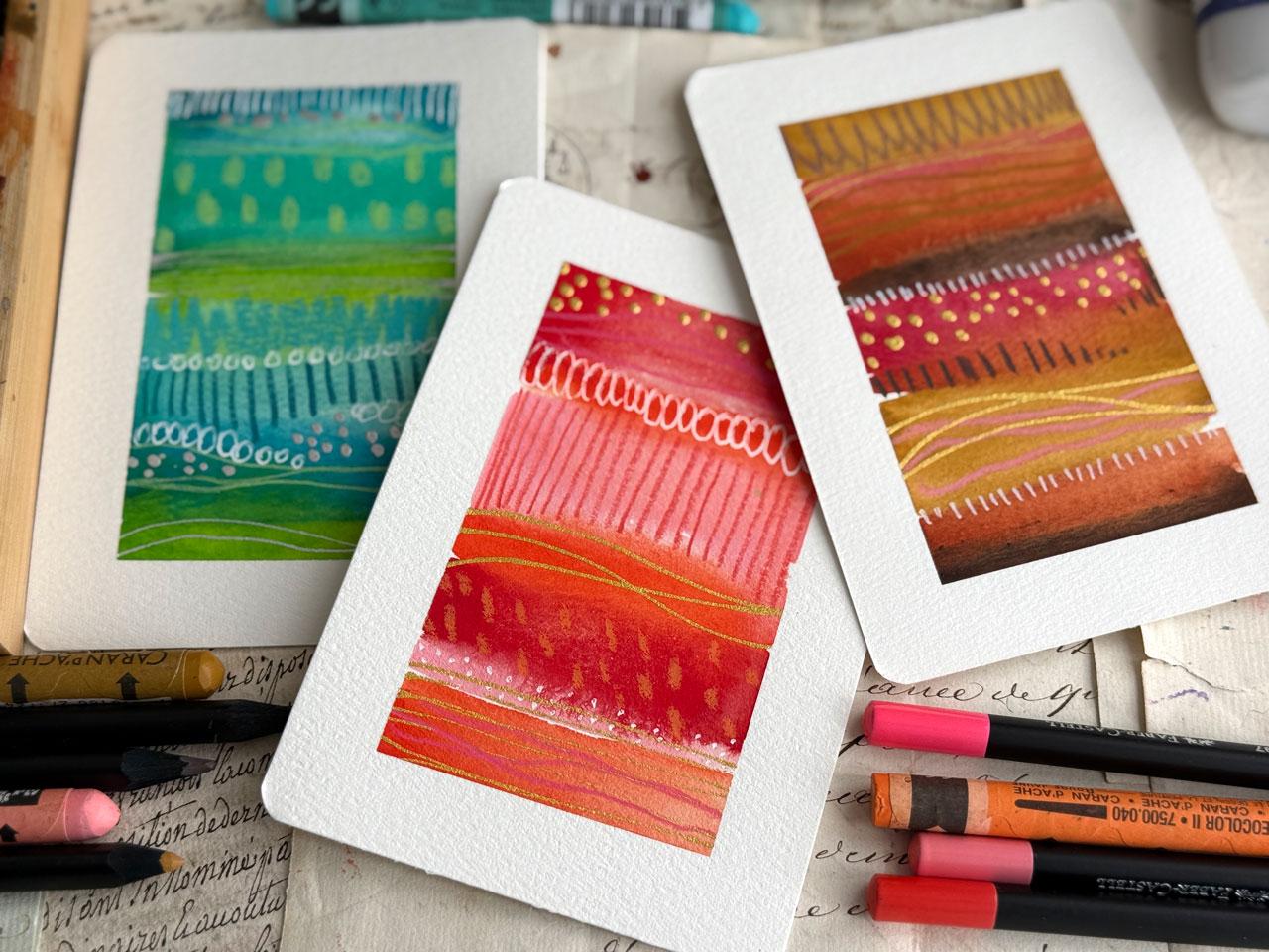
7. Split Complementary Stripe Painting: Video, let's go
ahead and move to the next color palette here that the color
wheel gives us. We've already done
the complimentary, we've already done
the analogous. I thought we would do
a split complementary, a triad, and a tetrad. This video is the
split complementary, which is basically
one main color. Then instead of going directly across the color wheel
to the one opposite, we go across the color
wheel and then go left and right one color so
that red violet, which is a purply color would
go to green and yellow. I'm thinking we could do orange and that would split off into a blue and
a green basically. So I'm thinking that we're
going to do some of these. Let's start off with the
orange because I can get pretty close to color
palettes that I love with this hob and
gouache and I've given you this color sheet sample in your supply PDF so that when I'm pulling colors and I don't
know what they are, you can go look in this and
see what colors I'm pulling. They're in order with
my palette there. Oh, yeah, I thinking that maybe we'll start
off with an orange, maybe this 531 or eight oh four and then we want more
in the blue violet, which is a purply blue, and then blue green, which
is more like a teal. In my mind, it
could be something like these two right here. Gold is not to be exact, it's just be interesting. What if we do this 531, this 572 and this 560? I think that gets us right
in there with are split. So that's what we're
going to do for this one, and then we'll pick colors
for the next one in a second. But I'm thinking
that's the first one. Let's just go ahead and lay some color down and
you can make them look different depending
on what you lay down first and how thick
you make your stripes. I've gone ahead and wet
these down a little bit to get them started because these dry out more than a watercolor, and they're very thirsty. So it's really good
if you can go ahead and wet them down when you sit down before you start painting before you
tape stuff down. I forgot to do that today, so it's not as juicy as normal. But the longer you can give these to really
saturate in the better. I'm doing some thick
lines and some thin lines and letting them run together a little bit and just
getting some interest. If you don't want
them to run together, then you can wait in
between the layers. But I'm getting
nice juicy layers and I'm going ahead
and letting them spread and do their thing just for some fun
because I like it. I'm going to get a
tissue and if I have too much water
gathering anywhere, I'm just going to soak a
little bit of that up. Again, I want to make sure you understand you do not have to use anything that I'm using. You do not have to have
gouache, you can do watercolor. Let's see what else we got.
Look at this green here. Let's go with this funky green, which I know I've
already got, it's that G 553 on our thing. I've got a red and a violet, so I don't have a
red, yeah, I do. I got a red red about to
say I don't have a red red, but I do right
there. And a purple. I don't have a true deep purple, but we do have
this fun lavender. Let's just throw it
in there because I like it when the
colors are weird. Weird colors make me happier cause I never would have done this color palette if I
hadn't done this exercise. This is exactly why I like
doing stuff like this. I just smushed those
together, didn't I? It's still a real fat
stripe just a why not? It'd be fun. Maybe
a little green at the bottom. I won't
look at that. I got so much. I'm real
bad about I've just noticed for myself
coming all the way to the end and dropping a
ton of water on the end. So on the next one, I'll
try to do different. Alright, let's see
what we got now. I kind of like this aqua. We already did a blue and
orange, though, didn't we? What do we not do? We could do this deeper blue with a
brighter yellow and an orange. Yeah, yeah, let's do that.
Okay. So what do we got here? I'm thinking. I'm thinking
just dropped a water in there. Let's just blowing that in. Thinking this brighter
blue blue here 566, I think is what
that says on here. Who that is a blue. Oh my gosh. That's like a
whole bunch of blue in there. What do we say? We
said a blue and a yellow I don't like yellow. I'm thinking we're going to use yellow, but I
don't like yellow. G 823. But you know what? If we mix it in good enough,
maybe it'll be a green. And then an orange. Ooh, should we do this kind of midtone orange or
this bright orange? Kind of feeling
like bright, right? I heard you say it,
I heard you vote the bright us now we're just
going to be obnoxious here. This is an obnoxious
color palet. Oh, my gosh. Just pulling that right out. All right, we'll just say it. We'll say it right now. That's my least favorite
stripe one. But that's okay. That's okay. It's interesting to learn. Not every one of these learning experiences have
to be our favorites. But I do love this one.
Let's soak up some of this. Extra extra. We got puddles. I do like this lovely
blue over here. All right, let's let these dry and then I'll be right
back. All right. These are dry and I want to
do maybe some mark making or something within one of these
now that they're dry dry. Thinking that just
would be interesting. Doesn't have to be
anything special, but maybe some extra fun marks. And because it's dry dry, I should be getting nice crisp mark making
just like that. Now, those look like almost like littlest little purple
ghost. How cool is that? Super fun. Or little
purple trees. Little purple trees. I totally looks like little purple trees. We could come through with
maybe some thin lines and we could do this
with the pencils too, but I think it's fun to use your supplies and experiment
in a way that maybe we haven't done before and these lend themselves well to some
extra fun experimenting. I really like the blue
over here, the teal, but I think I'm going to throw
in maybe a lighter shade because It still blends in
with that pretty tilish color. We would like that. Good choice. I like the orange. Let's see. This one still still
not my favorite. But we could do
some works up here, maybe some lovely bigger
brush dots or something in a color that will still
show up on top of that blue. That's fun. All right. Good job. I like these. Um, kind of thinking
maybe some pencil line. So gonna pick pencils out of my favorite Castle
black edition, going to pull some that
I think kind of still fit within the color palette that we've picked. So
that's a good one. I like that. Okay, good one. Good job on that one. Alright. Ooh. Don't get the
pencil in the way there. Look at this. What I
like it. I like it. Okay, so I'm kind of thinking lines and the
reason, of course, I've mentioned in
class, but in case you've skipped to
a certain video, these I like because
they're bold. They are the best mark making colored pencils
that I have found. I love them. And they're bold like my 14 B graphite pencils
that I like so much. They're bold like
that, nice and bold. All right. I'm thinking
on these colored pencils. Flip it over for maybe an orange and maybe we'll do some mark making over here,
maybe a scribble. Look at that. I don't like
it, but that was a good mark. Then we've got
some other colors. What color? I don't think
any of those, really. I mean, maybe the blue. Um I kind of feel like
maybe we should do some mark making on
top of this one, and maybe the white. Let's get that we started. But maybe we could pull
some white back in here. This is my Pandafly
white gel pin. These white pins by Pandafly have turned into my
favorite ones because they're more reliable and consistent than the UIBL Cignas. Okay, I like that. Let's
do some of that over here. You know, at this stage, what
makes something successful or not successful to
me now is colors. I can almost just
throw anything down, and I'm probably
going to like it. But if I don't like the colors, it doesn't matter if it
ends up good or not. If I don't like the colors, I get stuck on, Oh, I
don't like that piece. I did not love those colors. So this is not my
favorite piece, but I do think over though for the color
that we got in there, it works, but not my
favorite favorite. Let's do some big flower
petal shape here. Which fits in with the ovals, but has a flat edge or it ends instead of seeing
the topper oval there. We'll call it a flower petal. Oh, I like that. It's like a little
ruffle up there, like a little
fringe, little bags. Okay, I do think
I need some dots. We're going to go for
the paska for the dots. I've got the extra
fine pointed paska here because these are
little tiny pieces of art, so the little tiny detail
makers seems appropriate. This is that one
that's 0.7 millimeter. I like that? Let's
do that up here. This looks like trees at night, and this is the night sky and I just put stars in the night sky. I love that. Just a
fun little thought as I'm creating
that little stripe, super fun, super
fun. I like that. Okay, this one needs some more needs some
more. Let's see. How about What we got
this orange here? Yes, I like the orange. And we could have just a
fine scribble on this one. You don't forget to look
at those mark making idea sheets that I have
in your PDFs also. If you get stuck and
you're like, oh, I want a different
mark, but I don't know what mark I want. This is, that's a good
idea guide for you. Okay, I'm kind of thinking maybe possibly
gold on something. Feeling gold on this
one. What do you think? KurtokiGld Mica ink in our lovely little
fine line bottle. I like to just get it started so we can get it fed
into the tip there. Oh, yeah. Just give me
some stripe action. Let's do that over
here. I like it. I go to switch to the silver, but not going to. Kind of like that. Oh, yeah. Let's do that one over here. Once you decide that you don't love, the colors in a piece, you start thinking, what
else could I do to that? Let's do a few dots down here. Because you get. You get
brave when you're like, Okay, I'm not invested
in that piece anymore. You get brave and
start experimenting, like, What if I did this
or what if I did that? That's the piece that we're just like, experiment on that one. These other two I love. This is the perfect way
to discover if you love color palettes for the
split complementary, what color palettes
would you like? It could just be the depth of color that I used over there. If I had done that
in a lighter set of orange and blue and green. I might have liked that
better because I tend to be liking these better
in the lighter shades. But I think I'm
there. Let me dry that gold so I don't smear it. These two, you can do marks inside of marks
inside of marks. You can be as detailed as
you want on some of these, but I feel like there's
so little that I'm good with the amount of mark making that I'm
accomplishing on these, but it's definitely something
fun to experiment with. Oh, my goodness,
look at this one. Okay, so split complementary with greenish and
bluish and orange. I like that. Super fun. I like a little bit
of shine in there. That was an interesting
color palette. This one with the greenish, red and purplish,
I liked it, too. Usually red and green
make Christmas for me, but that green was a
different shade of green. It wasn't Christmas green, and that made it a little
more elevated for me as a color palette that didn't end up
looking like Christmas, even though we did have a
little Christmas tree farm in the middle with
the night sky there. But that one's super fun, too. I love that one. We're
just going to say that these This one's not my
favorite set of colors. But it was interesting
pulling those out of the split complementary range and just seeing
what would we get? What would it look
like? This reminds me of a little boys room. It's very, very rugged
and intense in color. Yeah, I love those.
Hope you have fun with this color palette, doing the split complementary
colors on a color wheel, and I'll see you guys
in the next video.
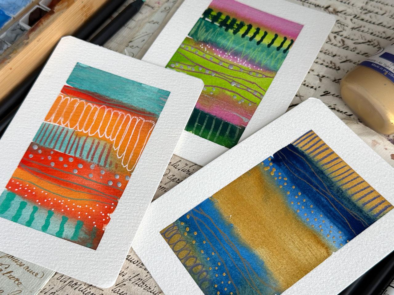
8. Triad colors - Tetrad - Artist Choice: This video, I thought
it would be fun to do the last few color paltes, but I'm going to speed it up
and not do three of each. But I was thinking
we could do a triad, a tetrad, and a People's Choice. Like, what is it that
you might like to do, what's your favorite
color setup? Triad is three equidistant
colors on the color wheel. Orange, green, blue violet, red orange, blue green, blue violet or violet, green and orange or
yellow, red and blue. They're not my favorites, but we're going to do it anyway. If we do a red orange, which we know I like red orange, we're going to keep the
color wheel handy here. We're going to call that color
right up here, red orange. This eight oh four. Then we've got the blue violet, which is a little more blue, so we're going to call
that one the 573. Then we've got
this yellow green, which is a funky
color, maybe that one. And I think I could buy
into that. Let's see. Let's just do it. We've
got this fun red orange. Then I'm going to
come down here to this what we're going to call
blue violet that is bright. Then we're going over to this
super funky greenish color. I thought I was going to like
it, but now I'm not sure. You got to lay these colors down and really look at
them and be like, do I like that color palette? Is that something
I would do again? I think I just picked up a different blue,
but that's okay. It's very close. The goal is that you
made the effort. It's not that you got it exact. If you pick up a different
one and you're like, ops don't get upset about it. It's fun to just
see where it leads us and see where that effort got us and then we'll know if we want to
do it again or not. That is fun. Feeling like
I like that better than that third one on that
last set where it was all really intense. Let's pick out tetrad.
That's our triad. Our tetrad would be orange and purple til and
green. Let's do it. It's going to be
similar to that, but a little different.
Let's do the orange. Then we got a purply color, which I'm just going to
get as close as I can. Then what did we say? We said orange and purple tell. Let's pick up this pretty
tell because I like it. Tell. What else did we say tell In this kind
of greenish color. Alright, let's do
it. Yeah. Alright. There we are. That's
what we're going with. That's our story
enough. Sticking to it. And I'm not putting
down the stripes in any particular order. I'm just being
inspired to just ride, which everyone kind
of jumps out at me. It doesn't have to be perfect. We don't have to get
anywhere specific. Ooh, let's do the
green at the top. I'm just having fun. Okay. So there was
enough water on those that it's making a
wave. Look at that. I think we'll just let it kind. I've got some build
up, so I'm just going to pull some of the build up really gently with a tissue. You can make textures in
these too if you want to use some texture and corrugated cardboard or bubble wrap or any of those fun
watercolor texture tricks. You could do that too.
Don't limit yourself to just coloring regular
mark making tools. Think outside the
box a little bit. I'm digging that one.
Then the last one, dealers Choice. What's
your favorite colors? What is it that you would
really like to see? I'm thinking Thinking some of these natural colors and maybe a bright pink thrown in. Maybe, don't ask me why. Just feeling it for some
reason. Thinking some of these. Thinking like this
burgundy shade. I like that a lot, actually. I'm not really following
a color palette, more following what colors seem the most interesting to me. I feel like these
might be the one that was in the back of that
book similar to that that we looked at that
I'm just in love with. I feel like this could
be that similar feel. Now that we've got it going
in here, these are lovely. It could be my favorite
piece of the whole thing. And of course, you can
do all artist choice for all of your
stripes if you want. I just thought it
would be fun to experiment with the
different known, interesting color
palettes and just see what would that create for us if we
did some of those? How would we like them?
Would we use them again? Just some fun ideas. With those. I do like this lovely
vivid T one, T one. Okay. Let's let these dry, and then I will be right
back to mark make. Alright. We're almost dry.
We're getting close here. So I thought we'd go ahead
and do some mark making. I've got my pencils over here. I don't know if the
colors are bright enough, but let's pick a teal and
throw some lines in here. I do like the fine lines
that these pencils give for these lovely
kind of abstract, stripy compositions,
it like that. Kind of need like a braider.
Then I got it here. He would go like a reddish.
What are we thinking? Maybe a red? Why not?
Why not? Let's do it. Oh, yeah, that's a good choice. Again, I'm just using
the color separations as my visual separator to start and stop what
it is that I'm doing. This one's a tiny
bit more orange. What if we go more like
this orangy Samiy color? Okay, that's fun. I feel like I need a bright a bright
green. Oh, look at this one. This one's kind of bright. Why not that one?
Yeah. Yeah, why not? Okay, that's fun. Okay, not so good on the purple. We already did it now.
It's kind of light. It's kind of like too light. Like, I can see too
much of the underlayer. That's okay. That's kind of fun. Alright, let's see. This one. This one is so beautiful. Like Fils. Fills
people's so beautiful. Oh, so lovely. Feel like I need a
pre semini color, but it's not quite that color. Oh, yeah, we could use that. Let's use that. Ooh. Me like e, me like you, me likey. Let's see. How about a burgundy? How about a burgundy. It's kind of the
same as the other. I guess I'll throw another line in there since I
did that, though. That's too Sami, Sami. We already had that color. I should have just
stuck with that. Alright, let's do some white. Feel some white in
our future here. Maybe just bring some of that
lightness back in there. This is the pantaflyGel pin. Oh, I love that. Yeah, I need another
white somewhere there, but I think I'm going to go
ahead and do it in a dot. So I'm going to do these ovals in between
these blue lines that are going on this green blue layer. And what I like about that is
that it won't be straight. I'm following something
that's there. I've got the pencil lines
that are very fine, but you can tell
as you get closer, that I was following
those lines, not a specific color
stripe. Look at that. Oh, super fun. You can mark
make in the mark making if you feel like that
needs more details. You can detail that up with more little stripes or lines or dots or another layer
of ovals in there. I like the simplicity. Um so I don't do extra
detail a lot of times. I kind of like the simplicity
of that first layer, but some people love
all the extra details. So I'm just giving
you some ideas. Alright, let's wait strape it. I mean, white.it.
Wait dtrape it. We already did white drapes. Mm. Alright. Yes. It's
that little fine posca pen at 0.7 millimeter one
with a very lovely fine dot. Oh, that one's so
pretty. Alright. I feel like I need some
little fine dots over here. Yeah, I like it. I like it. All I like it. Let's
do some right here. Now, I know the
Tetrad and the Triad are two of the interesting
color combinations, but I'll tell you, they're a
little bit less favorite for me on this set. They're okay. They're okay. The gold totally
need gold on that one. All, yeah, yeah,
yeah, yeah, yeah. Work with me here. I'm
going to do a little. Let me get it started
before I get it on there. It gets off the
air bubble and it lets the gold get
to the tip there. I just want super fine. Lovely. Totally a total favorite. I feel like these would do
better with, like, a silver. So it's a silver kerataki
ink in my fine line bottle, if you haven't seen the other
videos where I've used it. Look at that. All
right, that's fine. I feel like I want
to do that up here. I just like the extra
texture that that gives me in those layers.
I just like it. Might not be your thing.
Whatever your thing is. I want you to show us. Show up, do some painting, post in the project gallery, and tell us why you liked
whatever it is you did. Or if you didn't like
it, what did you learn? There's plenty on here where maybe I didn't love it,
but I learned a lot. And if the thing that you learn is that you didn't
love it, there you go. Look how pretty
that one came out. Not my favorite. What
it is kind of cool. And somebody else might be like, Those are my favorite
colors ever. That's why I still do, even though the colors
might not be my jam. I still do them and post them. With all my doubts and stuff because those might be
your perfect colors. We're not all going
to love the same. Then I like that this one
became similar but more complicated or more
complex we threw that fourth color in for
a four for a tetrad, for a triad for a tetrad. And then here we
go. Artists Choice. What colors would
you pick if you just looked at that lineup? And let me tell you. This
is one of my favorites. Oh, my gosh. Look how
beautiful this is. That is so pretty. That little tiny bit of shine, it's got all my
favorite bits in there. Oh, yeah. Total favorite. Alright, Dealers Choice
today for the wind. Hope you enjoy trying out
these last color palettes, Triad, Tetrad, and
then your choice. So can't wait to
see some of these. I'll see you back in class.
9. Recap of Projects: Thought that we might do a
little tiny recap of what we did in class Look how pretty all these are.
Oh, my goodness. This class was originally
inspired by some of these that I did with the
Holbein artist guash. I'm using the same
guash that I used. You can tell some of these
colors are very similar. I love this one with the
bright bright pink in there, which is similar to
what I was trying to create in this last
video with that one. But this one was
brighter with that opera color pink. I like that. Then I did a bright green. These were all artist choice, you'll understand that if
you've watched all the videos. Um, but it's kind of fun to use some specific
color palettes from the color wheel or using color palette cards
or however it is that you like to pick
colors and create. It's fun to experiment and see. Which ones would
you visit again? Which ones did you like? Which
ones did you not care for? I personally like
the analogous set. These were the complimentary
set and out of that, I love these two and
this one was okay. But for me, some of that is the colors that
just aren't my jam. Then we went to split complimentary Tetrad
Triad, and dealers Choice. So out of all of those, I liked artists choice. I liked analogous colors, so I do like it when they're on the same side of
the color wheel. I do like complimentary colors. And then the more
colors we throw in specifically from the
color wheel that I choose, maybe not my favorites
out of those, which is why I like using
color cards so much, which I showed you earlier in the video on when you
were picking colors, what what you might consider. I decided to go color
wheel for these because we can all look at a
color wheel pretty easily. But when I get more
complicated in the colors and more complex, I like using the color cards because I think it picks
colors better than I do, which is probably why
when I pick the colors, it's maybe not my favorite
and that's why I enjoy color pilot cards so much. But this was fun. I
liked experimenting with the different known
color ways that are interesting and just
seeing what could we create with these
given the opportunity. Hope you had fun creating. I can't wait to see some
of these that you did. Share those in the group in
the project area, please. I truly enjoy logging in and seeing all
the projects posted, and I'll see you
guys back in class.
10. Final Thoughts: Thank you so much for painting
with me in this class. I hope these many
abstract stripe paintings inspired you to
experiment with color, try new marks, and enjoy the creative process without
worrying about perfection. One of the things I love most about working
small like this is that each painting becomes a little playground for ideas. You can explore
different palettes, textures and patterns
in just a few minutes. I encourage you to
keep going and create a whole series try new
color combinations, change up your
marks, or experiment with different materials
like metallic paints, colored pencils or ink. If you feel comfortable,
please share your many paintings in the
class project gallery. It's always inspiring to see how everyone interprets
the same process in their own unique way. Thank you again for joining me, and I hope you continue
exploring color, marks, and creativity in
your own art practice.
 DENISE LOVE, Artist & Creative Educator