Transcripts
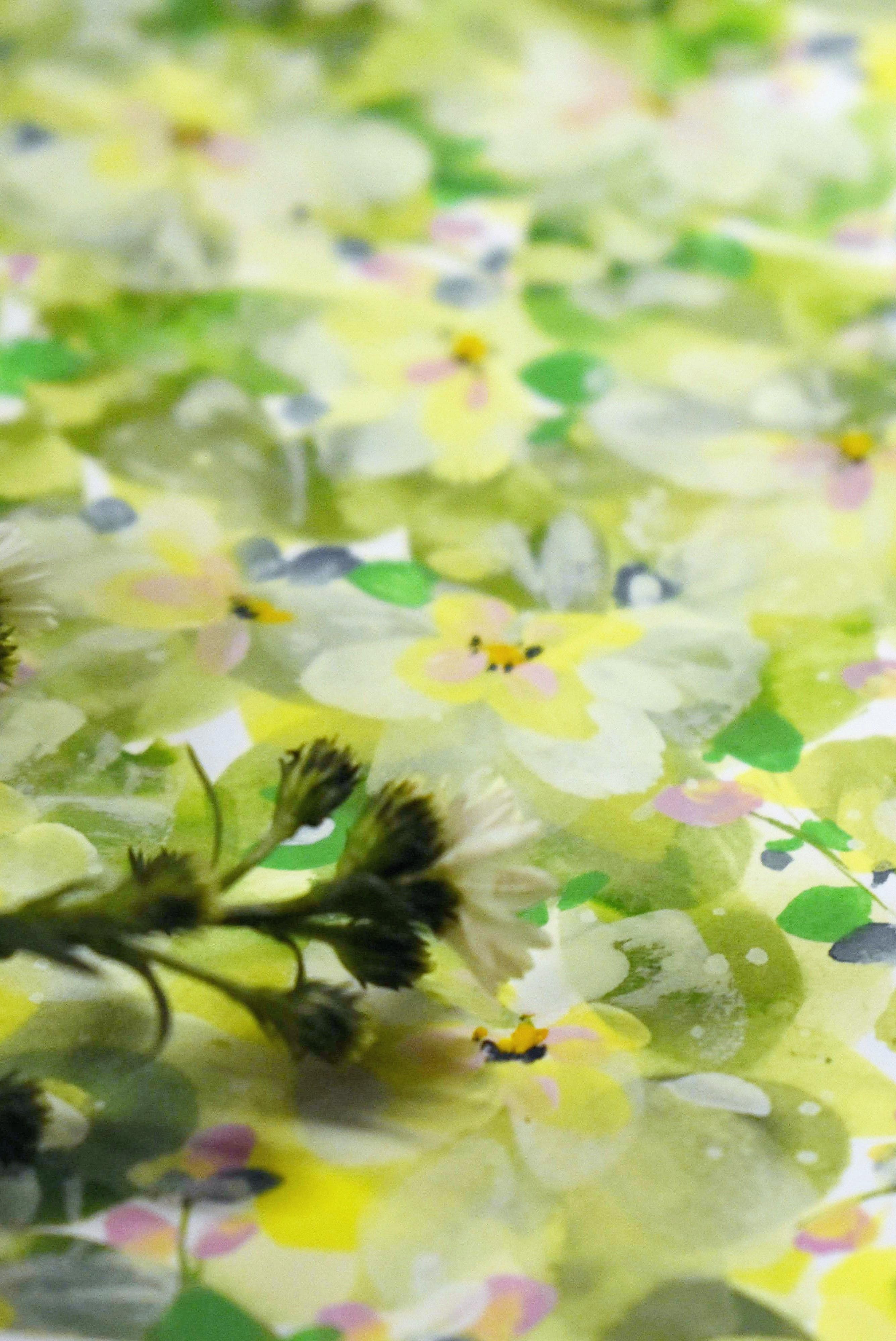
1. Welcome To Millie's Meadow: Welcome to Millis Meadow. We're going to be
creating a ditzy design. Ditzes are made up by regular patterns of
small flowers or motifs, multi directional and
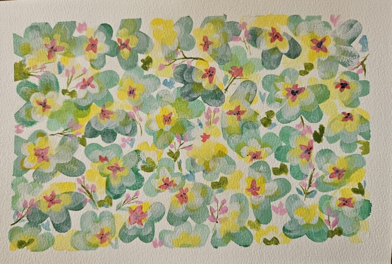
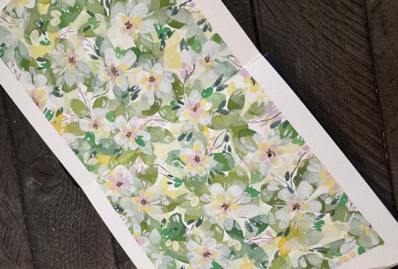
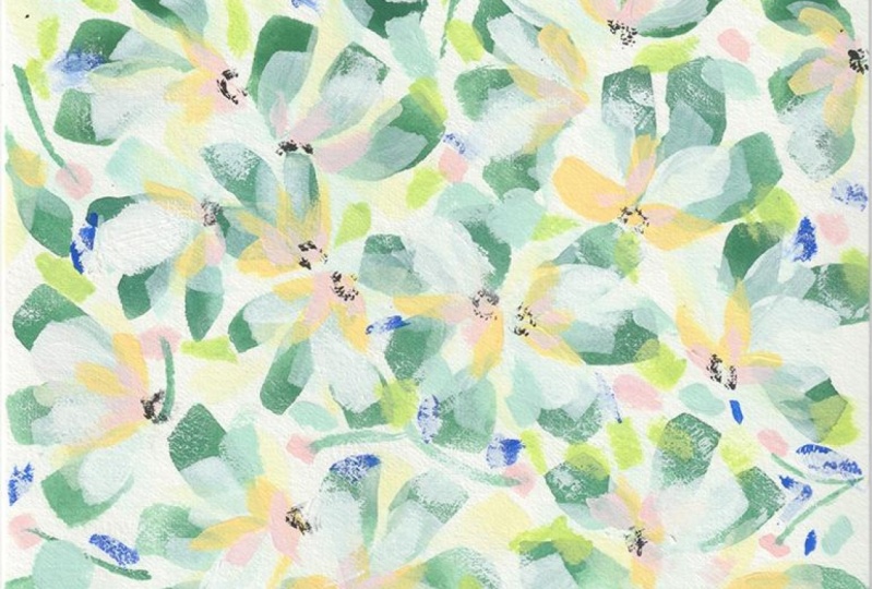
a scattered placement. I use dises a lot
in my design work. And here are some of my diss, which I've done for
the design industry. The great thing about them
is once you zoom out, it all becomes really cohesive. There are some
large design houses whose identity was built
around ditsy designs, and growing up in
the design world, they influenced me hugely. So today, I wanted to share with you my signature technique. So we're going to primarily be using translucency
and opacity. And we're going to achieve that by using different
values of paint, starting with less value and working up to
a greater value. And if translucency and opacity
are the star of the show, Detailing is its support. We're not only going to change
the value of our petals. We're also going
to go from larger and to smaller and
more detailed. This also creates
a sense of depth. If you're new to skill share, let me acquaint you with our
projects and resources area, which is just below the class. Here, you can upload
your project, and it's brilliant because you can not only keep
in touch with me. But also you can get tips and a whole lot of support
from your fellow students. So let's move on with our class.
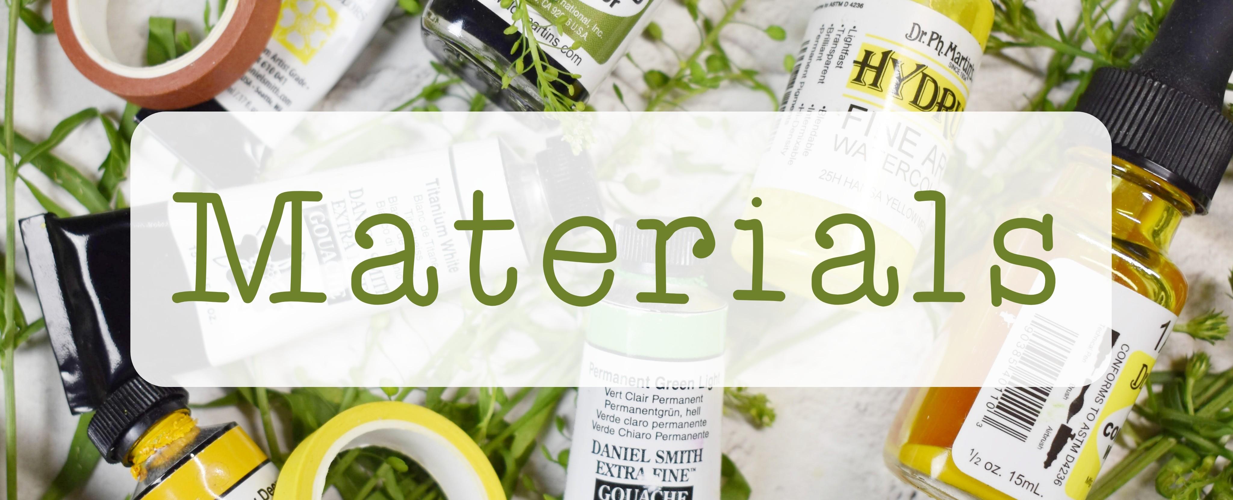
2. Materials: Let me run through
materials with you. This is a fabriano
artistic hot pressed, and this is the
five by seven pad. Let's take you through
brushes first. I don't quite know
what shape this is, but I can refer to as
my pointed filbert, and this is a size
12 memory point. These two blue ones
came in a set, which I use a lot. First, I use the size four. This is master touch
aquamarine and its ab, and the size two in
this range as well. I'll leave all the
details for brushes. Finally, just a fine liner. This is Billy Schools. If you don't have a
fillbert, don't worry. I'll take you through how to use a round brush as
well for this class. Here I have a size two coda, and this is travel brush. Here I have a size four
Princeton Neptune. I would normally go
up to a size six, probably, but I
don't have access to all of my art
materials at the moment. I used a size ten in the demo. This is an cow go
through paints, we're going to be using
an awful lot of white. I've used white gh, but you could also
use white watercolor. That's our friend
today, the white. The green that I chose
for the initial layer, which I actually mixed with some quin lin is
permanent green light. This is the Daniel
Smith brash too, but it can be watercolor or
any choice of paint that you like interchange wherever
you feel necessary. The Quin lilac, as
I just mentioned, I used just to
make this a little bit earthier for
our first layer. I also mix it with
the titanium white for some little pink butts that we do towards
the end of the class. Use any pink that
you like, any red. Pink or red, mixed with the white or mixed with the
green would be perfect. As for yellows, I used a
hands yellow deep go again, but it could be watercolor. I used hands yellow light. I think I only used
a tiny bit of this, and this is watercolor as well. These two on the side, we're going to use the black for the centers of the flowers, but you can mix a black or you can mix a brown
or a gray, I should say. The way to do that is to mix
three primaries together. We have a blue here and
just before I go into that, this is Prussian blue, but any blue of your choice, and I use a ti amo of this
towards the end of the class. It was on my palette and is
a little bit out of view, so I apologize in advance. So we have the three
primaries here close enough because we have
the pink yellow and blue. If you mix all of those through as we have
in previous classes, it will turn into either
a gray or a brown depending on how warm
or how cool it is. If you have a black that will
make things a lot easier. As for inks, now I use inks just because
they're very vibrant, but also they make lovely first layers because we're going to be using translucency
and opacity today. The inks are more translucent, generally speaking,
guash is more opaque. We're working with
that and going through the full spectrum
to very opaque. The inks that I used here are doctor PH Martin's
25 B olive green, is the radiant
concentrated at color, and lemon yellow,
which I think I referred to as daffodil
yellow in the class. So correction that
is lemon yellow, one radiant
concentrated a color. I think I also used
a tiny bit of this, which is 25 H hands
yellow medium, doctor PH Martin's hydrous. I accidentally, I think, dipped my brush into
14 H yellow cha. I don't think I meant to use it, but I just want to
show it in case you wanted to use that if
you had it in your stop. Okay. Apart from that, all I needed then was just
to take off the page. It's not necessary, but I
do like the way it outlines your work and just makes it look really finished and
polished and clean. When you're using white
and mixing with white, you have to be really careful
to be using a clean brush, constantly can just
keep washing a brush between going back to white because you can
pick it up from anywhere. It seems to come in
from all angles. Sometimes it can pick it up from your palette
by accident, sometimes off the blotting
paper that it might have. Sometimes because your
water has got dirty. Clean water and white, that's what we need
primarily in this glass. Let's move on to
our next lesson.
3. Preparing our Palette: First of all, I'm going to make sense of the
palette for you. I started out on this before realizing that I was going
to make a class from it. I was working with paints that were already on my palette. In the first lesson, we're going to be doing
the initial leaves, and I used a mix of
permanent green light, which is here and quinacridme, light, which is here. What that does is it just makes the bright green just
a little bit more natural. Let's start to do that now. I'm just reawakening
the green here and this is the gash but
you can use watercolor. Then all I did was just
bring over a little bit of that quinn it makes this
gorgeous natural color. So I'll just pull that
out for you so you can see that. Gorgeous. Okay. In the second lesson, we were mixing a white, but just with water because we're wanting some
translucency here. So just going to bring a
little bit of that down here. Then I can show you this
over this green here. So you can see it's very watery. Can I add a little bit
there so you can see. This is the first
translucent layer of white over the green, and we'll build on that, but you can see that it
has a lovely effect. For the third lesson, we put down some
translucent yellow petals. I'm just going to bring
it over here so that it's easier to see and I can
put some fresh paint down. We were using a white
g or water color. Okay. And all I did was just bring some of that over and it's so concentrated, you can easily mix a lovely buttery yellow if
you add more even more color. And what we were doing there was similar to the white petals. We were just pulling these
over the layers underneath. For the fourth layer, I actually used the
25 H handsy yellow, and this is where I mixed it, so I'm just going to add a little of that
I'm running out here. Let me go. And we're trying
to reach here a 50 50 mix. So I'm going to bring
over quite a lot of the white mix
that into a 50 50, a little bit more
water, I think. And I do want to block this because we're
still going for layers. So I'm going to take
a lot off my brush. It's a little thicker
than this layer. I put more yellow in
it so you can see. But we could also add more
white to that as well. So for lesson five, we're using yet more
pigment to water. I'm just going to clear this
away so beautiful color, but I need this to be very clean because we're
now going into just white. I'm going to pull this
over that green there so you can see what
we're aiming for here. It's quite tacky there, adding a little bit more water. I think that's about right. This is probably a 65%
or 70% pigment to water. You can start to see there that we're getting a
lot more coverage. This is a lot more opaque. Now we're going to
move to 90% pigment. 90% pigment going in
with a damp brush, not too much water. All we're doing really is
adding enough water to make it move and let's just see
how that's shown up. You can start to see
the different layers and how opaque this is even
next to this one here. I just pull along here. For layer eight, where we do the inner yellow
petals more pigmented. I brought out my anti
yellow light watercolor, but any yellow that you like. The reason why we're
using watercolor or gouache is because we
started out with the inks, which are very soft and flowy. Now we're wanting quite
a lot of pigment to water because we started
out with the inks, which are very soft and flowy. Now we're wanting quite a
lot of pigment to water. Then I just added a bit of white putting some out there
because I need it to flow. So I'm just bringing
some of that white over to my hands yellow. We put it over the green. When we get to the
flower centers, we're actually going to use
a little tiny bit of black. So I happen to have ivory black, but any black would
be great for this, and we're just
needing a tiny bit, so I tend to just put this
in between the wells. Again, we're going to
be mixing this with 90% pigment and ten water. In the class, we're going
to use a liner brush, but I just wanted to show you what it looks like when
it's pulled out a little bit. That's the black and
we're going for that mix of dark with a
little bit of water. That's just because
we're using it very sparingly and we'll do
that in brush practice. The other thing for the
centers is to mix a peach. You can mix your yellow with whichever pink or red echoes and on the side of the yellow, I think, it's a
lovely peachy color. All I did there was I just put little centers in the
middle of the flowers. It's even smaller than that. Let me just pull this out. So you can see the color. You could certainly err on the side of the
yellow if you wanted. Okay. But again, these are
tiny little blobs even, so we want to keep
control by having that mostly pigment with
a little bit of water. Then when we get to the bright leaves that we're going to do, we can mix what we
have here with some of this this and just make a really bright
spring of springy green. Just adding a little bit
of yellow mix or white and not the red this
time because we're going to keep it nice and bright. It looks a lot brighter than
one where we added the red. And we will be using a lot
of pigment to water again. I'm just going to pull it out
so you can see the color. And sometimes, I like to add a little bit of blue because it feels to me that it brings the piece together and it
calms it a little bit. Very reluctant to come out of the tube but got
there in the end. This again, very thick. Enough just to do little blobs, nice control, and we're going to just add some white to that. I'll just pull that
out for you to see. Just so you have an idea of
what you would like to mix. Any blue, and you can
just mix it with the white or a little bit of
pink, whatever you fancy. But for this, I think I just use the Prussian blue and
a little bit of white. You could also use
hands yellow deep. You could also use this to mix into your pink for a peach. So just pick a top
and mix it with the hands yellow light to
get somewhere in between. It's just another
choice of yellow, but you don't need to have this. It's just a lot warmer than
the hands yellow light, which is quite a cool yellow. I realized when I
stopped filming that it didn't pick
up the pink mixing. I'm just going to
redo this for you. It is just a mix of quinacridone
light for your choice of pink or red and
titanium white gas. This is water color
and the white is gas. But you can interchange and
just used what you have. That's a 50 50 mix. It's quite bright and it all depends on how much
contrast you want. I wanted quite subtle layers, but you could go in with
a very bright pink for the buds and for the inner
centers of the flowers. Then if you wanted
to have a paler mix, you could have this
kind of mixture here. It's a beautiful color. M.
4. Brush Practise Part 1 : Moving on to brush strokes. I'm going to pick up my filbert. This is the memory 0.1. But you don't need
to have this brush. Now, let me just demonstrate what we're going to do
for that first layer. We want quite a lot
of pigmentoal brush, but maybe we're
going for a 50 50. I'm just pressing
down as far as I can and dragging it up and then
just twisting a little bit. I wouldn't worry about
the finish of the brush because we're going to be
adding so many layers on top. Pressing it down
and pulling it up. Let's try that again. Allowing it to fan out. Particularly because this has a point on it, you
may not want that. As you push down
with this brush, it does make a can a
fill book shape anyway. Pressing down quite
hard and then twisting. Let me show you where the fill. This would be a size eight, it's quite big actually. This would be very
similar shape. Let me demo that with the
round brush. I'm using good. This is a size ten, which is good for
this size of leaf. But as you go, we're going to be reducing the
size of our brush. With a round brush, you try to create the same
shape as a bit. We can do that by just allowing the brush to fan out quite
a lot and then bring it up. It's a similar shape, it's not exactly the same shape, and you need to work your
brush a little bit more, but I think it
looks really nice. We're going down and wiggling
the brush so it fans out, bringing it, drag
it along the page. Let's do that again here. Don't feel you have to be at a loss if you don't
have a field rate, there's always
something we can do. I'm always trying to think of things that you may
already have in stock and give you
alternatives because art materials are way
too expensive, I think. That's pretty much
our first layer. For layer two, we used a
very translucent white, but it's the same brush shape. First of all, let me just show
you where the round brush. I'll just pull it over these
green ones so you can see. I'm doing it a little more
pigmented just so you can see because it's very hard
with translucent layers. Allowing the brush to
fan out bing it up to the point Mince your brush, and let's try again. Exactly the same movement. And I will get my
memory point back. I'm just going to put
this in here because I've got quite a lot of
color going on there. Wash your brush really well
when you're using white. Then with the
filbert, we're doing the same exact
movement as the green underneath and I show you
how to lay these down. They can go in between the leaves or we could
pull them over the leaf. That's just as simple
as the other green. Exactly the same movement
as the green underneath. Here, I'm just showing you with the round brush how to do the
transparent yellow layer. Again, keeping it transparent means more water than
you would normally use. We're looking for something
like 30% pigment, 70 water. Then as we go through
mixing other colors, we're going to get more and more pigmented as we go along. For this next layer, which is layer five in the
lesson, I used hydras. It just is a lot than the
concentrated water color, and I mix that I've only got
a tiny bit left of that. Okay. The brush stroke
doesn't change too much, but we're going down to smaller brushes as we
go through the class. This is size four fiber. There are two strokes
that we could use. We can use the full brush. We're putting splaying
out again just as we did with the leaves
underneath and twist. We can do that again here. And the other brush drop
is just to use the side of the brush for a side petal. Let's try that again
over the green leaves. So we're aiming to allow
the brush to glide, but we do want a lot of
pigment on there as well. I'll just demo that with a
small round brush for you. This is the size for
Princeton Neptune. For this, if you
want a fill shape, the same as with the
larger round brush, we're going to wiggle and fan it out and then bring
it in and twist. Let's do the same here. W fan it out, and
then bring it up. You could go for the shape
of the round brush and just have a more pointed
petal if you like. Which is equally as nice. Then if you have a
smaller gilbert, we can go down to a size two. And this is for
the inner petals. It's pretty much the same
brush stroke as this here. For the inner petals, we're going for a
smaller movement. Now what I often do is I don't go full on like
this with my brush. I can use it side on. I'm using the side of the tip if you like men
pulling it through. Let me just show you the different movements that
we can do with that. If you wanted to vary the direction of
your brush strokes, we can start by
doing four brush. So your size two though, very small and then pulling
that down like this. Let's do that again.
We can also go up, it's harder, but the more that you integrate
that into style, the easier it becomes. We've got the down,
we've got the up. We can do side sweep. We can do side sweep. We could also do
these angles here. I often use it in my work. The way that I would do that, I wouldn't approach it
like this you can do, but I can approach it side
on and I pull the side of the son It's
really hard to demo, but let me do that
again over here. I'm using the side halfway down the brush and
then fanning it out. It creates a really
nice petal shape. I really like it because
it's slightly irregular. If I did that from this side, I would be going in again like this and then
pulling it in. Side of my brush again here, tip and then side of the brush. So that's what I used here, used tiny little strokes. And if I want to do one here, I could do this one here. Coming in between
these two petals. It would be this movement. Four brush arm
downwards movement. Side movement, this
stroke here, tip, flare to the side and bring
the side of the bush down. I've got a size two
round brush here, so I'll demo that too. We to do inner pink petals. There's nothing much
different here. I'm going to use
the same strokes. I just wanted to
show you quickly, and I'm mixing all the
colors a lot brighter than the actual project
just so that you can see. But you could, by all means
go with any color scheme you like or go in with a
very deep pink likeness. We're getting smaller
with our movements here. What I was doing there if
we go on this area here, we can do side. We can do that side sweep. And now just demoing this
with coder number two. I do like this brush
for making petals and it's so easy to hold and like with it being
a travel brush. So with this, you can either just go with the
shape of the brush. This is it's normal
kind of brush stroke, or you can do the
little fan movement that we tried earlier
with the other petals. Down and then fan it out as much as you can,
and then bring it up. Fan it out and bring to it tip. You definitely could do this
class with all round brush.
5. Brush Practise Part 2: And then we get into
the flower centers. I'm mixing some black here, and this is 90%
pigment, 10% water. Just enough to allow
your brush to glide. We're also going to take off the excess as well because we've got a
lot of control here. First of all, let's just do some little dots
and dashes here. I'll make them a little larger and then you can
see what I'm doing. Just allowing my brush to dance. It doesn't need to be
a complete circle. So very, very simple
and economic movements. It's best to go in with this
once all the petals are dry, but mine are a little
bit wet here still, but I can still show
you what I mean. Just allowing your brush to
dance, some dots, dashes. I do like this. It's so
minimal and yet so effective. Then we could do
a little center. As I just showed you earlier, we can mix a cana peachy color, which I think is here. Let me pull down again. A little bit of yellow, a little bit of red, and
you've got i peachy color. Then again, 90%
pigment ten water, blot bit and then we're
just doing little blobs, maybe like half moons
or full circles. These little details do matter because this is like
a peach made up of the yellow and the pink that we've used adds as a way of
blending the colors together. Cute? I think so. I do like doing these
little details a bit, but quite easy to do
because all we're doing is circles
or a whole circle, if you want or a blob, and that's it for the sentence. I'm going to do a technique
then with dry brushing. I'm just making sure that I
have a really clean brush. This takes a little
bit of practice, but once you got the hang of it, such a lovely thing to do. It makes your piece
look a bit angelic. I don't know there's something
about it that's magical. The way that I do dry brushing is the same movement
as we did here, that movement where we're
using the side of the brush, starting off of the tip just off the tip and then pulling through the whole brush. Now, the key to dry brushing
of course is having your brush dry enough
to create that effect. You want to dip your brush in
that very pigmented white. Take the excess
off and then start to pull out little
dry brush marks. I usually start at the edge of the flowers, whatever
wherever they are, and I just go from the tip of a petal and just bring
it in like that. You can always go
in between as well. I'm just going to create
some stems here so that we can just practice the little buds that
we're going to do. I have my hand off the
table for this movement and just allowing the
brush to do its thing. For the little green leaves, really bright ones that will help to bring it forward again, we're going to just use a smaller movement than these petals that
we've just done. I love this movement. It is just the tip to the
mid part of the brush. And you can do a downward
movement like this one. Sideways. Or across like this. I do like to interrupt the brush flow because it makes
these little leaf shapes, which I really do like. Do these a little larger than
we will do in the project. But these are almost abstract, so they are shapes really. Don't think of them as leaves. We're just putting
blobs down loves. You can also add
these little petals around the flowers as well, little leaves poking
out from behind. Then we're going to
bring in that blue that we mixed earlier. You don't have to
do this. In fact, you can stop at any stage
throughout this whole project. You can see I've only
got a tiny bit of paint there and that's
because we're not going to be using a lot. We just little flops and put them down
where fancy really. You can vary it from a tiny circle dot or I can
pull through a little leaf. I tend to do this quickly because it doesn't
give me time to think and we're not trying
to make leaves here. We're just putting blobs down, and it's nice to place them
next to the green in places. All I'm doing there is a
little blobs basically using half a brush size two tiny brush and just
making little marks. Again, you can do them poking
out behind your flowers. I realize I missed out
putting the buds in, which was one of my
favorite things. It's the same movement
as this really. All we're doing is just building up little blobs of color, sometimes next to each other, sometimes on their own. I do that slowly. I'm interrupting the movement, I'm not pulling it right down. It's more like this. You go along your stems here. Drop these in where you fancy. You can also do this with white, 90% pigment ten water just put tiny little highlights
over certain areas. We're really enhancing our
little project here by adding all these tiny little
blobs of color, and they interact
with each other. I do like it because
it's expressive. It's easy to do.
We're not trying to make it look like
leaves or bubs. I just blobbing away
wherever we feel like it. I cut really love
this technique. And then should you wish. Again, you don't
need to do this. It's just something I did at the end to go in with one last, pigmented brush and just put some tiny little marks all
adds interest to the piece. I mean, you can carry on and
carry on and at some point, you have to stop.
It's very hard. The very final thing we're
going to do together, and I'm just going to pull through some leaves here so I could demo this much better. Make it quite dry so I
don't have to wait for me. I just want to show you how we can splatter some white
on right at the end. It is very tempting
to do a lot of this. I'm trying not to B again, it gets so enjoyable that we can go a
little bit overboard. We want this way. I I got enough white
here, probably not. Remove some of this here, we're just going to water
it down quite a lot. You can always try it out on some paper before you splatter. I tend to just
knock on my finger. People have different
ways of doing it. That's the way that I do. I like this brush for that. It's really nice splatter. Then you go. I do a lot so it shows up. That's my excuse anyway.
Isn't it pretty? It just really finishes off
the whole magic feel to this. Oh, I love it so much. Absolutely gorgeous. One more thing which I forgot to include is I did use a little
bit of this olive green, 25 B do PH Martin. This is such a nice
vibrant green that it's nice to add to
watercolor or gush. You can see just changes
things up a bit. I forget my little page back. Or I can just show you how we can just pull in a slightly different
green with that in. I enjoy using these inks. Now we are just another
green that you can bring in at some point if
you want to. Okay.
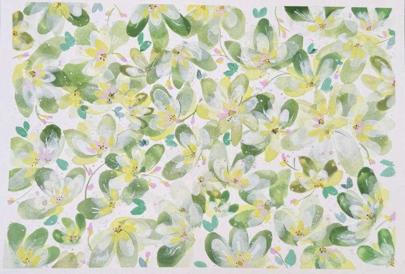
6. 1: Green Leaves: So let's start by
taping off our page. I'm using five millimeter tape just so I don't lose
too much of the page. So I'm going into the permanent green and mixing a little bit
of white guash, bringing over a little
bit of the quin lilac there just to make the
green a little more earthy. And we're using that
first brush stroke that we went through
in our practice. This is with the
memory point brush, but you could also use
your fill bit here. Tading a little bit more
white there to my green and randomly placing this
cluster of three leaves. And all I'm doing is keeping an eye on which
direction they're pointing and making sure that I keep turning
my page round. I'm just adding a touch of the daffodil yellow
there into the green. And we're just going to continue on making these random leaves. And you can see I've
just carried on here, adding these leaves and just leaving a little
bit of white space. Let's move on now to our second layer, white
translucent petals.
7. 2: White Translucent Petals: So what we're going to do for this layer is to add quite a lot of water to our white guash
or white water color. Now, although guash
is very opaque, you can still achieve
a translucent look. I'm taking off the
excess water pigment. I don't want this
to be too watery. We need some control
for our brush. And you can see here how beautiful these translucent
petals and leaves are. I'm continuing to
pick up the watery white and just taking
the excess off. Even though this is watery, we do still need to blot
off the excess water, just so that we have control
over our brush strokes. And you can see here the lovely interaction
between the petal going over, a leaf which is
still quite damp, and I really love that. So I'm just continuing on
building up the layers. In some places, I'm
going right over the green leaves and
in others in between. It can be a bit of a
challenge using white because it just picks up any other color
that you're using. So to avoid that, just keep washing a brush
and picking up fresh paint. You can see that my
white has a tinge of green despite
my best efforts, but I think it
looks really nice. In the next lesson,
we're going to move on to yellow translucent petals.
8. 3: Yellow Translucent Petals: So I'm mixing some of
the daffodil yellow, and this is the doctor PH Martin's
concentrated watercolor with white gouache. I'm adding quite a lot of
water to it as we did with the previous layer and
blotting off the excess. I'm not too worried about
making these perfect flowers. So I'm just placing down these petals wherever
it feels right. And as in the previous layer, sometimes over the white, sometimes between
the white petals. But don't get too worried
if it all seems a little out of control at this point because it will come together. And don't feel restricted
to the previous layers. I'm putting some petals in here around the edge onto
the white paper. This is more of an
intuitive process. The nature of a DTC
means that it's small scale and
randomly scattered. And as we work
through the layers, this becomes more defined
and more cohesive.
9. 4: More Opaque Yellow Petals: This whole design is about
transolucency and opacity. As we go through the layers, we're going to increase
the value of our paints. We're using more paint to water. I'm mixing up some
more yellow here, what we're aiming for
is a 50 50 ratio. Continuing to blot and take off the excess just
to keep that control. So you can see that the
layering in our class project is very gradual and quite
subtle at this stage. If you feel you've laid down
too much paint and mortar, go in with the dry brush as
I just did then and lift it. So I'm just looking at placing
them over the white or in between the white as we
have with other layers. Remember, we don't need the
flowers to look like flowers. This is a random
stage of the process, where we're just doing
intuitive marks on the page, making sure that all the motifs are scattered over the page, but with not too much
white paper showing. Let's move on to the
next lesson where we'll be placing more
opaque white petals, increasing pigment to water.
10. 5: Opaque White Petals: So this time, we're going to add even more pigment to water. I'm using white guash. But white water color or
any other white that you generally use in your painting
should be good for this. I'm just ensuring that
my brush is really clean and adding a little water. This is probably 80
pigment to 20 water. Trying out the movement here. I'm really pushing down on the brush and allowing
it to flare out. You can see that because
we're using more pigment, this is sitting on top of the layers that
we've done before. Again, I'm keeping my
brush strokes varied. I'm thinking of this more
as an abstract layer, keeping up the random
placement of the petals. The white over the deep green in particular is really lovely. And I don't want to go
overboard with this layer. So maybe just one or two petals. And then, yeah, I'm
happy with that.
11. 6: 90% Pigment White Petals: So now we're moving over to
a 90% pigment, 10% water. And I'm just taking off all the extra color
that's made its way onto this little glass coaster and putting down
some fresh white. I really want this to sing, so I need to make sure there's no stray color getting
into the white. Just ensure that you have some fresh water that
your brush is clean, and that there's no stray color which could get into the white. We want this to be
really white and. Because we're making
more defined petals now, this takes a little longer, but it's also very
restful to do. You can just take
your time and I'm alternating there
between the full brush and the side of the brush. It's at this stage
that we can really appreciate all the layers
that we've already done. Keep varying your strokes, and the direction
of your petals. I'm starting to add
some very tiny details. Using the side of our brush, but our very light
and quick movement. Just adds a little
character to the petals and suggests a side view or petals that may be on the
far side of the flower. It's worth spending time
over these little details. You could also use a liner brush to make
these tiny little lines. Again, making these
tiny little marks over the darker green really
brings it forward. Just a few more petals, a few more little gestures, and none, I think we're
ready for the next layer.
12. 7: Stems & Buds: So now we're getting to the
pretty little details part, which I really enjoy. So getting our line a brush, we're going to use 90%
pigment to ten water, but ensure that there's
not too much paint on our brush that just
gives us control. And we can make thin lines
that aren't blotchy. I'm adding the lines randomly. I'm not worried about
them connecting. I'm mixing a little bit of the quin lilac with
the white gash. Using quite a lot of
pigment on my brush. This is the opposite to what we were doing
with the liner. And then we're just
adding these pink blobs, if you like to the little stems. It's such an easy
little brush stroke. These are our most
throwaway movements. Semi abstract. Just
the suggestion of maybe some pink blossom. Adding another color at this point really brings
our project to life. And that's it. Let's move on.
13. 8: Inner Yellow Petals: So this time, we're needing
a very pigmented brush, so I'm using handsome
yellow light water color. And that's because the PH Martin's concentrated
watercolor is quite runny, and we really want something that's going to stand out here. I'm going to use a lot of
pigment on our brush again. Tiny little movements
smaller than the white ones that we did
inside of the white petals. All we need to remember here
is to keep a balance between having a very pigmented brush
with a lot of paint on it, but not so that it gets tacky, and we also don't want to
go the other way where it's too watery and
we'll start to spread. Whereas these are very
much defined now. And I'm using the full brush and also the side of the brush, as we did with
your larger fiber. I find it useful to keep moving my paper
around at this stage. It gives me a good perspective. Again, this is a very
meditative thing to do because we know
the brush stroke and we know that we want to add these inner yellow
petals to every flower. It's a repetitive but
meditative process. We can relax right into it. I'm adding a couple
of petals here and there over the green leaves. Again, this gives
us a feeling of. Starting off with
more watery strokes in the background and now creating this foreground with more defined brush strokes. That's really great for
creating that depth of field. And now I'm just putting in some yellow next to
the pink blossoms. Just little dabs of
color here and there. So let's move on
to our next layer. We're going to be adding
some inner pink petals on top of the yellow ones. We'll start to see all these
gorgeous, luscious layers.
14. 9: Inner Pink Petals: So I'm using that mix of quinacridone lilac with the
white for these inner petals. So I'm using my
size two filbert. But if you don't have a filbert, you could use a round
brush for this or any small brush that you're
happy to use for petals. And we're going inside the inner yellow petals
that we did previously. You could use your choice of red or pink mixed with
the white for this. It doesn't have
to be Quin lilac. By now, you'll be in the flow, and this becomes slightly
easier because we've already warmed up so much
with the previous petals. So it becomes more
and more relaxing. So our little ditsy is
really coming to life now. A
15. 10: Flower Centres: So now we're going to
concentrate on the centers, but this is a very
simple technique just to bring the
flowers to life. Very minimal. So we'll be
using a liner brush for this. We're going to mix
a bit of black. If you don't have black, any dark color like a dark purple or brown
would be just as good. I'm adding a little
bit of water to this, but I want it to
be mostly pigment. What we're trying to
achieve here is a brush which glides easily with not too many dabs
of paint on it. So it's very thick paint
with a little water, but enough for it to move. And we're just going to.in
these very simple centers. What I've learned about centers is it doesn't have to be as
complicated as you think. I think a lot of us shy away from centers.
I certainly do. And I've realized that actually just a few little specks of color can be just as effective as when we spend
a lot of time over it. Sometimes just little
deft movements, little dots, little
dashes are enough. So less is definitely more I do apologize because this
is just off the screen. But I noticed I had some handsy yellow deep gash on my palette, and I thought I would use that along with the
black for the centers. I'm just mixing that up. It was actually
dried on my palette, and I'm just adding
some water to it. I want it to be
quite thick and we don't want too much water
on our brushes either. We want just enough to fill in between the
little black dots. Very thick paint, 90%
pigment, ten water again. I just thought they
would look really cute against the black. Of course, you can use
any yellow that you have. And actually, if you
mix a yellow with the quin lilac or the
pink that you have, it will make a lovely peach.
16. 11: Dry Brushing: If you haven't done
dry brushing before, it can take a while
to get used to it. What we're doing is we're applying a lot of
paint on the brush, very thick, 90% to
10% water again. Then we're taking
the excess off. This is where we
need to practice because if we take too much off, nothing happens, we
don't take enough off, then it can look quite opaque. What we're trying to
get there is an idea of not even translucency,
but transparency. We can see through the dry brushing to the
leaves or petals underneath. It's such a delicate
technique to master, and I really love
using this in my work. So what I do is I use the side of my brush just
as we practiced, and I'm starting at the edge of the petals and
bringing the brush in. So what we're looking for
there is a partial coverage. The reason I love it so much, it almost has a
magical quality to it. And I just curve my brush
around in the shape of a petal, and I'm using the full
side of the brush, although this is a
very small brush. I just pulling it towards
the center of the flower. And bear in mind, this looks particularly good over
the darker colors. So if you see any of
your dark leaves, pulling some dry brushing over that really
looks effective. And there's an opportunity
here to knock back any bright leaves that you feel are coming
through too much. Just by dry brushing
over the green, it will knock it back
into the background and integrate it with the
rest of your painting. So we're coming to the
end of the lesson. Let's move on to the next.
17. 12: Green & Blue Leaves and White Highlights: So I'm using my permanent
green gouache here, and I've just mixed it with that yellow and white mixture
that we were using earlier. Because these are so
bright, it really makes it. I'm just adding these where
I feel they're needed and putting some on the stems with the pink buds and some next
to the larger white flowers. So what I'm doing here is mixing a little bit of Prussian blue that I happen to
have on my palette, and I mixed it
quite thickly as we did with the permanent
green and yellow mixture. I'm just adding
them where again, I feel intuitively,
they're needed. Just little blobs, they don't
need to look like leaves. Some are placed next to
the bright green leaves, some over the petals
or beside the petals. You could omit this, or if you wanted to mix your own blue, any blue of your choice
with a little bit of white will make
a very gentle blue. I don't know what
it is about blue, but I often do add little hints of it in my
work because it seems to calm the piece and also creates that cohesion
that we're looking for. So I've got an area here, which is less defined, and I think I know how
I can correct that. I'm going to clean my brush and load it up with
that very thick white again and I'm going to pull in a little bit of dry
brushing around that area. And I'm just adding a few
little dots of white as well. And now I'm continuing
just to add a few dots on those
sprigs of blossoms. And I just want to catch
the edge of the colors. So tiny little dots over but not completely the
green and blue leaves. I'm just freshening my brush up and mixing a little
bit more white, probably 80% pigment
to 20 water. I'm putting in these tiny little highlights
over the flowers. We don't want them
to be overbearing. They're just little
touches than the petals. Sometimes painting quickly like this doesn't give your
brain much time to think, which I think is a good
thing when we get to this stage because
what we're doing now, we don't want it to be placed. If we think about
this a beforehand, sometimes it can look a
little bit contrived. What I aim for is almost an intuitive just paint where I feel like it and
hoping it works out. Self here. You've done a lot of brush strokes so
far in this ditzy, by now you will have warmed up and been
much more relaxed. Try and allow yourself to make these movements in a
very abandoned way. I think abandon is such a difficult thing to
achieve in art and music. We've done so well
to get this far. There is so much work in this. And now I think it's
time to move on to the reveal and a last
minute finishing touch.
18. 13: Final Reveal: Yeah, we're here. Final reveal. I love this bit where we
can take off the tape, and it reveals
these crisp edges. I just think it looks adorable. It's also practical, because
it's easier for framing, as well, having that margin. So pretty. One last
trick up our sleeve. Let's do a little
bit of spatter. I'm watering down
the white here. We've want it quite watery. I'm just checking because
I haven't splattered with this brush before,
what it looks like. I've just got some
scrap paper there. And yeah, it's just
about the right size of droplets that
I'm looking for. With splatter, less is more. I'm so tempted to go overboard, but just a tiny bit,
I think it's lovely. And we got there. It's finished. What a lovely journey
we've been on together.
19. Thank You!: Thanks so much for
choosing this class. I hope you feel you
can move forward with more confidence in the use of paint value from
translucency to opacity. Lose to detailed. We've used different techniques, including wet on dry, expressive marks, dry
brushing, and splattering. I can't wait to
see your project. In the meantime, I'm over on Instagram at Holly
Thomas Design, or you can leave a comment or a review underneath
the class lessons. Take care of yourself. See
you again soon. Bye for now.
 Holly Tomas Art, Watercolour | Gouache | Mixed Media