Transcripts
1. Introduction Trailer : Style is not about what it is, but how it's rendered based on the prompt
that you give it. This class is all about
talking style in MidJourney. Hi, I'm Arnold of a
marketing director, educator, and professional
content creator. I've been working as a
creative professional for over a decade now. And style is something
that I worked with on a daily basis with the
accessibility of AI imagery, it's now part of my daily
content creation and workflow. I already have two classes
on Skillshare about it. And I'm constantly looking for ways to implement more
of it into what I do. What of my biggest
challenge is starting out was how to create a
consistent style. Imagine generating a
beautiful image from a simple prompt that not knowing how to recreate
this certain style. Because when you use
the same prompt, there are countless
variations in output, but what the right strategies, you can identify style and recreate them with a high
likelihood of success. In this class, we will learn
the strategies to identify styles and how to
incorporate that into your generative
prompting workflow. We will analyze the steps in
Creating a consistent style. And throughout that process, we will cover the definition
of style, elements of style, the powerful describe
command, color, Composition and framing,
and you're Art Medium. This class is perfect
for artists who want to test how concepts
fans of something who wants to make custom
Art or content creators who need to make something
of a certain look and feel. By the end of this class, you'll be able to apply these skills to
intentionally create Art or content and fine tune the results that
you get from AI. So if you're excited to
learn about style in AIR, then let's get started.
2. Project: Alright, let's talk
about the project. The project for this
class is going to be pretty exciting because you are going to start to
making your own style of Art. This is going to be broken down throughout three
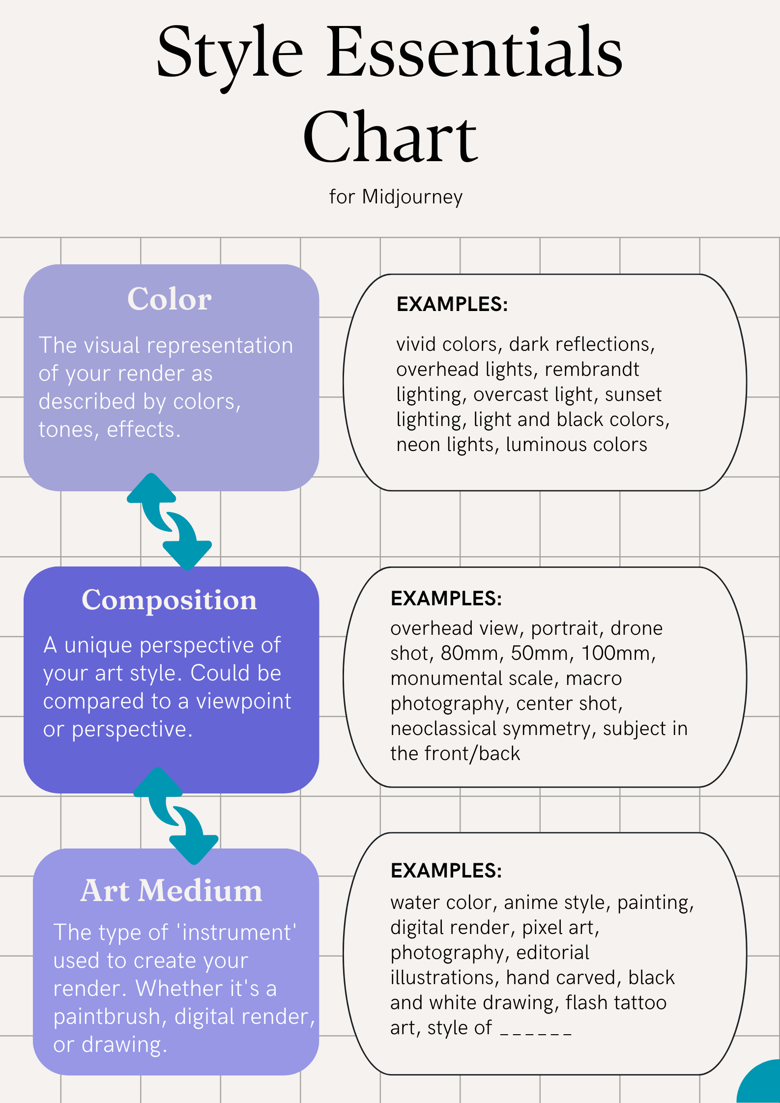
important key elements. Now the first one is
going to be the color, the visual element
of your image. The next element is going to be how this image is
going to be composed, how it's going to be framed. And then finally, the third one is how you are going to
be creating this image. So what medium is
this created on? These are the three
things that I want you to consider as you're thinking about what image is going to be part
of your style. Now we're gonna go
in depth throughout the next few lessons
so that you have a clear understanding
of what I mean by each of these
individual parts. Alright, let's dive
into the class
3. Style Preference: This lecture, we're
going to talk about style Preference or
choosing your style. Style is a complicated topic
and it could go really far, really deep in this
course though, I want to lay out
the steps for you to find a simple way
to define your style. Now style is not just limited
to a certain few elements. Style is infinitesimal. Style goes on very far into how something has put
together the inspiration, the connection
from this to that, the different elements that go into how something is made. All of that as part of
the creative process, part of what the artist
goes through and considers as they
are making Art. Now, with that being said, style could be broken
down and boiled down into something that is
representative of you. Now unless you're doing
something that's commercial. But if you're accreting, Art, style can be a reflection
of what you like, what your inspiration is, what your experiences has been, where you're drawing all
of these connections from different aspects of your life and
putting it together, Creating what you're creating. Now framing example. When I was a content creator, making stuff for
different brains in Southern California
and Hawaii. I took a lot of inspiration from the background that I had, which was through surfing, it's skating, and
being by the beat. So I use a lot of those
elements in the shots, in the work that
I created and at people that worked
with me and hired me were able to appreciate
that because they found that that was very authentic
and at the same time, that hadn't matched with
the type of branding, an advertisement that
they wanted to do. So as you're creating Art, there's many different things to consider as you're
considering your style. Are you doing Art to push
a commercial purpose? Is this something
that's gonna be marketed to a mass audience? Or is this something
that is genuine to you? Is this something that
you're trying to create for yourself, to express herself, to have yourself go through
a meditative Art process. These are two different
types of Art styles that you can consider
because they're both very different
from each other. And it's not just limited
to these as well. It's infinitesimal Art can be in any type of form
that you want it to be. The style is also
a product of that. Now, an easy thing
to remember in a takeaway for you to go on as an artist and to choose
your style is to think what is most
representative of view? How is this authentic to you? Why do you like it? Which elements of
this to you like? And how can you
incorporate and tie all of this in to your creation. Now up next, we're going to talk about hands-on practices on how you can do style within
your AI image renders
4. Elements of Style: This section, we're
going to learn about the elements of Style. Now, style, as we learned,
is infinitesimal. But for the sake of this lesson and for
practical reasons, I want to show you how to do style in the way that
could be replicated. So that whenever you
go and generate Art, it could be done over
and over and over again. Now, the thing is with style, once you are a master at it, and once you're
able to nail all of these three style elements down, you're gonna be able
to put your own touch, your own spin to it, and you're going to be able
to make it uniquely you. For this lesson though, we're going to break down just what really makes the style
as simple as it is, so that you can recreate it and consistently come up with something that you're
gonna be like, Oh, okay, this is the
style that I'm going for. And then once you're
used to that, you can build on top of it. So let's discuss the
three elements of Style. Now. The first one is color. Color is how your
images show up. Now, when we're talking
about photography, color, it could be a wide range of
different types of color. So it could be sunset lighting, it could be mourning lighting, or it could be black and white. All of these are
elements of color. Now photography, is it easy
examples to think about? Because with photography
is so easy to capture the different types of colors that are
available out there. Now we translate this
into Art as well. Art is a bit more
complex because Art can encapsulate all these
different types of color. It could be neon colors, some type of glitchy
type of colors, hand-drawn black and
white on color pencils. Now, as we're talking
about color in the sense of creating AI images, color is what you use to create your images
over and over again. What I mean by that is that
what you're trying to get down your style as you're
creating AI images, there's a certain prompt that you're gonna be using so that it always brings out this
similar looking color style. Now the next element
is the framing. Framing is essentially
the types of shots, the type help
composition that you typically use in your Art. So think about certain
artists, for example, they're very well-known for
a certain type of framing, asserted type of look, a certain type of way that
they portray their character, their subject, their main Art seeing that
they're highlighting. So if you use the example
of photography again, which is also very good to think about
because you could use the same photography angles
in your AI image prompts. So if we think about
photography again, there are many ways
to compose an image, for example, so one might
do a portrait shot. At portrait shot
has someone's face. It's very up-close and maybe their whole career is
built off of portraits. So that person's style is known as a portrait
photographer. Now along with portrait shots, there other such shots
as a drone shot. So maybe you're style is a drone shot shooting down
on something on the bottom. Or maybe you do wide
shots a lot where the wide shot will encapsulate everything that
is in this scene. Or maybe you're
somebody that does macro photography and that just shoots really up-close
of something. And all of these
shots in some ways help define the
style of the artist. Now the last element
that I want to talk about is your medium. Now your medium is essentially what type of tool or are
you using to make this Art? And because we're
doing this on AI, tools are essentially unlimited. Now let me define what tools are tools that you're using
to create this Art. For example, might
be at paintbrush. So if you have a paintbrush,
you paint something, it's gonna look like a
painted type of artwork. Now, if you are a
digital artist, you might be creating something on your computer, on an iPad. And that's going
to come out with its own different style as well. And it doesn't have
to be limited to just the medium of painting,
like physical painting. It could really be anything. If you are a photographer,
that is your Medium, your camera shoots and image of real life,
that is your medium. So the thing to think about
here is how you are going to communicate this artwork
that you're making and what is your medium
to create this artwork? So are you doing a photograph, a watercolor, a vector image? All of these are the medium that you're going to
use for your Art. And it also doesn't
have to be limited towards the different types of elements that
I just mentioned. Either you can combine all of them and that could
be your medium. You can have a photograph
with digital Art on top, maybe some thoughts, some words. That's also another medium to, on a different part
of that image. And really it's up to you and your creativity to
make it what it is. So in this lecture, we learned about
elements of style. The first one, we
talked about color and how that affects your
image and you're Art. The next we talked
about the framing, the composition of how
you're Art is going to look. And then finally,
we talked about the medium that you use
to create your Art, whether this is
through photograph, through digital vector
R, or through painting. Now the next lecture,
we're going to dive into MidJourney so
we can understand how to incorporate all of
this that we just talked about into your generative
prompting process.
5. ChatGPT Tip: Okay, I want to show you this
technique on ChatGPT that helps break down and
analyze a image prompt. Now this is an optional Tip, but I've found it to
be very helpful in understanding what
different parts of a prompt actually
does and how it goes into play as we're
prompting AIR. So let's dive into ChatGPT and
I'll show you what I mean. Okay, here in ChatGPT, we're going to ask
it to do this. So our prompts gonna be purged. The duty, this is a
text to image prompt. Please break it down to
it, individual arts. Then we'll paste it afterwards. So there's the prompt that
we pasted that we copied, spits out this long breakdown
of all the different parts. If you want it to be a bit
easier, how I like it, I would also add, please break it
down into sections. Then once you break it down, There's many different elements from here that we can look at and understand what
makes this render. So what we're gonna do here is tight back to the coloring, the framing, and the medium, the method of how this
image is rendered. So as we see here, first part is description
of the image. So this is just a
subject essentially, but as we move down will see different parts that
make this render. So here you have a scene
from this movie which will play into how the frame of this
render is looking like. And then these are also parts of it to covered in
jewels cascading. Now the next part, we're
going to see that this affects the color,
the visual elements. So there's violet and
orange structures, lavish green crystal artifacts, selective water, film
grain miss the mood. These all play a
part in controlling how the color of this render
is going to look like. Now, we'll move down a bit
and we'll see some more. Here is the artistic and
technical elements part. Then we'll see that this is based on the Art
House Art Style, photographic still style,
fine Art Photography style. So if you just look at these, for example, is like this view. It's essentially plays into the method of how this
is going to be made. So we can start to expect that this is going to
be something that is more realistic looking
kind of Human real life, look in things that
will move down. We'll see more of the
lighting cinematic. This would play more into the color of
the visual elements. Same with the
Photoshop edit style and the hyper-realistic details. This all plays into the elements of how
this has gone to look. Now, if we think about it a
little bit more actually, the hyper-realistic
details along with the photo descriptions here is probably going to
render this out to be a lot more realistic looking
like real life looking. And as we see here, as we go down even more, there's a render in Maya, which is a 3D
rendering software, 50 millimeter lens in all these other ones wishes
also going to further drive this image render into something that
is more realistic. So when we think about this, this is the method, the medium you're
creating your artwork in. So for example, this is 3D, while others might be
painted or in anime style. And then the last section here, the additional
information, you can see that it goes even further in this, it's
hyper-realistic. Is that 500 Px photography, which is a website
that has a lot of very sharp, beautiful photos. Again, fair real life, and then Fujifilm colors. This will just add to the color elements
and then Polaroid, we'll give it that
film like effect. And then for K, which will
make it more hyper-realistic. And then as you put all of these things together
that we broke down, you'll see that they highlighted things that made for the colors and mood and then things like this that affect
the scene of it, like how this is going to
be framed because this is based off of a movie scene. And also a lot of these
photographic type of prompts will also drive it to control how this
framing has gone to look. And it's most likely going to be very common type of
photography styles, which there'll be a portrait or something that's very
close to a portrait. And also you'll see that there's this 50 millimeter lens which is very popular for portraits. And then finally, things
like the render in 3D, like referencing this, and then having the hyper details
hyper-realistic. This will make the
medium of this to be something that is a real
life looking image render. So as you find images
that you like, you can plug it into ChatGPT so that it
helps you break down all these individual parts of your prompt or
of that prompt. So then you can know and
choose what you want to maybe borrow from For
inspiration and then use it in your own
prompt as well. Now, the next section, we're going to dive into color
6. Describe Function: This section, I'm going
to show you how to use the describe function, which is one of my favorite
features of MidJourney. Because with this function, you're going to be
able to dissect an image and generate a
prompt based on that image. And this is all done through AI on MidJourney is platform. So basically what it does
is you give it an image, and then from that image, it's going to give you back a couple of different prompts. And if you want to have more prompts that it
generates for you, you can also just refresh button and you'll
get more prompts. The most powerful part about
this is that you can use this tool to recreate
different elements, this image that
you're generating. So if there's a certain aspect of this image day
you really like, this feature is gonna help you highlight it and they
understand what word, what prompt is going to affect the final outcome so that it comes out looking like
how you want it to. So let's jump into MidJourney so I could show you what I mean. Okay, so now we're going to show the describe function
on maturity. So I just typed it
in slash describe. And then what you
do here is you drag an image into this
spot right here. So I have this image of just some renders I did
awhile ago saying I'm a Style render and I'm going to end press Enter
and let it run. So basically what it does here
is it looks at the image, breaks it down into
different elements that it thinks would make
for this image. So here are the prompts. So the first ones in anime, girl standing outside
a door looking into the distance and the style
of nostalgic landscapes, dark cyan and yellow
expansive landscape. Eight K romanticized
landscapes, settled coloring. So you have all of these come out of justice
image that you feed it, which is very helpful
now because now you have all these
different elements, words that you could use to
recreate this exact image. We're not this exact image, but a similar fueling image. And they're all different too. But if none of these come out with something
that you like, you can always just
rewrote it and then you will have more
descriptions as well. Now, also with the
numbers down here, these numbers are basically, if you press it, then you can quickly render what it gave you. This is the first one
that we just looked at. Well, this is the
re-wrote that we did, but this is the first
one that we looked at. If you press one, it will come up with this, which was the first prompt
description that it gave us. And then you can press Submit. And then it's going to go
and run this right here, it's running and animate girl standing outside a door,
look in the distance. The wall we just read, Here's what it rendered out for us. Something similar
to what we had. But I would say it
stopped completely exact. So I will also run the other ones just to see
which elements work out best. But for the most part, it's pretty close and
it looks really good. Now for the next lecture, we're going to go
into color Work and describe how prompts play
into your generations.
7. Color Work: In this section, we're going
to learn about color Work. Color is essentially how you're going to represent
your Art visually. And these are elements of
not just the red, white, and blue, the colors
that you have, but more so the entire
color scheme of this. So how does your Art turnout? What is the light to into it? What is the colors
that are being used? What type of effect is this
entire work piece portraying? All of these are
things that you're considering as
you're doing color. So good thing to consider as you are looking up inspiration
for color Work is a see what other people are
doing and then narrow down exactly what colors make
that piece, what it is. We're going to jump
into MidJourney, and then we're going to see a few pieces and then we're
going to break down what exactly makes for the color or an easier way to remember
the visual elements of it. Okay, We're going to start
with our first example, which is a shot of this man and of a
cinematic look and shot. And what I'm going to do first
is I'm going to bring it into MidJourney and then
have it be described. So here on the MidJourney,
here I'm MidJourney. You can see that I uploaded
the image and then I have the describe prompt setup. And then I'm going
to press Enter. And then it's going to
start thinking about what this prompt is going to
be to create this image. Now, it came out with results. And then we're going
to look through these results and then
we're going to find the visual elements because
we're trying to find colors, the things that bring it together and make it
into what this is. So we're gonna go down every individual one
of these and look at them and see what would
make for this generation. And we're going to look
for things like colors, lighting styles, that way it all plays together
into creating this field. Essentially everything that
is the visual elements. So starting here we have
actor standing in front of a library and the style of
texture rich surfaces, dark, academia, 32 K UHD, DC Comics, light
focused in optical. So from here, I can take away that perhaps dark academia
or a texture rich surfaces might be a visual
elements that would contribute to what
this image would be. So let's copy those
down and put it into our message that way we can save it or remember what it is. And then we'll look down a bit, we will see what else is here. There's light focused. Alright, This sounds
like it might play with the lighting of this image
that we're going to generate. So let's go and put
that in there as well. And then we'll go down, will see the second prompt
that it gave us. Again. It starts off with
setting the scene. So we're going to skip
there and go down a bit in the style of light maroon
and brands movies still. So again, these are
visual elements. To really take this,
we're going to put it in here again just so we can
remember all of these. And then moving on, we will
see textured surfaces again, not by true or a
textured surfaces does. But this could potentially play into creating something
that's similar to this. We've seen it twice, so I figured let's just copy
it and put it down here. Again, there's DC Comics. Alright, maybe we can just put DC Kabat-Zinn and see
what it looks like. Alright, well, throw
that in there as well. And then the third prompt
that they gave us is a man with glasses again,
setting the scene. We'll skip that
one and the style of cinematic stills, okay, so we don't have
cinematic stills yet, so we'll add that as well in
this style cinematic stills. And then we also have
dark academia again, which was one of the first ones, zigzags, just yarn as vodka. This might be an artist, creative, light beige and Amber. Now this is the colors that
we also referenced here, like maroon and bronze, but this is BIJ and Amber would just stick
with these colors for now. Perhaps even take
these out if they are too strong in a
certain direction, like it skews the image into
much of a certain direction, then we could take that out. But for now we're writing down all these words
so that we can generate something
with it and see if it comes out to be something
similar to this. And then we can
move on to really pinpoint what elements we actually want and
want to focus on. Third prompt we just
looked at and then we'll go on to the
fourth prompt, which is library and the
style of film grain. We haven't done any
film grain stuff yet, so we'll throw that
in there as well. So in this style of
film grain, okay, and then close up the intensity AK resolution,
eerily realistic. We could possibly put your
really realistic as well. So now we have all
of these words in the style of
texture rich surfaces, dark academia, light focused
in the style of light, maroon and bronze, movie
still textured surfaces. Dc Comics in the style
of cinematic stills, in the style of film grain
in eerily realistic. Now, if you look at these
words and you think about it, it's probably going
to come out to be something that bit darker, moody type of lighting,
something like this. So what we're going
to do now is we're going to copy this and
then we're going to test A few renders and see if it
comes out to be similar. So I'm going to go
right-click and copy it, and then I'm going to
prompt a few prompts. So man, standing in library
and then it come out, I'm going to paste
what we just copied. And then I'll do a few woman
standing in living room, child standing at playground. So we're having a few just to see how it's going to turn out. Okay, so it rendered out a
couple of images for us. Now, let's look at,
well, we got the first one of the main standing
in the library. So actually it comes out to be a very similar mood already just from these renders kind of dark, kind of mysterious,
very cinematic looking. Okay, We'll move on to the next woman standing in
her living room one. Okay. Also very similar mood. It's got that color, that dark, intense cinematic looking color as if you're watching
something in a movie. Alright, and then next we have child standing in
the playground. Now this one is a little
less dark and brooding. It doesn't have
exactly that mood that we had in the last two. But from here, you need
to play around and see what causes it to go
in this certain direction. Now I have a hunch that it's in the style of light
maroon and bronze. So if I take that out, it might actually do the trick. I'm going to try
again and imagine. That's what we just pasted. Child standing in a playground. And then this is what
we had from before. I'm going to take out in the style of light
maroon and bronze. And there's dark
academia, light focus. So basically, we want
this to a little darker. Now, which one of these would
push it to a light side? Maybe it's light focused. So let's try and take out
light focused and see if that gets us in the direction
that we want it to be. Okay, then I'll have this
render, and here it is. So this is kind of like exactly what we
were looking to do. So if you look at it, these
are kinda dark, broody, brooding mood, just like the original one that we put in there with what
we just looked at. These words from the describe really drove the image
to look like this. Now, for our next example, I'm going to describe an anime looking image and
animated looking scene. And we're going to try and
recreate this as well. Okay, so now with this anime cartoon
looking type of scene, we had these four prompts pop up and let's go through them and
see what might create this. So the first prompt will maybe go with in
the style of Swiss. So maybe you just
Swiss style and then dark green and light brown. So that looks like it's a bit a different
colorway than this. So we're going to skip that one. Cftr note that sometimes these descriptions aren't
going to be perfect, but it just gives you a
basis on what to think about and the thought process on how these images come together. So there's also a sheet film
or a romanticized realism. So this might be the mood
that this image has. Will copy row and just put it in there and
see if it works. And then Northwest School
glistening, watering eyes. Okay, that might be enough
for the tones and colors. Now the next one, now this
one added in an anime, I think that's
actually pretty key. This one also had anime
at first as well. So having an array
is pretty key. I would throw anime
first since enemy is what really drives
this whole image. So I'm gonna do an May 1st
and then we're going to go and keep going on here
in the style of UHD, image, green and
bronze in preschool. Neil romantic. We've seen sheet film twice. Let's throw in sheet
form just to see if that makes any
difference or if that actually just comes together in a way that works
correctly and puts us all together in this style,
uniformly staged images. Charming realism said you
liked harming realism to, I think this would add
to the visual element. So I'll put that in there. And then the third
prompt we see in this style of animated
film pioneer. Okay, that's interesting. I'm not sure what pioneered is, but it potentially could be
a film studio or something. So we'll throw this
in here as well. Then there's green and brown. We don't want to throw any colors in there
yet because that will drive it too skewed
towards the colors. And then we'll see other details
like cartoonish realism. Okay, I like that. I feel like that might make
it look in this style. And then there sheet film again, 32 K UHD, alright, we've seen this few times, so let's just copy
and put it in there. Finally, the fourth
one for the prompt is in this style of official
Art, green academia. So let's just throw green
academia in there since green is driving
this image in a way. So let's throw it there
and see what we can get. Now. Again, we'll copy
this and then we'll run our first render and see if it comes out to be very
similar to this field. Alright, I'll copy it. And then I'm going to imagine
and make your AT field. And then I just pasted the
prompt that we copied. Maybe I asked grass, I'll add a grass field. Then I'll generate a
couple of other as well. And I'm a boy running in prairie and then I'll
paste what we just did. Okay, So this is what we got and it does look really close. So the first 1, s
one and a fourth, the fourth one a bit, this one has a bit more detail, but I think it is very close to what we
originally gave it. The first one is second one in particular I think are
basically spot on. So from here, well, we got here, just
worked really well. Now we move on to this one. This is the other Generation, and this one I also think
looks really good as well. The second one and the fourth
one are basically spot on. The third one has a
bit extra detail. First one also as
well, but it's close. Okay, Now the last example
we're gonna do here, four colors is going
to be this painting. And I put it in describe again, and then I'm going to have
MidJourney describe it. So basically we are doing this
watercolor type painting. I think it's
watercolor actually. No, I'm not the best painter, but essentially a painting. So we're going to recreate
a painting style. We're noticing that these
are orange sunset he tones. And let's see what they
gave us with this gripe. So as we're going
down, describe both, see that it mentioned that beautiful abstract
sunset background. Okay, I like that. I think that would drive
some of the colors. So let's copy that,
paste it in here. Next we move on and we'll see in this style of
realistic brushwork, okay, that's good as part of
the visual elements as well. Love and romance, psychological
phenomena, illustrations. I can see that being part of the colors that
in there as well. Then there's some artists. Now, I like to stray away stuff from artists as much
as possible and just have the words that describe it, like
freehand painting. That way I don't
step on any toes, but sometimes it's a must. So depending on what
you're creating, some times you do have to reference a certain
artists and creatives. Now for the second prompt, where we have is water vector illustration in this style of
painterly landscapes. So I'm gonna do this one. I know that water
vector Illustration is probably going to look good, but I think it's
going to make it more of a digital looking
thing just because of my familiarity with knowing that vector illustrations are
typically digitally made. So I'm just going to put
something here or copy something here in the style of
painterly landscapes because this is not digital, it's painting and then Realism with
surrealistic elements. We don't have to exactly
put that will cover more of these elements in the
next few sessions, painted realisms. Okay, I think we already
have painted realism, but if not, Let's just
throw it in there. I don't think we do actually. So although that
in their horizons, dark amber or yellow shirt, these colors would probably
drive it to look like what we have in the sample image at the third prompt
that they gave us, sunset with colorful background and the style of
realistic brushwork. We already have
realistic brushwork copied psychological phenomenon, illustrations already
have that as well. Stencil Art, this is not
exactly stencil heart, so I'm not going to
copy that in there. Printed primitive Art. It's also not
primitive or either. So I don't think that
would help too much, although bronze and
Amber could help. So maybe I'll copy the bronze in amber and then
I'll paste it in there. Then finally the last prompt we have coupling in love at sunset, hand-holding on water canvas
background in this style of flat brush word, surreal,
seascape Illustration. I do like in the style
of flat brush for, I think this would emphasize the brush marks like some
of these that you see here. So I'm going to copy that. I'm going to paste it here. Now, we have all
of this already. And this seems like
it might make for a good candidate to create something that's
similar to this. So I'm going to copy this and
I'm gonna do dog at sunset. They don't want to
paste what we wrote down just now and
then render it. Also do man at sunset by
beach, run that as well. And then I'm gonna do one
last one woman at sunset and then paste
what we just wrote down and then have
all these render. Alright, so we got our renders. Now this is the first
one with a dog. Looks really good. Honestly. This looks spot on. Okay, great. We'll move on. This is
the render with the men. Also looks really good as the
brush marks has the tones. Finally, this is the woman at sunset, also very beautiful. Has the brush marks, has the similar tones
that as you notice, some are easier to
recreate than others. So you really have to just
experiment around and use the describe function
to find what works best. Now, the next lesson, we're going to talk about how to find the
type of framing and composition that makes for your render to create
it in a certain style. Okay, up next we're
going to talk about how the composition of your renders help make your style
and how we're going to replicate that based on
our reference images.
8. Framing Composition: Now we're going to talk
about the composition or the framing of what you're Art piece is
going to look like. Certain artists
have certain styles of what their Art looks like. And as we're creating our Art, it is nice to have something that is distinctive
for your style. So as you're creating your Art, consider what type of angles, what type of scene
you're portraying. Maybe this is a
really wide scene. Maybe you're an overhead
drone shot type of person. Maybe you're someone
that does very portrait style ART renders. And this isn't just
limited to photography. This is how you want to set your stage to look like as
we're creating this workpiece. How you are going to put all the different elements together so that it
communicates your story, communicates what you're
trying to create, and most importantly,
help stand out. So that when somebody
sees this piece, they're going gonna
know it's your Art. So let's dive into discord
and see what mid journey has to say when we give
it different images. And we're going to
break that down and see exactly what makes up the composition or the framing
of certain ART renders. First example, and this is going to be a portrait
of this astronaut. So what we're gonna do here
is we're going to put it back into the describe if Midjourney and then
I'm going to run it and see what prompts
that they give us. And then from here, we're going to look at what words would make
for the composition. The way that this
image turns out, maybe the way that how things
are just put together. So we're going to
find those words and then we're going to use them and generate and test out whether these words are going to get
us the results that we want. So I'm gonna go with the first prompt and look
at what we have here. The first thing that stands out to me is layered portraits, because it is a portrait. And you do notice there's actually a few things that
reference portraits as well. So you see layered portraits, celebrity portraits, and
also celebrity portraits. Again, we probably don't need
celebrity portraits twice, so let's just copy one of them. We'll start off with
layered portraits, and then we'll copy
celebrity portraits. Now, there's also
a Sony A7 three, which funny enough is what
I used to film this course. But we can also copy this
because this will give us a realistic looking image
more so we don't put this, it might end up being
a 3D looking thing or a cartoon looking thing. And essentially we want
this composition to be or of a realistic photo
type of composition. So Sony A7 is a camera and we want a camera to tie in with these portrait.
Alright, moving on. This is the second
prop that gave us, again the setting up the topic
of the person astronaut in the mountains and the style
of celebrity portraits was with personality
gray academia, gen part must be an
artist or something UHD image when
seeing this a lot. So let's just throw it in there, just the habit for
Safe Measures. And then there's quantum, quantum pug might be referencing that will park is something
that is not normal. And quantum at the
same time might just be something that is
super futuristic. So quantum path is probably referencing this alphabet
that he's wearing. But in this section we're
only go for composition. So we're going to skip that one. I would possibly copy close-up because this is a
pretty close-up portrait. And moving on, the third
prompt that they gave us is very similar
to the last one, with a celebrity portraits
as well, iMac, close-up. So this one's very
similar to the elements. So we took from the second prop as move on to the fourth prompt. Here we get to see the topic
and the scene being set up in the style of celebrity
portraits with personality. So it seems like celebrity
porches is something that is a repeating aspect
of these prompts. So I will add
celebrity portraits with personality since I
saw that pop a few times. Now there's also a K resolution. We do have UHD and
it's one out already, but we could add that in
there, it won't hurt. And then moving on, we have new American
documentary photography shirt. We could add that as well. I'm sure this would play into it and it classic
portraiture. Alright? And then these
will probably give us essentially
what we want here. We want a portrait
of our subject, and I'll copy this. But for the most part, I'm fairly confident it's going to come out
to be something similar to how this is
framed and compose. So we can have firemen
and then I just pasted what we just copied and now our render
another one as well. I'll do maybe a race car driver, and then we could also
do maybe a nurse. Now from what I am seeing
here of these regenerating, it does look really close up. So maybe the closest
thing might not be the exact thing that
we're looking for. So I'll do one last one
and I'll take the close up For this one, for this one, I'll do a share
and then I'll take off because not all porches
are exactly close up. Okay, So as it
finished generating, we get to see this one, for example, have some nurses and it is basically
what we want. It is in a square format, so let's take a look
as wide as we gave it. But this style, the way that it's composed,
looks pretty good. Now these ones are
a bit close up, but there was one like this one. The first one is a
bit further out. If we did do a 16 by
nine aspect ratio, that would be perfect. So I'll do one more render out. I'll just copy the same when we did was shift and then I'll imagine chef paste,
everything we did. I will take out close up again. And then for this one, will do the aspect
ratio 16 by nine. And then we'll run
this one and then it's going to be
a perfect result. Now, as we can already see
to the chefs right here, these are good results. Now, even this one look in here, it's when it's a
wide, it looks good. So 16 by nine is what we need
is going to do the trick. Now, I am noticing that some of these come out to have multiple. So it might have to do with be layered portraits aspect here. So I'll do another render where I don't put
layered portrait, so I just remove this. We already have celebrity
portraits and a couple of other words for our prop
that allude to the portrait, sure, like the
Portraiture section. So we can take that off. I'll take off close-up as well. And then now we're left
with this portrait. It would personality connects to the camera high
resolution image. And then we'll finish
off with a bit more of documentary photography
and portraiture. And then I'll do in aspect ratio of 16 by nine, and
then we'll run it. Now looking at these, you
can see that the angling, the composure Composition,
this all looks good. This is exactly what we're
looking for and we're this in a wide screen wide Composition, it will be perfect. And as this is generating, I'm already seeing
that this has gone to look exactly like how I want it. And from her results,
this is perfect. Number one and number two
are basically spot on. Now for our next example, we're going to do
something that's kind of a futuristic, odd angle. And basically it's
focused on this, this really abstract
looking Work soap. We're going to paste
this into the describe, run it and see what
Midjourney gives us. Okay, from here we
have the first prompt, a view from the top
of a building in an imaginary see that just
about nails the angle down. Alright, so I will copy that
because directly affects the composition
of our generation of view from the top of ability. Next, in this style of
high-end year Zackie Thomas, black shear watering, I bulbous. This does seem kind of bogus, so I will walk through
that in there, maybe play an effect and creating this kind
of circular effect. Clarity of form. Sure, this might be
a visual element at 100% affect the composition, but it'll be nice
to have in here. And then there's
imaginative space gapes. Now, this is going
to be for something else because it doesn't
affect the composition, but it does affect feel a bit. The second prompt, the
view from a city and the buildings in this
style of colorful Mobius, hyper-realistic sci-fi
conic, a big Mini. I think conic is a camera. So conic of big money could be referring to a certain camera. Alright, I'll put that
in there and then watering eyes, circular shapes. Alright, That seems like
furious, similar to this, although that in there as
well, imposing monumentality. So it's kind of complex word, but monumentality, I'm guessing, refers to something that's
kinda like a monument. So something big, high, tall, imposing anyway, shows
that it's super grain. If you're on the
top of a monument, you're imposing on
everyone underneath. We'll copy this because I think
this will play a part and Creating a similar look and
then detailed crowd scenes. I'll skip that one. Now the third prompt, we have anime fantasy. So this is giving the
anime look to it that would really help with
creating this similar style. And then in the style of surreal see scenes,
circular shapes. I will throw this circular
shaped thing in here again, maybe an extra bulbous,
realistic Tropp, loyal blink and you miss it detail forced perspective
and bulbous again, the first perspective seems like an interesting
one like this one, we are forced to
have a wide angle. Alright, other
enforce perspective, let's see if that
will do anything. Then for force prompt
that they gave us. The first part is just setting this up and
the style of this. And then we have high angle, which we haven't used it, but it is similar to a view
from the top of a building. So I could add that behind that. So it's connected. And then there's a couple of these things watering
I we saw twice, so it's already in there and This is what we got. So I want to copy this. Then. We're going to run Generation
and see what it looks like. Imagine futuristic city. And then I'll add what we
just copied it again because we press cut by accident
and then let's run it. It would also be cool to see this in maybe a city like Dubai. So I'm going to
run that as well. And then let's see what we get. N are renters are here
basically spot on. Look at this one. These ones are perfect. I will just remove
this whitespace. This one is great right here. Moving on, the while we did
with dubai, looks amazing. This is Dubai from the top. Looks just like the
image that we gave it, a forced perspective
from somewhere up above. Okay, so for our last example, we're gonna do one of this flower and as
you can already see, it has a certain style in particular that pops out
and it's macro photography. So let's see if while we get can help us recreate this
forest macro perspective. Okay, so we just did
describe and then these are the four prompts
that it returned with. Now first thing that we
see is a close-up shot of a blue flower with red
and gold highlights. Exactly this flower right here. But the most important part is a close-up shots a flower.
So let's copy that. We can take off the
blue part because that's not exactly
what we are doing. We're doing composition
in this lesson. So I'll take that out in this style of water drops
for you, ray tracing. And I'm not sure what
V ray tracing is, but it seems like it might have an effect on our image. So
let's put that in there. And then there is
these two that I think is gonna make an
effect on our composition. So National Geographic photo
and high-quality photo, because we do want this to
look like a photo still. And so there'll be a macro
close-up shot of this flower. A good photo. Now the next one, a flower
with drops on it in a dark background in the style into one bronze colorful dreams, National Geographic photo,
high-quality photo. Alright, the two that
are basically tied to composition or
the photo aspects, and we already have that. So let's move on to the neck. Now the third
prompt they gave us flower with the droplets
on this surface. Now, this actually
hints that we're so close that we're able to see
droplets on the surface. So actually, I
would like to copy that and then I'll
place it here. Close-up shot of a flower
with droplets on the surface. So I'm adding, but we
just got from here into this part and then this move on and see what else they
got colorful imagery, National Geographic
photo be ray tracing, UHD, and natural nature
inspired imagery. Okay, next to the fourth prompt, we have a blue flower
with water droplets on it in this style of dark mix, magenta and light gold. Alright, we're not focused
on colors, so let's move on. National Geographic photo again, the ray tracing UHD image, Carl Larson, maybe this
is similar to his style. Colorful textures, intense and dramatic lighting.
Alright, great. So in terms of the
composition is seems like these are the words that
will give us composition. So let's try this
out and render. These are copying. And imagine due to, of a blue flower. Here our renders and
basically hits the spot. This looks perfect, exactly like the same composition
of what we gave it, a close-up shot with droplets, and these are tied together with the photographic elements. Now from here you can add whatever type of feel that
you would like to this, and that concludes our
lesson on Composition. Now up next we're going
to talk about the medium that your work is
going to be in. Give me an exciting one
because there's gonna be many different styles of
Art that we go through
9. Medium: In this section, we're gonna
learn about the Art Medium. Now, the Art Medium is how you're Art is
going to be made. Is this going to be a painting? Is this a drawing? Is this a digital render? These are things that
you need to consider as you're going into and making the selection of what medium you're
creating your Art. So because we are
essentially linked lists, since this is AI, we need to go beyond the traditional
Art Medium. That's if you want to
get extra creative. But at the same time, photo Work is also
very beautifully done. Paintings are also
very beautifully done. Or even cinematic type Art is also beautifully
done on MidJourney. So if you're going for something
that's more traditional, all those bases are
typically already covered. Which is great because you
have many different options. Or at least as you are
rendering your Art, Midjourney has many different
options to draw and pull information from so that it can build up what you're
trying to build. Now, let's jump into MidJourney. We're gonna go on the discord. I'm going to break down a couple of images and
then we're going to see what exactly goes into how the Art Medium of a certain
Art render is done. Okay, So we're gonna dive
into our first example, which is going to be
a Hawaiian landscape. And we are doing the
describe as usual. We'll look at what makes up for this image based on
how it is composed. The first example
we're going to look at is going to be this
Hawaiian landscape. And we're gonna look at what makes up this
beautiful painting. And then we're going
to try to copy it using the describe feature. See what words would
go into the prompts so that it could recreate something
similar to this fueling. So we just did our describe Function and these are the four prompts
that they gave us. Now, the first one is, this is an HD wallpaper in the style of C
and coast painter. Enigmatic tropics, realist
landscapes, golden light, flat shading, American
scene painting and visually enhance. Now these last two, I know for sure is going
to give us this field, this painting medium
that we want to have. This is for sure
gonna give it to us. Now, what else we have in here that might
contribute to that? It seems like these
would just be colors. So HD wallpaper would probably
affect the quality of it. And this in the style of
seeing coast painter. Sure, we could add
that in there. This seems like it might be in this style of something
by the ocean. And the rest are eminem,
enigmatic tropics. So this is the scene,
realist landscapes, also the scene and golden
light, flat shading. And now we can also add
flat shading in here. This will probably give
it the tone that we want it to be in so that it's uniform to this example
that we gave it. Okay, now going out to the second prompt
that they returned us is an image of the ocean in
the style of this person. Trouble of symbolism. Steve Henderson,
vibrant illustrations. We can get throw in
vibrant illustrations too. I think that would work synergistically with the
painting part aspect. And then some more
colors for the prompt. There is UK high-def
isolated landscapes. Okay, So these are mainly for what this scene
is going to be, not exactly the medium
that we're working with. Now. The third prompt,
ocean with water and waves in the style of
exotic fantasy landscapes. Now, this might play a, a factor in how it comes out because this will
create the feel for it. But in our example, since we're working
on Composition, we're looking for
things that relate to this being more
of a painting. So I'm going to skip that one
and I'm going to go down. And we see American
scene painting, which we already did. And gouache. This here I believe is
related to painting, so I will copy that and
add that into her list. Then finally, for
our last prompt that they gave us in the step. Let's go and see what there is. Edit seems like there
isn't too much besides American scene painting
which we already have. So for the most part, this would give us the feel, the similarity to this
medium that they have here. So we can copy this
and then we can try something that is similar. So I can go maybe
Hawaiian Islands Then I'll add what
we just copied. Now, if we want something
that is more of an opposite, maybe I can do a
desert mountaintop or desert mountain and then
I'll paste what we did. Let's try a wide as well. So I'll do an aspect
ratio of 16 by nine. Then we will see
what we get from looking at this first
example of what we got. It is a bit more cartoonish. Now it did notice
that there were the UHD term in
their 30s, UK UHD. So maybe I'll add that. I want to imagine again, Hawaii landscape, a
pace where we copied. And then I'll add 32 K UHD, something that gives it
more depth and detail. Now there's also realistic, hybrid detailed rendering and highly detailed
environments. I will maybe copy this one. The other one seems like
it might be too detailed. So paste that in there and
then we'll run this again. Now, I will add one last thing. I'll do, a wide aspect
ratio and see what we get. Now for our desert looking one, this also looks really cool. It's really nice. But I still think it
doesn't have as much of detail as the original
example that we gave it. But these colors, sunset
colors, beautiful. Now, if we want to recreate
the sunset colors, I would add that in there
since we didn't have that. But other than that, I do think this is pretty close. The desert one is pretty close. Now, for this one we just
did of a Hawaiian landscape. This basically nails it spot on. This fourth one right
here, basically spot on. And because we added the extra
high-def elements to it, I think this is basically the same type of medium that we gave it
for our sample image. So this is what I
would use if I were to recreate something
like, well, we gave it. Now for our next example, we're gonna go through a
Japanese type of artwork. You've probably seen
it with a giant wave, but I'll show you how easy to be if you get something that
has a very unique style. So we're gonna do the describe. And then once we describe and get returned
with four prompts, we're going to look
through these prompts. So these are our four prompts, and let's see what we have. The first prompt is a cat on a surfboard riding over
Waves yet, that is it. But we are looking
at the medium, so we're looking at what
creates this style. Now, I'm gonna go down and
I'm going to see that this has in the style of
intricate illustrations. Sure, let's do that. And then Japanese
Inspired imagery as well. Okay, that works. So what's paste that into
our notes on the bottom. And then there's
also some tones, some detail, some more detail. And then also we can do maybe
densely pattern imagery. This might affect how it looks like in terms of
what medium we use. Now for the second prompt, we can see folklorist
part Art sepia tone, again with densely patterned
imagery, realists details. Now I don't think it looks like a scientific
illustration per say. So I'm gonna skip that one because it just
seems more obvious that this is like a
traditional looking artwork. So I'm going to skip that. And then the third prompt, it shows again the
cat, the tone. And then some person that
could be famous for the style. But what catches my eyes here as detailed illustrations with
wood cut inspired graphics. I think this is really
going to add to this look because this does look like
a woodcut inspired graphic. We have that and we
put it in there. And then now for
the fourth prompt, we have again the
cat on the wave. And this style of this,
these few people. Like I said, I do
try to stay away from names as much as possible. If this doesn't generate
us the result we want, then I will go back and look at these names and try
to incorporate them. So here we have this. I think this might do the job. So I'm gonna go and copy this. And then let's try
a couple of things. Let's try surfing
cat, then paste that. And then I'll make
it wide as well. Then I'll do another one, maybe a in town. And then I'll paste what we did as well, and
then I'll run it. Okay, So we have our images. Now, this first one actually
looks very similar. This one does the trick. This one really does the trick. The only difference is this
tone is a bit more brown, which is the sepia
tone thing that was referenced in
a couple of V's. And the second one, it does look a lot
more detailed. But since our first
one did the trick, really what this is
saying is that we need to just run it multiple times Until we get what we want, the exact result that we want. Okay, So the next
example we have, this one's going to be a kind of a black and white
coloring book type thing. So if you're making
a coloring book, this would be a great
looking style for you to do. So we're gonna go
and describe it. And then we're going to see what we get when we use the describe
function on MidJourney. So we have for that
they returned us with and right away it
says coloring page. So this is going to
for sure give us, give us what we need. So I will add that right away. Coloring page in the style
of editorial Illustration. Okay, I'll also copy that to, I think this will give us
that look that we want. Now, there's also a
high contrast shading. I think this will play
an effect as well. Let's paste it in there. Then panoramic scale,
coastal landscapes, contract shading, shirt,
contrast, shading. What I will leave play
into the type of medium, the style of how this
is all put together. So our first prompt gave us
a good amount to work with. Second prompt, let's see. Now, we have in the style of
grandiose cityscape views, Balinese Art, bold manga lines. Okay, so there's, these two. Balinese are in
bold manga lines. Now I think the
Balinese Art part is referring to these temples. I don't quite think
this looks like the Balinese Art that I was familiar with when
I was in Bali. So I'm going to skip that one. But I will put Board manga
lines and then look at this. There's quiet moments
captured in paint, landscape photography, floating structures,
and contrast shading. Again, out of these last few, only Cotard's shading would seem like it fits in with this, just like how things are shaded. So I'll move on
to this next one, a drawing of a person riding
a boat in a landscape. So, sure, I could use
this one to drawing of something which will
be in the beginning. That way we can just
start off with that. Then we can move on in the style of elegant
inking techniques. Inking might play with it too. So let's copy this,
paste it in here, and then see what
text, stylistic, manga, floating
structures, contour lines. We already have contour
lines now cartridge shading. So I'll copy this as well. It seems like it might
play a part in it, but we do want to
focus on lines, on shading and on
the color of this. And it seems like
coloring page it might make this a
black and white. If not, then we can go back and make our renders
black and white. And finally, let's go on to the fourth prompt
that they returned. They say coating page. Okay, we have that in this style of terrorists, landscapes
or cityscapes. Yes, it's more of
how this image has gone to look. Manga style. Sure. I'll throw in manga style. I think that might make it
black and white as well. Then traditional techniques re-imagined
impressionists lines, exotic, transparency
and opacity. Now, this is an interesting one. This is like stuff that
you should test out and see if this creates
the effect that you want. For now, I think what
we have here will create this coloring
book type of effect. We even wet pretty
far into it as well. So I'm going to copy this. And then I'm going to try
and generate a few drawing of Asian city coloring page. And I'll make it
wide as well since our example had a pretty
wide and looking at core. And then also do another one. And I'll do a CAD drawing of
a pizza shop coloring page. And then a run these two
and see what we get. Our first one dot pause. So let's run it again. Dry of an Asian
city coloring page in a wide aspect ratio. So our first rendered
came out and you can see that it basically
covers what we wanted, like a coloring page, slight detail good
enough for it to keep a similar vibe to the example and generally
looking really cool. Now one thing I would
add is that there is a lot of detail
in this actually. So if you were to
do a coloring book, I would probably
do something that takes off a bit of the detail. So we go back in here, we can look and see things
like editorial illustrations, which editorials are
really high-quality. So maybe that would be taken out and make it a
little less detailed. Or maybe it's contour
lines are bold lines. So you have to
experiment a bit. Now. Let's try and your
own where we take out the style of
editorial illustrations. City or the see Japanese sit
in drawing, coloring page. And we'll make it wide again. Okay, So this is
our Asian city one. Also a lot of details, a lot of different
things going on. This one could be
a coloring page is not super complicated. It is pretty complicated though. Or this one, a lot more clear
of what the shapes are. Now, it seems like our goal
here is to make it a little less complicated if we were
to do a coloring page style. So I would go through
and look at these and see which ones would make
it a bit more simple. And then eventually come up with the right prompt to
make it a bit more simple so that we can use
it in color AMP books. So I'll do this again. I do a drawing of Japanese
town coloring page. I'll take out this one, maybe high contrast
shading as well. That seems like it might
be complicating it. Contract cheating, contour
lines, bold manga line, maybe elegant inking
techniques could be something that
makes it go crazy. Or maybe sometimes being
super simple is all we need. So I'm gonna try it, this just a couple of
words and see what we get. Now this last one we created
was a very complicated, There's a lot going on here. But in terms of
look and feel wise, it does look and feel that
this example we gave it. Now I have a suspicious
feeling that maybe are prompt is
just very complicated. So I'm going to try and make it instead of a town
which is very light, has a lot of Ruby elements
drying up a farmer. So we'll see what
that looks like. Because I do like
what this looks like and the feeling is correct. Okay, So with this last one, it's gotten a lot more simplified and something
that we can work with. So it did come down to our prompt in how
complicated it made this. Okay, So this concludes
our three examples. And up next, or you're going
to learn about how to create a consistent style with the
work that you generate.
10. Recreating a Style (Process): In this lesson, we're
going to learn about how to recreate a style. So I'm gonna go through a couple renders and
we're gonna talk about how we would approach
recreating this exact style. Let's go in, generate
some Art on here, and then we're gonna
go and recreate it. So I'm just going to do
something really simple and just imagine, imagine Art. And then we'll have
somebody come out. We'll see if we like it, and then we'll go
and recreate it. And in doing so, you can see
what my process is like as I find things that I want to recreate and pick out
certain elements of it. So right now we're gonna do Art, which is just something
super-simple. And the beauty of this
is that if you give it something that is
generated from MidJourney, then you know for sure
that it could be made and you can break it down
into individual parts. So for this first example
that we generated, we had some very abstract
looking Art right here. But I do like this
third one a lot. It looks cool and interesting. There's fishes, There's a lady, and it's kind of
historic to looking like a Greco-Roman
building and architecture. But here is our image and
I'm going to save this. And then like we did before, the first thing I'm
gonna do as we re-create is to use the describe command. Now, describe is so powerful because it could
really just break down this entire image and maybe just give us exactly
what we need right away. So here are the four
prompts that we got. Now the first step that I
always do is that I just run all of these and let them generate that way I
can see how close that these prompts are into the original image that
it's referring to. I'm just gonna go and run off for them and then we'll wait. Okay. And they are starting to come in and they
look really good. They look very similar to the image that we
gave it to reference. Now, as we're looking
at these prompts, because we still
want to figure out what word combinations would
give us similar results. So as we look at these prompts, It's important to
notice what are the things that
drive the colors, what drives the composition, how this image comes out, and what is the medium
that this is created on. So let's go up and look. Now for this first one
that was rendered, I would take note
of in this style of classical figurative realism, since that'll probably give it the type of medium that this
is going to be made on. So I'll paste that in
here so we remember it. And then there's the
color red and cyan, which is not completely
important since it's just color. What this does is it will
emphasize this color more, but we really want
this color palette. So other details that I noted are highly
detailed illustrations, nostalgic
illustrations, which is to fall into maybe the
color of how this looks. Since thus strategic is
going to reference to this, how this is kind
of an old school looking color way as a bit faded and then highly
detailed illustrations is that all of these Art, the individual characters and details are all really
highly detailed. Now there's also a
neoclassical composition which is neo-classical, is referencing into
something that is both classical but at the
same time kind of futuristic. So we're going to throw
that in there because it does have this Neoclassical, slightly dreamy feel to it. I'll also add that in there. And then Jim light portraiture, This explains itself really. This is a very
dreamlike portraiture. Now, there's also
detailed skies. And if you are doing something
that involves skies, like maybe this is your style, then definitely
add that in there. But we just want to
recreate a style. So I'm going to just use this. So let me break down
what we have so far. Now, the first part
in this style of classical figure to
realism is going to be affecting how this is created through the medium
that it's created in. As we think of classical
figurative realism, that's more of stuff you see at the museums that are
kind of like made through paint and looks real versus just
a simple drawing. And then we also added highly detailed
illustration to it, which is going to give it that extra layer
of extra detail. And then the nostalgic
Illustration. Now that histology part in
my mind is going to play into the vintage looking colors that are going to come out. And then neoclassical
composition is part of that visual element. So it's also going
to be tapping into both the colors and also the
medium that this is created. It dreamlike portraiture. This is the composition
of the image. This is a portrait
and it's very dreamy Go back and look at this. This is also very dreamy, so we can use this
and then have it as a base for us to create
something on top up. Now here, I could just run
this and say, man, thinking. And then I'll just run that. And then we'll see
what we do that again. So I'll run this man thinking in the style of classical
figurative realism. Highly detailed illustrations,
nostalgic Illustration, neoclassical composition,
and dreamlike portraiture. Now you also note that in this, we hit all three
pillars of colors, the visual elements, and
then we hit the composition. And then finally, we hit the medium that it is
going to be created in. Our render is done. But as you note, it's not completely dreamy like the example
that we gave it. The colors and the
style looks good. So we're gonna go back and
reference the other prompts that we were given and see how we can improve what we have. Now this is the second prompt
from the describe feature. And from here, there's
not too much different from the original one
that we just copied. So we're going to move
on to this next one. This next one has a bit more
of a dreamy element to it. So let's look at it
and see what we have. This has a couple of words that I think
will be very helpful. So the first one,
grand year of scale, this does look really gray
and she is a subject in this massive castle or
this massive empire. So I do want to use that
word, grandeur of scale. Now, let's copy it
down and then I'll paste it on the bottom
so we remember it. And then I'll move on. And these are a few names
of potentially artists. I do like to avoid using names as much as
possible since it is a gray area sometimes when referring to other
artists is style, but I do like ethereal
cloud scapes. I feel like this has a
magical effect to it. So I'm gonna copy that and
I'm going to paste it here. And I think this would
make a difference. I got big difference
on what we have here. So I'm going to copy
what we had earlier, and then I'm going
to paste it in front of what we just added, the old prompt added into granular scale and
ethereal soundscapes. And I'm going to copy
the whole thing. And then I'll run a prompt. Now this one, I'll do
Main thinking again. Since that last one didn't
really do it justice. I'm going to run this and have these two that we just added. Now as it's rendering, let me describe for you why I chose these grandiose scale. Now this one is going to affect the composition of how this
image is going to generate. And that's really
important because as we look in this image, the ones that were
generated previously, it wasn't very grand, like some of these were
actually just really close up. And then might have to
do with the fact that we included portraiture in here. So if that happens too much, I would take out portraiture. Now, it also wasn't very dreamy. So I noticed that this
word, ethereal clouds, gapes, would probably give
it more of a dreamy feeling. And as we are seeing
this come together, it does look pretty
dreamy, okay? And so as we look at
this new-generation, it looks good. It looks good. So from here, you can copy this and just create
Art in this style. Now, we can go back to our other initial image and create something
similar to that. Women in dress surrounded by fishes in a Greek
inspired environment. This will be the subject, the topic that we're doing. I just feel it's really magical, so I wanted to try that and then we're going to paste
what we just did. So that's running. And here is what we generated. It looks really good,
it looks magical. And I think this is very much in the same style as your
original image that we got. So from here, basically
you just need to build up into whatever
type of pizza you want. We already have the
prompts that you need to add on to make
it into this style. And all that you have to do
is come up with the subject. For example, in this
example we use this, but for you It's whatever you want your imagination to be. Now I will add to
have you want to know exactly what every individual
piece of this prop does. I would prompt it
individually so I wouldn't know how it affects
the certain image. But as you get
better and better, you have an understanding
of how certain prompts work together and where it
affects the entire prompt. But ultimately, it
takes a lot of time to know exactly how prompts
affect the final outcome, and that can only be
done through practice. So I highly recommend you practicing describing as
many photos as you can and just figuring out what makes that Generation
into what it is
11. Conclusion: Okay, congratulations
and welcome to the end of this class. You've made it and I'm so
happy that you're here. Now to conclude, first, we talked about style and
how style is infinitesimal. Style is really a
reflection of you. That is the big takeaway. And this class is really just to teach you the
thought process on how you want to
represent yourself through your Art and
through your style. Now, the next thing that we've
talked about and learned, We're at the three
elements of style. These are three simple elements
that you can think about so that you can have a
clearly defined style. Now, of course, once
you master these, you can add on a lot of different flair to
that so that you can further distinguish
yourself from everybody else. So the first element of style
that we learned about was color and the color Work that goes into creating your Art. Now this is also represented in the visual
elements of the word. Next, the second one we
learned about is the framing. What types of shots, what types of angles
are part of your style? How does this stick
out and stand out as something that is
no to be made by you. The third one is the Art Medium. What type of Art is this? Is just a digital drawing. Is this a hand painted portrait? Is this a Work of Art
that is made out of sand? And since we're
doing this on AI, the potential is limitless. Now that's it for
this class makes sure you submit a project. I'd love to see what you make. And before we leave, please leave a review. Let me know what helped
you out and what you'd like to see so that I could add more of those in the future. Thanks again for finishing
and congratulations.
 Arnold Trinh, Multi-Disciplinary Creative